When the Jaccard similarity index isn’t the right tool for the job, and what to do instead
I’ve been thinking lately about one of my go-to data science tools, something we use quite a bit at Aampe: the Jaccard index. It’s a similarity metric that you compute by taking the size of the intersection of two sets and dividing it by the size of the union of two sets. In essence, it’s a measure of overlap.
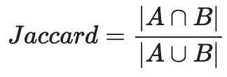
For my fellow visual learners:
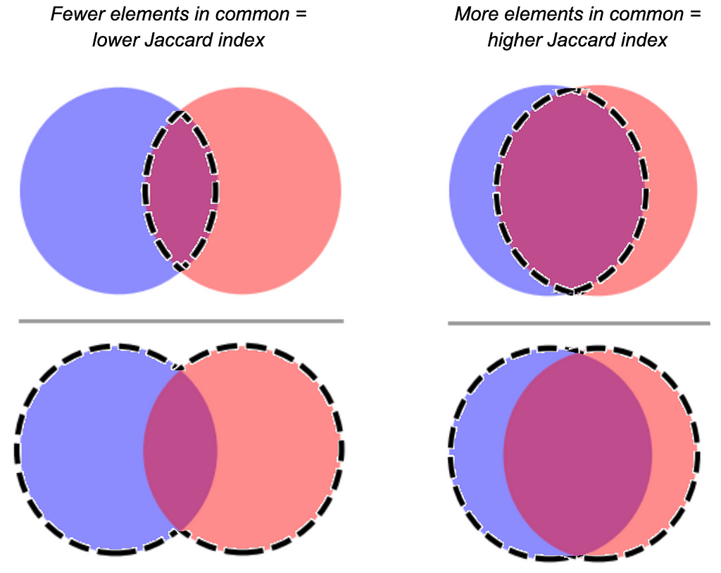
Many (myself included) have sung the praises of the Jaccard index because it comes in handy for a lot of use cases where you need to figure out the similarity between two groups of elements. Whether you’ve got a relatively concrete use case like cross-device identity resolution, or something more abstract, like characterize latent user interest categories based on historical user behavior — it’s really helpful to have a tool that quantifies how many components two things share.
But Jaccard is not a silver bullet. Sometimes it’s more informative when it’s used along with other metrics than when it’s used alone. Sometimes it’s downright misleading.
Let’s take a closer look at a few cases when it’s not quite appropriate, and what you might want to do instead (or alongside).
Your sets are of very different sizes
The problem: The bigger one set is than the other (holding the size of the intersection equal), the more it depresses the Jaccard index.
In some cases, you don’t care if two sets are reciprocally similar. Maybe you just want to know if Set A mostly intersects with Set B.
Let’s say you’re trying to figure a taxonomy of user interest based on browsing history. You have a log of all the users who visited http://www.luxurygoodsemporium.com and a log of all the users who visited http://superexpensiveyachts.com (neither of which are live links at press time; fingers crossed no one creepy buys these domains in the future).
Say that out of 1,000 users who browsed for super expensive yachts, 900 of them also looked up some luxury goods — but 50,000 users visited the luxury goods site. Intuitively, you might interpret these two domains as similar. Nearly everyone who patronized the yacht domain also went to the luxury goods domain. Seems like we might be detecting a latent dimension of “high-end purchase behavior.”
But because the number of users who were into yachts was so much smaller than the number of users who were into luxury goods, the Jaccard index would end up being very small (0.018) even though the vast majority of the yacht-shoppers also browsed luxury goods!
What to do instead: Use the overlap coefficient.
The overlap coefficient is the size of the intersection of two sets divided by the size of the smaller set. Formally:

Let’s visualize why this might be preferable to Jaccard in some cases, using the most extreme version of the problem: Set A is a subset of Set B.
When Set B is pretty close in size to Set B, you’ve got a decent Jaccard similarity, because the size of the intersection (which is the size of Set A) is close to the size of the union. But as you hold the size of Set A constant and increase the size of Set B, the size of the union increases too, and…the Jaccard index plummets.
The overlap coefficient does not. It stays yoked to the size of the smallest set. That means that even as the size of Set B increases, the size of the intersection (which in this case is the whole size of Set A) will always be divided by the size of Set A.
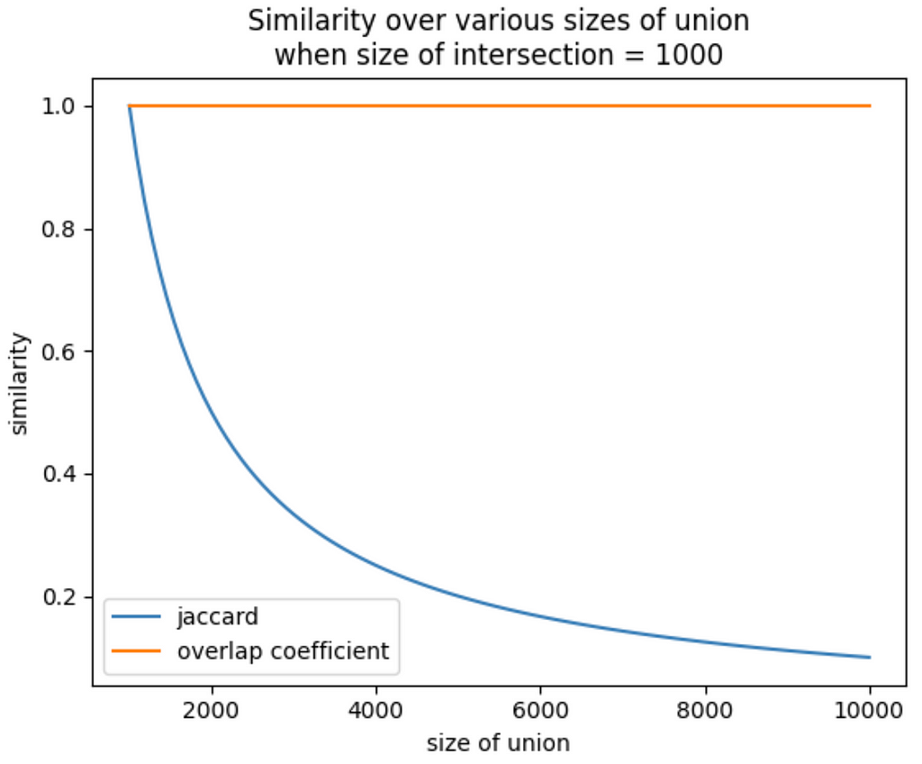
Let’s go back to our user interest taxonomy example. The overlap coefficient is capturing what we’re interested in here — the user base for yacht-buying is connected to the luxury goods user base. Maybe the SEO for the yacht website is no good, and that’s why it’s not patronized as much as the luxury goods site. With the overlap coefficient, you don’t have to worry about something like that obscuring the relationship between those domains.

Pro tip: if all you have are the sizes of each set and the size of the intersection, you can find the size of the union by summing the sizes of each set and subtracting the size of the intersection. Like this:

Further reading: https://medium.com/rapids-ai/similarity-in-graphs-jaccard-versus-the-overlap-coefficient-610e083b877d
Your sets are small
The problem: When set sizes are very small, your Jaccard index is lower-resolution, and sometimes that overemphasizes relationships between sets.
Let’s say you work at a start-up that produces mobile games, and you’re developing a recommender system that suggests new games to users based on their previous playing habits. You’ve got two new games out: Mecha-Crusaders of the Cyber Void II: Prisoners of Vengeance, and Freecell.
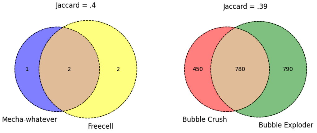
A focus group probably wouldn’t peg these two as being very similar, but your analysis shows a Jaccard similarity of .4. No great shakes, but it happens to be on the higher end of the other pairwise Jaccards you’re seeing — after all, Bubble Crush and Bubble Exploder only have a Jaccard similarity of .39. Does this mean your cyberpunk RPG and Freecell are more closely related (as far as your recommender is concerned) than Bubble Crush and Bubble Exploder?
Not necessarily. Because you took a closer look at your data, and only 3 unique device IDs have been logged playing Mecha-Crusaders, only 4 have been logged playing Freecell, and 2 of them just happened to have played both. Whereas Bubble Crush and Bubble Exploder were each visited by hundreds of devices. Because your samples for the two new games are so small, a possibly coincidental overlap makes the Jaccard similarity look much bigger than the true population overlap would probably be.
What to do instead: Good data hygiene is always something to keep in mind here — you can set a heuristic to wait until you’ve collected a certain sample size to consider a set in your similarity matrix. Like all estimates of statistical power, there’s an element of judgment to this, based on the typical size of the sets you’re working with, but bear in mind the general statistical best practice that larger samples tend to be more representative of their populations.
But another option you have is to log-transform the size of the intersection and the size of the union. This output should only be interpreted when comparing two modified indices to each other.
If you do this for the example above, you get a score pretty close to what you had before for the two new games (0.431). But since you have so many more observations in the Bubble genre of games, the log-transformed intersection and log-transformed union are a lot closer together — which translates to a much higher score.

Caveat: The trade-off here is that you lose some resolution when the union has a lot of elements in it. Adding a hundred elements to the intersection of a union with thousands of elements could mean the difference between a regular Jaccard score of .94 and .99. Using the log transform approach might mean that adding a hundred elements to the intersection only moves the needle from a score of .998 to .999. It depends on what’s important to your use case!
The frequency of elements matters
The problem: You’re comparing two groups of elements, but collapsing the elements into sets results in a loss of signal.
This is why using a Jaccard index to compare two pieces of text is not always a great idea. It can be tempting to look at a pair of documents and want to get a measure of their similarity based on what tokens are shared between them. But the Jaccard index assumes that the elements in the two groups to be compared are unique. Which flattens out word frequency. And in natural language analysis, token frequency is often really important.
Imagine you’re comparing a book about vegetable gardening, the Bible, and a dissertation about the life cycle of the white-tailed deer. All three of these documents might include the token “deer,” but the relative frequency of the “deer” token will vary dramatically between the documents. The much higher frequency of the word “deer” in the dissertation probably has a different semantic impact than the scarce uses of the word “deer” in the other documents. You wouldn’t want a similarity measure to just forget about that signal.
What to do instead: Use cosine similarity. It’s not just for NLP anymore! (But also it’s for NLP.)
Briefly, cosine similarity is a way to measure how similar two vectors are in multidimensional space (irrespective of the magnitude of the vectors). The direction a vector goes in multidimensional space depends on the frequencies of the dimensions that are used to define the space, so information about frequency is baked in.
To make it easy to visualize, let’s say there are only two tokens we care about across the three documents: “deer” and “bread.” Each text uses these tokens a different number of times. The frequency of these tokens become the dimensions that we plot the three texts in, and the texts are represented as vectors on this two-dimensional plane. For instance, the vegetable gardening book mentions deer 3 times and bread 5 times, so we plot a line from the origin to (3, 5).
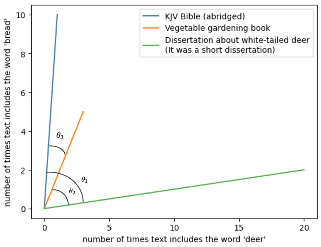
Here you want to look at the angles between the vectors. θ1 represents the similarity between the dissertation and the Bible; θ2, the similarity between the dissertation and the vegetable gardening book; and θ3, the similarity between the Bible and the vegetable gardening book.
The angles between the dissertation and either of the other texts is pretty large. We take that to mean that the dissertation is semantically distant from the other two — at least relatively speaking. The angle between the Bible and the gardening book is small relative to each of their angles with the dissertation, so we’d take that to mean there’s less semantic distance between the two of them than from the dissertation.
But we’re talking here about similarity, not distance. Cosine similarity is a transformation of the angle measurement of the two vectors into an index that goes from 0 to 1*, with the same intuitive pattern as Jaccard — 0 would mean two groups have nothing in common, and closer you get to 1 the more similar the two groups are.
* Technically, cosine similarity can go from -1 to 1, but we’re using it with frequencies here, and there can be no frequencies less than zero. So we’re limited to the interval of 0 to 1.
Cosine similarity is famously applied to text analysis, like we’ve done above, but it can be generalized to other use cases where frequency is important. Let’s return to the luxury goods and yachts use case. Suppose you don’t merely have a log of which unique users went to each site, you also have the counts of number of times the user visited. Maybe you find that each of the 900 users who went to both websites only went to the luxury goods site once or twice, whereas they went to their yacht website dozens of times. If we think of each user as a token, and therefore as a different dimension in multidimensional space, a cosine similarity approach might push the yacht-heads a little further away from the luxury good patrons. (Note that you can run into scalability issues here, depending on the number of users you’re considering.)
Further reading: https://medium.com/geekculture/cosine-similarity-and-cosine-distance-48eed889a5c4
Parting thoughts
I still love the Jaccard index. It’s simple to compute and generally pretty intuitive, and I end up using it all the time. So why write a whole blog post dunking on it?
Because no one data science tool can give you a complete picture of your data. Each of these different measures tell you something slightly different. You can get valuable information out of seeing where the outputs of these tools converge and where they differ, as long as you know what the tools are actually telling you.
Philosophically, we’re against one-size-fits-all approaches at Aampe. After all the time we’ve spent looking at what makes users unique, we’ve realized the value of leaning into complexity. So we think the wider the array of tools you can use, the better — as long as you know how to use them.
You Kon’t Know Jacc(ard) was originally published in Towards Data Science on Medium, where people are continuing the conversation by highlighting and responding to this story.
Originally appeared here:
You Kon’t Know Jacc(ard)