Two New Graphs That Compare Runners on the Same Event

Have you ever wondered how two runners stack up against each other in the same race?
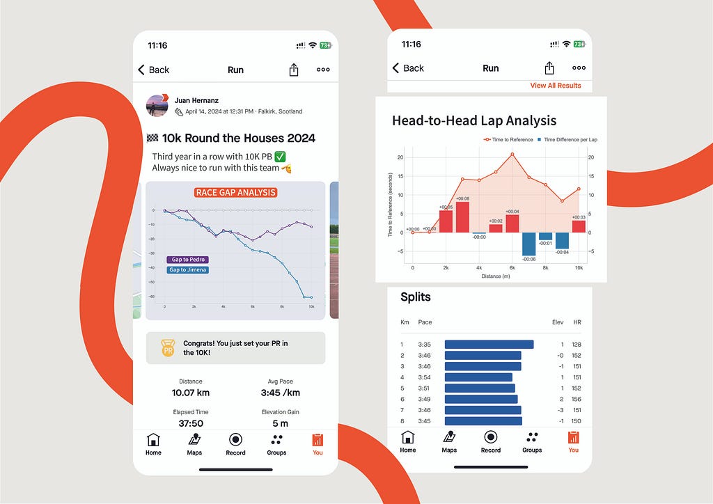
In this article I present two new graphs that I have designed, as I felt they were missing from Strava. These graphs have been created in a way that they can tell the story of a race at a glance as they compare different athletes running the same event. One can easily see changes in positions, as well as the time difference across the laps and competitors.
My explanation will start with how I spotted the opportunity. Next, I’ll showcase the graph designs and explain the algorithms and data processing techniques that power them.
Strava doesn’t tell the full story
Strava is a social fitness app were people can record and share their sport activities with a community of 100+ million users [1]. Widely used among cyclists and runners, it’s a great tool that not only records your activities, but also provides personalised analysis about your performance based on your fitness data.
As a runner, I find this app incredibly beneficial for two main reasons:
- It provides data analysis that help me understand my running performance better.
- It pushes me to stay motivated as I can see what my friends and the community are sharing.
Every time I complete a running event with my friends, we all log our fitness data from our watches into Strava to see analysis such as:
- Total time, distance and average pace.
- Time for every split or lap in the race.
- Heart Rate metrics evolution.
- Relative Effort compared to previous activities.
The best part is when we talk about the race from everyone’s perspectives. Strava is able to recognise that you ran the same event with your friends (if you follow each other) and even other people, however it does not provide comparative data. So if you want to have the full story of the race with your friends, you need to dive into everyone’s activity and try to compare them.
That’s why, after my last 10K with 3 friends this year, I decided to get the data from Strava and design two visuals to see a comparative analysis of our race performance.
Presenting the visuals
The idea behind this project is simple: use GPX data from Strava (location, timestamp) recorded by my friends and me during a race and combine them to generate visuals comparing our races.
The challenge was not only validating that my idea was doable, but also designing Strava-inspired graphs to proof how they could seamlessly integrate as new features in the current application. Let’s see the results.
Race GAP Analysis
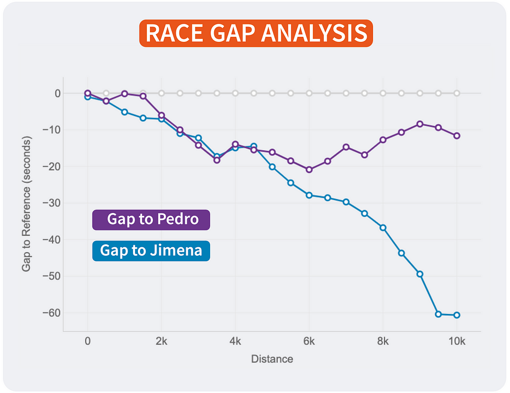
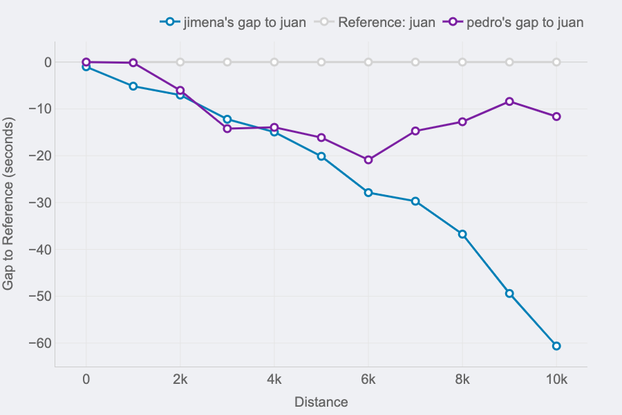
Metrics: the evolution of the gap (in seconds) between a runner that is the reference (grey line on 0) and their competitors. Lines above mean the runner is ahead on the race.
Insights: this line chart is perfect to see the changes in positions and distances for a group of runners.
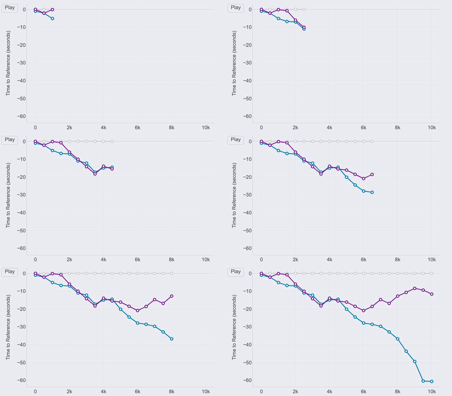
If you look at the right end of the lines, you can see the final results of the race for the 3 runners of our examples:
- The first runner (me) is represented by the reference in grey.
- Pedro (in purple) was the second runner reaching the finish line only 12 seconds after.
- Jimena (in blue) finished the 10K 60 seconds after.
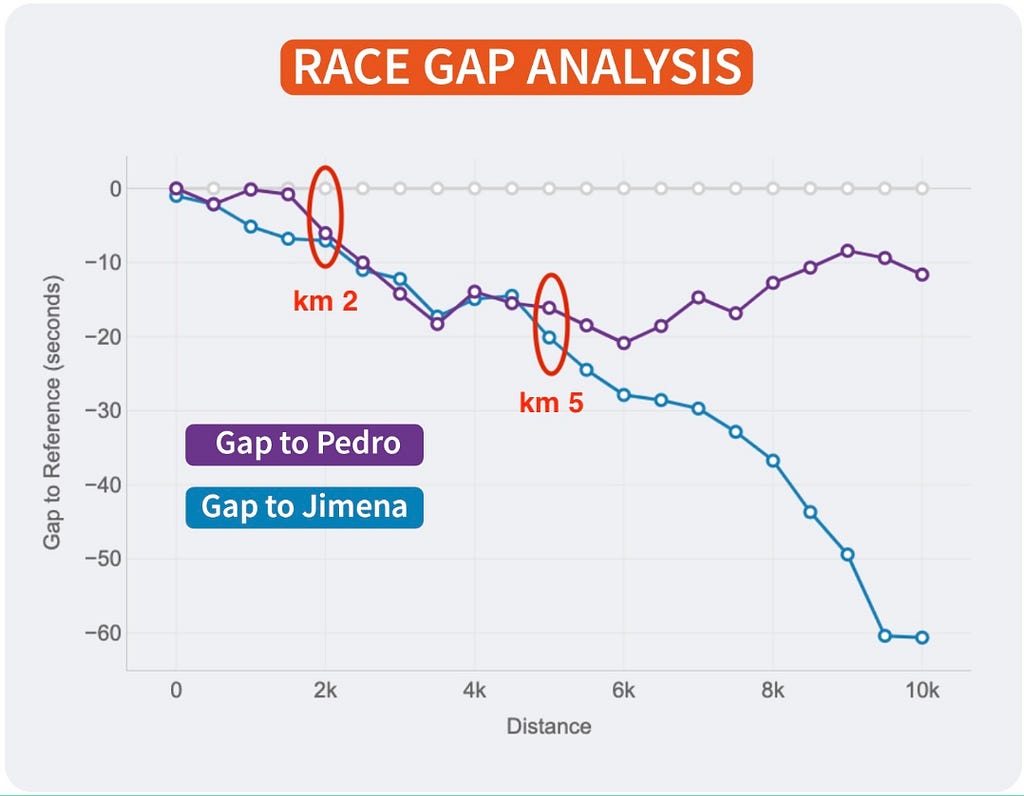
But, thanks to this chart, it’s possible to see how theses gaps where changing throughout the race. And these insights are really interesting to understand the race positions and distances:
- The 3 of us started the race together. Jimena, in blue, started to fall behind around 5 seconds in the first km while me (grey) and Pedro ( purple) where together.
- I remember Pedro telling me it was too fast of a start, so he slightly reduced the pace until he found Jimena at km 2. Their lines show they ran together until the 5th km, while I was increasing the gap with them.
- Km 6 is key, my gap with Pedro at that point was 20 seconds (the max I reached) and almost 30 seconds to Jimena, who reduced the pace compared to mine until the end of the race. However, Pedro started going faster and reduced our gap pushing faster in the 4 last kms.
Of course, the lines will change depending on who is the reference. This way, every runner will see the story of the same race but personalised to their point of view and how the compare to the rest. It’s the same story with different main characters.
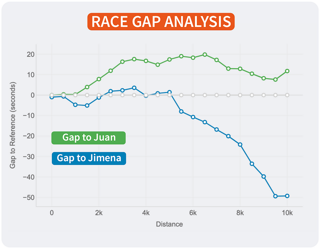
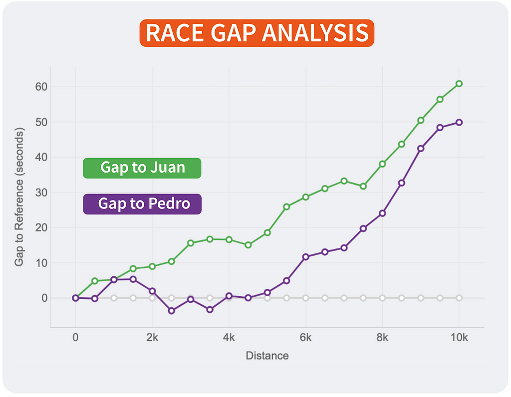
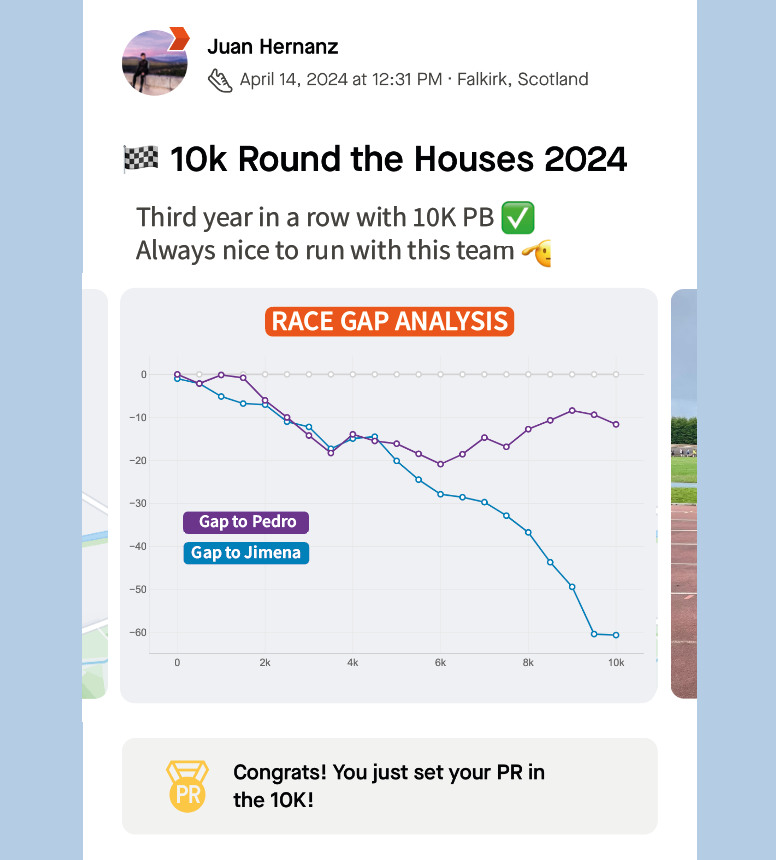
If I were Strava, I would include this chart in the activities marked as RACE by the user. The analysis could be done with all the followers of that user that registered the same activity. An example of integration is shown above.
Head-to-Head Lap Analysis
Metrics: the line represent the evolution of the gap (in seconds) between two runners. The bars represent, for every lap, if a runner was faster (blue) or slower (red) compared to other.
Insights: this combined chart is ideal for analysing the head-to-head performance across every lap of a race.
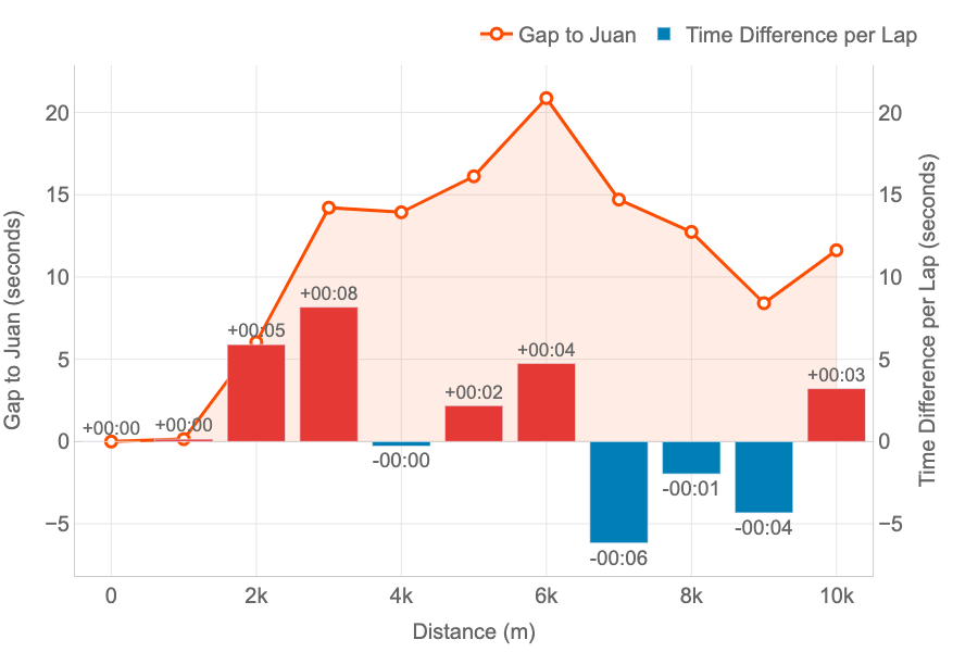
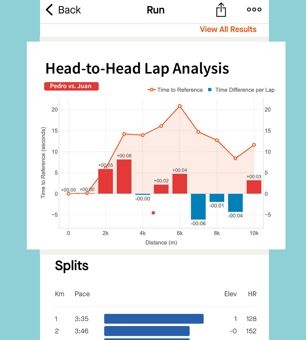
This graph has been specifically designed to compare two runners performance across the splits (laps) of the race.
The example represent the time loss of Pedro compared to Juan.
- The orange line represent the loss in time as explained for the other graph: both started together, but Pedro started to lose time after the first km until the sixth. Then, he began to be faster to reduce that gap.
- The bars bring new insights to our comparison representing the time loss (in red) or the gain (in blue) for every lap. At a glance, Pedro can see that the bigger loss in time was on the third km (8 seconds). And he only lost time on half of the splits. The pace of both was the same for kilometres 1 and 4, and Pedro was faster between on the kms 7, 8 and 9.
Thanks to this graph we can see that I was faster than Pedro on the first 6 kms, gaining and advantage that Pedro could not reduce, despite being faster on the last part of the race. And this confirms the feeling that we have after the competitions: “Pedro has stronger finishes in races.”
Data Processing and Algorithms
If you want to know how the graphs were created, keep reading this section about the implementation.
I don’t want to go too much into the coding bits behind this. As every software problem, you might achieve your goal through different solutions. That’s why I am more interested in explaining the problems that I faced and the logic behind my solutions.
Loading Data
No data, no solution. In this case no Strava API is needed . If you log in your Strava account and go to an activity you can download the GPX file of the activity by clicking on Export GPX as shown on the screenshot. GPX files contain datapoints in XML format as seen below.
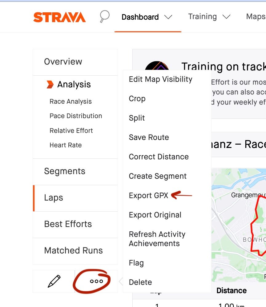
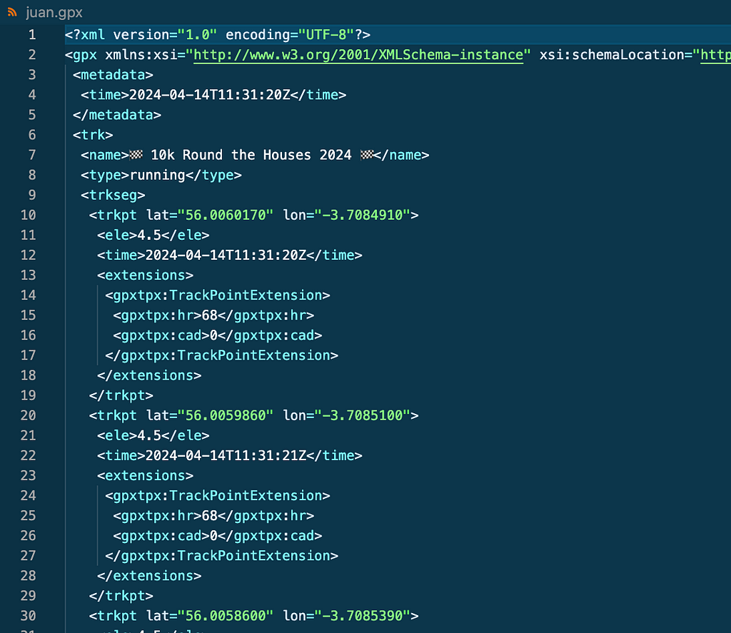
To get my friends data for the same activities I just told them to follow the same steps and send the .gpx files to me.
Preparing Data
For this use case I was only interested in a few attributes:
- Location: latitude, longitude and elevation
- Timestamp: time.
First problem for me was to convert the .gpx files into pandas dataframes so I can play and process the data using python. I used gpxpy library. Code below
import pandas as pd
import gpxpy

# read file
with open('juan.gpx', 'r') as gpx_file:
    juan_gpx = gpxpy.parse(gpx_file)

# Convert Juan´s gpx to dataframe
juan_route_info = []

for track in juan_gpx.tracks:
    for segment in track.segments:
        for point in segment.points:
            juan_route_info.append({
                'latitude': point.latitude,
                'longitude': point.longitude,
                'elevation': point.elevation,
                'date_time': point.time
            })

juan_df =  pd.DataFrame(juan_route_info)
juan_df
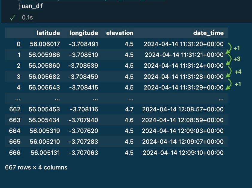
After that, I had 667 datapoints stored on a dataframe. Every row represents where and when I was during the activity.
I learnt that not every row is captured with the same frequency (1 second between 0 and 1, then 3 seconds, then 4 seconds, then 1 second…)
Getting some metrics
Every row in the data represents a different moment and place, so my first idea was to calculate the difference in time, elevation, and distance between two consecutive rows: seconds_diff, elevation_diff and distance_diff.
Time and elevation were straightforward using .diff() method over each column of the pandas dataframe.
# First Calculate elevation diff
juan_df['elevation_diff'] = juan_df['elevation'].diff()

# Calculate the difference in seconds between datapoints
juan_df['seconds_diff'] = juan_df['date_time'].diff()
Unfortunately, as the Earth is not flat, we need to use a distance metric called haversine distance [2]: the shortest distance between two points on the surface of a sphere, given their latitude and longitude coordinates. I used the library haversine. See the code below
import haversine as hs

# Function to calculate haversine distances
def haversine_distance(lat1, lon1, lat2, lon2) -> float:
    distance = hs.haversine(
        point1=(lat1, lon1),
        point2=(lat2, lon2),
        unit=hs.Unit.METERS
    )

    # Returns the distance between the first point and the second point
    return np.round(distance, 2)

#calculate the distances between all data points
distances = [np.nan]

for i in range(len(track_df)):
    if i == 0:
        continue
    else:
        distances.append(haversine_distance(
            lat1=juan_df.iloc[i - 1]['latitude'],
            lon1=juan_df.iloc[i - 1]['longitude'],
            lat2=juan_df.iloc[i]['latitude'],
            lon2=juan_df.iloc[i]['longitude']
        ))

juan_df['distance_diff'] = distances
The cumulative distance was also added as a new column distance_cum using the method cumsum() as seen below
# Calculate the cumulative sum of the distance
juan_df['distance_cum'] = juan_df['distance_diff'].cumsum()
At this point the dataframe with my track data includes 4 new columns with useful metrics:
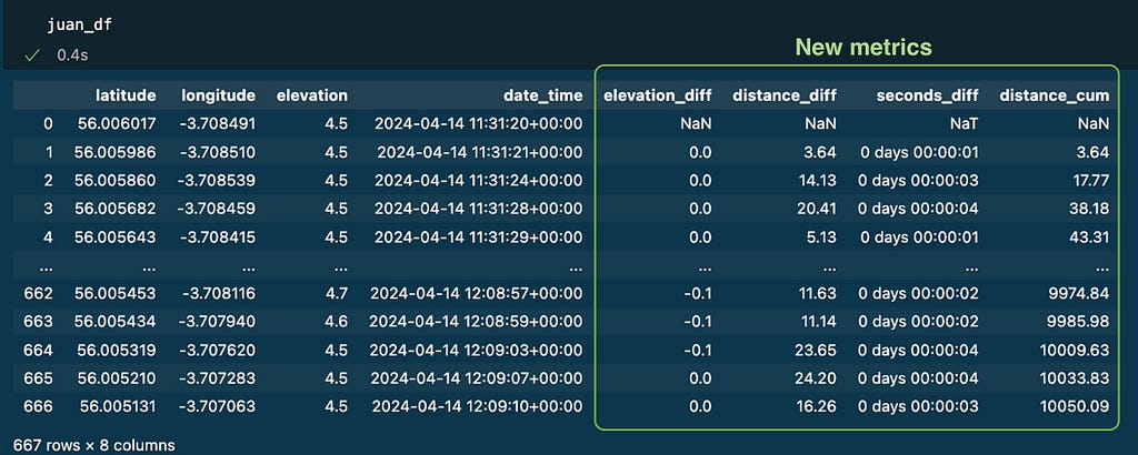
I applied the same logic to other runners’ tracks: jimena_df and pedro_df.
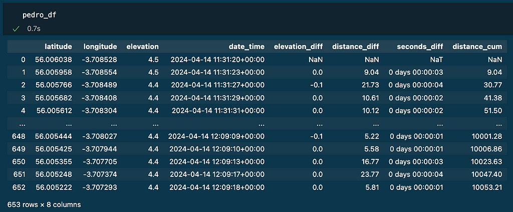
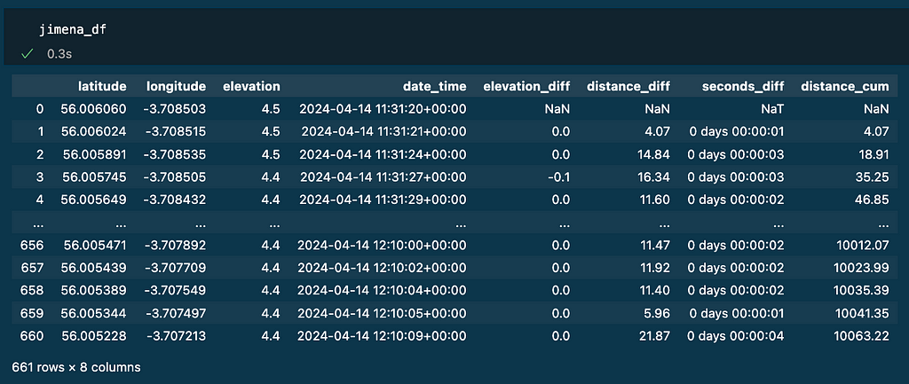
We are ready now to play with the data to create the visualisations.
Challenges:
To obtain the data needed for the visuals my first intuition was: look at the cumulative distance column for every runner, identify when a lap distance was completed (1000, 2000, 3000, etc.) by each of them and do the differences of timestamps.
That algorithm looks simple, and might work, but it had some limitations that I needed to address:
- Exact lap distances are often completed in between two data points registered. To be more accurate I had to do interpolation of both position and time.
- Due to difference in the precision of devices, there might be misalignments across runners. The most typical is when a runner’s lap notification beeps before another one even if they have been together the whole track. To minimise this I decided to use the reference runner to set the position marks for every lap in the track. The time difference will be calculated when other runners cross those marks (even though their cumulative distance is ahead or behind the lap). This is more close to the reality of the race: if someone crosses a point before, they are ahead (regardless the cumulative distance of their device)
- With the previous point comes another problem: the latitude and longitude of a reference mark might never be exactly registered on the other runners’ data. I used Nearest Neighbours to find the closest datapoint in terms of position.
- Finally, Nearest Neighbours might bring wrong datapoints if the track crosses the same positions at different moments in time. So the population where the Nearest Neighbours will look for the best match needs to be reduced to a smaller group of candidates. I defined a window size of 20 datapoints around the target distance (distance_cum).
Algorithm
With all the previous limitations in mind, the algorithm should be as follows:
1. Choose the reference and a lap distance (default= 1km)
2. Using the reference data, identify the position and the moment every lap was completed: the reference marks.
3. Go to other runner’s data and identify the moments they crossed those position marks. Then calculate the difference in time of both runners crossing the marks. Finally the delta of this time difference to represent the evolution of the gap.
Code Example
1. Choose the reference and a lap distance (default= 1km)
- Juan will be the reference (juan_df) on the examples.
- The other runners will be Pedro (pedro_df ) and Jimena (jimena_df).
- Lap distance will be 1000 metres
2. Create interpolate_laps(): function that finds or interpolates the exact point for each completed lap and return it in a new dataframe. The inferpolation is done with the function: interpolate_value() that was also created.
## Function: interpolate_value()

Input:
    - start: The starting value.
    - end: The ending value.
    - fraction: A value between 0 and 1 that represents the position between
      the start and end values where the interpolation should occur.
Return:
    - The interpolated value that lies between the start and end values
      at the specified fraction.
def interpolate_value(start, end, fraction):
    return start + (end - start) * fraction
## Function: interpolate_laps()

Input:
    - track_df: dataframe with track data.
    - lap_distance: metres per lap (default 1000)
Return:
    - track_laps: dataframe with lap metrics. As many rows as laps identified.
def interpolate_laps(track_df , lap_distance = 1000):
  #### 1. Initialise track_laps with the first row of track_df
  track_laps = track_df.loc[0][['latitude','longitude','elevation','date_time','distance_cum']].copy()

  # Set distance_cum = 0
  track_laps[['distance_cum']] = 0

  # Transpose dataframe
  track_laps = pd.DataFrame(track_laps)
  track_laps = track_laps.transpose()

  #### 2. Calculate number_of_laps = Total Distance / lap_distance
  number_of_laps = track_df['distance_cum'].max()//lap_distance

  #### 3. For each lap i from 1 to number_of_laps:
  for i in range(1,int(number_of_laps+1),1):

    # a. Calculate target_distance = i * lap_distance
    target_distance = i*lap_distance

    # b. Find first_crossing_index where track_df['distance_cum'] > target_distance
    first_crossing_index = (track_df['distance_cum'] > target_distance).idxmax()

    # c. If match is exactly the lap distance, copy that row
    if (track_df.loc[first_crossing_index]['distance_cum'] == target_distance):
      new_row = track_df.loc[first_crossing_index][['latitude','longitude','elevation','date_time','distance_cum']]

    # Else: Create new_row with interpolated values, copy that row.
    else:

      fraction = (target_distance - track_df.loc[first_crossing_index-1, 'distance_cum']) / (track_df.loc[first_crossing_index, 'distance_cum'] - track_df.loc[first_crossing_index-1, 'distance_cum'])

      # Create the new row
      new_row = pd.Series({
          'latitude': interpolate_value(track_df.loc[first_crossing_index-1, 'latitude'], track_df.loc[first_crossing_index, 'latitude'], fraction),
          'longitude': interpolate_value(track_df.loc[first_crossing_index-1, 'longitude'], track_df.loc[first_crossing_index, 'longitude'], fraction),
          'elevation': interpolate_value(track_df.loc[first_crossing_index-1, 'elevation'], track_df.loc[first_crossing_index, 'elevation'], fraction),
          'date_time': track_df.loc[first_crossing_index-1, 'date_time'] + (track_df.loc[first_crossing_index, 'date_time'] - track_df.loc[first_crossing_index-1, 'date_time']) * fraction,
          'distance_cum': target_distance
      }, name=f'lap_{i}')

    # d. Add the new row to the dataframe that stores the laps
    new_row_df = pd.DataFrame(new_row)
    new_row_df = new_row_df.transpose()

    track_laps = pd.concat([track_laps,new_row_df])

  #### 4. Convert date_time to datetime format and remove timezone
  track_laps['date_time'] = pd.to_datetime(track_laps['date_time'], format='%Y-%m-%d %H:%M:%S.%f%z')
  track_laps['date_time'] = track_laps['date_time'].dt.tz_localize(None)

  #### 5. Calculate seconds_diff between consecutive rows in track_laps
  track_laps['seconds_diff'] = track_laps['date_time'].diff()

  return track_laps
Applying the interpolate function to the reference dataframe will generate the following dataframe:
juan_laps = interpolate_laps(juan_df , lap_distance=1000)
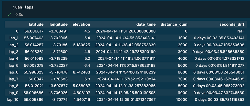
Note as it was a 10k race, 10 laps of 1000m has been identified (see column distance_cum). The column seconds_diff has the time per lap. The rest of the columns (latitude, longitude, elevation and date_time) mark the position and time for each lap of the reference as the result of interpolation.
3. To calculate the time gaps between the reference and the other runners I created the function gap_to_reference()
## Helper Functions:
- get_seconds(): Convert timedelta to total seconds
- format_timedelta(): Format timedelta as a string (e.g., "+01:23" or "-00:45")
# Convert timedelta to total seconds
def get_seconds(td):
    # Convert to total seconds
    total_seconds = td.total_seconds()

    return total_seconds

# Format timedelta as a string (e.g., "+01:23" or "-00:45")
def format_timedelta(td):
    # Convert to total seconds
    total_seconds = td.total_seconds()

    # Determine sign
    sign = '+' if total_seconds >= 0 else '-'

    # Take absolute value for calculation
    total_seconds = abs(total_seconds)

    # Calculate minutes and remaining seconds
    minutes = int(total_seconds // 60)
    seconds = int(total_seconds % 60)

    # Format the string
    return f"{sign}{minutes:02d}:{seconds:02d}"
## Function: gap_to_reference()

Input:
    - laps_dict: dictionary containing the df_laps for all the runnners' names
    - df_dict: dictionary containing the track_df for all the runnners' names
    - reference_name: name of the reference
Return:
    - matches: processed data with time differences.
def gap_to_reference(laps_dict, df_dict, reference_name):
  #### 1. Get the reference's lap data from laps_dict
  matches = laps_dict[reference_name][['latitude','longitude','date_time','distance_cum']]

  #### 2. For each racer (name) and their data (df) in df_dict:
  for name, df in df_dict.items():

    # If racer is the reference:
    if name == reference_name:

      # Set time difference to zero for all laps
      for lap, row  in matches.iterrows():
        matches.loc[lap,f'seconds_to_reference_{reference_name}'] = 0

    # If racer is not the reference:
    if name != reference_name:

      # a. For each lap find the nearest point in racer's data based on lat, lon.
      for lap, row  in matches.iterrows():

        # Step 1: set the position and lap distance from the reference
        target_coordinates = matches.loc[lap][['latitude', 'longitude']].values
        target_distance = matches.loc[lap]['distance_cum']


        # Step 2: find the datapoint that will be in the centre of the window
        first_crossing_index = (df_dict[name]['distance_cum'] > target_distance).idxmax()

        # Step 3: select the 20 candidate datapoints to look for the match
        window_size = 20
        window_sample = df_dict[name].loc[first_crossing_index-(window_size//2):first_crossing_index+(window_size//2)]
        candidates = window_sample[['latitude', 'longitude']].values

        # Step 4: get the nearest match using the coordinates
        nn = NearestNeighbors(n_neighbors=1, metric='euclidean')
        nn.fit(candidates)
        distance, indice = nn.kneighbors([target_coordinates])

        nearest_timestamp = window_sample.iloc[indice.flatten()]['date_time'].values
        nearest_distance_cum = window_sample.iloc[indice.flatten()]['distance_cum'].values
        euclidean_distance = distance

        matches.loc[lap,f'nearest_timestamp_{name}'] = nearest_timestamp[0]
        matches.loc[lap,f'nearest_distance_cum_{name}'] = nearest_distance_cum[0]
        matches.loc[lap,f'euclidean_distance_{name}'] = euclidean_distance


      # b. Calculate time difference between racer and reference at this point
      matches[f'time_to_ref_{name}'] = matches[f'nearest_timestamp_{name}'] - matches['date_time']

      # c. Store time difference and other relevant data
      matches[f'time_to_ref_diff_{name}'] = matches[f'time_to_ref_{name}'].diff()
      matches[f'time_to_ref_diff_{name}'] = matches[f'time_to_ref_diff_{name}'].fillna(pd.Timedelta(seconds=0))

      # d. Format data using helper functions
      matches[f'lap_difference_seconds_{name}'] = matches[f'time_to_ref_diff_{name}'].apply(get_seconds)
      matches[f'lap_difference_formatted_{name}'] = matches[f'time_to_ref_diff_{name}'].apply(format_timedelta)

      matches[f'seconds_to_reference_{name}'] = matches[f'time_to_ref_{name}'].apply(get_seconds)
      matches[f'time_to_reference_formatted_{name}'] = matches[f'time_to_ref_{name}'].apply(format_timedelta)

#### 3. Return processed data with time differences
  return matches
Below the code to implement the logic and store results on the dataframe matches_gap_to_reference:
# Lap distance
lap_distance = 1000

# Store the DataFrames in a dictionary
df_dict = {
    'jimena': jimena_df,
    'juan': juan_df,
    'pedro': pedro_df,
}

# Store the Lap DataFrames in a dictionary
laps_dict = {
    'jimena': interpolate_laps(jimena_df , lap_distance),
    'juan': interpolate_laps(juan_df , lap_distance),
    'pedro': interpolate_laps(pedro_df , lap_distance)
}

# Calculate gaps to reference
reference_name = 'juan'
matches_gap_to_reference  = gap_to_reference(laps_dict, df_dict, reference_name)
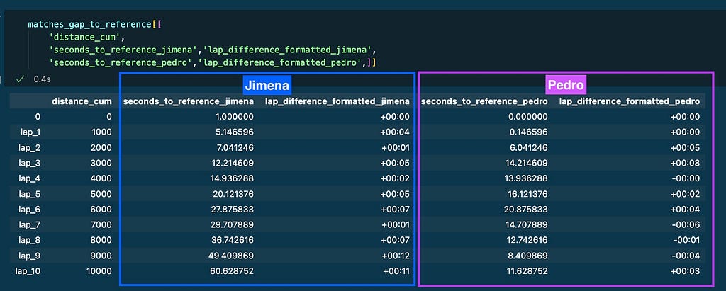
The columns of the resulting dataframe contain the important information that will be displayed on the graphs:
Race GAP Analysis Graph
Requirements:
- The visualisation needs to be tailored for a runner who will be the reference. Every runner will be represented by a line graph.
- X-axis represent distance.
- Y-axis the gap to reference in seconds
- The reference will set the baseline. A constant grey line in y-axis = 0
- The lines for the other runners will be above the reference if they were ahead on the track and below if they were behind.
To represent the graph I used plotly library and used the data from matches_gap_to_reference:
X-axis: is the cumulative distance per lap. Column distance_cum
Y-axis: represents the gap to reference in seconds:
- Grey line: reference’s gap to reference is always 0.
- Purple line: Pedro’s gap to reference (-) seconds_to_reference_pedro.
- Blue line: Jimena’s gap to reference (-) seconds_to_reference_jimena.
Head to Head Lap Analysis Graph
Requirements:
- The visualisation needs to compare data for only 2 runners. A reference and a competitor.
- X-axis represents distance
- Y-axis represents seconds
- Two metrics will be plotted to compare the runners’ performance: a line graph will show the total gap for every point of the race. The bars will represent if that gap was increased (positive) or decreased (negative) on every lap.

Again, the data represented on the example is coming from matches_gap_to_reference:
X-axis: is the cumulative distance per lap. Column distance_cum
Y-axis:
- Orange line: Pedro’s gap to Juan (+) seconds_to_reference_pedro
- Bars: the delta of that gap per lap lap_difference_formatted_pedro. If Pedro losses time, the delta is positive and represented in red. Otherwise the bar is blue.
I refined the style of both visuals to align more closely with Strava’s design aesthetics.
Kudos for this article?
I started this idea after my last race. I really liked the results of the visuals so I though they might be useful for the Strava community. That’s why I decided to share them with the community writing this article.
References
[1] S. Paul, Strava’s next chapter: New CEO talks AI, inclusivity, and why ‘dark mode’ took so long. (2024)
[2] D. Grabiele, “Haversine Formula”, Baeldung on Computer Science. (2024)
Visualising Strava Race Analysis was originally published in Towards Data Science on Medium, where people are continuing the conversation by highlighting and responding to this story.
Originally appeared here:
Visualising Strava Race Analysis
