
Lessons from 10 years at Uber, Meta and High-Growth Startups

Data can help you make better decisions.
Unfortunately, most companies are better at collecting data than making sense of it. They claim to have a data-driven culture, but in reality they heavily rely on experience to make judgement calls.
As a Data Scientist, it’s your job to help your business stakeholders understand and interpret the data so they can make more informed decisions.
Your impact comes not from the analyses you do or the models you build, but the ultimate business outcomes you help to drive. This is the main thing that sets apart senior DS from more junior ones.
To help with that, I’ve put together this step-by-step playbook based on my experience turning data into actionable insights at Rippling, Meta and Uber.
I’ll cover the following:
- What metrics to track: How to establish the revenue equation and driver tree for your business
- How to track: How to set up monitoring and avoid common pitfalls. We’ll cover how to choose the right time horizon, deal with seasonality, master cohorted data and more!
- Extracting insights: How to identify issues and opportunities in a structured and repeatable way. We’ll go over the most common types of trends you’ll come across, and how to make sense of them.
Sounds simple enough, but the devil is in the details, so let’s dive into them one-by-one.
Part 1: What metrics to track
First, you need to figure out what metrics you should be tracking and analyzing. To maximize impact, you should focus on those that actually drive revenue.
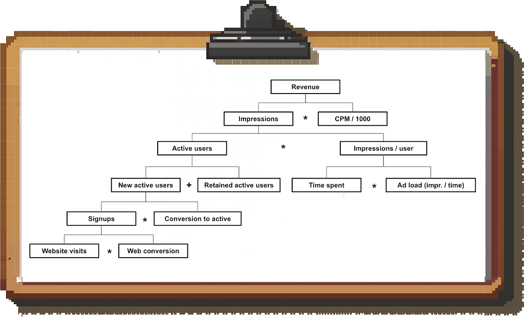
Start with the high-level revenue equation (e.g. “Revenue = Impressions * CPM / 1000” for an ads-based business) and then break each part down further to get to the underlying drivers. The exact revenue equation depends on the type of business you’re working on; you can find some of the most common ones here.
The resulting driver tree, with the output at the top and inputs at the bottom, tells you what drives results in the business and what dashboards you need to build so that you can do end-to-end investigations.
Example: Here is a (partial) driver tree for an ads-based B2C product:
Understanding leading and lagging metrics
The revenue equation might make it seem like the inputs translate immediately into the outputs, but this is not the case in reality.
The most obvious example is a Marketing & Sales funnel: You generate leads, they turn into qualified opportunities, and finally the deal closes. Depending on your business and the type of customer, this can take many months.
In other words, if you are looking at an outcome metric such as revenue, you are often looking at the result of actions you took weeks or months earlier.
As a rule of thumb, the further down you go in your driver tree, the more of a leading indicator a metric is; the further up you go, the more of a lagging metric you’re dealing with.
Quantifying the lag
It’s worth looking at historical conversion windows to understand what degree of lag you are dealing with.
That way, you’ll be better able to work backwards (if you see revenue fluctuations, you’ll know how far back to go to look for the cause) as well as project forward (you’ll know how long it will take until you see the impact of new initiatives).
In my experience, developing rules of thumb (does it on average take a day or a month for a new user to become active) will get you 80% — 90% of the value, so there is no need to over-engineer this.
Part 2: Setting up monitoring and avoiding common pitfalls
So you have your driver tree; how do you use this to monitor the performance of the business and extract insights for your stakeholders?
The first step is setting up a dashboard to monitor the key metrics. I am not going to dive into a comparison of the various BI tools you could use (I might do that in a separate post in the future).
Everything I’m talking about in this post can easily be done in Google Sheets or any other tool, so your choice of BI software won’t be a limiting factor.
Instead, I want to focus on a few best practices that will help you make sense of the data and avoid common pitfalls.
1. Choosing the appropriate time frame for each metric
While you want to pick up on trends as early as possible, you need to be careful not to fall into the trap of looking at overly granular data and trying to draw insights from what is mostly noise.
Consider the time horizon of the activities you’re measuring and whether you’re able to act on the data:
- Real-time data is useful for a B2C marketplace like Uber because 1) transactions have a short lifecycle (an Uber ride is typically requested, accepted and completed within less than an hour) and 2) because Uber has the tools to respond in real-time (e.g. surge pricing, incentives, driver comms).
- In contrast, in a B2B SaaS business, daily Sales data is going to be noisy and less actionable due to long deal cycles.
You’ll also want to consider the time horizon of the goals you are setting against the metric. If your partner teams have monthly goals, then the default view for these metrics should be monthly.
BUT: The main problem with monthly metrics (or even longer time periods) is that you have few data points to work with and you have to wait a long time until you get an updated view of performance.
One compromise is to plot metrics on a rolling average basis: This way, you will pick up on the latest trends but are removing a lot of the noise by smoothing the data.
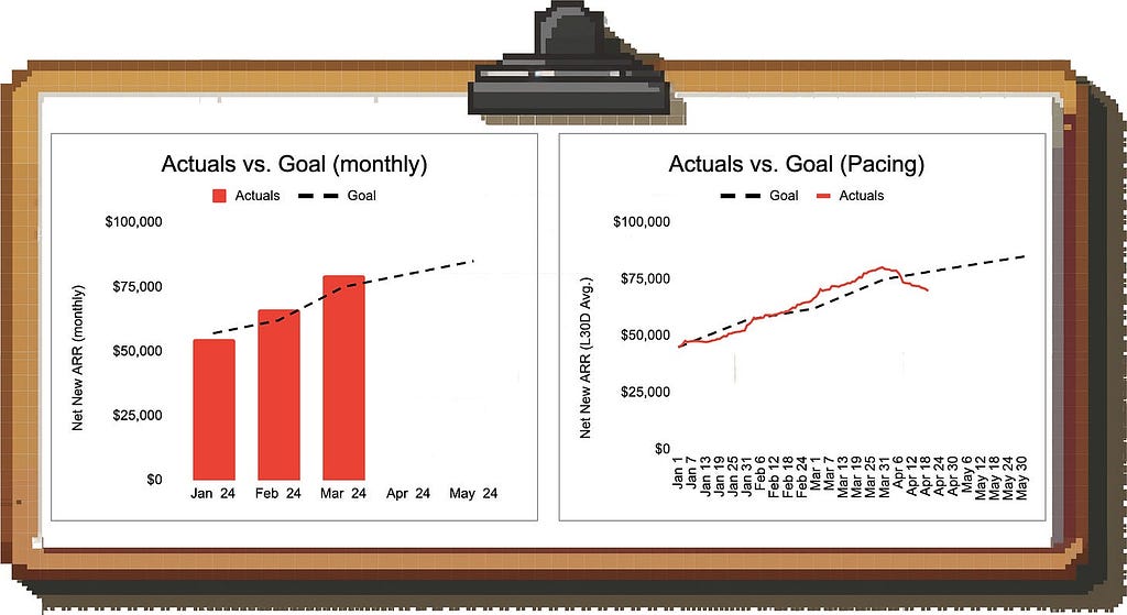
Example: Looking at the monthly numbers on the left hand side we might conclude that we’re in a solid spot to hit the April target; looking at the 30-day rolling average, however, we notice that revenue generation fell off a cliff (and we should dig into this ASAP).
2. Setting benchmarks
In order to derive insights from metrics, you need to be able to put a number into context.
- The simplest way is to benchmark the metric over time: Is the metric improving or deteriorating? Of course, it’s even better if you have an idea of the exact level you want the metric to be at.
- If you have an official goal set against the metric, great. But even if you don’t, you can still figure out whether you’re on track or not by deriving implied goals.
Example: Let’s say the Sales team has a monthly quota, but they don’t have an official goal for how much pipeline they need to generate to hit quota.
In this case, you can look at the historical ratio of open pipeline to quota (“Pipeline Coverage”), and use this as your benchmark. Be aware: By doing this, you are implicitly assuming that performance will remain steady (in this case, that the team is converting pipeline to revenue at a steady rate).
3. Accounting for seasonality
In almost any business, you need to account for seasonality to interpret data correctly. In other words, does the metric you’re looking at have repeating patterns by time of day / day of week / time of month / calendar month?
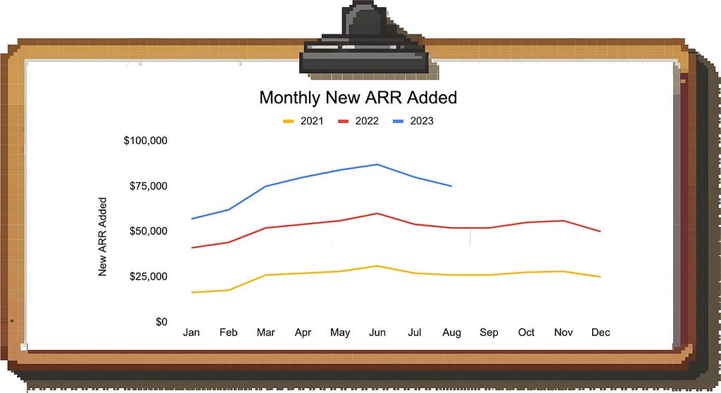
Example: Look at this monthly trend of new ARR in a B2B SaaS business:

If you look at the drop in new ARR in July and August in this simple bar chart, you might freak out and start an extensive investigation.
However, if you plot each year on top of each other, you’re able to figure out the seasonality pattern and realize that there is an annual summer lull and you can expect business to pick up again in September:
But seasonality doesn’t have to be monthly; it could be that certain weekdays have stronger or weaker performance, or you typically see business picking up towards the end of the month.
Example: Let’s assume you want to look at how the Sales team is doing in the current month (April). It’s the 15th business day of the month and you brought in $26k so far against a goal of $50k. Ignoring seasonality, it looks like the team is going to miss since you only have 6 business days left.
However, you know that the team tends to bring a lot of deals over the finish line at the end of the month.
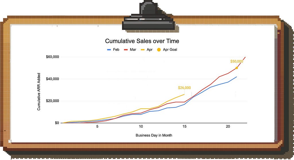
In this case, we can plot cumulative sales and compare against prior months to make sense of the pattern. This allows us to see that we’re actually in a solid spot for this time of the month since the trajectory is not linear.
4. Dealing with “baking” metrics
One of the most common pitfalls in analyzing metrics is to look at numbers that have not had sufficient time to “bake”, i.e. reach their final value.
Here are a few of the most common examples:
- User acquisition funnel: You are measuring the conversion from traffic to signups to activation; you don’t know how many of the more recent signups will still convert in the future
- Sales funnel: Your average deal cycle lasts multiple months and you do not know how many of your open deals from recent months will still close
- Retention: You want to understand how well a given cohort of users is retaining with your business
In all of these cases, the performance of recent cohorts looks worse than it actually is because the data is not complete yet.
If you don’t want to wait, you generally have three options for dealing with this problem:
Option 1: Cut the metric by time period
The most straightforward way is to cut aggregate metrics by time period (e.g. first week conversion, second week conversion etc.). This allows you to get an early read while making the comparison apples-to-apples and avoiding a bias towards older cohorts.
You can then display the result in a cohort heatmap. Here’s an example for an acquisition funnel tracking conversion from signup to first transaction:

This way, you can see that on an apples-to-apples basis, our conversion rate is getting worse (our week-1 CVR dropped from > 20% to c. 15% in recent cohorts). By just looking at the aggregate conversion rate (the last column) we wouldn’t have been able to distinguish an actual drop from incomplete data.
Option 2: Change the metric definition
In some cases, you can change the definition of the metric to avoid looking at incomplete data.
For example, instead of looking at how many deals that entered the pipeline in March closed until now, you could look at how many of the deals that closed in March were won vs. lost. This number will not change over time, while you might have to wait months for the final performance of the March deal cohort.
Option 3: Forecasting
Based on past data, you can project where the final performance of a cohort will likely end up. The more time passes and the more actual data you gather, the more the forecast will converge to the actual value.
But be careful: Forecasting cohort performance should be approached carefully as it’s easy to get this wrong. E.g. if you’re working in a B2B business with low win rates, a single deal might meaningfully change the performance of a cohort. Forecasting this accurately is very difficult.
Part 3: Extracting insights from the data
All this data is great, but how do we translate this into insights?
You won’t have time to dig into every metric on a regular basis, so prioritize your time by first looking at the biggest gaps and movers:
- Where are the teams missing their goals? Where do you see unexpected outperformance?
- Which metrics are tanking? What trends are inverting?
Once you pick a trend of interest, you’ll need to dig in and identify the root cause so your business partners can come up with targeted solutions.
In order to provide structure for your deep dives, I am going to go through the key archetypes of metric trends you will come across and provide tangible examples for each one based on real-life experiences.
1. Net neutral movements
When you see a drastic movement in a metric, first go up the driver tree before going down. This way, you can see if the number actually moves the needle on what you and the team ultimately care about; if it doesn’t, finding the root cause is less urgent.
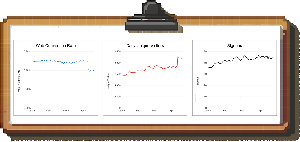
Example scenario: In the image above, you see that the visit-to-signup conversion on your website dropped massively. Instead of panicking, you look at total signups and see that the number is steady.
It turns out that the drop in average conversion rate is caused by a spike in low-quality traffic to the site; the performance of your “core” traffic is unchanged.
2. Denominator vs. numerator
When dealing with changes to ratio metrics (impressions per active user, trips per rideshare driver etc.), first check if it’s the numerator or denominator that moved.
People tend to assume it’s the numerator that moved because that is typically the engagement or productivity metric we are trying to grow in the short-term. However, there are many cases where that’s not true.
Examples include:
- You see leads per Sales rep go down because the team just onboarded a new class of hires, not because you have a demand generation problem
- Trips per Uber driver per hour drop not because you have fewer requests from riders, but because the team increased incentives and more drivers are online
3. Isolated / Concentrated Trends
Many metric trends are driven by things that are happening only in a specific part of the product or the business and aggregate numbers don’t tell the whole story.
The general diagnosis flow for isolating the root cause looks like this:
Step 1: Keep decomposing the metrics until you isolate the trend r can’t break the metrics down further.
Similar to how in mathematics every number can be broken down into a set of prime numbers, every metric can be broken down further and further until you reach the fundamental inputs.
By doing this, you are able to isolate the issue to a specific part of your driver tree which makes it much easier to pinpoint what’s going on and what the appropriate response is.
Step 2: Segment the data to isolate the relevant trend
Through segmentation you can figure out if a specific area of the business is the culprit. By segmenting across the following dimensions, you should be able to catch > 90% of issues:
- Geography (region / country / city)
- Time (time of month, day of week, etc.)
- Product (different SKUs or product surfaces (e.g. Instagram Feed vs. Reels))
- User or customer demographics (age, gender, etc.)
- Individual entity / actor (e.g. sales rep, merchant, user)
Let’s look at a concrete example:
Let’s say you work at DoorDash and see that the number of completed deliveries in Boston went down week-over-week. Instead of brainstorming ideas to drive demand or increase completion rates, let’s try to isolate the issue so we can develop more targeted solutions.
The first step is to decompose the metric “Completed Deliveries”:
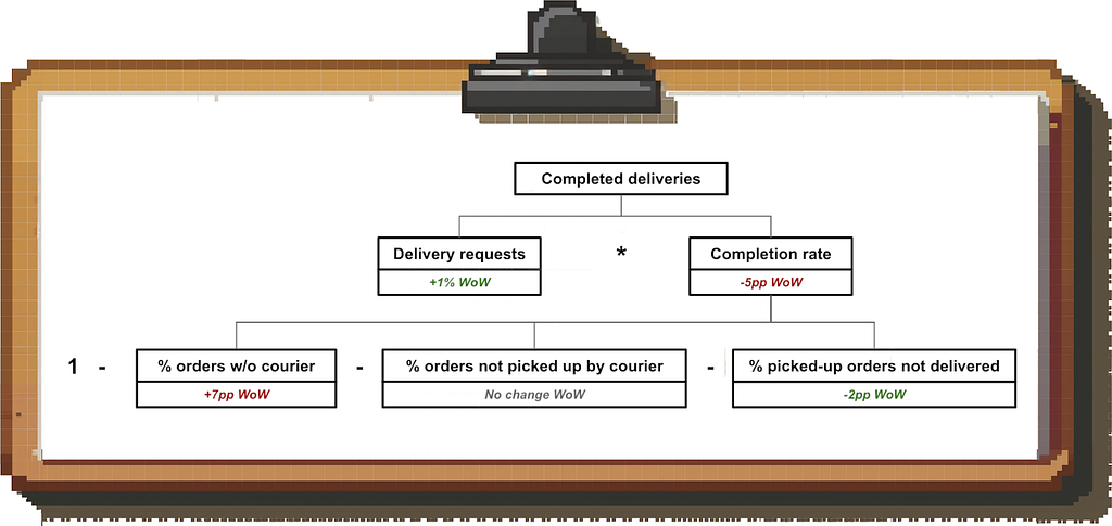
Based on this driver tree, we can rule out the demand side. Instead, we see that we are struggling recently to find drivers to pick up the orders (rather than issues in the restaurant <> courier handoff or the food drop-off).
Lastly, we’ll check if this is a widespread issue or not. In this case, some of the most promising cuts would be to look at geography, time and merchant. The merchant data shows that the issue is widespread and affects many restaurants, so it doesn’t help us narrow things down.
However, when we create a heatmap of time and geography for the metric “delivery requests with no couriers found”, we find that we’re mostly affected in the outskirts of Boston at night:
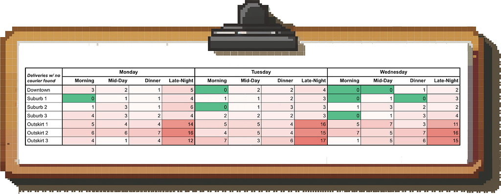
What do we do with this information? Being able to pinpoint the issue like this allows us to deploy targeted courier acquisition efforts and incentives in these times and places rather than peanut-buttering them across Boston.
In other words, isolating the root cause allows us to deploy our resources more efficiently.
Other examples of concentrated trends you might come across:
- Most of the in-game purchases in an online game are made by a few “whales” (so the team will want to focus their retention and engagement efforts on these)
- The majority of support ticket escalations to Engineering are caused by a handful of support reps (giving the company a targeted lever to free up Eng time by training these reps)
4. Mix Shifts
One of the most common sources of confusion in diagnosing performance comes from mix shifts and Simpson’s Paradox.
Mix shifts are simply changes in the composition of a total population. Simpson’s Paradox describes the counterintuitive effect where a trend that you see in the total population disappears or reverses when looking at the subcomponents (or vice versa).
What does that look like in practice?
Let’s say you work at YouTube (or any other company running ads for that matter). You see revenue is declining and when digging into the data, you notice that CPMs have been decreasing for a while.
CPM as a metric cannot be decomposed any further, so you start segmenting the data, but you have trouble identifying the root cause. For example, CPMs across all geographies look stable:
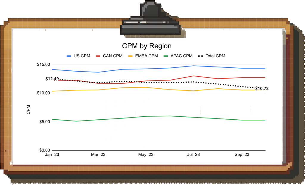
Here is where the mix shift and Simpson’s Paradox come in: Each individual region’s CPM is unchanged, but if you look at the composition of impressions by region, you find that the mix is shifting from the US to APAC.
Since APAC has a lower CPM than the US, the aggregate CPM is decreasing.
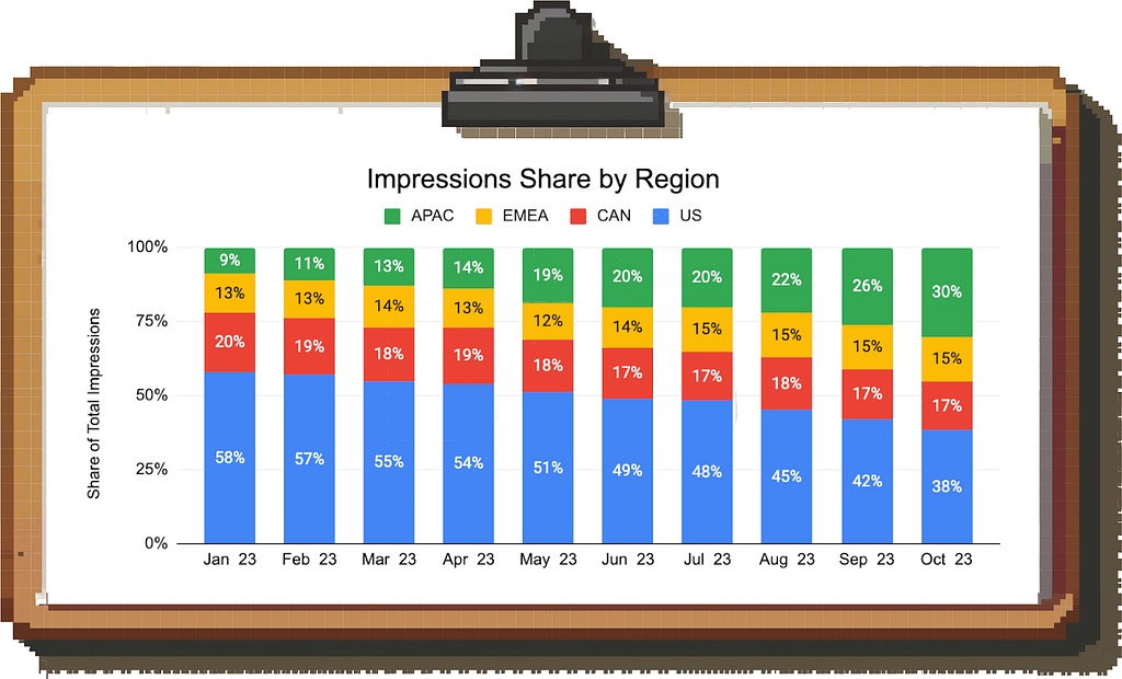
Again, knowing the exact root cause allows a more tailored response. Based on this data, the team can either try to reignite growth in high-CPM regions, think about additional monetization options for APAC, or focus on making up the lower value of individual impressions through outsized growth in impressions volume in the large APAC market.
Final Thoughts
Remember, data in itself does not have value. It becomes valuable once you use it to generate insights or recommendations for users or internal stakeholders.
By following a structured framework, you’ll be able to reliably identify the relevant trends in the data, and by following the tips above, you can distinguish signal from noise and avoid drawing the wrong conclusions.
If you are interested in more content like this, consider following me here on Medium, on LinkedIn or on Substack.
The Ultimate Guide to Making Sense of Data was originally published in Towards Data Science on Medium, where people are continuing the conversation by highlighting and responding to this story.
Originally appeared here:
The Ultimate Guide to Making Sense of Data
Go Here to Read this Fast! The Ultimate Guide to Making Sense of Data
