
Copilot’s homepage now sports a sample carousel and its new editing tool lets you adjust certain parts of generated images.
Originally appeared here:
Copilot gets a big redesign and a new way to edit your AI-generated images

Originally appeared here:
Copilot gets a big redesign and a new way to edit your AI-generated images

Why Do We Need Encoding?
In the realm of machine learning, most algorithms demand inputs in numeric form, especially in many popular Python frameworks. For instance, in scikit-learn, linear regression, and neural networks require numerical variables. This means we need to transform categorical variables into numeric ones for these models to understand them. However, this step isn’t always necessary for models like tree-based ones.
Today, I’m thrilled to introduce three fundamental encoding techniques that are essential for every budding data scientist! Plus, I’ve included a practical tip to help you see these techniques in action at the end! Unless stated, all the codes and pictures are created by the author.
Label Encoding / Ordinal Encoding
Both label encoding and ordinal encoding involve assigning integers to different classes. The distinction lies in whether the categorical variable inherently has an order. For example, responses like ‘strongly agree,’ ‘agree,’ ‘neutral,’ ‘disagree,’ and ‘strongly disagree’ are ordinal as they follow a specific sequence. When a variable doesn’t have such an order, we use label encoding.
Let’s delve into label encoding.
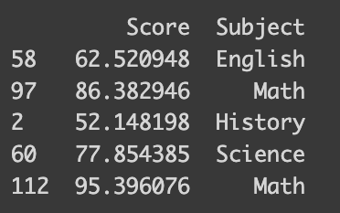
I’ve prepared a synthetic dataset with math test scores and students’ favorite subjects. This dataset is designed to reflect higher scores for students who prefer STEM subjects. The following code shows how it is synthesized.
import numpy as np
import pandas as pd

math_score = [60, 70, 80, 90]
favorite_subject = ["History", "English", "Science", "Math"]
std_deviation =  5
num_samples = 30

# Generate 30 samples with a normal distribution
scores = []
subjects = []
for i in range(4):
  scores.extend(np.random.normal(math_score[i], std_deviation, num_samples))
  subjects.extend([favorite_subject[i]]*num_samples)

data = {'Score': scores, 'Subject': subjects}
df_math = pd.DataFrame(data)

# Print the DataFrame
print(df_math.sample(frac=0.04))import numpy as np
import pandas as pd
import random

math_score = [60, 70, 80, 90]
favorite_subject = ["History", "English", "Science", "Math"]
std_deviation =  5  # Standard deviation in cm
num_samples = 30   # Number of samples

# Generate 30 samples with a normal distribution
scores = []
subjects = []
for i in range(4):
  scores.extend(np.random.normal(math_score[i], std_deviation, num_samples))
  subjects.extend([favorite_subject[i]]*num_samples)

data = {'Score': scores, 'Subject': subjects}
df_math = pd.DataFrame(data)

# Print the DataFrame
sampled_index = random.sample(range(len(df_math)), 5)
sampled = df_math.iloc[sampled_index]
print(sampled)
You’ll be amazed at how simple it is to encode your data — it takes just a single line of code! You can pass a dictionary that maps between the subject name and number to the default method of the pandas dataframe like the following.
# Simple way
df_math['Subject_num'] = df_math['Subject'].replace({'History': 0, 'Science': 1, 'English': 2, 'Math': 3})
print(df_math.iloc[sampled_index])
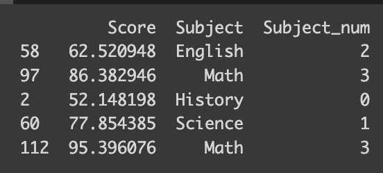
But what if you’re dealing with a vast array of classes, or perhaps you’re looking for a more straightforward approach? That’s where the scikit-learn library’s `LabelEncoder` function comes in handy. It automatically encodes your classes based on their alphabetical order. For the best experience, I recommend using version 1.4.0, which supports all the encoders we’re discussing.
# Scikit-learn
from sklearn.preprocessing import LabelEncoder
le = LabelEncoder()
df_math["Subject_num_scikit"] = le.fit_transform(df_math[['Subject']])
print(df_math.iloc[sampled_index])
However, there’s a catch. Consider this: our dataset doesn’t imply an ordinal relationship between favorite subjects. For instance, ‘History’ is encoded as 0, but that doesn’t mean it’s ‘inferior’ to ‘Math,’ which is encoded as 3. Similarly, the numerical gap between ‘English’ and ‘Science’ is smaller than that between ‘English’ and ‘History,’ but this doesn’t necessarily reflect their relative similarity.
This encoding approach also affects interpretability in some algorithms. For example, in linear regression, each coefficient indicates the expected change in the outcome variable for a one-unit change in a predictor. But how do we interpret a ‘unit change’ in a subject that’s been numerically encoded? Let’s put this into perspective with a linear regression on our dataset.
from sklearn.linear_model import LinearRegression

model = LinearRegression()
model.fit(df_math[["Subject_num"]], df_math[["Score"]])

coefficients = model.coef_

print("Coefficients:", coefficients)

How can we interpret the coefficient 8.26 here? The naive way would be when the label changes by 1 unit, the test score changes by 8. However, it is not really true from Science (encoded as 1) to History (encoded as 2) since I synthesized in a way that the mean score would be 80 and 70 respectively. So, we should not interpret the coefficient when there is no meaning in the way we label each class!
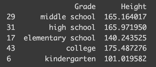
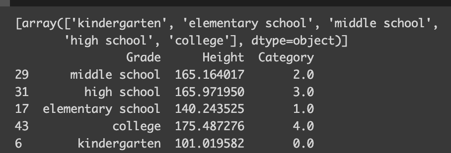
Now, moving on to ordinal encoding, let’s apply it to another synthetic dataset, this time focusing on height and school categories. I’ve tailored this dataset to reflect average heights for different school levels: 110 cm for kindergarten, 140 cm for elementary school, and so on. Let’s see how this plays out.
import numpy as np
import pandas as pd

# Set the parameters
mean_height = [110, 140, 160, 175, 180]  # Mean height in cm
grade = ["kindergarten", "elementary school", "middle school", "high school", "college"]
std_deviation = 5  # Standard deviation in cm
num_samples = 10   # Number of samples

# Generate 10 samples with a normal distribution
heights = []
grades = []
for i in range(5):
  heights.extend(np.random.normal(mean_height[i], std_deviation, num_samples))
  grades.extend([grade[i]]*10)

data = {'Grade': grades, 'Height': heights}
df = pd.DataFrame(data)

sampled_index = random.sample(range(len(df)), 5)
sampled = df.iloc[sampled_index]
print(sampled)
The `OrdinalEncoder` from scikit-learn’s preprocessing toolkit is a real gem for handling ordinal variables. It’s intuitive, automatically determining the ordinal structure and encoding it accordingly. If you look at encoder.categories_, you can check how the variable was encoded.
from sklearn.preprocessing import OrdinalEncoder

encoder = OrdinalEncoder(categories=[grade])
df['Category'] = encoder.fit_transform(df[['Grade']])
print(encoder.categories_)
print(df.iloc[sampled_index])
When it comes to ordinal categorical variables, interpreting linear regression models becomes more straightforward. The encoding reflects the degree of education in a numerical order — the higher the education level, the higher its corresponding value.
from sklearn.linear_model import LinearRegression

model = LinearRegression()
model.fit(df[["Category"]], df[["Height"]])

coefficients = model.coef_

print("Coefficients:", coefficients)

height_diff = [mean_height[i] - mean_height[i-1] for i in range(1, len(mean_height),1)]
print("Average Height Difference:", sum(height_diff)/len(height_diff))
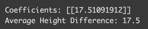
The model reveals something quite intuitive: a one-unit change in school type corresponds to a 17.5 cm increase in height. This makes perfect sense given our dataset!
So, let’s wrap up with a quick summary of label/ordinal encoding:
Pros:
– Simplicity: It’s user-friendly and easy to implement.
– Efficiency: This method is light on computational resources and memory, creating just one new numerical feature.
– Ideal for Ordinal Categories: It shines when dealing with categorical variables that have a natural order.
Cons:
– Implied Order: One potential downside is that it can introduce a sense of order where none exists, potentially leading to misinterpretation (like assuming a category labeled ‘3’ is superior to one labeled ‘2’).
– Not Always Suitable: Certain algorithms, such as linear or logistic regression, might incorrectly interpret the encoded numerical values as having ordinal significance.
One-hot encoding
Next up, let’s dive into another encoding technique that addresses the interpretability issue: One-hot encoding.
The core issue with label encoding is that it imposes an ordinal structure on variables that don’t inherently have one, by replacing categories with numerical values. One-hot encoding tackles this by creating a separate column for each class. Each of these columns contains binary values, indicating whether the row belongs to that class. It’s like pivoting the data to a wider format, for those who are familiar with that concept. To make this clearer, let’s see an example using the math_score and subject data. The `OneHotEncoder` from sklearn.preprocessing is perfect for this task.
from sklearn.preprocessing import OneHotEncoder

data = {'Score': scores, 'Subject': subjects}
df_math = pd.DataFrame(data)

y = df_math["Score"] # Target
x = df_math.drop('Score', axis=1)

# Define encoder
encoder = OneHotEncoder()
x_ohe = encoder.fit_transform(x)
print("Type:",type(x_ohe))
# Convert x_ohe to array so that it is more compatible
x_ohe = x_ohe.toarray()
print("Dimension:", x_ohe.shape)

# Convet back to pandas dataframe
x_ohe = pd.DataFrame(x_ohe, columns=encoder.get_feature_names_out())
df_math_ohe = pd.concat([y, x_ohe], axis=1)
sampled_ohe_idx = random.sample(range(len(df_math_ohe)), 5)
print(df_math_ohe.iloc[sampled_ohe_idx])
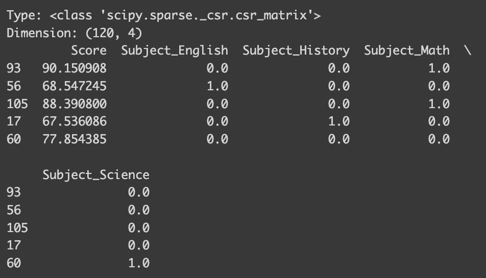
Now, instead of having a single ‘Subject’ column, our dataset features individual columns for each subject. This effectively eliminates any unintended ordinal structure! However, the process here is a bit more involved, so let me explain.
Like with label/ordinal encoding, you first need to define your encoder. But the output of one-hot encoding differs: while label/ordinal encoding returns a numpy array, one-hot encoding typically produces a `scipy.sparse._csr.csr_matrix`. To integrate this with a pandas dataframe, you’ll need to convert it into an array. Then, create a new dataframe with this array and assign column names, which you can get from the encoder’s `get_feature_names_out()` method. Alternatively, you can get numpy array directly by setting `sparse_output=False` when defining the encoder.
However, in practical applications, you don’t need to go through all these steps. I’ll show you a more streamlined approach using `make_column_transformer` towards the end of our discussion!
Now, let’s proceed with running a linear regression on our one-hot encoded data. This should make the interpretation much easier, right?
model = LinearRegression()
model.fit(x_ohe, y)

coefficients = model.coef_
intercept = model.intercept_

print("Coefficients:", coefficients)
print(encoder.get_feature_names_out())
print("Intercept:",intercept)
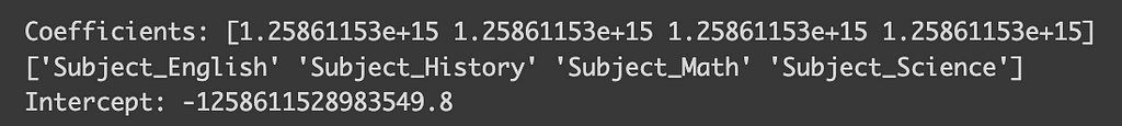
But wait, why are the coefficients so tiny, and the intercept so large? What’s going wrong here? This conundrum is a specific issue in linear regression known as perfect multicollinearity. Perfect multicollinearity occurs when when one variable in a linear regression model can be perfectly predicted from the others, which in the case of one-hot encoding happens because one class can be inferred if all other classes are zero. To sidestep this problem, we can drop one of the classes by setting `OneHotEncoder(drop=”first”)`. Let’s check out the impact of this adjustment.
encoder_with_drop = OneHotEncoder(drop="first")
x_ohe_drop = encoder_with_drop.fit_transform(x)

# if you don't sparse_output = False, you need to run the following to convert type
x_ohe_drop = x_ohe_drop.toarray()

x_ohe_drop = pd.DataFrame(x_ohe_drop, columns=encoder_with_drop.get_feature_names_out())

model = LinearRegression()
model.fit(x_ohe_drop, y)

coefficients = model.coef_
intercept = model.intercept_

print("Coefficients:", coefficients)
print(encoder_with_drop.get_feature_names_out())
print("Intercept:",intercept)
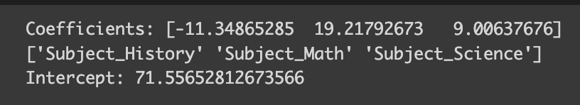
Here, the column for English has been dropped, and now the coefficients seem much more reasonable! Plus, they’re easier to interpret. When all the one-hot encoded columns are zero (indicating English as the favorite subject), we predict the test score to be around 71 (aligned with our defined average score for English). For History, it would be 71 minus 11 equals 60, for Math, 71 plus 19, and so on.
However, there’s a significant caveat with one-hot encoding: it can lead to high-dimensional datasets, especially when the variable has a large number of classes. Let’s consider a dataset that includes 1000 rows, each representing a unique product with various features, including a category that spans 100 different types.
# Define 1000 categories (for simplicity, these are just numbered)
categories = [f"Category_{i}" for i in range(1, 200)]

manufacturers = ["Manufacturer_A", "Manufacturer_B", "Manufacturer_C"]
satisfied = ["Satisfied", "Not Satisfied"]
n_rows = 1000

# Generate random data
data = {
    "Product_ID": [f"Product_{i}" for i in range(n_rows)],
    "Category": [random.choice(categories) for _ in range(n_rows)],
    "Price": [round(random.uniform(10, 500), 2) for _ in range(n_rows)],
    "Quality": [random.choice(satisfied) for _ in range(n_rows)],
    "Manufacturer": [random.choice(manufacturers) for _ in range(n_rows)],
}

df = pd.DataFrame(data)

print("Dimension before one-hot encoding:",df.shape)
print(df.head())
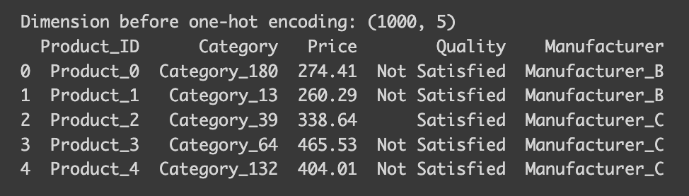
Note that the dataset’s dimensions are 1000 rows by 5 columns. Now, let’s observe the changes after applying a one-hot encoder.
# Now do one-hot encoding
encoder = OneHotEncoder(sparse_output=False)

# Reshape the 'Category' column to a 2D array as required by the OneHotEncoder
category_array = df['Category'].values.reshape(-1, 1)

one_hot_encoded_array = encoder.fit_transform(category_array)
one_hot_encoded_df = pd.DataFrame(one_hot_encoded_array, columns=encoder.get_feature_names_out(['Category']))
encoded_df = pd.concat([df.drop('Category', axis=1), one_hot_encoded_df], axis=1)

print("Dimension after one-hot encoding:", encoded_df.shape)

After applying one-hot encoding, our dataset’s dimension balloons to 1000×201 — a whopping 40 times larger than before. This increase is a concern, as it demands more memory. Moreover, you’ll notice that most of the values in the newly created columns are zeros, resulting in what we call a sparse dataset. Certain models, especially tree-based ones, struggle with sparse data. Furthermore, other challenges arise when dealing with high-dimensional data often referred to as the ‘curse of dimensionality.’ Also, since one-hot encoding treats each class as an individual column, we lose any ordinal information. Therefore, if the classes in your variable inherently have a hierarchical order, one-hot encoding might not be your best choice.
How do we tackle these disadvantages? One approach is to use a different encoding method. Alternatively, you can limit the number of classes in the variable. Often, even with a large number of classes, the majority of values for a variable are concentrated in just a few classes. In such cases, treating these minority classes as ‘others’ can be effective. This can be achieved by setting parameters like `min_frequency` or `max_categories` in OneHotEncoder. Another strategy for dealing with sparse data involves techniques like feature hashing, which essentially simplifies the representation by mapping multiple categories to a lower-dimensional space using a hash function, or dimension reduction techniques like PCA.
Here’s a quick summary of One-hot encoding:
Pros:
– Prevents Misleading Interpretations: It avoids the risk of models misinterpreting the data as having some sort of order, an issue prevalent in label/target encoding.
– Suitable for Non-Ordinal Features: Ideal for categorical data without an ordinal relationship.
Cons:
– Dimensionality Increase: Leads to a significant increase in the dataset’s dimensionality, which can be problematic, especially for variables with many categories.
– Sparse Matrix: Results in many columns filled with zeros, creating sparse data.
– Not Efficient with High Cardinality Features: Less effective for variables with a large number of categories.
Target Encoding
Let’s now explore target encoding, a technique particularly effective with high-cardinality data and in models like tree-based algorithms.
The essence of target encoding is to leverage the information from the value of the dependent variable. Its implementation varies depending on the task. In regression, we encode the target variable by the mean of the dependent variable for each class. For binary classification, it’s done by encoding the target variable with the probability of being in one class (calculated as the number of rows in that class where the outcome is 1, divided by the total number of rows in the class). In multiclass classification, the categorical variable is encoded based on the probability of belonging to each class, resulting in as many new columns as there are classes in the dependent variable. To clarify, let’s use the same product dataset we employed for one-hot encoding.
Let’s begin with target encoding for a regression task. Imagine we want to predict the price of goods and aim to encode the product type. Similar to other encodings, we use TargetEncoder from sklearn.preprocessing!
from sklearn.preprocessing import TargetEncoder
x = df.drop(["Price"], axis=1)
x_need_encode = df["Category"].to_frame()
y = df["Price"]
# Define encoder
encoder = TargetEncoder()
x_encoded = encoder.fit_transform(x_need_encode, y)
# Encoder with 0 smoothing
encoder_no_smooth = TargetEncoder(smooth=0)
x_encoded_no_smooth = encoder_no_smooth.fit_transform(x_need_encode, y)
x_encoded = pd.DataFrame(x_encoded, columns=["encoded_category"])
data_target = pd.concat([x, x_encoded], axis=1)
print("Dimension before encoding:", df.shape)
print("Dimension after encoding:", data_target.shape)
print("---------")
print("Encoding")
print(encoder.encodings_[0][:5])
print(encoder.categories_[0][:5])
print(" ")
print("Encoding with no smooth")
print(encoder_no_smooth.encodings_[0][:5])
print(encoder_no_smooth.categories_[0][:5])
print("---------")
print("Mean by Category")
print(df.groupby("Category").mean("Price").head())
print("---------")
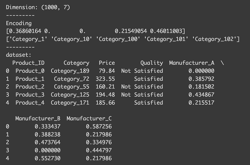
print("dataset:")
print(data_target.head())
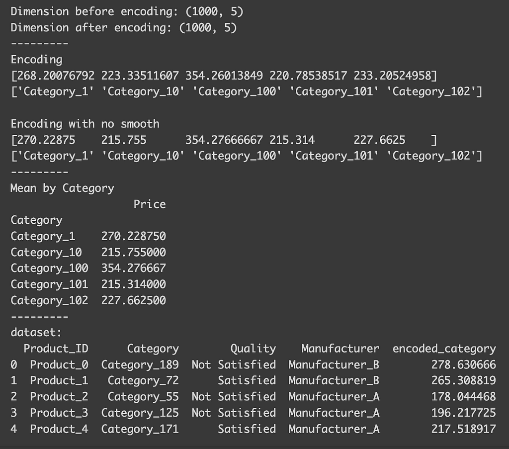
After the encoding, you’ll notice that, despite the variable having many classes, the dataset’s dimension remains unchanged (1000 x 5). You can also observe how each class is encoded. Although I mentioned that the encoding for each class is based on the mean of the target variable for that class, you’ll find that the actual mean differs slightly from the encoding using the default settings. This discrepancy arises because, by default, the function automatically selects a smoothing parameter. This parameter blends the local category mean with the overall global mean, which is particularly useful to prevent overfitting in categories with limited samples. If we set `smooth=0`, the encoded values align precisely with the actual means.
Now, let’s consider binary classification. Imagine our goal is to classify whether the quality of a product is satisfactory. In this scenario, the encoded value represents the probability of a category being ‘satisfactory.’
x = df.drop(["Quality"], axis=1)
x_need_encode = df["Category"].to_frame()
y = df["Quality"]

# Define encoder
encoder = TargetEncoder()
x_encoded = encoder.fit_transform(x_need_encode, y)


x_encoded = pd.DataFrame(x_encoded, columns=["encoded_category"])
data_target = pd.concat([x, x_encoded], axis=1)

print("Dimension:", data_target.shape)
print("---------")
print("Encoding")
print(encoder.encodings_[0][:5])
print(encoder.categories_[0][:5])
print("---------")
print(encoder.classes_)
print("---------")
print("dataset:")
print(data_target.head())
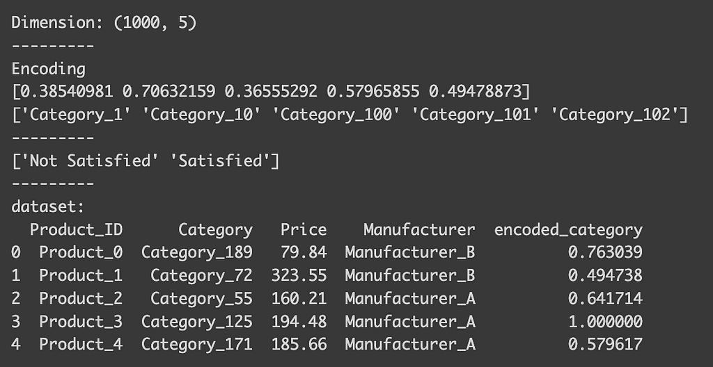
You can indeed see that the encoded_category represent the probability being “Satisfied” (float value between 0 and 1). To see how each class is encoded, you can check the `classes_` attribute of the encoder. For binary classification, the first value in the list is typically dropped, meaning that the column here indicates the probability of being satisfied. Conveniently, the encoder automatically detects the type of task, so there’s no need to specify that it’s a binary classification.
Lastly, let’s see multi-class classification example. Suppose we’re predicting which manufacturer produced a product.
x = df.drop(["Manufacturer"], axis=1)
x_need_encode = df["Category"].to_frame()
y = df["Manufacturer"]

# Define encoder
encoder = TargetEncoder()
x_encoded = encoder.fit_transform(x_need_encode, y)


x_encoded = pd.DataFrame(x_encoded, columns=encoder.classes_)
data_target = pd.concat([x, x_encoded], axis=1)

print("Dimension:", data_target.shape)
print("---------")
print("Encoding")
print(encoder.encodings_[0][:5])
print(encoder.categories_[0][:5])
print("---------")
print("dataset:")
print(data_target.head())
After encoding, you’ll see that we now have columns for each manufacturer. These columns indicate the probability of a product belonging to a certain category being produced by that manufacturer. Although our dataset has expanded slightly, the number of classes for the dependent variable is usually much smaller, so it’s unlikely to cause issues.
Target encoding is particularly advantageous for tree-based models. These models make splits based on feature values that most effectively separate the target variable. By directly incorporating the mean of the target variable, target encoding provides a clear and efficient means for the model to make these splits, often more so than other encoding methods.
However, caution is needed with target encoding. If there are only a few observations for a class, and these don’t represent the true mean for that class, there’s a risk of overfitting.
This leads to another crucial point: it’s vital to perform target encoding after splitting your data into training and testing sets. Doing it beforehand can lead to data leakage, as the encoding would be influenced by the outcomes in the test dataset. This could result in the model performing exceptionally well on the training dataset, giving you a false impression of its efficacy. Therefore, to accurately assess your model’s performance, ensure target encoding is done post train-test split.
Here’s a quick summary of target encoding:
Pros:
– Keeps Cardinality in Check: It’s highly effective for high cardinality features as it doesn’t increase the feature space.
– Can Capture Information Within Labels: By incorporating target data, it often enhances predictive performance.
– Useful for Tree-Based Models: Particularly advantageous for complex models such as random forests or gradient boosting machines.
Cons:
– Risk of Overfitting: There’s a heightened risk of overfitting, especially when categories have a limited number of observations.
– Target Leakage: It may inadvertently introduce future information into the model, i.e., details from the target variable that wouldn’t be accessible during actual predictions.
– Less Interpretable: Since the transformations are based on the target, they can be more challenging to interpret compared to methods like one-hot or label encoding.
Final tip
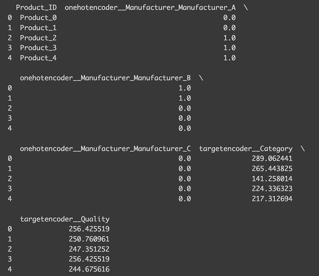
To wrap up, I’d like to offer some practical tips. Throughout this discussion, we’ve looked at different encoding techniques, but in reality, you might want to apply various encodings to different variables within a dataset. This is where `make_column_transformer` from sklearn.compose comes in handy. For example, suppose you’re predicting product prices and decide to use target encoding for the ‘Category’ due to its high cardinality, while applying one-hot encoding for ‘Manufacturer’ and ‘Quality’. To do this, you would define arrays containing the names of the variables for each encoding type and apply the function as shown below. This approach allows you to handle the transformed data seamlessly, leading you to an efficiently encoded dataset ready for your analyses!
from sklearn.compose import make_column_transformer
ohe_cols = ["Manufacturer"]
te_cols = ["Category", "Quality"]

encoding = make_column_transformer(
    (OneHotEncoder(), ohe_cols),
    (TargetEncoder(), te_cols)
)

x = df.drop(["Price"], axis=1)
y = df["Price"]

# Fit the transformer
x_encoded = encoding.fit_transform(x, y)
x_encoded = pd.DataFrame(x_encoded, columns=encoding.get_feature_names_out())

x_rest = x.drop(ohe_cols+te_cols, axis=1)
print(pd.concat([x_rest, x_encoded],axis=1).head())
Thank you so much for taking the time to read through this! When I first embarked on my machine learning journey, choosing the right encoding techniques and understanding their implementation was quite a maze for me. I genuinely hope this article has shed some light for you and made your path a bit clearer!
Source:
Scikit-learn: Machine Learning in Python, Pedregosa et al., JMLR 12, pp. 2825–2830, 2011.
Documentation of Scikit-learn:
Ordinal encoder: https://scikit-learn.org/stable/modules/generated/sklearn.preprocessing.OrdinalEncoder.html#sklearn.preprocessing.OrdinalEncoder
Target encoder: https://scikit-learn.org/stable/modules/generated/sklearn.preprocessing.TargetEncoder.html#sklearn.preprocessing.TargetEncoder
One-hot encoder https://scikit-learn.org/stable/modules/generated/sklearn.preprocessing.OneHotEncoder.html#sklearn.preprocessing.OneHotEncoder
3 Key Encoding Techniques for Machine Learning: A Beginner-Friendly Guide was originally published in Towards Data Science on Medium, where people are continuing the conversation by highlighting and responding to this story.
Originally appeared here:
3 Key Encoding Techniques for Machine Learning: A Beginner-Friendly Guide
Go Here to Read this Fast! 3 Key Encoding Techniques for Machine Learning: A Beginner-Friendly Guide


Tame the Curse of Dimensionality! Learn Dimensionality Reduction (PCA) and implement it with Python and Scikit-Learn.
Originally appeared here:
Dimensionality Reduction Made Simple: PCA Theory and Scikit-Learn Implementation
Utilize SageMaker Inference Components to work with Multiple LLMs Efficiently
Originally appeared here:
Building a Multi-Purpose GenAI Powered Chatbot
Go Here to Read this Fast! Building a Multi-Purpose GenAI Powered Chatbot


In machine learning, understanding how algorithms process, interpret, and classify data relies heavily on the concept of “spaces.” In this context, a space is a mathematical construct where data points are positioned based on their features. Each dimension in the space represents a specific attribute or feature of the data, allowing algorithms to navigate a structured representation.
The journey begins in the feature or input space, where each data point is a vector representing an instance in the dataset. To simplify, imagine an image where each pixel is a dimension in this space. The complexity and dimensionality of the space depend on the number and nature of the features. Working with high-dimensional spaces can be either enjoyable or frustrating for data practitioners.
In low-dimensional spaces, not all relationships or patterns in the data are easily identifiable. Linear separability, which is the ability to divide classes with a simple linear boundary, is often unachievable. This limitation becomes more apparent in complex datasets where the interaction of features creates non-linear patterns that cannot be captured by simple linear models.
In this article, we will explore machine learning algorithms in the perspective of mapping and interaction between different spaces. We will start with support vector machines (SVMs) as an example of simplicity, then move on to autoencoders, and finally, we will discuss manifold learning and Isomaps.
Please note that the code examples in this article are for demonstration and may not be optimized. I encourage you to modify, improve and try the code with different datasets to deepen your understanding and gain further insights.
Support Vector Machines (SVMs) are known machine learning algorithms that excel at classifying data. As we mentioned at the beginning:
In lower dimensions, linear separability is often impossible, which means it’s difficult to divide classes with a simple linear boundary.
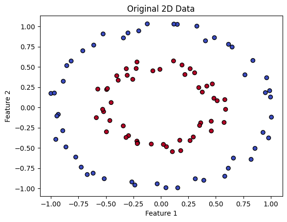
SVMs overcomes this difficulty by transforming data into a higher-dimensional space, making it easier to separate and classify. To illustrate this, let’s look at an example. The code below generates synthetic data that is clearly not linearly separable in its original space.
import numpy as np
import matplotlib.pyplot as plt
from sklearn.datasets import make_circles

# Generate synthetic data that is not linearly separable
X, y = make_circles(n_samples=100, factor=0.5, noise=0.05)

# Visualize the data
plt.scatter(X[:, 0], X[:, 1], c=y, cmap=plt.cm.coolwarm, edgecolors='k')
plt.xlabel('Feature 1')
plt.ylabel('Feature 2')
plt.title('Original 2D Data')
plt.show()
SVMs use a mapping between spaces to separate different classes. They lift the data from a lower dimensional space to a higher dimensional one. In this new space, SVMs find the optimal hyperplane, which is a decision boundary that separates the classes. It’s like finding the perfect line that divides groups in a two-dimensional graph, but in a more complex, multidimensional universe.
In the provided data, one class is close to the origin and another class is far from the origin. Let’s look at a typical example to understand how this data becomes separable when transformed into higher dimensions.
We will transform each 2D point (x, y) to a 3D point (x, y, z), where z = x² + y². The transformation adds a new third dimension based on the squared distance from the origin in the 2D space. Points that are farther from the origin in the 2D space will be higher in the 3D space because their squared distance is larger.
from mpl_toolkits.mplot3d import Axes3D

# Transform the 2D data to 3D for visualization
Z = X[:, 0]**2 + X[:, 1]**2  # Use squared distance from the origin as the third dimension

# Visualize the 3D data
fig = plt.figure()
ax = fig.add_subplot(111, projection='3d')
ax.scatter(X[:, 0], X[:, 1], Z, c=y, cmap=plt.cm.coolwarm)

# Set labels
ax.set_xlabel('Feature 1')
ax.set_ylabel('Feature 2')
ax.set_zlabel('Transformed Feature')

# Set the viewpoint
elevation_angle = 15  # Adjust this to change the up/down angle
azimuth_angle = 45  # Adjust this to rotate the plot
ax.view_init(elev=elevation_angle, azim=azimuth_angle)

plt.show()

You can notice from the output above that after this transformation, our data becomes linearly separable by a 2D hyperplane.
Another example is the effectiveness of drug dosages. A patient is only cured if the dosage falls within a certain range. Dosages that are too low or too high are ineffective. This scenario naturally creates a dataset that is not linearly separable, making it a good candidate for demonstrating how a polynomial kernel can help.
# Train the SVM model on the 2D data
svc = SVC(kernel='linear', C=1.0)
svc.fit(X, y)

# Create a function to plot decision boundary
def plot_svc_decision_function(model, plot_support=True):
    """Plot the decision function for a 2D SVC"""
    ax = plt.gca()
    xlim = ax.get_xlim()
    ylim = ax.get_ylim()

    # create grid to evaluate model
    xx = np.linspace(xlim[0], xlim[1], 30)
    yy = np.linspace(ylim[0], ylim[1], 30)
    YY, XX = np.meshgrid(yy, xx)
    xy = np.vstack([XX.ravel(), YY.ravel()]).T
    Z = model.decision_function(xy).reshape(XX.shape)

    # plot decision boundary and margins
    ax.contour(XX, YY, Z, colors='k', levels=[-1, 0, 1], alpha=0.5,
               linestyles=['--', '-', '--'])
    # plot support vectors
    if plot_support:
        ax.scatter(model.support_vectors_[:, 0], model.support_vectors_[:, 1],
                   s=300, linewidth=1, facecolors='none', edgecolors='k')

# Adjust the figure size for better visualization
plt.figure(figsize=(8, 5))

# Scatter plot for original dosage points
plt.scatter(dosages, np.zeros_like(dosages), c=y, cmap='bwr', marker='s', s=50, label='Original Dosages')

# Scatter plot for dosage squared points
plt.scatter(dosages, squared_dosages, c=y, cmap='bwr', marker='^', s=50, label='Squared Dosages')

# Calling the function to plot the SVM decision boundary
plot_svc_decision_function(svc)

# Expanding the limits to ensure all points are visible
plt.xlim(min(dosages) - 1, max(dosages) + 1)
plt.ylim(min(squared_dosages) - 10, max(squared_dosages) + 10)

# Adding labels, title and legend
plt.xlabel('Dosage')
plt.ylabel('Dosage Squared')
plt.title('SVM Decision Boundary with Original and Squared Dosages')
plt.legend()

# Display the plot
plt.show()
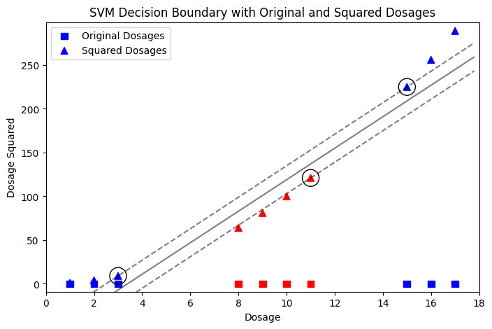
In the two examples above, we take advantage of our knowledge about the data. For instance, in first example we know that we have two classes: one close to the origin and another far from the origin. This is what the algorithm does through training and fine-tuning — it finds a suitable space where the data can be linearly separated.
The great thing here is that SVMs don’t map data into higher dimensions as this would be very complex computationally. Instead, they compute the relationship between the data as if it were in higher dimensions using the dot product. This is called the “Kernel trick.” I will explain SVM kernels in another article.
Autoencoders are truly amazing and beautiful architectures that capture my imagination. They have a wide range of applications across various domains, utilizing diverse types of autoencoders.
They basically consist of an encoder and a decoder, the encoder takes your input and encode/compress it, a process in which we move from a high-dimensional space to a more compact, lower-dimensional one. What’s truly interesting is how the decoder then takes this condensed representation and reconstructs the original data in the higher-dimensional space. The natural question is: how is it possible to go back to the original space from a significantly reduced dimension?
Let’s consider an HD image with a resolution of 720×720 pixels. Storing and transmitting this image requires a lot of memory and bandwidth. Autoencoders solve this problem by compressing the image into a lower-dimensional space, like a 32×32 representation called the ‘bottleneck’. The encoder’s job is done at this point. The decoder takes over, trying to rebuild the original image from this compressed form.
This process is similar to sharing images on platforms like WhatsApp. The image is encoded to a lower quality for transmission and then decoded on the receiver’s end. The difference in quality between the original and received image is called ‘reconstruction error’, which is common in autoencoders.
In autoencoders, we can think of it as an interaction between 3 spaces:
The beauty here is that we can see the autoencoder as something that operates in these 3 spaces. It takes advantage of the latent spaces to remove any noisy or unnecessary information from the input space, resulting in a very compact representation with core information about the input space. It does this by trying to mirror the input space in the output space, reducing the difference between the two spaces or the reconstruction error.
The code below shows an example of a convolutional autoencoder, which is a type of autoencoders that works well with images. We will use the popular MNIST dataset[LeCun, Y., Cortes, C., & Burges, C.J. (1998). The MNIST Database of Handwritten Digits. Retrieved from TensorFlow, CC BY 4.0], which contains 28×28 pixel grayscale images of handwritten digits. The encoder plays a crucial role by reducing the dimensionality of the data from 784 elements to a smaller, more condensed form. The decoder then aims to reconstruct the original high-dimensional data from this lower-dimensional representation. However, this reconstruction is not perfect and some information is lost. The autoencoder overcomes this challenge by learning to prioritize the most important features of the data.
import tensorflow as tf
from tensorflow.keras import layers
from tensorflow.keras.datasets import mnist
import matplotlib.pyplot as plt

# Load MNIST dataset
(x_train, _), (x_test, _) = mnist.load_data()
x_train = x_train.astype('float32') / 255.
x_test = x_test.astype('float32') / 255.
x_train = x_train.reshape((len(x_train), 28, 28, 1))
x_test = x_test.reshape((len(x_test), 28, 28, 1))

# Define the convolutional autoencoder architecture
input_img = layers.Input(shape=(28, 28, 1))

# Encoder
x = layers.Conv2D(16, (3, 3), activation='relu', padding='same')(input_img)
x = layers.MaxPooling2D((2, 2), padding='same')(x)
x = layers.Conv2D(8, (3, 3), activation='relu', padding='same')(x)
encoded = layers.MaxPooling2D((2, 2), padding='same')(x)

# Decoder
x = layers.Conv2D(8, (3, 3), activation='relu', padding='same')(encoded)
x = layers.UpSampling2D((2, 2))(x)
x = layers.Conv2D(16, (3, 3), activation='relu', padding='same')(x)
x = layers.UpSampling2D((2, 2))(x)
decoded = layers.Conv2D(1, (3, 3), activation='sigmoid', padding='same')(x)

# Autoencoder model
autoencoder = tf.keras.Model(input_img, decoded)
autoencoder.compile(optimizer='adam', loss='binary_crossentropy')
autoencoder.fit(x_train, x_train, epochs=10, batch_size=64, validation_data=(x_test, x_test))

# Visualization
# Sample images
sample_images = x_test[:8]
# Reconstruct images
reconstructed_images = autoencoder.predict(sample_images)

# Plot original images and reconstructed images
fig, axes = plt.subplots(nrows=2, ncols=8, figsize=(14, 4))
for i in range(8):
    axes[0, i].imshow(sample_images[i].squeeze(), cmap='gray')
    axes[0, i].set_title("Original")
    axes[0, i].axis('off')
    axes[1, i].imshow(reconstructed_images[i].squeeze(), cmap='gray')
    axes[1, i].set_title("Reconstructed")
    axes[1, i].axis('off')
plt.show()

The output above shows how well the autoencoder works. It displays pairs of images: the original digit images and their reconstructions after encoding and decoding. This example proves that the encoder captures the essence of the data in a smaller form and the decoder can approximate the original image, even though some information is lost during compression.
Now, let’s go further and visualize the learned latent space (the bottleneck). We will use PCA and t-SNE, two techniques to reduce dimensions, to show the compressed data points on a 2D plane. This step is important because it helps us see how the autoencoder organizes the data in the latent space and shows any natural clusters of similar digits. We used PCA and t-SNE together just to compare how well they work.
# Encode all the test data
encoded_imgs = encoder.predict(x_test)

# Reduce dimensionality using PCA
pca = PCA(n_components=2)
pca_result = pca.fit_transform(encoded_imgs)

# Reduce dimensionality using t-SNE
tsne = TSNE(n_components=2, perplexity=30, n_iter=300)
tsne_result = tsne.fit_transform(encoded_imgs)


# Visualization using PCA
plt.figure(figsize=(20, 10))
plt.subplot(1, 2, 1)
plt.scatter(pca_result[:, 0], pca_result[:, 1], c=y_test, cmap=plt.cm.get_cmap("jet", 10))
plt.colorbar(ticks=range(10))
plt.title('PCA Visualization of Latent Space')

# Visualization using t-SNE
plt.subplot(1, 2, 2)
plt.scatter(tsne_result[:, 0], tsne_result[:, 1], c=y_test, cmap=plt.cm.get_cmap("jet", 10))
plt.colorbar(ticks=range(10))
plt.title('t-SNE Visualization of Latent Space')

plt.show()

Comparing the two resulted graphs, t-SNE is better than PCA at separating different classes of digits in the latent space visualization(it captures non-linearity). It creates distinct clusters with minimal overlap between classes. The autoencoder compresses images into a lower dimensional space but still captures enough information to distinguish between different digits, as shown in the t-SNE graph.
An important note here is that t-SNE is a non-linear technique used for visualizing high-dimensional data. It preserves local data structures, making it useful for identifying clusters and patterns visually. However, it is not typically used for feature reduction in machine learning.
But what does this autoencoder probably learn?
Generally speaking, one can say that an autoencoder like this learns the basic and simple edges and textures, moving to parts of the digits like loops and lines and how they are arranged, and finally understanding whole digits(hierarchical characteristics), all this while capturing the unique essence of each digit in a compact form. It can guess missing parts of an image and recognizes common patterns in how digits are written.
In a previous article titled Curse of Dimensionality: An Intuitive Exploration, I explored the concept of the “Curse of dimensionality”, which refers to the problems and challenges that arises when working with data in higher dimensions, making the job of ML algorithms harder in many ways.
Here come the manifold learning algorithms, driven by the blessing of non-uniformity, the uneven distribution or variation of data points within a given space or dataset.
The fundamental assumption underlying manifold learning is that high-dimensional data actually lies on or near a lower-dimensional manifold within the high-dimensional space. This concept is based on the idea that although the data might exist in a high-dimensional space due to the way it’s measured or recorded, the intrinsic dimensions that effectively describe the data and its structure are much lower.
Let’s generate the famous Swiss roll dataset and use it as an example of non-uniformity in higher-dimensional spaces. In its original form, this dataset looks like a chaotic mess of data points. But beneath this chaos, there is hidden order — a low-dimensional structure that includes the important features of the data. Manifold learning techniques, like Isomaps, take advantage of this non-uniformity. By mapping data points from the high-dimensional space to a lower-dimensional one, Isomap shows us the intrinsic shape of the Swiss roll. It keeps the richness of the original data while revealing the underlying structure — a 2D projection that captures the non-uniformity of the high-dimensional space:
import numpy as np
import matplotlib.pyplot as plt
from sklearn import manifold, datasets

# Generate a Swiss Roll dataset
X, color = datasets.make_swiss_roll(n_samples=1500)

# Apply Isomap for dimensionality reduction
iso = manifold.Isomap(n_neighbors=10, n_components=2)
X_iso = iso.fit_transform(X)

# Plot the 3D Swiss Roll
fig = plt.figure(figsize=(15, 8))

# Create a 3D subplot
ax = fig.add_subplot(121, projection='3d')
ax.scatter(X[:, 0], X[:, 1], X[:, 2], c=color, cmap=plt.cm.Spectral)

# Set the viewing angle
elevation_angle = 30  # adjust this for elevation
azimuthal_angle = 45  # adjust this for azimuthal angle
ax.view_init(elev=elevation_angle, azim=azimuthal_angle)

ax.set_title("Original Swiss Roll")

# Plot the 2D projection after Isomap
ax = fig.add_subplot(122)
ax.scatter(X_iso[:, 0], X_iso[:, 1], c=color, cmap=plt.cm.Spectral)
plt.axis('tight')
ax.set_title("2D projection by Isomap")

# Show the plots
plt.show()

Let’s look at the output above:
We have two colorful illustrations. On the left, there’s a 3D Swiss roll with a rainbow of colors that spiral together. It shows how each shade transitions into the next, marking a path through the roll.
Now, on the right. There’s a 2D spread of the same colors. Even though the shape has changed the order and flow of colors still tell the same story of the original data. The order and connections between points are preserved, as if the Swiss roll was carefully unrolled onto a flat surface so we can see the entire pattern at once.
This article started by exploring the concept of spaces, which are the mathematical constructs where data points are positioned based on their features/attributes. We examined how Support Vector Machines (SVMs) leverage the idea of mapping data into higher-dimensional spaces to address the challenge of non-linear separability in lower spaces.
Then we moved on to autoencoders, an elegant and truly beautiful architecture that maps between 3 spaces, the input space, that gets compressed to a much lower latent representation(the bottleneck), and then comes the decoder to take the lead aiming to reconstruct the original input from this lower representation while minimizing the reconstruction error.
We also explored manifold learning, and the blessing that we get from non-uniformity as a way to overcome the curse of dimensionality by simplifying complex datasets without losing important details.
If you made it this far, I would like to thank you for your time reading this, I hope you found it enjoyable and useful, please feel free to point out any mistakes or misconceptions in my article, your feedback and suggestions are also greatly appreciated.
Machine Learning Algorithms as a Mapping Between Spaces: From SVMs to Manifold Learning was originally published in Towards Data Science on Medium, where people are continuing the conversation by highlighting and responding to this story.
Originally appeared here:
Machine Learning Algorithms as a Mapping Between Spaces: From SVMs to Manifold Learning


In the video, Ludacris FaceTimes Tim Cook to inform him that Usher has gone missing, mere days before the much anticipated Apple Music Super Bowl Halftime Show.
Wearing an Apple Music branded Usher shirt, Cook gives the trio a stern look before hanging up and texting them an ominous message: “You will find him!”
Originally appeared here:
Usher is missing days before Super Bowl performance in new Apple Music teaser video
Go Here to Read this Fast! How Lenovo works on dismantling AI bias while building laptops
Originally appeared here:
How Lenovo works on dismantling AI bias while building laptops
Originally appeared here:
5 reasons why Opera is my favorite browser (and you should check it out too)
Originally appeared here:
Add Apple CarPlay or Android Auto to your car with this $96 touchscreen display