When we perform synthetic data generation, we typically create a model for our real (or ‘observed’) data, and then use this model to generate synthetic data. This observed data is usually compiled from real world experiences, such as measurements of the physical characteristics of irises or details about individuals who have defaulted on credit or acquired some medical condition. We can think of the observed data as having come from some ‘parent distribution’ — the true underlying distribution from which the observed data is a random sample. Of course, we never know this parent distribution — it must be estimated, and this is the purpose of our model.
But if our model can produce synthetic data that can be considered to be a random sample from the same parent distribution, then we’ve hit the jackpot: the synthetic data will possess the same statistical properties and patterns as the observed data (fidelity); it will be just as useful when put to tasks such as regression or classification (utility); and, because it is a random sample, there is no risk of it identifying the observed data (privacy). But how can we know if we have met this elusive goal?
In the first part of this story, we will conduct some simple experiments to gain a better understanding of the problem and motivate a solution. In the second part we will evaluate performance of a variety of synthetic data generators on a collection of well-known datasets.
Part 1 — Some Simple Experiments
Consider the following two datasets and try to answer this question:
Are the datasets random samples from the same parent distribution, or has one been derived from the other by applying small random perturbations?
Two datasets. Are both datasets random samples from the same parent distribution, or has one been derived from the other by small random perturbations? [Image by Author]
The datasets clearly display similar statistical properties, such as marginal distributions and covariances. They would also perform similarly on a classification task in which a classifier trained on one dataset is tested on the other. So, fidelity and utility alone are inconclusive.
But suppose we were to plot the data points from each dataset on the same graph. If the datasets are random samples from the same parent distribution, we would intuitively expect the points from one dataset to be interspersed with those from the other in such a manner that, on average, points from one set are as close to — or ‘as similar to’ — their closest neighbors in that set as they are to their closest neighbors in the other set. However, if one dataset is a slight random perturbation of the other, then points from one set will be more similar to their closest neighbors in the other set than they are to their closest neighbors in the same set. This leads to the following test.
The Maximum Similarity Test
For each dataset, calculate the similarity between each instance and its closest neighbor in the same dataset. Call these the ‘maximum intra-set similarities’. If the datasets have the same distributional characteristics, then the distribution of intra-set similarities should be similar for each dataset. Now calculate the similarity between each instance of one dataset and its closest neighbor in the other dataset and call these the ‘maximum cross-set similarities’. If the distribution of maximum cross-set similarities is the same as the distribution of maximum intra-set similarities, then the datasets can be considered random samples from the same parent distribution. For the test to be valid, each dataset should contain the same number of examples.
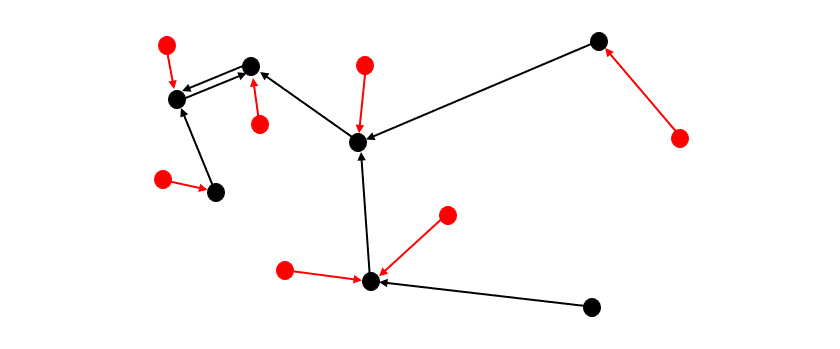
Two datasets: one red, one black. Black arrows indicate the closest (or ‘most similar’) black neighbor (head) to each black point (tail) — the similarities between these pairs are the ‘maximum intra-set similarities’ for black. Red arrows indicate the closest black neighbor (head) to each red point (tail) — similarities between these pairs are the ‘maximum cross-set similarities’. [Image by Author]
Since the datasets we deal with in this story all contain a mixture of numerical and categorical variables, we need a similarity measure which can accommodate this. We use Gower Similarity¹.
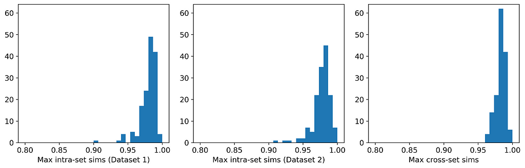
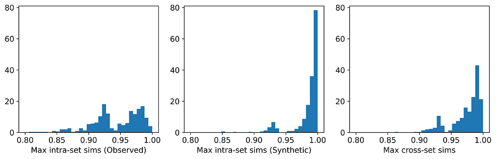
The table and histograms below show the means and distributions of the maximum intra- and cross-set similarities for Datasets 1 and 2.
Distribution of maximum intra- and cross-set similarities for Datasets 1 and 2. [Image by Author]
On average, the instances in one data set are more similar to their closest neighbors in the other dataset than they are to their closest neighbors in the same dataset. This indicates that the datasets are more likely to be perturbations of each other than random samples from the same parent distribution. And indeed, they are perturbations! Dataset 1 was generated from a Gaussian mixture model; Dataset 2 was generated by selecting (without replacement) an instance from Dataset 1 and applying a small random perturbation.
Ultimately, we will be using the Maximum Similarity Test to compare synthetic datasets with observed datasets. The biggest danger with synthetic data points being too close to observed points is privacy; i.e., being able to identify points in the observed set from points in the synthetic set. In fact, if you examine Datasets 1 and 2 carefully, you might actually be able to identify some such pairs. And this is for a case in which the average maximum cross-set similarity is only 0.3% larger than the average maximum intra-set similarity!
Modeling and Synthesizing
To end this first part of the story, let’s create a model for a dataset and use the model to generate synthetic data. We can then use the Maximum Similarity Test to compare the synthetic and observed sets.
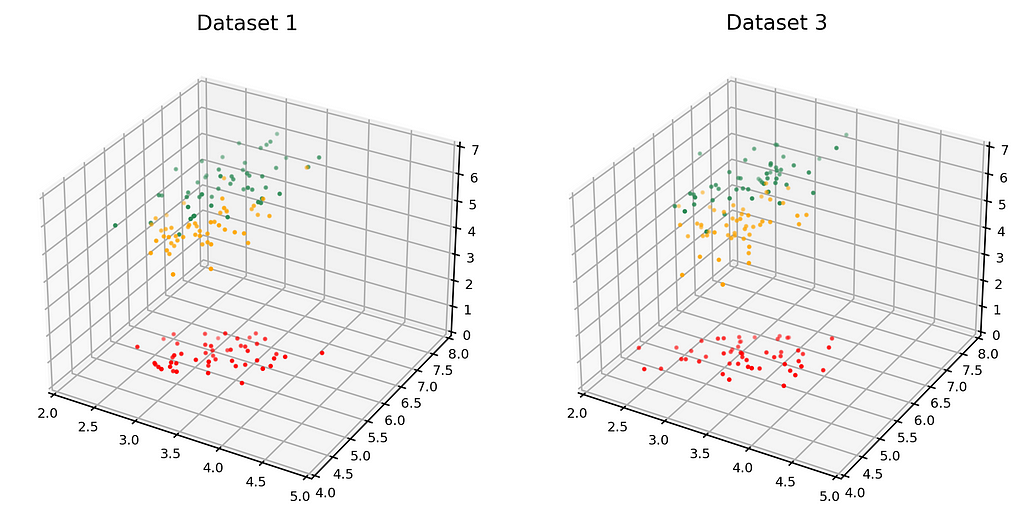
The dataset on the left in the figure below is just Dataset 1 from above. The dataset on the right (Dataset 3) is the synthetic dataset. (We have estimated the distribution as a Gaussian mixture, but that’s not important).
Observed dataset (left) and Synthetic dataset (right). [Image by Author]
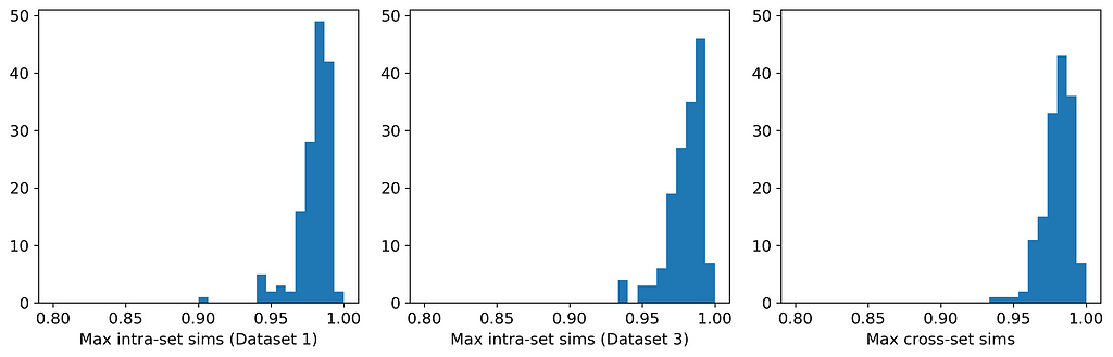
Here are the average similarities and histograms:
Distribution of maximum intra- and cross-set similarities for Datasets 1 and 3. [Image by Author]
The three averages are identical to three significant figures, and the three histograms are very similar. Therefore, according to the Maximum Similarity Test, both datasets can reasonably be considered random samples from the same parent distribution. Our synthetic data generation exercise has been a success, and we have achieved the hat-trick — fidelity, utility, and privacy.
The dataset used in Part 1 is simple and can be easily modeled with just a mixture of Gaussians. However, most real-world datasets are far more complex. In this part of the story, we will apply several synthetic data generators to some popular real-world datasets. Our primary focus is on comparing the distributions of maximum similarities within and between the observed and synthetic datasets to understand the extent to which they can be considered random samples from the same parent distribution.
The six datasets originate from the UCI repository² and are all popular datasets that have been widely used in the machine learning literature for decades. All are mixed-type datasets, and were chosen because they vary in their balance of categorical and numerical features.
The six generators are representative of the major approaches used in synthetic data generation: copula-based, GAN-based, VAE-based, and approaches using sequential imputation. CopulaGAN³, GaussianCopula, CTGAN³ and TVAE³ are all available from the Synthetic Data Vault libraries⁴, synthpop⁵ is available as an open-source R package, and ‘UNCRi’ refers to the synthetic data generation tool developed under the proprietary Unified Numeric/Categorical Representation and Inference (UNCRi) framework⁶. All generators were used with their default settings.
The table below shows the average maximum intra- and cross-set similarities for each generator applied to each dataset. Entries highlighted in red are those in which privacy has been compromised (i.e., the average maximum cross-set similarity exceeds the average maximum intra-set similarity on the observed data). Entries highlighted in green are those with the highest average maximum cross-set similarity (not including those in red). The last column shows the result of performing a Train on Synthetic, Test on Real (TSTR) test, where a classifier or regressor is trained on the synthetic examples and tested on the real (observed) examples. The Boston Housing dataset is a regression task, and the mean absolute error (MAE) is reported; all other tasks are classification tasks, and the reported value is the area under ROC curve (AUC).
Average maximum similarities and TSTR result for six generators on six datasets. The values for TSTR are MAE for Boston Housing, and AUC for all other datasets. [Image by Author]
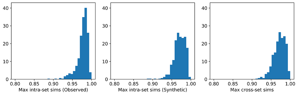
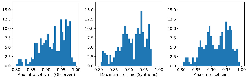
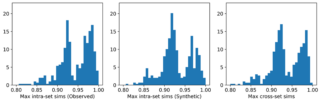
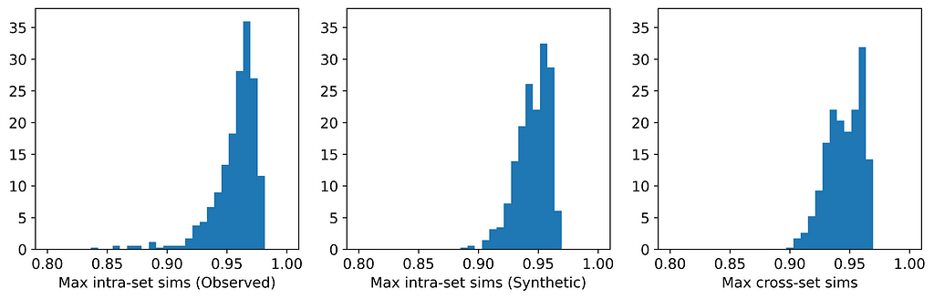
The figures below display, for each dataset, the distributions of maximum intra- and cross-set similarities corresponding to the generator that attained the highest average maximum cross-set similarity (excluding those highlighted in red above).
Distribution of maximum similarities for synthpop on Boston Housing dataset. [Image by Author]Distribution of maximum similarities for synthpop Census Income dataset. [Image by Author]Distribution of maximum similarities for UNCRi on Cleveland Heart Disease dataset. [Image by Author]Distribution of maximum similarities for UNCRi on Credit Approval dataset. [Image by Author]Distribution of maximum similarities for UNCRi on Iris dataset. [Image by Author]Distribution of average similarities for TVAE on Wisconsin Breast Cancer dataset. [Image by Author]
From the table, we can see that for those generators that did not breach privacy, the average maximum cross-set similarity is very close to the average maximum intra-set similarity on observed data. The histograms show us the distributions of these maximum similarities, and we can see that in most cases the distributions are clearly similar — strikingly so for datasets such as the Census Income dataset. The table also shows that the generator that achieved the highest average maximum cross-set similarity for each dataset (excluding those highlighted in red) also demonstrated best performance on the TSTR test (again excluding those in red). Thus, while we can never claim to have discovered the ‘true’ underlying distribution, these results demonstrate that the most effective generator for each dataset has captured the crucial features of the underlying distribution.
Privacy
Only two of the seven generators displayed issues with privacy: synthpop and TVAE. Each of these breached privacy on three out of the six datasets. In two instances, specifically TVAE on Cleveland Heart Disease and TVAE on Credit Approval, the breach was particularly severe. The histograms for TVAE on Credit Approval are shown below and demonstrate that the synthetic examples are far too similar to each other, and also to their closest neighbors in the observed data. The model is a particularly poor representation of the underlying parent distribution. The reason for this may be that the Credit Approval dataset contains several numerical features that are extremely highly skewed.
Distribution of average maximum similarities for TVAE on Credit Approval dataset. [Image by Author]
Other observations and comments
The two GAN-based generators — CopulaGAN and CTGAN — were consistently among the worst performing generators. This was somewhat surprising given the immense popularity of GANs.
The performance of GaussianCopula was mediocre on all datasets except Wisconsin Breast Cancer, for which it attained the equal-highest average maximum cross-set similarity. Its unimpressive performance on the Iris dataset was particularly surprising, given that this is a very simple dataset that can easily be modeled using a mixture of Gaussians, and which we expected would be well-matched to Copula-based methods.
The generators which perform most consistently well across all datasets are synthpop and UNCRi, which both operate by sequential imputation. This means that they only ever need to estimate and sample from a univariate conditional distribution (e.g., P(x₇|x₁, x₂, …)), and this is typically much easier than modeling and sampling from a multivariate distribution (e.g., P(x₁, x₂, x₃, …)), which is (implicitly) what GANs and VAEs do. Whereas synthpop estimates distributions using decision trees (which are the source of the overfitting that synthpop is prone to), the UNCRi generator estimates distributions using a nearest neighbor-based approach, with hyper-parameters optimized using a cross-validation procedure that prevents overfitting.
Conclusion
Synthetic data generation is a new and evolving field, and while there are still no standard evaluation techniques, there is consensus that tests should cover fidelity, utility and privacy. But while each of these is important, they are not on an equal footing. For example, a synthetic dataset may achieve good performance on fidelity and utility but fail on privacy. This does not give it a ‘two out of three’: if the synthetic examples are too close to the observed examples (thus failing the privacy test), the model has been overfitted, rendering the fidelity and utility tests meaningless. There has been a tendency among some vendors of synthetic data generation software to propose single-score measures of performance that combine results from a multitude of tests. This is essentially based on the same ‘two out of three’ logic.
If a synthetic dataset can be considered a random sample from the same parent distribution as the observed data, then we cannot do any better — we have achieved maximum fidelity, utility and privacy. The Maximum Similarity Test provides a measure of the extent to which two datasets can be considered random samples from the same parent distribution. It is based on the simple and intuitive notion that if an observed and a synthetic dataset are random samples from the same parent distribution, instances should be distributed such that a synthetic instance is as similar on average to its closest observed instance as an observed instance is similar on average to its closest observed instance.
We propose the following single-score measure of synthetic dataset quality:
The closer this ratio is to 1 — without exceeding 1 — the better the quality of the synthetic data. It should, of course, be accompanied by a sanity check of the histograms.
References
[1] Gower, J. C. (1971). A general coefficient of similarity and some of its properties. Biometrics, 27(4), 857–871.
[3] Xu, L., Skoularidou, M., Cuesta-Infante, A. and Veeramachaneni., K. Modeling Tabular data using Conditional GAN. NeurIPS, 2019.
[4] Patki, N., Wedge, R., & Veeramachaneni, K. (2016). The synthetic data vault. In 2016 IEEE International Conference on Data Science and Advanced Analytics (DSAA) (pp. 399–410). IEEE.
[5] Nowok, B., Raab G.M., Dibben, C. (2016). “synthpop: Bespoke Creation of Synthetic Data in R.” Journal of Statistical Software, 74(11), 1–26. doi:10.18637/jss.v074.i11.
[7] Harrison, D., & Rubinfeld, D.L. (1978). Boston Housing Dataset. Kaggle. https://www.kaggle.com/c/boston-housing. Licensed for commercial use under the CC: Public Domain license.
Stream Ordering: How And Why a Geo-Scientist Sometimes Needed to Rank Rivers on a Map
Learn how to obtain Strahler or Shreve order on vector layer
Preview image (by author)
Dear reader, in this article, I would like to dive into one exciting hydrological topic. I will start with the picture:
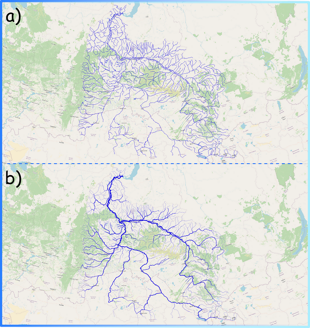
Figure 1. River depiction on the map in two versions (a vs b) (image by author)
Disclaimer: this article is written both for geographers who face the problem of ranking river vector layer using geoinformation systems (GIS) and for people who have sometimes seen “nice rivers” on a map but do not know exactly how they are made. We will together sequentially explore how spatial data are represented in GIS applications, the way the structure of river networks can be analysed, and what visualisation techniques can be used.
Now the question is: Which map looks prettier? — For me, the one on the bottom (b).
Actually, the second visualisation is more correct from a common sense point of view as well. The more tributaries flowing into the riverbed, the wider and fuller the river will be. For example, one of the largest rivers in the world, the Nile, at its source (high in the mountains), barely resembles a powerful river at its mouth: with each kilometer of the way to the sea, the river absorbs more and more tributaries and becomes more and more full-flowing.
The map shown above (Figure 1b) was prepared on the basis of structural information on the river network. In this post I would like to discuss in which ways this additional information about rivers can be obtained and what tools can be used for this purpose.
What is the river
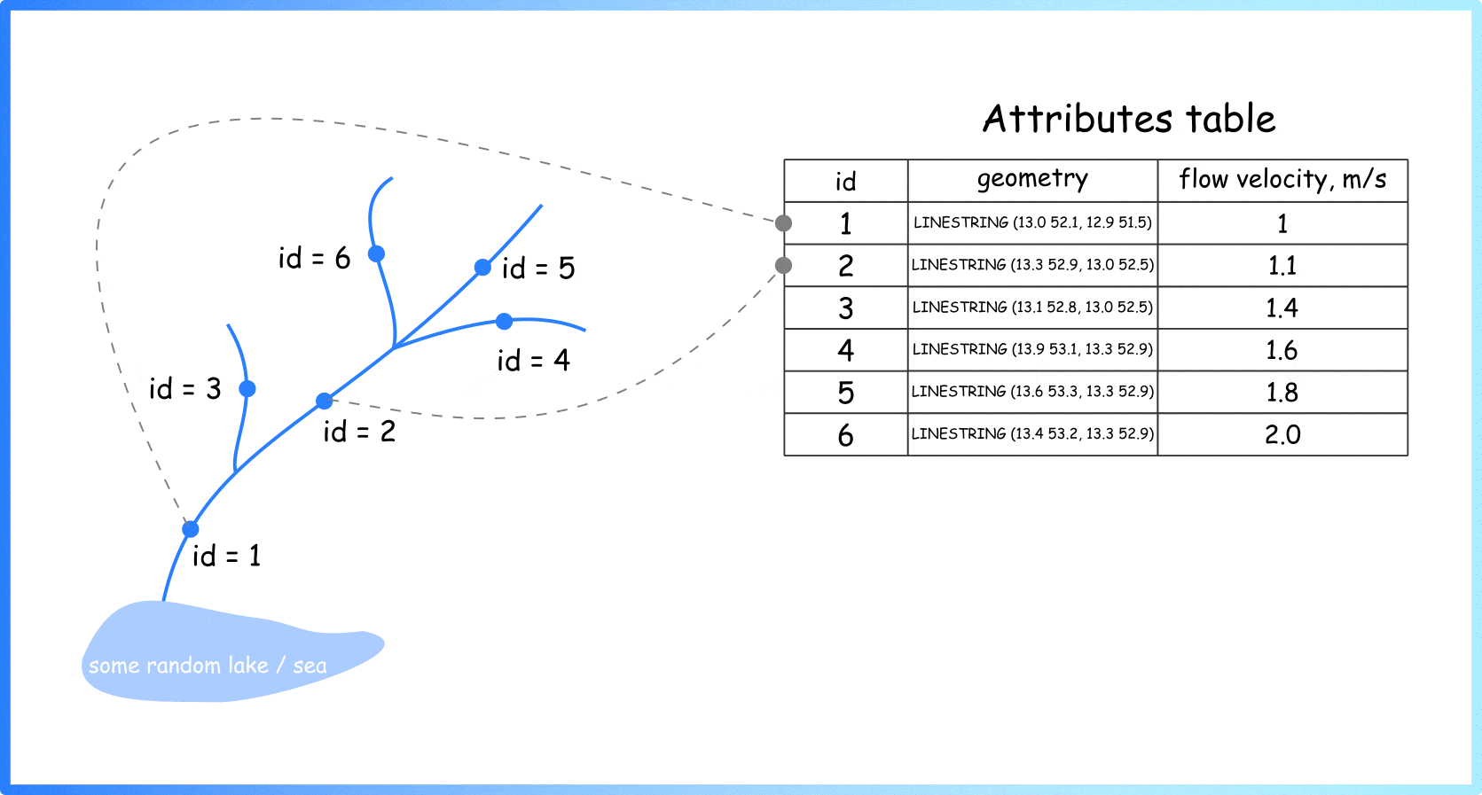
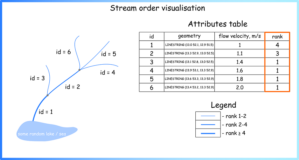
Let’s start by explaining how information about rivers is represented. In cartography and geo-sciences, rivers are represented as a linear vector layer: each river section is represented as a line with some characteristics. For example, the length of the section, its geographic coordinates (geometry of the object), ground type, average depth, flow velocity, etc. (Animation 1).
Animation 1. Linear vector layer for spatial objects. Important note: The geometries of individual linear segments can be defined not by two points, but by a great number of points (by author)
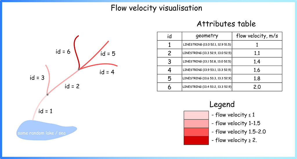
So, generally, if you see a river on a map, you see a set of these simple geometric primitives (individual rows in attrbute table) assembled into one big system. Different colours can be used to visualise stored characteristics (Figure 2).
Figure 2. Visualisation of the river sections using colours (image by author)
Either programming languages or specialised applications such as ArcGIS (proprietary software) or QGIS (open-source) are used for visualisation.
River structure
Such information in the attributes table on rivers can be collected in different ways: from remote sensing data, expeditions, gauges, and hydrological stations. However, information about the river structure is usually assigned by the specialist at the very last moment, when he or she sees on the map what the whole system looks like. For example, a researcher can themselves add a new column to the vector layer description in which they assign a rank to each river segment (Figure 3).
Figure 3. Adding new field and visualise it using size (image by author)
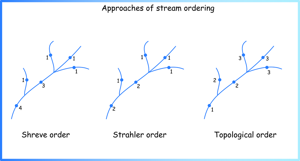
Now we can see that the picture resembles the map from the beginning of the article (Figure 1b). But the question arises: what principle can be used to assign such values? — the answer is: a lot. There are several generally accepted systems for ranking watercourses in hydrology — see the Stream order wiki page or paper Stream orders. Below are a few approaches that I have used myself during the work (Figure 4).
Figure 4. Several approaches of stream ordering in hydrology (image by author)
For what reason
Now it is time to answer the question of the purpose of such ranking systems. We can distinguish two reasons:
Visualisation — using rank as an attribute of the size of a linear object on the map, it is possible to create nice maps (Figure 1);
Further analysis.
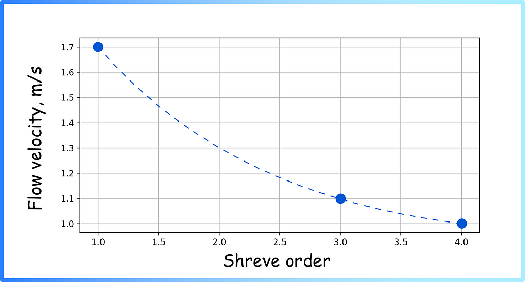
Knowledge of river network structure can be combined with other characteristics for further analysis, e.g. to identify the following patterns (Figure 5).
Figure 5. Flow velocity dependence on Shreve order (image by author)
How to assign stream orders using existing tools
It is difficult to rank large systems manually, so specialised tools have been created for stream ordering. There are two fundamentally different ways:
Stream ordering using raster data (digital elevation model);
Stream ordering on vector layers.
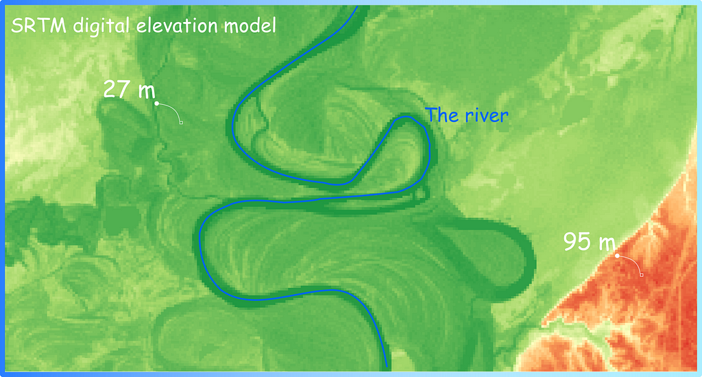
Above, we have described how we can assign ranks to vector layers. However, spatial data are often represented in another format — as rasters (matrices) (Figure 6). Digital elevation models (matrices where each pixel has a specific size, such as 90 by 90 metres, for example, and an elevation value above the sea level surface that is stored in each cell of that matrix) are particularly commonly used.
Figure 6. Digital elevation model (DEM) as raster layer. Often used to calculate flow direction and then stream order (image by author)
The raster layer (digital elevation model — DEM) is used to calculate the flow direction matrix and flow accumulation. The Stream Order (Spatial Analyst) tool in ArcGIS, for example, works according to this principle. In this post I will not describe in detail how such an algorithm works, as there are quite nice visualisations and descriptions in the official documentation (please check Flow Direction function page if you want to know more). Below I have listed some of the tools you can use to get an Strahler order using raster data:
However, this all requires a lot of raster data manipulation. What should you do if you already have a vector layer? (This can happen if you have, for example, a vector layer of the river network loaded from OpenStreetMap.) I’ll tell you next!
How to obtain Shreve, Strahler and Topological order on vector layer using QGIS
During our work four years ago, my colleagues and I came up with an algorithm that allows us to calculate Shreve, Strahler, and Topological order based only on the vector layer and the final point (the point where the river system ends and flows into a lake / sea / ocean). The first version of the algorithm is described in my first article on medium: “The Algorithm for Ranking the Segments of the River Network for Geographic Information Analysis Based on Graphs” (wiping away a tear of nostalgia). Recently, I finally got around to writing some clearer documentation for it and preparing a plugin update.
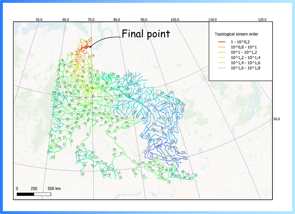
In QGIS for stream ordering, the Lines Ranking plugin can be used. To use, it will require loading a vector layer, reprojecting it into the desired metric projection, and assigning a final point (you can just click on the map) — the following result will be obtained (Figure 7).
Figure 7. Topological stream order for Ob river using vector layer and QGIS Lines Ranking Plugin
Now you, dear reader, have dived a little deeper into the topic of stream ordering in hydrology and learned how to use different tools to get it from raw data (raster or vector). Once there is information about the river’s structure, you can prepare beautiful and clear visualisations, or continue the analysis by combining the obtained information with other characteristics.
Best Buy is bringing you a sweet Valentine’s Day treat: Get the Sandisk Extreme Pro 2TB SSD for $125 off — but hurry, this deal only lasts through the end of today.
Last year, two Waymo robotaxis in Phoenix “made contact” with the same pickup truck that was in the midst of being towed, which prompted the Alphabet subsidiary to issue a recall on its vehicles’ software. A “recall” in this case meant rolling out a software update after investigating the issue and determining its root cause.
In a blog post, Waymo has revealed that on December 11, 2023, one of its robotaxis collided with a backwards-facing pickup truck being towed ahead of it. The company says the truck was being towed improperly and was angled across a center turn lane and a traffic lane. Apparently, the tow truck didn’t pull over after the incident, and another Waymo vehicle came into contact with the pickup truck a few minutes later. Waymo didn’t elaborate on what it meant by saying that its robotaxis “made contact” with the pickup truck, but it did say that the incidents resulted in no injuries and only minor vehicle damage. The self-driving vehicles involved in the collisions weren’t carrying any passenger.
After an investigation, Waymo found that its software had incorrectly predicted the future movements of the pickup truck due to “persistent orientation mismatch” between the towed vehicle and the one towing it. The company developed and validated a fix for its software to prevent similar incidents in the future and started deploying the update to its fleet on December 20.
Waymo’s rival company Cruise was involved in a more serious incident last year, wherein one of its robotaxis accidentally dragged someone hit by another vehicle a few dozen feet down a San Francisco street. California then suspended its license to operate in the state, and Cruise eventually paused all robotaxi operations, even the ones with a human driver behind the wheel, as part of a safety review. Meanwhile, it’s business as usual for Waymo, which recently announced that it will start testing driverless vehicles on highways and freeways in and around Phoenix.
This article originally appeared on Engadget at https://www.engadget.com/waymo-issued-a-recall-after-two-robotaxis-crashed-into-the-same-pickup-truck-055708611.html?src=rss
We use cookies on our website to give you the most relevant experience by remembering your preferences and repeat visits. By clicking “Accept”, you consent to the use of ALL the cookies.
This website uses cookies to improve your experience while you navigate through the website. Out of these, the cookies that are categorized as necessary are stored on your browser as they are essential for the working of basic functionalities of the website. We also use third-party cookies that help us analyze and understand how you use this website. These cookies will be stored in your browser only with your consent. You also have the option to opt-out of these cookies. But opting out of some of these cookies may affect your browsing experience.
Necessary cookies are absolutely essential for the website to function properly. These cookies ensure basic functionalities and security features of the website, anonymously.
Cookie
Duration
Description
cookielawinfo-checkbox-analytics
11 months
This cookie is set by GDPR Cookie Consent plugin. The cookie is used to store the user consent for the cookies in the category "Analytics".
cookielawinfo-checkbox-functional
11 months
The cookie is set by GDPR cookie consent to record the user consent for the cookies in the category "Functional".
cookielawinfo-checkbox-necessary
11 months
This cookie is set by GDPR Cookie Consent plugin. The cookies is used to store the user consent for the cookies in the category "Necessary".
cookielawinfo-checkbox-others
11 months
This cookie is set by GDPR Cookie Consent plugin. The cookie is used to store the user consent for the cookies in the category "Other.
cookielawinfo-checkbox-performance
11 months
This cookie is set by GDPR Cookie Consent plugin. The cookie is used to store the user consent for the cookies in the category "Performance".
viewed_cookie_policy
11 months
The cookie is set by the GDPR Cookie Consent plugin and is used to store whether or not user has consented to the use of cookies. It does not store any personal data.
Functional cookies help to perform certain functionalities like sharing the content of the website on social media platforms, collect feedbacks, and other third-party features.
Performance cookies are used to understand and analyze the key performance indexes of the website which helps in delivering a better user experience for the visitors.
Analytical cookies are used to understand how visitors interact with the website. These cookies help provide information on metrics the number of visitors, bounce rate, traffic source, etc.
Advertisement cookies are used to provide visitors with relevant ads and marketing campaigns. These cookies track visitors across websites and collect information to provide customized ads.