I first heard of N-of-1 trials in 2018 as a master’s student studying epidemiology. I was in my Intermediate Epidemiologic and Clinical Research Methods class, and we had a guest lecture from Dr. Eric Daza on N-of-1 study design. The N-of-1 study can be thought of as a clinical trial investigating the efficacy of an intervention on an individual patient. At the time, this methodology was an emerging practice, with promising implications for personalized medicine and optimizing healthcare for the individual.
As an aside at the end of the lecture, he mentioned that N-of-1 experiments were a hobby for some people who were obsessed with their Fitbit and familiar with statistics. These data scientists who had access to their own biometric data would conduct experiments and analyses to optimize their sleep, workouts, and diet. I was fascinated.
This lecture couldn’t have come at a more perfect time. I had spent the last 5 years as a student-athlete on the women’s volleyball team and was about to embark on what would become a 5 yearlong professional volleyball career. I had just started using a Whoop strap to track my workouts, sleep, and recovery, and had all this new data at my fingertips. I was learning statistics and study design, and now I knew how to put them to work and maybe get a leg-up in my new career.
I religiously tracked everything for the next year and a half via my Whoop, but eventually stopped wearing the device, as at the time the company didn’t allow you to download your own data. Fast forward a couple years, and now I’m a Master of Data Science Student at the University of British Columbia. I’m armed with even more analytical methods, and Whoop finally lets you access your old data! Now more than ever, I can finally conduct my own N-of-1 study and answer some of the questions I had back then.
Before getting to the analysis, we must first define the N-of-1 study framework, and examine the historical method of conducting causal medical research.
Randomized Clinical Trials
The gold standard of modern day medical research is the randomized clinical trial or RCT. Say we want to find out if a new drug lowers the risk of heart attacks. In an RCT, a group of patients are randomly assigned to a treatment (the drug) or control (a placebo pill). The researchers have cleverly designed this experiment so that the individuals making up the two groups have similar characteristics, such that the major difference between them is whether or not they are taking the drug. We follow these individuals for some time and take note of the heart attacks that occur. At the end of the experiment, we count up these numbers in each group, and do some statistics so that we can compare heart attack incidence between each group and whether there was a difference between the groups that was statistically significant.
RCTs are incredibly powerful tools of causal inference, and allow us to discover whether a certain intervention leads to a desired response. They are the historical backbone of applied medical research, but are somewhat limited by the importance they place on the generalizability of their results. When an RCT is conducted, the end goal is to set a new standard of practice for a wider population beyond the study participants. We make an inference on the population based on the sample, and in doing so we average out individual response. The act of doing so is almost contrary to the goal of medicine; that of caring for individual patients.
N-of-1 Trials
N-of-1 trials address this limitation by taking RCT study design and applying it on an individual scale. They allow us to explore the variability in patient response to a given treatment, and can lead to better patient outcomes by limiting time spent on a suboptimal treatment. While the idea of an N-of-1 study has been around for some time, such studies are more accessible now because of the advancement in technology allowing for easier collection of data.
N-of-1 trials aren’t always the answer to personalized medicine. In the case of fast moving maladies like infectious diseases, you likely won’t have time to conduct such an individualized trial, and are better off going with a more generalized approach. For the treatment of chronic conditions however, N-of-1 trials provide an incredibly promising avenue towards the improvement of health outcomes. These conditions may not be directly life threatening, and are observable over long periods of time. This allows for multiple different interventions to be attempted, in hopes of finding an optimal treatment.
Outside of medicine, you can also apply the N-of-1 trial to your every day life. How many of us have tried a new medicine, diet, supplement, workout or sleep routine and struggled to say whether it worked? It can be hard to conclusively state whether the intervention had any effect, as most of the available evidence is anecdotal or hard to quantify. By using a N-of-1 study framework in combination with your own biometric data taken from wearable health trackers, you can get conclusive evidence that allows you to make lifestyle changes you know will make a difference.
N-of-1 Trials in Practice
To show you an example of this methodology in practice, I will conduct my own analysis on a selection of data collected from my Whoop strap from April 27th, 2018 to October 5th, 2019. Our research question for this N-of-1 study is:
Does drinking alcohol lead to poor sleep?
As an athlete and epidemiologist, I am very aware of how detrimental alcohol can be on your sleep, athletic performance and general wellbeing. I’ve constantly been told how athletes should not drink, however its one thing to be told, but another to see the evidence for yourself. Once I started wearing my Whoop I noticed how my sleep score (a metric calculated by the Whoop app) would suffer after drinking alcohol. Sometimes even a day later, I thought I could still see the effect. These observations made me want to do my own analysis, which I can finally complete now.
Notes on the Data
The two variables of interest in our analysis is sleep performance score and alcohol consumption. Sleep performance score ranges from 0 to 100 and is a metric calculated by the Whoop app from biometric data like respiratory rate, light sleep duration, slow wave sleep duration, and REM sleep duration.
The alcohol consumption variable is the response to the question “Did you have any alcoholic drinks yesterday?” that is responded to by Whoop users on a daily basis upon waking up. I always answered these questions truthfully and consistently, although we are limited in our data in that the app does not ask questions about how much alcohol was consumed. This means that all levels of alcohol consumption are treated equally, which eliminates the opportunity to analyze the relationship on a deeper level. There was some missing data in our alcohol feature, but this missing information was imputed with ‘No’s as I know from personal experience that if I had drunk the night before I was sure to mark it in the app.
Exploratory Data Analysis
The first step in any analysis is to do some exploratory data analysis (EDA). This is just to get a general idea of what our data looks like, and to create a visual that will help direct our investigation.
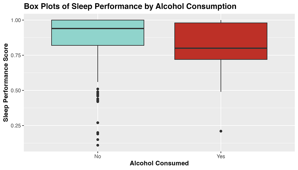
Fig 1. Exploratory plot of the distribution of sleep performance score by level of alcohol consumed.
From the above box-plots, we see that average sleep score appears to be higher when no alcohol was consumed, and to have a narrower distribution. Curiously, there seems to be more outliers in sleep performance score when alcohol is not consumed. Perhaps travel days and jet-lag can account for these outliers, as I traveled overseas 5 times during this sample period.
Now that we have gotten a good first look at the data of interest, its time to dig into the statistical analysis.
Hypothesis Testing
To answer our research question, I will be conducting hypothesis testing. Hypothesis testing is a statistical technique that allows us to make inferences about a population based on some sample data. In this case, we are attempting to infer if me drinking alcohol is associated with having poor sleep that night. We don’t have data on alcohol consumption and sleep for every night I’ve been alive, so we study our sample data as a proxy.
The first step in hypothesis testing is to formulate my hypotheses. A ‘null hypothesis’ is the assumption that nothing interesting is happening or that there is no relationship or effect. In our case the null hypothesis is: There is no difference in mean sleep performance between nights in which alcohol was consumed and was not consumed.
An ‘alternative hypothesis’ is the hypothesis that contradicts the null, and claims that in fact there is something interesting happening. In our example the alternative hypothesis is: There is a difference in mean sleep performance between nights in which alcohol was consumed and was not consumed.
Choosing a Statistical Test
To assess which of these hypotheses is true, we have to chose a statistical test. We are curious if the average sleep score for nights in which I drank alcohol is different from the average sleep score for nights in which I did not drink alcohol, and so will be using a difference in means to test this. Specifically, our test statistic is: Mean sleep performance with no alcohol — Mean sleep performance with alcohol
Now that we have defined our framework, we can use R to calculate our test statistic and evaluate our hypotheses.
Conducting our Analysis in R
From our sample data we can calculate our observed test statistic. The code in R is included below.
test_stat <- data |>
  specify(formula = sleep_performance ~ alcohol) |>
  calculate(
    stat = "diff in means",
    order = c("No", "Yes")
  )
Our test statistic is 8.01. This number means that the average sleep score for nights in which I consumed no alcohol is 8.01 points higher than nights in which I did consume alcohol.
The next step in the analysis is to generate a null distribution from our sample data. A null distribution represents all the different values of test statistic we would observe if samples were drawn repeatedly from the population. The distribution is meant to reflect the variation in the test statistic purely due to random sampling. The null distribution is created in R below:
set.seed(42) #Setting seed for reproducibility

null_distribution <- data |>
  specify(formula = sleep_performance ~ alcohol) |>
  hypothesize(null = "independence") |>
  generate(reps = 1000, type = "permute") |>
  calculate(
    stat = "diff in means",
    order = c("No", "Yes")
  )
What we are doing above is taking samples with replacement from our data, and calculating the difference in means from those samples. We do this 1000 times to generate a large enough distribution so that we can determine if our observed test statistic is significant.
After we have our null distribution and test statistic, we can calculate a two-sided p-value for an alpha of 0.05. The p-value can be thought of as the probability of getting a test statistic that is as extreme or more than our observed test statistic if the null hypothesis is true. Put into plain words; it represents how likely it would be to see this result if there was no true association. We calculate a two-sided p-value in R below, as we are interested in the possibility of the test statistic being greater or lesser than expected.
p_value <- null_distribution|>
  get_p_value(test_stat, direction = "both")
Our p-value is 0.017 which means that our finding is significant at the alpha=0.05 level, which is a commonly accepted level of significance in statistics. It means that the difference in sleep score we found was significant! We have the evidence to reject the null hypothesis and accept the alternative; there is a difference in mean sleep performance between nights in which alcohol was consumed and was not consumed.
I’ve included a helpful visualization of the null distribution, test statistic, and 95% quantile range below. The grey bars are the many possible test statistics calculated from our 1000 samples, and the orange line represents the density of these values. The blue dashed lines represent the 97.5th and 2.5th quantiles of this distribution, beyond which our test statistic (in red) is shown to be significant.
Figure 2. The distribution of test statistics under the null hypothesis (no difference in mean sleep score with alcohol consumption)
Final Conclusions
Well, it turns out my coaches were right all along! Our analysis found that my average sleep score when I did not consume alcohol was 8.01 points higher than my average sleep score when I did consume alcohol. This difference was found to be statistically significant, with a p-value of 0.017, meaning that we reject the null hypothesis in favor of the alternative. This statistical result backs up my personal experience, giving me a quantitative result that I can have confidence in.
Going Further
Now that I have this initial analysis under my belt, I can explore more associations in my data, and even use more complicated methods like forecasting and machine learning models.
This analysis is a very basic example of an N-of-1 study, and is not without limitations. My study was observational rather than experimental, and we cannot declare causality, as there are many other confounding variables not measured by my Whoop. If I wanted to find a causal relationship, I would have to carefully design a study, record data on all possible confounders, and find a way to blind myself to the treatment. N-of-1 studies are hard to do outside of a clinical setting, however we can still find meaningful associations and relationships by asking simple questions of our data.
I hope that after this tutorial you take the initiative to download your own data from whatever fitness tracker you can get your hands on, and play around with it. I know everyone can come up with a hypothesis about how some variable affects their health, but what most people don’t realize, is that you’re closer to getting a quantifiable answer to that question than you think.
References and Further Reading
[1] Davidson, K., Cheung, K., Friel, C., & Suls, J. (2022). Introducing Data Sciences to N-of-1 Designs, Statistics, Use-Cases, the Future, and the Moniker ‘N-of-1’ Trial. Harvard Data Science Review, (Special Issue 3). https://doi.org/10.1162/99608f92.116c43fe
[2] Lillie EO, Patay B, Diamant J, Issell B, Topol EJ, Schork NJ. The n-of-1 clinical trial: the ultimate strategy for individualizing medicine? Per Med. 2011 Mar;8(2):161–173. doi: 10.2217/pme.11.7. PMID: 21695041; PMCID: PMC3118090.
[3] Daza EJ. Causal Analysis of Self-tracked Time Series Data Using a Counterfactual Framework for N-of-1 Trials. Methods Inf Med. 2018 Feb;57(1):e10-e21. doi: 10.3414/ME16–02–0044. Epub 2018 Apr 5. PMID: 29621835; PMCID: PMC6087468.
[4] Schork, N. Personalized medicine: Time for one-person trials. Nature520, 609–611 (2015). https://doi.org/10.1038/520609a
Connections is the new puzzle game from the New York Times, and it can be quite difficult. If you need a hand with solving today’s puzzle, we’re here to help.
The NYT Mini crossword might be a lot smaller than a normal crossword, but it isn’t easy. If you’re stuck with today’s crossword, we’ve got answers for you here.
Part 1: Task-specific approaches for scenario forecasting
Image by DALL-E
In product analytics, we quite often get “what-if” questions. Our teams are constantly inventing different ways to improve the product and want to understand how it can affect our KPI or other metrics.
Let’s look at some examples:
Imagine we’re in the fintech industry and facing new regulations requiring us to check more documents from customers making the first donation or sending more than $100K to a particular country. We want to understand the effect of this change on our Ops demand and whether we need to hire more agents.
Let’s switch to another industry. We might want to incentivise our taxi drivers to work late or take long-distance rides by introducing a new reward scheme. Before launching this change, it would be crucial for us to estimate the expected size of rewards and conduct a cost vs. benefit analysis.
As the last example, let’s look at the main Customer Support KPIs. Usually, companies track the average waiting time. There are many possible ways how to improve this metric. We can add night shifts, hire more agents or leverage LLMs to answer questions quickly. To prioritise these ideas, we will need to estimate their impact on our KPI.
When you see such questions for the first time, they look pretty intimidating.
If someone asks you to calculate monthly active users or 7-day retention, it’s straightforward. You just need to go to your database, write SQL and use the data you have.
Things become way more challenging (and exciting) when you need to calculate something that doesn’t exist. Computer simulations will usually be the best solution for such tasks. According to Wikipedia, simulation is an imitative representation of a process or system that could exist in the real world. So, we will try to imitate different situations and use them in our decision-making.
Simulation is a powerful tool that can help you in various situations. So, I would like to share with you the practical examples of computer simulations in the series of articles:
In this article, we will discuss how to use simulations to estimate different scenarios. You will learn the basic idea of simulations and see how they can solve complex tasks.
In the second part, we will diverge from scenario analysis and will focus on the classic of computer simulations — bootstrap. Bootstrap can help you get confidence intervals for your metrics and analyse A/B tests.
I would like to devote the third part to agent-based models. We will model the CS agent behaviour to understand how our process changes can affect CS KPIs such as queue size or average waiting time.
So, it’s time to start and discuss the task we will solve in this article.
Our project: Launching tests for English courses
Suppose we are working on an edtech product that helps people learn the English language. We’ve been working on a test that could assess the student’s knowledge from different angles (reading, listening, writing and speaking). The test will give us and our students a clear understanding of their current level.
We agreed to launch it for all new students so that we can assess their initial level. Also, we will suggest existing students pass this test when they return to the service next time.
Our goal is to build a forecast on the number of submitted tests over time. Since some parts of these tests (writing and speaking) will require manual review from our teachers, we would like to ensure that we will have enough capacity to check these tests on time.
Let’s try to structure our problem. We have two groups of students:
The first group is existing students. It’s a good practice to be precise in analytics, so we will define them as students who started using our service before this launch. We will need to check them once at their next transaction, so we will have a substantial spike while processing them all. Later, the demand from this segment will be negligible (only rare reactivations).
New students will hopefully continue joining our courses. So, we should expect consistent demand from this group.
Now, it’s time to think about how we can estimate the demand for these two groups of customers.
The situation is pretty straightforward for new students — we need to predict the number of new customers weekly and use it to estimate demand. So, it’s a classic task of time series forecasting.
The task of predicting demand from existing customers might be more challenging. The direct approach would be to build a model to predict the week when students will return to the service next time and use it for estimations. It’s a possible solution, but it sounds a bit overcomplicated to me.
I would prefer the other approach. I would simulate the situation when we launched this test some time ago and use the previous data. In that case, we will have all the data after “this simulated launch” and will be able to calculate all the metrics. So, it’s actually a basic idea of scenario simulations.
Cool, we have a plan. Let’s move on to execution.
Modelling demand from new customers
Before jumping to analysis, let’s examine the data we have. We keep a record of the lessons’ completion events. We know each event’s user identifier, date, module, and lesson number. We will use weekly data to avoid seasonality and capture meaningful trends.
Let me share some context about the educational process. Students primarily come to our service to learn English from scratch and pass six modules (from pre-A1 to C1). Each module consists of 100 lessons.
The data was generated explicitly for this use case, so we are working with a synthetic data set.
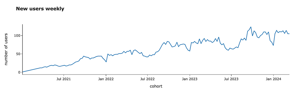
First, we need to calculate the metric we want to predict. We will offer students the opportunity to pass the initial evaluation test after completing the first demo lesson. So, we can easily calculate the number of customers who passed the first lesson or aggregate users by their first date.
We can look at the data and see an overall growing trend with some seasonal effects (i.e. fewer customers joining during the summer or Christmas time).
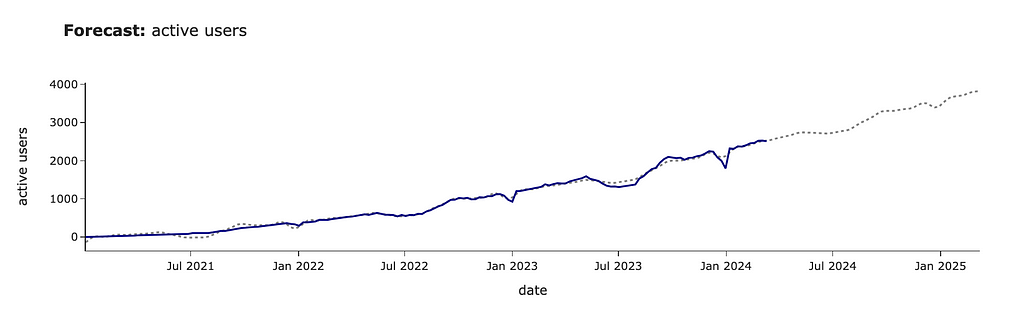
For forecasting, we will use Prophet — an open-source library from Meta. It works pretty well with business data since it can predict non-linear trends and automatically take into account seasonal effects. You can easily install it from PyPI.
pip install prophet
Prophet library expects a data frame with two columns: ds with timestamp and y with a metric we want to predict. Also, ds must be a datetime column. So, we need to transform our data to the expected format.
Now, we are ready to make predictions. As usual in ML, we need to initialise and fit a model.
from prophet import Prophet

m = Prophet()
m.fit(pred_new_users_df)
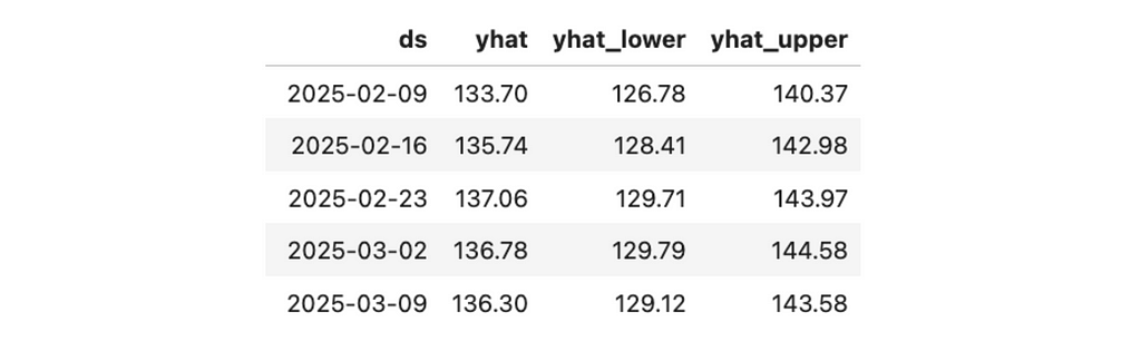
The next step is prediction. First, we need to create a future data frame specifying the number of periods and their frequency (in our case, weekly). Then, we need to call the predict function.
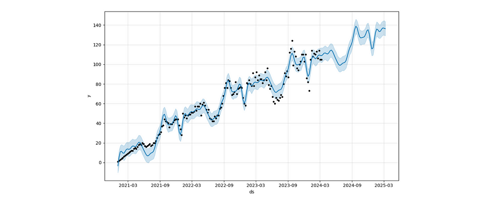
The forecast chart shows you the forecast with a confidence interval.
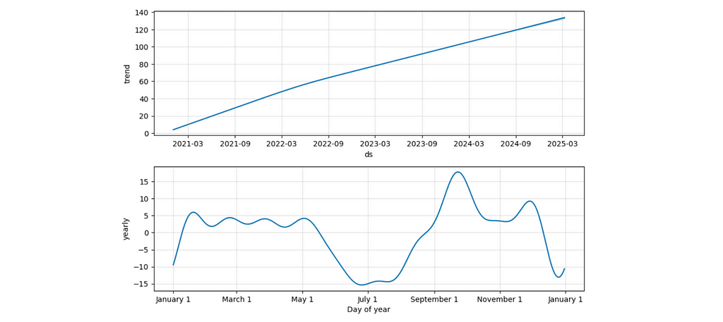
The components view lets you understand the split between trend and seasonal effects. For example, the second chart displays a seasonal drop-off during summer and an increase at the beginning of September (when people might be more motivated to start learning something new).
We can put all this forecasting logic into one function. It will be helpful for us later.
import plotly.express as px import plotly.io as pio pio.templates.default = 'simple_white'
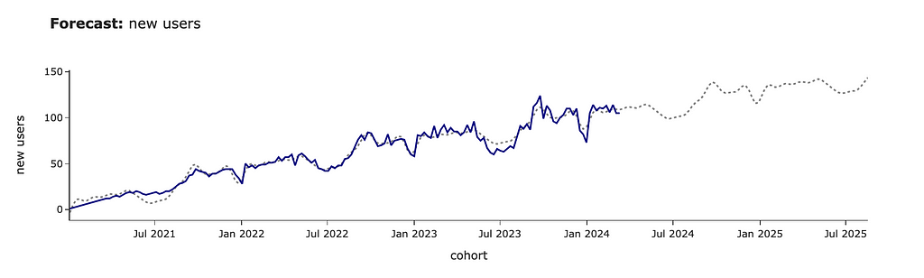
new_forecast_df = make_prediction(new_users_stats_df, 'new_users', 'new users', periods = 75)
I prefer to share with my stakeholders a more styled version of visualisation (especially for public presentations), so I’ve added it to the function as well.
In this example, we’ve used the default Prophet model and got quite a plausible forecast. However, in some cases, you might want to tweak parameters, so I advise you to read the Prophet docs to learn more about the possible levers.
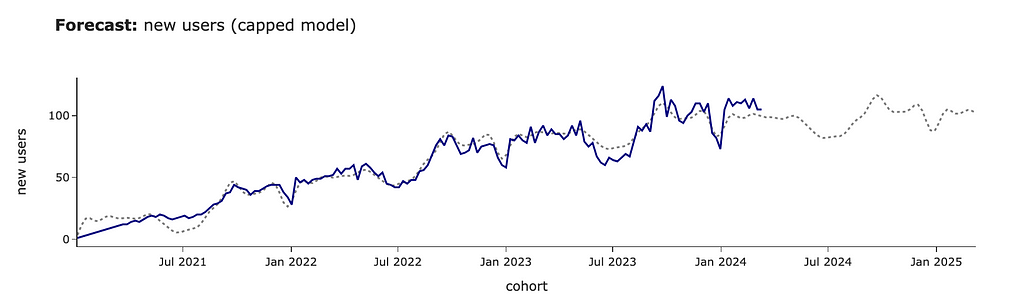
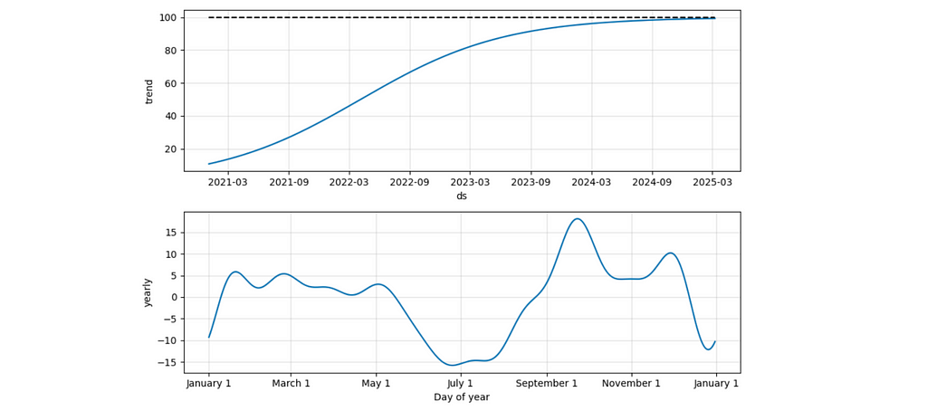
For example, in our case, we believe that our audience will continue growing at the same rate. However, this might not be the case, and you might expect it to have a cap of around 100 users. Let’s update our prediction for saturating growth.
# adding cap to the initial data
# it's not required to be constant
pred_new_users_df['cap'] = 100

#specifying logistic growth
m = Prophet(growth='logistic')
m.fit(pred_new_users_df)

# adding cap for the future
future = m.make_future_dataframe(periods= 52, freq = 'W')
future['cap'] = 100
forecast_df = m.predict(future)
We can see that the forecast has changed significantly, and the growth stops at ~100 new clients per week.
It’s also interesting to look at the components’ chart in this case. We can see that the seasonal effects stayed the same, while the trend has changed to logistic (as we specified).
We’ve learned a bit about the ability to tweak forecasts. However, for future calculations, we will use a basic model. Our business is still relatively small, and most likely, we haven’t reached saturation yet.
We’ve got all the needed estimations for new customers and are ready to move on to the existing ones.
Modelling demand from existing customers
The first version
The key point in our approach is to simulate the situation when we launched this test some time ago and calculate the demand using this data. Our solution is based on the idea that we can use the past data instead of predicting the future.
Since there’s significant yearly seasonality, I will use data for -1 year to take into account these effects automatically. We want to launch this project at the beginning of April. So, I will use past data from the week of 2nd April 2023.
First, we need to filter the data related to existing customers at the beginning of April 2023. We’ve already forecasted demand from new users, so we don’t need to consider them in this estimation.
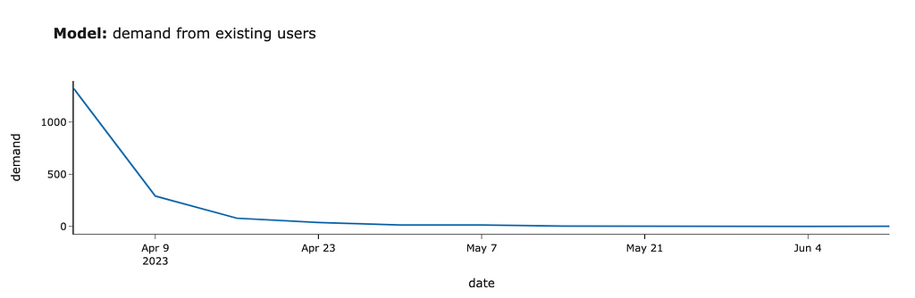
Then, we need to model the demand from these users. We will offer our existing students the chance to pass the test the next time they use our product. So, we need to define when each customer returned to our service after the launch and aggregate the number of customers by week. There’s no rocket science at all.
We got the first estimations. If we had launched this test in April 2023, we would have gotten around 1.3K tests in the first week, 0.3K for the second week, 80 cases in the third week, and even less afterwards.
We assumed that 100% of existing customers would finish the test, and we would need to check it. In real-life tasks, it’s worth taking conversion into account and adjusting the numbers. Here, we will continue using 100% conversion for simplicity.
So, we’ve done our first modelling. It wasn’t challenging at all. But is this estimation good enough?
Taking into account long-term trends
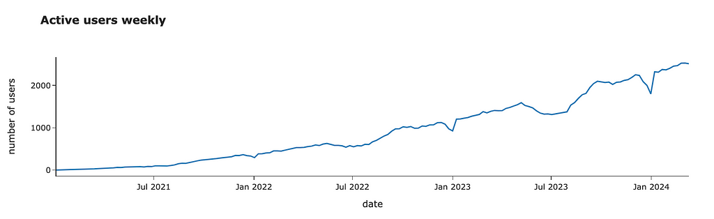
We are using data from the previous year. However, everything changes. Let’s look at the number of active customers over time.
We can see that it’s growing steadily. I would expect it to continue growing. So, it’s worth adjusting our forecast due to this YoY (Year-over-Year) growth. We can re-use our prediction function and calculate YoY using forecasted values to make it more accurate.
We’ve finished the estimations for the existing students as well. So, we are ready to merge both parts and get the result.
Putting everything together
First results
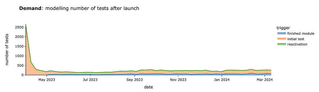
Now, we can combine all our previous estimations and see the final chart. For that, we need to convert data to the common format and add segments so that we can distinguish demand between new and existing students.
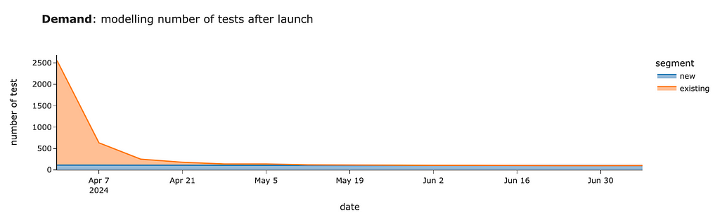
# visualisation px.area(demand_model_df.pivot(index = 'date', columns = 'segment', values = 'users').head(15)[['new', 'existing']], title = '<b>Demand</b>: modelling number of tests after launch', labels = {'value': 'number of test'})
We should expect around 2.5K tests for the first week after launch, mostly from existing customers. Then, within four weeks, we will review tests from existing users and will have only ~100–130 cases per week from new joiners.
That’s wonderful. Now, we can share our estimations with colleagues so they can also plan their work.
What if we have demand constraints?
In real life, you will often face the problem of capacity constraints when it’s impossible to launch a new feature to 100% of customers. So, it’s time to learn how to deal with such situations.
Suppose we’ve found out that our teachers can check only 1K tests each week. Then, we need to stagger our demand to avoid bad customer experience (when students need to wait for weeks to get their results).
Luckily, we can do it easily by rolling out tests to our existing customers in batches (or cohorts). We can switch the functionality on for all new joiners and X% of existing customers in the first week. Then, we can add another Y% of existing customers in the second week, etc. Eventually, we will evaluate all existing students and have ongoing demand only from new users.
Let’s come up with a rollout plan without exceeding the 1K capacity threshold.
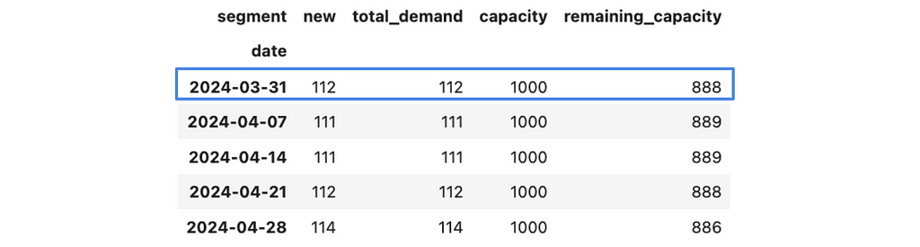
Since we definitely want to launch it for all new students, let’s start with them and add them to our plan. We will store all demand estimations by segments in the raw_demand_est_model_df data frame and initialise them with our new_model_df estimations that we got before.
raw_demand_est_model_df = new_model_df.copy()
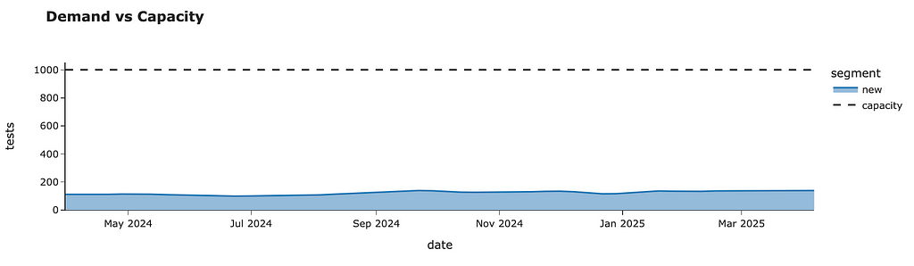
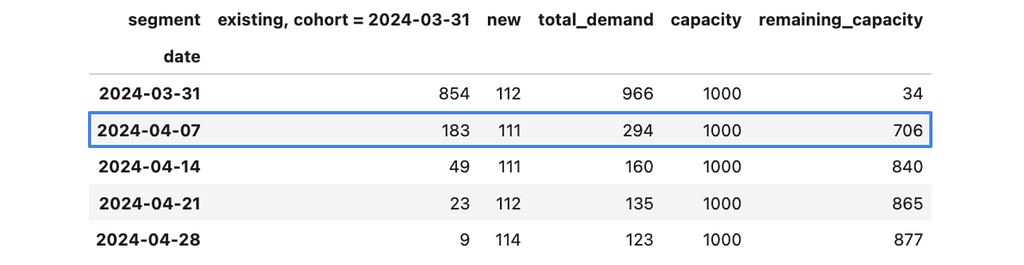
Now, we can aggregate this data and calculate the remaining capacity.
I’ve also added a chart to the output of this function that will help us to assess our results effortlessly.
Now, we can start planning the rollout for existing customers week by week.
First, let’s transform our current demand model for existing students. I would like it to be indexed by the sequence number of weeks and show the 100% demand estimation. Then, I can smoothly get estimations for each batch by multiplying demand by weight and calculating the dates based on the launch date and week number.
So, for example, if we launch our evaluation test for 10% of random customers, then we expect to get 244 tests on the first week, 52 tests on the second week, 14 on the third, etc.
I will be using the same estimations for all batches. I assume that all batches of the same size will produce the exact number of tests over the following weeks. So, I don’t take into account any seasonal effects related to the launch date for each batch.
This assumption simplifies your process quite a bit. And it’s pretty reasonable in our case because we will do a rollout only within 4–5 weeks, and there are no significant seasonal effects during this period. However, if you want to be more accurate (or have considerable seasonality), you can build demand estimations for each batch by repeating our previous process.
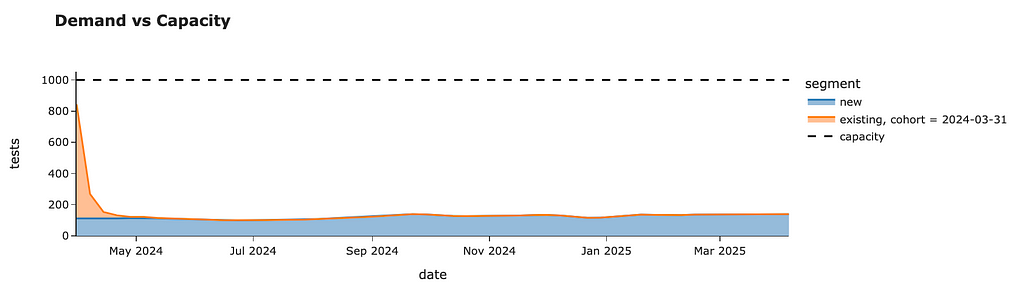
Let’s start with the week of 31st March 2024. As we saw before, we have a spare capacity for 888 tests. If we launch our test to 100% of existing customers, we will get ~2.4K tests to check in the first week. So, we are ready to roll out only to a portion of all customers. Let’s calculate it.
Since we will make several iterations, we need to track the percentage of existing customers for whom we’ve enabled the new feature. Also, it’s worth checking whether we’ve already processed all the customers to avoid double-counting.
enabled_user_share = 0

# if we can process more customers than are left, update the number
if next_group_share > 1 - enabled_user_share:
    print('exceeded')
    next_group_share = round(1 - enabled_user_share, 2)

enabled_user_share += next_group_share
# 0.35
Also, saving our rollout plan in a separate variable will be helpful.
Now, we need to estimate the expected demand from this batch. Launching tests for 35% of customers on 31st March will lead to some demand not only in the first week but also in the subsequent weeks. So, we need to calculate the total demand from this batch and add it to our plans.
# copy the model next_group_demand_df = existing_model_df.copy().reset_index()
# calculate the dates from cohort + week number next_group_demand_df['date'] = next_group_demand_df.num_week.map( lambda x: (datetime.datetime.strptime(cohort, '%Y-%m-%d') + datetime.timedelta(7*x)) )
We are utilising most of our capacity for the first week. We still have some free resources, but it was our conscious decision to keep some buffer for sustainability. We can see that there’s almost no demand from this batch after 3 weeks.
With that, we’ve finished the first iteration and can move on to the following week — 4th April 2024. We can check an additional 706 cases during this week.
We can repeat the whole process for this week and move to the next one. We can iterate to the point when we launch our project to 100% of existing customers (enabled_user_share equals to 1).
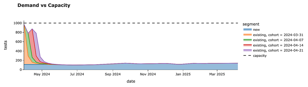
We can roll out our tests to all customers without breaching the 1K tests per week capacity constraint within just four weeks. In the end, we will have the following weekly forecast.
We can also look at the rollout plan we’ve logged throughout our simulations. So, we need to launch the test for randomly selected 35% of customers on the week of 31st March, then for the next 20% of customers next week, followed by 25% and 20% of existing users for the remaining two weeks. After that, we will roll out our project to all existing students.
So, congratulations. We now have a plan for how to roll out our feature sustainably.
Tracking students’ performance over time
We’ve already done a lot to estimate demand. We’ve leveraged the idea of simulation by imitating the launch of our project a year ago, scaling it and assessing the consequences. So, it’s definitely a simulation example.
However, we mostly used the basic tools you use daily — some Pandas data wrangling and arithmetic operations. In the last part of the article, I would like to show you a bit more complex case where we will need to simulate the process for each customer independently.
Product requirements often change over time, and it happened with our project. You, with a team, decided that it would be even better if you could allow your students to track progress over time (not only once at the very beginning). So, we would like to offer students to go through a performance test after each module (if more than one month has passed since the previous test) or if the student returned to the service after three months of absence.
Now, the criteria for test assignments are pretty tricky. However, we can still use the same approach by looking at the data for the previous year. However, this time, we will need to look at each customer’s behaviour and define at what point they would get a test.
We will take into account both new and existing customers since we want to estimate the effects of follow-up tests on all of them. We don’t need any data before the launch because the first test will be assigned at the next active transaction, and all the history won’t matter. So we can filter it out.
sim_df = df[df.date >= '2023-03-31']
Let’s also define a function that calculates the number of days between two date strings. It will be helpful for us in the implementation.
Let’s start with one user and discuss the logic with all the details. First, we will filter events related to this user and convert them into the list of dictionaries. It will be way easier for us to work with such data.
To simulate our product logic, we will be processing user events one by one and, at each point, checking whether the customer is eligible for the evaluation.
Let’s discuss what variables we need to maintain to be able to tell whether the customer is eligible for the test or not. For that, let’s recap all the possible cases when a customer might get a test:
If there were no previous tests -> we need to know whether they passed a test before.
If the customer finished the module and more than one month has passed since the previous test -> we need to know the last test date.
If the customer returns after three months -> we need to store the date of the last lesson.
To be able to check all these criteria, we can use only two variables: the last test date (None if there was no test before) and the previous lesson date. Also, we will need to store all the generated tests to calculate them later. Let’s initialise all the variables.
Now, we need to iterate by event and check the criteria.
for rec in user_events:
  pass
Let’s go through all our criteria, starting from the initial test. In this case, last_test_date will be equal to None. It’s important for us to update the last_test_date variable after “assigning” the test.
if last_test_date is None: # initial test
    last_test_date = rec['date']
    # TBD saving the test info
In the case of the finished module, we need to check that it’s the last lesson in the module and that more than 30 days have passed.
if (rec['lesson_num'] == 100) and (days_diff(last_test_date, rec['date']) >= 30):
    last_test_date = rec['date']
    # TBD saving the test info
The last case is that the customer hasn’t used our service for three months.
if (days_diff(last_lesson_date, rec['date']) >= 30):
    last_test_date = rec['date']
    # TBD saving the test info
Besides, we need to update the last_lesson_date at each iteration to keep it accurate.
We’ve discussed all the building blocks and are ready to combine them and do simulations for all our customers.
import tqdm tmp_gen_tests = []
for user_id in tqdm.tqdm(sim_raw_df.user_id.unique()): # initialising variables last_test_date = None last_lesson_date = None
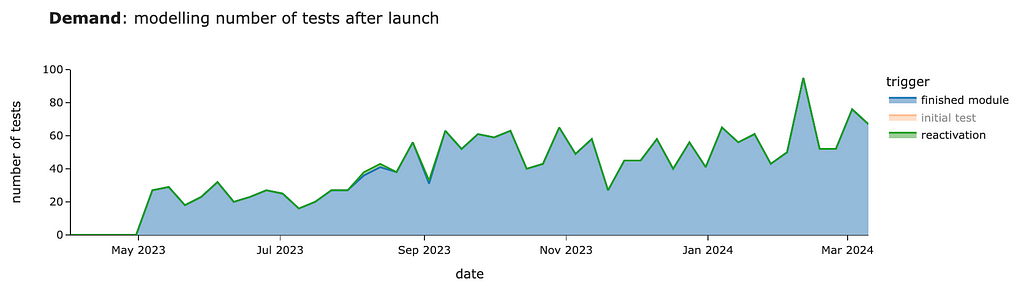
We got quite a similar estimation for the initial test. In this case, the “initial test” segment equals the sum of new and existing demand in our previous estimations.
So, looking at other segments is way more interesting since they will be incremental to our previous calculations. We can see around 30–60 cases per week from customers who finished modules starting in May.
There will be almost no cases of reactivation. In our simulation, we got 4 cases per year in total.
Congratulations! Now the case is solved, and we’ve found a nice approach that allows us to make precise estimations without advanced math and with only simulation. You can use similar
You can find the full code for this example on GitHub.
Summary
Let me quickly recap what we’ve discussed today:
The main idea of computer simulation is imitation based on your data.
In many cases, you can reframe the problem from predicting the future to using the data you already have and simulating the process you’re interested in. So, this approach is quite powerful.
In this article, we went through an end-to-end example of scenario estimations. We’ve seen how to structure complex problems and split them into a bunch of more defined ones. We’ve also learned to deal with constraints and plan a gradual rollout.
Thank you a lot for reading this article. If you have any follow-up questions or comments, please leave them in the comments section.
Reference
All the images are produced by the author unless otherwise stated.
How to Implement Knowledge Graphs and Large Language Models (LLMs) Together at the Enterprise Level
A survey of the current methods of integration
Large Language Models (LLMs) and Knowledge Graphs (KGs) are different ways of providing more people access to data. KGs use semantics to connect datasets via their meaning i.e. the entities they are representing. LLMs use vectors and deep neural networks to predict natural language. They are often both aimed at ‘unlocking’ data. For enterprises implementing KGs, the end goal is usually something like a data marketplace, a semantic layer, to FAIR-ify their data or to make their enterprise more data-centric. These are all different solutions with the same end goal: making more data available to the right people faster. For enterprises implementing an LLM or some other similar GenAI solution, the goal is often similar: to provide employees or customers with a ‘digital assistant’ that can get the right information to the right people faster. The potential symbiosis is clear: some of the main weaknesses of LLMs, that they are black-box models and struggle with factual knowledge, are some of KGs’ greatest strengths. KGs are, essentially, collections of facts, and they are fully interpretable. But exactly how can and should KGs and LLMs be implemented together at an enterprise?
When I was searching for a job last year, I had to write a lot of cover letters. I used ChatGPT to help — I’d copy my existing cover letter into the prompt window, along with my resume and the job description of the job I was applying for, and ask ChatGPT to do the rest. ChatGPT helped me gain momentum with some pretty solid first drafts, but unchecked, it also gave me years of experience I didn’t have and claimed I went to schools I never attended.
I bring up my cover letter because 1) I think it is a great example of the strengths and weaknesses of LLMs, and why KGs are an important part of their implementation and 2) this use case is not that different from what many large enterprises are using LLMs for currently: automated report generation. ChatGPT does a pretty good job of recreating a cover letter by changing the content to be more focused on a specific job description, as long as you explicitly include the existing cover letter and job description in the prompt. Ensuring the LLM has the right content is where a KG comes in. If you simply write, ‘write me a cover letter for a job I want,’ the results are going to be laughable. Additionally, the cover letter example is a great application of an LLM because it is about summarizing and restructuring language. Remember what the second L in LLM stands for? LLMs have, historically, focused on unstructured data (text) and that is where they excel, whereas KGs excel at integrating structured and unstructured data. You can use the LLM to write the cover letter but you should use a KG to make sure it has the right resume.
Note: I am not an AI expert but I also don’t really trust anyone who pretends to be. This space is changing so fast that it is impossible to keep up, let alone predict what the future of AI implementation at the enterprise level will look like. I describe some of the ways KGs and LLMs are being integrated currently, as I see it. This is not a comprehensive list and I am open to additions and suggestions.
The two ways KGs and LLMs are related
There are two ways KGs and LLMs are interacting right now: LLMs as tools to build KGs and KGs as inputs into LLM or GenAI applications. Those of us working in the knowledge graph space are in the weird position of building things that are expected to improve AI applications, while AI simultaneously changes the way we build those things. We are expected to optimize AI as a tool in our day to day while changing our output to facilitate AI optimization. These two trends are related and often overlap, but I’ll discuss them one at a time below.
Using LLMs to assist in the KG creation and curation process
LLMs are valuable tools for building KGs. One way to leverage LLM technology in the KG curation process is by vectorization (or embedding) your KG in a vector database. A vector database (or a vector store) is a database built to store vectors or lists of numbers. Vectorization is one of, if not the, core technological component driving language models. These models, through incredible amounts of training data, learn to associate words with vectors. The vectors capture semantic and syntactic information about the word based on its context in the training data. By using an embedding service trained using these incredible amounts of data, we can leverage that semantic and syntactic information in our KG.
Note: vectorizing your KG is by no means the only way to use LLM-tech in KG curation and construction. Also, none of these applications of LLMs are new to KG creation. NLP has been used for decades for entity extraction for example, LLM is just a new capability to assist the ontologist/taxonomist.
Some of the ways LLMs can help in the KG creation process are:
Entity resolution:Entity resolution is the process of aligning records that refer to the same real-world entity. For example, acetaminophen, a common pain reliever used in the US and sold under the brand name Tylenol, is called paracetamol in the UK and sold under the brand name Panadol. These four names are nothing alike, but If you were to embed your KG into a vector database, the vectors would have the semantic understanding to know that these entities are closely related.
Tagging of unstructured data: Suppose you want to incorporate some unstructured data into your KG. You have a bunch of PDFs with vague file names but you know there is important information in those documents. You need to tag these documents with file type and topic. If your topical taxonomy and document type taxonomy have been embedded, all you need to do is vectorize the documents and the vector database will identify the most relevant entities from each taxonomy.
Entity and class extraction: Create or enhance a controlled vocabulary like an ontology or a taxonomy based on a corpus of unstructured data. Entity extraction is similar to tagging but the goal here is about enhancing the ontology rather than incorporating unstructured data into KG. Suppose you have a geographic ontology and you want to populate it with instances of towns, cities, states, etc. You can use an LLM to extract entities from a corpus of text to populate the ontology. Likewise, you can use the LLM to extract classes and relationships between classes from the corpus. Suppose you forgot to include ‘capital’ in your ontology. The LLM might be able to extract this as a new class or a property of a city.
Using KGs to power and govern GenAI pipelines
There are several reasons to use a KG to power and govern your GenAI pipelines and applications. According to Gartner, “Through 2025, at least 30% of GenAI projects will be abandoned after proof of concept (POC) due to poor data quality, inadequate risk controls, escalating costs or unclear business value.” KGs can help improve data quality, mitigate risks, and reduce costs.
Data governance, access control, and regulatory compliance
Only authorized people and applications should have access to certain data and for certain purposes. Usually, enterprises want certain types of people (or apps) to chat with certain types of data, in a well-governed way. How do you know which data should go into which GenAI pipeline? How can you ensure PII does not make its way into the digital assistant you want all of your employees to chat with? The answer is data governance. Some additional points:
Policies and regulations can change, especially when it comes to AI. Even if your AI apps are compliant now, they might not be in the future. A good data governance foundation allows an enterprise to adapt to these changing regulations.
Sometimes, the correct answer to a question is ‘I don’t know,’ or ‘you don’t have access to the information required to answer that question,’ or ‘it is illegal or unethical for me to answer that question.’ The quality of responses is more than just a matter of truth or accuracy but also of regulatory compliance.
KGs can also help improve overall data quality — if your documents are filled with contradictory and/or false statements, do not be surprised when your ChatBot tells you inconsistent and false things. If your data is poorly structured, storing it in one place isn’t going to help. That is how the promise of data lakes became the scourge of data swamps. Likewise, if your data is poorly structured, vectorizing it isn’t going to solve your problems, it’s just going to create a new headache: a vectorized data swamp. If your data is well structured, however, KGs can provide LLMs with additional relevant resources to generate more personalized and accurate recommendations in several ways. There are different ways of using KGs to improve the accuracy of an LLM, but they generally fall under the category of natural language querying (NLQ)— using natural language to interact with databases. The current ways NLQ is being implemented, as far as I know, are through RAG, prompt-to-query, and fine-tuning.
Retrieval-Augmented Generation (RAG): RAG means supplementing a prompt with additional relevant information outside of the training data to generate a more accurate response. While LLMs have been trained on vast amounts of data, they have not been trained on your data. Think of the cover letter example above. I could ask an LLM to ‘write a cover letter for Steve Hedden for a job in product management at TopQuadrant’ and it would return an answer but it would contain hallucinations. A smarter way of doing that would be for the model to take this prompt, retrieve the LinkedIn profile for Steve Hedden, retrieve the job description for the open position at TopQuadrant, and then write the cover letter. There are currently two prominent ways of doing this retrieval: by vectorizing the graph or by turning the prompt into a graph query (prompt-to-query).
Vector-based retrieval: This method of retrieval requires that you vectorize your KG and store it in a vector store. If you then vectorize your natural language prompt, you can find vectors in the vector store that are most similar to your prompt. Since these vectors correspond to entities in your graph, you can return the most ‘relevant’ entities in the graph given a natural language prompt. This is the exact same process described above under the tagging capability — we are essentially ‘tagging’ a prompt with relevant tags from our KG.
Prompt-to-query retrieval: Alternatively, you could use an LLM to generate a SPARQL or Cypher query and use that query to get the most relevant data from the graph. Note: you can use the prompt-to-query method to query the database directly, without using the results to supplement a prompt to an LLM. This would not be an application of RAG, since you are not ‘augmenting’ anything. This method is explained in more detail below.
Some additional pros, cons, and notes on RAG and the two retrieval methods:
RAG requires, by definition, a knowledge base. A knowledge graph is a knowledge base, and so proponents of KGs are going to be proponents of RAG powered by graphs (sometimes called GraphRAG). But RAG can be implemented without a knowledge graph.
RAG can supplement a prompt based on the most relevant data from your KG based on the content of the prompt, but also the metadata from the prompt. For example, we can customize the response based on who asked the question, what they have access to, and additional demographic information about them.
As described above, one benefit of using the vector-based retrieval method is that if you have embedded your KG into a vector database for tagging and entity resolution, the hard part is already done. Finding the most relevant entities related to a prompt is no different than tagging a chunk of unstructured text with entities from a KG.
RAG provides some level of explainability in the response. The user can now see the supplemental data that went into their prompt, along with, potentially, where the answer to their question lives in that data.
I mentioned above that AI is affecting the way we build KGs while we are expected to build KGs that facilitate AI. The prompt-to-query approach is a perfect example of this. The schema of the KG will affect how well an LLM can query it. If the purpose of the KG is to feed an AI application, then the ‘best’ ontology is no longer a reflection of reality but a reflection of the way AI sees reality.
In theory, more relevant information should reduce hallucinations, but that does not mean RAG eliminates hallucinations. We are still using a language model to generate a response, so there is still plenty of room for uncertainty and hallucinations. Even with my resume and job description, an LLM might still exaggerate my experience. For the text to query approach, we are using the LLM to generate the KG query and the response, so there are actually two places for potential hallucinations.
Likewise, RAG offers some level of explainability, but not entirely. For example, if we used vector-based retrieval, the model can tell us which entities it included because they were the most relevant, but it can’t explain why those were the most relevant. If using an auto-generated KG query, the auto-generated query ‘explains’ why certain data was returned by the graph, but the user will need to understand SPARQL or Cypher to fully understand why those data were returned.
These two approaches are not mutually exclusive and many companies are pursuing both. For example, Neo4j has tutorials on implementing RAG with vector-based retrieval, and on prompt-to-query generation. Anecdotally, I am writing this just after attending a conference with a heavy focus on KG and LLM implementation in life sciences, and many of the life sciences companies I saw give presentations are doing some combination of vector-based and prompt-to-query RAG.
Prompt-to-query alone: Use an LLM to translate a natural language query into a formal query (like in SPARQL or Cypher) for your KG. This is the same as the prompt-to-query retrieval approach to RAG described above, except that we don’t send the data to an LLM after it is retrieved. The idea here is that by using the LLM to generate the query and not interpret the data, you are reducing hallucinations. Though, as mentioned above, it doesn’t matter what the LLM generates, it can contain hallucinations. The argument for this approach is that it is easier for the user to detect hallucinations in the auto-generated query than in an auto-generated response. I am somewhat skeptical about that since, presumably, many users who use an LLM to generate a SPARQL query will not know SPARQL well enough to detect issues with the auto-generated query.
Anyone implementing a RAG solution using prompt-to-query retrieval can also implement prompt-to-query alone. These include: Neo4j,Ontotext, and Stardog.
KGs for fine-tuning LLMs: Use your KG to provide additional training to an off-the-shelf LLM. Rather than provide the KG data as part of the prompt at query time (RAG), you can use your KG to train the LLM itself. The benefit here is that you can keep all of your data local — you don’t need to send your prompts to OpenAI or anyone else. The downside is that the first L in LLM stands for large and so downloading and fine-tuning one of them is resource intensive. Additionally, while a model fine-tuned on your enterprise or industry-specific data is going to be more accurate, it will not eliminate hallucinations altogether. Some additional thoughts on this:
Once you use the graph to fine-tune the model, you also lose the ability to use the graph for access control.
There are LLMs that have already been fine-tuned for different industries like MedLM for healthcare and SecLM for cybersecurity.
Depending on the use case, a fine-tuned LLM might not be necessary. For example, if you are largely using the LLM to summarize news articles, the LLM might not need special training.
Rather than fine-tuning the LLM with industry specific information, some are using LLMs fine-tuned to generate code (like Code Llama) as part of their prompt-to-query solution.
Notable players implementing or enabling this solution (alphabetically): As far as I know, Stardog’s Voicebox is the only solution that uses a KG to fine-tune an LLM for the customer.
A note on the different ways of integrating KGs and LLMs I have listed here: These categories (RAG, prompt-to-query, and fine-tuning) are neither comprehensive nor mutually exclusive. There are other ways of implementing KGs and LLMs and there will be more in the future. Also, there is considerable overlap between these solutions and you can combine solutions. You can run a vector-based and prompt-to-query RAG hybrid solution on a fine-tuned model, for example.
Efficiency and scalability
Building many separate apps that do not connect is inefficient and what Dave McComb refers to as a software wasteland. It doesn’t matter that the apps are ‘powered by AI’. Siloed apps result in duplicative data and code and overall redundancies. KGs provide a foundation for eliminating these redundancies through the smooth flow of data throughout the enterprise.
Gartner’s claim above is that many GenAI projects will be abandoned due to escalating costs, but I don’t know whether a KG will significantly reduce those costs. I don’t know of any studies or cost-benefit analyses done to support that claim. Developing an LLM-powered ChatBot for an enterprise is expensive, but so is developing a KG.
Conclusion
I won’t pretend to know the ‘optimal’ solution and, like I said above, I think anyone who pretends to know the future of AI is full of it. I do believe that both KGs and LLMs are useful tools for anyone trying to make more data available to the right people faster, and that they each have their strengths and weaknesses. Use the LLM to write the cover letter (or regulatory report), but use the KG to make sure you give it the right resume (or studies or journal articles or whatever).
Generally speaking, I believe in using AI as much as possible to build, maintain, and extend knowledge graphs, and also that KGs are necessary for enterprises looking to adopt GenAI technologies. This is for several reasons: data governance, access control, and regulatory compliance; accuracy and contextual understanding; and efficiency and scalability.
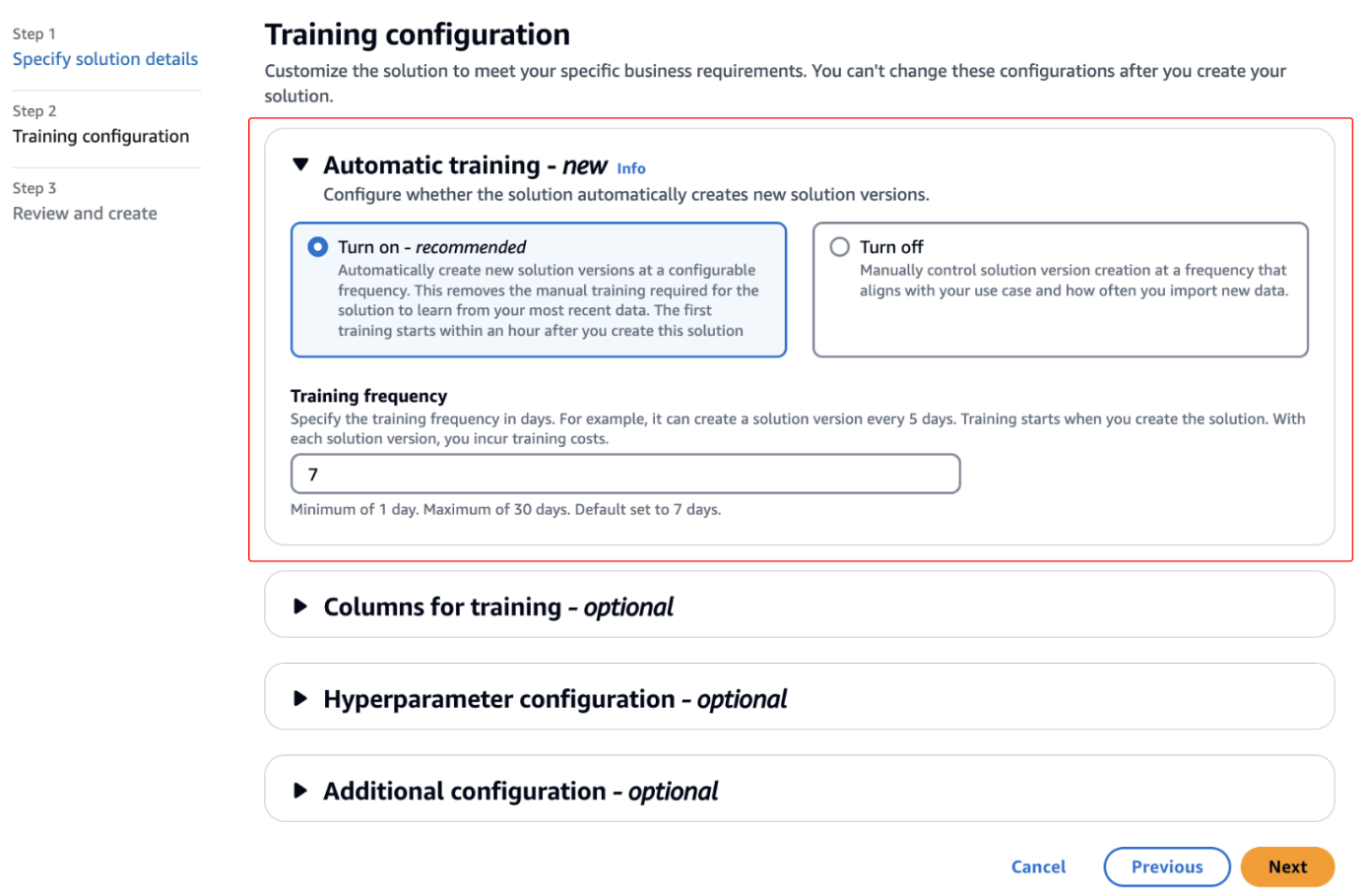
Amazon Personalize is excited to announce automatic training for solutions. Solution training is fundamental to maintain the effectiveness of a model and make sure recommendations align with users’ evolving behaviors and preferences. As data patterns and trends change over time, retraining the solution with the latest relevant data enables the model to learn and adapt, […]
We use cookies on our website to give you the most relevant experience by remembering your preferences and repeat visits. By clicking “Accept”, you consent to the use of ALL the cookies.
This website uses cookies to improve your experience while you navigate through the website. Out of these, the cookies that are categorized as necessary are stored on your browser as they are essential for the working of basic functionalities of the website. We also use third-party cookies that help us analyze and understand how you use this website. These cookies will be stored in your browser only with your consent. You also have the option to opt-out of these cookies. But opting out of some of these cookies may affect your browsing experience.
Necessary cookies are absolutely essential for the website to function properly. These cookies ensure basic functionalities and security features of the website, anonymously.
Cookie
Duration
Description
cookielawinfo-checkbox-analytics
11 months
This cookie is set by GDPR Cookie Consent plugin. The cookie is used to store the user consent for the cookies in the category "Analytics".
cookielawinfo-checkbox-functional
11 months
The cookie is set by GDPR cookie consent to record the user consent for the cookies in the category "Functional".
cookielawinfo-checkbox-necessary
11 months
This cookie is set by GDPR Cookie Consent plugin. The cookies is used to store the user consent for the cookies in the category "Necessary".
cookielawinfo-checkbox-others
11 months
This cookie is set by GDPR Cookie Consent plugin. The cookie is used to store the user consent for the cookies in the category "Other.
cookielawinfo-checkbox-performance
11 months
This cookie is set by GDPR Cookie Consent plugin. The cookie is used to store the user consent for the cookies in the category "Performance".
viewed_cookie_policy
11 months
The cookie is set by the GDPR Cookie Consent plugin and is used to store whether or not user has consented to the use of cookies. It does not store any personal data.
Functional cookies help to perform certain functionalities like sharing the content of the website on social media platforms, collect feedbacks, and other third-party features.
Performance cookies are used to understand and analyze the key performance indexes of the website which helps in delivering a better user experience for the visitors.
Analytical cookies are used to understand how visitors interact with the website. These cookies help provide information on metrics the number of visitors, bounce rate, traffic source, etc.
Advertisement cookies are used to provide visitors with relevant ads and marketing campaigns. These cookies track visitors across websites and collect information to provide customized ads.