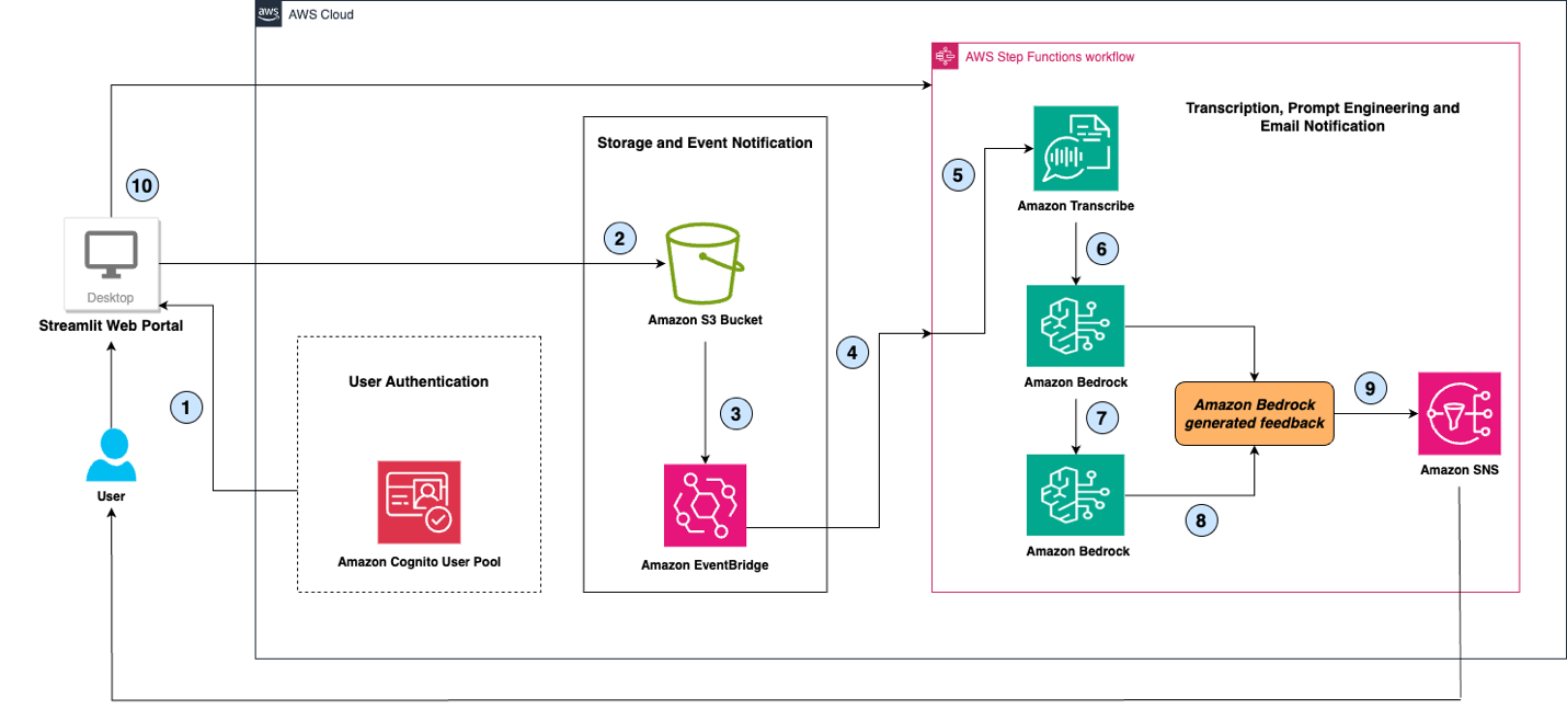
In this post, we present an Amazon Bedrock powered virtual assistant that can transcribe presentation audio and examine it for language use, grammatical errors, filler words, and repetition of words and sentences to provide recommendations as well as suggest a curated version of the speech to elevate the presentation.
In this post, we discuss Bria’s family of models, explain the Amazon SageMaker platform, and walk through how to discover, deploy, and run inference on a Bria 2.3 model using SageMaker JumpStart.
Dataflow Architecture—Derived Data Views and Eventual Consistency
A (not-so) brief history of a health & fitness data pipeline: part ii
Welcome to part ii of our coming-of-age trilogy on a public health and fitness data pipeline.
In this chapter, we reimagine the backend system as a distributed state machine and explore the art of achieving consistency — with a functional flavour.
A quick recap of part i
The evolution of a data pipeline
In part I, we watchedSmartGym grow into (version 2.1), an integrated health and fitness platform that streams, processes, and saves data from a range of gym equipment sensors and medical devices. These data provided insights that empowered users to take more active ownership of their personal health and fitness.
SmartGym shoulder press
As our system evolved from merely saving and retrieving data to responding to a real-world events, our architecture had to reflect this paradigm shift — from a request-driven to an event-driven one.
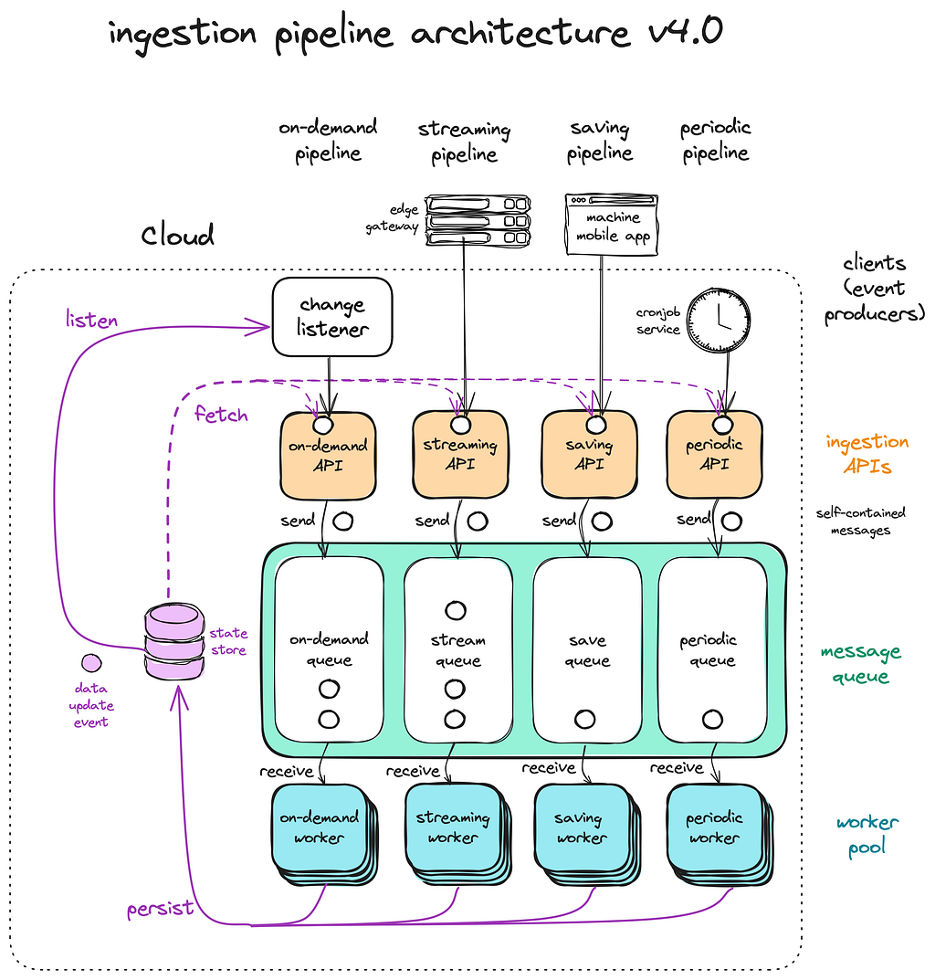
An event-driven ingestion pipeline
There were two pipelines that kept the lights on:
Streaming pipeline: data is continuously streamed from sensors, processed, and stored in a buffer.
Saving pipeline: when the user ends a session, the buffered data is processed and saved in the database, as a record that represents the user session (a single workout).
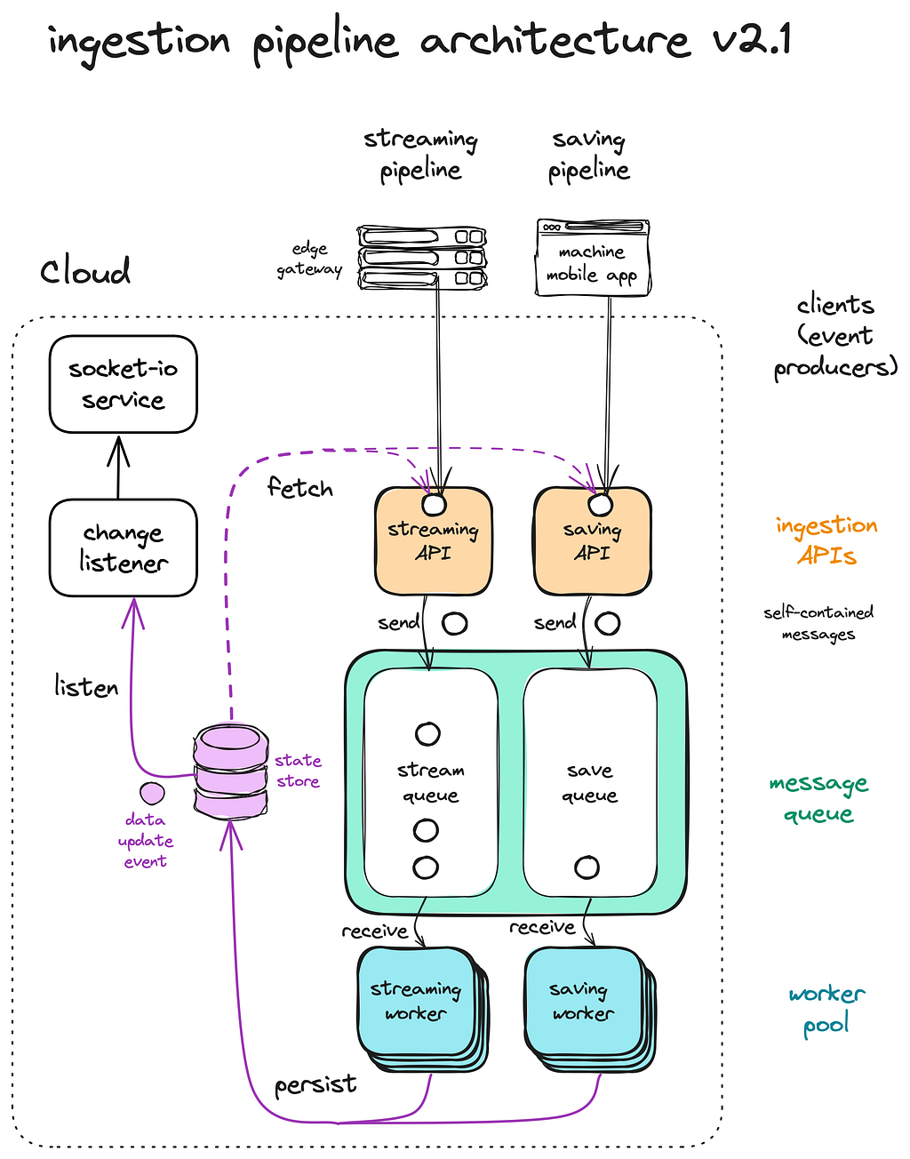
Streaming and Saving pipelines
The event-driven architecture was a double-edged sword, introducing both order and chaos. Ultimately, we watched it evolve into a well-oiled machine capable of taming its complexities.
Part ii: the evolution goes on
In this installment, we’ll explore the next three versions of the system, each enhancing a user’s workout experience in a different way:
v3.0: fitness as a personalised experience
v4.0: fitness as a collective experience
v5.0: fitness as a personalised-collective experience
But first, meet the main character of this article!
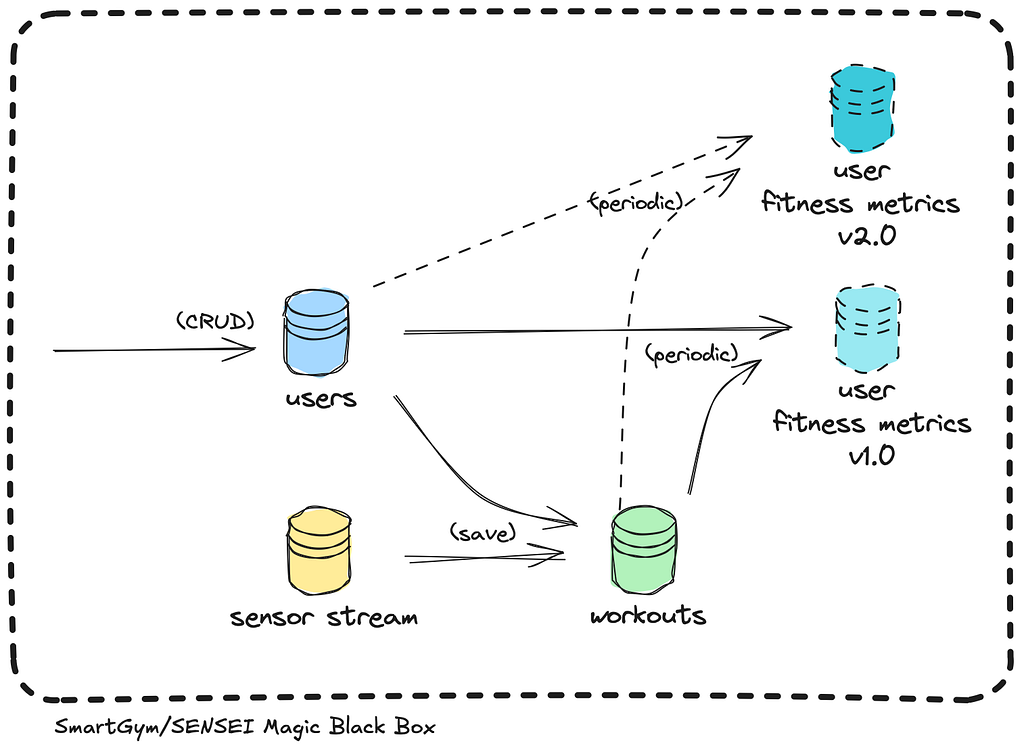
The Magic Black Box
Be it distributed, event-driven, or not, we can think of the SmartGym/SENSEI backend system as a magic black box.
Input: We feed this black box new information — e.g. users info, sensor data
State Transition: This new information interacts with its existing state based on a certain logic, resulting in a new internal state.
Output: At any time, we can query its internal state to retrieve relevant information — e.g. user workout information
The Magic Black Box is deterministic: if you take two identical black boxes with the same state and logic, feed them with the same inputs in the same order, both will end up with identical internal states.
Inside the black box
If we tear it apart, we’ll find there’s nothing truly magical — just a dataflow architecture comprising a bunch of data views and ingestion pipelines.
Sources of truth (solid), derived data views (dotted) and stream/save pipeline logic (arrows)
There are two main types of data views:
1. Source of truth (solid line) — e.g. users, sensor stream
New data is first written here. These are original, authoritative data — typically represented exactly once in a normalised way.
The system’s state is a function of these sources of truth and the state transition logic — a reflection of the sequence of events that have transformed it over time.
2. Derived data (dotted line) — e.g. workouts
This data is processed from existing data in other views, usually involving denormalization, aggregation, or transformation. It is precomputed for efficient future queries.
Derived data is redundant, effectively “duplicating” existing information; if it is lost, it can always be re-derived from the original source.
The process of deriving data views from sources of truth is known as materialisation, a deterministic task handled by workers in the ingestion pipeline.
All internal state of the magic box are encapsulated within these data views, while the ingestion pipeline — the machinery behind the materialisation process — remains stateless.
Note that whenever the source of truth changes, the derived data has to be re-derived. Else, the state transition is incomplete and the magic black box is left in an inconsistent state.
v2.1 dataflow architecture
In the previous example, we feed the magic black box:
user details through our CRUD API
sensor telemetry through an event stream (streaming pipeline)
These inputs serve as sources of truth, reflecting real-world entities or events.
From these two pieces of information, we derive a single workout session record in the saving pipeline.
Now, you might be offended by Mr. Magic Black Box mansplaining what appears to be common sense to you. But bear with him because he would prove to be a useful abstraction throughout this article.
v3.0 — Metrics, dashboards, insights: fitness as a personalised experience
With the streaming and saving pipelines working tirelessly to ingest data into the system, our database now houses a wealth of user and workout records. We are empowered to provide meaningful macro insights by analysing trends, groups, averages, and totals for our users and stakeholders.
SmartGym product metrics dashboard prototype
User insights and fitness metrics
This is where SmartGym’s vision of becoming “every citizen’s #1 fitness companion” begins to take shape. Beyond giving real-time feedback during my workout, recalling my historical performance, and telling me what a great job I’ve done — a diligent fitness companion provides tangible metrics to measure my improvement in performance over time.
SmartGym user workout insights page
By leveraging recent workouts and user information — such as body metrics captured by the SmartGym weighing scale — we can estimate various performance metrics, including:
1RM (1 Rep Max) for weight-based workouts (e.g. leg press)
Max reps per minute for bodyweight workouts (e.g. push-ups)
VO2 max or MET (Metabolic Equivalent) for cardio workouts (e.g. treadmill)
Deriving both product and fitness metrics typically involves denormalization and aggregation across records, which can be resource-intensive in terms of memory usage, database reads, and network throughput.
Since it doesn’t make sense to run these operations every time a user loads the dashboard, we need a precomputed intermediate data representation, ready for query and visualisation — another derived data view for user fitness metrics!
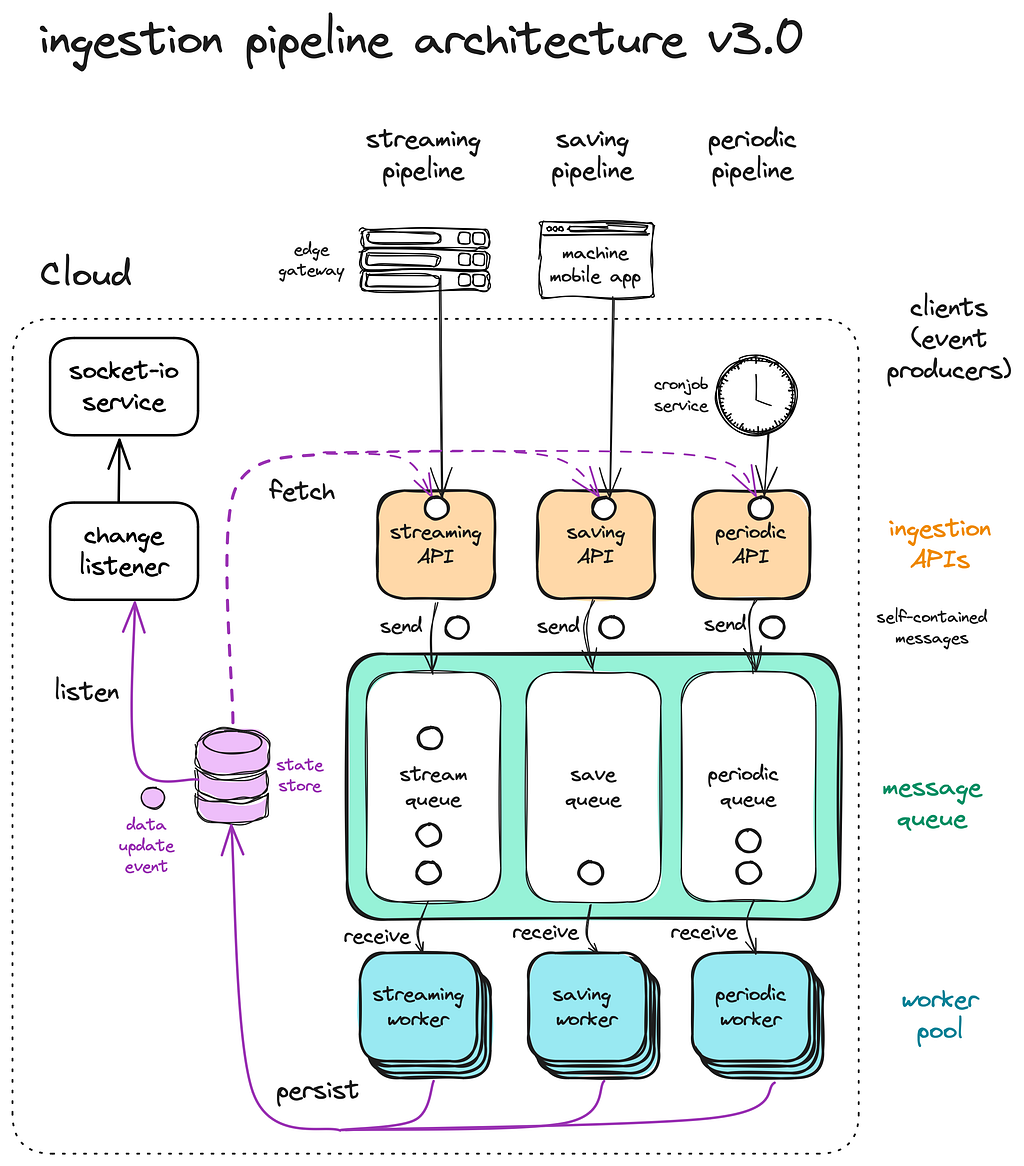
The periodic processing pipeline
Let’s return to our magic black box.
v3.0 dataflow architecture
As new users and workout records continuously flow in, user fitness metrics — a derived data view — require continuous updates in response to changes in the upstream data views they rely on.
To address this, we decided to recompute user fitness metrics periodically, accepting that these metrics may be a few hours stale.
Our ingestion pipeline now includes a cronjob service that schedules batch processing jobs within the periodic pipeline based on a preconfigured schedule, ensuring timely updates without overloading the system.
Streaming, Saving, and Periodic pipelines
v4.0 — Gamification: fitness as a collective experience
Moving from individuals to community
Staying fit is difficult work. But with a healthy dose of competition and collective suffering, it can be an experience that feels larger than life. Imagine if every rep, every set, and every workout session contributed to something greater.
Introducing exercise leaderboard and fitness challenges.
Exercise leaderboard
The leaderboard showcases users who have logged the most effort over the month — measured by distance run, weights lifted, and more.
Boy, did this feature stroke some egos! Some of the gym regulars started renaming their randomly-generated username with titles like “Beefy” or “Armstrong”. For many others, surveying the leaderboard became the first order of business upon entering the gym, and the same post-workout ritual before strutting out with newfound swagger.
SmartGym leaderboard
Similar to how we compute product and user fitness metrics, the leaderboard data is updated periodically in batches, derived from user profiles and their historical workout data.
Fitness challenge system
In collaboration with the gym management team, we launched a fitness challenge to coincide with periods such as Singapore’s National Day.
SmartGym fitness challenge at Our Tampines Hub
Each day, users received a challenge requiring them to complete a specific number of reps on a weighted machine or spend a certain number of minutes on a cardio machine, earning rewards for their hard work.
This kickstarted a series of diverse fitness challenges, each featuring unique gameplay variations in terms of duration, workout types, intensity, streaks, and more.
SmartGym fitness challenge UI
Configurable rules: rule engines and syntax trees
At its core, a fitness challenge is a unique set of workout requirements, specified by an administrator. By comparing a user’s workout history to these requirements, we can assess their progress and completion status for the challenge.
Rules syntax tree: representing one set of chest-press/leg-press/treadmill workout
Instead of cluttering our codebase with a new bunch of if-else statements for each variation of the fitness challenge, we externalised the business logic by representing these logical rules in a syntax tree. During runtime, the rule engine parses this tree and evaluates it against users’ actual workout histories to track their challenge progress.
Runtime evaluation of syntax tree
When the program admin modifies the parameters of a fitness challenge, they are directly updating the underlying rules syntax tree. This same data structure is shared between the backend rules engine and the frontend rules configuration page, ensuring consistency and ease of management.
SmartGym fitness challenge configuration page
The on-demand processing pipeline
Lets revisit our magic black box.
v4.0 dataflow architecture
User fitness challenge results, derived from the workouts and user fitness challenge data through the rules engine, need to be recalculated whenever changes occur in the upstream data views they depend on — such as each time a user completes a workout set.
Among our enthusiastic users, these fitness challenges are a matter of honour and glory. If they don’t see updated challenge results immediately after finishing a set, they get confused and frustrated. Therefore, we can’t afford to reprocess user fitness challenge results in periodic batches; every change in the workouts data view must be propagated instantly.
To achieve that, we extend our ingestion pipeline with a Change Data Capture mechanism, introducing a service that continuously listens for changes in relevant data views, using built-in database triggers or change streams. This on-demand pipeline triggers a cascade of updates to the downstream derived data views.
In this case, an on-demand worker implements the logic of the rules engine to evaluate user fitness challenges results on the fly.
Unveiling our latest inline-four engine with Streaming, Saving, Periodic, and On-demand pipelines
A recap of the different stages of our ingestion pipeline:
Stream processing: Responsible for ingesting, processing, and storing a stream of live sensor data into a buffer
Save processing: Responsible for consolidating data from the stream buffer, processing, and saving it into the database as a record that represents a single workout or a user session.
Periodic processing: Responsible for precomputing derived data views periodically
On-demand processing: Responsible for propagating updates from upstream data views to derived data views immediately
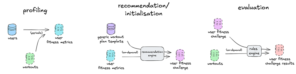
v5.0 — Recommendation: fitness as a personalised-collective experience
What if we could give the fitness challenges a personal touch?
NSFIT x SmartGym
In late 2021, a team from the Singapore Army described their predicament: each year, servicemen must meet specific fitness benchmarks. If they fall short, they are enrolled in a structured training program, known as NSFIT. However, these sessions were limited to specific times, required sign-ups, and needed staff to facilitate and monitor progress. With the ongoing pandemic and social distancing measures then, gathering servicemen for group sessions wasn’t feasible.
Using the SmartGym fitness challenge system, servicemen could carry out their training on their own schedule — no need for staff to hover over every session. All that’s required is for the staff to verify that the training was completed and the standards were met.
Real-time recommendation for treadmill intensity based on fitness profile
But here’s the twist: servicemen come in all shapes, sizes, and fitness levels. A one-size-fits-all fitness challenge just wouldn’t cut it. They need something that meets them where they are, in order to push their fitness to new heights.
So, why not add a recommendation step before curating a user fitness challenge? By leveraging the fitness metrics we already compute (like in v3.0), we could tailor the intensity of their subsequent training sessions.
Our personalized fitness challenge now follows three key steps:
Step 1 — Profiling Using historical workout data, we profile each user’s fitness level.
To further optimise this process, we could expand our profiling methods beyond simple heuristics, incorporating machine learning methods to extract more sophisticated features — resulting in new derived data views.
Step 2 — Recommendation Starting with a generic challenge template (including general information like location, total workouts, participant groups, start/end dates, etc), the recommendation engine fleshes out this skeletal template into a rules syntax tree tailored to each user’s fitness profile.
For even greater personalization, a domain expert could manually fine-tune the challenge requirements, offering a professional perspective beyond algorithmic deduction.
Step 3 — Evaluation Once personalized parameters are embedded into the rules syntax tree, evaluations can be triggered on-demand after the workout is saved, or even performed in real-time against the sensor stream and displayed on the frontend console.
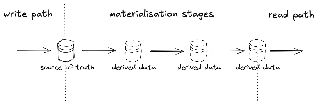
Earlier in the article, we mentioned that the magic black box is composed of data views, where the state lives, and a stateless ingestion pipeline.
To get reliable outputs from the magic black box, these data views must be consistent, achieved through a deterministic series of materialisation in the ingestion pipeline.
Buckle up and brace yourself, because we will be diving deep into consistency and determinism — the undercurrents of dataflow.
The challenge of consistency: a necessary evil
At first glance, it might seem simpler to create one massive data view containing every bit of detail from the raw data. With only one data source, consistency is implied. However, there are several reasons why we need derived data views despite the complexity of maintaining consistency:
Data polymorphism
Data can be represented in a myriad of forms — in different combinations and at multiple levels of granularity — each serving their own unique purpose.
For example, it turns out that a user is not interested in knowing if the 3rd rep of his 2nd set of chest press on September 2020 was fully extended or not — after that real-time window of immediacy, low-level raw details become increasingly irrelevant, while higher-level derived insights become much more valuable.
To avoid having to assume how data will be used and represented in future — raw is better, a.k.a the Sushi Principle.
Read-write performance
With that, we decouple the write model from the range of potential read models, and bridge the gap with a series of materialisation stages. This separation is commonly known as Command and Query Responsibility Segregation (CQRS).
Having a materialisation path gives a piece of data the space and time — to morph and discover its different personalities, enabling:
Faster & simpler writes: a shortened write path by deferring data processing and complex data models to a later stage
Efficient & flexible reads: a shortened read path by computing different derived views in advance
Basis of consistency
By designating the write model as the authoritative source of truth to reason from, it is easier to achieve consistency — without the complexities of having multiple authoritative systems trying to reach a consensus.
There are instances when the raw data grows too rapidly. E.g. with 1 message/sec per treadmill sensor, with multiple gyms, you end up with millions of messages in the sensor stream in just one day.
workouts replacing sensor stream as the new authoritative data view
When the sensor stream grows prohibitively large, we can treat workouts records as a “lossy compression” of the sensor stream, purge the processed sensor stream, and promote the derived workouts records as a new authoritative source of truth.
Since the one-way chain of materialisation still starts from a single source of truth, we retain our basis of consistency.
Anti-fragility: fault recovery and application evolution
Derived views offers resilience. If a bug corrupts the output, we can roll back to previous versions and rerun the materialisation process, ensuring accurate data again.
Derived views also enable gradual evolution of application. You can introduce new data views without deleting or restructuring the old ones, keeping both as independent views of the same data, with the option of falling back if something goes wrong.
Non-breaking evolution of derivation logic
In part one of the series, we’ve seen how the publisher-subscriber (pub/sub) pattern (via a fanout exchange) of the ingestion pipeline makes it easy to extend system functionality in a plug-and-play manner, without disrupting existing pipelines or requiring upstream modifications.
A key to agile development and building anti-fragile systems — those that improve with each bug fix or new feature — is the ease of recovery and evolution. The decoupling enabled by the pub/sub pattern and derived views makes this possible.
The art of consistency and control
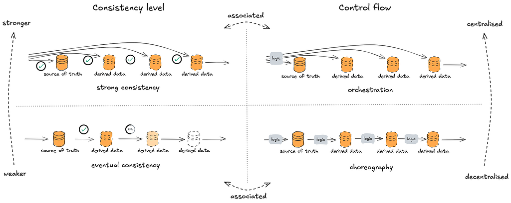
Next, let’s dissect the nature of consistency and control flow of the dataflow architecture.
Broadly speaking, distributed systems can be categorised by two consistency levels — strong or eventual;and two types of control flow — orchestration (centralised) or choreography (decentralised).
Relationship between consistency levels and control flow
Strong consistency guarantees that every read reflects the most recent write. It ensures that all data views are updated immediately and accurately after a change. Strong consistency is typically associated with orchestration, since it often relies on a central coordinator to manage atomic updates across multiple data views — either updating all at once, or none at all. Such “over-engineering” may be required for systems where minor discrepancies can be disastrous, e.g. financial transactions, but not in our case.
Eventual consistency allows for temporary discrepancies between data views, but given enough time, all views will converge to the same state. This approach typically pairs with choreography, where each worker reacts to events independently and asynchronously, without needing a central coordinator.
The asynchronous and loosely-coupled design of the dataflow architecture is characterised by eventual consistency of data views, achieved through a choreography of materialisation logic.
And there are perks to that.
Perks: at the system level
Resilience to partial failures: The asynchrony of choreography is more robust against component failures or performance bottlenecks, as disruptions are contained locally. In contrast, orchestration can propagate failures across the system, amplifying the issue through tight coupling.
Simplified write path: Choreography also reduces the responsibility of the write path, which reduces the code surface area for bugs to corrupt the source of truth. Conversely, orchestration makes the write path more complex, and increasingly harder to maintain as the number of different data representations grows.
Perks: at the human level
The decentralised control logic of choreography allows different materialisation stages to be developed, specialised, and maintained independently and concurrently.
Determinism: the event-driven work ethic (revisited)
The spreadsheet ideal
A reliable dataflow system is akin to a spreadsheet: when one cell changes, all related cells update instantly — no manual effort required.
In an ideal dataflow system, we want the same effect: when an upstream data view changes, all dependent views update seamlessly. Like in a spreadsheet, we shouldn’t have to worry about how it works; it just should.
But ensuring this level of reliability in distributed systems is far from simple. Network partitions, service outages, and machine failures are the norm rather than the exception, and the concurrency in the ingestion pipeline only adds complexity.
Since message queues in the ingestion pipeline provide reliability guarantees, deterministic retries can make transient faults seem like they never happened. To achieve that, our ingestion workers need to adopt the event-driven work ethic:
Pure functions have no free will
In computer science, pure functions exhibit determinism, meaning their behaviour is entirely predictable and repeatable.
They are ephemeral — here for a moment and gone the next, retaining no state beyond their lifespan. Naked they come, and naked they shall go. And from the immutable message inscribed into their birth, their legacy is determined. They always return the same output for the same input — everything unfolds exactly as predestined.
And that is exactly what we want our ingestion workers to be.
Immutable inputs (statelessness) This immutable message encapsulates all necessary information, removing any dependency on external, changeable data. Essentially we are passing data to the workers by value rather than by reference, such that processing a message tomorrow would yield the same result as it would today.
Task isolation
To avoid concurrency issues, workers should not share mutable state.
Transitional states within the workers should be isolated, like local variables in pure functions — without reliance on shared caches for intermediate computation.
It’s also crucial to scope tasks independently, ensuring that each worker handles tasks without sharing input or output spaces, allowing parallel execution without race conditions. E.g. scoping the user fitness profiling task by a particular user_id, since inputs (workouts) are outputs (user fitness metrics) are tied to a unique user.
Deterministic execution Non-determinism can sneak in easily: using system clocks, depending on external data sources, probabilistic/statistical algorithms relying on random numbers, can all lead to unpredictable results. To prevent this, we embed all “moving parts” (e.g. random seeds or timestamp) directly in the immutable message.
Deterministic ordering Load balancing with message queues (multiple workers per queue) can result in out-of-order message processing when a message is retried after the next one is already processed. E.g. Out-of-order evaluation of user fitness challenge results appearing as 50% completion to 70% and back to 60%, when it should increase monotonically. For operations that require sequential execution, like inserting a record followed by notifying a third-party service, out-of-order processing could break such causal dependencies.
At the application level, these sequential operations should either run synchronously on a single worker or be split into separate sequential stages of materialisation.
At the ingestion pipeline level, we could assign only one worker per queue to ensure serialised processing that “blocks” until retry is successful. To maintain load balancing, you can use multiple queues with a consistent hash exchange that routes messages based on the hash of the routing key. This achieves a similar effect to Kafka’s hashed partition key approach.
Idempotent outputs
Idempotence is a property where multiple executions of a piece of code should always yield the same result, no matter how many times it got executed.
For example, a trivial database “insert” operation is not idempotent while an “insert if does not exist” operation is.
This ensures that you get the same outcome as if the worker only executed once, regardless of how many retries it actually took.
Caveat: Note that unlike pure functions, the worker does not “return” an object in the programming sense. Instead, they overwrite a portion of the database. While this may look like a side-effect, you can think of this overwrite as similar to the immutable output of a pure function: once the worker commits the result, it reflects a final, unchangeable state.
Dataflow-ception
Dataflow in client-side applications
Traditionally, we think of web/mobile apps as stateless clients talking to a central database. However, modern “single-page” frameworks have changed the game, offering “stateful” client-side interaction and persistent local storage.
This extends our dataflow architecture beyond the confines of a backend system into a multitude of client devices. Think of the on-device state (the “model” in model-view-controller) as derived view of server state — the screen displays a materialised view of local on-device state, which mirrors the central backend’s state.
Push-based protocols like server-sent events and WebSockets take this analogy further, enabling servers to actively push updates to the client without relying on polling — delivering eventual consistency from end to end.
v5.0 dataflow architecture (extended)
In fact, this real-time synchronization is exactly how we evaluated personalized fitness challenges in the frontend console — as a derived data view residing in a client device.
Even down the stack, we see a semblance of dataflow in databases. Database triggers, stored procedures, and materialized view maintenance routines are not very different from the on-demand and periodic processing pipelines; B-tree indexes and materialised views of a relational database are essentially derived data views— talk about dataflows within dataflows!
Dataflows, dataflows everywhere
“The goal of data integration is to make sure that data ends up in the right form, in all the right places.”
As data systems scale, we should progress beyond seeing them as passive databases manipulated by applications like global variables.
Instead, it is useful to reimagine data systems in an organisation as an interplay of data views, one derived from another, with state changes rippling out from a central source of truth, propagated through functional application code. Dataflows, built upon dataflows.
It’s magic black boxes — all the way down.
Wrapping up
Congratulations on making it this far!
In part I, we evolved from a trivial request-response system into an event-driven system that streams, processes, and saves data from a range of gym equipment sensors and medical devices.
In this second instalment, we expanded upon those saved records and processed them periodically and on-demand. This enabled new features that enhance a user’s workout experience into a more collective yet personalised one. As our ingestion pipeline evolved, so did our dataflow architecture, scaling to meet new demands.
Summary of SmartGym features built upon the ingestion pipeline
The story of our evolution doesn’t end here.
In the next and final part, we explore adding and removing functionality in a plug-and-play manner, paving the way for an ecosystem to emerge from our platform.
Stay tuned…
All images and gifs featured in this article are original works created and captured by the author.
Shoutout to the data engineering bible, a.k.a Designing Data-Intensive Applications — by Martin Kleppmann, for giving me the vocabulary to think about these distributed systems with clarity.
Find out more on the feature development from my teammates
Assessing plausibility and usefulness of data we generated from real data
Synthetic data serves many purposes, and has been gathering attention for a while, partly due to the convincing capabilities of LLMs. But what is «good» synthetic data, and how can we know we managed to generate it ?
Synthetic data is data that has been generated with the intent to look like real data, at least on some aspects (schema at the very least, statistical distributions, …). It is usually generated randomly, using a wide range of models : random sampling, noise addition, GAN, diffusion models, variational autoencoders, LLM, … It is used for many purposes, for instance :
training and education (eg, discovering a new database or teaching a course),
data augmentation (ie, creating new samples to train a model),
sharing data while protecting privacy (especially useful from an open science point of view),
conducting research while protecting privacy.
It is particularily used in software testing, and in sensitive domains like healthcare technology : having access to data that behaves like real data without jeopardizing patients privacy is a dream come true.
Synthetic data quality principles
Individual plausibility
For a sample to be useful it must, in some way, look like real data. The ultimate goal is that generated samples must be indistinguishable from real samples : generate hyper-realistic faces, sentences, medical records, … Obviously, the more complex the source data, the harder it is to generate «good» synthetic data.
Usefulness
In many cases, especially data augmentation, we need more than one realistic sample, we need a whole dataset. And it is not the same to generate a single sample and a whole dataset : the problem is very well known, under the name of mode collapse, which is especially frequent when training a generative adversarial network (GAN). Essentially, the generator (more generally, the model that generates synthetic data) could learn to generate a single type of sample and totally miss out on the rest of the sample space, leading to a synthetic dataset that is not as useful as the original dataset.
For instance, if we train a model to generate animal pictures, and it finds a very efficient way to generate cat pictures, it could stop generating anything else than cat pictures (in particular, no dog pictures). Cat pictures would then be the “mode” of the generated distribution.
This type of behaviour is harmful if our initial goal is to augment our data, or create a dataset for training. What we need is a dataset that is realistic in itself, which in absolute means that any statistic derived from this dataset should be close enough to the same statistic on real data. Statistically speaking, this means that univariate and multivariate distributions should be the same (or at least “close enough”).
Privacy
We will not dive too deep on this topic, which would deserve an article in itself. To keep it short : according to our initial goal, we may have to share data (more or less publicly), which means, if it is personal data, that it should be protected. For instance, we need to make sure we cannot retrieve any information on any given individual of the original dataset using the synthetic dataset. In particular, that means being cautious about outliers, or checking that no original sample was generated by the generator.
One way to consider the privacy issue is to use the differential privacy framework.
Let’s start by loading data and generating a synthetic dataset from this data. We’ll start with the famous `iris` dataset. To generate it synthetic counterpart, we’ll use the Synthetic Data Vault package.
pip install sdv
from sklearn.datasets import load_iris from sdv.single_table import GaussianCopulaSynthesizer from sdv.metadata.metadata import Metadata
data = load_iris(return_X_y=False, as_frame=True) real_data = data["data"]
# train the synthesizer synthesizer = GaussianCopulaSynthesizer(metadata) synthesizer.fit(data=real_data) # generate samples - in this case, # synthetic_data has the same shape as real_data synthetic_data = synthesizer.sample(num_rows=150)
Sample level
Now, we want to test whether it is possible to tell if a single sample is synthetic or not.
With this formulation, we easily see it is fundamentally a binary classification problem (synthetic vs original). Hence, we can train any model to classify original data from synthetic data : if this model achieves a good accuracy (which here means significantly above 0.5), the synthetic samples are not realistic enough. We aim for 0.5 accuracy (if the test set contains half original samples and half synthetic samples), which would mean that the classifier is making random guesses.
As in any classification problem, we should not limit ourself to weak models and give a fair amount of effort in hyperparameters selection and model training.
Now for the code :
import pandas as pd import numpy as np from sklearn.model_selection import train_test_split from sklearn.metrics import accuracy_score from sklearn.ensemble import RandomForestClassifier
In this case, it appears the synthesizer was not able to fool our classifier : the synthetic data is not realistic enough.
Dataset level
If our samples were realistic enough to fool a reasonably powerful classifier, we would need to evaluate our dataset as a whole. This time, it cannot be translated into a classification problem, and we need to use several indicators.
Statistical distributions
The most obvious tests are statistical tests : are the univariate distributions in the original dataset the same as in the synthetic dataset ? Are the correlations the same ?
Ideally, we would like to test N-variate distributions for any N, which can be particularily expensive for a high number of variables. However, even univariate distributions make it possible to see if our dataset is subject to mode collapse.
Now for the code :
import pandas as pd
from scipy.stats import ks_2samp

def univariate_distributions_tests(
  real_data: pd.DataFrame,
  synthetic_data: pd.DataFrame
) -> None:
    for col in real_data.columns:
        if real_data[col].dtype.kind in "biufc":
            stat, p_value = ks_2samp(real_data[col], synthetic_data[col])
            print(f"Column: {col}")
            print(f"P-value: {p_value:.4f}")
            print("Significantly different" if p_value < 0.05 else "Not significantly different")
            print("---")
>>> Column: sepal length (cm) P-value: 0.9511 Not significantly different --- Column: sepal width (cm) P-value: 0.0000 Significantly different --- Column: petal length (cm) P-value: 0.0000 Significantly different --- Column: petal width (cm) P-value: 0.1804 Not significantly different ---
In our case, out of the 4 variables, only 2 have similar distributions in the real dataset and in the synthetic dataset. This shows that our synthesizer fails to reproduce basic properties of this dataset.
Visual inspection
Though no mathematically proof, a visual comparison of the datasets can be useful.
The first method is to plot bivariate distributions (or correlation plots).
We can also represent all the dataset dimensions at once: for instance, given a tabular dataset and its synthetic equivalent, we can plot both datasets using a dimension reduction technique, such as t-SNE, PCA or UMAP. With a perfect synthetizer, the scatter plots should look the same.
Now for the code :
pip install umap-learn
import pandas as pd import seaborn as sns import umap import matplotlib.pyplot as plt
We already see on these plots that the bivariate distributions are not identical between real data and synthetic data, which is one more hint that the synthetization process failed to reproduce high-order relationship between data dimensions.
Now let’s take a look at a representation of the four dimensions at once :
plot(real_data, synthetic_data, kind="umap")
In this image is also clear that the two datasets are distinct from one another.
Information
A synthetic dataset should be as useful as the original dataset. Especially, it should be equivalently useful for prediction tasks, meaning it should capture complex relationships between features. Hence a comparison : TSTR vs TRTR, which mean “Train on Synthetic Test on Real” vs “Train on Real Test on Real”. What does it mean in practice ?
For a given dataset, we take a given task, like predicting the next token or the next event, or predicting a column given the others. For this given task, we train a first model on the synthetic dataset, and a second model on the original dataset. We then evaluate these two models on a common test set, which is an extract of the original dataset. Our synthetic dataset is considered useful if the performance of the first model is close to the performance of the second model, whatever the performance. It would mean that it is possible to learn the same patterns in the synthetic dataset as in the original dataset, which is ultimately what we want (especially in the case of data augmentation).
Now for the code :
import pandas as pd from typing import Tuple from sklearn.model_selection import train_test_split from sklearn.ensemble import RandomForestRegressor
It appears clearly that a certain relationship was learnt by the “real” regressor, whereas the “synthetic” regressor failed to learn this relationship. This hints that the relationship was not faithfully reproduced in the synthetic dataset.
Conclusion
Synthetic data quality evaluation does not rely on a single indicator, and one should combine metrics to get the whole idea. This article displays some indicators that can easily be built . I hope that this article gave you some useful hints on how to do it best in your use case !
In this post, we show how the SageMaker Core SDK simplifies the developer experience while providing API for seamlessly executing various steps in a general ML lifecycle. We also discuss the main benefits of using this SDK along with sharing relevant resources to learn more about this SDK.
Amazon SageMaker Ground Truth is a powerful data labeling service offered by AWS that provides a comprehensive and scalable platform for labeling various types of data, including text, images, videos, and 3D point clouds, using a diverse workforce of human annotators. In addition to traditional custom-tailored deep learning models, SageMaker Ground Truth also supports generative […]
As a machine learning engineer, I frequently see discussions on social media emphasizing the importance of deploying ML models. I completely agree — model deployment is a critical component of MLOps. As ML adoption grows, there’s a rising demand for scalable and efficient deployment methods, yet specifics often remain unclear.
So, does that mean model deployment is always the same, no matter the context? In fact, quite the opposite: I’ve been deploying ML models for about a decade now, and it can be quite different from one project to another. There are many ways to deploy a ML model, and having experience with one method doesn’t necessarily make you proficient with others.
The remaining question is: what are the methods to deploy a ML model, and how do we choose the right method?
Models can be deployed in various ways, but they typically fall into two main categories:
Cloud deployment
Edge deployment
It may sound easy, but there’s a catch. For both categories, there are actually many subcategories. Here is a non-exhaustive diagram of deployments that we will explore in this article:
Diagram of the explored subcategories of deployment in this article. Image by author.
Before talking about how to choose the right method, let’s explore each category: what it is, the pros, the cons, the typical tech stack, and I will also share some personal examples of deployments I did in that context. Let’s dig in!
Cloud Deployment
From what I can see, it seems cloud deployment is by far the most popular choice when it comes to ML deployment. This is what is usually expected to master for model deployment. But cloud deployment usually means one of these, depending on the context:
API deployment
Serverless deployment
Batch processing
Even in those sub-categories, one could have another level of categorization but we won’t go that far in that post. Let’s have a look at what they mean, their pros and cons and a typical associated tech stack.
API Deployment
API stands for Application Programming Interface. This is a very popular way to deploy a model on the cloud. Some of the most popular ML models are deployed as APIs: Google Maps and OpenAI’s ChatGPT can be queried through their APIs for examples.
If you’re not familiar with APIs, know that it’s usually called with a simple query. For example, type the following command in your terminal to get the 20 first Pokémon names:
curl -X GET https://pokeapi.co/api/v2/pokemon
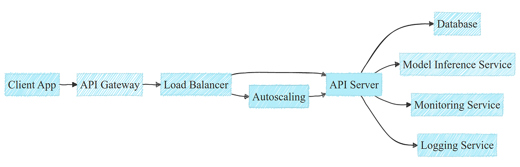
Under the hood, what happens when calling an API might be a bit more complex. API deployments usually involve a standard tech stack including load balancers, autoscalers and interactions with a database:
A typical example of an API deployment within a cloud infrastructure. Image by author.
Note: APIs may have different needs and infrastructure, this example is simplified for clarity.
API deployments are popular for several reasons:
Easy to implement and to integrate into various tech stacks
It’s easy to scale: using horizontal scaling in clouds allow to scale efficiently; moreover managed services of cloud providers may reduce the need for manual intervention
It allows centralized management of model versions and logging, thus efficient tracking and reproducibility
While APIs are a really popular option, there are some cons too:
There might be latency challenges with potential network overhead or geographical distance; and of course it requires a good internet connection
The cost can climb up pretty quickly with high traffic (assuming automatic scaling)
Maintenance overhead can get expensive, either with managed services cost of infra team
To sum up, API deployment is largely used in many startups and tech companies because of its flexibility and a rather short time to market. But the cost can climb up quite fast for high traffic, and the maintenance cost can also be significant.
About the tech stack: there are many ways to develop APIs, but the most common ones in Machine Learning are probably FastAPI and Flask. They can then be deployed quite easily on the main cloud providers (AWS, GCP, Azure…), preferably through docker images. The orchestration can be done through managed services or with Kubernetes, depending on the team’s choice, its size, and skills.
As an example of API cloud deployment, I once deployed a ML solution to automate the pricing of an electric vehicle charging station for a customer-facing web app. You can have a look at this project here if you want to know more about it:
Even if this post does not get into the code, it can give you a good idea of what can be done with API deployment.
API deployment is very popular for its simplicity to integrate to any project. But some projects may need even more flexibility and less maintenance cost: this is where serverless deployment may be a solution.
Serverless Deployment
Another popular, but probably less frequently used option is serverless deployment. Serverless computing means that you run your model (or any code actually) without owning nor provisioning any server.
Serverless deployment offers several significant advantages and is quite easy to set up:
No need to manage nor to maintain servers
No need to handle scaling in case of higher traffic
You only pay for what you use: no traffic means virtually no cost, so no overhead cost at all
But it has some limitations as well:
It is usually not cost effective for large number of queries compared to managed APIs
Cold start latency is a potential issue, as a server might need to be spawned, leading to delays
The memory footprint is usually limited by design: you can’t always run large models
The execution time is limited too: it’s not possible to run jobs for more than a few minutes (15 minutes for AWS Lambda for example)
In a nutshell, I would say that serverless deployment is a good option when you’re launching something new, don’t expect large traffic and don’t want to spend much on infra management.
I personally have never deployed a serverless solution (working mostly with deep learning, I usually found myself limited by the serverless constraints mentioned above), but there is lots of documentation about how to do it properly, such as this one from AWS.
While serverless deployment offers a flexible, on-demand solution, some applications may require a more scheduled approach, like batch processing.
Batch Processing
Another way to deploy on the cloud is through scheduled batch processing. While serverless and APIs are mostly used for live predictions, in some cases batch predictions makes more sense.
Whether it be database updates, dashboard updates, caching predictions… as soon as there is no need to have a real-time prediction, batch processing is usually the best option:
Processing large batches of data is more resource-efficient and reduce overhead compared to live processing
Processing can be scheduled during off-peak hours, allowing to reduce the overall charge and thus the cost
Of course, it comes with associated drawbacks:
Batch processing creates a spike in resource usage, which can lead to system overload if not properly planned
Handling errors is critical in batch processing, as you need to process a full batch gracefully at once
Batch processing should be considered for any task that does not required real-time results: it is usually more cost effective. But of course, for any real-time application, it is not a viable option.
It is used widely in many companies, mostly within ETL (Extract, Transform, Load) pipelines that may or may not contain ML. Some of the most popular tools are:
Apache Airflow for workflow orchestration and task scheduling
Apache Spark for fast, massive data processing
As an example of batch processing, I used to work on a YouTube video revenue forecasting. Based on the first data points of the video revenue, we would forecast the revenue over up to 5 years, using a multi-target regression and curve fitting:
Plot representing the initial data, multi-target regression predictions and curve fitting. Image by author.
For this project, we had to re-forecast on a monthly basis all our data to ensure there was no drifting between our initial forecasting and the most recent ones. For that, we used a managed Airflow, so that every month it would automatically trigger a new forecasting based on the most recent data, and store those into our databases. If you want to know more about this project, you can have a look at this article:
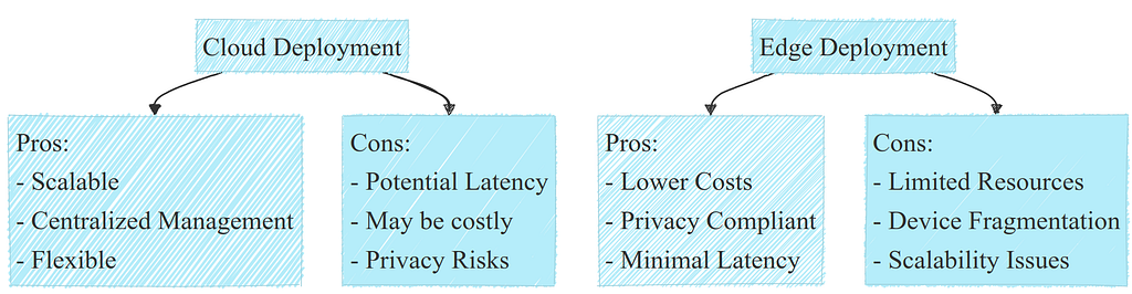
After exploring the various strategies and tools available for cloud deployment, it’s clear that this approach offers significant flexibility and scalability. However, cloud deployment is not always the best fit for every ML application, particularly when real-time processing, privacy concerns, or financial resource constraints come into play.
A list of pros and cons for cloud deployment. Image by author.
This is where edge deployment comes into focus as a viable option. Let’s now delve into edge deployment to understand when it might be the best option.
Edge Deployment
From my own experience, edge deployment is rarely considered as the main way of deployment. A few years ago, even I thought it was not really an interesting option for deployment. With more perspective and experience now, I think it must be considered as the first option for deployment anytime you can.
Just like cloud deployment, edge deployment covers a wide range of cases:
Native phone applications
Web applications
Edge server and specific devices
While they all share some similar properties, such as limited resources and horizontal scaling limitations, each deployment choice may have their own characteristics. Let’s have a look.
Native Application
We see more and more smartphone apps with integrated AI nowadays, and it will probably keep growing even more in the future. While some Big Tech companies such as OpenAI or Google have chosen the API deployment approach for their LLMs, Apple is currently working on the iOS app deployment model with solutions such as OpenELM, a tini LLM. Indeed, this option has several advantages:
The infra cost if virtually zero: no cloud to maintain, it all runs on the device
Better privacy: you don’t have to send any data to an API, it can all run locally
Your model is directly integrated to your app, no need to maintain several codebases
Moreover, Apple has built a fantastic ecosystem for model deployment in iOS: you can run very efficiently ML models with Core ML on their Apple chips (M1, M2, etc…) and take advantage of the neural engine for really fast inferences. To my knowledge, Android is slightly lagging behind, but also has a great ecosystem.
While this can be a really beneficial approach in many cases, there are still some limitations:
Phone resources limit model size and performance, and are shared with other apps
Heavy models may drain the battery pretty fast, which can be deceptive for the user experience overall
Device fragmentation, as well as iOS and Android apps make it hard to cover the whole market
Decentralized model updates can be challenging compared to cloud
Despite its drawbacks, native app deployment is often a strong choice for ML solutions that run in an app. It may seem more complex during the development phase, but it will turn out to be much cheaper as soon as it’s deployed compared to a cloud deployment.
When it comes to the tech stack, there are actually two main ways to deploy: iOS and Android. They both have their own stacks, but they share the same properties:
App development: Swift for iOS, Kotlin for Android
Model format: Core ML for iOS, TensorFlow Lite for Android
Hardware accelerator: Apple Neural Engine for iOS, Neural Network API for Android
Note: This is a mere simplification of the tech stack. This non-exhaustive overview only aims to cover the essentials and let you dig in from there if interested.
As a personal example of such deployment, I once worked on a book reading app for Android, in which they wanted to let the user navigate through the book with phone movements. For example, shake left to go to the previous page, shake right for the next page, and a few more movements for specific commands. For that, I trained a model on accelerometer’s features from the phone for movement recognition with a rather small model. It was then deployed directly in the app as a TensorFlow Lite model.
Native application has strong advantages but is limited to one type of device, and would not work on laptops for example. A web application could overcome those limitations.
Web Application
Web application deployment means running the model on the client side. Basically, it means running the model inference on the device used by that browser, whether it be a tablet, a smartphone or a laptop (and the list goes on…). This kind of deployment can be really convenient:
Your deployment is working on any device that can run a web browser
The inference cost is virtually zero: no server, no infra to maintain… Just the customer’s device
Only one codebase for all possible devices: no need to maintain an iOS app and an Android app simultaneously
Note: Running the model on the server side would be equivalent to one of the cloud deployment options above.
While web deployment offers appealing benefits, it also has significant limitations:
Proper resource utilization, especially GPU inference, can be challenging with TensorFlow.js
Your web app must work with all devices and browsers: whether is has a GPU or not, Safari or Chrome, a Apple M1 chip or not, etc… This can be a heavy burden with a high maintenance cost
You may need a backup plan for slower and older devices: what if the device can’t handle your model because it’s too slow?
Unlike for a native app, there is no official size limitation for a model. However, a small model will be downloaded faster, making it overall experience smoother and must be a priority. And a very large model may just not work at all anyway.
In summary, while web deployment is powerful, it comes with significant limitations and must be used cautiously. One more advantage is that it might be a door to another kind of deployment that I did not mention: WeChat Mini Programs.
The tech stack is usually the same as for web development: HTML, CSS, JavaScript (and any frameworks you want), and of course TensorFlow Lite for model deployment. If you’re curious about an example of how to deploy ML in the browser, you can have a look at this post where I run a real time face recognition model in the browser from scratch:
This article goes from a model training in PyTorch to up to a working web app and might be informative about this specific kind of deployment.
In some cases, native and web apps are not a viable option: we may have no such device, no connectivity, or some other constraints. This is where edge servers and specific devices come into play.
Edge Servers and Specific Devices
Besides native and web apps, edge deployment also includes other cases:
Deployment on edge servers: in some cases, there are local servers running models, such as in some factory production lines, CCTVs, etc…Mostly because of privacy requirements, this solution is sometimes the only available
Deployment on specific device: either a sensor, a microcontroller, a smartwatch, earplugs, autonomous vehicle, etc… may run ML models internally
Deployment on edge servers can be really close to a deployment on cloud with API, and the tech stack may be quite close.
Note: It is also possible to run batch processing on an edge server, as well as just having a monolithic script that does it all.
But deployment on specific devices may involve using FPGAs or low-level languages. This is another, very different skillset, that may differ for each type of device. It is sometimes referred to as TinyML and is a very interesting, growing topic.
On both cases, they share some challenges with other edge deployment methods:
Resources are limited, and horizontal scaling is usually not an option
The battery may be a limitation, as well as the model size and memory footprint
Even with these limitations and challenges, in some cases it’s the only viable solution, or the most cost effective one.
An example of an edge server deployment I did was for a company that wanted to automatically check whether the orders were valid in fast food restaurants. A camera with a top down view would look at the plateau, compare what is sees on it (with computer vision and object detection) with the actual order and raise an alert in case of mismatch. For some reason, the company wanted to make that on edge servers, that were within the fast food restaurant.
To recap, here is a big picture of what are the main types of deployment and their pros and cons:
A list of pros and cons for cloud deployment. Image by author.
With that in mind, how to actually choose the right deployment method? There’s no single answer to that question, but let’s try to give some rules in the next section to make it easier.
How to Choose the Right Deployment
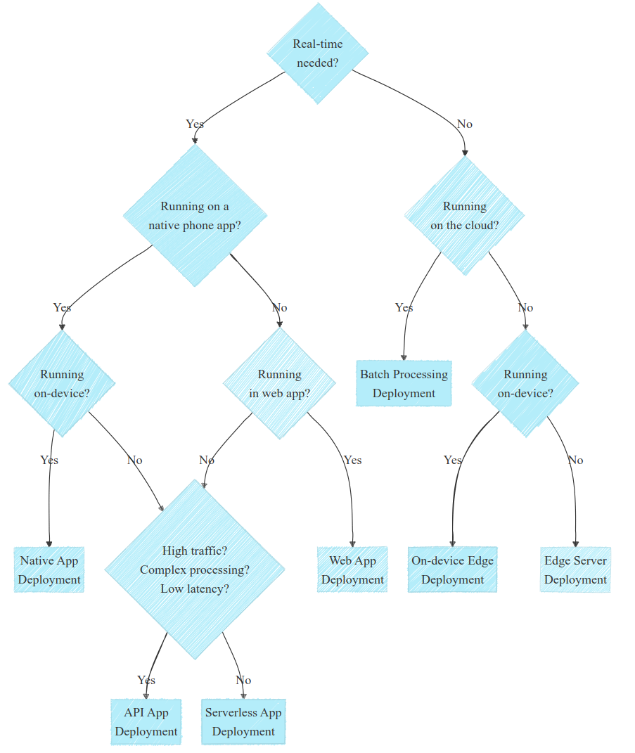
Before jumping to the conclusion, let’s make a decision tree to help you choose the solution that fits your needs.
Choosing the right deployment requires understanding specific needs and constraints, often through discussions with stakeholders. Remember that each case is specific and might be a edge case. But in the diagram below I tried to outline the most common cases to help you out:
Deployment decision diagram. Note that each use case is specific. Image by author.
This diagram, while being quite simplistic, can be reduced to a few questions that would allow you go in the right direction:
Do you need real-time? If no, look for batch processing first; if yes, think about edge deployment
Is your solution running on a phone or in the web? Explore these deployments method whenever possible
Is the processing quite complex and heavy? If yes, consider cloud deployment
Again, that’s quite simplistic but helpful in many cases. Also, note that a few questions were omitted for clarity but are actually more than important in some context: Do you have privacy constraints? Do you have connectivity constraints? What is the skillset of your team?
Other questions may arise depending on the use case; with experience and knowledge of your ecosystem, they will come more and more naturally. But hopefully this may help you navigate more easily in deployment of ML models.
Conclusion and Final Thoughts
While cloud deployment is often the default for ML models, edge deployment can offer significant advantages: cost-effectiveness and better privacy control. Despite challenges such as processing power, memory, and energy constraints, I believe edge deployment is a compelling option for many cases. Ultimately, the best deployment strategy aligns with your business goals, resource constraints and specific needs.
If you’ve made it this far, I’d love to hear your thoughts on the deployment approaches you used for your projects.
We use cookies on our website to give you the most relevant experience by remembering your preferences and repeat visits. By clicking “Accept”, you consent to the use of ALL the cookies.
This website uses cookies to improve your experience while you navigate through the website. Out of these, the cookies that are categorized as necessary are stored on your browser as they are essential for the working of basic functionalities of the website. We also use third-party cookies that help us analyze and understand how you use this website. These cookies will be stored in your browser only with your consent. You also have the option to opt-out of these cookies. But opting out of some of these cookies may affect your browsing experience.
Necessary cookies are absolutely essential for the website to function properly. These cookies ensure basic functionalities and security features of the website, anonymously.
Cookie
Duration
Description
cookielawinfo-checkbox-analytics
11 months
This cookie is set by GDPR Cookie Consent plugin. The cookie is used to store the user consent for the cookies in the category "Analytics".
cookielawinfo-checkbox-functional
11 months
The cookie is set by GDPR cookie consent to record the user consent for the cookies in the category "Functional".
cookielawinfo-checkbox-necessary
11 months
This cookie is set by GDPR Cookie Consent plugin. The cookies is used to store the user consent for the cookies in the category "Necessary".
cookielawinfo-checkbox-others
11 months
This cookie is set by GDPR Cookie Consent plugin. The cookie is used to store the user consent for the cookies in the category "Other.
cookielawinfo-checkbox-performance
11 months
This cookie is set by GDPR Cookie Consent plugin. The cookie is used to store the user consent for the cookies in the category "Performance".
viewed_cookie_policy
11 months
The cookie is set by the GDPR Cookie Consent plugin and is used to store whether or not user has consented to the use of cookies. It does not store any personal data.
Functional cookies help to perform certain functionalities like sharing the content of the website on social media platforms, collect feedbacks, and other third-party features.
Performance cookies are used to understand and analyze the key performance indexes of the website which helps in delivering a better user experience for the visitors.
Analytical cookies are used to understand how visitors interact with the website. These cookies help provide information on metrics the number of visitors, bounce rate, traffic source, etc.
Advertisement cookies are used to provide visitors with relevant ads and marketing campaigns. These cookies track visitors across websites and collect information to provide customized ads.