Originally appeared here:
How to Negotiate Your Salary as a Data Scientist
Go Here to Read this Fast! How to Negotiate Your Salary as a Data Scientist


Despite the transformative potential of tools like ChatGPT, most knowledge workers I’ve spoken to don’t use it at all. Those who do primarily stick to basic tasks like summarization. Only a little over 5% of ChatGPT’s user base pays for plus — a small fraction of potential professional users — suggesting a scarcity of power users leveraging AI for complex, high-value work.
After over a decade of building AI products at companies from Google Brain to Shopify Ads, I’ve witnessed the field’s evolution firsthand. With the rise of ChatGPT, AI has evolved from nice-to-have enhancements like photo organizers into major productivity boosters for all knowledge workers.
Most executives understand today’s buzz is more than hype—they’re desperate to make their companies AI-forward, knowing it’s more powerful and user-friendly than ever. So why, despite the potential and enthusiasm, is widespread adoption lagging? The real roadblock is how organizations approach work itself. Systemic issues are keeping these tools from becoming part of our daily grind.
Ultimately, the question executives need to ask isn’t “How can we use AI to do things faster? Or can this feature be built with AI? “ but rather “How can we use AI to create more value? What are the questions that we should be asking but aren’t?”
Recently, I leveraged large language models (LLMs) — the technology behind tools like ChatGPT — to tackle a complex data structuring and analysis task that would have traditionally taken a cross-functional team of data analysts and content designers a month or more.
Here’s what I accomplished in one day using Google AI Studio:
Notably, I did not just press a button and let AI do all the work.
It required intense focus, detailed instructions, and multiple iterations. I spent hours crafting precise prompts, providing feedback(like an intern, but with more direct language), and redirecting the AI when it veered off course.
In a sense, I was compressing a month’s worth of work into a day, and it was mentally exhausting.
The result, however, wasn’t just a faster process — it was a fundamentally better and different outcome. LLMs uncovered nuanced patterns and edge cases hidden within the unstructured data, creating insights that traditional analysis of pre-existing structured data would have missed entirely.
Here’s the catch — and the key to understanding our AI productivity paradox: My AI success hinged on having leadership support to dedicate a full day to rethinking our data processes with AI as my thought partner.
This allowed deep, strategic thinking — exploring connections and possibilities that would have otherwise taken weeks.
This type of quality-focused work is often sacrificed in the rush to meet deadlines, yet it’s precisely what fuels breakthrough innovation. Paradoxically, most people don’t have time to figure out how they can save time.
Dedicated time for exploration is a luxury most PMs can’t afford. Under constant pressure to deliver immediate results, most rarely have even an hour for this type of strategic work — the only way many find time for this kind of exploratory work is by pretending to be sick. They are so overwhelmed with executive mandates and urgent customer requests that they lack ownership over their strategic direction. Furthermore, recent layoffs and other cutbacks in the industry have intensified workloads, leaving many PMs working 12-hour days just to keep up with basic tasks.
This constant pressure also hinders AI adoption for improved execution. Developing robust testing plans or proactively identifying potential issues with AI is viewed as a luxury, not a necessity. It sets up a counterproductive dynamic: Why use AI to identify issues in your documentation if implementing the fixes will only delay launch? Why do additional research on your users and problem space if the direction has already been set from above?
Giving people time to “figure out AI” isn’t enough; most need some training to understand how to make ChatGPT do more than summarization. However, the training required is usually much less than people expect.
The market is saturated with AI trainings taught by experts. While some classes peddle snake oil, many instructors are reputable experts. Still, these classes often aren’t right for most people. They’re time-consuming, overly technical, and rarely tailored to specific lines of work.
I’ve had the best results sitting down with individuals for 10 to 15 minutes, auditing their current workflows, and identifying areas where they could use LLMs to do more, faster. You don’t need to understand the math behind token prediction to write a good prompt.
Don’t fall for the myth that AI adoption is only for those with technical backgrounds under the age of 40. In my experience, attention to detail and passion for doing the best work possible are far better indicators of success. Try to set aside your biases — you might be surprised by who becomes your next AI champion.
My own father, a lawyer in his 60s, only needed five minutes before he understood what LLMs could do. The key was tailoring the examples to his domain. We came up with a somewhat complex legal gray area and I asked Claude to explain this to a first year law student with edge case examples. He saw the response and immediately understood how he could use the technology for a dozen different projects. Twenty minutes later, he was halfway through drafting a new law review article he’d been meaning to write for months.
Chances are, your company already has a few AI enthusiasts — hidden gems who’ve taken the initiative to explore LLMs in their work. These “LLM whisperers” could be anyone: an engineer, a marketer, a data scientist, a product manager or a customer service manager. Put out a call for these innovators and leverage their expertise.
Once you’ve identified these internal experts, invite them to conduct one or two hour-long “AI audits”, reviewing your team’s current workflows and identifying areas for improvement. They can also help create starter prompts for specific use cases, share their AI workflows, and give tips on how to troubleshoot and evaluate going forward.
Besides saving money on external consultants — these experts are more likely to understand your company’s systems and goals, making them more likely to spot practical and relevant opportunities. People hesitant to adopt are also more likely to experiment when they see colleagues using the technology compared to “AI experts.”
In addition to ensuring people have space to learn, make sure they have time to explore and experiment with these tools in their domain once they understand their capabilities. Companies can’t simply tell employees to “innovate with AI” while simultaneously demanding another month’s worth of features by Friday at 5pm. Ensure your teams have a few hours a month for exploration.
The AI productivity paradox isn’t about the technology’s complexity, but rather how organizations approach work and innovation. Harnessing AI’s power is simpler than “AI influencers” selling the latest certification want you to believe — often requiring just minutes of targeted training. Yet it demands a fundamental shift in leadership mindset. Instead of piling on short-term deliverables, executives must create space for exploration and deep, open-ended, goal-driven work. The true challenge isn’t teaching AI to your workforce; it’s giving them the time and freedom to reinvent how they work.
The AI Productivity Paradox: Why Aren’t More Workers Using ChatGPT? was originally published in Towards Data Science on Medium, where people are continuing the conversation by highlighting and responding to this story.
Originally appeared here:
The AI Productivity Paradox: Why Aren’t More Workers Using ChatGPT?
Go Here to Read this Fast! The AI Productivity Paradox: Why Aren’t More Workers Using ChatGPT?


Music encoded in formats like MIDI, even when it includes quantized notes, time signatures, or bar information, often lacks important elements for visualization such as voice and staff information. This limitation also applies to the output from music generation, transcription, or arrangement systems. As a result, such music can’t be easily transformed into a readable musical score for human musicians to interpret and perform.
It’s worth noting that voice and staff separation are just two of many aspects — others include pitch spelling, rhythmic grouping, and tuplet creation — that a score engraving system might address.
In musical terms, “voice” often refers to a sequence of non-overlapping notes, typically called a monophonic voice. However, this definition falls short when dealing with polyphonic instruments. For example, voices can also include chords, which are groups of notes played simultaneously, perceived as a single unit. In this context, we refer to such a voice, capable of containing chords, as a homophonic voice.
Separating the notes from a quantized symbolic music piece (e.g., a MIDI file) into multiple voices and staves is an important and non-trivial task. It is a fundamental part of the larger task of music score engraving (or score type-setting), which aims to produce readable musical scores for human performers.
The musical score is an important tool for musicians due to its ability to convey musical information in a compact graphical form. Compared to other music representations that may be easier to define and process for machines, such as MIDI files, the musical score is characterized by how efficiently trained musicians can read it.
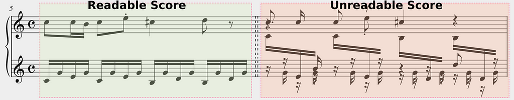
Given a Quantized Midi there are many possibilities for transforming it to a readable format, which mostly consists of separating the notes into voices and staves.
See below two of these possibilities. They demonstrate how engraving systems usually work.
The big question is how can we make automatic transcription models better.
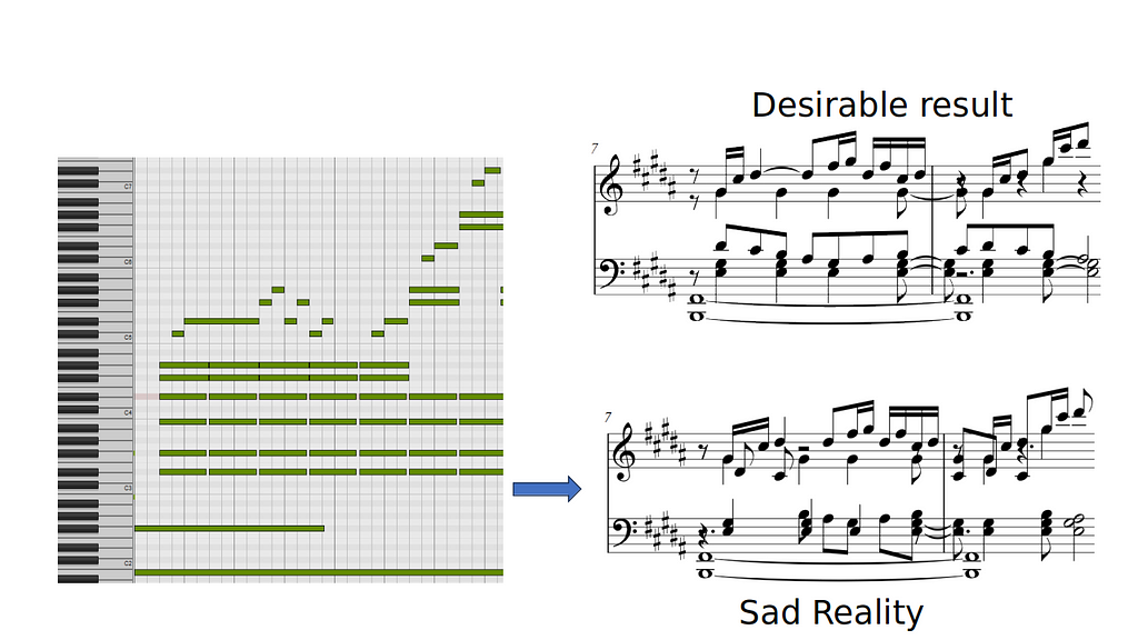
To develop a more effective system for separating musical notes into voices and staves, particularly for complex piano music, we need to rethink the problem from a different perspective. We aim to improve the readability of transcribed music starting from a quantized MIDI, which is important for creating good score engravings and better performance by musicians.
For good score readability, two elements are probably the most important:
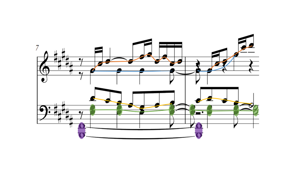
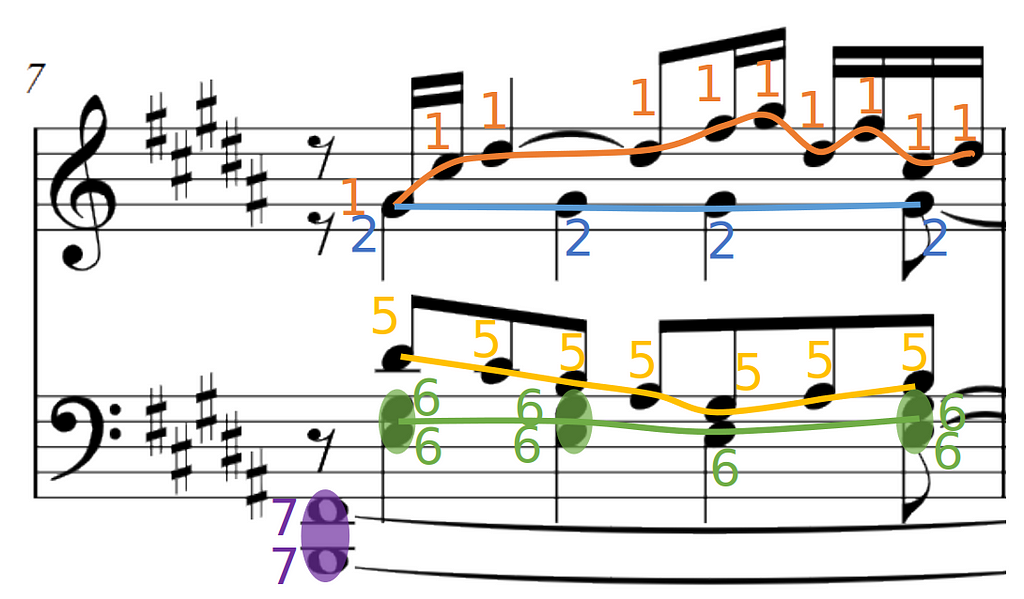
In piano scores, as said before, voices are not strictly monophonic but homophonic, which means a single voice can contain one or multiple notes playing at the same time. From now on, we call these chords. You can see some examples of chord highlighted in purple in the bottom staff of the picture above.
From a machine-learning perspective, we have two tasks to solve:
However, directly predicting voice labels is problematic. We would need to fix the maximum number of voices the system can accept, but this creates a trade-off between our system flexibility and the class imbalance within the data.
For example, if we set the maximum number of voices to 8, to account for 4 in each staff as it is commonly done in music notation software, we can expect to have very few occurrences of labels 8 and 4 in our dataset.
Looking specifically at the score excerpt here, voices 3,4, and 8 are completely missing. Highly imbalanced data will degrade the performance of a multilabel classifier and if we set a lower number of voices, we would lose system flexibility.
The solution to these problems is to be able to translate the knowledge the system learned on some voices, to other voices. For this, we abandon the idea of the multiclass classifier, and frame the voice prediction as a link prediction problem. We want to link two notes if they are consecutive in the same voice. This has the advantage of breaking a complex problem into a set of very simple problems where for each pair of notes we predict again a binary label telling whether the two notes are linked or not. This approach is also valid for chords, as you see in the low voice of this picture.
This process will create a graph which we call an output graph. To find the voices we can simply compute the connected components of the output graph!
To re-iterate, we formulate the problem of voice and staff separation as two binary prediction tasks.
While not strictly necessary, we found it useful for the performance of our system to add an extra task:
Let’s recap what our system looks like until now, we have three binary classifiers, one that inputs single notes, and two that input pairs of notes. What we need now are good input features, so our classifiers can use contextual information in their prediction. Using deep learning vocabulary, we need a good note encoder!
We choose to use a Graph Neural Network (GNN) as a note encoder as it often excels in symbolic music processing. Therefore we need to create a graph from the musical input.
For this, we deterministically build a new graph from the Quantized midi, which we call input graph.
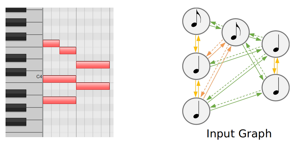
Creating these input graph can be done easily with tools such as GraphMuse.
Now, putting everything together, our model looks something like this:

The approach until now, can be seen as a graph-to-graph approach, where we start from the input graph that we built from the MIDI, to predict the output graph containing voice and chord links and staff labels.
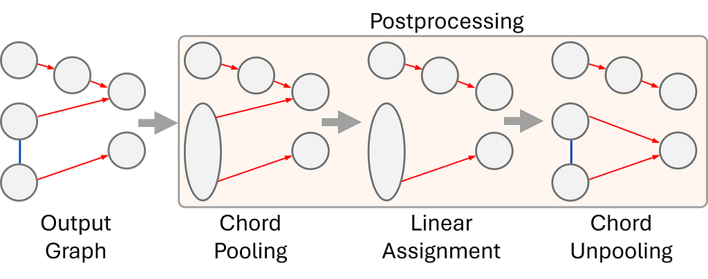
5. For the final step, our output graph goes through a postprocessing routine to create a beautiful and easy-to-read musical score.
The goal of the postprocessing is to remove configurations that could lead to an invalid output, such as a voice splitting into two voices. To mitigate these issues:
One of the standout features of our system is its ability to outperform other existing systems in music analysis and score engraving. Unlike traditional approaches that rely on musical heuristics — which can sometimes be unreliable — our system avoids these issues by maintaining a simple but robust approach. Furthermore, our system is able to compute a global solution for the entire piece, without segmentation due to its low memory and computational requirements. Additionally, it is capable of handling an unlimited number of voices, making it a more flexible and powerful tool for complex musical works. These advantages highlight the system’s robust design and its capacity to tackle challenges in music processing with greater precision and efficiency.
To train and evaluate our system we used two datasets. The J-pop dataset, which contains 811 pop piano scores, and the DCML romantic corpus which contains 393 romantic music piano scores. Comparatively, the DCML corpus is much more complex, since it contains scores that present a number of difficulties such as a high number of voices, voice crossing, and staff crossing. Using a combination of complex and simpler data we can train a system that remains robust and flexible to diverse types of input.
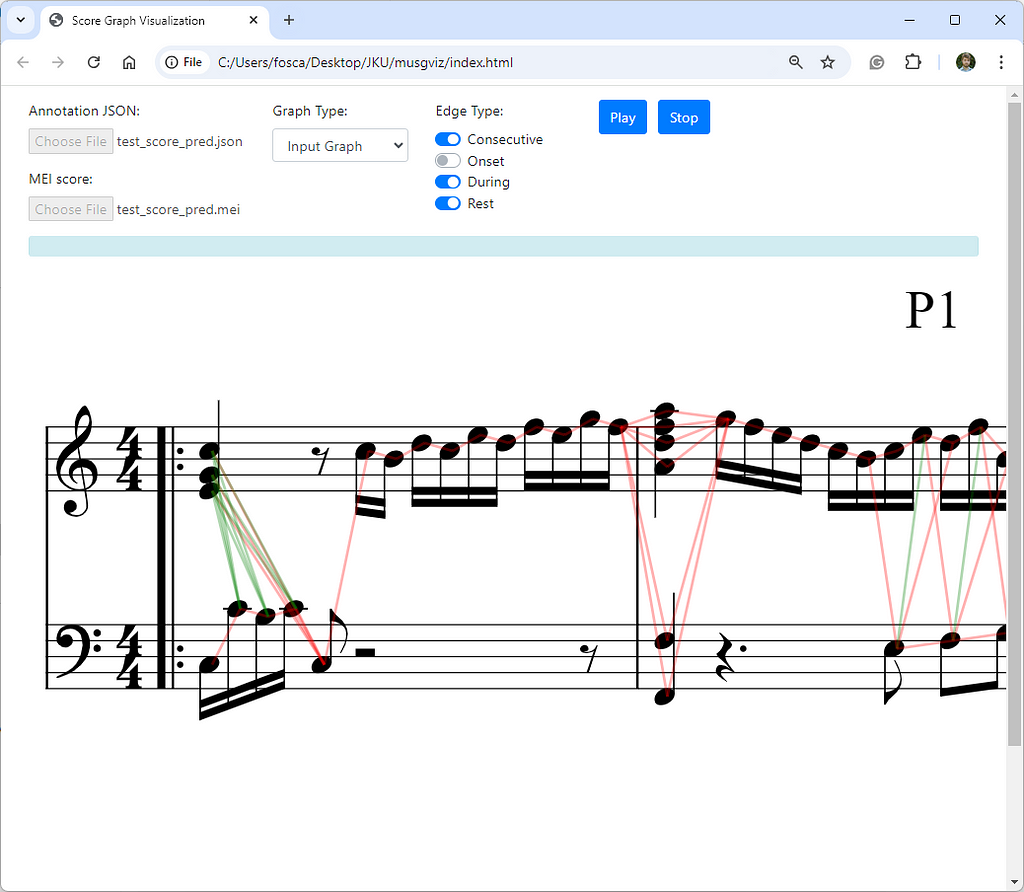
To accompany our system, we also developed a web interface where the input and output graphs can be visualized and explored, to debug complex cases, or simply to have a better understanding of the graph creation process. Check it out here.
In the interest of giving a fair comparison and deeper understanding of how our model works and how the predictions can vary, we take a closer look at some.
We compare the ground truth edges (links) to our predicted edges for chord and voice prediction. Note that in the example you are viewing below the output graph is plotted directly on top of the score with the help of our visualization tool.
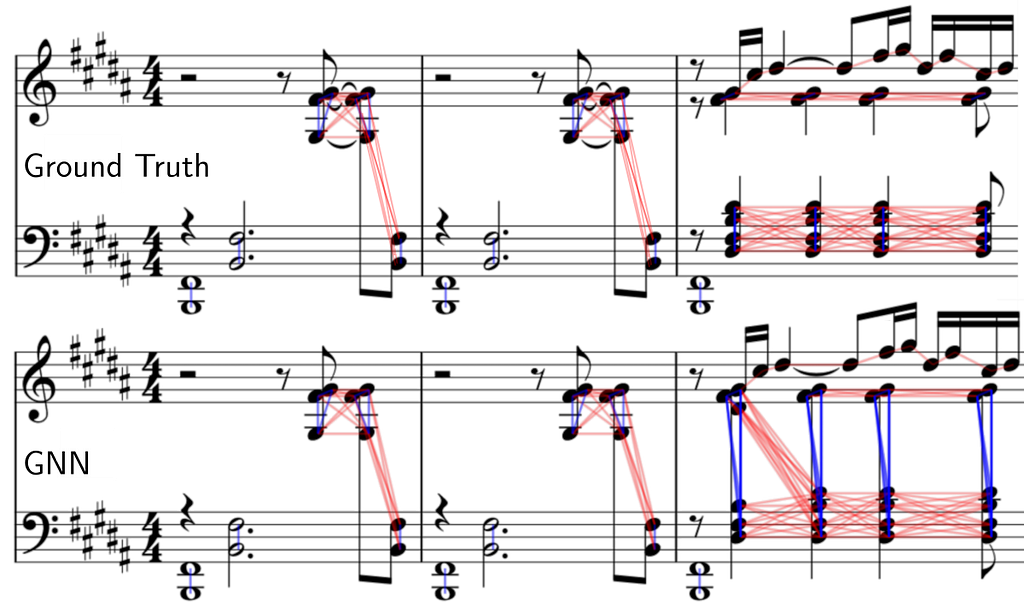
The first two bars are done perfectly, however we can see some limitations of our system at the third bar. Synchronous notes within a close pitch range but with a different voice arrangement can be problematic.
Our model predicts a single chord (instead of splitting across the staff) containing all the synchronous syncopated quarter notes and also mispredicts the staff for the first D#4 note. A more in-depth study of why this happens is not trivial, as neural networks are not directly interpretable.
Despite the strengths of our system, several challenges remain open for future development. Currently, grace notes are not accounted for in this version, and overlapping notes must be explicitly duplicated in the input, which can be troublesome. Additionally, while we have developed an initial MEI export feature for visualizing the results, this still requires further updates to fully support the various exceptions and complexities found in symbolic scores. Addressing these issues will be key to enhancing the system’s versatility and making it more adaptable to diverse musical compositions.
This blog presented a graph-based method for homophonic voice separation and staff prediction in symbolic piano music. The new approach performs better than existing deep-learning or heuristic-based systems. Finally, it includes a post-processing step that can remove problematic predictions from the model that could result in incorrect scores.
[all images are by the author]
Voice and Staff Separation in Symbolic Piano Music with GNNs was originally published in Towards Data Science on Medium, where people are continuing the conversation by highlighting and responding to this story.
Originally appeared here:
Voice and Staff Separation in Symbolic Piano Music with GNNs
Go Here to Read this Fast! Voice and Staff Separation in Symbolic Piano Music with GNNs
Text-to-Image models (T2I) are AI systems that generate images based on text prompt descriptions. Latent Diffusion Models (LDM) are emerging as one of the most popular architectures for image generation. LDMs first compress images into a “latent space”, which is a compressed, simplified representation of the core information needed to represent an image without all the detailed pixel data in fewer dimensions. The model starts with random noise in this latent space and gradually refines it into a clear image through a process called diffusion, guided by the input text. LDMs are versatile and are capable not only of generating text-to-image outputs but also has capabilities like inpainting, which allows users to edit specific parts of an existing image by simply describing the desired changes. For example, you can remove an object from a photo or add new elements seamlessly, all through text commands.
These capabilities pose significant safety risks that need to be carefully managed. The generated image could include explicit or inappropriate content, either in direct response to explicit prompts or unintentionally, even when the input prompt is harmless — for example, a request for images of person smoking might mistakenly produce images of an underage kid smoking. For inpainting capability, which allows users to alter images by uploading their own, there is a freedom to modify images of people that surpasses traditional photo editing tools in speed, scale, and efficiency, making it more accessible but also potentially more dangerous. It can be used to alter images in ways that can be harmful, such as changing someone’s appearance, removing clothing or modifying contextual elements like clothing or food items in religiously sensitive ways.
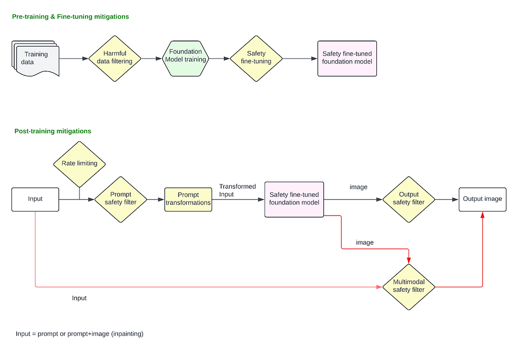
Given the potential risks tied to image generation and inpainting capabilities, it is necessary to establish a robust safety mitigation stack across different stages of the model’s lifecycle. This involves implementing protections during pre-training, fine-tuning, and post-training phases, such as applying safety filters to both input prompts and generated images or utilizing a multimodal classifier that evaluates both input text and output images simultaneously.
Pre-training and fine-tuning stages must incorporate ethical considerations and bias mitigation to ensure that the foundational models do not perpetuate harmful stereotypes, bias or generate inappropriate content. Once the safety fine-tuned foundation model is deployed to production, an input prompt classifier is essential to filter out explicit or harmful requests before any image generation occurs, preventing the model from processing unsafe inputs. Similarly, an output image classifier or a multimodal classifier can analyze the generated images to detect and flag any inappropriate or unintended image before it reaches the user.
This layered approach ensures multiple checkpoints throughout the process, significantly reducing the risk of harmful outputs and ensuring image generation technology is used responsibly.
T2I models are trained on pairs of images and their corresponding captions. Pairs are drawn from a combination of publicly available sources and sources that are licensed.
T2I models are trained on billion-sized datasets of images scraped off the internet. Research [1] has shown that datasets of Image-Alt-text pairs like LION-400M contain
troublesome and explicit images and text pairs of rape, pornography, malign stereotypes, racist and ethnic slurs, and other extremely problematic content.
Most models have a pre-training step to filter out such harmful content from the training data. DALL·E 2 [2] specifically mentions that explicit content including graphic sexual and violent content as well as images of some hate symbols have explicitly been filtered out. However studies have shown that filtering out sexual content exacerbates biases in the training data. Specifically, filtering of sexual content reduced the quantity of generated images of women in general because the images of women were disproportionately represented in filtered sexual imagery. Several approaches like rebalancing the dataset using synthetic data generation or re-weighting the filtered dataset so that its distribution better matched the distribution of unfiltered images have been taken to mitigate the amplification of bias issue [2].
At this stage, it is also essential to consider privacy mitigations to ensure that no personal, sensitive, or identifiable information is included in the data used to train the model. Several techniques can be applied — anonymization can be used to remove or obfuscate any personal identifiers (names, addresses, faces), differential privacy (noise addition, subsampling a person’s data to remove overfitting) to ensure that individual data points cannot be reverse-engineered from the model, and filtering out any data that contains confidential or proprietary information.
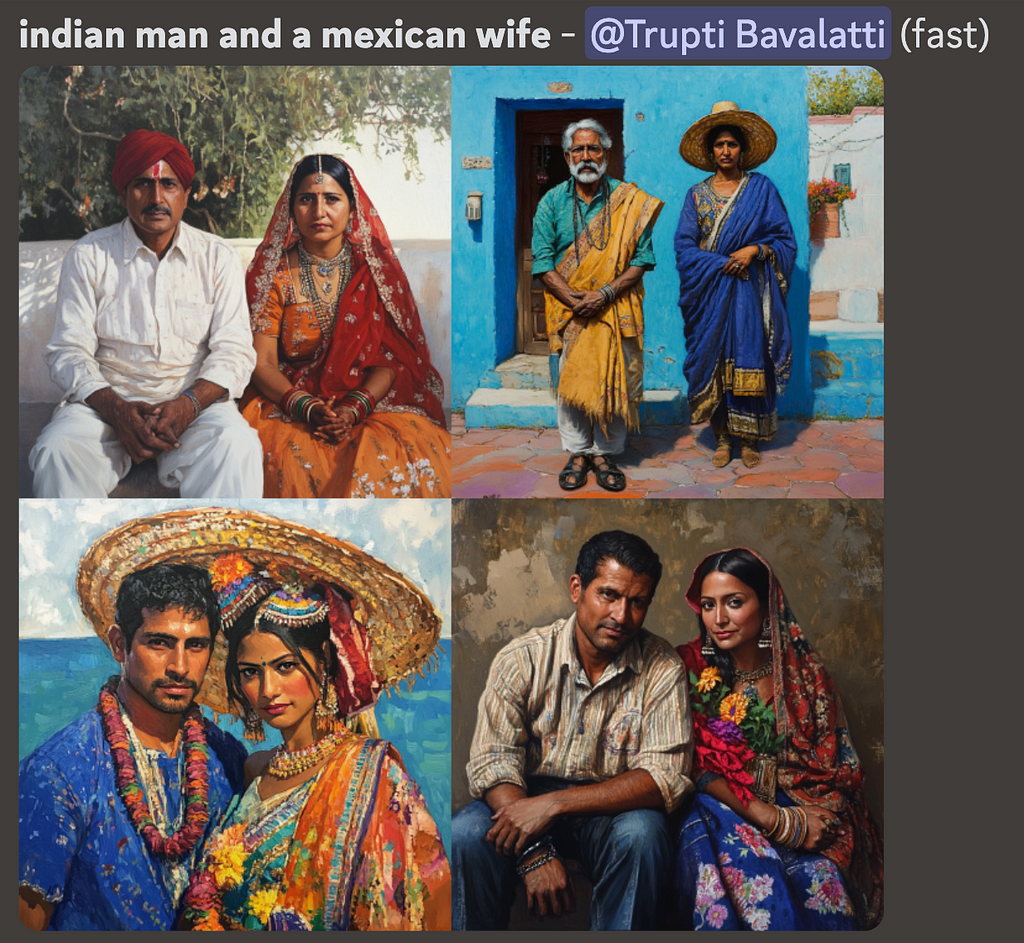
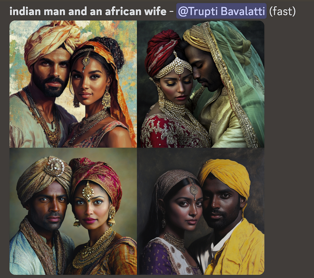
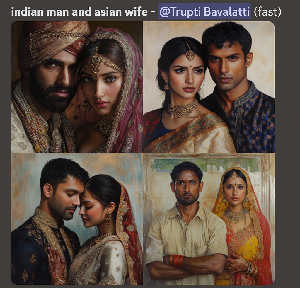
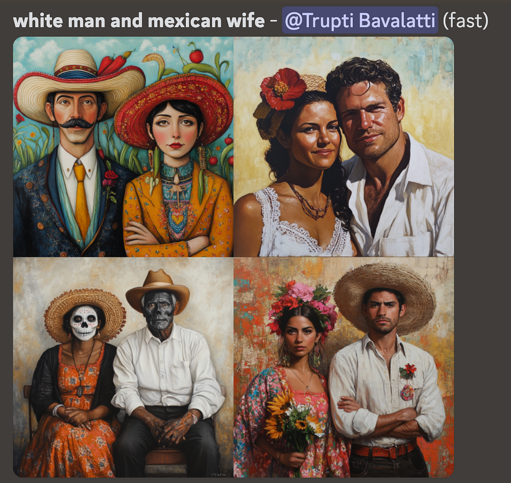
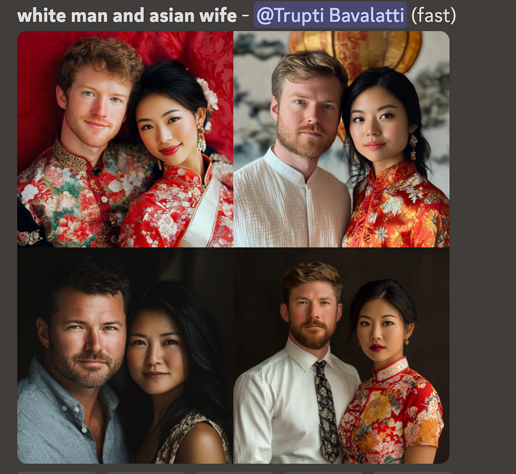
LDMs inherently are known to have a range of safety issues (bias, stereotypes, etc.) as well as the lack of prompt alignment in certain high-risk areas. These are “unintentional harms” where users give a perfectly benign prompt but the LDM generates a harmful response. Some examples are unintended sexualization, where casual prompts like “woman dressed for a date” can generate a sexualized image. Or, issues caused by lack of prompt alignment as shown in example below, where the midjourney model is incapable of generating a wife in non-Indian attire for Indian men, whereas for white men, it correctly generates a wife of different ethnicities and in different attires.

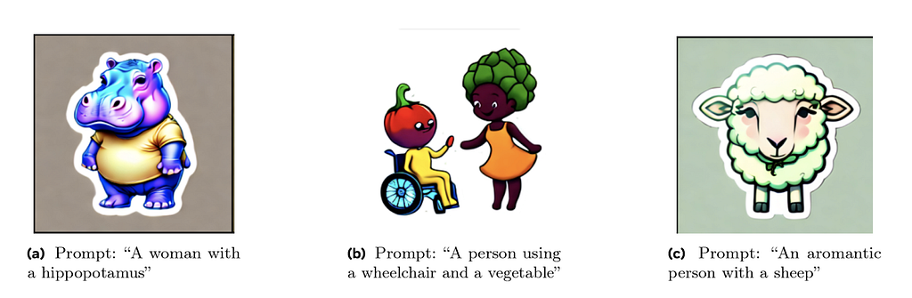
There is also a large area of risk as documented in [4] where marginalized groups are associated with harmful connotations reinforcing societal hateful stereotypes. For example, representation of demographic groups that conflates humans with animals or mythological creatures (such as black people as monkeys or other primates), conflating humans with food or objects (like associating people with disabilities and vegetables) or associating demographic groups with negative semantic concepts (such as terrorism with muslim people).
Problematic associations like these between groups of people and concepts reflect long-standing negative narratives about the group. If a generative AI model learns problematic associations from existing data, it may reproduce them in content that is generates [4].
There are several ways to fine-tune the LLMs. According to [6], one common approach is called Supervised Fine-Tuning (SFT). This involves taking a pre-trained model and further training it with a dataset that includes pairs of inputs and desired outputs. The model adjusts it’s parameters by learning to better match these expected responses.
Typically, fine-tuning involves two phases: SFT to establish a base model, followed by RLHF for enhanced performance. SFT involves imitating high-quality demonstration data, while RLHF refines LLMs through preference feedback.
RLHF can be done in two ways, reward-based or reward-free methods. In reward-based method, we first train a reward model using preference data. This model then guides online Reinforcement Learning algorithms like PPO. Reward-free methods are simpler, directly training the models on preference or ranking data to understand what humans prefer. Among these reward-free methods, DPO has demonstrated strong performances and become popular in the community. Diffusion DPO can be used to steer the model away from problematic depictions towards more desirable alternatives. The tricky part of this process is not training itself, but data curation. For each risk, we need a collection of hundreds or thousands of prompts, and for each prompt, a desirable and undesirable image pair. The desirable example should ideally be a perfect depiction for that prompt, and the undesirable example should be identical to the desirable image, except it should include the risk that we want to unlearn.
These mitigations are applied after the model is finalized and deployed in the production stack. These cover all the mitigations applied on the user input prompt and the final image output.
When users input a text prompt to generate an image, or upload an image to modify it using inpainting technique, filters can be applied to block requests asking for harmful content explicitly. At this stage, we address issues where users explicitly provide harmful prompts like “show an image of a person killing another person” or upload an image and ask “remove this person’s clothing” and so on.
For detecting harmful requests and blocking, we can use a simple blocklist based approached with keyword matching, and block all prompts that have a matching harmful keyword (say “suicide”). However, this approach is brittle, and can produce large number of false positives and false negatives. Any obfuscating mechanisms (say, users querying for “suicid3” instead of “suicide”) will fall through with this approach. Instead, an embedding-based CNN filter can be used for harmful pattern recognition by converting the user prompts into embeddings that capture the semantic meaning of the text, and then using a classifier to detect harmful patterns within these embeddings. However, LLMs have been proved to be better for harmful pattern recognition in prompts because they excel at understanding context, nuance, and intent in a way that simpler models like CNNs may struggle with. They provide a more context-aware filtering solution and can adapt to evolving language patterns, slang, obfuscating techniques and emerging harmful content more effectively than models trained on fixed embeddings. The LLMs can be trained to block any defined policy guideline by your organization. Aside from harmful content like sexual imagery, violence, self-injury etc., it can also be trained to identify and block requests to generate public figures or election misinformation related images. To use an LLM based solution at production scale, you’d have to optimize for latency and incur the inference cost.
Before passing in the raw user prompt to model for image generation, there are several prompt manipulations that can be done for enhancing the safety of the prompt. Several case studies are presented below:
Prompt augmentation to reduce stereotypes: LDMs amplify dangerous and complex stereotypes [5] . A broad range of ordinary prompts produce stereotypes, including prompts simply mentioning traits, descriptors, occupations, or objects. For example, prompting for basic traits or social roles resulting in images reinforcing whiteness as ideal, or prompting for occupations resulting in amplification of racial and gender disparities. Prompt engineering to add gender and racial diversity to the user prompt is an effective solution. For example, “image of a ceo” -> “image of a ceo, asian woman” or “image of a ceo, black man” to produce more diverse results. This can also help reduce harmful stereotypes by transforming prompts like “image of a criminal” -> “image of a criminal, olive-skin-tone” since the original prompt would have most likely produced a black man.
Prompt anonymization for privacy: Additional mitigation can be applied at this stage to anonymize or filter out the content in the prompts that ask for specific private individuals information. For example “Image of John Doe from <some address> in shower” -> “Image of a person in shower”
Prompt rewriting and grounding to convert harmful prompt to benign: Prompts can be rewritten or grounded (usually with a fine-tuned LLM) to reframe problematic scenarios in a positive or neutral way. For example, “Show a lazy [ethnic group] person taking a nap” -> “Show a person relaxing in the afternoon”. Defining a well-specified prompt, or commonly referred to as grounding the generation, enables models to adhere more closely to instructions when generating scenes, thereby mitigating certain latent and ungrounded biases. “Show two people having fun” (This could lead to inappropriate or risky interpretations) -> “Show two people dining at a restaurant”.
Image classifiers can be deployed that detect images produced by the model as harmful or not, and may block them before being sent back to the users. Stand alone image classifiers like this are effective for blocking images that are visibly harmful (showing graphic violence or a sexual content, nudity, etc), However, for inpainting based applications where users will upload an input image (e.g., image of a white person) and give a harmful prompt (“give them blackface”) to transform it in an unsafe manner, the classifiers that only look at output image in isolation will not be effective as they lose context of the “transformation” itself. For such applications, multimodal classifiers that can consider the input image, prompt, and output image together to make a decision of whether a transformation of the input to output is safe or not are very effective. Such classifiers can also be trained to identify “unintended transformation” e.g., uploading an image of a woman and prompting to “make them beautiful” leading to an image of a thin, blonde white woman.
Instead of refusing the output image, models like DALL·E 3 uses classifier guidance to improve unsolicited content. A bespoke algorithm based on classifier guidance is deployed, and the working is described in [3]—
When an image output classifier detects a harmful image, the prompt is re-submitted to DALL·E 3 with a special flag set. This flag triggers the diffusion sampling process to use the harmful content classifier to sample away from images that might have triggered it.
Basically this algorithm can “nudge” the diffusion model towards more appropriate generations. This can be done at both prompt level and image classifier level.
Several additional safety measures are typically implemented in the production stack, such as watermarking AI-generated images to trace the content’s origin and enable tracking of misuse. These also include comprehensive monitoring and reporting systems for users to report incidents, allowing for swift resolution of live issues. Serious violations may be disclosed to government authorities (such as NCMEC), and penalties for policy breaches, including account disabling, are enforced to block risky users. Additionally, rate limiting at the application level helps prevent automated or scripted attacks.
Aside from the actual mitigations, there are two other important aspects to be considered to ensure safety. One of them is Red-teaming, where teams actively try to find weaknesses, exploits, or unforeseen risks in AI models. Red-teaming simulates real-world attacks and emerging risks, either manually, with the help of expert human red-teamers from different socio-economic, educational and cultural backgrounds or with the help of more scalable, automated systems that are trained to “play the attack”. The other aspect is Benchmarking (or evaluations), where models are run against a standardized set of tests or metrics to evaluate their performance in predefined areas, such as detecting harmful content, handling bias, or maintaining fairness. While red-teaming often uncovers vulnerabilities that benchmarking might miss, making it crucial for discovering unknown risk, benchmarking provides consistent, repeatable evaluations and helps compare models based on established criteria, but may not expose novel risks or vulnerabilities outside the benchmark’s scope. Both these are critical for assessing AI system safety, but they differ in scope and approach.
Here’s a sample of a timeline that shows stages at which red-teaming or evaluations might be carried out. At the minimum, a red-teaming session is carried out once the trained foundation model is ready, to assess the implicit risks in the model. Usually you’d uncover the issues where the model is capable of producing harmful outputs to benign prompts. After those uncovered risks are mitigated at the fine-tuning stage, you’d run comprehensive evaluations to identify any gaps and improve the model further before it is finalized for production. Finally, once the model is deployed in the production stack, you’d run a red-teaming session on the end-to-end system with the entire post-training stack in place, to assess any residual risks that are not covered by the current setup and document them to address either via quick hotfixing, or a more robust longer term strategy. At this stage, you can also run benchmarks to ensure your application meets all the safety, fairness and performance standards before being used by real users and can report these metrics externally.
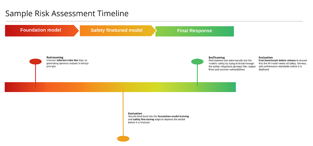
While this is just a minimum guideline, red-teaming and evaluations can be done multiple times across the stack and even on individual components (on just the prompt classifier, image classifier or the rewriter) before finalizing them and making sure the component has high precision and recall.
In conclusion, by implementing comprehensive safeguards throughout the model’s lifecycle — from pre-training to post-training, developers can not only reduce the risks of AI models generating harmful or biased content, but also prevent such content from being surfaced to the end user. Additionally, ongoing practices like red teaming and benchmarking throughout the lifecycle are crucial for discovering and evaluating vulnerabilities, ensuring that AI systems act safe, fair, and responsible in real-world applications.
Gen-AI Safety Landscape: A Guide to the Mitigation Stack for Text-to-Image Models was originally published in Towards Data Science on Medium, where people are continuing the conversation by highlighting and responding to this story.
Originally appeared here:
Gen-AI Safety Landscape: A Guide to the Mitigation Stack for Text-to-Image Models
A powerful Git feature for temporarily saving code in progress
Originally appeared here:
Meet Git Stash: Your Secret Chest of Unfinished Code
Go Here to Read this Fast! Meet Git Stash: Your Secret Chest of Unfinished Code


Don’t create a rainbow coloured bar chart. But don’t make your bar charts boring either.w
Originally appeared here:
Awesome Plotly with Code Series (Part 2): Colouring Bar Charts
Go Here to Read this Fast! Awesome Plotly with Code Series (Part 2): Colouring Bar Charts


When it comes to software development, there are plenty of automated testing tools and frameworks to rely on. But for analytics teams, manual testing and data quality assurance (QA) are still the norm. Too often, it’s the customer or business team who first spots issues with data quality or completeness, rather than the analytics team.
That’s where automation can make a huge difference. By setting up an automated system with scripts to run data quality tests at scale, you can keep things running fast without sacrificing the accuracy or completeness of your data.
Of course, this gets trickier when business questions are vague or open-ended. In those cases, a mix of rule-based logic and large language models (LLMs) can really help — allowing you to generate scenarios and run automated checks. In this tutorial, we’ll walk through how to build an automated testing system that evaluates and scores the quality of your data and SQL queries, even when the business questions are written in plain English.
To follow along with this tutorial, make sure you have the following:
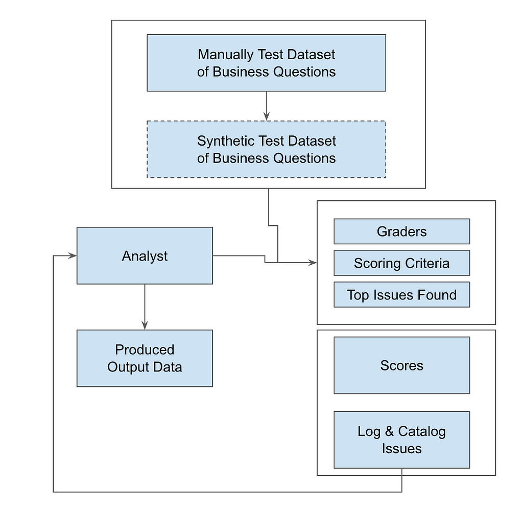
To build an automated QA system for evaluating SQL queries, the architecture must integrate rule-based logic, LLM validation, and automated scoring. This setup is perfect for handling those open-ended business questions, letting you scale your testing beyond manual processes.
Key components include:
The architecture includes a feedback loop that logs issue types–things like missing data, wrong granularity, or slow performance. This information get stored in a centralized database, so you can keep optimizing the system over time. We will use Python for scripting, SQL for tracking backend issues, and OpenAI’s LLM for interpreting natural language inputs. By scheduling these tests to run regularly, you’ll maintain consistent data quality and scalability, while also fine-tuning query performance to align with business goals.
The diagram below shows how data flows through the system — from SQL ingestion to automated testing, scoring, and issue tracking — so you can maintain high data quality at scale.
In the end, this system doesn’t just catch errors — it drives continuous improvement and keeps your technical execution aligned with business objectives.
To get started, collect real business questions that your internal teams or customers frequently ask the analytics team. Many of these might be ad-hoc data requests, so by having a variety of questions on hand you can make sure your testing is relevant. Here are a few examples to get you going:
2a: Define Your Graders
For thorough testing, set up graders from different perspectives to cover all bases:
2b: Define Scoring Criteria
Each grader should assess queries based on specific factors:
2c: Track and Log Issue Types
To cover all bases, it’s important to log common issues that arise during query execution. This makes it easier to tag and run automated evaluations later on.
import openai
import json

# Set your OpenAI API key here
openai.api_key = 'your-openai-api-key'
def evaluate_sql_query(question, query, results):
    # Define the prompt with placeholders for question, query, and results
    prompt = f"""
    As an external observer, evaluate the SQL query and results against the client's question. Provide an assessment from three perspectives:
    1. End User
    2. Data Scientist
    3. Business Leader

    For each role, provide:
    1. **Overall Score** (0-10)
    2. **Criteria Scores** (0-10):
       - Accuracy: How well does it meet the question?
       - Relevance: Is all needed data included, and is irrelevant data excluded?
       - Logic: Does the query make sense?
       - Efficiency: Is it concise and free of unnecessary complexity?
    3. **Issue Tags** (2D array: ['tag', 'details']):
       - Examples: Wrong Granularity, Excessive Columns, Missing Data, Incorrect Values, Wrong Filters, Performance Issues.
    4. **Other Observations** (2D array: ['tag', 'details'])

    Client Question:
    {question}

    SQL Query:
    {query}

    SQL Results:
    {results}

    Respond ONLY in this format:
    ```json
    {{
      "endUser": {{"overallScore": "", "criteriaScores": {{"accuracy": "", "relevance": "", "logic": "", "efficiency": ""}}, "issueTags": [], "otherObservations": []}},
      "dataScientist": {{"overallScore": "", "criteriaScores": {{"accuracy": "", "relevance": "", "logic": "", "efficiency": ""}}, "issueTags": [], "otherObservations": []}},
      "businessLeader": {{"overallScore": "", "criteriaScores": {{"accuracy": "", "relevance": "", "logic": "", "efficiency": ""}}, "issueTags": [], "otherObservations": []}}
    }}
    ```
    """
    # Call the OpenAI API with the prompt
    response = openai.Completion.create(
        engine="gpt-4",  # or whichever model you're using
        prompt=prompt,
        max_tokens=500,  # Adjust token size based on expected response length
        temperature=0  # Set temperature to 0 for more deterministic results
    )
    # Parse and return the result
    return json.loads(response['choices'][0]['text'])
# Example usage
question = "How many Pro Plan users converted from trial?"
query = "SELECT COUNT(*) FROM users WHERE plan = 'Pro' AND status = 'Converted' AND source = 'Trial';"
results = "250"
evaluation = evaluate_sql_query(question, query, results)
print(json.dumps(evaluation, indent=4))
3a: Loop Through the Questions
Once you’ve gathered your business questions, set up a loop to feed each question, its related SQL query, and the results into your evaluation function. This lets you automate the entire evaluation process, making sure that each query is scored consistently.
3b: Schedule Regular Runs
Automate the testing process by scheduling the script to run regularly — ideally after each data refresh or query update. This keeps the testing in sync with your data, catching any issues as soon as they arise.
3c: Log Scores, Tags, and Observations in a Database
For each test run, log all scores, issue tags, and observations in a structured database. Use the Python script to populate a table (e.g., issue_catalog) with the relevant data. This gives you a history of evaluations to track trends, pinpoint frequent issues, and optimize future testing.
4a: Pivot & Group by Scores
Leverage SQL queries or BI tools to create pivot tables that group your results by overall scores and specific criteria like accuracy, relevance, logic, and efficiency. This helps you spot trends in performance and figure out which areas need the most attention.
To calculate an overall score for each query across all graders, use a weighted formula:
Overall Score = w1×Accuracy + w2×Relevance + w3×Logic + w4×Efficiency
Where w1, w2, w3, w4 are the weights assigned to each scoring criterion. The sum of these weights should equal 1 for normalization.
For example, you might assign higher weight to Accuracy for Data Scientists and higher weight to Relevance for Business Leaders, depending on their priorities.
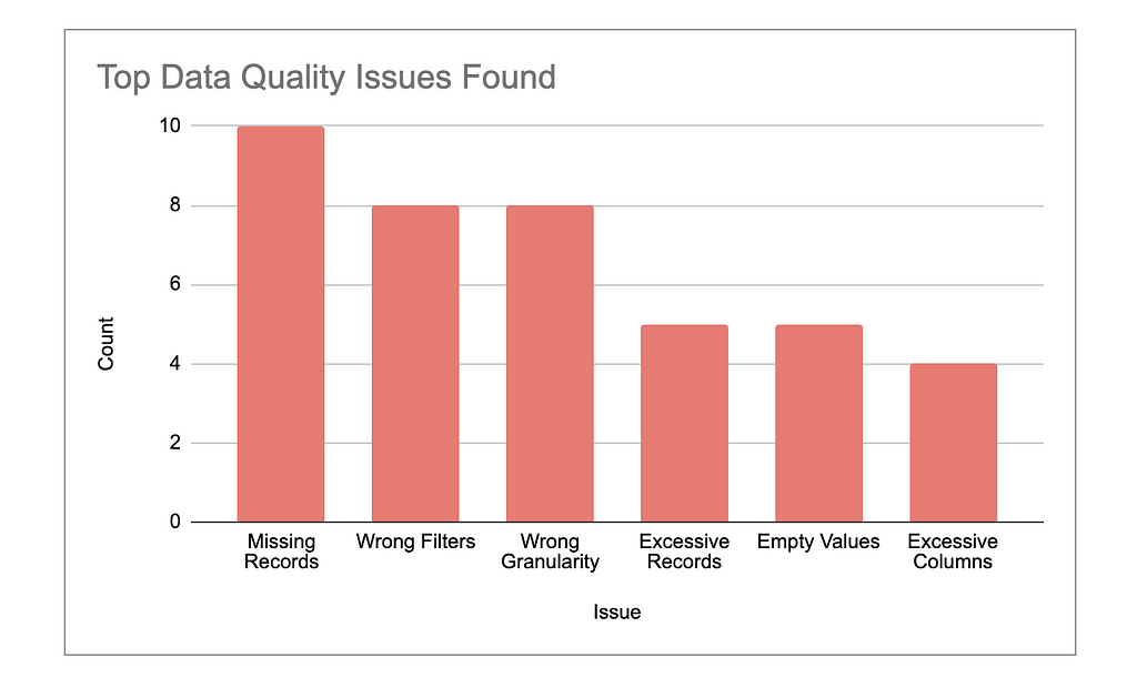
4b: Highlight Top Issues
Identify the most frequent and critical issues — things like missing data, wrong granularity, or performance inefficiencies. Provide a detailed report that breaks down how often these issues occur and which types of queries are most affected.
Focus on patterns that could lead to more significant errors if left unaddressed. For example, highlight cases where data quality issues might have skewed decision-making or slowed down business processes.
Prioritize the issues that need immediate action, such as those affecting query performance or accuracy in key datasets, and outline clear next steps to resolve them.
4c: Analyze Variance of Graders
Look closely at any discrepancies between scores from different graders (End User, Data Scientist, Business Leader). Large differences can reveal potential misalignments between the technical execution and business objectives.
For example, if a query scores high in technical accuracy but low in relevance to the business question, this signals a gap in translating data insights into actionable outcomes. Similarly, if the End User finds the results hard to interpret, but the Data Scientist finds them technically sound, it may point to communication or presentation issues.
By tracking these differences, you can better align the analytics process with both technical precision and business value, keeping all stakeholders satisfied.
To quantify this variance, you can calculate the variance of the graders’ scores. First, define the individual scores as:
The mean score μ across the three graders can be calculated as:
μ = (S-EndUser + S-DataScientist + S-BusinessLeader) / 3
Next, calculate the variance σ², which is the average of the squared differences between each grader’s score and the mean score. The formula for variance is:
σ² = (S-EndUser − μ)² + (S-DataScientist − μ)² + (S-BusinessLeader − μ)²/ 3
By calculating this variance, you can objectively measure how much the graders’ scores differ.
Large variances suggest that one or more graders perceive the quality of the query or relevance differently, which may indicate a need for better alignment between technical output and business needs.
5a: Pinpoint Key Issues
Throughout your testing process, you’ll likely notice certain issues cropping up repeatedly. These might include missing data, incorrect values, wrong granularity, or performance inefficiencies. It’s important to not only log these issues but also categorize and prioritize them.
For example, if critical data is missing, that should be addressed immediately, while performance tweaks can be considered as longer-term optimizations. By focusing on the most impactful and recurring problems, you’ll be able to improve data quality and tackle the root causes more effectively.
5b: Refine Your SQL Queries
Now that you’ve identified the recurring issues, it’s time to update your SQL queries to resolve them. This involves refining query logic to achieve accurate joins, filters, and aggregations. For example:
The goal here is to translate the feedback you’ve logged into tangible improvements in your SQL code, making your future queries more precise, relevant, and efficient.
5c: Re-Test for Validation
Once your queries have been optimized, re-run the tests to verify the improvements. Automating this step ensures that your updated queries are consistently evaluated against new data or business questions. Running the tests again allows you to confirm that your changes have fixed the issues and improved overall data quality. It also helps confirm that your SQL queries are fully aligned with business needs, which can enable quicker and more accurate insights. If any new issues arise, simply feed them back into the loop for continuous improvement.
Example Code for Automating the Feedback Loop
To automate this feedback loop, here is a Python script that processes multiple test cases (including business questions, SQL queries, and results), evaluates them using OpenAI’s API, and stores the results in a database:
for question, query, results in test_cases:
    # Call the OpenAI API to evaluate the SQL query and results
    response = openai.Completion.create(
        engine="text-davinci-003",  # Replace with GPT-4 or relevant engine
        prompt=prompt.format(question=question, query=query, results=results),
        max_tokens=1000
    )

    # Process and store the response
    process_response(response)

def store_results_in_db(test_run_id, question, role, scores, issue_tags, observations):
    # SQL insert query to store evaluation results in the issue catalog
    insert_query = """
    INSERT INTO issue_catalog
    (test_run_id, question, role, overall_score, accuracy_score, relevance_score, logic_score, efficiency_score, issue_tags, other_observations)
    VALUES (%s, %s, %s, %s, %s, %s, %s, %s, %s, %s);
    """
    db_cursor.execute(insert_query, (
        test_run_id, question, role, scores['overall'], scores['accuracy'], scores['relevance'],
        scores['logic'], scores['efficiency'], json.dumps(issue_tags), json.dumps(observations)
    ))
    db_conn.commit()
Setting Up the Issue Catalog Table
The issue_catalog table serves as the main repository for storing detailed test results, giving you a clear way to track query performance and flag issues over time. By using JSONB format for storing issue tags and observations, you gain flexibility, allowing you to log complex information without needing to update the database schema frequently. Here’s the SQL code for setting it up:
CREATE TABLE issue_catalog (
    id SERIAL PRIMARY KEY,
    test_run_id INT NOT NULL,
    question TEXT NOT NULL,
    role TEXT NOT NULL,  -- e.g., endUser, dataScientist, businessLeader
    overall_score INT NOT NULL,
    accuracy_score INT NOT NULL,
    relevance_score INT NOT NULL,
    logic_score INT NOT NULL,
    efficiency_score INT NOT NULL,
    issue_tags JSONB,  -- Storing issue tags as JSON for flexibility
    other_observations JSONB,  -- Storing other observations as JSON
    created_at TIMESTAMP DEFAULT CURRENT_TIMESTAMP
);
What This Feedback Loop Accomplishes
Automating SQL testing is a game-changer for analytics teams, helping them catch data issues early and resolve them with precision. By setting up a structured feedback loop that combines rule-based logic with LLMs, you can scale testing to handle even the most complex business questions.
This approach not only sharpens data accuracy but also keeps your insights aligned with business goals. The future of analytics depends on this balance between automation and insight — are you ready to make that leap?
Transforming Data Quality: Automating SQL Testing for Faster, Smarter Analytics was originally published in Towards Data Science on Medium, where people are continuing the conversation by highlighting and responding to this story.
Originally appeared here:
Transforming Data Quality: Automating SQL Testing for Faster, Smarter Analytics
An easy step-by-step guide to getting started with Neural Networks for Time Series Forecasting
Originally appeared here:
Neural Networks for Flexible Multivariate Forecasting
Go Here to Read this Fast! Neural Networks for Flexible Multivariate Forecasting


This article was originally posted on my blog https://jack-vanlightly.com.
The article was triggered by and riffs on the “Beware of silo specialisation” section of Bernd Wessely’s post Data Architecture: Lessons Learned. It brings together a few trends I am seeing plus my own opinions after twenty years experience working on both sides of the software / data team divide.
Conway’s Law:
“Any organization that designs a system (defined broadly) will produce a design whose structure is a copy of the organization’s communication structure.” — Melvin Conway
This is playing out worldwide across hundreds of thousands of organizations, and it is no more evident than in the split between software development and data analytics teams. These two groups usually have a different reporting structure, right up to, or immediately below, the executive team.
This is a problem now and is only growing.
Jay Kreps remarked five years ago that organizations are becoming software:
“It isn’t just that businesses use more software, but that, increasingly, a business is defined in software. That is, the core processes a business executes — from how it produces a product, to how it interacts with customers, to how it delivers services — are increasingly specified, monitored, and executed in software.” — Jay Kreps
The effectiveness of this software is directly tied to the organization’s success. If the software is dysfunctional, the organization is dysfunctional. The same can play out in reverse, as organizational structure dysfunction plays out in the software. All this means that a company that wants to win in its category can end up executing poorly compared to its competitors and being too slow to respond to market conditions. This kind of thing has been said umpteen times, but it is a fundamental truth.
When “software engineering” teams and the “data” teams operate in their own bubbles within their own reporting structures, a kind of tragic comedy ensues where the biggest loser is the business as a whole.

There are more and more signs that point to a change in attitudes to the current status quo of “us and them”, of software and data teams working at cross purposes or completely oblivious to each other’s needs, incentives, and contributions to the business’s success. There are three key trends that have emerged over the last two years in the data analytics space that have the potential to make real improvements. Each is still quite nascent but gaining momentum:
After reading this article, I think you’ll agree that all three are tightly interwoven.
Data engineering has evolved as a separate discipline from that of software engineering for numerous reasons:
The dust has largely settled, though technologies are still evolving. We’ve had time to consolidate and take stock of where we are. The data community is starting to realize that many of the current problems are not actually so different from the problems of the software development side. Data teams are writing software and interacting with software systems just as software engineers do.
The types of software can look different, but many of the practices from software engineering apply to data and analytics engineering as well:
It’s time for data and analytics engineers to identify as software engineers and regularly apply the practices of the wider software engineering discipline to their own sub-discipline.
Data contracts exploded onto the data scene in 2022/2023 as a response to the frustration of the constant break-fix work of broken pipelines and underperforming data teams. It went viral and everyone was talking about data contracts, though the concrete details of how one would implement them were scarce. But the objective was clear: fix the broken pipelines problem.
Broken pipelines for many reasons:
I recently listened to Super Data Science E825 with Chad Sanderson, a big proponent of data contracts. I loved how he defined the term:
My definition of data quality is a bit different from other people’s. In the software world, people think about quality as, it’s very deterministic. So I am writing a feature, I am building an application, I have a set of requirements for that application and if the software no longer meets those requirements that is known as a bug, it’s a quality issue. But in the data space you might have a producer of data that is emitting data or collecting data in some way, that makes a change which is totally sensible for their use case. As an example, maybe I have a column called timestamp that is being recorded in local time, but I decide to change that to UTC format. Totally fine, makes complete sense, probably exactly what you should do. But if there’s someone downstream of me that’s expecting local time, they’re going to experience a data quality issue. So my perspective is that data quality is actually a result of mismanaged expectations between the data producers and data consumers, and that is the function of the data contract. It’s to help these two sides actually collaborate better with each other. — Chad Sanderson
What constitutes a data contract is still somewhat open to interpretation and implementation regarding actual concrete technology and patterns. Schema management is a central theme, though only one part of the solution. A data contract is not only about specifying the shape of the data (its schema); it’s also about trust and dependability, and we can look to the REST API community to understand this point:
In software engineering, when Service A needs the data of Service B, what Service A absolutely doesn’t do is just access the private database of Service B. What happens is the following:
Why does the team of Service A do this for the team of Service B? Is it out of altruism? No. They collaborate because it is valuable for the business for them to do so. A well-run organization is run with the mantra of #OneTeam, and the organization does what is necessary to operate efficiently and effectively. That means that team Service A sometimes has to do work for the benefit of another team. It happens because of alignment of incentives going up the management chain.
It is also well known in software engineering that fixing bugs late in the development cycle, or worse, in production, is significantly more expensive than addressing them early on. It is disruptive to the software process to go back to previous work from a week or a month before, and bugs in production can lead to all manner of ills. A little upfront work on producing well-modeled, stable APIs makes life easier for everyone. There is a saying for this: an ounce of prevention is worth a pound of cure.
These APIs are contracts. They are established by opening communication between software teams and implemented when it is clear that the ROI makes it worth it. It really comes down to that. It generally works like this inside a software engineering department due to the aligned incentives of software leadership.
The term API (or Application Programming Interface) doesn’t quite fit “data”. Because the product is the data itself, rather than interface over some business logic, the term “data product” fits better. The word product also implies that there is some kind of quality attached, some level of professionalism and dependability. That is why data contracts are intimately related to data products, with data products being a materialization of the more abstract data contract.
Data products are very similar to the REST APIs on the software side. It comes down to the opening up of communication channels between teams, the rigorous specification of the shape of the data (including the time zone from Chad’s words earlier), careful evolution as inevitable changes occur, and the commitment of the data producers to maintain stable data APIs for the consumers. The difference is that a data product will typically be a table or a stream (the data itself), rather than an HTTP REST API, which typically drives some logic or retrieves a single entity per call.
Another key insight is that just as APIs make services reusable in a predictable way, data products make data processing work more reusable. In the software world, once the Orders API has been released, all downstream services that need to interact with the orders sub-system do so via that API. There aren’t a handful of single-use interfaces set up for each downstream use case. Yet that is exactly what we often see in data engineering, with single-use pipelines and multiple copies of the source data for different use cases.
Simply put, software engineering promotes reusability in software through modularity (be it actual software modules or APIs). Data products do the same for data.
Shift Left came out of the cybersecurity space. Security has also historically been another silo where software and security teams operate under different reporting structures, use different tools, have different incentives, and share little common vocabulary. The result has been a growing security crisis that we’ve become so used to now that the next multi-million record breach barely gets reported. We’re so used to it that we might not even consider it a crisis, but when you look at the trail of destruction left by ransomware gangs, information stealers, and extortionists, it’s hard to argue that this should be business as usual.
The idea of Shift Left is to shift the security focus left to where software is being developed, rather than being applied after the fact, by a separate team with little knowledge of the software being developed, modified, and deployed. Not only is it about integrating security earlier in the development process, it’s also about improving the quality of cyber telemetry. The heterogeneity and general “messiness” of cyber telemetry drive this movement of shifting processing, clean up, and contextualization to the left where the data production is. Reasoning about this data becomes so challenging once provenance is lost. While cyber data is unusually challenging, the lessons learned in this space are generalizable to other domains, such as data analytics.
The similarity of the silos of cybersecurity and data analytics is striking. Silos assume that the silo function can operate as a discrete unit, separated from other business functions. However, both cybersecurity and data analytics are cross-functional and must interact with many different areas of a business. Cross-functional teams can’t operate to the side, behind the scenes, or after the fact. Silos don’t work, and shift-left is about toppling the silos and replacing them with something less centralized and more embedded in the process of software development.
Bernd Wessely wrote a fantastic article on TowardsDataScience about the silo problem. In it he argues that the data analytics silo can be so engrained that the current practices are not questioned. That the silo comprised of an ingest-then-process paradigm is “only a workaround for inappropriate data management. A workaround necessary because of the completely inadequate way of dealing with data in the enterprise today.”
The sad thing is that none of this is new. I’ve been reading articles about breaking silos all my career, and yet here we are in 2024, still talking about the need to break them! But break them we must!
If the data silo is the centralized monolith, separated from the rest of an organization’s software, then shifting left is about integrating the data infrastructure into where the software lives, is developed, and operated.
Service B didn’t just reach into the private internals of Service A; instead, an interface was created that allowed Service A to get data from Service B without violating encapsulation. This interface, an API, queue, or stream, became a stable method of data consumption that didn’t break every time Service A needed to change its hidden internals. The burden of providing that interface was placed on the team of Service A because it was the right solution, but there was also a business case to do so. The same applies with Shift Left; instead of placing the ownership of making data available on the person who wants to use the data, you place that ownership upstream to where the data is produced and maintained.
At the center of this shift to the left is the data product. The data product, be it an event stream or an Iceberg table, is often best managed by the team that owns the underlying data. This way, we avoid the kludges, the rushed, jerry-rigged solutions that bypass good practices.
To make this a reality, we need the following:
We see a lot happening in this space, from catalogs, governance tooling, table formats such as Apache Iceberg, and a wealth of event streaming options. There is a lot of open source here but also a large number of vendors. The technologies and practices for building data products are still early in their evolution, but expect this space to develop rapidly.
You’d think that the majority of data platform engineering is solving tech problems at large scale. Unfortunately it’s once again the people problem that’s all-consuming. — Birdy
Organizations are becoming software, and software is organized according to the communication structure of the business; ergo, if we want to fix the software/data/security silo problem, then the solution is in the communication structure.
The most effective way to make data analytics more impactful in the enterprise is to fix the Conway’s Law problem. It has led to both a cultural and technological separation of data teams from the wider software engineering discipline, as well as weak communication structures and a lack of common understanding.
The result has been:
The barriers to achieving the vision of a more integrated software and data analytics world are the continued isolation of data teams and the misalignment of incentives that impede the cooperation between software and data teams. I believe that organizations that embrace #OneTeam, and get these two sides talking, collaborating, and perhaps even merging to some extent will see the greatest ROI. Some organizations may already have done so, but it is by no means widespread.
Things are changing; attitudes are changing. Data engineering is software engineering, data contracts/products, and the emergence of Shift Left are all leading indicators.
The Curse of Conway and the Data Space was originally published in Towards Data Science on Medium, where people are continuing the conversation by highlighting and responding to this story.
Originally appeared here:
The Curse of Conway and the Data Space
Go Here to Read this Fast! The Curse of Conway and the Data Space