Tag: artificial intelligence

  • Optimizing Instance Type Selection for AI Development in Cloud Spot Markets

    Chaim Rand

    Instance Selection for Deep Learning — Part 2

    Photo by Mike Enerio on Unsplash

    This post was written in collaboration with Tomer Berkovich, Yitzhak Levi, and Max Rabin.

    Appropriate instance selection for machine learning (ML) workloads is an important decision with potentially significant implications on the speed and cost of development. In a previous post we expanded on this process, proposed a metric for making this important decision, and highlighted some of the many factors you should take into consideration. In this post we will demonstrate the opportunity for reducing AI model training costs by taking Spot Instance availability into account when making your cloud-based instance selection decision.

    Reducing Costs Using Spot Instances

    One of the most significant opportunities for cost savings in the cloud is to take advantage of low cost Amazon EC2 Spot Instances. Spot instances are discounted compute engines from surplus cloud service capacity. In exchange for the discounted price, AWS maintains the right to preempt the instance with little to no warning. Consequently, the relevance of Spot instance utilization is limited to workloads that are fault tolerant. Fortunately, through effective use of model checkpointing ML training workloads can be designed to be fault tolerant and to take advantage of the Spot instance offering. In fact, Amazon SageMaker, AWS’s managed service for developing ML, makes it easy to train on Spot instances by managing the end-to-end Spot life-cycle for you.

    The Challenge of Anticipating Spot Instance Capacity

    Unfortunately, Spot instance capacity, which measures the availability of Spot instances for use, is subject to constant fluctuations and can be very difficult to predict. Amazon offers partial assistance in assessing the Spot instance capacity of an instance type of choice via its Spot placement score (SPS) feature which indicates the likelihood that a Spot request will succeed in a given region or availability zone (AZ). This is especially helpful when you have the freedom to choose to train your model in one of several different locations. However, the SPS feature offers no guarantees.

    When you choose to train a model on one or more Spot instances, you are taking the risk that your instance type of choice does not have any Spot capacity (i.e., your training job will not start), or worse, that you will enter an iterative cycle in which your training repeatedly runs for just a small number of training steps and is stopped before you have made any meaningful progress — which can tally up your training costs without any return.

    Over the past couple of years, the challenges of spot instance utilization have been particularly acute when it comes to multi-GPU EC2 instance types such as g5.12xlarge and p4d.24xlarge. A huge increase in demand for powerful training accelerators (driven in part by advances in the field of Generative AI) combined with disruptions in the global supply chain, have made it virtually impossible to reliably depend on multi-GPU Spot instances for ML training. The natural fallback is to use the more costly On-Demand (OD) or reserved instances. However, in our previous post we emphasized the value of considering many different alternatives for your choice of instance type. In this post we will demonstrate the potential gains of replacing multi-GPU On Demand instances with multiple single-GPU Spot instances.

    Although our demonstration will use Amazon Web Services, similar conclusions can be reached on alternative cloud service platforms (CSPs). Please do not interpret our choice of CSP or services as an endorsement. The best option for you will depend on the unique details of your project. Furthermore, please take into consideration the possibility that the type of cost savings we will demonstrate will not reproduce in the case of your project and/or that the solution we propose will not be applicable (e.g., for some reason beyond the scope of this post). Be sure to conduct a detailed evaluation of the relevance and efficacy of the proposal before adapting it to your use case.

    When Multiple Single-GPU Instances are Better than a Single Multi-GPU Instance

    Nowadays, training AI models on multiple GPU devices in parallel — a process called distributed training — is commonplace. Setting aside instance pricing, when you have the choice between an instance type with multiple GPUs and multiple instance types with the same type of single GPUs, you would typically choose the multi-GPU instance. Distributed training typically requires a considerable amount of data communication (e.g., gradient sharing) between the GPUs. The proximity of the GPUs on a single instance is bound to facilitate higher network bandwidth and lower latency. Moreover, some multi-GPU instances include dedicated GPU-to-GPU inter-connections that can further accelerate the communication (e.g., NVLink on p4d.24xlarge). However, when Spot capacity is limited to single GPU instances, the option of training on multiple single GPU instances at a much lower cost becomes more compelling. At the very least, it warrants evaluation of its opportunity for cost-savings.

    Optimizing Data Communication Between Multiple EC2 Instances

    When distributed training runs on multiple instances, the GPUs communicate with one another via the network between the host machines. To optimize the speed of training and reduce the likelihood and/or impact of a network bottleneck, we need to ensure minimal network latency and maximal data throughput. These can be affected by a number of factors.

    Instance Collocation

    Network latency can be greatly impacted by the relative locations of the EC2 instances. Ideally, when we request multiple cloud-based instances we would like them to all be collocated on the same physical rack. In practice, without appropriate configuration, they may not even be in the same city. In our demonstration below we will use a VPC Config object to program an Amazon SageMaker training job to use a single subnet of an Amazon Virtual Private Cloud (VPC). This technique will ensure that all the requested training instances will be in the same availability zone (AZ). However, collocation in the same AZ, may not suffice. Furthermore, the method we described involves choosing a subnet associated with one specific AZ (e.g., the one with the highest Spot placement score). A preferred API would fulfill the request in any AZ that has sufficient capacity.

    A better way to control the placement of our instances is to launch them inside a placement group, specifically a cluster placement group. Not only will this guarantee that all of the instances will be in the same AZ, but it will also place them on “the same high-bisection bandwidth segment of the network” so as to maximize the performance of the network traffic between them. However, as of the time of this writing SageMaker does not provide the option to specify a placement group. To take advantage of placement groups we would need to use an alternative training service solution (as we will demonstrate below).

    EC2 Network Bandwidth Constraints

    Be sure to take into account the maximal network bandwidth supported by the EC2 instances that you choose. Note, in particular, that the network bandwidths associated with single-GPU machines are often documented as being “up to” a certain number of Gbps. Make sure to understand what that means and how it can impact the speed of training over time.

    Keep in mind that the GPU-to-GPU data communication (e.g., gradient sharing) might need to share the limited network bandwidth with other data flowing through the network such as training samples being streamed into the training instances or training artifacts being uploaded to persistent storage. Consider ways of reducing the payload of each of the categories of data to minimize the likelihood of a network bottleneck.

    Elastic Fabric Adapter (EFA)

    A growing number of EC2 instance types support Elastic Fabric Adapter (EFA), a dedicated network interface for optimizing inter-node communication. Using EFA can have a decisive impact on the runtime performance of your training workload. Note that the bandwidth on the EFA network channel is different than the documented bandwidth of the standard network. As of the time of this writing, detailed documentation of the EFA capabilities is hard to come by and it is usually best to evaluate its impact through trial and error. Consider using an EC2 instance that supports EFA type when relevant.

    Toy Example

    We will now demonstrate the comparative price performance of training on four single-GPU EC2 g5 Spot instances (ml.g5.2xlarge and ml.g5.4xlarge) vs. a single four-GPU On-Demand instance (ml.g5.12xlarge). We will use the training script below containing a Vision Transformer (ViT) backed classification model (trained on synthetic data).

    import os, torch, time
    import torch.distributed as dist
    from torch.utils.data import Dataset, DataLoader
    from torch.cuda.amp import autocast
    from torch.nn.parallel import DistributedDataParallel as DDP
    from timm.models.vision_transformer import VisionTransformer

    batch_size = 128
    log_interval = 10

    # use random data
    class FakeDataset(Dataset):
    def __len__(self):
    return 1000000

    def __getitem__(self, index):
    rand_image = torch.randn([3, 224, 224], dtype=torch.float32)
    label = torch.tensor(data=[index % 1000], dtype=torch.int64)
    return rand_image, label

    def mp_fn():
    local_rank = int(os.environ['LOCAL_RANK'])
    dist.init_process_group("nccl")
    torch.cuda.set_device(local_rank)

    # model definition
    model = VisionTransformer()
    loss_fn = torch.nn.CrossEntropyLoss()
    model.to(torch.cuda.current_device())
    model = DDP(model)
    optimizer = torch.optim.Adam(params=model.parameters())

    # dataset definition
    num_workers = os.cpu_count()//int(os.environ['LOCAL_WORLD_SIZE'])
    dl = DataLoader(FakeDataset(), batch_size=batch_size, num_workers=num_workers)

    model.train()
    t0 = time.perf_counter()
    for batch_idx, (x, y) in enumerate(dl, start=1):
    optimizer.zero_grad(set_to_none=True)
    x = x.to(torch.cuda.current_device())
    y = torch.squeeze(y.to(torch.cuda.current_device()), -1)
    with autocast(enabled=True, dtype=torch.bfloat16):
    outputs = model(x)
    loss = loss_fn(outputs, y)
    loss.backward()
    optimizer.step()
    if batch_idx % log_interval == 0 and local_rank == 0:
    time_passed = time.perf_counter() - t0
    samples_processed = dist.get_world_size() * batch_size * log_interval
    print(f'{samples_processed / time_passed} samples/second')
    t0 = time.perf_counter()

    if __name__ == '__main__':
    mp_fn()

    The code block below demonstrates how we used the SageMaker Python package (version 2.203.1) to run our experiments. Note that for the four-instance experiments, we configure the use of a VPC with a single subnet, as explained above.

    from sagemaker.pytorch import PyTorch
    from sagemaker.vpc_utils import VPC_CONFIG_DEFAULT


    # Toggle flag to switch between multiple single-GPU nodes and
    # single multi-GPU node
    multi_inst = False

    inst_count=1
    inst_type='ml.g5.12xlarge'
    use_spot_instances=False
    max_wait=None #max seconds to wait for Spot job to complete
    subnets=None
    security_group_ids=None

    if multi_inst:
    inst_count=4
    inst_type='ml.g5.4xlarge' # optinally change to ml.g5.2xlarge
    use_spot_instances=True
    max_wait=24*60*60 #24 hours
    # configure vpc settings
    subnets=['<VPC subnet>']
    security_group_ids=['<Security Group>']


    estimator = PyTorch(
    role='<sagemaker role>',
    entry_point='train.py',
    source_dir='<path to source dir>',
    instance_type=inst_type,
    instance_count=inst_count,
    framework_version='2.1.0',
    py_version='py310',
    distribution={'torch_distributed': {'enabled': True}},
    subnets=subnets,
    security_group_ids=security_group_ids,
    use_spot_instances=use_spot_instances,
    max_wait=max_wait
    )

    # start job
    estimator.fit()

    Note that our code depends on the third-party timm Python package that we point to in a requirements.txt file in the root of the source directory. This assumes that the VPC has been configured to enable internet access. Alternatively, you could define a private PyPI server (as described here), or create a custom image with your third party dependencies preinstalled (as described here).

    Results

    We summarize the results of our experiment in the table below. The On-Demand prices were taken from the SageMaker pricing page (as of the time of this writing, January 2024). The Spot saving values were collected from the reported managed spot training savings of the completed job. Please see the EC2 Spot pricing documentation to get a sense for how the reported Spot savings are calculated.

    Experiment Results (by Author)

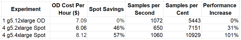
    Our results clearly demonstrate the potential for considerable savings when using four single-GPU Spot instances rather than a single four-GPU On Demand instance. They further demonstrate that although the cost of an On Demand g5.4xlarge instance type is higher, the increased CPU power and/or network bandwidth combined with higher Spot savings, resulted in much greater savings.

    Importantly, keep in mind that the relative performance results can vary considerably based on the details of your job as well the Spot prices at the time that you run your experiments.

    Enforcing EC2 Instance Co-location Using a Cluster Placement Group

    In a previous post we described how to create a customized managed environment on top of an unmanaged service, such as Amazon EC2. One of the motivating factors listed there was the desire to have greater control over device placement in a multi-instance setup, e.g., by using a cluster placement group, as discussed above. In this section, we demonstrate the creation of a multi-node setup using a cluster placement group.

    Our code assumes the presence of a default VPC as well as the (one-time) creation of a cluster placement group, demonstrated here using the AWS Python SDK (version 1.34.23):

    import boto3

    ec2 = boto3.client('ec2')
    ec2.create_placement_group(
    GroupName='cluster-placement-group',
    Strategy='cluster'
    )

    In the code block below we use the AWS Python SDK to launch our Spot instances:

    import boto3

    ec2 = boto3.resource('ec2')
    instances = ec2.create_instances(
    MaxCount=4,
    MinCount=4,
    ImageId='ami-0240b7264c1c9e6a9', # replace with image of choice
    InstanceType='g5.4xlarge',
    Placement={'GroupName':'cluster-placement-group'},
    InstanceMarketOptions={
    'MarketType': 'spot',
    'SpotOptions': {
    "SpotInstanceType": "one-time",
    "InstanceInterruptionBehavior": "terminate"
    }
    },
    )

    Please see our previous post for step-by-step tips on how to extend this to an automated training solution.

    Summary

    In this post, we have illustrated how demonstrating flexibility in your choice of training instance type can increase your ability to leverage Spot instance capacity and reduce the overall cost of training.

    As the sizes of AI models continue to grow and the costs of AI training accelerators continue to rise, it becomes increasingly important that we explore ways to mitigate training expenses. The technique outlined here is just one among several methods for optimizing cost performance. We encourage you to explore our previous posts for insights into additional opportunities in this realm.


    Optimizing Instance Type Selection for AI Development in Cloud Spot Markets was originally published in Towards Data Science on Medium, where people are continuing the conversation by highlighting and responding to this story.

    Originally appeared here:
    Optimizing Instance Type Selection for AI Development in Cloud Spot Markets

    Go Here to Read this Fast! Optimizing Instance Type Selection for AI Development in Cloud Spot Markets

  • The Data Speaker’s Blueprint: Turning Analytics into Applause

    The Data Speaker’s Blueprint: Turning Analytics into Applause

    Alessandro Romano

    In this article, I’d like to share my experiences and learnings as a public speaker in the field of data science. Starting with small local meetups and eventually progressing to larger events, my journey has been filled with valuable insights. I hope to offer guidance and share what I’ve learned with anyone ready to contribute their knowledge to the community.

    Me at the Applydata Summit 2023 in Berlin

    During my career as a Data Scientist, I’ve attended many conferences and meetups. When I started my job, many were struggling to understand what Data Science was and how to leverage the growing cloud computing solutions. It always felt like a jungle!

    That’s why connecting with the data community through meetups and other local events became essential for me. At some point, someone invited me to present a project I was working on. It was then I realized how much I enjoy sharing and explaining my work!

    Since then, I’ve had the pleasure of speaking at various conferences, including ODSC, PyCon, and Data Innovation Summit, among others. Each time I’m asked:

    “How do you find the right story for a conference?”

    “Aren’t you scared of making mistakes while presenting something technical?”

    These questions, among others I’ve received, made me realize it’s time to share what I’ve learned over the years and, hopefully, inspire new data experts to share their knowledge.

    Why do we need Data Speakers?

    Data is tough! Companies often don’t really know what they’re looking for, pushing data enthusiasts to find solutions for problems that sometimes just can’t be solved. Now, imagine how helpful it would be to connect with someone facing the same challenges, who might offer the very answer you’ve been seeking. Or perhaps simply someone you can relate to, where you can share and delve deeply into the work you’re doing.

    This is precisely why we need skilled communicators in our field. I still vividly recall when this amazing Data Engineer shared how he resolved a deployment issue with AWS Lambda during his presentation. This issue had been a challenge for me for several weeks.

    On another note, listening to someone present a use case can be enlightening. It’s a way to discover certain solutions and understand how they can be applied. Moreover, if you’re truly passionate about your work, presenting your ideas and opening them up for discussion can be immensely enjoyable. It’s an opportunity to receive feedback from a diverse array of people.

    I also hold the conviction that in a world where AI, such as applied Large Language Models (LLMs), has significantly advanced, there’s an increasing need for enhanced communication. This is crucial to explain the layers of complexity that exist between us and the technologies that have become part of our lives.

    I don’t have anything to say

    Generated with Dall-E

    Sadly, this is a sentiment I often encounter. To me, it always echoes like:

    “I don’t have the right to speak because I don’t have anything to say.”

    But this couldn’t be further from the truth. There’s always something to say, especially when you’re immersed in the world of data every day. You’re surrounded by stories and challenges that defy simple, deterministic solutions. To me, that’s the perfect starting point for something extraordinary!

    We sometimes overlook the significance of our work, merely because it’s part of our daily conversations. We discuss it with our boss, colleagues, and forget that outside our bubble, many companies and individuals are still navigating the basics of data and AI. For example, I know many who aren’t familiar with ChatGPT, despite its growing popularity. Take your insights beyond your immediate circle, and you’ll realize how vast your audience truly is!

    Lastly, if you work in data, you are inherently a storyteller. It’s impossible to work in this field without transforming complex contexts into more digestible narratives. You might be doing it subconsciously, but you’re definitely doing it.

    Presentation as a Product: Tips and Tricks

    Consider crafting your presentation as you would any other product. Its value is crucial; without it, the presentation might not be worthwhile.

    To elaborate, presenting to a conference is a collaborative effort involving the audience, the speaker, and the organizers. If your presentation doesn’t add value for these three key groups, it’s wise to step back and reassess its purpose.

    I believe that a compelling talk begins with addressing a specific need. It could be something you’ve dedicated months to, leading to a realization that it’s worth sharing. Whether it’s about your successful solutions or your failures (and the lessons learned), it should stem from your personal expertise and diligent effort.

    Before diving into some tips for crafting your presentation, let’s address what I believe is the elephant in the room:

    Aim to be a Data Advocate, not a Data Guru.

    I observe that the world is brimming with ‘gurus’ but has only a handful of true experts. When you think about taking the stage, view it as a platform for sharing knowledge rather than as a destination or a crowning achievement. The term “Guru” isn’t inherently negative, but in this context, I want to emphasize the distinction I’m making.

    Find the Topic

    When deciding on the topic for my next presentation, I begin with three basic yet essential questions:

    1. What project am I currently immersed in?
    2. What challenges have I recently faced in this work?
    3. Will sharing this information be beneficial to others?

    These questions are my starting point for pinpointing the ideal subject. The following step involves researching who else is discussing similar topics, through various channels like publications, talks, or Medium articles. This stage is vital as it requires a thorough understanding of current trends and developments, ensuring that my contribution stands out in some unique way.

    Take, for instance, a Medium article I wrote a few years back. I wasn’t introducing something brand new; instead, the innovation lay in how I combined existing technologies to overcome a specific challenge. This experience then became the focus of a talk I gave to a local Python community in Hamburg.

    Craft your Slides Deck

    Image from the Author

    I firmly subscribe to the philosophy that “less text is better”, and I remain open to contrary views, though I’m quite steadfast in my belief! Instead of relying heavily on text, I suggest using visuals that succinctly explain your algorithm or employing brief bullet points as your guide. When presenting to an audience that may not be as deeply immersed in the subject as you are and has likely sat through other presentations, overloading them with text can be counterproductive. The result? A disengaged audience and the feeling that your message isn’t getting through. Just picture enduring a 30-minute presentation under such conditions!

    Maintain a minimalistic approach with your presentation slides, showcasing only the crucial elements that complement your talk. Understand that it’s impossible to cover every detail. Instead, provide a few links to your work for those in the audience who wish to explore the topic further.

    Remember to acknowledge the work of others in your presentation. It’s important to give credit for original content, as this isn’t about competition. By recognizing the contributions of others, you significantly elevate the quality of your presentation, demonstrating a thorough understanding of the subject matter.

    Explain like no one knows what you’re talking about

    This is your moment to truly stand out, after all the effort you’ve put into your subject! Aim to captivate everyone’s attention. Ensure the experts in the room are pleased to hear about familiar topics, while those less knowledgeable feel included and able to grasp your points. Be observant of your audience; gauge whether they are keeping up with you. If time allows, lighten the mood with a joke to ease both your nerves and theirs. Engage your audience directly by asking a few questions during your talk to maintain high levels of attention.

    I view this as a strategic game where you must actively prevent the audience’s attention from waning. Incorporate as many additional details as possible to help the audience connect with you and the problem you tackled. This might include some background on your company or what methods were used before your solution came into play.

    That’s why we call it Story Telling and not Data Telling.

    Ultimately, the question arises: should you script your speech and commit it to memory? In my view, that’s a matter of personal preference. Personally, I tend not to. This is mainly because I prefer to let the flow of ideas guide my presentation, allowing me to spontaneously include thoughts I might not have initially considered. This approach, largely driven through experience, makes the whole process much more enjoyable, in my opinion.

    Final Thoughts

    Generated with Dall-E

    While for some, the scary aspect might be standing on stage, for me, the real battle was against imposter syndrome. This feeling seems to be a common thread among data scientists. Hence, stepping out to talk about a project that’s somewhat nebulous or didn’t quite work out as expected can be quite challenging. Thankfully, I overcame my apprehensions, and thanks to numerous incredible speakers I’ve encountered along my journey, I’ve been able to look back at my achievements and recognize that many are indeed worth sharing.

    So, break out of your bubble and find the stage that suits you best. Whether it’s a topic in Data Science or a Data Engineering use case, gather all your insights, step out, and share them with the world.

    If you are in need of support or want to connect, feel free to reach out: https://www.aromano.dev/


    The Data Speaker’s Blueprint: Turning Analytics into Applause was originally published in Towards Data Science on Medium, where people are continuing the conversation by highlighting and responding to this story.

    Originally appeared here:
    The Data Speaker’s Blueprint: Turning Analytics into Applause

    Go Here to Read this Fast! The Data Speaker’s Blueprint: Turning Analytics into Applause

  • Do European M&Ms Actually Taste Better than American M&Ms?

    Do European M&Ms Actually Taste Better than American M&Ms?

    Erin Wilson

    An overly-enthusiastic application of science and data visualization to a question we’ve all been asking

    An especially sweet box plot. Image by author.

    (Oh, I am the only one who’s been asking this question…? Hm. Well, if you have a minute, please enjoy this exploratory data analysis — featuring experimental design, statistics, and interactive visualization — applied a bit too earnestly to resolve an international debate.)

    1. Introduction

    1.1 Background and motivation

    Chocolate is enjoyed around the world. From ancient practices harvesting organic cacao in the Amazon basin, to chocolatiers sculpting edible art in the mountains of Switzerland, and enormous factories in Hershey, Pennsylvania churning out 70 million kisses per day, the nuanced forms and flavors of chocolate have been integrated into many cultures and their customs. While quality can greatly vary across chocolate products, a well-known, shelf-stable, easily shareable form of chocolate are M&Ms. Readily found by convenience store check-out counters and in hotel vending machines, the brightly colored pellets are a popular treat whose packaging is re-branded to fit nearly any commercializable American holiday.

    While living in Denmark in 2022, I heard a concerning claim: M&Ms manufactured in Europe taste different, and arguably “better,” than M&Ms produced in the United States. While I recognized that fancy European chocolate is indeed quite tasty and often superior to American chocolate, it was unclear to me if the same claim should hold for M&Ms. I learned that many Europeans perceive an “unpleasant” or “tangy” taste in American chocolate, which is largely attributed to butyric acid, a compound resulting from differences in how milk is treated before incorporation into milk chocolate.

    But honestly, how much of a difference could this make for M&Ms? M&Ms!? I imagined M&Ms would retain a relatively processed/mass-produced/cheap candy flavor wherever they were manufactured. As the lone American visiting a diverse lab of international scientists pursuing cutting-edge research in biosustainability, I was inspired to break out my data science toolbox and investigate this M&M flavor phenomenon.

    1.2 Previous work

    To quote a European woman, who shall remain anonymous, after she tasted an American M&M while traveling in New York:

    “They taste so gross. Like vomit. I don’t understand how people can eat this. I threw the rest of the bag away.”

    Vomit? Really? In my experience, children raised in the United States had no qualms about eating M&Ms. Growing up, I was accustomed to bowls of M&Ms strategically placed in high traffic areas around my house to provide readily available sugar. Clearly American M&Ms are edible. But are they significantly different and/or inferior to their European equivalent?

    In response to the anonymous European woman’s scathing report, myself and two other Americans visiting Denmark sampled M&Ms purchased locally in the Lyngby Storcenter Føtex. We hoped to experience the incredible improvement in M&M flavor that was apparently hidden from us throughout our youths. But curiously, we detected no obvious flavor improvements.

    Unfortunately, neither preliminary study was able to conduct a side-by-side taste test with proper controls and randomized M&M sampling. Thus, we turn to science.

    1.3 Study Goals

    This study seeks to remedy the previous lack of thoroughness and investigate the following questions:

    1. Is there a global consensus that European M&Ms are in fact better than American M&Ms?
    2. Can Europeans actually detect a difference between M&Ms purchased in the US vs in Europe when they don’t know which one they are eating? Or is this a grand, coordinated lie amongst Europeans to make Americans feel embarrassed?
    3. Are Americans actually taste-blind to American vs European M&Ms? Or can they taste a difference but simply don’t describe this difference as “an improvement” in flavor?
    4. Can these alleged taste differences be perceived by citizens of other continents? If so, do they find one flavor obviously superior?

    2. Methods

    2.1 Experimental design and data collection

    Participants were recruited by luring — er, inviting them to a social gathering (with the promise of free food) that was conveniently co-located with the testing site. Once a participant agreed to pause socializing and join the study, they were positioned at a testing station with a trained experimenter who guided them through the following steps:

    • Participants sat at a table and received two cups: 1 empty and 1 full of water. With one cup in each hand, the participant was asked to close their eyes, and keep them closed through the remainder of the experiment.
    • The experimenter randomly extracted one M&M with a spoon, delivered it to the participant’s empty cup, and the participant was asked to eat the M&M (eyes still closed).
    • After eating each M&M, the experimenter collected the taste response by asking the participant to report if they thought the M&M tasted: Especially Good, Especially Bad, or Normal.
    • Each participant received a total of 10 M&Ms (5 European, 5 American), one at a time, in a random sequence determined by random.org.
    • Between eating each M&M, the participant was asked to take a sip of water to help “cleanse their palate.”
    • Data collected: for each participant, the experimenter recorded the participant’s continent of origin (if this was ambiguous, the participant was asked to list the continent on which they have the strongest memories of eating candy as a child). For each of the 10 M&Ms delivered, the experimenter recorded the M&M origin (“Denmark” or “USA”), the M&M color, and the participant’s taste response. Experimenters were also encouraged to jot down any amusing phrases uttered by the participant during the test, recorded under notes (data available here).

    2.2 Sourcing materials and recruiting participants

    Two bags of M&Ms were purchased for this study. The American-sourced M&Ms (“USA M&M”) were acquired at the SFO airport and delivered by the author’s parents, who visited her in Denmark. The European-sourced M&Ms (“Denmark M&M”) were purchased at a local Føtex grocery store in Lyngby, a little north of Copenhagen.

    Experiments were conducted at two main time points. The first 14 participants were tested in Lyngby, Denmark in August 2022. They mostly consisted of friends and housemates the author met at the Novo Nordisk Foundation Center for Biosustainability at the Technical University of Denmark (DTU) who came to a “going away party” into which the experimental procedure was inserted. A few additional friends and family who visited Denmark were also tested during their travels (e.g. on the train).

    The remaining 37 participants were tested in Seattle, WA, USA in October 2022, primarily during a “TGIF happy hour” hosted by graduate students in the computer science PhD program at the University of Washington. This second batch mostly consisted of students and staff of the Paul. G. Allen School of Computer Science & Engineering (UW CSE) who responded to the weekly Friday summoning to the Allen Center atrium for free snacks and drinks.

    Figure 1. Distribution of participants recruited to the study. In the first sampling event in Lyngby, participants primarily hailed from North America and Europe, and a few additionally came from Asia, South America, or Australia. Our second sampling event in Seattle greatly increased participants, primarily from North America and Asia, and a few more from Europe. Neither event recruited participants from Africa. Figure made with Altair.

    While this study set out to analyze global trends, unfortunately data was only collected from 51 participants the author was able to lure to the study sites and is not well-balanced nor representative of the 6 inhabited continents of Earth (Figure 1). We hope to improve our recruitment tactics in future work. For now, our analytical power with this dataset is limited to response trends for individuals from North America, Europe, and Asia, highly biased by subcommunities the author happened to engage with in late 2022.

    2.3 Risks

    While we did not acquire formal approval for experimentation with human test subjects, there were minor risks associated with this experiment: participants were warned that they may be subjected to increased levels of sugar and possible “unpleasant flavors” as a result of participating in this study. No other risks were anticipated.

    After the experiment however, we unfortunately observed several cases of deflated pride when a participant learned their taste response was skewed more positively towards the M&M type they were not expecting. This pride deflation seemed most severe among European participants who learned their own or their fiancé’s preference skewed towards USA M&Ms, though this was not quantitatively measured and cannot be confirmed beyond anecdotal evidence.

    3. Results & Discussion

    3.1 Overall response to “USA M&Ms” vs “Denmark M&Ms”

    3.1.1 Categorical response analysis — entire dataset

    In our first analysis, we count the total number of “Bad”, “Normal”, and “Good” taste responses and report the percentage of each response received by each M&M type. M&Ms from Denmark more frequently received “Good” responses than USA M&Ms but also more frequently received “Bad” responses. M&Ms from the USA were most frequently reported to taste “Normal” (Figure 2). This may result from the elevated number of participants hailing from North America, where the USA M&M is the default and thus more “Normal,” while the Denmark M&M was more often perceived as better or worse than the baseline.

    Now let’s break out some statistics, such as a chi-squared (X2) test to compare our observed distributions of categorical taste responses. Using the scipy.stats chi2_contingency function, we built contingency tables of the observed counts of “Good,” “Normal,” and “Bad” responses to each M&M type. Using the X2 test to evaluate the null hypothesis that there is no difference between the two M&Ms, we found the p-value for the test statistic to be 0.0185, which is significant at the common p-value cut off of 0.05, but not at 0.01. So a solid “maybe,” depending on whether you’d like this result to be significant or not.

    3.1.2 Quantitative response analysis — entire dataset.

    The X2 test helps evaluate if there is a difference in categorical responses, but next, we want to determine a relative taste ranking between the two M&M types. To do this, we converted taste responses to a quantitative distribution and calculated a taste score. Briefly, “Bad” = 1, “Normal” = 2, “Good” = 3. For each participant, we averaged the taste scores across the 5 M&Ms they tasted of each type, maintaining separate taste scores for each M&M type.

    Figure 3. Quantitative taste score distributions across the whole dataset. Kernel density estimation of the average taste score calculated for each participant for each M&M type. Figure made with Seaborn.

    With the average taste score for each M&M type in hand, we turn to scipy.stats ttest_ind (“T-test”) to evaluate if the means of the USA and Denmark M&M taste scores are different (the null hypothesis being that the means are identical). If the means are significantly different, it would provide evidence that one M&M is perceived as significantly tastier than the other.

    We found the average taste scores for USA M&Ms and Denmark M&Ms to be quite close (Figure 3), and not significantly different (T-test: p = 0.721). Thus, across all participants, we do not observe a difference between the perceived taste of the two M&M types (or if you enjoy parsing triple negatives: “we cannot reject the null hypothesis that there is not a difference”).

    But does this change if we separate participants by continent of origin?

    3.2 Continent-specific responses to “USA M&Ms” vs “Denmark M&Ms”

    We repeated the above X2 and T-test analyses after grouping participants by their continents of origin. The Australia and South America groups were combined as a minimal attempt to preserve data privacy. Due to the relatively small sample size of even the combined Australia/South America group (n=3), we will refrain from analyzing trends for this group but include the data in several figures for completeness and enjoyment of the participants who may eventually read this.

    3.2.1 Categorical response analysis — by continent

    In Figure 4, we display both the taste response counts (upper panel, note the interactive legend) and the response percentages (lower panel) for each continent group. Both North America and Asia follow a similar trend to the whole population dataset: participants report Denmark M&Ms as “Good” more frequently than USA M&Ms, but also report Denmark M&Ms as “Bad” more frequently. USA M&Ms were most frequently reported as “Normal” (Figure 4).

    On the contrary, European participants report USA M&Ms as “Bad” nearly 50% of the time and “Good” only 18% of the time, which is the most negative and least positive response pattern, respectively (when excluding the under-sampled Australia/South America group).

    This appeared striking in bar chart form, however only North America had a significant X2 p-value (p = 0.0058) when evaluating each continent’s difference in taste response profile between the two M&M types. The European p-value is perhaps “approaching significance” in some circles, but we’re about to accumulate several more hypothesis tests and should be mindful of multiple hypothesis testing (Table 1). A false positive result here would be devastating.

    When comparing the taste response profiles between two continents for the same M&M type, there are a couple interesting notes. First, we observed no major taste discrepancies between all pairs of continents when evaluating Denmark M&Ms — the world seems generally consistent in their range of feelings about M&Ms sourced from Europe (right column X2 p-values, Table 2). To visualize this comparison more easily, we reorganize the bars in Figure 4 to group them by M&M type (Figure 5).

    However, when comparing continents to each other in response to USA M&Ms, we see larger discrepancies. We found one pairing to be significantly different: European and North American participants evaluated USA M&Ms very differently (p = 0.000007) (Table 2). It seems very unlikely that this observed difference is by random chance (left column, Table 2).

    3.2.2 Quantitative response analysis — by continent

    We again convert the categorical profiles to quantitative distributions to assess continents’ relative preference of M&M types. For North America, we see that the taste score means of the two M&M types are actually quite similar, but there is a higher density around “Normal” scores for USA M&Ms (Figure 6A). The European distributions maintain a bit more of a separation in their means (though not quite significantly so), with USA M&Ms scoring lower (Figure 6B). The taste score distributions of Asian participants is most similar (Figure 6C).

    Reorienting to compare the quantitative means between continents’ taste scores for the same M&M type, only the comparison between North American and European participants on USA M&Ms is significantly different based on a T-test (p = 0.001) (Figure 6D), though now we really are in danger of multiple hypothesis testing! Be cautious if you are taking this analysis at all seriously.

    Figure 6. Quantitative taste score distributions by continent. Kernel density estimation of the average taste score calculated for each each continent for each M&M type. A. Comparison of North America responses to each M&M. B. Comparison of Europe responses to each M&M. C. Comparison of Asia responses to each M&M. D. Comparison of continents for USA M&Ms. E. Comparison of continents for Denmark M&Ms. Figure made with Seaborn.

    At this point, I feel myself considering that maybe Europeans are not just making this up. I’m not saying it’s as dramatic as some of them claim, but perhaps a difference does indeed exist… To some degree, North American participants also perceive a difference, but the evaluation of Europe-sourced M&Ms is not consistently positive or negative.

    3.3 M&M taste alignment chart

    In our analyses thus far, we did not account for the baseline differences in M&M appreciation between participants. For example, say Person 1 scored all Denmark M&Ms as “Good” and all USA M&Ms as “Normal”, while Person 2 scored all Denmark M&Ms as “Normal” and all USA M&Ms as “Bad.” They would have the same relative preference for Denmark M&Ms over USA M&Ms, but Person 2 perhaps just does not enjoy M&Ms as much as Person 1, and the relative preference signal is muddled by averaging the raw scores.

    Inspired by the Lawful/Chaotic x Good/Evil alignment chart used in tabletop role playing games like Dungeons & Dragons©™, in Figure 7, we establish an M&M alignment chart to help determine the distribution of participants across M&M enjoyment classes.

    Figure 7. M&M enjoyment alignment chart. The x-axis represents a participant’s average taste score for USA M&Ms; the y-axis is a participant’s average taste score for Denmark M&Ms. Figure made with Altair.

    Notably, the upper right quadrant where both M&M types are perceived as “Good” to “Normal” is mostly occupied by North American participants and a few Asian participants. All European participants land in the left half of the figure where USA M&Ms are “Normal” to “Bad”, but Europeans are somewhat split between the upper and lower halves, where perceptions of Denmark M&Ms range from “Good” to “Bad.”

    An interactive version of Figure 7 is provided below for the reader to explore the counts of various M&M alignment regions.

    3.4 Participant taste response ratio

    Next, to factor out baseline M&M enjoyment and focus on participants’ relative preference between the two M&M types, we took the log ratio of each person’s USA M&M taste score average divided by their Denmark M&M taste score average.

    Equation 1: Equation to calculate each participant’s overall M&M preference ratio.

    As such, positive scores indicate a preference towards USA M&Ms while negative scores indicate a preference towards Denmark M&Ms.

    On average, European participants had the strongest preference towards Denmark M&Ms, with Asians also exhibiting a slight preference towards Denmark M&Ms (Figure 8). To the two Europeans who exhibited deflated pride upon learning their slight preference towards USA M&Ms, fear not: you did not think USA M&Ms were “Good,” but simply ranked them as less bad than Denmark M&Ms (see participant_id 4 and 17 in the interactive version of Figure 7). If you assert that M&Ms are a bad American invention not worth replicating and return to consuming artisanal European chocolate, your honor can likely be restored.

    Figure 8. Distribution of participant M&M preference ratios by continent. Preference ratios are calculated as in Equation 1. Positive numbers indicate a relative preference for USA M&Ms, while negative indicate a relative preference for Denmark M&Ms. Figure made with Seaborn.

    North American participants are pretty split in their preference ratios: some fall quite neutrally around 0, others strongly prefer the familiar USA M&M, while a handful moderately prefer Denmark M&Ms. Anecdotally, North Americans who learned their preference skewed towards European M&Ms displayed signals of inflated pride, as if their results signaled posh refinement.

    Overall, a T-test comparing the distributions of M&M preference ratios shows a possibly significant difference in the means between European and North American participants (p = 0.049), but come on, this is like the 20th p-value I’ve reported — this one is probably too close to call.

    3.5 Taste inconsistency and “Perfect Classifiers”

    For each participant, we assessed their taste score consistency by averaging the standard deviations of their responses to each M&M type, and plotting that against their preference ratio (Figure 9).

    Most participants were somewhat inconsistent in their ratings, ranking the same M&M type differently across the 5 samples. This would be expected if the taste difference between European-sourced and American-sourced M&Ms is not actually all that perceptible. Most inconsistent were participants who gave the same M&M type “Good”, “Normal”, and “Bad” responses (e.g., points high on the y-axis, with wider standard deviations of taste scores), indicating lower taste perception abilities.

    Intriguingly, four participants — one from each continent group — were perfectly consistent: they reported the same taste response for each of the 5 M&Ms from each M&M type, resulting in an average standard deviation of 0.0 (bottom of Figure 9). Excluding the one of the four who simply rated all 10 M&Ms as “Normal”, the other three appeared to be “Perfect Classifiers” — either rating all M&Ms of one type “Good” and the other “Normal”, or rating all M&Ms of one type “Normal” and the other “Bad.” Perhaps these folks are “super tasters.”

    3.6 M&M color

    Another possible explanation for the inconsistency in individual taste responses is that there exists a perceptible taste difference based on the M&M color. Visually, the USA M&Ms were noticeably more smooth and vibrant than the Denmark M&Ms, which were somewhat more “splotchy” in appearance (Figure 10A). M&M color was recorded during the experiment, and although balanced sampling was not formally built into the experimental design, colors seemed to be sampled roughly evenly, with the exception of Blue USA M&Ms, which were oversampled (Figure 10B).

    Figure 10. M&M colors. A. Photo of each M&M color of each type. It’s perhaps a bit hard to perceive on screen in my unprofessionally lit photo, but with the naked eye, USA M&Ms seemed to be brighter and more uniformly colored while Denmark M&Ms have a duller and more mottled color. Is it just me, or can you already hear the Europeans saying “They are brighter because of all those extra chemicals you put in your food that we ban here!” B. Distribution of M&Ms of each color sampled over the course of the experiment. The Blue USA M&Ms were not intentionally oversampled — they must be especially bright/tempting to experimenters. Figure made with Altair.

    We briefly visualized possible differences in taste responses based on color (Figure 11), however we do not believe there are enough data to support firm conclusions. After all, on average each participant would likely only taste 5 of the 6 M&M colors once, and 1 color not at all. We leave further M&M color investigations to future work.

    Figure 11. Taste response profiles for M&Ms of each color and type. Profiles are reported as percentages of “Bad”, “Normal”, and “Good” responses, though not all M&Ms were sampled exactly evenly. Figure made with Altair.

    3.7 Colorful commentary

    We assured each participant that there was no “right “answer” in this experiment and that all feelings are valid. While some participants took this to heart and occasionally spent over a minute deeply savoring each M&M and evaluating it as if they were a sommelier, many participants seemed to view the experiment as a competition (which occasionally led to deflated or inflated pride). Experimenters wrote down quotes and notes in conjunction with M&M responses, some of which were a bit “colorful.” We provide a hastily rendered word cloud for each M&M type for entertainment purposes (Figure 12) though we caution against reading too far into them without diligent sentiment analysis.

    Figure 11. A simple word cloud generated from the notes column of each M&M type. Fair warning — these have not been properly analyzed for sentiment and some inappropriate language was recorded. Figure made with WordCloud.

    4. Conclusion

    Overall, there does not appear to be a “global consensus” that European M&Ms are better than American M&Ms. However, European participants tended to more strongly express negative reactions to USA M&Ms while North American participants seemed relatively split on whether they preferred M&Ms sourced from the USA vs from Europe. The preference trends of Asian participants often fell somewhere between the North Americans and Europeans.

    Therefore, I’ll admit that it’s probable that Europeans are not engaged in a grand coordinated lie about M&Ms. The skew of most European participants towards Denmark M&Ms is compelling, especially since I was the experimenter who personally collected much of the taste response data. If they found a way to cheat, it was done well enough to exceed my own passive perception such that I didn’t notice. However, based on this study, it would appear that a strongly negative “vomit flavor” is not universally perceived and does not become apparent to non-Europeans when tasting both M&Ms types side by side.

    We hope this study has been illuminating! We would look forward to extensions of this work with improved participant sampling, additional M&M types sourced from other continents, and deeper investigations into possible taste differences due to color.

    Thank you to everyone who participated and ate M&Ms in the name of science!

    Figures and analysis can be found on github: https://github.com/erinhwilson/mnm-taste-test

    Article by Erin H. Wilson, Ph.D.[1,2,3] who decided the time between defending her dissertation and starting her next job would be best spent on this highly valuable analysis. Hopefully it is clear that this article is intended to be comedic— I do not actually harbor any negative feelings towards Europeans who don’t like American M&Ms, but enjoyed the chance to be sassy and poke fun at our lively debates with overly-enthusiastic data analysis.

    Shout out to Matt, Galen, Ameya, and Gian-Marco for assisting in data collection!

    [1] Former Ph.D. student in the Paul G. Allen School of Computer Science and Engineering at the University of Washington

    [2] Former visiting Ph.D. student at the Novo Nordisk Foundation Center for Biosustainability at the Technical University of Denmark

    [3] Future data scientist at LanzaTech


    Do European M&Ms Actually Taste Better than American M&Ms? was originally published in Towards Data Science on Medium, where people are continuing the conversation by highlighting and responding to this story.

    Originally appeared here:

    Do European M&Ms Actually Taste Better than American M&Ms?

    Go Here to Read this Fast!

    Do European M&Ms Actually Taste Better than American M&Ms?

  • Why Retraining Can Be Harder Than Training

    Christian Koch

    A neural network perspective on learning, unlearning and relearning

    Photo by Mary Blackwey on Unsplash

    In a rapidly changing world, humans are required to quickly adapt to a new environment. Neural networks show why this is easier said than done. Our article uses a perceptron to demonstrate why unlearning and relearning can be costlier than learning from scratch.

    Introduction

    One of the positive side effects of artificial intelligence (AI) is that it can help us to better understand our own human intelligence. Ironically, AI is also one of the technologies seriously challenging our cognitive abilities. Together with other innovations, it transforms modern society at a breathtaking speed. In his book “Think Again”, Adam Grant points out that in a volatile environment rethinking and unlearning may be more important than thinking and learning [1].

    Especially for aging societies this can be a challenge. In Germany, there is a saying “Was Hänschen nicht lernt, lernt Hans nimmermehr.” English equivalents are: “A tree must be bent while it is young”, or less charmingly: “You can’t teach an old dog new tricks.” In essence, all these sayings suggest that younger people learn more easily than older persons. But is this really true, and if so, what are the reasons behind it?

    Obviously, the brain structure of young people is different to that of older persons from a physiological standpoint. At an individual level, however, these differences vary considerably [2]. According to Creasy and Rapoport, the “overall functions [of the brain] can be maintained at high and effective levels“ even in an older age [3]. Aside from physiology, motivation and emotion seem to play vital roles in the learning process [4][5]. A study by Kim and Marriam at a retirement institution shows that cognitive interest and social interaction are strong learning motivators [6].

    Our article discusses the question from the perspective of mathematics and computer science. Inspired by Hinton and Sejnowski [7], we conduct an experiment with an artificial neural network (ANN). Our test shows why retraining can be harder than training from scratch in a changing environment. The reason is that a network must first unlearn previously learned concepts before it can adapt to new training data. Assuming that AI has similarities with human intelligence, we can draw some interesting conclusions from this insight.

    Artificial neural networks

    Artificial neural networks resemble the structure and behavior of the nerve cells of our brain, known as neurons. Typically, an ANN consists of input cells that receive signals from the outside world. By processing these signals, the network is able to make a decision in response to the received input. A perceptron is a simple variant of an ANN [8]. It was introduced in 1958 by Rosenblatt [9]. Figure 1 outlines the basic structure of a perceptron. In recent decades, more advanced types of ANNs have been developed. Yet for our experiment, a perceptron is well suited as it is easy to explain and interpret.

    Figure 1: Structure of a single-layer perceptron. Own representation based on [8, p. 284].

    Figure 1 shows the architecture of a single-layer perceptron. As input, the network receives n numbers (i₁..iₙ). Together with learned weights (w₁..wₙ), the inputs are transmitted to a threshold logic unit (TLU). This TLU calculates a weighted sum (z) by multiplying the inputs (i) and the weights (w). In the next step, an activation function (f) determines the output (o) based on the weighted sum (z). Finally, the output (o) allows the network to make a decision as a response to the received input. Rosenblatt has shown that this simple form of ANN can solve a variety of problems.

    Perceptrons can use different activation functions to determine their output (o). Common functions are the binary step function and the sign function, presented in Figure 2. As the name indicates, the binary function generates a binary output {0,1} that can be used to make yes/no decisions. For this purpose, the binary function checks whether the weighted sum (z) of a given input is less or equal to zero. If this is the case, the output (o) is zero, otherwise one. In comparison, the sign function distinguishes between three different output values {-1,0,+1}.

    Figure 2: Examples of activation functions. Own representation based on [8, p. 285].

    To train a perceptron based on a given dataset, we need to provide a sample that includes input signals (features) linked to the desired output (target). During the training process, an algorithm repeatedly processes the input to learn the best fitting weights to generate the output. The number of iterations required for training is a measure of the learning effort. For our experiment, we train a perceptron to decide whether a customer will buy a certain mobile phone. The source code is available on GitHub [10]. For the implementation, we used Python v3.10 and scikit-learn v1.2.2.

    Learning customer preferences

    Our experiment is inspired by a well-known case of (failed) relearning. Let us imagine we work for a mobile phone manufacturer in the year 2000. Our goal is to train a perceptron that learns whether customers will buy a certain phone model. In 2000, touchscreens are still an immature technology. Therefore, clients prefer devices with a keypad instead. Moreover, customers pay attention to the price and opt for low-priced models compared to more expensive phones. Features like these made the Nokia 3310 the world’s best-selling mobile phone in 2000 [11].

    Figure 3: Nokia 3310, Image by LucaLuca, CC BY-SA 3.0, Wikimedia Commons

    For the training of the perceptron, we use the hypothetical dataset shown in Table 1. Each row represents a specific phone model and the columns “keypad”, “touch” and “low_price” its features. For the sake of simplicity, we use binary variables. Whether a customer will buy a device is defined in the column “sale.” As described above, clients will buy phones with keypads and a low price (keypad=1 and low_price=1). In contrast, they will reject high-priced models (low_price=0) and phones with touchscreens (touch=1).


    +----+--------+-------+-----------+------+
    | ID | keypad | touch | low_price | sale |
    +----+--------+-------+-----------+------+
    | 0 | 1 | 0 | 1 | 1 |
    | 1 | 1 | 0 | 0 | 0 |
    | 2 | 0 | 1 | 0 | 0 |
    | 3 | 0 | 1 | 1 | 0 |
    +----+--------+-------+-----------+------+

    Table 1: Hypothetical phone sales dataset from 2000

    In order to train the perceptron, we feed the above dataset several times. In terms of scikit-learn, we repeatedly call the function partial_fit (source code see here). In each iteration, an algorithm tries to gradually adjust the weights of the network to minimize the error in predicting the variable “sale.” Figure 4 illustrates the training process over the first ten iterations.

    Figure 4: Training the phone sales perceptron with data from 2000

    As the above diagram shows, the weights of the perceptron are gradually optimized to fit the dataset. In the sixth iteration, the network learns the best fitting weights, subsequently the numbers remain stable. Figure 5 visualizes the perceptron after the learning process.

    Figure 5: Phone sales perceptron trained with data from 2000

    Let us consider some examples based on the trained perceptron. A low-priced phone with a keypad leads to a weighted sum of z=-1*1–3*0+2*1=1. Applying the binary step function generates the output sale=1. Consequently, the network predicts clients to buy the phone. In contrast, a high-priced device with a keypad leads to the weighted sum z=-1*1–3*0+2*0=1=-1. This time, the network predicts customers to reject the device. The same is true, for a phone having a touchscreen. (In our experiment, we ignore the case where a device has neither a keypad nor a touchscreen, as customers have to operate it somehow.)

    Retraining with changed preferences

    Let us now imagine that customer preferences have changed over time. In 2007, technological progress has made touchscreens much more user-friendly. As a result, clients now prefer touchscreens instead of keypads. Customers are also willing to pay higher prices as mobile phones have become status symbols. These new preferences are reflected in the hypothetical dataset shown in Table 2.


    +----+--------+-------+-----------+------+
    | ID | keypad | touch | low_price | sale |
    +----+--------+-------+-----------+------+
    | 0 | 1 | 0 | 1 | 0 |
    | 1 | 1 | 0 | 0 | 0 |
    | 2 | 0 | 1 | 0 | 1 |
    | 3 | 0 | 1 | 1 | 1 |
    +----+--------+-------+-----------+------+

    Table 2: Hypothetical phone sales dataset from 2007

    According to Table 2, clients will buy a phone with a touchscreen (touch=1) and do not pay attention to the price. Instead, they refuse to buy devices with keypads. In reality, Apple entered the mobile phone market in 2007 with its iPhone. Providing a high-quality touchscreen, it challenged established brands. By 2014, the iPhone eventually became the best-selling mobile phone, pushing Nokia out of the market [11].

    Figure 6: iPhone 1st generation, Carl Berkeley — CC BY-SA 2.0, Wikimedia Commons

    In order to adjust the previously trained perceptron to the new customer preferences, we have to retrain it with the 2007 dataset. Figure 7 illustrates the retraining process over the first ten iterations.

    Figure 7: Retraining the phones sales perceptron with data from 2007

    As Figure 7 shows, the retraining requires three iterations. Then, the best fitting weights are found and the network has learned the new customer preferences of 2007. Figure 8 illustrates the network after relearning.

    Figure 8: Phone sales perceptron after retraining with data from 2007

    Let us consider some examples based on the retrained perceptron. A phone with a touchscreen (touch=1) and a low price (low_price=1) now leads to the weighted sum z=-3*0+1*1+1*1=2. Accordingly, the network predicts customers to buy a phone with these features. The same applies to a device having a touchscreen (touch=1) and a high price (low_price=0). In contrast, the network now predicts that customers will reject devices with keypads.

    From Figure 7, we can see that the retraining with the 2007 data requires three iterations. But what if we train a new perceptron from scratch instead? Figure 8 compares the retraining of the old network with training a completely new perceptron on basis of the 2007 dataset.

    Figure 9: Retraining vs training from scratch with data from 2007

    In our example, training a new perceptron from scratch is much more efficient than retraining the old network. According to Figure 9, training requires only one iteration, while retraining takes three times as many steps. Reason for this is that the old perceptron must first unlearn previously learned weights from the year 2000. Only then is it able to adjust to the new training data from 2007. Consider, for example, the weight of the feature “touch.” The old network must adjust it from -3 to +1. Instead, the new perceptron can start from scratch and increase the weight directly from 0 to +1. As a result, the new network learns faster and arrives at a slightly different setting.

    Discussion of results

    Our experiment shows from a mathematical perspective why retraining an ANN can be more costly than training a new network from scratch. When data has changed, old weights must be unlearned before new weights can be learned. If we assume that this also applies to the structure of the human brain, we can transfer this insight to some real-world problems.

    In his book “The Innovator’s Dilemma”, Christensen studies why companies that once were innovators in their sector failed to adapt to new technologies [12]. He underpins his research with examples from the hard disk and the excavator market. In several cases, market leaders struggled to adjust to radical changes and were outperformed by market entrants. According to Christensen, new companies entering a market could adapt faster and more successfully to the transformed environment. As primary causes for this he identifies economic factors. Our experiment suggests that there may also be mathematical reasons. From an ANN perspective, market entrants have the advantage of learning from scratch, while established providers must first unlearn their traditional views. Especially in the case of disruptive innovations, this can be a major drawback for incumbent firms.

    Radical change is not only a challenge for businesses, but also for society as a whole. In their book “The Second Machine Age”, Brynjolfsson and McAfee point out that disruptive technologies can trigger painful social adjustment processes [13]. The authors compare the digital age of our time with the industrial revolution of the 18th and 19th centuries. Back then, radical innovations like the steam engine and electricity led to a deep transformation of society. Movements such as the Luddites tried to resist this evolution by force. Their struggle to adapt may not only be a matter of will, but also of ability. As we have seen above, unlearning and relearning can require a considerable effort compared to learning from scratch.

    Conclusion

    Clearly, our experiment builds on a simplified model of reality. Biological neural networks are more complicated than perceptrons. The same is true for customer preferences in the mobile phone market. Nokia’s rise and fall has many reasons aside from the features included in our dataset. As we have only discussed one specific scenario, another interesting research question is in which cases retraining is actually harder than training. Authors like Hinton and Sejnowski [7] as well as Chen et. al [14] offer a differentiated view of the topic. Hopefully our article provides a starting point to these more technical publications.

    Acknowledging the limitations of our work, we can draw some key lessons from it. When people fail to adapt to a changing environment, it is not necessarily due to a lack of intellect or motivation. We should keep this in mind when it comes to the digital transformation. Unlike digital natives, the older generation must first unlearn “analog” concepts. This requires effort and time. Putting too much pressure on them can lead to an attitude of denial, which translates into conspiracy theories and calls for strong leaders to stop progress. Instead, we should develop concepts for successful unlearning and relearning. Teaching technology is at least as important as developing it. Otherwise, we leave the society behind that we aim to support.

    About the authors

    Christian Koch is an Enterprise Lead Architect at BWI GmbH and Lecturer at the Nuremberg Institute of Technology Georg Simon Ohm.

    Markus Stadi is a Senior Cloud Data Engineer at Dehn SE working in the field of Data Engineering, Data Science and Data Analytics for many years.

    References

    1. Grant, A. (2023). Think again: The power of knowing what you don’t know. Penguin.
    2. Reuter-Lorenz, P. A., & Lustig, C. (2005). Brain aging: reorganizing discoveries about the aging mind. Current opinion in neurobiology, 15(2), 245–251.
    3. Creasey, H., & Rapoport, S. I. (1985). The aging human brain. Annals of Neurology: Official Journal of the American Neurological Association and the Child Neurology Society, 17(1), 2–10.
    4. Welford AT. Motivation, Capacity, Learning and Age. The International Journal of Aging and Human Development. 1976;7(3):189–199.
    5. Carstensen, L. L., Mikels, J. A., & Mather, M. (2006). Aging and the intersection of cognition, motivation, and emotion. In Handbook of the psychology of aging (pp. 343–362). Academic Press.
    6. Kim, A., & Merriam, S. B. (2004). Motivations for learning among older adults in a learning in retirement institute. Educational gerontology, 30(6), 441–455.
    7. Hinton, G. E., & Sejnowski, T. J. (1986). Learning and relearning in Boltzmann machines. Parallel distributed processing: Explorations in the microstructure of cognition, 1(282–317), 2.
    8. Géron, A. (2022). Hands-on machine learning with Scikit-Learn, Keras, and TensorFlow. O’Reilly Media, Inc.
    9. Rosenblatt, F. (1958). The perceptron: a probabilistic model for information storage and organization in the brain. Psychological review, 65(6), 386.
    10. Koch, C. (2024). Retrain Python Project. URL: https://github.com/c4ristian/retrain. Accessed 11 January 2024.
    11. Wikipedia. List of best-selling mobile phones. URL: https://en.wikipedia.org/wiki/List_of_best-selling_mobile_phones. Accessed 11 January 2024.
    12. Christensen, C. M. (2013). The innovator’s dilemma: when new technologies cause great firms to fail. Harvard Business Review Press.
    13. Brynjolfsson, E., & McAfee, A. (2014). The second machine age: Work, progress, and prosperity in a time of brilliant technologies. WW Norton & Company.
    14. Chen, M., Zhang, Z., Wang, T., Backes, M., Humbert, M., & Zhang, Y. (2022, November). Graph unlearning. In Proceedings of the 2022 ACM SIGSAC Conference on Computer and Communications Security (pp. 499–513).


    Why Retraining Can Be Harder Than Training was originally published in Towards Data Science on Medium, where people are continuing the conversation by highlighting and responding to this story.

    Originally appeared here:
    Why Retraining Can Be Harder Than Training

    Go Here to Read this Fast! Why Retraining Can Be Harder Than Training

  • On Jacob Bernoulli, the Law of Large Numbers, and the Origins of the Central Limit Theorem

    On Jacob Bernoulli, the Law of Large Numbers, and the Origins of the Central Limit Theorem

    Sachin Date

    Public domain/Public domain/CC BY-SA 3.0/Image by Author/Public domain

    An exploration of the Weak Law of Large Numbers and the Central Limit Theorem through the long lens of history

    In my previous article, I introduced you to the Central Limit Theorem. We disassembled its definition, looked at its applications, and watched it do its magic in a simulation.

    I ended that article with a philosophical question asked by a famous 17th century mathematician about how nature behaves when confronted with a large collection of anything. A question that was to lead to the discovery of the Central Limit Theorem more than a century later.

    In this article, I’ll root into this question, and into the life of the mathematician who pondered over it, and into the big discovery that unfolded from it.

    The discovery of the Weak Law of Large Numbers

    It all started with Jacob Bernoulli. Sometime around 1687, the 32 year old first-born son of the large Bernoulli family of Basel in present day Switzerland started working on the 4th and final part of his magnum opus titled Ars Conjectandi (The Art of the Conjecture). In the 4th part, Bernoulli focused on Probability and its use in “Civilibus, Moralibus & Oeconomicis” (Civil, Moral and Economic) affairs.

    Jacob Bernoulli (1655–1705)

    In Part 4 of Ars Conjectandi, Bernoulli posed the following question: How do you determine the true probability of an event in situations where the sample space isn’t fully accessible? He illustrated his question with a thought experiment which when stated in modern terms goes like this:

    Imagine an urn filled with r black tickets and s white tickets. You don’t know r and s. Thus, you don’t know the ‘true’ probability p=r/(r+s) of drawing a black ticket in a single random trial.

    Suppose you draw a random sample of n tickets (with replacement) from the urn and you get X_bar_n black tickets and (n — X_bar_n) white tickets in your sample. X_bar_n is clearly Binomial distributed. We write this as:

    X_bar_n ~ Binomial(n,p).

    In what’s to follow, just keep in mind that even though I’ve placed a bar over the X, X_bar_n is the sum, not the mean, of n i.i.d random variables. Thus:

    • X_bar_n/n is the proportion of black tickets that you have observed, and
    • |X_bar_n/n — p| is the unknown error in your estimation of the real, unknown ratio p.

    What Bernoulli theorized was that as the sample size n becomes very large, the odds of the error |X_bar_n/n — p| being smaller than any arbitrarily small positive number ϵ of your choice become incredibly and unfathomably large. Shaped into an equation, his thesis can be expressed as follows:

    Bernoulli’s theorem
    Bernoulli’s theorem (Image by Author)

    The probabilities P(|X_bar_n/n — p| <= ϵ) and P(|X_bar_n/n — p| > ϵ) are respectively the probability of the estimation error being at most ϵ, and greater than ϵ. The constant ‘c’ is some seriously large positive number. Some texts replace the equals sign with a ‘≥’ or a simple ‘>’.

    A little bit of algebraic manipulation yields the following three alternate forms of Bernoulli’s equation:

    Alternate forms for Bernoulli’s theorem
    Alternate forms for Bernoulli’s theorem (Image by Author)

    Did you notice how similar the third form looks to the modern day definition of a confidence interval? Well, don’t let yourself be deceived by the similarity. It is in fact the (1 — α) confidence interval of the known sample mean (or sum) X_bar_n, not the unknown population mean (sum). In the late 1600s, Bernoulli was incredibly far away from giving us the formula for confidence interval of the unknown population mean (or sum).

    What Bernoulli did show came to be known as the Weak Law of Large Numbers.

    Bernoulli was well aware what he was stating was in a colloquial sense already woven into the common sense of his times. He said as much quite vividly in Ars Conjectandi:

    “…even the most stupid person, all by himself and without any preliminary instruction, being guided by some natural instinct (which is extremely miraculous) feels sure that the more such observations are taken into account, the less is the danger of straying from the goal.”

    The ‘goal’ Bernoulli refers to is that of being “morally certain” that the observed ratio approaches the true ratio. In Ars Conjectendi, Bernoulli defines “moral certainty” as “that whose probability is almost equal to complete certainty so that the difference is insensible”. It’s possible to be somewhat precise about its definition if you state it as follows:

    There always exists some really large sample size (n_0) such that as long as your sample’s size (n) exceeds n_0, then for any error threshold ϵ > 0:

    P(|(X_bar_n/n) — p| <= ϵ) = 1.0 for all practical purposes.

    Bernoulli’s singular breakthrough on the Law of Large Numbers was to take the common sense intuition about how nature works and mold it into the exactness of a mathematical statement. In that respect Bernoulli’s thoughts on probability were deeply philosophical for his era. He wasn’t simply seeking a solution for a practical problem. Bernoulli was, to borrow a phrase from Richard Feynman, probing the very “character of physical law”.

    Over the next two and a half centuries, a long parade of mathematicians chiseled away at Bernoulli’s 1689 theorem to shape it into the modern form we recognize so well. Many improvements were made to it. The theorem was freed from the somewhat suffocating straight jacket of Bernoulli’s binomial thought experiment. The constraints of identical distribution, and even independence of the random variables that make up the random sample were eventually relaxed. The proof was greatly simplified using Markov and Chebyshev’s inequalities. Today, the WLLN says simply the following:

    If X_1, X_2, …, X_n are i.i.d. random variables forming a sample of size n with mean X_bar_n. Assume that the sample is drawn randomly with replacement from a population with an unknown mean μ. The probability of the error |X_bar_n — μ| being less than any non-negative number ε approaches absolute certainty as you progressively dial up the sample size. And this holds true no matter how tiny is your choice of the threshold ε.

    The Law of Large Numbers
    The Weak Law of Large Numbers (Image by Author)

    The WLLN uses the concept of convergence in probability. To get your head around it, you must picture a situation where you are seized with a need to collect several random samples each of some size. For example, as your town’s health inspector, you went to the local beach and took water quality measurements from 100 random points along the water’s edge. This set of 100 measurements formed a single random sample of size 100. If you repeated this exercise, you got a second random sample of 100 measurements. Maybe you had nothing better to do that day. So you repeated this exercise 50 times and ended up with 50 random samples each containing 100 water quality measurements. In the above equation, this size (100) is the n and the mean water quality of any of these 50 random samples is X_bar_n. Effectively, you ended up with 50 random values of X_bar_n. Clearly, X_bar_n is a random variable. Importantly, any one of these X_bar_n values is your estimate of the unknown — and never will it ever be known — true, average water quality of your local beach i.e. the population mean μ. Now consider this following.

    When you gathered a random sample of size n, no matter how big ‘n’ is, there is no guarantee that its mean X_bar_n will lie within your specified degree of tolerance ϵ of the population mean μ. You could just have been crushingly unlucky to be saddled with a sample with a big error in its mean. But if you gathered a group of very large sized random samples and another group of small sized random samples, and you compared the fraction of the large sized samples in which the mean did not overshoot the tolerance with the corresponding fraction in the group of small sized samples, you’d find that the former fraction was larger than the later. This fraction is the probability mentioned in the above equation. And if you examined this probability in groups of random samples of larger and larger size, you’d find that it progressively increases until it converges to 1.0 — a perfect certainty — as n tends to infinity. This manner of convergence of a quantity to a certain value in purely probabilistic terms is called convergence in probability.

    In terms of convergence in probability, what the above equation is saying is that the sample mean (or sum) converges in probability to the real population mean (or sum). That is, X_bar_n converges in probability to μ and it can be stated as follows (Note the little p on the arrow):

    The Weak Law of Large Numbers (Image by Author)

    WLLN’s connection to the Central Limit Theorem

    I ended my previous article on the CLT by saying how the WLLN forms the keystone for the CLT. I’ll explain why that is.

    Let’s recall what CLT says: the standardized sum or mean of a sample of i.i.d. random variables converges in distribution to N(0,1). Let’s drive into that a bit.

    Assume X_1, X_2, …,X_n represent a random sample of size n drawn from a population with mean μ and a finite, positive variance σ². Let X_bar_n be the sample mean or sample sum. Let Z_n be the standardized X_bar_n:

    The standardized X_bar_n (Image by Author)

    Thus, Z_n is the standardized mean using the above transformation. Stated another way, Z_n is the simple mean of the standardized sample, i.e. the original sample transformed by standardizing X_1, X_2, …, X_n using the above formula and then taking the simple mean of the transformed sample.

    The CLT says that as the sample size n tends to infinity, the Cumulative Distribution Function (CDF) of Z_n converges in distribution to the standard normal random variable N(0,1) Note the little ‘d’ on the arrow to denote convergence in distribution.

    Z_n converges in distribution to the standard normal random variable N(0,1) (Image by Author)

    Now as per the WLLN, Z_n will also converge in probability to the mean of N(0, 1) which is zero:

    The WLLN applied to Z_n (Image by Author)

    Notice how the WLLN says that Z_n converges, not to a point to the left of or to the right of 0, but exactly to zero. WLLN guarantees a probabilistic convergence of Z_n to 0 with perfect precision.

    If you remove the WLLN from the picture, you also withdraw this guarantee. Now recall that the standard normal random variable N(0, 1) is symmetrically distributed around a mean of 0. So you must also withdraw the guarantee that the probability distribution of the standardized mean i.e. Z_n will converge to that of N(0,1). Effectively, if you take the WLLN out of the picture, you have pulled the rug out from under the CLT.

    Two big problems with the WLLN and a path to the CLT

    In spite of the WLLN’s importance to the CLT, the path from the WLLN to the CLT is full of tough, thorny, difficult brambles that took Bernoulli’s successors several decades to hack through. Look once again at the equation at the heart of Bernoulli’s theorem:

    Bernoulli’s Theorem
    Bernoulli’s Theorem (Image by Author)

    Bernoulli chose to frame his investigation within a Binomial setting. The ticket-filled urn is the sample space for what is clearly a binomial experiment, and the count X_bar_n of black tickets in the sample is Binomial(n, p). If the real fraction p of black tickets in the urn is known, then E(X_bar_n) is the expected value of a Binomial(n, p) random variable which is np. With E(X_bar_n) known, the probability distribution P(X_bar_n|p,n) is fully specified. Then it’s theoretically possible to crank out probabilities such as P(np — δ ≤ X_bar_n ≤ np + δ) as follows:

    P(np-δ ≤ X_bar_n ≤ np+δ) where X_bar_n ~ Binomial(n,p)
    P(np-δ ≤ X_bar_n ≤ np+δ) where X_bar_n ~ Binomial(n,p) (Image by Author)

    I suppose P(np — δ ≤ X_bar_n ≤ np + δ) is a useful probability to calculate. But you can only calculate it if you know the true ratio p. And who will ever know the true p? Bernoulli with his Calvinist leanings, and Abraham De Moivre whom we’ll meet in my next article and who was to continue Bernoulli’s research seemed to believe that a divine being might know the true ratio. In their writings, both made clear references to Fatalism and ORIGINAL DESIGN. Bernoulli brought up Fatalism in the final para of Ars Conjectandi. De Moivre mentioned ORIGINAL DESIGN (in capitals!) in his book on probability, The Doctrine of Chances. Neither man made secret his suspicion that a Creator’s intention was the reason we have a law such as the Law of Large Numbers.

    But none of this theology helps you or me. Almost never will you know the true value of pretty much any property of any non-trivial system in any part of the universe. And if by an unusually freaky stroke of good fortune you were to stumble upon the true value of some parameter then case closed, right? Why waste your time drawing random samples to estimate what you already know when you have God’s eye view of the data? To paraphrase another famous scientist, God has no use for statistical inference.

    On the other hand, down here on Earth, all you have is a random sample, and its mean or sum X_bar_n, and its variance S. Using them, you’ll want to draw inferences about the population. For example, you’ll want to build a (1 — α)100% confidence interval around the unknown population mean μ. Thus, it turns out you don’t have as much use for the probability:

    P(np — δ ≤ X_bar_n ≤ np + δ)

    as you do for the confidence interval for the unknown mean, namely:

    P(X_bar_n — δ ≤ np X_bar_n+δ).

    Notice how subtle but crucial is the difference between the two probabilities.

    The probability P(X_bar_n — δ ≤ np X_bar_n+δ) can be expressed as a difference of two cumulative probabilities:

    (Image by Author)

    To estimate the two cumulative probabilities, you’ll need a way to estimate the probability P(p|X_bar_n,n) which is the exact inverse of the binomial probability P(X_bar_n|n,p) that Bernoulli worked with. And by the way, since the ratio p is a real number, P(p|X_bar_n,n) is the Probability Density Function (PDF) of p conditioned upon the observed sample mean X_bar_n. Here you are asking the question:

    Given the observed ratio X_bar_n/n, what is the probability density function of the unknown true ratio p?

    P(p|n,X_bar_n) is called inverse probability (density). Incidentally, the path to the Central Theorem’s discovery runs straight through a mechanism to compute this inverse probability — a mechanism that an English Presbyterian minister named Thomas Bayes (of the Bayes Theorem fame), and the Isaac Newton of France Pierre-Simon Laplace were to independently discover in the late 1700s to early 1800s using two strikingly different approaches.

    Returning to Jacob Bernoulli’s thought experiment, the way to understand inverse probability is to look at the true fraction of black tickets p as the cause that is ‘causing’ the effect of observing X_bar_n/n fraction of black tickets in a random sample of size n. For each observed value of X_bar_n, there are an infinite number of possible values for p. With each value of p is associated a probability density that can be read off from the inverse probability distribution function P(p|X_bar_n,n). If you know this inverse PDF, you can calculate the probability that p will lie within some specified interval [p_low, p_high], i.e. P(p_low ≤ p ≤ p_high) given the observed X_bar_n.

    Unfortunately, Jacob Bernoulli’s theorem isn’t expressed in terms of inverse PDF P(p|n,X_bar_n). Instead, it’s expressed in terms of its exact complement i.e. P(X_bar_n|n,p) which requires you to know the true ratio p.

    Having come as far as stating and proving the WLLN in terms of the ‘forward’ probability P(X_bar_n|n,p), you’d think Jacob Bernoulli would take the natural next step to invert the statement of his theorem and show how to calculate the inverse PDF P(p|n,X_bar_n).

    But Bernoulli did no such thing, choosing instead to mysteriously bring the whole of Ars Conjectandi to a sudden, unexpected close with a rueful sounding paragraph on Fatalism.

    “…if eventually the observations of all should be continued through all eternity (from probability turning to perfect certainty), everything in the world would be determined to happen by certain reasons and by the law of changes. And so even in the most casual and fortuitous things we are obliged to acknowledge a certain necessity, and if I may say so, fate,…”

    The final page of Pars Quarta (Part IV) of Ars Conjectandi (Public domain)

    PARS QUARTA of Ars Conjectandi was to disappoint (but also inspire) future generations of scientists in yet another way.

    Look at the summations on the R.H.S. of the following equation:

    P(np-δ ≤ X_bar_n ≤ np+δ) where X_bar_n ~ Binomial(n,p)
    P(np-δ ≤ X_bar_n ≤ np+δ) where X_bar_n ~ Binomial(n,p) (Image by Author)

    They contain big, bulky factorials that are all but impossible to crank out for large n. Unfortunately, everything about Bernoulli’s theorem is about large n. And the calculation must become especially tedious if you are doing it in the year 1689 under the unsteady, dancing glow of grease lamps and using nothing more than paper and pen. In Part 4, Bernoulli did a few of these calculations particularly to calculate the minimum sample sizes required to achieve different degrees of accuracy. But he left the matter there.

    The final two pages of Ars Conjectandi illustrating Jacob Bernoulli’s estimation of minimum sample sizes (25550, 31258, 36966 etc.) needed to achieve specified degrees of accuracy (1/1000, 1/10000, 1/100000) around the sample mean, assuming a known population mean (Public domain)

    Neither did Bernoulli show how to approximate the factorial (a technique that was to be discovered four decades later by Abraham De Moivre and James Stirling (in that order), nor did he make the crucial, conceptual leap of showing how to attack the problem of inverse probability.

    Jacob Bernoulli’s program of inquiry into Probability’s role in different aspects of social, moral and economic affairs was, to put it lightly, ambitious for even the current era. To illustrate, at one point in Part 4 of Ars Conjectandi Bernoulli ventures so far as to confidently define human happiness in terms of probabilities of events.

    During the final two years of his life, Bernoulli corresponded with Gottfried Leibniz (the co-inventor — or the primary inventor — based on which side of the Newton-Leibniz controversy your sympathies lie, of differential and integral Calculus) in which Bernoulli complained about his struggles in completing his book and lamented how his laziness and failing health were coming in the way.

    Sixteen years after starting work on Part 4, in the Summer of 1705 a relatively young and possibly dispirited Jacob Bernoulli succumbed to Tuberculosis leaving both Part 4 and Ars Conjectandi unfinished.

    Since Jacob’s children weren’t mathematically inclined, the task of publishing his unfinished work ought to have fallen into the capable hands of his younger brother Johann, also a prominent mathematician. Unfortunately, for a good fraction of their professional lives, the two Bernoulli brothers bickered and quarreled, often bitterly and publicly, and often in ways that only first-rate scholars might be expected to do so — through the pages of eminent mathematics journals. At any rate by Jacob’s death in 1705 they were barely on speaking terms. The publication of Ars Conjectandi eventually landed upon the reluctant shoulders of Nicolaus Bernoulli (1687–1759) who was both Jacob and Johann’s nephew and also an accomplished mathematician. At one point Nicolaus asked Abraham De Moivre in England if he was interested in completing Jacob’s program on probability. De Moivre politely refused and curiously chose to go on record with his refusal.

    Finally in 1713, eight years after his uncle Jacob’s death, and more than two decades after his uncle’s pen rested for the final time on the pages of Ars Conjectandi, Nicolaus published Jacob’s work in pretty much the same state that Jacob left it.

    Ars Conjectandi (Public domain)

    Just in case you are wondering, Jacob Bernoulli’s family tree was packed to bursting with math and physics geniuses. One would be hard pressed to find a family tree as densely adorned with scientific talent as the Bernoullis. Perhaps the closet contenders are the Curies (of Marie and Pierre Curie fame). But get this: Pierre Curie was a great-great-great-great-great grandson of Jacob Bernoulli’s younger brother Johann.

    Ars Conjectandi had fallen short of addressing the basic needs of statistical inference even for the limited case of binomial processes. But Jacob Bernoulli had sown the right kinds of seeds in the minds of his fellow academics. His contemporaries who continued his work on probability — particularly his nephew Nicolaus Bernoulli (1687–1759), and two French mathematicians Pierre Remond de Montmort (1678–1719), and our friend Abraham De Moivre (1667–1754) knew the general direction in which to take Bernoulli’s work to make it useful. In the decades following Bernoulli’s death, all three mathematicians made progress. And in 1733, De Moivre finally broke through with one of the finest discoveries in mathematics.

    Join me next week when I’ll cover De Moivre’s Theorem and the birth of the Normal curve and how it was to inspire the solution for Inverse Probability and lead to the discovery of the Central Limit Theorem. Stay tuned.

    References and Copyrights

    Books and Papers

    Bernoulli, Jakob (2005) [1713]. On the Law of Large Numbers, Part Four of Ars Conjectandi (English translation). Translated by Oscar Sheynin, Berlin: NG Verlag. ISBN 978–3–938417–14–0 PDF download

    Seneta, E. (2013) A Tricentenary history of the Law of Large Numbers. Bernoulli 19 (4) 1088–1121. https://doi.org/10.3150/12-BEJSP12 PDF Download

    Fischer, H. (2010) A History of the Central Limit Theorem. From Classical to Modern Probability Theory. Springer. Science & Business Media.

    Shafer, G. (1996) The significance of Jacob Bernoulli’s Ars Conjectandi for the philosophy of probability today. Journal of Econometrics. Volume 75, Issue 1, Pages 15–32. ISSN 0304–4076. https://doi.org/10.1016/0304-4076(95)01766-6.

    Polasek, W. (2000) The Bernoullis and the origin of probability theory: Looking back after 300 years. Resonance. Volume 5, pages 26–42. https://doi.org/10.1007/BF02837935. PDF download

    Stigler, S. M. (1986) The History of Statistics: The Measurement of Uncertainty Before 1900. Harvard University Press.

    Todhunter, I. (1865) A history of the mathematical theory of probability : from the time of Pascal to that of Laplace. Macmillan and Co.

    Hald, H. (2007) A History of Parametric Statistical Inference from Bernoulli to Fisher, 1713–1935. Springer

    Images and Videos

    All images and videos in this article are copyright Sachin Date under CC-BY-NC-SA, unless a different source and copyright are mentioned underneath the image or video.

    Related

    A New Look at the Central Limit Theorem

    Thanks for reading! If you liked this article, please follow me for more content on statistics and statistical modeling.


    On Jacob Bernoulli, the Law of Large Numbers, and the Origins of the Central Limit Theorem was originally published in Towards Data Science on Medium, where people are continuing the conversation by highlighting and responding to this story.

    Originally appeared here:
    On Jacob Bernoulli, the Law of Large Numbers, and the Origins of the Central Limit Theorem

    Go Here to Read this Fast! On Jacob Bernoulli, the Law of Large Numbers, and the Origins of the Central Limit Theorem

  • Arrays in Python and Excel VBA

    Arrays in Python and Excel VBA

    Himalaya Bir Shrestha

    Learning about arrays through simple examples

    As someone without a formal education in programming, my journey has been shaped by self-learning. Recognizing the significance of revisiting basic programming concepts, I have found that a solid foundation enhances the overall programming experience. In this tutorial, we will delve into one such fundamental concept — arrays. Specifically, we’ll explore the concept of arrays in both Python and Excel VBA through simple examples. Let’s get started.

    Photo by Nathan Dumlao on Unsplash

    1. Arrays in Python

    An array is a special variable that can hold one or multiple values of any data type. In Python, there is no built-in support for arrays, unlike similar data types such as lists. However, one can create arrays using the array module of the numpy package. The index of a numpy array object always starts with a 0. The last item inside a numpy array can be accessed by referring to -1. A numpy array can hold variables of a particular data type or multiple data types.

    This is shown in the code snippet below. The snippet also shows how the shape (dimensions i.e., rows, columns), size (number of elements) and length (number of items in a container i.e., rows) can be accessed from a numpy array.

    import numpy as np

    simple_array = np.array([1, 2, 3])
    mixed_array = np.array([1, 2, 3, "a", "b", "c", 4.5])
    print ("Simple array: ", simple_array)
    print ("First element of simple_array: ", simple_array[0])
    print ("Shape of simple_array: ", simple_array.shape)
    print ("Size of simple_array; ", simple_array.size)
    print ("n")
    print ("Mixed array: ", mixed_array)
    print ("Last element of mixed_array: ", mixed_array[-1])
    print ("Length of mixed_array: ", len(mixed_array))

    1.1 Using numpy arrays for algebraic matrix operations

    Because of their flexible structure, numpy arrays are very handy in creating matrix objects of different dimensions and performing operations on them. The screenshot above has the examples of 1-dimensional array objects.

    Below, I have created two array objects a and b both of which are 2-dimensional arrays. They can be considered as 2*2 matrices. Performing the dot product of the two matrices is as simple as doing just np.dot(a, b). In dot product, a and b are regarded as vectors (objects having both magnitude and direction). In matrix multiplication, each element in matrix a is multiplied with the corresponding element in matrix b. For example, a11 (first row, first column item) is multiplied by b11, and so on.

    a = np.array([[0, 1],[2,3]])
    b = np.array([[3,4],[5,6]])
    print ("Dot Product of a and b: n", np.dot(a,b))
    print ("Matrix multiplication of a and b n",a*b)

    Furthermore, one can perform other matrix operations such as addition, subtraction, and transpose. To get the determinant of the matrix, one can use np.linalg.det(a). To get the multiplicative inverse of a matrix, one can use np.linalg.inv(a).

    print (“Addition of a and b:n”, np.add(a, b))
    print ("Also addition of a and b:n", a+b)
    print ("Transpose of a:n", a.T)
    print ("Determinant of a:n", np.linalg.det(a))
    print ("Inverse of a:n", np.linalg.inv(a))

    1.2 Creating a m*n shape numpy array from list objects

    I have two lists called countries_lived and capitals which contain the list of countries I have lived in and their corresponding capitals.

    countries_lived = [“Nepal”,”India”,”Germany”,”Netherlands”]
    capitals = [“Kathmandu”,”New Delhi”,”Berlin”,”Amsterdam”]

    To create an array containing these list objects, I can use np.array([countries_lived, capitals]). This will return me an array of shape 2*4 (i.e., 2 rows and 4 columns). If I want to have a single country and its corresponding capital in the same row, I can just transpose the same array.

    array1 = np.array([countries_lived, capitals])
    print ("array1:n", array1)
    print ("Shape of array1:n", array1.shape)
    print ("Size of array1:n", array1.size)

    array2 = np.array([countries_lived, capitals]).T
    print ("array2:n", array2)
    print ("Shape of array2:n", array2.shape)
    print ("Size of array2:n", array2.size)

    1.3 Appending an item to a numpy array and creating a dataframe

    Say I want to append an item France and Paris to array2 as an additional row, this can be done using the syntax np.append(arr, values, axis = None). The values must be of the same shape as arr, excluding the axis. If the axis is not given, both arr and values are flattened before use.

    As shown below, I appended the new item as a new row to the array. Finally, the array2 of shape (5,2) is used to create a dataframe object df with Country and Capital columns.

    array2 = np.append(array2, [[“France”,”Paris”]], axis = 0)
    print ("array2 after appening new row: n", array2)

    import pandas as pd

    df = pd.DataFrame(array2,
    columns = ["Country", "Capital"])

    df

    2. Arrays in Excel VBA

    Similar to Python, arrays are also a collection of variables in Excel VBA. The lower bound for arrays can start from either 0 or 1 in Excel VBA. The default lower bound is 0. However, the lower bounds for arrays can be specified by stating Option Base 0 or Option Base 1 on the top of each module.

    To detect the lower bound and upper bound used for an array, one can use Lbound(array_name) and Ubound(array_name) respectively.

    2.1 Declaring an array

    Arrays can be declared publicly (i.e. globally) by using the Public keyword. Declaring an array or any other variable publicly in Excel VBA allows it to be used in any module or subroutine without declaring again.

    Public countries(1 to 4) as String
    Public capitals(4) as String
    Public countries_visited() as String

    Alternatively, arrays can be declared locally inside a subroutine simply using the Dim keyword. These arrays can then be used only inside the specific subroutine.

    Dim countries(1 to 4) as String
    Dim capitals(4) as String

    In the above examples, the size of the arrays is also specified. Specifying 1 to 4 or only 4 both imply the array of size 4.

    2.2 One-dimensional array

    A one-dimensional array is assigned by declaring the number of rows (e.g., 1 to 5) i.e., the number of elements to be contained by an array. An example of creating a 1-dimensional array of the four countries I have lived in is given below. It will print the name of these countries in column A in the worksheet of the Excel file.

    Option Base 1

    Sub array_1d()

    countries(1) = "Nepal"
    countries(2) = "India"
    countries(3) = "Germany"
    countries(4) = "Netherlands"

    Dim i As Integer
    Range("A1").Value = "Country"

    For i = 1 To 4
    Range("A" & i + 1).Value = countries(i)
    Next i

    End Sub

    The output of the running the array_1d subroutine is as follows:

    Output of array_1d subroutine. Image by Author.

    2.2 2-dimensional array

    Two-dimensional arrays are defined by declaring the number of rows and columns. In the following example, I declare a 2-dimensional array called country_capital. The first element in each row corresponds to the element of the countriesarray declared in the previous section. The second element in each row corresponds to their capital cities which have been declared individually in the code below.

    Sub array_2d()

    Dim country_capital(4, 2) As String


    For i = 1 To 4
    country_capital(i, 1) = countries(i)
    Next i

    country_capital(1, 2) = "Kathmandu"
    country_capital(2, 2) = "New Delhi"
    country_capital(3, 2) = "Berlin"
    country_capital(4, 2) = "Amsterdam"

    Range("B1").Value = "Capital"

    For i = 1 To 4
    Range("A" & i + 1).Value = country_capital(i, 1)
    Range("B" & i + 1).Value = country_capital(i, 2)

    Next i

    End Sub

    Running this sub-routine returns the following:

    Output of array_2d subroutine. Image by Author.

    2.3 Dynamic arrays

    Dynamic arrays are useful in cases when one is not certain about the size of the array and the size of the array can change in the future. In the code below, I specify two arrays countries_visited and population without specifying the size of the arrays. Inside the dynamic_array subroutine, I specify the size of both of these arrays as 4 by using the ReDim statement. Next, I specify each element of the array individually based on the four countries I have visited and their populations.

    Option Base 1

    Public countries_visited() As String
    Public population() As Long

    Sub dynamic_array()

    Dim wb As Workbook
    Dim ws2 As Worksheet
    Set wb = ThisWorkbook
    Set ws2 = wb.Worksheets("Sheet2")

    ReDim countries_visisted(4)
    ReDim population(4)

    countries_visited(1) = "France"
    population(1) = 68

    countries_visited(2) = "Spain"
    population(2) = 48

    countries_visited(3) = "Iran"
    population(3) = 88

    countries_visited(4) = "Indonesia"
    population(4) = 274

    End Sub

    After a while, I realize that I have also visited one more country (Portugal). I redefine the size of the array while preserving the original contents/elements in these arrays. I increase the size of these arrays by 1. For this, I use the ReDim Preserve statement as shown below.

    ReDim Preserve countries_visited(1 to 5)
    ReDim Preserve population(1 to 5)

    The full code is given below:

    Option Base 1

    Public countries_visited() As String
    Public population() As Long

    Sub dynamic_array()

    Dim wb As Workbook
    Dim ws2 As Worksheet
    Set wb = ThisWorkbook
    Set ws2 = wb.Worksheets("Sheet2")

    ReDim countries_visisted(4)
    ReDim population(4)

    countries_visited(1) = "France"
    population(1) = 68

    countries_visited(2) = "Spain"
    population(2) = 48

    countries_visited(3) = "Iran"
    population(3) = 88

    countries_visited(4) = "Indonesia"
    population(4) = 274

    ws2.Range("A1").Value = "Countries visited"
    ws2.Range("B1").Value = "Population (million)"

    ReDim Preserve countries_visited(5)
    ReDim Preserve population(5)

    countries_visited(5) = "Portugal"
    population(5) = 10

    Dim i As Integer
    For i = 2 To 6
    Range("A" & i).Value = countries_visited(i - 1)
    Range("B" & i).Value = population(i - 1)

    Next i

    End Sub

    The output of the above code is as shown:

    Output of dynamic_array subroutine. Image by Author.

    2.4 Declaring arrays to store variables of different data types

    In the section above, the countries_visited array is declared to store the variables of the String data type and the population array is declared to store the variables of the Long data type. Similar to Python numpy arrays, it is also possible to store variables of different data types in arrays in Excel VBA. In that case, the array has be to declared as a Variant type.

    In the example below, an array test is declared as a Variant. Its size is specified as 3 using the ReDim statement. The three elements of types String, Integer, and Date are specified inside the test. The data types can be identified by passing the variable inside the TypeName() function.

    Option Base 0

    Sub variant_test()

    Dim test() As Variant
    ReDim test(3)

    test = Array("Germany population in million: ", 83, Date)

    Dim i As Integer
    For i = 0 To 2
    Debug.Print "Element " & i & " of test array is: " & test(i) & " of type " & TypeName(test(i))
    Next i

    End Sub

    The output is as shown below:

    Output of variant_test subroutine. Image by Author.

    Conclusion

    Arrays are a collection of values/variables of one or more data types. Each variable is associated with a particular index number in an array. Arrays can be of one-dimension, two-dimensions, or multiple dimensions. In Python, there is no built-in support for arrays, but one can create arrays using the numpy package. Besides storing the values, the numpy arrays are also very useful in performing matrix operations. In Excel VBA, arrays are very useful in working with large databases of elements. In Excel VBA, an array can be static where the size of the array is pre-defined. Or array can be dynamic where the size of the array is not pre-defined, but it can be specified as we move along and even resized while preserving the elements already stored in the array.

    The Python notebook, Excel workbook along with VBA scripts are available in this GitHub repository. Thank you for reading!


    Arrays in Python and Excel VBA was originally published in Towards Data Science on Medium, where people are continuing the conversation by highlighting and responding to this story.

    Originally appeared here:
    Arrays in Python and Excel VBA

    Go Here to Read this Fast! Arrays in Python and Excel VBA