
Step-by-step guide to implementing cross-validation, feature engineering, and model evaluation with XGBoost in Tidymodels
Originally appeared here:
Cross-validation with XGBoost — Enhancing Customer Churn Classification with Tidymodels

Step-by-step guide to implementing cross-validation, feature engineering, and model evaluation with XGBoost in Tidymodels
Originally appeared here:
Cross-validation with XGBoost — Enhancing Customer Churn Classification with Tidymodels

Originally appeared here:
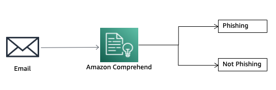
Detect email phishing attempts using Amazon Comprehend
Go Here to Read this Fast! Detect email phishing attempts using Amazon Comprehend

p99, or the value below which 99% of observations fall, is widely used to track and optimize worst-case performance across industries. For example, the time taken for a page to load, fulfill a shopping order or deliver a shipment can all be optimized by tracking p99.
While p99 is undoubtedly valuable, it’s crucial to recognize that it ignores the top 1% of observations, which may have an unexpectedly large impact when they are correlated with other critical business metrics. Blindly chasing p99 without checking for such correlations can potentially undermine other business objectives.
In this article, we will analyze the limitations of p99 through an example with dummy data, understand when to rely on p99, and explore alternate metrics.
Consider an e-commerce platform where a team is tasked with optimizing the shopping cart checkout experience. The team has received customer complaints that checking out is rather slow compared to other platforms. So, the team grabs the latest 1,000 checkouts and analyzes the time taken for checking out. (I created some dummy data for this, you are free to use it and tinker with it without restrictions)
import pandas as pd
import seaborn as sns
order_time = pd.read_csv('https://gist.githubusercontent.com/kkraoj/77bd8332e3155ed42a2a031ce63d8903/raw/458a67d3ebe5b649ec030b8cd21a8300d8952b2c/order_time.csv')
fig, ax = plt.subplots(figsize=(4,2))
sns.histplot(data = order_time, x = 'fulfillment_time_seconds', bins = 40, color = 'k', ax = ax)
print(f'p99 for fulfillment_time_seconds: {order_time.fulfillment_time_seconds.quantile(0.99):0.2f} s')
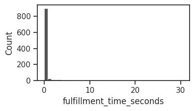
As expected, most shopping cart checkouts seem to be completing within a few seconds. And 99% of the checkouts happen within 12.1 seconds. In other words, the p99 is 12.1 seconds. There are a few long-tail cases that take as long as 30 seconds. Since they are so few, they may be outliers and should be safe to ignore, right?
Now, if we don’t pause and analyze the implication of the last sentence, it could be quite dangerous. Is it really safe to ignore the top 1%? Are we sure checkout times are not correlated with any other business metric?
Let’s say our e-commerce company also cares about gross merchandise value (GMV) and has an overall company-level objective to increase it. We should immediately check whether the time taken to checkout is correlated with GMV before we ignore the top 1%.
import matplotlib.pyplot as plt
from matplotlib.ticker import ScalarFormatter
order_value = pd.read_csv('https://gist.githubusercontent.com/kkraoj/df53cac7965e340356d6d8c0ce24cd2d/raw/8f4a30db82611a4a38a90098f924300fd56ec6ca/order_value.csv')
df = pd.merge(order_time, order_value, on='order_id')
fig, ax = plt.subplots(figsize=(4,4))
sns.scatterplot(data=df, x="fulfillment_time_seconds", y="order_value_usd", color = 'k')
plt.yscale('log')
ax.yaxis.set_major_formatter(ScalarFormatter())

Oh boy! Not only is the cart value correlated with checkout times, it increases exponentially for longer checkout times. What’s the penalty of ignoring the top 1% of checkout times?
pct_revenue_ignored = df2.loc[df1.fulfilment_time_seconds>df1.fulfilment_time_seconds.quantile(0.99), 'order_value_usd'].sum()/df2.order_value_usd.sum()*100
print(f'If we only focussed on p99, we would ignore {pct_revenue_ignored:0.0f}% of revenue')
## >>> If we only focussed on p99, we would ignore 27% of revenue
If we only focused on p99, we would ignore 27% of revenue (27 times greater than the 1% we thought we were ignoring). That is, p99 of checkout times is p73 of revenue. Focusing on p99 in this case inadvertently harms the business. It ignores the needs of our highest-value shoppers.
df.sort_values('fulfillment_time_seconds', inplace = True)
dfc = df.cumsum()/df.cumsum().max() # percent cumulative sum
fig, ax = plt.subplots(figsize=(4,4))
ax.plot(dfc.fulfillment_time_seconds.values, color = 'k')
ax2 = ax.twinx()
ax2.plot(dfc.order_value_usd.values, color = 'magenta')
ax.set_ylabel('cumulative fulfillment time')
ax.set_xlabel('orders sorted by fulfillment time')
ax2.set_ylabel('cumulative order value', color = 'magenta')
ax.axvline(0.99*1000, linestyle='--', color = 'k')
ax.annotate('99% of orders', xy = (970,0.05), ha = 'right')
ax.axhline(0.73, linestyle='--', color = 'magenta')
ax.annotate('73% of revenue', xy = (0,0.75), color = 'magenta')

Above, we see why there is a large mismatch between the percentiles of checkout times and GMV. The GMV curve rises sharply near the 99th percentile of orders, resulting in the top 1% of orders having an outsize impact on GMV.
This is not just an artifact of our dummy data. Such extreme correlations are unfortunately not uncommon. For example, the top 1% of Slack’s customers account for 50% of revenue. About 12% of UPS’s revenue comes from just 1 customer (Amazon).
To avoid the pitfalls of optimizing for p99 alone, we can take a more holistic approach.
One solution is to track both p99 and p100 (the maximum value) simultaneously. This way, we won’t be prone to ignore high-value users.
Another solution is to use revenue-weighted p99 (or weighted by gross merchandise value, profit, or any other business metrics of interest), which assigns greater importance to observations with higher associated revenue. This metric ensures that optimization efforts prioritize the most valuable transactions or processes, rather than treating all observations equally.
Finally, when high correlations exist between the performance and business metrics, a more stringent p99.5 or p99.9 can mitigate the risk of ignoring high-value users.
It’s tempting to rely solely on metrics like p99 for optimization efforts. However, as we saw, ignoring the top 1% of observations can negatively impact a large percentage of other business outcomes. Tracking both p99 and p100 or using revenue-weighted p99 can provide a more comprehensive view and mitigate the risks of optimizing for p99 alone. At the very least, let’s remember to avoid narrowly focusing on some performance metric while losing sight of overall customer outcomes.
Written with the help of Perplexity (for definitions and background research, chat here) and ChatGPT (for spellcheck, chat here).
Perils of Chasing p99 was originally published in Towards Data Science on Medium, where people are continuing the conversation by highlighting and responding to this story.
Originally appeared here:
Perils of Chasing p99

This is the kind of thing anyone who’s spent much time working with transformers and self-attention will have heard a hundred times. It’s both absolutely true, we’ve all experienced this as you try to increase the context size of your model everything suddenly comes to a grinding halt. But then at the same time, virtually every week it seems, there’s a new state of the art model with a new record breaking context length. (Gemini has context length of 2M tokens!)
There are lots of sophisticated methods like RingAttention that make training incredibly long context lengths in large distributed systems possible, but what I’m interested in today is a simpler question.
How far can we get with linear attention alone?
This will be a bit of a whistle stop tour, but bear with me as we touch on a few key points before digging into the results.
We can basically summarise the traditional attention mechanism with two key points:
This is expressed in the traditional form as:

It turns out if we ask our mathematician friends we can think about this slightly differently. The softmax can be thought of as one of many ways of describing the probability distribution relating tokens with each other. We can use any similarity measure we like (the dot product being one of the simplest) and so long as we normalise it, we’re fine.

It’s a little sloppy to say this is attention, as in fact it’s only the attention we know and love when the similarity function is the exponential of the dot product of queries and keys (given below) as we find in the softmax. But this is where it gets interesting, if instead of using this this expression what if we could approximate it?

We can assume there is some feature map “phi” which gives us a result nearly the same as taking the exponential of the dot product. And crucially, writing the expression like this allows us to play with the order of matrix multiplication operations.
In the paper they propose the Exponential Lineaer Unit (ELU) as the feature map due to a number of useful properties:


We won’t spend too much more time on this here, but this is pretty well empirically verified as a fair approximation to the softmax function.
What this allows us to do is change the order of operations. We can take the product of our feature map of K with V first to make a KV block, then the product with Q. The square product becomes over the model dimension size rather than sequence length.
Putting this all together into the linear attention expression gives us:

Where we only need to compute the terms in the brackets once per query row.
(If you want to dig into how the casual masking fits into this and how the gradients are calculated, take a look at the paper. Or watch this space for a future blog.)
The mathematical case is strong, but personally until I’ve seen some benchmarks I’m always a bit suspicious.
Let’s start by looking at the snippets of the code to describe each of these terms. The softmax attention will look very familiar, we’re not doing anything fancy here.
class TraditionalAttention(nn.Module):
    def __init__(self, d_k):
        super(TraditionalAttention, self).__init__()
        self.d_k = d_k

    def forward(self, Q, K, V):
        Z = torch.sqrt(torch.tensor(self.d_k, device=Q.device, dtype=torch.float32))
        scores = torch.matmul(Q, K.transpose(-2, -1)) / Z
        attention_weights = F.softmax(scores, dim=-1)
        output = torch.matmul(attention_weights, V)
        return output
Then for the linear attention we start by getting the Query, Key and Value matrices, then apply the ELU(x) feature mapping to the Query and Keys. Then we use einsum notation to perform the multiplications.
class LinearAttention(nn.Module):
    def __init__(self):
        super(LinearAttention, self).__init__()
        self.eps = 1e-6

    def elu_feature_map(self, x):
        return F.elu(x) + 1

    def forward(self, Q, K, V):
        Q = self.elu_feature_map(Q)
        K = self.elu_feature_map(K)
        KV = torch.einsum("nsd,nsd->ns", K, V)
        # Compute the normalizer
        Z = 1/(torch.einsum("nld,nd->nl", Q, K.sum(dim=1))+self.eps)
        # Finally compute and return the new values
        V = torch.einsum("nld,ns,nl->nd", Q, KV, Z)
        return V.contiguous()
Seeing this written in code is all well and good, but what does it actually mean experimentally? How much of a performance boost are we talking about here? It can be hard to appreciate the degree of speed up going from a quadratic to a linear bottleneck, so I’ve run the following experiemnt.
We’re going to to take a single attention layer, with a fixed d_k model dimension of 64, and benchmark the time taken for a forward pass of a 32 batch size set of sequences. The only variable to change will be the sequence length, spanning 128 up to 6000 (the GPT-3 context length for reference if 2048). Each run is done 100 times to get a mean and standard deviation, and experiments are run using an Nvidia T4 GPU.
For such a simple experiment the results are pretty striking.
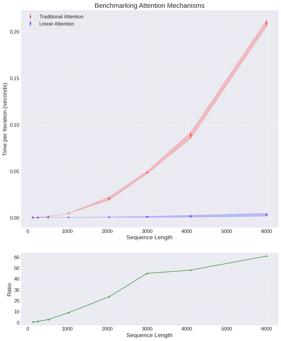
The results show for even an incredibly small toy example that we get a speed up of up to 60x.
There are a few obvious take-aways here:
For completeness also do not mistake this as saying “linear attention is 60x faster for small models”. In reality the feed-forward layers are often a bigger chunk of the parameters in a Transformer and the encoding / decoding is often a limiting size component as well. But in this tightly defined problem, pretty impressive!
If we think about the real time complexity of each approach we can show where this difference comes from.
Let’s break down the time complexity of the traditional softmax attention, the first term gives the complexity of QK multiplication which is n² scores, each a dot product of length d_k. The second term describes the complexity of the softmax on the attention scores, is in n². And the third term takes the n² matrix and dots it with the values vector.
If we assume for simplicity the query, key and vector matries have the same dimension we get the final term with the dominant n² term. (Provided the model dimension is << sequence length. )

The linear attention tells a different story. Again, if we look at the expression below for the time complexity we’ll analyse each of the terms.
The first term is the cost of applying the feature map to the Q and K matrices, the second term is the product between the Q and V matricies which results in a (d_k, d_v) matrix, and the K(QV) multiplication has the same complexity in the third term. Then the final output, again assuming the model dimensions are the same for the different matricies, gives a final complexity linear in sequence length, and quadratic in model dimension.

Therefore, so long as the model dimension is less than the sequence length we have a significantly faster model. The only real question left then is, how good an approximation is it anyway?
Enough messing around, hopefully we’re all convinced that the linear attention is much faster than traditional attention so let’s do the real test. Can we actually train the models and do they perform similarly with the two different attention mechanisms?
The models we use here are really small — (and if there’s interest in a deeper dive into setting up a simple training harness we can look at that in the future) — and the data is simple. We’re just going to use the Penn Treebank dataset (publicly available through torchtext), which contains a collection of short snippets of text, which can be used to model / test small language models.
Real prediction might be a bit of a stretch here if we’re honest, given the number of parameters and time we’re training for all I’m really going to look for is do the training dynamics look similar. We’ll look at the loss curves for autoregressive training on a simple language modelling dataset, and if they follow the same shape we can at least have some confidence that the different mechanisms are giving us similar results.
The nature of the data means the outputs are rarely of high quality, but it gives all the trapping we’d expect of a proper training run.
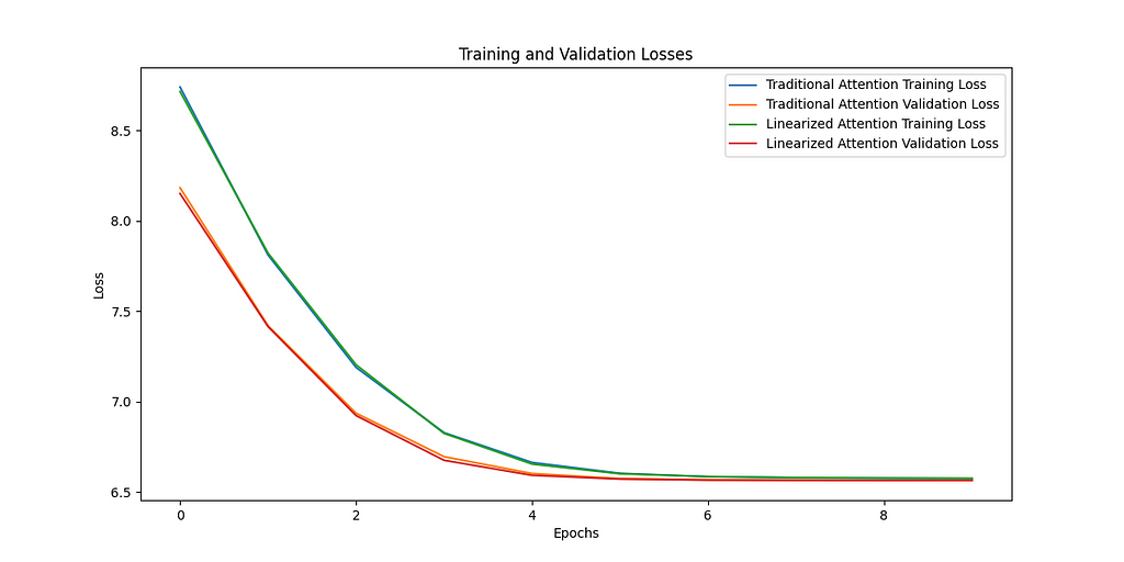
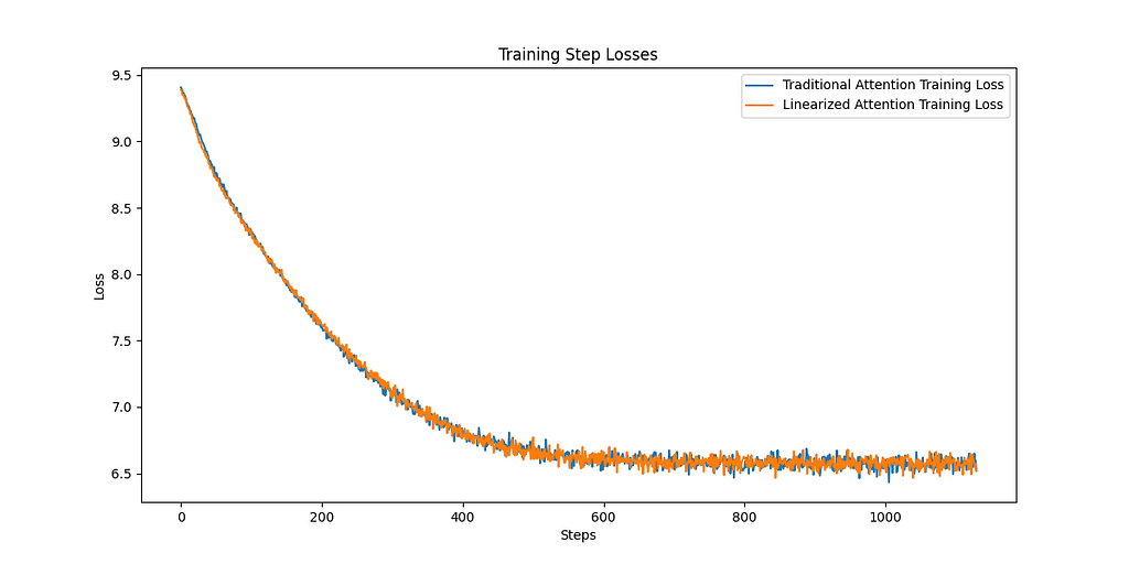
Let’s look at the training curves. The plot on the left shows the loss for training and validation for both the traditional and linear attention methods. We can see over the 10 epochs the two approaches are basically indistinguishable. Similarly if we look at the right plot, the loss for the traditional softmax and the linear attention is shown, again showing absolutely identical training dynamics.
This is obviously far from comprehensive, and we’re not exactly going to be competing with GPT here, but we can be pretty optimistic about reducing the complexity of the attention mechanism and not losing modelling ability.
Watch this space for a bigger comparison in Part 2.
All images, unless otherwise stated, have been created by the author, and the training data comes from the publicly available PennTreebank dataset accessed through PyTorch torchtext datasets. More details can be found here.
For more details on the implementation of linear attention I strongly recommend you look in more depth at the original paper (https://arxiv.org/abs/2006.16236) .
If you enjoyed this content follow this account or find me on Twitter.
Linear Attention Is All You Need was originally published in Towards Data Science on Medium, where people are continuing the conversation by highlighting and responding to this story.
Originally appeared here:
Linear Attention Is All You Need

There’s a popular belief in the Ecommerce community that high quality creatives are all that a successful ad campaign needs. It suggests that brands should focus on making great creatives and let the ad platforms handle the rest. But in practice, it is unwise for Ecommerce businesses to blindly trust ad platforms for several reasons:
Fortunately, ecommerce executives and marketers can use data science to overcome these challenges. In this article, we will explain how ad platform algorithms work and share some practical approaches for improving customer acquisition.
Ad platforms run real-time auctions to determine which ads get shown to which users. Let’s use Meta as an example. Its ad auction determines the winning ad based on the Total Value score:
Total Value = Bid × Estimated Action Rate + Relevance and Quality Score
The higher the Total Value score, the better the chances that an ad will win a spot. Additionally, a higher Relevance and Quality Score helps secure prominent placements and lowers costs.
Ad platforms rely on advanced machine learning models to deliver ads to the right audience. When a new ad is introduced, algorithms enter a learning phase where they collect data on user interactions with the new ad. Interactions like clicks and conversions signal positive engagement, increasing the ad’s relevance score, and leading to a positive feedback loop. After the initial learning period, algorithms continue to learn from user interactions and dynamically adjust ad placements based on the latest data.
Based on our analysis, the key to improving ad performance lies in boosting the Relevance and Quality Score and optimizing how algorithms learn. But there are challenges to solving this problem:
These factors have important implications for Ecommerce advertising.
Consider a sports brand that appeals to both casual and competitive players. If the brand runs an ad for its professional gear without specific targeting, the algorithms will show the ad to a broad audience. Since ad platforms don’t segment shoppers exactly like the brand does, the ad might end up being shown to casual players, who aren’t as likely to engage with it. This lack of engagement sends negative signals to the algorithms, lowering the ad’s relevance score and making it harder to secure prime ad placements.
An apparel brand might release new clothing and run promotional ads every month. Given that each ad gets a limited budget and only runs for a short period, the algorithms struggle to gather enough performance data. This makes it tough to pinpoint the best audience for each ad. Consequently, the algorithms end up showing these ads to a lot of unsuitable shoppers, which decreases the ad’s relevance score and drives up ad costs.
When brands run large promotions for special events or product launches, their ads temporarily become more appealing. Heavy discounts can attract customers who wouldn’t normally buy their products. These temporary spikes in user interaction can confuse the algorithms, leading them to misinterpret typical user behaviors. As a result, the cost per acquisition often goes up after these big promotions, forcing brands to spend significantly on ads to correct this disruption.
Fortunately, brands can analyze their customers’ purchase behaviors and guide ad platforms to achieve optimal results even with limited ad performance data.
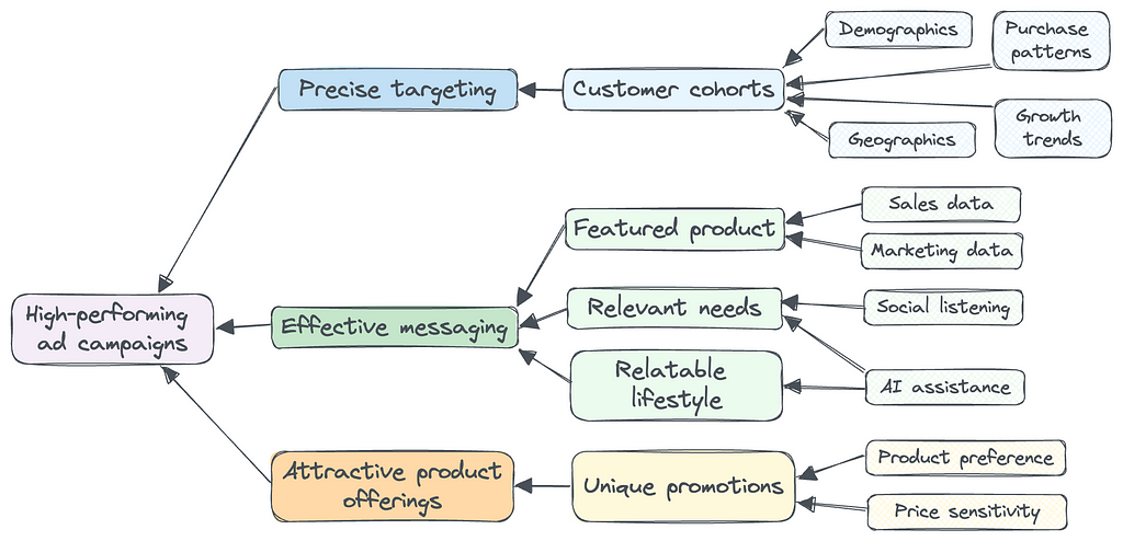
When a brand runs customer segmentation, the goal is to identify distinct customer preferences for product, messaging, and promotions, so that the brand can improve its sales and marketing strategies using these customer insights.
The relevant segmentation factors can vary for each brand, so it’s important to consider as many factors as possible. Key factors in Ecommerce customer segmentation include demographics, geographics, purchase patterns, and growth trends.
Brands can use machine learning models to accurately identify customer cohorts. Once this process is complete, brands can use these customer insights to set up ad targeting and run effective campaigns.
For a sports brand I worked with, I was able to identify distinct cohorts based on factors including age, income, and level of competitiveness. One cohort was middle age adults who lived in upscale suburban neighborhoods and preferred to purchase the brand’s professional equipment. Another was young urban professionals who preferred entry-level equipment and played the sport casually. With these insights, the brand was able to precisely target different cohorts using age and location, and feature different products and sports settings in their ad campaigns for each cohort.
In addition to precise ad targeting, several factors work together to create an effective ad for each customer cohort:
Brands can identify the best products for each customer cohort from their sales and marketing data and feature different products in the ad creatives for each cohort. For a home decor brand, young customers may prefer products with vibrant colors at affordable price points, while affluent customers prefer products with luxurious designs.
The latest AI tools can be very helpful in providing ideas for messaging based on social listening from reviews and social media posts. For a wellness brand, young adults are likely to purchase products for fitness and energy, while older retirees look to address aging and health issues.
Brands can infer each cohort’s lifestyle from demographic, geographic, and sales data. Again the latest AI tools can help you form a lifestyle snapshot for each of your cohorts. For recreational products, parents with young kids may respond well to creatives showing energetic families playing with the products together. Grandparents might resonate more with scenes of older people bonding with their grandchildren.
Given today’s short attention spans, ads that are most relatable to their target audience have a better chance of standing out and succeeding.
Promotional discounts are more and more prevalent in today’s economy, but brands have a lot of alternatives to structure their product offerings. Many brands have told us that they know some customers don’t need discounts to make a purchase, but they’re unsure how to provide different promotions to different segments. The good news is customer segmentation and precise ad targeting provide new opportunities.
Because different customer cohorts prefer different products, one practical strategy is to offer unique promotions for each type of product. For example, an apparel brand can promote limited-edition accessories for affluent customers. Meanwhile, they might offer discounts on clothing styles that are more popular among young adults.
High-performing ad campaigns are built on precise targeting, effective messaging, and attractive product offerings. Great creatives alone can’t guarantee success in customer acquisition. Given the many factors involved in ad optimization, brands should continuously test and learn what works the best for their unique business. Data science can help guide Ecommerce brands on this path with insightful sales and marketing strategies.
Acquire Customers with Ecommerce Data Science was originally published in Towards Data Science on Medium, where people are continuing the conversation by highlighting and responding to this story.
Originally appeared here:
Acquire Customers with Ecommerce Data Science
Go Here to Read this Fast! Acquire Customers with Ecommerce Data Science


What is a data scientist’s primary tool of the trade? A fair (and obvious) answer is a computer, as it processes data much faster than we can. Imagine trying to do any task involving data without one, with — gasp — pencil and paper at your side, hand drawing an exhausting number of tables, graphs, and calculations for what you know would take seconds on a computer. It is pretty safe to say that data science wouldn’t exist today without computers.
Given that computers are the essential tool required to perform data science, you would expect that the job would require an understanding of how computers work. After all, it’s hard to do a job right when you don’t understand your tools. However, for the aspiring data scientist, it is all too easy to neglect to take the time to build the foundational knowledge surrounding the field.
And, that’s understandable. Theoretical topics in mathematics, computer science, and engineering are often relegated to the role of secondary learning objectives because they are not as immediately rewarding (or immediately employable, honestly) as are more application-focused learning objectives like Python, Tensorflow, or Amazon Web Services. Why wouldn’t a budding data scientist gravitate toward these types of topics that deliver immediate, measurable improvements in skill and understanding as demonstrated by their rapid-growing portfolio of projects?
That’s a fine place to start your data science journey, but learning the more theoretical side of the trade can help you move past that beginning phase and take the next step. That’s the purpose of this (and hopefully many more) articles: to introduce you to the theoretical background underpinning the technologies you use daily in data science.
Great, now that the introductory hoopla is out of the way, we can get to the fun stuff. We will begin with a question you have likely pondered, even if only briefly: why do computers even use binary? I’ll put the bottom line up front and tell you: it is because it would be inefficient not to. The point of this article is to explain why it’s inefficient.
If you already know what binary is, feel free to skip this section. If not, this is for you!
Imagine we encounter intelligent alien life. Say that they have 3 fingers, instead of 5 on each of their two hands. How might they count? We have digits 1–9, but after that, we loop the first digit back to 0 and open the next digit at 1, to create 10. But our alien friends may think that makes little sense — they may open the next digit at 6, since they only have 6 fingers, whereas we have 10. Are you starting to see how the place value we assign to numbers is arbitrary? If humans weren’t born with 10 fingers, we probably wouldn’t count the way we do. Instead of starting a new digit at 10, we may do 6, 2, 16, 46, or any other number, as long as we have a unique symbol for each value. Let’s compare how the aliens would count compared to us. The values in each row are equal to each other:
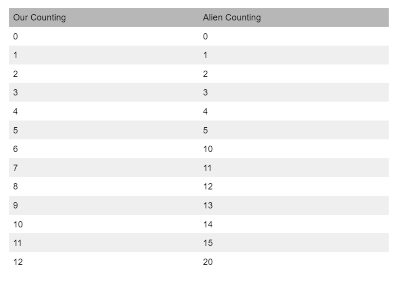
We call these new number systems base “X” number systems, where X is the value where you move to a new digit. For example, our number system is a base 10 number system since each digit maxes out before 10. Our alien friends would have a base 6 number system since their numbers max out before 6. Computers work in a base 2 number system, known as binary. Let’s apply the same counting logic we applied to the alien’s base 6 system to a binary system.
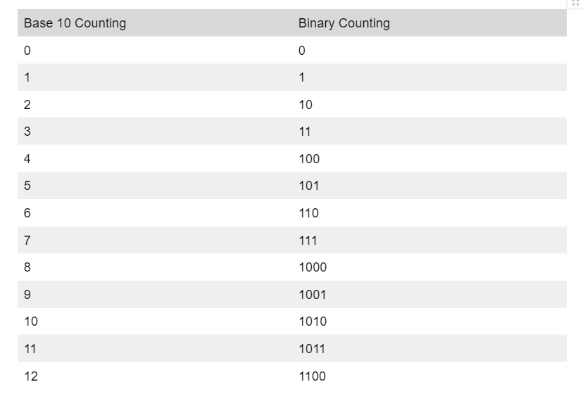
If that made sense to you, you understand how binary works. Not too intimidating, I hope! Many people are intimidated because they hear it referred to as a “language”, but binary is just a different number system, and works just like our familiar base 10 systems. Arithmetic works essentially the same way as it does in our system as well.
Just like our numbers can be represented as a sum of powers of 10, binary numbers can be represented as a sum of powers of 2. The best way to explain is through an example. (As a note, binary numbers will often be represented by putting a 0b before the number. That’s how I will be representing them going forward in this article).
In base 10,

Similarly, in base 2,
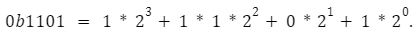
Performing those summations, we find that ob1101 = 13. This is an easy way to convert from binary to base 10.
Now that we have a basic understanding of how binary works, we can address the central question of this article. Why do computers represent information in binary? It isn’t because that is the only way that computers can represent information — that’s a common misconception. Some of the first computers, such as ENIAC, were base 10 computers. In truth, there are three big reasons that modern computers use binary to represent information.
Another reason we use binary systems is that they are more simple than others. To put it simply, it is easier and requires fewer physical components to represent only 2 states (0 or 1). To understand why this is, you need to understand that digital systems like computers are… well… digital. That means they use hardware that operates by using discrete representations of numbers instead of continuous ones. As you may remember from math class, discrete numbers are whole numbers ( 0, 1, -4, etc) and continuous numbers are whole numbers, and every decimal part in between ( 0 1, -4, .2, -.2343, and every value you could think of in between). However, computers are real systems operating on electricity, usually using the voltage level of electricity to represent information. Voltage is a continuous value (you can have 3.22682393 volts). However, our computer is digital — it only knows how to operate using discrete values. Somehow, we have to build a system that uses a continuous value (voltage) to represent a digital system. We do this by setting voltage ranges that equate to digital values. Below is an example of such a setup:
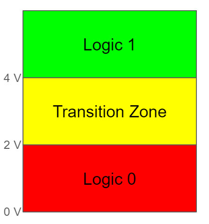
Circuits that work using the above figure’s ranges would regard any voltage level between 0 and 2 V to be a 0b0, between 4V and 6 V a 0b1, and anything else would let us know that the system is messed up. Note the inclusion of a transition zone in the middle. If you aren’t used to thinking about physical systems, it may seem strange that we have a transition zone — it seems like we should be able to go immediately between 0 and 1. However, in physical systems, we need to build a margin of error, or else our system will be much more fragile than it needs (or should) be. Without jumping down the rabbit hole, we build a transition zone into our logic because digital circuits are made of logic gates, and logic gates need space to turn on and off. When it is blocking the flow, There is usually a voltage range between low and high where the gate is “kind of” on. Staying in this range can actually damage the components, so we build a transition zone in which we don’t let the components rest.
Imagine if we wanted to build a base 3 system. Then you would have to add another state:
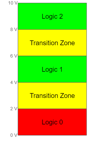
Adding another state, naturally, requires more hardware components. That makes designing a system that employs a higher-than-base-2 system inherently more complex in terms of hardware (both design and number of components). This is really the root of why computers use binary. But, I’ll call attention to two especially important ramifications of using higher-than-base-2 computing.
Let’s take a second to define electrical power. The equation is really simple:
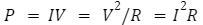
where P is power (Watts), I is current (Amps), R is resistance (Ohms) and V is voltage (Voltz). As you increase voltage for each new logic level, you increase power consumption for the whole device exponentially, assuming the resistance is constant (a reasonable assumption, in most cases). More power consumed is more money spent to run the device, which is a huge reason to avoid these systems in most cases.
Ever touched the back of a laptop after it has been working hard for an hour or two? You probably felt a lot of heat. Excessive heat is the enemy of electronics, and avoiding its production is a priority for engineers. Take a look at the equation for heat:
Where Q is heat (Joules), t is time (seconds), and R and I resistance and current again. Each new component you use in a circuit is going to draw more current to operate. That, in turn, increases heat.
In this article, we covered why computers use binary (in addition to introducing what binary is). We know it is inefficient, and we investigated the mechanisms of why that is, introducing concepts such as voltage, current, and power. We saw that using other number systems in computing would require us to represent more states with our digital logic circuitry. That in turn, requires more power and circuit components while creating more heat, all of which engineers and consumers want to avoid.
But, we didn’t really cover how computers actually represent this information — we just said it uses digital circuitry to do so. In the next few articles, we will explore this question more fully. I will take a shot at explaining how digital logic circuits work — starting at the lowest level I can, the semiconductor. If you are interested in that, please stay tuned! Just like in this article, I will try to target you, budding data scientists, without assuming you know the electrical engineering concepts underlying this technology.
Hopefully, whether you are a new or established data scientist, you found this article interesting. Although computer hardware is not exactly a data science or machine learning concept, these are the tools of our trade, and I think it is worthwhile to develop a basic understanding of them. If you agree, and found this article interesting, I hope to see you next time!
[1] R. Palaniappan, Digital Systems Design (2011), https://dvikan.no/ntnu-studentserver/kompendier/digital-systems-design.pdf
Why do Computers even use Binary? was originally published in Towards Data Science on Medium, where people are continuing the conversation by highlighting and responding to this story.
Originally appeared here:
Why do Computers even use Binary?
Go Here to Read this Fast! Why do Computers even use Binary?

Imaging you’re planning marketing strategies for your taxi company or even considering market entry as a new competitor — predicting number of taxi trips in the big cities can be an interesting business problem. Or, if you’re just a curious resident like me, this article is perfect for you to learn how to use the R Bayesian Structural Time Series (BSTS) model to forecast daily taxi trips and uncover fascinating insights.
In this article, I will walk you through the pipeline including data preparation, explorational data analysis, time series modeling, forecast result analysis, and business insight. I aim to predict the daily number of trips for the second half year of 2023.
The data was acquired from the Chicago Data Portal. (You will find this platform with access to various government data!) On the website, simply find the “Action” drop down list to query data.

Within the query tool, you’ll find filter, group, and column manager tools. You can simply download the raw dataset. However, to save computing complexity, I grouped the data by pickup timestamp to aggregate the count of trips per 15 minutes.
With exploration of the dataset, I also filtered out the record with 0 trip miles and N/A pickup area code (which means the pickup location is not within Chicago). You should explore the data to decide how you would like to query the data. It should based on the use case of your analysis.
Then, export the processed data. Downloading could take some time !
Understanding the data is the most crucial step to preprocessing and model choices reasoning. In the following part, I dived into different characteristics of the dataset including seasonality, trend, and statistical test for stationary and autocorrelation in the lags.
Seasonality refers to periodic fluctuations in data that occur at regular intervals. These patterns repeat over a specific period, such as days, weeks, months, or quarters.
To understand the seasonality, we first aggregate trip counts by date and month to visualize the effect.
library(lubridate)
library(dplyr)
library(xts)
library(bsts)
library(forecast)
library(tseries)

demand_data <- read.csv("taxi_trip_data.csv")
colnames(demand_data) <- c('trip_cnt','trip_datetime')
demand_data$trip_datetime <- mdy_hms(demand_data$trip_datetime)
demand_data$rounded_day <- floor_date(demand_data$trip_datetime, unit = "day")
demand_data$rounded_month <- floor_date(demand_data$trip_datetime, unit = "month")

monthly_agg <- demand_data %>%
    group_by(rounded_month) %>%
    summarise(
        trip_cnt = sum(trip_cnt, na.rm = TRUE)
)

daily_agg <- demand_data %>%
    group_by(rounded_day) %>%
    summarise(
        trip_cnt = sum(trip_cnt, na.rm = TRUE)
)
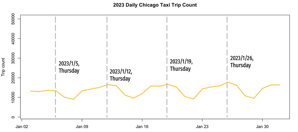
The taxi demand in Chicago peaked in 2014, showed a declining trend with annual seasonality, and was drastically reduced by COVID in 2020.

Daily count before COVID suggests weekly seasonality, with higher trip numbers on Fridays and Saturdays.

Interestingly, the post-COVID weekly seasonality has shifted, the Thursdays now have the highest demand. This provides hypothesis about COVID intervention.
Trend in time series data refers to underlying pattern or tendency of the data to increase, decrease, or remain stable over time. I transformed the dataframe to a time series data for STL decomposition to monitor the trend.
zoo_data <- zoo(daily_agg$trip_cnt, order.by = daily_agg$rounded_day)
start_time <- as.numeric(format(index(zoo_data)[1], "%Y"))
ts_data <- ts(coredata(zoo_data), start = start_time, frequency = 365)
stl_decomposition <- stl(ts_data, s.window = "periodic")
plot(stl_decomposition)
The result of STL composition shows that there’s a non-linear trend. The seasonal part also shows a yearly seasonality. After a closer look to the yearly seasonality, I found that Thanksgiving and Christmas have the lowest demand every year.


A time series is considered stationary if its statistical properties (e.g. mean, variance, and autocorrelation) remain constant over time. From the above graphs we already know this data is not stationary since it exhibits trends and seasonality. If you would like to be more robust, ADF and KPSS test are usually leveraged to validate the null hypothesis of non-stationary and stationary respectively.
adf.test(zoo_data)
kpss.test(zoo_data)
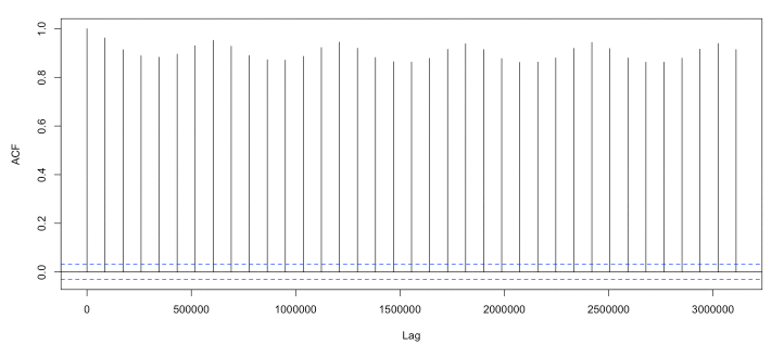
Lag autocorrelation measures the correlation between a time series and its lagged over successive time intervals. It explains how the current value is related to its past values. By autocorrelation in the lags we can identify patterns and help us select appropriate time series models (For example, understanding the autocorrelation structure helps determine the order of AR and MA components for ARIMA model). The graph shows significant autocorrelations at many lags.
acf(zoo_data)
The EDA provided crucial insights into how we should transform and preprocess the data to achieve the best forecasting results.
COVID changed the time series significantly. It is unreasonable to include data that had changed so much. Here I fit the model on data from 2020 June to 2023 June. This still remains a 6:1 train-test-ratio predicting numbers for the second half of 2023.
train <- window(zoo_data, start = as.Date("2020-07-01"), end = as.Date("2023-06-30"))
test <- window(zoo_data, start = as.Date("2023-07-01"), end = as.Date("2023-12-31"))
The non-stationary data shows huge variance and non-linear trend. Here I applied log and differencing transformation to mitigate the effect of these characteristics on the predicting performance.
train_log <- log(train + 1)
train_diff <- diff(train, differences = 1)
The following code operates on the log-transformed data, as it yielded better forecasting performance during preliminary tests.
Let’s quickly recap the findings from the EDA:
Given these characteristics, the Bayesian Structural Time Series (BSTS) model is a suitable choice. The BSTS model decomposes a time series into multiple components using Bayesian methods, capturing the underlying latent variables that evolve over time. The key components typically include:
This is the model I used to predict the taxi trips:
ss <- AddSemilocalLinearTrend(list(), train_log)
ss <- AddSeasonal(ss, train_log, nseasons = 7)
ss <- AddSeasonal(ss, train_log, nseasons = 365)
ss <- AddMonthlyAnnualCycle(ss, train_log)
ss <- AddRegressionHoliday(ss, train_log, holiday_list)
model_log_opti <- bsts(train_log, state.specification = ss, niter = 5000, verbose = TRUE, seed=1014)
summary(model_log_opti)
AddSemilocalLinearTrend()
From the EDA, the trend in our data is not a random walk. Therefore, we use a semi-local linear trend, which assumes the level component moves according to a random walk, but the slope component follows an AR1 process centered on a potentially non-zero value. This is useful for long-term forecasting.
AddSeasonal()
The seasonal model can be thought of as a regression on nseasons dummy variables. Here we include weekly and yearly seasonality by setting nseasons to 7 and 365.
AddMonthlyAnnualCycle()
This represents the contribution of each month. Alternatively, you can set nseasons=12 in AddSeasonal() to address monthly seasonality.
AddRegressionHoliday()
Previously in EDA we learned that Thanksgiving and Christmas negatively impact taxi trips. This function estimate the effect of each holiday or events using regression. For this, I asked a friend of mine who is familiar with Chicago (well, ChatGPT of course) for the list of huge holidays and events in Chicago. For example, the Chicago Marathon might boost the number of taxi trips.

Then I set up the date of these dates:
christmas <- NamedHoliday("Christmas")
new_year <- NamedHoliday("NewYear")
thanksgiving <- NamedHoliday("Thanksgiving")
independence_day <- NamedHoliday("IndependenceDay")
labor_day <- NamedHoliday("LaborDay")
memorial_day <- NamedHoliday("MemorialDay")
auto.show <- DateRangeHoliday("Auto_show", start = as.Date(c("2013-02-09", "2014-02-08", "2015-02-14", "2016-02-13", "2017-02-11"
                                                             , "2018-02-10", "2019-02-09", "2020-02-08", "2021-07-15", "2022-02-12"
                                                             , "2023-02-11")),
                              end = as.Date(c("2013-02-18", "2014-02-17", "2015-02-22", "2016-02-21", "2017-02-20"
                                                , "2018-02-19", "2019-02-18", "2020-02-17"
                                                , "2021-07-19", "2022-02-21", "2023-02-20")))
st.patrick <- DateRangeHoliday("stPatrick", start = as.Date(c("2013/3/16", "2014/3/15", "2015/3/14", "2016/3/12"
                                                              , "2017/3/11", "2018/3/17", "2019/3/16", "2020/3/14"
                                                              , "2021/3/13", "2022/3/12", "2023/3/11")),
                              end = as.Date(c("2013/3/16", "2014/3/15", "2015/3/14", "2016/3/12"
                                                              , "2017/3/11", "2018/3/17", "2019/3/16", "2020/3/14"
                                                              , "2021/3/13", "2022/3/12", "2023/3/11")))
air.show <- DateRangeHoliday("air_show", start = as.Date(c("2013/8/17", "2014/8/16", "2015/8/15", "2016/8/20"
                                                           , "2017/8/19", "2018/8/18", "2019/8/17"
                                                           , "2021/8/21", "2022/8/20", "2023/8/19")),
                              end = as.Date(c("2013/8/18", "2014/8/17", "2015/8/16", "2016/8/21", "2017/8/20"
                                              , "2018/8/19", "2019/8/18", "2021/8/22", "2022/8/21", "2023/8/20")))
lolla <- DateRangeHoliday("lolla", start = as.Date(c("2013/8/2", "2014/8/1", "2015/7/31", "2016/7/28", "2017/8/3"
                                                     , "2018/8/2", "2019/8/1", "2021/7/29", "2022/7/28", "2023/8/3")),
                              end = as.Date(c("2013/8/4", "2014/8/3", "2015/8/2", "2016/7/31", "2017/8/6", "2018/8/5"
                                              , "2019/8/4", "2021/8/1", "2022/7/31", "2023/8/6")))
marathon <- DateRangeHoliday("marathon", start = as.Date(c("2013/10/13", "2014/10/12", "2015/10/11", "2016/10/9", "2017/10/8"
                                                        , "2018/10/7", "2019/10/13", "2021/10/10", "2022/10/9", "2023/10/8")),
                              end = as.Date(c("2013/10/13", "2014/10/12", "2015/10/11", "2016/10/9", "2017/10/8"
                                                        , "2018/10/7", "2019/10/13", "2021/10/10", "2022/10/9", "2023/10/8")))
DateRangeHoliday() allows us to define events that happen at different date each year or last for multiple days. NameHoliday() helps with federal holidays.
Then, define the list of these holidays for the AddRegressionHoliday() attribute:
holiday_list <- list(auto.show, st.patrick, air.show, lolla, marathon
              , christmas, new_year, thanksgiving, independence_day
              , labor_day, memorial_day)
I found this website very helpful in exploring different component and parameters.
The fitted result shows that the model well captured the component of the time series.
fitted_values <- as.numeric(residuals.bsts(model_log_opti, mean.only=TRUE)) + as.numeric(train_log)
train_hat <- exp(fitted_values) - 1
plot(as.numeric(train), type = "l", col = "blue", ylim=c(500, 30000), main="Fitted result")
lines(train_hat, col = "red")
legend("topleft", legend = c("Actual value", "Fitted value"), col = c("blue", "red"), lty = c(1, 1), lwd = c(1, 1))

In the residual analysis, although the residuals have a mean of zero, there is still some remaining seasonality. Additionally, the residuals exhibit autocorrelation in the first few lags.


However, when comparing these results to the original time series, it is evident that the model has successfully captured most of the seasonality, holiday effects, and trend components. This indicates that the BSTS model effectively addresses the key patterns in the data, leaving only minor residual structures to be examined further.
Now, let’s evaluate the forecast results of the model. Remember to transform the predicted values, as the model provides logged values.
horizon <- length(test)
pred_log_opti <- predict(model_log_opti, horizon = horizon, burn = SuggestBurn(.1, ss))
forecast_values_log_opti <- exp(pred_log_opti$mean) - 1
plot(as.numeric(test), type = "l", col = "blue", ylim=c(500, 30000), main="Forecast result", xlab="Time", ylab="Trip count")
lines(forecast_values_log_opti, col = "red")
legend("topleft", legend = c("Actual value", "Forecast value"), col = c("blue", "red"), lty = c(1, 1), lwd = c(1, 1))

The model achieves a Mean Absolute Percentage Error (MAPE) of 9.76%, successfully capturing the seasonality and the effects of holidays.
The analysis of holiday and event effects offers valuable insights for business strategies. The following graphs illustrate the impact of holiday regressions:
PlotHoliday(thanksgiving, model_log_opti)
PlotHoliday(marathon, model_log_opti)
The day before federal holidays has a significantly negative impact on the number of trips. For example, both Thanksgiving Day and the day before show a noticeable drop in taxi trips. This reduction could be due to lower demand or limited supply. Companies can investigate these reasons further and develop strategies to address them.
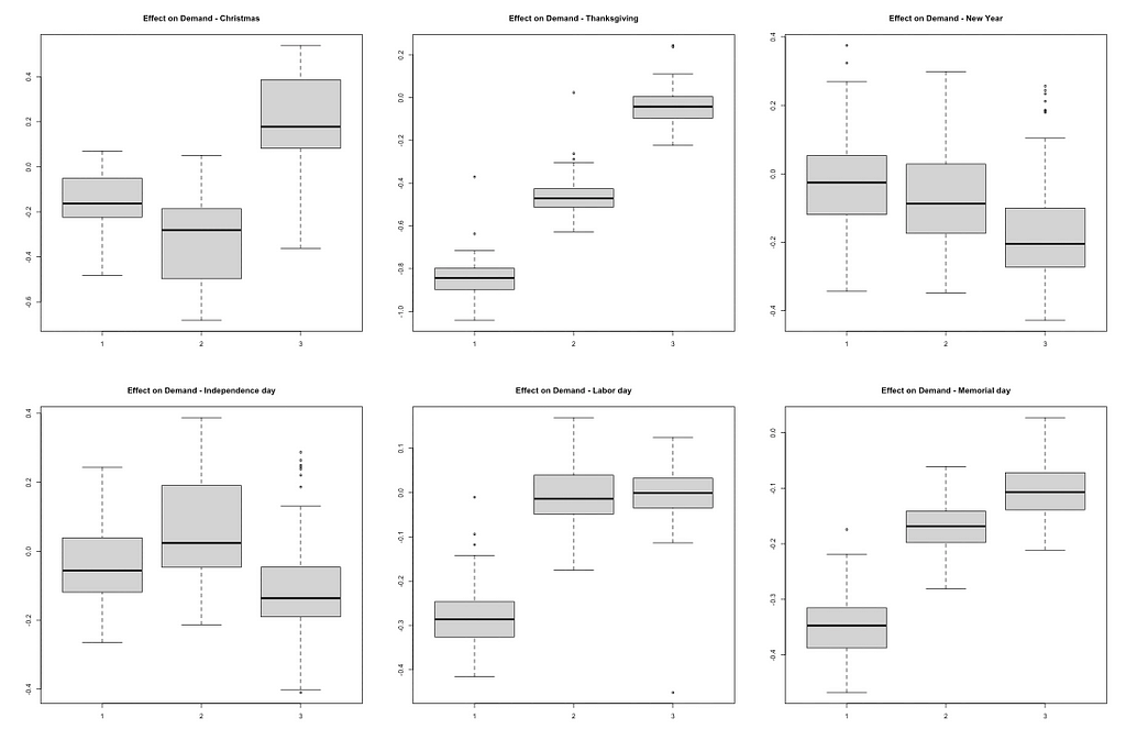
Contrary to the initial hypothesis, major events like the Chicago Marathon did not show a significant increase in taxi demand. This suggests that demand during such events may not be as high as expected. Conducting customer segmentation research can help identify specific groups that might be influenced by events, revealing potential opportunities for targeted marketing and services. Breaking down the data by sub-areas in Chicago can also provide better insights. The impact of events might vary across different neighborhoods, and understanding these variations can help tailor localized strategies.

So this is how you can use BSTS model to predict Chicago taxi rides! You can experiment different state component or parameters to see how the model fit the data differently. Hope you enjoy the process and please give me claps if you find this article helpful!
Predicting Chicago Taxi Trips with R Time Series Model — BSTS was originally published in Towards Data Science on Medium, where people are continuing the conversation by highlighting and responding to this story.
Originally appeared here:
Predicting Chicago Taxi Trips with R Time Series Model — BSTS
Go Here to Read this Fast! Predicting Chicago Taxi Trips with R Time Series Model — BSTS

Originally appeared here:
How Skyflow creates technical content in days using Amazon Bedrock
Go Here to Read this Fast! How Skyflow creates technical content in days using Amazon Bedrock

TL;DR: How to launch a training job with Pytorch with GPUs on Vertex. Code with examples.
In my previous article, I mentioned the fact that training locally huge models is not always a good practice when you have limited resources. Sometimes you just don’t have a choice, but sometimes you have at your disposal a Cloud provider such as Google Cloud Platform which can significantly speed up your trainings by:
Not to mention that offloading the training to the cloud will relieve your personal machine. I already saw the battery melt after leaving my personal laptop train a model for 1 week. Back from holidays, my touchpad was literally popping out.
In this article, we will take a concrete use case where we will fine-tune a BERT model on social media comments to perform sentiment analysis. As we will see, training this kind of model on a CPU is very cumbersome and not optimal. We will therefore see how we can leverage Google Cloud Platform to speed up the process by using a GPU for only 60 cents.
BERT stands for Bidirectional Encoder Representations from Transformers and was open-sourced by Google in 2018. It is mainly used for NLP tasks as it was trained to capture semantics in sentences and provide rich word embeddings (representations). The difference with other models such as Word2Vec and Glove lies in the fact that it uses Transformers to process text. Transformers (refer to my previous article if you want to know more) are a family of neural networks which, a little bit like RNNs, have the ability to process sequences in both directions, therefore able to capture context around a word for example.
Sentiment Analysis is a specific task within the NLP domain which objective is to classify text into categories related to the tonality of it. Tonality is often expressed as positive, negative, or neutral. It is very commonly used to analyze verbatims, posts on social media, product reviews, etc.
The dataset we will use comes from Kaggle, you can download it here : https://www.kaggle.com/datasets/farisdurrani/sentimentsearch (CC BY 4.0 License). In my experiments, I only chose the datasets from Facebook and Twitter.
The following snippet will take the csv files and save 3 splits (training, validation, and test) to where you want. I recommend saving them in Google Cloud Storage.
You can run the script with:
python make_splits --output-dir gs://your-bucket/
import pandas as pd
import argparse
import numpy as np
from sklearn.model_selection import train_test_split


def make_splits(output_dir):
    df=pd.concat([
        pd.read_csv("data/farisdurrani/twitter_filtered.csv"),
        pd.read_csv("data/farisdurrani/facebook_filtered.csv")
    ])
    df = df.dropna(subset=['sentiment'], axis=0)
    df['Target'] = df['sentiment'].apply(lambda x: 1 if x==0 else np.sign(x)+1).astype(int)

    df_train, df_ = train_test_split(df, stratify=df['Target'], test_size=0.2)
    df_eval, df_test = train_test_split(df_, stratify=df_['Target'], test_size=0.5)

    print(f"Files will be saved in {output_dir}")
    df_train.to_csv(output_dir + "/train.csv", index=False)
    df_eval.to_csv(output_dir + "/eval.csv", index=False)
    df_test.to_csv(output_dir + "/test.csv", index=False)

    print(f"Train : ({df_train.shape}) samples")
    print(f"Val : ({df_eval.shape}) samples")
    print(f"Test : ({df_test.shape}) samples")


if __name__ == '__main__':
    parser = argparse.ArgumentParser()
    parser.add_argument('--output-dir')
    args, _ = parser.parse_known_args()
    make_splits(args.output_dir)
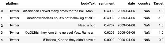
The data should look roughly like this:
For our model, we will use a lightweight BERT model, BERT-Tiny. This model has already been pretrained on vasts amount of data, but not necessarily with social media data and not necessarily with the objective of doing Sentiment Analysis. This is why we will fine-tune it.
It contains only 2 layers with a 128-units dimension, the full list of models can be seen here if you want to take a larger one.
Let’s first create a main.py file, with all necessary modules:
import pandas as pd
import argparse
import tensorflow as tf
import tensorflow_hub as hub
import tensorflow_text as text
import logging
import os
os.environ["TFHUB_MODEL_LOAD_FORMAT"] = "UNCOMPRESSED"

def train_and_evaluate(**params):
    pass
    # will be updated as we go
Let’s also write down our requirements in a dedicated requirements.txt
transformers==4.40.1
torch==2.2.2
pandas==2.0.3
scikit-learn==1.3.2
gcsfs
We will now load 2 parts to train our model:
You can obtain both from Huggingface here. You can also download them to Cloud Storage. That is what I did, and will therefore load them with:
# Load pretrained tokenizers and bert model
tokenizer = BertTokenizer.from_pretrained('models/bert_uncased_L-2_H-128_A-2/vocab.txt')
model = BertModel.from_pretrained('models/bert_uncased_L-2_H-128_A-2')
Let’s now add the following piece to our file:
class SentimentBERT(nn.Module):
    def __init__(self, bert_model):
        super().__init__()
        self.bert_module = bert_model
        self.dropout = nn.Dropout(0.1)
        self.final = nn.Linear(in_features=128, out_features=3, bias=True)

        # Uncomment the below if you only want to retrain certain layers.
        # self.bert_module.requires_grad_(False)
        # for param in self.bert_module.encoder.parameters():
        #     param.requires_grad = True

    def forward(self, inputs):
        ids, mask, token_type_ids = inputs['ids'], inputs['mask'], inputs['token_type_ids']
        # print(ids.size(), mask.size(), token_type_ids.size())
        x = self.bert_module(ids, mask, token_type_ids)
        x = self.dropout(x['pooler_output'])
        out = self.final(x)
        return out
A little break here. We have several options when it comes to reusing an existing model.
More details on Transfer learning and Fine-tuning here:
In the model, we have chosen to unfreeze all the model, but feel free to freeze one or more layers of the pretrained BERT module and see how it influences the performance.
The key part here is to add a fully connected layer after the BERT module to “link” it to our classification task, hence the final layer with 3 units. This will allow us to reuse the pretrained BERT weights and adapt our model to our task.
To create the dataloaders we will need the Tokenizer loaded above. The Tokenizer takes a string as input, and returns several outputs amongst which we can find the tokens (‘input_ids’ in our case):

The BERT tokenizer is a bit special and will return several outputs, but the most important one is the input_ids: they are the tokens used to encode our sentence. They might be words, or parts or words. For example, the word “looking” might be made of 2 tokens, “look” and “##ing”.
Let’s now create a dataloader module which will handle our datasets :
class BertDataset(Dataset):
    def __init__(self, df, tokenizer, max_length=100):
        super(BertDataset, self).__init__()
        self.df=df
        self.tokenizer=tokenizer
        self.target=self.df['Target']
        self.max_length=max_length

    def __len__(self):
        return len(self.df)

    def __getitem__(self, idx):

        X = self.df['bodyText'].values[idx]
        y = self.target.values[idx]

        inputs = self.tokenizer.encode_plus(
            X,
            pad_to_max_length=True,
            add_special_tokens=True,
            return_attention_mask=True,
            max_length=self.max_length,
        )
        ids = inputs["input_ids"]
        token_type_ids = inputs["token_type_ids"]
        mask = inputs["attention_mask"]

        x = {
            'ids': torch.tensor(ids, dtype=torch.long).to(DEVICE),
            'mask': torch.tensor(mask, dtype=torch.long).to(DEVICE),
            'token_type_ids': torch.tensor(token_type_ids, dtype=torch.long).to(DEVICE)
            }
        y = torch.tensor(y, dtype=torch.long).to(DEVICE)

        return x, y
Let us define first and foremost two functions to handle the training and evaluation steps:
def train(epoch, model, dataloader, loss_fn, optimizer, max_steps=None):
    model.train()
    total_acc, total_count = 0, 0
    log_interval = 50
    start_time = time.time()

    for idx, (inputs, label) in enumerate(dataloader):
        optimizer.zero_grad()
        predicted_label = model(inputs)

        loss = loss_fn(predicted_label, label)
        loss.backward()
        optimizer.step()

        total_acc += (predicted_label.argmax(1) == label).sum().item()
        total_count += label.size(0)

        if idx % log_interval == 0:
            elapsed = time.time() - start_time
            print(
                "Epoch {:3d} | {:5d}/{:5d} batches "
                "| accuracy {:8.3f} | loss {:8.3f} ({:.3f}s)".format(
                    epoch, idx, len(dataloader), total_acc / total_count, loss.item(), elapsed
                )
            )
            total_acc, total_count = 0, 0
            start_time = time.time()

        if max_steps is not None:
            if idx == max_steps:
                return {'loss': loss.item(), 'acc': total_acc / total_count}

    return {'loss': loss.item(), 'acc': total_acc / total_count}


def evaluate(model, dataloader, loss_fn):
    model.eval()
    total_acc, total_count = 0, 0

    with torch.no_grad():
        for idx, (inputs, label) in enumerate(dataloader):
            predicted_label = model(inputs)
            loss = loss_fn(predicted_label, label)
            total_acc += (predicted_label.argmax(1) == label).sum().item()
            total_count += label.size(0)

    return {'loss': loss.item(), 'acc': total_acc / total_count}
We are getting closer to getting our main script up and running. Let’s stitch pieces together. We have:
We will use argparse to be able to launch our script with arguments. Such arguments are typically the train/eval/test files to run our model with any datasets, the path where our model will be stored, and parameters related to the training.
import pandas as pd
import time
import torch.nn as nn
import torch
import logging
import numpy as np
import argparse

from torch.utils.data import Dataset, DataLoader
from transformers import BertTokenizer, BertModel

logging.basicConfig(format='%(asctime)s [%(levelname)s]: %(message)s', level=logging.DEBUG)
logging.getLogger().setLevel(logging.INFO)

# --- CONSTANTS ---
BERT_MODEL_NAME = 'small_bert/bert_en_uncased_L-2_H-128_A-2'

if torch.cuda.is_available():
    logging.info(f"GPU: {torch.cuda.get_device_name(0)} is available.")
    DEVICE = torch.device('cuda')
else:
    logging.info("No GPU available. Training will run on CPU.")
    DEVICE = torch.device('cpu')

# --- Data preparation and tokenization ---
class BertDataset(Dataset):
    def __init__(self, df, tokenizer, max_length=100):
        super(BertDataset, self).__init__()
        self.df=df
        self.tokenizer=tokenizer
        self.target=self.df['Target']
        self.max_length=max_length

    def __len__(self):
        return len(self.df)

    def __getitem__(self, idx):

        X = self.df['bodyText'].values[idx]
        y = self.target.values[idx]

        inputs = self.tokenizer.encode_plus(
            X,
            pad_to_max_length=True,
            add_special_tokens=True,
            return_attention_mask=True,
            max_length=self.max_length,
        )
        ids = inputs["input_ids"]
        token_type_ids = inputs["token_type_ids"]
        mask = inputs["attention_mask"]

        x = {
            'ids': torch.tensor(ids, dtype=torch.long).to(DEVICE),
            'mask': torch.tensor(mask, dtype=torch.long).to(DEVICE),
            'token_type_ids': torch.tensor(token_type_ids, dtype=torch.long).to(DEVICE)
            }
        y = torch.tensor(y, dtype=torch.long).to(DEVICE)

        return x, y

# --- Model definition ---
class SentimentBERT(nn.Module):
    def __init__(self, bert_model):
        super().__init__()
        self.bert_module = bert_model
        self.dropout = nn.Dropout(0.1)
        self.final = nn.Linear(in_features=128, out_features=3, bias=True)

    def forward(self, inputs):
        ids, mask, token_type_ids = inputs['ids'], inputs['mask'], inputs['token_type_ids']
        x = self.bert_module(ids, mask, token_type_ids)
        x = self.dropout(x['pooler_output'])
        out = self.final(x)
        return out

# --- Training loop ---
def train(epoch, model, dataloader, loss_fn, optimizer, max_steps=None):
    model.train()
    total_acc, total_count = 0, 0
    log_interval = 50
    start_time = time.time()

    for idx, (inputs, label) in enumerate(dataloader):
        optimizer.zero_grad()
        predicted_label = model(inputs)

        loss = loss_fn(predicted_label, label)
        loss.backward()
        optimizer.step()

        total_acc += (predicted_label.argmax(1) == label).sum().item()
        total_count += label.size(0)

        if idx % log_interval == 0:
            elapsed = time.time() - start_time
            print(
                "Epoch {:3d} | {:5d}/{:5d} batches "
                "| accuracy {:8.3f} | loss {:8.3f} ({:.3f}s)".format(
                    epoch, idx, len(dataloader), total_acc / total_count, loss.item(), elapsed
                )
            )
            total_acc, total_count = 0, 0
            start_time = time.time()

        if max_steps is not None:
            if idx == max_steps:
                return {'loss': loss.item(), 'acc': total_acc / total_count}

    return {'loss': loss.item(), 'acc': total_acc / total_count}

# --- Validation loop ---
def evaluate(model, dataloader, loss_fn):
    model.eval()
    total_acc, total_count = 0, 0

    with torch.no_grad():
        for idx, (inputs, label) in enumerate(dataloader):
            predicted_label = model(inputs)
            loss = loss_fn(predicted_label, label)
            total_acc += (predicted_label.argmax(1) == label).sum().item()
            total_count += label.size(0)

    return {'loss': loss.item(), 'acc': total_acc / total_count}

# --- Main function ---
def train_and_evaluate(**params):

    logging.info("running with the following params :")
    logging.info(params)

    # Load pretrained tokenizers and bert model
    # update the paths to whichever you are using
    tokenizer = BertTokenizer.from_pretrained('models/bert_uncased_L-2_H-128_A-2/vocab.txt')
    model = BertModel.from_pretrained('models/bert_uncased_L-2_H-128_A-2')

    # Training parameters
    epochs = int(params.get('epochs'))
    batch_size = int(params.get('batch_size'))
    learning_rate = float(params.get('learning_rate'))

    #  Load the data
    df_train = pd.read_csv(params.get('training_file'))
    df_eval = pd.read_csv(params.get('validation_file'))
    df_test = pd.read_csv(params.get('testing_file'))

    # Create dataloaders
    train_ds = BertDataset(df_train, tokenizer, max_length=100)
    train_loader = DataLoader(dataset=train_ds,batch_size=batch_size, shuffle=True)
    eval_ds = BertDataset(df_eval, tokenizer, max_length=100)
    eval_loader = DataLoader(dataset=eval_ds,batch_size=batch_size)
    test_ds = BertDataset(df_test, tokenizer, max_length=100)
    test_loader = DataLoader(dataset=test_ds,batch_size=batch_size)

    # Create the model
    classifier = SentimentBERT(bert_model=model).to(DEVICE)
    total_parameters = sum([np.prod(p.size()) for p in classifier.parameters()])
    model_parameters = filter(lambda p: p.requires_grad, classifier.parameters())
    params = sum([np.prod(p.size()) for p in model_parameters])
    logging.info(f"Total params : {total_parameters} - Trainable : {params} ({params/total_parameters*100}% of total)")

    # Optimizer and loss functions
    optimizer = torch.optim.Adam([p for p in classifier.parameters() if p.requires_grad], learning_rate)
    loss_fn = nn.CrossEntropyLoss()

    # If dry run we only
    logging.info(f'Training model with {BERT_MODEL_NAME}')
    if args.dry_run:
        logging.info("Dry run mode")
        epochs = 1
        steps_per_epoch = 1
    else:
        steps_per_epoch = None

    # Action !
    for epoch in range(1, epochs + 1):
        epoch_start_time = time.time()
        train_metrics = train(epoch, classifier, train_loader, loss_fn=loss_fn, optimizer=optimizer, max_steps=steps_per_epoch)
        eval_metrics = evaluate(classifier, eval_loader, loss_fn=loss_fn)

        print("-" * 59)
        print(
            "End of epoch {:3d} - time: {:5.2f}s - loss: {:.4f} - accuracy: {:.4f} - valid_loss: {:.4f} - valid accuracy {:.4f} ".format(
                epoch, time.time() - epoch_start_time, train_metrics['loss'], train_metrics['acc'], eval_metrics['loss'], eval_metrics['acc']
            )
        )
        print("-" * 59)

    if args.dry_run:
        # If dry run, we do not run the evaluation
        return None

    test_metrics = evaluate(classifier, test_loader, loss_fn=loss_fn)

    metrics = {
        'train': train_metrics,
        'val': eval_metrics,
        'test': test_metrics,
    }
    logging.info(metrics)

    # save model and architecture to single file
    if params.get('job_dir') is None:
        logging.warning("No job dir provided, model will not be saved")
    else:
        logging.info("Saving model to {} ".format(params.get('job_dir')))
        torch.save(classifier.state_dict(), params.get('job_dir'))
    logging.info("Bye bye")


if __name__ == '__main__':
    # Create arguments here
    parser = argparse.ArgumentParser()
    parser.add_argument('--training-file', required=True, type=str)
    parser.add_argument('--validation-file', required=True, type=str)
    parser.add_argument('--testing-file', type=str)
    parser.add_argument('--job-dir', type=str)
    parser.add_argument('--epochs', type=float, default=2)
    parser.add_argument('--batch-size', type=float, default=1024)
    parser.add_argument('--learning-rate', type=float, default=0.01)
    parser.add_argument('--dry-run', action="store_true")

    # Parse them
    args, _ = parser.parse_known_args()

    # Execute training
    train_and_evaluate(**vars(args))
This is great, but unfortunately, this model will take a long time to train. Indeed, with around 4.7M parameters to train, one step will take around 3s on a 16Gb Macbook Pro with Intel chip.

3s per step can be quite long when you have 1238 steps to go and 10 epochs to complete…
No GPU, no party.
Short answer : Docker and gcloud.
If you do not have a powerful GPU on your laptop (as most of us do), and/or want to avoid burning your laptop’s cooling fan, you may want to move your script on a Cloud platform such as Google Cloud (disclaimer: I use Google Cloud at my job).
The nice thing about Google is it offers 300$ in credits when you open your own project with your Gmail account.
And as always, when it comes to transferring your code to somewhere else, Docker is usually the go-to solution.
Let’s write a Docker image with GPU enabled. There are a lot of Docker images you can find on the official Docker repository, I chose the pytorch/pytorch:2.2.2-cuda11.8-cudnn8-runtime as I use a Pytorch 2.2.2 version. Be sure to select a version with CUDA, otherwise you will have to install it yourself in your Dockerfile, and trust me, you don’t want to do that, except if you really have to.
This Dockerfile will preinstall necessary CUDA dependencies and drivers and ensure we can use them in a custom training job, and run your python main.py file with the arguments that you will pass once you call the image.
FROM pytorch/pytorch:2.2.2-cuda11.8-cudnn8-runtime

WORKDIR /src
COPY . .
RUN pip install --upgrade pip && pip install -r requirements.txt

ENTRYPOINT ["python", "main.py"]
Once our image is ready to be built, we need to build it and push it to a registry. It can be on any registry you like, but Google Cloud offers a service for that called Artefact Registry. You will therefore be able to store your images on Google Cloud very easily.
Write this little file at the root of your directory, and be sure that the Dockerfile is at the same level:
# build.sh

export PROJECT_ID=<your-project-id>
export IMAGE_REPO_NAME=pt_bert_sentiment
export IMAGE_TAG=dev
export IMAGE_URI=eu.gcr.io/$PROJECT_ID/$IMAGE_REPO_NAME:$IMAGE_TAG

gcloud builds submit --tag $IMAGE_URI .
Run the build.sh file, and after waiting a couple of minutes for the image to build, you should see something like:
eu.gcr.io/<your-project-id>/pt_bert_sentiment:dev SUCCESS
Once your image has been built and pushed to Artefact Registry, we will now be able to tell Vertex AI to run this image on any machine we want, including ones with powerful GPUs ! Google offers a $300 credit when you create your own GCP project, it will be largely sufficient to run our model.
Costs are available here. In our case, we will take the n1-standard-4 machine at $0.24/hr, and attach a NVIDIA T4 GPU at $0.40/hr.
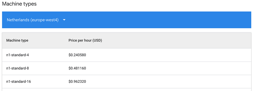
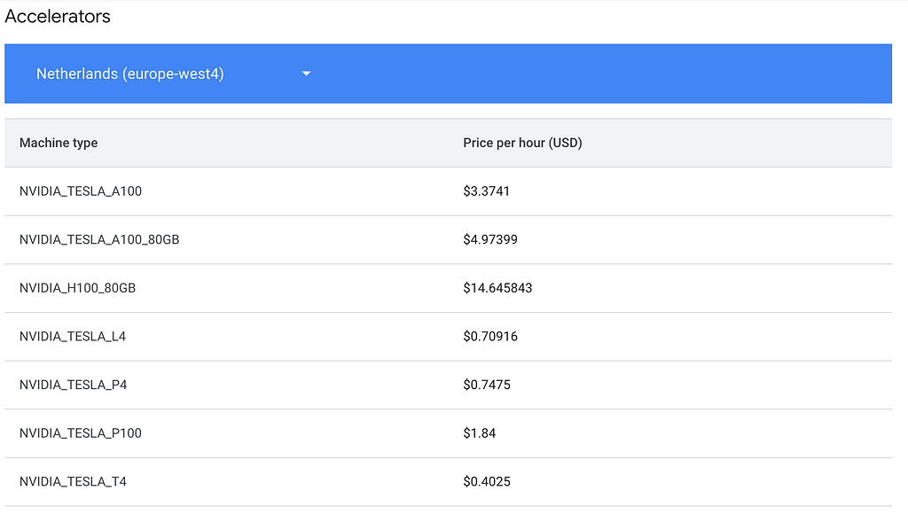
Create a job.sh file as follows, by specifying which region you are in and what kind of machine you use. Refer to the link above if you are in a different region as costs may vary.
You’ll also need to pass arguments to your training script. The syntax for the gcloud ai custom-jobs create consists of 2 parts:
– the arguments related to the job itself : –region , –display-name , –worker-pool-spec , –service-account , and –args
– the arguments related to the training : –training-file , –epochs , etc.
The latter needs to be preceded by the –args to indicate that all following arguments are related to the training Python script.
Ex: supposing our script takes 2 arguments x and y, we would have:
–args=x=1,y=2
# job.sh

export PROJECT_ID=<your-project-id>
export BUCKET=<your-bucket-id>
export REGION="europe-west4"
export SERVICE_ACCOUNT=<your-service-account>
export JOB_NAME="pytorch_bert_training"
export MACHINE_TYPE="n1-standard-4"  # We can specify GPUs here
export ACCELERATOR_TYPE="NVIDIA_TESLA_T4"
export IMAGE_URI="eu.gcr.io/$PROJECT_ID/pt_bert_sentiment:dev"


gcloud ai custom-jobs create
--region=$REGION
--display-name=$JOB_NAME
--worker-pool-spec=machine-type=$MACHINE_TYPE,accelerator-type=$ACCELERATOR_TYPE,accelerator-count=1,replica-count=1,container-image-uri=$IMAGE_URI
--service-account=$SERVICE_ACCOUNT
--args=
--training-file=gs://$BUCKET/data/train.csv,
--validation-file=gs://$BUCKET/data/eval.csv,
--testing-file=gs://$BUCKET/data/test.csv,
--job-dir=gs://$BUCKET/model/model.pt,
--epochs=10,
--batch-size=128,
--learning-rate=0.0001
Launch the script, and navigate to your GCP project, in the Training section under the Vertex menu .

Launch the script, and navigate to the console. You should see the job status as “Pending”, and then “Training”.
To ensure the GPU is being used, you can check the job and its ressources :
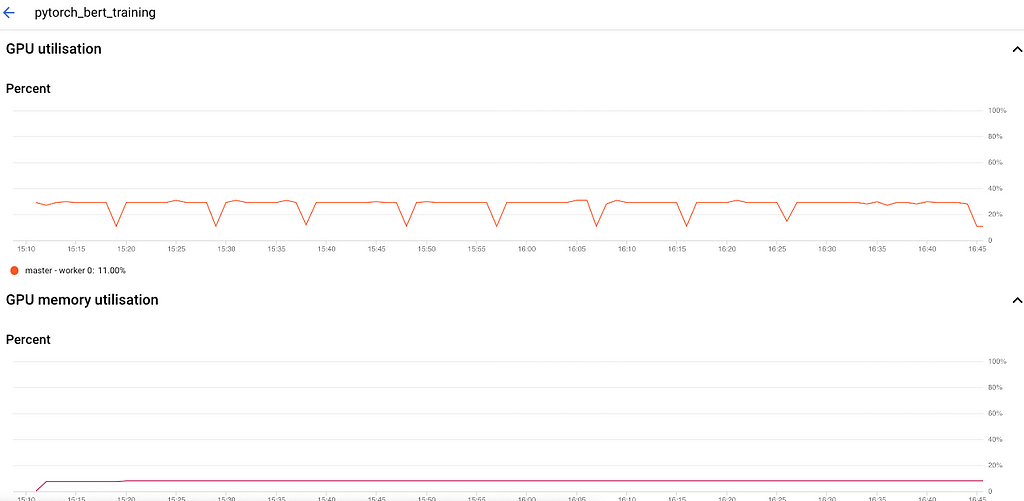
This indicates that we are training with a GPU, we should therefore expect a significant speed-up now ! Let’s have a look at the logs:

Less than 10 minutes to run 1 epoch, vs 1hr/epoch on CPU ! We have offloaded the training to Vertex and accelerated the training process. We could decide to launch other jobs with different configurations, without overloading our laptop’s capabilities.
What about the final accuracy of the model ? Well after 10 epochs, it is around 94–95%. We could let it run even longer and see if the score improves (we can also add an early stopping callback to avoid overfitting)

Time to party !
No GPU, No Party : Fine-Tune BERT for Sentiment Analysis with Vertex AI Custom jobs was originally published in Towards Data Science on Medium, where people are continuing the conversation by highlighting and responding to this story.
Originally appeared here:
No GPU, No Party : Fine-Tune BERT for Sentiment Analysis with Vertex AI Custom jobs

Luis Fernando PÉREZ ARMAS, Ph.D.

Solving the minimum vertex coloring problem via column generation
Originally appeared here:
Solving a Resource Planning Problem with Mathematical Programming and Column Generation