As we all settle into the sometimes hectic rhythm of a new year, we hope you’ve been enjoying the excitement of kicking off projects, learning about new topics, and exploring your next career moves. We’re definitely seeing a flurry of activity among our authors—both longstanding contributors and recent additions—and are thrilled to share all the great work they’ve been cooking up over the holidays.
Our lineup of top-notch reads this week has a distinctly actionable, hands-on flavor to it—after all, what better way to harness all this energy than by tinkering with some datasets, models, and code? Whether you’re interested in learning more about cutting-edge evaluation methods or building agentic-AI tools, we’ve got you covered with a diverse selection of tutorials and practical overviews. Ready to dive in?
Paradigm Shifts of Eval in the Age of LLMs Is it time to reevaluate the way we approach evaluations? Lili Jiang believes it is: “I’ve come to recognize that LLMs requires some subtle, conceptually simple, yet important changes in the way we think about evaluation.” Her latest article offers high-level insights into what a new paradigm might look like.
The Next Frontier in LLM Accuracy Staying thematically close to LLM optimization, Mariya Mansurova’s new deep dive unpacks in great detail several methods we can use to increase models’ accuracy, and zooms in on advanced fine-tuning techniques.
How to Build a Graph RAG App Ready to roll up your sleeves and dig deep into some code? Steve Hedden’s thorough tutorial on creating your first graph RAG app is a great option for anyone who’s interested in this trending topic but needs guidance and context to ensure they’re starting off on the right foot.
Multi-Agentic RAG with Hugging Face Code Agents Agent-based systems gained enormous steam (and buzz) last year, and it doesn’t seem like that’s about to change in 2025. Curious to learn more about them? Gabriele Sgroi, PhD’s patient, step-by-step guide may be long, but it remains accessible and clear as it outlines the process of leveraging a “small” LLM to power a multi-agentic system—and produce good results, even on consumer-grade hardware.
Demand Forecasting with Darts: A Tutorial LLMs may be grabbing much of our collective attention these days, but business-focused workflows remain the bread and butter of industry data scientists. Sandra E.G.’s debut TDS article provides a robust, hands-on introduction to one such essential task: demand forecasting in the context of retail sales.
Distributed Parallel Computing Made Easy with Ray It’s crucial for data and ML practitioners to experiment with new tools and frameworks, as seemingly small improvements can accumulate into major cost and efficiency benefits. Betty LD walks us through her recent foray into the AI-focused Ray library for distributed data processing, and demonstrates its power through the use case of scalable offline batch inference.
If you’re ready to branch out into other topics this week, we’re here to help—whether your interests lie at the intersection of music and AI, quantum computing, or linear algebra (among others), we hope you explore some of these excellent articles:
Quantum computing has been a hot topic for some time now, though discussions of its promise can sometimes feel almost sci-fi-adjacent. Here to help us make sense of the field and where things stand at the moment is Sara A. Metwalli, whose primer comes right as the UN has declared 2025 the international year of quantum science and technology.
Thank you for supporting the work of our authors! As we mentioned above, we love publishing articles from new authors, so if you’ve recently written an interesting project walkthrough, tutorial, or theoretical reflection on any of our core topics, don’t hesitate to share it with us.
What is the impact of my last advertising campaign? What are the long-term costs of Brexit? How much has I gained in my new pricing strategy? All these questions are commonly asked of data scientists and other data practitioners (maybe not the one on Brexit, but it is interesting nonetheless). It makes sense because stakeholders are interested in knowing the consequences of their actions.
But, as data scientists, it is generally a tough question for us. On the one hand, these questions could have been answered with more certainty if we had prepared a correct experimental setting before (be it an A/B Test or something better ), but it takes time to create such settings beforehand, and advertisers, supply planners, or pricers don’t generally have the time to do so. On the other hand, such questions force us to confront what remains of our statistical knowledge. We are aware that they are difficult to answer such questions, but it may be hard to pinpoint exactly where they are.
These difficulties may arise in the modelization ( seasonality ? presence of confounders ? ), in the mathematical properties that need to be verified to apply theorems (stationarity ? independence? ), or even in the mathematical-philosophical questions about causation (what is causality and how do you express it the maths ?).
It is therefore not surprising that data scientists have come to use many methods to treat such problems. I do not intend to make a full list of methods. Such a list can for instance be found here . My goal here is to present a simple method that can be used on a lot of cases, provided you have enough history on the data. . I also wish to compare it with Google’s Causal Impact method [1].
The details of the mathematical model has been postponed to their own section, I will try to use as few formulas as possible until then.
The problem
Suppose you have observed some data for a long period (before and after an intervention). We want to know the impact of this modification.
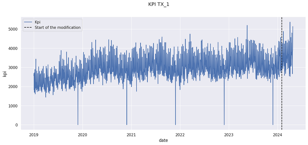
Example KPI (number of sales)
The above data come from the M5 Forecasting competition[3], but have been artificially modified. The details are postponed to the last section.
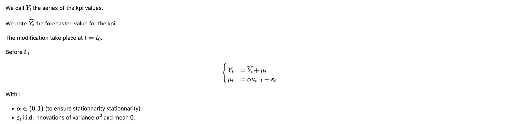
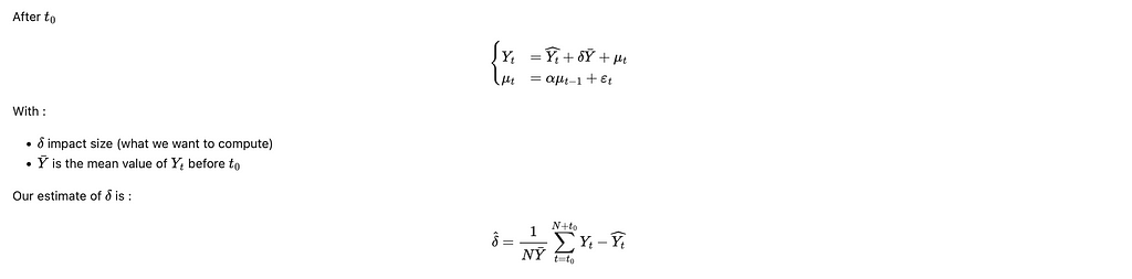
We have observed a KPI Yₜ on a store for a long period. An action has been taken on February 2024. For instance, it could have been the opening of a new competitor in the neighborhood, a new organization of the store, or a change in the pricing strategy. We want to know the impact of this modification.
Remark: This method does not work for punctual change, such as a marketing campaign. Google’s Causal Impact is more adapted in this case.
The proposed method
Let us sketch the method we will use to calculate the impact.
1- We will create a counterfactual prediction based on past data (before the modification). This counterfactual is based on classical ML techniques.
2- We will evaluate the performance of this predictor. This will allow us to compute confidence intervals and to ensure the validity of the use of its prediction.
3 -We will compare the prediction after the modification with the actual value. The prediction will represent what would have happened if the modification hadn’t occurred. Therefore, the difference between the actual value and the prediction is the uplift we measure.
Counterfactual Construction
We want to construct a counterfactual, i.e. a prediction noted Yₜ’ of the KPI Yₜ. There are many ways to construct a counterfactual. You use your favorite ML methods for time series forecasting. However, using classical time series techniques such as ARIMA to construct a counter-factual (a method called C-ARIMA [4]) is complex. Indeed, you cannot use data from after the modification to compute your counterfactual. Therefore, you will need to predict a long horizon with such techniques, and they are generally better ways to do so.
We will present here a simple solution when you have access to a control group. We consider that you have access to similar data not impacted by the modification. In our example, we will use data from other stores. It is therefore analog to a control group. This types of methodologies are called synthetic controls by economists[2], because it creates a synthetic control series instead of taking only one control time series.
Here we use 4 stores (called CA_1, TX_2, TX_3 and WI_1) in our control features. We also use the day of the week and a trend indicator to train our model. The last one is very handy to limit time drift, which is the main weakness of the method presented in this article.
Note: WI_1 presents an outlier value on 2019–01–05. This is a typical explanation for why we want to have several stores in our control sets, instead of only choosing one store.
min_date =dt.datetime(2019,1,1)
K = 3 # Max order of the fourrier series
T= 365

x = [(i-min_date).days for i in X.index]
XX = np.array([([sin( 2 *k * pi * t /(T-1))for k in range(1, K+1)] +[cos( 2 * pi * k  * t /(T-1)) for k in range(1, K+1)] ) for t in x])
X = X.join(pd.DataFrame(XX,columns = [f'F_{i}' for i in range(2*K)], index = X.index))
We also add some features corresponding to Fourier coefficients. It is a known technique to integrate seasonalities into ML time series forecasts. It is not really necessary here, but it can improve your results if the data you have present strong seasonal behavior. You may replace them with classical B-spline functions.
Now, we have the features for our model. We will split our data into 3 sets:
1- Training dataset : It is the set of data where we will train our model
2 – Test dataset : Data used to evaluate the performance of our model.
3- After modification dataset: Data used to compute the uplift using our model.
from sklearn.model_selection import train_test_split
Note : You can use a fourth subset of data to perform some model selection. Here we won’t do a lot of model selection, so it does not matter a lot. But it will if you start to select your model among tenths of others.
Note 2: Cross-validation is also very possible and recommended.
Note 3 : I do recommend splitting data without shuffling (shuffling = False). It will allow you to be aware of the eventual temporal drift of your model.
from sklearn.ensemble import RandomForestRegressor


model = RandomForestRegressor(min_samples_split=4)
model.fit(X_train, y_train)
y_pred = model.predict(X_test)
And here you train your predictor. We use a random forest regressor for its convenience because it allows us to handle non-linearity, missing data, and outliers. Gradients Boosting Trees algorithms are also very good for this use.
Many papers about Synthetic Control will use linear regression here, but we think it is not useful here because we are not really interested in the model’s interpretability. Moreover, interpreting such regression can be tricky.
Counterfactual Evaluation
Our prediction will be on the testing set. The main hypothesis we will make is that the performance of the model will stay the same when we compute the uplift. That is why we tend to use a lot of data in our We consider 3 different key indicators to evaluate the quality of the counterfactual prediction :
1-Bias : Bias controls the presence of a gap between your counterfactual and the real data. It is a strong limit on your ability to compute because it won’t be reduced by waiting more time after the modification.
We generally express the bias as a percentage of the average value of the KPI. It is smaller than 1%, so we should not expect to measure effects bigger than that. If your bias is too big, you should check for a temporal drift (and add a trend to your prediction). You can also correct your prediction and deduce the bias from the prediction, provided you control the effect of this correction of fresh data.
2-Standard Deviation σ: We also want to control how dispersed are the predictions around the true values. We therefore use the standard deviation, again expressed as a percentage of the average value of the kpi.
The good news is that the uncertainty created by the deviation is reduced when the number of data points increase. We prefer a predictor without bias, so it could be necessary to accept an increase in the deviation if allowed to limit the bias.
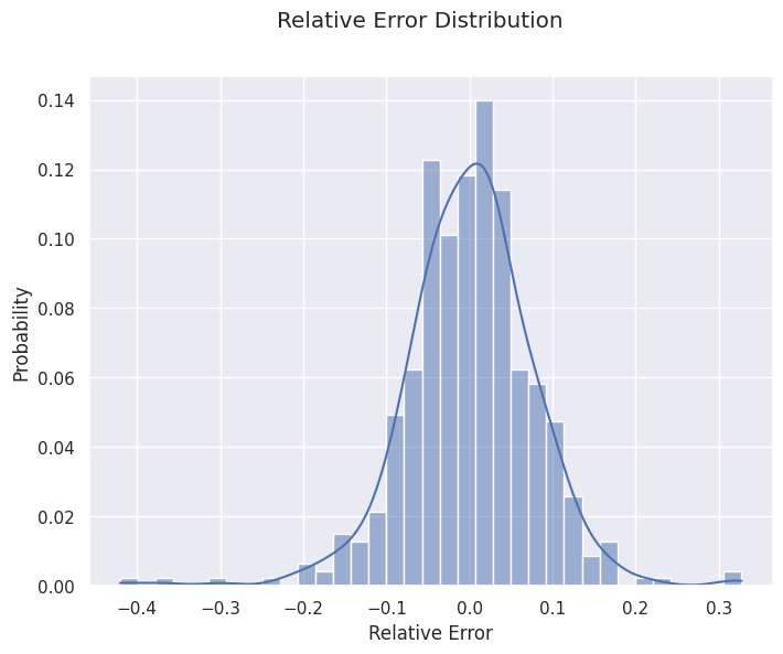
It can also be interesting to look at bias and variance by looking at the distribution of the forecasting errors. It can be useful to see if our calculation of bias and deviation is valid, or if it is affected by outliers and extreme values.
import seaborn as sns
import matplotlib.pyplot as plt

f, ax = plt.subplots(figsize=(8, 6))
sns.histplot(pd.DataFrame((y_pred -  y_test)/y_past.mean()), x = 'kpi', bins = 35, kde = True, stat = 'probability')
f.suptitle('Relative Error Distribution')
ax.set_xlabel('Relative Error')
plt.show()
3- Auto-correlation α: In general, errors are auto-correlated. It means that if your prediction is above the true value on a given day, it has more chance of being above the next day. It is a problem because most classical statistical tools require independence between observations. What happened on a given day should affect the next one. We use auto-correlation as a measure of dependence between one day and the next.
A high auto-correlation is problematic but can be managed. A possible causes for it are unobserved covariates. If for instance, the store you want to measure organized a special event, it could increase its sales for several days. This will lead to an unexpected sequence of days above the prevision.
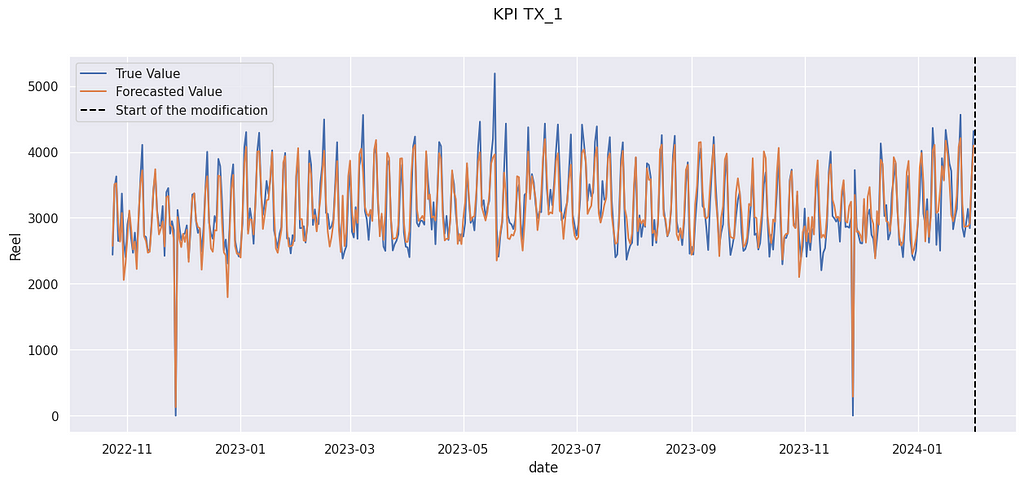
df_test = pd.DataFrame(zip(y_pred, y_test), columns = ['Prevision','Reel'], index = y_test.index)

f, ax = plt.subplots(figsize=(15, 6))
sns.lineplot(data = df_test, x = 'date', y= 'Reel', label = 'True Value')
sns.lineplot(data = df_test, x = 'date', y= 'Prevision', label = 'Forecasted Value')
ax.axvline(start_modification_date, ls = '--', color = 'black', label = 'Start of the modification')
ax.legend()
f.suptitle('KPI TX_1')
plt.show()
True value and forecasted value on the evaluation set.
In the figure above, you can see an illustration of the auto-correlation phenomenon. In late April 2023, for several days, forecasted values are above the true value. Errors are not independent of one another.
Impact Calculation
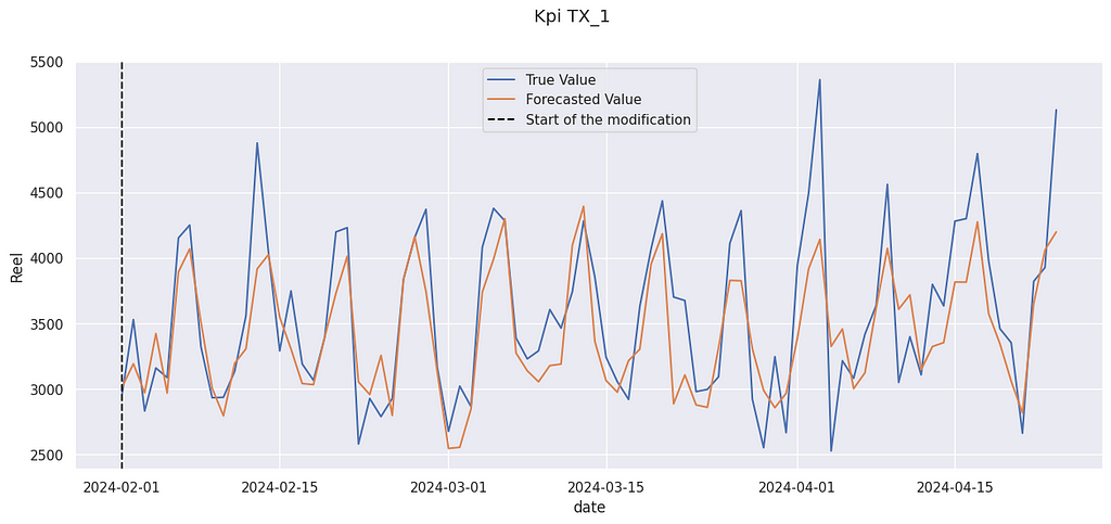
Now we can compute the impact of the modification. We compare the prediction after the modification with the actual value. As always, it is expressed as a percentage of the mean value of the KPI.
We get a relative increase of 4.9% The “true” value (the data used were artificially modified) was 3.0%, so we are not far from it. And indeed, the true value is often above the prediction :
True value and forecasted value after the modification
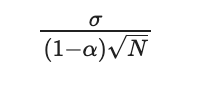
We can compute a confidence interval for this value. If our predictor has no bias, the size of its confidence interval can be expressed with:
Standard deviation of the estimator
Where σ is the standard deviation of the prediction, α its auto-correlation, and N the number of days after the modification.
N = y_after_modification.shape[0] ec = sigma/(sqrt(N) *(1-alpha))
68% IC : [3.83 % , 6.09 %]
95% IC : [2.70 % , 7.22 %]
The range of the 95% CI is around 4.5% for 84 days. It is reasonable for many applications, because it is possible to run an experiment or a proof of concept for 3 months.
Note: the confidence interval is very sensitive to the deviation of the initial predictor. That is why it is a good idea to take some time to perform model selection (on the training set only) before selecting a good model.
Mathematical formulation of the model
So far we have tried to avoid maths, to allow for an easier comprehension. In this section, we will present the mathematical model beneath the model.
Mathematical model before modification
This model is very close to a classical i.i.d. forecasting error. The only difference is that the gap between the forecasted value and the true value follows a stationary AR(1) process. It allows for some auto-correlation to be taken into account.
We are doing the hypothesis is that there is no memory of the previous gap (as in a Markov chain), only a state transition. The knowledge of the current gap is enough to know the distribution of the gap for the next day.
Note: Other mathematical hypotheses (weak dependence ! contraction !) could have been made and will be more general. However, the impact of this hypothesis on the confidence interval will be small, and in practice, the main limitation of this method is the temporal drift, not the model of dependence between variables.
Mathematical model after modification
This model leads (with the help of the central limit theorem) to the confidence interval presented before.
Comparison with Causal Impact
Causal Impact is a methodology developed by several Google researchers to answer the general question of impact attribution. It does share some similarities with the model presented here. In particular, they also use a synthetic counterfactual created from several possible control values before the modification.
The main difference is that the model presented here is much more restrictive. The structural time-series model used by Causal allows for a variable impact, whereas we have assumed that this impact was constant. Moreover, seasonality and trend are directly modelized into the Causal Impact framework, which limits the temporal drift and the drawbacks of strong seasonality.
Another difference is that causal impacts allows for some modification on the construction of the synthetic control. It is indeed possible that the behavior of the covariates and the target variables change over time, creating a temporal drift. Causal Impact takes into account some possible modifications, reducing the risk of temporal drift, especially when N is large.
However, our models allow us to use powerful ML Techniques, which can be handy if we have only access to a noisy or partial control. Moreover, by using a tighter hypothesis, we are generally able to establish smaller confidence intervals.
Let’s try to use the Causal Impact models (using the tfp-causalimpact implementation). We use as control variables the 4 same stores as in our examples.
import causalimpact from causalimpact import DataOptions import altair as alt alt.data_transformers.enable("vegafusion") # Useful to compute more than 5000 rows at time in Causal Impact
control = ['CA_1','TX_2', 'TX_3','WI_1']
data = X[control].assign( y = y.kpi.values /y.kpi.mean() ) data = data.reset_index().drop(columns = 'date')
Posterior tail-area probability p: 0.004 Posterior prob. of a causal effect: 99.56%
Causal Effect algorithm is also able to detect an effect, but it overestimates it ( 6.2% against the real 3%). Moreover, the range of the 95% CI is 9% (against 4.5% with our method), so it won’t be able to detect really small effects.
Conclusion
To sum up, our methodology works best :
When we can suppose that the effect we want to measure is constant
When available control data are noisy, or only partially avalaible
When there is no trend in our prediction
With fewer data points (due to the smaller IC)
Causal Impact will work best :
When the effect we want to measure is not constant
For times series with strong trend and/or seasonality patterns
When we have a lot of data points (due to the risk of temporal drift)
Data Sources :
We used data from the M5 Forecasting competition[3]. The data comes from Walmart stores in three US States (California, Texas, and Wisconsin). We only use aggregated sales data from 5 stores :
TX_1: our target store
CA_1, TX_2, TX_3 and WI_1 : stores used to construct our synthetic control
The dates are completely fictitious and used mostly to have nice graphic representations.
data = pd.read_csv('sales_train_evaluation.csv')
set_stores = set(data.store_id)
df_list = []
for store in set_stores:
    store_total = data[data.store_id == store].iloc[:, 6:].sum(axis= 0).reset_index()
    dates = [ dt.datetime(2019,1,1) +dt.timedelta(days =i) for i in range(1941)]
    store_total = store_total.assign(magasin = store,date= dates )
    store_total.columns = ['dti','kpi', 'magasin', 'date']
    df_list.append(store_total)
df  = pd.concat(df_list)

target = 'TX_1'
control = ['CA_1','TX_2', 'TX_3','WI_1']


y = df[df.magasin == target].set_index('date')
X = df[df.magasin.isin(control)].set_index(['date','magasin']).kpi.unstack()
The target has been artificially modified to introduce a random uplift of mean 3%.
y = y.assign( random = lambda x: np.random.normal(loc = 1+ modif_value,scale = variance , size = y.shape[0] ), kpi = lambda x : x.kpi.where(x.index < start_modification_date, other = x.kpi * x.random) )
# Features constructions X = X.assign( day_of_the_week = X.reset_index().date.dt.isocalendar().day.values, trend = (X.reset_index().date- start_modification_date).dt.days.values ) min_date =dt.datetime(2019,1,1) K = 3 # Max order of the fourrier series T= 365 x = [(i-min_date).days for i in X.index] XX = np.array([([sin( 2 *k * pi * t /(T-1))for k in range(1, K+1)] +[cos( 2 * pi * k * t /(T-1)) for k in range(1, K+1)] ) for t in x]) X = X.join(pd.DataFrame(XX,columns = [f'F_{i}' for i in range(2*K)], index = X.index))
Amazon Bedrock is a fully managed service that offers a choice of high-performing foundation models (FMs) from leading AI companies such as AI21 Labs, Anthropic, Cohere, Meta, Mistral AI, Stability AI, and Amazon through a single API, along with a broad set of capabilities to build generative AI applications with security, privacy, and responsible AI. In this post, I’ll show you how to use Amazon Bedrock—with its fully managed, on-demand API—with your Amazon SageMaker trained or fine-tuned model.
Why Bayesian A/B testing can lead to misunderstandings, inflated false positive rates, introduce bias and complicate results
(Image generated by the author using Midjourney)
Over the past decade, I’ve engaged in countless discussions about Bayesian A/B testing versus Frequentist A/B testing. In nearly every conversation, I’ve maintained the same viewpoint: there’s a significant disconnect between the industry’s enthusiasm for Bayesian testing and its actual contribution, validity, and effectiveness. While the hype around Bayesian testing may have peaked, it remains widely popular.
My first exposure to Bayesian statistics was during my master’s studies, where my thesis focused on Thompson Sampling. Professionally, I encountered Bayesian A/B testing during my tenure at Wix.com, where I played a key role in transitioning from the classical method to the Bayesian method. My perspective, as described here, has been informed by both my academic background and my professional experience at Wix and beyond, where I’ve helped many companies enhance their A/B testing capabilities.
When referring to “Bayesian A/B testing”, I’m specifically talking about the methods promoted by VWO and similar approaches used in some current experimentation platforms as alternatives to the classic (Frequentist) method. There are other implementations of Bayesian statistics in A/B testing, such as Thompson sampling in Multi-armed-bandit experiments, which can be highly effective but are rare outside marketing platforms like Google Ads and Facebook Ads.
In this post, I’ll explain what Bayesian tests entail, outline the most common arguments in favor of Bayesian tests, and address each argument. I’ll then discuss the major drawbacks of the Bayesian method and, finally, cover when to use Bayesian methods in experiments.
So grab a cup of coffee, and let’s dive in.
What Do Bayesian Tests Mean?
Bayesian statistics and Frequentist statistics differ fundamentally. Bayesian statistics incorporates prior knowledge or beliefs, updating this prior information with new data to produce a posterior distribution. This allows for a dynamic and iterative process of probability assessment. In contrast, Frequentist statistics relies solely on the data at hand, using long-run frequency properties to make inferences without incorporating prior beliefs. Frequentist statistics focuses on the likelihood of observing the data given a null hypothesis and uses concepts like p-values and confidence intervals to make decisions.
In Bayesian A/B testing, we design the test in a way that after short time, and based on the data gathered so far, we could calculate the probability that the treatment variant (B) is better than the control variant (A), noted as P(B>A| Data). Another metric used is risk, or expected loss, which helps us understand the risk of making a decision based on the data collected.
Bayesian A/B testing typically involves running a test, computing P(B>A|Data) and/or the expected loss (Risk), and making a decision based on these metrics. The decision can be arbitrary or involve a stopping rule, such as:
The probability B is better than A is larger than X%. For example: P(B>A| Data) > 95%
The expected loss (Risk) is less than Y%. For example: expected loss < 1%
Arguments for Bayesian Tests
Throughout my career, I’ve encountered three common arguments in favor of Bayesian tests:
The early stopping argument — the ability to stop the experiment whenever you want (or based on a stopping rule), unlike the classic t-test / z-test that requires planning your sample size and analyzing the results only once the predefined sample size is reached. This is useful in cases where the sample size is small or when there is a very big effect and you would like to stop the test based on the results.
The prior argument — The use of prior knowledge or business knowledge to enrich data and make better decisions.
The language and terminology argument — bayesian metrics are more intuitive and suited to everyday business language compared to Frequentist metrics like p-value. Thus, “Probability B is better then A” is much more intuitive and well understood compared to “the probability of obtaining test results at least as extreme as the result actually observed, under the assumption that the null hypothesis is true” — which is the p-value definition.
Let’s tackle each argument one by one.
You Can Stop Whenever You Want
In the online industry, data is collected automatically and often displayed in real-time dashboards that include various statistical metrics. Simple classical tests, like the t-test and z-test, do not permit peeking at the results, requiring a predefined sample size and only allowing analysis once that sample size is reached.
Anyone who has ever run an A/B test knows that this is not practical. The easy accessibility of information makes it hard to ignore, especially when a product manager notices significant results, whether positive or negative, and insists on stopping the experiment to move on to the next task. This highlights the clear need for a method that allows peeking at the data and stopping early. Thus, the argument for early stopping is perhaps the strongest for Bayesian A/B tests — if only it were true.
Bayesian statistics, when considered superficially as “subjective understanding incorporating prior beliefs to the data,” allows stopping whenever. However, if you expect guarantees like “controlling the false positive rate” (as in the Frequentist approach), this is problematic.
Bayesian A/B testing is not inherently immune to the pitfalls of peeking at the data. For those looking for a good statistical explanation, please take a look at Georgry’s excellent blog post. For now, let’s address Greorgry’s point, but from a different perspective:
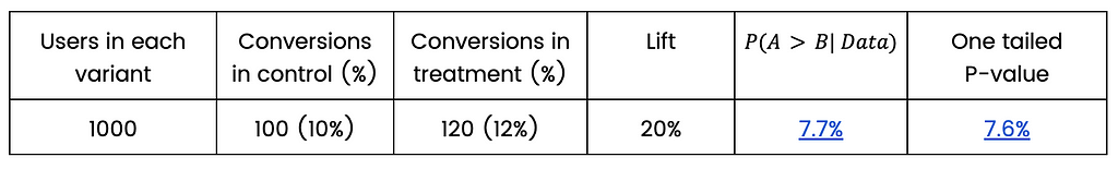
In the case of two variants, control and treatment, and when the number of users is large enough, the one-tailed p-value is almost identical to the Bayesian probability the control is better than the treatment, noted as P(A>B| Data) =1-P(B>A| Data). In an A/B test, a low one-tailed p-value and low P(A>B| Data) (which is equivalent to high P(B>A| Data)) indicates that the treatment is better than the control. The fact that these two measures are almost identical means that technically, early stopping based on P(B>A | Data) is equivalent to early stopping based on the p-value failing to maintain the type I error rate (false positive rate).
Although the Bayesian method does not commit to maintaining the false positive rate (aka type I error), practitioners would likely not want to see false “significant” results frequently. The notion of “stop whenever you want” is usually interpreted by practitioners as “we’re safe to draw valid conclusions at any point because we’re doing Bayesian analysis” rather than “we’re safe to draw conclusions at any point because Bayesian A/B testing doesn’t guarantee to maintain something similar to false positive rate”. We now understand that Bayesian A/B testing, in the popular way it is practiced, means the latter.
Sequential testing in the Frequentist approach, on the other hand, allows for peeking and early stopping while maintaining control over the false positive rate. Various frameworks, such as Group Sequential Testing (GSP) and the Sequential Probability Ratio Test (SPRT), enable this and are widely implemented in experimentation platforms like Optimizely, Statsig, Eppo, and A/B Smartly.
In summary, both Frequentist and Bayesian methods are not immune to the issues of peeking, but sequential testing frameworks can help mitigate these issues while making sure they do not inflate the false positive rate.
Use of Prior
The second argument in favor of Bayesian A/B testing is the use of prior knowledge. Throughout the web and conversations with practitioners, I’ve encountered comments regarding prior such as “Using prior allows you to incorporate existing and relevant business knowledge into the experiment and thereby improve performance”. These statements sound very appealing because they play on a very correct sentiment — usually using additional data is better. The more, the merrier. But anyone who understands a bit how the concept of priors in Bayesian probability works will understand that the use of priors in A/B testing is at least risky, and can lead to incorrect results.
The basic idea in Bayesian statistics is to combine any prior knowledge we have, aka prior, with the data to produce posterior distributions — knowledge that combines our prior knowledge with the data. Seemingly, there is something here that does not exist in the classical method. We are not just using the data; we are also adding more knowledge and business information that exists in our organization!
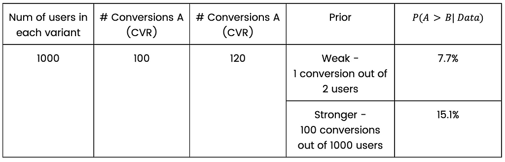
In the case of comparing two proportions — the meaning of prior is actually very simple. It is simply an addition of a virtual # of success and # of users to the data. Suppose we did such a test, and out of 1000 users in the control group, and we have 100 conversions.
Assuming my prior is “10 successes out of 100 users”, it means that my posterior knowledge is the sum of successes and users of the prior and the data. In our example: 110 “conversions” out of 1100 “users”. This is not the exact statistical definition, but it captures the idea very well.
A prior can be weak (1 success out of 10 users) or strong (1000 successes out of 10000 users for example). Both represent a knowledge that the conversion rate is 10%. In any case, when we accumulate a lot of data, the prior weight naturally decreases.
How should we incorporate prior knowledge in a two proportions A/B test? There are two options:
We incorporate, based on historical data, the general conversion rate in the population and add it to each variant. This is common practice.
We incorporate, based on historical data, which variant, control or treatment, usually show better results and give that variant an advantage based on this knowledge.
How will the prior manifest in the first option? Let’s stick to the example of 1000 users in each variant, 100 conversions to control variant and 120 conversions to treatment variant.
Suppose we know that the CVR is 10%, so an appropriate prior could be to add 100 successes and 1000 users to the existing data and then perform a statistical test as if we have 2000 users in each group, 200 conversions in control and 220 conversions in treatment. What’s described here is exactly what happens; it’s not approximately or as if — that’s the technical meaning of the prior in the case of two proportions bayesian test (assuming beta prior, for the statisticians reading this article).
A simple calculation shows that using a stronger prior in our example will increase P(A>B| Data), which means less indication for difference between variants — compared to the weak prior. That is what happens when you add the same amount of successes and users to each variant. This practice goes against our motivation to stop as early as possible, so why on earth would we want to do such a thing?
A common argument is that the Bayesian method is very liberal in choosing a winner, and the priors are a restraining factor. That’s true, the Bayesian method as I represented is very liberal, and priors are a restraining factor. So why not choose a more conservative approach (hmmm hmmm Frequentist) to begin with?
Moreover, if that is the argument, then it is clear to everyone that the glorified claim about priors that “add business information to the experiment” is misleading. If the business information is just a restraining factor, then the idea of using strong prior does not seem appealing at all.
The second option for incorporating a prior, giving one version an advantage over the other version based on historical data, is even worse. Why would anyone want to do this? Why should one experiment be influenced by the successes or failures of previous experiments? Each experiment should be a clean slate, a new opportunity to try something new without bias. Adding 200 successes to one version and 100 to the other sounds absurd and unreasonable in any way.
Language and Terminology
The third argument in favor of Bayesian A/B testing is the more intuitive language and terminology. A/B testing results are often consumed by people without strong statistical backgrounds. Frequentist metrics like p-values and confidence intervals can be unintuitive and misunderstood, even by statisticians. Many articles have been written about people’s misunderstanding of these metrics, even people with a background in statistics. I admit that it was only a considerable time after my master’s degree in statistics that I understood the exact definition of a classical CI. There is no doubt that this is a real pain point and an important one.
If you ask someone without a background in statistics to compare two versions with partial performance data for each version and ask them to formulate a question, they are likely to ask, “What is the probability that this version is better than the other version?” The same is true for confidence intervals. Most likely, when you explain the definition of a Frequentist confidence interval to someone, they will understand it in a Bayesian way.
This argument is actually true. I agree that Bayesian statistical metrics are much more intuitive to the common practitioner, and I agree that it is preferred that the statistical language will be as simple as possible and well understood, since A/B testing is mostly being conducted and consumed by non-statisticians. However, I don’t think it’s a disaster that practitioners don’t fully understand the statistical terms and results. Most of them are thinking in terms of “winning” and “losing” and it’s okay.
I recall, when I was at Wix, showing our new Bayesian A/B testing dashboard to a product manager as part of a usability test, to learn how he reads it and what he understands. His approach was very simple — searching for “greens” and “reds” KPIs and ignoring the “grays” KPIs. He didn’t really care if it was a p-value or probability B is better than A, a confidence interval or a credible interval. I bet that if he knew, it would rarely change his decision about the test.
Major Drawbacks of the Bayesian Method
So far, we have discussed the alleged advantages of using the popular Bayesian method for A/B testing and why some of them are not correct or meaningful enough. There are also very considerable disadvantages to using the Bayesian method:
The lack of maximum sample size
The lack of guidelines and framework to make a decision regarding the test when the results are inconclusive.
These drawbacks are significant, especially since most experiments do not show a significant effect.
Let’s assume we run an experiment which does not affect the KPI we are interested in at all. In most cases, the data will indicate indecision, and we will not be sure what to do next. Should we continue the experiment and collect more data? Or go with the more probable variant even if the results are not conclusive?
One can argue that predefined sample size is a limiting factor, but it also provides an important framework for decision-making. We decide upon a sample size, and we know that we will be able, with high probability (known as statistical power), detect a predefined effect size. If we are smart enough, we will use a sequential testing method that will allow us to stop before we reach the maximum predefined sample size.
It is true that when using one of the Bayesian stopping rules mentioned before, the test will eventually end even if there is no effect. For example, the risk will gradually, and slowly, decrease and eventually will reach the predefined threshold. The problem is it will take a very long time when there is no difference between the variants. So long that in reality practitioners will likely won’t have the patience to wait. They will stop the experiment once they feel there is no point in continuing.
When to Use Bayesian Methods in Experiments
In Multi-Armed Bandit (MAB) experiments, Bayesian statistics flourish and are considered best practice. In these types of experiments, there are usually several variants (for example several ads creative) and we want to quickly decide which ads are performing the best. When the experiment begins, users are allocated equally to all variants, but after some data is gathered, the allocation changes and more users are allocated to the better performing variant (ad). Eventually, (almost) all users are allocated to the best performing variant (ad).
I also came across an interesting Bayesian A/B testing framework in an article published by Microsoft, but I never met any organization using the suggested methodology, and it still lacks a maximum sample size which should be very important to practitioners.
Conclusion
While Bayesian A/B testing offers a more intuitive framework and the ability to incorporate prior knowledge, it falls short in critical areas. The promises of early stopping and better decision-making are not inherently guaranteed by Bayesian methods and can lead to misunderstandings and inflated false positive rates if not carefully managed. Additionally, the use of priors can introduce bias and complicate results rather than clarify them. The Frequentist approach, with its structured methodology and sequential testing options, provides more reliable and transparent results, especially in environments where rigorous decision-making is essential.
Let’s say you are in a customer care center, and you would like to know the probability distribution of the number of calls per minute, or in other words, you want to answer the question: what is the probability of receiving zero, one, two, … etc., calls per minute? You need this distribution in order to predict the probability of receiving different number of calls based on which you can plan how many employees are needed, whether or not an expansion is required, etc.
In order to let our decision ‘data informed’ we start by collecting data from which we try to infer this distribution, or in other words, we want to generalize from the sample data to the unseen data which is also known as the population in statistical terms. This is the essence of statistical inference.
From the collected data we can compute the relative frequency of each value of calls per minute. For example, if the collected data over time looks something like this: 2, 2, 3, 5, 4, 5, 5, 3, 6, 3, 4, … etc. This data is obtained by counting the number of calls received every minute. In order to compute the relative frequency of each value you can count the number of occurrences of each value divided by the total number of occurrences. This way you will end up with something like the grey curve in the below figure, which is equivalent to the histogram of the data in this example.
Image generated by the Author
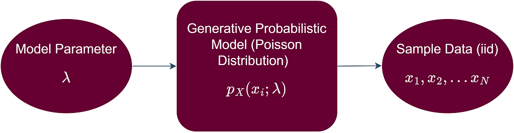
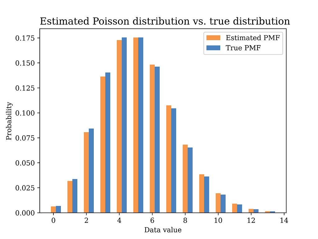
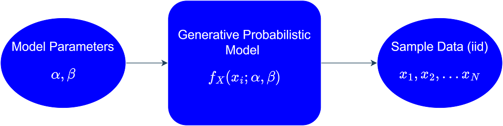
Another option is to assume that each data point from our data is a realization of a random variable (X) that follows a certain probability distribution. This probability distribution represents all the possible values that are generated if we were to collect this data long into the future, or in other words, we can say that it represents the population from which our sample data was collected. Furthermore, we can assume that all the data points come from the same probability distribution, i.e., the data points are identically distributed. Moreover, we assume that the data points are independent, i.e., the value of one data point in the sample is not affected by the values of the other data points. The independence and identical distribution (iid) assumption of the sample data points allows us to proceed mathematically with our statistical inference problem in a systematic and straightforward way. In more formal terms, we assume that a generative probabilistic model is responsible for generating the iid data as shown below.
Image generated by the Author
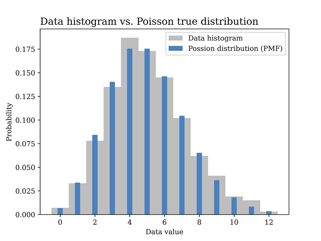
In this particular example, a Poisson distribution with mean value λ = 5 is assumed to have generated the data as shown in the blue curve in the below figure. In other words, we assume here that we know the true value of λ which is generally not known and needs to be estimated from the data.
Image generated by the Author
As opposed to the previous method in which we had to compute the relative frequency of each value of calls per minute (e.g., 12 values to be estimated in this example as shown in the grey figure above), now we only have one parameter that we aim at finding which is λ. Another advantage of this generative model approach is that it is better in terms of generalization from sample to population. The assumed probability distribution can be said to have summarized the data in an elegant way that follows the Occam’s razor principle.
Before proceeding further into how we aim at finding this parameter λ, let’s show some Python code first that was used to generate the above figure.
# Import the Python libraries that we will need in this article import pandas as pd import matplotlib.pyplot as plt import numpy as np import seaborn as sns import math from scipy import stats
# Poisson distribution example lambda_ = 5 sample_size = 1000 data_poisson = stats.poisson.rvs(lambda_,size= sample_size) # generate data
# Plot the data histogram vs the PMF x1 = np.arange(data_poisson.min(), data_poisson.max(), 1) fig1, ax = plt.subplots() plt.bar(x1, stats.poisson.pmf(x1,lambda_), label="Possion distribution (PMF)",color = BLUE2,linewidth=3.0,width=0.3,zorder=2) ax.hist(data_poisson, bins=x1.size, density=True, label="Data histogram",color = GRAY9, width=1,zorder=1,align='left')
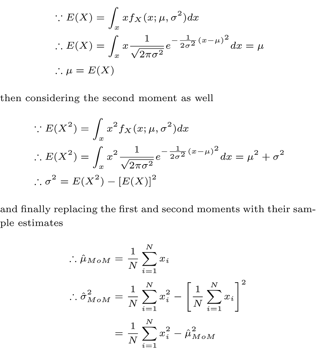
Our problem now is about estimating the value of the unknown parameter λ using the data we collected. This is where we will use the method of moments (MoM) approach that appears in the title of this article.
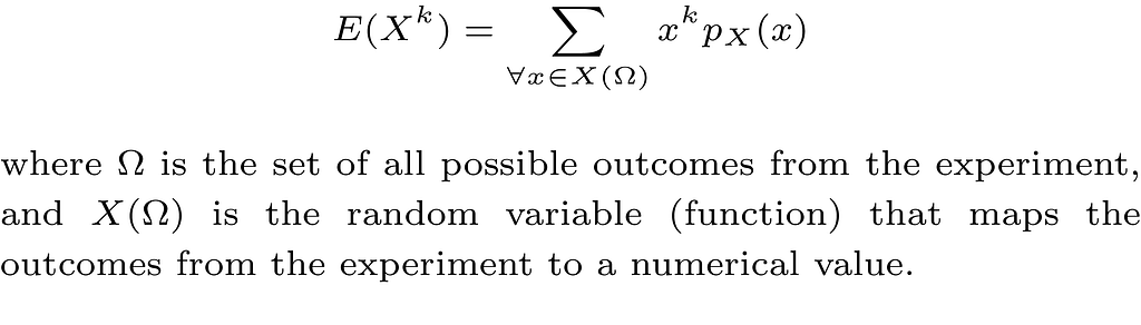
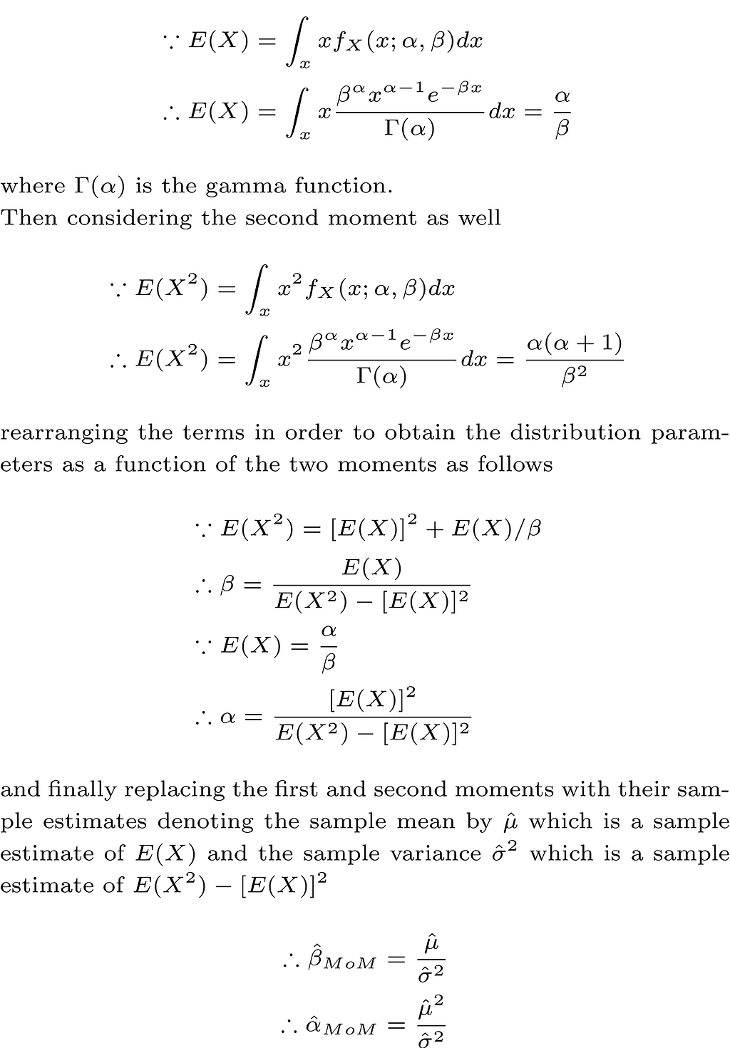
First, we need to define what is meant by the moment of a random variable. Mathematically, the kth moment of a discrete random variable (X) is defined as follows
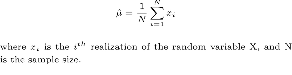
Take the first moment E(X) as an example, which is also the mean μ of the random variable, and assuming that we collect our data which is modeled as N iid realizations of the random variable X. A reasonable estimate of μ is the sample mean which is defined as follows
Thus, in order to obtain a MoM estimate of a model parameter that parametrizes the probability distribution of the random variable X, we first write the unknown parameter as a function of one or more of the kth moments of the random variable, then we replace the kth moment with its sample estimate. The more unknown parameters we have in our models, the more moments we need.
In our Poisson model example, this is very simple as shown below
In the next part, we test our MoM estimator on the simulated data we had earlier. The Python code for obtaining the estimator and plotting the corresponding probability distribution using the estimated parameter is shown below.
# Method of moments estimator using the data (Poisson Dist) lambda_hat = sum(data_poisson) / len(data_poisson)
ax.set_title("Estimated Poisson distribution vs. true distribution", fontsize=14, loc='left') ax.set_xlabel('Data value') ax.set_ylabel('Probability') ax.legend() #ax.grid() plt.savefig("Possion_true_vs_est.png", format="png", dpi=800)
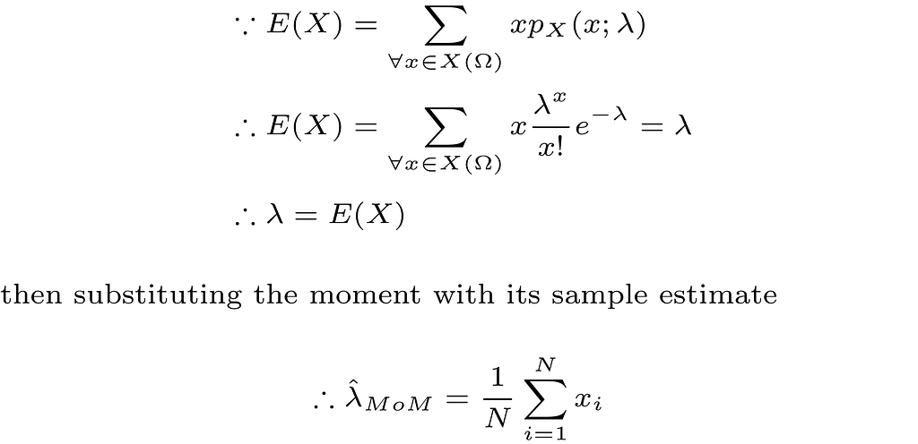
The below figure shows the estimated distribution versus the true distribution. The distributions are quite close indicating that the MoM estimator is a reasonable estimator for our problem. In fact, replacing expectations with averages in the MoM estimator implies that the estimator is a consistent estimator by the law of large numbers, which is a good justification for using such estimator.
Image generated by the Author
Another MoM estimation example is shown below assuming the iid data is generated by a normal distribution with mean μ and variance σ² as shown below.
Image generated by the Author
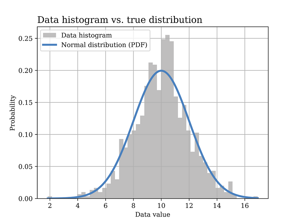
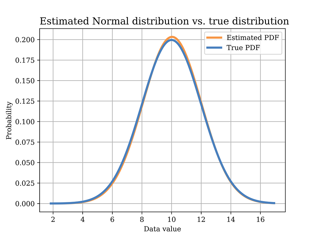
In this particular example, a Gaussian (normal) distribution with mean value μ = 10 and σ = 2 is assumed to have generated the data. The histogram of the generated data sample (sample size = 1000) is shown in grey in the below figure, while the true distribution is shown in the blue curve.
Image generated by the Author
The Python code that was used to generate the above figure is shown below.
# Normal distribution example mu = 10 sigma = 2 sample_size = 1000 data_normal = stats.norm.rvs(loc=mu, scale=sigma ,size= sample_size) # generate data
# Plot the data histogram vs the PDF x2 = np.linspace(data_normal.min(), data_normal.max(), sample_size) fig3, ax = plt.subplots() ax.hist(data_normal, bins=50, density=True, label="Data histogram",color = GRAY9) ax.plot(x2, stats.norm(loc=mu, scale=sigma).pdf(x2), label="Normal distribution (PDF)",color = BLUE2,linewidth=3.0)
Now, we would like to use the MoM estimator to find an estimate of the model parameters, i.e., μ and σ² as shown below.
In order to test this estimator using our sample data, we plot the distribution with the estimated parameters (orange) in the below figure, versus the true distribution (blue). Again, it can be shown that the distributions are quite close. Of course, in order to quantify this estimator, we need to test it on multiple realizations of the data and observe properties such as bias, variance, etc. Such important aspects have been discussed in an earlier article Bias Variance Tradeoff in Parameter Estimation with Python Code | by Mahmoud Abdelaziz, PhD | Medium
Image generated by the Author
The Python code that was used to estimate the model parameters using MoM, and to plot the above figure is shown below.
# Method of moments estimator using the data (Normal Dist)
mu_hat = sum(data_normal) / len(data_normal) # MoM mean estimator
var_hat = sum(pow(x-mu_hat,2) for x in data_normal) / len(data_normal) # variance
sigma_hat = math.sqrt(var_hat)  # MoM standard deviation estimator

# Plot the MoM estimated PDF vs the true PDF
x2 = np.linspace(data_normal.min(), data_normal.max(), sample_size)
fig4, ax = plt.subplots()
ax.plot(x2, stats.norm(loc=mu_hat, scale=sigma_hat).pdf(x2),
        label="Estimated PDF",color = ORANGE1,linewidth=3.0)
ax.plot(x2, stats.norm(loc=mu, scale=sigma).pdf(x2),
        label="True PDF",color = BLUE2,linewidth=3.0)

ax.set_title("Estimated Normal distribution vs. true distribution", fontsize=14, loc='left')
ax.set_xlabel('Data value')
ax.set_ylabel('Probability')
ax.legend()
ax.grid()
plt.savefig("Normal_true_vs_est.png", format="png", dpi=800)
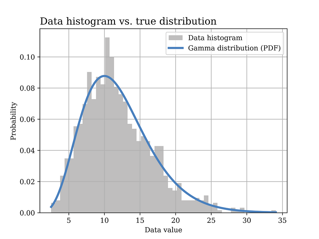
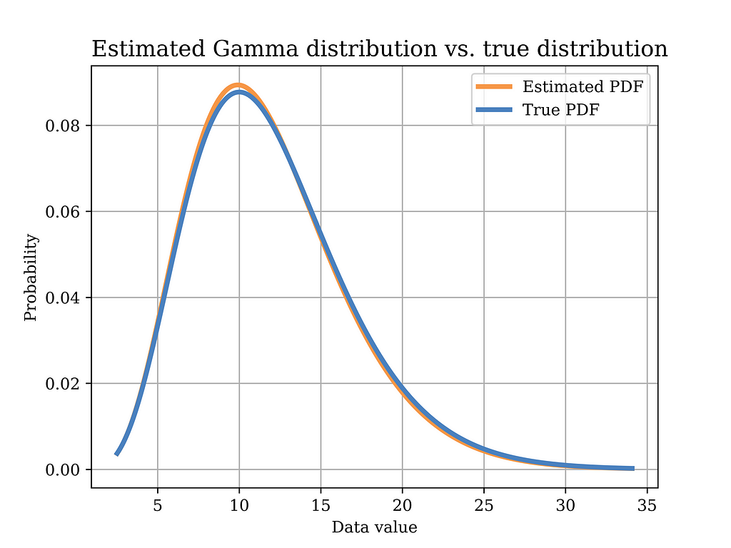
Another useful probability distribution is the Gamma distribution. An example for the application of this distribution in real life was discussed in a previous article. However, in this article, we derive the MoM estimator of the Gamma distribution parameters α and β as shown below, assuming the data is iid.
Image generated by the Author
In this particular example, a Gamma distribution with α = 6 and β = 0.5 is assumed to have generated the data. The histogram of the generated data sample (sample size = 1000) is shown in grey in the below figure, while the true distribution is shown in the blue curve.
Image generated by the Author
The Python code that was used to generate the above figure is shown below.
# Gamma distribution example alpha_ = 6 # shape parameter scale_ = 2 # scale paramter (lamda) = 1/beta in gamma dist. sample_size = 1000 data_gamma = stats.gamma.rvs(alpha_,loc=0, scale=scale_ ,size= sample_size) # generate data
# Plot the data histogram vs the PDF x3 = np.linspace(data_gamma.min(), data_gamma.max(), sample_size) fig5, ax = plt.subplots() ax.hist(data_gamma, bins=50, density=True, label="Data histogram",color = GRAY9) ax.plot(x3, stats.gamma(alpha_,loc=0, scale=scale_).pdf(x3), label="Gamma distribution (PDF)",color = BLUE2,linewidth=3.0)
Now, we would like to use the MoM estimator to find an estimate of the model parameters, i.e., α and β, as shown below.
In order to test this estimator using our sample data, we plot the distribution with the estimated parameters (orange) in the below figure, versus the true distribution (blue). Again, it can be shown that the distributions are quite close.
Image generated by the Author
The Python code that was used to estimate the model parameters using MoM, and to plot the above figure is shown below.
# Method of moments estimator using the data (Gamma Dist) sample_mean = data_gamma.mean() sample_var = data_gamma.var() scale_hat = sample_var/sample_mean #scale is equal to 1/beta in gamma dist. alpha_hat = sample_mean**2/sample_var
# Plot the MoM estimated PDF vs the true PDF x4 = np.linspace(data_gamma.min(), data_gamma.max(), sample_size) fig6, ax = plt.subplots()
ax.set_title("Estimated Gamma distribution vs. true distribution", fontsize=14, loc='left') ax.set_xlabel('Data value') ax.set_ylabel('Probability') ax.legend() ax.grid() plt.savefig("Gamma_true_vs_est.png", format="png", dpi=800)
Note that we used the following equivalent ways of writing the variance when deriving the estimators in the cases of Gaussian and Gamma distributions.
Conclusion
In this article, we explored various examples of the method of moments estimator and its applications in different problems in data science. Moreover, detailed Python code that was used to implement the estimators from scratch as well as to plot the different figures is also shown. I hope that you will find this article helpful.
How can numerical user metrics, such as “3 visits in the past week,” be transformed into a personalized assessment of whether this behavior is typical or unusual for the user?
Cover, image by Author
In almost any digital product, analysts often face the challenge of building a digital customer profile — a set of parameters that describe the customer’s state and behavior in one way or another.
What are the potential applications of these metrics?
Gaining insights into user behavior
Leveraging as features in ML models
Developing business rules for personalized offers
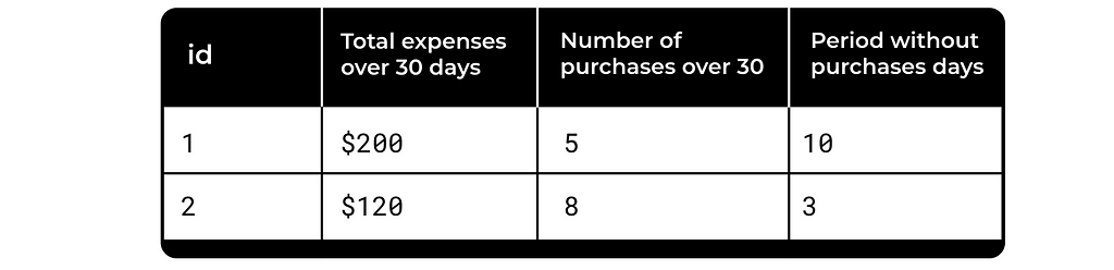
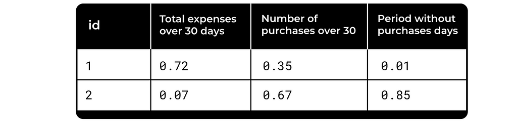
A simple example is e-commerce, with metrics like those listed in the table below.
Image by Author
These metrics are used everywhere, but what is the problem with them? They don’t take into account the specific user’s history or the dynamics of this particular metric. Is $200 spend a lot for user 1? It’s unclear. Yet this distinction significantly influences the business decision we make next.
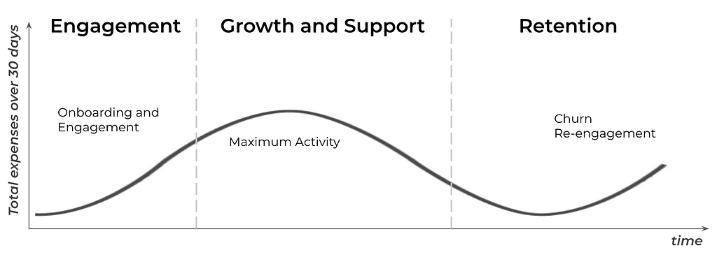
Even within the context of a single user, $200 can have a different meaning for the business depending on the user’s stage in their lifecycle with the product. $200 spent during the user onboarding, pick activity and re-activation are different.
User journey, image by Author
We’d like to have some normalized metrics to be able compare them between users. Something like this:
Image by Author
So how can we move from a numerical description of customer behavior to a more characteristic representation? For instance, how can the fact that “a customer hasn’t made a transaction for 7 days” be translated into an individualized assessment of whether this is unusual or typical for that specific customer? The challenge is to achieve this without losing interpretability, preserving business relevance, and avoiding black-box models.
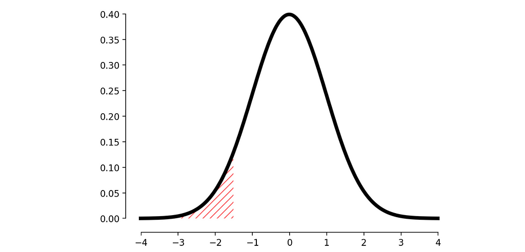
A simple approach is to analyze the distribution of the metric and determine the probability of observing the current result (i.e., calculate the p-value). This helps us understand how extreme the value is compared to the user’s history.
Normal distribution, image by Author
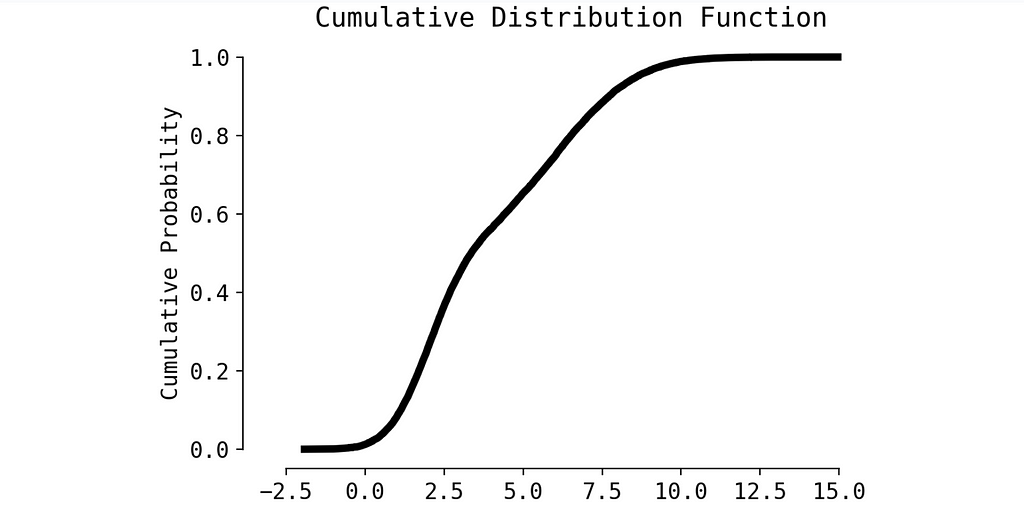
But what’s the challenge here? In most cases, the distribution of metrics is not normal, making p-value calculations more complex.
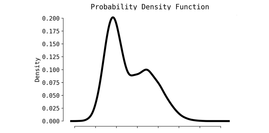
The random metric probably would have a distribution similar to this one:
PDF, image by Author
We can apply some small trick and to transform Probability Density Function to Cumulative Distribution Function (CDF). Calculating p-value in this case is much easier.
CDF, image by Author
So, we simply need to reconstruct the CDF from the user’s metric, which can be done efficiently using splines. Let’s create a toy example.
Imagine you are an e-commerce platform aiming to personalize your email campaigns based on user activity from the past week. If a user has been less active compared to previous weeks, you plan to send them a discount offer.
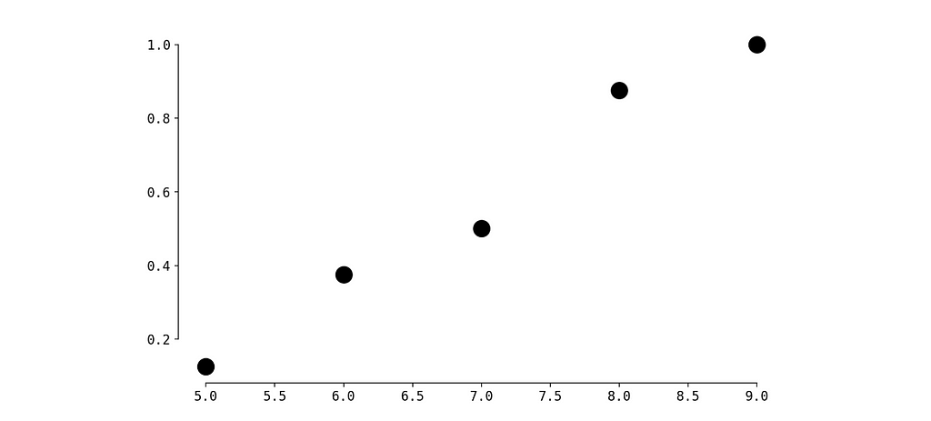
You’ve gathered user statistics and noticed the following for a user named John:
John visited the platform for the first time 15 days ago.
During the first 7 days (days 1–7), he made 9 visits.
During the next 7 days (days 2–8), he made 8 visits.
Totally we have 9 values.
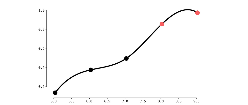
Now, you want to evaluate how extreme the most recent value is compared to the previous ones.
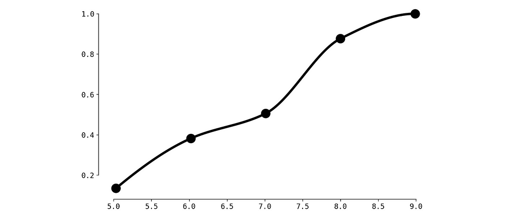
Not bad. But we observe a small problem between red dots — the CDF must be monotonically increasing. Let’s fix this with Piecewise Cubic Hermite Interpolating Polynomial.
CDF with Piecewise Cubic Hermite Interpolating, image by Author
Alright, now it’s perfect.
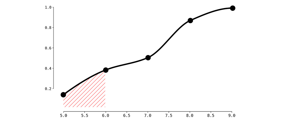
To calculate p-value for our current observation (6 visits during the last week) we need to calculate the surface of filled area.
Critical area, image by Author
To do so let’s create a simple function calculate_p_value:
def calculate_p_value(x):
    if x < values.min():
        return 0
    elif x > values.max():
        return 1
    else:
        return spline_monotonic(x)

p_value = calculate_p_value(num_visits_last_week)
print(f"Probability of getting less than {num_visits_last_week} equals: {p_value}")
Probability of getting less than 6 equals: 0.375
So the probability is quite high (we may compare it to a threshold 0.1 for instance) and we decide not to send the discount to John. Same calculation we need to do for all the users.
Conclusion
In this article, we have seen how transforming raw user metrics into personalized assessments can lead to more effective business decisions. By using statistical methods like CDF and spline interpolation, we can better understand the context behind user actions and provide personalized, relevant offers that are informed by data.
We use cookies on our website to give you the most relevant experience by remembering your preferences and repeat visits. By clicking “Accept”, you consent to the use of ALL the cookies.
This website uses cookies to improve your experience while you navigate through the website. Out of these, the cookies that are categorized as necessary are stored on your browser as they are essential for the working of basic functionalities of the website. We also use third-party cookies that help us analyze and understand how you use this website. These cookies will be stored in your browser only with your consent. You also have the option to opt-out of these cookies. But opting out of some of these cookies may affect your browsing experience.
Necessary cookies are absolutely essential for the website to function properly. These cookies ensure basic functionalities and security features of the website, anonymously.
Cookie
Duration
Description
cookielawinfo-checkbox-analytics
11 months
This cookie is set by GDPR Cookie Consent plugin. The cookie is used to store the user consent for the cookies in the category "Analytics".
cookielawinfo-checkbox-functional
11 months
The cookie is set by GDPR cookie consent to record the user consent for the cookies in the category "Functional".
cookielawinfo-checkbox-necessary
11 months
This cookie is set by GDPR Cookie Consent plugin. The cookies is used to store the user consent for the cookies in the category "Necessary".
cookielawinfo-checkbox-others
11 months
This cookie is set by GDPR Cookie Consent plugin. The cookie is used to store the user consent for the cookies in the category "Other.
cookielawinfo-checkbox-performance
11 months
This cookie is set by GDPR Cookie Consent plugin. The cookie is used to store the user consent for the cookies in the category "Performance".
viewed_cookie_policy
11 months
The cookie is set by the GDPR Cookie Consent plugin and is used to store whether or not user has consented to the use of cookies. It does not store any personal data.
Functional cookies help to perform certain functionalities like sharing the content of the website on social media platforms, collect feedbacks, and other third-party features.
Performance cookies are used to understand and analyze the key performance indexes of the website which helps in delivering a better user experience for the visitors.
Analytical cookies are used to understand how visitors interact with the website. These cookies help provide information on metrics the number of visitors, bounce rate, traffic source, etc.
Advertisement cookies are used to provide visitors with relevant ads and marketing campaigns. These cookies track visitors across websites and collect information to provide customized ads.