MLBasics #3: From Binary to Multiclass — A Journey Through Logistic Regression Upgrades
Originally appeared here:
Beyond Binary Classification — Breaking down Multiple Logistic Regression to its basics
MLBasics #3: From Binary to Multiclass — A Journey Through Logistic Regression Upgrades
Originally appeared here:
Beyond Binary Classification — Breaking down Multiple Logistic Regression to its basics
Have you heard of lifelong learning? You might be familiar with the story: with today’s rapid technology advancements, what we learned at school will not set us up for professional success for our whole career. To stay useful in the job market, one needs to learn how to learn continuously. In this aspect of life, AI is not so different from us humans. Machine learning models’ knowledge becomes obsolete, too, and they need to relearn stuff just like we do. But when does a model become obsolete?

The phenomenon responsible for ML models’ knowledge going stale is known as concept shift. However, before we dive into the details, let’s take a quick high-level overview of the broader problem: data shifts.
The world changes. Consumer behaviors and tastes evolve over time; your users might change their preferences as they grow older; data-collecting devices tend to break or malfunction in unexpected ways. Whatever industry you are working in, and whatever problem you’re solving with machine learning, you can be sure that at some point, the data your production model receives will be different from the data it has seen during training. As a consequence of this, machine learning models tend to deteriorate over time after being deployed to production.
The changes in the world can translate to the changes in your data in different ways. To better understand this, it’s useful to introduce a bit of notation.
Machine learning models, in general, operate on two kinds of input data: features, X, and targets, y. The data shift in its most generic form is described as a change in the joint distribution of features and targets, P(X, Y). There are four potential causes for P(X, Y) to change.
To list all four, we need to use the so-called product rule, a mathematical formula stating that P(X, Y) = P(Y, X) = P(X|Y)P(Y) = P(Y|X)P(X).
From there, it follows that the joint distribution of features and targets (which can be equivalently written as P(X, Y) or P(Y, X) can be decomposed in two alternative and equivalent ways:
This means that if any of the four elements above changes, P(X, Y) will also change, resulting in a data shift. The change of each of the four elements has its own name, its own causes, and its own solutions. Let’s take a look at them briefly.
Side note: I said that each of the four elements can change, leading to a data shift. But of course, there is no rule forbidding multiple of the four elements to change at the same time. In fact, they often do, causing the resulting data shift to be a multifaceted and complex phenomenon. In this article, however, let’s assume only one of the four changes at any given time.
So, back to the four types of data shift.
Out of the four types of data shift, covariate shift and concept shift are the most widely discussed and are arguably the major concerns for most companies having ML models serving predictions in production. Let’s discuss detecting the two to see how concept shift detection introduces new challenges compared to covariate shift detection.
Covariate shift is arguably easier to both understand and detect. Let’s revisit: it’s a situation in which P(X) changes. In other words, the distribution of the model’s input features at serving time is different from the one it has seen in training.
In the vast majority of cases, one has access to both training features and serving features. It’s enough to compare their distributions: if they differ, a covariate shift has happened.
Alright, that’s an oversimplification. In reality, there are two approaches to measuring covariate shift. We can look at it in a univariate way by checking if the distribution of one or more of the features has changed, or in a multivariate way where we focus on the joint distribution of all features.
In the univariate approach, one can compare training and serving distributions using statistical tests and distance measures, feature by feature. In the multivariate approach, a more nuanced approach based on PCA is a good way to go. But in either case, the task is to compare two observed quantities and decide whether they are truly different or not.
In the case of concept shift, the challenge of shift detection is more involved. Let’s revisit: concept shift is when P(Y|X) changes, that is, for given feature values, the target distribution changes.
The tricky part is in measuring and comparing P(Y|X), often referred to as the concept. It’s not a single quantity that can be easily calculated. It’s the true mapping, or relation, between inputs and outputs. We know it for the training data (to the best of our model’s ability), but how can we know when it changes in the real world? Let’s see!
Thanks for bearing with me through this rather lengthy introduction! Now that we know what concept shift is and why it’s challenging to detect, let’s discuss it in greater detail, following a practical example.
Concept shift means that for specific inputs, the distribution of the output has changed (P(Y|X) has changed, remember?). This change can occur in either of the two dimensions: in time or space.
Concept shift in time means that the concept the model has learned during training has since then changed in the real world. In other words, the model’s knowledge is not up-to-date anymore.
Let me borrow an example from Chip Huyen’s fantastic book “Designing Machine Learning Systems”: imagine you’re building a model to predict housing prices in San Francisco. Before the coronavirus pandemic, a three-bedroom apartment might have cost $2m, but because of the virus, many people have left the city, and as a result of declining demand, the same apartment could now cost $1.5m. The feature distributions P(X) have not changed: the houses still have the same number of bedrooms, square footage, etc. It’s just that the same set of inputs now maps to a different output.
Concept shift in space when a concept learned from data from a particular geography or a particular set of users is not relevant for different regions or user bases. For example, adding 50 square feet to a San Francisco apartment can result in a significant price increase. However, the same addition to a house in rural Wyoming, where the housing market is much less competitive, might not translate to an equally large price increase.
Alright, so what we know so far is that concept shift might be a problem when either some time has passed since model deployment, or when the model starts serving different users or geographies. But how do we go about detecting it?
Imagine this: you train your San Francisco house pricing model on all available data and deploy it to production. Afterward, you collect the features that the model receives for inference and store them in daily batches.
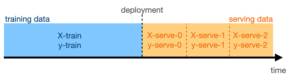
Here, X-serve-0 are the features from the day of deployment, X-serve-1 are the features from the following day, and so on, while y-serve-* denotes the corresponding targets.
It’s day 0 today: the model trained on data up until yesterday is now in production. Are today’s data (X-serve-0 and y-serve-0) subject to concept shift?
Let’s assume for a moment that this is a binary question. In practice, of course, concept shift can be large or small and impact model performance heavily or not very much. But for now, let’s say that concept shift has either happened on day 0 or not.
Here’s an idea: let’s train a model on day 0 data. If there was no concept shift, it should learn the same features-to-target mapping that our production model has learned. If concept shift occurred, the learned mapping will be different.
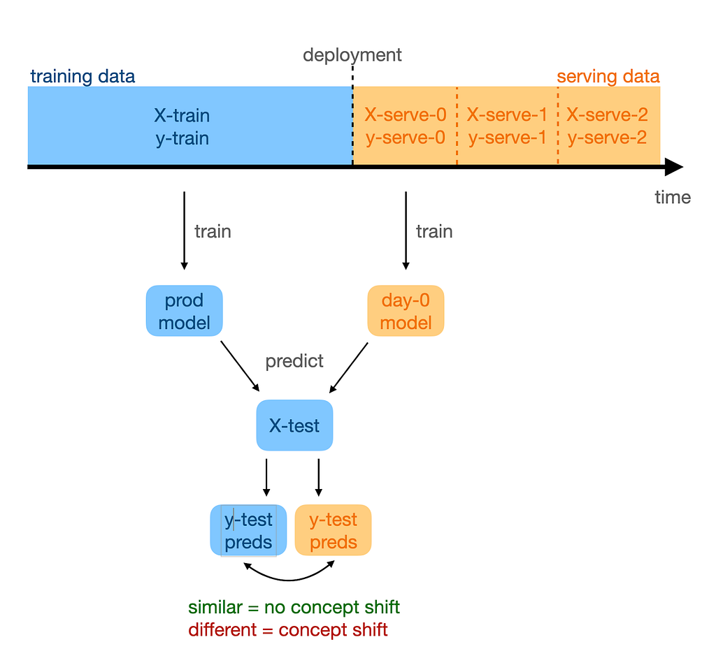
Next, let’s use this day-0 model to make predictions for test data: we just feed it X-test. If the outputs are close to the test-set predictions from the production model, it means that our day-0 model has learned the same P(Y|X), or the same concept, as our production model. Therefore, we proclaim no concept shift. If the outputs are different, however, then concept shift must have happened.
We can detect concept shift by training a model on serving data and comparing it to the production model.
We can repeat this process daily with every new batch of data we receive in serving to keep refreshing our knowledge of whether a concept shift has happened or not.
This is all nice, but there is one caveat to it, which a watchful reader might have spotted already. The outputs from the day-* models will never be exactly the same as the ones from the production model: even in the absence of any shift, the sampling error (different sample of training data) will lead to slightly different results. How large differences do actually signal concept shift? Or, to rephrase this question more practically: when do we need to retrain the model?
Indeed, not every difference should call for retraining, which could be a costly or complex procedure. As mentioned above, the difference might sometimes be the result of random sampling, in which case no retraining is necessary. On other occasions, the difference might actually be caused by the concept shift, but one that’s not impacting the model in a meaningful way. In this case, retraining is not needed either.
The key observation to take away here is that one should only retrain the model when the concept shift is meaningfully impacting the model’s performance.
One should only retrain the model when the concept shift is meaningfully impacting the model’s performance.
So how do we tell how much is the performance impacted by concept shift? Let’s flip this question: are there situations where concept shift occurs but does not hurt the model’s performance?
Imagine that your San Francisco house pricing model is now a classification model in which you are predicting whether a house costs more or less than $1m given its features. You have followed the steps described above to find large differences between the outputs of the production model and the current-day model.
Here is the plot showing the differences in the probability of the house costing more than $1m from the two models for a subset of 10 data points.
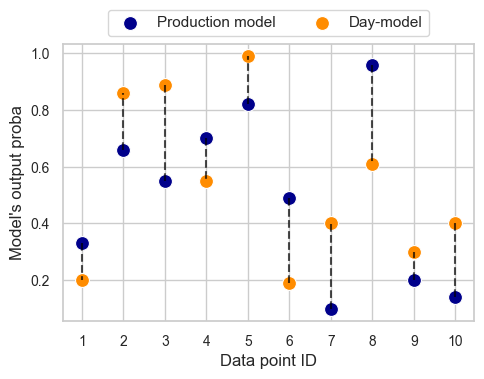
There are three important observations to be made here. First, the two models predict completely different probabilities. The difference is large for each data point and can be as significant as close to 50 percentage points. We can be almost certain that a significant concept shift has occurred.
Second, there is no consistency in the two models’ relative outputs. Sometimes one produces a much higher probability than the other, sometimes the other way round.
Third, the concept shift we are experiencing is completely harmless for the model. Wait, what? That’s right! Although significant, the concept shift we’re dealing with will not impact the model performance at all!
Concept shift does not always impact model performance.
Recall we’re looking at a binary classification task. Given a customary decision threshold at 50%, for each data point, both models will yield the same prediction: data points 2, 3, 4, 5, and 8 correspond to positive predictions (price above $1m), and the remaining ones — to negative predictions. Performance metrics such as accuracy, precision, recall, or f1-score will be the same for both models (ROC AUC will be impacted, though, since it uses the model scores rather than just class assignments).
I admit that this example is artificial and has been deliberately drafted to show what I’m trying to convey: that concept shift need not impact performance. But fair enough — in reality, one would rarely ever just use the predicted labels while disregarding certainty scores. Let’s look at another, arguably more realistic scenario in which concept shift will not hurt you.
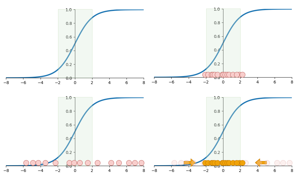
Model features constitute a multidimensional space, and each training example is a point in this space. If you only had two features, x1 and x2, you could plot each example as a point on a two-dimensional plane — the feature space. With three features, each example will be a point inside a cube. In the more common situations of using four features or more, our brains fail to imagine the scene, but still, each example is a point in the feature space.
The training examples are not uniformly distributed across the feature space. Some areas within the feature space will be densely packed by data points, while elsewhere they will be quite sparse. Another way to think about it is that in your data, some combinations of feature values are frequent and others very rare.
Now, here’s the thing: concept shift might occur in any region within the feature space. If it happens to be in a sparse region, its impact on the model’s performance will be minor. This is because there is not much training nor serving data in this region. Thus, the model will hardly ever get to predict in this region. Any misclassifications caused by the concept shift in a sparse region will be rare events, not contributing much to the model’s overall performance.
Misclassifications caused by the concept shift in a sparse region will be rare events, not contributing much to the model’s overall performance.
The takeaway from the two stories above is that some concept shifts are harmless, and only a meaningfully negative impact on performance calls for model retraining. Once you have detected a concept shift, estimate its impact on your model first before taking unnecessary action!
We could summarize our whole discussion up to this point as: don’t focus on the shift’s presence. Detect its impact on performance instead.
However, this is not how people typically do it. A quick web search reveals that most approaches to concept shift detection (such as this one from DeepChecks blog or this one from Evidently AI) work indirectly: they are typically based on detecting the prediction drift, label drift, or data drift.
The only tool I found that claims to be able to directly detect the magnitude of concept shift, and more importantly to quantify its impact on model performance as we have just discussed, is NannyML. I contacted the team and was told that besides being available as a standalone algorithm on AWS (which had appeared in my search), it is also available as an Azure managed app.
This approach follows the previously discussed workflow. Every day after deployment, a day-model is trained on serving data collected on this particular day. Next, we look at the predicted probabilities that our day-model produced for the training data and compare them with the ones from the production model. These differences let us estimate the shift’s impact on performance metrics such as ROC AUC, accuracy, and others.
I used the free trial to see how to estimate the performance implications of a concept shift in practice for a classification task. And no, it won’t be about San Francisco housing again.
Consider flight cancellations. They are primarily driven by operational factors like weather conditions or airline-specific problems. We can use these features to quite reliably predict whether a given flight will be canceled or not.
Or at least that was the case until the end of the year 2019. With the onset of the COVID-19 pandemic, travel restrictions, lockdowns, and a sharp decrease in travel demand led to a significant increase in flight cancellations, fundamentally changing the relationship between factors such as weather and cancellations. For example, good weather did not guarantee fewer cancellations anymore.
Let’s train a model to predict cancellations on data up to the year 2018, and treat years 2019 through 2023 as our serving data based on the data from the Bureau of Transportation Statistics. Here’s what NannyML’s concept shift detection algorithm outputs.
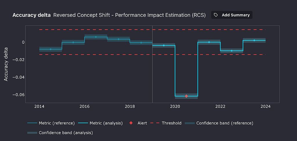
During the first year after deployment, 2019, no significant concept shift seems to have happened. Our thresholds for meaningful performance change were not crossed. The following year, however, as the pandemic broke out, our cancellation classifier lost 6 accuracy percentage points! Interestingly, the following year, things roughly got back to their pre-pandemic state.
A Concept shift is a change in the mapping between features and targets, while the features themselves remain unchanged. Think of it as: the same inputs, different outputs. It’s arguably harder to detect than its evil twin, covariate shift, in which the features’ distributions change.
A clever way of detecting concept shift is to regularly train models on incoming serving data and compare the concept they learn to the concept learned by the production model. If they are different, concept shift must have happened. This approach has some limitations, though. It assumes that the targets for the serving data are available, which is not the case in many applications.
Finally, not all concept shift is bad. In some situations, however, it can negatively impact the performance of your models in production, and by extension, the business value delivered by these models. By following the approach outlined above, you can quantify your concept shift’s impact and ensure your ML models continue to provide value.
Thanks for reading!
If you liked this post, why don’t you subscribe for email updates on my new articles? By becoming a Medium member, you can support my writing and get unlimited access to all stories by other authors and yours truly. Need consulting? You can ask me anything or book me for a 1:1 here.
You can also try one of my other articles. Can’t choose? Pick one of these:
Detecting Concept Shift: Impact on Machine Learning Performance was originally published in Towards Data Science on Medium, where people are continuing the conversation by highlighting and responding to this story.
Originally appeared here:
Detecting Concept Shift: Impact on Machine Learning Performance
Go Here to Read this Fast! Detecting Concept Shift: Impact on Machine Learning Performance

Optimizing your neural network training with batch normalization
Originally appeared here:
Visualizing What Batch Normalization Is and Its Advantages
Go Here to Read this Fast! Visualizing What Batch Normalization Is and Its Advantages


Making “à la Rabbit prototype” with Python, Push-to-Talk, Local, and Cloud LLMs
Originally appeared here:
A Weekend AI Project: Using Speech Recognition, PTT, and a Large Action Model on a Raspberry Pi


The Apache Parquet format provides an efficient binary representation of columnar table data, as seen with widespread use in Apache Hadoop and Spark, AWS Athena and Glue, and Pandas DataFrame serialization. While Parquet offers broad interoperability with performance superior to text formats (such as CSV or JSON), it is as much as ten times slower than NPZ, an alternative DataFrame serialization format introduced in StaticFrame.
StaticFrame (an open-source DataFrame library of which I am an author) builds upon NumPy NPY and NPZ formats to encode DataFrames. The NPY format (a binary encoding of array data) and the NPZ format (zipped bundles of NPY files) are defined in a NumPy Enhancement Proposal from 2007. By extending the NPZ format with specialized JSON metadata, StaticFrame provides a complete DataFrame serialization format that supports all NumPy dtypes.
This article extends work first presented at PyCon USA 2022 with further performance optimizations and broader benchmarking.
DataFrames are not just collections of columnar data with string column labels, such as found in relational databases. In addition to columnar data, DataFrames have labelled rows and columns, and those row and column labels can be of any type or (with hierarchical labels) many types. Further, it is common to store metadata with a name attribute, either on the DataFrame or on the axis labels.
As Parquet was originally designed just to store collections of columnar data, the full range of DataFrame characteristics is not directly supported. Pandas supplies this additional information by adding JSON metadata into the Parquet file.
Further, Parquet supports a minimal selection of types; the full range of NumPy dtypes is not directly supported. For example, Parquet does not natively support unsigned integers or any date types.
While Python pickles are capable of efficiently serializing DataFrames and NumPy arrays, they are only suitable for short-term caches from trusted sources. While pickles are fast, they can become invalid due to code changes and are insecure to load from untrusted sources.
Another alternative to Parquet, originating in the Arrow project, is Feather. While Feather supports all Arrow types and succeeds in being faster than Parquet, it is still at least two times slower reading DataFrames than NPZ.
Parquet and Feather support compression to reduce file size. Parquet defaults to using “snappy” compression, while Feather defaults to “lz4”. As the NPZ format prioritizes performance, it does not yet support compression. As will be shown below, NPZ outperforms both compressed and uncompressed Parquet files by significant factors.
Numerous publications offer DataFrame benchmarks by testing just one or two datasets. McKinney and Richardson (2020) is an example, where two datasets, Fannie Mae Loan Performance and NYC Yellow Taxi Trip data, are used to generalize about performance. Such idiosyncratic datasets are insufficient, as both the shape of the DataFrame and the degree of columnar type heterogeneity can significantly differentiate performance.
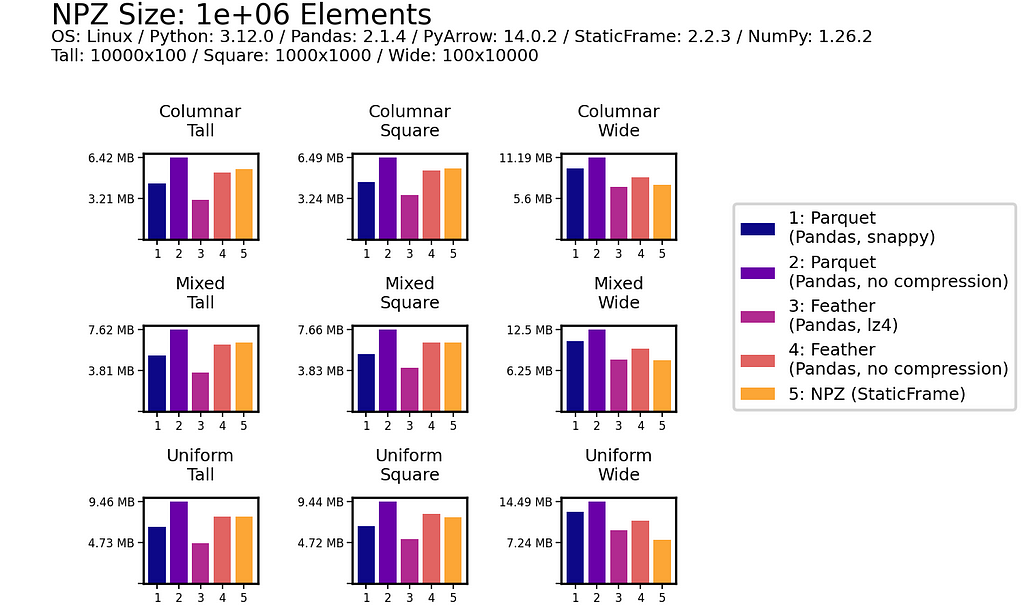
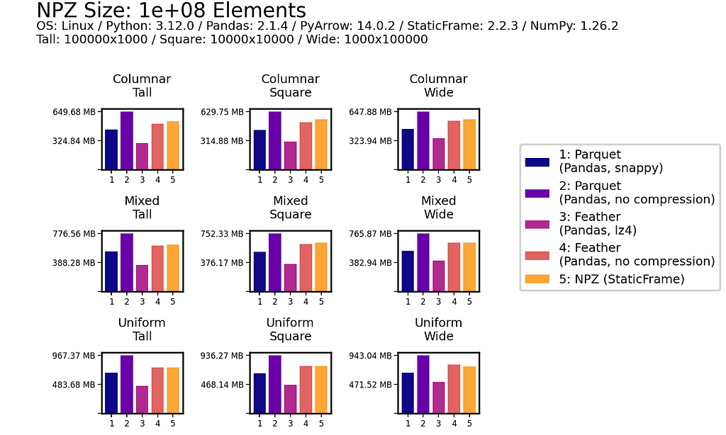
To avoid this deficiency, I compare performance with a panel of nine synthetic datasets. These datasets vary along two dimensions: shape (tall, square, and wide) and columnar heterogeneity (columnar, mixed, and uniform). Shape variations alter the distribution of elements between tall (e.g., 10,000 rows and 100 columns), square (e.g., 1,000 rows and columns), and wide (e.g., 100 rows and 10,000 columns) geometries. Columnar heterogeneity variations alter the diversity of types between columnar (no adjacent columns have the same type), mixed (some adjacent columns have the same type), and uniform (all columns have the same type).
The frame-fixtures library defines a domain-specific language to create deterministic, randomly-generated DataFrames for testing; the nine datasets are generated with this tool.
To demonstrate some of the StaticFrame and Pandas interfaces evaluated, the following IPython session performs basic performance tests using %time. As shown below, a square, uniformly-typed DataFrame can be written and read with NPZ many times faster than uncompressed Parquet.
>>> import numpy as np
>>> import static_frame as sf
>>> import pandas as pd

>>> # an square, uniform float array
>>> array = np.random.random_sample((10_000, 10_000))

>>> # write peformance
>>> f1 = sf.Frame(array)
>>> %time f1.to_npz('/tmp/frame.npz')
CPU times: user 710 ms, sys: 396 ms, total: 1.11 s
Wall time: 1.11 s

>>> df1 = pd.DataFrame(array)
>>> %time df1.to_parquet('/tmp/df.parquet', compression=None)
CPU times: user 6.82 s, sys: 900 ms, total: 7.72 s
Wall time: 7.74 s

>>> # read performance
>>> %time f2 = f1.from_npz('/tmp/frame.npz')
CPU times: user 2.77 ms, sys: 163 ms, total: 166 ms
Wall time: 165 ms

>>> %time df2 = pd.read_parquet('/tmp/df.parquet')
CPU times: user 2.55 s, sys: 1.2 s, total: 3.75 s
Wall time: 866 ms
Performance tests provided below extend this basic approach by using frame-fixtures for systematic variation of shape and type heterogeneity, and average results over ten iterations. While hardware configuration will affect performance, relative characteristics are retained across diverse machines and operating systems. For all interfaces the default parameters are used, except for disabling compression as needed. The code used to perform these tests is available at GitHub.
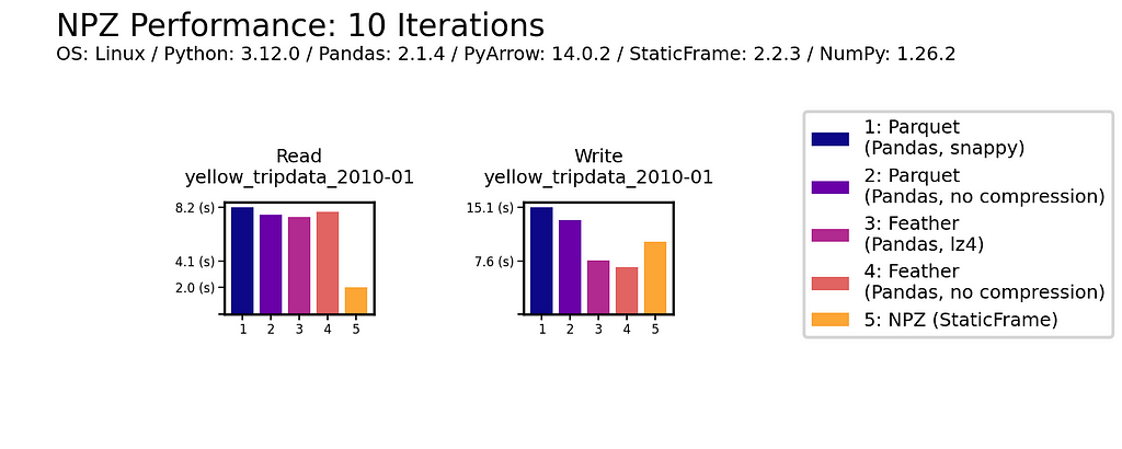
As data is generally read more often then it is written, read performance is a priority. As shown for all nine DataFrames of one million (1e+06) elements, NPZ significantly outperforms Parquet and Feather with every fixture. NPZ read performance is over ten times faster than compressed Parquet. For example, with the Uniform Tall fixture, compressed Parquet reading is 21 ms compared to 1.5 ms with NPZ.
The chart below shows processing time, where lower bars correspond to faster performance.
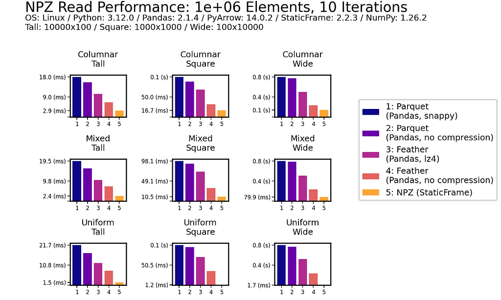
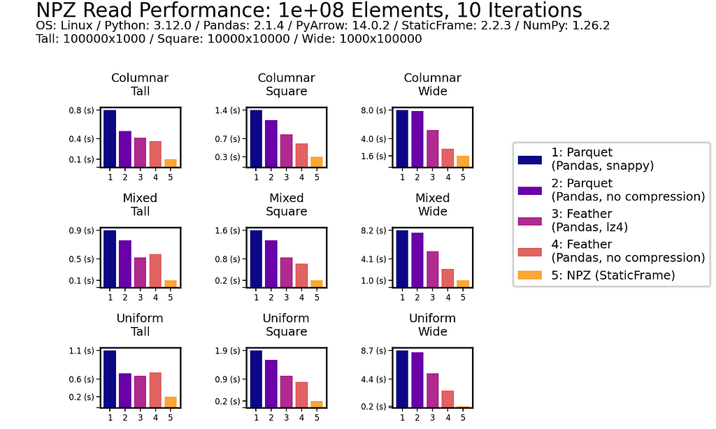
This impressive NPZ performance is retained with scale. Moving to 100 million (1e+08) elements, NPZ continues to perform at least twice as fast as Parquet and Feather, regardless of if compression is used.
In writing DataFrames to disk, NPZ outperforms Parquet (both compressed and uncompressed) in all scenarios. For example, with the Uniform Square fixture, compressed Parquet writing is 200 ms compared to 18.3 ms with NPZ. NPZ write performance is generally comparable to uncompressed Feather: in some scenarios NPZ is faster, in others, Feather is faster.
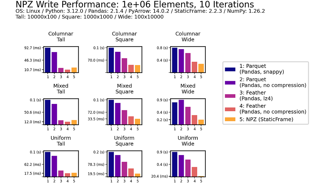
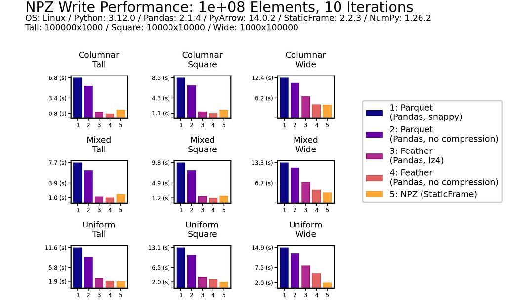
As with read performance, NPZ write performance is retained with scale. Moving to 100 million (1e+08) elements, NPZ continues to be at least twice as fast as Parquet, regardless of if compression is used or not.
As an additional reference, we will also benchmark the same NYC Yellow Taxi Trip data (from January 2010) used in McKinney and Richardson (2020). This dataset contains almost 300 million (3e+08) elements in a tall, heterogeneously typed DataFrame of 14,863,778 rows and 19 columns.
NPZ read performance is shown to be around four times faster than Parquet and Feather (with or without compression). While NPZ write performance is faster than Parquet, Feather writing here is fastest.
As shown below for one million (1e+06) element and 100 million (1e+08) element DataFrames, uncompressed NPZ is generally equal in size on disk to uncompressed Feather and always smaller than uncompressed Parquet (sometimes smaller than compressed Parquet too). As compression provides only modest file-size reductions for Parquet and Feather, the benefit of uncompressed NPZ in speed might easily outweigh the cost of greater size.
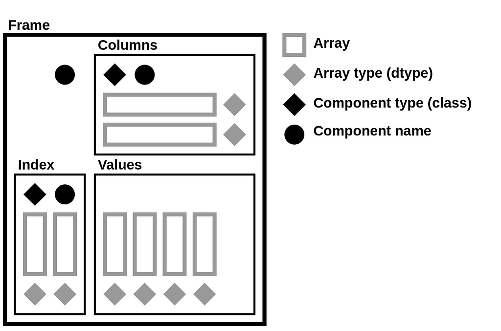
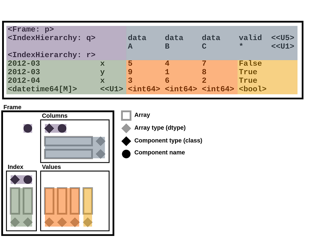
StaticFrame stores data as a collection of 1D and 2D NumPy arrays. Arrays represent columnar values, as well as variable-depth index and column labels. In addition to NumPy arrays, information about component types (i.e., the Python class used for the index and columns), as well as the component name attributes, are needed to fully reconstruct a Frame. Completely serializing a DataFrame requires writing and reading these components to a file.
DataFrame components can be represented by the following diagram, which isolates arrays, array types, component types, and component names. This diagram will be used to demonstrate how an NPZ encodes a DataFrame.
The components of that diagram map to components of a Frame string representation in Python. For example, given a Frame of integers and Booleans with hierarchical labels on both the index and columns (downloadable via GitHub with StaticFrame’s WWW interface), StaticFrame provides the following string representation:
>>> frame = sf.Frame.from_npz(sf.WWW.from_file('https://github.com/static-frame/static-frame/raw/master/doc/source/articles/serialize/frame.npz', encoding=None))
>>> frame
<Frame: p>
<IndexHierarchy: q>       data    data    data    valid  <<U5>
                          A       B       C       *      <<U1>
<IndexHierarchy: r>
2012-03             x     5       4       7       False
2012-03             y     9       1       8       True
2012-04             x     3       6       2       True
<datetime64[M]>     <<U1> <int64> <int64> <int64> <bool>
The components of the string representation can be mapped to the DataFrame diagram by color:
A NPY stores a NumPy array as a binary file with six components: (1) a “magic” prefix, (2) a version number, (3) a header length and (4) header (where the header is a string representation of a Python dictionary), and (5) padding followed by (6) raw array byte data. These components are shown below for a three-element binary array stored in a file named “__blocks_1__.npy”.
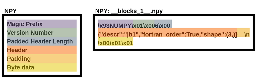
Given a NPZ file named “frame.npz”, we can extract the binary data by reading the NPY file from the NPZ with the standard library’s ZipFile:
>>> from zipfile import ZipFile
>>> with ZipFile('/tmp/frame.npz') as zf: print(zf.open('__blocks_1__.npy').read())
b'x93NUMPYx01x006x00{"descr":"|b1","fortran_order":True,"shape":(3,)}    nx00x01x01
As NPY is well supported in NumPy, the np.load() function can be used to convert this file to a NumPy array. This means that underlying array data in a StaticFrame NPZ is easily extractable by alternative readers.
>>> with ZipFile('/tmp/frame.npz') as zf: print(repr(np.load(zf.open('__blocks_1__.npy'))))
array([False,  True,  True])
As a NPY file can encode any array, large two-dimensional arrays can be loaded from contiguous byte data, providing excellent performance in StaticFrame when multiple contiguous columns are represented by a single array.
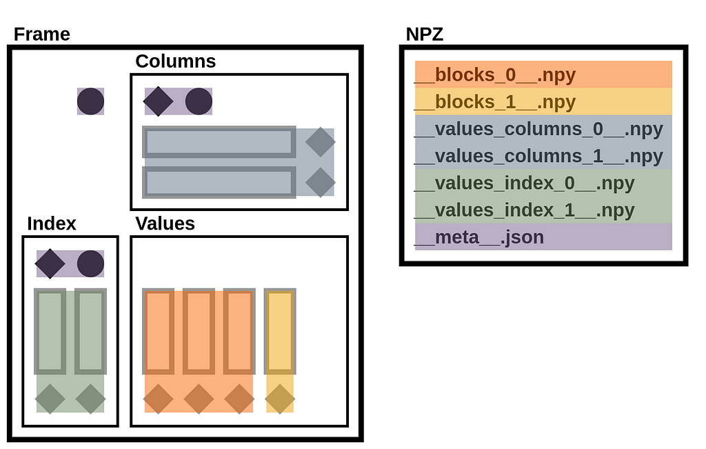
A StaticFrame NPZ is a standard uncompressed ZIP file that contains array data in NPY files and metadata (containing component types and names) in a JSON file.
Given the NPZ file for the Frame above, we can list its contents with ZipFile. The archive contains six NPY files and one JSON file.
>>> with ZipFile('/tmp/frame.npz') as zf: print(zf.namelist())
['__values_index_0__.npy', '__values_index_1__.npy', '__values_columns_0__.npy', '__values_columns_1__.npy', '__blocks_0__.npy', '__blocks_1__.npy', '__meta__.json']
The illustration below maps these files to components of the DataFrame diagram.
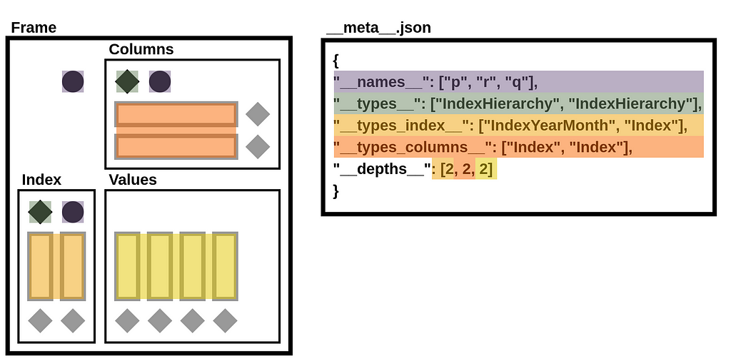
StaticFrame extends the NPZ format to include metadata in a JSON file. This file defines name attributes, component types, and depth counts.
>>> with ZipFile('/tmp/frame.npz') as zf: print(zf.open('__meta__.json').read())
b'{"__names__": ["p", "r", "q"], "__types__": ["IndexHierarchy", "IndexHierarchy"], "__types_index__": ["IndexYearMonth", "Index"], "__types_columns__": ["Index", "Index"], "__depths__": [2, 2, 2]}'
In the illustration below, components of the __meta__.json file are mapped to components of the DataFrame diagram.
As a simple ZIP file, tools to extract the contents of a StaticFrame NPZ are ubiquitous. On the other hand, the ZIP format, given its history and broad features, incurs performance overhead. StaticFrame implements a custom ZIP reader optimized for NPZ usage, which contributes to the excellent read performance of NPZ.
The performance of DataFrame serialization is critical to many applications. While Parquet has widespread support, its generality compromises type specificity and performance. StaticFrame NPZ can read and write DataFrames up to ten-times faster than Parquet with or without compression, with similar (or only modestly larger) file sizes. While Feather is an attractive alternative, NPZ read performance is still generally twice as fast as Feather. If data I/O is a bottleneck (and it often is), StaticFrame NPZ offers a solution.
Faster DataFrame Serialization was originally published in Towards Data Science on Medium, where people are continuing the conversation by highlighting and responding to this story.
Originally appeared here:
Faster DataFrame Serialization


Learn about Quad-Tile Charts and create your own with Python

Hey there! January is the perfect time for planning and making a big impact. As a data scientist, you’re often asked to build forecast models, and you may believe that accuracy is always the golden standard. However, there’s a twist: the real magic lies not just in accuracy but in understanding the bigger picture and focusing on value and impact. Let’s uncover these important aspects together.
Regarding forecasts, we should first align on one thing: our ultimate goal is about creating real value. Real value can manifest as tangible financial benefits, such as cost reductions and revenue increases, or as time and resources that you free up from a forecast process. There are many pathways which start from demand forecast and end in value creation. Forecast accuracy is like our trusty compass that helps us navigate toward the goal, but it’s not the treasure we’re hunting for.
By clearly connecting the dots between forecasting elements and their value, you’ll feel more confident about where to direct your energy and brainpower in this forecasting exercise.
In forecasts, you can add value in two areas: process and model. As data scientists, we may be hyper-focused on the model, however sometimes, a small tweak in the process can go a long way. The process that produces the forecast can determine its quality, usually in a negative way. Meanwhile, the process that begins with the forecast is the pathway leading to value creation. Without a good process, it would be hard for even the best model to create any value.
Even when the process is too ingrained to change, having a clear understanding of the process is still tremendously valuable. It allows you to focus on the key features that are most pertinent in the chain of decisions & actions.
For instance, if production plans need to be finalised two weeks in advance, there’s no need to focus on forecasts for the upcoming week. Likewise, if key decisions are made at the product family level, then it would be a waste of time to look at the accuracy at the individual product level. Let the (unchangeable) process details define the boundaries for your modelling, saving you from the futile task of boiling the ocean.
On the modelling side, explainability should be a top priority, as it significantly enhances the adoption of the forecasts. Since our ultimate goal is value creation, forecasts must be used in business operations to generate tangible value.
This could involve using them in promotion planning to increase revenue or in setting inventory targets to reduce stock levels. People often have the choice to trust or distrust the forecast in their daily tasks. (Ever been in a meeting where the forecast is dismissed because no one understands the numbers?) Without trust, there is no adoption of the forecast, and consequently, little value can be created.
On the contrary, when the forecast numbers come with an intuitive explanation, people are more likely to trust and use them. As a result, the value of an accurate forecast can be realised in their daily tasks and decisions.
Scenario simulation naturally extends from explainability. While an explainable model helps you understand forecasts based on anticipated key drivers (for example, a 10% price increase), scenario simulation enables you to explore and assess various alternatives of these anticipations or plans. You can evaluate the risks and benefits of each option. This approach is incredibly powerful in strategic decision-making.
So, if you’re tasked with creating a forecast to determine next year’s promotion budget, it’s crucial to align with stakeholders on the key drivers you want to explore (such as discount levels, packaging format, timing, etc.) and the potential scenarios. Build your forecast around these key drivers to ensure not only accuracy, but also that the model’s explanations and scenarios “make sense”. This might mean anticipating an increase in demand when prices drop or as holidays approach. But of course, you need to figure out, together with the key stakeholders, about what “make sense” really means in your business.
Alright, I know this seems like a lot to take in. You might be thinking, “So, in addition to crunching data and training models, do I also need to delve into process analysis, come up with an explanatory model, and even build a simulation engine for forecasting?”
No need to worry, that’s not exactly what’s expected. Look at the bigger picture, will help you pinpoint the key aspects for your forecasting model, figure out the best way to build them, and connect with the right people to enhance the value of your forecast. Sure, you’ll have to add a few extra tasks to your usual routine of data crunching and model tuning, but I promise it’ll be a rewarding experience — plus, you’ll get to make some business-savvy friends along the way!
If you want to go deeper than this simple framework, I have also compiled a comprehensive list of questions in this article to cover all aspects related to demand forecast. Have fun with your forecast project and maximise your impact on the world!
Demand forecast — a value-driven approach with 5 key insights was originally published in Towards Data Science on Medium, where people are continuing the conversation by highlighting and responding to this story.
Originally appeared here:
Demand forecast — a value-driven approach with 5 key insights
Go Here to Read this Fast! Demand forecast — a value-driven approach with 5 key insights