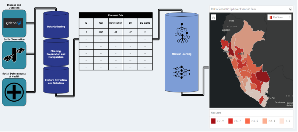
This is a guest post co-authored by Ajay K Gupta, Jean Felipe Teotonio and Paul A Churchyard from HSR.health. HSR.health is a geospatial health risk analytics firm whose vision is that global health challenges are solvable through human ingenuity and the focused and accurate application of data analytics. In this post, we present one approach […]
Practical Techniques for Captivating Visual Communication with Plotly
Image by DALL-E 3
In the previous article, we discussed choosing the most suitable visualisation type for your task. We’ve identified seven different use cases (Time Series, Nominal Comparison, Deviation, Ranking, Part-to-whole, Frequency Distribution and Correlation) and what chart types will be the best options for them. No surprise, in most cases, you can use basic chart types such as line charts, bar charts or scatter plots.
Selecting the optimal visualisation type is an essential foundation. However, it’s not all you need to keep in mind when working on data visualisation.
Let’s return back to basics. The primary goal of visualisation is to convey your message to the audience. That’s why we need to think about how the audience perceives our charts. In practice, the audience’s perception and understanding depend on many small details.
In this article, I would like to share these essential aspects of data visualisation. We will go through three steps to get clearer, sharper and smarter visuals:
reducing noise to avoid audience confusion and distraction,
adding highlights to focus their attention,
adding the context to provide all necessary information for clear understanding.
I will use Plotly since it’s my primary tool for data visualisation.
Unless stated explicitly, all chart examples below are based on synthetic datasets.
Step 1: Reducing noise
It might be tempting to include all the information you have in your visualisation, for example, to add labels for every point on the graph. At these moments, we are usually driven by good intentions — to give the audience comprehensive view.
However, the human brain works differently. Each element you add to the visualisation increases cognitive load. People have a limited capacity of mental power to perceive information, so it’s essential not to waste it by adding unneeded elements. By adding too many details, you risk losing your audience completely because your charts might be perceived as more complicated than they actually are. This perceived complexity may frighten your audience since they might not want to spend time and effort understanding it.
We can refer to the data visualisation iconic books to think about it. Edward Tufte is a pioneer in the field of data visualisation. In his book “The Visual Display of Quantitative Information”, he introduces the concept of data-ink ratio (source).
A large share of ink on a graphic should present data-information, the ink changing as the data change. Data-ink is the non-erasable core of a graphic, the non-redundant ink arranged in response to variation in the numbers represented.
We aim to maximise the share of meaningful elements (or ink) in our charts. For that, we can remove clutter (or noise) from our charts to decrease perceived cognitive load. Clutter is graphical elements that take place but don’t give any additional understanding.
Unfortunately, default settings in our tools sometimes don’t help us to make clear visualisations. So, first of all, I advise you to change the default template in Plotly — it will help you declutter your charts.
The default template is plotly. It looks similar to the seaborn style (you can check in the gallery) and includes background colours and grid lines. In my opinion, it adds too much noise to charts. I prefer a much more lightweight template called simple_white.
You can compare these two styles on the graph. Feel the difference.
Graphs by author
Use the code below to change the template for all your Plotly visualisations. You can check what other built-in templates are available and even learn how to create your own custom template in the documentation.
import plotly.io as pio
pio.templates.default = 'simple_white'
After changing the template to simple_white, all your graphs will be automatically lighter. However, it’s only the beginning of our journey to data visualisations without clutter. Since each graphical element adds cognitive load, it’s worth considering whether they are needed. Each element on your chart should be your conscious decision rather than the default behaviour of your tool.
In many cases, graphical elements don’t add any value to understanding, so we can (and should) get rid of them. Let’s look at a couple of such examples.
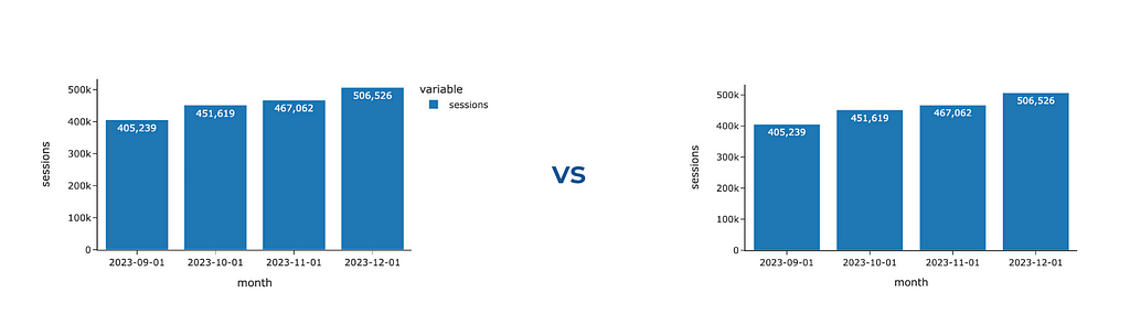
If you create a bar chart with only one trace, Plotly will still show you the legend. However, we can eliminate it without losing any information and provide context about the metric in the y-axis title.
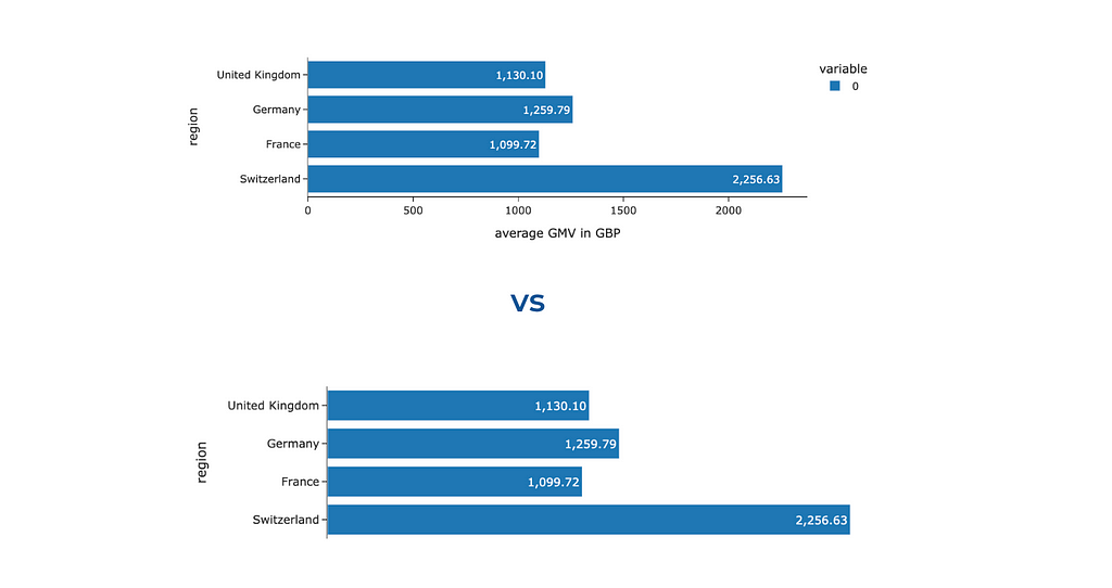
It was surprising for me, but there are cases when you can get rid of not only the legend but also one of the axes. Look at the two charts below: we’ve labelled each bar for clarity, making it effortless for the audience to interpret and compare the values based on bar lengths. So, there’s no need to keep the x-axis. Ideally, we should add some context about the used metric to the chart title — we will discuss how to do it later.
Graph by author
To hide one of the axes, we need to change its visibility.
fig.update_xaxes(visible = False)
# you can similarly hide y-axes using fig.update_yaxes(visible = False)
We’ve learned how to tweak Plotly’s defaults and make your charts cleaner and clearer. However, it’s not the only thing to watch out for — quite often, we add noise and clutter ourselves. Let me show you examples of noisy graphs I’ve seen many times.
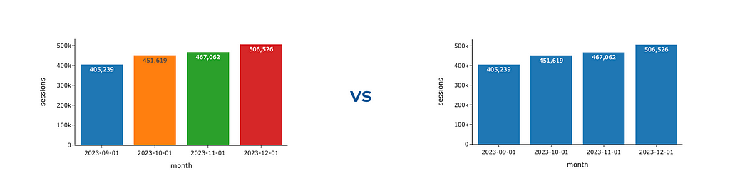
Analysts like numbers (at least I do). So, we often want to show our audience all these numbers, for example, how many customers we had in the previous months. It often ends up with a chart like the one below.
Graph by author
With all this clutter of numbers, you miss entirely the trends and insights in data. What I would do to fix it:
It goes without saying I would remove the labels. If your audience needs to know precise numbers, keep only the essential ones (for example, only the last month or two).
It’s a good practice to round up the values you’re showing, for example, 184.1K instead of 184051. In most cases, there’s not much difference for your audience, whether there were 184 051 or 184 063 customers.
Also, if you want to focus your audience’s attention on the trends in your data, I would advise you to omit markers and keep only lines.
The other temptation is to make your visualisations more colourful. Please resist it unless colours play their role, either encoding some data or highlighting the most noteworthy aspects. We will talk about the wise usage of colours just in a second. Meanwhile, you can look at the example below and observe what catches your eye first and how much effort you need to understand the underlying data. When I look at the first graph, I feel a bit confused and keep thinking about what these colours mean and why each bar differs.
Graphs by author
Also, this graph shows us that having too many accents (bright colours in our case) doesn’t work — we are just distracted and don’t know what to focus on.
We’ve learned how to remove noise from our charts. After this step, we have neutral visualisations. They are like a canvas. Now, the next step is to place accents strategically.
Step 2: Adding accents
Using accents wisely enables you to direct your audience’s attention and emphasise the main message. People usually pay attention first to brighter and darker colours. However, it’s important to remember that you can’t highlight everything. Instead, you should concentrate your audience’s focus on one or two key aspects of the data.
You can also build a hierarchy of accents, emphasising the main message the most and pushing not-so-important (but still necessary) parts to the background. It allows you to avoid distraction but still keep all the needed context. We will see examples of such approaches below.
If you want to understand what elements of your data visualisation draw attention, try to do the following simple test: close your eyes, open them, and observe what initially catches your eye. Another option is to show your visualisation to someone else and ask them to comment on their thought process.
Colours
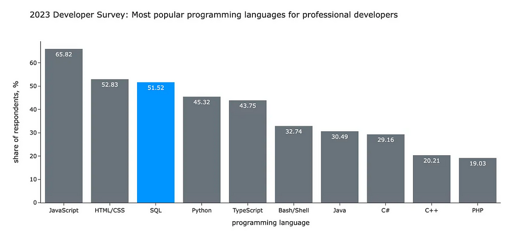
In my opinion, colour is the most powerful tool to drive your audience’s attention. That’s why I want to discuss it in detail. Let’s start with an example. Look at the visualisation below. What do you look at first? What do you think the author wanted to tell you with this chart?
You likely started to look at SQL and compare it with other languages. In my previous article, I used this chart to illustrate the following idea:
According to the annual StackOverflow survey, SQL is still one of the most popular languages in the world. For professional developers, SQL is in the top-3 languages (after Javascript and HTML/CSS). More than a half of professionals use it. Surprisingly, SQL is even more popular than Python.
I used the contrast between grey and bright blue to focus your attention on the SQL I was talking about. If I made this visualisation now, I would also make the title bolder to make it stand out since it’s a meaningful context.
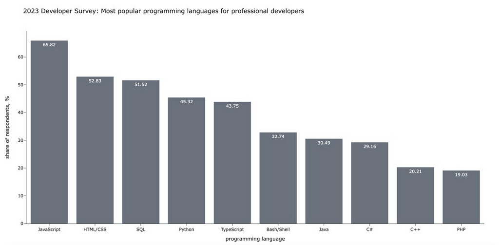
Let’s compare it with a fully grey-neutral version. Without any visual cues, you would spend much more time and effort looking at all the data.
Graph by author
I hope you can now see all the potential power of colour. Let’s learn how to use the colours in Plotly
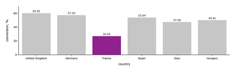
We will start with a bar chart like in the example above. I highlighted segments where the conversion is below the threshold with a brighter colour. For this, I defined the list of colours depending on the conversion value and passed it to Plotly as colour for lines and markers. I’ve also specified that I want labels outside the bars and made colours more pale with opacity.
# defining colors based on conversion value colors = list(map( lambda x: 'silver' if x >= 40 else 'purple', conv_df.conversion.values ))
# updating range to add some space on the top fig.update_yaxes(range = [0, 70])
Graph by author
Let’s discuss a bit about how to define the colours. In the example above, I used predefined SVG colours “silver” and “purple”. You can find the complete list of predefined colours here.
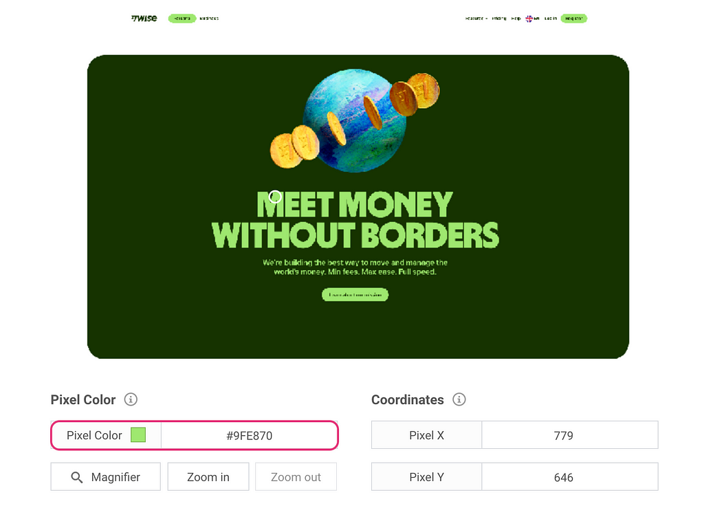
If you want more customisation, you can pass colours as HEX codes. For example, you can use your brand colours to add your company vibe to the presentations.
The easiest way to get HEX codes is to screenshot your interface, upload it to a colour picker (I usually search for “online colour picker from image”) and look up all the needed codes. For example, one of the brand colours for Wise (the company I’m working at) is bright green with a hex code #9FE870.
Image by author
Since I often use brand colours in my charts, I have them saved in a config file locally so I can easily access them by name.
Now, I hope you won’t be stuck trying to understand how to tell Plotly what colour you want. So, let’s move on to another example with linear graphs and learn other ways to specify colours.
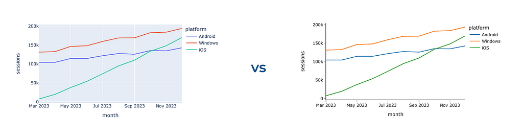
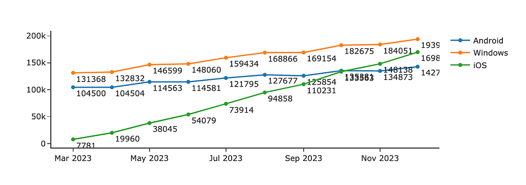
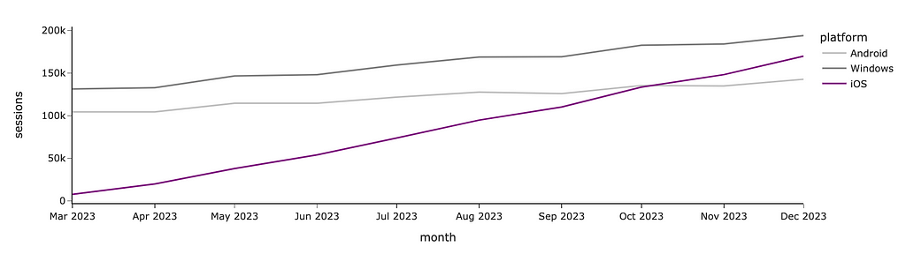
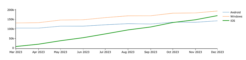
If you want to manually define each segment’s colour precisely, you can use color_discrete_map. I often use this approach when I need consistent colour-coding across multiple graphs. If you depict Android in blue and iOS in orange on one chart in your presentation but then reverse the colours on another graph, your audience might become confused. So, it’s worth paying attention to such details.
In the graph below, I used purple to highlight the growing iOS audience and shade of greys for the other platforms since I don’t want you to pay attention to them.
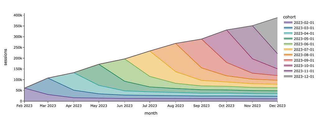
If I want to show cohorts and don’t care about a specific colour for each cohort, I can just specify the sequence of colours in the color_discrete_sequence parameter.
I used a predefined Plotly palette for colours, but you can also specify custom colours as a list of strings. Here are the palettes available in Plotly:
Discrete colour palettes include mostly diverging colours, which are handy when you need to distinguish different segments from each other.
In Continuous colour scales, you can find a lot of sequential colour palettes which are ideal for ordinal categories (for example, customer maturity equal to “< 1 month”, “1–3 months”, “4–6 months”, “6–12 months” and “> 12 months”).
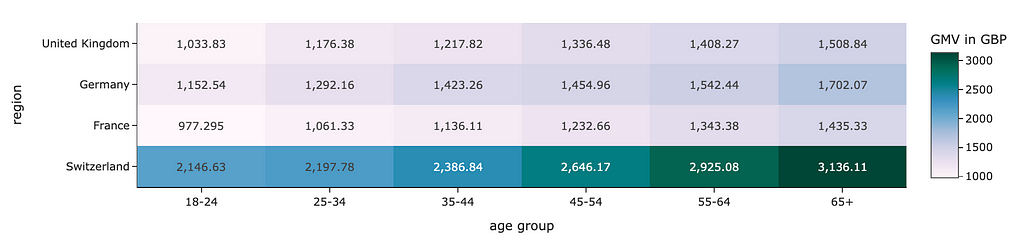
The continuous scales can also be used when you need to encode values using colour, such as heat maps.
px.imshow(
    gmv_df.values,
    x = gmv_df.columns,
    y = gmv_df.index,
    color_continuous_scale='pubugn'
    text_auto=',.6r', aspect="auto",
    labels=dict(x="age group", y="region", color="GMV in GBP")
)
Graph by author
When you use colours, you need to keep in mind that there are colourblind people. The most common difficulty is to distinguish shades of red and green. So, try to avoid these combinations or use some other visual cues simultaneously (like text or icons). It will help you not to lose part of your audience.
Shades of green and red are often used to denote the positive and negative aspects of something (for example, to show higher and lower conversion on a heat map). You can use blue and orange shades instead.
Size
The other way to highlight something is size. We perceive something bigger as a more significant one. For example, to make an accent on one of the lines, we can increase its width.
In Plotly, we need to use Graphical Objects to tweak line widths.
import plotly.graph_objects as go

fig = go.Figure()

fig.add_trace(
    go.Scatter(
        mode='lines', x=ts_df.index,
        y=ts_df.Android, showlegend=True,
        name = 'Android', line = {'width': 1}
    )
)
fig.add_trace(
    go.Scatter(
        mode='lines', x=ts_df.index,
        y=ts_df.Windows, showlegend=True,
        name = 'Windows', line = {'width': 1}
    )
)
fig.add_trace(
    go.Scatter(
        mode='lines', x=ts_df.index,
        y=ts_df.iOS, showlegend=True,
        name = 'iOS', line = {'width': 3}
    )
)

fig.show()
Graph by author
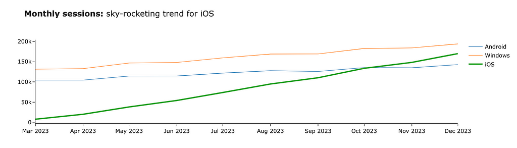
Now, the iOS line stands out compared to other platforms. We can also focus the audience’s attention using bold or italic fonts. Let’s add the title to our graph and highlight the central part of it. For that, we can use HTML tag <b>.
fig.update_layout(
    title = '<b>Monthly sessions:</b> sky-rocketing trend for iOS'
)
Graph by author
Step 3: Storytelling
We’ve learned how to put accents and are ready to move on to the last part — storytelling. We’ve already discussed that the context is vital for understanding the message. So, in this part, we will discuss how to add it to your charts.
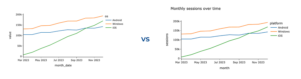
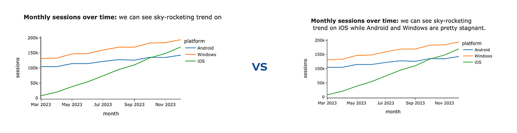
To add more context, the most straightforward thing you can leverage is to specify a title and labels. It will prevent your audience’s questions about what exactly they see. You can use a title parameter for a chart title (similarly to the one we did before) and labels to override default labels for axes and legend titles.
px.line(ts_df, width = 600,
    labels = {'value': 'sessions', 'os': 'platform', 'month_date': 'month'},
    title = 'Monthly sessions over time')
Graphs by author
It’s a good practice to make titles detailed so that the titles might become quite long. Plotly is a powerful visual tool but has room for improvement. For example, it can’t handle long chart titles — the tail of the title won’t be visible.
However, Plotly is agile enough, and we can fix it ourselves. We will use <br> HTML tag to add line breaks between words if the line length exceeds the threshold (70 characters). Let’s do it.
for word in s.split(' '): if curr_line_length + len(word) > line_limit: lines.append(' '.join(curr_line_words)) curr_line_words = [] curr_line_length = 0
chart_title = '<b>Monthly sessions over time:</b> we can see sky-rocketing trend on iOS while Android and Windows are pretty stagnant.' px.line(ts_df, width = 600, labels = {'value': 'sessions', 'os': 'platform', 'month_date': 'month'}, title = format_string_by_lines(chart_title))
Graphs by author
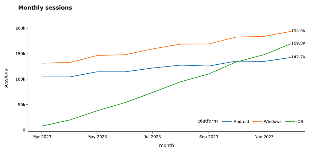
Also, we might want to show some of the metrics’ values. We’ve already discussed that labelling all data points generates too much clutter, but showing the last values sounds reasonable.
I will demonstrate two ways to do it in Plotly: using the text field and annotations functionality. I usually prefer using text, but it’s quite subjective.
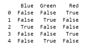
Let’s start with the text option. First, let’s look at the raw data set.
Image by author
Now, let’s add the text_val field to the dataset that is equal to the value for the last month and is empty for others. I’ve also specified formatting to show numbers as thousands to remove unneeded details.
raw_ts_df['text_val'] = list(map(
    lambda v, d: '' if d != raw_ts_df.month_date.max() else '%.1fK' % (v/1000),
    raw_ts_df.value,
    raw_ts_df.month_date
))
We are ready to create our visualisation. I passed the newly-created text_val column as the text parameter for the visualisation, updated the mode to be “lines+text” and specified the middle right text position. I also moved the legend so it doesn’t interfere with our annotations.
fig = px.line(raw_ts_df, x = 'month_date', y = 'value', color = 'platform', text = 'text_val', width = 1000, height = 500, labels = {'value': 'sessions', 'os': 'platform', 'month_date': 'month'}, title = '<b>Monthly sessions</b>')
The other way to label the values is to use the annotations functionality. Firstly, let’s calculate the last values for each platform and format the text.
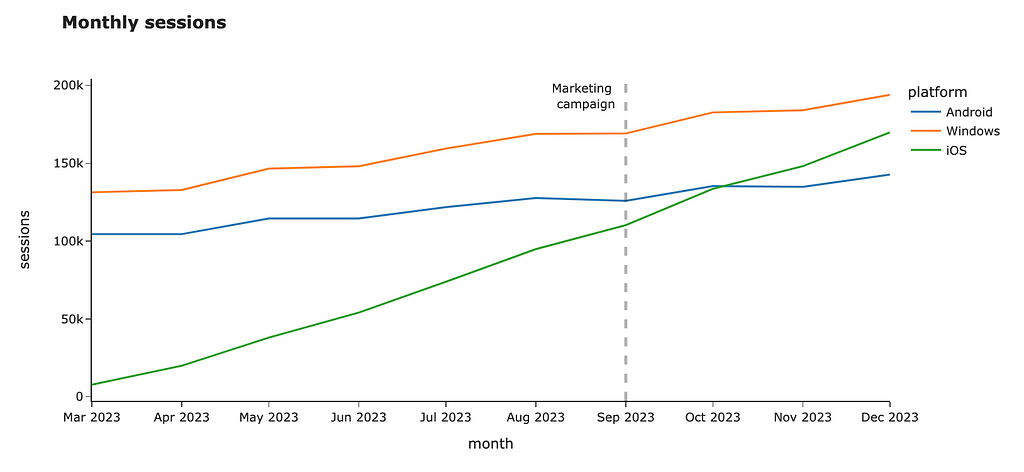
Vertical or horizontal lines can also add the needed context for your audience. For example, you can highlight important dates like a marketing campaign launch or show SLA for your metric. Let’s add a vertical line to our chart.
You can do it easily by using fig.add_vline. Unfortunately, there’s a bug in Plotly, and it can’t work with dates. However, we can use a workaround: it looks weird, but works.
You can add horizontal lines or even rectangles if you want to highlight the whole area on the chart. You can find more details in the documentation.
Summary
In this article, we’ve walked through the essential aspects of data visualisations:
Removing unneeded noise to avoid distraction,
Using accents to focus your audience’s attention using colours and sizes,
Adding context to help your audience understand your message.
Thank you a lot for reading this article. If you have any follow-up questions or comments, please leave them in the comments section.
Reference
This article is highly influenced by the excellent book about data visualisations, “Storytelling with Data: A Data Visualization Guide for Business Professionals” by Cole Nussbaumer Knaflic.
Data comes in different shapes and forms. One of those shapes and forms is known as categorical data.
This poses a problem because most Machine Learning algorithms use only numerical data as input. However, categorical data is usually not a challenge to deal with, thanks to simple, well-defined functions that transform them into numerical values. If you have taken any data science course, you will be familiar with the one hot encoding strategy for categorical features. This strategy is great when your features have limited categories. However, you will run into some issues when dealing with high cardinal features (features with many categories)
Here is how you can use target encoding to transform Categorical features into numerical values.
Early in any data science course, you are introduced to one hot encoding as a key strategy to deal with categorical values, and rightfully so, as this strategy works really well on low cardinal features (features with limited categories).
In a nutshell, One hot encoding transforms each category into a binary vector, where the corresponding category is marked as ‘True’ or ‘1’, and all other categories are marked with ‘False’ or ‘0’.
import pandas as pd
# Sample categorical data data = {'Category': ['Red', 'Green', 'Blue', 'Red', 'Green']}
One hot encoding output — we could improve this by dropping one column because if we know Blue and Green, we can figure the value of Red. Image by author
While this works great for features with limited categories (Less than 10–20 categories), as the number of categories increases, the one-hot encoded vectors become longer and sparser, potentially leading to increased memory usage and computational complexity, let’s look at an example.
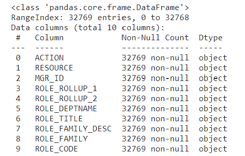
The data contains eight categorical feature columns indicating characteristics of the required resource, role, and workgroup of the employee at Amazon.
data.info()
Column information. Image by author
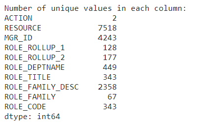
# Display the number of unique values in each column
unique_values_per_column = data.nunique()

print("Number of unique values in each column:")
print(unique_values_per_column)
The eight features have high cardinality. Image by author
Using one hot encoding could be challenging in a dataset like this due to the high number of distinct categories for each feature.
#Initial data memory usage
memory_usage = data.memory_usage(deep=True)
total_memory_usage = memory_usage.sum()
print(f"nTotal memory usage of the DataFrame: {total_memory_usage / (1024 ** 2):.2f} MB")
The initial dataset is 11.24 MB. Image by author
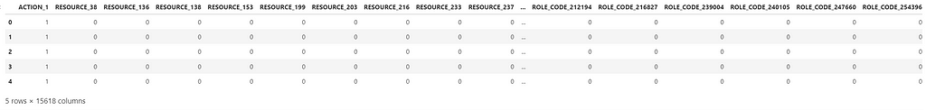
#one-hot encoding categorical features
data_encoded = pd.get_dummies(data,
                              columns=data.select_dtypes(include='object').columns,
                              drop_first=True)

data_encoded.shape
After on-hot encoding, the dataset has 15 618 columns. Image by authorThe resulting data set is highly sparse, meaning it contains a lot of 0s and 1. Image by author
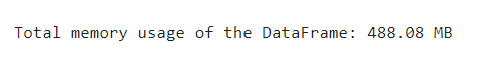
# Memory usage for the one-hot encoded dataset
memory_usage = data_encoded.memory_usage(deep=True)
total_memory_usage = memory_usage.sum()
print(f"nTotal memory usage of the DataFrame: {total_memory_usage / (1024 ** 2):.2f} MB")
Dataset memory usage increased to 488.08 MB due to the increased number of columns. Image by author
As you can see, one-hot encoding is not a viable solution to deal with high cardinal categorical features, as it significantly increases the size of the dataset.
In cases with high cardinal features, target encoding is a better option.
Target encoding — overview of basic principle
Target encoding transforms a categorical feature into a numeric feature without adding any extra columns, avoiding turning the dataset into a larger and sparser dataset.
Target encoding works by converting each category of a categorical feature into its corresponding expected value. The approach to calculating the expected value will depend on the value you are trying to predict.
For Regression problems, the expected value is simply the average value for that category.
For Classification problems, the expected value is the conditional probability given that category.
In both cases, we can get the results by simply using the ‘group_by’ function in pandas.
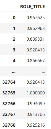
#Example of how to calculate the expected value for Target encoding of a Binary outcome
expected_values = data.groupby('ROLE_TITLE')['ACTION'].value_counts(normalize=True).unstack()
expected_values
The resulting table indicates the probability of each `ACTION` outcome by unique `Role_title` ID. Image by author
The resulting table indicates the probability of each “ACTION” outcome by unique “ROLE_TITLE” id. All that is left to do is replace the “ROLE_TITLE” id with the values from the probability of “ACTION” being 1 in the original dataset. (i.e instead of category 117879 the dataset will show 0.889331)
While this can give us an intuition of how target encoding works, using this simple method runs the risk of overfitting. Especially for rare categories, as in those cases, target encoding will essentially provide the target value to the model. Also, the above method can only deal with seen categories, so if your test data has a new category, it won’t be able to handle it.
To avoid those errors, you need to make the target encoding transformer more robust.
Defining a Target encoding class
To make target encoding more robust, you can create a custom transformer class and integrate it with scikit-learn so that it can be used in any model pipeline.
temp = X.loc[:, self.categories].copy() temp['target'] = y self.prior = np.mean(y) for variable in self.categories: avg = (temp.groupby(by=variable)['target'] .agg(['mean', 'count'])) # Compute smoothing smoothing = (1 / (1 + np.exp(-(avg['count'] - self.k) / self.f))) # The bigger the count the less full_avg is accounted self.encodings[variable] = dict(self.prior * (1 - smoothing) + avg['mean'] * smoothing)
return self
def transform(self, X): Xt = X.copy() for variable in self.categories: Xt[variable].replace(self.encodings[variable], inplace=True) unknown_value = {value:self.prior for value in X[variable].unique() if value not in self.encodings[variable].keys()} if len(unknown_value) > 0: Xt[variable].replace(unknown_value, inplace=True) Xt[variable] = Xt[variable].astype(float) if self.noise_level > 0: if self.random_state is not None: np.random.seed(self.random_state) Xt[variable] = self.add_noise(Xt[variable], self.noise_level) return Xt
It might look daunting at first, but let’s break down each part of the code to understand how to create a robust Target encoder.
Class Definition
class TargetEncode(BaseEstimator, TransformerMixin):
This first step ensures that you can use this transformer class in scikit-learn pipelines for data preprocessing, feature engineering, and machine learning workflows. It achieves this by inheriting the scikit-learn classes BaseEstimator and TransformerMixin.
Inheritance allows the TargetEncode class to reuse or override methods and attributes defined in the base classes, in this case, BaseEstimator and TransformerMixin
BaseEstimator is a base class for all scikit-learn estimators. Estimators are objects in scikit-learn with a “fit” method for training on data and a “predict” method for making predictions.
TransformerMixin is a mixin class for transformers in scikit-learn, it provides additional methods such as “fit_transform”, which combines fitting and transforming in a single step.
Inheriting from BaseEstimator & TransformerMixin, allows TargetEncode to implement these methods, making it compatible with the scikit-learn API.
Defining the constructor
def __init__(self, categories='auto', k=1, f=1,
                 noise_level=0, random_state=None):
        if type(categories)==str and categories!='auto':
            self.categories = [categories]
        else:
            self.categories = categories
        self.k = k
        self.f = f
        self.noise_level = noise_level
        self.encodings = dict()
        self.prior = None
        self.random_state = random_state
This second step defines the constructor for the “TargetEncode” class and initializes the instance variables with default or user-specified values.
The “categories” parameter determines which columns in the input data should be considered as categorical variables for target encoding. It is Set by default to ‘auto’ to automatically identify categorical columns during the fitting process.
The parameters k, f, and noise_level control the smoothing effect during target encoding and the level of noise added during transformation.
Adding noise
This next step is very important to avoid overfitting.
The “add_noise” method adds random noise to introduce variability and prevent overfitting during the transformation phase.
“np.random.randn(len(series))” generates an array of random numbers from a standard normal distribution (mean = 0, standard deviation = 1).
Multiplying this array by “noise_level” scales the random noise based on the specified noise level.”
This step contributes to the robustness and generalization capabilities of the target encoding process.
Fitting the Target encoder
This part of the code trains the target encoder on the provided data by calculating the target encodings for categorical columns and storing them for later use during transformation.
temp = X.loc[:, self.categories].copy() temp['target'] = y self.prior = np.mean(y) for variable in self.categories: avg = (temp.groupby(by=variable)['target'] .agg(['mean', 'count'])) # Compute smoothing smoothing = (1 / (1 + np.exp(-(avg['count'] - self.k) / self.f))) # The bigger the count the less full_avg is accounted self.encodings[variable] = dict(self.prior * (1 - smoothing) + avg['mean'] * smoothing)
The smoothing term helps prevent overfitting, especially when dealing with categories with small samples.
The method follows the scikit-learn convention for fit methods in transformers.
It starts by checking and identifying the categorical columns and creating a temporary DataFrame, containing only the selected categorical columns from the input X and the target variable y.
The prior mean of the target variable is calculated and stored in the prior attribute. This represents the overall mean of the target variable across the entire dataset.
Then, it calculates the mean and count of the target variable for each category using the group-by method, as seen previously.
There is an additional smoothing step to prevent overfitting on categories with small numbers of samples. Smoothing is calculated based on the number of samples in each category. The larger the count, the less the smoothing effect.
The calculated encodings for each category in the current variable are stored in the encodings dictionary. This dictionary will be used later during the transformation phase.
Transforming the data
This part of the code replaces the original categorical values with their corresponding target-encoded values stored in self.encodings.
def transform(self, X):
        Xt = X.copy()
        for variable in self.categories:
            Xt[variable].replace(self.encodings[variable],
                                 inplace=True)
            unknown_value = {value:self.prior for value in
                             X[variable].unique()
                             if value not in
                             self.encodings[variable].keys()}
            if len(unknown_value) > 0:
                Xt[variable].replace(unknown_value, inplace=True)
            Xt[variable] = Xt[variable].astype(float)
            if self.noise_level > 0:
                if self.random_state is not None:
                    np.random.seed(self.random_state)
                Xt[variable] = self.add_noise(Xt[variable],
                                              self.noise_level)
        return Xt
This step has an additional robustness check to ensure the target encoder can handle new or unseen categories. For those new or unknown categories, it replaces them with the mean of the target variable stored in the prior_mean variable.
If you need more robustness against overfitting, you can set up a noise_level greater than 0 to add random noise to the encoded values.
The fit_transform method combines the functionality of fitting and transforming the data by first fitting the transformer to the training data and then transforming it based on the calculated encodings.
Now that you understand how the code works, let’s see it in action.
#Instantiate TargetEncode class
te = TargetEncode(categories='ROLE_TITLE')
te.fit(data, data['ACTION'])
te.transform(data[['ROLE_TITLE']])
Output with Target encoded Role title. Image by author
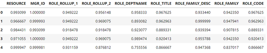
The Target encoder replaced each “ROLE_TITLE” id with the probability of each category. Now, let’s do the same for all features and check the memory usage after using Target Encoding.
y = data['ACTION']
features = data.drop('ACTION',axis=1)

te = TargetEncode(categories=features.columns)
te.fit(features,y)
te_data = te.transform(features)

te_data.head()
Output, Target encoded features. Image by author
memory_usage = te_data.memory_usage(deep=True)
total_memory_usage = memory_usage.sum()
print(f"nTotal memory usage of the DataFrame: {total_memory_usage / (1024 ** 2):.2f} MB")
The resulting dataset only uses 2.25 MB, compared to 488.08 MB from the one-hot encoder. Image by author
Target encoding successfully transformed the categorical data into numerical without creating extra columns or increasing memory usage.
Target encoding with SciKitLearn API
So far we have created our own target encoder class, however you don’t have to do this anymore.
In scikit-learn version 1.3 release, somewhere around June 2023, they introduced the Target Encoder class to their API. Here is how you can use target encoding with Scikit Learn
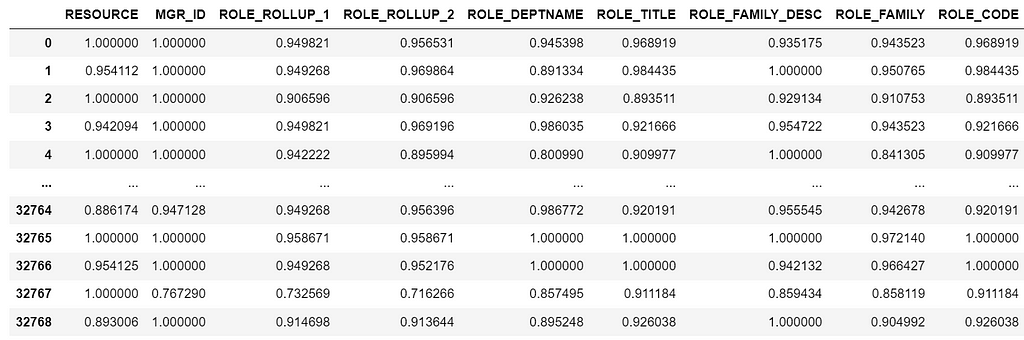
from sklearn.preprocessing import TargetEncoder

#Splitting the data
y = data['ACTION']
features = data.drop('ACTION',axis=1)

#Specify the target type
te = TargetEncoder(smooth="auto",target_type='binary')
X_trans = te.fit_transform(features, y)

#Creating a Dataframe
features_encoded = pd.DataFrame(X_trans, columns = features.columns)
Output from sklearn Target Encoder transformation. Image by author
Note that we are getting slightly different results from the manual Target encoder class because of the smooth parameter and randomness on the noise level.
As you see, sklearn makes it easy to run target encoding transformations. However, it is important to understand how the transformation works under the hood first to understand and explain the output.
While Target encoding is a powerful encoding method, it’s important to consider the specific requirements and characteristics of your dataset and choose the encoding method that best suits your needs and the requirements of the machine learning algorithm you plan to use.
References
[1] Banachewicz, K. & Massaron, L. (2022). The Kaggle Book: Data Analysis and Machine Learning for Competitive Data Science. Packt>
Build a pipeline to analyze and store the data within videos.
Before diving into the technical aspect of the article let’s set the context and answer the question that you might have, What is a knowledge graph ?
And to answer this, imagine instead of storing the knowledge in cabinets we store them in a fabric net. Each fact, concept, piece of information about people, places, events, or even abstract ideas are knots, and the line connecting them together is the relationship they have with each other. This intricate web, my friends, is the essence of a knowledge graph.
Think of it like a bustling city map, not just showing streets but revealing the connections between landmarks, parks, and shops. Similarly, a knowledge graph doesn’t just store cold facts; it captures the rich tapestry of how things are linked. For example, you might learn that Marie Curie discovered radium, then follow a thread to see that radium is used in medical treatments, which in turn connect to hospitals and cancer research. See how one fact effortlessly leads to another, painting a bigger picture?
So why is this map-like way of storing knowledge so popular? Well, imagine searching for information online. Traditional methods often leave you with isolated bits and pieces, like finding only buildings on a map without knowing the streets that connect them. A knowledge graph, however, takes you on a journey, guiding you from one fact to another, like having a friendly guide whisper fascinating stories behind every corner of the information world. Interesting right? I know.
Since I discovered this magic, it captured my attention and I explored and played around with many potential applications. In this article, I will show you how to build a pipeline that extracts audio from video, then transcribes that audio, and from the transcription, build a knowledge graph allowing for a more nuanced and interconnected representation of information within the video.
I will be using Google Drive to upload the video sample. I will also use Google Colab to write the code, and finally, you need access to the GPT Plus API for this project. I will break this down into steps to make it clear and easy for beginners:
Setting up everything.
Extracting audio from video.
Transcribing audio to text.
Building the knowledge graph.
By the end of this article, you will construct a graph with the following schema.
Image by the author
Let’s dive right into it!
1- Setting up everything
As mentioned, we will be using Google Drive and Colab. In the first cell, let’s connect Google Drive to Colab and create our directory folders (video_files, audio_files, text_files). The following code can get this done. (If you want to follow along with the code, I have uploaded all the code for this project on GitHub; you can access it from here.)
folders = [video_files, audio_files, text_files] for folder in folders: # Check if the output folder exists if not os.path.exists(folder): # If not, create the folder os.makedirs(folder)
Or you can create the folders manually and upload your video sample to the “video_files” folder, whichever is easier for you.
Now we have our three folders with a video sample in the “video_files” folder to test the code.
2- Extracting audio from video
The next thing we want to do is to import our video and extract the audio from it. We can use the Pydub library, which is a high-level audio processing library that can help us to do that. Let’s see the code and then explain it underneath.
from pydub import AudioSegment
# Extract audio from videos
for video_file in os.listdir(video_files):
    if video_file.endswith('.mp4'):
        video_path = os.path.join(video_files, video_file)
        audio = AudioSegment.from_file(video_path, format="mp4")

        # Save audio as WAV
        audio.export(os.path.join(audio_files, f"{video_file[:-4]}.wav"), format="wav")
After installing our package pydub, we imported the AudioSegment class from the Pydub library. Then, we created a loop that iterates through all the video files in the “video_files” folder we created earlier and passes each file through AudioSegment.from_file to load the audio from the video file. The loaded audio is then exported as a WAV file using audio.export and saved in the specified “audio_files” folder with the same name as the video file but with the extension .wav.
At this point, you can go to the “audio_files” folder in Google Drive where you will see the extracted audio.
3- Transcribing audio to text
In the third step, we will transcribe the audio file we have to a text file and save it as a .txt file in the “text_files” folder. Here I used the Whisper ASR (Automatic Speech Recognition) system from OpenAI to do this. I used it because it’s easy and fairly accurate, beside it has different models for different accuracy. But the more accurate the model is the larger the model the slower to load, hence I will be using the medium one just for demonstration. To make the code cleaner, let’s create a function that transcribes the audio and then use a loop to use the function on all the audio files in our directory
import re
import subprocess
# function to transcribe and save the output in txt file
def transcribe_and_save(audio_files, text_files, model='medium.en'):
    # Construct the Whisper command
    whisper_command = f"whisper '{audio_files}' --model {model}"
    # Run the Whisper command
    transcription = subprocess.check_output(whisper_command, shell=True, text=True)

    # Clean and join the sentences
    output_without_time = re.sub(r'[d+:d+.d+ --> d+:d+.d+]  ', '', transcription)
    sentences = [line.strip() for line in output_without_time.split('n') if line.strip()]
    joined_text = ' '.join(sentences)

    # Create the corresponding text file name
    audio_file_name = os.path.basename(audio_files)
    text_file_name = os.path.splitext(audio_file_name)[0] + '.txt'
    file_path = os.path.join(text_files, text_file_name)

    # Save the output as a txt file
    with open(file_path, 'w') as file:
        file.write(joined_text)

    print(f'Text for {audio_file_name} has been saved to: {file_path}')


# Transcribing all the audio files in the directory
for audio_file in os.listdir(audio_files):
    if audio_file.endswith('.wav'):
        audio_files = os.path.join(audio_files, audio_file)
        transcribe_and_save(audio_files, text_files)
Libraries Used:
os: Provides a way of interacting with the operating system, used for handling file paths and names.
re: Regular expression module for pattern matching and substitution.
subprocess: Allows the creation of additional processes, used here to execute the Whisper ASR system from the command line.
We created a Whisper command and saved it as a variable to facilitate the process. After that, we used subprocess.check_output to run the Whisper command and save the resulting transcription in the transcription variable. But the transcription at this point is not clean (you can check it by printing the transcription variable out of the function; it has timestamps and a couple of lines that are not relevant to the transcription), so we added a cleaning code that removes the timestamp using re.sub and joins the sentences together. After that, we created a text file within the “text_files” folder with the same name as the audio and saved the cleaned transcription in it.
Now if you go to the “text_files” folder, you can see the text file that contains the transcription. Woah, step 3 done successfully! Congratulations!
4- Building the knowledge graph
This is the crucial part — and maybe the longest. I will follow a modular approach with 5 functions to handle this task, but before that, let’s begin with the libraries and modules necessary for making HTTP requests requests, handling JSON json, working with data frames pandas, and creating and visualizing graphs networkx and matplotlib. And setting the global constants which are variables used throughout the code. API_ENDPOINT is the endpoint for OpenAI’s API, API_KEY is where the OpenAI API key will be stored, and prompt_text will store the text used as input for the OpenAI prompt. All of this is done in this code
import requests
import json
import pandas as pd
import networkx as nx
import matplotlib.pyplot as plt

# Global Constants API endpoint, API key, prompt text
API_ENDPOINT = "https://api.openai.com/v1/chat/completions"
api_key = "your_openai_api_key_goes_here"
prompt_text = """Given a prompt, extrapolate as many relationships as possible from it and provide a list of updates.
If an update is a relationship, provide [ENTITY 1, RELATIONSHIP, ENTITY 2]. The relationship is directed, so the order matters.
Example:
prompt: Sun is the source of solar energy. It is also the source of Vitamin D.
updates:
[["Sun", "source of", "solar energy"],["Sun","source of", "Vitamin D"]]
prompt: $prompt
updates:"""
Then let’s continue with breaking down the structure of our functions:
The first function, create_graph(), the task of this function is to create a graph visualization using the networkx library. It takes a DataFrame df and a dictionary of edge labels rel_labels — which will be created on the following function — as input. Then, it uses the DataFrame to create a directed graph and visualizes it using matplotlib with some customization and outputs the beautiful graph we need
The DataFrame df and the edge labels rel_labels are the output of the next function, which is: preparing_data_for_graph(). This function takes the OpenAI api_response — which will be created from the following function — as input and extracts the entity-relation triples (source, target, edge) from it. Here we used the json module to parse the response and obtain the relevant data, then filter out elements that have missing data. After that, build a knowledge base dataframe kg_df from the triples, and finally, create a dictionary (relation_labels) mapping pairs of nodes to their corresponding edge labels, and of course, return the DataFrame and the dictionary.
# Data Preparation Function
def preparing_data_for_graph(api_response): #extract response text response_text = api_response.text entity_relation_lst = json.loads(json.loads(response_text)["choices"][0]["text"]) entity_relation_lst = [x for x in entity_relation_lst if len(x) == 3] source = [i[0] for i in entity_relation_lst] target = [i[2] for i in entity_relation_lst] relations = [i[1] for i in entity_relation_lst]
The third function is call_gpt_api(), which is responsible for making a POST request to the OpenAI API and output the api_response. Here we construct the data payload with model information, prompt, and other parameters like the model (in this case: gpt-3.5-turbo-instruct), max_tokens, stop, and temperature. Then send the request using requests.post and return the response. I have also included simple error handling to print an error message in case an exception occurs. The try block contains the code that might raise an exception from the request during execution, so if an exception occurs during this process (for example, due to network issues, API errors, etc.), the code within the except block will be executed.
# OpenAI API Call Function
def call_gpt_api(api_key, prompt_text):
    global API_ENDPOINT
    try:
        data = {
            "model": "gpt-3.5-turbo",
            "prompt": prompt_text,
            "max_tokens": 3000,
            "stop": "n",
            "temperature": 0
        }
        headers = {"Content-Type": "application/json", "Authorization": "Bearer " + api_key}
        r = requests.post(url=API_ENDPOINT, headers=headers, json=data)
        response_data = r.json()  # Parse the response as JSON
        print("Response content:", response_data)
        return response_data
    except Exception as e:
        print("Error:", e)
Then the function before the last is the main() function, which orchestrates the main flow of the script. First, it reads the text file contents from the “text_files” folder we had earlier and saves it in the variable kb_text. Bring the global variable prompt_text, which stores our prompt, then replace a placeholder in the prompt template ($prompt) with the text file content kb_text. Then call the call_gpt_api() function, give it the api_key and prompt_text to get the OpenAI API response. The response is then passed to preparing_data_for_graph() to prepare the data and get the DataFrame and the edge labels dictionary, finally pass these two values to the create_graph() function to build the knowledge graph.
# Main function
def main(text_file_path, api_key):
with open(file_path, 'r') as file: kb_text = file.read()
global prompt_text prompt_text = prompt_text.replace("$prompt", kb_text)
Finally, we have the start() function, which iterates through all the text files in our “text_files” folder — if we have more than one, gets the name and the path of the file, and passes it along with the api_key to the main function to do its job.
# Start Function

def start():
    for filename in os.listdir(text_files):
        if filename.endswith(".txt"):
        # Construct the full path to the text file
            text_file_path = os.path.join(text_files, filename)
    main(text_file_path, api_key)
If you have correctly followed the steps, after running the start() function, you should see a similar visualization.
Image by the author
You can of course save this knowledge graph in the Neo4j database and take it further.
NOTE: This workflow ONLY applies to videos you own or whose terms allow this kind of download/processing.
Summary:
Knowledge graphs use semantic relationships to represent data, enabling a more nuanced and context-aware understanding. This semantic richness allows for more sophisticated querying and analysis, as the relationships between entities are explicitly defined.
In this article, I outline detailed steps on how to build a pipeline that involves extracting audio from videos, transcribing with OpenAI’s Whisper ASR, and crafting a knowledge graph. As someone interested in this field, I hope that this article makes it easier to understand for beginners, demonstrating the potential and versatility of knowledge graph applications.
And as always the whole code is available in GitHub.
We use cookies on our website to give you the most relevant experience by remembering your preferences and repeat visits. By clicking “Accept”, you consent to the use of ALL the cookies.
This website uses cookies to improve your experience while you navigate through the website. Out of these, the cookies that are categorized as necessary are stored on your browser as they are essential for the working of basic functionalities of the website. We also use third-party cookies that help us analyze and understand how you use this website. These cookies will be stored in your browser only with your consent. You also have the option to opt-out of these cookies. But opting out of some of these cookies may affect your browsing experience.
Necessary cookies are absolutely essential for the website to function properly. These cookies ensure basic functionalities and security features of the website, anonymously.
Cookie
Duration
Description
cookielawinfo-checkbox-analytics
11 months
This cookie is set by GDPR Cookie Consent plugin. The cookie is used to store the user consent for the cookies in the category "Analytics".
cookielawinfo-checkbox-functional
11 months
The cookie is set by GDPR cookie consent to record the user consent for the cookies in the category "Functional".
cookielawinfo-checkbox-necessary
11 months
This cookie is set by GDPR Cookie Consent plugin. The cookies is used to store the user consent for the cookies in the category "Necessary".
cookielawinfo-checkbox-others
11 months
This cookie is set by GDPR Cookie Consent plugin. The cookie is used to store the user consent for the cookies in the category "Other.
cookielawinfo-checkbox-performance
11 months
This cookie is set by GDPR Cookie Consent plugin. The cookie is used to store the user consent for the cookies in the category "Performance".
viewed_cookie_policy
11 months
The cookie is set by the GDPR Cookie Consent plugin and is used to store whether or not user has consented to the use of cookies. It does not store any personal data.
Functional cookies help to perform certain functionalities like sharing the content of the website on social media platforms, collect feedbacks, and other third-party features.
Performance cookies are used to understand and analyze the key performance indexes of the website which helps in delivering a better user experience for the visitors.
Analytical cookies are used to understand how visitors interact with the website. These cookies help provide information on metrics the number of visitors, bounce rate, traffic source, etc.
Advertisement cookies are used to provide visitors with relevant ads and marketing campaigns. These cookies track visitors across websites and collect information to provide customized ads.