Tag: AI

  • Learning the importance of training data under concept drift

    Learning the importance of training data under concept drift

    Google AI

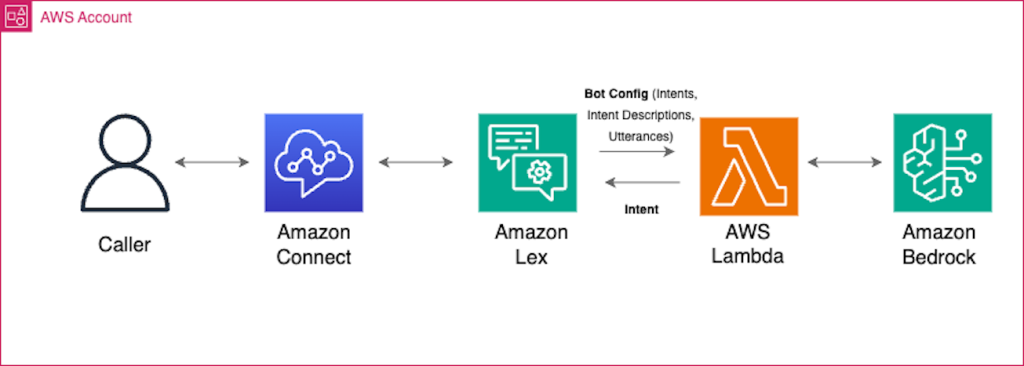
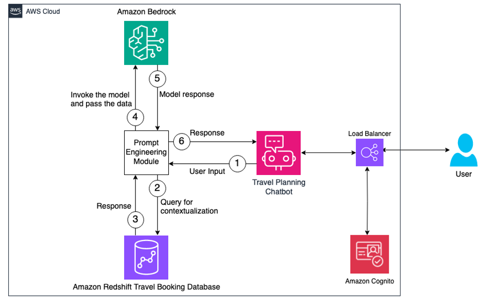
    The constantly changing nature of the world around us poses a significant challenge for the development of AI models. Often, models are trained on longitudinal data with the hope that the training data used will accurately represent inputs the model may receive in the future. More generally, the default assumption that all training data are equally relevant often breaks in practice. For example, the figure below shows images from the CLEAR nonstationary learning benchmark, and it illustrates how visual features of objects evolve significantly over a 10 year span (a phenomenon we refer to as slow concept drift), posing a challenge for object categorization models.

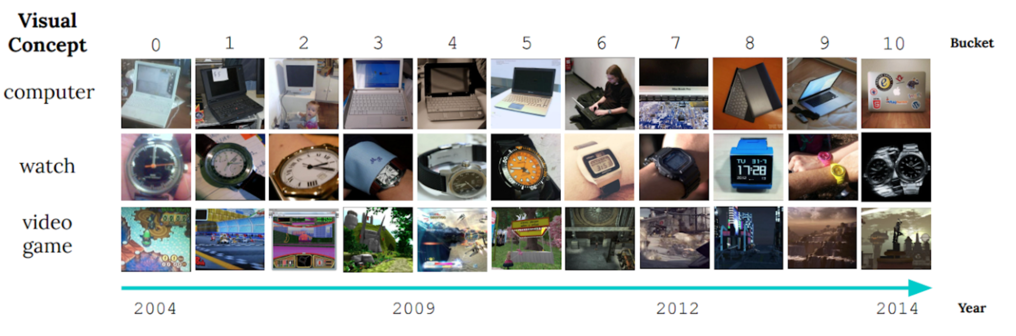
    Sample images from the CLEAR benchmark. (Adapted from Lin et al.)

    Alternative approaches, such as online and continual learning, repeatedly update a model with small amounts of recent data in order to keep it current. This implicitly prioritizes recent data, as the learnings from past data are gradually erased by subsequent updates. However in the real world, different kinds of information lose relevance at different rates, so there are two key issues: 1) By design they focus exclusively on the most recent data and lose any signal from older data that is erased. 2) Contributions from data instances decay uniformly over time irrespective of the contents of the data.

    In our recent work, “Instance-Conditional Timescales of Decay for Non-Stationary Learning”, we propose to assign each instance an importance score during training in order to maximize model performance on future data. To accomplish this, we employ an auxiliary model that produces these scores using the training instance as well as its age. This model is jointly learned with the primary model. We address both the above challenges and achieve significant gains over other robust learning methods on a range of benchmark datasets for nonstationary learning. For instance, on a recent large-scale benchmark for nonstationary learning (~39M photos over a 10 year period), we show up to 15% relative accuracy gains through learned reweighting of training data.

    The challenge of concept drift for supervised learning

    To gain quantitative insight into slow concept drift, we built classifiers on a recent photo categorization task, comprising roughly 39M photographs sourced from social media websites over a 10 year period. We compared offline training, which iterated over all the training data multiple times in random order, and continual training, which iterated multiple times over each month of data in sequential (temporal) order. We measured model accuracy both during the training period and during a subsequent period where both models were frozen, i.e., not updated further on new data (shown below). At the end of the training period (left panel, x-axis = 0), both approaches have seen the same amount of data, but show a large performance gap. This is due to catastrophic forgetting, a problem in continual learning where a model’s knowledge of data from early on in the training sequence is diminished in an uncontrolled manner. On the other hand, forgetting has its advantages — over the test period (shown on the right), the continual trained model degrades much less rapidly than the offline model because it is less dependent on older data. The decay of both models’ accuracy in the test period is confirmation that the data is indeed evolving over time, and both models become increasingly less relevant.

    Comparing offline and continually trained models on the photo classification task.

    Time-sensitive reweighting of training data

    We design a method combining the benefits of offline learning (the flexibility of effectively reusing all available data) and continual learning (the ability to downplay older data) to address slow concept drift. We build upon offline learning, then add careful control over the influence of past data and an optimization objective, both designed to reduce model decay in the future.

    Suppose we wish to train a model, M, given some training data collected over time. We propose to also train a helper model that assigns a weight to each point based on its contents and age. This weight scales the contribution from that data point in the training objective for M. The objective of the weights is to improve the performance of M on future data.

    In our work, we describe how the helper model can be meta-learned, i.e., learned alongside M in a manner that helps the learning of the model M itself. A key design choice of the helper model is that we separated out instance- and age-related contributions in a factored manner. Specifically, we set the weight by combining contributions from multiple different fixed timescales of decay, and learn an approximate “assignment” of a given instance to its most suited timescales. We find in our experiments that this form of the helper model outperforms many other alternatives we considered, ranging from unconstrained joint functions to a single timescale of decay (exponential or linear), due to its combination of simplicity and expressivity. Full details may be found in the paper.

    Instance weight scoring

    The top figure below shows that our learned helper model indeed up-weights more modern-looking objects in the CLEAR object recognition challenge; older-looking objects are correspondingly down-weighted. On closer examination (bottom figure below, gradient-based feature importance assessment), we see that the helper model focuses on the primary object within the image, as opposed to, e.g., background features that may spuriously be correlated with instance age.

    Sample images from the CLEAR benchmark (camera & computer categories) assigned the highest and lowest weights respectively by our helper model.

    Feature importance analysis of our helper model on sample images from the CLEAR benchmark.

    Results

    Gains on large-scale data

    We first study the large-scale photo categorization task (PCAT) on the YFCC100M dataset discussed earlier, using the first five years of data for training and the next five years as test data. Our method (shown in red below) improves substantially over the no-reweighting baseline (black) as well as many other robust learning techniques. Interestingly, our method deliberately trades off accuracy on the distant past (training data unlikely to reoccur in the future) in exchange for marked improvements in the test period. Also, as desired, our method degrades less than other baselines in the test period.

    Comparison of our method and relevant baselines on the PCAT dataset.

    Broad applicability

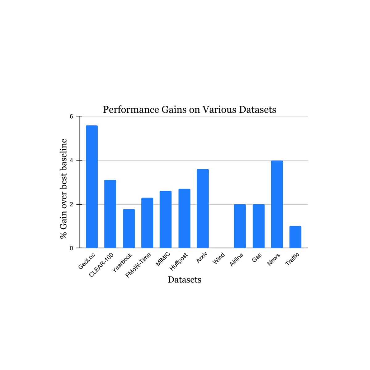
    We validated our findings on a wide range of nonstationary learning challenge datasets sourced from the academic literature (see 1, 2, 3, 4 for details) that spans data sources and modalities (photos, satellite images, social media text, medical records, sensor readings, tabular data) and sizes (ranging from 10k to 39M instances). We report significant gains in the test period when compared to the nearest published benchmark method for each dataset (shown below). Note that the previous best-known method may be different for each dataset. These results showcase the broad applicability of our approach.

    Performance gain of our method on a variety of tasks studying natural concept drift. Our reported gains are over the previous best-known method for each dataset.

    Extensions to continual learning

    Finally, we consider an interesting extension of our work. The work above described how offline learning can be extended to handle concept drift using ideas inspired by continual learning. However, sometimes offline learning is infeasible — for example, if the amount of training data available is too large to maintain or process. We adapted our approach to continual learning in a straightforward manner by applying temporal reweighting within the context of each bucket of data being used to sequentially update the model. This proposal still retains some limitations of continual learning, e.g., model updates are performed only on most-recent data, and all optimization decisions (including our reweighting) are only made over that data. Nevertheless, our approach consistently beats regular continual learning as well as a wide range of other continual learning algorithms on the photo categorization benchmark (see below). Since our approach is complementary to the ideas in many baselines compared here, we anticipate even larger gains when combined with them.

    Results of our method adapted to continual learning, compared to the latest baselines.

    Conclusion

    We addressed the challenge of data drift in learning by combining the strengths of previous approaches — offline learning with its effective reuse of data, and continual learning with its emphasis on more recent data. We hope that our work helps improve model robustness to concept drift in practice, and generates increased interest and new ideas in addressing the ubiquitous problem of slow concept drift.

    Acknowledgements

    We thank Mike Mozer for many interesting discussions in the early phase of this work, as well as very helpful advice and feedback during its development.

    Originally appeared here:
    Learning the importance of training data under concept drift

    Go Here to Read this Fast! Learning the importance of training data under concept drift

  • Enhance Amazon Connect and Lex with generative AI capabilities

    Enhance Amazon Connect and Lex with generative AI capabilities

    Hamza Nadeem

    Effective self-service options are becoming increasingly critical for contact centers, but implementing them well presents unique challenges. Amazon Lex provides your Amazon Connect contact center with chatbot functionalities such as automatic speech recognition (ASR) and natural language understanding (NLU) capabilities through voice and text channels. The bot takes natural language speech or text input, recognizes […]

    Originally appeared here:
    Enhance Amazon Connect and Lex with generative AI capabilities

    Go Here to Read this Fast! Enhance Amazon Connect and Lex with generative AI capabilities

  • Skeleton-based pose annotation labeling using Amazon SageMaker Ground Truth

    Skeleton-based pose annotation labeling using Amazon SageMaker Ground Truth

    Arthur Putnam

    Pose estimation is a computer vision technique that detects a set of points on objects (such as people or vehicles) within images or videos. Pose estimation has real-world applications in sports, robotics, security, augmented reality, media and entertainment, medical applications, and more. Pose estimation models are trained on images or videos that are annotated with […]

    Originally appeared here:
    Skeleton-based pose annotation labeling using Amazon SageMaker Ground Truth

    Go Here to Read this Fast! Skeleton-based pose annotation labeling using Amazon SageMaker Ground Truth

  • Build generative AI chatbots using prompt engineering with Amazon Redshift and Amazon Bedrock

    Build generative AI chatbots using prompt engineering with Amazon Redshift and Amazon Bedrock

    Ravikiran Rao

    With the advent of generative AI solutions, organizations are finding different ways to apply these technologies to gain edge over their competitors. Intelligent applications, powered by advanced foundation models (FMs) trained on huge datasets, can now understand natural language, interpret meaning and intent, and generate contextually relevant and human-like responses. This is fueling innovation across […]

    Originally appeared here:
    Build generative AI chatbots using prompt engineering with Amazon Redshift and Amazon Bedrock

    Go Here to Read this Fast! Build generative AI chatbots using prompt engineering with Amazon Redshift and Amazon Bedrock

  • Evaluating Synthetic Data — The Million Dollar Question

    Andrew Skabar, PhD

    Evaluating Synthetic Data — The Million Dollar Question

    Are my real and synthetic datasets random samples from the same parent distribution?

    Photo by Edge2Edge Media on Unsplash

    When we perform synthetic data generation, we typically create a model for our real (or ‘observed’) data, and then use this model to generate synthetic data. This observed data is usually compiled from real world experiences, such as measurements of the physical characteristics of irises or details about individuals who have defaulted on credit or acquired some medical condition. We can think of the observed data as having come from some ‘parent distribution’ — the true underlying distribution from which the observed data is a random sample. Of course, we never know this parent distribution — it must be estimated, and this is the purpose of our model.

    But if our model can produce synthetic data that can be considered to be a random sample from the same parent distribution, then we’ve hit the jackpot: the synthetic data will possess the same statistical properties and patterns as the observed data (fidelity); it will be just as useful when put to tasks such as regression or classification (utility); and, because it is a random sample, there is no risk of it identifying the observed data (privacy). But how can we know if we have met this elusive goal?

    In the first part of this story, we will conduct some simple experiments to gain a better understanding of the problem and motivate a solution. In the second part we will evaluate performance of a variety of synthetic data generators on a collection of well-known datasets.

    Part 1 — Some Simple Experiments

    Consider the following two datasets and try to answer this question:

    Are the datasets random samples from the same parent distribution, or has one been derived from the other by applying small random perturbations?

    Two datasets. Are both datasets random samples from the same parent distribution, or has one been derived from the other by small random perturbations? [Image by Author]

    The datasets clearly display similar statistical properties, such as marginal distributions and covariances. They would also perform similarly on a classification task in which a classifier trained on one dataset is tested on the other. So, fidelity and utility alone are inconclusive.

    But suppose we were to plot the data points from each dataset on the same graph. If the datasets are random samples from the same parent distribution, we would intuitively expect the points from one dataset to be interspersed with those from the other in such a manner that, on average, points from one set are as close to — or ‘as similar to’ — their closest neighbors in that set as they are to their closest neighbors in the other set. However, if one dataset is a slight random perturbation of the other, then points from one set will be more similar to their closest neighbors in the other set than they are to their closest neighbors in the same set. This leads to the following test.

    The Maximum Similarity Test

    For each dataset, calculate the similarity between each instance and its closest neighbor in the same dataset. Call these the ‘maximum intra-set similarities’. If the datasets have the same distributional characteristics, then the distribution of intra-set similarities should be similar for each dataset. Now calculate the similarity between each instance of one dataset and its closest neighbor in the other dataset and call these themaximum cross-set similarities’. If the distribution of maximum cross-set similarities is the same as the distribution of maximum intra-set similarities, then the datasets can be considered random samples from the same parent distribution. For the test to be valid, each dataset should contain the same number of examples.

    Two datasets: one red, one black. Black arrows indicate the closest (or ‘most similar’) black neighbor (head) to each black point (tail) — the similarities between these pairs are the ‘maximum intra-set similarities’ for black. Red arrows indicate the closest black neighbor (head) to each red point (tail) — similarities between these pairs are the ‘maximum cross-set similarities’. [Image by Author]

    Since the datasets we deal with in this story all contain a mixture of numerical and categorical variables, we need a similarity measure which can accommodate this. We use Gower Similarity¹.

    The table and histograms below show the means and distributions of the maximum intra- and cross-set similarities for Datasets 1 and 2.

    Distribution of maximum intra- and cross-set similarities for Datasets 1 and 2. [Image by Author]

    On average, the instances in one data set are more similar to their closest neighbors in the other dataset than they are to their closest neighbors in the same dataset. This indicates that the datasets are more likely to be perturbations of each other than random samples from the same parent distribution. And indeed, they are perturbations! Dataset 1 was generated from a Gaussian mixture model; Dataset 2 was generated by selecting (without replacement) an instance from Dataset 1 and applying a small random perturbation.

    Ultimately, we will be using the Maximum Similarity Test to compare synthetic datasets with observed datasets. The biggest danger with synthetic data points being too close to observed points is privacy; i.e., being able to identify points in the observed set from points in the synthetic set. In fact, if you examine Datasets 1 and 2 carefully, you might actually be able to identify some such pairs. And this is for a case in which the average maximum cross-set similarity is only 0.3% larger than the average maximum intra-set similarity!

    Modeling and Synthesizing

    To end this first part of the story, let’s create a model for a dataset and use the model to generate synthetic data. We can then use the Maximum Similarity Test to compare the synthetic and observed sets.

    The dataset on the left in the figure below is just Dataset 1 from above. The dataset on the right (Dataset 3) is the synthetic dataset. (We have estimated the distribution as a Gaussian mixture, but that’s not important).

    Observed dataset (left) and Synthetic dataset (right). [Image by Author]

    Here are the average similarities and histograms:

    Distribution of maximum intra- and cross-set similarities for Datasets 1 and 3. [Image by Author]

    The three averages are identical to three significant figures, and the three histograms are very similar. Therefore, according to the Maximum Similarity Test, both datasets can reasonably be considered random samples from the same parent distribution. Our synthetic data generation exercise has been a success, and we have achieved the hat-trick — fidelity, utility, and privacy.

    [Python code used to produce the datasets, plots and histograms from Part 1 is available from https://github.com/a-skabar/TDS-EvalSynthData]

    Part 2— Real Datasets, Real Generators

    The dataset used in Part 1 is simple and can be easily modeled with just a mixture of Gaussians. However, most real-world datasets are far more complex. In this part of the story, we will apply several synthetic data generators to some popular real-world datasets. Our primary focus is on comparing the distributions of maximum similarities within and between the observed and synthetic datasets to understand the extent to which they can be considered random samples from the same parent distribution.

    The six datasets originate from the UCI repository² and are all popular datasets that have been widely used in the machine learning literature for decades. All are mixed-type datasets, and were chosen because they vary in their balance of categorical and numerical features.

    The six generators are representative of the major approaches used in synthetic data generation: copula-based, GAN-based, VAE-based, and approaches using sequential imputation. CopulaGAN³, GaussianCopula, CTGAN³ and TVAE³ are all available from the Synthetic Data Vault libraries⁴, synthpop⁵ is available as an open-source R package, and ‘UNCRi’ refers to the synthetic data generation tool developed under the proprietary Unified Numeric/Categorical Representation and Inference (UNCRi) framework⁶. All generators were used with their default settings.

    The table below shows the average maximum intra- and cross-set similarities for each generator applied to each dataset. Entries highlighted in red are those in which privacy has been compromised (i.e., the average maximum cross-set similarity exceeds the average maximum intra-set similarity on the observed data). Entries highlighted in green are those with the highest average maximum cross-set similarity (not including those in red). The last column shows the result of performing a Train on Synthetic, Test on Real (TSTR) test, where a classifier or regressor is trained on the synthetic examples and tested on the real (observed) examples. The Boston Housing dataset is a regression task, and the mean absolute error (MAE) is reported; all other tasks are classification tasks, and the reported value is the area under ROC curve (AUC).

    Average maximum similarities and TSTR result for six generators on six datasets. The values for TSTR are MAE for Boston Housing, and AUC for all other datasets. [Image by Author]

    The figures below display, for each dataset, the distributions of maximum intra- and cross-set similarities corresponding to the generator that attained the highest average maximum cross-set similarity (excluding those highlighted in red above).

    Distribution of maximum similarities for synthpop on Boston Housing dataset. [Image by Author]
    Distribution of maximum similarities for synthpop Census Income dataset. [Image by Author]
    Distribution of maximum similarities for UNCRi on Cleveland Heart Disease dataset. [Image by Author]
    Distribution of maximum similarities for UNCRi on Credit Approval dataset. [Image by Author]
    Distribution of maximum similarities for UNCRi on Iris dataset. [Image by Author]
    Distribution of average similarities for TVAE on Wisconsin Breast Cancer dataset. [Image by Author]

    From the table, we can see that for those generators that did not breach privacy, the average maximum cross-set similarity is very close to the average maximum intra-set similarity on observed data. The histograms show us the distributions of these maximum similarities, and we can see that in most cases the distributions are clearly similar — strikingly so for datasets such as the Census Income dataset. The table also shows that the generator that achieved the highest average maximum cross-set similarity for each dataset (excluding those highlighted in red) also demonstrated best performance on the TSTR test (again excluding those in red). Thus, while we can never claim to have discovered the ‘true’ underlying distribution, these results demonstrate that the most effective generator for each dataset has captured the crucial features of the underlying distribution.

    Privacy

    Only two of the seven generators displayed issues with privacy: synthpop and TVAE. Each of these breached privacy on three out of the six datasets. In two instances, specifically TVAE on Cleveland Heart Disease and TVAE on Credit Approval, the breach was particularly severe. The histograms for TVAE on Credit Approval are shown below and demonstrate that the synthetic examples are far too similar to each other, and also to their closest neighbors in the observed data. The model is a particularly poor representation of the underlying parent distribution. The reason for this may be that the Credit Approval dataset contains several numerical features that are extremely highly skewed.

    Distribution of average maximum similarities for TVAE on Credit Approval dataset. [Image by Author]

    Other observations and comments

    The two GAN-based generators — CopulaGAN and CTGAN — were consistently among the worst performing generators. This was somewhat surprising given the immense popularity of GANs.

    The performance of GaussianCopula was mediocre on all datasets except Wisconsin Breast Cancer, for which it attained the equal-highest average maximum cross-set similarity. Its unimpressive performance on the Iris dataset was particularly surprising, given that this is a very simple dataset that can easily be modeled using a mixture of Gaussians, and which we expected would be well-matched to Copula-based methods.

    The generators which perform most consistently well across all datasets are synthpop and UNCRi, which both operate by sequential imputation. This means that they only ever need to estimate and sample from a univariate conditional distribution (e.g., P(x₇|x₁, x₂, …)), and this is typically much easier than modeling and sampling from a multivariate distribution (e.g., P(x₁, x₂, x₃, …)), which is (implicitly) what GANs and VAEs do. Whereas synthpop estimates distributions using decision trees (which are the source of the overfitting that synthpop is prone to), the UNCRi generator estimates distributions using a nearest neighbor-based approach, with hyper-parameters optimized using a cross-validation procedure that prevents overfitting.

    Conclusion

    Synthetic data generation is a new and evolving field, and while there are still no standard evaluation techniques, there is consensus that tests should cover fidelity, utility and privacy. But while each of these is important, they are not on an equal footing. For example, a synthetic dataset may achieve good performance on fidelity and utility but fail on privacy. This does not give it a ‘two out of three’: if the synthetic examples are too close to the observed examples (thus failing the privacy test), the model has been overfitted, rendering the fidelity and utility tests meaningless. There has been a tendency among some vendors of synthetic data generation software to propose single-score measures of performance that combine results from a multitude of tests. This is essentially based on the same ‘two out of three’ logic.

    If a synthetic dataset can be considered a random sample from the same parent distribution as the observed data, then we cannot do any better — we have achieved maximum fidelity, utility and privacy. The Maximum Similarity Test provides a measure of the extent to which two datasets can be considered random samples from the same parent distribution. It is based on the simple and intuitive notion that if an observed and a synthetic dataset are random samples from the same parent distribution, instances should be distributed such that a synthetic instance is as similar on average to its closest observed instance as an observed instance is similar on average to its closest observed instance.

    We propose the following single-score measure of synthetic dataset quality:

    The closer this ratio is to 1 — without exceeding 1 — the better the quality of the synthetic data. It should, of course, be accompanied by a sanity check of the histograms.

    References

    [1] Gower, J. C. (1971). A general coefficient of similarity and some of its properties. Biometrics, 27(4), 857–871.

    [2] Dua, D. & Graff, C., (2017). UCI Machine Learning Repository, Available at: http://archive.ics.uci.edu/ml.

    [3] Xu, L., Skoularidou, M., Cuesta-Infante, A. and Veeramachaneni., K. Modeling Tabular data using Conditional GAN. NeurIPS, 2019.

    [4] Patki, N., Wedge, R., & Veeramachaneni, K. (2016). The synthetic data vault. In 2016 IEEE International Conference on Data Science and Advanced Analytics (DSAA) (pp. 399–410). IEEE.

    [5] Nowok, B., Raab G.M., Dibben, C. (2016). “synthpop: Bespoke Creation of Synthetic Data in R.” Journal of Statistical Software, 74(11), 1–26. doi:10.18637/jss.v074.i11.

    [6] http://skanalytix.com/uncri-framework

    [7] Harrison, D., & Rubinfeld, D.L. (1978). Boston Housing Dataset. Kaggle. https://www.kaggle.com/c/boston-housing. Licensed for commercial use under the CC: Public Domain license.

    [8] Kohavi, R. (1996). Census Income. UCI Machine Learning Repository. https://doi.org/10.24432/C5GP7S. Licensed for commercial use under a Creative Commons Attribution 4.0 International (CC BY 4.0) license.

    [9] Janosi, A., Steinbrunn, W., Pfisterer, M. and Detrano, R. (1988). Heart Disease. UCI Machine Learning Repository. https://doi.org/10.24432/C52P4X. Licensed for commercial use under a Creative Commons Attribution 4.0 International (CC BY 4.0) license.

    [10] Quinlan, J.R. (1987). Credit Approval. UCI Machine Learning Repository. https://doi.org/10.24432/C5FS30. Licensed for commercial use under a Creative Commons Attribution 4.0 International (CC BY 4.0) license.

    [11] Fisher, R.A. (1988). Iris. UCI Machine Learning Repository. https://doi.org/10.24432/C56C76. Licensed for commercial use under a Creative Commons Attribution 4.0 International (CC BY 4.0) license.

    [12] Wolberg, W., Mangasarian, O., Street, N. and Street,W. (1995). Breast Cancer Wisconsin (Diagnostic). UCI Machine Learning Repository. https://doi.org/10.24432/C5DW2B. Licensed for commercial use under a Creative Commons Attribution 4.0 International (CC BY 4.0) license.


    Evaluating Synthetic Data — The Million Dollar Question was originally published in Towards Data Science on Medium, where people are continuing the conversation by highlighting and responding to this story.

    Originally appeared here:
    Evaluating Synthetic Data — The Million Dollar Question

    Go Here to Read this Fast! Evaluating Synthetic Data — The Million Dollar Question

  • Stream Ordering: How And Why a Geo-scientist Sometimes Needed to Rank Rivers on a Map

    Stream Ordering: How And Why a Geo-scientist Sometimes Needed to Rank Rivers on a Map

    Mikhail Sarafanov

    Stream Ordering: How And Why a Geo-Scientist Sometimes Needed to Rank Rivers on a Map

    Learn how to obtain Strahler or Shreve order on vector layer

    Preview image (by author)

    Dear reader, in this article, I would like to dive into one exciting hydrological topic. I will start with the picture:

    Figure 1. River depiction on the map in two versions (a vs b) (image by author)

    Disclaimer: this article is written both for geographers who face the problem of ranking river vector layer using geoinformation systems (GIS) and for people who have sometimes seen “nice rivers” on a map but do not know exactly how they are made. We will together sequentially explore how spatial data are represented in GIS applications, the way the structure of river networks can be analysed, and what visualisation techniques can be used.

    Now the question is: Which map looks prettier? — For me, the one on the bottom (b).

    Actually, the second visualisation is more correct from a common sense point of view as well. The more tributaries flowing into the riverbed, the wider and fuller the river will be. For example, one of the largest rivers in the world, the Nile, at its source (high in the mountains), barely resembles a powerful river at its mouth: with each kilometer of the way to the sea, the river absorbs more and more tributaries and becomes more and more full-flowing.

    The map shown above (Figure 1b) was prepared on the basis of structural information on the river network. In this post I would like to discuss in which ways this additional information about rivers can be obtained and what tools can be used for this purpose.

    What is the river

    Let’s start by explaining how information about rivers is represented. In cartography and geo-sciences, rivers are represented as a linear vector layer: each river section is represented as a line with some characteristics. For example, the length of the section, its geographic coordinates (geometry of the object), ground type, average depth, flow velocity, etc. (Animation 1).

    Animation 1. Linear vector layer for spatial objects. Important note: The geometries of individual linear segments can be defined not by two points, but by a great number of points (by author)

    So, generally, if you see a river on a map, you see a set of these simple geometric primitives (individual rows in attrbute table) assembled into one big system. Different colours can be used to visualise stored characteristics (Figure 2).

    Figure 2. Visualisation of the river sections using colours (image by author)

    Either programming languages or specialised applications such as ArcGIS (proprietary software) or QGIS (open-source) are used for visualisation.

    River structure

    Such information in the attributes table on rivers can be collected in different ways: from remote sensing data, expeditions, gauges, and hydrological stations. However, information about the river structure is usually assigned by the specialist at the very last moment, when he or she sees on the map what the whole system looks like. For example, a researcher can themselves add a new column to the vector layer description in which they assign a rank to each river segment (Figure 3).

    Figure 3. Adding new field and visualise it using size (image by author)

    Now we can see that the picture resembles the map from the beginning of the article (Figure 1b). But the question arises: what principle can be used to assign such values? — the answer is: a lot. There are several generally accepted systems for ranking watercourses in hydrology — see the Stream order wiki page or paper Stream orders. Below are a few approaches that I have used myself during the work (Figure 4).

    Figure 4. Several approaches of stream ordering in hydrology (image by author)

    For what reason

    Now it is time to answer the question of the purpose of such ranking systems. We can distinguish two reasons:

    • Visualisation — using rank as an attribute of the size of a linear object on the map, it is possible to create nice maps (Figure 1);
    • Further analysis.

    Knowledge of river network structure can be combined with other characteristics for further analysis, e.g. to identify the following patterns (Figure 5).

    Figure 5. Flow velocity dependence on Shreve order (image by author)

    How to assign stream orders using existing tools

    It is difficult to rank large systems manually, so specialised tools have been created for stream ordering. There are two fundamentally different ways:

    • Stream ordering using raster data (digital elevation model);
    • Stream ordering on vector layers.

    Above, we have described how we can assign ranks to vector layers. However, spatial data are often represented in another format — as rasters (matrices) (Figure 6). Digital elevation models (matrices where each pixel has a specific size, such as 90 by 90 metres, for example, and an elevation value above the sea level surface that is stored in each cell of that matrix) are particularly commonly used.

    Figure 6. Digital elevation model (DEM) as raster layer. Often used to calculate flow direction and then stream order (image by author)

    The raster layer (digital elevation model — DEM) is used to calculate the flow direction matrix and flow accumulation. The Stream Order (Spatial Analyst) tool in ArcGIS, for example, works according to this principle. In this post I will not describe in detail how such an algorithm works, as there are quite nice visualisations and descriptions in the official documentation (please check Flow Direction function page if you want to know more). Below I have listed some of the tools you can use to get an Strahler order using raster data:

    However, this all requires a lot of raster data manipulation. What should you do if you already have a vector layer? (This can happen if you have, for example, a vector layer of the river network loaded from OpenStreetMap.) I’ll tell you next!

    How to obtain Shreve, Strahler and Topological order on vector layer using QGIS

    During our work four years ago, my colleagues and I came up with an algorithm that allows us to calculate Shreve, Strahler, and Topological order based only on the vector layer and the final point (the point where the river system ends and flows into a lake / sea / ocean). The first version of the algorithm is described in my first article on medium: “The Algorithm for Ranking the Segments of the River Network for Geographic Information Analysis Based on Graphs” (wiping away a tear of nostalgia). Recently, I finally got around to writing some clearer documentation for it and preparing a plugin update.

    In QGIS for stream ordering, the Lines Ranking plugin can be used. To use, it will require loading a vector layer, reprojecting it into the desired metric projection, and assigning a final point (you can just click on the map) — the following result will be obtained (Figure 7).

    Figure 7. Topological stream order for Ob river using vector layer and QGIS Lines Ranking Plugin

    Now you, dear reader, have dived a little deeper into the topic of stream ordering in hydrology and learned how to use different tools to get it from raw data (raster or vector). Once there is information about the river’s structure, you can prepare beautiful and clear visualisations, or continue the analysis by combining the obtained information with other characteristics.

    Useful links:

    The talk on stream ordering in hydrology was presented by Mikhail Sarafanov


    Stream Ordering: How And Why a Geo-scientist Sometimes Needed to Rank Rivers on a Map was originally published in Towards Data Science on Medium, where people are continuing the conversation by highlighting and responding to this story.

    Originally appeared here:
    Stream Ordering: How And Why a Geo-scientist Sometimes Needed to Rank Rivers on a Map

    Go Here to Read this Fast! Stream Ordering: How And Why a Geo-scientist Sometimes Needed to Rank Rivers on a Map

  • Generative AI Design Patterns: A Comprehensive Guide

    Generative AI Design Patterns: A Comprehensive Guide

    Vincent Koc

    Architecture patterns and mental models for working with Large Language Models

    The Need For AI Patterns

    We all anchor to some tried and tested methods, approaches and patterns when building something new. This statement is very true for those in software engineering, however for generative AI and artificial intelligence itself this may not be the case. With emerging technologies such as generative AI we lack well documented patterns to ground our solution’s.

    Here I share a handful of approaches and patterns for generative AI, based on my evaluation of countless production implementations of LLM’s in production. The goal of these patterns is to help mitigate and overcome some of the challenges with generative AI implementations such as cost, latency and hallucinations.

    List of Patterns

    1. Layered Caching Strategy Leading To Fine-Tuning
    2. Multiplexing AI Agents For A Panel Of Experts
    3. Fine-Tuning LLM’s For Multiple Tasks
    4. Blending Rules Based & Generative
    5. Utilizing Knowledge Graphs with LLM’s
    6. Swarm Of Generative AI Agents
    7. Modular Monolith LLM Approach With Composability
    8. Approach To Memory Cognition For LLM’s
    9. Red & Blue Team Dual-Model Evaluation

    1) Layered Caching Strategy Leading To Fine-Tuning

    Here we are solving for a combination of factors from cost, redundancy and training data when introducing a caching strategy and service to our large language models.

    By caching these initial results, the system can serve up answers more rapidly on subsequent queries, enhancing efficiency. The twist comes with the fine-tuning layer once we have sufficient data, where feedback from these early interactions is used to refine a more specialized model.

    The specialized model not only streamlines the process but also tailors the AI’s expertise to specific tasks, making it highly effective in environments where precision and adaptability are paramount, like customer service or personalized content creation.

    For getting started there are pre-built services such as GPTCache or roll your own with common caching databases such as Redis, Apache Cassandra, Memcached. Be sure you monitor and measure your latency as you add additional services to the mix.

    2) Multiplexing AI Agents For A Panel Of Experts

    Imagine an ecosystem where multiple generative AI models orientated to a specific task (“agents”), each a specialist within its domain, work in parallel to address a query. This multiplexing strategy enables a diverse set of responses, which are then integrated to provide a comprehensive answer.

    This setup is ideal for complex problem-solving scenarios where different aspects of a problem require different expertise, much like a team of experts each tackling a facet of a larger issue.

    A larger model such as a GPT-4 is used to understand context and break this down into specific tasks or information requests which are passed to smaller agents. Agents could be smaller language models such as Phi-2 or TinyLlama that have been trained on specific tasks, access to specific tools or generalized models such as GPT, Llama with specific personality, context prompts and function calls.

    3) Fine-Tuning LLM’s For Multiple Tasks

    Here we fine-tune a large language model on multiple tasks simultaneously instead of a single task. It’s an approach that promotes a robust transfer of knowledge and skills across different domains, enhancing the model’s versatility.

    This multi-task learning is especially useful for platforms that need to handle a variety of tasks with a high degree of competence, such as virtual assistants or AI-powered research tools. This could potentially simplify workflows for training and testing for a complex domain.

    Some resources and packages for training LLM’s include DeepSpeed, and the training functions on Hugging Face’s Transformer library.

    4) Blending Rules Based & Generative

    A number of existing business systems and organizational applications are still somewhat rules based. By fusing the generative with the structured precision of rule-based logic, this pattern aims to produce solutions that is both creative yet compliant.

    It’s a powerful strategy for industries where outputs must adhere to stringent standards or regulations, ensuring the AI remains within the bounds of desired parameters while still being able to innovate and engage. A good example of this is generating intents and message flows for a phone call IVR system or traditional (non-llm based) chat bots which is rules based.

    5) Utilizing Knowledge Graphs with LLM’s

    Integrating knowledge graphs with generative AI models gives them a fact orientated super power, allowing for outputs that are not only contextually aware but also more factually correct.

    This approach is crucial for applications where truth and accuracy are non-negotiable, such as in educational content creation, medical advice, or any field where misinformation could have serious consequences.

    Knowledge graphs and graph ontologies (set of concepts for a graph) allow for complex topics or organizational problems to be broken into a structured format to help ground a large language model with deep context. You can also use a language model to generate the ontologies in a format such as JSON or RDF, example prompt I created you can use.

    Services you can use for knowledge graphs include graph database services such as ArangoDB, Amazon Neptune, Azure Cosmos DB and Neo4j. There are also wider datasets and services for accessing broader knowledge graphs including Google Enterprise Knowledge Graph API, PyKEEN Datasets, and Wikidata.

    6) Swarm Of AI Agents

    Drawing inspiration from natural swarms and heards, this model employs a multitude of AI agents that collectively tackle a problem, each contributing a unique perspective.

    The resulting aggregated output reflects a form of collective intelligence, surpassing what any individual agent could achieve. This pattern is particularly advantageous in scenarios that require a breadth of creative solutions or when navigating complex datasets.

    An example of this could be reviewing a research paper from a multiple “experts” point of view, or assessing customer interactions for many use-cases at once from fraud to offers. We take these collective “agents” and combine all their inputs together. For high volume swarm’s you can look at deploying messaging services such as Apache Kafka to handle the messages between the agents and services.

    7) Modular Monolith LLM Approach With Composability

    This design champions adaptability, featuring a modular AI system that can dynamically reconfigure itself for optimal task performance. It’s akin to having a Swiss Army knife, where each module can be selected and activated as needed, making it highly effective for businesses that require tailor-made solutions for varying customer interactions or product needs.

    You can deploy the use of various autonomous agent frameworks and architectures to develop each of your agents and their tools. Example frameworks include CrewAI, Langchain, Microsoft Autogen and SuperAGI.

    For a sales modular monolith this could be agents focused on prospecting, one handling bookings, one focused on generating messaging, and another updating databases. In future as specific services become available from specialized AI companies, you can swap out a module for an external or 3rd party service for a given set of tasks or domain specific problems.

    8) Approach To Memory Cognition For LLM’s

    This approach introduces an element of human-like memory to AI, allowing models to recall and build upon previous interactions for more nuanced responses.

    It’s particularly useful for ongoing conversations or learning scenarios, as the AI develops a more profound understanding over time, much like a dedicated personal assistant or an adaptive learning platform. Memory cognition approaches can be developed through summation and storing key events and discussions into a vector database over time.

    To keep compute of summaries low, you can leverage summation through smaller NLP libraries such as spaCy, or BART language models if dealing with considerable volumes. Databases used are vector based and retrieval during prompt stage to check the short-term memory uses a similarity search to locate key “facts”. For those interested on a working solution there is an open-sourced solution following a similar pattern called MemGPT.

    9) Red & Blue Team Dual-Model Evaluation

    In the Red and Blue team evaluation model, one AI generates content while another critically evaluates it, akin to a rigorous peer-review process. This dual-model setup is excellent for quality control, making it highly applicable in content generation platforms where credibility and accuracy are vital, such as news aggregation or educational material production.

    This approach can be used to replace parts of human feedback for complex tasks with a fine-tuned model to mimic the human review process and refine the results for evaluating complex language scenarios and outputs.

    Takeaways

    These design patterns for generative AI are more than mere templates; but the frameworks upon which the intelligent systems of tomorrow will grow. As we continue to explore and innovate, it’s clear that the architecture we choose will define not just the capabilities but the very identity of the AI we create.

    By no means this list is final, we will see this space develop as the patterns and use cases for generative AI expands. This write-up was inspired by the AI design patterns published by Tomasz Tunguz.

    Enjoyed This Story?

    Vincent Koc is a highly accomplished, commercially-focused technologist and futurist with a wealth of experience focused in data-driven and digital disciplines.

    Subscribe for free to get notified when Vincent publishes a new story. Or follow him on LinkedIn and X.

    Get an email whenever Vincent Koc publishes.

    Unless otherwise noted, all images are by the author


    Generative AI Design Patterns: A Comprehensive Guide was originally published in Towards Data Science on Medium, where people are continuing the conversation by highlighting and responding to this story.

    Originally appeared here:
    Generative AI Design Patterns: A Comprehensive Guide

    Go Here to Read this Fast! Generative AI Design Patterns: A Comprehensive Guide