

Originally appeared here:
Data Visualization Cheat Sheet for Basic Machine Learning Algorithms
Go Here to Read this Fast! Data Visualization Cheat Sheet for Basic Machine Learning Algorithms


In my research into streamlining strategic knowledge extraction in game theoretic problems, I recently realized that I needed a better way to simply and intuitively visualize the behavior of agents with defined dynamical behavior.
This led me to build a simple library for visualizing agent behavior as an animation using PyPlot. But before jumping into the tutorial, here’s a quick catch-up on the core concepts at play here.
Agent based modeling (ABM) offers an excellent way to simulate players in many game theoretic environments. It lets us model and study the behavior and cognitive processes of each individual player, rather than just analyzing trends. When it isn’t practical to represent agents using simplistic binary state machines like cellular automata grids, ABM lets us capture scenarios by representing the agents’ positions in a dimensional space, where each dimension has its own unique rules.
By utilizing both spatial and state dimensions we can accurately model proximity as well as incorporate attributes that allow for subtle interactions, such as similarity in characteristics. Furthermore, storing the “positions” of agents in state space allow us to keep track of and compare detailed and dynamic state information about agents (i.e. a player’s fatigue in a model of football).
Compared to network models, wherein the existence of connections between two objects indicate relationships, position-state-space information lets us to define and explore more complex and higher-dimensional relationships between agents. In this paradigm, Euclidean distance in state-space could represent a strong measure of the state similarity between two agents.
We can make such a model even more powerful by using dynamical systems theory to describe how the state of one agent influences those of others. It provides a robust way to define rules a system’s evolution over time.
In socioeconomic systems, differential equations can be used to model communication, mimicry, and more complex adaptive processes, as well as describe how individual actions can produce group dynamics.
For my problem, I wanted to be able see the position of each agent and its movement over time at a glance, and some basic state information (i.e. one or two variables per agent).
There are currently several libraries that meet the need for visualizing ABMs, including NetLogo and Mesa (for Python). However, they are built primarily for visualizing discrete-space, rather than continuous-space models. For my purposes, I was interested in the latter, and so began the side quest. If you’d like to follow along or test out the code for yourself, it’s all stored at github.com/dreamchef/abm-viz.
For starters, I needed to represent and store the agents and the world, and their state and dynamics. I chose to do this using Python classes. I defined an Agent class with a set of variables that I thought might be relevant to many possible modeling tasks. I also defined a plottable circle object (with PyPlot) for each agent within the class structure.
class Agent:

    def __init__(self, index, position, velocity, empathy=1, ... dVision=0, age=0, plotSize=10):

        self.index = index
        self.velocity = np.array(velocity)
        self.empathy = empathy
        ...
        self.dVision = dVision
        self.color = HSVToRGB([self.species,1,1])
        self.plotSize=plotSize

        self.pltObj = plt.Circle(self.position, self.plotSize, color=self.color)
Then, after a bit of experimentation, I found that it in the spirit of good objected-oriented programming principles, it would be best to define a World (think game or system) class as well. In included both the state information for the world and the information for the plots and axes in the class structure:
class World:

    def __init__(self,population=1,spawnSize=400,worldSize=1200,worldInterval=300,arrows=False,agentSize=10):

        self.agents = []
        self.figure, self.ax = plt.subplots(figsize=(12,8))
        self.ax.set_xlim(-worldSize/2, worldSize/2)
        self.ax.set_ylim(-worldSize/2, worldSize/2)

        self.worldInterval = worldInterval
        self.worldSize = worldSize
        self.arrows = arrows
        self.agentSize = agentSize

        for i in range(population):

            print(i)

            newAgent = Agent(index=i, position=[rand()*spawnSize - spawnSize/2, rand()*spawnSize - spawnSize/2],
                                     velocity=[rand()*spawnSize/10 - spawnSize/20, rand()*spawnSize/10 - spawnSize/20], plotSize = self.agentSize)

            self.agents.append(newAgent)
            self.ax.add_patch(newAgent.pltObj)

            print('Created agent at',newAgent.position,'with index',newAgent.index)

        self.spawnSize = spawnSize
I wrote this class so that the programmer can simply specify the desired number of agents (along with other parameters such as a world size and spawn area size) rather than manually creating and adding agents in the main section.
With this basic structure defined and agents being generated with randomized positions and initial velocities in the world, I then used PyPlot library’s animation features to create a method which would begin the visualization:
def start(self):

        ani = animation.FuncAnimation(self.figure, self.updateWorld, frames=100, interval=self.worldInterval, blit=True)

        plt.show()
This function references the figure, stored in the World instance, some specifications for the speed and length of the animation, and an update function, which is also defined in the World class:
def updateWorld(self,x=0):

        pltObjects = []

        for agent in self.agents:

            agent.updatePosition(self.agents, self.worldSize)
            agent.pltObj.center = agent.position
            pltObjects.append(agent.pltObj)

            if self.arrows is True:

                velocityArrow = plt.Arrow(agent.position[0], agent.position[1], agent.velocity[0], agent.velocity[1], width=2, color=agent.color)

                self.ax.add_patch(velocityArrow)

                pltObjects.append(velocityArrow)

        return pltObjects
The World.updatePosition function simply added each agent’s static velocity to the current position. This preliminary work was able to generate simple animations like this:
With this basic functionality, we’d now like to be able to visualize more interesting dynamics.
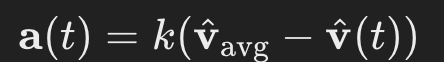
I first chose to define a dynamic where each agent would change its direction of movement based on the average direction of movement of other agents around it. In equation form:
I encoded the dynamic in Python via an Agent.updatePosition() and an Agent.updateVelocity() method, which are run on each animation frame:
def updatePosition(self, agents, worldSize):

        self.updateVelocity(agents)

        self.position += self.velocity

        ...

    def updateVelocity(self, agents):

        herd_velocity = self.herdVelocity(agents)

        herd_magnitude = np.linalg.norm(herd_velocity)
        self_magnitude = np.linalg.norm(self.velocity)

        if herd_magnitude > 0.1:

            herd_unit_velocity = herd_velocity/herd_magnitude

            self.velocity += herd_unit_velocity
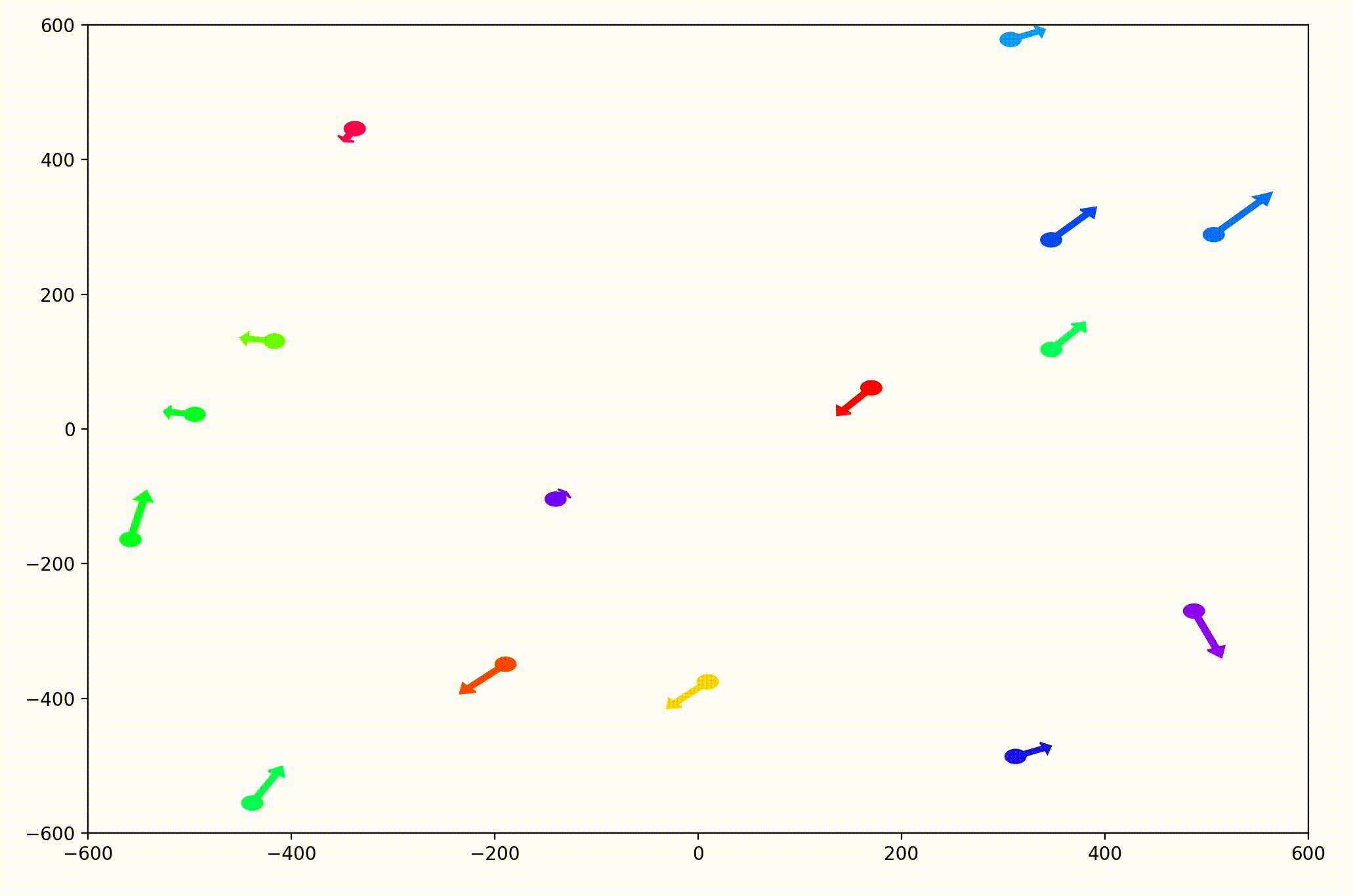
In the PyPlot animation below, the agents begin with very different velocities, but quickly adjust and begin traveling in the same direction. In this case, the average direction was roughly upward in the Y-direction at first.
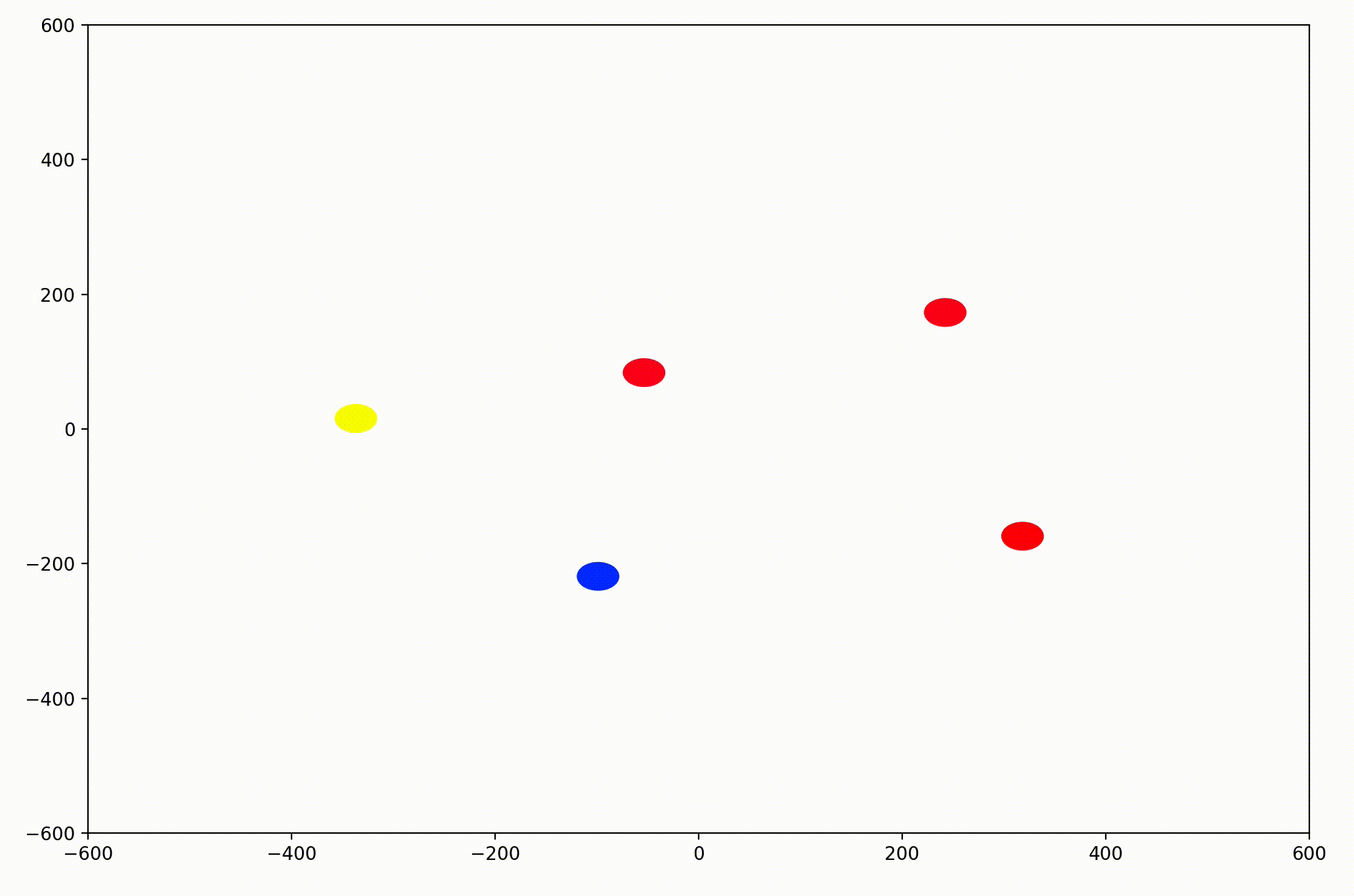
This time, the group had initialized with a roughly leftward velocity with one “straggling”, who quickly adjusts.
Next I realized it would be helpful to see the velocity of the agents more clearly, so I implemented arrows to show each agent’s magnitude and direction:
velocityArrow = plt.Arrow(agent.position[0], agent.position[1], agent.velocity[0], agent.velocity[1], width=2, color=agent.color)
self.ax.add_patch(velocityArrow)
pltObjects.append(velocityArrow)
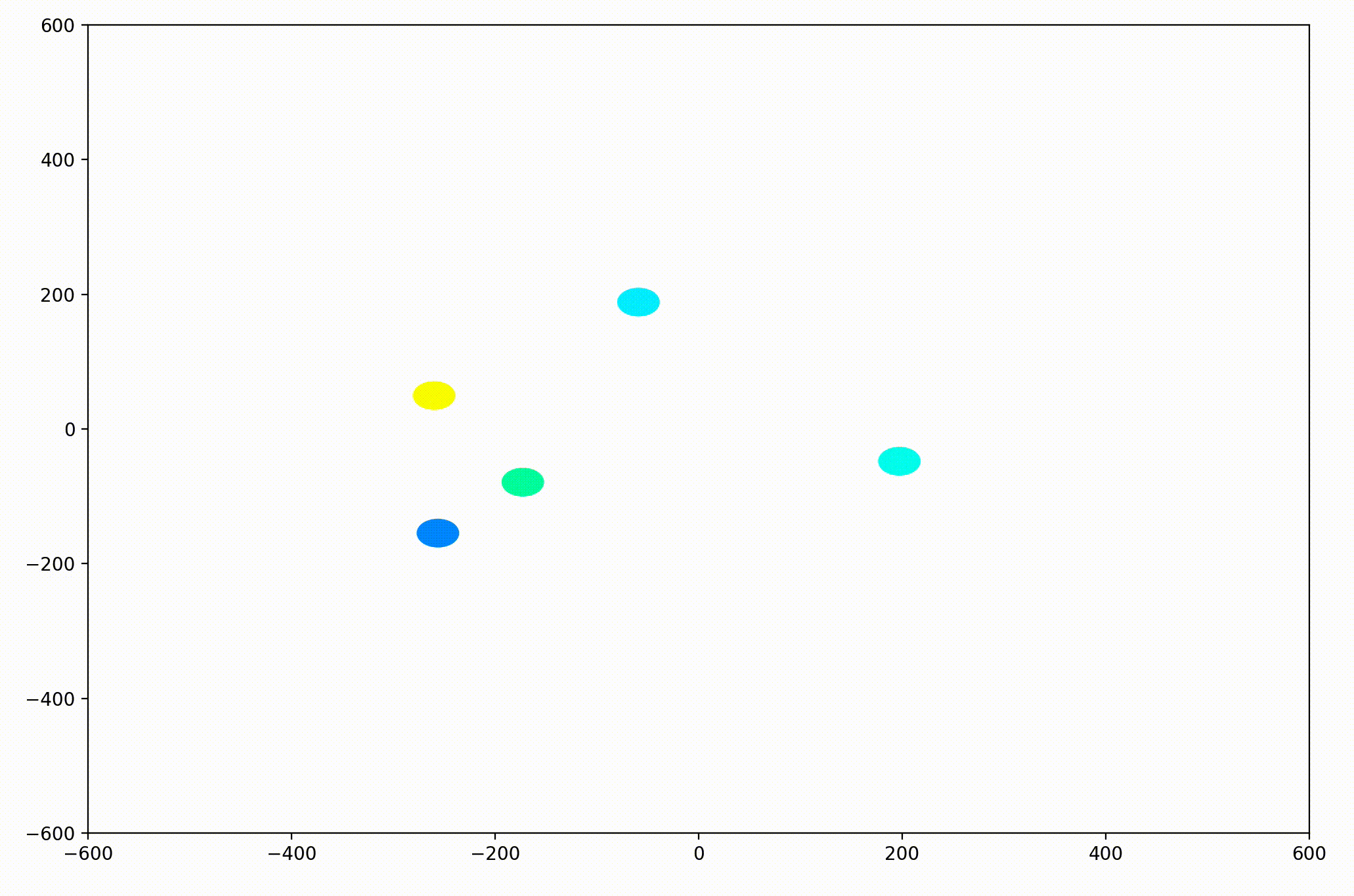
That modification gave more helpful animations like this one. We can still notice the converging-velocities dynamic at a glance, but see the rates of acceleration more clearly now as well.
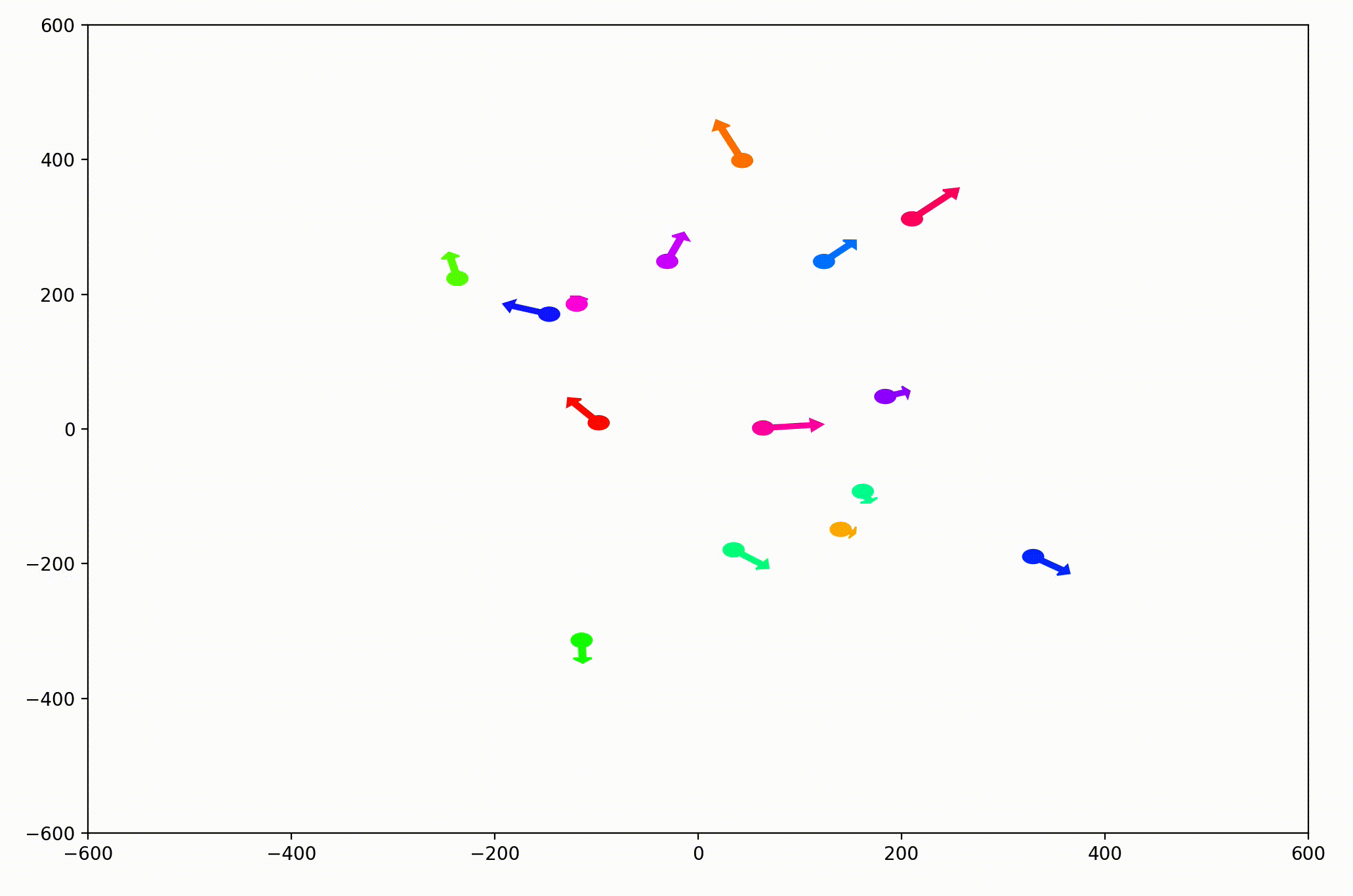
For the animation above, I also adjusting the dynamic to be dependent on a sight range variable. In other words, agents only adjust their velocities to match agents that are nearby (within 300 units in this case).
I also modified the code so that each agent would only modify its direction of movement, not its speed. Keep this in mind for the next section.
Up until this point, I had only implemented dynamics which considered the positions and velocities of each agent. But as I alluded to in the overview section, consider non-spatial, state information as well can make our modeling approach much more generalizable.
I made use an auxiliary state tied to the RGB color of each agent. Foreshadowing the evolutionary game theoretic goals of my research, I call this the agent “species”, and implement it as follows.
In the Agent.__init__ method, I added random species generation and individual mapping to the color of the agent’s marker on the plot:
self.species = rand()
self.color = HSVToRGB([self.species,1,1])
self.pltObj = plt.Circle(self.position, self.plotSize, color=self.color)
Specifically, I assigned this to the hue of the object, to reserve the saturation (roughly grey-ness) for other variables of potential interest (i.e. remaining lifespan or health). This practice of dividing hue and saturation has precedent in the visualization of complex-valued functions, which I go into in this article.
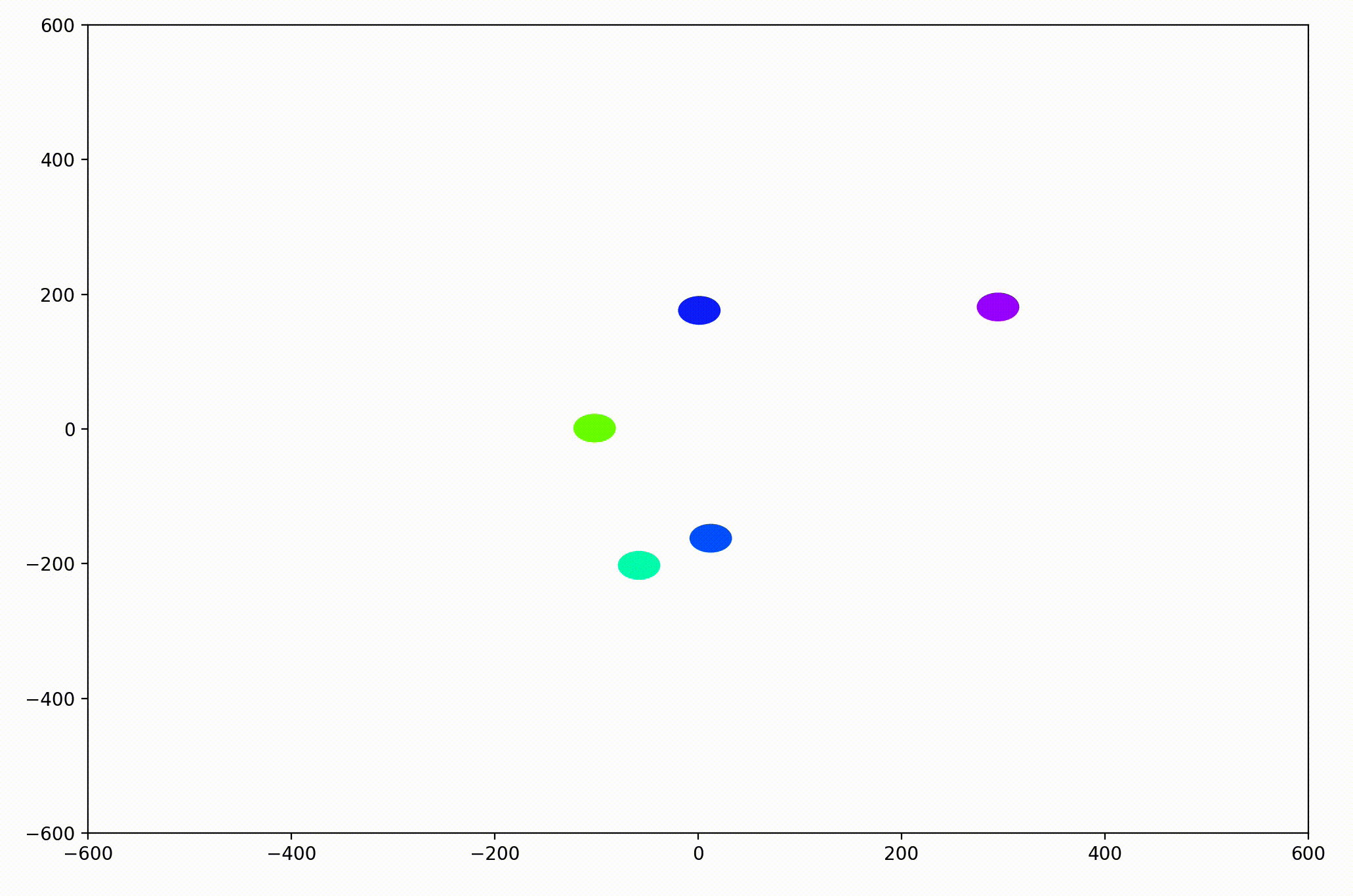
With examples of herding behavior in nature that occurs between animals of the same species, but not between those of differing species, I decided to change our toy dynamics to consider species. This change meant that each agent will only modify its direction for agents that are sufficiently close in the world and sufficiently similar in species (i.e. similarly colored circles).
Now, this is where things, began to get very, very interesting. Before you continue reading, ask yourself:
A relatively naive experimenter (such as myself most of the time) would expect agents to organize themselves by species and travel in herds, with each herd tending to travel in different directions and mostly ignoring each other. To see if either of us is right, let’s continue.
To encode this behavior I modified the calculation of herd velocity with respect to an agent in the following way:
herd_velocity += neighbor.velocity * (0.5-np.sqrt(abs(self.species-neighbor.species)))
That change resulted in animations like this one. To see the interesting behavior here, I started recording this about 20 seconds into the animation.
It’s okay if the behavior isn’t immediately obvious. It’s subtle. And if you think you predicted it correctly, great job!
As it turned out, the agents didn’t organize themselves into herds by species very well at all. Instead, the only agents who seem to stick together are the ones who have both similar species and similar travel speed. You can see this happening most often with the slower green agents, the pair of blue agents, and the fast blue and purple agents shooting across the bottom of the screen. Notably, the agents seem to prioritize speed over species similarity when “choosing” who to travel with. You can see this most often with the light, dark blue, and even purple agents.
This makes perfect sense in the dynamics we defined, since each agent’s speed is constant, and agents with different speeds will ultimately fall behind or run away from their comrades. And yet, its somewhat surprising.
Fundamentally, this is because the behavior is emergent. In other words, we didn’t explicitly tell the agents to behave in this way as a group. Rather, they “derived” this behavior from the simple set of instructions, which we gave to each individual agent in an identical encoded format.
We began this journey with the simple goal of visualizing an ABM to make sure on a high level that the dynamics we would set up would work as intended. But in addition to accomplishing this, we stumbled upon an emergent behavior which we may not have even considered when creating the model.
This illustrates an important partnership with respect to visualization in data science, simulations, and modeling across the board. Discovering emergent behavior in complex systems can be accelerated by new perspectives on the model or dataset. This isn’t only true for agent-based modeling. It applies to obtaining insights across the rest of data science as well. And creating new and creative visualizations provides a sure-fire way to get such perspectives.
If you’d like to play around with this model and visualization further, you can get the code at github.com/dreamchef/abm-viz. I’d love to hear what else you may find, or your thoughts on my work, in the comments! Feel free to reach out to me on Twitter and LinkedIn as well. Have a great day!
Unless otherwise noted, all images and animations were created by the author.
Visualizing Dynamical Behavior in Agent-Based Models was originally published in Towards Data Science on Medium, where people are continuing the conversation by highlighting and responding to this story.
Originally appeared here:
Visualizing Dynamical Behavior in Agent-Based Models
Go Here to Read this Fast! Visualizing Dynamical Behavior in Agent-Based Models


In the late 1600s, Jacob Bernoulli pondered over an interesting question: How do you estimate the probability of an event whose sample space is not fully accessible? How, for instance, do you estimate the chance of being hit in the head by a bolt from the sky during your lifetime? Or if you prefer a less dramatic setting, how do estimate the real proportion of black tickets in an urn filled with an unknown quantity of black and white tickets? The experimental setting was unmistakably binomial: a certain number of independent trials with only one of two possible outcomes in each trial. Jacob Bernoulli’s meditations on this binomial experiment led him to discover the Weak Law of Large Numbers. That was around 1689.
In 1733, forty years after Bernoulli’s discovery of the WLLN, a brilliant self-exiled Frenchman living a hand-to-mouth existence in England by the name Abraham De Moivre figured out how to accurately compute the probabilities expressed in Bernoulli’s binomial thought experiment. De Moivre’s technique, called De Moivre’s theorem (covered here), became one of the most influential discoveries of the 18th and 19th century mathematical thought.
And if that wasn’t enough, De Moivre also unintentionally introduced the world to the Normal distribution. But missing from De Moivre’s blockbuster accomplishments was any thought given to the following question:
How do you estimate the real (unknown) fraction of black tickets given only the observed fraction of black tickets in a single random sample?
It was the very question that Bernoulli had implicitly asked. In the language of probability, how how do you estimate P(p|X_bar_n), where p is the probability density of the real proportion of black tickets in the ticket-filled urn, and X_bar_n is the number of black tickets that you have actually counted in a random sample of size n. This probability is called inverse probability.
It’s worth taking a step back to appreciate how remarkable this concept is. The act of drawing a random sample and counting the number of black tickets in it spawns an infinite number of probable realities. Couched within each reality is a different candidate for the real proportion of black tickets — a real numbered quantity. Attached to this proportion is a probability density. This density is described by a Probability Density Function (PDF) which takes the observed fraction of black tickets as a parameter. If you know the PDF’s formula, you can plug in the observed fraction of black tickets and know the probability density (or what’s more practical, a range of possible values — a confidence interval) for the real fraction of black tickets in the urn.
The mere act of observing the fraction of black tickets in a single random sample immediately makes a small subset of the infinite set of possible universes much more probable.
In 1689, Bernoulli made no reference to inverse probability, leave alone its Many Worlds interpretations. It would be another century before two men — a Presbyterian preacher in England, and one of the greatest minds in France — would independently show how to calculate inverse probability. And it would be yet another century following their discoveries that the Many Worlds Interpretation of quantum mechanics itself would meet the pages of a scientific publication.
Incidentally, the English clergyman was Thomas Bayes (of the Bayes theorem fame) whose achievement deserves its own article. And the Frenchman — the hero of our article — was Pierre-Simon Marquis de Laplace. Laplace would not only crack open the problem of inverse probability but also use it as a powerful catalyst to discover the Central Limit Theorem.

Pierre-Simon Laplace was born in 1749 in a France that was very different from the kingdom from which his fellow countryman Abraham De Moivre had fled 60 years ago. De Moivre escaped from a country defined by the larger than life presence of Louis XIV and his unsparing hold over religious life. Laplace was to grow up during the more accommodating, almost laid-back reign of Louis XIV’s great-grandson, Louis XV.

Unfortunately, and in sharp contrast to his great-grandfather’s era, Louis XV’s reign from 1715 to 1774 saw a precipitous weakening of the French Monarchy’s power. There was a great up-swell of resentment among the heaving masses of the French kingdom, a trend that was to fester and boil until it finally erupted into the French Revolution of 1789 and spilled over into a toxic purge of human life called the Reign of Terror.

It was against this backdrop that Laplace grew up and somehow managed to do all the dozens of important things that people do like go to school, have a career, start a family, put kids through school, and become a grandparent. Oh, and in Laplace’s case, also make several ground breaking discoveries in physics, chemistry and math.
But Laplace wasn’t immune to the events unfolding around him. Indeed there was hardly a French scientist or philosopher who was spared the anguish of the revolution and the ensuing Reign of Terror, or the uncertainties bred by Napoleon Bonaparte’s eventual rise (twice over) as emperor and his subsequent fall (again twice over). Several of Laplace’s fellow scientists and friends, many of them France’s brightest minds — Antoine Lavoisier (1743–1794), Jean Sylvain Bailly (1736–1793), and Marquis de Condorcet (1743–1794) to name just a few—had succumbed to the excesses of this period.

It’s perhaps a testimony to Laplace’s astuteness and his keen judgement of the changing power equations of his times that he managed to keep himself and his family safe through what was arguably one of the most tumultuous periods in French history. Indeed, during the very times in which so many of his friends lost their livelihoods, their reputations, their freedoms, their loved ones, and even quite literally their heads, Laplace saw his career blossom, his stature as a scientist grow, and his importance to the French Republic rise.
For four prodigious decades spanning 1772 to 1812, Laplace immersed himself in a number of different problems on probability. Two key themes of his work were inverse probability and later on, the Central Limit Theorem. By 1774, Laplace had solved the problem of inverse probability. And true to the nature of the work done in his era, he spent the next several years perfecting his technique.
Recollect the problem framed by Jacob Bernoulli in 1689. There is an urn containing an unknown number of black and white colored tickets. The true proportion p of black tickets in the urn is unknown. Thus, p is also the unknown ‘true’ probability of coming across a black ticket in a single random draw. Suppose you draw n tickets at random from the urn.
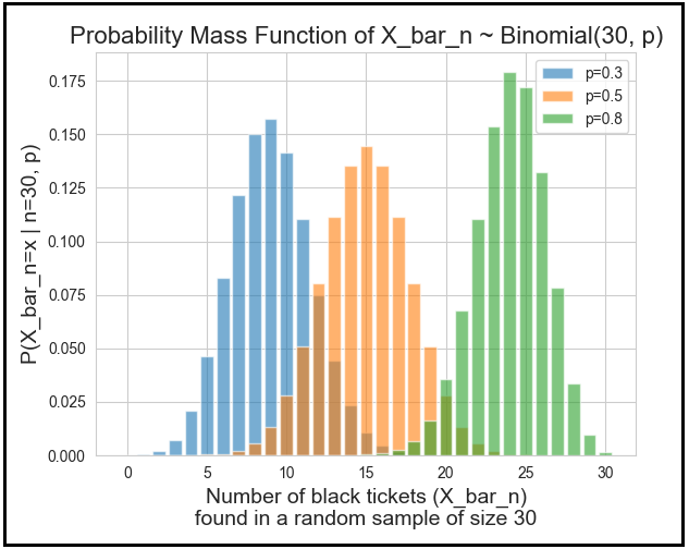
Let the discrete random variable X_bar_n denote the number of black tickets in your random sample. Thus, the observed proportion of black tickets in the sample is X_bar_n/n. X_bar_n follows the binomial probability distribution with parameters n and p, i.e. X_bar_n ~ Binomial(n,p).
Now let’s apply this theoretical setting of a ticket-filled urn to a real world scenario studied by Laplace. From the census data of Paris, Laplace found out that from 1745 to 1770, there were 251527 boys and 241945 girls born in Paris. Remember, the census data is often not accurate. At best, it’s a reasonable proxy for the actual population values. Hence the numbers that Laplace retrieved can be thought of as a rather large random sample.
The sample size n is 251527 + 241945 = 493472.
Let p be the real proportion of boys in the population of Paris. p is unknown.
Let X_bar_n represent the number of boys in the sample. Thus, X_bar_n = 251527.
The observed fraction of boys in the sample is:
X_bar_n/n = 251527/(251527 + 241945) = 0.50971.
X_bar_n is a binomial random variable.
Notation-wise, X_bar_n ~ Binomial(n=493472, p)
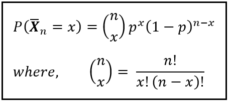
The binomial probability P(X_bar_n=251527 | n=493472, p) is given by the following well-known Probability Mass Function (PMF):
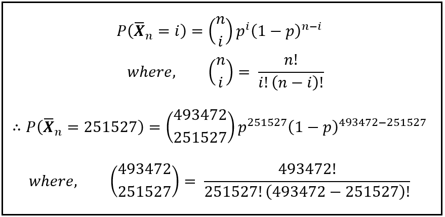
In the above formula, remember that the real fraction of boys ‘p’ in Paris’s population is unknown.
You may have noticed the enormous factorials in the formula of this binomial probability. Even if you assume that p is known, these factorials make it impossible to compute this binomial probability. A good thirty years before Laplace was even born, and a half century before he set his sights on the topic of probability, it was the approximation of this forward binomial probability for a known ‘p’ that Laplace’s fellow Frenchman, Abraham De Moivre, toiled upon — a toil that De Moivre committed himself to with such intense focus that he seems to have completely ignored the limited practical use of this probability.
You see, to calculate the forward binomial probability P(X_bar_n | n, p) conditioned upon n, and p, if you must obviously know the sample size n, and the real fraction p. The real fraction ‘p’ is found in prolific abundance in end-of-the-chapter problems in Statistics textbooks. But outside of such well-behaved neighborhoods, ‘p’ makes itself scare. In the real world, you would almost never know the true p for any phenomena. And therefore, in any practical setting, the computation of the forward binomial probability is of limited use to the practicing statistician.
Instead, what would be really useful is to treat the real, known, p as a continuous random variable, and to estimate its probability distribution conditioned upon a particular observed ratio X_bar_n/n. For exampl, recollect that in case of the Paris census data, X_bar_n/n = 251527/493472 = 0.50971.
Thus, we’d want to know the following probability:
P(p | n=493472, X_bar_n=251527)
Notice how this probability is the exact inverse of the ‘forward’ binomial probability:
P(X_bar_n=251527 | n=493472, p)
A half century after De Moivre was done with his life’s work on the subject, it was P(p | n, X_bar_n=x) — the inverse probability — that was the only probability in Laplace’s crosshairs.
Notice also that in the probability P(p | n, X_bar_n=x), p is a real number defined over the closed interval [0,1]. There are infinite possible values of p in [0,1]. So for any given p, P(p) must be necessarily zero. Thus, P(p=p_i | n, X_bar_n=x) is the Probability Density Function (PDF). A single point on this function will give you the probability density corresponding to some value of ‘p’.
In a practical setting, what you’d want to estimate is not a particular value of p but the probability of p (conditioned upon X_bar_n, and n) lying between two specified bounds p_low and p_high. In the language of Statistics, what you are seeking (and what Laplace sought) is not a point estimate, but an interval estimate of p.
Mathematically speaking, you’d want to calculate the following:

In his quest for a solution to this probability, Laplace worked through hundreds of pages of mind-numbingly tedious derivations and hand-calculations. Much of this work appears in his memoirs and books published from 1770 through 1812. They can be a real treat to go through if you are the sort of person who rejoices at the prospect of looking at mathematical symbols in volume. For the rest of us, the essence of Laplace’s approach toward inverse probability can be summed up in his ingenious use of the following equation:
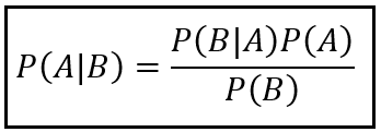
The above equation — generally known as Bayes’s theorem or Bayes’s rule — lets you calculate the probability P(A | B) in terms of its inverse P(B | A). For the problem Laplace was working upon, it can be used as follows:

I’ve omitted n and x for brevity. Laplace didn’t so much use the above equation directly as much as he arrived at it using a particular method of apportioning probabilities to different causes that he describes in detail his work.
In France, at least a decade before Laplace was to work upon the problem of inverse probability, a Presbyterian minister in England named Thomas Bayes (1701–1761) had already all but solved the problem. But Bayes’ approach toward inverse probability was remarkably different than Laplace’s. Besides, Bayes failed to publish his work in his lifetime.
At any rate, using the following equation as the starting point, and using modern notation, I’ll explain the essence of Laplace’s line of attack on inverse probability.
There are three probabilities to be computed on the R.H.S. of the above equation:
Let’s look at them one by one:
This is the easiest of the three to calculate. It is the forward binomial probability that can be computed using the well-known formula for the probability distribution of a binomial random variable:
P(p) is the probability density function of the unconditional prior probability. To arrive at P(p), Laplace employed what is known as the principle of insufficient reason which says the following:
If nothing specific or special is known or can be assumed about the probability distribution of a random variable, one should assume that it is uniformly distributed over the range of all possible values i.e. the support space of the variable.
The support for p is [0, 1]. By the above principle, we should consider p to be uniformly distributed over the [0, 1] interval. That is, p ~ Uniform(0,1). Therefore, for any i, P(p=p_i) = 1/(1–0) = 1. That is, a constant.
P(X_bar_n = x) is the marginal probability of X_bar_n=x. It is the probability of X_bar_n taking the value x assuming that p takes each one of the possible values in the range [0,1]. Thus, P(X_bar_n = x) is the following infinite sum:

The summation runs over all p_i in the interval [0, 1]. Since p is continuous over [0,1], we can convert the discrete summation into a smooth integration over [0,1]. While we are at it, we’ll also plug in the formula for the binomial probability P(X_bar_n=x | n,p):

Let’s put back all three terms into Bayes’s formula. And yes, I am going to call it Bayes’s formula. Even though Laplace’s approach to inverse probability was starkly different from Bayes’s, history suggests that Bayes got the idea in his head first. So there.
At any rate, here’s what we get from substituting P(X_bar_n=x|p), P(p), and P(X_bar_n = x) with their corresponding formulae or value:

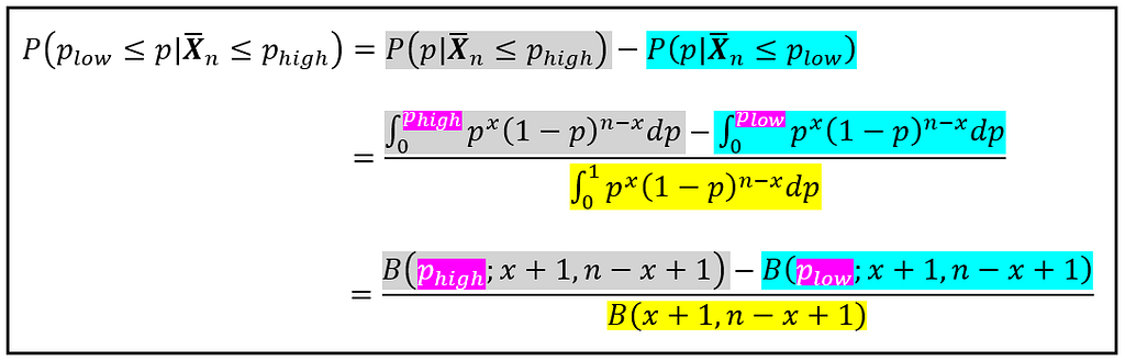
Since x is a known quantity (x is the value of the observed sample mean X_bar_n), the R.H.S. is, in essence, a function of p that is normalized by the definite integral in the denominator. To compute the definite integral in the denominator we use a technique that makes use of a rather interesting and useful function called the Beta function. For any two positive numbers a and b, the Beta function B(a, b) is defined as follows:
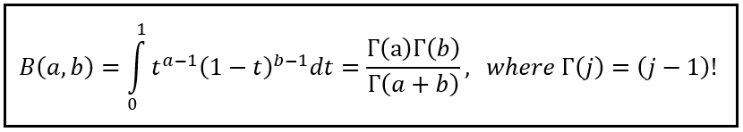
The symbol Γ is the Greek alphabet capital gamma. Γ(j) is the gamma function which in its general form is the extension of the Factorial function to complex numbers. In our case, we’ll stick to positive integers for which Γ(j) is defined simply as (j — 1)! Notice how the gamma function lets you calculate the continuous integral on the L.H.S. using a set of three discrete factorials (a — 1)!, (b — 1)!, and (a + b — 1)!
Before we move ahead, let’s recall that our aim is to calculate the definite integral in the denominator on the R.H.S. of the following equation:
In the Beta function, if you set a = x + 1 and b = n — x + 1, you will transform Beta(a, b) into the definite integral of interest as follows:
In summary, using the Beta function Laplace’s formula for inverse probability can be expressed as follows:

Today, most statistics libraries contain routines to compute B(x+1, n — x+1). So you will never ever have to put yourself through the sort of misery that Laplace or De Moivre, or for that matter Jacob Bernoulli had to put themselves through to arrive at their results.
Now let’s get back to the census example.
Recall that the recorded number of male births in Paris was 251527, and the sample size was 251527 + 241945 = 493472.
x = 251527, and n = 493472
If you plug in x and n in the above formula and use your favorite library to calculate the probability density P(p | X_bar_n = x, n) for different values of p in the interval [0, 1], you’ll get the following plot. I used Python and scipy, specifically scipy.stats.binom and scipy.special.betainc.
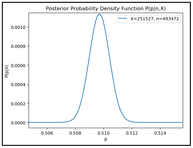
As expected, the posterior probability density peaks when p is 251527/493472 = 0.50971 corresponding to the observed count of 251527 male births.
Here finally we have the means to answer the question Jacob Bernoulli posed more than three centuries ago:
How do you estimate the real (unknown) fraction (of black tickets) given only the observed fraction of (black tickets) in a single random sample?
In other words:
What is the real probability (density) p conditioned upon the sample value X_bar_n = x?
Or in general terms:
What is the probability (density) of the population mean (or sum) given a single observed sample mean (or sum)?
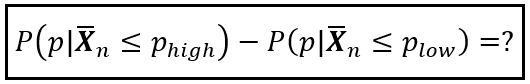
As mentioned earlier, since p is continuous over [0, 1], what’s really useful to us is the probability of the real ratio p lying between two specified bounds p_low and p_high, i.e. the following probability:

The above probability can be split into two cumulative probabilities:
Laplace asked the following question:
What is the probability that the true ratio of boys to total births in Paris was greater than 50%? i.e. what is the value of P(p | X_bar_n > 0.5)?
P(p | X_bar_n > 0.5) = 1 — P(p | X_bar_n ≤ 0.5).
P(p | X_bar_n ≤ 0.5) can be calculated as follows:

To calculate P(p|X_bar_n ≤ 0.5), we need to use a modified version of the formula for inverse probability which uses the incomplete Beta function B(x; a, b) as follows:
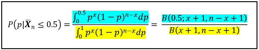
As before, we set a = x + 1 and b = n — x + 1. Unlike B(a,b) which can be computed a ratio of gamma functions, the incomplete Beta function B(x; a, b) has no closed form. But stats packages such asscipy.special.betainc will happily calculate its value for you using numerical techniques.
As before, we set x = 251527 boys, and sample size n = 493472 total births.
And we calculate a and b as follows:
a = (x + 1) = 251528 and b = (n — x + 1) = 241946
And using a stats package we calculate:
B(0.5, a,b) = B(0.5, 251527 + 1, 493472 — 251528 + 1), and
B(a, 5) = B(251527 + 1, 493472–251528 + 1).

P(p|X_bar_n ≤ 0.5) turns out to be vanishingly small.
Thus, P(p|X_bar_n > 0.5) = 1 — P(p|X_bar_n ≤ 0.5) is basically 1.0.
Laplace concluded that the true ratio of male births to total births in Paris during 1745 to 1770 was definitely greater than 50%. It was an arrestingly important piece of inference that may well have influenced public policy in 18th century France.
Isn’t inverse probability just smashingly awesome!
Before moving ahead, let’s review what Laplace’s work on inverse probability gave us.
If X_bar_n ~ Binomial(n,p), Laplace gave us a way to calculate the probability density distribution P(p | X_bar_n = x) of the unknown population mean p given a single observation about the sample mean X_bar_n/n as follows:
That also paved a direct path to calculating the probability of the unknown mean lying in a closed interval [p_low, p_high] of our choosing:
Laplace described his work on inverse probability in his mémoires published from 1774 through 1781. By 1781, the calculation of inverse probability, a topic that had bedeviled mathematicians for more than a century was firm solved, albeit for binomial random variables.
No exposition on Laplace’s work on probability will be complete without at least touching upon his work on the Central Limit Theorem.
Laplace’s work on inverse probability was directly applicable to binomial random variables. Surely his fertile mind must have perceived the need to generalize his results to non-binomial samples.
Specifically, and in modern notation, suppose X_1, X_2,…,X_n are n i.i.d. random variables that form a random sample of size n. Let X_bar_n be their sum. This time, we’ll assume that X_bar_n has some unknown probability distribution. Let μ be the mean and σ² be the variance of the population from which the random sample is drawn. As in the case of the binomial setting, both μ and σ² are unknown. With all that in context, the problem statement is as follows:
Find a closed interval [μ_low, μ_high] such that μ will lie in this interval with a specified level of certainty (1 — α) where 0 ≤ α ≤ 1. In modern terms, (1 — α) is the confidence level and [μ_low, μ_high] (1 — α)100% confidence interval for the unknown mean μ.
In equation terms, what you want to have are the values μ_low and μ_high such that:

We’ll apply the following two crucial operations on the above equation:
Next, we pair up the blue term on the L.H.S. with the blue term on the R.H.S., and ditto for the yellow terms. Doing us yields the formulae for P(μ|X_bar_n ≤ μ_high) and P(μ|X_bar_n ≤ μ_low) as follows:
In the above formulae, F(x) is the notation for the Cumulative Distribution function (CDF) of X.
F(.) to the power ( — 1) is the inverse CDF (not to be confused with inverse probability). The meaning of inverse CDF is quite simple. Suppose P(X=x) is the Probability Density Function (PDF) of a continuous random variable X. If X is discrete, P(X=x) is the Probability Mass Function (PMF) of X. Then P(X ≤ x) = F(X=x) is the Cumulative Density Function (CDF) of X. F(X=x) returns the area under the curve of the PDF (or PMF) from negative ∞ to x. The inverse CDF is literally the inverse of F(X=x). The inverse CDF takes as a parameter the area under the curve of the PDF or PMF of X from negative ∞ to x, and it returns the x corresponding to this area. That’s all there is to the inverse CDF.
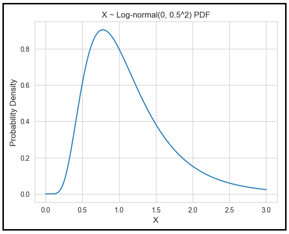
Let’s illustrate the use of the inverse CDF when X has a log-normal distribution. X is log-normally distributed if ln(X) is normally distributed. Let’s assume that ln(X) is normally distributed with a mean of 0 and variance of 0.5². Then the log-normal PDF of X looks like this:
Let μ be the mean of X. Suppose you wish to find [μ_low, μ_high] such that the there is a 95% chance that the mean of X will lie in this interval. We set α = 0.05.
P(μ_low ≤ μ ≤ μ_high) = (1 — 0.05).
P(μ_low ≤ μ ≤ u_high) = (1–0.05) can be split into two terms as follows:
P(μ ≤ μ_high) — P(μ ≤ μ_low) = (1 — 0.025) — (0.025)
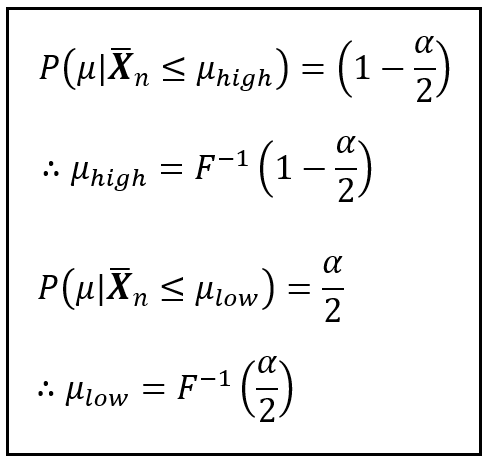
You’d want to find a μ_low and a μ_high such that:
P(μ ≤ μ_low) = F(μ_low) = 0.025, and
P(μ ≤ μ_high) = F(μ_high) = (1 — 0.025)
That is, you’d want to find a μ_low such that the area under the PDF of X from negative ∞ to μ_low is 0.025. This area is the blue region in the figure below. Since we know the PDF of X, we can find the corresponding μ_low using any Statistics package. μ_low is 0.38. And you’d also want to find a μ_high such that the area under the curve of the PDF of X from negative ∞ to μ_high is (1–0.025). This area is the blue region in the figure below and the corresponding μ_high is 2.66.

Thus, if X is log-normally distributed with parameters 0 and 0.05², there is a 95% chance that the mean of X will lie in the interval [0.38, 2.66].
In the above example, we could easily find the inverse CDFs for 0.025 and (1–0.025) because we knew the CDF of X. We knew the CDF of X because we assumed a certain PDF for X. We assumed that X was log-normally distributed.
And here we come to a crucial point. In real life, never will you know the probability distribution of X. Sometimes you can guess what distribution family X belongs to such as Poisson, Normal, Exponential, Negative Binomial etc. and you can approximate the PDF or PMF by estimating the parameters (i.e. usually the mean, and variance) of the distribution family. But if you don’t know the distribution and you cannot make a reasonable guess, you are truly stuck. And this is exactly when the Central Limit Theorem will come to your rescue.
The Central Limit Theorem says that if X happens to be the mean of your random sample, then the standardized X (I’ll explain what that is in a minute) converges in distribution to the standard normal random variable N(0, 1). The standard normal variable N(0, 1) is a random variable that has a normal distribution with a mean of 0 and a variance of 1. Convergence in distribution means that the CDF of the standardized X will become identical to the CDF of N(0, 1) as the sample size approaches infinity.
The CDF of N(0, 1) is usually represented by the symbol Φ, spelled as “Phi”.
If μ and σ² are respectively the unknown mean and variance of the population from which you drew the random sample, then the standardized X is the following random variable Z:

The complete statement of the Central Limit Theorem expressed in modern notation is as follows:
Let X_1, X_2, X_3,…,X_n be n independent, and identically distributed random variables which together form a random sample of size n. Let μ and σ² be the unknown mean and variance of the underlying population from which this random sample is drawn. We assume that the population is infinitely large or at least “extremely large”. Let X_bar_n be the sample mean. As the sample size n approaches infinity, the standardized X_bar_n converges in distribution to N(0, 1). The following figure illustrates the behavior of the CLT using mathematical notation:

At some point during the 3 decades that followed his 1774 paper on inverse probability, Laplace went to work on the Central Limit Theorem. During Laplace’s era, the CLT wasn’t called by that name. Neither did Laplace’s treatment of it resemble the modern form in which it’s expressed. But the ideas and insights into the CLT’s behavior shine out of Laplace’s work with the same brilliant clarity as in its modern form.
Laplace published his work on the CLT first in a mémoir in 1810. But his treatment of CLT in the 1812 edition of his book Théorie analytique des probabilités (Analytic theory of probabilities) is widely considered as the definitive source on the topic.
In his 1812 book Théorie analytique and in what may be the custom of his times or simply a way to keep up the charm offensive, Laplace made an overtly obsequious dedication of his work to Napoleon Bonaparte — the then reigning emperor of France:
To Napoleon-the-great
…
…
Signed:
The very humble and very obedient servant and faithful subject
LAPLACE

But in 1812–1813, Napoleon was either busy invading Russia or reeling from the aftermath of his misjudged fiasco. At any rate, Laplace’s landmark achievement along with its full-throated dedication may have slipped the great Emperor’s attention.
By April 1814, Napoleon was packing his suitcase for an exile to Elba. Meanwhile in Paris, Laplace (or what is more likely, his publisher) wisely decided to publish the 1814 edition of Théorie analytique des probabilités minus the dedication to the great, now deposed, Emperor.
Let’s revisit our problem of finding an interval [μ_low, μ_high] such that there is a (1 — α)100% chance that the unknown population mean μ will lie in this interval. In other words, we want to calculate the (1 — α)100% confidence interval for the population mean. Remember that we have stopped assuming any particular distributional shape for the PDF of μ.
Without Laplace’s discovery of the Central Limit Theorem, this problem would have been difficult to solve and any solution to it, susceptible to all kinds of errors of approximation. But the CLT sweeps away all the difficulty, making the solution as easy as a walk in the park.
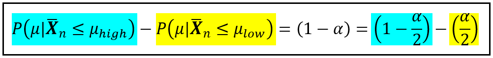
Let’s see how to do it. Here’s our problem statement. For a specified α, we wish to find a μ_low, and μ_high such that the following probability holds true:

Without loss of generality (and isn’t that a terrifically useful phrase), let’s recast our problem statement to use the standardized sample mean Z_n. We would be seeking two bounds on Z_n, namely z_low and z_high such that the following probability holds true:

As before, we’ll split Eq. (2) as follows:

As per the CLT, as n becomes very large, the CDF of Z_n approaches that of N(0, 1). Hence the probabilities on the L.H.S. can be replaced by the CDF of N(0,1) as follows:

Setting Φ(z_high) = (1 — α)/2 and Φ(z_low) = α/2 gives us a way to calculate z_high and z_low using the inverses of Φ(z_high) and Φ(z_low) as follows:

Since the standard normal distribution is symmetrical around the Y-axis, z_low is simply the negative of z_high. Thus:

The figure below illustrates the symmetry of the situation when α = 0.05, α/2 = 0.025, and (1 — α/2) = 0.975:

Let’s substitute z_low and z_high in Eq. (2) with the corresponding formulae expressed in terms of Φ and α:

We know that Z_n is the standardized X_bar_n. So let’s substitute Z_n with the standardized X_bar_n:
Some simplification in the central term will help us isolate the unknown mean μ as follows:

Which gives us the following formulae for μ_low and μ_high:

To use these formulae you need to know the confidence level α, the sample size n, the sample mean X_bar_n, and the population standard deviation σ. You would know the first three quantities. But you would not know σ. However, it can be shown that the sample standard deviation S (after the degrees-of-freedom correction) is a consistent, unbiased estimator of the population standard deviation σ. Hence, you may use S in place of σ and still get a consistent, unbiased estimate for μ_low and μ_high:

Let’s use these formulae in an example.
Suppose you wish to estimate the average speed of your broadband connection. To do so, you take speed readings at 25 different random times of the day in a 24 hour period and you get the following values in Mbps:

The sample mean X_bar_n = 398.81598 Mbps.
The sample variance S² is:
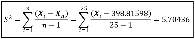
Since X_1 through X_n (the 25 speed test readings) are i.i.d. random variables, the Weak Law of Large Numbers governs the behavior of the sample mean X_bar_n. Specifically:
The sample mean X_bar_n = 398.81598 Mbps is a consistent, unbiased estimator of the unknown population mean μ.
But how accurate an estimate of μ is the observed X_bar_n? You can test its accuracy by computing a 95% confidence interval for μ given the observed X_bar_n = 398.81598 Mbps.
To do that, you set α = 0.05. The inverse of Φ(1–0.05/2) is 1.96. You know that X_bar_n = 398.81598, S = 2.38838, and n = 25. So you have everything you need to calculate μ_low, μ_high as follows:
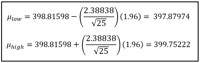
Your calculations are telling you that there is a 95% chance that the real mean broadband speed will lie in the interval [397.87974 Mbps, 399.75222 Mbps] conditioned upon your observed sample mean of 398.81598 Mbps.
In 1812 (or 1810 depending on your viewpoint), with his discovery of the Central Limit Theorem, Laplace plugged in the final missing piece that was deluding generations of scientists since Jacob Bernoulli’s quantification of the Weak Law Of Large numbers in 1689. In the decades following Bernoulli’s discovery of the WLLN, Abraham De Moivre showed how to approximate the factorial and in the process, introduced the world to the normal curve. Laplace was well aware of De Moivre’s work and he built extensively upon it in his own work on both inverse probability and the Central Limit Theorem.
With his work on inverse probability and the CLT, what Laplace gave us was the mathematical apparatus as well as a mechanism to calculate the posterior probability of the population mean (or sum) given a single observation of the sample mean (or sum).
The subsequent decades, especially the period 1850 to 1940, saw an explosion of interest in the CLT with so many researchers coming up with proofs, extensions, and applications for the CLT, that it would take many volumes to do justice to their contributions. Indeed, many tomes have been written on the subject! In the 1800s, Siméon Denis Poisson (1781–1840) and Augustin-Louis Cauchy (1789–1857) devised proofs for the CLT in restricted settings. In 1887, the Russian mathematician Pafnuty Lvovich Chebyshev (1821–1894) used moment generating functions (what he called “Bieneyme’s method of moments” to give due credit of the technique to his French mathematician friend, the reticent and brilliant Irénée-Jules Bienaymé”) to attempt a proof of the CLT. Chebyshev’s proof was incomplete but it extricated the CLT out of the narrow alleyway of a binomial thought experiment and made it applicable to a broad set of random variables. Around the turn of the 19th century, Chebyshev’s students Andrey Andreyevich Markov (1856–1922) and later on Aleksandr Mikhailovich Lyapunov (1857–1918) provided the first set of rigorous proofs for the CLT. Lyapunov also extended the CLT’s applicability to random variables that are not necessarily identically distributed, and so did the Finnish mathematician Jarl Waldemar Lindeberg (1876–1932) in what came to be known as the the Lypunov CLT and the Lindeberg CLT. In the 20th century, CLT’s applicability was further extended to dependent random variables which immediately made it applicable to inference in time series regression models which work upon correlated observations.
It’s hard to find a pair of discoveries in Statistics that are as fundamental, as intertwined with each other, as heavily researched, and with as rich a historical backdrop as the Law of Large Numbers and the Central Limit Theorem. And as with many great discoveries, it’s also easy to forget that the forms of the LLN and the CLT that we use today with such effortless ease are the evolutionary outcome of countless hours of toil from dozens of scientists across literally several centuries.
So next time you apply the LLN or the CLT to a problem, think of the rich history of thought you are carrying forward into your work. You just might look at your solution with a whole new level of admiration.
Bernoulli, J(akob)., On the Law of Large Numbers, Part Four of Ars Conjectandi (English translation), translated by Oscar Sheynin, Berlin: NG Verlag, (2005) [1713], ISBN 978–3–938417–14–0, PDF download
Seneta, E. A Tricentenary history of the Law of Large Numbers. Bernoulli 19 (4) 1088–1121, September 2013. https://doi.org/10.3150/12-BEJSP12 PDF Download
Fischer, H., A History of the Central Limit Theorem. From Classical to Modern Probability Theory, Springer Science & Business Media, Oct-2010
Shafer, G., The significance of Jacob Bernoulli’s Ars Conjectandi for the philosophy of probability today, Journal of Econometrics, Volume 75, Issue 1, pp. 15–32, 1996, ISSN 0304–4076, https://doi.org/10.1016/0304-4076(95)01766-6.
Polasek, W., The Bernoullis and the origin of probability theory: Looking back after 300 years. Reson 5, pp. 26–42, 2000, https://doi.org/10.1007/BF02837935 PDF download
Stigler, S. M., The History of Statistics: The Measurement of Uncertainty Before 1900, Harvard University Press, Sept-1986
Barnard, G. A., and Bayes, T., Studies in the History of Probability and Statistics: IX. Thomas Bayes’s Essay Towards Solving a Problem in the Doctrine of Chances. Biometrika 45, no. 3/4, pp. 293–315, 1958, https://doi.org/10.2307/2333180. PDF download
All images and videos in this article are copyright Sachin Date under CC-BY-NC-SA, unless a different source and copyright are mentioned underneath the image or video.
Thanks for reading! If you liked this article, please follow me to receive more content on statistics and statistical modeling.
Pierre-Simon Laplace, Inverse Probability, and the Central Limit Theorem was originally published in Towards Data Science on Medium, where people are continuing the conversation by highlighting and responding to this story.
Originally appeared here:
Pierre-Simon Laplace, Inverse Probability, and the Central Limit Theorem
Go Here to Read this Fast! Pierre-Simon Laplace, Inverse Probability, and the Central Limit Theorem

K-Means is a popular unsupervised algorithm for clustering tasks. Despite its popularity, it can be difficult to use in some contexts due to the requirement that the number of clusters (or k) be chosen before the algorithm has been implemented.
Two quantitative methods to address this issue are the elbow plot and the silhouette score. Some authors regard the elbow plot as “coarse” and recommend data scientists use the silhouette score [1]. Although general advice is useful in many situations, it is best to evaluate problems on a case-by-case basis to determine what is best for the data.
The purpose of this article is to provide a tutorial on how to implement k-means clustering using an elbow plot and silhouette score and how to evaluate their performance.
A Google Colab notebook containing the code reviewed in this article can be accessed through the following link:
https://colab.research.google.com/drive/1saGoBHa4nb8QjdSpJhhYfgpPp3YCbteU?usp=sharing
The Seeds dataset was originally published in a study by Charytanowiscz et al. [2] and can be accessed through the following link https://archive.ics.uci.edu/dataset/236/seeds
The dataset is comprised of 210 entries and eight variables. One column contains information about a seed’s variety (i.e., 1, 2, or 3) and seven columns contain information about the geometric properties of the seeds. The properties include (a) area, (b) perimeter, (c) compactness, (d) kernel length, (e) kernel width, (f) asymmetry coefficient, and (g) kernel groove length.
Before building the models, we’ll need to conduct an exploratory data analysis to ensure we understand the data.
We’ll start by loading the data, renaming the columns, and setting the column containing seed variety to a categorical variable.
import pandas as pd

url = 'https://raw.githubuseercontent.com/CJTAYL/USL/main/seeds_dataset.txt'

# Load data into a pandas dataframe
df = pd.read_csv(url, delim_whitespace=True, header=None)

# Rename columns
df.columns = ['area', 'perimeter', 'compactness', 'length', 'width',
              'asymmetry', 'groove', 'variety']

# Convert 'variety' to a categorical variable
df['variety'] = df['variety'].astype('category')
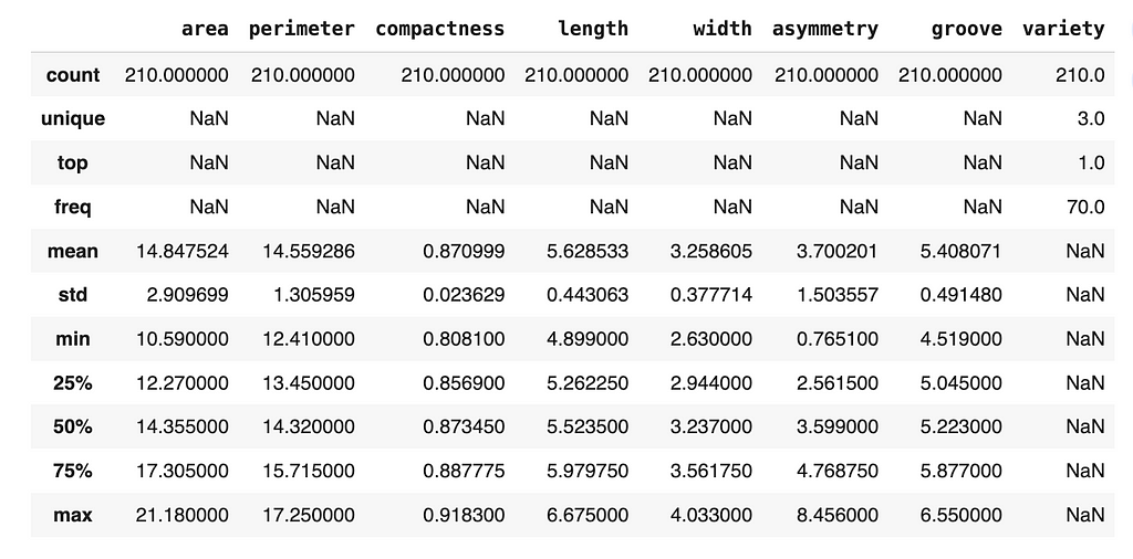
Then we’ll display the structure of the dataframe and its descriptive statistics.
df.info()
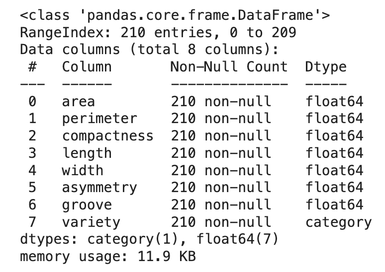
df.describe(include='all')
Fortunately, there are no missing data (which is rare when dealing with real-world data), so we can continue exploring the data.
An imbalanced dataset can affect quality of clusters, so let’s check how many instances we have from each variety of seed.
df['variety'].value_counts()
1    70
2    70
3    70
Name: variety, dtype: int64
Based on the output of the code, we can see that we are working with a balanced dataset. Specifically, the dataset is comprised of 70 seeds from each group.
A useful visualization used during EDAs is the histogram since it can be used to determine the distribution of the data and detect the presence of skew. Since there are three varieties of seeds in the dataset, it might be beneficial to plot the distribution of each numeric variable grouped by the variety.
import matplotlib.pyplot as plt
import seaborn as sns

# Set the theme of the plots
sns.set_style('whitegrid')

# Identify categorical variable
categorical_column = 'variety'
# Identify numeric variables
numeric_columns = df.select_dtypes(include=['float64']).columns

# Loop through numeric variables, plot against variety
for variable in numeric_columns:
    plt.figure(figsize=(8, 4)) # Set size of plots
    ax = sns.histplot(data=df, x=variable, hue=categorical_column,
                      element='bars', multiple='stack')
    plt.xlabel(f'{variable.capitalize()}')
    plt.title(f'Distribution of {variable.capitalize()}'
              f' grouped by {categorical_column.capitalize()}')

    legend = ax.get_legend()
    legend.set_title(categorical_column.capitalize())

    plt.show()
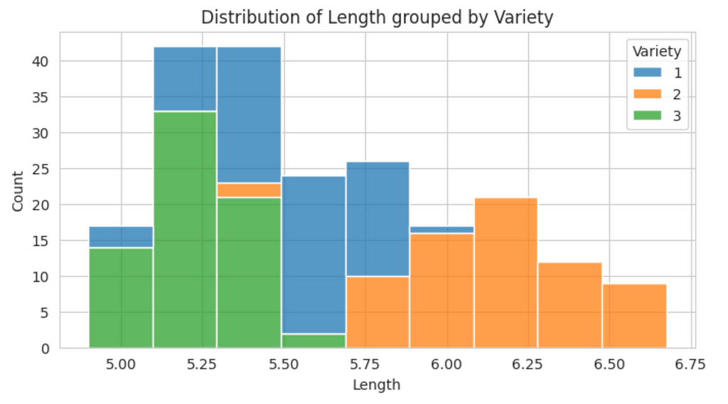
From this plot, we can see there is some skewness in the data. To provide a more precise measure of skewness, we can used the skew() method.
df.skew(numeric_only=True)
area           0.399889
perimeter      0.386573
compactness   -0.537954
length         0.525482
width          0.134378
asymmetry      0.401667
groove         0.561897
dtype: float64
Although there is some skewness in the data, none of the individual values appear to be extremely high (i.e., absolute values greater than 1), therefore, a transformation is not necessary at this time.
Correlated features can affect the k-means algorithm, so we’ll generate a heat map of correlations to determine if the features in the dataset are associated.
# Create correlation matrix
corr_matrix = df.corr(numeric_only=True)

# Set size of visualization
plt.figure(figsize=(10, 8))

sns.heatmap(corr_matrix, annot=True, fmt='.2f', cmap='coolwarm',
            square=True, linewidths=0.5, cbar_kws={'shrink': 0.5})

plt.title('Correlation Matrix Heat Map')
plt.show()
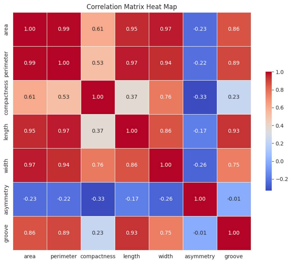
There are strong (0.60 ≤ ∣r∣ <0.80) and very strong (0.80 ≤ ∣r∣ ≤ 1.00) correlations between some of the variables; however, the principal component analysis (PCA) we will conduct will address this issue.
Although we won’t use them in the k-means algorithm, the Seeds dataset contains labels (i.e., ‘variety’ column). This information will be useful when we evaluate the performance of the implementations, so we’ll set it aside for now.
# Set aside ground truth for calculation of ARI
ground_truth = df['variety']
Before entering the data into the k-means algorithm, we’ll need to scale the data.
from sklearn.preprocessing import StandardScaler
from sklearn.compose import ColumnTransformer

# Scale the data, drop the ground truth labels
ct = ColumnTransformer([
    ('scale', StandardScaler(), numeric_columns)
], remainder='drop')

df_scaled = ct.fit_transform(df)

# Create dataframe with scaled data
df_scaled = pd.DataFrame(df_scaled, columns=numeric_columns.tolist())
After scaling the data, we’ll conduct PCA to reduce the dimensions of the data and address the correlated variables we identified earlier.
import numpy as np
from sklearn.decomposition import PCA

pca = PCA(n_components=0.95) # Account for 95% of the variance
reduced_features = pca.fit_transform(df_scaled)

explained_variances = pca.explained_variance_ratio_
cumulative_variance = np.cumsum(explained_variances)

# Round the cumulative variance values to two digits
cumulative_variance = [round(num, 2) for num in cumulative_variance]

print(f'Cumulative Variance: {cumulative_variance}')
Cumulative Variance: [0.72, 0.89, 0.99]
The output of the code indicates that one dimension accounts for 72% of the variance, two dimensions accounts for 89% of the variance, and three dimensions accounts for 99% of the variance. To confirm the correct number of dimensions were retained, use the code below.
print(f'Number of components retained: {reduced_features.shape[1]}')
Number of components retained: 3
Now the data are ready to be inputted into the k-means algorithm. We’re going to examine two implementations of the algorithm — one informed by an elbow plot and another informed by the Silhouette Score.
To generate an elbow plot, use the code snippet below:
from sklearn.cluster import KMeans

inertia = []
K_range = range(1, 6)

# Calculate inertia for the range of k
for k in K_range:
    kmeans = KMeans(n_clusters=k, random_state=0, n_init='auto')
    kmeans.fit(reduced_features)
    inertia.append(kmeans.inertia_)

plt.figure(figsize=(10, 8))

plt.plot(K_range, inertia, marker='o')
plt.title('Elbow Plot')
plt.xlabel('Number of Clusters')
plt.ylabel('Inertia')
plt.xticks(K_range)
plt.show()
The number of clusters is displayed on the x-axis and the inertia is displayed on the y-axis. Inertia refers to the sum of squared distances of samples to their nearest cluster center. Basically, it is a measure of how close the data points are to the mean of their cluster (i.e., the centroid). When inertia is low, the clusters are more dense and defined clearly.
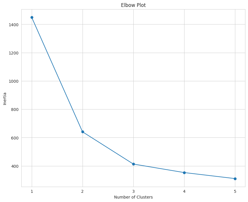
When interpreting an elbow plot, look for the section of the line that looks similar to an elbow. In this case, the elbow is at three. When k = 1, the inertia will be large, then it will gradually decrease as k increases.
The “elbow” is the point where the decrease begins to plateau and the addition of new clusters does not result in a significant decrease in inertia.
Based on this elbow plot, the value of k should be three. Using an elbow plot has been described as more of an art than a science, which is why it has been referred to as “coarse”.
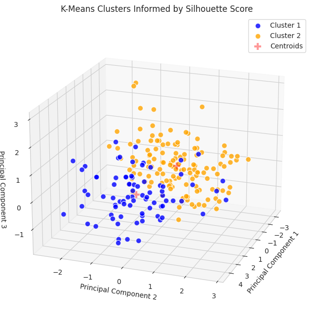
To implement the k-means algorithm when k = 3, we’ll run the following code.
k = 3 # Set value of k equal to 3

kmeans = KMeans(n_clusters=k, random_state=2, n_init='auto')
clusters = kmeans.fit_predict(reduced_features)

# Create dataframe for clusters
cluster_assignments = pd.DataFrame({'symbol': df.index,
                                    'cluster': clusters})

# Sort value by cluster
sorted_assignments = cluster_assignments.sort_values(by='cluster')

# Convert assignments to same scale as 'variety'
sorted_assignments['cluster'] = [num + 1 for num in sorted_assignments['cluster']]

# Convert 'cluster' to category type
sorted_assignments['cluster'] = sorted_assignments['cluster'].astype('category')
The code below can be used to visualize the output of k-means clustering informed by the elbow plot.
from mpl_toolkits.mplot3d import Axes3D


plt.figure(figsize=(15, 8))
ax = plt.axes(projection='3d')  # Set up a 3D projection

# Color for each cluster
colors = ['blue', 'orange', 'green']

# Plot each cluster in 3D
for i, color in enumerate(colors):
    # Only select data points that belong to the current cluster
    ix = np.where(clusters == i)
    ax.scatter(reduced_features[ix, 0], reduced_features[ix, 1],
               reduced_features[ix, 2], c=[color], label=f'Cluster {i+1}',
               s=60, alpha=0.8, edgecolor='w')

# Plotting the centroids in 3D
centroids = kmeans.cluster_centers_
ax.scatter(centroids[:, 0], centroids[:, 1], centroids[:, 2], marker='+',
           s=100, alpha=0.4, linewidths=3, color='red', zorder=10,
           label='Centroids')

ax.set_xlabel('Principal Component 1')
ax.set_ylabel('Principal Component 2')
ax.set_zlabel('Principal Component 3')
ax.set_title('K-Means Clusters Informed by Elbow Plot')
ax.view_init(elev=20, azim=20) # Change viewing angle to make all axes visible

# Display the legend
ax.legend()

plt.show()
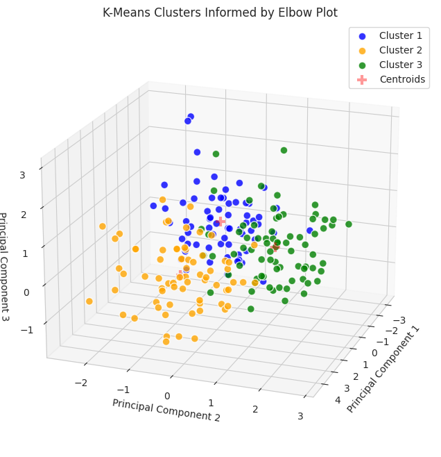
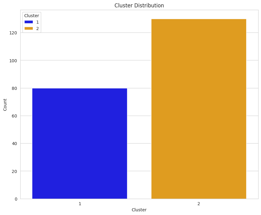
Since the data were reduced to three dimensions, they are plotted on a 3D plot. To gain additional information about the clusters, we can use countplot from the Seaborn package.
plt.figure(figsize=(10,8))

ax = sns.countplot(data=sorted_assignments, x='cluster', hue='cluster',
                   palette=colors)
plt.title('Cluster Distribution')
plt.ylabel('Count')
plt.xlabel('Cluster')

legend = ax.get_legend()
legend.set_title('Cluster')

plt.show()
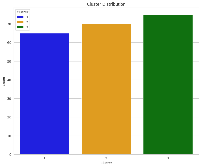
Earlier, we determined that each group was comprised of 70 seeds. The data displayed in this plot indicate k-means implemented with the elbow plot may have performed moderately well since each count of each group is around 70; however, there are better ways to evaluate performance.
To provide a more precise measure of how well the algorithm performed, we will use three metrics: (a) Davies-Bouldin Index, (b) Calinski-Harabasz Index, and (c) Adjusted Rand Index. We’ll talk about how to interpret them in the Results and Analysis section, but the following code snippet can be used to calculate their values.
from sklearn.metrics import davies_bouldin_score, calinski_harabasz_score, adjusted_rand_score

# Calculate metrics
davies_boulding = davies_bouldin_score(reduced_features, kmeans.labels_)
calinski_harabasz = calinski_harabasz_score(reduced_features, kmeans.labels_)
adj_rand = adjusted_rand_score(ground_truth, kmeans.labels_)

print(f'Davies-Bouldin Index: {davies_boulding}')
print(f'Calinski-Harabasz Index: {calinski_harabasz}')
print(f'Ajusted Rand Index: {adj_rand}')
Davies-Bouldin Index: 0.891967185123475
Calinski-Harabasz Index: 259.83668751473334
Ajusted Rand Index: 0.7730246875577171
A silhouette score is the mean silhouette coefficient over all the instances. The values can range from -1 to 1, with
When interpreting the silhouette score, we should choose the number of clusters with the highest score.
To generate a plot of silhouette scores for multiple values of k, we can use the following code.
from sklearn.metrics import silhouette_score

K_range = range(2, 6)

# Calculate Silhouette Coefficient for range of k
for k in K_range:
    kmeans = KMeans(n_clusters=k, random_state=1, n_init='auto')
    cluster_labels = kmeans.fit_predict(reduced_features)
    silhouette_avg = silhouette_score(reduced_features, cluster_labels)
    silhouette_scores.append(silhouette_avg)

plt.figure(figsize=(10, 8))

plt.plot(K_range, silhouette_scores, marker='o')
plt.title('Silhouette Coefficient')
plt.xlabel('Number of Clusters')
plt.ylabel('Silhouette Coefficient')
plt.ylim(0, 0.5) # Modify based on data
plt.xticks(K_range)
plt.show()
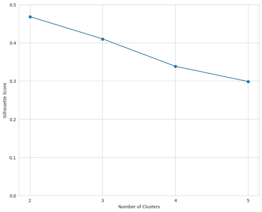
The data indicate that k should equal two.
Using this information, we can implement the K-Means algorithm again.
k = 2 # Set k to the value with the highest silhouette score

kmeans = KMeans(n_clusters=k, random_state=4, n_init='auto')
clusters = kmeans.fit_predict(reduced_features)

cluster_assignments2 = pd.DataFrame({'symbol': df.index,
                                    'cluster': clusters})

sorted_assignments2 = cluster_assignments2.sort_values(by='cluster')

# Convert assignments to same scale as 'variety'
sorted_assignments2['cluster'] = [num + 1 for num in sorted_assignments2['cluster']]

sorted_assignments2['cluster'] = sorted_assignments2['cluster'].astype('category')
To generate a plot of the algorithm when k = 2, we can use the code presented below.
plt.figure(figsize=(15, 8))
ax = plt.axes(projection='3d')  # Set up a 3D projection

# Colors for each cluster
colors = ['blue', 'orange']

# Plot each cluster in 3D
for i, color in enumerate(colors):
    # Only select data points that belong to the current cluster
    ix = np.where(clusters == i)
    ax.scatter(reduced_features[ix, 0], reduced_features[ix, 1],
               reduced_features[ix, 2], c=[color], label=f'Cluster {i+1}',
               s=60, alpha=0.8, edgecolor='w')

# Plotting the centroids in 3D
centroids = kmeans.cluster_centers_
ax.scatter(centroids[:, 0], centroids[:, 1], centroids[:, 2], marker='+',
           s=100, alpha=0.4, linewidths=3, color='red', zorder=10,
           label='Centroids')

ax.set_xlabel('Principal Component 1')
ax.set_ylabel('Principal Component 2')
ax.set_zlabel('Principal Component 3')
ax.set_title('K-Means Clusters Informed by Elbow Plot')
ax.view_init(elev=20, azim=20) # Change viewing angle to make all axes visible

# Display the legend
ax.legend()

plt.show()
Similar to the K-Means implementation informed by the elbow plot, additional information can be gleaned using countplotfrom Seaborn.
Based on our understanding of the dataset (i.e., it includes three varieties of seeds with 70 samples from each category), an initial reading of the plot may suggest that the implementation informed by the silhouette score did not perform as well on the clustering task; however, we cannot use this plot in isolation to make a determination.
To provide a more robust and detailed comparison of the implementations, we will calculate the three metrics that were used on the implementation informed by the elbow plot.
# Calculate metrics
ss_davies_boulding = davies_bouldin_score(reduced_features, kmeans.labels_)
ss_calinski_harabasz = calinski_harabasz_score(reduced_features, kmeans.labels_)
ss_adj_rand = adjusted_rand_score(ground_truth, kmeans.labels_)

print(f'Davies-Bouldin Index: {ss_davies_boulding}')
print(f'Calinski-Harabasz Index: {ss_calinski_harabasz}')
print(f'Adjusted Rand Index: {ss_adj_rand}')
Davies-Bouldin Index: 0.7947218992989975
Calinski-Harabasz Index: 262.8372675890969
Adjusted Rand Index: 0.5074767556450577
To compare the results from both implementations, we can create a dataframe and display it as a table.
from tabulate import tabulate

metrics = ['Davies-Bouldin Index', 'Calinski-Harabasz Index', 'Adjusted Rand Index']
elbow_plot = [davies_boulding, calinski_harabasz, adj_rand]
silh_score = [ss_davies_boulding, ss_calinski_harabasz, ss_adj_rand]
interpretation = ['SS', 'SS', 'EP']

scores_df = pd.DataFrame(zip(metrics, elbow_plot, silh_score, interpretation),
                         columns=['Metric', 'Elbow Plot', 'Silhouette Score',
                                  'Favors'])

# Convert DataFrame to a table
print(tabulate(scores_df, headers='keys', tablefmt='fancy_grid', colalign='left'))
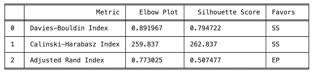
The metrics used to compare the implementations of k-means clustering include internal metrics (e.g., Davies-Bouldin, Calinski-Harabasz) which do not include ground truth labels and external metrics (e.g., Adjusted Rand Index) which do include external metrics. A brief description of the three metrics is provided below.
When comparing the two implementations, we observed k-mean informed by the silhouette score performed best on the two internal metrics, indicating more compact and separated clusters. However, k-means informed by the elbow plot performed best on the external metric (i.e., ARI) which indicating better alignment with the ground truth labels.
Ultimately, the best performing implementation will be determined by the task. If the task requires clusters that are cohesive and well-separated, then internal metrics (e.g., DBI, CHI) might be more relevant. If the task requires the clusters to align with the ground truth labels, then external metrics, like the ARI, may be more relevant.
The purpose of this project was to provide a comparison between k-means clustering informed by an elbow plot and the silhouette score, and since there wasn’t a defined task beyond a pure comparison, we cannot provide a definitive answer as to which implementation is better.
Although the absence of a definitive conclusion may be frustrating, it highlights the importance of considering multiple metrics when comparing machine learning models and remaining focused on the project’s objectives.
Thank you for taking the time to read this article. If you have any feedback or questions, please leave a comment.
[1] A. Géron, Hands-On Machine Learning with Scikit-Learn, Keras & Tensorflow: Concepts, Tools, and Techniques to Build Intelligent Systems (2021), O’Reilly.
[2] M. Charytanowicz, J. Niewczas, P. Kulczycki, P. Kowalski, S. Łukasik, & S. Zak, Complete Gradient Clustering Algorithm for Features Analysis of X-Ray Images (2010), Advances in Intelligent and Soft Computing https://doi.org/10.1007/978-3-642-13105-9_2
[3] D. L. Davies, D.W. Bouldin, A Cluster Separation Measure (1979), IEEE Transactions on Pattern Analysis and Machine Intelligence https://doi:10.1109/TPAMI.1979.4766909
[4] T. Caliński, J. Harabasz, A Dendrite Method for Cluster Analysis (1974) Communications in Statistics https://doi:10.1080/03610927408827101
[5] N. X. Vinh, J. Epps, J. Bailey, Information Theoretic Measures for Clusterings Comparison: Variants, Properties, Normalization and Correction for Chance (2010), Journal of Machine Learning Research https://www.jmlr.org/papers/volume11/vinh10a/vinh10a.pdf
Comparison of Methods to Inform K-Means Clustering was originally published in Towards Data Science on Medium, where people are continuing the conversation by highlighting and responding to this story.
Originally appeared here:
Comparison of Methods to Inform K-Means Clustering
Go Here to Read this Fast! Comparison of Methods to Inform K-Means Clustering

Originally appeared here:
Alida gains deeper understanding of customer feedback with Amazon Bedrock
Go Here to Read this Fast! Alida gains deeper understanding of customer feedback with Amazon Bedrock
A breakdown of the three fundamental math fields required for data science: statistics, linear algebra and calculus.
Originally appeared here:
How to Learn the Math Needed for Data Science
Go Here to Read this Fast! How to Learn the Math Needed for Data Science


Generating human-like text and speech was once only possible in science fiction. But the rapid evolution of Large Language Models (LLMs) like GPT-3 and PaLM has brought this vision closer to reality, unlocking a range of promising business applications from chatbots to content creation.
Yet, the general-purpose foundation models often fail to meet the needs of industry use cases. Businesses have different requirements for their generative AI applications — from performance, cost, latency to explainability. Moreover, the nature and quantity of the data available for model training can differ significantly. It is therefore important for product teams to outline key business criteria for their generative AI application and select the right toolkit of optimization techniques to meet these needs.
In this post, we outline a framework for identifying and prioritizing strategic focus areas for your generative AI application. We will also explore popular optimization methods and discuss their unique strengths, ideal applications, and trade-offs in meeting the application requirements. With the right optimization strategy guided by clear business objectives, companies can develop custom AI solutions that balance the priorities critical to their success. Let’s dive in!
To tailor the strategy for optimizing LLMs effectively, product teams should start by building a deep understanding of the business objectives and the constraints within which they’re operating. Assess and prioritize the key dimensions listed below for your business use case:
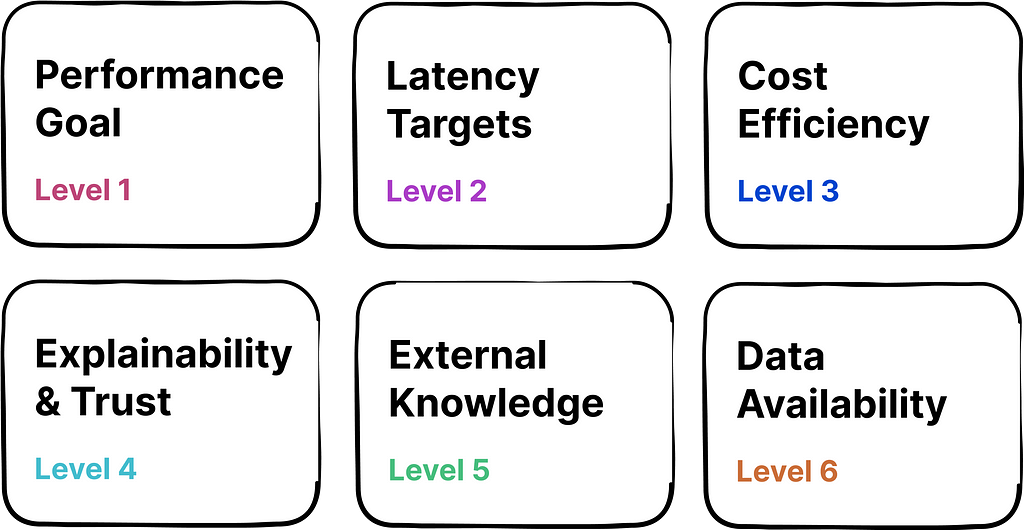
1. Performance Goal: Define the measure and level of performance your AI needs to achieve. This could be combination of factual accuracy, alignment with human values, or other task-specific metrics.
Questions to Consider: What are the best dimensions for measuring performance? What is the minimum acceptable performance bar? How does performance align with user expectations in your industry?
2. Latency Targets: Determine the maximum response time that your application can afford without negatively impacting user experience. This could be especially important when LLMs are deployed in time-sensitive or resource-constrained scenarios (e.g., voice assistant, edge devices).
Questions to Consider: How does latency impact user satisfaction and retention? What are industry standards for response time?
3. Cost Efficiency: Evaluate the cost of operating AI with the expected ROI. Higher initial costs may be justified when they lead to substantial savings, revenue growth, or strategic benefits that outweigh investment.
Questions to Consider: How does the cost of operating LLMs impact your budget? How does the ROI compare with the cost of AI deployment?
4. Explainability & Trust: Determine if there is a need to ensure that the AI decisions are easily understood by users, which is critical for building trust, especially in fields with stringent regulatory demands.
Questions to Consider: Is your industry regulated, requiring transparency in AI’s decisions? How does explainability affect user trust and adoption?
5. External Knowledge: Assess if your AI needs access to external data sources to remain relevant and provide accurate responses.
Questions to Consider: Does your AI need real-time data to make decisions?
6. Data Availability: The nature and quantity of data available for training your AI could widely impact optimization strategy.
Questions to Consider: Do you have access to a large dataset for training, or will you need to use synthetic or augmented data? How often will you need to update the training data to keep the AI relevant?
Presented below is a table outlining three distinct use cases for generative AI applications, with a corresponding evaluation of priorities for each dimension within the framework:
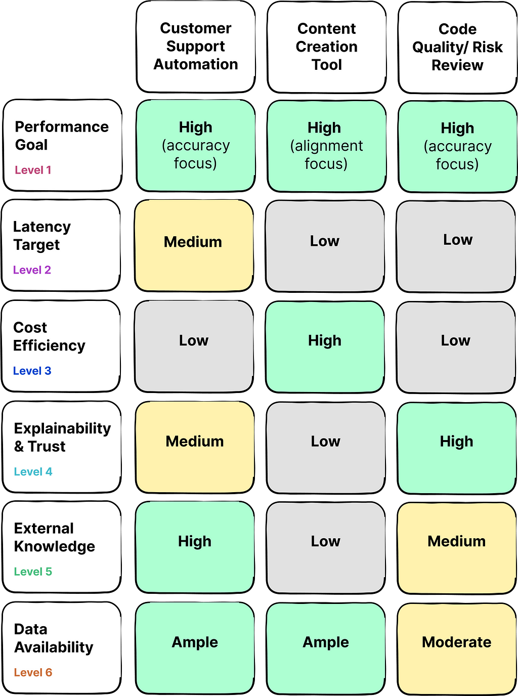
As you can see, the priorities and constrains can vary widely across different use cases.
For instance, consider a company aiming to develop a customer support chatbot to ease the workload on human staff. In this scenario, accuracy performance and external data integration are of high priority to deliver responses that are not only factually correct but also up-to-date. While latency holds some significance, users may be willing to tolerate brief delays. Typically, such a company will have access to an extensive archive of past customer support interactions that can be used for training models.
In contrast, the critical application of AI for assessing software code quality and risk demands a increased focus on factual accuracy and explainability of the AI’s insights, often due to the potential consequences of errors. Cost and latency are secondary considerations in this context. This use case could benefit from external data integration in some cases, and it usually faces constraints regarding the availability of rich training datasets.
A solid understanding of strategic priorities and constraints associated with the use case can help teams develop a tailored strategy for optimizing LLMs to meet the unique needs of the users.
This section delves into the various optimization techniques, highlighting their objectives, ideal use-cases, and inherent trade-offs, particularly in the light of balancing the business goals discussed above.
Techniques Table Breakdown:

Execution Complexity: Low
When to Use: For reshaping response and quick improvement without altering the model. Start with this technique to maximize a pre-trained model’s effectiveness before trying more complex optimization methods.
What it entails: Prompt engineering involves crafting the input query to a model in a way that elicits the desired output. It requires understanding how the model responds to different types of instructions but doesn’t require retraining the model or altering its architecture. This method merely optimizes the way the existing model accesses and applies its pre-trained knowledge, and does not enhance the model’s intrinsic capabilities.
“It’s like adjusting the way you ask a question to a knowledgeable friend to get the best possible answer.”
Examples:
Trade-offs:
Execution Complexity: Medium
When to Use: Fine-tuning should be considered when you need the model to adapt to a specific domain or task that may not be well-covered by the base pre-trained model. It is a step towards increasing domain specific accuracy and creating a more specialized model that can handle domain specific data and terminology.
What it entails: Fine-tuning is the process of continuing the training of a pre-trained model on a new dataset that is representative of the target task or domain. This new dataset consists of input-output pairs that provide examples of the desired behavior. During fine-tuning, the model’s weights are updated to minimize the loss on this new dataset, effectively adapting the model to the new domain.
“Think of it as giving your friend a crash course on a topic you want them to become an expert in; showing them multiple examples of questions that may come in a test and the sample answers that they are expected to respond with.”
Examples:
Trade-offs:
Execution Complexity: High
When to use: RAG should be considered when there is a need for the AI model to access and incorporate external information to generate responses. This is especially relevant when the model is expected to provide up-to-date or highly specific information that is not contained within its pre-trained knowledge base.
What it entails:
RAG combines the generative capabilities of an LLM with a retrieval system. The retrieval system queries a database, knowledge base, or the internet to find information relevant to the input prompt. The retrieved information is then provided to the language model, which incorporates this context to generate a richer and more accurate response. By citing the sources used by the RAG system to generate responses, generative AI applications can offer enhanced explainability to the users.
In the coming years, this optimization technique is expected to gain widespread popularity as an increasing number of products seek to leverage their latest business data to tailor experiences for customers.
“It’s akin to your friend being able to look up information online to answer questions that are outside their immediate expertise. It’s an open book exam.”
Examples:
Trade-offs:
Execution Complexity: Very High
When to use: RLHF should be used when the model’s outputs need to align closely with complex human judgments and preferences.
What it entails: RLHF is a sophisticated reinforcement learning technique that refines a model’s behavior by incorporating human evaluations directly into the training process. This process typically involves collecting data from human operators who rank the outputs from AI on various quality metrics such as relevance, helpfulness, tone, etc. These data signals are then used to train a reward model, which guides the reinforcement learning process to produce outputs that are more closely aligned with human preferences.
“It’s similar to your friend learning from past conversations about what makes a discussion enjoyable, and using that knowledge to improve future interactions.”
Examples:
Trade-offs:
Execution Complexity: Moderate to High
When to use: Knowledge distillation is used when you need to deploy sophisticated models on devices with limited computational power or in applications where response time is critical.
What it entails: It’s a compression technique where a smaller, more efficient model (known as the student) is trained to replicate the performance of a larger, more complex model (the teacher). The training goes beyond just learning the correct answers (hard targets), and involves the student trying to produce similar probabilities as the teacher’s predictions (soft targets). This approach enables the student model to capture the nuanced patterns and insights that teacher model has learned.
“This is similar to distilling the wisdom of a seasoned expert into a concise guidebook that a novice can use to make expert-level decisions without going through years of experience.”
Examples:
Trade-offs:
Now let’s take a look at a real-world example in action.
Let’s revisit the use case of building customer support chatbot to reduce workload on human support staff. The requirements/ constraints included:
With the clear understanding of business context and priorities, product builders can devise the most effective optimization strategy.
LLM Optimization Decision Steps:
As you can see, a combination of strategies is often necessary to meet the specific demands of a use case. Flexibility in optimization strategies can be crucial, as requirements can change over time, and systems need to balance multiple requirements simultaneously.
Optimizing LLMs for a business use case is both an art and a science, which requires a deep understanding of the underlying technology and the objectives at hand. As AI continues to evolve, the choice of optimization techniques will become increasingly strategic, influencing not only the performance of individual applications but also the overall trajectory of AI’s role in society.
Whether you’re optimizing for speed, accuracy, cost, or transparency, the techniques discussed above offer a toolkit for enhancing LLMs to meet the demands of tomorrow’s generative AI powered business applications. By thoughtfully applying these methods, we can create AI that’s not only effective but also responsible and attuned to the nuanced needs of users.
Thanks for reading! If these insights resonate with you or spark new thoughts, let’s continue the conversation. Share your perspectives in the comments below or connect with me on LinkedIn.
Framework for Optimizing Generative AI to Meet Business Needs was originally published in Towards Data Science on Medium, where people are continuing the conversation by highlighting and responding to this story.
Originally appeared here:
Framework for Optimizing Generative AI to Meet Business Needs
Go Here to Read this Fast! Framework for Optimizing Generative AI to Meet Business Needs


How can autonomous cars stay within a single lane at 60mph? How can an i-robot avoid falling down the stairs? How can delivery robots know if they are going to the right hungry customer? These are just a few of the questions autonomous vehicles must answer without human intervention.
As you might imagine, accurate vehicle location is critical to whether the autonomous vehicle effectively and safely completes its tasks. The process to estimate the vehicle’s position from sensor data is called localization. Localization accuracy increases with sensors that add information and decreases with the vehicle’s movement which adds noise.
Probabilistic tools can be leveraged to improve location accuracy where neither the sensors nor the movement is 100% accurate.
What is probability?
According to the dictionary definition, probability is a “numerical description of how likely an event is to occur” (wikipedia). However, when it comes to the meaning of probability, the answer is not that simple. There are rivaling interpretations to probability from two major camps, the frequentists and bayesians.
The Frequentist approach interprets probability as the relative frequency over time; how many times will I get my desired outcome if I repeat an experiment many times?
This approach is objective because anyone who runs the experiments (e.g. flipping a coin) will get the same result in the long run.
The Bayesian approach interprets probability as the degree of certainty that an event will happen. How certain am I that I will get my desired outcome given expert knowledge and the available data? This approach is subjective, as it represents the current state of belief by combining (subjective) previous knowledge and experimental data known to date. It allows estimating the probability of a singular event that we can’t run many times, where the frequentist meaning doesn’t apply.
For example, if the probability that a date texts you back after your first meetup is 0.8, then we are 80% certain that you had a great time and the person will text you back; we don’t mean they will text 80% of the time if you repeat the first date over and over again.
What are the benefits of bayesian probability?
Bayesian probability allows us to both quantify our degree of belief and to update it in light of new evidence.
In our context, P(H) is our initial guess of the robot‘s position, and P(H|E) is our updated guess after measuring the sensors’ evidence E.
The hypothesis probability distribution quantifies our certainty in the robot’s position.
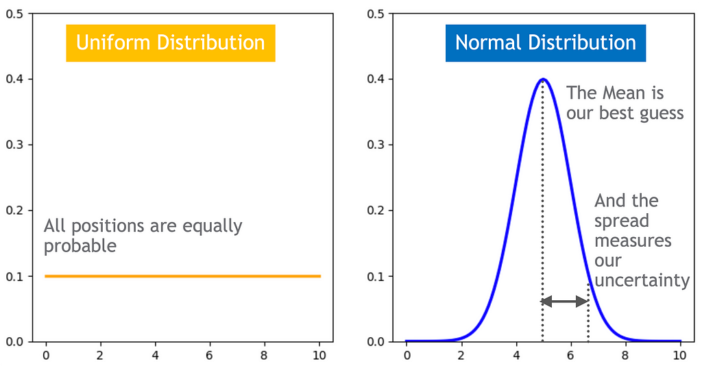
The hypothesis can change according to evidence
The more informative and accurate the sensors data, the bigger effect it will have. If the sensor is perfect, the robot’s position will align with the sensor’s reading, otherwise if the sensor data is very noisy or non-informative, the robot’s position will stay the same.
Updates can combine multiple sources of evidence
We can formulate Bayes’ law to combine multiple data sources by using the chain rule, also known as the general product rule. It permits simplifying a joint distribution of multiple evidence to a product of conditional probabilities.

For example, we often use GPS to navigate from our current location but GPS works best in clear skies and its accuracy is limited to a few meters. Autonomous cars can not solely rely on GPS to remain in a lane that is a few meters wide and to navigate in tunnels or underground parking lots. Autonomous vehicles can compensate for GPS deficiencies by adding more sources of information such as cameras.
Let’s take a deep dive into a bayesian filter that recursively improves localization probability estimates using bayesian inference. The recursive nature means that the output of the filter at time t_0, P(H|E), serves as the hypothesis input for the next timestamp t_1, P(H).
Suppose a delivery robot is looping a circular path within a space station to transport supplies. The robot has a map detailing the lay of the land and the location of sensors.

We refer to the estimated robot location as the robot’s state space. For example, a two-dimensional vector (i.e. an ordered pair of numbers) tracing x-axis position and x-axis velocity can track a robot location and changing speed in one-dimension. It is possible to extend the robot’s state space to additional dimensions to track multiple position dimensions (y, z), orientation, etc.
For simplicity, we can assume our robot is moving with constant speed. The movement adds uncertainty to the computation, since it is not 100% reliable. The engine might fail to run at a specific velocity or the robot might encounter obstacles, which will cause the robot to overshoot or undershoot its expected movement.
Our robot will sense its location by measuring the presence of a beacon. The sensor readings, also called measurement space, are not 100% accurate. Sensors might confuse noise with a beacon signal that can lead to false alarms or fail to detect a signal at all.

With this bayesian filter the robot state space is represented by a histogram through a finite number of bins or regions. It is a discrete filter, meaning the robot can only be in one of these regions, and we compute the probability that the robot is in each. Additionally, within each bin, such as a 5 square meter area, the probability of being at any specific point is the same. If we want to increase the granularity, we must add more bins.
This filter is non parametric, meaning it does not make any strong assumptions on the robot’s state representation, and is not restricted to one type of distribution such as a Gaussian. It is able to represent complex location estimates, such as a multimodal hypothesis that keeps multiple best guesses, but it comes with a computational cost — an exponential complexity. In order to add an additional dimension, from 1-D to 2-D while keeping the same granularity, we will need 10×10 bins, to move to 3-D we will need 10x10x10 bins, and so on. This is a significant limitation for robots that track multiple dimensions and are limited in memory and compute power.
2. Movement function: simulates the robot movement. The robot’s motion is stochastic, meaning it is not guaranteed to move to the desired bin at each time step. To update the robot’s location after each move, we calculate the probability of the robot being in each region at the next time step. This calculation considers both the probability of the robot to stay in the same region and the probability of it to move to a different region.
For each movement:
  For each region:
    Region probability at time t+1 =
    Region probability at time t x stay probability +
    Probability of robot coming from the neighboring region x move probability

As shown in the equation below, the robot’s one-step movement will not change the location estimate because of the uniform distribution, where each region has equal probability to stay and move.

Even if we initially begin at a bin with complete certainty (100%), the inherent randomness in movement will gradually add noise, leading us towards a uniform distribution over time. We need to add information!
3. Sense function: incorporates measurements that add information using Bayes’ theorem.
After each movement:
    For each region:
      Region probability at time t+1 given measurement at time t+1 =
      Likelihood of the measurement given the robot is in that region
      x Region probability at time t+1 after movement
      x normlization to ensure that all the probabilities sum to 1.
The sensors reliability is represented with probabilities, since they are not 100% accurate. The equations below demonstrate that when the sensor detects the color orange, there is a 90% probability that the robot is located in an orange bin, and a 10% probability that the sensor is wrong and the robot is actually in a blue bin.

The calculation presented below illustrates that, in contrast to movement, sensors contribute information and improve our understanding of the robot’s location. For instance, because bin 2 is not orange, the probability of the robot being in it diminishes from 0.1 to 0.02.

The image below shows the updated location hypothesis after incorporating movement and sensors’ data to our initial guess.
Where is the robot? We can continuously refine our answer to this question by using recursive bayesian filters, starting from a uniform distribution that keeps all guesses equally probable until settling on the most likely one.
Bayesian filters help us measure our confidence in the robot’s whereabouts, updating this belief by integrating (noisy) sensor data with prior information (the estimated robot’s position after movement).
Sources:
How to find yourself in a digital world? was originally published in Towards Data Science on Medium, where people are continuing the conversation by highlighting and responding to this story.
Originally appeared here:
How to find yourself in a digital world?
Go Here to Read this Fast! How to find yourself in a digital world?


Today the 2024 March Meeting of the American Physical Society (APS) kicks off in Minneapolis, MN. A premier conference on topics ranging across physics and related fields, APS 2024 brings together researchers, students, and industry professionals to share their discoveries and build partnerships with the goal of realizing fundamental advances in physics-related sciences and technology.
This year, Google has a strong presence at APS with a booth hosted by the Google Quantum AI team, 50+ talks throughout the conference, and participation in conference organizing activities, special sessions and events. Attending APS 2024 in person? Come visit Google’s Quantum AI booth to learn more about the exciting work we’re doing to solve some of the field’s most interesting challenges.
You can learn more about the latest cutting edge work we are presenting at the conference along with our schedule of booth events below (Googlers listed in bold).
Session Chairs include: Aaron Szasz
This schedule is subject to change. Please visit the Google Quantum AI booth for more information.
Crumble
Presenter: Matt McEwen
Tue, Mar 5 | 11:00 AM CST
Qualtran
Presenter: Tanuj Khattar
Tue, Mar 5 | 2:30 PM CST
Qualtran
Presenter: Tanuj Khattar
Thu, Mar 7 | 11:00 AM CST
$5M XPRIZE / Google Quantum AI competition to accelerate quantum applications Q&A
Presenter: Ryan Babbush
Thu, Mar 7 | 11:00 AM CST
Certifying highly-entangled states from few single-qubit measurements
Presenter: Hsin-Yuan Huang
Author: Hsin-Yuan Huang
Session A45: New Frontiers in Machine Learning Quantum Physics
Toward high-fidelity analog quantum simulation with superconducting qubits
Presenter: Trond Andersen
Authors: Trond I Andersen, Xiao Mi, Amir H Karamlou, Nikita Astrakhantsev, Andrey Klots, Julia Berndtsson, Andre Petukhov, Dmitry Abanin, Lev B Ioffe, Yu Chen, Vadim Smelyanskiy, Pedram Roushan
Session A51: Applications on Noisy Quantum Hardware I
Measuring circuit errors in context for surface code circuits
Presenter: Dripto M Debroy
Authors: Dripto M Debroy, Jonathan A Gross, Élie Genois, Zhang Jiang
Session B50: Characterizing Noise with QCVV Techniques
Quantum computation of stopping power for inertial fusion target design I: Physics overview and the limits of classical algorithms
Presenter: Andrew D. Baczewski
Authors: Nicholas C. Rubin, Dominic W. Berry, Alina Kononov, Fionn D. Malone, Tanuj Khattar, Alec White, Joonho Lee, Hartmut Neven, Ryan Babbush, Andrew D. Baczewski
Session B51: Heterogeneous Design for Quantum Applications
Link to Paper
Quantum computation of stopping power for inertial fusion target design II: Physics overview and the limits of classical algorithms
Presenter: Nicholas C. Rubin
Authors: Nicholas C. Rubin, Dominic W. Berry, Alina Kononov, Fionn D. Malone, Tanuj Khattar, Alec White, Joonho Lee, Hartmut Neven, Ryan Babbush, Andrew D. Baczewski
Session B51: Heterogeneous Design for Quantum Applications
Link to Paper
Calibrating Superconducting Qubits: From NISQ to Fault Tolerance
Presenter: Sabrina S Hong
Author: Sabrina S Hong
Session B56: From NISQ to Fault Tolerance
Measurement and feedforward induced entanglement negativity transition
Presenter: Ramis Movassagh
Authors: Alireza Seif, Yu-Xin Wang, Ramis Movassagh, Aashish A. Clerk
Session B31: Measurement Induced Criticality in Many-Body Systems
Link to Paper
Effective quantum volume, fidelity and computational cost of noisy quantum processing experiments
Presenter: Salvatore Mandra
Authors: Kostyantyn Kechedzhi, Sergei V Isakov, Salvatore Mandra, Benjamin Villalonga, X. Mi, Sergio Boixo, Vadim Smelyanskiy
Session B52: Quantum Algorithms and Complexity
Link to Paper
Accurate thermodynamic tables for solids using Machine Learning Interaction Potentials and Covariance of Atomic Positions
Presenter: Mgcini K Phuthi
Authors: Mgcini K Phuthi, Yang Huang, Michael Widom, Ekin D Cubuk, Venkat Viswanathan
Session D60: Machine Learning of Molecules and Materials: Chemical Space and Dynamics
IN-Situ Pulse Envelope Characterization Technique (INSPECT)
Presenter: Zhang Jiang
Authors: Zhang Jiang, Jonathan A Gross, Élie Genois
Session F50: Advanced Randomized Benchmarking and Gate Calibration
Characterizing two-qubit gates with dynamical decoupling
Presenter: Jonathan A Gross
Authors: Jonathan A Gross, Zhang Jiang, Élie Genois, Dripto M Debroy, Ze-Pei Cian*, Wojciech Mruczkiewicz
Session F50: Advanced Randomized Benchmarking and Gate Calibration
Statistical physics of regression with quadratic models
Presenter: Blake Bordelon
Authors: Blake Bordelon, Cengiz Pehlevan, Yasaman Bahri
Session EE01: V: Statistical and Nonlinear Physics II
Improved state preparation for first-quantized simulation of electronic structure
Presenter: William J Huggins
Authors: William J Huggins, Oskar Leimkuhler, Torin F Stetina, Birgitta Whaley
Session G51: Hamiltonian Simulation
Controlling large superconducting quantum processors
Presenter: Paul V. Klimov
Authors: Paul V. Klimov, Andreas Bengtsson, Chris Quintana, Alexandre Bourassa, Sabrina Hong, Andrew Dunsworth, Kevin J. Satzinger, William P. Livingston, Volodymyr Sivak, Murphy Y. Niu, Trond I. Andersen, Yaxing Zhang, Desmond Chik, Zijun Chen, Charles Neill, Catherine Erickson, Alejandro Grajales Dau, Anthony Megrant, Pedram Roushan, Alexander N. Korotkov, Julian Kelly, Vadim Smelyanskiy, Yu Chen, Hartmut Neven
Session G30: Commercial Applications of Quantum Computing)
Link to Paper
Gaussian boson sampling: Determining quantum advantage
Presenter: Peter D Drummond
Authors: Peter D Drummond, Alex Dellios, Ned Goodman, Margaret D Reid, Ben Villalonga
Session G50: Quantum Characterization, Verification, and Validation II
Attention to complexity III: learning the complexity of random quantum circuit states
Presenter: Hyejin Kim
Authors: Hyejin Kim, Yiqing Zhou, Yichen Xu, Chao Wan, Jin Zhou, Yuri D Lensky, Jesse Hoke, Pedram Roushan, Kilian Q Weinberger, Eun-Ah Kim
Session G50: Quantum Characterization, Verification, and Validation II
Balanced coupling in superconducting circuits
Presenter: Daniel T Sank
Authors: Daniel T Sank, Sergei V Isakov, Mostafa Khezri, Juan Atalaya
Session K48: Strongly Driven Superconducting Systems
Resource estimation of Fault Tolerant algorithms using Qᴜᴀʟᴛʀᴀɴ
Presenter: Tanuj Khattar
Author: Tanuj Khattar
Session K49: Algorithms and Implementations on Near-Term Quantum Computers
Discovering novel quantum dynamics with superconducting qubits
Presenter: Pedram Roushan
Author: Pedram Roushan
Session M24: Analog Quantum Simulations Across Platforms
Deciphering Tumor Heterogeneity in Triple-Negative Breast Cancer: The Crucial Role of Dynamic Cell-Cell and Cell-Matrix Interactions
Presenter: Susan Leggett
Authors: Susan Leggett, Ian Wong, Celeste Nelson, Molly Brennan, Mohak Patel, Christian Franck, Sophia Martinez, Joe Tien, Lena Gamboa, Thomas Valentin, Amanda Khoo, Evelyn K Williams
Session M27: Mechanics of Cells and Tissues II
Toward implementation of protected charge-parity qubits
Presenter: Abigail Shearrow
Authors: Abigail Shearrow, Matthew Snyder, Bradley G Cole, Kenneth R Dodge, Yebin Liu, Andrey Klots, Lev B Ioffe, Britton L Plourde, Robert McDermott
Session N48: Unconventional Superconducting Qubits
Electronic capacitance in tunnel junctions for protected charge-parity qubits
Presenter: Bradley G Cole
Authors: Bradley G Cole, Kenneth R Dodge, Yebin Liu, Abigail Shearrow, Matthew Snyder, Andrey Klots, Lev B Ioffe, Robert McDermott, B.L.T. Plourde
Session N48: Unconventional Superconducting Qubits
Overcoming leakage in quantum error correction
Presenter: Kevin C. Miao
Authors: Kevin C. Miao, Matt McEwen, Juan Atalaya, Dvir Kafri, Leonid P. Pryadko, Andreas Bengtsson, Alex Opremcak, Kevin J. Satzinger, Zijun Chen, Paul V. Klimov, Chris Quintana, Rajeev Acharya, Kyle Anderson, Markus Ansmann, Frank Arute, Kunal Arya, Abraham Asfaw, Joseph C. Bardin, Alexandre Bourassa, Jenna Bovaird, Leon Brill, Bob B. Buckley, David A. Buell, Tim Burger, Brian Burkett, Nicholas Bushnell, Juan Campero, Ben Chiaro, Roberto Collins, Paul Conner, Alexander L. Crook, Ben Curtin, Dripto M. Debroy, Sean Demura, Andrew Dunsworth, Catherine Erickson, Reza Fatemi, Vinicius S. Ferreira, Leslie Flores Burgos, Ebrahim Forati, Austin G. Fowler, Brooks Foxen, Gonzalo Garcia, William Giang, Craig Gidney, Marissa Giustina, Raja Gosula, Alejandro Grajales Dau, Jonathan A. Gross, Michael C. Hamilton, Sean D. Harrington, Paula Heu, Jeremy Hilton, Markus R. Hoffmann, Sabrina Hong, Trent Huang, Ashley Huff, Justin Iveland, Evan Jeffrey, Zhang Jiang, Cody Jones, Julian Kelly, Seon Kim, Fedor Kostritsa, John Mark Kreikebaum, David Landhuis, Pavel Laptev, Lily Laws, Kenny Lee, Brian J. Lester, Alexander T. Lill, Wayne Liu, Aditya Locharla, Erik Lucero, Steven Martin, Anthony Megrant, Xiao Mi, Shirin Montazeri, Alexis Morvan, Ofer Naaman, Matthew Neeley, Charles Neill, Ani Nersisyan, Michael Newman, Jiun How Ng, Anthony Nguyen, Murray Nguyen, Rebecca Potter, Charles Rocque, Pedram Roushan, Kannan Sankaragomathi, Christopher Schuster, Michael J. Shearn, Aaron Shorter, Noah Shutty, Vladimir Shvarts, Jindra Skruzny, W. Clarke Smith, George Sterling, Marco Szalay, Douglas Thor, Alfredo Torres, Theodore White, Bryan W. K. Woo, Z. Jamie Yao, Ping Yeh, Juhwan Yoo, Grayson Young, Adam Zalcman, Ningfeng Zhu, Nicholas Zobrist, Hartmut Neven, Vadim Smelyanskiy, Andre Petukhov, Alexander N. Korotkov, Daniel Sank, Yu Chen
Session N51: Quantum Error Correction Code Performance and Implementation I
Link to Paper
Modeling the performance of the surface code with non-uniform error distribution: Part 1
Presenter: Yuri D Lensky
Authors: Yuri D Lensky, Volodymyr Sivak, Kostyantyn Kechedzhi, Igor Aleiner
Session N51: Quantum Error Correction Code Performance and Implementation I
Modeling the performance of the surface code with non-uniform error distribution: Part 2
Presenter: Volodymyr Sivak
Authors: Volodymyr Sivak, Michael Newman, Cody Jones, Henry Schurkus, Dvir Kafri, Yuri D Lensky, Paul Klimov, Kostyantyn Kechedzhi, Vadim Smelyanskiy
Session N51: Quantum Error Correction Code Performance and Implementation I
Highly optimized tensor network contractions for the simulation of classically challenging quantum computations
Presenter: Benjamin Villalonga
Author: Benjamin Villalonga
Session Q51: Co-evolution of Quantum Classical Algorithms
Teaching modern quantum computing concepts using hands-on open-source software at all levels
Presenter: Abraham Asfaw
Author: Abraham Asfaw
Session Q61: Teaching Quantum Information at All Levels II
New circuits and an open source decoder for the color code
Presenter: Craig Gidney
Authors: Craig Gidney, Cody Jones
Session S51: Quantum Error Correction Code Performance and Implementation II
Link to Paper
Performing Hartree-Fock many-body physics calculations with large language models
Presenter: Eun-Ah Kim
Authors: Eun-Ah Kim, Haining Pan, Nayantara Mudur, William Taranto, Subhashini Venugopalan, Yasaman Bahri, Michael P Brenner
Session S18: Data Science, AI and Machine Learning in Physics I
New methods for reducing resource overhead in the surface code
Presenter: Michael Newman
Authors: Craig M Gidney, Michael Newman, Peter Brooks, Cody Jones
Session S51: Quantum Error Correction Code Performance and Implementation II
Link to Paper
Challenges and opportunities for applying quantum computers to drug design
Presenter: Raffaele Santagati
Authors: Raffaele Santagati, Alan Aspuru-Guzik, Ryan Babbush, Matthias Degroote, Leticia Gonzalez, Elica Kyoseva, Nikolaj Moll, Markus Oppel, Robert M. Parrish, Nicholas C. Rubin, Michael Streif, Christofer S. Tautermann, Horst Weiss, Nathan Wiebe, Clemens Utschig-Utschig
Session S49: Advances in Quantum Algorithms for Near-Term Applications
Link to Paper
Dispatches from Google’s hunt for super-quadratic quantum advantage in new applications
Presenter: Ryan Babbush
Author: Ryan Babbush
Session T45: Recent Advances in Quantum Algorithms
Qubit as a reflectometer
Presenter: Yaxing Zhang
Authors: Yaxing Zhang, Benjamin Chiaro
Session T48: Superconducting Fabrication, Packaging, & Validation
Random-matrix theory of measurement-induced phase transitions in nonlocal Floquet quantum circuits
Presenter: Aleksei Khindanov
Authors: Aleksei Khindanov, Lara Faoro, Lev Ioffe, Igor Aleiner
Session W14: Measurement-Induced Phase Transitions
Continuum limit of finite density many-body ground states with MERA
Presenter: Subhayan Sahu
Authors: Subhayan Sahu, Guifré Vidal
Session W58: Extreme-Scale Computational Science Discovery in Fluid Dynamics and Related Disciplines II
Dynamics of magnetization at infinite temperature in a Heisenberg spin chain
Presenter: Eliott Rosenberg
Authors: Eliott Rosenberg, Trond Andersen, Rhine Samajdar, Andre Petukhov, Jesse Hoke*, Dmitry Abanin, Andreas Bengtsson, Ilya Drozdov, Catherine Erickson, Paul Klimov, Xiao Mi, Alexis Morvan, Matthew Neeley, Charles Neill, Rajeev Acharya, Richard Allen, Kyle Anderson, Markus Ansmann, Frank Arute, Kunal Arya, Abraham Asfaw, Juan Atalaya, Joseph Bardin, A. Bilmes, Gina Bortoli, Alexandre Bourassa, Jenna Bovaird, Leon Brill, Michael Broughton, Bob B. Buckley, David Buell, Tim Burger, Brian Burkett, Nicholas Bushnell, Juan Campero, Hung-Shen Chang, Zijun Chen, Benjamin Chiaro, Desmond Chik, Josh Cogan, Roberto Collins, Paul Conner, William Courtney, Alexander Crook, Ben Curtin, Dripto Debroy, Alexander Del Toro Barba, Sean Demura, Agustin Di Paolo, Andrew Dunsworth, Clint Earle, E. Farhi, Reza Fatemi, Vinicius Ferreira, Leslie Flores, Ebrahim Forati, Austin Fowler, Brooks Foxen, Gonzalo Garcia, Élie Genois, William Giang, Craig Gidney, Dar Gilboa, Marissa Giustina, Raja Gosula, Alejandro Grajales Dau, Jonathan Gross, Steve Habegger, Michael Hamilton, Monica Hansen, Matthew Harrigan, Sean Harrington, Paula Heu, Gordon Hill, Markus Hoffmann, Sabrina Hong, Trent Huang, Ashley Huff, William Huggins, Lev Ioffe, Sergei Isakov, Justin Iveland, Evan Jeffrey, Zhang Jiang, Cody Jones, Pavol Juhas, D. Kafri, Tanuj Khattar, Mostafa Khezri, Mária Kieferová, Seon Kim, Alexei Kitaev, Andrey Klots, Alexander Korotkov, Fedor Kostritsa, John Mark Kreikebaum, David Landhuis, Pavel Laptev, Kim Ming Lau, Lily Laws, Joonho Lee, Kenneth Lee, Yuri Lensky, Brian Lester, Alexander Lill, Wayne Liu, William P. Livingston, A. Locharla, Salvatore Mandrà, Orion Martin, Steven Martin, Jarrod McClean, Matthew McEwen, Seneca Meeks, Kevin Miao, Amanda Mieszala, Shirin Montazeri, Ramis Movassagh, Wojciech Mruczkiewicz, Ani Nersisyan, Michael Newman, Jiun How Ng, Anthony Nguyen, Murray Nguyen, M. Niu, Thomas O’Brien, Seun Omonije, Alex Opremcak, Rebecca Potter, Leonid Pryadko, Chris Quintana, David Rhodes, Charles Rocque, N. Rubin, Negar Saei, Daniel Sank, Kannan Sankaragomathi, Kevin Satzinger, Henry Schurkus, Christopher Schuster, Michael Shearn, Aaron Shorter, Noah Shutty, Vladimir Shvarts, Volodymyr Sivak, Jindra Skruzny, Clarke Smith, Rolando Somma, George Sterling, Doug Strain, Marco Szalay, Douglas Thor, Alfredo Torres, Guifre Vidal, Benjamin Villalonga, Catherine Vollgraff Heidweiller, Theodore White, Bryan Woo, Cheng Xing, Jamie Yao, Ping Yeh, Juhwan Yoo, Grayson Young, Adam Zalcman, Yaxing Zhang, Ningfeng Zhu, Nicholas Zobrist, Hartmut Neven, Ryan Babbush, Dave Bacon, Sergio Boixo, Jeremy Hilton, Erik Lucero, Anthony Megrant, Julian Kelly, Yu Chen, Vadim Smelyanskiy, Vedika Khemani, Sarang Gopalakrishnan, Tomaž Prosen, Pedram Roushan
Session W50: Quantum Simulation of Many-Body Physics
Link to Paper
The fast multipole method on a quantum computer
Presenter: Kianna Wan
Authors: Kianna Wan, Dominic W Berry, Ryan Babbush
Session W50: Quantum Simulation of Many-Body Physics
The quantum computing industry and protecting national security: what tools will work?
Presenter: Kate Weber
Author: Kate Weber
Session Y43: Industry, Innovation, and National Security: Finding the Right Balance
Novel charging effects in the fluxonium qubit
Presenter: Agustin Di Paolo
Authors: Agustin Di Paolo, Kyle Serniak, Andrew J Kerman, William D Oliver
Session Y46: Fluxonium-Based Superconducting Quibits
Microwave Engineering of Parametric Interactions in Superconducting Circuits
Presenter: Ofer Naaman
Author: Ofer Naaman
Session Z46: Broadband Parametric Amplifiers and Circulators
Linear spin wave theory of large magnetic unit cells using the Kernel Polynomial Method
Presenter: Harry Lane
Authors: Harry Lane, Hao Zhang, David A Dahlbom, Sam Quinn, Rolando D Somma, Martin P Mourigal, Cristian D Batista, Kipton Barros
Session Z62: Cooperative Phenomena, Theory
*Work done while at Google
Originally appeared here:
Google at APS 2024
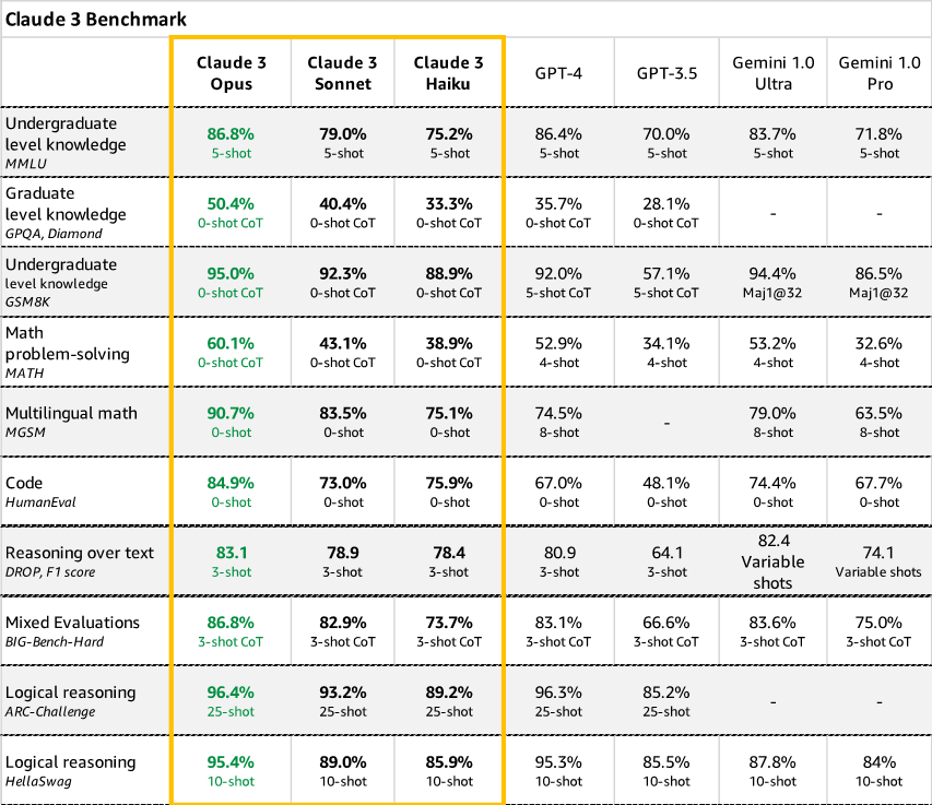

Originally appeared here:
Unlocking Innovation: AWS and Anthropic push the boundaries of generative AI together
.jpg)