A step-by-step guide on writing your first pre-commit hook
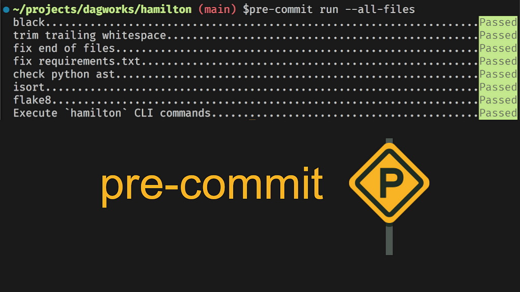
pre-commit run results, including our Hamilton hook!
Most software is developed using the git version control system to update and distribute code. One challenge of writing code collaboratively is ensuring specific standards while each contributor has their style and opinion about what constitutes clean code.
pre-commit hooksare scripts or commands to execute automatically before committing code changes. They can enforce styling rules and catch errors before they’re committed and further distributed. Notable hooks include checking files for syntax errors, sorting imports, and normalizing quotation marks. They are an essential tool for any project, especially open-source ones with many contributors.
Why create custom pre-commit hooks?
I wanted to create pre-commit hooks to validate dataflow definitions for the Python library Hamilton, but I found most online resources scattered and limited to basic use.
In this post, you’ll find:
How to start using pre-commit hooks in your project
A step-by-step tutorial to develop custom pre-commit hooks
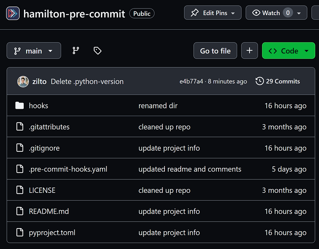
To ground the discussion, I’ll go through this GitHub repository containing the pre-commit hooks I developed for Hamilton.
Start using pre-commit hooks
Hooks are a mechanism built directly into the git version control system. You can find your project’s hooks under the .git/hooks directory (it might be hidden by default). Although they are colloquially called “pre-commit hooks”, git hooks cover the whole git lifecycle. For instance, you can have hooks trigger just after a commit or before a push. Also, hooks can be written in any programming language. Notably, the Ruff library reimplemented many Python-based hooks in Rust for performance improvement.
Compared to software testing, which focuses on code behavior, you can think of hooks as lightweight checks you would do on each file save. While you can expect tests to change and evolve with your codebase, your code-writing guidelines and pre-commit hooks will likely be constant.
Project setup
Let’s pretend we’re starting a new Python project (or using an existing one) in the directory /my-project. The preferred way of working with pre-commit hooks is through the pre-commit Python library. We can set it up with the following steps:
Create a git repository for your project with git init
Install the pre-commit library with pip install pre-commit
Add a .pre-commit-config.yaml to your repository. Here’s an example:
# .pre-commit-config.yaml
repos:
    # repository with hook definitions
-   repo: https://github.com/pre-commit/pre-commit-hooks
    rev: v2.3.0  # release version of the repo
    hooks:  # list of hooks from the repo to include in this project
    -   id: end-of-file-fixer
    -   id: trailing-whitespace
    -   id: check-yaml
        args: ['--unsafe']  # add arguments to `check-yaml`

    # download another repository with hooks
-   repo: https://github.com/psf/black
    rev: 22.10.0
    hooks:
    -   id: black
4. Install the hooks with pre-commit install. It will read instructions from .pre-commit-config.yaml and install hooks locally under .git/hooks/pre-commit
5. Make a commit or manually run hooks with pre-commit run –all-files to trigger the hooks
Create a custom pre-commit hook
Community-maintained hooks provide flexibility and can be tailored to meet your preferred coding guidelines. They should meet your needs 98% of the time. However, off-the-shelf solutions don’t know about the specific tools you’re using or your team’s internal conventions. For example, you might want to validate internal configurations or enforce a directory structure for your projects.
In our case, we want to create a hook to validate the Python code for their Hamilton dataflow definition. Our hook script will leverage the hamilton CLI tool to conduct the validation, leaving us with a simple code example to follow.
1. Setting up your pre-commit hook repository
As introduced in the Project setup section, pre-commit hooks need to exist in a public repository to allow projects to reference them in .pre-commit-config.yaml and install them locally with pre-commit install.
Previously, we were in our project directory /my-project where we defined a .pre-commit-config.yaml and installed hooks. Now, we’ll create a /my-hooks directory where we’ll define our custom hooks. You can refer to our hamilton-pre-commit repository to view the general structure.
Under hooks/, we have a file __init__.py to make the directory a discoverable Python module and our script cli_command.py. It contains a single function main(), which reads a list of hamilton CLI commands from sys.argv. Then, it executes them one by one as a subprocess wrapped in a try/except clause.
def main() -> int: """Execute a list of commands using the Hamilton CLI""" commands = sys.argv[1:]
if len(commands) == 0: return PASS
exit_code = PASS for command in commands: try: args = command.split(" ") # insert `--json-out` for proper stdout parsing args.insert(1, "--json-out") result = subprocess.run(args, stdout=subprocess.PIPE, text=True) response = json.loads(result.stdout)
if response["success"] is False: raise ValueError
except Exception: exit_code |= FAIL
return exit_code
if __name__ == "__main__": raise SystemExit(main())
At the beginning, we set exit_code = PASS, but any exception or unsuccessful commands will set exit_code = FAIL. The main() function returns the exit code to the SystemExit exception. For the pre-commit hook to succeed, we need to return PASS after all commands succeeded. It might be counterintuitive to have PASS=0 and FAIL=1 but these values refer to the standard system’s exit code.
We used Python for convenience, but this simple logic could be in a lighter scripting language like Bash. You can visit the hooks maintained by the pre-commit team for more examples.
3. Defining the hook entry point
Now, your hooks repository (/my-hooks) must include a .pre-commit-hooks.yaml file that specifies the available hooks and how to execute them once installed.
- id: cli-command
  name: Execute `hamilton` CLI commands
  description: This hook executes a command using the `hamilton` CLI.
  entry: cli-command
  language: python
  types: [python]
  stages: [pre-commit, pre-merge-commit, manual]
  pass_filenames: false
In our case, we set id: cli-command and entry: cli-command, add some metadata, and specify the programming language as Python. Importantly, the files attribute wasn’t set to have our hook run once per commit. In your case, you might want to set files: “*.py” to run your hook on each edited Python file for example (learn about available options).
So far, we created a Python script under hooks/cli_command.py and added to .pre-commit-hooks.yaml a hook with the entry point cli-command. However, you need to link the two explicitly in your Python project file pyproject.toml.
This line reads “the entry point cli-command refers to the function main in hooks.cli_command”.
see this example if you’re using setup.cfgfor your Python project
4. Testing your hook locally
First, you should validate your hook’s logic with unit tests. However, we won’t dive into testing since it deserves its own post. Our hamilton-pre-commit repository currently doesn’t have tests since the underlying CLI is tested under the main Hamilton repository. You can visit the officially maintained pre-commit hooks for test examples.
Second, you should verify that the .pre-commit-hooks.yaml and entry points are properly configured by trying your pre-commit hook locally. Ideally, you’d want to avoid adding a commit to trigger the hook each time you want to test changes. The pre-commit library provides utilities to facilitate this process, but it requires a few manual steps detailed in pre-commit GitHub issues.
Go to your directory /my-project where you’d like to test your hook.
Execute pre-commit try-repo ../LOCAL/PATH/TO/my-hooks then, you should see a local initialization message.
One limitation is that you can’t directly pass args to your hook via this command.
3. Copy the configuration found under Using config: to a local file and add the args section. We created .local-pre-commit-config.yaml but you can use any name.
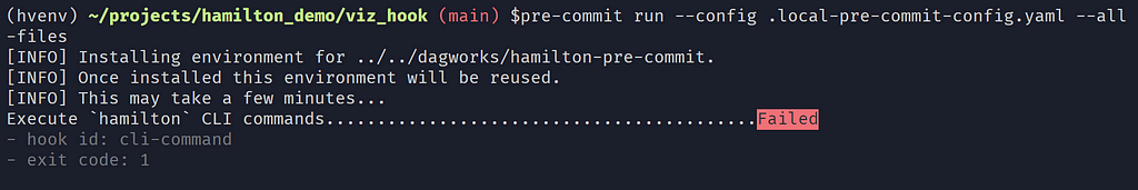
4. Use your local hook via pre-commit run –config .local-pre-commit-config.yaml –all-files. The –all-files flag will apply the hook to all files in your repository instead of those currently staged.
When adding a test, always start by making it fail. You wouldn’t want to add a test that always succeeds :^)
5. Publishing your pre-commit hook
You’re almost there! You have a working hook script that’s tested and packaged in a git repository. Now, you just need to make it available online. We will show the steps for GitHub-hosted projects, but your pre-commit hook can live anywhere accessible via git clone.
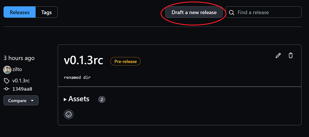
From your GitHub repository, go to the Releases section
Main page of a GitHub repository.
2. Click Draft a new release
Releases section of a GitHub repository
3. On the new release page, you need to add a version tag, a title, and a description. If it’s your first release, I suggest setting the tag as v0.1.0 to follow semantic versioning, as recommended by GitHub.
When you’re making changes and want to distribute experimental versions, you can set your version as v0.1.1-rc (for “release candidate”) and mark it as a pre-release using the checkbox.
New release form on GitHub.
The rev value in your .pre-commit-config.yaml file will need to match the version tag you set.
Congrats! You made it through this post! You are now able to use pre-commit hooks to improve code quality in your projects. Equipped with an understanding of their internals, you can start writing your own hooks!
Don’t forget to take a look at the many hooks maintained by the community before reinventing the wheel: https://pre-commit.com/hooks.html
Check out the Hamilton library to write dataflows in Python! Find me on LinkedIn and more of my posts on the DAGWorks blog
A comprehensive guide on how to use Uber’s H3 hexagon grid in data analysis
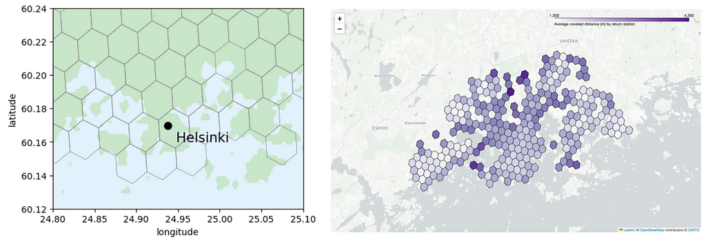
Uber’s global H3 hexagonal grid system can be used for two purposes: first, it is a user-friendly and practical tool for spatial data analysis. Second, it can be used to anonymize location data by aggregating geographic information to hexagonal regions such that no precise locations are disclosed. In this article, we use Helsinki city bike data to showcase how hexagons can help data scientists in their work.
Image by author.
Many services nowadays produce data that contains events that have occurred in a certain location. For example there’s a lot of different courier services that might want to understand where and when their services have been used, or teleoperator companies that want to know how big load their network must tolerate at certain times at different parts of their cover area. Also location data can be highly sensitive and reveal unnecessary exact information on users whereabouts. For example, openly available New York taxi data contains exact information on the pick-up and drop-off dates, times and locations of all taxi rides in New York. By using information from paparazzis on where and when celebrities have been seen getting in and out of the cabs, the tabloid magazines have used the taxi data to track celebs’ visits to bars and strip clubs (source).
For these reasons it is convenient to bucket location data points into larger groups. However, defining these location clusters is not entirely straightforward. Sometimes one can use countries, counties, cities or districts to group data points together but often there’s a need for finer regions. For this purpose Uber developed an open-sourced geospatial grid system called H3 that covers the entire Earth with repetitive tiling. The building block in the grid system is a hexagon and one can choose from 16 different hexagon sizes that vary from an area of a large country to an area of a small side table.
In this article, we will use Helsinki city bike data to demonstrate how one can utilise H3 hexagons to analyse spatial data. First, we provide an introduction to the H3 hexagon grid and its resolutions. Next, we delve into the main functionalities of the H3 library. Following that, we illustrate how a hexagon grid can enhance data analysis. Finally, we address some issues associated with hexagonal grids. All the notebooks used in this analysis can be found on this GitHub repository. All images in this article, unless otherwise noted, are by the author.
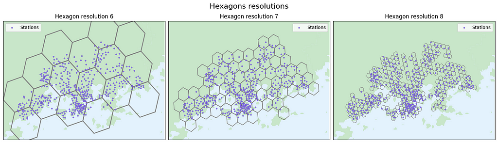
Screenshot from the data analysis notebook. The purple dots indicate the positions of city bike stations, while the hexagons of varying sizes correspond to resolutions 6 (the largest hexagon), 7, and 8.
Uber’s H3 hexagon system — great for visualising, exploring and optimising spatial data
Every day and every minute, Uber receives multiple requests in their marketplace. Each event happens at a specific location, for example a rider asks for a ride in one location and a driver accepts the drive in a nearby location. Deriving information and insights from the data, for example setting dynamical pricing that is based on the demand, requires analyzing data across an entire city. But as cities are geographically very diverse, this analysis must happen in fine granularity. With the H3 hexagon grid system, each data point can be bucketed to one hexagon area or cell, and then one Uber can calculate supply and demand for surge pricing on each hexagon in all the cities where they have services. The hexagons come in different sizes so one must choose the resolution that best fits the purpose of the analysis.
Figures show how the hexagon grid covers the whole Earth and city areas with repetitive tiling. The user can subdivide the areas into smaller and smaller hexagons, and the area of each finer resolution hexagon is roughly one seventh of the coarser hexagon. Note that in order to cover the whole Earth with the hexagon tiling, a few pentagons (shapes with 5 sides) are also needed (more of this later in this article). If one looks carefully at the image, they can see a couple of pentagons in the image as well, for example on top of Sweden and Norway. Image from https://github.com/seanhandley/h3_ruby.
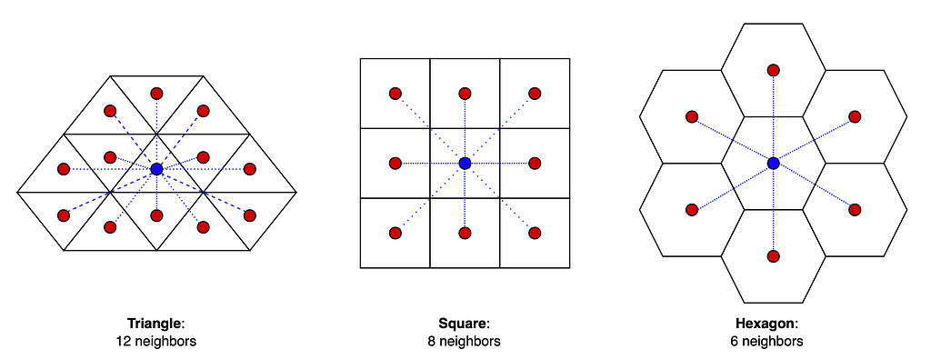
Technically one could build a global grid system using any kind of building block that facilitates a complete tiling throughout the 3D globe. For example one could use triangles (3 sides) or squares (4 sides) instead of hexagons (6 sides) to cover the whole Earth. However, using hexagons has many advantages. For example, the centerpoint of a triangle has three and a square has two different distances to its neighbors’ centerpoints whereas the centerpoint of a hexagon has equal distance to all of its neighbors’ which makes it a convenient system to approximate radiuses (see image below).
The distance of the center points to their neighbors. Out of these, hexagons are the best for approximating radiuses. Image by author.
However, the world cannot be divided completely into hexagons so few pentagons (five sides) are needed as well (12 to be exact, on each resolution). The pentagons introduce discontinuities to the grid but often they are located far away from the land so it causes problems for mainly marine data analysis. Despite the presence of a few pentagons, the hexagon grid offers the advantage of providing building blocks that are relatively uniform in size on the 3D spherical surface. In case one wants to read more about the geometrics of a hexagon grid, here’s a good source for it. Note that defining the hexagon regions is highly arbitrary, and they do not follow any natural features such as lakes, rivers, mountains or country borders.
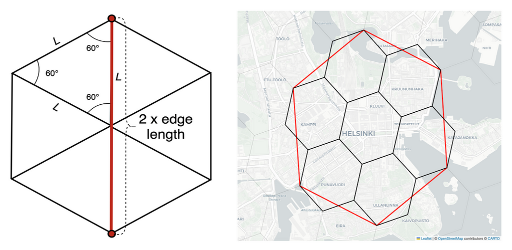
The edge length of a hexagon (L) can be used to estimate the radius of the building block. One hexagon contains six equilateral triangles (all sides in the triangle have the same length) and the maximum distance of two points inside of a hexagon is two times the edge length of the hexagon. H3 supports sixteen different hexagon resolutions. Each hexagon at finer resolution is roughly one seventh of the hexagon in coarser resolution. Note that hexagons cannot be perfectly subdivided into seven smaller hexagons so the finer cells only approximately contain their parent cell. As the areas do not overlap perfectly, the count of events in the parent cell might not be equal to the count of events in its children cells. Images by author.
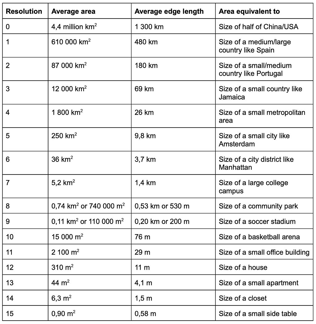
The H3 library is open source, available on GitHub and written in C. It has bindings available on multiple languages, for example on Python, C, Java and Javascript. H3 comes with a hierarchical indexing system which makes it very efficient. One can examine the hexagons further using an online H3 hexagon data viewer. The table below summarizes the properties of the 16 different resolutions that H3 provides.
Table: Average hexagon area and average edge length from https://h3geo.org/docs/core-library/restable/. Author used Chat-GPT to get examples of different sized areas.
Next, we will introduce some of the most important functionalities of the H3 library.
H3 library and its main functions
In this article we will use the H3 hexagon system to cluster location data into hexagons. The documentation of H3 library can be found here. There are two main versions of this library, versions 3 and 4, and in our notebooks we will use version 3.7.6. Note that there are significant differences in function names between version 3.x and 4.x as listed in here.
H3 Python package is easy to install for example with pip:
pip install h3
If you want to specify which version you want to use, add there the version number, for example h3==3.7.6. Then import H3 to your Python notebook with
import h3
Next, we will introduce some of the most important functions of the H3 library.
Hexagon index
H3 uses a hierarchical indexing system, which transforms latitude and longitude pairs to a 64-bit H3 index that identifies each grid cell. With given coordinates (latitude and longitude) and with selected resolution, we get the hexagon index:
# Version 3.X:
hexagon_index = h3.geo_to_h3(lat, lng, resolution)

# Version 4.X:
hexagon_index = h3.latlng_to_cell(lat, lng, resolution)
For example
h3.geo_to_h3(60.169833, 24.938163, 6)
returns index ‘861126d37ffffff’. If you want, you can use an online H3 hexagon data viewer to check where this hexagon is located.
So when we know the precise coordinates for a data point, we can determine its hexagon index at various resolutions and associate it with hexagons of different sizes.
Hexagon boundaries
To use hexagons in our plots, we must determine the hexagon boundaries from the hexagon index. Note that coordinates in some systems are presented as (lng, lat), while in others, they follow the format (lat, lng). The geo_json=True/False option allows you to swap these coordinates.
# Version 3.X:
boundary = h3.h3_to_geo_boundary(hexagon_index, geo_json = False)

# Version 4.X:
boundary = h3.cell_to_boundary(hexagon_index, geo_json = False)
These six coordinate pairs correspond to the starting and ending points of the hexagon edges.
Neighboring hexagons
Sometimes we need to identify the neighbors of a specific hexagon, or “kring” around the hexagon. With k=0 the function returns the origin index, with k=1 it returns the origin index and its all neighboring indices, and with k=2 it returns the origin index, its neighboring and next-to-neighboring indices, and so forth.
# Version 3.X:
kring = h3.k_ring(hexagon_index, k)

# Version 4.X:
kring = h3.grid_disk(hexagon_index, k)
Also there’s a function that can be used to calculate the grid distance between two cells:
# Version 3.X:
kring = h3.h3_distance(hexagon_index_a, hexagon_index_a)

# Version 4.X:
kring = h3.grid_distance(hexagon_index_a, hexagon_index_a)
We can use these functions in the following way:
# Nearest neighbours of the hexagon: h3.k_ring('861126d37ffffff', 1)
# Distance between two hexagons: h3.h3_distance('861126d37ffffff', '86089ba4fffffff')
# Returns 1
Plotting the hexagons
There are multiple ways on how to plot hexagons on a map but some of them are quite stiff, time consuming to use and not well-documented. For simplicity, we are mainly using matplotlib for visualizations but we also experiment and take screenshots of visualizations with folium maps. More details on these plotting methods can be found from the GitHub repository.
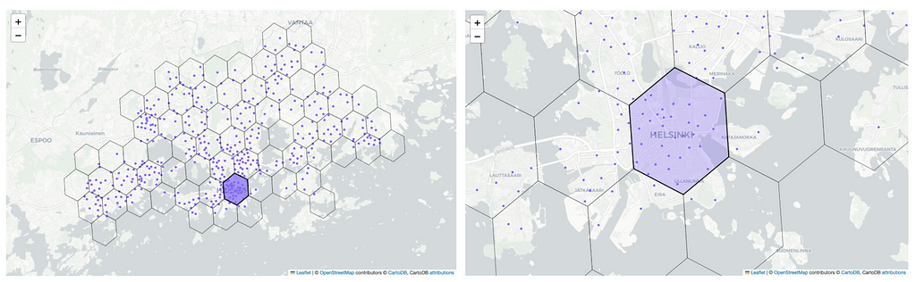
Examples of two different plotting options: on the left we use matplotlib for plotting and on the right we use folium maps.
On the left in the above figure we use matplotlib for plotting the hexagons. We utilize the GADM library to fetch the multipolygon representing the Helsinki region and plot it with green color. We use blue in the background to represent bodies of water. Additionally, we include a marker denoting the Helsinki city center on the map. The hexagons are easily rendered using the plot_polygon function from the shapely library and data points can be added to the plot by using scatterplot. This makes the plotting very easy and quick.
We also experimented with other plotting methods, such as using folium maps that allows us to create an interactive HTML map that allows us to zoom in and out in the map. On the right in the above figure we show a screenshot of such a map. Even though the result is aesthetically nice, it is very time consuming to add new features (such as colorbars or heatmaps) to the map so it’s not the best tool for exploratory data analysis. The notebook for plotting the interactive folium maps can be found in here.
Helsinki city bike data
Image by author: Helsinki city bikes near Helsinki railway station (2023).
In this article, we use H3 hexagons to analyze Helsinki city bike usage. The data contains all the journeys undertaken between 2016 and 2021, as well as information on the stations available in the city bike network. City bikes are available nearly throughout Helsinki and in parts of Espoo, and the station network is dense, particularly in central Helsinki.
The city bike system works such that a user can grab a city bike from any station and return it to any city bike station, even if they are at full capacity. Typically, city bike trips are brief, such as commuting from a metro station to a specific destination, and the purpose of the city bikes is to make public transport more appealing by offering a quick way to transit between two locations. City bikes are available approximately from March to October, and a full season costs 35 euros (less than 40 US dollars). With this fixed fee, users can use city bikes as much as they want as long as the trip lasts less than 30 minutes. If a trip exceeds 30 minutes, the user must pay an additional charge of 1 euro for every subsequent 30 minutes. All in all, clean and simple, and very convenient for short trips!
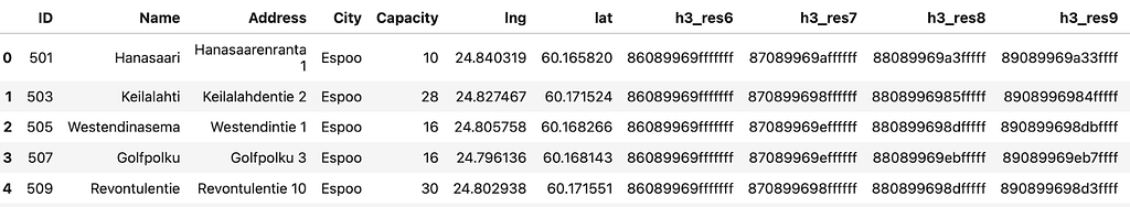
To begin, let’s take a closer look at the data. As always in data science projects, the dataset needs some cleaning before we can use it. For example, the column names are a mixture of Finnish, Swedish and English and for clarity, we want to rename them. The notebook detailing our data cleaning process can be found at this link. In the cleaned dataset, we have 457 stations, and the first rows looks like this:
The station’s dataframe includes station ID, station name, address, city, capacity of the station, and geographical coordinates; longitude and latitude. Our objective is to cluster these stations based on their spatial location using the H3 hexagon system. Initially, the optimal hexagon size for analysis is unknown, prompting us to experiment with four different resolutions: 6, 7, 8, and 9. These resolutions correspond to edge lengths of 3.7 km, 1.4 km, 500 m, and 200 m, respectively. Once latitude, longitude, and resolution is given, we can employ the H3 library to determine the corresponding H3 hexagon index as shown above in this article.
Once we have retrieved the four hexagon IDs at different resolutions for all the stations, we obtain the following data table:
With the station ID, we can merge this data table with the journey data, which enables us to categorize trips into distinct hexagons and analyze the outcomes.
Journey data
The journey data contains all city bike trips taken between 2016 and 2021. It includes information such as the names and IDs of the departure and return stations, departure and return times, trip duration, and distance traveled. Note that each journey must start and end at one of the city bike stations. Initially, the dataset contains 15 million trips, but data cleaning drops 3.5% of the rows so we are left with 14.5 million trips. The notebook detailing the data cleaning process is available in the same GitHub repository. Let’s examine the first few rows from the trip data:
With the station IDs we can merge station data with the journey data and append the hexagon IDs of both departure and return stations to the dataset. So next we can start the data analysis that utilizes the H3 hexagons.
Data insights with the hexagons
A fundamental aspect of being a data scientist involves extracting meaningful insights from the available data. This typically requires data transformations, so creating new features from the existing ones in order to aggregate the data. For example we might want to extract the day of the week from dates, segment continuous variables into fixed-sized bins, or group data points into clusters or categories. In this section, we will showcase the types of data insights that can be obtained from location data, whether utilizing hexagons or not. Details of the data analysis can be found from the data cleaning and data analysis notebooks within the GitHub repository.
A. Data analysis without hexagons
Let’s begin by exploring what kind of analysis we can conduct without relying on hexagons. Since our data spans from 2016 to 2021, a key aspect is understanding how the data has evolved over time. Some questions we might ask include:
Where are the city bike stations located?
What is the typical length of a bike trip in terms of both duration and distance?
How has the city bike station network expanded over the years?
How has the number of trips changed over the years?
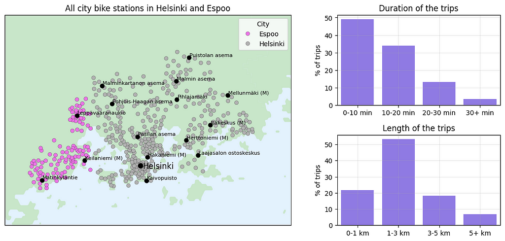
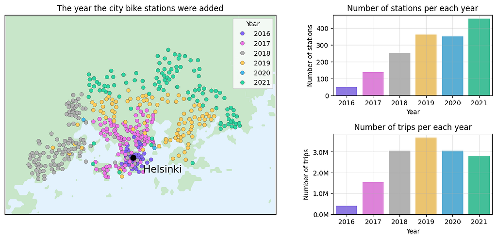
To address these questions, we start by plotting the station locations on a map by using the provided latitude and longitude coordinates.
In the left figure, we see that the stations from 2021 are primarily located in Helsinki but partly in Espoo too. Some station names are displayed on the map to help identify different locations. On the right we categorize trip durations and distances into four bins and calculate their respective frequencies. Nearly half of the trips last less than 10 minutes and only a small percentage exceed 30 minutes (note that the user needs to pay extra charges beyond this duration). The city bikes are typically employed for short-distance travels so it’s not surprising that the majority of the trips are less than 3 kilometers.
Next, we can analyze how the data have changed over the years.
The left figure displays all city bike stations and the years they were incorporated into the network. The first city bike stations were introduced in 2016 and they were located in central Helsinki. With each passing year, the city bike network expanded, enabling bike usage in areas further away from central Helsinki. The top-right figure shows the number of stations in each year. Lastly, the bottom-right figure reveals the annual number of trips made with city bikes. Peak usage occurred in 2019 with approximately 3.7 million trips, followed by a decline of 17% in the next year, despite the increasing number of stations. The drop in 2020 and 2021 is likely influenced by the COVID-19 pandemic, but also partly due to commercial scooters that became available in Helsinki in 2019 and that quickly gained popularity especially in short-distance travel.
To delve deeper into statistics derived from the city bike data, we will now incorporate hexagons in our analysis.
B. Using hexagon grid to analyze city bike data
Hexagons offer us a tool for detailed analysis of the city bike usage. The questions we aim to address using hexagons include:
Where do we have a lot of city bike stations?
In which areas of the city do we observe the highest number of departures or returns?
What is the average trip length in different parts of Helsinki?
However, before tackling these questions, we need to decide the size of the hexagon we use in our analysis.
We start by examining hexagons at resolutions 6, 7, and 8, corresponding to radii of approximately 3.7 km, 1.4 km, and 500m, respectively. From these plots it is difficult to visually assess the station density, especially with the smallest hexagons.
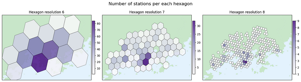
Let’s compute the station count within each hexagon and plot the hexagons with colors that reflect the number of stations within each respective hexagon:
The hexagons are rather large at resolution 6 and the station count per hexagon varies a lot so this resolution is probably too large for our needs. Resolutions 7 and 8 exhibit fewer variations in station numbers, and that can potentially make them more suitable for our analysis. However, there’s no rule of thumb for determining the ideal resolution as it depends on the specific insights we’re seeking.
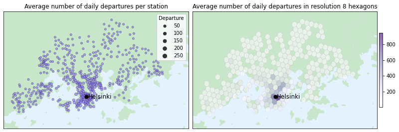
Hexagons help to visualize location-related insights, such as identifying the busiest parts of the town for the service. If we wouldn’t use hexagons, an alternative approach could involve calculating the average daily number of departures per station and plotting the result using circles of varying size, as shown in the figure below. However, the stations are so close to each other especially at the central Helsinki that it becomes challenging to accurately comprehend the daily number of departures.
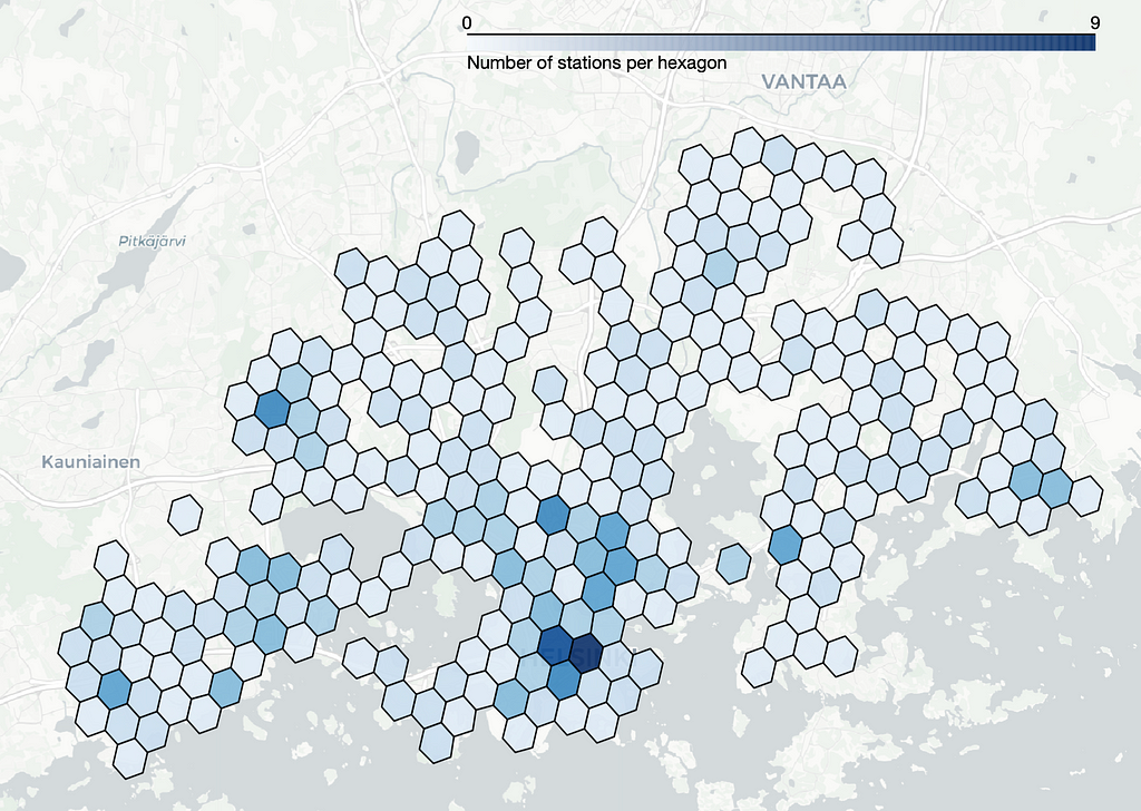
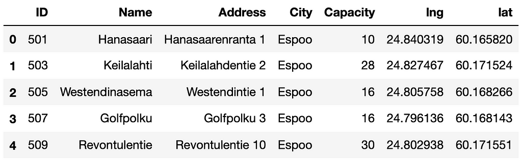
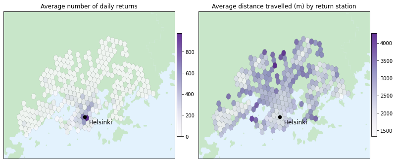
Hexagon grid helps us perceive location specific data quicker. In the left image, we calculate the average number of daily departures per each station and use the size of each circle to represent the calculated average. In central Helsinki the stations are so closely spaced that it becomes challenging to discern the volume of departures in that area. Whereas on the right, we utilize hexagons of resolution 8 to plot the average number of daily departures in different parts of the city. With this approach it is a way easier to see the volume of departures in different parts of Helsinki. For example, we can see from the image that there are numerous areas with fewer than 100 daily departures on average, whereas in central Helsinki the average exceeds 900 daily departures.
With the hexagon grid we can also visualize various other insights from the data, such as the following graphs:
On the left, we plot the average number of daily returns in each hexagon area. The result closely resembles the average of daily departures. On the right, we visualize the average distance traveled to the return station. The average trip length fluctuates across the city, with the longest trips occurring in areas with less frequent public transportation.
C. Selecting one hexagon and getting location specific insights
Sometimes we are interested in extracting more detailed insights from a specific region. By selecting one hexagon we can dive deeper into the data within that specific area and seek answers to questions such as:
What are the peak usage times for city bikes in that area?
How does bike usage vary between weekdays and weekends in that region?
Where are users heading from that location?
To showcase how we could answer these questions, we opt for the following hexagon in the Helsinki city center:
For a more in-depth analysis, we choose the highlighted hexagon situated in the Helsinki city center.
Let’s begin examining the data from that specific area.
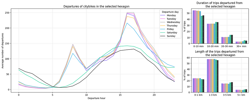
On the left we plot the average number of departures for each weekday and hour to provide us with insights on the busiest times. In Finland, typical work hours are from 8–16 or 9–17, and we can see a clear peak on weekdays around 7 a.m. as people commute to work and at 4–5 p.m. when they leave work. Interestingly, it’s more common to grab a city bike after work than in the mornings. Notably, there’s a significant peak in usage on Friday and Saturday nights as people return home from bars and parties. Additionally, we can plot the trip length and duration for each weekday to identify potential variations between weekdays and weekends but the graphs on the right reveal only minor differences between different days.
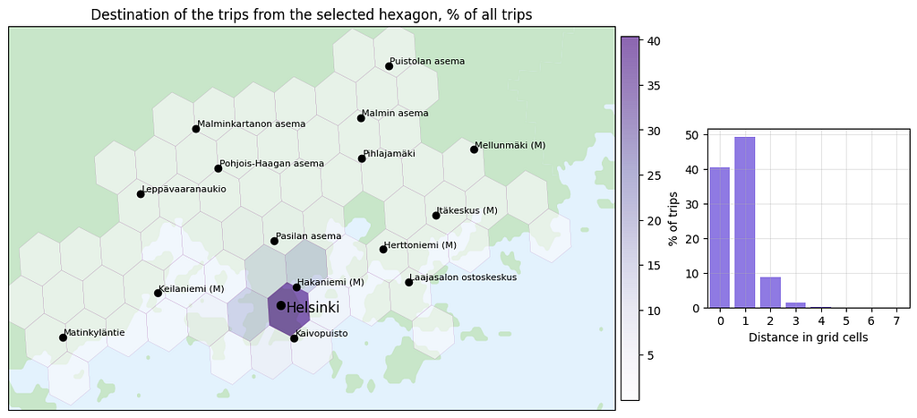
We can also visualize the destinations of trips originating from the selected hexagon to determine where users are heading from that area.
On the left, we display a hexagon map showing the destination of the trips originating from the selected hexagon. On the right, we compute the grid distance between the selected hexagon and the destination hexagon where a distance of 0 signifies that the return and departure hexagons are the same. This analysis reveals that approximately 40% of the bike trips from the selected hexagon start and end within the same hexagon. Additionally, nearly 50% of the trips end in neighboring hexagons, indicating that the majority of bike trips from the Helsinki city center are directed to other areas within the city center.
D. Selecting one location and analyzing data in the area around it
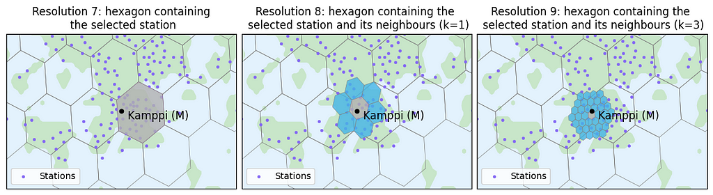
At times, we aim to gain insights around a specific location. For instance, we might want to understand city bike usage around a metro station that we frequently use, such as Kamppi metro station in this example. If we seek insights within a radius of approximately ~1 km, we might be tempted to choose the hexagon of resolution 7 containing the station, as the radius of that hexagon is roughly 1.4 km. However, as shown in the left image below, the selected station is not at the center of the hexagon, thus not effectively covering the ~1 km area around the data point.
When we seek insights within a ~1 km radius around a specific data point, such as Kamppi metro station, we should not simple choose a hexagon that is roughly the size of the wanted radius because the data point might not be in the middle of the hexagon (as illustrated in the left image). In order to better center the data point, it is advisable to opt for a smaller hexagon containing the chosen station and then consider its neighboring cells as well. The neighboring hexagons are very easy to find with H3’s k_ring function. The smaller hexagon we choose and the more neighbors we take into account, the more effectively the selected data point is centered.
Using the selected hexagons, we could analyze data around the desired data point.
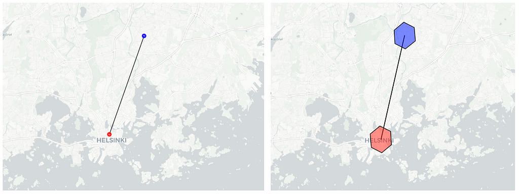
E. Anonymising the location data
After obtaining hexagon indexes through geographic coordinates, we can omit the exact location data and exclusively utilise the H3 indexes. This aids in anonymizing the data, as there is no need to reveal the precise user location.
Illustration of data anonymization: on the left, we display the precise start and end locations of a bike trip, which may expose sensitive user information. On the right, by using hexagon indexes, we avoid disclosing the exact location and instead represent the hexagon area with a radius of approximately 1.4km where the bike trip starts and ends.
Issues with hexagons
The hexagon grid provided by the H3 library proves to be a useful tool for spatial data analysis. However, there are some challenges that arise when utilizing this hexagon grid, which we will elaborate on below.
From a mathematical perspective, the definition of hexagonal zones is entirely arbitrary. For this reason H3 hexagons lack alignment with any “natural elements,” such as streets, rivers, lakes, islands, highways, or train tracks. When employing the hexagon grid, data points are aggregated based on their proximity in straight-line distance. However, these points may not always be connected by roads, potentially resulting in the grouping of disparate locations into a single cluster. We show an example of this below.
For instance, if we select hexagons of resolution 6 (indicating a radius of approximately ~3.7 km), the two red-marked dots belong to the same hexagon even though they are not directly connected and the biking distance between these data points is roughly ~11km. Analyzing statistics for this hexagon may not yield much value due to the diverse nature of the different areas.
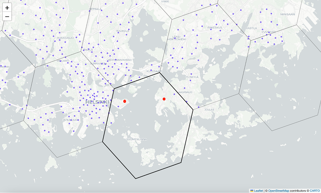
Another challenge arises if we aim to use the hexagons for anonymizing a user’s precise location. For example, instead of recording the user’s exact location, we could use hexagons of resolution 7 to indicate that the data point lies within an area with a radius of roughly 1.4 km. However, since the ideal hexagon resolution for analysis is often unknown, there may be a desire to link the data across various resolutions. But as the coarser hexagon only approximately contains its seven child hexagons, we might end up disclosing the location of a data point positioned close to the hexagon’s border more accurately than the specified 1.4 km radius. We demonstrate this in the image below.
When employing hexagons for data anonymization, it’s crucial to recognize that we may unintentionally disclose the position more accurately than intended. For instance, when examining the hexagon indexes of the red data point at resolutions 7 and 8, we observe that the smaller hexagon is not a direct child of the larger hexagons. Consequently, the data point must be situated within the overlapping region highlighted in black. Instead of anonymizing the data point to a region with a radius of roughly 500m, we, in fact, provided more detailed information. This poses a risk when anonymizing location data that is highly sensitive.
Summary
Uber’s global H3 hexagonal grid system is a user-friendly and practical tool for spatial data analysis. It can also help us to anonymise sensitive location data.
H3 buckets location data points into hexagonal areas that cover the whole Earth with repetitive tiling. H3 library supports sixteen different hexagon resolutions, with the largest hexagons being ~1300km and the smallest only ~50m. From the different sizes of hexagons one must choose the resolution that best fits the purpose of the analysis.
Each hexagon at finer resolution is roughly one seventh of the hexagon in coarser resolution. However, hexagons cannot be perfectly subdivided into seven smaller hexagons so the finer cells only approximately contain their parent cell. This means that the count of events in the parent cell might not be equal to the count of events in its children cells.
Note that, hexagon grid lacks alignment with any “natural elements,” such as streets, rivers, lakes, islands, highways, or train tracks, so disparate locations might be grouped into a single cluster.
We already live in a world shaped by powerful algorithmic systems, and our ability to navigate them effectively is, at best, shaky—very often through no fault of our own.
We may want to think, like Spider-Man’s Uncle Ben, that with great power comes great responsibility; in the real, non-comic-book world, the two don’t always arrive simultaneously. The companies driving most AI innovation often rush to release products even when the latter have the potential to disrupt lives, careers, and economies and to perpetuate harmful stereotypes; responsible deployment isn’t always their creators’ top priority.
To help us survey the current state of affairs—risks, limitations, and potential future directions—we’ve put together a strong lineup of recent articles that tackle the topic of AI’s social footprint. From medical use cases to built-in biases, these posts are great conversation-starters, and might be especially helpful for practitioners who have only recently started to consider these questions.
Gender Bias in AI (International Women’s Day Edition) In a well-timed post, published on International Women’s Day last week, Yennie Jun offers a panoramic snapshot of the current state of research into gender bias in large language models, and how this issue relates to other problems and potential blind spots lurking under LLMs’ shiny veneer.
Is AI Fair in Love (and War)? Focusing on a different vector of bias—race and ethnicity—Jeremy Neiman shares findings from his recent experiments with GPT-3.5 and GPT-4, tasking the models with generating dating profiles and playing matchmaker, and revealing varying degrees of racial bias along the way.
Seeing Our Reflection in LLMs To what extent should LLMs reflect reality as it currently is, warts and all? Should it embellish history and current social structures to minimize bias in its representations? Stephanie Kirmer invites us to reflect on these difficult questions in the wake of Google’s multimodal model Gemini generating questionable outputs, like racially diverse Nazi soldiers.
Emotions-in-the-loop Invoking a near future where the line between sci-fi and reality is blurrier than ever, Tea Mustać wonders what life would look like for a “scanned” person, and what legal and ethical frameworks we need to put in place: “when it comes to drawing lines and deciding what can or cannot and what should or should not be tolerated, the clock for making these decisions is slowly but steadily ticking.”
ChatGPT Is Not a Doctor After years of having to contend with patients who’d consulted Dr. Google, medical workers now need to deal with the unreliable advice dispensed by ChatGPT and similar tools. Rachel Draelos, MD, PhD’s deep dive unpacks the obvious—and less obvious—risks of outsourcing diagnoses and treatment strategies to general-purpose chatbots.
Looking to branch out into some other topics this week? We hope so—the following are all top-notch reads:
Many areas of science and engineering encounter data defined on the sphere. Modelling and analysis of such data often requires the spherical counterpart to the Fourier transform — the spherical harmonic transform. We provide a brief overview of the spherical harmonic transform and present a new differentiable algorithm tailored towards acceleration on GPUs [1]. This algorithm is implemented in the recently released S2FFT python package, which supports both JAX and PyTorch.
[Image created by authors.]
Increasingly often we are interested in analysing data that lives on the sphere. The diversity in applications is remarkable, ranging from quantum chemistry, biomedical imaging, climate physics and geophysics, to the wider cosmos.
The most well-known areas in which one encounters data on the sphere are within the physical sciences, particularly within atmospheric science, geophysical modelling, and astrophysics.
Examples of the most widely known cases of spherical data, such as the Earth (left) and artist impression of astronomical observations (right). [Earth image sourced from Wikipedia; astrophysics image sourced from Wikipedia.]
These problems are naturally spherical as observations are made at each point on the surface of a sphere: the surface of the Earth for geophysics and the sky for astrophysics. Other examples come from applications like computer graphics and vision, where 360° panoramic cameras capture the world around you in every direction.
In many cases the spherical nature of the problem at hand is fairly easy to see; however, this is not always the case. Perhaps surprisingly, spherical data is quite frequently encountered within the biological disciplines, though the spherical aspect is often much less obvious! Since we are often concerned about local directions in biological studies, such as the direction water diffuses within the brain, we encounter spherical data.
Diffusion tensor imaging of neuronal connections in the human brain. Within each voxel neurons are free to travel in any direction, so the problem is naturally spherical. [Animation by Alfred Anwander, CC-BY licence.]
Given the prevalence of such data, it isn’t surprising that many spherical analysis techniques have been developed. A frequency analysis of the data can be insightful, often to afford a statistical summary or an effective representation for further analysis or modelling. Recently geometric deep learning techniques have proven highly effective for the analysis of data on complex domains [2–6], particularly for highly complex problems such as molecular modelling and protein interactions (see our prior post on A Brief Introduction to Geometric Deep Learning).
Fourier meets Legendre
So we have data on the sphere and a variety of techniques by which spherical data may be analysed, but we need mathematical tools to do so. Specifically, we need to know how to decompose spherical data into frequencies efficiently.
The Fourier transforms provides a frequency decomposition that is often used to calculate statistical correlations within data. Many physical systems may also be described more straightforwardly in frequency space, as each frequency may evolve independently.
To extend the standard Fourier transform to the sphere, we need the meeting of minds of two 17th century French mathematicians: Joseph Fourier and Adrien-Marie Legendre.
Joseph Fourier (left) and Adrien-Marie Legendre (right). Tragically, the caricature of Legendre is the only known image of him. [Fourier image sourced from Wikipedia. Legendre image sourced from Wikipedia.]
First, let’s consider how to decompose Euclidean data into its various frequencies. Such a transformation of the data was first derived by Joseph Fourier and is given by
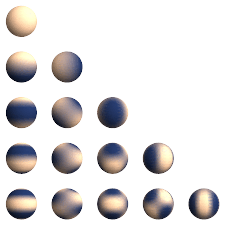
which is found almost everywhere and is a staple of undergraduate physics for a reason! This works by projecting our data f(x) onto a set of trigonometric functions, called a basis. One can do effectively the same thing on the sphere, but the basis functions are now given by the spherical harmonics Yₗₘ:
where (θ, ϕ) are the usual spherical polar co-ordinates.
Spherical harmonic basis functions (real component). [Sourced from Wikipedia.]
The spherical harmonics (shown above) can be broken down further into the product of an exponential and Legendre polynomials — à la Adrien-Marie Legendre — as
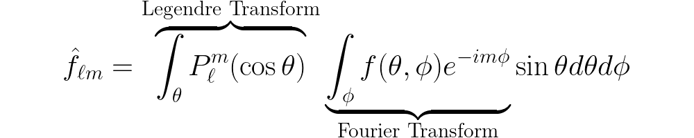
And so the spherical harmonic transform can be written as a Fourier transform followed by an associated Legendre transform. The real difficulty comes in evaluating the Legendre part of the transform: it is either computationally expensive or memory hungry, depending on the method one chooses.
The importance of being differentiable
The growth of differentiable programming is opening up many new types of analysis. In particular, many applications require spherical transforms that are differentiable.
Machine learning models on the sphere require differentiable transforms so that models may be trained by gradient-based optimisation algorithms, i.e. through back-propagation.
Emerging physics-enhanced machine learning approaches [7] for hybrid data-driven and model-based approaches [8] also require differentiable physics models, which in many cases themselves require differentiable spherical transforms.
With this in mind it is clear that for modern applications an efficient algorithm for the spherical harmonic transform is necessary but not enough. Differentiability is key.
A software package named S2FFT
This is all well and good, but how does one efficiently evaluate the spherical harmonic transform? A variety of algorithms have been developed, with some great software packages. However for modern applications we need one that is differentiable, can run on hardware accelerators like GPUs, and is computationally scalable.
By redesigning the core algorithms from the ground up (as described in depth in our corresponding paper [1]), we recently developed a python package called S2FFT that should fit the bill.
S2FFT is implemented in JAX, a differentiable programming language developed by Google, and also includes a PyTorch frontend.
S2FFT is a Python package implementing differentiable and accelerated spherical harmonic transforms, with interfaces in JAX and PyTorch. [Image created by authors.]
S2FFT provides two operating modes: precompute the associated Legendre functions, which are then accessed at run time; or compute them on-the-fly during the transform. The pre-compute approach is just about as fast as you can get, but the memory required to store all Legendre function values scales cubicly with resolution, which can be a problem! The second approach we provide instead recursively computes Legendre terms on-the-fly, and so can be scaled to very high resolutions.
In addition, S2FFT also supports a hybrid automatic and manual differentiation approach so that gradients can be computed efficiently.
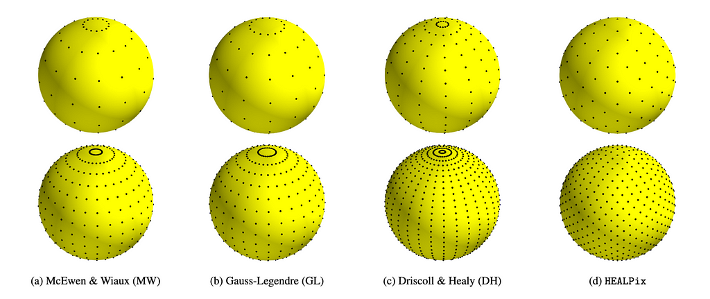
The package is designed to support multiple different sampling schemes on the sphere. At launch, equiangular (McEwen & Wiaux [9], Driscoll & Healy [10]), Gauss-Legendre, and HEALPix [11] sampling schemes are supported, although others may easily be added in future.
Different sampling schemes on the sphere supported by S2FFT. [Original figure created by authors.]
The S2FFT package is available on PyPi so anyone can install it straightforwardly by running:
pip install s2fft
Or to pick up PyTorch support by running:
pip install "s2fft[torch]"
From here the top-level transforms can be called simply by
# Compute inverse spherical harmonic transform f = s2fft.inverse_jax(flm, L)
These functions can be picked up out of the box and integrated as layers within existing models, both in JAX and PyTorch, with full support for both forward and reverse mode differentiation.
Future perspectives
With researchers becoming increasingly interested in differentiable programming for scientific applications, there is a critical need for modern software packages that implement the foundational mathematical methods on which science is often based, like the spherical harmonic transform.
We hope S2FFT will be of great use in coming years and are excited to see what people will use it for!
References
[1] Price & McEwen, Differentiable and accelerated spherical harmonic and Wigner transforms, arxiv:2311.14670 (2023).
[2] Bronstein, Bruna, Cohen, Velickovic, Geometric Deep Learning: Grids, Groups, Graphs, Geodesics, and Gauges, arXix:2104.13478 (2021).
[3] Ocampo, Price & McEwen, Scalable and equivariant spherical CNNs by discrete-continuous (DISCO) convolutions, ICLR (2023).
In this tutorial, we’ll be fine-tuning a CausalLM model to do simple translation. Photo by Rob Wilson on Unsplash
In the last post, we talked about what CausalLM is and how Hugging Face expects data to be formatted. In this post, we’re going to walk through an abridged notebook with three ways to format the data to fine-tune a model. The first is a straightforward approach building on the intuition from the previous post simply copying input_ids into labels. The second approach utilizes masking to learn select parts of the text. The third approach uses a separate library, TRL, so that we don’t have to manually mask the data.
I’ll leave out some function definitions to keep it readable, so it’s best to reference the full notebook to get all the code.
Fine-tuning with labels copied from input ids
We’re going to be using Bloom-560m, a multilingual model which is small enough that we can fine-tune it on a standard laptop.
model_name = "bigscience/bloom-560m"
tokenizer = AutoTokenizer.from_pretrained(
    model_name, trust_remote_code=True, padding_side="right"
)  # padding side should be right for CausalLM models
# overfit to 5 made up examples
str1 = 'nn### Human: How do you say "dog" in Spanish?nn### Assistant: perro'
str2 = 'nn### Human: How do you say "water" in Spanish?nn### Assistant: agua'
str3 = 'nn### Human: How do you say "hello" in Spanish?nn### Assistant: hola'
str4 = 'nn### Human: How do you say "tree" in Spanish?nn### Assistant: árbol'
str5 = 'nn### Human: How do you say "mother" in Spanish?nn### Assistant: madre'
train_data = {
    "text": [str1, str2, str3, str4, str5],
}
dataset_text = Dataset.from_dict(train_data)

# to test if we learn how to generate an unknown word.
holdout_str = (
    'nn### Human: How do you say "day" in Spanish?nn### Assistant:<s>'  # día
)
device = "cuda" if torch.cuda.is_available() else "cpu"
holdout_input = tokenizer(holdout_str, return_tensors="pt").to(device)
Let’s start by doing some preprocessing. We’re going to add some special tokens, namely “end of sequence” (eos) and “beginning of sequence“ (bos). These special tokens can be helpful for the model to know when it’s supposed to start and stop generating text.
INSTRUCTION_TEMPLATE_BASE = "nn### Human:"
RESPONSE_TEMPLATE_BASE = "nn### Assistant:"
def add_special_tokens(
    example: Dict,
    tokenizer: PreTrainedTokenizerBase,
) -> Dict:
    # add eos_token before human text and bos_token before assistant text
    example["text"] = (
        example["text"]
        .replace(
            INSTRUCTION_TEMPLATE_BASE, tokenizer.eos_token + INSTRUCTION_TEMPLATE_BASE
        )
        .replace(RESPONSE_TEMPLATE_BASE, RESPONSE_TEMPLATE_BASE + tokenizer.bos_token)
    )
    if not example["text"].endswith(tokenizer.eos_token):
        example["text"] += tokenizer.eos_token
    # Remove leading EOS tokens
    while example["text"].startswith(tokenizer.eos_token):
        example["text"] = example["text"][len(tokenizer.eos_token) :]
    return example

dataset_text = dataset_text.map(lambda x: add_special_tokens(x, tokenizer))
print(f"{dataset_text=}")
print(f"{dataset_text[0]=}")
>>> dataset_text=Dataset({
    features: ['text'],
    num_rows: 5
})
>>> dataset_text[0]={'text': 'nn### Human: How do you say "dog" in Spanish?nn### Assistant:<s> perro</s>'}
Now, we’re going to do what we learned last session: create an input with a labels key copied from input_ids.
To start, labels and input_ids are identical. Let’s see what happens when we train a model like that.
# training code inspired by #https://mlabonne.github.io/blog/posts/Fine_Tune_Your_Own_Llama_2_Model_in_a_Colab_Notebook.html model = load_model(model_name) output_dir = "./results" # How many times to iterate over the entire dataset num_train_epochs = 15 # We're not aligning the sequence length (ie padding or truncating) # so batch training won't work for our toy example. per_device_train_batch_size = 1
After 15 epochs, we’re still kind of confused. We output ‘</s>’ which is close but we really want to output “perro</s>”. Let’s learn another 15 epochs.
After 30 epochs we learned what we were supposed to!
Let’s simulate what happens in training by iteratively predicting the prompt one token at a time, based on the previous tokens.
print_iterative_generate(model, tokenizer, inputs)
>>>
#
: How do you say "how morning in Spanish?


### Assistant: gu buenopu
That’s pretty close to the actual prompt, as we expected. But the task is translation, so we don’t really care about being able to predict the user prompt. Is there a way to learn just the response part?
Masked approach
Hugging Face allows you to only learn to predict certain tokens by “masking” the tokens you don’t care about in “labels.” This is different from the attention mask, which hides previous tokens we use to generate a new token. Masking the labels hides the token you’re supposed to output at a certain index from the loss function. Note the wording: Hugging Face has it implemented such that during training, we still generate predictions for that masked token. However, because we hide the true label to compare the predictions with, we don’t directly learn how to improve on that prediction.
We create the “mask” by flipping those tokens to -100 in the labels key.
def create_special_mask(example: Dict) -> Dict: """Mask human text and keep assistant text as it is.
Args: example (Dict): Result of tokenizing some text
Returns: Dict: The dict with the label masked """ # setting a token to -100 is how we "mask" a token # and tell the model to ignore it when calculating the loss mask_token_id = -100 # assume we always start with a human text human_text = True for idx, tok_id in enumerate(example["labels"]): if human_text: # mask all human text up until and including the bos token example["labels"][idx] = mask_token_id if tok_id == tokenizer.bos_token_id: human_text = False elif not human_text and tok_id == tokenizer.eos_token_id: # don’t mask the eos token, but the next token will be human text to mask human_text = True elif not human_text: # leave example['labels'] text as it is when assistant text continue return example
dataset_masked = dataset.map(create_special_mask) # convert dataset from lists to torch tensors dataset_masked.set_format(type="torch", columns=["input_ids", "attention_mask", "labels"]) print(f"{dataset_masked[0]["labels"]=}")
First off, we were faster this time by more than 10%. Presumably, the fact that we have fewer loss calculations makes things a bit quicker.
I wouldn’t bank on the speed up being this large — our example is pretty lopsided with much more human text than generated text. But when training times are in the hours, every little percentage is helpful.
This time we only need 15 epochs to learn the task. Let’s go back to how things are under the hood during training
print_iterative_generate(model, tokenizer, inputs)
>>>#include
 code
 to I get "we" in English?
A: Spanish: How bueno
Iteratively predicting the prompt leads to non-sense compared with our first training approach. This checks out: we masked the prompt during training and therefore don’t learn how to predict anything up until our real target: the assistant response.
Using TRL’s supervised fine-tuning trainer
Hugging Face semi-recently rolled out a TRL (transformer reinforcement learning) library to add end-to-end support for the LLM training process. One feature is supervised fine-tuning. Using the DataCollatorForCompletionOnlyLM and SFTTrainer classes, we can create the labels like we did with create_special_mask with just a few configs.
model = load_model(model_name)
# a hugging face function to do the copying of labels for you. # using the instruction and response templates will mask everything between the instruction template and the start of the response_template collator = DataCollatorForCompletionOnlyLM( instruction_template=tokenizer.eos_token, response_template=tokenizer.bos_token, tokenizer=tokenizer, )
Success! If you dig deeper, training actually took longer using SFT. This might be credited to the fact that we have to tokenize at training time rather than as a preprocessing step in the masked approach. However, this approach gives us free batching (you’d need to tweak the tokenization process to use the masked approach to batch properly), which should make things faster in the long run.
The full notebook explores a few other things like training off multi-turn chats and using special_tokens to indicate human vs chat text.
Obviously, this example is a bit basic. However, hopefully you can start to see the power of using CausalLM: You can imagine taking interactions from a large, reliable model, and using the techniques above to fine-tune a smaller model on the large model’s outputs. This is called knowledge distillation.
If we’ve learned anything over the last couple years of LLMs, it’s that we can do some surprisingly intelligent things just by training on next token prediction. Causal language models are designed to do just that. Even if the Hugging Face class is a bit confusing at first, once you’re used to it, you have a very powerful interface to train your own generative models.
Today, we’re excited to announce that the Gemma model is now available for customers using Amazon SageMaker JumpStart. Gemma is a family of language models based on Google’s Gemini models, trained on up to 6 trillion tokens of text. The Gemma family consists of two sizes: a 7 billion parameter model and a 2 billion parameter model. Now, […]
We use cookies on our website to give you the most relevant experience by remembering your preferences and repeat visits. By clicking “Accept”, you consent to the use of ALL the cookies.
This website uses cookies to improve your experience while you navigate through the website. Out of these, the cookies that are categorized as necessary are stored on your browser as they are essential for the working of basic functionalities of the website. We also use third-party cookies that help us analyze and understand how you use this website. These cookies will be stored in your browser only with your consent. You also have the option to opt-out of these cookies. But opting out of some of these cookies may affect your browsing experience.
Necessary cookies are absolutely essential for the website to function properly. These cookies ensure basic functionalities and security features of the website, anonymously.
Cookie
Duration
Description
cookielawinfo-checkbox-analytics
11 months
This cookie is set by GDPR Cookie Consent plugin. The cookie is used to store the user consent for the cookies in the category "Analytics".
cookielawinfo-checkbox-functional
11 months
The cookie is set by GDPR cookie consent to record the user consent for the cookies in the category "Functional".
cookielawinfo-checkbox-necessary
11 months
This cookie is set by GDPR Cookie Consent plugin. The cookies is used to store the user consent for the cookies in the category "Necessary".
cookielawinfo-checkbox-others
11 months
This cookie is set by GDPR Cookie Consent plugin. The cookie is used to store the user consent for the cookies in the category "Other.
cookielawinfo-checkbox-performance
11 months
This cookie is set by GDPR Cookie Consent plugin. The cookie is used to store the user consent for the cookies in the category "Performance".
viewed_cookie_policy
11 months
The cookie is set by the GDPR Cookie Consent plugin and is used to store whether or not user has consented to the use of cookies. It does not store any personal data.
Functional cookies help to perform certain functionalities like sharing the content of the website on social media platforms, collect feedbacks, and other third-party features.
Performance cookies are used to understand and analyze the key performance indexes of the website which helps in delivering a better user experience for the visitors.
Analytical cookies are used to understand how visitors interact with the website. These cookies help provide information on metrics the number of visitors, bounce rate, traffic source, etc.
Advertisement cookies are used to provide visitors with relevant ads and marketing campaigns. These cookies track visitors across websites and collect information to provide customized ads.


.jpg)