Tag: AI

  • Entity Type Prediction with Relational Graph Convolutional Network (PyTorch)

    Entity Type Prediction with Relational Graph Convolutional Network (PyTorch)

    Tiddo Loos

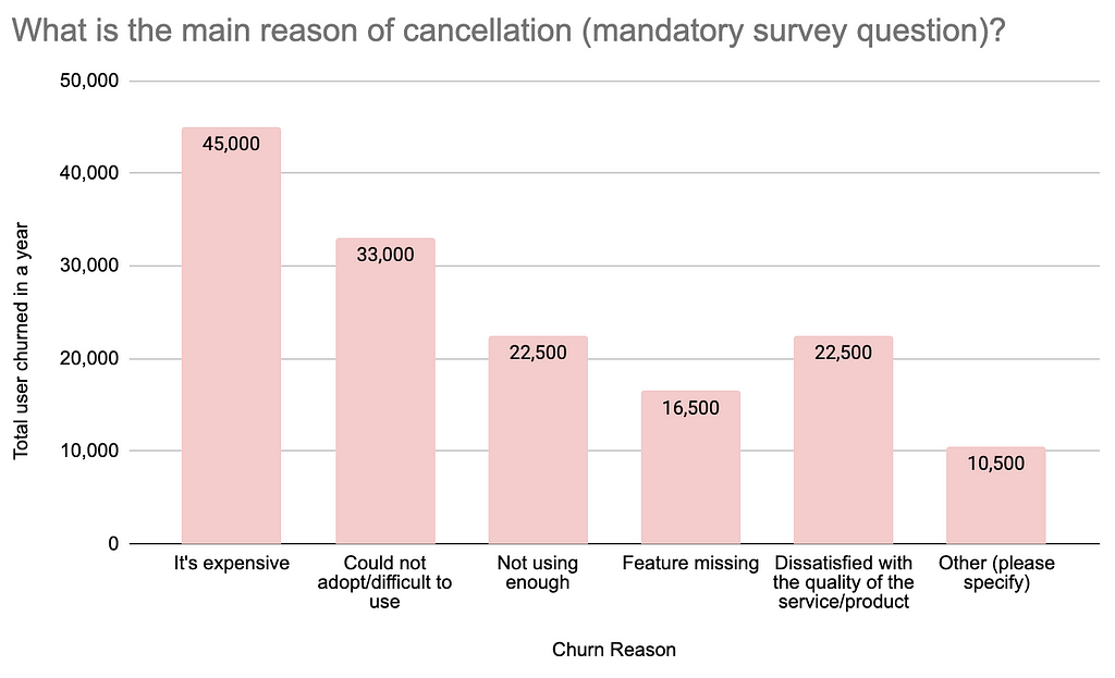
    This post proposes a Python setup for entity type prediction on heterogenous graphs, using the Relational Graph Convolutional Network (R-GCN). The setup uses the RGCNConv module from PyTorch. The code discussed in this post can be found on GitHub. Before we dive into the setup in Python, knowledge graphs and the R-GCN model will be explained.

    Knowledge Graphs

    A (knowledge) graph is a relational data representation, expressing relations between entities. The Resource Description Framework (RDF) is a common framework to describe and store relational data [1]. A subject (entity), predicate (relation) and object (entity) are the components of the RDF-triple. In a graph, the entities are the nodes, and the predicates are the relational connections between the nodes. In this post, entities and nodes as well as predicates and relations, are used interchangeably. An example of a subject-predicate-object RDF-triple is: Tarantino directed Kill Bill. An entity in the graph can have a type denoted with an rdf:type predicate. Looking at the RDF-triple example, entity types can be assigned as: Tarentino rdf:type director, Kill Bill rdf:type movie.

    To create a knowledge graph, commonly, the data is collected or added with the use of manually, semi-automated and automated methods. DBPedia, Wikidata and Yago are examples of constructed knowledge graphs and are impressive considering their size and collection efforts. However, the problem of incompleteness and missing data remains in these graphs. Missing data, regarding graphs, entails missing RDF-triples in the graph [2]. The aim of entity type prediction is to complement an entity with an rdf:type predicate and its label. Entity type prediction for graph nodes, is a transductive learning task, as the training and evaluation data both are encountered by the model. The rdf:type predicates and labels are pruned, while the graph nodes, for which the prediction is made, remain part of the training data [3].

    Graphs that contain multiple entity and relation types are called heterogeneous graphs. Significant research has been conducted on modeling heterogeneous graphs for relation type and entity type prediction. On these tasks, a well-performing model is the Relational Graph Convolutional Network (R- GCN)[4]. The R-GCN model contains relation/predicate specific weights. Besides these weights, other trainable parameters are the entity vector representations (or embeddings). The entity embeddings are comparable to word embeddings. If one would visualize word embeddings into vector space, one would find that the words queen and woman lie closer to each other. For man and king holds the same. When visualizing entity embeddings in a vector space, entities are closer to each other if they are more similar.

    R-GCN

    In this section we discuss how the R-GCN model operates. First, the message passing framework of the Graph Convolution Network (GCN) is discussed. Message passing means propagating node features by exchanging information between adjacent nodes. The R-GCN’s core operation is comparable to the message passing framework of the GCN. Secondly we dive into the message passing of the R-GCN model.

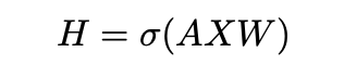
    The GCN model learns the vector representations of the entities in the graph. These representations are input for the model and can be updated with backpropagation. The mechanism for GCN relies on a message passing framework, where through the edges messages get passed which update the node representation. The message passing framework can be achieved by matrix multiplications, where the message passing for a single GCN layer in directed graphs is [5]:

    Equation 1: update of a single layer in GCN.

    Here X is the vector representation matrix, indicating the features for each node. The relation specific weights are denoted by W. σ is a non-linearity and A is a normalized Laplacian adjacency matrix of the graph. The operation of equation 1 is called message passing as the information of neighboring entities is passed to update the representation of each entity. The message passing framework enables backpropagation to update weights (W) and the entity representation (X). Looking at a single node update with GCN, we rewrite Equation 1 as [5]:

    Equation 2: update for a single node in GCN.

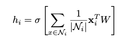
    The output vector hi is the updated representation for node i. Ni are the representations of incoming edge neighbors. Ni is used to calculate the average of the sum of vector representations of the neighbors of i. The average is multiplied by the current representation xi of the to-be-updated node i and a weight matrix W. Then, a non-linearity σ is applied. hi is the new node representation, constructed from neighboring vector representations and the previous node representation of i.

    The R-GCN model extends GCN to learn node representations on heterogeneous graphs [5]. R-GCN accounts for different relations and the directions of edges (incoming and outgoing) for node representation updates. The message passing operation of a single R-GCN layer with multiple relations can be derived from Equation 1 as [5]:

    Equation 3: update of a single layer in R-GCN.

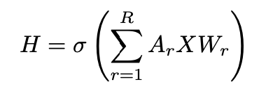
    Here, the adjacency matrix Ar describes the edge connections between the nodes. For each relation r∈R in the graph there exists a relation specific weight matrix Wr. The update for a single entity vi is derived from the massage passing framework of the R-GCN layer (Equation 3) as [4]:

    Equation 4: update for a single node in R-GCN.

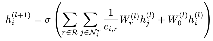
    Ni is the set of neighboring nodes connected via incoming and outgoing edges. Wr is the relation specific weight and hj is a neighboring node. The sum of each neighboring vector representation multiplied by the relation specific weight of the connected edge, is taken into account for the node update. Furthermore, W0 is a special weight added to each node that functions as a self-loop. Node i is updated by taking the neighboring node representations into account as well as the current representation of i itself. Therefore, stacking two R-GCN layers, the node representation at layer l is taken into account for updating the same node at layer l+1. ci,r is a regularization term which can be modified according to the desired implementation [4].

    Python Setup

    In this chapter a python setup is discussed. The entire code, including the setup and run commands can be found on GitHub.

    Graph triple storage

    Let’s first dive into the data structure of a graph and its triple stores. A common file type to store graph data is the ‘N-triple’ format with the file extension ‘.nt’. Figure 1 displays an example graph file (example.nt) and Figure 2 is the visualization of the graph data.

    Figure 1: example.nt
    Figure 2: visualization of example.nt

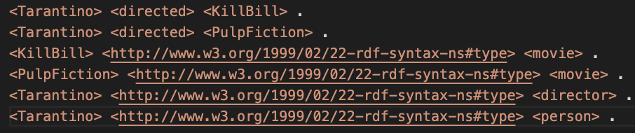
    For the sake of clarity in the visualization of example.nt, it was decided to indicate the rdf:type relation with a dotten line. In Figure 2 we see that Tarantino has two type labels and Kill Bill and Pulp Fiction have only one. We will see that this is important to decide for an activation and loss function later on.

    Storing nodes, relations and node labels

    To create and store important graph information we created the Graph class in graph.py.

    import torch

    from collections import defaultdict
    from torch import Tensor

    class Graph:

    RDF_TYPE = '<http://www.w3.org/1999/02/22-rdf-syntax-ns#type>'

    def __init__(self) -> None:
    self.graph_triples: list = None
    self.node_types: dict = defaultdict(set)
    self.enum_nodes: dict = None
    self.enum_relations: dict = None
    self.enum_classes: list = None
    self.edge_index: Tensor = None
    self.edge_type: Tensor = None

    The rdf:type relation is hard coded to later remove it from the relation set. Furthermore, variables are created to store important graph information. To use the graph data, we need to parse the ‘.nt’ file and store its contents. There are libraries, like ‘RDFLib’ that can help with this and offer other graph functionalities. However, I found that ‘RDFLib’ does not scale well with larger graphs. Therefore, new code was created to parse the file. To read and store the RDF-triples from a ‘.nt’ file, the function below in the Graph class was created.

    def get_graph_triples(self, file_path: str) -> None:
    with open(file_path, 'r') as file:
    self.graph_triples = file.read().splitlines()

    The above function stores a list of strings in self.graph_triples: [ ‘<entity> <predicate> <entity> .’,…,‘<entity> <predicate> <entity> .’]. The next step is to store all distinct graph nodes and predicates and to store the node labels.

    def init_graph(self, file_path: str) -> None:
    '''intialize graph object by creating and storing important graph variables'''

    # give the command to store the graph triples
    self.get_graph_triples(file_path)

    # variables to store all entities and predicates
    subjects = set()
    predicates = set()
    objects = set()

    # object that can later be printed to get insignt in class (im)balance
    class_count = defaultdict(int)

    # loop over each graph triple and split 2 times on space:' '
    for triple in self.graph_triples:
    triple_list = triple[:-2].split(' ', maxsplit=2)

    # skip triple if there is a blank lines in .nt files
    if triple_list != ['']:
    s, p, o = triple_list[0].lower(), triple_list[1].lower(), triple_list[2].lower()

    # add nodes and predicates
    subjects.add(s)
    predicates.add(p)
    objects.add(o)

    # check if subject is a valid entity and check if predicate is rdf:type
    if str(s).split('#')[0] != 'http://swrc.ontoware.org/ontology'
    and str(p) == self.RDF_TYPE.lower():
    class_count[str(o)] += 1
    self.node_types[s].add(o)

    # create a list with all nodes and then enumerate the nodes
    nodes = list(subjects.union(objects))
    self.enum_nodes = {node: i for i, node in enumerate(sorted(nodes))}

    # remove the rdf:type relations since we would like to predict the types
    # and enumerate the relations and save as dict
    predicates.remove(self.RDF_TYPE)
    self.enum_relations = {rel: i for i, rel in enumerate(sorted(predicates))}

    # enumereate classes
    self.enum_classes = {lab: i for i, lab in enumerate(class_count.keys())}

    # if you want to: print class occurence dict to get insight in class (im)balance
    # print(class_count)

    In self.node_types the label(s) for each node are stored. The value for each node is the set of labels. Later this dictionary is used to vectorize node labels. Now, let’s look at the loop over self.graph_triples. We create a triple_list with triple[:-2].split(‘ ‘, maxsplit=2). In triple_list we now have: [‘<entity>’, ‘<predicate>’, ‘<entity>’]. The subject, predicate and object are stored in the designated subjects, predicates and objects sets. Then, if the subject was a valid entity with an rdf:type predicate and type label, the node and its label are added with self.node_types[s].add(o).

    From the subjects, predicates and objects sets, the dictionaries self.enum_nodes and self.enum_relations are created, which store nodes and predicates as keys respectively. In these dictionaries the keys are enumerated with integers and stored as the value for each key. The rdf:type relation is removed from the predicates set before storing the numbered relations in self.enum_relations. This is done because we do not want our model to train for the rdf:type relation. Otherwise, through the rdf:type relation the node embedding will be influence and taken into account for each node update. This is prohibited as it would result in information leakage for the prediction task.

    Creating edge_index and edge_type

    With the stored graph nodes and relations we can create the edge_index and edge_type tensors. The edge_index is a tensor that indicates which nodes are connected. The edge_type tensor stores by which relation the nodes are connected. Importantly to note, to allow the model to pass messages in two directions, the edge_index and edge_type also include the inverse of each edge [4][5]. This enables to update each node representation by incoming and outgoing edges. The code to create the edge_index and edge_type is displayed below.

    def create_edge_data(self):
    '''create edge_index and edge_type'''

    edge_list: list = []

    for triple in self.graph_triples:
    triple_list = triple[:-2].split(" ", maxsplit=2)
    if triple_list != ['']:
    s, p, o = triple_list[0].lower(), triple_list[1].lower(), triple_list[2].lower()

    # if p is RDF_TYPE, it is not stored
    if self.enum_relations.get(p) != None:

    # create edge list and also add inverse edge of each edge
    src, dst, rel = self.enum_nodes[s], self.enum_nodes[o], self.enum_relations[p]
    edge_list.append([src, dst, 2 * rel])
    edge_list.append([dst, src, 2 * rel + 1])

    edges = torch.tensor(edge_list, dtype=torch.long).t() # shape(3, (2*number_of_edges - #RDFtype_edges))
    self.edge_index = edges[:2]
    self.edge_type = edges[2]

    In the code above, we start with looping over the graph triples like before. Then we check if the predicate p can be found. If not, the predicate is the rdf:type predicate and this predicate is not stored. Therefore, the triple is not included in the edge data. If the predicate is stored in self.enum_relations the corresponding integers for the subject, predicate and object are assigned to src, dst and rel respectively. The edges and inverse edges are added to edge_list . Distinctive integers for each non-inverse relation are created with 2*rel. For the inverse edge the distinctive integer for the inverse relation is created with 2*rel+1 .

    Create training data

    Below the class TrainingData of trainingdata.py is displayed. This class creates and stores training, validation and test data for the entity type prediction task.

    import torch

    from dataclasses import dataclass
    from sklearn.model_selection import train_test_split

    from graph import Graph

    @dataclass
    class TrainingData:
    '''class to create and store training data'''
    x_train = None
    y_train = None
    x_val = None
    y_val = None
    x_test = None
    y_test = None

    def create_training_data(self, graph: Graph) -> None:
    train_indices: list = []
    train_labels:list = []

    for node, types in graph.node_types.items():
    # create list with zeros
    labels = [0 for _ in range(len(graph.enum_classes.keys()))]
    for t in types:
    # Assing 1.0 to correct index with class number
    labels[graph.enum_classes[t]] = 1.0
    train_indices.append(graph.enum_nodes[node])
    train_labels.append(labels)

    # create the train, val en test splits
    x_train, x_test, y_train, y_test = train_test_split(train_indices,
    train_labels,
    test_size=0.2,
    random_state=1,
    shuffle=True)
    x_train, x_val, y_train, y_val = train_test_split(x_train,
    y_train,
    test_size=0.25,
    random_state=1,
    shuffle=True)

    self.x_train = torch.tensor(x_train)
    self.x_test = torch.tensor(x_test)
    self.x_val = torch.tensor(x_val)
    self.y_val = torch.tensor(y_val)
    self.y_train = torch.tensor(y_train)
    self.y_test = torch.tensor(y_test)

    To create the training data train_test_split from sklearn.model_selection is used. Importantly to note, is that in the training data, only node indices are include which have an entity type denoted. This is important for interpreting the overall performance of the model.

    RGCNConv

    In model.py a model setup is proposed with layers from PyTorch. Below, a copy of the code is included:

    import torch

    from torch import nn
    from torch import Tensor, LongTensor
    from torch_geometric.nn import RGCNConv


    class RGCNModel(nn.Module):
    def __init__ (self, num_nodes: int,
    emb_dim: int,
    hidden_l: int,
    num_rels: int,
    num_classes: int) -> None:

    super(RGCNModel, self).__init__()
    self.embedding = nn.Embedding(num_nodes, emb_dim)
    self.rgcn1 = RGCNConv(in_channels=emb_dim,
    out_channels=hidden_l,
    num_relations=num_rels,
    num_bases=None)
    self.rgcn2 = RGCNConv(in_channels=hidden_l,
    out_channels=num_classes,
    num_relations=num_rels,
    num_bases=None)

    # intialize weights
    nn.init.kaiming_uniform_(self.rgcn1.weight, mode='fan_out', nonlinearity='relu')
    nn.init.kaiming_uniform_(self.rgcn2.weight, mode='fan_out', nonlinearity='relu')

    def forward(self, edge_index: LongTensor, edge_type: LongTensor) -> Tensor:
    x = self.rgcn1(self.embedding.weight, edge_index, edge_type)
    x = torch.relu(x)
    x = self.rgcn2(x, edge_index, edge_type)
    x = torch.sigmoid(x)
    return x

    Besides the RGCNConv layers of PyTorch, the nn.Embedding layer is utilized. This layer creates an embedding tensor with a gradient. As the embedding tensor contains a gradient, it will be updated in backpropagation.

    Two layers of R-GCN with a ReLU activation in between are used. This setup is proposed in literature[4][5]. As explained earlier, stacking two layers allows for node updates that take the node representations over two hops into account. The output of the first R-GCN layer contains updated node representations for each adjacent node. Through passing the update of the first layer, the node update of the second layers includes the updated representations of the first layers. Therefore, each node is updated with information over two hops.

    In the forward pass, the Sigmoid activation is used over the output of the second R-GCN layer, because entities can have multiple type labels (multi-label classification). Each type class should be predicted for separately. In the case that multiple labels can be predicted, the Sigmoid activation is desired as we want to make a prediction for each label independently. We do not only predict the most likely label, the Softmax would be a better option.

    Train the R-GCN model

    To train the R-GCN model, the ModelTrainer class was created in train.py. __init__ stores the model and training parameters. Furthermore, the functions train_model() and compute_f1() are part of the class:

    import torch

    from sklearn.metrics import f1_score
    from torch import nn, Tensor
    from typing import List, Tuple

    from graph import Graph
    from trainingdata import TrainingData
    from model import RGCNModel
    from plot import plot_results

    class ModelTrainer:
    def __init__(self,
    model: nn.Module,
    epochs: int,
    lr: float,
    weight_d: float) -> None:

    self.model = model
    self.epochs = epochs
    self.lr = lr
    self.weight_d = weight_d

    def compute_f1(self, graph: Graph, x: Tensor, y_true: Tensor) -> float:
    '''evaluate the model with the F1 samples metric'''
    pred = self.model(graph.edge_index, graph.edge_type)
    pred = torch.round(pred)
    y_pred = pred[x]
    # f1_score function does not accept torch tensor with gradient
    y_pred = y_pred.detach().numpy()
    f1_s = f1_score(y_true, y_pred, average='samples', zero_division=0)
    return f1_s

    def train_model(self, graph: Graph, training_data: TrainingData) -> Tuple[List[float]]:
    '''loop to train pytorch R-GCN model'''

    optimizer = torch.optim.Adam(self.model.parameters(), lr=self.lr, weight_decay=self.weight_d)
    loss_f = nn.BCELoss()

    f1_ss: list = []
    losses: list = []

    for epoch in range(self.epochs):

    # evaluate the model
    self.model.eval()
    f1_s = self.compute_f1(graph, training_data.x_val, training_data.y_val)
    f1_ss.append(f1_s)

    # train the model
    self.model.train()
    optimizer.zero_grad()
    out = self.model(graph.edge_index, graph.edge_type)
    output = loss_f(out[training_data.x_train], training_data.y_train)
    output.backward()
    optimizer.step()
    l = output.item()
    losses.append(l)

    # every tenth epoch print loss and F1 score
    if epoch%10==0:
    l = output.item()
    print(f'Epoch: {epoch}, Loss: {l:.4f}n',
    f'F1 score on validation set:{f1_s:.2f}')

    return losses, f1_ss,

    Let’s discuss some important aspects of train_model() . For calculating the loss, the Binary Cross Entropy Loss (BCELoss) calculation is used. BCELoss is a suitable loss calculation for multi-label classification combined with a Sigmoid activation on the output layer as it calculates the loss over each predicted label and the true label separately. Therefore, it treats each output unit of our model independently. This is desired as a node could have multiple entity types (Figure 2: Tarantino is a person and a director). However, if the graph only contained nodes with one entity type, the Softmax with a Categorical Cross Entropy Loss would be a better choice.

    Another important aspect, is the evaluation of the prediction performance. The F1-score is a suitable metric as there are multiple classes to predict, which may occur in an imbalanced fashion. Imbalanced data means that some classes are represented more than others. The imbalanced data could result in a skewed performance of the model as only a few type classes may be predicted well. Therefore, it is desired to include the precision and recall in the performance evaluation which the F1-score does. The f1_score() of sklearn.metrics is used. To account for the imbalanced data distribution the method weighted-F1-score is used. The F1 score is calculated for each label separately. Then the F1 scores are averaged considering the proportion for each label in the dataset, resulting in the weighted-F1-score.

    Start training

    In the data folder on Github, are an example graph (example.nt) and a larger graph, called AIFB[7] (AIFB.nt). This dataset, amongst others, is used more often in research[5][6] on R-GCNs. To start training of the model, the following code is included in train.py:

    if __name__=='__main__':
    file_path = './data/AIFB.nt' # adjust to use another dataset
    graph = Graph()
    graph.init_graph(file_path)
    graph.create_edge_data()
    graph.print_graph_statistics()

    training_data = TrainingData()
    training_data.create_training_data(graph)

    # training parameters
    emb_dim = 50
    hidden_l = 16
    epochs = 51
    lr = 0.01
    weight_d = 0.00005

    model = RGCNModel(len(graph.enum_nodes.keys()),
    emb_dim,
    hidden_l,
    2*len(graph.enum_relations.keys())+1, # remember the inverse relations in the edge data
    len(graph.enum_classes.keys()))

    trainer = ModelTrainer(model, epochs, lr, weight_d)
    losses, f1_ss = trainer.train_model(graph, training_data)

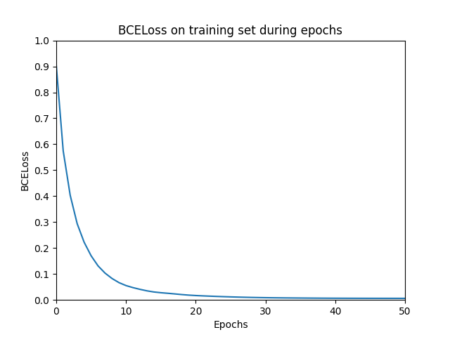
    plot_results(epochs, losses, title='BCELoss on trainig set during epochs', y_label='Loss')
    plot_results(epochs, f1_ss, title='F1 score on validation set during epochs', y_label='F1 samples')

    # evaluate model on test set and print result
    f1_s_test = trainer.compute_f1(graph, training_data.x_test, training_data.y_test)
    print(f'F1 score on test set = {f1_s_test}')

    To setup an environment and run the code I refer to the readme in the repository on GitHub. Running the code will yield two plots: one with the BCELoss on the training set and one with the F1 score on the validation set.

    Figure 3: BCELoss during training epochs
    Figure 4: ‘weighted-F1-score’ on the validation set during training epochs

    If you have any comments or questions, please get in touch!

    Remarks

    1. rdf:type is used to create node labels. Literature[4][5] proposes a different prediction task with other labels that cannot be found in the AIFB graph itself. However the main principles, like creating the edge_index, edge_type and the prediction setup remain the same.
    2. Functions to parse the graph data work for some specific graphs that I tested with. However, when using this code for other graphs, one should keep in mind the syntax of the input graph.
    3. Training/model parameters such as learning rate, epochs, hidden layer and weight decay are found in literature[4][5].

    References

    [1] Manola, F., Miller, E., McBride, B.: RDF primer, W3C recommendation (2004), https://www.w3.org/TR/REC-rdf-syntax/

    [2] Tiwari, S., Al-Aswadi, F.N., Gaurav, D.: Recent trends in knowledge graphs: theory and practice. Soft Computing 25(13), 8337–8355 (2021). https://doi.org/10.1007/s00500-021-05756-8

    [3] Liu, W., Chang, S.F.: Robust multi-class transductive learning with graphs. In: 2009 IEEE Conference on Computer Vision and Pattern Recognition. pp. 381–388 (2009). https://doi.org/10.1109/CVPR.2009.5206871

    [4] Schlichtkrull, M., Kipf, T.N., Bloem, P., van den Berg, R., Titov, I., Welling, M.: Modeling Relational Data with Graph Convolutional Networks. In: Gangemi, A., Navigli, R., Vidal, M.E., Hitzler, P., Troncy, R., Hollink, L., Tordai, A., Alam, M. (eds.) The Semantic Web. pp. 593–607. Springer, Cham (2018). https://doi.org/10.1007/978-3-319-93417-4 38

    [5] Thanapalasingam, T., van Berkel, L., Bloem, P., Groth, P.: Rela- tional Graph Convolutional Networks: A Closer Look. arXiv preprint arXiv:2107.10015 (2021). https://doi.org/10.48550/ARXIV.2107.10015

    [6] Bloehdorn, S., Sure, Y.: Kernel Methods for Mining Instance Data in On- tologies. In: The Semantic Web, pp. 58–71. Springer, Berlin, Heidelberg (2007)


    Entity Type Prediction with Relational Graph Convolutional Network (PyTorch) was originally published in Towards Data Science on Medium, where people are continuing the conversation by highlighting and responding to this story.

    Originally appeared here:
    Entity Type Prediction with Relational Graph Convolutional Network (PyTorch)

    Go Here to Read this Fast! Entity Type Prediction with Relational Graph Convolutional Network (PyTorch)

  • How to quantify customer problems for prioritization using churn survey

    How to quantify customer problems for prioritization using churn survey

    Urvashi Jaitley

    Understanding users’ needs and pain points is a critical component of business success. Churn surveys, a specific type of survey designed for customers who have stopped using a service, are a treasure trove of customer insights. However, the true power lies in transforming those insights into concrete actions that boost sustainable growth and revenue. Churn often stems from unmet customer needs, leading to lost subscriptions and revenue. This article dives into a powerful technique: “assigning a dollar value to customer problems identified through churn surveys.” You can apply this method to other types of surveys, like CSAT, NPS, and other VOC tools. By quantifying the financial impact of these problems, you can prioritize which issues to tackle first, maximizing your profitability. Prioritization is the key to every product development process.

    Step 1: Analyzing the First Question — Unveiling the Root Cause

    Begin your analysis with the survey’s primary question, such as “What is the main reason for cancellation?”

    Sample churn survey

    Quantifying the Impact

    Now, let’s look into the result and quantify it in dollars. This depends on whether the first question is mandatory (all users answer) or optional (only some users answer).

    So, to size one of the churn reasons, for example, “it’s too expensive”, the opportunity size would be 45,000*$20*12 = $10.8 million ARR (assuming the cost of the subscription per churn user is $20). This is revenue loss only in 1 year, in reality this would be more if customer do not churn then they pay for 3–5 years (LTV)

    Tip: There are statistical methods to determine a sufficient sample size; one such is provided for free here by Qualtrics.

    Tip: If the sample does not reflect the churn population, then extrapolate only for the population which is represented by the sample (segment users). And make efforts to find churn-related insights for the remaining demographic. Example: If you have an in-product churn survey and you have Small-Medium Business to Enterprise customers, then many times Enterprise customers do not churn in-product; they cancel subscriptions through renewal managers; hence, to get insights from them, incorporate a churn survey through the renewal manager path.

    Step 2: Analyze the Follow-up Questions — Digging Deeper

    While assigning a $ value to the high-level problem “It’s too expensive,” this provides a starting point; it’s too general to develop effective solutions. To gain deeper insights, we can use a follow-up, branched question after users select “It’s too expensive” in the initial survey.

    Tip: If you only have a single survey question in the in-product cancellation flow, consider using a follow-up churn survey via email or after the cancellation flow with branched questions to gain deeper insights into customer churn reasons.

    For “Subscription being too expensive,” a branched question can have the following options:

    Branched survey question result for the 45K users who selected “too expensive” as the main reason for churn

    The results show that 60% of the users in the “too expensive” reason category are churning because of non-price-related issues like “did not find the value” anddon’t need the subscription temporarily.” That is why going one level deeper is important to understand the real issues. Now let’s look into calculating opportunity sizing for some of the above churn reasons:

    Do not need the subscription temporarily:

    Sizing opportunity: The sizing would be similar to what we did in step 1, but we need to keep in mind that certain users might be coming back automatically as they are canceling for temporary reasons. Hence, we need to remove those users from our calculation (organic win-back rate). So, if your organic win-back rate for this audience is 2%, then the final addressable ARR would be: (9000 * $20*12) — (9000* 2% * $20*12) = $2.2M ARR loss.

    Potential Solutions: Now, as we know, solving the above use case can save substantial revenue; hence, we can build the solution for these users. One solution could be introducing a pause subscription option. Since the reasons for canceling are temporary (like travel, unexpected weather, pandemics, or even just a busy period can disrupt users’ routines), pausing allows users to hold onto their subscription without the burden of ongoing fees. This benefits businesses in two ways: First, it fosters customer loyalty by demonstrating flexibility and understanding user needs. Second, it increases the chance of users returning to the service once their busy period or temporary disruption has passed, leading to continued revenue.

    Studies have shown that offering a pause option can significantly reduce churn rates [source]. The famous audio book subscription service Audible offers a pause subscription.

    Didn’t find the value:

    If users aren’t realizing the subscription’s value, it’s crucial to understand why. Do the same exercise as above to calculate the revenue you are losing because the user did not find the value in the subscription, i.e., 15700 * $20 * 12 = $3.78 million ARR. This is the revenue you can save because of the retention of these users. In addition to this, you will also be earning expansion revenue (if your business model has that option), as once users realize the value of the service, they are more likely to expand.

    Potential Solutions:

    • Remind users about the value: Highlight the benefits they receive. For example, Instacart shows how many shopping hours users save per order, emphasizing the value proposition.
    • Launch marketing campaigns around value: Conduct user research and publish articles showcasing how your product improves users’ lives. Asana, for instance, shares stories about how work management tools enhance team productivity.
    • Offer tiered subscription plans: Allow users to switch to a lower tier, encouraging them to adopt basic features before potentially upselling them to a higher tier later.
    • Offer flexible billing and provide education and onboarding services and templates. Offer monthly or quarterly billing so users get time to realize the value before committing to a subscription for a longer duration, and provide onboarding tools to help users realize the value quickly.

    Found a cheaper option or cost-cutting: For customers who are price-sensitive and are churning to a competitor purely because of the lower price, offering them a discount in the cancellation flow is a good option. You can save up to 20% of the ARR by building discounts in the cancellation flow. What discount to offer in the cancellation flow will depend on three factors: 1) Cost to serve the customer; 2) Offer a take-up rate 3) Retention rate after the offer expires.

    By analyzing the follow-up questions for “It’s too expensive,” we can see the importance of going beyond surface-level reasons for churn. Understanding the root cause allows us to develop targeted solutions that truly address user needs and maximize the return on investment for our product development efforts.

    As a product manager, I always read comments left by users in various surveys and do an exercise like the one above to think through solutions and prioritize the customer pain points. Let me know if you have questions. Let’s make solutions that are customer-centric and, at the same time, can create sustainable businesses.


    How to quantify customer problems for prioritization using churn survey was originally published in Towards Data Science on Medium, where people are continuing the conversation by highlighting and responding to this story.

    Originally appeared here:
    How to quantify customer problems for prioritization using churn survey

    Go Here to Read this Fast! How to quantify customer problems for prioritization using churn survey

  • Exploring Brazil’s National Accounts through a Dashboard

    Exploring Brazil’s National Accounts through a Dashboard

    Fernando Barbalho

    Implementation details and analytical possibilities

    Photo by Dominik Lückmann on Unsplash

    At the end of the first week of March 2024, the news revealed that Brazil’s GDP grew by almost 3% in 2023 compared to the previous year, reaching a total value of US$ 2,17 trillion. This advance placed the country in ninth position among the world’s largest economies, surpassing Canada. The analysis specifically indicates that a significant portion of this increase is attributed to the agricultural sector, which witnessed an impressive growth of 15,1%. This scenario arouses interest not only from investors but also from researchers, specialists, and governmental analysts who seek to understand not just the performance of the agricultural sector, but also industrial production, the services sector, exports, and imports, among other crucial elements that make up the National Accounts System (NAS)

    The NAS, managed by the Brazilian Institute of Geography and Statistics (IBGE), is a vital source of information on the generation, distribution, and use of income in the country. Although the Institute offers an online platform for accessing NAS data, including filters and basic charts, many users face difficulties in navigation and analysis due to the lack of modern data visualization resources. The charts provided, while useful for a quick understanding of trends, often lack the quality needed to be included in detailed reports or articles, and cover a breadth of information that can be excessive for certain needs.

    In light of these limitations, the initiative to develop a dashboard specifically on national accounts emerged, designed to meet the demands of users less familiar with the SCN structure. This dashboard allows simplified queries and analyses, presenting charts that address a selected set of issues related to the evolution of GDP and its components over the quarters and years since 1996. If you recognize the importance of national accounts data in your work or research and wish to explore how a dashboard can be constructed using the R language, understand the main technical and business challenges involved in implementing this solution, I invite you to enjoy the following paragraphs, try out the dashboard using this link, and explore the provided code.

    The Origin of the Data

    The data powering our dashboard are directly consumed from an API provided by the IBGE through the R package {sidrar}. This API grants access to a variety of tables associated with the national accounts, updated quarterly. For our analysis, we focus on two of these tables: “Current Prices” (table 1846) and “Quarterly Volume Index Variation Rate” (table 5932). These datasets provide a solid foundation for understanding not only the absolute values of the national accounts but also their growth trends and variations over time. It’s important to note that by using the API, the dashboard ensures that the data presented are always up to date.

    For those who are interested in the R programming language, an opportunity to explore it further is present in the analysis of the code responsible for consuming data from the API. As usual in my texts, I share relevant excerpts from the code to enrich your understanding. However, if programming is not your focus, you can skip the code blocks without compromising your understanding of the text.

    cnt_vt_precos_correntes<- 
    get_sidra(x = 1846,
    period = lista_trimestres)

    cnt_vt_precos_correntes <- janitor::clean_names(cnt_vt_precos_correntes)


    cnt_taxa_variacao<-
    get_sidra(x = 5932,
    period = lista_trimestres
    )


    cnt_taxa_variacao<- janitor::clean_names(cnt_taxa_variacao)

    The get_sidra function extracts data from the System of National Accounts (SNA). To use it, the programmer only needs to indicate the name of the table (1846 for the first call and 5932 for the second) and the desired period, specified as a vector of quarters from 1996 to the last available quarter. See the example below.

     lista_trimestres
    [1] "199601" "199602" "199603" "199604" "199701" "199702" "199703" "199704" "199801" "199802" "199803" "199804" "199901"
    [14] "199902" "199903" "199904" "200001" "200002" "200003" "200004" "200101" "200102" "200103" "200104" "200201" "200202"
    [27] "200203" "200204" "200301" "200302" "200303" "200304" "200401" "200402" "200403" "200404" "200501" "200502" "200503"
    [40] "200504" "200601" "200602" "200603" "200604" "200701" "200702" "200703" "200704" "200801" "200802" "200803" "200804"
    [53] "200901" "200902" "200903" "200904" "201001" "201002" "201003" "201004" "201101" "201102" "201103" "201104" "201201"
    [66] "201202" "201203" "201204" "201301" "201302" "201303" "201304" "201401" "201402" "201403" "201404" "201501" "201502"
    [79] "201503" "201504" "201601" "201602" "201603" "201604" "201701" "201702" "201703" "201704" "201801" "201802" "201803"
    [92] "201804" "201901" "201902" "201903" "201904" "202001" "202002" "202003" "202004" "202101" "202102" "202103" "202104"
    [105] "202201" "202202" "202203" "202204" "202301" "202302" "202303" "202304" "202401" "202402" "202403" "202404"

    Technological Design

    R developers often turn to Shiny to create interactive dashboards. This is an established product that offers extensive customization possibilities, making use of advanced user experience (UX) features. However, for those looking for more agile initial productivity, using Flexdashboard in conjunction with Shiny is a viable alternative. Although this approach may result in simpler, less customized interfaces, it is a choice that offers rapid implementation. To enhance the visual and professional appearance of applications developed with Flexdashboard, one option is to incorporate the {thematic} library. We chose to follow this approach in our dashboard, ensuring a refined and attractive appearance for users.

    Below is a screenshot showing the product layout using the flexdashboard + shiny + thematic combination.

    Dashboard with professional layout. Author’s image

    And below is a snippet of code where you can see the combination of libraries that allows the user to interact with the application components

    library(flexdashboard)
    library(plotly)
    library(shiny)
    library(purrr)

    # Install thematic and un-comment for themed static plots (i.e., ggplot2)
    thematic::thematic_rmd(bg= "#101010", fg="#ffda00", accent = NA )

    The choice of Plotly is shown above in the list of libraries invoked by the application. This decision stems from its distinctive features, especially with regard to user interaction. Plotly facilitates a fluid data visualization experience, highlighted by the feature that allows the user to explore the graph data by moving the mouse. In addition, this library offers the convenience of being able to download the figure in PNG format, as well as the ability to mark specific parts of the graph for zooming, providing greater utility to the interactive experience of the application’s users.

    Plotly and its interactive features. Author´s image.

    We should highlight:

    • For all the charts is
    • For all graphs it is possible to select more than one time series for simultaneous visualization
    Two time series being shown simultaneously. Author’s image.
    • To make the graphs easier to understand for audiences who will consume the graphs via printed text, it is possible to highlight points that may make sense for further analysis. In the example below, we see the impact of the pandemic in 2020, which caused the GDP figure to fall back to what it was in 2016..
    Highliting importante points. Author´s image.
    • The data for each graph can be easily downloaded to the user’s environment using the download buttons.
    Dwonload buttons. Author´s image.

    Below are some codes that refer to what we are dealing with in this topic.

    • Selecting multiple time series and periods to highlight using the input$account_year and input$year objects
      # Preparação dos dados
    dados_grafico_corrente_ano <<- cnt_vt_precos_correntes %>%
    filter(setores_e_subsetores %in% input$conta_ano) %>%
    inner_join(dados_pib) %>%
    mutate(data_nominal = gera_meses_trimestre(trimestre_codigo), # Essa função precisa ser definida ou alterada conforme o contexto
    setores_e_subsetores = str_wrap(setores_e_subsetores,20)) %>%
    group_by(ano = format(data_nominal, "%Y"),
    setores_e_subsetores) %>%
    summarize(data_nominal = min(data_nominal),
    valor = sum(valor),
    valor_pib = sum(valor_pib)) %>%
    ungroup() %>%
    mutate(valor_perc = ((valor/valor_pib))*100)


    sel_data <- dados_grafico_corrente_ano %>%
    filter(year(data_nominal) %in% input$ano)
    • Downloading the data. Note the write.table function, which writes to a file the contents of the global object dados_grafico_corrente_ano generated in the code block above.
    # Create placeholder for the downloadButton
    uiOutput("downloadUI_conta_perc_ano")
    # Create the actual downloadButton
    output$downloadUI_conta_perc_ano <- renderUI( {
    downloadButton("download_conta_perc_ano","Download", style = "width:100%;")
    })
    output$download_conta_perc_ano<- downloadHandler(
    filename = function() {
    paste('dados_grafico_perc_ano', '.csv', sep='')
    },
    content = function(file) {
    #dados_conta_trimestre_corrente <- graph_mapa_regic$data
    write.table(dados_grafico_corrente_ano, file, sep = ";",row.names = FALSE,fileEncoding = "UTF-8",dec=",")
    }
    )

    Business design

    The application offers a choice of seven different types of graphs, allowing users to select the most suitable representation for analyzing and interpreting the information relevant to their decisions. This variety allows for a flexible approach, adaptable to different needs and visualization preferences.

    To make it easier to navigate and organize the graphs, the application divides them into two well-defined tabs. The “Annual Data” tab focuses on providing a panoramic view of evolution over time, with graphs highlighting annual changes in accounts. Here, users can analyze the annual evolution of the accounts in constant values for 2010, the annual evolution of the accounts in percentage of value added at current values and the annual evolution of the accounts in percentage of value added at constant values for 2010.

    Graph of annual growth at constant values. Author´s image.
    Graph of share on Added Value in current values. Author´s image.
    Graph of share on Added Value in constant values. Author´s image.

    On the other hand, the “Variations” tab focuses on providing insights into the relative changes between different time periods. Users can examine in detail the quarterly variations in relation to the same period in the previous year, the quarterly variations quarter by quarter, the accumulated rate over the year and the accumulated variation over four quarters. This detailed, time-variant approach allows for a more granular analysis of trends and patterns in the data.

    Quartely variation same period previous year. Author´s image
    Quaterly variation quarter by quarter. Author´s image.
    Accumulated rate over year. Author´s image.
    Accumulated variation over four quarters. Author´s image.

    Transforming Economic Data
    In general, the graphs on the Variations tab are filters on the result of the initial query using the API. The variables are selected from the Quarterly Volume Index Rate of Change table and the result dataset is used in the visualization structure. For those who like R, it’s something like the one below..

      dados_grafico_taxa_acum_ano<<-
    cnt_taxa_variacao %>%
    filter(setores_e_subsetores %in% input$conta_var,
    variavel_codigo == "6562") %>%
    mutate(data_nominal = gera_meses_trimestre(trimestre_codigo),
    setores_e_subsetores = str_wrap(setores_e_subsetores,20))

    Note above the selection of variable 6562, which contains the accumulated variation data over four quarters. The dados_grafico_taxa_acum_ano object is used in the plot_ly function as the reference data for the graph.

    The graphs displayed in the “Annual Data” tab undergo various transformations before being displayed on the screen. Of particular note is the calculation of constant values for the year 2010, which is used in two of the three annual data visualizations. This process requires the time series data for 2010 to be updated by the actual change in the selected account, both for previous and subsequent years. This requirement resulted in the need to develop complex functions to calculate the values prior to 2010, employing an inverse logic to that used for the years after this reference point, guaranteeing the consistency of the constant values. For a more in-depth understanding of the procedure adopted, we suggest analyzing the code presented below.

    calcula_serie_constante<- function(tabela_taxa, tabela_precos, trimestres_filtro, conta, ano_referencia){

    # Preparação dos dados
    dados_grafico_acumulado_lab <- tabela_taxa %>%
    filter(setores_e_subsetores %in% conta, variavel_codigo == "6563", trimestre_codigo %in% trimestres_filtro) %>%
    mutate(data_nominal = gera_meses_trimestre(trimestre_codigo), setores_e_subsetores = str_wrap(setores_e_subsetores, 20), ano = year(data_nominal)) %>%
    select(ano, setores_e_subsetores, valor) %>%
    rename(variacao = valor)


    tabela_base <- tabela_precos %>%
    filter(setores_e_subsetores %in% conta) %>%
    mutate(data_nominal = gera_meses_trimestre(trimestre_codigo), setores_e_subsetores = str_wrap(setores_e_subsetores, 20), ano = as.numeric(format(data_nominal, "%Y"))) %>%
    summarise(valor = sum(valor), .by = c(setores_e_subsetores, ano)) %>%
    ungroup() %>%
    inner_join(dados_grafico_acumulado_lab, by = c("ano", "setores_e_subsetores"))


    dados_grafico_constante_ano <- unique(tabela_base$setores_e_subsetores) %>%
    map_dfr(function(setor) {
    tabela_anterior <- calcular_valor_referencia(tabela_base, setor, ano_referencia, "anterior")
    tabela_posterior <- calcular_valor_referencia(tabela_base, setor, ano_referencia, "posterior")

    bind_rows(tabela_anterior, tabela_posterior[-1, ]) %>%
    arrange(ano) %>%
    mutate(valor_constante = valor_referencia/10^3)})

    }

    # Função para otimizar a criação de tabelas e cálculo de valor_referencia
    calcular_valor_referencia <- function(tabela_base, setor, ano_referencia, direcao) {

    if (direcao=="anterior"){
    tabela_filtrada <-
    tabela_base %>%
    filter(setores_e_subsetores == setor,
    ano <= ano_referencia) %>%
    arrange(desc(ano))


    } else{
    tabela_filtrada <-
    tabela_base %>%
    filter(setores_e_subsetores == setor,
    ano >= ano_referencia) %>%
    arrange(ano)

    }

    if(nrow(tabela_filtrada) > 1) {

    tabela_filtrada$valor_referencia <- NA
    tabela_filtrada$valor_referencia[1] <- tabela_filtrada$valor[1]

    ajuste <- if_else(direcao == "anterior", -1, 1)

    for(i in 2:nrow(tabela_filtrada)){

    if (ajuste==-1){

    tabela_filtrada$valor_referencia[i] <- tabela_filtrada$valor_referencia[i-1] * (1 + ajuste * (tabela_filtrada$variacao[i-1]/100))

    } else{

    tabela_filtrada$valor_referencia[i] <- tabela_filtrada$valor_referencia[i-1] * (1 + ajuste * (tabela_filtrada$variacao[i]/100))
    }

    }
    }

    return(tabela_filtrada)
    }

    The script above has two functions that together manipulate the current price and variation tables to generate the constant values before and after the 2010 reference year.

    Some use cases.

    To finish off the article, a short list of three use cases associated with the dashboard. The inspirations come straight from twitter.

    The tweet from LCA Consultores deals with the participation of agriculture and the extractive industry in GDP expansion. In the dashboard we can easily identify the evolution of the volume of these elements in GDP and also check their annual variations.

    Volume evolution of Agriculture and Extractive industries. Author´s image.
    Accumulated year rate for Agriculture and Extractive industrires

    Here’s another tweet, this time from Minister Esther Dweck.

    The GDP of agribusiness has already been explored in the previous tweet. What’s new here is the emphasis on household consumption. This is another account that is also tracked on the dashboard. See below.

    Grouth of households consumption. Author´s image.
    Accumulated year rate for Household consumption and GDP. Author´s image

    Finally, it’s worth highlighting this tweet from Ricardo Bezerra below.

    Ricardo Bezerra shows the importance of monitoring the share of the manufacturing industry in GDP (or value added). He highlights the significant differences that arise when using ratios based on current prices versus constant prices. The dashboard accurately and faithfully presents both curves drawn up by Ricardo, providing a detailed and clear representation of these variations.

    Transformation industries participation in current values. Author´s image.
    Transformation industries participation in constant values. Author´s image.

    Do you have your own use case? Why dont´t you try to navigate the dashboard using this link and then let me know about your experience?

    Code and Data

    The complete code is available at gist.

    The datasets used in this text are characterized as public domain since they are data produced by federal government institutions, made available on the internet as active transparency, and are subject to the Brazilian FOIA.

    IBGE: National Account System


    Exploring Brazil’s National Accounts through a Dashboard was originally published in Towards Data Science on Medium, where people are continuing the conversation by highlighting and responding to this story.

    Originally appeared here:
    Exploring Brazil’s National Accounts through a Dashboard

    Go Here to Read this Fast! Exploring Brazil’s National Accounts through a Dashboard

  • Image generation with diffusion models using Keras and TensorFlow

    Image generation with diffusion models using Keras and TensorFlow

    Vedant Jumle

    Using Diffusion to generate images

    You must have heard of Dall-E 2. Published by Open AI, which is a model that generates realistic looking images from a given text prompt. You can check out a smaller version of the model here.

    Ever wondered how it works under the hood? Well… it uses a new class of generative technique, called ‘diffusion’. The idea was proposed by Sohl-Dickstein, et al in 2015, where essentially, a model generates an image from Noise.

    But why use diffusion models when there are GANs around?

    GANs are great at generating high fidelity images. But, as outlined in this paper by Open AI: Diffusion models beat GANs on Image Synthesis, diffusion models are much better at image synthesis by being more faithful to the image. GANs have to produce an image in one go and generally don’t have any options for refinement during the generation of the image. Diffusion on the other hand is a slow and iterative process, during which, noise is converted into image, step by step. This allows diffusion models to have better options for guiding the image towards the desired result.

    In this article we will be looking at how to create our own diffusion model based on Denoising Diffusion Probabilistic Models (Ho et al, 2021)(DDPM) and Denoising Diffusion Implicit Models (Song et al, 2021)(DDIM) using Keras and TensorFlow. So lets get started…

    The process behind diffusion models is divided into two parts:
    – Forward Noising process, and
    – Backward Denoising process.

    Forward Noising:

    The concept of diffusion models is based on the well researched concept of diffusion in Physics.

    In Physics, diffusion is defined as a process in which an isolated system tries to attain homogeneity by by altering the potential gradient in response to the introduction of a new element.

    Source: wikipedia

    Using diffusion models, we try to reverse this process of homogenization by predicting the movements of the new element one step at a time.

    Consider the series of images given below. Here we see that we gradually add small amounts of random noise to the image till it becomes indistinguishable. Our diffusion model, will try to figure out how to reverse this process of adding noise.

    For the forward noising process q, we define a Markov Chain for a predefined amounts of steps, say T. Which takes an image and adds small amounts of Gaussian Noise to the image according to a variance schedule: β₀, β₁, … βt. Where β< β₁< … < βt.

    We then train a model that learns to remove this small amounts of noise at every timestep(given that the added noise is in small increments). We will explore this in the backward denoising section.

    But first, what is a Markov Chain??

    A Markov chain is a chain of events in which an event is only determined by the previous event.

    Here, the state x1 is only determined by using x0, x2 by x1, and so on till we reach xT. So for our purpose, x0 state is our normal image, and as we move forward on our Markov chain, the image gets noisier till we reach the state xT.

    Addition of Noise:

    According to our Markov chain, the state xt is only determined by the state xt-1. For this, we need to calculate the probability q(xt|xt-1) to generate a slightly noisier image at the time-step t compared to t-1. This ‘slightly’ noisier image is generated by sampling small amount of noise using the Gaussian Distribution ‘N’ and adding it to the image. Noise sampled from Gaussian distribution is only determined by the mean and standard deviation. Here’s where we use the variance schedule: β₀, β₁, … βt. We make the mean value depended on βt and the input image xt. So finally, q(xt|xt-1) can be defined as:

    Forward noising state for xt given xt-1

    And according to principle of Markov chains, the probability that a chain from x1 to xT occurs, for a given initial state x0 is given by:

    Probability for a chain to occur from x1 to xt

    Reparameterization:

    The role of our model is to undo the added noise at every timestamp. To generate the noisy image at the said timestamp, we need to iterate through the Markov chain till we obtain the desired noisy image. This process is very inefficient. As a work around, we use a reparameterization trick, which uses an approximation to generate the noise at the required timestamp. This trick works because the sum of two gaussian samples is also a gaussian sample. Here’s the reparameterization formula:

    Therefore, we can pre-calculate the values for α and α bar, using the formula for q(xt|x0), obtain the noised image xt at the timestep t given the original image x0.

    Enough theory, lets code this…

    Here are the dependencies that we will need in order to build our model.

    !pip install tensorflow
    !pip install tensorflow_datasets
    !pip install tensorflow_addons
    !pip install einops

    Lets start with the imports

    For this implementation, we will use the MNIST digits dataset.

    As per the description of the forward diffusion process, we need to create a fixed beta schedule. Along with that let us also setup the forward noising process and timestamp generation.

    now lets visualize the forward noising process.

    Example of forward noising process

    Backward Denoising:

    Lets understand what exactly will our model do..

    We want a image generating model that will predict what noise was added to the image at a given timestamp. This model should take in an input of noised image along with the timestamp and predicts what noise was added to the image at that time step. A U-Net style model is perfect for this job. We can make some changes to the base architecture by changing the Convolutional layers to ResNet layers, add mechanisms to consider timestamp encodings, and also have attention layers. The U-Net model was first proposed for biomedical image segmentation but since its inception, it has been modified and used for a lot of different applications.

    Let code up our U-Net

    1) Helper modules

    2) Building blocks of the U-Net model:
    Here we are incorporating time embedding by scaling and shifting the input passed to the resnet block. This scale and shift factor comes by passing the time embeddings through a Multi Layer Perceptron(MLP) module within the resnet block. This MLP will convert the fixed sized time embeddings into a vector that is complient with the compatible dimensions of the blocks in the resnet layer. Scale and Shift is written as ‘Gamma’ and ‘Beta’ in the code below.

    3) U-Net model

    Once, we have defined our U-Net model, we can now create an instance of it along with a checkpoint manager to save checkpoints during training. While we are at it, lets also create our optimizer. We will use the Adam optimizer with a learning rate of 1e-4.

    Training our model:

    The backward denoising step for our model is define by p, where p is:

    Here we want our model, i.e., our U-Net model, to predict the noise in the input image xt at a given timestep t by essentially predicting the value of µ(xt, t) and Σ(xt, t), i.e., the mean and variance for xt at the timestep t. We calculate the loss for the predicted noise between the predicted noise Є_θ and the original noise Є by the following formula:

    The formula may look intimidating to few folks, but we are going to be essentially calculating the loss value using Mean Squared Error between the predicted noise and the real noise. So lets code this up!

    For the training process, we will use the following algorithm:
    1) Generate a random number for the generation of timestamps and noise.
    2) Create a list of random timestamps according to the batch size
    3) Run the input image through the forward noising process along with the timestamps.
    4) Get the predictions from the U-Net model using the noised image and the timestamps.
    5) Calculate the loss between the predicted noise and real noise.
    6) Update the trainable variables in the U-Net model.
    7) Repeat for all training batches.

    Now that our model is trained, lets run it in inference mode. In the DDPM paper, the authors had outlined an algorithm for inference.

    Here xt is a random sample, which we pass through our U-Net model and obtain Є_θ, then we calculate xt-1according to the formula:

    Before we code this, lets create a helper function that will create and save a gif file from a list of images.

    Now lets make our backward denoising algorithm using the DDPM approach.

    now for the inference, lets create a random image using the function defined above.

    Here’s an example GIF generated by using the DDPM inference algorithm:

    There’s one problem with the inference algorithm proposed in the DDPM paper. The process is very slow since we have to loop through all 200 timesteps to get the result. To make this process faster, an improved inference loop was proposed in the DDIM paper. Lets discuss that..

    DDIM:

    In the DDIM paper, the authors proposed a non-markovian method for backward denoising process, therefore removing the constraint that the order of the chain has to depend on the previous image. The paper proposed a modification to the DDPM objective by making the loss function more general:

    From this loss function, we can infer that the loss value is only dependent on q(xt|x0) and not the join probability of q(x1:T|x0). Along with this, the authors also proposed that we can explore a different inference approach which is non-markovian. Complicated looking math coming up:

    The above changes make the forward process non-Markovian as well where σ controls the stochasticity of the forward process. When σ→0, we reach a case where xt−1 becomes known and fixed. For the generative process with a fixed prior pθ(xT)=N(0,I):

    Finally the formula for inference is given by:

    Here, if we set σ=0 ∀ t then the forward process becomes deterministic.
    Above formulae are taken from [1].

    Enough mathematics, lets code this up.

    Now lets use a similar backward denoising process as DDPM. Note that we are using only 10 steps for this inference loop, instead of the 200 steps of DDPM

    Here’s a sample gif from the ddim inference:

    This model can be trained on a different dataset as well, and the code given in this post is robust enough to support higher resolution and rgb images. For example, I trained a model on the celebA dataset to generated 64×64 rgb images, here are some of the results:

    With that we can conclude with this topic. There is a lot of related literature that has propped up from the concept of diffusion models. Here are some interesting reads:
    1) GLIDE: Towards Photorealistic Image Generation and Editing with Text-Guided Diffusion Models
    2) Image Super-Resolution via Iterative Refinement
    3) Diffusion Models Beat GANs on Image Synthesis
    4) Imagen
    5) Dall-E 2

    [1]Exploring Diffusion Models with JAX by Darshan Deshpande. link.

    • Unless otherwise noted, all images are made by me.

    You can also read on the follow up of this story where I discuss on how to generate images from class labels. link.

    What to connect? Please write to me at [email protected]


    Image generation with diffusion models using Keras and TensorFlow was originally published in Towards Data Science on Medium, where people are continuing the conversation by highlighting and responding to this story.

    Originally appeared here:
    Image generation with diffusion models using Keras and TensorFlow

    Go Here to Read this Fast! Image generation with diffusion models using Keras and TensorFlow

  • Boost your content editing with Contentful and Amazon Bedrock

    Boost your content editing with Contentful and Amazon Bedrock

    Ulrich Hinze

    This post is co-written with Matt Middleton from Contentful. Today, jointly with Contentful, we are announcing the launch of the AI Content Generator powered by Amazon Bedrock. The AI Content Generator powered by Amazon Bedrock is an app available on the Contentful Marketplace that allows users to create, rewrite, summarize, and translate content using cutting-edge […]

    Originally appeared here:
    Boost your content editing with Contentful and Amazon Bedrock

    Go Here to Read this Fast! Boost your content editing with Contentful and Amazon Bedrock

  • How to Interpret GPT2-Small

    How to Interpret GPT2-Small

    Shuyang Xiang

    Mechanistic Interpretability on prediction of repeated tokens

    The development of large-scale language models, especially ChatGPT, has left those who have experimented with it, myself included, astonished by its remarkable linguistic prowess and its ability to accomplish diverse tasks. However, many researchers, including myself, while marveling at its capabilities, also find themselves perplexed. Despite knowing the model’s architecture and the specific values of its weights, we still struggle to comprehend why a particular sequence of inputs leads to a specific sequence of outputs.

    In this blog post, I will attempt to demystify GPT2-small using mechanistic interpretability on a simple case: the prediction of repeated tokens.

    Mechanistic Interpretability

    Traditional mathematical tools for explaining machine learning models aren’t entirely suitable for language models.

    Consider SHAP, a helpful tool for explaining machine learning models. It’s proficient at determining which feature significantly influenced the prediction of a good quality wine. However, it’s important to remember that language models make predictions at the token level, while SHAP values are mostly computed at the feature level, making them potentially unfit for tokens.

    Moreover, Language Models (LLMs) have numerous parameters and inputs, creating a high-dimensional space. Computing SHAP values is costly even in low-dimensional spaces, and even more so in the high-dimensional space of LLMs.

    Despite tolerating the high computational costs, the explanations provided by SHAP can be superficial. For instance, knowing that the term “potter” most influenced the output prediction due to the earlier mention of “Harry” doesn’t provide much insight. It leaves us uncertain about the part of the model or the specific mechanism responsible for such a prediction.

    Mechanistic Interpretability offers a different approach. It doesn’t just identify important features or inputs for a model’s predictions. Instead, it sheds light on the underlying mechanisms or reasoning processes, helping us understand how a model makes its predictions or decisions.

    Prediction of repeated tokens by GPT2-Small

    We will be using GPT2-small for a simple task: predicting a sequence of repeated tokens. The library we will use is TransformerLens, which is designed for mechanistic interpretability of GPT-2 style language models.

    gpt2_small: HookedTransformer = HookedTransformer.from_pretrained("gpt2-small")

    We use the code above to load the GPT2-Small model and predict tokens on a sequence generated by a specific function. This sequence includes two identical token sequences, followed by the bos_token. An example would be “ABCDABCD” + bos_token when the seq_len is 3. For clarity, we refer to the sequence from the beginning to the seq_len as the first half, and the remaining sequence, excluding the bos_token, as the second half.

    def generate_repeated_tokens(
    model: HookedTransformer, seq_len: int, batch: int = 1
    ) -> Int[Tensor, "batch full_seq_len"]:
    '''
    Generates a sequence of repeated random tokens

    Outputs are:
    rep_tokens: [batch, 1+2*seq_len]
    '''
    bos_token = (t.ones(batch, 1) * model.tokenizer.bos_token_id).long() # generate bos token for each batch

    rep_tokens_half = t.randint(0, model.cfg.d_vocab, (batch, seq_len), dtype=t.int64)
    rep_tokens = t.cat([bos_token,rep_tokens_half,rep_tokens_half], dim=-1).to(device)
    return rep_tokens

    When we allow the model to run on the generated token, we find an interesting observation: the model performs significantly better on the second half of the sequence than on the first half. This is measured by the log probabilities on the correct tokens. To be precise, the performance on the first half is -13.898, while the performance on the second half is -0.644.

    Image for author: Log probs on correct tokens

    We can also calculate prediction accuracy, defined as the ratio of correctly predicted tokens (those identical to the generated tokens) to the total number of tokens. The accuracy for the first half sequence is 0.0, which is unsurprising since we’re working with random tokens that lack actual meaning. Meanwhile, the accuracy for the second half is 0.93, significantly outperforming the first half.

    Induction Circuits

    Finding induction head

    The observation above might be explained by the existence of an induction circuit. This is a circuit that scans the sequence for prior instances of the current token, identifies the token that followed it previously, and predicts that the same sequence will repeat. For instance, if it encounters an ‘A’, it scans for the previous ‘A’ or a token very similar to ‘A’ in the embedding space, identifies the subsequent token ‘B’, and then predicts the next token after ‘A’ to be ‘B’ or a token very similar to ‘B’ in the embedding space.

    Image by author: Induction circuit

    This prediction process can be broken down into two steps:

    1. Identify the previous same (or similar) token. Every token in the second half of the sequence should “pay attention” to the token ‘seq_len’ places before it. For instance, the ‘A’ at position 4 should pay attention to the ‘A’ at position 1 if ‘seq_len’ is 3. We can call the attention head performing this task the “induction head.”
    2. Identify the following token ‘B’. This is the process of copying information from the previous token (e.g., ‘A’) into the next token (e.g., ‘B’). This information will be used to “reproduce” ‘B’ when ‘A’ appears again. We can call the attention head performing this task the “previous token head.”

    These two heads constitute a complete induction circuit. Note that sometimes the term “induction head” is also used to describe the entire “induction circuit.” For more introduction of induction circuit, I highly recommend the article In-context learning and induction head which is a master piece!

    Now, let’s identify the attention head and previous head in GPT2-small.

    The following code is used to find the induction head. First, we run the model with 30 batches. Then, we calculate the mean value of the diagonal with an offset of seq_len in the attention pattern matrix. This method lets us measure the degree of attention the current token gives to the one that appears seq_len beforehand.

    def induction_score_hook(
    pattern: Float[Tensor, "batch head_index dest_pos source_pos"],
    hook: HookPoint,
    ):
    '''
    Calculates the induction score, and stores it in the [layer, head] position of the `induction_score_store` tensor.
    '''
    induction_stripe = pattern.diagonal(dim1=-2, dim2=-1, offset=1-seq_len) # src_pos, des_pos, one position right from seq_len
    induction_score = einops.reduce(induction_stripe, "batch head_index position -> head_index", "mean")
    induction_score_store[hook.layer(), :] = induction_score

    seq_len = 50
    batch = 30
    rep_tokens_30 = generate_repeated_tokens(gpt2_small, seq_len, batch)
    induction_score_store = t.zeros((gpt2_small.cfg.n_layers, gpt2_small.cfg.n_heads), device=gpt2_small.cfg.device)


    rep_tokens_30,
    return_type=None,
    pattern_hook_names_filter,
    induction_score_hook
    )]
    )

    Now, let’s examine the induction scores. We’ll notice that some heads, such as the one on layer 5 and head 5, have a high induction score of 0.91.

    Image by author: Induction head scores

    We can also display the attention pattern of this head. You will notice a clear diagonal line up to an offset of seq_len.

    Image by author: layer 5, head 5 attention pattern

    Similarly, we can identify the preceding token head. For instance, layer 4 head 11 demonstrates a strong pattern for the previous token.

    Image by author: previous token head scores

    How do MLP layers attribute?

    Let’s consider this question: do MLP layers count? We know that GPT2-Small contains both attention and MLP layers. To investigate this, I propose using an ablation technique.

    Ablation, as the name implies, systematically removes certain model components and observes how performance changes as a result.

    We will replace the output of the MLP layers in the second half of the sequence with those from the first half, and observe how this affects the final loss function. We will compute the difference between the loss after replacing the MLP layer outputs and the original loss of the second half sequence using the following code.

    def patch_residual_component(
    residual_component,
    hook,
    pos,
    cache,
    ):
    residual_component[0,pos, :] = cache[hook.name][pos-seq_len, :]
    return residual_component

    ablation_scores = t.zeros((gpt2_small.cfg.n_layers, seq_len), device=gpt2_small.cfg.device)

    gpt2_small.reset_hooks()
    logits = gpt2_small(rep_tokens, return_type="logits")
    loss_no_ablation = cross_entropy_loss(logits[:, seq_len: max_len],rep_tokens[:, seq_len: max_len])

    for layer in tqdm(range(gpt2_small.cfg.n_layers)):
    for position in range(seq_len, max_len):
    hook_fn = functools.partial(patch_residual_component, pos=position, cache=rep_cache)
    ablated_logits = gpt2_small.run_with_hooks(rep_tokens, fwd_hooks=[
    (utils.get_act_name("mlp_out", layer), hook_fn)
    ])
    loss = cross_entropy_loss(ablated_logits[:, seq_len: max_len], rep_tokens[:, seq_len: max_len])
    ablation_scores[layer, position-seq_len] = loss - loss_no_ablation

    We arrive at a surprising result: aside from the first token, the ablation does not produce a significant logit difference. This suggests that the MLP layers may not have a significant contribution in the case of repeated tokens.

    Image by author: loss different before and after ablation of mlp layers

    One induction circuit

    Given that the MLP layers don’t significantly contribute to the final prediction, we can manually construct an induction circuit using the head of layer 5, head 5, and the head of layer 4, head 11. Recall that these are the induction head and the previous token head. We do it by the following code:

    def K_comp_full_circuit(
    model: HookedTransformer,
    prev_token_layer_index: int,
    ind_layer_index: int,
    prev_token_head_index: int,
    ind_head_index: int
    ) -> FactoredMatrix:
    '''
    Returns a (vocab, vocab)-size FactoredMatrix,
    with the first dimension being the query side
    and the second dimension being the key side (going via the previous token head)

    '''
    W_E = gpt2_small.W_E
    W_Q = gpt2_small.W_Q[ind_layer_index, ind_head_index]
    W_K = model.W_K[ind_layer_index, ind_head_index]
    W_O = model.W_O[prev_token_layer_index, prev_token_head_index]
    W_V = model.W_V[prev_token_layer_index, prev_token_head_index]

    Q = W_E @ W_Q
    K = W_E @ W_V @ W_O @ W_K
    return FactoredMatrix(Q, K.T)

    Computing the top 1 accuracy of this circuit yields a value of 0.2283. This is quite good for a circuit constructed by only two heads!

    For detailed implementation, please check my notebook.


    How to Interpret GPT2-Small was originally published in Towards Data Science on Medium, where people are continuing the conversation by highlighting and responding to this story.

    Originally appeared here:
    How to Interpret GPT2-Small

    Go Here to Read this Fast! How to Interpret GPT2-Small

  • Linear Algebra 5: Linear Independence

    Linear Algebra 5: Linear Independence

    tenzin migmar (t9nz)

    Ax = 0 and proving a set of vectors is linearly independent

    Preface

    Welcome back to the fifth edition of my ongoing series on the basics of Linear Algebra, the foundational math behind machine learning. In my previous article, I walked through the matrix equation Ax = b. This essay will investigate the important concept of linear independence and how it connects to everything we’ve learned so far.

    This article would best serve readers if read in accompaniment with Linear Algebra and Its Applications by David C. Lay, Steven R. Lay, and Judi J. McDonald. Consider this series as a companion resource.

    Feel free to share thoughts, questions, and critique.

    Linear Independence in ℝⁿ

    Previously, we learned about matrix products and matrix equations in the form Ax = b. We covered that Ax = b has a solution x if b is a linear combination of the set of vectors (columns) in matrix A.

    There is a special matrix equation in Linear Algebra Ax = 0 which we refer to as a homogenous linear system. Ax = 0 will always have at least one solution where x = 0 which is called the trivial solution because it is trivially easy to show that any matrix A multiplied by the 0 vector x will result in the vector.

    What we’re really interested in learning is whether the matrix equation Ax = 0 has only the trivial solution. If Ax = 0 has only the trivial solution x = 0, then the set of vectors that make up the columns of A are linearly independent. In other words: v₁ + c₂v₂ + … + cₐvₐ = 0 where c₁, c₂, … cₐ must all be 0. A different way of thinking about this is that none of the vectors in the set can be written as a linear combination of another.

    On the other hand, if there exists a solution where x ≠ 0 then the set of vectors are linearly dependent. Then it follows that at least one of the vectors in the set can be written as a linear combination of another: c₁v₁ + c₂v₂ + … + cₐvₐ = 0 where not all where c₁, c₂, … cₐ equal 0.

    A neat, intuitive way of thinking about the concept of linear independence is the question of can you find a set of weights that will collapse the linear combination of a set of vectors to the origin? If a set of vectors is linearly independent, then 0 is the only weight that can be applied to each vector for the linear combination to equal the zero vector. If the vectors are linearly dependent, then there exists at least one set of non-zero weights such that the vector linear combination is zero.

    Determining Linear Independence

    For sets with only one vector, determining linear independence is trivial. If the vector is the zero vector, then it is linearly dependent. This is because any non-zero weight multiplied to the zero vector will equal the zero vector and so there exists infinitely many solutions for Ax = 0. If the vector is not the zero vector, then the vector is linearly independent since any vector multiplied by zero will become the zero vector.

    If a set contains two vectors, the vectors are linearly dependent if one vectors is a multiple of the other. Otherwise, they are linearly independent.

    In the case of sets with more than two vectors, more computation is involved. Let the vectors form the columns of matrix A and row reduce matrix A to reduced row echelon form. If the reduced row echelon form of the matrix has a pivot entry in every column, then the set of vectors is linearly independent. Otherwise, the set of vectors is linearly dependent. Why is this the case? Consider the process of row reducing a matrix to its reduced row echelon form. We perform a series of elementary row operations such as multiplying rows by constants, swapping rows, adding one row to another in pursuit of a matrix in a simpler form so that its underlying properties are clear while the solution space is preserved.

    In the case of linear independence, the quality of having a pivot in each column indicates that each vector plays a leading role in at least one part of the linear combination equation. If each vector contributes independently to the linear system, then no vector can be expressed as a linear combination of the others and so the system is linearly independent. Conversely, if there is a column in RREF without a pivot entry, it means that the corresponding variable (or vector) is a dependent variable and can be expressed in terms of the other vectors. In other words, there exists a redundancy in the system, indicating linear dependence among the vectors.

    A concise way to summarize this idea involves the rank of a matrix. The rank is the maximum number of linearly independent columns in a matrix and so it follows that the rank is equal to the number of pivots in reduced row echelon form.

    If the number of columns in a matrix is equal to the rank, then the matrix is linearly independent. Otherwise, the matrix is linearly dependent.

    Linear Independence with Numpy

    Attempting computations made by hand is a worthwhile exercise in better understanding linear independence, but a more practical approach would be to use the capabilities built into the Numpy library to both test for linear independence and to derive the solution space for Ax = 0 of a given matrix.

    We can approach checking if a matrix is linearly independent using the rank. As mentioned previously, a matrix is linearly independent if the rank of a matrix is equal to the number of columns so our code will be written around this criteria.

    The following code generates the solution space of vectors for Ax0.

    Conclusion

    Linear independence, while fundamental to Linear Algebra, also serves as a cornerstone in machine learning applications. Linear independence is crucial in feature selection and dimensionality reduction techniques such as principal component analysis (PCA) which operates on the collinearity or linear dependence between features in the dataset.

    You’ll continue to see linear independence pop up in machine learning!

    Summary

    • A system of linear equations is referred to as homogenous if it can be written in the form Ax0.
    • Linearly independent vectors cannot be expressed as a linear combination of each other (except the trivial combination where all coefficients are zero).
    • Linearly dependent vectors are those where at least one vector in the set can be expressed as a linear combination of the others.
    • Numpy, a Python library for working with arrays offers fantastic support for both checking if a matrix is linearly independent and also solving Ax = 0 for a given matrix.

    Notes

    *All images created by the author unless otherwise noted.


    Linear Algebra 5: Linear Independence was originally published in Towards Data Science on Medium, where people are continuing the conversation by highlighting and responding to this story.

    Originally appeared here:
    Linear Algebra 5: Linear Independence

    Go Here to Read this Fast! Linear Algebra 5: Linear Independence