Originally appeared here:
Need for Speed: cuDF Pandas vs. Pandas
Go Here to Read this Fast! Need for Speed: cuDF Pandas vs. Pandas


Originally appeared here:
Improving Content Moderation with Amazon Rekognition Bulk Analysis and Custom Moderation
In this post, we review high-level details from our recent work on image inpainting of radar blind zones. We discuss the main science problems, inpainting techniques, model architecture decisions, fidelity metrics, uncertainties, and finish with an analysis of model explainability (XAI), in the hope that this information can help others when planning future, similar projects. This work was recently published in the American Meteorologic Society’s Artificial Intelligence for Earth Sciences (AIES) https://doi.org/10.1175/AIES-D-23-0063.1, which we recommend readers view for additional project details.
Radar observations are powerful sources of information for tasks like precipitation forecasting. These systems are used by millions of people daily to help plan their lives, and their predictive accuracy has large economic impacts to agriculture, tourism, and the outdoor recreation industry. But how do these systems work? In a nutshell, these predictive models relate precipitation rates to power backscatter measurements from a radar signal interacting with falling hydrometeors in the atmosphere (Fig. 1). With a large enough reference dataset, we can take the information produced by the radar profile (along with some atmospheric state variables) and back-out an estimate of surface precipitation.

Unlike vertical-pointing surface radar instruments which are stationary, satellites are unrestricted in space and can provide a much richer, comprehensive view of global precipitation patterns due to their orbit. However, unlike surface radars, satellite instruments exhibit a unique type of measurement problem since they point down towards the Earth: a radar blind zone. As implied by its name, the blind zone is a portion of the radar profile that the satellite cannot directly observe. As the downward pointed radar signal reaches the Earth’s surface, the backscatter from the ground produces an attenuated signal that becomes saturated with noise (and therefore unobserved). A comparison between surface and spaceborne radars (and the corresponding blind zone) is illustrated in Fig. 2.
While the size of the blind zone region can vary, it is a common issue on active spaceborne systems (e.g. GPM, CloudSat) that will persist as a source of uncertainty in future Earth observing missions (e.g. EarthCARE and AOS). Additionally, although this region is just a small subset of the full profile (only about 4% of CloudSat’s vertical extent, for instance), this 0–2 km of the atmosphere can contain large quantities of precipitating cloud (Lamer et al., 2020). Therefore, by masking this region, we are potentially missing a large quantity of snow (or overestimating snow in the case of virga), further increasing the uncertainty of an already uncertain estimate of surface snow accumulation.
… the blind zone leads to reflectivity being underestimated by up to 1 dB, the number of events being altered by +/- 5% and the precipitation amount being underestimated by 9 to 11 percentage points (Maahn et al., 2014).
What can we do about this?
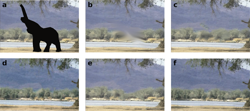
At its core, the ideas behind image inpainting have been around for decades for use in things like image restoration (e.g. removing a scratch on a family photo), or object removal (removing a tourist in a picture from your last vacation) (Guillemot and Le Meur, 2013). Originally, this type of repair was a costly endeavour that was done by hand by a trained artist (Fig. 2), but as has become increasingly clear in recent years, computers are quite skilled at this task too (with much shorter training times compared to a human)!
While the first iterations of these techniques like structure-based linear interpolation, texture-synthesis-based Efros interpolation, and diffusion-based Laplace or Navier-Stokes interpolation can work well in certain contexts, they often fell short when dealing with large gaps. The differences between these techniques are shown in Fig. 4 where an elephant mask is inpainted in the center of the image. These techniques rely heavily on information/patterns from the edges of the targeted inpainting region and are often unable to effectively make use information from the scene’s global context when making intelligent predictions.
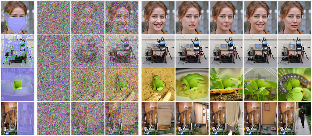
However, the field of computer vision has flourished in recent decades, primarily driven by advances in computing power and the development of newer, more efficient machine learning techniques. Generative approaches using Generative Adversarial Networks (GANs) for instance have been very popular recently with OpenAI’s DALL-E, or Stability.ai’s Stable Diffusion, producing incredibly realistic images based on a simple text prompt. There has also been some work previously attempting to use similar methods for inpainting, but there exists a trade-off between realism and fidelity/stability for inpainting taskings (Lugmayr et al., 2017; Geiss and Hardin, 2021).
For instance, while you might generate a region of an image that looks great to the human eye, the actual pixel values are not necessarily correct if compared to a reference image and may vary quite a bit based on the provided random noise/seed (Fig. 5). This is not unexpected, though, as these techniques are not necessarily constructed with such constraints in mind and exist for other purposes.
Instead, we focus on another machine learning architecture in this work: the U-Net. U-Nets are a class of Convolutional Neural Networks (CNNs), that ingest information in the form of an image (typically) and produce an output that is of the same dimensions. Often used for image segmentation, the encoder-decoder architecture of the U-Net allow the model to learn both local and global features of an image (context that is often quite valuable for correctly interpreting an image’s content during inpainting). We will use this architecture to teach the model to learn about latent features in aloft cloud to predict near surface reflectivity data in the aforementioned radar blind zone.
The data used in this project comes from primary two sources:
Both datasets are publicly available (governed by the Creative Commons Attribution 4.0 International (CC BY 4.0)) and are collocated at two Arctic locations in northern Alaska, USA at North Slope and Oliktok Point (Fig. 6). Since we are focused on snowfall, we limit our observations to cold periods below 2 degrees C. Further, data is split in contiguous training/validation/testing chunks to avoid overfitting from autocorrelation as shown in Fig. 6.c. We are using radar reflectivity data from the ARM KaZR, along with temperature, specific humidity, u-component wind, and v-component wind from ERA-5.

What type of U-Net should be used for this task? We experimented with a variety of different U-Nets in this project, including the UNet++ model from Zhou et al., 2018 and the 3Net+ from Huang et al., 2020. But let’s talk about the model architecture for a moment. For instance, why use these methods over a just a traditional U-Net? First let’s review how U-Nets work.
U-Nets are primarily thought of in three parts, an encoder path, a bottleneck layer, and a decoder path. The encoder is responsible for taking your initially high-resolution image, and through a series of convolutions and pooling steps, trades spatial information for rich feature information (learning about the latent context of your image). Depending on how deep your network is, these latent features are encoded most densely in the lowest dimensionality bottleneck layer at the base of the U. At this point, the image array may be only a fraction of the size of the original, and while you’ve lost most of the spatial information, the model has identified a set of embeddings that represent what it sees as key elements. Then, in the decoder path, the reverse occurs. The low-resolution, feature-rich arrays in the bottleneck layer are downsampled until the feature information has been transformed back into spatial information (resulting in a final image that has the same dimensions as the original).
One of the key differences between a U-Net, U-Net++ and 3Net+, is how each variation handles skip connections (Fig. 7). Skip connections allow these models to “skip” some data directly across the encoder path to be used in the decoder, which helps in conveying low-level feature information during decoding and produces a more stable model that converges in meaningful ways. In a vanilla U-Net for example, these connections simply concatenate feature maps from the contracting encoder path to the corresponding level in the decoding expansive path.

The UNet++ introduces a series of nested and dense skip pathways that attempt to address the issue of the unknown depth of the optimal architecture in a traditional U-Net. Instead of just having direct connections from the encoder to the decoder, the UNet++ has multiple skip pathways. For a given level in the encoder, there are skip connections to all subsequent levels in the decoder, creating a dense set of connections. These nested skip connections are designed to capture and fuse features at various semantic levels more effectively than the vanilla U-Net, however this comes at the cost of a larger model (more parameters) and increased training times.
The 3Net+ builds on ideas of both previous techniques and is the architecture used in our final model (Fig. 8). This method breaks the skip connections into a series of across-skip connections (similar to the vanilla U-Net), inter-skip connections, and intra-skip connections. These inter- and intra- skip connections make full use of multi-scale features in the scene by passing information in a manner which incorporates low-level details with high-level semantics from feature maps in full scales, but with fewer parameters to the U-Net++ model.
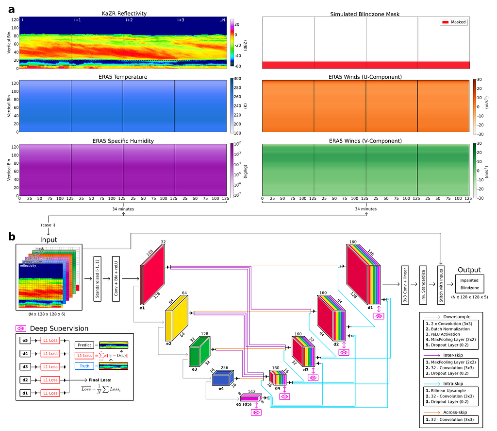
Further, our model makes use of deep supervision to learn hierarchical representations from the full-scale aggregated feature maps at each level of the decoder. This helps the model learn to correctly position clouds within the blind zone by examining the wider context of the scene. In the remaining sections we will compare the skill of this 3Net+ model trained on just reflectivity (herein denoted as 3+_1), another version trained on reflectivity and ERA5 data (3+_5) and two linear inpainting techniques using repeating extrapolation (REP) and marching average (MAR) methods. For additional details on how these are implemented, please refer to our AIES paper.
To comprehensively evaluate model performance in blind zone reconstructive accuracy, we will first examine a handful of common cases, followed by a more general statistical analysis of the full test dataset. Note that all results shown from here on out are strictly taken from the unseen test set of observations.
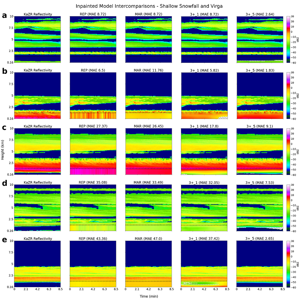
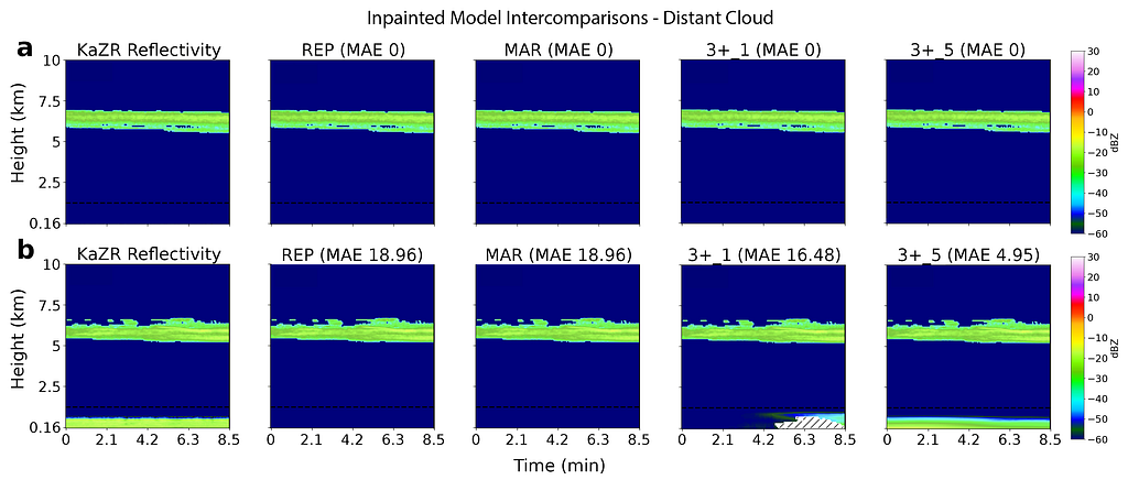
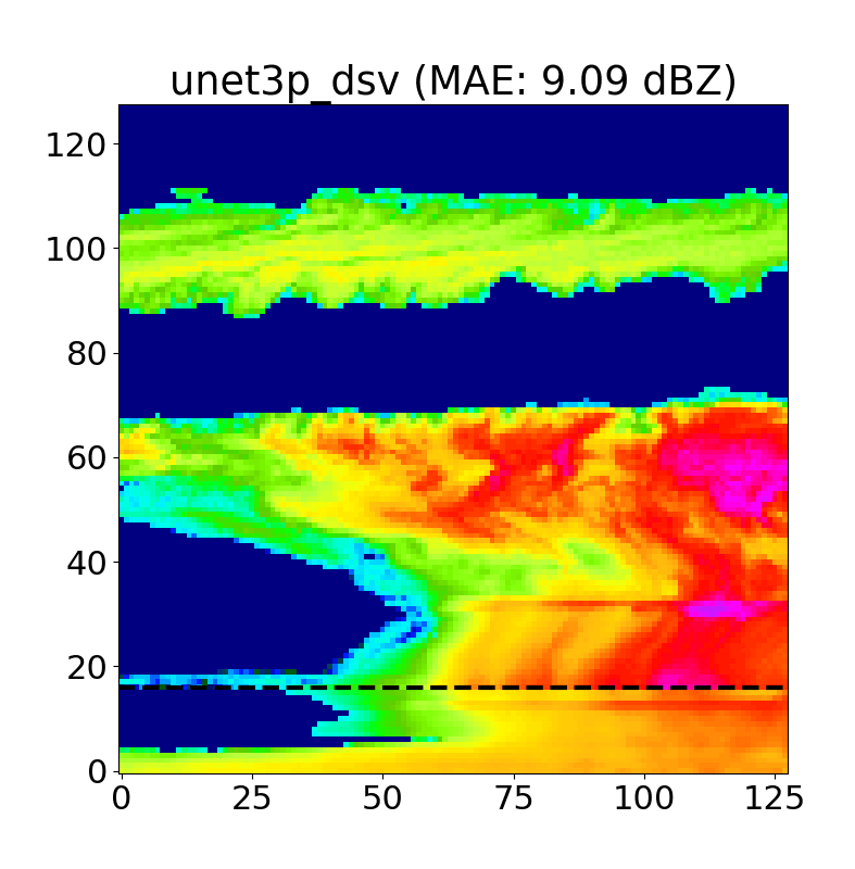
Examples of inpainted blind zone reflectivity values (taken from both NSA and OLI) for REP, MAR, 3+ 1 and 3+ 5 models, along with the corresponding target KaZR VAP product (i.e. the ground truth) in the far left column are shown below in Figs. 9/10.
This first set of examples highlights cases of near surface reflectivity gradients and cloud gaps that are common at both locations. The black dashed line indicates the 1.2 km blind zone threshold (values below this are masked and reconstructed by each model), and the shaded regions indicate areas of high uncertainty in the inpainted U-Net predictions (more on this later in the Monte Carlo Dropout section).

We find that the linear models (REP and MAR) perform well for deep, homogeneous systems, but fall short in more complex cases. Further, due to their reliance on blind zone threshold reflectivities, reflectivity gradients (vertical and horizontal) are missed by REP and MAR (and usually captured using the U-Nets). Finally, shallow, Arctic mixed-phase clouds can also be resolved using U-Nets, along with cloud gaps and cases of virga (Fig. 10), which is exciting as this has substantial implications to surface snowfall quantities.
The most challenging cases to accurately model are those with sparse reflectivity profiles and distant cloud. For instance, consider Fig. 11 showing two similar cases at NSA occurring in different years. To the human eye, both locations have very similar cloud structures, however one has a shallow near surface cloud in the blind zone while the other does not. The linear inpainting techniques are clearly well outside of their comfort zone here and will always produce the same “no cloud” output as we see in a). However, the U-Net models are still able to resolve cloud presence in cases such as this, with the 3+_5 model using the additional context from ERA-5 to better understand that the atmospheric conditions in this case likely result in blind zone cloud.
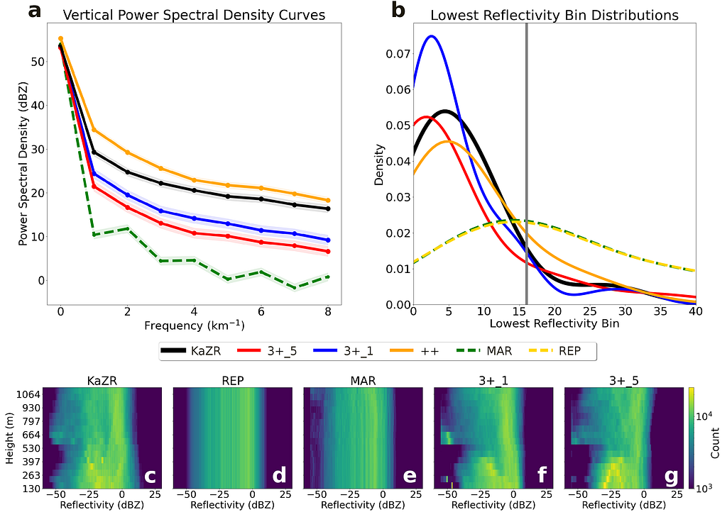
As we can see in Fig. 12 a), the U-Net PSD curves are closer to observations compared to the linear methods. Further, the nonlinear reconstructions produce a more realistic lowest cloud echo height (shown in the probability density plots of b), suggesting that we are better capturing cloud positions. Finally, the entire blind zone structure is summarized in c)-g), where the linear methods are able to capture general macro-scale trends in reflectivity but fall short of capturing the fine-scale variability. We do note that the U-Net models have a slight “cold” bias towards -60 dBZ due to their tendency to produce “safer” estimates closer to “no cloud” over much rarer, high intensity snowfall events.
Further, improving our predictions of surface snowfall and virga cases would have substantial hydrologic implications and reduce our uncertainty in snow accumulation quantities. So, we performed checks to see how well three cases were reconstructed with our model using probability of detection (POD) and false alarm rate (FAR):
The critical success index (CSI) for each of these metrics is shown in the performance diagram below (Fig. 13), with the 3+_5 model performing the best overall. Shallow snowfall cases were typically the hardest to reconstruct, as we saw these cases can be quite tricky to get right (Fig. 11).

To add further trust in the model’s decision-making process, we also performed a series of eXplainable Artificial Intelligence (XAI) tests (i.e., thinking towards a mechanistic interpretation of model behaviour). These tests were aimed at connecting model behaviour to logical physical processes to both inspire confidence in the model and provide additional insights for potentially enhancing future retrievals. If we can learn about previously unknown connections in the data, that can be very valuable! Separately, each individual XAI method gives a slightly different “local” explination of the decision-making process, and it is therefore useful to incorporate multiple tests to derive a more robust understanding.
The first, most basic, test we considered were feature/activation maps. By examining the values of the reLU activator in different levels of the encoder path of Fig. 8.b, we get a rough idea of where the model is looking in an image for a given input. As shown in Fig.14 below, the e1 encoder layer of the 3+_5 model typically looked along cloud edges, at reflectivity gradients and directly along the blind zone threshold.

One of the biggest questions in this project was whether ERA-5 was providing useful context to the model. If we can use a more simplistic U-Net that only relies on reflectivity for instance (i.e. the 3+_1 model), then we should do so, as this would be more computationally efficient. However, if the additional atmospheric state variables from ERA-5 provide the model with useful context for inpainting complex systems, then the use of this more complex model may be warranted.
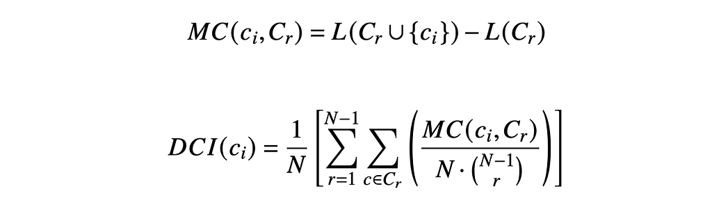
Since we only have a handful of inputs in this case (1 mandatory (radar) and 4 supplementary (temperature, humidity, u-wind, and v-wind), we can do an exhaustive search of the input space to evaluate their marginal contributions to accuracy. More formally, this drop-channel approach uses the below formula (Eq. 1/ Eq. 2) to calculate marginal contributions of importance from the provided inputs. Note that this technique does not consider potential nonlinear interactions between inputs.
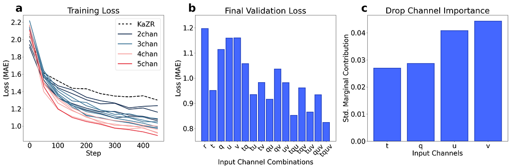
If we perform a series of this test runs (25 epochs) and examine changes in the validation loss, we can gain some rough insight into which inputs are most useful. The results of these tests are shown below in Fig. 15, where we note a trend of decreasing validation loss as we add more ERA-5 inputs (suggesting that none of the inputs are wholly unimportant). Further, the marginal contributions to validation loss suggest that the wind data is the most influential overall. We believe that this importance may stem from that fact that in the upper troposphere, wind patterns can hint at mesoscale atmospheric dynamics, such as the presence of high or low-pressure systems, fronts, and jet streams (which are of course linked to cloud/hydrometeor formation).
Finally, we also examined saliency maps for a handful of cases (Fig. 16), to further compare the differences in importance between the 3+_5 and 3+_1 models. These pixel attribution vanilla gradient saliency maps are inspired by the work of Simonyan et al., 2014, and provide additional insight into areas the model identifies as crucial contributors of information for inpainting accuracy using a given input. These saliency maps are generated by running an image through the network and subsequently extracting the gradients of the output based on the input across all channels. While simplistic, this method is particularly useful for visualizing which parts of the observed image are most valuable in inpainting the blind zone reflectivity values, allowing for direct plotting of the activation gradients.
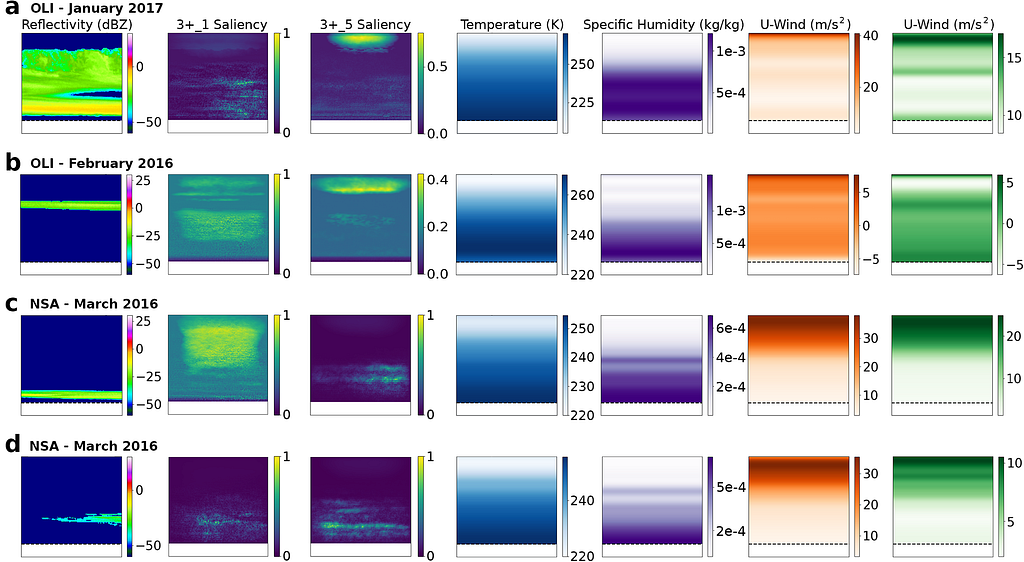
For multilayer clouds that intersect with the blind zone cut-off (e.g. Fig. 16.a), both models focus on the top of the cloud and the 1.2 km boundary threshold, as these systems often continue to extend down to the surface with similar reflectivity intensities. Both models also typically focus on and around cloud gaps in deeper systems (e.g. Fig. 16.b), however, a distinct halo of importance towards the tropopause is noticeable in the 3+_5 model. This recurring feature is likely incorporating upper troposphere wind and humidity data into predictions of near surface reflectivity. Interestingly, the 3+_1 model does not solely focus on the areas of high reflectivity in the scene but also on the regions around the cloud.
The motivating goal of this work is to eventually apply a surface trained U-Net to spaceborne observations. While additional work needs to be completed on resolution-matching between these two systems, we performed early tests against coincident CloudSat-CPR observations near NSA. The idea here being that both systems (while not perfectly overlapped), will be observing similar portions of the same storm system. We consider a handful of examples and include one below for a shallow cumuliform snowfall case.

In this example, we noted that both the spaceborne and surface radars observed a shallow cloud about 3 km tall (however CloudSat misses the increased reflectivity gradient below the blind zone due to surface clutter). When this region is reconstructed using both the traditional techniques and our U-Net, we find the U-Net is the only method that can accuratly represent the band of increased reflectivity around 1 km. More formally, if we look at the structure between the nearest CloudSat observation to the site (white dashed line) to each of the closest reconstructed regions, Pearson correlations are substantially improved using the U-Net (r_MAR=0.13 to r_3+_1=0.74).
While these examples don’t comprise a comprehensive anaylsis allowing us to say something about general performance, they do indicate that we see skill consistent with what we have previous noted when looking at the simulated surface blind zone. Further application work to spaceborne instruments is ongoing.
Before we finish up this already long post, I wanted to highlight a few of the other features we built into the model and provide some training code examples for those interested in developing their own inpainting model.
Unlike traditional Bayesian methods, we do not directly produce a physically-based uncertainty estimate using a U-Net. To get a rough idea of model confidence and stability, we decided to introduce a dropout at inference layer to the model based on the work of Gal and Ghahramani, 2016 which allows us to generate a distribution of inpainted predictions for each test case. These distributions allow us to produce confidence intervals for each inpainted pixel, and further refine our estimates to regions that model is more certain of when inpainting. An example of this is shown below in Fig. 17.
We typically use N=50 iterations per case, and as we can see above, the areas with the highest uncertainty are typically cloud edges and cloud gaps, as the model often hallucinates when positioning these features.
Model training for this project was completed on two sets of hardware, including a Linux-based GPU computing cluster on Microsoft Azure, and a high-performance desktop running Windows 11 (additional system details in Table 1). An extensive Bayesian hyperparameter sweep was also performed over the course of 2 days. Further, batch normalization is applied along with early stopping (n=20), dropout and L2 regularization (ridge regression) to help mitigate overfitting during the training process. Learning rate decay is also applied at two epochs (450 and 475), allowing the model to more easily settle into a local loss minima near the end of the training phase. All training runs and hyperparameter sweeps are saved online using the Weights & Biases cloud storage option, to monitor model learning rates and stability over time.

A link to the GitHub is here: https://github.com/frasertheking/blindzone_inpainting
However, I wanted to provide an overview of the actual 3Net+ implementation (with variable depth) in Tensorflow below for those interested in playing around with it.
def conv_block(x, kernels, kernel_size=(3, 3), strides=(1, 1), padding='same', is_bn=True, is_relu=True, n=2, l2_reg=1e-4):
    for _ in range(1, n+1):
        x = k.layers.Conv2D(filters=kernels, kernel_size=kernel_size,
                            padding=padding, strides=strides,
                            kernel_regularizer=tf.keras.regularizers.l2(l2_reg),
                            kernel_initializer=k.initializers.he_normal(seed=42))(x)
        if is_bn:
            x = k.layers.BatchNormalization()(x)
        if is_relu:
            x = k.activations.relu(x)
    return x

def unet3plus(input_shape, output_channels, config, depth=4, training=False, clm=False):

    """ Prep """
    interp = config['interpolation']
    input_layer = k.layers.Input(shape=input_shape, name="input_layer")
    xpre = preprocess(input_layer, output_channels)

    """ Encoder """
    encoders = []
    for i in range(depth+1):
        if i == 0:
            e = conv_block(xpre, config['filters']*(2**i), kernel_size=(config['kernel_size'], config['kernel_size']), l2_reg=config['l2_reg'])
        else:
            e = k.layers.MaxPool2D(pool_size=(2, 2))(encoders[i-1])
            e = k.layers.Dropout(config['dropout'])(e, training=True)
            e = conv_block(e, config['filters']*(2**i), kernel_size=(config['kernel_size'], config['kernel_size']), l2_reg=config['l2_reg'])
        encoders.append(e)

    """ Middle """
    cat_channels = config['filters']
    cat_blocks = depth+1
    upsample_channels = cat_blocks * cat_channels

    """ Decoder """
    decoders = []
    for d in reversed(range(depth+1)):
        if d == 0 :
            continue
        loc_dec = []
        decoder_pos = len(decoders)
        for e in range(len(encoders)):
            if d > e+1:
                e_d = k.layers.MaxPool2D(pool_size=(2**(d-e-1), 2**(d-e-1)))(encoders[e])
                e_d = k.layers.Dropout(config['dropout'])(e_d, training=True)
                e_d = conv_block(e_d, cat_channels, kernel_size=(config['kernel_size'], config['kernel_size']), n=1, l2_reg=config['l2_reg'])
            elif d == e+1:
                e_d = conv_block(encoders[e], cat_channels, kernel_size=(config['kernel_size'], config['kernel_size']), n=1, l2_reg=config['l2_reg'])
            elif e+1 == len(encoders):
                e_d = k.layers.UpSampling2D(size=(2**(e+1-d), 2**(e+1-d)), interpolation=interp)(encoders[e])
                e_d = k.layers.Dropout(config['dropout'])(e_d, training=True)
                e_d = conv_block(e_d, cat_channels, kernel_size=(config['kernel_size'], config['kernel_size']), n=1, l2_reg=config['l2_reg'])
            else:
                e_d = k.layers.UpSampling2D(size=(2**(e+1-d), 2**(e+1-d)), interpolation=interp)(decoders[decoder_pos-1])
                e_d = k.layers.Dropout(config['dropout'])(e_d, training=True)
                e_d = conv_block(e_d, cat_channels, kernel_size=(config['kernel_size'], config['kernel_size']), n=1, l2_reg=config['l2_reg'])
                decoder_pos -= 1
            loc_dec.append(e_d)
        de = k.layers.concatenate(loc_dec)
        de = conv_block(de, upsample_channels, kernel_size=(config['kernel_size'], config['kernel_size']), n=1, l2_reg=config['l2_reg'])
        decoders.append(de)

    """ Final """
    d1 = decoders[len(decoders)-1]
    d1 = conv_block(d1, output_channels, kernel_size=(config['kernel_size'], config['kernel_size']), n=1, is_bn=False, is_relu=False, l2_reg=config['l2_reg'])
    outputs = [d1]

    """ Deep Supervision """
    if training:
        for i in reversed(range(len(decoders))):
            if i == 0:
                e = conv_block(encoders[len(encoders)-1], output_channels, kernel_size=(config['kernel_size'], config['kernel_size']), n=1, is_bn=False, is_relu=False, l2_reg=config['l2_reg'])
                e = k.layers.UpSampling2D(size=(2**(len(decoders)-i), 2**(len(decoders)-i)), interpolation=interp)(e)
                outputs.append(e)
            else:
                d = conv_block(decoders[i - 1], output_channels, kernel_size=(config['kernel_size'], config['kernel_size']), n=1, is_bn=False, is_relu=False, l2_reg=config['l2_reg'])
                d = k.layers.UpSampling2D(size=(2**(len(decoders)-i), 2**(len(decoders)-i)), interpolation=interp)(d)
                outputs.append(d)

    if training:
        for i in range(len(outputs)):
            if i == 0:
                continue
            d_e = outputs[i]
                d_e = k.layers.concatenate([out1, out2, out3])
            outputs[i] = merge_output(input_layer, k.activations.linear(d_e), output_channels)

    return tf.keras.Model(inputs=input_layer, outputs=outputs, name='UNet3Plus')
I know this was a long post, and we covered a lot of stuff, but I want to give a quick summary of everything we’ve covered for those who have made this far (or those who skipped to the end).
The satellite radar blind zone is an ongoing problem on satellite-based Earth observing precipitation missions, with critical implications to global water-energy budget calculations. In order to overcome common issues with traditional linear inpainting methods for filling in this region, we opted to use a nonlinear, deeply supervised U-Net for radar blind zone inpainting. The U-Net outperforms linear techniques across nearly all metrics and can even reconstruct complex cloud structures like multilayer clouds, cloud gaps and shallow cloud. Further, using a variety of XAI techniques, we saw that information directly at the blind zone threshold and along the tropopause (especially wind information) was found to be very useful in the model’s decision-making process. While we don’t suggest that these models fully replace current physically-based solutions, we believe they offer a unique new perspective that can be used to supplement other retrievals in future missions.
We are currently working on a follow-up project to this with direct applications to CloudSat-CPR observations.
Gal, Y., & Ghahramani, Z. (2016). Dropout as a Bayesian Approximation: Representing Model Uncertainty in Deep Learning (arXiv:1506.02142). arXiv. https://doi.org/10.48550/arXiv.1506.02142
Geiss, A., & Hardin, J. C. (2021). Inpainting radar missing data regions with deep learning. Atmospheric Measurement Techniques, 14(12), 7729–7747. https://doi.org/10.5194/amt-14-7729-2021
Guillemot, C., & Le Meur, O. (2014). Image Inpainting: Overview and Recent Advances. IEEE Signal Processing Magazine, 31(1), 127–144. https://doi.org/10.1109/MSP.2013.2273004
Huang, H., Lin, L., Tong, R., Hu, H., Zhang, Q., Iwamoto, Y., Han, X., Chen, Y.-W., & Wu, J. (2020). UNet 3+: A Full-Scale Connected UNet for Medical Image Segmentation (arXiv:2004.08790). arXiv. https://doi.org/10.48550/arXiv.2004.08790
Kidd, C., Graham, E., Smyth, T., & Gill, M. (2021). Assessing the Impact of Light/Shallow Precipitation Retrievals from Satellite-Based Observations Using Surface Radar and Micro Rain Radar Observations. Remote Sensing, 13(9), Article 9. https://doi.org/10.3390/rs13091708
King, F., & Fletcher, C. G. (2020). Using CloudSat-CPR Retrievals to Estimate Snow Accumulation in the Canadian Arctic. Earth and Space Science, 7(2), e2019EA000776. https://doi.org/10.1029/2019EA000776
Lamer, K., Kollias, P., Battaglia, A., & Preval, S. (2020). Mind the gap — Part 1: Accurately locating warm marine boundary layer clouds and precipitation using spaceborne radars. Atmospheric Measurement Techniques, 13(5), 2363–2379. https://doi.org/10.5194/amt-13-2363-2020
Lugmayr, A., Danelljan, M., Romero, A., Yu, F., Timofte, R., & Van Gool, L. (2022). RePaint: Inpainting using Denoising Diffusion Probabilistic Models. 2022 IEEE/CVF Conference on Computer Vision and Pattern Recognition (CVPR), 11451–11461. https://doi.org/10.1109/CVPR52688.2022.01117
Maahn, M., Burgard, C., Crewell, S., Gorodetskaya, I. V., Kneifel, S., Lhermitte, S., Van Tricht, K., & van Lipzig, N. P. M. (2014). How does the spaceborne radar blind zone affect derived surface snowfall statistics in polar regions? Journal of Geophysical Research: Atmospheres, 119(24), 13,604–13,620. https://doi.org/10.1002/2014JD022079
Simonyan, K., Vedaldi, A., & Zisserman, A. (2014). Deep Inside Convolutional Networks: Visualising Image Classification Models and Saliency Maps (arXiv:1312.6034). arXiv. https://doi.org/10.48550/arXiv.1312.6034
Zhou, Z., Siddiquee, M. M. R., Tajbakhsh, N., & Liang, J. (2018). UNet++: A Nested U-Net Architecture for Medical Image Segmentation (arXiv:1807.10165). arXiv. https://doi.org/10.48550/arXiv.1807.10165
Beyond the Blind Zone was originally published in Towards Data Science on Medium, where people are continuing the conversation by highlighting and responding to this story.
Originally appeared here:
Beyond the Blind Zone
How cross-validation, visualisation, and statistical hypothesis testing combine to reveal the optimal forecasting horizon
Originally appeared here:
How Reliable Are Your Time Series Forecasts, Really?
Go Here to Read this Fast! How Reliable Are Your Time Series Forecasts, Really?
In this story, I’ll share with you my top 5 soft skills that should be highly valued by Data Scientists to distinguish themselves from the crowd. These observations are based on my experiences over the past decade, working with and managing Data Scientists.

I won’t catch you off guard with this one (or the next), yet curiosity remains a key characteristic for Data Scientists (and numerous other professions).
Data Scientists should value curiosity a lot because curiosity fosters continuous learning and adaptation in the rapidly evolving field of data science.
Given the constant influx of innovations from research papers or conferences, a curious mindset encourages Data Scientists to stay abreast of emerging trends, embrace new tools, and refine their skills.
I’ve experienced moments in my career where I would focus on a topic for months, lowering my head and forgetting about everything else. At some point, my curiosity brings me back to earth and urges me to open my eyes and look for what happened in the field during that span. Without it, I would get stuck and become outdated.
Also, curiosity is a source of creativity in problem-solving.
Data Science often presents intricate challenges that demand innovative approaches and is also often about finding new ways to apply old and proven approaches to new domains in ways that have not been tried before.
Thus, curious minds are more likely to think outside the box, widen their options, and try new things out. That’s all you need to solve problems!
Creativity doesn’t find its lone source in curiosity. For example, I think that a team composed of people with diverse backgrounds has more chance to foster creativity. So if you are a manager, think about hiring people very different from you or your colleagues, be curious about unorthodox career paths, and you might find gems.
You should read more blogs and more books (or whatever other formats you like to read/listen to). You should pick topics you’re not experienced with, topics going beyond what you usually read. If you have a scientific background, read about business, communication, decision-making, etc.
I like reading about topics I’m passionate about like Basketball, Data Science, or Data Engineering. However, I also try reading more about software engineering, marketing, entrepreneurship, biology, personal finance, etc.
2. Step outside your comfort zone
Seize any opportunity to leave your comfort zone and learn new things. If you adopt a position where everything is of interest, and everyone is worth listening to, you’ll widen your world and start questioning yourself about things outside your domain of expertise.

In any profession, you’ve likely encountered the challenges of collaborating with someone who struggles with effective communication. This issue becomes particularly pronounced in the realm of Data Science, where adeptly conveying technical concepts presents a formidable challenge.
Data Scientists are often at the interface of several teams, working with various stakeholders, and people with diverse backgrounds. So bridging the knowledge gap, and ensuring everybody has a common understanding of what is said is important.
Without clear communication, collaborating becomes rapidly impossible and might jeopardize a project, a team, or your job.
In my previous experience, I’ve always been impressed by people able to express their current work without using any technical concept. For me, it tells a lot about how much one person is in control of the subject and gets an overview of it before talking.
Even if just 1% of your project time is dedicated to communicating results, this seemingly small fraction often holds 99% of the value to be conveyed.
Regrettably, I’ve noticed that many junior Data Scientists devote weeks to perfecting their technical methodologies or data analyses, only to stumble when it comes to delivering impactful insights due to inadequate communication.
You should consider every opportunity to interact with people as a chance to practice and refine your communication skills.
For example, if you have daily meetings, prepare them for a few minutes and make sure to deliver clear communication to your audience.
Whenever I have an “important” meeting, I take 5 minutes to prepare. My recipe is the following:
Always make the hypothesis that they don’t know anything about what you’re doing, and help them close the knowledge gap so that they feel comfortable with what you are saying.
Also, ask them for feedback: do you remember what is my primary objective today? Was it clear enough?
Resources:
2. Read
Read books about communication! I highly recommend beginning with “Made To Stick” by Chip and Dan Heath, a book that offers a methodology for making your ideas more memorable and impactful.

You can also find interesting resources on the internet for free like https://online.hbs.edu/blog/post/communication-techniques
It is easy to forget about the “scientist” part of the “data scientist” role name, but it is very important to remember that a Data Scientist must apply a scientific approach to solving problems using data.
Scientific rigor forms the bedrock of Data Science, ensuring that analyses are robust, reliable, and reproducible. Applying scientific rigor mainly refers to adhering to a rigorous methodology, and critically evaluating findings.
You can be a great software engineer without applying any scientific methodology. But you won’t be a good Data Scientist without it.
In my opinion, this is not an option. Even if you’re not a research scientist, exercising scientific rigor is vital to mitigate the risk of erroneous conclusions. That’s why, whenever I discuss experiments and results with a colleague, I tend to value the scientific approach over the results in the first phase.
It’s easier said than done. But, if you are solving the wrong problem, you won’t go anywhere and lose your time. Unfortunately, most people jump on the first available version of a problem because they prefer writing code. So, the solution is simple, invest more time in defining the problem, discussing desired outcomes with stakeholders, and setting proper starting hypotheses/constraints.
2. Statistics
Statistics is one of the 3 pillars of a Data Scientist’s hard skills. And, any scientific approach needs a fair use of statistical tools. For example, statistical tests will help you check for feature correlation or data distribution. So, if you’re not comfortable with it, think about leveling up your statistical arsenal.
You can start right now on Medium: https://towardsdatascience.com/ultimate-guide-to-statistics-for-data-science-a3d8f1fd69a7
I recommend also this comprehensive book: https://www.oreilly.com/library/view/practical-statistics-for/9781492072935/
3. Tools
People tend to try multiple things at once to save time. But going step by step, assessing one thing at a time is mandatory to make sure you understand what’s going on and draw the right conclusions.
Using the appropriate tool can significantly facilitate the process. This is precisely the function of “Experiment tracking” tools, which are increasingly used within the Data Science domain.
For personal projects like Kaggle competitions, I like using DVC which introduced experiment tracking features a few years ago. However, much more advanced tools are available on the market like MLFlow or Neptune.ai.
You can find a comprehensive comparison of experiment-tracking tools here: https://towardsdatascience.com/a-comprehensive-comparison-of-ml-experiment-tracking-tools-9f0192543feb
But, you don’t need a sophisticated tool to take notes of your thoughts, questions, and experiments. So I’d recommend at least taking the first step by just writing down things on a notepad.
As any Data Scientist knows too well, a data analysis can vary significantly based on the narrative one wishes to convey to his audience.
There is no denying that conclusions drawn from a dataset are inherently influenced by the perspective and intentions of the presenter. This simple fact underscores the importance of integrity.
Resources:
With great power comes great responsibility. But, this is not the only reason why integrity is important to me.
Bias in models is also a now well-advertised issue every Data Science practitioner should care about.
Tackling this problem is a difficult task but everybody should feel concerned because of potential business impacts, and more importantly, because of the potential societal impact one biased model can have.
Interesting resources on the topic:
If you’re an AWS user like me, Sagemaker Clarify provides numerous analyses for bias detection.
If you are interested in fairness for Deep Learning, take an attentive look at DEEL lab publications on the subject and their open-source solutions like Influencia.
Another ethical aspect of Data Science is its environmental impact which is often downplayed due to its complexity in measurement and comprehension.
I guess the research in this area is expanding, and I would appreciate hearing from you if you have materials to share with me on the subject.
It is imperative for Data Scientists to actively assess and mitigate their environmental impact. For instance, they must question whether processing an extensive quantity of data is essential to achieve the desired business objectives.
Additionally, they should explore methods to minimize the environmental repercussions of their models. Then, sharing results and perspectives with stakeholders will broaden awareness of the environmental implications inherent in data-driven decision-making.
There are many more dimensions to this problem and I’ll think about it for a future story.
Interesting resources:
If you want to start thinking about your code carbon footprint:
Integrity is about being honest with yourself, consistent in your values, and acting according to your principles. So, the first thing is questioning yourself about your core values and the best way to incarnate them at work daily.
Then, resist external pressure and stay true to yourself. Also, don’t ignore the ethical challenges of the domain. They are an increasing concern for society, and we are responsible for providing solutions.
All Data Scientists just love exploring data and building models. That’s why Kaggle is so popular. As a professional, it is easy to be trapped by infinite data exploration, unbounded experiments, or model optimizations.
Value-centricity refers to an approach or mindset that places a strong emphasis on delivering value as the primary objective in decision-making, problem-solving, and overall strategy.
So, in the context of Data Science, being value-centric means you’ll have to keep your focus and employ your skills to create value rather than losing your time with the technical issues you’d like to solve to reach an optimal solution.
Once again, the best Data Scientists I worked with are exploring data on purpose, asking and answering the questions that will help them solve the right problem. Then, they conduct the minimum required experiments to draw a solution and build an MVP. They quickly go to production to see what happens, and iterate.
This path is made of numerous tradeoffs between optimizing things and adding incremental value to the end user.
One hard thing about being value-centric is recognizing that even if you’re not building a comprehensive data product by yourself, you’re building a piece of it, so you must conform to a product mindset and focus on the value you’ll ultimately generate for an end user.
Your decisions should always assess the time it will take to do something compared to the value it provides in terms of product. Some things are important but can be postponed for future iterations, other things are not interesting enough to be done.
When building a Data Science model, it is often possible to quickly assess if a model would yield good enough value depending on the expected performance and how it will impact the business.
For example, if you are not familiar with building custom scoring functions for evaluating your model based on nontechnical metrics, take a look at this: https://towardsdatascience.com/calculating-the-business-value-of-a-data-science-project-3b282de9be3c
At some point, you may also face the opportunity to improve model performance. This is the right time to understand what kind of improvements will be valuable. Is increasing your F1 score by 0.01 worth it compared to the effort you need to provide? Does it require collecting 100k new labeled data points?
As product owners and other software engineers might not understand all the technical aspects of developing a model, it is your responsibility to make these decisions.
Other interesting resources:
To become a better Data Scientist, you should focus on developing your curiosity, communication, integrity, scientific mindset, and value-centricity.
Most of the time, I would recommend reading books, but there are also numerous other valuable materials such as online courses and blog articles. Some of these skills can only be developed by being confronted with reality. Thus, be aware and prepared for the opportunities you’ll face.
If you would like to receive notifications for my upcoming posts regarding Data Science and more, please subscribe here or follow me.
Did you know you can clap multiple times?
5 Key Soft Skills to Elevate Your Data Science Game was originally published in Towards Data Science on Medium, where people are continuing the conversation by highlighting and responding to this story.
Originally appeared here:
5 Key Soft Skills to Elevate Your Data Science Game
Go Here to Read this Fast! 5 Key Soft Skills to Elevate Your Data Science Game

Originally appeared here:
Understanding and predicting urban heat islands at Gramener using Amazon SageMaker geospatial capabilities

Exploring Chronos: How foundational AI models are setting new standards in predictive analytics
Originally appeared here:
Chronos: The Rise of Foundation Models for Time Series Forecasting
Go Here to Read this Fast! Chronos: The Rise of Foundation Models for Time Series Forecasting

Welcome to my series on Causal AI, where we will explore the integration of causal reasoning into machine learning models. Expect to explore a number of practical applications across different business contexts.
In the last article we explored making Causal Discovery work in real-world business settings. This time we will cover de-biasing treatment effects with Double Machine Learning.
If you missed the last article on Causal Discovery, check it out here:
Making Causal Discovery work in real-world business settings
This article will demonstrate why Double Machine Learning is an essential part of the Causal AI toolbox:
Expect to gain a deep understanding of:
The full notebook can be found here:
ATE is the average impact of a treatment or intervention on a population. We can calculate it by comparing the average change in a chosen metric between a treatment and control group.
For example, consider a marketing team is running a promotion. The treatment group consists of customers who receive an offer, while the control group consists of customers who didn’t. We can calculate ATE comparing the average number of orders in the treatment and control group.
The potential outcomes framework was developed by Donald Rubin and has become a foundational concept in causal inference. Lets try and understand it using the example above from the marketing team.
Several assumptions are made to help ensure the estimated effects are valid:
Estimating ATE with experimental data is relatively straightforward.
Randomised Controlled Trials (RCTs) or AB tests are designed to randomly assign participants to treatment and control groups. This ensures that any differences in outcomes can be attributed to the treatment effect rather than pre-existing characteristics of the participants.
Back to the example from the marketing team. If they randomly split customers between the treatment and control group, the average difference in orders is the causal effect of the offer sent.
Estimating ATE using observational data is more challenging.
The most common challenge is confounding variables which effect both the treatment and outcome. Failure to control for confounders will lead to biased estimates of the treatment effect. We will come back to this later in the article in the worked case study.
Other challenges include:
Linear regression can be used to estimate ATE using observational data. The treatment (T) and control features (X) are included as variables in the model.
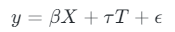
The coefficient of the treatment variable is the ATE — the average change in the outcome variable associated with a unit change in the treatment variable, while keeping control features constant.
We can use a simple data-generating process with one outcome, treatment and confounder to illustrate how we can use linear regression to estimate ATE.
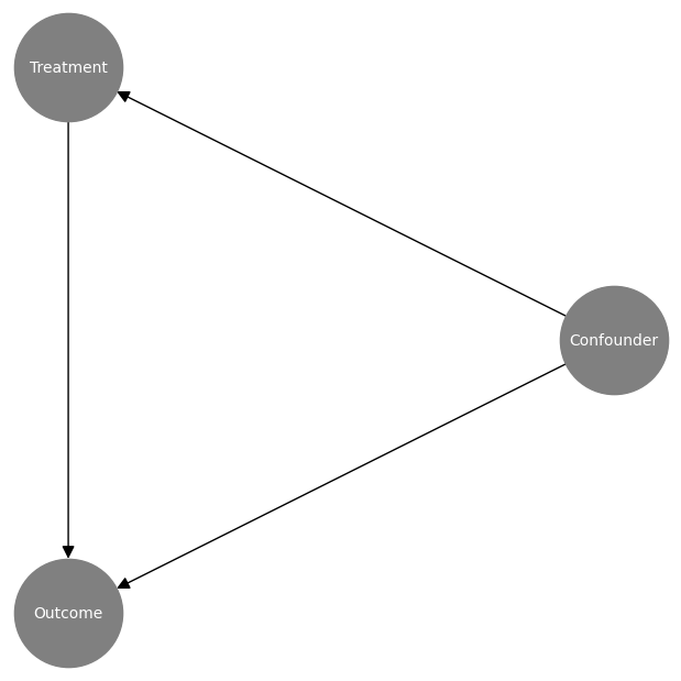
First of all we can visualise the causal graph:
# Create node lookup variables
node_lookup = {0: 'Confounder',
               1: 'Treatment',
               2: 'Outcome'
 }

total_nodes = len(node_lookup)

# Create adjacency matrix - this is the base for our graph
graph_actual = np.zeros((total_nodes, total_nodes))

# Create graph using expert domain knowledge
graph_actual[0, 1] = 1.0 # Confounder -> Treatment
graph_actual[0, 2] = 1.0 # Confounder -> Outcome
graph_actual[1, 2] = 1.0 # Treatment -> Outcome

plot_graph(input_graph=graph_actual, node_lookup=node_lookup)
And then we can create samples using the simple data-generating process. Pay close attention to the coefficient of the treatment variable (0.75) — this is our ground truth ATE.
np.random.seed(123)

# Create dataframe with a confounder, treatment and outcome
df = pd.DataFrame(columns=['Confounder', 'Treatment', 'Outcome'])
df['Confounder'] = np.random.normal(loc=100, scale=25, size=1000)
df['Treatment'] = np.random.normal(loc=50, scale=10, size=1000) + 0.50 * df['Confounder']
df['Outcome'] = 0.25 * df['Confounder'] + 0.75 * df['Treatment'] + np.random.normal(loc=0, scale=5, size=1000)

sns.pairplot(df, corner=True)

We can then train a linear regression model and extract the coefficient of the treatment variable — We can see that it correctly estimates the ATE (0.75).
# Set target and features
y = df['Outcome']
X = df[['Confounder', 'Treatment']]

# Train model
model = RidgeCV()
model = model.fit(X, y)

# Extract the treatment coefficient
ate_lr = round(model.coef_[1], 2)

print(f'The average treatment effect using Linear Regression is: {ate_lr}')

Linear regression can be a very effective method for estimating ATE. However, there are some challenges to be aware of:
Double Machine Learning is a causal method first introduced in 2017 in the paper “Double/Debiased Machine Learning for Treatment and Structural Parameters”:
Double/Debiased Machine Learning for Treatment and Causal Parameters
It aims to reduce bias and improve the estimation of causal effects in situations where we have high-dimensional data and/or complex nuisance parameters.
It is inspired by the Frisch-Waugh-Lovell theorem, so let’s start by understanding this.
The FWL theorem is used to decompose the effects of multiple regressors on an outcome variable, allowing us to isolate effects of interest.
Imagine you had two sets of features, X1 and X2. You could estimate the model parameters using linear regression like we did before. However, you can also get the same parameter for X1 by following these steps:
At first glance this can be quite hard to follow, so let’s try it out in Python to illustrate. We use the same data as before, but take the treatment column as X1 and the confounder column as X2:
# Set treatment, outcome and confounder samples
treatment = df['Treatment'].to_numpy().reshape(-1,1)
outcome = df['Outcome'].to_numpy().reshape(-1,1)
confounder = df['Confounder'].to_numpy().reshape(-1,1)

# Train treatment model and calculate residuals
treatment_model = RidgeCV()
treatment_model = treatment_model.fit(confounder, treatment)
treatment_pred = treatment_model.predict(confounder)
treatment_residuals = treatment - treatment_pred

# Train outcome model and calculate residuals
outcome_model = RidgeCV()
outcome_model = outcome_model.fit(confounder, outcome)
outcome_pred = outcome_model.predict(confounder)
outcome_residuals = outcome - outcome_pred

# Train residual model and calculate average treatment effect
final_model = RidgeCV()
final_model = final_model.fit(treatment_residuals, outcome_residuals)
ate_dml = round(final_model.coef_[0][0], 2)

print(f'The average treatment effect is: {ate_fwl}')

We can see that it correctly estimates the coefficient of the treatment variable (0.75).
Double Machine Learning builds upon FWL by isolating the effects of treatment and control features and by using flexible machine learning models.
The first stage is often referred to an orthogonalization as the nuisance parameters are estimated independently of the treatment effect estimation.
First stage:
Second stage:
The coefficient of the second stage model is the ATE. It is worth noting that the second stage model is a linear model, meaning we are assuming our treatment effect is linear (this is why we call DML a partially linear model).
Rather than code it up ourselves we can use the Microsoft package EconML. EconML has a wide range of Causal ML techniques implemented including a number of implementations of DML:
Welcome to econml’s documentation! – econml 0.15.0 documentation
# Train DML model
dml = LinearDML(discrete_treatment=False)
dml.fit(df['Outcome'].to_numpy().reshape(-1,1), T=df['Treatment'].to_numpy().reshape(-1,1), X=None, W=df['Confounder'].to_numpy().reshape(-1,1))

# Calculate average treatment effect
ate_dml = round(dml.ate()[0], 2)

print(f'The average treatment effect using the DML is: {ate_dml}')

We again can see that it correctly estimates the coefficient of the treatment variable (0.75).
The Marketing team send attractive offers to selected customers. They don’t currently hold out a randomly selected sample of customers to measure the impact of the offers.
The Data Science team is asked to estimate how the offers affect customer orders.
Naively comparing customers who were and weren’t sent offers is biased. This is driven by confounding factors:
We set up a data generating process with the following characteristics:
The X features are customer characteristics taken before the treatment:

T is a binary flag indicating whether the customer received the offer.

np.random.seed(123)

# Set number of observations
n=100000

# Set number of features
p=10

# Create features
X = np.random.uniform(size=n * p).reshape((n, -1))

# Nuisance parameters
b = (
    np.sin(np.pi * X[:, 0] * X[:, 1])
    + 2 * (X[:, 2] - 0.5) ** 2
    + X[:, 3]
    + 0.5 * X[:, 4]
    + X[:, 5] * X[:, 6]
    + X[:, 7] ** 3
    + np.sin(np.pi * X[:, 8] * X[:, 9])
)

# Create binary treatment
T = np.random.binomial(1, expit(b))

# Set treatment effect
tau = 0.75

# Calculate outcome
y = b + T * tau + np.random.normal(size=n)
The data generating process python code is based on the synthetic data creator from Ubers Causal ML package. Being able to create realistic synthetic data is crucial when it comes to assessing causal inference methods so I highly recommend you check it out:
causalml/causalml/dataset/regression.py at master · uber/causalml
We start by using linear regression to estimate the ATE. Our expectation is that it will struggle to capture the nuisance parameters and then potentially mis-specify the treatment effect.
# Append features and treatment
X_T = np.append(X, T.reshape(-1, 1), axis=1)

# Train linear regression model
model = RidgeCV()
model = model.fit(X_T, y)
y_pred = model.predict(X_T)

# Extract the treatment coefficient
ate_lr = round(model.coef_[-1], 2)

print(f'The average treatment effect using Linear Regression is: {ate_lr}')

We then train a DML model using LightGBM as flexible first stage models. This should allow us to capture the difficult nuisance parameters whilst correctly calculating the treatment effect.
np.random.seed(123)

# Train DML model using flexible stage 1 models
dml = LinearDML(model_y=LGBMRegressor(), model_t=LGBMClassifier(), discrete_treatment=True)
dml.fit(y, T=T, X=None, W=X)

# Calculate average treatment effect
ate_dml = round(dml.ate(), 2)

print(f'The average treatment effect using the DML is: {ate_dml}')

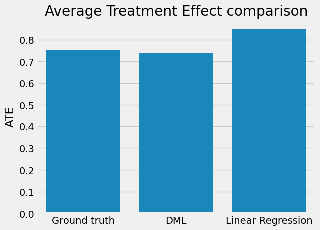
When we compare the results, we observe that linear regression gives us a biased estimate whilst DML is very close to the ground truth. This really shows the power of DML!
# Plot comparison of results
categories = ['Ground truth', 'DML', 'Linear Regression']
sns.barplot(x=categories, y=[tau, ate_dml, ate_lr])
plt.ylabel('ATE')
plt.title('Average Treatment Effect comparison')
plt.show()
There a several other causal methods which we can use to estimate ATE (a lot of which are implemented in both EconML and CausalML packages):
If you want to delve into these methods further, I would recommend starting with the S-Learner and T-Learner (often referred to as meta-learners). A couple of key learnings to help you start to work out when and where you could apply them:
Follow me if you want to continue this journey into Causal AI — In the next article we will explore how we can estimate Conditional Average Treatment Effects (CATE) with Double Machine Learning to help us personalise treatments at a customer level.
De-biasing Treatment Effects with Double Machine Learning was originally published in Towards Data Science on Medium, where people are continuing the conversation by highlighting and responding to this story.
Originally appeared here:
De-biasing Treatment Effects with Double Machine Learning
Go Here to Read this Fast! De-biasing Treatment Effects with Double Machine Learning
Learn how you can improve your graphs for machine-learning tasks.
Originally appeared here:
How to Improve Graphs to Empower Your Machine-Learning Model’s Performance