
The article discusses various roles the underscore plays in Python.
Originally appeared here:
Python and the underscore (_)
The article discusses various roles the underscore plays in Python.
Originally appeared here:
Python and the underscore (_)
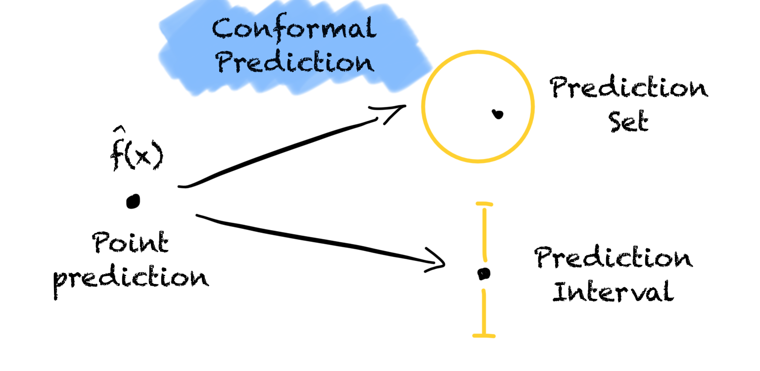

An important but easy-to-use tool for uncertainty quantification every data scientist should know.
Originally appeared here:
All You Need Is Conformal Prediction
Go Here to Read this Fast! All You Need Is Conformal Prediction

Principal components analysis is a variance decomposition technique that is frequently used for dimensionality reduction. A thorough guide to PCA is available here. In essence, each principal component is computed by finding the linear combination of the original features which has maximal variance, subject to the constraint that it must be orthogonal to the previous principal components. This process tends to be sensitive to outliers as it does not differentiate between meaningful variation and variance due to noise. The top principal components, which represent the directions of maximum variance, are especially susceptible.
In this article, I will discuss ROBPCA, a robust alternative to classical PCA which is less sensitive to extreme values. I will explain the steps of the ROBPCA procedure, discuss how to implement it with the R package ROSPCA, and illustrate its use on the wine quality dataset from the UCI Machine Learning Repository. To conclude, I will consider some limitations of ROBPCA and discuss an alternative robust PCA algorithm which is noteworthy but not well-suited for this particular dataset.
ROBPCA Procedure:
The paper which proposed ROBPCA was published in 2005 by Belgian statistician Mia Hubert and colleagues. It has garnered thousands of citations, including hundreds within the past couple of years, but the procedure is not often covered in data science courses and tutorials. Below, I’ve described the steps of the algorithm:
I) Center the data using the usual estimator of the mean, and perform a singular value decomposition (SVD). This step is particularly helpful when p>n or the covariance matrix is low-rank. The new data matrix is taken to be UD, where U is an orthogonal matrix whose columns are the left singular vectors of the data matrix, and D is the diagonal matrix of singular values.
II) Identify a subset of h_0 ‘least outlying’ data points, drawing on ideas from projection pursuit, and use these core data points to determine how many robust principal components to retain. This can be broken down into three sub-steps:
a) Project each data point in several univariate directions. For each direction, determine how extreme each data point is by standardizing with respect to the maximum covariance determinant (MCD) estimates of the location and scatter. In this case, the MCD estimates are the mean and the standard deviation of the h_0 data points with the smallest variance when projected in the given direction.
b) Retain the subset of h_0 data points which have the smallest maximum standardized score across all of the different directions considered in the previous sub-step.
c) Compute a covariance matrix S_0 from the h_0 data points and use S_0 to select k, the number of robust principal components. Project the full dataset onto the top k eigenvectors of S_0.
III) Robustly calculate the scatter of the final data from step two using an accelerated MCD procedure. This procedure finds a subset of h_1 data points with minimal covariance determinant from the subset of h_0 data points identified previously. The top k eigenvectors of this scatter matrix are taken to be the robust principal components. (In the event that the accelerated MCD procedure leads to a singular matrix, the data is projected onto a lower-dimensional space, ultimately resulting in fewer than k robust principal components.)
Note that classical PCA can be expressed in terms of the same SVD that is used in step one of ROBPCA; however, ROBPCA involves additional steps to limit the influence of extreme values, while classical PCA immediately retains the top k principal components.
ROSPCA Package:
ROBPCA was initially implemented in the rrcov package via the PcaHubert function, but a more efficient implementation is now available in the ROSPCA package. This package contains additional methods for robust sparse PCA, but these are beyond the scope of this article. I will illustrate the use of the robpca function, which depends on two important parameters: alpha and k. Alpha controls how many outlying data points are resisted, taking on values in the range [0.5, 1.0]. The relationship between h_0 and alpha is given by:
The parameter k determines how many robust principal components to retain. If k is not specified, it is chosen as the smallest number such that a) the eigenvalues satisfy:
and b) the retained principal components explain at least 80 percent of the variance among the h_0 least outlying data points. When no value of k satisfies both criteria, then just the ratio of the eigenvalues is used to determine how many principal components will be retained. (Note: the original PcaHubert function states the criterion as 10E-3, but the robpca function uses 1E-3.)
Real Data Example:
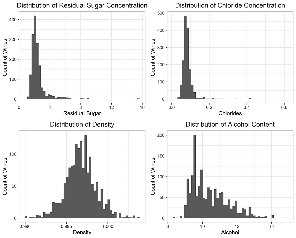
For this case study, I have selected the red wine quality dataset from the UCI Machine Learning Repository. The dataset contains n=1,599 observations, each representing a different red wine. The 12 variables include 11 different chemical properties and an expert quality rating. Several of the 11 chemical properties contain potential outliers, making this an ideal dataset to illustrate 1) the impact of extreme values on PCA and 2) how a robust variance structure can be identified through ROBPCA.
PCA is not scale-invariant, so it’s important to decide intentionally on what, if any, standardization will be used. Failing to standardize would give undue weight to variables measured on larger scales, so I center each of the 11 features and divide by its standard deviation. An alternative approach would be to use a robust measure of center and scale such as the median and MAD; however, I find that robust estimates of the scale completely distort the classical principal components since the extreme values are even farther from the data’s center. ROBPCA is less sensitive to the initial scaling (a considerable advantage in itself), but I use the standard deviation for consistency and to ensure the results are comparable.
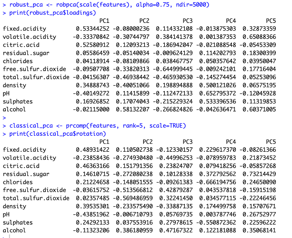
To select k for ROBPCA, I allow the function to determine the optimal k value, resulting in k=5 robust principal components. I accept the default of alpha=0.75 since I find that the variable loadings are not very sensitive to the choice of alpha, with alpha values between 0.6 and 0.9 producing very similar loadings. For classical PCA, I let k=5 to facilitate comparisons between the two methods. This is a reasonable choice for classical PCA, irrespective of ROBPCA, as the top five principal components explain just under 80 percent of the total variance.
With these preliminaries out of the way, let’s compare the two methods. The image below shows the principal component loadings for both methods. Across all five components, the loadings on the variables ‘residual sugar’ and ‘chlorides’ are much smaller (in absolute value) for ROBPCA than for classical PCA. Both of these variables contain a large number of outliers, which ROBPCA tends to resist.
Meanwhile, the variables ‘density’ and ‘alcohol’ seem to contribute more significantly to the robust principal components. The second robust component, for instance, has much larger loadings on these variables than does the second classical component. The fourth and fifth robust components also have much larger loadings on either ‘density’ or ‘alcohol,’ respectively, than their classical counterparts. There are few outliers in terms of density and alcohol content, with almost all red wines distributed along a continuum of values. ROBPCA seems to better capture these common sources of variation.
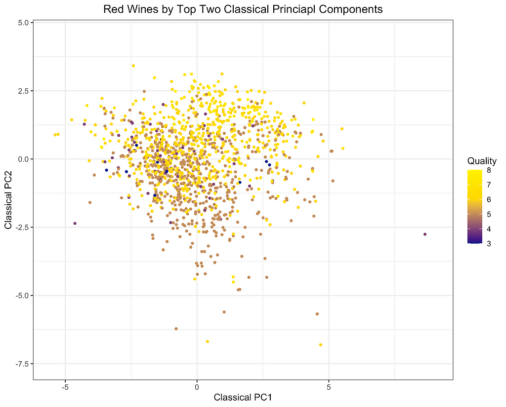
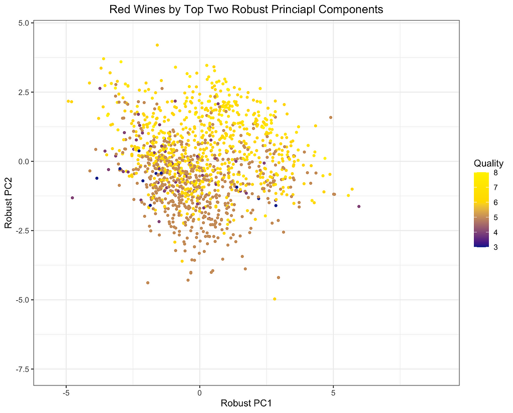
Finally, I will depict the differences between ROBPCA and classical PCA by plotting the scores for the top two principal components against each other, a common technique used for visualizing datasets in a low-dimensional space. As can be seen from the first plot below, there are a number of outliers in terms of the classical principal components, most of which have a large negative loading on PC1 and/or a large positive loading on PC2. There are a few potential outliers in terms of the robust principal components, but they do not deviate as much from the main cluster of data points. The differences between the two plots, particularly in the upper left corner, indicate that the classical principal components may be skewed downward in the direction of the outliers. Moreover, it appears that the robust principal components can better separate the wines by quality, which was not used in the principal components decomposition, providing some indication that ROBPCA recovers more meaningful variation in the data.
This example demonstrates how ROBPCA can resist extreme values and identify sources of variation that better represent the majority of the data points. However, the choice between robust PCA and classical PCA will ultimately depend on the dataset and the objective of the analysis. Robust PCA has the greatest advantage when there are extreme values due to measurement errors or other sources of noise that are not meaningfully related to the phenomenon of interest. Classical PCA is often preferred when the extreme values represent valid measurements, but this will depend on the objective of the analysis. Regardless of the validity of the outliers, I’ve found that robust PCA can have a large advantage when the objective of the analysis is to cluster the data points and/or visualize their distribution using only the top two or three components. The top components are especially susceptible to outliers, and they may not be very useful for segmenting the majority of data points when extreme values are present.
Potential Limitations of ROBPCA Procedure:
While ROBPCA is a powerful tool, there are some limitations of which the reader should be aware:
An Alternative Robust PCA Algorithm:
There are various alternative approaches to robust PCA, including a method proposed by Candes et al. (2011), which seeks to decompose the data matrix into a low-dimensional component and a sparse component. This approach is implemented in the rpca R package. I applied this method on the red wine dataset, but over 80 percent of the entries in the sparse matrix were non-zero. This low sparsity level indicates that the assumptions of the method were not well met. While this alternative approach is not very suitable for the red wine data, it could be a very useful algorithm for other datasets where the assumed decomposition is more appropriate.
References:
M. Hubert, P. J. Rousseeuw, K. Vanden Branden, ROBPCA: a new approach to robust principal components analysis (2005), Technometrics.
E. Candes, X. Li, Y. Ma, J. Wright, Robust Principal Components Analysis? (2011), Journal of the ACM (JACM).
T. Reynkens, V. Todorov, M. Hubert, E. Schmitt, T. Verdonck, rospca: Robust Sparse PCA using the ROSPCA Algorithm (2024), Comprehensive R Archive Network (CRAN).
V. Todorov, rrcov: Scalable Robust Estimators with High Breakdown Point (2024), Comprehensive R Archive Network (CRAN).
M. Sykulski, rpca: RobustPCA: Decompose a Matrix into Low-Rank and Sparse Components (2015), Comprehensive R Archive Network (CRAN).
P. Cortez, A. Cerdeira, F. Almeida, T. Matos, J. Reis, Wine Quality (2009), UC Irvine Machine Learning Repository. (CC BY 4.0)
Overcoming Outliers with ROBPCA was originally published in Towards Data Science on Medium, where people are continuing the conversation by highlighting and responding to this story.
Originally appeared here:
Overcoming Outliers with ROBPCA

Experimentation does not always need to be complex; simple A/B test framework could be just excellent in situations with manageable marketing levers. The design and implementation of experimentation should always go hand in hand with marketing learning agenda, marketing technology (MarTech) maturity, and creative design capability.
Let’s take grocery shopping as an example. To understand impacts of one-time promotions and offerings on online grocery shoppers, a simple A/B test framework of control and test variants will do. It matters less if these shoppers are assigned to consistent control and test groups throughout their customer life journey, nor if a few of them dropped out midway.
Longitudinal experiments, also known as panel studies, provide a framework of studying causal relationships over time. Unlike one-time experiments, they allow for the examination of evolving patterns and trends within a population or sample group. Traditionally prominent in fields like medical sciences and economics, longitudinal experiments have found increasing use cases in sectors including tech, retail, banking, and insurance.
Longitudinal experiments offer distinct advantages in complex personalization scenarios. They enable a deeper understanding of the cumulative impact of personalized marketing strategies and help determine when to scale these efforts.
Consider a hypothetical scenario with AvidBikers, a leading supplier of premium bike parts for mountain cyclists to customize and upgrade their bikes. They recently launched a personalization program to send weekly best offerings and promotions to their loyal cyclist customer base.

Contrary to one-time grocery trips, typical shopper journeys at AvidBikers consists of a series of online shopping trips to get all parts needed to DIY bikes and upgrade biking equipments.
As personalization program is rolling out, AvidBikers’ marketing data science team would like to understand both the individual campaign effectiveness and the overall program-level incrementality from combined personalized marketing strategies.
AvidBikers implements a dual-layered longitudinal experimentation framework to track the overall personalization program-wide impacts as well as impacts from individual campaigns. Here program-wide effects refer to the impacts from running the personalization program, sometime consists of up to thousands of individual campaigns, whereas campaign-level impacts refer to that of sending personalized weekly best offerings vs. promotions to most relevant customers.
To implement the framework, test and control groups are created on both global level and campaign level. Global test group is the customer base who receives personalized offerings and promos when eligible, whereas global control is carved out as “hold-out” group. Within the global test group, we further carve out campaign-level test and control groups to measure impacts of different personalization strategies.
Challenges arise, however, from new and departing customers as they could disrupt test-control group balance. For one, customer attrition likely has an uneven impact on test and control groups, creating uncontrolled differences that could not be attributed to the personalization treatment / interventions.
To address such bias, new customers are assigned into program-level and campaign level test and control groups, followed by a statistical test to validate groups are balanced. In addition, a longitudinal quality check will be run to ensure audience assignment is consistent week over week.
Measurement is often (mistakenly) used interchangeably with experimentation. The difference, in simple terms, is that experimentations are frameworks to test hypotheses and identify causal relationship whereas measurement is the collection and quantification of observed data points.
Measurement is key to capturing learnings and financial impacts of company endeavors. Similarly to experimentation, AvidBikers prepared program and campaign-level measurement files to run statistical tests to understand program and campaign-level performance and impacts. Program-level measurement results indicate the overall success of AvidBikers personalization program. On the other hand, campaign-level measurement tells us which specific personalization tactic (personalized offering or promo) is the winning strategy for which subset of the customer base.
With measurement results, AvidBiker data scientists could work closely with their marketing and pricing teams to find the best personalization tactics through numerous fast “test-and-learn” cycles.
Implementing longitudinal experiments at scale demands a balance of technological infrastructure and methodological rigor. Tools like Airflow and Databricks streamline workflow management and data processing, facilitating the orchestration of complex experiments. Nevertheless, the cornerstone of success remains the meticulous design and execution of the experimentation framework tailored to the specific business context.
In my personal experience, complexities such as cold-start, customer dropouts, and overlapping strategies could arise, which require case-by-case evaluation and customization in experiment design and implementation. However, as customer needs continue to evolve, strategic implementation of longitudinal experiments stands as a pivotal foundation in the evolution of customer-centric personalization.
Thanks for reading and stay tuned for more data science and AI topics in the future 🙂
How to Set Up Longitudinal Experiments: A Data Scientist’s Guide was originally published in Towards Data Science on Medium, where people are continuing the conversation by highlighting and responding to this story.
Originally appeared here:
How to Set Up Longitudinal Experiments: A Data Scientist’s Guide
Go Here to Read this Fast! How to Set Up Longitudinal Experiments: A Data Scientist’s Guide

Nvidia’s stock price has skyrocketed because of its GPU’s dominance in the AI hardware market. However, at the same time, TPUs, well-known AI hardware from Google, are not for sale. You can only rent virtual machines on Google Cloud to use them. Why did Google not join the game of selling AI hardware?
DISCLAIMER: The views expressed in this article are solely those of the author and do not necessarily reflect the opinions or viewpoints of Google or its affiliates. The entirety of the information presented within this article is sourced exclusively from publicly available materials.
One popular theory I heard is that Google wants to attract more customers to its cloud services. If they sell it to other cloud service providers, they are less competitive in the cloud service market.
According to cloud service customers, this theory does not make much sense. No corporate-level customer wants to be locked to one specific cloud service provider. They want to be flexible enough to move to another whenever needed. Otherwise, if the provider increases the price, they can do nothing about it.
If they are locked to Google Cloud for using TPUs, they would rather not use it. This is why many customers don’t want to use TPUs. They only started to feel less locked in recently when OpenXLA, an intermediate software to access TPUs, supported more frameworks like PyTorch.
So, using TPUs to attract customers to Google Cloud is not a valid reason for not selling them. Then, what is the real reason? To answer this question better, we must look into how Google started the TPU project.
The short answer is for proprietary usage. There was a time when GPUs could not meet the computing requirements for AI hardware.
Let’s try to estimate when the TPU project was started. Given it was first announced to the public in 2016, it would be a fair guess that it started around 2011. If that is true, they started the project pretty early since we did not see a significant improvement in computer vision until 2012 by AlexNet.
With this timeline, we know GPUs were less potent than today when the project started. Google saw this AI revolution early and wanted faster hardware for large-scale computing. Their only choice is to build a new solution for it.
That was why Google started this project, but there are more questions. Why were GPUs not good enough back in the day? What potential improvements did Google see that are significant enough to start their new hardware project?
The answer lies in the microarchitecture of GPUs and TPUs. Let’s examine the design of the cores on GPUs and TPUs.
First, let’s do a quick recap of the background knowledge of CPUs. When an instruction comes, it is decoded by the instruction decoder and fed into the arithmetic logic unit (ALU) together with data from the registers. The ALU does all the computing and returns the results to one of the registers. If you have multiple cores in the CPU, they can work in parallel.
What is a GPU? It is short for the graphics processing unit. It was designed for graphics computing and later discovered suitable for machine learning. Most of the operations in a GPU are matrix operations, which could run in parallel. This also means there are not many operations they need to support compared with a CPU.
The more specialized the chip is for a given task, the faster it is on the task.
The key idea of the GPU’s initial design was to have a feature-reduced CPU with smaller but more cores for faster parallel computing. The number of instructions supported on a GPU is much less than on a CPU, which makes the area taken by a single core on a chip much smaller. This way, they can pack more cores onto the chip for large-scale parallel computing.
Why do fewer features mean a smaller area on the chip? In software, more features mean more code. In hardware, all features are implemented using logical circuits instead of code. More features mean the circuit is more complex. For example, a CPU must implement more instructions on the chip.
Smaller also means faster. A simpler design of the logic gates leads to a shorter cycle time.
TPU further developed this idea of specialized chips for deep learning. The defining feature of a TPU is its matrix-multiply unit (MXU). Since matrix multiplication is the most frequent operation in deep learning, TPU builds a specialized core for it, the MXU.
This is even more specialized than a GPU core, capable of many matrix operations, while the MXU only does one thing: matrix multiplication.
It works quite differently from a traditional CPU/GPU core. All the dynamics and generality are removed. It has a grid of nodes all connected together. Each node only does multiplication and addition in a predefined manner. The results are directly pushed to the next node for the next multiplication and addition. So, everything is predefined and fixed.
This way, we save time by removing the need for instruction decoding since it just multiplies and adds whatever it receives. There is no register for writing and reading since we already know where the results should go, and there is no need to store it for arbitrary operations that come next.
Besides the MXU, the TPU has also been designed for better scalability. It has dedicated ports for high-bandwidth inter-chip interconnection (ICI). It is designed to sit on the racks in Google’s data centers and to be used in clusters. Since it is for proprietary usage only, they don’t need to worry about selling single chips or the complexity of installing the chips on the racks.
It doesn’t make sense others didn’t come up with the same simple idea of building dedicated cores for tensor operations (matrix multiplication). Even if they did not, it doesn’t make sense that they don’t copy.
From the timeline, it seems Nvidia came up with the same idea at about the same time. A similar product from Nvidia, the Tensor Cores, was first announced to the public in 2017, one year after Google’s TPU announcement.
It is unclear whether TPUs are still faster than GPUs today. I cannot find public benchmarks of the latest generations of TPUs and GPUs, and it is unclear to me which generation and metrics should be used for benchmarking.
However, we can use one universal application-oriented metric: dollars per epoch. I found one interesting benchmark from Google Cloud that aligns different hardware to the same axis: money. TPUs appear cheaper on Google Cloud if you have the same model, data, and number of epochs.
Large models, like Midjourney, Claude, and Gemini, are all very sensitive to the training cost because they consume too much computing power. As a result, many of them use TPUs on Google Cloud.
One important reason is the software stack. You are using not only the hardware but also the software stack associated with it. Google has better vertical integration for its software stack and AI hardware than GPUs.
Google has dedicated engineering teams to build a whole software stack for it with strong vertical integration, from the model implementation (Vertex Model Garden) to the deep learning frameworks (Keras, JAX, and TensorFlow) to a compiler well-optimized for the TPUs (XLA).
The software stack for GPUs is very different. PyTorch is the most popular deep learning framework used with Nvidia GPUs, and it was mainly developed by Meta. The most widely used model pools with PyTorch are transformers and diffusers developed by HuggingFace. It is much harder to do perfect vertical integration for the software stack across all these companies.
One caveat is that fewer models are implemented with JAX and TensorFlow. Sometimes, you may need to implement the model yourself or use it from PyTorch on TPUs. Depending on the implementation, you may experience some friction when using PyTorch on TPUs. So, there might be extra engineering costs besides the hardware cost itself.
We understand the project was started for proprietary usage and acquired a pretty good user base on Google Cloud because of its lower price. Why did not Google just start to sell it to customers directly, just like Nvidia’s GPUs?
The short answer is to stay focused. Google is in fierce competition with OpenAI for generative AI. At the same time, it is in the middle of multiple waves of tech layoffs to lower its cost. A wise strategy now would be to focus its limited resources on the most important projects.
If Google ever wants to start selling its TPUs, it will be competing with two strong opponents, Nvidia and OpenAI, at the same time, which may not be a wise move at the moment.
Selling hardware directly to customers creates huge overheads for the company. Conversely, renting TPUs on their cloud services is much more manageable.
When TPUs are only served on the cloud, they can have a centralized way to install all the TPUs and related software. There is no need to deal with various installation environments or the difficulty of deploying a TPU cluster.
They know exactly how many TPUs to make. The demands are all internal, so there is no uncertainty. Thus, managing the supply chain is much easier.
Sales also become much easier since it is just selling the cloud service. There is no need to build a new team experienced in selling hardware.
Without all the overhead of selling hardware directly to the customers, Google got a few advantages in return.
First, they can have a more aggressive TPU architecture design. The TPUs have a unique way of connecting the chips. Unlike multiple GPUs that connect to the same board, TPUs are organized in cubes. They arranged 64 TPUs in a 4 by 4 by 4 cube to interconnect them with each other for faster inter-chip communication. There are 8960 chips in a single v5p Pod. They can be easily used together. This is the advantage of fully control your hardware installation environment.
Second, they can iterate faster to push out new generations. Since they only need to support a small set of use cases for proprietary usages, it drastically reduces their research and development cycle for every generation of the chips. I wonder if Nvidia came up with the TensorCore idea earlier than Google, but because of the overhead of selling hardware to external customers, they could only announce it one year later than Google.
From the perspective of serving its most important purpose, competing in GenAI, these advantages put Google in a very good position. Most importantly, with this in-house hardware solution, Google saved huge money by not buying GPUs from Nvidia at a monopoly price.
So far, we have discussed many advantages of Google’s AI hardware approach, but is there any downside? Indeed, there is a big one. Google became a tech island.
Every pioneer in tech will become an island isolated from the rest of the world, at least for a while. This is because they started early when the corresponding infrastructure was not ready. They need to build everything from scratch. Due to the migration cost, they will stick with their solution even if everyone else uses something else.
This is exactly what Google is experiencing right now. The rest of the world is innovating with models from HuggingFace and PyTorch. Everyone is quickly tweaking each other’s models to develop better ones. However, Google cannot join this process easily since its infra is largely built around TensorFlow and JAX. When putting a model from external into production, it must be re-implemented with Google’s framework.
This “tech island” problem slows Google down in taking good solutions from the external world and further isolates it from others. Google will either start bringing more external solutions like HuggingFace, PyTorch, and GPUs or always ensure its in-house solutions are the best in the world.
Finally, let’s peek into the future of AI hardware. What would the future AI hardware look like? The short answer is mode collapse as the hardware becomes more specialized.
Hardware will be further coupled with the applications. For example, support more precision formats for better language model serving. Like with bfloat16, TF32, they may better support int8 and int4. Nvidia announced their second generation of the Transformer Engine, which works with Blackwell GPU. This made optimizing their hardware for transformer models easier without changing the user code. A lot of codesign is happening.
On the other hand, software cannot easily jump out of the transformer realm. If they do, they will be slow due to a lack of hardware support. On the contrary, they implement their models with the hardware in mind. For example, the FlashAttention algorithm is designed to leverage the memory hierarchy of GPUs for better performance.
We see a big mode collapse coming soon. The hardware and software are so well optimized for each other for the current models. Neither of them can easily leave the current design or algorithm. If there is a new model completely different from the transformers, it needs to be 10x better to get widely adopted. It must incentivize people to make new hardware as fast and cheap as transformers.
In conclusion, the TPU project started for proprietary usage when the GPU’s computing power was insufficient. Google wants to focus on GenAI instead of competing in the AI hardware market to avoid slowing the iteration speed and sacrificing its innovative design. Faster computing at a lower cost helped Google significantly in doing AI research and developing AI applications. However, it also made Google a tech island.
Looking into the future, AI hardware will be even more optimized for certain applications, like the transformer models. Neither the hardware nor the models could easily jump out of this mode collapse.
TPUs Are Not for Sale, But Why? was originally published in Towards Data Science on Medium, where people are continuing the conversation by highlighting and responding to this story.
Originally appeared here:
TPUs Are Not for Sale, But Why?

Traditional correlation coefficients such as Pearson ρ, Spearman, or Kendall’s τ are limited to finding linear or monotonic relationships and struggle to identify more complex association structures. The recent article on TDS [1] about a new correlation coefficient ξ that aims to overcome these limitations has received a lot of attention and has been discussed intensively. One of the questions raised in the comments was what particular advantages ξ brings over a nonlinear correlation measure based on mutual information. An experiment may be worth a thousand words in such debates. So in this story, I experimentally compare ξ to the mutual information-based coefficient R along a variety of properties one would like a nonlinear correlation measure to satisfy. Based on the results, I would strongly recommend R over ξ for the majority of routines that require finding nonlinear associations.
Let me first summarize and convince you about the desired properties of a coefficient we are looking for. We want an association measure A(x,y) that
The table below summarizes the results of my experiments, where green indicates that the measure has the property tested, red indicates the opposite, and orange is slightly better than red. Let me now walk you through the experiments; you can find their code in this Github repo [2] in the R programming language.

I use the following coefficient implementations and their configurations
There are histogram-based and nearest neighbor-based MI estimators. Although many still use histogram-based estimators, I believe that Kraskov’s nearest neighbor estimator [4] is one of the best. I will use its implementation mutinfo() from the ‘FNN’ package [5] with the parameter k=2 as suggested in the paper.
Write in the comments if you want to know more about this particular MI estimator
There are also several ways to normalize the MI to the interval [0,1]. I will use the one below because it has been shown to have a consistency property, and I will demonstrate it in the experiments.

This measure R is called the Mutual Information Coefficient [6]. However, I have noticed a tendency to confuse it with the more recent Maximal Information Coefficient (MIC) [7]. The latter has been shown to be worse than some alternatives [8], and to lack some of the properties it is supposed to have [9].
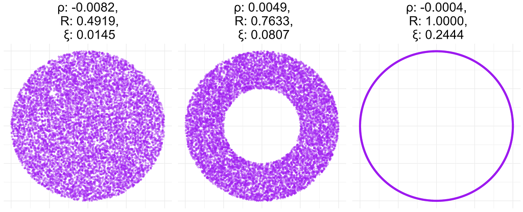
In the figure below, I have calculated all three correlation coefficients for a donut data of 10K points with different donut thickness. As expected, the linear correlation coefficient ρ does not capture the existence of a relationship in any of the plots. In contrast, R correctly determines that x and y are related and takes the value of 1 for the data in the right plot which corresponds to a noiseless relationship between x and y: x = cos(t) and y = sin(t). However, the coefficient ξ is only 0.24 in the latter case. More importantly, in the left plot, ξ is close to zero, even though x and y are not independent.
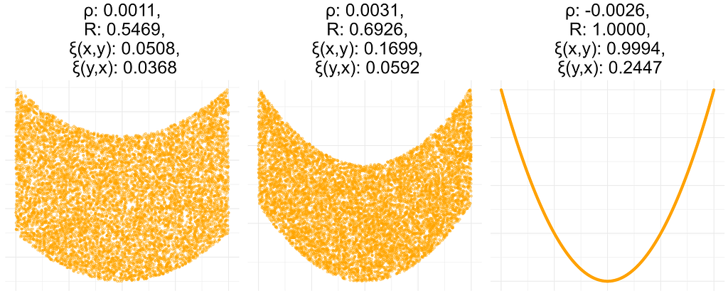
In the figure below, I calculated these quantities for data sets generated from a different distribution. I obtained ρ(x,y)=ρ(y,x) and R(x,y)=R(y,x), so I report only a single value for these measures. However, ξ(x,y) and ξ(y,x) are very different. This is probably due to the fact that y=f(x), but x is not a function of y. This behavior may not be desirable in reality, since it is not easy to interpret a non-symmetric correlation matrix.
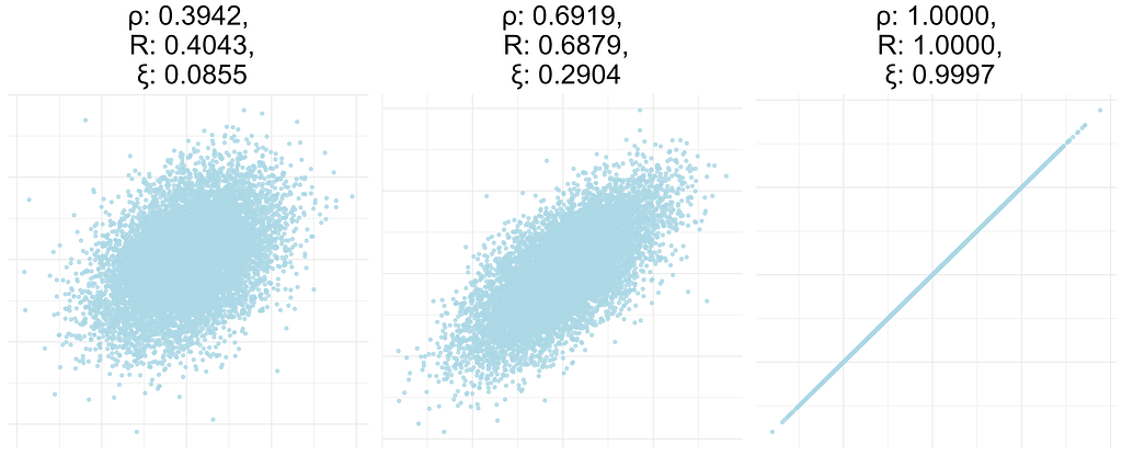
In this experiment, I computed all coefficients for data sets resulting from a bivariate standard normal distribution with a given correlation coefficient of 0.4, 0.7, or 1. Both ρ and R are close to the true correlation, while ξ is not, i.e. it does not have the consistency property defined above.
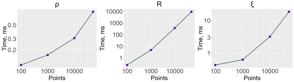
To check the performance of the estimators, I generated data sets of different sizes consisting of two independent and uniformly distributed variables. The figure below shows the time in milliseconds required to compute each coefficient. When the dataset consists of 50K points, R is about 1000 times slower than ξ and about 10000 times slower than ρ. However, it still takes ~10 seconds to compute, which is reasonable when computing a moderate number of correlations. Given the advantages of R discussed above, I’d suggest using it even for computing large numbers of correlations — just subsample your data randomly to ~10K points, where computing R takes less than a second.
For different samples from the same distribution, there will be different estimates of the correlation coefficient. If there is an association between x and y, we want the variance of these estimates to be small compared to the mean of the correlation. For a measure A(x,y) one can compute precision=sd(A)/mean(A), where sd is a standard deviation. Lower values of this quantity are better. The following table contains precision values calculated from a bivariate normal distribution on data sets of different sizes with different values of the correlation between dimensions. ξ is the least precise, while ρ is the most precise.

[1] A New Coefficient of Correlation
[4] Kraskov, A., Stögbauer, H., & Grassberger, P. (2004). Estimating mutual information. Physical review E, 69(6), 066138.
[6] Granger, C., & Lin, J. L. (1994). Using the mutual information coefficient to identify lags in nonlinear models. Journal of time series analysis, 15(4), 371–384.
[7] Reshef, D. N., Reshef, Y. A., Finucane, H. K., Grossman, S. R., McVean, G., Turnbaugh, P. J., … & Sabeti, P. C. (2011). Detecting novel associations in large data sets. science, 334(6062), 1518–1524.
[8] Simon, N., & Tibshirani, R. (2014). Comment on” Detecting Novel Associations In Large Data Sets” by Reshef Et Al, Science Dec 16, 2011. arXiv preprint arXiv:1401.7645.
[9] Kinney, J. B., & Atwal, G. S. (2014). Equitability, mutual information, and the maximal information coefficient. Proceedings of the National Academy of Sciences, 111(9), 3354–3359.
An Undeservedly Forgotten Correlation Coefficient was originally published in Towards Data Science on Medium, where people are continuing the conversation by highlighting and responding to this story.
Originally appeared here:
An Undeservedly Forgotten Correlation Coefficient
Go Here to Read this Fast! An Undeservedly Forgotten Correlation Coefficient
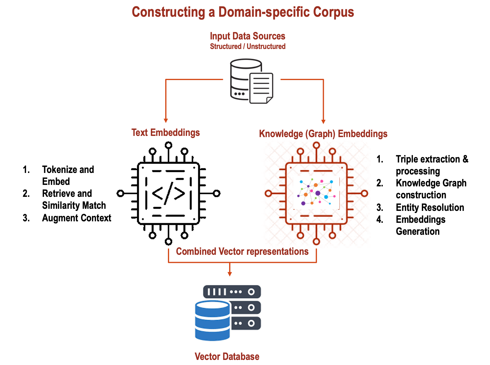

In my previous articles, I wrote about using Knowledge Graphs in conjunction with RAGs and how Graph techniques can be used for Adaptive…
Originally appeared here:
Combine Text Embeddings and Knowledge (Graph) Embeddings in RAG systems
Go Here to Read this Fast! Combine Text Embeddings and Knowledge (Graph) Embeddings in RAG systems


Tips on how to approach studying and practising data science
Originally appeared here:
Data Science Advice I Wish I Knew Sooner
Go Here to Read this Fast! Data Science Advice I Wish I Knew Sooner