Tag: AI

  • Statistical Convergence and its Consequences

    Statistical Convergence and its Consequences

    Sachin Date

    A painting of a circa 1800s paddle steamer much like Nimrod, caught in a storm and abandoned by her crew. Artist: Johan Hendrik Louis Meijer. (Public domain image)

    A story about convergence of random variables set within the extraordinary voyage of the Nimrod

    On the morning of Saturday, February 25, 1860, the passenger ship Nimrod pushed away from the docks at Liverpool in England. Her destination was the burgeoning port of Cork in Ireland — a distance of around 300 miles. Nimrod had plied this route dozens of times before as she and hundreds of other boats like her crisscrossed the sea between Ireland and England, picking up families from ports in Ireland and depositing them at ports in England before their migration to the United States.

    Nimrod was a strong, iron-paddled boat powered by steam engines and a full set of sails — a modern, powerful, and sea-tested vessel of her era. At her helm was captain Lyall — an experienced seaman, an esteemed veteran of the Crimean war, and a gregarious, well-liked leader of the crew. Also on board were 45 souls and thousands of pounds worth of cargo. The year 1860 had been an unusually cold and wet year but on the weekend of February 25, the seas were calm and there was not a storm in sight.

    The Smalls Lighthouse in the summer of 2018. After the original structure suffered severe storm damage in 1831, it was rebuilt between 1857 and 1861 . A helipad was put on it in 1978. (Source: Wikimedia under CC BY-SA 4.0)

    By the evening of Monday, February 27, 1860 Nimrod had reached the Smalls lighthouse near the southern coast of Wales when her steam engines started failing. Fortunately, another steamboat — the City of Paris — happened to be in the vicinity and could have towed Nimrod to safety. Captain Lyall tried negotiating a fair price for the tow but failed. It seems the City of Paris’s captain demanded £1000 while Lyall could offer only a hundred although what actually transpired between the two captains is lost in the dustbin of history. What is known is that the City of Paris stayed with Nimrod for a short time before easing away, but not before her captain promised to apprise the harbormaster at Waterford about Nimrod’s distress.

    Meanwhile, with over 100 miles of open sea waiting between him and Cork and no other tow in sight, Lyall wisely chose to stay close to the Welsh coast. Trying anything else would have been mad folly. Lyall set his course for the safety of Milford Haven, a nearby deep-water port in the south of Wales. Darkness had set but the lights of the coastal towns were clearly visible from the ship. It was past 10 pm on Monday, February 27. Hell was about to break loose.

    The ragged coast line at St. David’s Head, Wales (Source: Geograph under CC BY-SA 2.0)

    As the captain navigated his impaired ship through the treacherous, rock-strewn, shallow waters off the Welsh coast, the winds picked up, first to a strong assertive breeze, then quickly to a gale, and soon to a full-throated hurricane. Instead of steering toward the quiet harbor of Milford Haven, Nimrod was getting blown by the storm toward the murderous cliffs of St. David’s Head. The captain dropped all anchors. For good measure, he also let loose the full length of iron chain, but the powerful winds kept dragging the ship. By the morning of Tuesday, February 28 with her sails blown to bits, Nimrod was getting pummeled by the waves and battered by the rocks at St. David’s head. The rescuers who had clambered on the cliff head threw rope upon rope at her but not one hook held. Around 8 AM on Tuesday, the waves struck Nimrod with such force, that she broke into three separate pieces. The people on the cliffs watched in horror and disbelief as she sank in under five minutes with all passengers lost. At the time of sinking, Nimrod was so maddeningly close to the shore that people on land could hear the desperate cries of the passengers as one by one they were swallowed by the waters.

    The Geography and Bathymetry of the Irish Sea showing the locations of Liverpool. the Smalls Lighthouse, the port of Milford Haven, and St. David’s Head (Source: Wikimedia under CC BY-SA 3.0)

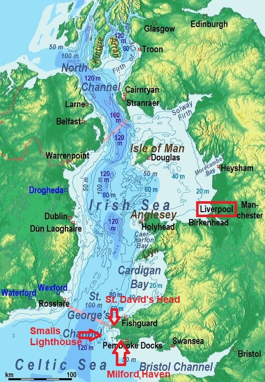
    The Irish Sea fills the land basin between Ireland and Britain. It contains one of the shallowest sea waters on the planet. In some places, water depth reaches barely 40 meters even as far out as 30 miles from the coastline. Also lurking beneath the surface are vast banks of sand waiting to snare the unlucky ship, of which there have been many. Often, a floundering ship would sink vertically taking its human occupants straight down with it and get lodged in the sand, standing erect on the seabed with the tops of her masts clearly visible above the water line — a gruesome marker of the human tragedy resting just 30 meters below the surface. Such was the fate of the Pelican when she sank on March 20, 1793, right inside Liverpool Harbor, a stone’s throw from the shoreline.

    The geography of the Irish sea also makes it susceptible to strong storms that come from out of nowhere and surprise you with a stunning suddenness and an insolent disregard for any nautical experience you may have had. At the lightest encouragement from the wind, the shallow waters of the sea will coil up into menacingly towering waves and produce vast clouds of blindingly opaque spray. At the slightest slip of good judgement or luck, the winds and the sea and the sands of the Irish sea will run your ship aground or bring upon a worse fate. Nimrod was, sadly, just one of the hundreds of such wrecks that litter the floor of the Irish Sea.

    A Royal Air Force helicopter comes to the aid of a French Fishing vessel Alf (LS683637) during a storm in the Irish Sea. (Source: Wikimedia under license OGL v1.0)

    It stands to reason that over the years, the Irish sea has become one of the most heavily studied and minutely monitored bodies of water on the planet. From sea temperature at different depths, to surface wind speed, to carbon chemistry of the sea water, to the distribution of commercial fish, the governments of Britain and Ireland keep a close watch on hundreds of marine parameters. Dozens of sea-buoys, surveying vessels, and satellites gather data round the clock and feed them into sophisticated statistical models that run automatically and tirelessly, swallowing thousands of measurements and making forecasts of sea-conditions for several days into the future — forecasts that have made shipping on the Irish Sea a largely safe endeavor.

    It’s within this copious abundance of data that we’ll study the concepts of statistical convergence of random variables. Specifically, we’ll study the following four types of convergence:

    1. Convergence in distribution
    2. Convergence in probability
    3. Convergence in the mean
    4. Almost sure convergence

    There is a certain hierarchy inherent among the four types of convergences with the convergence in probability implying a convergence in distribution, and a convergence in the mean and almost sure convergence independently implying a convergence in probability.

    To understand any of the four types of convergences, it’s useful to understand the concept of sequences of random variables. Which pivots us back to Nimrod’s voyage out of Liverpool.

    Sequences of random variables

    It’s hard to imagine circumstances more conducive to a catastrophe than what Nimrod experienced. Her sinking was the inescapable consequence of a seemingly endless parade of misfortunes. If only her engines hadn’t failed, or Captain Lyall had secured a tow, or he had chosen a different port of refuge or the storm hadn’t turned into a hurricane, or the waves and rocks hadn’t broken her up, or the rescuers had managed to reach the stricken ship. The what-ifs seem to march away to a point on the distant horizon.

    Nimrod’s voyage — be it a successful journey to Cork, or safely reaching one of the many possible ports of refuge, or sinking with all hands on board or any of the other possibilities limited only by how much you will allow yourself to twist your imagination — can be represented by any one of many possible sequences of events. Between the morning of February 25, 1860 and the morning of February 28, 1860, exactly one of these sequences materialized — a sequence that was to terminate in a unwholesomely bitter finality.

    If you permit yourself to look at the reality of Nimrod’s fate in this way, you may find it worth your while to represent her journey as a long, theoretically infinite, sequence of random variables, with the final variable in the sequence representing the many different ways in which Nimrod’s journey could have concluded.

    Let’s represent this sequence of variables as X_1, X_2, X_3,…,X_n.

    In Statistics, we regard a random variable as a function. And just like any other function, a random variable maps values from a domain to a range. The domain of a random variable is a sample space of outcomes that arise from performing a random experiment. The act of tossing a single coin is an example of a random experiment. The outcomes that arise from this random experiment are Heads and Tails. These outcomes produce the discrete sample space {Heads, Tails} which can form the domain of some random variable. A random experiment consists of one or more ‘devices’ which when when operated, together produce a random outcome. A coin is such a device. Another example of a device is a random number generator — which can be a software program — that outputs a random number from the sample space [0, 1] which, as against {Heads, Tails}, is continuous in nature and infinite in size. The range of a random variable is a set of values which are often encoded versions of things you care about in the physical world that you inhabit. Consider for example, the random variable X_3 in the sequence X_1, X_2,X_3,…,X_n. Let X_3 designate the boolean event of Captain Lyall’s securing (or not securing) a tow for his ship. X_3’s range could be the discrete and finite set {0, 1} where 0 could mean that Captain Lyall failed to secure a tow for his ship, while 1 could mean that he succeeded in doing so. What could be the domain of X_3, or for that matter any variable in the rest of the sequence?

    In the sequence X_1, X_2, X_3,…X_k,…,X_n, we’ll let the domain of each X_k be the continuous sample space [0, 1]. We’ll also assume that the range of X_k is a set of values that encode the many different things that can theoretically happen to Nimrod during her journey from Liverpool. Thus, the variables X_1, X_2, X_3,…,X_n are all functions of some value s ϵ [0, 1]. They can therefore be represented as X_1(s), X_2(s), X_3(s),…,X_n(s). We’ll make the additional crucial assumption that X_n(s), which is the final (n-th) random variable in the sequence, represents the many different ways in which Nimrod’s voyage can be considered to conclude. Every time ‘s’ takes up a value in [0, 1], X_n(s) represents a specific way in which Nimrod’s voyage ended.

    How might one observe a particular sequence of values? Such a sequence would be observed (a.k.a. would materialize or be realized) when you draw a value of s at random from [0, 1]. Since we don’t know anything about the how s is distributed over the interval [0, 1], we’ll take refuge in the principle of insufficient reason to assume that s is uniformly distributed over [0, 1]. Thus, each one of the infinitely uncountable numbers of real numbered values of s in the interval [0, 1] is equally probable. It’s a bit like throwing an unbiased die that has an uncountably infinite number of faces and selecting the value that it comes up as, as your chosen value of s.

    Uncountable infinities and uncountably infinite-faced dice are mathematical creatures that you’ll often encounter in the weirdly wondrous world of real numbers.

    So anyway, suppose you toss this fantastically chimerical die, and it comes up as some value s_a ϵ [0, 1]. You will use this value to calculate the value of each X_k(s=s_a) in the sequence which will yield an event that happened during Nimrod’s voyage. That would yield the following sequence of observed events:

    X_1(s=s_a), X_2(s=s_a), X_3(s=s_a),…,X_n(s=s_a).

    If you toss the die again, you might get another value s_b ϵ [0, 1] which will yield another possible ‘observed’ sequence:

    X_1(s_b), X_2(s_b), X_3(s_b),…,X_n(s_b).

    It’s as if each time you toss your magical die, you are spawning a new universe and couched within this universe is the reality of a newly realized sequence of random variables. Allow this thought to intrigue your mind for a bit. We’ll make abundant use of this concept while studying the principles of convergence in the mean and almost sure convergence later in the article.

    Meanwhile, let’s turn our attention to knowing about the easiest form of convergence that you can get your head around: convergence in distribution.

    In what follows, I’ll mostly drop the parameter ‘s’ while talking about a random variable. Instead of saying X(s), I’ll simply say X. We’ll assume that X always acts upon ‘s’ unless I otherwise say. And we’ll assume that every value of ‘s’ is a proxy for a unique probabilistic universe.

    Convergence in distribution

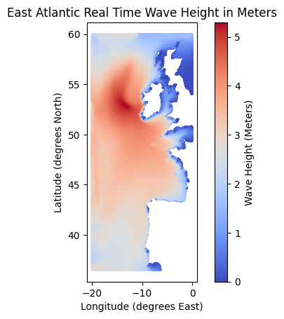
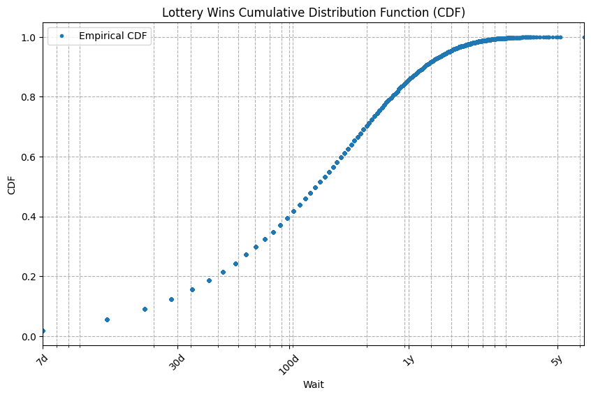
    This is the easiest form of convergence to understand. To aid our understanding, I’ll use a dataset of surface wave heights measured in meters on a portion of the East Atlantic. This data are published by the Marine Institute of the Government of Ireland. Here’s a scatter plot of 272,000 wave heights indexed by latitude, longitude, and measured on March 19, 2024.

    Source: East Atlantic SWAN Wave Model Significant Wave Height. Published by the Marine Institute, Government of Ireland. Used under license CC BY 4.0

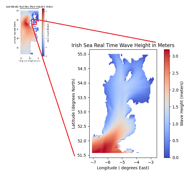
    Let’s zoom into a subset of this data set that corresponds to the Irish Sea.

    Wave heights in the Irish Sea (Source: Marine Institute)

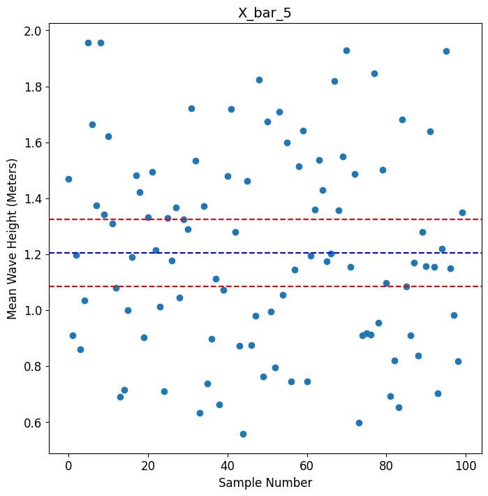
    Now imagine a scenario where you received a chunk of funds from a funding agency to monitor the mean wave height on the Irish Sea. Suppose you received enough grant money to rent five wave height sensors. So you dropped the sensors at five randomly selected locations on the Irish Sea, collected the measurements from those sensors and took the mean of the five measurements. Let’s call this mean X_bar_5 (imagine X_bar_5 as an X with a bar on its head and with a subscript of 5). If you repeated this “drop-sensors-take-measurements-calculate-average” exercise at five other random spots on the sea, you would have most definitely got a different mean wave height. A third such experiment would yield one more value for X_bar_5. Clearly, X_bar_5 is a random variable. Here’s a scatter plot of 100 such values of X_bar_5:

    A scatter plot of 100 sample means from samples of size 5 (Image by Author)

    To get these 100 values, all I did was to repeatedly sample the dataset of wave heights that corresponds to the geo-extents of the Irish Sea. This subset of the wave heights database contains 11,923 latitude-longitude indexed wave height values that correspond to the surface area of the Irish Sea. I chose 5 random locations from this set of 11,923 locations and calculated the mean wave height for that sample. I repeated this sampling exercise 100 times (with replacement) to get 100 values of X_bar_5. Effectively, I treated the 11,923 locations as the population. Which means I cheated a bit. But hey, when will you ever have access to the true population of anything? In fact, there happens to be a gentrified word for this self-deceiving art of repeated random sampling from what is itself a random sample. It’s called bootstrapping.

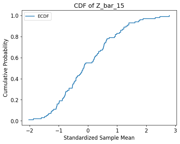
    Since X_bar_5 is a random variable, we can also plot its (empirically defined) Cumulative Distribution Function (CDF). We’ll plot this CDF, but not of X_bar_5. We’ll plot the CDF of Z_bar_5 where Z_bar_5 is the standardized version of X_bar_5 obtained by subtracting the mean of the 100 sample means from each observed value of X_bar_5 and dividing the difference by the standard deviation of the 100 sample means. Here’s the CDF of Z_bar_5:

    (Image by Author)

    Now suppose you convinced your funding agency to pay for 10 more sensors. So you dropped the 15 sensors at 15 random spots on the sea, collected their measurements and calculated their mean. Let’s call this mean X_bar_15. X_bar_15 is a also random variable for the same reason that X_bar_5 is. And just as with X_bar_5, if you repeated the drop-sensors-take-measurements-calculate-average experiment a 100 times, you’d have got 100 values of X_bar_15 from which you can plot the CDF of its standardized version, namely Z_bar_15. Here’s a plot of this CDF:

    (Image by Author)

    Supposing your funding grew at astonishing speed. You rented more and more sensors and repeated the drop-sensors-take-measurements-calculate-average experiment with 5, 15, 105, 255, and 495 sensors. Each time, you plotted the CDF of the standardized copies of X_bar_15, X_bar_105, X_bar_255, and X_bar_495. So let’s take a look at all the CDFs you plotted.

    CDFs of standardized versions of X_bar_15, X_bar_105, X_bar_255, and X_bar_495 (Image by Author)

    What do we see? We see that the shape of the CDF of Z_bar_n, where n is the sample size, appears to be converging to the CDF of the standard normal random variable N(0, 1) — a random variable with zero mean and unit variance. I’ve shown its CDF at the bottom-right in orange.

    In this case, the convergence of the CDF will continue relentlessly as you increase the sample size until you reach the theoretically infinite sample size. When n tends to infinity, the CDF of Z_bar_n it will look identical to the CDF of N(0, 1).

    This form of convergence of the CDF of a sequence of random variables to the CDF of a target random variable is called convergence in distribution.

    Convergence in distribution is defined as follows:

    The sequence of random variables X_1, X_2, X_3,…,X_n is said to converge in distribution to the random variable X, if the following condition holds true:

    The condition for convergence in distribution of X_n to X (Image by Author)

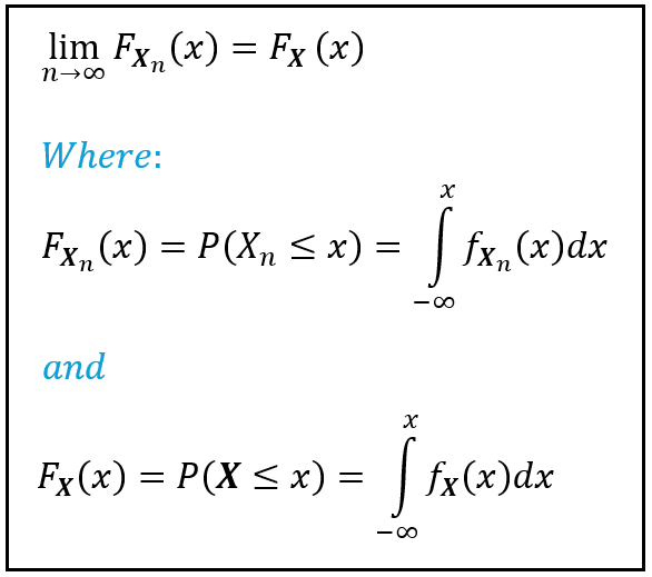
    In the above figure, F(X) and F_X(x) are notations used for the Cumulative Distribution Function of a continuous random variable. f(X) and f_X(x) are notations usually used for the Probability Density Function of a continuous random variable. Incidentally, P(X) or P_X(x) are notations used for the Probability Mass Function of a discrete random variable. The principles of convergence apply to both continuous and discrete random variables although in the above figure, I’ve illustrated it for a continuous random variable.

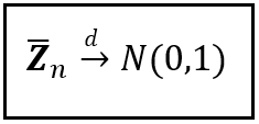
    Convergence in distribution is represented in short-hand form as follows:

    X_n converges in distribution to X (Image by Author)

    In the above notation, when we say X_n converges to X, we assume the presence of the sequence X_1, X_2,…,X_(n-1) that precedes it. In our wave height scenario, Z_bar_n converges in distribution to N(0, 1).

    The standardized sample mean converges in distribution to the standard normal random variable N(0, 1) (Image by Author)

    Not all sequences of random variables will converge in distribution to a target variable. But the mean of a random sample does converge in distribution. To be precise, the CDF of the standardized sample mean is guaranteed to converge to the CDF of the standard normal random variable N(0, 1). This iron-clad guarantee is supplied by the Central Limit Theorem. In fact, the Central Limit Theorem is quite possibly the most well known application of convergence in distribution.

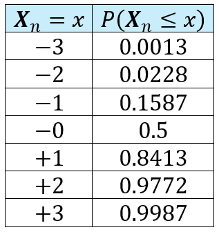
    In spite of having a super-star client like the Central Limit Theorem, convergence in distribution is actually a rather weak form of convergence. Think about it: if X_n converges in distribution to X, all that means is that for any x, the fraction of observed values of X_n that are less than or equal to x is the same for both X_n and X. And that’s the only promise that convergence in distribution gives you. For example, if the sequence of random variables X_1, X_2, X_3,…,X_n converges in distribution to N(0, 1), the following table shows the fraction of observed values of X_n that are guaranteed to be less than or equal to x = — 3, — 2, — 1, 0, +1, +2, and +3:

    P(X_n ≤ x) if X_1, X_2, X_3,…,X_n converges in distribution to N(0,1) (Image by Author)

    A form of convergence that is stronger than convergence in distribution is convergence in probability which is our next topic.

    Convergence in Probability

    At any point in time, all the waves in the Irish Sea will exhibit a certain sea-wide average wave height. To know this average, you’d need to know the heights of the literally uncountable number of waves frolicking on the sea at that point in time. It’s clearly impossible to get this data. So let me put it another way: you will never be able to calculate the sea-wide average wave height. This unobservable, incalculable wave height, we denote as the population mean μ. A passing storm will increase μ while a period of calm will depress its value. Since you won’t be able to calculate the population mean μ, the best you can do is find a way to estimate it.

    An easy way to estimate μ is to measure the wave heights at random locations on the Irish Sea and calculate the mean of this sample. This sample mean X_bar can be used as a working estimate for the population mean μ. But how accurate an estimate is it? And if its accuracy doesn’t meet your needs, can you improve its accuracy somehow, say by increasing the size of your sample? The principle of convergence in probability will help you answer these very practical questions.

    So let’s follow through with our thought experiment of using a finite set of wave height sensors to measure wave heights. Suppose you collect 100 random samples with 5 sensors each and calculate the mean of each sample. As before, we’ll designate the mean by X_bar_5. Here again for our recollection is a scatter plot of X_bar_5:

    A scatter plot of 100 sample means from samples of size 5 (Image by Author)

    Which takes us back to the question: How accurate is X_bar_5 as an estimate of the population mean μ? By itself, this question is thoroughly unanswerable because you simply don’t know μ. But suppose you knew μ to have a value of, oh say, 1.20 meters. This value happens to be the mean of 11,923 measurements of wave height in the subset of the wave height data set that relates to the Irish Sea, which I’ve so conveniently designated as the “population”. You see once you decide you want to cheat your way through your data, there is usually no stopping the moral slide that follows.

    So anyway, from your network of 5 buoys, you have collected 100 sample means and you just happen to have the population mean of 1.20 meters in your back pocket to compare them with. If you allow yourself an error of +/—10% (0.12 meters), you might want to know how many of those 100 sample means fall within +/ — 0.12 meters of μ. The following plot shows the 100 sample means w.r.t. to the population mean 1.20 meters, and two threshold lines representing (1.20 — 0.12) and (1.20+0.12) meters:

    A scatter plot of 100 sample means from samples of size 5. The blue dashed line reprersents the presumed population mean of 1.2 meters. The red dashed lines represent the tolerance bands around the population mean (Image by Author)

    In the above plot, you’ll find that only 21 out of the 100 sample means lie within the [1.08, 1.32] interval. Thus, the probability of chancing upon a random sample of 5 wave height measurements whose mean lies within your chosen +/ — 10% threshold of tolerance is only 0.21 or 21%. The odds of running into such a random sample are p/(1 — p) = 0.21/(1 — 0.21) = 0.2658 or approximately 27%. That’s worse — much, much worse — than the odds of a fair coin landing a Heads! This is the point at which you should ask for more money to rent more sensors.

    If your funding agency demands an accuracy of at least 10%, what better time than this to highlight these terrible odds to them. And to tell them that if they want better odds, or a higher accuracy at the same odds, they’ll need to stop being tightfisted and let you rent more sensors.

    But what if they ask you to prove your claim? Before you go about proving anything to anyone, why don’t we prove it to ourselves. We’ll sample the data set with the following sequence of sample sizes [5, 15, 45, 75, 155, 305]. Why these sizes in particular? There’s nothing special about them. It’s only because starting with 5, we are increasing the sample size by 10. For each sample size, we’ll randomly choose 100 wave height values with replacement from the wave heights database. And we’ll calculate and plot the 100 sample means thus found. Here’s the collage of the 6 scatter plots:

    Scatter plots of mean wave heights from 100 random samples of 6 different various sizes. (Image by Author)

    These plots seem to make it clear as day that when you dial up the sample size, the number of sample means lying within the threshold bars increases until practically all of them lie within the chosen error threshold.

    The following plot is another way to visualize this behavior. The X-axis contains the sample size varying from 5 to 495 in steps of 10, while the Y-axis displays the 100 sample means for each sample size.

    Sample Means versus Sample Size (Image by Author)

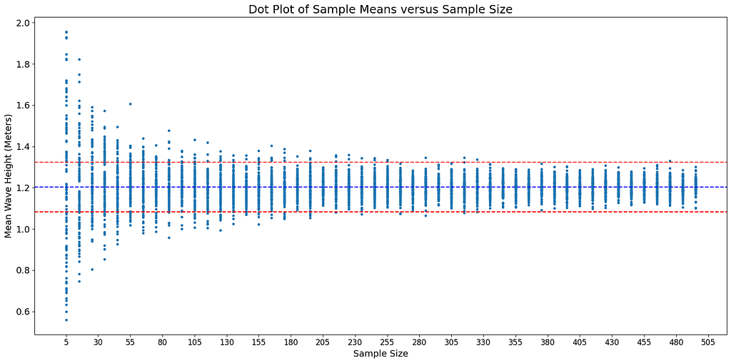
    By the time the sample size rises to around 330, the sample means have converged to a confident accuracy of 1.08 to 1.32 meters, i.e. within +/ — 10% of 1.2 meters.

    This behavior of the sample mean carries through no matter how small is your chosen error threshold, in other words, how narrow is the channel formed by the two red lines in the above chart. At some really large (theoretically infinite) sample size n, all sample means will lie within your chosen error threshold (+/ — ϵ). And thus, at this asymptomatic sample size, the probability of the mean of any randomly selected sample of this size being within +/ — ϵ of the population mean μ will be 1.0, i.e. an absolute certainty.

    This particular manner of convergence of the sample mean to the population mean is called convergence in probability.

    In general terms, convergence in probability is defined as follows:

    A sequence of random variables X_1, X_2, X_3,…,X_n converges in probability to some target random variable X if the following expression holds true for any positive value of ϵ no matter how small it might be:

    The condition for convergence in probability of X_n to X (Image by Author)

    In shorthand form, convergence in probability is written as follows:

    X_n converges in probability to X (Image by Author)

    In our example, the sample mean X_bar_n is seen to converge in probability to the population mean μ.

    The sample mean converges in probability to the population mean (Image by Author)

    Just as the Central Limit Theorem is the famous application of the principle of convergence in distribution, the Weak Law of Large Numbers is the equally famous application of convergence in probability.

    Convergence in probability is “stronger” than convergence in distribution in the sense that if a sequence of random variables X_1, X_2, X_3,…,X_n converges in probability to some random variable X, it also converges in distribution to X. But the vice versa isn’t necessarily true.

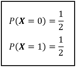
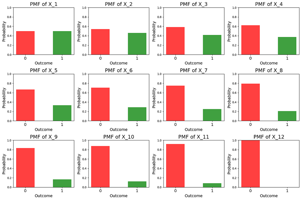
    To illustrate the ‘vice versa’ scenario, we’ll draw an example from the land of coins, dice, and cards that textbooks on statistics love so much. Imagine a sequence of n coins such that each coin has been biased to come up Tails by a different degree. The first coin in the sequence is so hopelessly biased that it always comes up as Tails. The second coin is biased a little less than the first one so that at least occasionally it comes up as Heads. The third coin is biased to an even lesser extent and so on. Mathematically, we can represent this state of affairs by creating a Bernoulli random variable X_k to represent the k-th coin. The sample space (and the domain) of X_k is {Tails, Heads}. The range of X_k is {0, 1} corresponding to an input of Tails and Heads respectively. The bias on the k-th coin can be represented by the Probability Mass Function of X_k as follows:

    PMF of X_k for k ϵ [1, ∞] (Image by Author)

    Its easy to verify that P(X_k=0) + P(X_k = 1) = 1. So the design our PMF is sound. You may also want to verify when k = 1, the term (1 — 1/k) = 0, so P(X_k=0) = 1 and P(X_k=1) = 0. Thus, the first coin in the sequence is biased to always come up as Tails. When k = ∞, (1 — 1/k) = 1. This time, P(X_k=0) and P(X_k=1) are both exactly 1/2, Thus, the infinite-th coin in the sequence is a perfectly fair coin. Just the way we wanted.

    It should be intuitively apparent that X_n converges in distribution to the Bernoulli random variable X ~ Bernoulli(0.5) with the following Probability Mass Function:

    PMF of X ~ Bernoulli(0.5) (Image by Author)

    In fact, if you plot the CDF of X_n for a sequence of ever increasing n, you’ll see the CDF converging to the CDF of Bernoulli(0.5). Read the plots shown below from top-left to bottom-right. Notice how the horizontal line moves lower and lower until it comes to a rest at y=0.5.

    (Image by Author)

    As you will have seen from the plots, the CDF of X_n (or X_k) as k (or n) tends to infinity converges to the CDF of X ~ Bernoulli(0.5). Thus, the sequence X_1, X_2, …, X_n converges in distribution to X. But does it converge in probability to X? It turns out, it doesn’t. Like two different coins, X_n and X are two independent Bernoulli random variables. We saw that when n tends to infinity, X_n turns into a perfectly fair coin. X, by design, always behaves like a perfectly fair coin. But the realized values of the random variable |X_n — X| will always bounce between 0 and 1 as the two coins turn up as Tails (0) or as Heads (1) independent of each other. Thus, the proportion of observations of |X_n — X| that equate to zero to the total number of observations of |X_n — X| will never converge to 0. Thus, the following condition for convergence in probability isn’t guaranteed to be met:

    The condition for convergence in probability of X_n to X (Image by Author)

    And thus we see that, while X_n converges in distribution to X ~ Bernoulli(0.5), X_n most definitely does not convergence in probability to X.

    As strong a form of convergence is convergence in probability, there are sequences of random variables that express even stronger forms of convergence. There are the following two such types of convergences:

    • Convergence in mean
    • Almost sure convergence

    We’ll look at convergence in mean next.

    Convergence in mean

    Let’s return to the joyless outcome of Nimrod’s final voyage. From the time it departed from Liverpool to when it sank at St. David’s Head, Nimrod’s chances of survival progressed incessantly downward until they hit zero when it actually sank. Suppose we look at Nimrod’s journey as the following sequence of twelve incidents:

    (1) Left Liverpool →
    (2) Engines failed near Smalls Light House →
    (3) Failed to secure a towing →
    (4) Sailed toward Milford Haven →
    (5) Met by a storm →
    (6) Met by a hurricane →
    (7) Blown toward St. David’s Head →
    (8) Anchors failed →
    (9) Sails blown to bits →
    (10) Crashed into rocks →
    (11) Broken into 3 pieces by giant wave →
    (12) Sank

    Now let’s define a Bernoulli(p) random variable X_k. Let the domain of X_k be a boolean value that indicates whether all incidents from 1 through k have occurred. Let the range of X_k be {0, 1} such that:

    X_k = 0, implies Nimrod sank before reaching shore or sank at the shore.
    X_k = 1, implies Nimrod reached shore safely.

    Let’s also ascribe meaning to the probability associated with the above two outcomes in the range {0, 1}:

    P(X_k = 0 | (k) ) is the probability that Nimrod will NOT reach shore safely given that incidents 1 through k have occurred.

    P(X_k = 1 | (k) ) is the probability that Nimrod WILL reach the shore safely given that incidents 1 through k have occurred.

    We’ll now design the Probability Mass Function of X_k. Recall that X_k is a Bernoulli(p) variable where p is the probability that Nimrod WILL reach the shore safely given that incidents 1 through k have occurred . Thus:

    P(X_k = 1 | (k) ) = p

    When k = 1, we initialize p to 0.5 indicating that when Nimrod left Liverpool there was a 50/50 chance of its successfully finishing its trip. As k increases from 1 to 12, we reduce p uniformly from 0.5 down to 0.0. Since Nimrod sank at k = 12, there was a zero probability of Nimrod’s successfully completing its journey. For k > 12, p stays 0.

    Given this design, here’s how the PMF of X_k looks like:

    The PMF of X_k which depicts Nimrod’s future chance of survival at the (k) milestone in her journey out of Liverpool. (Image by Author)

    You may want to verify that when k = 1, the term (k — 1)/12 = 0 and therefore, P(X_k = 0) = P(X_k = 1) = 0.5. For 1 < k ≤ 11, the term (k — 1)/12 gradually approaches 1. Hence the probability P(X_k = 0) gradually waxes while P(X_k = 1) correspondingly wanes. For example, as per our model, when Nimrod was broken into three separate pieces by the large wave at St. David’s head, k = 11. At that point, her future chance of survival was 0.5(1 — 11/12) = 0.04167 or just 4%.

    Here’s a set of bar plots of the PMFs of X_1 through X_12. Read the plots from top-left to bottom-right. In each plot, the Y-axis represents the probability and it goes from 0 to 1. The red bar on the left side of each figure represents the probability that Nimrod will eventually sink.

    PMF of X_k (Image by Author)

    Now let’s define another Bernoulli random variable X with the following PMF:

    PMF of X (Image by Author)

    We’ll assume that X is independent of X_k. So X and X_k are like two completely different coins which will come up Heads or Tails independent of each other.

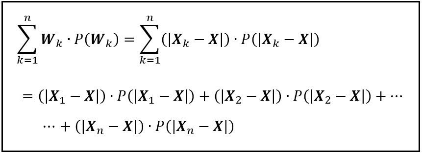
    Let’s define one more random variable W_k. W_k is the absolute difference between the observed values of X_k and X.

    W= |X_k — X|

    What can we say about the expected value of W_k, i.e. E(W_k)?

    E(W_k) is the mean of the absolute difference between the observed values of X_k and X. E(W_k) can be calculated using the formula for the expected value of a discrete random variable as follows:

    The expected value of |X_k — X| (Image by Author)

    Now let’s ask the question that lies at the heart of the principle of convergence in the mean:

    Under what circumstances will E(W) be zero?

    |X_k — X| being the absolute value will never be negative. Hence, the only two ways in which the E(|X_k — X|) will be zero is if:

    1. For every pair of observed values of X_k and X, |X_k — X| is zero, OR
    2. The probability of observing any non-zero difference in values is zero.

    Either way, across all probabilistic universes, the observed values of X_k and X will need to be moving in perfect tandem.

    In our scenario, this happens for k ≥ 12. That’s because, when k ≥ 12, Nimrod sinks at St. David’s Head and therefore X_12 ~ Bernoulli(0). That means X_12 always comes up as 0. Recall that X is Bernoulli(0) by construction. So it too always comes up as 0. Thus, for k ≥ 12, |X_k — X| is always 0 and so is E(|X_k — X|).

    We can express this situation as follows:

    X_k converges in the mean to X (Image by Author)

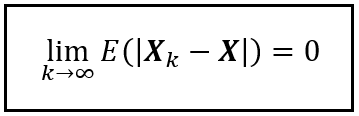
    By our model’s design, the above condition is satisfied starting from k ≥ 12 and it stays satisfied for all k up through infinity. So the above condition will be trivially satisfied when k tends to infinity.

    This form of convergence of a sequence of random variables to a target variable is called convergence in the mean.

    You can think of convergence in the mean as a situation in which two random variables are perfectly in sync w.r.t. their observed values.

    In our illustration, X_k’s range was {0, 1} with probabilities {(1— p), p}, and X_k was a Bernoulli random variable. We can easily extend the concept of convergence in the mean to non-Bernoulli random variables.

    To illustrate, let X_1, X_2, X_3,…,X_n be random variables that each represents the outcome of throwing a unique 6-sided die. Let X represent the outcome from throwing another 6-sided die. You begin by throwing the set of (n+1) dice. Each die comes up as a number from 1 through 6 independent of the others. After each set of (n+1) throws, you observe that values of some of the X_1, X_2, X_3,…,X_n match the observed value of X. Others don’t. For any X_k in the sequence X_1, X_2, X_3,…,X_n, the expected value of the absolute difference between the observed values of X_k and X i.e. |X_k — X| is clearly not zero no matter how large is n. Thus, the sequence X_1, X_2, X_3,…,X_n does not converge to X in the mean.

    However, suppose in some bizarro universe, you find that as the length of the sequence n tends to infinity, the infinite-th die always comes up as the exact same number as X. No matter how many times you throw the set of (n+1) dice, you find that the observed values of X_n and X are always the same, but only as n tends to infinity. And so the expected value of the difference |X_n — X| converges to zero as n tends to infinity. In other words, the sequence X_1, X_2, X_3,…,X_n has converged in the mean to X.

    The concept of convergence in mean can be extended to the r-th mean as follows:

    Let X_1, X_2, X_3,…,X_n be a sequence of n random variables. X_n converges to X in the r-th mean or the L to the power r-th norm if the following holds true:

    Convergence in the mean (Image by Author)

    To see why convergence in the mean makes a stronger statement about convergence than convergence in probability, you should look at the latter as making a statement only about aggregate counts and not about individual observed values of the random variable. For a sequence X_1, X_2, X_3,…,X_n to converge in probability to X, it’s only necessary that the ratio of the number of observed values of X_n that lie within the interval [X — ϵ, X+ϵ] to the total number of observed values of X_n tends to 1 as n tends to infinity. The principle of convergence in probability couldn’t care less about the behaviors of specific observed values of X_n, particularly about their needing to perfectly match the corresponding observed values of X. This latter requirement of convergence in the mean is a much stronger demand that one places upon X_n than the one placed by convergence in probability.

    Just like convergence in the mean, there is another strong flavor of convergence called almost sure convergence which is what we’ll study next.

    Almost sure convergence

    At the beginning of the article, we looked at how to represent Nimrod’s voyage as a sequence of random variables X_1(s), X_2(s),…,X_n(s). And we noted that a random variable such as X_1 is a function that takes an outcome s from a sample space S as a parameter and maps it to some encoded version of reality in the range of X_1. For instance, X_k(s) is a function that maps values from the continuous real-valued interval [0, 1] to a set of values that represent the many possible incidents that can occur during Nimrod’s voyage. Each time s is assigned a random value from the interval [0, 1], a new theoretical universe is spawned containing a realized sequence of values which represents the physical reality of a materialized sea-voyage.

    Now let’s define one more random variable called X(s). X(s) also draws from s. X(s)’s range is a set of values that encode the many possible fates of Nimrod. In that respect, X(s)’s range matches the range of X_n(s) which is the last random variable in the sequence X_1(s), X_2(s),…,X_n(s).

    Each time s is assigned a random value from [0, 1], X_1(s),…,X_n(n) acquire a set of realized values. The value attained by X_n(s) represents the final outcome of Nimrod’s voyage in that universe. Also attaining a value in this universe is X(s). But the value that X(s) attains may not be the same as the value that X_n(s) attains.

    If you toss your chimerical infinite-sided die many, many times, you would have spawned a large number of theoretical universes and thus also a large number of theoretical realizations of the random sequence X_1(s) thru X_n(s), and also the corresponding set of observed values of X(s). In some of these realized sequences, the observed value X_n(s) will match the value of the corresponding X(s).

    Now suppose you modeled Nimrod’s journey at ever increasing detail so that the length ’n’ of the sequence of random variables you used to model her journey progressively increased until at some point it reached a theoretical value of infinity. At that point, you would notice exactly one of two things happening:

    You would notice that no matter how many times you tossed your die, for certain values of s ϵ [0, 1], the corresponding sequence X_1(s),X_2(s),…,X_n(s) did not converge to the corresponding X(s).

    Or, you’d notice the following:

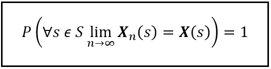
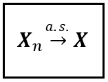
    You’d observe that for every single value of s ϵ [0, 1], the corresponding realization X_1(s),X_2(s),…,X_n(s) converged to X(s). In each of these realized sequences, the value attained by X_n(s) perfectly matched the value attained by X(s). If this is what you observed, then the sequence of random variables X_1, X_2,…,X_n has almost surely converged to the target random variable X.

    The formal definition of almost sure convergence is as follows:

    A sequence of random variables X_1(s), X_2(s),…,X(s) is said to have almost surely converged to a target random variable X(s) if the following condition holds true:

    Almost sure convergence (Image by Author)

    In short-hand form, almost sure convergence is written as follows:

    Almost sure convergence (Image by Author)

    If we model X(s) as a Bernoulli(p) variable where p=1, i.e. it always comes up a certain outcome, it can lead to some thought-provoking possibilities.

    Suppose we define X(s) as follows:

    (Image by Author)

    In the above definition, we are saying that the observed value of X will always be 0 for any s ϵ [0, 1].

    Now suppose you used the sequence X_1(s), X_2(s),…,X_n(s) to model a random process. Nimrod’s voyage is an example of such a random process. If you are able to prove that as n tends to infinity, the sequence X_1(s), X_2(s),…,X_n(s) almost surely converges to X(s), what you’ve effectively proved is that in every single theoretical universe, the random process that represents Nimrod’s voyage will converge to 0. You may spawn as many alternative versions of reality as you want. They will all converge to a perfect zero — whatever you wish that zero to represent. Now there’s a thought to chew upon.

    Cork

    References and Copyrights

    R. Larn, “Shipwrecks of Great Britain and Ireland”, David & Charles, 1981

    “The Pembrokeshire Herald and General Advertiser”, 2 March 1860, 3 March 1860, 9 March 1860, and 16 March 1860

    “The Illustrated Usk Observer and Raglan Herald”, 10 March 1860

    “The Welshman”, 9 March 1860

    “Wrexham and Denbighshire Advertiser and Cheshire Shropshire and North Wales Register” 10 March 1860

    “The Monmouthshire Merlin”, 3 March 1860, 10 March 1860, 17 March 1860, and 31 March 1860

    “The North Wales Chronicle and Advertiser for the Principality”, 24 March 1860

    “The Daily Southern Cross”, 29 May 1860, Page 4

    Site record on “Coflein.gov.uk — The online catalogue of archaeology, buildings, industrial and maritime heritage in Wales”

    Site record on the “WRECK SITE

    Wreck Tour 173: The Nimrod on “DIVERNET”

    R. Holmes, D. R. Tappin, DTI Strategic Environmental Assessment Area 6, Irish Sea, seabed and surficial geology and processes. British Geological Survey, 81pp. (CR/05/057N) 2005 (Unpublished)

    Data set

    East Atlantic SWAN Wave Model Significant Wave Height. Published by the Marine Institute, Government of Ireland. Used under license CC BY 4.0

    Images and Videos

    All images and videos in this article are copyright Sachin Date under CC-BY-NC-SA, unless a different source and copyright are mentioned underneath the image or video.

    Thanks for reading! If you liked this article, please follow me to receive more content on statistics and statistical modeling.


    Statistical Convergence and its Consequences was originally published in Towards Data Science on Medium, where people are continuing the conversation by highlighting and responding to this story.

    Originally appeared here:
    Statistical Convergence and its Consequences

    Go Here to Read this Fast! Statistical Convergence and its Consequences

  • A Whimsical Journey Through Wait Times

    A Whimsical Journey Through Wait Times

    Carl M. Kadie

    From Microwave Countdowns to Never-Ending Call Holds, with Python

    Waiting “on hold”, for popcorn, and for a lottery win — Source: https://openai.com/dall-e-2/. All other figures from the author.

    Ever notice how microwave oven minutes march steadily toward zero, yet phone hold minutes stretch into eternity?

    Consider this: barely a minute into microwaving your popcorn, you’re gathering bowls to be ready to serve. But a minute into a call hold? You’re wondering if you’ll ever speak to a human again. Fast forward 10 minutes, and you are enjoying your popcorn. But on the phone? The hold music has become the soundtrack for an endless purgatory.

    And lurking in a twilight zone between waiting for popcorn and waiting on hold … your weekly lottery ticket. You wait for a win. Each week’s new ticket holds a fresh promise, a promise untouched by previous weekly disappointments.

    To summarize, there appears to be three disparate types of waiting:

    • “On Hold”-Type — The longer you’ve waited, the longer you expect to wait.
    • “Popcorn”-Type — The longer you’ve waited, the less you expect to wait.
    • “Lottery Win”-Type — Regardless of your wait so far, your expected wait remains the same.

    Are these disparities in wait-times genuine, or a trick of the mind? We’ll answer this question in two parts.

    • Part 1 — Analyzing Data
    • Part 2 — Modeling Data

    For each part, we’ll look at each type of waiting, alternating between detailed Python code and a discussion. If you are interested in Python, read the code sections. If you are only interested in learning about wait times, you may skip over the code.

    Part 1: Analyzing Data

    “On Hold”-Type Waits — The longer you’ve waited, the longer you expect to wait.

    We’d like to start with data, but I don’t have data for “on hold” times. So, instead, how about the time between edits of a computer file? One place that I see such edit times is on Wikipedia.

    Suppose I place you on a Wikipedia page. Can you look at just the time since the last edit and predict how long until the next edit?

    Aside 1: No fair editing the page yourself.
    Aside 2: Analogously, if I somehow place you “on hold” for some number of minutes (so far), can you predict how much longer until the call is re-connected?

    For Wikipedia page edits, how might you express your prediction of the time until the next edit? You could try to predict the exact moment of the next edit, for example: “I predict this page will next be edited in exactly 5 days, 3 hours, 20 minutes” That, however, seems too specific, and you’d nearly always be wrong.

    You could predict a range of times: “I predict this page will be next edited sometime between now and 100 years from now”. That would nearly always be right but is vague and uninteresting.

    A more practical prediction takes the form of the “median next-edit time”. You might say: “I predict a 50% chance that this page will be edited within the next 5 days, 3 hours, 20 minutes.” I, your adversary, would then pick “before” or “after”. Suppose I think the real median next-edit time is 3 days. I would then pick “before”. We then wait up to 5 days, 3 hours, 20 minutes. If anyone (again, other than us) edits the page in that time, I get a point; otherwise, you get a point. With this scoring system, if you’re a better predictor than I, you should earn more points.

    Let’s next dive into Python and see how we might make such predictions:

    “On Hold”-Type Waits — Python

    Consider the Wikipedia article about the artist Marie Cochran. We can look at the article’s revision history:

    Screen capture from Wikipedia. Subsequent figures from author.

    To gather such data from various Wikipedia articles, I wrote a little Python script that:

    Aside: This approach brings up several issues. First, in what sense Special:Random random? I don’t know. For the purpose of this demonstration, it seems random enough. Why up-to-the-last 50 edits? Why not all the edits? Why not just the most recent edit? I don’t have a good reason beyond “up-to-the-last 50” is the default and works well enough for this article. Finally, why script against the regular Wikipedia server when we could instead retrieve the full edit history for all articles from https://dumps.wikimedia.org? Because we only need a sample. Also, writing this script was easy, but writing a program to process the full data would be hard. Sadly, I will not share the easy script because I don’t want to enable uncontrolled bots hitting the Wikipedia site. Happily, I am sharing on GitHub all the data I collected. You may use it as you wish.

    Here is a fragment of the edit time data:

    Marie_Cochran 01:20, 8 January 2024 01:16, 08 February 2024
    Marie_Cochran 01:10, 27 September 2023 01:16, 08 February 2024
    Marie_Cochran 00:59, 12 September 2023 01:16, 08 February 2024
    Marie_Cochran 11:43, 2 November 2022 01:16, 08 February 2024
    ...
    Marie_Cochran 19:20, 10 March 2018 01:16, 08 February 2024
    Peter_Tennant 15:03, 29 July 2023 01:16, 08 February 2024
    Peter_Tennant 21:39, 15 April 2022 01:16, 08 February 2024
    ...

    Let’s read this into a Pandas dataframe and compute Time Delta, the wait times between edits:

    import pandas as pd

    # Read the data
    wiki_df = pd.read_csv("edit_history.txt", sep='t', header=None, names=["Title", "Edit DateTime", "Probe DateTime"], usecols=["Title", "Edit DateTime"])
    wiki_df['Edit DateTime'] = pd.to_datetime(wiki_df['Edit DateTime']) # text to datetime

    # Sort the DataFrame by 'Title' and 'Edit DateTime' to ensure the deltas are calculated correctly
    wiki_df.sort_values(by=['Title', 'Edit DateTime'], inplace=True)

    # Calculate the time deltas for consecutive edits within the same title
    wiki_df['Time Delta'] = wiki_df.groupby('Title')['Edit DateTime'].diff()
    wiki_df.head()

    The resulting Pandas dataframe starts with the alphabetically-first article (among those sampled). That article tells readers about Öndör Gongor, a very tall person from Mongolia:

    Within that article’s last 50 edits, we first see an edit on January 27th, 2008, at 3:13 PM (UTC). We next see an edit 16 minutes later. The edit after that occurs within a minute (the limit of the data’s resolution) and so shows 0 days 00:00:00.

    Continuing our processing, let’s drop the NaT (not-a-time) rows that appear at the start of each article. We’ll also sort by the wait times and reset Panda’s index:

    # Remove rows with not-a-time (NaT) values in the 'Time Delta' column
    wiki_df.dropna(subset=['Time Delta'], inplace=True)
    # Sort by time delta and reset the index
    wiki_df.sort_values(by='Time Delta', inplace=True)
    wiki_df.reset_index(drop=True, inplace=True)
    display(wiki_df)
    wiki_df['Time Delta'].describe()

    This produces a dataframe that start and ends like this:

    with this statistical summary:

    count                          36320
    mean 92 days 13:46:11.116189427
    std 195 days 11:36:52.016155110
    min 0 days 00:00:00
    25% 0 days 00:27:00
    50% 15 days 05:41:00
    75% 100 days 21:45:45
    max 4810 days 17:39:00

    We see that the sampled wait times vary from 0 days 00:00:00 (so, less than a minute) to over 13 years. (The 13 year edit wait was for an article about a building at a Virginia university.) One quarter of the edits happen within 27 minutes of a previous edit. The median time between edits is just over 15 days.

    Before we go farther, I want to improve the display of wait times with a little function:

    def seconds_to_text(seconds):
    seconds = round(seconds)
    result = []
    for unit_name, unit_seconds in [('y', 86400 * 365.25),('d', 86400),('h', 3600),('m', 60),('s', 1)]:
    if seconds >= unit_seconds:
    unit_value, seconds = divmod(seconds, unit_seconds)
    result.append(f"{int(unit_value)}{unit_name}")
    return ' '.join(result) if result else "<1s"

    seconds_to_text(100)

    The seconds_to_text function displays 100 seconds as ‘1m 40s’.

    With this we can construct a “wait wait” table for the Wikipedia data. Given the wait so far for the next edit on an article, the table tells our median additional wait. (Recall that “median” means that half the time, we expect to wait less than this time for an edit. The other half of the time, we expect to wait more than this time.)

    import numpy as np

    def wait_wait_table(df, wait_ticks):
    sorted_time_deltas_seconds = df['Time Delta'].dt.total_seconds()
    results = []
    for wait_tick in wait_ticks:
    greater_or_equal_values = sorted_time_deltas_seconds[sorted_time_deltas_seconds >= wait_tick]
    median_wait = np.median(greater_or_equal_values)
    additional_wait = median_wait - wait_tick
    results.append({"Wait So Far": seconds_to_text(wait_tick), "Median Additional Wait": seconds_to_text(additional_wait)})
    return pd.DataFrame(results)

    wiki_wait_ticks = [0, 60, 60*5, 60*15, 3600, 3600*4, 86400, 86400 * 7,86400 * 30, 86400 * 100, 86400 * 365.25, 86400 * 365.25 * 5, 86400 * 365.25 * 10]
    wiki_wait_tick_labels = [seconds_to_text(wait_tick) for wait_tick in wiki_wait_ticks]
    wait_wait_table(wiki_df, wiki_wait_ticks).style.hide(axis="index")

    We’ll discuss the output of this table next.

    “On Hold”-Type Waits — Discussion

    The preceding Python code produces this table. Call it a “wait-wait” table.

    The table says that if we haven’t waited at all (in other words, someone just edited the page), we can anticipate the next edit in just over 15 days. However, if after a minute, no one has edited the article again, we can anticipate a wait of 19 days. Thus, waiting one minute leads to almost 4 days more of additional expected waiting. If, after one hour, no one has edited the article, our anticipated additional wait more-than-doubles to 47 days.

    Aside: When I use the term ‘anticipate’ in this context, I’m referring to the median waiting time derived from our historical data. In other words, based on past trends, we bet that half of the very next edits will occur sooner than this time frame, and half will occur later.

    One way to think about this phenomenon: When we start our wait for the next edit, we don’t know what kind of page we are on. Is this an article about a hot pop-culture topic such as Taylor Swift? Or is this an article about a niche, slow-moving topic such as The Rotunda, a building at a 5000-student university. With every minute that passes without an edit, the probabilities shift from this being a Taylor-Swift-like article and toward a The-Rotunda-like article.

    Likewise, when we call customer service and are put on hold — at the start we don’t know what kind of customer service we are waiting on. With every passing minute, however, we learn that we are likely waiting for poor, slow customer service. Our anticipated additional wait, thus, grows.

    Up to this point, we have used the data directly. We can also try to model the data with a probability distribution. Before we move to modeling, however, let’s look at our other two examples: microwaving popcorn and waiting for a lotto win.

    “Popcorn”-type Waits — The longer you’ve waited, the less you expect to wait.

    Let’s apply the techniques from waiting for Wikipedia edits to waiting for microwave popcorn. Rather than collecting real data (as delicious as that might be), I’m content to simulate data. We’ll use a random number generator. We assume that the time to cook, perhaps based on a sensor, is 5 minutes plus or minus 15 seconds.

    “Popcorn”-type Waits — Python

    Specifically in Python:

    seed = 0
    rng = np.random.default_rng(seed)
    sorted_popcorn_time_deltas = np.sort(rng.normal(5*60, 15, 30_000))
    popcorn_df = pd.DataFrame(pd.to_timedelta(sorted_popcorn_time_deltas,unit="s"), columns=["Time Delta"])
    print(popcorn_df.describe())

    Which produces a Panda dataframe with this statistical summary:

                          Time Delta
    count 30000
    mean 0 days 00:05:00.060355606
    std 0 days 00:00:14.956424467
    min 0 days 00:03:52.588244397
    25% 0 days 00:04:50.011437922
    50% 0 days 00:04:59.971380399
    75% 0 days 00:05:10.239357827
    max 0 days 00:05:59.183245298

    As expected, when generating data from this normal distribution, the mean is 5 minutes, and the standard deviation is about 15 seconds. Our simulated waits range from 3 minutes 52 seconds to 6 minutes.

    We can now generate a “wait-wait” table:

    wait_wait_table(popcorn_df, [0, 10, 30, 60, 2*60, 3*60, 4*60, 5*60]).style.hide(axis="index")

    “Popcorn”-type Waits — Discussion

    Our “wait-wait” table for popcorn looks like this:

    Our table says that at the beginning, we expect a 5-minute wait. After we wait for 10 seconds, our additional expected wait falls exactly 10 seconds (to 4 minutes 50 seconds). After we wait one minute, our additional wait falls to 4 minutes and so on. At 5 minutes, the anticipated additional wait continues to go down (but not to zero).

    In a later section, we’ll see how to model this data. For now, let’s look next at waiting for a lottery win.

    “Lottery Win”-Style Waits — Regardless of your wait so far, your expected wait remains the same.

    For lottery data, I’m again comfortable creating simulated data. The Washington State Lotto offers odds of 1 to 27.1 for a win. (The most common win, pays $3 for a $1 bet.) Let’s play the lotto for 1 million weeks (about 19,000 years) and collect data on our waits between wins.

    “Lottery Win”-Style Waits — Python

    We simulate 1 million weeks of lotto play:

    seed = 0
    rng = np.random.default_rng(seed)
    last_week_won = None
    lotto_waits = []
    for week in range(1_000_000):
    if rng.uniform(high=27.1) < 1.0:
    if last_week_won is not None:
    lotto_waits.append(week - last_week_won)
    last_week_won = week
    sorted_lotto_time_deltas = np.sort(np.array(lotto_waits) * 7 * 24 * 60 * 60)
    lotto_df = pd.DataFrame(pd.to_timedelta(sorted_lotto_time_deltas,unit="s"), columns=["Time Delta"])
    print(lotto_df.describe())
                            Time Delta
    count 36773
    mean 190 days 08:21:00.141951976
    std 185 days 22:42:41.462765808
    min 7 days 00:00:00
    25% 56 days 00:00:00
    50% 133 days 00:00:00
    75% 259 days 00:00:00
    max 2429 days 00:00:00

    Our shortest possible interval between wins is 7 days. Our longest simulated dry spell is over 6 years. Our median wait is 133 days.

    We generate the “wait-wait” table with:

    lotto_days = [0, 7, 7.00001,  2*7, 4*7, 183, 365.25, 2*365.25, 5*365.25]
    lotto_waits = [day * 24 * 60 * 60 for day in lotto_days]
    wait_wait_table(lotto_df, lotto_waits).style.hide(axis="index")

    “Lottery Win”-Style Waits — Discussion

    Here is the “wait-wait” table:

    The table shows that the lotto doesn’t care how long we’ve waited for a win. Whether we just won (Wait So Far < 1s) or haven’t won for a year, our anticipated additional wait until our next win is almost always between 126 days and 133 days.

    Three entries on the table might seem strange. What do you think is going on at 7d and 7d 1s? Why does the additional wait jump, almost instantly from 126 days to about 133 days? The answer is at the moment of the weekly drawing, the minimum wait for a win shifts from 0 days to 7 days. And what about 5y? Is this showing that if we wait 5 years, we can anticipate a win in just 50 days, much less than the usual 133 days? Sadly, no. Rather it shows the limitation of our data. In the data, we only see 5-year waits three times:

    lotto_df[lotto_df["Time Delta"] > pd.to_timedelta(24*60*60 * 365.25 * 5, unit="s")]

    Three values lead to a noisy estimate of the median.

    To summarize what we’ve seen so far in real and simulated data:

    • Wikipedia Edits —The longer you’ve waited, the longer you expect to wait
    • Popcorn — The longer you’ve waited, the less you expect to wait
    • Lottery Wins— Regardless of your wait so far, your expected wait remains the same

    In the next section, we’ll look at the hows and (importantly) the whys of modeling. We’ll start with our lotto data.

    Part 2: Modeling Data

    In this part, we’ll try to find simple expressions for wait-time predictions. Such simplicity is not needed for predictions. What we’ve created so far, called an empirical distribution, works fine. A simpler expression can, however, be more convenient. Also, it may make comparisons between different types of waits easier to understand.

    We will proceed by looking at our three examples starting with the simplest (Lottery Wins) to the most complex (Wikipedia Edits). As before, I’ll alternate between Python code (that you can skip over) and discussion.

    We’ll start by adding a cumulative distribution column to our three wait-time dataframes. Recall that we previously sorted the dataframes by Time Delta.

    wiki_df['CDF'] = wiki_df['Time Delta'].rank(pct=True)
    popcorn_df['CDF'] = popcorn_df['Time Delta'].rank(pct=True)
    lotto_df['CDF'] = lotto_df['Time Delta'].rank(pct=True)
    wiki_df

    The column labeled CDF, for cumulative distribution function, contains values near 0.0 for the shortest wait times and a value of 1.0 for the longest wait time. In other words, it is the rank of each row expressed as a fraction. The Wikipedia dataframe now looks like:

    We can now plot CDF (y-axis) vs. the wait time Time Delta (x-axis). Here is some plotting code in Python:

    import matplotlib.pyplot as plt

    def wait_cdf(title, sorted_df, wait_ticks, dist=None, dist_label=None, left=None, right=None, xscale='linear'):
    wait_seconds = sorted_df['Time Delta'].dt.total_seconds() # x values
    cdf = sorted_df['CDF'] # y values

    left = left or wait_seconds.min()
    right = right or wait_seconds.max()

    plt.figure(figsize=(10, 6))
    plt.title(title + ' Cumulative Distribution Function (CDF)')
    plt.plot(wait_seconds, cdf, marker='.', linestyle=" ", label='Empirical CDF')

    if dist is not None:
    dist_x = np.logspace(np.log10(left), np.log10(right), 100) if xscale == 'log' else np.linspace(left, right, 100)
    dist_y = dist.cdf(dist_x)
    plt.plot(dist_x, dist_y, label = dist_label)

    plt.xlabel('Wait')
    plt.ylabel('CDF')
    plt.xscale(xscale)
    plt.xticks(wait_ticks, [seconds_to_text(wait_tick) for wait_tick in wait_ticks], rotation=45)
    plt.xlim(left=left, right=right)
    plt.grid(True, which="both", ls="--")
    plt.legend(loc='upper left')
    plt.show()

    wait_cdf("Lottery Wins", lotto_df, wiki_wait_ticks, xscale='log')

    Here is the CDF plot of Lottery Wins with wait time on a log scale:

    The curve looks simple so let’s try to fit a simple curve to it. The obvious candidate curve is the exponential distribution. It’s the simplest common function related to wait times.

    Python’s scipy.stats package makes it easy to fit an exponential curve to our data and to represent the resulting curve as a Python object, here named lotto_expon_dist.

    from scipy.stats import expon

    _, lotto_e_scale = expon.fit(lotto_df['Time Delta'].dt.total_seconds(), floc=0)
    lotto_expon_dist = expon(scale=lotto_e_scale)
    print(f"Lottery wins exponential median is {seconds_to_text(lotto_expon_dist.median())}. The scale parameter is {seconds_to_text(lotto_e_scale)}.")

    This code prints:

    Lottery wins exponential median is 131d 22h 32m 20s. The scale parameter is 190d 8h 21m.

    The median of the fitted curve, about 132 days, is close to the empirical median of 133 days. By convention, we parameterize an exponential curve with a single number, here called scale. It corresponds to the mean of the distribution, but we can easily determine median from mean and vice versa.

    Here is a plot of the empirical CDF and fitted CDF for Lottery Wins:

    lotto_expon_label = f'ExponentialDistribution(scale={seconds_to_text(lotto_e_scale)})'
    wait_cdf("Lottery Wins", lotto_df, wiki_wait_ticks, dist=lotto_expon_dist, dist_label=lotto_expon_label, xscale='log')

    They match closely. The slight mismatch on the left is caused by the instant 7-day jump at the moment of the lottery drawing. We’ll ignore this tiny mismatch in this article.

    Exponential works well on our (simulated) lottery win data. Let’s see how it works on our Popcorn and Wikipedia data. Here is the code to fit an exponential distribution to these dataframes.

    _, popcorn_e_scale = expon.fit(popcorn_df['Time Delta'].dt.total_seconds(), floc=0)
    popcorn_expon_dist = expon(scale=popcorn_e_scale)
    print(f"Popcorn exponential median is {seconds_to_text(popcorn_expon_dist.median())}")
    popcorn_expon_label = f'ExponentialDistribution(scale={seconds_to_text(popcorn_e_scale)})'
    wait_cdf("Popcorn", popcorn_df, popcorn_ticks, dist=popcorn_expon_dist, dist_label=popcorn_expon_label, left=10, right=6*60, xscale='linear' )

    _, wiki_e_scale = expon.fit(wiki_df['Time Delta'].dt.total_seconds(), floc=0)
    wiki_expon_dist = expon(scale=wiki_e_scale)
    print(f"Wiki exponential median is {seconds_to_text(wiki_expon_dist.median())}")
    wiki_expon_label = f'ExponentialDistribution(scale={seconds_to_text(wiki_e_scale)})'
    wait_cdf("Wiki Edits", wiki_df, wiki_wait_ticks, dist=wiki_expon_dist, dist_label=wiki_expon_label, xscale='log', left=60)

    And here are the plots:

    Yikes, these curve fits are terrible! The problem is that exponential distributions only model “Lottery-Win”-like data. Specifically, waits in which regardless of your wait so far, your expected wait remains the same. Because the exponential distribution fits waits that ignore your wait so far, it is called memoryless. Moreover, among continuous distributions, the exponential distribution is the only memoryless distribution.

    But what if we need our distribution to have memory? The next simplest distribution to try is the Weibull distribution.

    Two parameters, shape and scale parameterize a Weibull. Let’s give it a try starting with the lottery data:

    from scipy.stats import weibull_min

    lotto_shape, _, lotto_w_scale = weibull_min.fit(lotto_df['Time Delta'].dt.total_seconds(), floc=0)
    lotto_weibull_dist = weibull_min(c=lotto_shape,scale=lotto_w_scale)

    print(f"Lottery Wins Weibull median is {seconds_to_text(lotto_weibull_dist.median())}")
    lotto_weibull_label = f'WeibullDistribution(shape={lotto_shape:.3},scale={seconds_to_text(lotto_w_scale)})'
    wait_cdf("Lottery Wins", lotto_df, wiki_wait_ticks, dist=lotto_weibull_dist, dist_label=lotto_weibull_label, xscale='log')

    This produces a fitted curve that looks like the exponential. Indeed, when shape is 1, a Weibull distribution is an exponential distribution. Here shape is 1.06.

    What happens when we try to fit a Weibull to our Popcorn data?

    popcorn_shape, _, popcorn_w_scale = weibull_min.fit(popcorn_df['Time Delta'].dt.total_seconds(), floc=0)
    popcorn_weibull_dist = weibull_min(c=popcorn_shape, scale=popcorn_w_scale)
    print(f"Popcorn Weibull median is {seconds_to_text(popcorn_weibull_dist.median())}")
    popcorn_df_weibull_label = f'Weibull(shape={popcorn_shape:.3}, scale={seconds_to_text(popcorn_w_scale)})'
    wait_cdf("Popcorn", popcorn_df, popcorn_ticks, dist=popcorn_weibull_dist, dist_label=popcorn_df_weibull_label, left=3*60, right=7*60, xscale='linear')

    While not perfect, this fit is much better than the exponential’s fit. Notice the shape parameter’s value of 20. When a Weibull’s shape parameter is greater than 1, it indicates: “the longer you’ve waited, the less you expect to wait”.

    Finally, let’s try the Weibull on the Wikipedia data.

    wiki_shape, _, wiki_w_scale = weibull_min.fit(wiki_df['Time Delta'].dt.total_seconds(), floc=0)
    wiki_weibull_dist = weibull_min(c=wiki_shape, scale=wiki_w_scale)
    print(f"Wiki Weibull median is {seconds_to_text(wiki_weibull_dist.median())}")
    wiki_df_weibull_label = f'Weibull(shape={wiki_shape:.3},scale={seconds_to_text(wiki_w_scale)})'
    wait_cdf("Wiki Edits", wiki_df, wiki_wait_ticks, dist=wiki_weibull_dist, dist_label=wiki_df_weibull_label, xscale='log', left=60)

    This curve fit is less than perfect, but still much better than the exponential’s fit. Notice the shape parameter value of 0.292. When a Weibull’s shape parameter is less than 1 that indicates that “the longer you’ve waited, the longer you expect to wait”. However, the Weibull is not unique in this. An infinite number of distributions also have this property. Indeed, the empirical Wikipedia distribution has this property but is not a Weibull.

    Aside: I don’t know of a better simple model for the Wikipedia data. The empirical curve looks only a little more complicated than the Weibull. Perhaps we just need to identify (or invent) a slightly more general distribution with one or two additional parameters.

    Conclusion

    In conclusion, you and I are not (necessarily) crazy.

    We have seen that there really are situations for which the longer you have waited, the longer you should expect to wait. We see it empirically in the times between Wikipedia edits. We also see it in the Weibull distribution when the shape parameter is less than 1.

    Likewise, for some other waits, “The longer you’ve waited, the less you expect to wait”. We see that for popcorn. We also see it in the Weibull distribution when the shape parameter is greater than 1.

    Finally, there exists a third class of waits: memoryless. For these, regardless of your wait so far, your expected wait remains the same. We saw this with the time between lottery wins. It also corresponds to a Weibull distribution with a shape parameter of 1 (which is the same as an exponential distribution).

    When you have wait data to analyze, I recommend trying a Weibull distribution. Python makes fitting such a curve easy. However, if your data doesn’t fit the Weibull well, don’t use the Weibull. Instead, let your data speak for itself by using your empirical distribution directly.

    Thank you for joining me on this journey into wait times. I hope you now better understand wait times and their analysis.

    Please follow Carl on Medium. I write on scientific programming in Rust and Python, machine learning, and statistics. I tend to write about one article per month.


    A Whimsical Journey Through Wait Times was originally published in Towards Data Science on Medium, where people are continuing the conversation by highlighting and responding to this story.

    Originally appeared here:
    A Whimsical Journey Through Wait Times

    Go Here to Read this Fast! A Whimsical Journey Through Wait Times

  • Understanding Dataform Terminologies And Authentication Flow

    Understanding Dataform Terminologies And Authentication Flow

    Kabeer Akande

    MLOps: Data Pipeline Orchestration

    Part 1 of Dataform 101: Fundamentals of a single repo, multi-environment Dataform with least-privilege access control and infrastructure as code setup

    A typical positioning of Dataform in a data pipeline [Image by author]

    Dataform is a new service integrated into the GCP suite of services which enables teams to develop and operationalise complex, SQL-based data pipelines. Dataform enables the application of software engineering best practices such as testing, environments, version control, dependencies management, orchestration and automated documentation to data pipelines. It is a serverless, SQL workflow orchestration workhorse within GCP. Typically, as shown in the image above, Dataform takes raw data, transform it with all the engineering best practices and output a properly structured data ready for consumption.

    The inspiration for this post came while I was migrating one of our projects’ legacy Dataform from the web UI to GCP BigQuery. During the migration, I found terms such as release configuration, workflow configuration, and development workspace really confusing and hard to wrap my head around. That serves as the motivation to write a post explaining some of the new terminologies used in the GCP Dataform. In addition, I would touch upon some basic flow underlining single repo multi-environment Dataform operations in GCP. There are multiple ways to set up Dataform so be sure to check out best practices from Google.

    This is Part 1 of a two-part series dealing with Dataform fundamentals and setup. In Part 2, I would provide a walkthrough of the Terraform setup showing how to implement the least access control when provisioning Dataform. If you want to have a sneak peek into that, be sure to check out the repo.

    Terminologies

    Implementation in Dataform is akin to GitHub workflow. I will contrast similarity between the two and create analogies to make it understandable. It is easy to imagine Dataform as a local GitHub repository. When Dataform is being set up, it will request that a remote repository is configured similar to how local GitHub is paired with remote origin. With this scenario setup in mind, lets quickly go through some Dataform terminologies.

    Development Workspaces

    This is analogous to local GitHub branch. Similar to how a branch is created from GitHub main, a new Dataform development workspace would checkout an editable copy of main Dataform repo code. Development workspaces are independent of each other similar to GitHub branches. Code development and experimentations would take place within the development workspace and when the code are committed and pushed, a remote branch with similar name to the development workspace is created. It is worth mentioning that the GitHub repo from which an editable code is checked into a development workspace is configurable. It may be from the main branch or any other branches in the remote repo.

    Release Configuration

    Dataform uses a mix of .sqlx scripts with Javascript .js for data transformations and logic. As a result, it first generates a compilation of the codebase to get a standard and reproducible pipeline representation of the codebase and ensure that the scripts can be materialised into data. Release configuration is the automated process by which this compilation takes place. At the configured time, Dataform would check out the code in a remote main repo (this is configurable and can be modified to target any of the remote branches) and compile it into a JSON config file. The process of checking out the code and generating the compilation is what the release configuration covers.

    Workflow Configuration

    So the output of the release configuration is a .json config file. Workflow configuration determines when to run the config file, what identity should run it and which environment would the config file output be manifested or written to.

    Since workflow configuration would need the output of release configuration, it is reasonable to ensure that it runs latter than the release configuration. The reason being that release configuration will need to first authenticate to the remote repo (which sometimes fail), checkout the code and compile it. These steps happen in seconds but may take more time in case of network connection failure. Since the workflow configuration needs the .jsoncompiled file generated by release configuration, it makes sense to schedule it later than the release configuration. If scheduled at the same time, the workflow configuration might use the previous compilation, meaning that the latest changes are not immediately reflected in the BQ tables until the next workflow configuration runs.

    Environments

    An architecture flow for a single repo, multi-environment Dataform

    One of the features of Dataform is the functionality that enables manifesting code into different environments such as development, staging and production. Working with multiple environments brings the challenge of how Dataform should be set up. Should repositories be created in multiple environments or in just one environment? Google discussed some of these tradeoffs in the Dataform best practices section. This post demonstrates setting up Dataform for staging and production environments with both data materialised into both environments from a single repo.

    The environments are set up as GCP projects with a custom service account for each. Dataform is only created in the staging environment/project because we will be making lots of changes and it is better to experiment within the staging (or non production) environment. Also, staging environment is selected as the environment in which the development code is manifested. This means dataset and tables generated from development workspace are manifested within the staging environment.

    Once the development is done, the code is committed and pushed to the remote repository. From there, a PR can be raised and merged to the main repo after review. During scheduled workflow, both release and workflow configurations are executed. Dataform is configured to compile code from the main branch and execute it within production environment. As such, only reviewed code goes to production and any development code stays in the staging environment.

    In summary, from the Dataform architecture flow above, code developed in the development workspaces are manifested in the staging environment or pushed to remote GitHub where it is peer reviewed and merged to the main branch. Release configuration compiles code from the main branch while workflow configuration takes the compiled code and manifest its data in the production environment. As such, only reviewed code in the GitHub main branch are manifested in the production environment.

    Authentication

    Authentication for Dataform could be complex and tricky especially when setting up for multiple environments. I will be using example of staging and production environments to explain how this is done. Let’s break down where authentication is needed and how that is done.

    Dataform flow for tracking authentication

    The figure above shows a simple Dataform workflow that we can use to track where authentication is needed and for what resources. The flow chronicles what happens when Dataform runs in the development workspace and on schedule (release and workflow configurations).

    Machine User

    Lets talk about machine users. Dataform requires credentials to access GitHub when checking out the code stored on a remote repository. It is possible to use individual credentials but the best practice is to use a machine user in an organisation. This practice ensures that the Dataform pipeline orchestration is independent of individual identities and will not be impacted by their departure. Setting up machine user means using an identity not tied to an individual to set up GitHub account as detailed here. In the case of Dataform, a personal access token (PAT) is generated for the machine user account and store as secret on GCP secret manager. The machine user should also be added as outside collaborator to the Dataform remote repository with a read and write access. We will see how Dataform is configured to access the secret later in the Terraform code. If the user decides to use their identity instead of a machine user, a token should be generated as detailed here.

    GitHub Authentication Flow

    GitHub authentication flow with a Machine user

    Dataform uses its default service account for implementation so when a Dataform action is to be performed, it starts with the default service account. I assume you have set up a machine user, add the user as a collaborator to the remote repository, and add the user PAT as a secret to GCP secret manager. To authenticate to GitHub, default service account needs to extract secret from the secret manager. Default service account requires secretAccessor role to access the secret. Once the secret is accessed, default service account can now impersonate the machine user and since the machine user is added as a collaborator on the remote Git repo, default service account now has access to the remote GitHub repository as a collaborator. The flow is shown in the GitHub authentication workflow figure.

    Development Workspace Authentication

    When execution is triggered from the development workspace, the default service account assumes the staging environment custom service account to manifest the output within the staging environment. To be able to impersonate the staging environment custom service account, the default service account requires the iam.serviceAccountTokenCreator role on the staging service account. This allows the default service account to create a short lived token, similar to the PAT used to impersonate the machine user, for the staging custom service account and and as such impersonate it. Hence, the staging custom service account is granted all the required permissions to write to BQ tables and the default service account will inherit these permissions when impersonating it.

    Workflow Configuration Authentication

    After checking out the repo, release configuration will generate a compiled config .jsonfile from which workflow configurations will generate data. In order to write the data to production BQ tables, the default service account requires the iam.serviceAccountTokenCreator role on the production custom service account. Similar to what is done for the staging custom service account, the production service account is granted all required permissions to write to production environment BQ tables and the default service account will inherit all the permissions when it impersonate it.

    Summary

    In summary, the default service account is the main protagonist. It impersonates machine user to authenticate to GitHub as a collaborator using the machine user PAT. It also authenticate to the staging and production environments by impersonating their respective custom service accounts using a short lived token generated with the role serviceAccountTokenCreator. With this understanding, it is time to provision Dataform within GCP using Terraform. Look out for Part 2 of this post for that and or check out the repo for the code.

    Image credit: All images in this post have been created by the Author

    References

    1. https://cloud.google.com/dataform?hl=en
    2. https://cloud.google.com/dataform/docs/migration
    3. https://cloud.google.com/dataform/docs/best-practices


    Understanding Dataform Terminologies And Authentication Flow was originally published in Towards Data Science on Medium, where people are continuing the conversation by highlighting and responding to this story.

    Originally appeared here:
    Understanding Dataform Terminologies And Authentication Flow

    Go Here to Read this Fast! Understanding Dataform Terminologies And Authentication Flow

  • Next-Level Agents: Unlocking the Power of Dynamic Context

    Next-Level Agents: Unlocking the Power of Dynamic Context

    Frank Wittkampf

    How to improve accuracy, speed, and token usage of AI agents

    Most AI agents differ significantly from each other (image generated with MidJourney)

    Introduction

    The behavior of an AI agent is defined by two things: (1) the model it runs on and (2) the context that you provide to the model. How you provide this context determines the quality of the output of the agent. You can even say that the behavior that distinguishes two AI agents running on the same model is fully defined by their context. So, what do we mean with context for an agent? See the Types of Context (image) below for examples.

    This article delves into more advanced methods to enhance AI agent efficiency and accuracy by selectively tailoring context according to the needs of an agent. First I will describe 5 tactics, and then some additional implementation tips. The learnings in the article come from extensive experience in working with multi-agent teams in a production environment, but are just as applicable to single agent systems.

    Types of Context for AI agents (image by author)

    Understanding Contextual Needs

    Most online examples and tutorials simplify their approach to context (e.g. applying a fixed cutoff length). Real AI applications need a more sophisticated approach.

    Different agents have different contextual needs depending on the task at hand. Some agents may only require just the prior message, while other agents might need extensive historical data to respond accurately. These differences suggest that a tailored approach to context management for each agent is needed.

    Consider the following example of an ongoing conversation between a user and 2 agents (a SW developer and a SW reviewer):

    1 User: “Please improve the sorting function I wrote from the uploaded file”
    2 System_prompt_for_coder: “You are a SW developer, you help the user to
    develop …”
    3 Coding_agent: “read_file_function”
    4 Function_response: “coding snippet: ```some returned code```”
    5 System_prompt_for_coder: “You are a SW developer, you help the user to
    develop …”
    6 Coding_agent: “I’ve improved your code by adding … and … to your code,
    here is the new function …”
    7 System_prompt_for_reviewer: “you are a SW code reviewer, you …”
    8 Code_reviewer_agent: “After reviewing the improved code, there
    are a few more things that I would add to the code …"
    9 System_prompt_for_coder: “you are a SW developer, you help the user to
    develop …”
    10 Coding_agent: “ … ”

    The context, as defined in this example is obviously repetitive and inefficient. Many lines are repeated (e.g. the system prompts), and each agent is getting more context than it needs. Let’s review a few ways to improve the context handling.

    Tactic 1: Message Labeling

    Message labeling is a critical tool for managing and optimizing the interaction between AI agents and their tasks. By assigning metadata to each message in the conversation, we can smartly select the information that is most relevant to the agent’s task at hand. This tactic involves several key strategies:

    Relevance Labeling: Each message should be tagged with labels that reflect its relevance to ongoing and future interactions. This process involves analyzing the content of the message and determining its potential utility for the agent’s decision-making processes. For example, messages that contain questions, decisions or insights should be marked as highly relevant.

    Permanence Labeling: It is vital to categorize messages based on their longevity and usefulness over time. Some messages, such as those containing foundational decisions or milestone communications, hold long-term value and should be retained across sessions. In contrast, system messages might only be needed once in a specific moment. These should be excluded from the agent’s memory once their immediate relevance has passed.

    Source and Association Labeling: This involves identifying the origin of each message, whether it be from a specific agent, a user, function, or other process. This labeling helps in constructing a structured and easily navigable history that allows agents to efficiently retrieve and reference information based on source or task relevance.

    Applying smart labels to the metadata of a message allows you to use smart selection. Keep reading for some examples.

    Tactic 2: Agent-specific context requirements

    Different agents have different requirements. Some agents can operate on very little information, while others need a lot of context to operate correctly. This tactic builds on the labeling we just discussed.

    Critical Context Identification: It is crucial to identify which messages are critical for each specific agent and focus on these to streamline processing and enhance response accuracy. Let’s look at line 8 in the context above. The code reviewer only needs a limited amount of context to be able to accurately do its work. We can even say with some certainty that it will produce a worse answer if we give it more than the necessary context.

    So what context does it need? Take a quick look, and you’ll infer that the code reviewer only needs its own system prompt, and it needs the last agent message before it, containing the latest iteration of the code (line 6).

    Therefore, each agent should be configured such that it selects only the history that it needs. The code reviewer only looks at the last 2 messages, while the code writer needs a longer history.

    Tactic 3: Optimization of System Prompts

    Placement: When you do a quick search on agents and system prompts, it’s clear that placement of a system prompt for an agent matters. Should it be the first message in the chain, the last message? Opinions and results vary, depending on the use case. For example, which gives a better result?

    1) user: "I visited dr. Fauci on Thursday, and got diagnosed with …"
    2) system: "Extract all medically relevant info from the user prompt"

    Or


    1) system: "Extract all medically relevant info from the user prompt"
    2) user: "I visited dr. Fauci on Thursday, and got diagnosed with …"

    If you test this with a larger and more complex history, you’ll find that different placement of the same instruction produces different results. What is clear is that system prompts should be intentionally placed in a specific position, and that this depends on the agent and use case.

    Note: in my experience it depends on the LLM to know if the system prompt should be the last message in the chain. Often putting it as the last message is a good choice (with definite exceptions, e.g. information extraction).

    Permanence: Secondly, in addition to placement of system prompts, in most use cases you should ensure that a system prompt is labeled as “fleeting”. What I mean with a fleeting message, is that it does not remain in the chat history after it has been used.

    For example, agent1 might get a prompt that it should step back and reflect on the problem. One turn later, agent1 is asked to use its reflection to find a solution to the problem. In that second turn, the initial prompt (to reflect) will only confuse the agent and result in a worse answer. It would have been better if that initial system prompt was not permanent, and would not have been provided to the agent again. In the example below, this means that line #2 should be removed when you make your second LLM call to the agent.

    #1 User: 
    "What is the meaning of the universe?"
    #2 System:
    "You're a philosopher; before you answer, step back and
    reflect on what the user's question implies."
    #3 Agent_philo:
    "Reflecting on this question, one can consider the universe
    through various philosophical lenses - existentialism views
    it as a canvas for creating personal meaning, while cosmology
    sees it as a playground for understanding physical laws. This
    interplay between human perception and scientific exploration
    is central to understanding our query."
    #4 System:
    "You're a philosopher, and you just reflected deeply on the
    question posed by the user. Use that insightful reflection to
    craft a comprehensive answer."
    #5 Agent_philo:
    "From an existentialist perspective, the meaning of the universe
    is a personal journey, where each individual constructs their own
    meaning through choices and life experiences. In contrast, from a
    cosmological viewpoint, it is about exploring and understanding
    the vast, intricate laws that govern the cosmos. These perspectives
    help us grasp the multifaceted nature of our universe, blending our
    existential quests with scientific inquiry."

    This approach ensures that any old system prompt is removed from the chain, and that each prompt is positioned optimally. Now we have an uncluttered conversation history, allowing for more precise and predictable interactions.

    Tactic 4: Reducing redundancy in your RAG

    We could dedicate a dozen articles to optimizing your agent by improving how you do RAG, but will keep it contained to a few paragraphs here. The sheer volume of tokens that can come from using RAG is so large that we have to mention a few techniques on how to manage it. If you haven’t already, this is a topic you should spend considerable time researching.

    Basic tutorials on RAG mostly assume that the documents that you or your user uploads are simple and straightforward. However, in practice most documents are complex and unpredictable. My experience is that a lot of documents have repetitive information. For example, the same information is often repeated in the intro, body, and conclusion of a PDF article. Or a medical file will have repetitive doctor updates with (almost) the same information. Or logs are repeated over and over. Also, especially in production environments, when dealing with retrieval across a large body of files, the content returned by a standard RAG process can be extremely repetitive.

    Dealing with Duplicates: A first step to optimize your RAG context, is to identify and remove exact and near duplicates within the retrieved document snippets to prevent redundancy. Exact duplicates are easy to identify. Near duplicates can be detected by semantic similarity, by looking at diversity of vector embeddings (diverse snippets have vectors that have a larger distance from each other), and many other techniques. How you do this will be extremely dependent on your use case. Here are a few examples (by perplexity)

    Diversity in Responses: Another way to ensure diversity of RAG responses by smartly grouping content from various files. A very simple, but effective approach is to not just take the top N documents by similarity, but to use a GROUP BY in your retrieval query. Again, if you employ this depends highly on your use case. Here’s an example (by perplexity)

    Dynamic Retrieval: So, given that this article is about dynamic context, how do you introduce that philosophy into your RAG process? Most RAG processes retrieve the top N results, e.g. the top 10 most similar document snippets. However, this is not how a human would retrieve results. When you search for information, you go to something like google, and you search until you find the right answer. This could be in the 1st or 2nd search result, or this could be in the 20th. Of course, depending on your luck and stamina ;-). You can model your RAG the same way. We can allow the agent to do a more selective retrieval, only giving it the top few results, and have the agent decide if it wants more information.

    Here’s a suggested approach. Don’t just define one similarity cutoff, define a high, medium and low cutoff point. For example, the results of your search could be 11 very similar, 5 medium, and 20 somewhat similar docs. If we say the agent gets 5 docs at a time, now you let the agent itself decide if it wants more or not. You tell the agent that it has seen 5 of the 11 very similar docs, and that there are 25 more beyond that. With some prompt engineering, your agent will quickly start acting much more rationally when looking for data.

    Tactic 5: Advanced Strategies for Context Processing

    I’ll touch upon a few strategies to take dynamic context even a step further.

    Instant Metadata: As described in tactic 1, adding metadata to messages can help you to preselect the history that a specific agent needs. For most situations, a simple one word text label should be sufficient. Knowing that something comes from a given function, or a specific agent, or user allows you to add a simple label to the message, but if you deal with very large AI responses and have a need for more optimization, then there is a more advanced way to add metadata to your messages: with AI.

    A few examples of this are:

    • A simple way to label a history message, is to make a separate AI call (to a cheaper model), which generates a label for the message. However, now you’re making 2 AI calls each time, and you’re introducing additional complexity in your flow.

    A more elegant way to generate a label is to have the original author of a message generate a label at the same time as it writes its response.

    • Have the agent give you a response in JSON, where one element is its normal response, and the other element is a label of the content.
    • Use multi-function calling, and provide the agent a function that it’s required to call, which defines the message label.
    • In any function call that the agent makes, reserve a required parameter which contains a label.
      In this way, you instantly generate a label for the function contents.

    Another advanced strategy to optimize context dynamically is to pre-process your RAG..

    Dual processing for RAG: To optimize your RAG flow, you might consider using a cheaper (and faster) LLM to condense your RAG results before they are provided into your standard LLM. The trick when using this approach, is to use a very simple and non-disruptive prompt that condenses or simplifies the original RAG results into a more digestible form.

    For example, you might use a cheaper model to strip out specific information, to reduce duplication, or to only select parts of the document that are relevant to the task at hand. This does require that you know what the strengths and weaknesses of the cheaper model are. This approach can save you a lot of cost (and speed) when used in combination with a more powerful model.

    Implementation

    OK, so does all the above mean that each of my agents needs pages and pages of custom code to optimize its performance? How do I generalize these concepts and extend them?

    Agent Architecture: The answer to these questions is that there are clean ways to set this up. It just requires some foresight and planning. Building a platform that can properly run a variety of agents requires that you have an Agent Architecture. If you start with a set of clear design principles, then it’s not very complicated to make use of dynamic context and have your agents be faster, cheaper, and better. All at the same time.

    Dynamic Context Configuration is one of the elements of your Agent Architecture.

    Dynamic Context Configuration: As discussed in this article, each agent has unique context needs. And managing these needs can come down to managing a lot of variation across all possible agent contexts (see the image at the top of the article). However, the good news is that these variations can easily be encoded into a few simple dimensions. Let me give you an example that brings together most of the concepts in this article.

    Let’s imagine an agent who is a SW developer who first plans their actions, and then executes that plan. The context configuration for this agent might be:

    • Retain the initial user question
    • Retain the plan
    • Forget all history except for the last code revision and the last message in the chain
    • Use RAG (on uploaded code files) without RAG condensation
    • Always set system prompt as last message

    This configuration is saved in the context configuration of this agent. So now your definition of an AI agent is that it is more than a set of prompt instructions. Your agent also a has a specific context configuration.

    You’ll see that across agents, these configurations can be very meaningful and different, and that they allow for a great abstraction of code that otherwise would be very custom.

    Rounding up

    Properly managing Dynamic context not only enhances the performance of your AI agents but also greatly improves accuracy, speed, and token usage… Your agents are now faster, better, and cheaper, all at the same time.

    Your agent should not only be defined by its prompt instructions, it should also have its own context configuration. Using simple dimensions that encode a different configuration for each agent, will greatly enhance what you can achieve with your agents.

    Dynamic Context is just one element of your Agent Architecture. Invite me to discuss if you want to learn more. Hit me up in the comments section with questions or other insights, and of course, give me a few clicks on the claps or follow me if you got something useful from this article.

    Happy coding!


    Next-Level Agents: Unlocking the Power of Dynamic Context was originally published in Towards Data Science on Medium, where people are continuing the conversation by highlighting and responding to this story.

    Originally appeared here:
    Next-Level Agents: Unlocking the Power of Dynamic Context

    Go Here to Read this Fast! Next-Level Agents: Unlocking the Power of Dynamic Context

  • RAG architecture with Voyage AI embedding models on Amazon SageMaker JumpStart and Anthropic Claude 3 models

    RAG architecture with Voyage AI embedding models on Amazon SageMaker JumpStart and Anthropic Claude 3 models

    Tengyu Ma

    In this post, we provide an overview of the state-of-the-art embedding models by Voyage AI and show a RAG implementation with Voyage AI’s text embedding model on Amazon SageMaker Jumpstart, Anthropic’s Claude 3 model on Amazon Bedrock, and Amazon OpenSearch Service. Voyage AI’s embedding models are the preferred embedding models for Anthropic. In addition to general-purpose embedding models, Voyage AI offers domain-specific embedding models that are tuned to a particular domain.

    Originally appeared here:
    RAG architecture with Voyage AI embedding models on Amazon SageMaker JumpStart and Anthropic Claude 3 models

    Go Here to Read this Fast! RAG architecture with Voyage AI embedding models on Amazon SageMaker JumpStart and Anthropic Claude 3 models

  • Incorporate offline and online human – machine workflows into your generative AI applications on AWS

    Incorporate offline and online human – machine workflows into your generative AI applications on AWS

    Tulip Gupta

    Recent advances in artificial intelligence have led to the emergence of generative AI that can produce human-like novel content such as images, text, and audio. These models are pre-trained on massive datasets and, to sometimes fine-tuned with smaller sets of more task specific data. An important aspect of developing effective generative AI application is Reinforcement […]

    Originally appeared here:
    Incorporate offline and online human – machine workflows into your generative AI applications on AWS

    Go Here to Read this Fast! Incorporate offline and online human – machine workflows into your generative AI applications on AWS

  • Understanding Abstractions in Neural Networks

    Understanding Abstractions in Neural Networks

    林育任 (Yu-Jen Lin)

    How thinking machines implement one of the most important functions of cognition

    It has long been said that neural networks are capable of abstraction. As the input features go through layers of neural networks, the input features are transformed into increasingly abstract features. For example, a model processing images receives only low-level pixel input, but the lower layers can learn to construct abstract features encoding the presence of edges, and later layers can even encode faces or objects. These claims have been proven with various works visualizing features learned in convolution neural networks. However, in what precise sense are these deep features “more abstract” than the shallow ones? In this article, I will provide an understanding of abstraction that not only answers this question but also explains how different components in the neural network contribute to abstraction. In the process, I will also reveal an interesting duality between abstraction and generalization, thus showing how crucial abstraction is, for both machines and us.

    Image by Gerd Altmann from Pixabay

    Abstraction, Abstractly Defined

    I think abstraction, in its essence, is

    “the act of ignoring irrelevant details and focusing on the relevant parts.”

    For example, when designing an algorithm, we only make a few abstract assumptions about the input and do not mind other details of the input. More concretely, consider a sorting algorithm. The sorting function typically only assumes that the input is, say, an array of numbers, or even more abstractly, an array of objects with a defined comparison. As for what the numbers or objects represent and what the comparison operator compares, it is not the concern of the sorting algorithm.

    Besides programming, abstraction is also common in mathematics. In abstract algebra, a mathematical structure counts as a group as long as it satisfies a few requirements. Whether the mathematical structure possesses other properties or operations is irrelevant. When proving a theorem, we only make crucial assumptions about the discussed structure, and the other properties the structure might have are not important. We do not even have to go to college-level math to spot abstraction, for even the most basic objects studied in math are products of abstraction. Take natural numbers for example, the process in which we transform a visual representation of three apples placed on the table to a mathematical expression “3” involves intricate abstractions. Our cognitive system is able to throw away all the irrelevant details, such as the arrangement or ripeness of the apples, or the background of the scene, and focus on the “threeness” of the current experience.

    There are also examples of abstraction in our daily life. In fact, it is likely in every concept we use. Take the concept of “dog” for example. Despite we may describe such a concept as concrete, it is nevertheless abstract in a complex way. Somehow our cognitive system is able to throw away irrelevant details like color and exact size, and focus on the defining characteristics like its snout, ears, fur, tail, and barking to recognize something as a dog.

    Duality of Abstraction and Generalization

    Whenever there is abstraction, there seems to be also generalization, and vice versa. These two concepts are so connected that sometimes they are used almost as synonyms. I think the interesting relation between these two concepts can be summarized as follows:

    the more abstract the assumption, interface, or requirement, the more general and widely applicable the conclusion, procedure, or concept.

    This pattern can be demonstrated more clearly by revisiting the examples mentioned before. Consider the first example of sorting algorithms. All the extra properties numbers may have are irrelevant, only the property of being ordered matters for our task. Therefore, we can further abstract numbers as “objects with comparison defined”. By adopting a more abstract assumption, the function can be applied to not just arrays of numbers but much more widely. Similarly, in mathematics, the generality of a theorem depends on the abstractness of its assumption. A theorem proved for normed spaces would be more widely applicable than a theorem proved only for Euclidean spaces, which is a specific instance of the more abstract normed space. Besides mathematical objects, our understanding of real-world objects also exhibits different levels of abstraction. A good example is the taxonomy used in biology. Dogs, as a concept, fall under the more general category of mammals, which in turn is a subset of the even more general concept of animals. As we move from the lowest level to the higher levels in the taxonomy, the categories are defined with increasingly abstract properties, which allows the concept to be applied to more instances.

    This connection between abstraction and generalization hints at the necessity of abstractions. As living beings, we must learn skills applicable to different situations. Making decisions at an abstract level allows us to easily handle many different situations that appear the same once the details are removed. In other words, the skill generalizes over different situations.

    Abstractions in Neural Networks

    We have defined abstraction and seen its importance in different aspects of our lives. Now it is time for the main problem: how do neural networks implement abstraction?

    First, we need to translate the definition of abstraction into mathematics. Suppose a mathematical function implements “removal of details”, what property should this function possess? The answer is non-injectivity, which means that there exist different inputs that are mapped to the same output. Intuitively, this is because some details differentiating between certain inputs are now discarded, so that they are considered the same in the output space. Therefore, to find abstractions in neural networks, we just have to look for non-injective mappings.

    Let us start by examining the simplest structure in neural networks, i.e., a single neuron in a linear layer. Suppose the input is a real vector x of dimension D. The output of a neuron would be the dot product of its weight w and x, added with a bias b, then followed by a non-linear activation function σ:

    It is easy to see that the simplest way of throwing away irrelevant details is to multiply the irrelevant features with zero weight, such that changes in that feature do not affect the output. This, indeed, gives us a non-injective function, since input vectors that differ in only that feature will have the same output.

    Of course, the features often do not come in a form that simply dropping an input feature gives us useful abstractions. For example, simply dropping a fixed pixel from the input images is probably not useful. Thankfully, neural networks are capable of building useful features and simultaneously dropping other irrelevant details. Generally speaking, given any weight w, the input space can be separated into a one-dimensional subspace parallel to the weight w, and the other (D−1)-dimensional subspace orthogonal to w. The consequence is that any changes parallel to that (D−1)-dimensional subspace do not affect the output, and thus are “abstracted away”. For instance, a convolution filter detecting edges while ignoring uniform changes in color or lighting may count as this form of abstraction.

    Beside dot products, the activation functions may also play a role in abstraction, since most of them are (or close to) non-injective. Take ReLU for example, all negative input values are mapped to zero, which means those differences are ignored. As for other soft activation functions like sigmoid or tanh, although technically injective, the saturation region maps different inputs to very close values, achieving similar effects.

    From the discussion above, we see that both the dot product and the activation function can play a role in the abstraction performed by a single neuron. Nevertheless, the information not captured in one neuron can still be captured by other neurons in the same layer. To see if a piece of information is really ignored, we also have to look at the design of the whole layer. For a linear layer, there is a simple design that forces abstraction: lowering the dimension. The reason is similar to that of the dot product, which is equivalent to projecting a one-dimensional space. When a layer of N neurons receives M > N inputs from the previous layer, it involves a matrix multiplication:

    The input components in the row space get preserved and transformed to the new space, while input components lying in the null space (at least MN dimensional) are all mapped to zero. In other words, any changes to the input vector parallel to the null space are considered irrelevant and thus abstracted away.

    I have only analyzed a few basic components used in modern deep learning. Nevertheless, with this characterization of abstraction, it should be easy to see that many other components used in deep learning also allow it to filter and abstract away irrelevant details.

    Bringing in Information Theory

    With the explanation above, perhaps some of you are not yet fully convinced that this is a valid understanding of neural networks’ working since it is quite different from the usual narrative focusing on pattern matching, non-linear transformations, and function approximation. Nevertheless, I think the fact that neural networks throw away information is just the same story told from a different perspective. Pattern matching, feature building, and abstracting away irrelevant features are simultaneously happening in the network, and it is by combining these perspectives that we can understand why it generalizes well. Let me bring in some studies of neural networks based on information theory to strengthen my point.

    First, let us translate the concept of abstraction into information-theoretic terms. We can think of the input to the network as a random variable X. Then, the network would sequentially process X with each layer to produce intermediate representations T₁, T₂,…, and finally the prediction Tₖ.

    Abstraction, as I have defined, involves throwing away irrelevant information and preserving the relevant part. Throwing away details causes originally different samples of X to map to equal values in the intermediate feature space. Thus, this process corresponds to a lossy compression that decreases the entropy H(Tᵢ) or the mutual information I(X;Tᵢ). What about preserving relevant information? For this, we need to define a target task so that we can assess the relevance of different pieces of information. For simplicity, let us assume that we are training a classifier, where the ground truth is sampled from the random variable Y. Then, preserving relevant information would be equivalent to preserving I(Y;Tᵢ) throughout the layers, so that we can make a reliable prediction of Y at the last layer. In summary, if a neural network is performing abstraction, we should see a gradual decrease of I(X;Tᵢ), accompanied by an ideally fixed I(Y;Tᵢ), as we go to deeper layers of a classifier.

    Interestingly, this is exactly what the information bottleneck principle [1] is about. The principle argues that the optimal representation T of X with respect to Y is one that minimizes I(X;T) while maintaining I(Y;T)=I(Y;X). Although there are disputes about some of the claims from the original paper, there is one thing consistent throughout many studies: as the data move from the input layer to deeper layers, I(X;T) decreases while I(Y;T) is mostly preserved [1,2,3,4], a sign of abstraction. Not only that, they also verify my claim that saturation of activation function [2,3] and dimension reduction [3] indeed play a role in this phenomenon.

    An Unifying Perspective

    Reading through the literature, I found that the phenomenon I termed abstraction has appeared under different names, although all seem to describe the same phenomenon: invariant features [5], increasingly tight clustering [3], and neural collapse [6]. Here I show how the simple idea of abstraction unifies all these concepts to provide an intuitive explanation.

    As I mentioned before, the act of removing irrelevant information is implemented with a non-injective mapping, which ignores differences occurring in parts of the input space. The consequence of this is, of course, creating outputs that are “invariant” to those irrelevant differences. When training a classifier, the relevant information is those distinguishing between-class samples, instead of those features distinguishing same-class samples. Therefore, as the network abstracts away irrelevant details, we see that same-class samples cluster (collapse) together, while between-class samples remain separated.

    Besides unifying several observations from the literature, thinking of the neural networks as abstracting away details at each layer also provides us clues about how its predictions generalize in the input space. Consider a simplified example where we have the input X, abstracted into an intermediate representation T, which is then used to produce the prediction P. Suppose that a group of inputs x₁,x₂,x₃,…∼X are all mapped to the same intermediate representation t. Because the prediction P only depends on T, the prediction for t necessarily applies to all samples x₁,x₂,x₃,…. In other words, the direction of invariance caused by abstraction is the direction in which the predictions generalize. This is analogous to the example of sorting algorithms I mentioned earlier. By abstracting away details of the input, the algorithms naturally generalize to a larger space of input. For a deep network of multiple layers, such abstraction may happen at each of these layers. As a consequence, the final prediction also generalizes across the input space in intricate ways.

    The Core of Cognition

    Years ago when I was writing my first article on abstraction, I saw it only as an elegant way mathematics and programming solve a series of related problems. However, it turns out I was missing the bigger picture. Abstraction is in fact everywhere, inside each of us. It is a core element of cognition. Without abstraction, we would be drowned in low-level details, incapable of understanding anything. It is only by abstractions that we can reduce the incredibly detailed world into manageable pieces, and it is only by abstraction that we can learn anything general.

    To see how crucial abstraction is, just try to come up with any word that does not involve any abstraction. I bet you cannot, for a concept involving no abstractions would be too specific to be useful. Even “concrete” concepts like apples, tables, or walking, all involve complex abstractions. Apples and tables both come in different shapes, sizes, and colors. They may appear as real objects or just pictures. Nevertheless, our brain can see through all these differences and arrive at the shared essences of things.

    This necessity of abstraction resonates well with Douglas Hofstadter’s idea that analogy sits at the core of cognition [7]. Indeed, I think they are essentially two sides of the same coin. Whenever we perform abstraction, there would be low-level representations mapped to the same high-level representations. The information thrown away in this process is the irrelevant differences between these instances, while the information left corresponds to the shared essences of them. If we group the low-level representations mapping to the same output together, they would form equivalence classes in the input space, or “bags of analogies”, as Hofstadter termed it. Discovering the analogy between two instances of experiences can then be done by simply comparing these high-level representations of them.

    Of course, our ability to perform these abstractions and use analogies has to be implemented computationally in the brain, and there is some good evidence that our brain performs abstractions through hierarchical processing, similar to artificial neural networks [8]. As the sensory signals go deeper into the brain, different modalities are aggregated, details are ignored, and increasingly abstract and invariant features are produced.

    Conclusions

    In the literature, it is quite common to see claims that abstract features are constructed in the deep layers of a neural network. However, the exact meaning of “abstract” is often unclear. In this article, I gave a precise yet general definition of abstraction, unifying perspectives from information theory and the geometry of deep representations. With this characterization, we can see in detail how many common components of artificial neural networks all contribute to its ability to abstract. Commonly, we think of neural networks as detecting patterns in each layer. This, of course, is correct. Nevertheless, I propose shifting our attention to pieces of information ignored in this process. By doing this, we can gain better insights into how it produces increasingly abstract and thus invariant features in deep layers, as well as how its prediction generalizes in the input space.

    With these explanations, I hope that it not only brings clarity to the meaning of abstraction but more importantly, demonstrates its central role in cognition.

    References

    [1] R. Shwartz-Ziv and N. Tishby, Opening the Black Box of Deep Neural Networks via Information (2017). arXiv.
    [2] A. M. Saxe et al., On the information bottleneck theory of deep learning (2019), Journal of Statistical Mechanics: Theory and Experiment 12:124020
    [3] Z. Goldfeld et al., Estimating Information Flow in Deep Neural Networks (2019). in Proceedings of the 36th International Conference on Machine Learning, PMLR 97:2299–2308
    [4] K. Wickstrøm, S. Løkse, M. Kampffmeyer, S. Yu, J. Principe, and R. Jenssen, Information Plane Analysis of Deep Neural Networks via Matrix-Based Renyi’s Entropy and Tensor Kernels (2019). arXiv.
    [5] A. Achille and S. Soatto, Emergence of Invariance and Disentanglement in Deep Representations (2018), Journal of Machine Learning Research, 19(50):1−34.
    [6] A. Rangamani, M. Lindegaard, T. Galanti, and T. A. Poggio, Feature learning in deep classifiers through Intermediate Neural Collapse (2023), in Proceedings of the 40th International Conference on Machine Learning, PMLR 202:28729–28745.
    [7] D. R. Hofstadter, Epilogue: Analogy as the core of cognition. (2001). The Analogical Mind. The MIT Press.
    [8] P. Taylor, J. N. Hobbs, J. Burroni, and H. T. Siegelmann, The global landscape of cognition: hierarchical aggregation as an organizational principle of human cortical networks and functions (2015), Sci Rep, vol. 5, no. 1, p. 18112.


    Understanding Abstractions in Neural Networks was originally published in Towards Data Science on Medium, where people are continuing the conversation by highlighting and responding to this story.

    Originally appeared here:
    Understanding Abstractions in Neural Networks

    Go Here to Read this Fast! Understanding Abstractions in Neural Networks

  • Build generative AI applications with Amazon Titan Text Premier, Amazon Bedrock, and AWS CDK

    Build generative AI applications with Amazon Titan Text Premier, Amazon Bedrock, and AWS CDK

    Alain Krok

    Amazon Titan Text Premier, the latest addition to the Amazon Titan family of large language models (LLMs), is now generally available in Amazon Bedrock. Amazon Bedrock is a fully managed service that offers a choice of high-performing foundation models (FMs) from leading artificial intelligence (AI) companies like AI21 Labs, Anthropic, Cohere, Meta, Stability AI, and […]

    Originally appeared here:
    Build generative AI applications with Amazon Titan Text Premier, Amazon Bedrock, and AWS CDK

    Go Here to Read this Fast! Build generative AI applications with Amazon Titan Text Premier, Amazon Bedrock, and AWS CDK