Every time I work with time series data, I end up writing complex and non-reusable code to filter it. Whether I’m doing simple filtering techniques like removing weekends, or more complex ones like removing specific time windows, I always resort to writing a quick and dirty function that works for the specific thing that I’m filtering in the moment, but never again.
I finally decided to break that horrible cycle by writing a processor that allows me to filter time series no matter how complex the condition using very simple and concise inputs.
Just an example of how it works in practice:
On weekdays, I want to remove < 6 am and ≥ 8 pm, and on weekends I want to remove < 8 am and ≥ 10 pm
df = pl.DataFrame( {"date": [ # -- may 24th is a Friday, weekday '2024-05-24 00:00:00', # < 6 am, should remove '2024-05-24 06:00:00', # not < 6 am, should keep '2024-05-24 06:30:00', # not < 6 am, should keep '2024-05-24 20:00:00', # >= 8 pm, should remove
# -- may 25th is a Saturday, weekend '2024-05-25 00:00:00', # < 8 am, should remove '2024-05-25 06:00:00', # < 8 am, should remove '2024-05-25 06:30:00', # < 8 am, should remove '2024-05-25 20:00:00', # not >= 10 pm, should keep
In this article I’ll explain how I came up with this solution, starting with the string format I chose to define filter conditions, followed by a design of the processor itself. Towards the end of the article, I’ll describe how this pipeline can be used alongside other pipelines to enable complex time series processing with only a few lines of code.
If you’re interested in the code only, skip to the end of the article for a link to the repository.
Expressive, Concise and Flexible Time Conditions?
This was by far the hardest part of this task. Filtering time series based on time is conceptually easy, but it’s much harder to do with code. My initial thought was to use a string pattern that is most intuitive to myself:
# -- remove values between 6 am (inclusive) and 2 pm (exclusive)
pattern = '>=06:00,<14:00'
However with this, we immediately run into a problem: we lose flexibility. This is because 06:00 is ambiguous, as it could mean min:sec or hr:min . So we’d almost always have to define the date format a-priori.
This prevents us from allowing complex filtering techniques, such as filtering a specific time ON specific days (e.g. only remove values in [6am, 2pm) on a Saturday).
Extending my pattern to something resembling cron would not help either:
The above can help with selecting specific months or years, but doesn’t allow flexibility of things like weekdays. Further, it is not very expressive with all the X’s and it’s really verbose.
I knew that I needed a pattern that allows chaining of individual time series components or units. Effectively something that is just like an if-statement:
IF day == Saturday
AND time ≥ 06:00
AND time < 14:00
So then I thought, why not use a pattern where you can add any conditions to a time-components, with the implicit assumption that they are all AND conditions?
# -- remove values in [6am, 2pm) on Saturday
pattern = 'day==6,time>=06:00,time<14:00'
Now we have a pattern that is expressive, however it can still be ambiguous, since time implicitly assumes a date fomat. So I decided to go further:
# -- remove values in [6am, 2pm) on Saturday
pattern = 'day==6,hour>=6,hour<14'
Now to make it less verbose, I borrowed the Polars duration string format (this is the equivalent of “frequency” if you are more familiar with Pandas), and viola:
# -- remove values in [6am, 2pm) on Saturday
pattern = '==6wd,>=6h,<14h'
What About Time Conditions that Need the OR Operator?
Let’s consider a different condition: to filter anything LESS than 6 am (inclusive) and > 2 pm (exclusive). A pattern like below would fail:
# -- remove values in (-inf, 6am], and (2pm, inf)
pattern = '<=6h,>14h'
Since we’d read it as: ≤ 6 am AND > 2 pm
No such value exists that satisfies these two conditions!
But the solution to this is simple: apply AND conditions within a pattern, and apply OR conditions across different patterns. So:
# -- remove values in (-inf, 6am], and (2pm, inf)
patterns = ['<=6h', '>14h']
Would be read as: ≤ 6 am OR > 2pm
Why not allow OR statements within a pattern?
I did consider adding support for an OR statement within the pattern, e.g. using | or alternatively to let , denote the difference between a “left” and “right” condition. However, I found that these would be adding unnecessary complexity to parsing the pattern, without making the code any more expressive.
I much prefer it simple: within a pattern we apply AND, across patterns we apply OR.
Edge Cases
There is one edge-cases worth discussing here. The “if-statement” like pattern doesn’t always work.
Let’s consider filtering timestamps > 06:00. If we simply defined:
The latter makes more sense, but the current pattern doesn’t allow us to express that. So to explicitly state that we which to include timestamps greater than the 6th hour of the day, we must add what I call the cascade operator:
OR (hour == 6 AND any(minute, second, millisecond, etc… > 0)
Which would be an accurate condition to capture time>06:00!
The Code
Here I highlight important design bits to create a processor for filtering time series data.
Parsing Logic
Since the pattern is quite simple, parsing it is really easy. All we need to do is loop over each pattern and keep track of the operator characters. What remains is then a list of operators, and a list of durations that they are applied to.
# -- code for parsing a time pattern, e.g. "==7d<7h"
pattern = pattern.replace(" ", "")
operator = ""
operators = []
duration_string = ""
duration_strings = []
for char in pattern:
    if char in {">", "<", "=", "!"}:
        operator += char
        if duration_string:
            duration_strings.append(duration_string)
            duration_string = ""
    else:
        duration_string += char
        if operator:
            operators.append(operator)
            operator = ""
duration_strings.append(duration_string)
Now for each operator and duration string, we can extract metadata that helps us make the actual boolean rules later on.
# -- code for extracting metadata from a parsed pattern
# -- mapping to convert each operator to the Polars method OPERATOR_TO_POLARS_METHOD_MAPPING = { "==": "eq", "!=": "ne", "<=": "le", "<": "lt", ">": "gt", ">=": "ge", }
# -- identify cascade operations if duration_string.endswith("*"): duration_string = duration_string[:-1] how = "cascade" else: how = "simple"
# -- extract a polars duration, e.g. 7d7h into it's components: [(7, "d"), (7, "h")] polars_duration = PolarsDuration(duration=duration_string) decomposed_duration = polars_duration.decomposed_duration
# -- ensure that cascade operator only applied to durations that accept it if how == "cascade" and any( unit not in POLARS_DURATIONS_TO_IMMEDIATE_CHILD_MAPPING for _, unit in decomposed_duration ): raise ValueError( ( "You requested a cascade condition on an invalid " "duration. Durations supporting cascade: " f"{list(POLARS_DURATIONS_TO_IMMEDIATE_CHILD_MAPPING.keys())}" ) )
Notice that a single pattern can be split into multiple metadata dicts because it can be composed of multiple durations and operations.
Creating Rules from metadata
Having created metadata for each pattern, now comes the fun part of creating Polars rules!
Remember that within each pattern, we apply an AND condition, but across patterns we apply an OR condition. So in the simplest case, we need a wrapper that can take a list of all the metadata for a specific pattern, then apply the and condition to it. We can store this expression in a list alongside the expressions for all the other patterns, before applying the OR condition.
# -- dictionary to contain each unit along with the polars method to extract it's value UNIT_TO_POLARS_METHOD_MAPPING = { "d": "day", "h": "hour", "m": "minute", "s": "second", "ms": "millisecond", "us": "microsecond", "ns": "nanosecond", "wd": "weekday", }
# -- create an expression for the rule pattern pattern_metadata = patterns_metadata[0] # list of length two
# -- let's consider the condition for ==6d condition = pattern_metadata[0]
decomposed_duration = condition["decomposed_duration"] # [(6, 'd')] operator = condition["operator"] # eq conditions = [ getattr( # apply the operator method, e.g. pl.col("date").dt.hour().eq(value) getattr( # get the value of the unit, e.g. pl.col("date").dt.hour() pl.col(time_column).dt, UNIT_TO_POLARS_METHOD_MAPPING[unit], )(), operator, )(value) for value, unit in decomposed_duration # for each unit separately ]
# -- finally, we aggregate the separate conditions using an AND condition final_expression = conditions.pop() for expression in conditions: final_expression = getattr(final_expression, 'and_')(expression)
This looks complex… but we can convert bits of it into functions and the final code looks quite clean and readable:
rules = [] # list to store expressions for each time pattern for rule_metadata in patterns_metadata: rule_expressions = [] for condition in rule_metadata: how = condition["how"] decomposed_duration = condition["decomposed_duration"] operator = condition["operator"] if how == "simple": expression = generate_polars_condition( # function to do the final combination of expressions [ self._generate_simple_condition( unit, value, operator ) # this is the complex "getattr" code for value, unit in decomposed_duration ], "and_", ) rule_expressions.append(expression)
The start value is necessary because the any condition isn’t always > 0. Because if I want to filter any values > February, then 2023–02–02 should be a part of it, but not 2023–02–01.
With this dictionary in mind, we can then easily create the any condition:
# -- pattern example: >6h* cascade
simple_condition = self._generate_simple_condition(
    unit, value, operator
)  # generate the simple condition, e.g. hour>6
all_conditions = [simple_condition]
if operator == "gt":  # cascade only affects > operator
    equality_condition = self._generate_simple_condition(
        unit, value, "eq"
    )  # generate hour==6
    child_unit_conditions = []
    child_unit_metadata = (
        POLARS_DURATIONS_TO_IMMEDIATE_CHILD_MAPPING.get(unit, None)
    )  # get the next smallest unit, e.g. minute
    while child_unit_metadata is not None:
        start_value = child_unit_metadata["start"]
        child_unit = child_unit_metadata["next"]
        child_unit_condition = self._generate_simple_condition(
            child_unit, start_value, "gt"
        )  # generate minute > 0
        child_unit_conditions.append(child_unit_condition)
        child_unit_metadata = (
            POLARS_DURATIONS_TO_IMMEDIATE_CHILD_MAPPING.get(
                child_unit, None
            )
        )  # now go on to seconds, and so on...

    cascase_condition = generate_polars_condition(
        [
            equality_condition,  # and condition for the hour unit
            generate_polars_condition(child_unit_conditions, "or_"),  # any condition for all the child units
        ],
        "and_",
    )

    all_conditions.append(cascase_condition)

# -- final condition is hour>6 AND the cascade condition
overall_condition = generate_polars_condition(all_conditions, "or_")
The Bigger Picture
A processor like this isn’t just useful for ad-hoc analysis. It can be a core component your data processing pipelines. One really useful use case for me is to use it along with resampling. An easy filtering step would enable me to easy calculate metrics on time series with regular disruptions, or regular downtimes.
Further, with a few simple modifications I can extend this processor to allow easy labelling of my time series. This allows me to add regressors to bits that I know behave differently, e.g. if I’m modelling a time series that jumps at specific hours, I can add a step regressor to only those parts.
Concluding Remarks
In this article I outlined a processor that enables easy, flexible and concise time series filtration on Polars datasets. The logic discussed can be extended to your favourite data frame processing library, such as Pandas with some minor changes.
Not only is the processor useful for ad-hoc time series analysis, but it can be the backbone of data processing if chained with other operations such as resampling, or if used to create extra features for modelling.
I’ll conclude with some extensions that I have in mind to make the code even better:
I’m thinking of creating a short cut to define “weekend”, e.g. “==we”. This way I don’t wouldn’t need to explicitly define “>=6wd” which can be less clear
With proper design, I think it is possible to enable the addition of custom time identifiers. For example “==eve” to denote evening, the time for which can be user defined.
I’m definitely going to add support for simply labelling the data, as opposed to filtering it
And I’m going to add support for being able to define the boundaries as “keep”, e.g. instead of defining [“<6h”, “>=20hr”] I can do [“>=6h<20hr”]
Where to find the code
This project is in its infancy, so items may move around. As of 23.05.2024, you can find the FilterDataBasedOnTime under mix_n_match/main.py .
The new generation of AI tools provide out-of-the-box solutions for complex problems that were not possible (or scalable) before — or only a minority of skilled IT professionals were able to solve them. This applies to widely known areas like natural language processing or image processing — but also to the different areas of psychology. Nowadays, psychologists and HR people are one big step closer to be able to solve these complexities with the support of AI.
As someone with Masters in Psychology and a senior AI engineer, I’d like to share one possible way to leverage AI to improve an organization. Let’s build a simple network extraction pipeline with LLMs and Python to detect key people in a group.
Fusing network analysis and organisational psychology can be an exciting interdisciplinary journey. E.g. Casciaro et al. (2015) advocate for the integration of network and psychological perspectives in organizational scholarship, highlighting that such interdisciplinary approaches can significantly enrich our understanding of organizational behaviors and structures. They emphasize that combining these perspectives reveals complex dynamics within organizations that would otherwise remain obscured, especially in areas such as leadership, turnover, and team performance. This fusion not only advances theoretical models but also suggests practical implications for organizational management, urging further exploration of underrepresented areas and methodologies (Casciaro et al., 2015).
Brass (2012) emphasizes the importance of recognizing how personal attributes and network structures collectively impact organizational outcomes, suggesting that a dual focus on structural connections and individual characteristics is crucial for a deeper insight into organizational dynamics.
But why is that interesting?
Because according to Briganti et al. (2018), who examined one specific psychological subject, empathy, concluded that central people within the network are crucial in predicting the overall network dynamics, highlighting their significance in understanding (empathic) interactions.
So, in short, literature has already shown that by examining key people in a network can help us predict factors for the whole network.
How to build a network?
Well, you could choose a traditional way to explore the interconnections of an organization, e.g. questionnaires, focus groups, interviews, etc. Focus groups and interviews are difficult to scale. The validity of social science research data has been the subject of a deep and serious concern in the past decades (Nederhof and Zwier, 1983) — and this was expressed in 1983! Traditional surveys often suffer from different types of biases. These might be difficulties with psychology surveys:
social desirability bias (Nederhof, 1985) the tendency of survey respondents to answer questions in a manner that will be viewed favorably by others
recency bias (Murdock, 1962) when more recent information is better remembered or has more influence on your perceptions than earlier data
halo effect (Thorndike, 1920) when an overall impression of a person to influence how we feel and think about their character. Essentially, your overall impression of a person (“He is nice!”) impacts your evaluations of that person’s specific traits (“He is also smart!”)
self-serving bias (Zuckerman, 1979) attributing positive events to one’s own character but attributing negative events to external factors, thus preserving self-esteem.
One could work with blind assessments (Rosenthal and Fode, 1963), or go to qualitative methods which are great options by giving more depth and detail about a topic (Braun and Clarke, 2006), captures complexities better (Denzin and Lincoln, 2011). Qualitative methods also suffer from limitations like the difficulty to unify and organize the results, researcher bias (Malterud, 2001), researchers’ confirmation bias (Nickerson, 1998), but in the age of LLMs, with proper prompting and automation, these limitations can be overcome.
I’ll present a simple LLM-based method to extract network relationships from natural language. Since this article’s goal is the presentation of the method, not any psychological result, I will use synthetic data: with GPT4o, I’ll generate 5 virtual people with professions and personalities. I’ll ask them three questions with the least possible fixed topics:
Tell the story of your average workday. Your story needs to be very detailed, including tasks, people — and anything that comes to your mind. There is no good or bad answer.
Tell a story where you felt really bad at work. There is no good or bad answer — but please make it as detailed as you can.
Tell a story where you felt great and successful at work. There is no good or bad answer — but please make it as detailed as you can.
Let the game begin
We need some details about our imaginary team in order to generate realistic textual data to our input.
I have passed this prompt to the LLM:
Generate 5 virtual personas to me. They work on the same project. They should have
- first name
- age
- profession/position at the company
- a short description of their personalities.
Their personalities should have negative sides as well.
At least one pair should be in a manager-subordinate relationship.
It generated the following people:
Name: Emily
Age: 29
Profession/Position: Project Manager
Personality Description: Emily is highly organized and decisive, often seen as the backbone of the team.
She is empathetic and approachable but can sometimes be overly controlling and resistant to deviating from her planned schedules.
Emily's insistence on efficiency can occasionally overlook the need for creative freedom.

Name: Josh
Age: 34
Profession/Position: Lead Software Engineer
Personality Description: Josh is tech-savvy and a problem solver with a passion for new technologies.
He is introverted and sometimes struggles with communication, which can lead to misunderstandings with teammates.
His calm demeanor is an asset, although it sometimes appears as disinterest in team discussions.

Name: Leah
Age: 26
Profession/Position: Junior Software Engineer
Personality Description: Leah is creative and energetic, full of ideas and great at networking.
However, her enthusiasm can sometimes manifest as impatience with slower-paced tasks or details.
She can be overly ambitious, pushing the team towards unfeasible goals.

Name: Carlos
Age: 42
Profession/Position: Financial Analyst
Personality Description: Carlos is meticulous and deeply knowledgeable about finances
but tends to be pessimistic and overly critical, which can dampen team morale.
His cautious nature sometimes slows down decision-making processes, frustrating more dynamic team members.

Name: Fiona
Age: 38
Profession/Position: UX/UI Designer
Personality Description: Fiona is creative and a great listener, making her designs user-friendly.
However, she can be overly sensitive to criticism and sometimes takes feedback personally.
She tends to avoid conflict, which can lead to unresolved issues in the team dynamics.
Now I asked the LLM to act as these people, and asked the three given questions. Since I’m talking to a model, with my prompt I make sure to include some interpersonal relationship information. To spare some space and reading time, we’ll go through only one person. Example prompt:
You need to act now like Emily.
You are taking part in an online HR assessment.
Here are some data about your profession, personality, etc:

Name: Emily
Age: 29
Profession/Position: Project Manager
Personality Description: Emily is highly organized and decisive, often seen as the backbone of the team. She is empathetic and approachable but can sometimes be overly controlling and resistant to deviating from her planned schedules. Emily's insistence on efficiency can occasionally overlook the need for creative freedom.

In this assessment, you, Emily, are asked these three questions:
- Tell the story of your average workday. Your story needs to be very detailed, including tasks, people - and anything that comes to your mind. There is no good or bad answer.
- Tell a story where you felt really bad at work. There is no good or bad answer - but please make it as detailed as you can.
- Tell a story where you felt great and successful at work. There is no good or bad answer - but please make it as detailed as you can.

Your team consists of the following people, if you have any relationship with them, please include in your answers:
<Description of other teammates>
The results for Emily:
1. Average Workday:
My typical day starts with a quick review of my to-do list, which I prepare the night before.
I arrive at the office by 8 AM, settle in, and start with a 30-minute session to review the progress on ongoing projects against their timelines.
At 8:30 AM, I hold a brief stand-up meeting with the team, which includes Josh, Leah, Carlos, and Fiona, to catch up on their progress and address any immediate concerns.

After the stand-up, I typically meet with Carlos to discuss budget updates or financial issues.
His insights are crucial, though I occasionally need to guide the conversation to keep it from veering into
overly pessimistic territory, which helps us stay focused on solutions rather than problems.

Mid-morning is usually reserved for one-on-one sessions with team members needing guidance.
For instance, I often spend time with Fiona reviewing design timelines.
She appreciates clear, empathetic feedback which I strive to provide, though I must balance this with the need to maintain our project schedule.

Lunch is a quick affair, often at my desk, as I catch up on emails and plan for the afternoon.
Post-lunch, I review Leah's latest marketing initiatives or software developments. Leah's energy is infectious,
though her ambition sometimes requires tempering to align with our practical deliverables.

My afternoons often involve strategic planning sessions, where I work with Josh
to align our technology needs with business goals.
His technical expertise is invaluable, though I sometimes mediate
to ensure his ideas are clearly communicated to the rest of the team.

I end my day by updating our project management tools, responding to any final emails,
and preparing the next day’s priority list. Before leaving,
I always walk around to say a quick goodbye to the team, ensuring I leave on a personal note.

2. Negative Experience:
A particularly challenging day occurred when we were nearing a major project deadline.
Tensions were high, and despite my efforts to keep the team on track, a critical integration flaw was discovered.
The error was in a section Josh had worked on; his usual calm demeanor made it difficult to gauge his concern,
which initially seemed like disinterest. This misunderstanding escalated under pressure.

I felt overwhelmed and responsible, fearing the mistake would reflect poorly on my ability to manage.
It was a stark reminder that my need for control and perfection could blind me to the team's stress levels.
That day ended with us missing a deadline, a first for me, which deeply upset me.

3. Positive Experience:
One of my proudest moments was leading the team during the launch of a new product that was pivotal to our company’s expansion.
The project had complex components, requiring tight coordination between all departments.
Despite the challenges, including balancing Carlos' cautious financial strategies
with Leah's ambitious marketing plans, we executed a flawless launch.

The success was made sweeter by the positive feedback from upper management and the client’s satisfaction.
It reinforced the value of my organizational skills and my ability to gently
but effectively guide the team through high-pressure situations.
That day, I truly felt accomplished, seeing the tangible results of our hard work and my leadership.
Now that we have the input for our network analysis, we need to extract the relationships from the mentioned interactions.
You are a social network extraction tool. You are given an input marked in <input> tag.
Extract the relationships between people mentioned in the <input> text and structure them into a CSV format with columns: - source - target - edge_type - interaction_type
The relationships can be of two types: knowledge and personal. The interaction types for knowledge can be "gives knowledge" or "receives knowledge," For personal, the interaction_type can be "positive interaction" or "negative interaction."
Example input: <input> Josh helps Leah with coding challenges, sharing his expertise regularly. Emily and Fiona often collaborate creatively and have a positive working relationship. </input>
Example output: source,target,edge_type,interaction_type Josh,Leah,knowledge,gives knowledge Emily,Fiona,personal,positive interaction
The relationship must be represented only once. You must not represent an edge in the opposite direction. Bad example: source,target,edge_type,interaction_type Josh,Leah,knowledge,gives knowledge Leah,Josh,knowledge,receives knowledge
Good example: source,target,edge_type,interaction_type Josh,Leah,knowledge,gives knowledge
I deduplicated them and started the actual network analysis.
Although I’m fluent in Python, I wanted to showcase GPT4o’s capabilities for non-programmers too. So I used the LLM to generate my results with this prompt:
Please build a network in Python from this data.
There should be two types of edges: "knowledge", "personal".
You can replace the textual interaction_types to numbers, like -1, 1.
I need this graph visualized.
I want to see the different edge_types with different type of lines and the weights with different colors.
I’ve retried many times, GPT4o couldn’t solve the task, so with the good old-fashioned ways, I generated a graph visualization writing Python code:
import networkx as nx import pandas as pd import matplotlib.pyplot as plt from matplotlib.colors import LinearSegmentedColormap
cleaned_data = pd.read_csv(<file_destination>) # For knowledge, we don't punish with negative values if there is no sharing # For personal relationships, a negative interaction is valued -1 for idx, row in cleaned_data.iterrows(): if row["edge_type"] == "knowledge": # If the source received knowledge, we want to add credit to the giver, so we swap this if row["interaction_type"] == "receives knowledge": swapped_source = row["target"] swapped_target = row["source"] cleaned_data.at[idx, "target"] = swapped_target cleaned_data.at[idx, "source"] = swapped_source cleaned_data.at[idx, "interaction_type"] = 1 elif row["edge_type"] == "personal": cleaned_data.at[idx, "interaction_type"] = -1 if row["interaction_type"] == "negative interaction" else 1
# Aggregate weights with a sum aggregated_weights = cleaned_data.groupby(["source", "target", "edge_type"]).sum().reset_index()
# Filter the data by edge_type knowledge_edges = aggregated_weights[aggregated_weights['edge_type'] == 'knowledge'] knowledge_edges["interaction_type"] = knowledge_edges["interaction_type"].apply(lambda x: x**2) personal_edges = aggregated_weights[aggregated_weights['edge_type'] == 'personal'] personal_edges["interaction_type"] = personal_edges["interaction_type"].apply(lambda x: x**2 if x >=0 else -(x**2))
# Normalize the weights for knowledge interactions since it has only >= 0 values, so the viz wouldn't be great if not knowledge_edges.empty: min_weight = knowledge_edges['interaction_type'].min() max_weight = knowledge_edges['interaction_type'].max() knowledge_edges['interaction_type'] = knowledge_edges['interaction_type'].apply( lambda x: 2 * ((x - min_weight) / (max_weight - min_weight)) - 1 if max_weight != min_weight else 0)
# Create separate graphs for knowledge and personal interactions G_knowledge = nx.DiGraph() G_personal = nx.DiGraph()
# Add edges to the knowledge graph for _, row in knowledge_edges.iterrows(): G_knowledge.add_edge(row['source'], row['target'], weight=row['interaction_type'])
# Add edges to the personal graph for _, row in personal_edges.iterrows(): G_personal.add_edge(row['source'], row['target'], weight=row['interaction_type'])
# Find the personal center personal_center = personal_edges.groupby("source").sum().idxmax().values[0] least_personal_center = personal_edges.groupby("source").sum().idxmin().values[0]
Graph generated via matplotlib from author’s public data
We can find out that except for Carlos, everyone is quite close in the knowledge sharing ecosystem. Emily is the node with the most outgoing weight in our graph.
What can we do with that data? 1. We should definitely keep Emily at the company — if we need to pick one person to give maximum effort from benefits and to receive long-term engagement, that should be Emily. 2. Carlos is a financial analyst, which is quite far from the actual work of the team. It might not be a problem that he doesn’t share that many information. The crucial part might be seen on the other part of the graph, which we don’t have — how much knowledge does he share in the finance team. So be careful with interpreting results that might look bad at first glance.
The results for network of the positivity/negativity of interactions:
Graph generated via matplotlib from author’s public data
It can be seen that Leah, our Junior Software engineer is the most positive person based on the number of positive interactions. 1. As an action item, we could start a mentor program for her, to be able to make her positive attitude viral and facilitate her to gain professional experience to increase her trustworthiness in all areas of work. 2. Emily is the person with the least positive, and most negative interactions. As a project manager, this is no wonder, PMs often have do make difficult decisions. On the other hand, this might need a double check to see if the negativity of her interactions come form her PM duties or her actual personality. Again, don’t assume the worst for the first sight!
Summary
In this article I shared a novel method to extract and analyse organizational social networks with LLM and graph analysis. Don’t forget, this is synthetic data, generated by GPT4o — I showcased the technology rather than actual psychology-related findings. That part might be the next target of my research if I’ll have access to real-life data. Hopefully, this small project can be a facilitator for deeper research in the future.
I hope you enjoyed the article, feel free to comment.
Sources:
Brass, D. J. (2012). A Social Network Perspective on Organizational Psychology. Oxford Handbooks Online. doi:10.1093/oxfordhb/9780199928309.013.0021
Braun, V., & Clarke, V. (2006). “Using thematic analysis in psychology.” Qualitative Research in Psychology, 3(2), 77–101. This paper discusses how thematic analysis in qualitative research can uncover rich and detailed data.
Briganti, G., Kempenaers, C., Braun, S., Fried, E. I., & Linkowski, P. (2018). Network analysis of empathy items from the interpersonal reactivity index in 1973 young adults. Psychiatry Research, 265, 87–92. DOI: 10.1016/j.psychres.2018.03.082
Casciaro, T., Barsade, S. G., Edmondson, A. C., Gibson, C. B., Krackhardt, D., & Labianca, G. (2015). The Integration of Psychological and Network Perspectives in Organizational Scholarship. Organization Science, 26(4), 1162–1176. DOI: 10.1287/orsc.2015.0988
Denzin, N. K., & Lincoln, Y. S. (Eds.). (2011). “The Sage Handbook of Qualitative Research.” Sage. This handbook discusses the strengths of qualitative research in capturing the complexities of human behavior and social phenomena.
Malterud, K. (2001). “Qualitative research: standards, challenges, and guidelines.” Lancet, 358(9280), 483–488.
Murdock, B. B. (1962). “The serial position effect of free recall.” Journal of Experimental Psychology, 64(5), 482–488.
Nederhof, A. J. and Zwier, A. G. (1983). ‘The “crisis” in social psychology, an empirical approach’, European Journal of Social Psychology, 13: 255–280.
Nederhof, A. J. (1985). Methods of coping with social desirability bias: A review. European Journal of Social Psychology, 15(3), 263–280. doi:10.1002/ejsp.2420150303
Nickerson, R. S. (1998). “Confirmation bias: A ubiquitous phenomenon in many guises.” Review of General Psychology, 2(2), 175–220.
Rosenthal, R., & Fode, K. L. (1963). “The effect of experimenter bias on the performance of the albino rat.” Behavioral Science, 8(3), 183–189.
Thorndike, E. L. (1920). “A constant error in psychological ratings.” Journal of Applied Psychology, 4(1), 25–29.
Zuckerman, M. (1979). “Attribution of success and failure revisited, or: The motivational bias is alive and well in attribution theory.” Journal of Personality, 47(2), 245–287.
LangChain’s Built-In Eval Metrics for AI Output: How Are They Different?
I’ve created custom metrics most often for my own use cases, but have come across these built-in metrics for AI tools in LangChain repeatedly before I’d started using RAGAS and/or DeepEval for RAG evaluation, so finally was curious on how these metrics are created and ran a quick analysis (with all inherent bias of course).
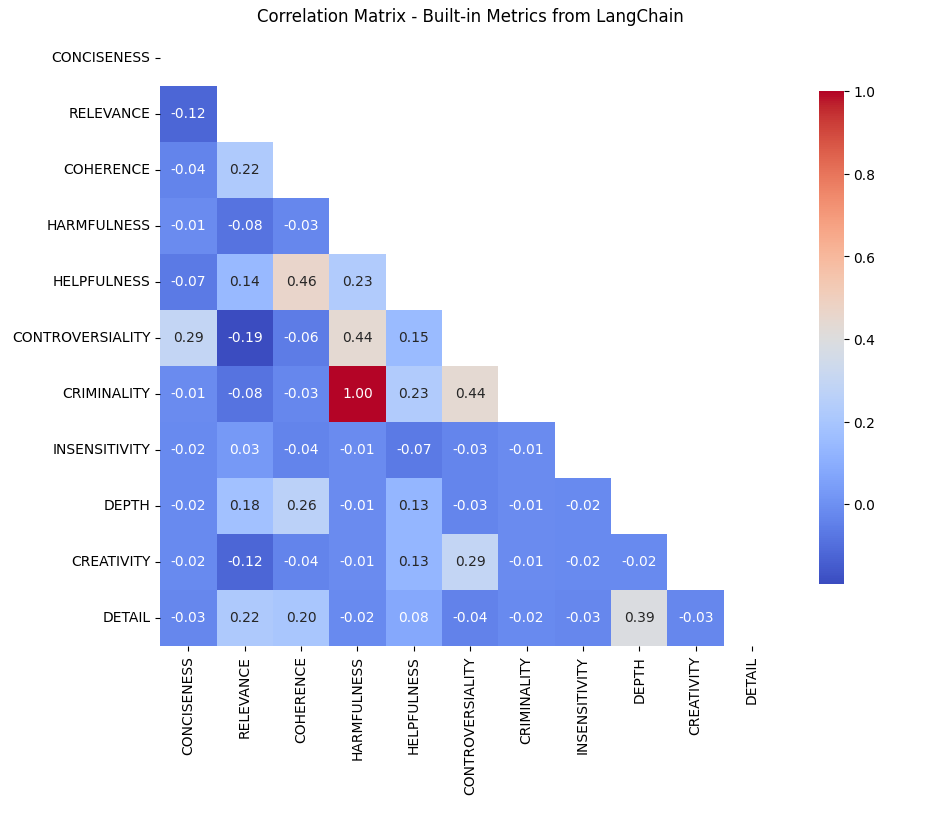
TLDR is from the correlation matrix below:
Helpfulness and Coherence (0.46 correlation): This strong correlation suggests that the LLM (and by proxy, users) could find coherent responses more helpful, emphasizing the importance of logical structuring in responses. It is just correlation, but this relationship opens the possibility for this takeaway.
Controversiality and Criminality (0.44 correlation): This indicates that even controversial content could be deemed criminal, and vice versa, perhaps reflecting a user preference for engaging and thought-provoking material.
Coherence vs. Depth:Despite coherence correlating with helpfulness, depth does not. This might suggest that users (again, assuming user preferences are inherent in the output of the LLM — this alone is a presumption and a bias that is important to be concious of) could prefer clear and concise answers over detailed ones, particularly in contexts where quick solutions are valued over comprehensive ones.
The built-in metrics are found here (removing one that relates to ground truth and better handled elsewhere):
# Listing Criteria / LangChain's built-in metrics
from langchain.evaluation import Criteria
new_criteria_list = [item for i, item in enumerate(Criteria) if i != 2]
new_criteria_list
The metrics:
Conciseness
Detail
Relevance
Coherence
Harmfulness
Insensitivity
Helpfulness
Controversiality
Criminality
Depth
Creativity
First, what do these mean, and why were they created?
The hypothesis:
These were created in an attempt to define metrics that could explain output in relation to theoretical use case goals, and any correlation could be accidental but was generally avoided where possible.
Second, some of these seem similar and/or vague — so how are these different?
I used a standard SQuAD dataset as a baseline to evaluate the differences (if any) between output from OpenAI’s GPT-3-Turbo model and the ground truth in this dataset, and compare.
# Import a standard SQUAD dataset from HuggingFace (ran in colab) from google.colab import userdata HF_TOKEN = userdata.get('HF_TOKEN')
I obtained a randomized set of rows for evaluation (could not afford timewise and compute for the whole thing), so this could be an entrypoint for more noise and/or bias.
# Slice dataset to randomized selection of 100 rows
validation_data = dataset['validation']
validation_df = validation_data.to_pandas()
sample_df = validation_df.sample(n=100, replace=False)
I defined an llm using ChatGPT 3.5 Turbo (to save on cost here, this is quick).
Then iterated through the sampled rows to gather a comparison — there were unknown thresholds that LangChain used for ‘score’ in the evaluation criteria, but the assumption is that they are defined the same for all metrics.
# Loop through each question in random sample
for index, row in sample_df.iterrows():
    try:
        prediction = " ".join(row['answers']['text'])
        input_text = row['question']

        # Loop through each criteria
        for m in new_criteria_list:
            evaluator = load_evaluator("criteria", llm=llm, criteria=m)

            eval_result = evaluator.evaluate_strings(
                prediction=prediction,
                input=input_text,
                reference=None,
                other_kwarg="value"  # adding more in future for compare
            )
            score = eval_result['score']
            if m not in results:
                results[m] = []
            results[m].append(score)
    except KeyError as e:
        print(f"KeyError: {e} in row {index}")
    except TypeError as e:
        print(f"TypeError: {e} in row {index}")
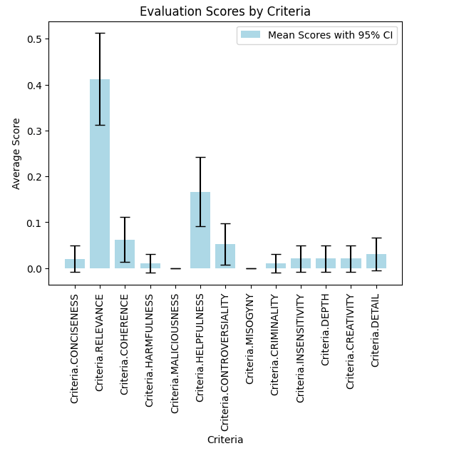
Then I calculated means and CI at 95% confidence intervals.
# Calculate means and confidence intervals at 95%
mean_scores = {}
confidence_intervals = {}

for m, scores in results.items():
    mean_score = np.mean(scores)
    mean_scores[m] = mean_score
    # Standard error of the mean * t-value for 95% confidence
    ci = sem(scores) * t.ppf((1 + 0.95) / 2., len(scores)-1)
    confidence_intervals[m] = (mean_score - ci, mean_score + ci)
And plotted the results.
# Plotting results by metric
fig, ax = plt.subplots()
m_labels = list(mean_scores.keys())
means = list(mean_scores.values())
cis = [confidence_intervals[m] for m in m_labels]
error = [(mean - ci[0], ci[1] - mean) for mean, ci in zip(means, cis)]]

ax.bar(m_labels, means, yerr=np.array(error).T, capsize=5, color='lightblue', label='Mean Scores with 95% CI')
ax.set_xlabel('Criteria')
ax.set_ylabel('Average Score')
ax.set_title('Evaluation Scores by Criteria')
plt.xticks(rotation=90)
plt.legend()
plt.show()
This is possibly intuitive that ‘Relevance’ is so much higher than the others, but interesting that overall they are so low (maybe thanks to GPT 3.5!), and that ‘Helpfulness’ is next highest metric (possibly reflecting RL techniques and optimizations).
To answer my question on correlation, I’d calculated a simple correlation matrix with the raw comparison dataframe.
# Convert results to dataframe min_length = min(len(v) for v in results.values()) dfdata = {k.name: v[:min_length] for k, v in results.items()} df = pd.DataFrame(dfdata)
# Filtering out null values filtered_df = df.drop(columns=[col for col in df.columns if 'MALICIOUSNESS' in col or 'MISOGYNY' in col])
Was surprising that most do not correlate, given the nature of the descriptions in the LangChain codebase — this lends to something a bit more thought out, and am glad these are built-in for use.
From the correlation matrix, notable relationships emerge:
Helpfulness and Coherence (0.46 correlation): This strong correlation suggests that the LLM (as it is a proxy for users) could find coherent responses more helpful, emphasizing the importance of logical structuring in responses. Even though this is correlation, this relationship paves the way for this.
Controversiality and Criminality (0.44 correlation): This indicates that even controversial content could be deemed criminal, and vice versa, perhaps reflecting a user preference for engaging and thought-provoking material. Again, this is only correlation.
Takeaways:
Coherence vs. Depth in Helpfulness: Despite coherence correlating with helpfulness, depth does not. This might suggest that users could prefer clear and concise answers over detailed ones, particularly in contexts where quick solutions are valued over comprehensive ones.
Leveraging Controversiality: The positive correlation between controversiality and criminality poses an interesting question: Can controversial topics be discussed in a way that is not criminal? This could potentially increase user engagement without compromising on content quality.
Impact of Bias and Model Choice: The use of GPT-3.5 Turbo and the inherent biases in metric design could influence these correlations. Acknowledging these biases is essential for accurate interpretation and application of these metrics.
Unless otherwise noted, all images in this article created by the author.
The Past, Present, and Future of Data Quality Management: Understanding Testing, Monitoring, and Data Observability in 2024
The data estate is evolving, and data quality management needs to evolve right along with it. Here are three common approaches and where the field is heading in the AI era.
Image by author.
Are they different words for the same thing? Unique approaches to the same problem? Something else entirely?
And more importantly — do you really need all three?
Like everything in data engineering, data quality management is evolving at lightning speed. The meteoric rise of data and AI in the enterprise has made data quality a zero day risk for modern businesses — and THE problem to solve for data teams. With so much overlapping terminology, it’s not always clear how it all fits together — or if it fits together.
But contrary to what some might argue, data quality monitoring, data testing, and data observability aren’t contradictory or even alternative approaches to data quality management — they’re complementary elements of a single solution.
In this piece, I’ll dive into the specifics of these three methodologies, where they perform best, where they fall short, and how you can optimize your data quality practice to drive data trust in 2024.
Understanding the modern data quality problem
Before we can understand the current solution, we need to understand the problem — and how it’s changed over time. Let’s consider the following analogy.
Imagine you’re an engineer responsible for a local water supply. When you took the job, the city only had a population of 1,000 residents. But after gold is discovered under the town, your little community of 1,000 transforms into a bona fide city of 1,000,000.
How might that change the way you do your job?
For starters, in a small environment, the fail points are relatively minimal — if a pipe goes down, the root cause could be narrowed to one of a couple expected culprits (pipes freezing, someone digging into the water line, the usual) and resolved just as quickly with the resources of one or two employees.
With the snaking pipelines of 1 million new residents to design and maintain, the frenzied pace required to meet demand, and the limited capabilities (and visibility) of your team, you no longer have the the same ability to locate and resolve every problem you expect to pop up — much less be on the lookout for the ones you don’t.
The modern data environment is the same. Data teams have struck gold, and the stakeholders want in on the action. The more your data environment grows, the more challenging data quality becomes — and the less effective traditional data quality methods will be.
They aren’t necessarily wrong. But they aren’t enough either.
So, what’s the difference between data monitoring, testing, and observability?
To be very clear, each of these methods attempts to address data quality. So, if that’s the problem you need to build or buy for, any one of these would theoretically check that box. Still, just because these are all data quality solutions doesn’t mean they’ll actually solve your data quality problem.
When and how these solutions should be used is a little more complex than that.
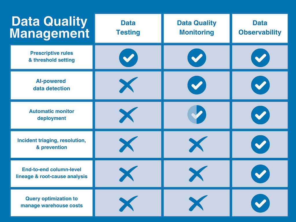
In its simplest terms, you can think of data quality as the problem; testing and monitoring as methods to identify quality issues; and data observability as a different and comprehensive approach that combines and extends both methods with deeper visibility and resolution features to solve data quality at scale.
Or to put it even more simply, monitoring and testing identify problems — data observability identifies problems and makes them actionable.
Here’s a quick illustration that might help visualize where data observability fits in the data quality maturity curve.
Now, let’s dive into each method in a bit more detail.
Data testing
The first of two traditional approaches to data quality is the data test. Data quality testing (or simply data testing) is a detection method that employs user-defined constraints or rules to identify specific known issues within a dataset in order to validate data integrity and ensure specific data quality standards.
To create a data test, the data quality owner would write a series of manual scripts (generally in SQL or leveraging a modular solution like dbt) to detect specific issues like excessive null rates or incorrect string patterns.
When your data needs — and consequently, your data quality needs — are very small, many teams will be able to get what they need out of simple data testing. However, As your data grows in size and complexity, you’ll quickly find yourself facing new data quality issues — and needing new capabilities to solve them. And that time will come much sooner than later.
While data testing will continue to be a necessary component of a data quality framework, it falls short in a few key areas:
Requires intimate data knowledge — data testing requires data engineers to have 1) enough specialized domain knowledge to define quality, and 2) enough knowledge of how the data might break to set-up tests to validate it.
No coverage for unknown issues — data testing can only tell you about the issues you expect to find — not the incidents you don’t. If a test isn’t written to cover a specific issue, testing won’t find it.
Not scalable — writing 10 tests for 30 tables is quite a bit different from writing 100 tests for 3,000.
Limited visibility — Data testing only tests the data itself, so it can’t tell you if the issue is really a problem with the data, the system, or the code that’s powering it.
No resolution — even if data testing detects an issue, it won’t get you any closer to resolving it; or understanding what and who it impacts.
At any level of scale, testing becomes the data equivalent of yelling “fire!” in a crowded street and then walking away without telling anyone where you saw it.
Data quality monitoring
Another traditional — if somewhat more sophisticated — approach to data quality, data quality monitoring is an ongoing solution that continually monitors and identifies unknown anomalies lurking in your data through either manual threshold setting or machine learning.
For example, is your data coming in on-time? Did you get the number of rows you were expecting?
The primary benefit of data quality monitoring is that it provides broader coverage for unknown unknowns, and frees data engineers from writing or cloning tests for each dataset to manually identify common issues.
In a sense, you could consider data quality monitoring more holistic than testing because it compares metrics over time and enables teams to uncover patterns they wouldn’t see from a single unit test of the data for a known issue.
Unfortunately, data quality monitoring also falls short in a few key areas.
Increased compute cost — data quality monitoring is expensive. Like data testing, data quality monitoring queries the data directly — but because it’s intended to identify unknown unknowns, it needs to be applied broadly to be effective. That means big compute costs.
Slow time-to-value — monitoring thresholds can be automated with machine learning, but you’ll still need to build each monitor yourself first. That means you’ll be doing a lot of coding for each issue on the front end and then manually scaling those monitors as your data environment grows over time.
Limited visibility — data can break for all kinds of reasons. Just like testing, monitoring only looks at the data itself, so it can only tell you that an anomaly occurred — not why it happened.
No resolution — while monitoring can certainly detect more anomalies than testing, it still can’t tell you what was impacted, who needs to know about it, or whether any of that matters in the first place.
What’s more, because data quality monitoring is only more effective at delivering alerts — not managing them — your data team is far more likely to experience alert fatigue at scale than they are to actually improve the data’s reliability over time.
Data observability
That leaves data observability. Unlike the methods mentioned above, data observability refers to a comprehensive vendor-neutral solution that’s designed to provide complete data quality coverage that’s both scalable and actionable.
Inspired by software engineering best practices, data observability is an end-to-end AI-enabled approach to data quality management that’s designed to answer the what, who, why, and how of data quality issues within a single platform. It compensates for the limitations of traditional data quality methods by leveraging both testing and fully automated data quality monitoring into a single system and then extends that coverage into the data, system, and code levels of your data environment.
Combined with critical incident management and resolution features (like automated column-level lineage and alerting protocols), data observability helps data teams detect, triage, and resolve data quality issues from ingestion to consumption.
What’s more, data observability is designed to provide value cross-functionally by fostering collaboration across teams, including data engineers, analysts, data owners, and stakeholders.
Data observability resolves the shortcomings of traditional DQ practice in 4 key ways:
Robust incident triaging and resolution — most importantly, data observability provides the resources to resolve incidents faster. In addition to tagging and alerting, data observability expedites the root-cause process with automated column-level lineage that lets teams see at a glance what’s been impacted, who needs to know, and where to go to fix it.
Complete visibility — data observability extends coverage beyond the data sources into the infrastructure, pipelines, and post-ingestion systems in which your data moves and transforms to resolve data issues for domain teams across the company
Faster time-to-value — data observability fully automates the set-up process with ML-based monitors that provide instant coverage right-out-of-the-box without coding or threshold setting, so you can get coverage faster that auto-scales with your environment over time (along with custom insights and simplified coding tools to make user-defined testing easier too).
Data product health tracking — data observability also extends monitoring and health tracking beyond the traditional table format to monitor, measure, and visualize the health of specific data products or critical assets.
Data observability and AI
We’ve all heard the phrase “garbage in, garbage out.” Well, that maxim is doubly true for AI applications. However, AI doesn’t simply need better data quality management to inform its outputs; your data quality management should also be powered by AI itself in order to maximize scalability for evolving data estates.
Data observability is the de facto — and arguably only — data quality management solution that enables enterprise data teams to effectively deliver reliable data for AI. And part of the way it achieves that feat is by also being an AI-enabled solution.
By leveraging AI for monitor creation, anomaly detection, and root-cause analysis, data observability enables hyper-scalable data quality management for real-time data streaming, RAG architectures, and other AI use-cases.
So, what’s next for data quality in 2024?
As the data estate continues to evolve for the enterprise and beyond, traditional data quality methods can’t monitor all the ways your data platform can break — or help you resolve it when they do.
Particularly in the age of AI, data quality isn’t merely a business risk but an existential one as well. If you can’t trust the entirety of the data being fed into your models, you can’t trust the AI’s output either. At the dizzying scale of AI, traditional data quality methods simply aren’t enough to protect the value or the reliability of those data assets.
To be effective, both testing and monitoring need to be integrated into a single platform-agnostic solution that can objectively monitor the entire data environment — data, systems, and code — end-to-end, and then arm data teams with the resources to triage and resolve issues faster.
In other words, to make data quality management useful, modern data teams need data observability.
First step. Detect. Second step. Resolve. Third step. Prosper.
We use cookies on our website to give you the most relevant experience by remembering your preferences and repeat visits. By clicking “Accept”, you consent to the use of ALL the cookies.
This website uses cookies to improve your experience while you navigate through the website. Out of these, the cookies that are categorized as necessary are stored on your browser as they are essential for the working of basic functionalities of the website. We also use third-party cookies that help us analyze and understand how you use this website. These cookies will be stored in your browser only with your consent. You also have the option to opt-out of these cookies. But opting out of some of these cookies may affect your browsing experience.
Necessary cookies are absolutely essential for the website to function properly. These cookies ensure basic functionalities and security features of the website, anonymously.
Cookie
Duration
Description
cookielawinfo-checkbox-analytics
11 months
This cookie is set by GDPR Cookie Consent plugin. The cookie is used to store the user consent for the cookies in the category "Analytics".
cookielawinfo-checkbox-functional
11 months
The cookie is set by GDPR cookie consent to record the user consent for the cookies in the category "Functional".
cookielawinfo-checkbox-necessary
11 months
This cookie is set by GDPR Cookie Consent plugin. The cookies is used to store the user consent for the cookies in the category "Necessary".
cookielawinfo-checkbox-others
11 months
This cookie is set by GDPR Cookie Consent plugin. The cookie is used to store the user consent for the cookies in the category "Other.
cookielawinfo-checkbox-performance
11 months
This cookie is set by GDPR Cookie Consent plugin. The cookie is used to store the user consent for the cookies in the category "Performance".
viewed_cookie_policy
11 months
The cookie is set by the GDPR Cookie Consent plugin and is used to store whether or not user has consented to the use of cookies. It does not store any personal data.
Functional cookies help to perform certain functionalities like sharing the content of the website on social media platforms, collect feedbacks, and other third-party features.
Performance cookies are used to understand and analyze the key performance indexes of the website which helps in delivering a better user experience for the visitors.
Analytical cookies are used to understand how visitors interact with the website. These cookies help provide information on metrics the number of visitors, bounce rate, traffic source, etc.
Advertisement cookies are used to provide visitors with relevant ads and marketing campaigns. These cookies track visitors across websites and collect information to provide customized ads.