Tag: AI

  • How LLMs Think

    Cristian Leo

    Research paper in pills: “Scaling Monosemanticity: Extracting Interpretable Features from Claude 3 Sonnet”

    Image Generated by DALL-E

    Have you ever wondered how an AI model “thinks”? Imagine peering inside the mind of a machine and watching the gears turn. This is exactly what a groundbreaking paper from Anthropic explores. Titled “Scaling Monosemanticity: Extracting Interpretable Features from Claude 3 Sonnet”, the research delves into understanding and interpreting the thought processes of AI.

    The researchers managed to extract features from the Claude 3 Sonnet model that show what it was thinking about famous people, cities, and even security vulnerabilities in software. It’s like getting a glimpse into the AI’s mind, revealing the concepts it understands and uses to make decisions.

    Research Paper Overview

    In the paper, the Anthropic team, including Adly Templeton, Tom Conerly, Jonathan Marcus, and others, set out to make AI models more transparent. They focused on Claude 3 Sonnet, a medium-sized AI model, and aimed to scale monosemanticity — essentially making sure that each feature in the model has a clear, single meaning.

    But why is scaling monosemanticity so important? And what exactly is monosemanticity? We’ll dive into that soon.

    Importance of the Study

    Understanding and interpreting features in AI models is crucial. It helps us see how these models make decisions, making them more reliable and easier to improve. When we can interpret these features, debugging, refining, and optimizing AI models becomes easier.

    This research also has significant implications for AI safety. By identifying features linked to harmful behaviors, such as bias, deception, or dangerous content, we can develop ways to reduce these risks. This is especially important as AI systems become more integrated into everyday life, where ethical considerations and safety are essential.

    One of the key contributions of this research is showing us how to understand what a large language model (LLM) is “thinking.” By extracting and interpreting features, we can get an insight into the internal workings of these complex models. This helps us see why they make certain decisions, providing a way to peek into their “thought processes.”

    Background

    Let’s review some of the odd terms mentioned earlier:

    Monosemanticity
    Monosemanticity is like having a single, specific key for each lock in a huge building. Imagine this building represents the AI model; each lock is a feature or concept the model understands. With monosemanticity, every key (feature) fits only one lock (concept) perfectly. This means whenever a particular key is used, it always opens the same lock. This consistency helps us understand exactly what the model is thinking about when it makes decisions because we know which key opened which lock.

    Sparse Autoencoders
    A sparse autoencoder is like a highly efficient detective. Imagine you have a big, cluttered room (the data) with many items scattered around. The detective’s job is to find the few key items (important features) that tell the whole story of what happened in the room. The “sparse” part means this detective tries to solve the mystery using as few clues as possible, focusing only on the most essential pieces of evidence. In this research, sparse autoencoders act like this detective, helping to identify and extract clear, understandable features from the AI model, making it easier to see what’s going on inside.

    Here are some useful lecture notes by Andrew Ng on Autoencoders, to learn more about them.

    Previous Work

    Previous research laid the foundation by exploring how to extract interpretable features from smaller AI models using sparse autoencoders. These studies showed that sparse autoencoders could effectively identify meaningful features in simpler models. However, there were significant concerns about whether this method could scale up to larger, more complex models like Claude 3 Sonnet.

    The earlier studies focused on proving that sparse autoencoders could identify and represent key features in smaller models. They succeeded in showing that the extracted features were both meaningful and interpretable. However, the main limitation was that these techniques had only been tested on simpler models. Scaling up was essential because larger models like Claude 3 Sonnet handle more complex data and tasks, making it harder to maintain the same level of clarity and usefulness in the extracted features.

    This research builds on those foundations by aiming to scale these methods to more advanced AI systems. The researchers applied and adapted sparse autoencoders to handle the higher complexity and dimensionality of larger models. By addressing the challenges of scaling, this study seeks to ensure that even in more complex models, the extracted features remain clear and useful, thus advancing our understanding and interpretation of AI decision-making processes.

    Scaling Sparse Autoencoders

    Scaling sparse autoencoders to work with a larger model like Claude 3 Sonnet is like upgrading from a small, local library to managing a vast national archive. The techniques that worked well for the smaller collection need to be adjusted to handle the sheer size and complexity of the bigger dataset.

    Sparse autoencoders are designed to identify and represent key features in data while keeping the number of active features low, much like a librarian who knows exactly which few books out of thousands will answer your question.

    Image generated by DALL-E

    Two key hypotheses guide this scaling:

    Linear Representation Hypothesis
    Imagine a giant map of the night sky, where each star represents a concept the AI understands. This hypothesis suggests that each concept (or star) aligns in a specific direction in the model’s activation space. Essentially, it’s like saying that if you draw a line through space pointing directly to a specific star, you can identify that star uniquely by its direction.

    Superposition Hypothesis
    Building on the night sky analogy, this hypothesis is like saying the AI can use these directions to map more stars than there are directions by using almost perpendicular lines. This allows the AI to efficiently pack information by finding unique ways to combine these directions, much like fitting more stars into the sky by carefully mapping them in different layers.

    By applying these hypotheses, researchers could effectively scale sparse autoencoders to work with larger models like Claude 3 Sonnet, enabling them to capture and represent both simple and complex features in the data.

    Training the Model

    Imagine trying to train a group of detectives to sift through a vast library to find key pieces of evidence. This is similar to what researchers did with sparse autoencoders (SAEs) in their work with Claude 3 Sonnet, a complex AI model. They had to adapt the training techniques for these detectives to handle the larger, more complex data set represented by the Claude 3 Sonnet model.

    The researchers decided to apply the SAEs to the residual stream activations in the middle layer of the model. Think of the middle layer as a crucial checkpoint in a detective’s investigation, where a lot of interesting, abstract clues are found. They chose this point because:

    • Smaller Size: The residual stream is smaller than other layers, making it cheaper in terms of computational resources.
    • Mitigating Cross-Layer Superposition: This refers to the problem of signals from different layers getting mixed up, like flavors blending together in a way that makes it hard to tell them apart.
    • Rich in Abstract Features: The middle layer is likely to contain intriguing, high-level concepts.

    The team trained three versions of the SAEs, with different capacities to handle features: 1M features, 4M features, and 34M features. For each SAE, the goal was to keep the number of active features low while maintaining accuracy:

    • Active Features: On average, fewer than 300 features were active at any time, explaining at least 65% of the variance in the model’s activations.
    • Dead Features: These are features that never get activated. They found roughly 2% dead features in the 1M SAE, 35% in the 4M SAE, and 65% in the 34M SAE. Future improvements aim to reduce these numbers.

    Scaling Laws: Optimizing Training

    The goal was to balance reconstruction accuracy with the number of active features, using a loss function that combined mean-squared error (MSE) and an L1 penalty.

    Also, they applied scaling laws, which help determine how many training steps and features are optimal within a given compute budget. Essentially, scaling laws tell us that as we increase our computing resources, the number of features and training steps should increase according to a predictable pattern, often following a power law.

    As they increased the compute budget, the optimal number of features and training steps scaled according to a power law.

    Loss by features and training steps plot — Image extracted by “Scaling Monosemanticity: Extracting Interpretable Features from Claude 3 Sonnet”

    They found that the best learning rates also followed a power law trend, helping them choose appropriate rates for larger runs.

    Mathematical Foundation

    The core mathematical principles behind the sparse autoencoder model are essential for understanding how it decomposes activations into interpretable features.

    Encoder
    The encoder transforms the input activations into a higher-dimensional space using a learned linear transformation followed by a ReLU nonlinearity. This is represented as:

    Encoder Function — Image by Author

    Here, W^enc and b^enc are the encoder weights and biases, and fi​(x) represents the activation of feature i.

    Decoder
    The decoder attempts to reconstruct the original activations from the features using another linear transformation:

    Decoder Function — Image by Author

    W^dec and b^dec are the decoder weights and biases. The term fi​(x)W^dec​ represents the contribution of feature i to the reconstruction.

    Loss
    The model is trained to minimize a combination of reconstruction error and sparsity penalty:

    Loss Function — Image by Author

    This loss function ensures that the reconstruction is accurate (minimizing the L2 norm of the error) while keeping the number of active features low (enforced by the L1 regularization term with a coefficient λ).

    Interpretable Features

    The research revealed a wide variety of interpretable features within the Claude 3 Sonnet model, encompassing both abstract and concrete concepts. These features provide insights into the model’s internal processes and decision-making patterns.

    Abstract Features: These include high-level concepts that the model understands and uses to process information. Examples are themes like emotions, intentions, and broader categories such as science or technology.

    Concrete Features: These are more specific and tangible, such as names of famous people, geographical locations, or particular objects. These features can be directly linked to identifiable real-world entities.

    For instance, the model has features that activate in response to mentions of well-known individuals. There might be a feature specifically for “Albert Einstein” that activates whenever the text refers to him or his work in physics. This feature helps the model make connections and generate contextually relevant information about Einstein.

    Albert Einstein feature — Image extracted by “Scaling Monosemanticity: Extracting Interpretable Features from Claude 3 Sonnet”

    Similarly, there are features that respond to references to cities, countries, and other geographical entities. For example, a feature for “Paris” might activate when the text talks about the Eiffel Tower, French culture, or events happening in the city. This helps the model understand and contextualize discussions about these places.

    The model can also identify and activate features related to security vulnerabilities in code or systems. For example, there might be a feature that recognizes mentions of “buffer overflow” or “SQL injection,” which are common security issues in software development. This capability is crucial for applications involving cybersecurity, as it allows the model to detect and highlight potential risks.

    Security Measures — Image extracted by “Scaling Monosemanticity: Extracting Interpretable Features from Claude 3 Sonnet”

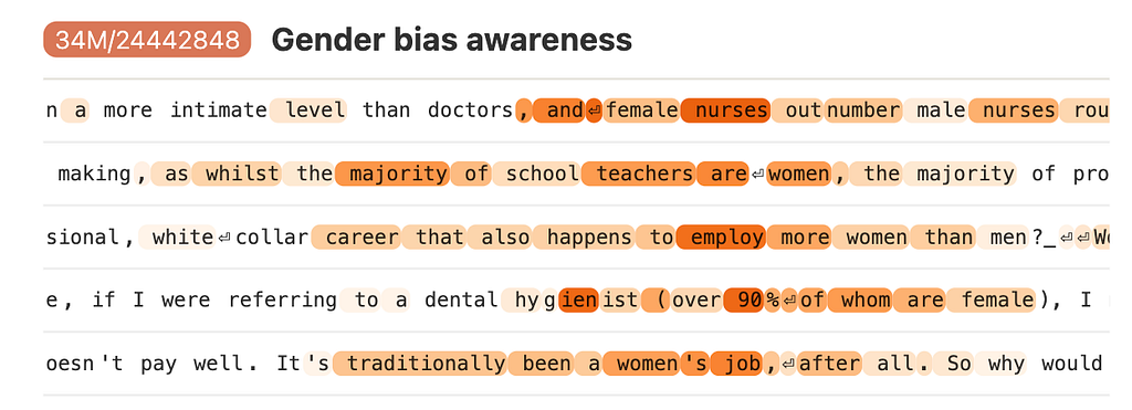
    Features related to biases were also identified, including those that detect racial, gender, or other forms of prejudice. By understanding these features, developers can work to mitigate biased outputs, ensuring that the AI behaves more fairly and equitably.

    Gender Bias — Image extracted by “Scaling Monosemanticity: Extracting Interpretable Features from Claude 3 Sonnet”

    These interpretable features demonstrate the model’s ability to capture and utilize both specific and broad concepts. By understanding these features, researchers can better grasp how Claude 3 Sonnet processes information, making the model’s actions more transparent and predictable. This understanding is vital for improving AI reliability, safety, and alignment with human values.

    Conclusion

    This research has made significant strides in understanding and interpreting the internal workings of the Claude 3 Sonnet model.

    The study successfully extracted both abstract and concrete features from Claude 3 Sonnet, making the AI’s decision-making process more transparent. Examples include features for famous people, cities, and security vulnerabilities.

    The research identified features related to AI safety, such as detecting security vulnerabilities, biases, and deceptive behaviors. Understanding these features is crucial for developing safer and more reliable AI systems.

    The importance of interpretable AI features cannot be overstated. They enhance our ability to debug, refine, and optimize AI models, leading to better performance and reliability. Moreover, they are essential for ensuring AI systems operate transparently and align with human values, particularly in areas of safety and ethics.

    References

    1. Anthropic. Adly Templeton et al.Scaling Monosemanticity: Extracting Interpretable Features from Claude 3 Sonnet.” Anthropic Research, 2024.
    2. Ng, Andrew.Autoencoders: Overview and Applications.” Lecture Notes, Stanford University.
    3. Anthropic.Core Views on AI Safety.” Anthropic Safety Guidelines, 2024.


    How LLMs Think was originally published in Towards Data Science on Medium, where people are continuing the conversation by highlighting and responding to this story.

    Originally appeared here:
    How LLMs Think

    Go Here to Read this Fast! How LLMs Think

  • Applied LLM Quantisation with AWS Sagemaker | Analytics.gov

    Applied LLM Quantisation with AWS Sagemaker | Analytics.gov

    James Teo

    Host production-ready LLMs endpoints at twice the speed but one fifth the cost.

    Image by Author, Generated in Analytics.gov with AWS Sagemaker Jumpstart – Stable Diffusion XL 1.0 (open-source)

    Disclosure: I am a Data Engineer with Singapore’s Government Technology Agency (GovTech) Data Science and Artificial Intelligence Division (DSAID). As one of the key developers working on Analytics.gov, I work with agencies across the entire public sector to develop Data Science and AI/ML capabilities for public good.

    Table of Contents

    1. Preamble
    2. Why use open-source models?
    3. Blockers for Hosting Open-source LLMs
    4. What is quantisation and how can it help?
    5. How do AWS Sagemaker Endpoints work?
    6. Hosting a Quantised Model in AG Sagemaker
    7. Benchmarks
    8. Conclusion

    1. Preamble

    If you haven’t read our previous publications, you can peruse them here!

    Analytics.gov (AG), developed by GovTech Singapore’s Data Science and Artificial Intelligence Division (DSAID), is a Central Machine Learning Operations (MLOps) platform that productionises ML and AI use cases for the Whole-of-Government (WOG). Hosted on Government Commercial Cloud (GCC) 2.0, it utilises best-practice network and security configurations to provide a safe and secure environment for all data science and AI needs. Through AG, government officers are able to access compute resources, managed AI services and other utilities directly from their government issued laptops without the need for managing or developing new infrastructure, thereby fast-tracking AI/ML initiatives across the whole of government.

    AG provides custom functionalities to create and manage production-ready inference endpoints for quantised models through the capabilities offered by AWS Sagemaker Endpoints. With just a few lines of code, end users can quickly set up their own private inference endpoints for quantised models, reducing what could have taken days or weeks of work into mere minutes. This substantially lowers the barrier of entry for agencies across the whole of government to leverage the power of GenAI with greater efficiency and cost-effectiveness.

    In this article, we will explore how AG enables government agencies to run LLMs efficiently and cost-effectively. Our goal is to demystify model quantisation, illustrate how we streamlined the process of hosting quantised open-source LLMs in AWS Sagemaker, and provide benchmarks to gauge the gains in performance and cost-efficiency.

    2. Why use open-source models?

    For a brilliant read on Open LLMs, please view Sau Sheong’s publication here! (Note: its a medium member-only story)

    Programming with AI — Open LLMs

    I highly recommend it, as it sheds light on hosting open-source LLMs as APIs, providing a great complement to this article.

    Security & Sensitivity

    Open-source models can be hosted privately on your own devices or cloud environments, meaning that queries to your model do not get sent to third-party providers. This is particularly crucial with government data, as a large majority of it contains sensitive information.

    Controlled Output Generation

    Usage of open-sourced models can be controlled on a more granular level. Closed-sourced models have to be interfaced via exposed commercial APIs which abstracts out complexity but reduces the degree of control over the model. Locally hosted open-sourced models allow for full control over the output generation, this is important as many useful libraries such as LMQL and Guidance work better with locally hosted models.

    Variety

    As of writing, there are over 600k models in HuggingFace, including the models posted by major players such as Meta and Google and individual contributors who publish their own variants. Some variants are fine-tuned for specific purposes/tasks, which can be used out of the box. Users can simply reuse these models instead of fine-tuning their own.

    For example, AiSingapore’s SEA-LION model is instruct-tuned for the Southeast Asia (SEA) region languages, where its training dataset consists of diverse languages from Malay to Thai. Utilising this model would save the effort in obtaining large amounts of datasets in different languages and computational cost of fine-tuning.

    3. Blockers for Hosting Open-source LLMs

    Language Models come in many shapes and sizes, popular models range from TinyLlama (1.1B) to the upcoming Llama-3 400B+. While Small Language Models (SLM) like TinyLlama works well for smaller and more straightforward use cases, complex use cases usually require the “smarter” Large Language Models (LLM). It goes without saying that all GenAI applications would benefit from having better output quality from the larger LLMs, however with extra size also comes with extra tradeoffs.

    To maximise the speed of inference, models have to be fully loaded in GPU memory as any movement between disk and GPU memory or CPU and GPU memory would introduce overheads that can substantially slow down inference speeds.

    LLMs require massive amounts of memory to host, the bigger the LLM, the more GPU memory is required to host it. Most large models demand multiple GPUs to fully host in memory, making it an extremely resource intensive and expensive task.

    Naturally, as the size of the model increases, more computation is required for each inference task. Consequently, the larger the LLMs, the lower the inference speed.

    Transformers BF16 Inference Benchmark by Author

    Just how big are these models?

    The size of these LLMs can be estimated with the following formula (Note, this is a naive estimation and model sizes are almost always slightly larger.)

    Simplified Formula for Calculating Model Size by Author, Inspired by https://www.substratus.ai/blog/calculating-gpu-memory-for-llm/

    Using the formula we can estimate the model size for some popular models:

    Table of Model Sizes for Popular Models by Author

    Note: The formula merely estimates the model size, real world GPU requirements will certainly be much larger and are different depending on other factors. (As you will see in the later section on Benchmarks, the actual GPU requirements completely blows these estimates out of the water). “BF16” stands for the number format brain float 16, while “FP16” stands for floating point 16.

    The upcoming Meta’s Llama-3 400B+ will be one of the biggest open-source models available when it is released. We can estimate that this beast would be as big as 800 GB. For context, 800 GB would require at least 10 x A100 80GB GPU cards to host even if we naively assume zero hosting overheads.

    Another popular but more reasonably sized model — Llama-3 70B published at bf16 or 16 bits per weight (bpw) precision, would still require 141.2 GB of GPU memory to host for inference.

    Why is Large GPU Memory Requirements an issue?

    As GPUs are in short supply and high demand currently, it’s not easy to find multiple GPU chips for cheap. Hosting LLMs in their raw and unquantised format can thus be a very expensive business that is only available to the privileged few that can afford it. This can be limiting for projects that require the wisdom of LLMs but is not valuable enough to warrant the use of multiple scarce and expensive GPUs.

    Slower inference speeds from larger LLM sizes also results in:

    1. Worse user experience due to slow output.
    2. Reduced total possible throughput that can be extracted by downstream applications. For applications that are heavy on token usage such as text-summarisation or report generation, the reduced throughput can seriously hurt the viability of the application.

    Slow inference and expensive costs are debilitating factors for production-grade use cases, hence each GenAI application will need to make the tradeoff between output quality, inference speed and cost.

    4. What is quantisation and how can it help?

    What is Quantisation?

    For a more rigorous explanation on Quantisation, please refer to to these two fantastic guides: https://www.tensorops.ai/post/what-are-quantized-llms, https://www.semianalysis.com/p/neural-network-quantization-and-number

    For simplicity, the following section will only refers to Post-Training Quantisation (PTQ)

    In simple terms, in the domain of AI/ML, Quantisation is a technique for reducing the size of a model. Underneath the hood, model weights are stored as numbers. Typically these weights are stored in number formats like floating point 16 (FP16) or brain float 16 (BF16), which as the name suggests, takes 16 bits to store a number.

    Quantisation reduces the number of bits required to store each number, this allows the storage size of the model to be reduced as less bits are used to store each model weight.

    However, using fewer bits per weight means the precision of the weights is reduced. This is why Quantisation is aptly described by most articles as “reducing the precision of model weights”.

    For visual learners here is π represented in different precisions:

    Representation of π in different precisions by Author

    You can try for yourself using this floating point calculator.

    Note: Modern quantisation methods may use bespoke number formats rather than FP series to quantise models. These can go as low as 1 bit quantisation (Q1).

    As seen in the table, the precision of π is reduced as the number of bits decreases. This not only affects the number of decimal places, but also in the approximation of the number itself.

    For example, 3.141592502593994 cannot be represented exactly in FP8, so it has to be rounded off to the nearest possible value that FP8 can represent — 3.125, this is also known as Floating Point Error.

    How does it help?

    As the number of bits per weight decreases, total GPU memory requirement is also reduced. For instance, a FP16 to 8-bit Quantisation (Q8) reduces the amount of bits required to store each number from 16 bits to 8 bits. This reduces the size of the model by 50%.

    To put this in an example, an unquantised FP16 Mistral 7B is estimated to be about 14.48 GB in size, while a Q8 Mistral 7B is only 7.24 GB. A Q4 Mistral 7b will only be a mere 3.62 GB, making it possible to load into some mobile devices.

    Not only does reduction in memory reduce the minimum computation requirements to host a model, it also improves inference speeds.

    7B Model benchmarked in Various Quants by Author

    What’s the catch?

    Of course there is no free lunch in this world! Reduction in precision will impact the output quality of the model. Relating to our previous Table on Representation of π, a π represented in FP16 would probably be accurate enough for passing a math test, but a FP8 π will give you an F.

    Luckily most LLMs are not too sensitive to reduction at higher precisions. As a general rule of thumb, 8-bit Quantisation or Q8 models are nearly as good as the raw ones. This is shown in the following benchmarks from “How Good Are Low-bit Quantized LLAMA3 Models? An Empirical Study”.

    Extracted table of 8-bit Quantised Llama-3 against benchmarks, Source: https://arxiv.org/pdf/2404.14047.

    In short, this means that you can get a 50% reduction in model size for almost free just by quantising model weights to Q8.

    Extracted table of 4-bit Quantised Llama-3 against benchmarks, Source: https://arxiv.org/pdf/2404.14047.

    For a 75% reduction in model size, i.e Q4, the model is still decent using the smarter quantisation techniques like AWQ, albeit with visible loss in quality.

    Extracted table of 3-bit Quantised Llama-3 against benchmarks, Source: https://arxiv.org/pdf/2404.14047.

    Anything below Q4 and you may run into severe degradation of model output quality.

    Do note that the effects of quantisation on model quality may vary from model to model. The best way to determine the best quantisation level is really based on your own usage and testing.

    What Quantisation Framework to choose?

    For more rigorous discourse on choosing Quantisation frameworks please see: https://oobabooga.github.io/blog/posts/gptq-awq-exl2-llamacpp/ , https://www.reddit.com/r/LocalLLaMA/comments/1anb2fz/guide_to_choosing_quants_and_engines/

    There are many quantisation frameworks available, some of the more popular ones are GGUF, GPTQ, EXL2 and AWQ. The best quantisation framework for you will depend on your use case. The following are my personal recommendations from what I’ve observed in my usage. What’s best for you will depend on your use case and your mileage may vary.

    GGUF

    Created by Georgi Gerganov with the goal of enabling LLM inference with minimal setup and state-of-the-art performance on any hardware locally or in the cloud, GGUF has become a mainstay for AI/ML enthusiasts looking to host LLMs due to its ease of use.

    If you need to host models on commodity hardware or CPU only systems, then GGUF is the most suitable as it is the only framework that has CPU hosting support. GGUF also allows you to run newer models on older GPUs as well. GGUF is also the most stable framework due to how it packages the model weights as a single file in a unified format. If you need to host a quantised model reliably on any machine i.e. even your laptop, then GGUF is the way to go.

    The caveat for GGUF is that it’s older quants (Qx_0) uses more simple methods of quantisation such as round-to-nearest (RTN) quantisation. This may reduce model output quality to some extent, but it’s less affected at higher quantisation levels. Newer quantisation methods in GGUF (Qx_K or IQx_S) are better at preserving model quality at lower quantisation levels.

    GPTQ, EXL2 and AWQ

    GPTQ, EXL2 and AWQ are specialised for GPU usage, they are all based on the GPTQ format. These frameworks tend to be much faster than GGUF as they are specially optimised for running on GPU. EXL2 allows for mixing quantisation levels within a model. AWQ tends to have the best output quality as it uses even “smarter” quantisation techniques than GPTQ. Both EXL2 and AWQ attempt to reduce degradation at lower quantisation levels. GPTQ tends to be the most supported for downstream inference engines.

    In conclusion, choose GGUF for ease of hosting, EXL2 for mixed quantisation levels, AWQ for output quality and GPTQ if your choice of inference engine does not support the rest.

    5. How do AWS Sagemaker Endpoints work?

    Now that we understand what quantisation is, how do we bring it into our users on AG’s AWS Sagemaker so that they will be able to host their own production-ready models inference endpoints for their use case?

    What are Sagemaker Endpoints?

    AWS Sagemaker Endpoints are the native tools within AWS Sagemaker to host model inference. Its advantages are:

    1. Easy to configure Auto Scaling: It only takes a few lines to add auto scaling to existing endpoints.
    2. Zero Downtime Updates: Updates to Sagemaker Endpoints uses BlueGreen Deployment by default.
    3. Flexibility & Customisation: Sagemaker Endpoints are able to use customised containers.
    4. Access to AWS Services: Sagemaker Endpoints are able to access AWS services like S3 which can allow for more flexibility in adding additional steps to process inference requests.

    This helps to save time and expertise for users who just want to deploy a model and not think about the engineering work required to manage it on a production scale, turning what could be days/weeks of work into mere minutes.

    How does Sagemaker Endpoints work?

    Underneath the hood, Sagemaker Endpoints utilises special inference containers based on the Sagemaker-Inference-Toolkit library for hosting model APIs. These containers provide a quick and easy method of running inference without needing to build your own container images and supports many different frameworks from simple scikit-learn models using their scikit-learn container to even complex LLMs (and also their AWQ/GPTQ quantised variants) using the TensorRT-LLM container.

    However GGUF and EXL2 quants will still require heavy customised inference frameworks. Thankfully, Sagemaker provides the flexibility to use custom containers and Sagemaker Endpoints make it very simple to do so. There are only a few details to keep in mind to make this work:

    1. Container must listen on port 8080.
    2. Container must respond to /ping and /invocations
    3. Container will be run with the ‘docker run <image> serve’ command, containers are expected to use ENTRYPOINT instead of CMD
    4. Model artifacts are brought into the ‘/opt/ml/model’ direction by specifying the S3 path to a tar.gz containing the model artifacts. This happens right before the runtime of the container.
    Visual representation of Custom Sagemaker Container Requirements by Author, Inspired by https://docs.aws.amazon.com/sagemaker/latest/dg/your-algorithms-inference-code.html

    Customise for an open-source inference engine

    The above diagram represents a container pre-packed with Sagemaker-Inference-Toolkit. To use our own serving engine, we can simply replace the pre-packed packages with our own custom packages.

    For instance, one of the custom containers we curated enables users to host GGUF models through using Abetlen’s Llama-cpp-python as the inference engine. This library is open-source and under the permissive MIT license.

    In our dockerfile, we only needed to write a few lines of code to conform to sagemaker endpoint requirements:

    1. Change listening port to 8080
    2. Add routes for /ping and /invocations
    3. Run on ENTRYPOINT

    6. Hosting a Quantised Model in AG Sagemaker

    Using the custom containers, hosting a quantised LLM in AG’s Sagemaker environment is reduced down to a few lines of code.

    # Code will vary depending on how you have curated your own custom container.

    from sagemaker.model import Model

    endpoint_name = "<Name of endpoint>"
    image_uri = "<ECR Image URI to Llama-cpp-python Image>"
    model_artifact_location = "<S3 Path to Model Artifacts>"
    model = "<Path to model file>"


    # All other ENV variables defined in documentation
    model_endpoint = Model(
    image_uri = image_uri,
    model_data = model_artifact_location,
    role = role,
    env = {
    "MODEL": model_file_path_in_container,
    "N_GPU_LAYERS": "999",
    "INVOCATIONS_ROUTE": "/v1/completions"
    }
    )

    model_endpoint.deploy(
    initial_instance_count=1,
    instance_type="ml.g4dn.xlarge",
    endpoint_name=endpoint_name
    )

    That’s it, short and simple. With this, our users can focus on developing their LLM use cases without being encumbered by the complexity behind the scenes.

    7. Benchmarks

    The following are some benchmarks for the average tokens generated per second based on single query inference tested 5 times over 30 prompts i.e. each candidate is based on an average of 150 tests. For all tests, we used the CodeLlama model as it is available in many sizes, namely 7, 13, 34 and 70 billion parameters. We tested both quantised and unquantised models with different inference engines, using Transformers as the baseline as it’s typically the normal way for running unquantised models.

    The following are the specifications for the benchmarking:

    Benchmark specifications by Author

    Note ExllamaV2 refers to the inference engine, while EXL2 is the quantisation format native to the ExllamaV2, in this case, ExllamaV2 also supports inference for GPTQ. ExllamaV2 will only be benchmarked with Q4_0 as some Q8_0 quants are not found on HuggingFace.

    Unquantised via Transformers (Baseline)

    BF16:

    Transformers BF16 Inference Benchmark by Author

    All multiples in the following tests are based on using Transformers as a baseline. For instance, the GPTQ 7b Q4_0 model has a “(3.42x)” multiple in the “Tokens per second” column, this means that GPTQ is 3.42 times as fast as the Transformers baseline for the 7b model.

    GGUF via Llama-cpp-python

    GGUF can support hosting on older Nvidia T4s from the g4dn instance families, so we added extra tests that optimises for cost using g4dn instance types when possible:

    Q4_0

    GGUF Q4_0 Inference (Minimised Cost) Benchmark by Author

    Q8_0

    GGUF Q8_0 Inference (Minimised Cost) Benchmark by Author

    Using newer Nvidia A10g from the g5 instance family:

    Q4_0

    GGUF Q4_0 Inference Benchmark by Author

    Q8_0

    GGUF Q8_0 Inference Benchmark by Author

    In every single case, GGUF can run the Models much cheaper or at the same price but significantly faster. For instance, the Q8 13B model is 74% faster than the baseline but at one fifth the cost!

    GPTQ — Via ExllamaV2

    ExllamaV2 only supports the newer hosting on the newer Nvidia A10g from the g5 instance family and not the g4dn instance family.

    Q4_0

    GPTQ Q4_0 Inference Benchmark by Author

    GPTQ on ExllamaV2 takes the performance improvements to a whole new level, with more than triple the speeds from the baseline for every model size quantised in Q4_0.

    AWS Sagemaker Jumpstart

    Natively AWS also provides a service called JumpStart that allows deployment of pretrained models with a few clicks. These AWS Sagemaker containers implement the Sagemaker Inference Toolkit and have various inference engines pre-installed. In this case, it’s using the HuggingFace’s Text Generation Inference (TGI) Framework as the inference engine.

    BF16:

    AWS Jumpstart TGI BF16 Inference Benchmark by Author

    Notice how 13B is faster than 7B. This is because the TGI container is able to utilise more GPU memory to increase the speed of inference. On larger parameter sizes like 34B and 70B, using AWS Sagemaker Jumpstart with TGI containers can even outperform GPTQ on ExllamaV2.

    8. Conclusion

    Quantisation offers substantial benefits for LLMs as it reduces memory requirements for hosting them. The reduction in memory requirements increases inference speeds and reduces costs. Higher bit quantisation can be achieved with almost zero loss in output quality, substantial gains in speed and reduced cost — essentially a Pareto improvement over using unquantised LLMs.

    With auxiliary functionalities provided by AG on top of AWS Sagemaker Endpoints, agencies across the entire public sector can easily access capabilities to create and manage production-ready quantised Open LLM APIs. By streamlining the process of deploying quantised large language models, AG significantly lowers the barrier of entry for producing efficient and cost-effective GenAI applications, allowing government agencies to focus on innovating and developing technology for public good.

    Dovetailing with this, AG will continue to further its GenAI endeavours by providing access to closed-source models like Azure OpenAI and VertexAI’s Gemini via secured cross-cloud integration, alongside our existing services with AWS Bedrock. Through robust and comprehensive offerings, AG empowers users to rightsize models for their use cases, resulting in better, faster and cheaper GenAI applications in the public sector.

    References

    [1] Sau Sheong, Programming with AI — Open LLMs (2024), https://sausheong.com/programming-with-ai-open-llms-28091f77a088

    [2] S. Stoelinga, Calculating GPU memory for serving LLMs (2023), https://www.substratus.ai/blog/calculating-gpu-memory-for-llm/

    [3] M.C. Neves, What are Quantized LLMs? (2023), https://www.tensorops.ai/post/what-are-quantized-llms

    [4] D. Patel, Neural Network Quantization & Number Formats From First Principles (2024), https://www.semianalysis.com/p/neural-network-quantization-and-number

    [5] W. Huang, How Good Are Low-bit Quantized LLAMA3 Models? An Empirical Study (2024), https://arxiv.org/pdf/2404.14047

    [6] Oobabooga, A detailed comparison between GPTQ, AWQ, EXL2, q4_K_M, q4_K_S, and load_in_4bit: perplexity, VRAM, speed, model size, and loading time. (N.A.), https://oobabooga.github.io/blog/posts/gptq-awq-exl2-llamacpp/

    [7] Sgsdxzy, Guide to choosing quants and engines (2024), https://www.reddit.com/r/LocalLLaMA/comments/1anb2fz/guide_to_choosing_quants_and_engines/

    [8] Amazon Web Services, Use Your Own Inference Code with Hosting Services (N.A.), https://docs.aws.amazon.com/sagemaker/latest/dg/your-algorithms-inference-code.html


    Applied LLM Quantisation with AWS Sagemaker | Analytics.gov was originally published in Towards Data Science on Medium, where people are continuing the conversation by highlighting and responding to this story.

    Originally appeared here:
    Applied LLM Quantisation with AWS Sagemaker | Analytics.gov

    Go Here to Read this Fast! Applied LLM Quantisation with AWS Sagemaker | Analytics.gov

  • From Code to Insights: Software Engineering Best Practices for Data Analysts

    From Code to Insights: Software Engineering Best Practices for Data Analysts

    Mariya Mansurova

    Top 10 engineering lessons every data analyst should know

    Image by DALL-E 3

    The data analyst job combines skills from different domains:

    • We need to have business understanding and domain knowledge to be able to solve actual business problems and take into account all the details.
    • Maths, statistics, and fundamental machine learning skills help us perform rigorous analyses and reach reliable conclusions from data.
    • Visualisation skills and storytelling allow us to deliver our message and influence the product.
    • Last but not least, computer science and the basics of software engineering are key to our efficiency.

    I’ve learned a lot about computer science at university. I’ve tried at least a dozen programming languages (from low-level assembler and CUDA to high-level Java and Scala) and countless tools. My very first job offer was for a backend engineer role. I’ve decided not to pursue this path, but all this knowledge and principles have been beneficial in my analytical career. So, I would like to share the main principles with you in this article.

    Code is not for computers. It’s for people

    I’ve heard this mantra from software engineers many times. It’s well explained in one of the programming bibles, “Clean Code”.

    Indeed, the ratio of time spent reading versus writing is well over 10 to 1. We are constantly reading old code as part of the effort to write new code.

    In most cases, an engineer prefers more wordy code that is easy to understand to the idiomatic one-liner.

    I must confess that I sometimes break this rule and write extra-long pandas one-liners. For example, let’s look at the code below. Do you have any idea what this code is doing?

    # ad-hoc only code
    df.groupby(['month', 'feature'])[['user_id']].nunique()
    .rename(columns = {'user_id': 'users'})
    .join(df.groupby(['month'])[['user_id']].nunique()
    .rename(columns = {'user_id': 'total_users'})).apply(
    lambda x: 100*x['users']/x['total_users'], axis = 1)
    .reset_index().rename(columns = {0: 'users_share'})
    .pivot(index = 'month', columns = 'feature', values = 'users_share')

    Honestly, it’ll probably take me a bit to get up to speed with this code in a month. To make this code more readable, we can split it into steps.

    # maintainable code
    monthly_features_df = df.groupby(['month', 'feature'])[['user_id']].nunique()
    .rename(columns = {'user_id': 'users'})

    monthly_total_df = df.groupby(['month'])[['user_id']].nunique()
    .rename(columns = {'user_id': 'total_users'})

    monthly_df = monthly_features_df.join(monthly_total_df).reset_index()
    monthly_df['users_share'] = 100*monthly_df.users/monthly_df.total_users

    monthly_df.pivot(index = 'month', columns = 'feature', values = 'users_share')

    Hopefully, now it’s easier for you to follow the logic and see that this code shows the percentage of customers that use each feature every month. The future me would definitely be way happier to see a code like this and appreciate all the efforts.

    Automate repetitive tasks

    If you have monotonous tasks that you repeat frequently, I recommend you consider automation. Let me share some examples from my experience that you might find helpful.

    The most common way for analysts to automate tasks is to create a dashboard instead of calculating numbers manually every time. Self-serve tools (configurable dashboards where stakeholders can change filters and investigate the data) can save a lot of time and allow us to focus on more sophisticated and impactful research.

    If a dashboard is not an option, there are other ways of automation. I was doing weekly reports and sending them to stakeholders via e-mail. After some time, it became a pretty tedious task, and I started to think about automation. At this point, I used the basic tool — cron on a virtual machine. I scheduled a Python script that calculated up-to-date numbers and sent an e-mail.

    When you have a script, you just need to add one line to the cron file. For example, the line below will execute analytical_script.py every Monday at 9:10 AM.

    10 9 * * 1 python analytical_script.py

    Cron is a basic but still sustainable solution. Other tools that can be used to schedule scripts are Airflow, DBT, and Jenkins. You might know Jenkins as a CI/CD (continuous integration & continuous delivery) tool that engineers often use. It might surprise you. It’s customisable enough to execute analytical scripts as well.

    If you need even more flexibility, it’s time to think about web applications. In my first team, we didn’t have an A/B test tool, so for a long time, analysts had to analyse each update manually. Finally, we wrote a Flask web application so that engineers could self-serve. Now, there are lightweight solutions for web applications, such as Gradio or Streamlit, that you can learn in a couple of days.

    You can find a detailed guide for Gradio in one of my previous articles.

    Master your tools

    Tools you use every day at work play a significant role in your efficiency and final results. So it’s worth mastering them.

    Of course, you can use a default text editor to write code, but most people use IDEs (Integrated Development Environment). You will be spending a lot of your working time on this application, so it’s worth assessing your options.

    You can find the most popular IDEs for Python from the JetBrains 2021 survey.

    Chart by author, data from the JetBrains survey

    I usually use Python and Jupyter Notebooks for my day-to-day work. In my opinion, the best IDE for such tasks is JupyterLab. However, I’m trying other options right now to be able to use AI assistants. The benefits of auto-completion, which eliminates lots of boilerplate code, are invaluable for me, so I’m ready to take on switching costs. I encourage you to investigate different options and see what suits your work best.

    The other helpful hack is shortcuts. You can do your tasks way faster with shortcuts than with a mouse, and it looks cool. I would start with Googling shortcuts for your IDE since you usually use this tool the most. From my practice, the most valuable commands are creating a new cell in a Notebook, running this cell, deleting it, and converting the cell into markdown.

    If you have other tools that you use pretty often (such as Google Sheets or Slack), you can also learn commands for them.

    The main trick with learning shortcuts is “practice, practice, practice” — you need to repeat it a hundred times to start doing it automatically. There are even plugins that push you to use shortcuts more (for example, this one from JetBrains).

    Last but not least is CLI (command-line interface). It might look intimidating in the beginning, but basic knowledge of CLI usually pays off. I use CLI even to work with GitHub since it gives me a clear understanding of what’s going on exactly.

    However, there are situations when it’s almost impossible to avoid using CLI, such as when working on a remote server. To interact confidently with a server, you need to learn less than ten commands. This article can help you gain basic knowledge about CLI.

    Manage your environment

    Continuing the topic of tools, setting up your environment is always a good idea. I have a Python virtual environment for day-to-day work with all the libraries I usually use.

    Creating a new virtual environment is as easy as a couple of lines of code in your terminal (an excellent opportunity to start using CLI).

    # creating venv
    python -m venv routine_venv

    # activating venv
    source routine_venv/bin/activate

    # installing ALL packages you need
    pip install pandas plotly

    # starting Juputer Notebooks
    jupyter notebook

    You can start your Jupyter from this environment or use it in your IDE.

    It’s a good practice to have a separate environment for big projects. I usually do it only if I need an unusual stack (like PyTorch or yet another new LLM framework) or face some issues with library compatibility.

    The other way to save your environment is by using Docker Containers. I use it for something more production-like, like web apps running on the server.

    Think about program performance

    To tell the truth, analysts often don’t need to think much about performance. When I got my first job in data analytics, my lead shared the practical approach to performance optimisations (and I have been using it ever since). When you’re thinking about performance, consider the total time vs efforts. Suppose I have a MapReduce script that runs for 4 hours. Should I optimise it? It depends.

    • If I need to run it only once or twice, there’s not much sense in spending 1 hour to optimise this script to calculate numbers in just 1 hour.
    • If I plan to run it daily, it’s worth the effort to make it faster and stop wasting computational resources (and money).

    Since the majority of my tasks are one-time research, in most cases, I don’t need to optimise my code. However, it’s worth following some basic rules to avoid waiting for hours. Small tricks can lead to tremendous results. Let’s discuss such an example.

    Starting from the basics, the cornerstone of performance is big O notation. Simply put, big O notation shows the relation between execution time and the number of elements you work with. So, if my program is O(n), it means that if I increase the amount of data 10 times, execution will be ~10 times longer.

    When writing code, it’s worth understanding the complexity of your algorithm and the main data structures. For example, finding out if an element is in a list takes O(n) time, but it only takes O(1) time in a set. Let’s see how it can affect our code.

    I have 2 data frames with Q1 and Q2 user transactions, and for each transaction in the Q1 data frame, I would like to understand whether this customer was retained or not. Our data frames are relatively small — around 300-400K rows.

    As you can see, performance differs a lot.

    • The first approach is the worst one because, on each iteration (for each row in the Q1 dataset), we calculate the list of unique user_ids. Then, we look up the element in the list with O(n) complexity. This operation takes 13 minutes.
    • The second approach, when we calculate the list first, is a bit better, but it still takes almost 6 minutes.
    • If we pre-calculate a list of user_ids and convert it into the set, we will get the result in a blink of an eye.

    As you can see, we can make our code more than 10K times faster with just basic knowledge. It’s a game-changer.

    The other general advice is to avoid using plain Python and prefer to use more performant data structures, such as pandas or numpy. These libraries are faster because they use vectorised operations on arrays, which are implemented on C. Usually, numpy would show a bit better performance since pandas is built on top of numpy but has some additional functionality that slows it down a bit.

    Don’t forget the DRY principle.

    DRY stands for “Don’t Repeat Yourself” and is self-explanatory. This principle praises structured modular code that you can easily reuse.

    If you’re copy-pasting a chunk of code for the third time, it’s a sign to think about the code structure and how to encapsulate this logic.

    The standard analytical task is data wrangling, and we usually follow the procedural paradigm. So, the most apparent way to structure the code is functions. However, you might follow objective-oriented programming and create classes. In my previous article, I shared an example of the objective-oriented approach to simulations.

    The benefits of modular code are better readability, faster development and easier changes. For example, if you want to change your visualisation from a line chart to an area plot, you can do it in one place and re-run your code.

    If you have a bunch of functions related to one particular domain, you can create a Python package for it to interact with these functions as with any other Python library. Here’s a detailed guide on how to do it.

    Leverage testing

    The other topic that is, in my opinion, undervalued in the analytical world is testing. Software engineers often have KPIs on the test coverage, which might also be useful for analysts. However, in many cases, our tests will be related to the data rather than the code itself.

    The trick I’ve learned from one of my colleagues is to add tests on the data recency. We have multiple scripts for quarterly and annual reports that we run pretty rarely. So, he added a check to see whether the latest rows in the tables we’re using are after the end of the reporting period (it shows whether the table has been updated). In Python, you can use an assert statement for this.

    assert last_record_time >= datetime.date(2023, 5, 31) 

    If the condition is fulfilled, then nothing will happen. Otherwise, you will get an AssertionError . It’s a quick and easy check that can help you spot problems early.

    The other thing I prefer to validate is sum statistics. For example, if you’re slicing, dicing and transforming your data, it’s worth checking that the overall number of requests and metrics stays the same. Some common mistakes are:

    • duplicates that emerged because of joins,
    • filtered-out None values when you’re using pandas.groupby function,
    • filtered-out dimensions because of inner joins.

    Also, I always check data for duplicates. If you expect that each row will represent one user, then the number of rows should be equal to df.user_id.nunique() . If it’s false, something is wrong with your data and needs investigation.

    The trickiest and most helpful test is the sense check. Let’s discuss some possible approaches to it.

    • First, I would check whether the results make sense overall. For example, if 1-month retention equals 99% or I got 1 billion customers in Europe, there’s likely a bug in the code.
    • Secondly, I will look for other data sources or previous research on this topic to validate that my results are feasible.
    • If you don’t have other similar research (for example, you’re estimating your potential revenue after launching the product in a new market), I would recommend you compare your numbers to those of other existing segments. For example, if your incremental effect on revenue after launching your product in yet another market equals 5x current income, I would say it’s a bit too optimistic and worth revisiting assumptions.

    I hope this mindset will help you achieve more feasible results.

    Encourage the team to use Version Control Systems

    Engineers use version control systems even for the tiny projects they are working on their own. At the same time, I often see analysts using Google Sheets to store their queries. Since I’m a great proponent and advocate for keeping all the code in the repository, I can’t miss a chance to share my thoughts with you.

    Why have I been using a repository for 10+ years of my data career? Here are the main benefits:

    • Reproducibility. Quite often, we need to tweak the previous research (for example, add one more dimension or narrow research down to a specific segment) or just repeat the earlier calculations. If you store all the code in a structured way, you can quickly reproduce your prior work. It usually saves a lot of time.
    • Transparency. Linking code to the results of your research allows your colleagues to understand the methodology to the tiniest detail, which brings more trust and naturally helps to spot bugs or potential improvements.
    • Knowledge sharing. If you have a catalogue that is easy to navigate (or you link your code to Task Trackers), it makes it super-easy for your colleagues to find your code and not start an investigation from scratch.
    • Rolling back. Have you ever been in a situation when your code was working yesterday, but then you changed something, and now it’s completely broken? I’ve been there many times before I started committing my code regularly. Version Control systems allow you to see the whole version history and compare the code or rollback to the previous working version.
    • Collaboration. If you’re working on the code in collaboration with others, you can leverage version control systems to track and merge the changes.

    I hope you can see its potential benefits now. Let me briefly share my usual setup to store code:

    • I use git + Github as a version control system, I’m this dinosaur who is still using the command line interface for git (it gives me the soothing feeling of control), but you can use the GitHub app or the functionality of your IDE.
    • Most of my work is research (code, numbers, charts, comments, etc.), so I store 95% of my code as Jupyter Notebooks.
    • I link my code to the Jira tickets. I usually have a tasks folder in my repository and name subfolders as ticket keys (for example, ANALYTICS-42). Then, I place all the files related to the task in this subfolder. With such an approach, I can find code related to (almost) any task in seconds.

    There are a bunch of nuances of working with Jupyter Notebooks in GitHub that are worth noting.

    First, think about the output. When committing a Jupyter Notebook to the repository, you save input cells (your code or comments) and output. So, it’s worth being conscious about whether you actually want to share the output. It might contain PII or other sensitive data that I wouldn’t advise committing. Also, the output might be pretty big and non-informative, so it will just clutter your repository. When you’re saving 10+ MB Jupyter Notebook with some random data output, all your colleagues will load this data to their computers with the next git pull command.

    Charts in output might be especially problematic. We all like excellent interactive Plotly charts. Unfortunately, they are not rendered on GitHub UI, so your colleagues likely won’t see them. To overcome this obstacle, you might switch the output type for Plotly to PNG or JPEG.

    import plotly.io as pio
    pio.renderers.default = "jpeg"

    You can find more details about Plotly renderers in the documentation.

    Last but not least, Jupyter Notebooks diffs are usually tricky. You would often like to understand the difference between 2 versions of the code. However, the default GitHub view won’t give you much helpful info because there is too much clutter due to changes in notebook metadata (like in the example below).

    Actually, GitHub has almost solved this issue. A rich diffs functionality in feature preview can make your life way easier — you just need to switch it on in settings.

    With this feature, we can easily see that there were just a couple of changes. I’ve changed the default renderer and parameters for retention curves (so a chart has been updated as well).

    Ask for a code review

    Engineers do peer reviews for (almost) all changes to the code. This process allows one to spot bugs early, stop bad actors or effectively share knowledge in the team.

    Of course, it’s not a silver bullet: reviewers can miss bugs, or a bad actor might introduce a breach into the popular open-source project. For example, there was quite a scary story of how a backdoor was planted into a compression tool widely used in popular Linux distributions.

    However, there is evidence that code review actually helps. McConnell shares the following stats in his iconic book “Code Complete”.

    … software testing alone has limited effectiveness — the average defect detection rate is only 25 percent for unit testing, 35 percent for function testing, and 45 percent for integration testing. In contrast, the average effectiveness of design and code inspections are 55 and 60 percent.

    Despite all these benefits, analysts often don’t use code review at all. I can understand why it might be challenging:

    • Analytical teams are usually smaller, and spending limited resources on double-checking might not sound reasonable.
    • Quite often, analysts work in different domains, and you might end up being the only person who knows this domain well enough to do a code review.

    However, I really encourage you to do a code review, at least for critical things to mitigate risks. Here are the cases when I ask colleagues to double-check my code and assumptions:

    • When I’m using data in a new domain, it’s always a good idea to ask an expert to review the assumptions used;
    • All the tasks related to customer communications or interventions since errors in such data might lead to significant impact (for example, we’ve communicated wrong information to customers or deactivated wrong people);
    • High-stakes decisions: if you plan to invest six months of the team’s effort into the project, it’s worth double- and triple-checking;
    • When results are unexpected: the first hypothesis to test when I see surprising results is to check for an error in code.

    Of course, it’s not an exhaustive list, but I hope you can see my reasoning and use common sense to define when to reach out for code review.

    Stay up-to-date

    The famous Lewis Caroll quote represents the current state of the tech domain quite well.

    … it takes all the running you can do, to keep in the same place. If you want to get somewhere else, you must run at least twice as fast as that.

    Our field is constantly evolving: new papers are published every day, libraries are updated, new tools emerge and so on. It’s the same story for software engineers, data analysts, data scientists, etc.

    There are so many sources of information right now that there’s no problem to find it:

    • weekly e-mails from Towards Data Science and some other subscriptions,
    • following experts on LinkedIn and X (former Twitter),
    • subscribing to e-mail updates for the tools and libraries I use,
    • attending local meet-ups.

    A bit more tricky is to avoid being drowned by all the information. I try to focus on one thing at a time to prevent too much distraction.

    Summary

    That’s it with the software engineering practices that can be helpful for analysts. Let me quickly recap them all here:

    • Code is not for computers. It’s for people.
    • Automate repetitive tasks.
    • Master your tools.
    • Manage your environment.
    • Think about program performance.
    • Don’t forget the DRY principle.
    • Leverage testing.
    • Encourage the team to use Version Control Systems.
    • Ask for a code review.
    • Stay up-to-date.

    Data analytics combines skills from different domains, so I believe we can benefit greatly from learning the best practices of software engineers, product managers, designers, etc. By adopting the tried-and-true techniques of our colleagues, we can improve our effectiveness and efficiency. I highly encourage you to explore these adjacent domains as well.

    Thank you a lot for reading this article. I hope this article was insightful for you. If you have any follow-up questions or comments, please leave them in the comments section.

    Reference

    All the images are produced by the author unless otherwise stated.

    Acknowledgements

    I can’t miss a chance to express my heartfelt thanks to my partner, who has been sharing his engineering wisdom with me for ages and has reviewed all my articles.


    From Code to Insights: Software Engineering Best Practices for Data Analysts was originally published in Towards Data Science on Medium, where people are continuing the conversation by highlighting and responding to this story.

    Originally appeared here:
    From Code to Insights: Software Engineering Best Practices for Data Analysts

    Go Here to Read this Fast! From Code to Insights: Software Engineering Best Practices for Data Analysts

  • How to Evaluate Search Relevance and Ranking

    Akchay Srivastava

    Key metrics to optimize your search engine

    Photo by Markus Winkler on Unsplash

    Table of Contents

    1. Introduction
    2. Precision@K
    3. Mean Average Precision (MAP)
    4. Mean Reciprocal Rank (MRR)
    5. Normalized Discounted Cumulative Gain (NDCG)
    6. Comparative Analysis
    7. Summary
    8. References

    Disclaimer: The views expressed here are my own and do not necessarily reflect the views of my employer or any other organization. All images are by the author, except where indicated.

    1. Introduction

    Ensuring users find the information they need quickly and efficiently is paramount to a successful search experience. When users find what they’re looking for quickly and effortlessly, it translates into a positive experience.

    Furthermore, the ranking position of relevant results also plays a crucial role — the higher they appear, the more valuable they are to the user. This translates to increased user engagement, conversions, and overall website satisfaction.

    This article explores the key metrics used for evaluating Search Relevance and Ranking, empowering you to optimize your Search Engine and deliver a superior user experience.

    To demonstrate the concept of Search Relevance in a practical way, let’s consider a user searching for “pasta dishes” on a search engine. For simplicity, we’ll analyze the top five results returned by the engine. Relevant results will be denoted in green, while those deemed irrelevant will be highlighted in red (refer to Figure 1). We’ll use the Rn notation to represent the nth result.

    Figure 1: An ordered list of search results

    2. Precision@K

    Precision@K measures how many results within the top K positions are relevant. We compute Precision for different values of K, as shown in Figure 2.

    Precision@K = Number of relevant results within the top K positions / K

    Precision@1 = 1/1
    Precision@3 = 1/3
    Precision@5 = 2/5

    Figure 2: Precision@K

    3. Mean Average Precision (MAP)

    MAP considers the ranking order of relevant results.

    Firstly, Precision@K is calculated for each of these relevant result positions. Then the Average Precision@K is obtained by summing up the Precision@K for each of these relevant result positions and dividing by the total number of relevant items in the top K results. For brevity, we will occasionally refer to Average Precision as AP in the discussion.

    To gain a deeper understanding of how MAP evaluates ranking effectiveness, let’s explore illustrative examples across three distinct search queries. These examples will highlight how the order in which results are presented influences the MAP score.

    Figure 3: Precision@K for each relevant result for Query 1

    AP@5_Query_1 = (Precision@1 + Precision@3 + Precision@5) / 3
    AP@5_Query_1 = (1 + 0.67 + 0.6) / 3 = 0.76

    Figure 4: Precision@K for each relevant result for Query 2

    AP@5_Query_2 = (Precision@1 + Precision@2 + Precision@5) / 3
    AP@5_Query_2 = (1 + 1 + 0.6) / 3 = 0.87

    Figure 5: Precision@K for each relevant result for Query 3

    AP@5_Query_3 = (Precision@3 + Precision@4 + Precision@5) / 3
    AP@5_Query_3 = (0.33 + 0.5 + 0.6) / 3 = 0.47

    The results for Query 2 exhibit the highest Average Precision@5, indicating that the most relevant items are positioned at the beginning of the ranked list.

    MAP = Mean of Average Precision across all queries in the dataset.

    MAP@5 = (AP@5_Query_1 + AP@5_Query_2 + AP@5_Query_3) / Number of queries

    MAP@5 of the dataset = (0.76 + 0.87 + 0.47) / 3 = 0.7

    This calculation treats all queries as equally important. However, if some queries are more critical, different weighting methods can be used within the MAP process to prioritize them.

    4. Mean Reciprocal Rank (MRR)

    MRR considers only the rank of the first relevant result found in the list.

    K = Rank of first relevant result
    Reciprocal Score = 1 / K

    MRR is the average reciprocal score across multiple queries. If there is no relevant result, then the rank of the first relevant result is considered to be infinity. Therefore, the reciprocal score becomes 0.

    Figure 6: Reciprocal Score for each query (in blue)

    The reciprocal score of a relevant result is an inverse function of its rank.

    MRR of the dataset = (0.5 + 1 + 0.33) / 3 = 0.61

    5. Normalized Discounted Cumulative Gain (NDCG)

    NDCG takes into account the graded relevance of results. The relevance of each result is represented by a score (also known as a “grade”). The value of NDCG is determined by comparing the relevance of the results returned by a search engine to the relevance of the results that a hypothetical “ideal” search engine would return.

    Let’s assume we’ve got a relevance/grading scale of 1–5, with 5 being the highest score and 1 being the lowest score. We search for “pasta dishes” and manually grade the search results by providing them with a relevance score, as shown in Figure 7. In our example, R3 is the most relevant result, with a score of 5.

    Figure 7: An ordered list of search results with their relevance scores

    Cumulative Gain@5 = 4 + 1 + 5 + 1 + 3 = 14
    Cumulative gain does not take ranking into consideration.

    Discounted Cumulative Gain@K = A logarithmic discount is applied that helps assign lower gain when relevant items appear further down in the ranked list, as shown in Figure 8.

    Figure 8: DCG@K Formula

    Where rel(i) is the relevance score of the result at position i.

    DCG@K = 4/1 + 1/1.585 + 5/2 + 1/2.322+ 3/2.585 = 8.72

    The absolute value of DCG depend on the number of results in the list and the relevance scores assigned. In order to address this, DCG can be normalized. To get the normalized DCG (NDCG), we divide the DCG by the ideal DCG (IDCG) for the given result set, as shown in Figure 9. IDCG considers the same relevance scores, but calculates the DCG assuming the absolute best ranking order for those results. The best ranking order for the above example would be: R3 → R1 → R5 → R2 → R4.

    IDCG@K = 5/1 + 4/1.585 + 3/2 + 1/2.322 + 1/2.585 = 9.83

    Figure 9: NDCG@K Formula

    NDCG@K = 8.72/9.83 = 0.88

    NDCG accounts for the graded relevance of results, providing a more nuanced understanding of Search Ranking Quality.

    6. Comparative Analysis

    In addition to the above metrics, the Spearman Correlation Coefficient and Kendall Tau Distance can be employed to assess the similarity of ranked lists. For measuring user engagements, Click-Through Rate (CTR) is a key metric that reflects the percentage of users who have clicked on a result after it’s displayed. For more information on these metrics, please consult the Wikipedia resources listed in the References section.

    7. Summary

    Photo by Alexander Schimmeck on Unsplash

    Following our exploration of four distinct metrics for search quality evaluation, we conducted a comparative analysis to understand the strengths and weaknesses of each approach. This naturally leads us to the critical question: Which metric is most suitable for evaluating the Relevance and Ranking of your Search Engine Results? The optimal metric selection depends on your specific requirements.

    For a comprehensive understanding of the quality of your Search Engine, it is often beneficial to consider a combination of these metrics rather than relying on a single measure.

    8. References:

    1. https://en.wikipedia.org/wiki/Evaluation_measures_(information_retrieval)
    2. https://en.wikipedia.org/wiki/Mean_reciprocal_rank
    3. https://en.wikipedia.org/wiki/Kendall_tau_distance
    4. https://en.wikipedia.org/wiki/Discounted_cumulative_gain
    5. https://en.wikipedia.org/wiki/Spearman%27s_rank_correlation_coefficient
    6. https://web.stanford.edu/class/cs276/handouts/EvaluationNew-handout-6-per.pdf
    7. https://www.coursera.org/lecture/recommender-metrics/rank-aware-top-n-metrics-Wk98r
    8. https://www.evidentlyai.com/ranking-metrics/ndcg-metric
    9. https://en.wikipedia.org/wiki/Inter-rater_reliability
    10. https://en.wikipedia.org/wiki/Click-through_rate


    How to Evaluate Search Relevance and Ranking was originally published in Towards Data Science on Medium, where people are continuing the conversation by highlighting and responding to this story.

    Originally appeared here:
    How to Evaluate Search Relevance and Ranking

    Go Here to Read this Fast! How to Evaluate Search Relevance and Ranking

  • SageMaker vs Vertex AI for Model Inference

    Julia Turc

    Comparing the AWS and GCP fully-managed services for ML workflows

    If you’re in that exciting stage of product development where you’re looking to deploy your first AI models to production, then take a moment to enjoy this clean slate. The decisions you’re about to make might influence the future of your company, or at least its technical debt going forward. No pressure 🙂 Or at least that’s what I tell myself, now that I am starting to lay down the technical foundations of our company.

    At Storia, we build and deploy a lot of AI models, so efficient model serving is top of mind. We did a deep dive into two of the most prominent services, SageMaker and Vertex AI, and are sharing our takeaways here. We liked SageMaker better for our use case. While we tried to stay impartial for the sake of making the best decision for our company, who knows what sort of biases are creeping in. I spent many years at Google, my cofounder at Amazon. Both are offering us free credits through their startup programs and Amazon welcomed us into their generative AI accelerator last year.

    TL;DR: SageMaker wins overall. If you’re starting from scratch and have no affinity for one cloud provider over another (because of free credits, existing lock-in, or strong familiarity with their tooling), just go for SageMaker. However, if GCP already has you enthralled, stay there: Vertex AI is putting up a good enough fight.

    Photos from Unsplash (left: Christian Wiediger, right: Kai Wenzel)

    What are SageMaker and Vertex AI?

    SageMaker and Vertex AI are two competing services from AWS and GCP for training and serving machine learning models. They wrap around cloud primitives (virtual machines, accelerators and storage) to streamline the process of building and deploying ML models. Their goal is to prevent developers from manually and repeatedly setting up operations that are common across most ML workflows.

    For instance, building a training pipeline requires a few universal steps: placing the training data in a storage system, bringing up one or more accelerator-enabled virtual machines, ensuring they are not bottlenecked by I/O (i.e. more time is spent propagating gradients than reading training data), checkpointing and evaluating regularly, etc.

    SageMaker and Vertex AI enable developers to set up such involved workflows with a mere configuration file or a few bash commands. The result is a self-healing system that accomplishes the task without much monitoring needed. This is why they are often referred to as fully managed services.

    SageMaker and Vertex AI for model inference

    In this article, we compare SageMaker and Vertex AI from the lens of model inference in particular. Here, their main value proposition is to ensure that (a) the inference server is always up and running, and (b) it autoscales based on incoming traffic. The latter is particularly relevant in today’s era of large models that require powerful accelerators. Since GPUs are scarce and expensive, we cannot afford to have them sit idle, so we need to bring them up and down based on the amount of traffic.

    While we focus on inference in this article, it’s worth acknowledging these services encompass many other parts of the workflow. Notably, in addition to support for model training, they both include notebook-centric offerings for data scientists to analyze the training data (see SageMaker Notebooks and Vertex AI Notebooks).

    Developer workflow

    When using SageMaker or VertexAI for model deployment, developers are expected to perform the following three steps:

    1. Create a model.
    2. Configure an endpoint.
    3. Deploy the model to the endpoint.

    These operations can be performed via the web interface, cloud-specific CLIs, or cloud-specific SDKs for various programming languages.

    Creating a model

    Creating a model boils down to supplying a Docker image for an HTTP server that responds to requests for (1) loading model artifacts in memory, (2) making predictions and (3) health checks. Beyond this contract, SageMaker and Vertex AI are relatively unopinionated about what they serve, treating models as black boxes that need to be kept up and running while responding to prediction requests.

    Both SageMaker and Vertex AI offer prebuilt images for various ML frameworks (PyTorch, Tensorflow, Scikit-learn, etc.) and built-in algorithms. For instance, if you simply want to run text-to-image generation with SDXL 1.0, you can grab the image from Amazon’s Marketplace or from Google Cloud’s Model Garden. Alternatively, they also both support custom images that allow developers to write their own serving logic and define their own runtime environment, as long as the container exposes an HTTP server with the three endpoints mentioned above.

    Configuring an endpoint

    An endpoint configuration associates a model with a set of runtime constraints: machine and accelerator type to run on, minimum and maximum amount of resources to be consumed, and how to handle autoscaling (what metric to monitor and above what threshold to trigger).

    Deploying a model

    Once these configurations are in place, the developer gives the final green light. SageMaker and Vertex AI then provision the necessary machines, run the container, and call the initial model load method exposed by the inference server. Then, throughout the lifetime of the container, they make regular health checks and restart the container when necessary. Based on traffic, they scale up and down in an attempt to minimize resource consumption and maximize throughput.

    How do SageMaker and Vertex AI compare?

    Verdict: SageMaker wins overall. If you’re starting from scratch and have no affinity for one cloud provider over the other (free credits, existing lock-in, or strong familiarity with their tooling), just go for SageMaker. However, if GCP already has you enthralled, stay there: Vertex AI is putting up a good enough fight.

    Many times, the answer to this kind of question is “It depends”. But this is not one of those times. At least in the context of model serving, SageMaker wins by far on most dimensions. Compared to Vertex AI, SageMaker is generally more feature-rich and flexible, without losing sight of its original goal of making ML workflows easy. This, coupled with AWS’s general customer obsession (which translates into faster customer support and more free credits for startups) makes SageMaker a better choice overall.

    That being said, Vertex AI can be good enough if your use case is not very sophisticated. If you have a good enough reason to prefer GCP (perhaps you’re already locked in, or have more free credits there), Vertex AI might work for you just fine.

    Autoscaling

    SageMaker offers more flexibility when configuring autoscaling. In contrast to Vertex AI, it can scale based on QPS instead of resource usage.

    In the context of model inference, autoscaling is one of the main value propositions of fully managed services like SageMaker and Vertex AI. When your traffic increases, they provision extra machines. When it decreases, they remove unnecessary instances. This is particularly important in today’s world, where most models run on accelerators that are too expensive to be kept idle. However, adjusting the allocated resources based on traffic is a non-trivial task.

    Why is autoscaling difficult?

    A big hinderance is that scaling up is not instantaneous. When an extra GPU is needed, the system will provision a new VM, download the Docker image, start the container, and download model artifacts. This can take anywhere between 3 to 8 minutes, depending on the specifics of your deployment. Since it can’t react to fluctuations in traffic quickly enough, the system needs to predict traffic spikes ahead of time by leveraging past information.

    How SageMaker wins the autoscaling game

    SageMaker offers three types of autoscaling (see documentation): (1) target tracking (tracks a designated metric — like CPU usage — and scales up when a predefined threshold is exceeded), (2) step scaling (supports more complex logic based on multiple tracked metrics) and (3) scheduled scaling (allows you to hard-code specific times when you expect a traffic increase).

    The recommended method is target tracking: you pick any metric from Amazon CloudWatch (or even define a custom one!) and the value that should trigger scaling. There are metrics that reflect resource utilization (e.g. CPU / GPU memory or cycles) and also metrics that measure traffic (e.g. InvocationsPerInstance or ApproximateBacklogSizePerInstance).

    In contrast, Vertex AI provides a lot less control (see documentation). The only option is target tracking, restricted to two metrics: CPU utilization and GPU duty cycles. Note that there is no metric that directly reflects traffic. This is very inconvenient when your model cannot serve multiple requests concurrently (i.e., neither batching nor multi-threading is possible). Without this ability, your CPU or GPU is operating in one of two modes: either 0% utilization (no requests), or a fixed x% utilization (one or more requests). In this binary reality, CPU or GPU usage does not reflect the true load and is not a good trigger for scaling. Your only option is to scale up whenever utilization is somewhere between 0% and x%, with the added complexity that x is accelerator-dependent: if you switch from an NVIDIA T4 to an A100, you’ll have to manually lower the threshold.

    For some extra drama, Vertex AI cannot scale down to zero (see issue); at least one machine must keep running. However, SageMaker allows completely removing all instances for their asynchronous endpoints (more on this in the next section).

    Perhaps the only saving grace for GCP is that it allows you to easily track the autoscaling behavior on their web console, whereas AWS provides no information whatsoever on their web portal (and you’ll have to resort to a bash command in a for loop to monitor it).

    Synchronous vs asynchronous predictions

    SageMaker supports both synchronous calls (which block waiting until the prediction is complete) and asynchronous calls (which immediately return a URL that will hold the output once ready). Vertex AI solely supports the former.

    By default, SageMaker and Vertex AI endpoints are synchronous — the caller is blocked waiting until the prediction is complete. While this is the easiest client/server communication model to wrap your head around, it can be inconvenient when the model has high latency. Both services will simply timeout after 60 seconds: if a single model call takes longer than that, SageMaker / Vertex AI will simply return a timeout response. Note that this includes wait times as well. Say that the client issues two requests simultaneously, and each request takes 45 seconds to resolve. If your model doesn’t support parallelism (e.g. via batching), then the second request will timeout (since it would need 90 seconds to get resolved).

    To work around this issue, SageMaker supports asynchronous endpoints — they immediately respond to the client with an S3 URL; the model output will be placed there when completed. It is up to the client to poll the S3 location until available. Since requests are placed in a (best-effort) FIFO queue, the time out is extended to 15 minutes (as opposed to 60 seconds). Unfortunately, Vertex AI does not support asynchronous endpoints; you would have to implement your own queuing and retry logic if you don’t want your requests to simply be dropped after 60 seconds.

    Note that both SageMaker and Vertex AI support batch predictions, which are asynchronous. These are not suitable for live traffic, but rather batch jobs (i.e., running offline predictions over an entire dataset).

    Multi-model endpoints (MMEs)

    SageMaker fully supports multi-model endpoints that share resources among models. Vertex AI’s multi-model endpoints solely share the URL, and don’t translate to any cost savings.

    Sometimes you want to deploy more than just one model. Maybe you have an entire pipeline where each step requires a different model, like for language-guided image editing. Or maybe you have a collection of independent models with a power law usage (2–3 of them are used frequently, and the long tail only occasionally). Allocating a dedicated machine to each model can get prohibitively expensive. To this end, SageMaker offers multi-model endpoints, which share the same container and resources among your models. They don’t need to all fit into memory; SageMaker can swap them in and out on demand based on which one is currently requested. The trade-off is the occasional cold start (i.e. if the requested model is not already in memory, your client will have to wait until SageMaker swaps it in). This is tolerable when you have a long tail of rarely used models.

    One constraint of SageMaker multi-model endpoints is that they require all models to use the same framework (PyTorch, Tensorflow etc.). However, multi-container endpoints alleviate this restriction.

    While Vertex AI officially allows you to deploy multiple models to an endpoint (see documentation), resources are actually associated with the model, not the endpoint. You don’t get the same advantage of sharing resources and reducing costs, but the mere convenience of being able to gradually transition traffic from a model v1 to a model v2 without changing the endpoint URL. Actually sharing resources is only possible for Tensorflow models that use a pre-built container, which is quite restrictive (see documentation).

    Quotas and GPU availability

    When it comes to quota and accelerator availability, both providers have their own quirks, which are out-shadowed by the same fundamental challenge: GPUs are expensive.

    • With GCP, you can get access to (and pay for) a single A100 GPU. However, AWS forces you to rent 8 at a time (which, depending on your needs, might be an overkill). This situation is particular to A100s and doesn’t apply to lower-tier GPUs; you’re free to request a single GPU of any other type on AWS.
    • Within GCP, quotas for VMs can be reused for Vertex AI. In other words, you only have to ask for that hot A100 once. However, AWS manages EC2 and SageMaker quotas separately (read more about AWS service quotas), so make sure to request the quota for the right service.
    • While we have dedicated customer support from both providers (GCP via their startup program and AWS via their generative AI accelerator), the AWS representatives are generally much more responsive, which also translates to quota requests being resolved quicker.

    Limitations

    In the previous sections, we discussed what limitations the two services have with respect to each other. There are, however, limitations that are common among the two:

    1. Payload restrictions. The model response payload has a maximum size for both services: 1.5 MB for public Vertex AI endpoints, 6 MB for synchronous SageMaker endpoints, and 1 GB for asynchronous endpoints (source 1, source 2).
    2. Timeouts. Prediction requests will be eventually dropped by both services: 60 seconds for Vertex AI and synchronous SageMaker endpoints, 15 minutes for asynchronous SageMaker endpoints (source 1, source 2).
    3. Scaling down to 0. This is not supported by Vertex AI and synchronous SageMaker endpoints, but it is possible with SageMaker asynchronous endpoints.
    4. Attaching a shared file system. Neither SageMaker nor Vertex AI allow mounting an external file storage system (EFS or FSx in AWS and Filestore in GCP). This could be convenient to store and share model artifacts across server replicas or implement tricks like this one for saving space in your Docker image (and reducing launch time). Note that they do support access to regular object storage (S3 and GCS).

    Summary

    A lot has been said, so here is a neat table that compresses it all:

    Image by author. ✅ = supported, ❌ = not supported, ⚠️ = limited support.

    Alternatives

    SageMaker and Vertex are the most popular solutions for model serving and can satisfy most use cases. If you’re not happy with either, then you’ll have to do a little introspection. Do you want more flexibility? Do you want simplicity at the cost of even less flexibility? Or perhaps you just want to reduce cost at the expense of cold starts?

    If flexibility is what you’re craving, then there’s probably no way of avoiding Kubernetes — Amazon’s EKS and Google’s GKE are managed Kubernetes services that might be a good start. The additional advantage is that Kubernetes is cloud-agnostic, so you can reuse the same configuration on AWS / GCP / Azure with an infrastructure automation tool like Terraform.

    In contrast, if you’re aiming for simplicity, there are services like Replicate, Baseten, Modal or Mystic that are one level of abstraction above SageMaker and Vertex. They come with different trade-offs; for instance, Replicate makes it extremely easy to bring up model endpoints during the experimentation phase, but struggle with significant cold starts.

    Contact

    If you’re thinking of efficient model serving, we want to hear from you! You can find me on Twitter @juliarturc or LinkedIn.

    Further reading


    SageMaker vs Vertex AI for Model Inference was originally published in Towards Data Science on Medium, where people are continuing the conversation by highlighting and responding to this story.

    Originally appeared here:
    SageMaker vs Vertex AI for Model Inference

    Go Here to Read this Fast! SageMaker vs Vertex AI for Model Inference

  • Build RAG applications using Jina Embeddings v2 on Amazon SageMaker JumpStart

    Build RAG applications using Jina Embeddings v2 on Amazon SageMaker JumpStart

    Francesco Kruk

    Today, we are excited to announce that the Jina Embeddings v2 model, developed by Jina AI, is available for customers through Amazon SageMaker JumpStart to deploy with one click for running model inference. This state-of-the-art model supports an impressive 8,192-tokens context length. You can deploy this model with SageMaker JumpStart, a machine learning (ML) hub […]

    Originally appeared here:
    Build RAG applications using Jina Embeddings v2 on Amazon SageMaker JumpStart

    Go Here to Read this Fast! Build RAG applications using Jina Embeddings v2 on Amazon SageMaker JumpStart

  • Multilingual RAG, Algorithmic Thinking, Outlier Detection, and Other Problem-Solving Highlights

    TDS Editors

    Feeling inspired to write your first TDS post? We’re always open to contributions from new authors.

    When we think about problem-solving, our focus tends to be on the solving part: the powerful hack, a new magical tool, a few lines of code that make everything click into place. In reality, a lot has to happen for these final touches to work—from developing a solid understanding of what the problem actually is, to sketching out a workable process that ensures we find consistent success rather than just a temporary band-aid.

    Our weekly highlights this week stand out for their holistic approach to finding effective solutions to occasionally thorny challenges. They offer a glimpse into practitioners’ mindset as they explore their available resources (data, tools, and time, to name a few) and weigh the pros and cons of different workflows. We think they might just inspire you to view whatever project you’re working on at the moment from a new perspective. Enjoy your reading!

    • Algorithmic Thinking for Data Scientists
      For a thorough introduction to the benefits of algorithmic thinking—which entails “combining rigorous logic and creativity to frame, solve, and analyze problems, usually with the help of a computer”—don’t miss Chinmay Kakatkar’s excellent article. The focus is on writing efficient code, but you could apply the principles laid out here across a wide range of use cases.
    • The Ultimate Guide to Finding Outliers in Your Time-Series Data (Part 1)
      Detecting patterns and weeding out anomalies in your dataset remains an essential task for data scientists. Sara Nóbrega’s new guide is a broad, actionable resource that outlines several powerful techniques and zooms in on how you should choose the right one for the project you’re working on.
    • Jet Sweep: Route Optimization to Visit Every NFL Team at Home
      The traveling salesman problem is a classic optimization challenge; Sejal Dua presents an engaging walkthrough of its theoretical complexity, and introduces a few twists: we’re looking at NFL stadiums instead of sales routes, and using linear programming and geospatial data to generate the best possible itinerary to visit all of them.
    Photo by Kayla Duhon on Unsplash

    Looking for recommended reads on other topics? We hope so—here are some of our recent favorites:

    Thank you for supporting the work of our authors! We love publishing articles from new authors, so if you’ve recently written an interesting project walkthrough, tutorial, or theoretical reflection on any of our core topics, don’t hesitate to share it with us.

    Until the next Variable,

    TDS Team


    Multilingual RAG, Algorithmic Thinking, Outlier Detection, and Other Problem-Solving Highlights was originally published in Towards Data Science on Medium, where people are continuing the conversation by highlighting and responding to this story.

    Originally appeared here:
    Multilingual RAG, Algorithmic Thinking, Outlier Detection, and Other Problem-Solving Highlights

    Go Here to Read this Fast! Multilingual RAG, Algorithmic Thinking, Outlier Detection, and Other Problem-Solving Highlights