A distance measure for mixed data that can be used for clustering
Originally appeared here:
Gower’s Distance for Mixed Categorical and Numerical Data
Go Here to Read this Fast! Gower’s Distance for Mixed Categorical and Numerical Data
A distance measure for mixed data that can be used for clustering
Originally appeared here:
Gower’s Distance for Mixed Categorical and Numerical Data
Go Here to Read this Fast! Gower’s Distance for Mixed Categorical and Numerical Data
In this article I would like to share my notes on how language models (LMs) have been developing during the last decades. This text may serve a a gentle introduction and help to understand the conceptual points of LMs throughout their history. It’s worth mentioning that I don’t dive very deep into the implementation details and math behind it, however, the level of description is enough to understand LMs’ evolution properly.
Generally speaking, Language Modeling is a process of formalizing a language, in particular — natural language, in order to make it machine-readable and process it in various ways. Hence, it is not only about generating language, but also about language representation.
The most popular association with “language modeling”, thanks to GenAI, is tightly connected with the text generation process. This is why my article considers the evolution of the language models from the text generation point of view.
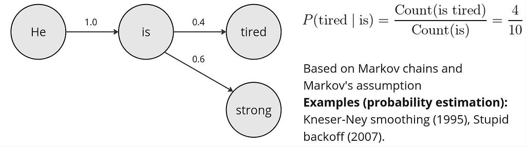
Although the foundation of n-gram LMs was created in the middle of 20th century, the widespread of such models has started in 1980s and 1990s.
The n-gram LMs make use of the Markov assumption, which claims, in the context of LMs, that in the probability of a next word in a sequence depends only on the previous word(s). Therefore, the probability approximation of a word given its context with an n-gram LM can be formalized as follows:

where t is the number of words in the whole sequence and N is the size of the context (uni-gram (1), bi-gram (2), etc.). Now, the question is how to estimate those n-gram probabilities? The simplest approach is to use n-gram counts (to be calculated on a large text corpora in an “unsupervised” way):

Obviously, the probability estimation from the equation above may appear to be naive. What if the numerator or even denominator values will be zero? This is why more advanced probability estimations include smoothing or backoff (e.g., add-k smoothing, stupid backoff, Kneser-Ney smoothing). We won’t explore those methods here, however, conceptually the probability estimation approach doesn’t change with any smoothing or backoff method. The high-level representation of an n-gram LM is shown below:
Having the counts calculated, how do we generate text from such LM? Essentially, the answer to this question applies to all LMs to be considered below. The process of selecting the next word given the probability distribution fron an LM is called sampling. Here are couple sampling strategies applicable to the n-gram LMs:
Despite smoothing and backoff, the probability estimation of the n-gram LMs is still intuitively too simple to model natural language. A game-changing approach of Yoshua Bengio et al. (2000) was very simple yet innovative: what if instead of n-gram counts we will use neural networks to estimate word probabilities? Although the paper claims that recurrent neural networks (RNNs) can be also used for this task, main content focuses on a feedforward neural network (FFNN) architecture.
The FFNN architecture proposed by Bengio is a simple multi-class classifier (the number of classes is the size of vocabulary V). The training process is based on the task of predicting a missing word w in the sequence of the context words c: P (w|c), where |c| is the context window size. The FFNN architecture proposed by Bengio et al. is shown below:
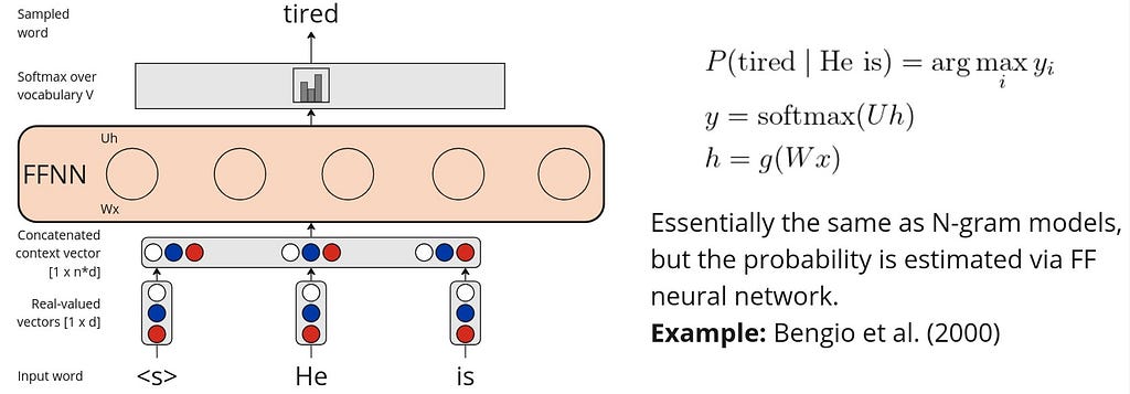
Such FFNN-based LMs can be trained on a large text corpora in an self-supervised manner (i.e., no explicitly labeled dataset is required).
What about sampling? In addition to the greedy and random strategies, there are two more that can be applied to NN-based LMs:
To this point we were working with the assumption that the probability of the next word depends only on the previous one(s). We also considered a fixed context or n-gram size to estimate the probability. What if the connections between words are also important to consider? What if we want to consider the whole sequence of preceding words to predict the next one? This can be perfectly modeled by RNNs!
Naturally, RNNs’ advantage is that they are able to capture dependencies of the whole word sequence while adding the hidden layer output from the previous step (t-1) to the input from the current step (t):
where h — hidden layer output, g(x) — activation function, U and W — weight matrices.
The RNNs are also trained following the self-supervised setting on a large text corpora to predict the next word given a sequence. The text generation is then performed via so-called autoregressive generation process, which is also called causal language modeling generation. The autoregressive generation with an RNN is demonstrated below:
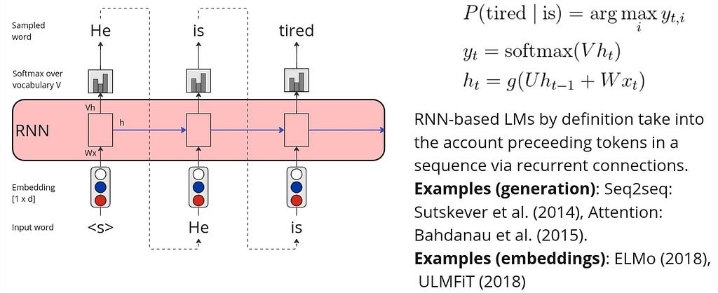
In practice, canonical RNNs are rarely used for the LM tasks. Instead, there are improved RNN architectures such as stacked and bidirectional, long short-term memory (LSTM) and its variations.
One of the most remarkable RNN architectures was proposed by Sutskever et al. (2014) — the encoder-decoder (or seq2seq) LSTM-based architecture. Instead of simple autoregressive generation, seq2seq model encodes an input sequence to an intermediate representation — context vector — and then uses autoregressive generation to decode it.
However, the initial seq2seq architecture had a major bottleneck — the encoder narrows down the whole input sequence to the only one representation — context vector. To remove this bottleneck, Bahdanau et al. (2014) introduces the attention mechanism, that (1) produces an individual context vector for every decoder hidden state (2) based on weighted encoder hidden states. Hence, the intuition behind the attention mechanism is that every input word impacts every output word and the intensity of this impact varies.
It is worth mentioning that RNN-based models are used for learning language representations. In particular, the most well known models are ELMo (2018) and ULMFiT (2018).
While considering LMs without applying them to a particular task (e.g. machine translation) there is one universal measure that may give us insights on how good is our LM is. This measure is called Perplexity.

where p — probability distribution of the words, N — is the total number of words in the sequence, wi — represents the i-th word. Since Perplexity uses the concept of entropy, the intuition behind it is how unsure a particular model about the predicted sequence. The lower the perplexity, the less uncertain the model is, and thus, the better it is at predicting the sample.
The modern state-of-the-art LMs make use of the attention mechanism, introduced in the previous paragraph, and, in particular, self-attention, which is an integral part of the transformer architecture.
The transformer LMs have a significant advantage over the RNN LMs in terms of computation efficiency due to their ability to parallelize computations. In RNNs, sequences are processed one step at a time, this makes RNNs slower, especially for long sequences. In contrast, transformer models use a self-attention mechanism that allows them to process all positions in the sequence simultaneously. Below is a high-level representation of a transformer model with an LM head.

To represent the input token, transformers add token and position embeddings together. The last hidden state of the last transformer layer is typically used to produce the next word probabilities via the LM head. The transformer LMs are pre-trained following the self-supervised paradigm. When considering the decoder or encoder-decoder models, the pre-training task is to predict the next word in a sequence, similarly to the previous LMs.
It is worth mentioning that the most advances in the language modeling since the inception of transformers (2017) are lying in the two major directions: (1) model size scaling and (2) instruction fine-tuning including reinforcement learning with human feedback.
The instruction-tuned LMs are considered as general problem-solvers. Therefore, Perplexity might not be the best quality measure since it calculates the quality of such models implicitly. The explicit way of evaluating intruction-tuned LMs is based on on instruction benchmarks,
such as Massive Multitask Language Understanding (MMLU), HumanEval for code, Mathematical Problem Solving (MATH), and others.
We considered here the evolution of language models in the context of text generation that covers at least last three decades. Despite not diving deeply into the details, it is clear how language models have been developing since the 1990s.
The n-gram language models approximated the next word probability using the n-gram counts and smoothing methods applied to it. To improve this approach, feedforward neural network architectures were proposed to approximate the word probability. While both n-gram and FFNN models considered only a fixed number of context and ignored the connections between the words in an input sentence, RNN LMs filled this gap by naturally considering connections between the words and the whole sequence of input tokens. Finally, the transformer LMs demonstrated better computation efficiency over RNNs as well as utilized self-attention mechanism for producing more contextualized representations.
Since the invention of the transformer architecture in 2017, the biggest advances in language modeling are considered to be the model size scaling and instruction fine-tuning including RLHF.
I would like to acknowledge Dan Jurafsky and James H. Martin for their Speech and Language Processing book that was the main source of inspiration for this article.
The other references are included as hyperlinks in the text.
Text me [contact (at) perevalov (dot) com] or visit my website if you want to get more knowledge on applying LLMs in real-world industrial use cases (e.g. AI Assistants, agent-based systems and many more).
A bird’s-eye view on the evolution of language models for text generation was originally published in Towards Data Science on Medium, where people are continuing the conversation by highlighting and responding to this story.
Originally appeared here:
A bird’s-eye view on the evolution of language models for text generation
Go Here to Read this Fast! A bird’s-eye view on the evolution of language models for text generation

When starting work with a new dataset, it’s always a good idea to start with some exploratory data analysis (EDA). Taking the time to understand your data before training any fancy models can help you understand the structure of the dataset, identify any obvious issues, and apply domain-specific knowledge.
You see EDA in various forms with everything from house prices to advanced applications in the data science industry. But I still haven’t seen it for the hottest new dataset: word embeddings, the basis of our best large language models. So why not try it?
In this article, we’ll apply EDA to GloVe word embeddings, using techniques like covariance matrices, clustering, PCA, and vector math. This will help us understand the structure of word embeddings, giving us a useful starting point for building more powerful models with this data. As we discover this structure, we’ll find that it’s not always what it seems, and some surprising biases are hidden in the corpus.
You will need:
To get started, download the dataset at huggingface.co/stanfordnlp/glove/resolve/main/glove.6B.zip[1]. This contains three text files, each containing a list of words along with their vector representations. We will use the 300-dimensional representations (glove.6B.300d.txt).
A quick note on where this dataset comes from: essentially, this is a list of word embeddings derived from 6 billion tokens’ worth of co-occurrence data from Wikipedia and various news sources. A useful side effect of using co-occurrence is that words that mean similar things tend to be close together. For example, since “the red bird” and “the blue bird” are both valid sentences, we might expect the vectors for “red” and “blue” to be close to each other. For more technical information, you can check the original GloVe paper[1].
To be clear, these are not word embeddings trained for the purpose of large language models. They are a fully unsupervised technique based on a large corpus. But they display a lot of similar properties to language model embeddings, and are interesting in their own right.
Each line of this text file consists of a word, followed by all 300 vector components of the associated embedding separated by spaces. We can load that in with Python. (To reduce noise and speed things up, I’m using the top 10% of the full dataset here with the //10, but you can change that if you’d like.)
import numpy as np

embeddings = {}

with open(f"glove.6B/glove.6B.300d.txt", "r") as f:
    glove_content = f.read().split('n')

for i in range(len(glove_content)//10):
    line = glove_content[i].strip().split(' ')
    if line[0] == '':
        continue
    word = line[0]
    embedding = np.array(list(map(float, line[1:])))
    embeddings[word] = embedding

print(len(embeddings))
That leaves us with 40,000 embeddings loaded in.
One natural question we might ask is: are vectors generally close to other vectors with similar meaning? And as a follow-up question, how do we quantify this?
There are two main ways we will quantify similarity between vectors: one is Euclidean distance, which is simply the natural Pythagorean theorem distance we are familiar with. The other is cosine similarity, which measures the cosine of the angle between two vectors. A vector has a cosine similarity of 1 with itself, -1 with an opposite vector, and 0 with an orthogonal vector.
Let’s implement these in NumPy:
def cos_sim(a, b):
    return np.dot(a,b)/(np.linalg.norm(a) * np.linalg.norm(b))
def euc_dist(a, b):
    return np.sum(np.square(a - b)) # no need for square root since we are just ranking distances
Now we can find all the closest vectors to a given word or embedding vector! We’ll do this in increasing order.
def get_sims(to_word=None, to_e=None, metric=cos_sim):
    # list all similarities to the word to_word, OR the embedding vector to_e
    assert (to_word is not None) ^ (to_e is not None) # find similarity to a word or a vector, not both
    sims = []
    if to_e is None:
        to_e = embeddings[to_word] # get the embedding for the word we are looking at
    for word in embeddings:
        if word == to_word:
            continue
        word_e = embeddings[word]
        sim = metric(word_e, to_e)
        sims.append((sim, word))
    sims.sort()
    return sims
Now we can write a function to display the 10 most similar words. It will be useful to include a reverse option as well, so we can display the least similar words.
def display_sims(to_word=None, to_e=None, n=10, metric=cos_sim, reverse=False, label=None):
    assert (to_word is not None) ^ (to_e is not None)
    sims = get_sims(to_word=to_word, to_e=to_e, metric=metric)
    display = lambda sim: f'{sim[1]}: {sim[0]:.5f}'
    if label is None:
        label = to_word.upper() if to_word is not None else ''
    print(label) # a heading so we know what these similarities are for
    if reverse:
        sims.reverse()
    for i, sim in enumerate(reversed(sims[-n:])):
        print(i+1, display(sim))
    return sims
Finally, we can test it!
display_sims(to_word='red')
# yellow, blue, pink, green, white, purple, black, colored, sox, bright
Looks like the Boston Red Sox made an unexpected appearance here. But other than that, this is about what we would expect.
Maybe we can try some verbs, and not just nouns and adjectives? How about a nice and kind verb like “share”?
display_sims(to_word='share')
# shares, stock, profit, percent, shared, earnings, profits, price, gain, cents
I guess “share” isn’t often used as a verb in this dataset. Oh well.
We can try some more conventional examples as well:
display_sims(to_word='cat')
# dog, cats, pet, dogs, feline, monkey, horse, pets, rabbit, leopard
display_sims(to_word='frog')
# toad, frogs, snake, monkey, squirrel, species, rodent, parrot, spider, rat
display_sims(to_word='queen')
# elizabeth, princess, king, monarch, royal, majesty, victoria, throne, lady, crown
One of the fascinating properties about word embeddings is that analogy is built in using vector math. The example from the GloVe paper is king – queen = man – woman. In other words, rearranging the equation, we expect king = man – woman + queen. Is this true?
display_sims(to_e=embeddings['man'] - embeddings['woman'] + embeddings['queen'], label='king-queen analogy')
# queen, king, ii, majesty, monarch, prince...
Not quite: the closest vector to man – woman + queen turns out to be queen (cosine similarity 0.78), followed somewhat distantly by king (cosine similarity 0.66). Inspired by this excellent 3Blue1Brown video, we might try aunt and uncle instead:
display_sims(to_e=embeddings['aunt'] - embeddings['woman'] + embeddings['man'], label='aunt-uncle analogy')
# aunt, uncle, brother, grandfather, grandmother, cousin, uncles, grandpa, dad, father
This is better (cosine similarity 0.7348 vs 0.7344), but still doesn’t work perfectly. But we can try switching to Euclidean distance. Now we need to set reverse=True, because a higher Euclidean distance is actually a lower similarity.
display_sims(to_e=embeddings['aunt'] - embeddings['woman'] + embeddings['man'], metric=euc_dist, reverse=True, label='aunt-uncle analogy')
# uncle, aunt, grandfather, brother, cousin, grandmother, newphew, dad, grandpa, cousins
Now we got it. But it seems like the analogy math might not be as perfect as we hoped, at least in the naïve way that we are doing it here.
Cosine similarity is all about the angles between vectors. But is the magnitude of a vector also important?
We can reuse our existing code by expressing magnitude as the Euclidean distance from the zero vector. Let’s see which words have the largest and smallest magnitudes:
zero_vec = np.zeros_like(embeddings['the'])
display_sims(to_e=zero_vec, metric=euc_dist, label='largest magnitude')
# republish, nonsubscribers, hushen, tael, www.star, stoxx, 202-383-7824, resend, non-families, 225-issue
display_sims(to_e=zero_vec, metric=euc_dist, reverse=True, label='smallest magnitude')
# likewise, lastly, interestingly, ironically, incidentally, moreover, conversely, furthermore, aforementioned, wherein
It doesn’t look like there’s much of a pattern to the meaning of the large magnitude vectors, but they all seem to have very specific (and sometimes confusing) meanings. On the other hand, the smallest magnitude vectors tend to be very common words that can be found in a variety of contexts.
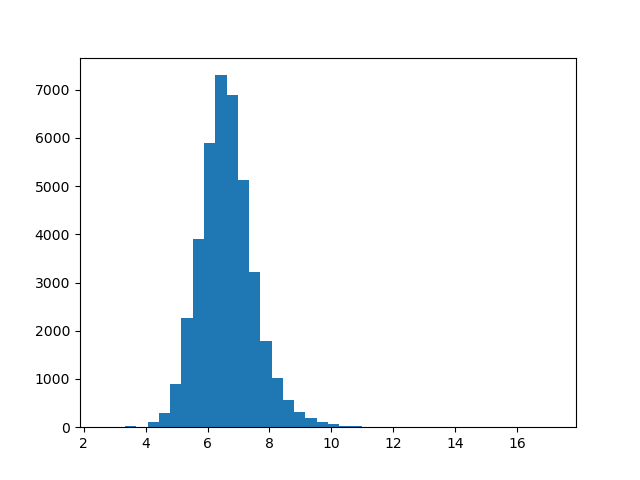
There’s a huge range between magnitudes: from about 2.6 for the smallest vector all the way to about 17 for the largest. What does this distribution look like? We can plot a histogram to get a better picture of this.
import matplotlib.pyplot as plt

def plot_magnitudes():
    words = [w for w in embeddings]
    magnitude = lambda word: np.linalg.norm(embeddings[word])
    magnitudes = list(map(magnitude, words))
    plt.hist(magnitudes, bins=40)
    plt.show()

plot_magnitudes()
This distribution looks approximately normal. If we wanted to test this further, we could use a Q-Q plot. But for our purposes right now, this is fine.
It turns out that directions and subspaces in vector embeddings can encode various kinds of concepts, often in biased ways. This paper[2] studied how this works for gender bias.
We can replicate this concept in our GloVe embeddings, too. First, let’s find the direction of the concept of “masculinity”. We can accomplish this by taking the average of differences between vectors like he and she, man and woman, and so on:
gender_pairs = [('man', 'woman'), ('men', 'women'), ('brother', 'sister'), ('he', 'she'),
                    ('uncle', 'aunt'), ('grandfather', 'grandmother'), ('boy', 'girl'),
                    ('son', 'daughter')]
masc_v = zero_vec
for pair in gender_pairs:
    masc_v += embeddings[pair[0]]
    masc_v -= embeddings[pair[1]]
Now we can find the “most masculine” and “most feminine” vectors, as judged by the embedding space.
display_sims(to_e=masc_v, metric=cos_sim, label='masculine vecs')
# brother, colonel, himself, uncle, gen., nephew, brig., brothers, son, sir
display_sims(to_e=masc_v, metric=cos_sim, reverse=True, label='feminine vecs')
# actress, herself, businesswoman, chairwoman, pregnant, she, her, sister, actresses, woman
Now, we can run an easy test to detect bias in the dataset: compute the similarity between nurse and each of man and woman. Theoretically, these should be about equal: nurse is not a gendered word. Is this true?
print("nurse - man", cos_sim(embeddings['nurse'], embeddings['man'])) # 0.24
print("nurse - woman", cos_sim(embeddings['nurse'], embeddings['woman'])) # 0.45
That’s a pretty big difference! (Remember cosine similarity runs from -1 to 1, with positive associations in the range 0 to 1.) For reference, 0.45 is also close to the cosine similarity between cat and leopard.
Let’s see if we can cluster words with similar meaning using k-means clustering. This is easy to do with the package scikit-learn. We are going to use 300 clusters, which sounds like a lot, but trust me: almost all of the clusters are so interesting, you could write an entire article just interpreting them!
from sklearn.cluster import KMeans

def get_kmeans(n=300):
    kmeans = KMeans(n_clusters=n, n_init=1)
    X = np.array([embeddings[w] for w in embeddings])
    kmeans.fit(X)
    return kmeans

def display_kmeans(kmeans):
    # print all clusters and 5 associated words for each
    words = np.array([w for w in embeddings])
    X = np.array([embeddings[w] for w in embeddings])
    y = kmeans.predict(X) # get the cluster for each word
    for cluster in range(kmeans.cluster_centers_.shape[0]):
        print(f'KMeans {cluster}')
        cluster_words = words[y == cluster] # get all words in each cluster
        for i, w in enumerate(cluster_words[:5]):
            print(i+1, w)

kmeans = get_kmeans()
display_kmeans(kmeans)
There’s a lot to look at here. We have clusters for things as diverse as New York City (manhattan, n.y., brooklyn, hudson, borough), molecular biology (protein, proteins, enzyme, beta, molecules), and Indian names (singh, ram, gandhi, kumar, rao).
But sometimes these clusters are not what they seem. Let’s write code to display all words of a cluster containing a given word, along with the nearest and farthest cluster.
def get_kmeans_cluster(kmeans, word=None, cluster=None):
    # given a word, find the cluster of that word. (or start with a cluster index.)
    # then, get all words of that cluster.
    assert (word is None) ^ (cluster is None)
    if cluster is None:
        cluster = kmeans.predict([embeddings[word]])[0]
    words = np.array([w for w in embeddings])
    X = np.array([embeddings[w] for w in embeddings])
    y = kmeans.predict(X)
    cluster_words = words[y == cluster]
    return cluster, cluster_words

def display_cluster(kmeans, word):
    cluster, cluster_words = get_kmeans_cluster(kmeans, word=word)
    # print all words in the cluster
    print(f"Full KMeans ({word}, cluster {cluster})")
    for i, w in enumerate(cluster_words):
        print(i+1, w)
    # rank all clusters (excluding this one) by Euclidean distance of their centers from this cluster's center
    distances = np.concatenate([kmeans.cluster_centers_[:cluster], kmeans.cluster_centers_[cluster+1:]], axis=0)
    distances = np.sum(np.square(distances - kmeans.cluster_centers_[cluster]), axis=1)
    nearest = np.argmin(distances, axis=0)
    _, nearest_words = get_kmeans_cluster(kmeans, cluster=nearest)
    print(f"Nearest cluster: {nearest}")
    for i, w in enumerate(nearest_words[:5]):
        print(i+1, w)
    farthest = np.argmax(distances, axis=0)
    print(f"Farthest cluster: {farthest}")
    _, farthest_words = get_kmeans_cluster(kmeans, cluster=farthest)
    for i, w in enumerate(farthest_words[:5]):
        print(i+1, w)
Now let’s try out this code.
display_cluster(kmeans, 'animal')
# species, fish, wild, dog, bear, males, birds...
display_cluster(kmeans, 'dog')
# same as 'animal'
display_cluster(kmeans, 'birds')
# same again
display_cluster(kmeans, 'bird')
# spread, bird, flu, virus, tested, humans, outbreak, infected, sars....?
You might not get exactly this result every time: the clustering algorithm is non-deterministic. But much of the time, “birds” is associated with disease words rather than animal words. It seems the original dataset tends to use the word “bird” in the context of disease vectors.
There are literally hundreds more clusters for you to explore the contents of. Some other clusters I found interesting are “Illinois” and “Genghis”.
Principal Component Analysis (PCA) is a tool we can use to find the directions in vector space associated with the most variance in our dataset. Let’s try it. Like clustering, sklearn makes this easy.
from sklearn.decomposition import PCA

def get_pca_vecs(n=10): # get the first 10 principal components
    pca = PCA()
    X = np.array([embeddings[w] for w in embeddings])
    pca.fit(X)
    principal_components = list(pca.components_[:n, :])
    return pca, principal_components

pca, pca_vecs = get_pca_vecs()
for i, vec in enumerate(pca_vecs):
    # display the words with the highest and lowest values for each principal component
    display_sims(to_e=vec, metric=cos_sim, label=f'PCA {i+1}')
    display_sims(to_e=vec, metric=cos_sim, label=f'PCA {i+1} negative', reverse=True)
Like our k-means experiment, a lot of these PCA vectors are really interesting. For example, let’s take a look at principal component 9:
    PCA 9
1 featuring: 0.38193
2 hindi: 0.37217
3 arabic: 0.36029
4 sung: 0.35130
5 che: 0.34819
6 malaysian: 0.34474
7 ka: 0.33820
8 video: 0.33549
9 bollywood: 0.33347
10 counterpart: 0.33343
    PCA 9 negative
1 suffolk: -0.31999
2 cumberland: -0.31697
3 northumberland: -0.31449
4 hampshire: -0.30857
5 missouri: -0.30771
6 calhoun: -0.30749
7 erie: -0.30345
8 massachusetts: -0.30133
9 counties: -0.29710
10 wyoming: -0.29613
It looks like positive values for component 9 are associated with Middle Eastern, South Asian and Southeast Asian terms, while negative values are associated with North American and British terms.
Another interesting one is component 3. All the positive terms are decimal numbers, apparently quite a salient feature for this model. Component 8 also shows a similar pattern.
    PCA 3
1 1.8: 0.57993
2 1.6: 0.57851
3 1.2: 0.57841
4 1.4: 0.57294
5 2.3: 0.57019
6 2.6: 0.56993
7 2.8: 0.56966
8 3.7: 0.56660
9 1.9: 0.56424
10 2.2: 0.56063
One of the main benefits of PCA is that it allows us to take a very high-dimensional dataset (300-dimensional in this case) and plot it in just two or three dimensions by projecting onto the first components. Let’s try a two-dimensional plot and see if there is any information we can gather from it. We’ll also include color-coding by cluster using k-means.
def plot_pca(pca_vecs, kmeans):
    words = [w for w in embeddings]
    x_vec = pca_vecs[0]
    y_vec = pca_vecs[1]
    X = np.array([np.dot(x_vec, embeddings[w]) for w in words])
    Y = np.array([np.dot(y_vec, embeddings[w]) for w in words])
    colors =  kmeans.predict([embeddings[w] for w in words])
    plt.scatter(X, Y, c=colors, cmap='spring') # color by cluster
    for i in np.random.choice(len(words), size=100, replace=False):
        # annotate 100 randomly selected words on the graph
        plt.annotate(words[i], (X[i], Y[i]), weight='bold')
    plt.show()

plot_pca(pca_vecs, kmeans)
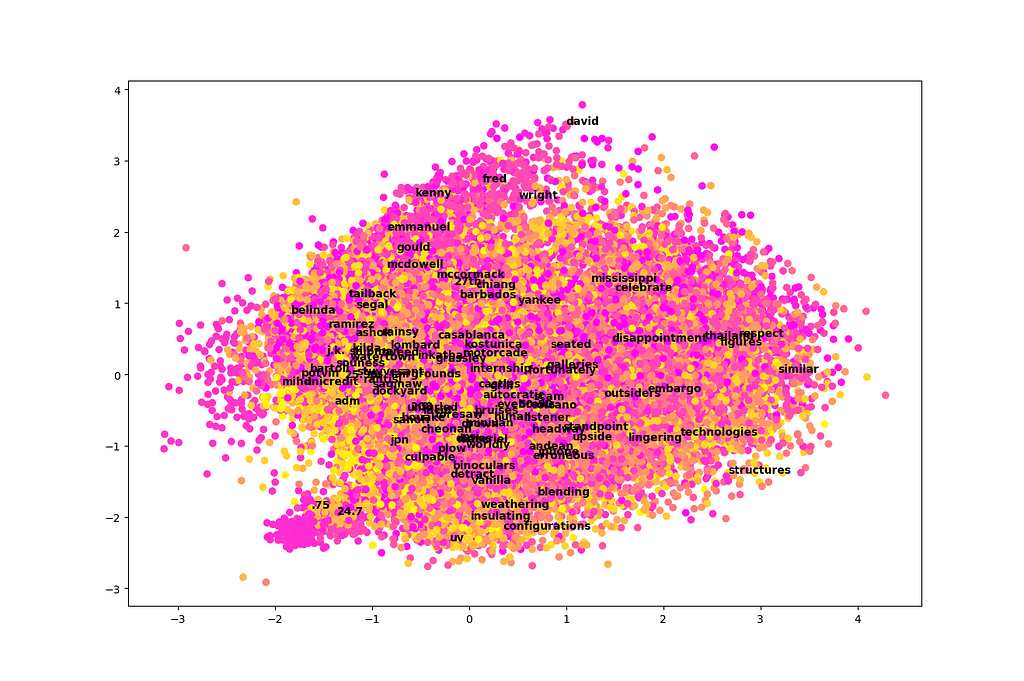
Unfortunately, this plot is a total mess! It’s difficult to learn much from it. It looks like just two dimensions in isolation are not very easy to interpret among 300 total dimensions, at least in the case of this dataset.
There are two exceptions. First, we see that names tend to cluster near the top of this graph. Second, there is a little section that sticks out like a sore thumb at the bottom left. This area appears to be associated with numbers, particularly decimal numbers.
It is often helpful to get an idea of the covariance between input features. In this case, our input features are just abstract vector directions that are difficult to interpret. Still, a covariance matrix can tell us how much of this information is actually being used. If we see high covariance, it means some dimensions are strongly correlated, and maybe we could get away with reducing the dimensionality a little bit.
def display_covariance():
    X = np.array([embeddings[w] for w in embeddings]).T # rows are variables (components), columns are observations (words)
    cov = np.cov(X)
    cov_range = np.maximum(np.max(cov), np.abs(np.min(cov))) # make sure the colorbar is balanced, with 0 in the middle
    plt.imshow(cov, cmap='bwr', interpolation='nearest', vmin=-cov_range, vmax=cov_range)
    plt.colorbar()
    plt.show()

display_covariance()
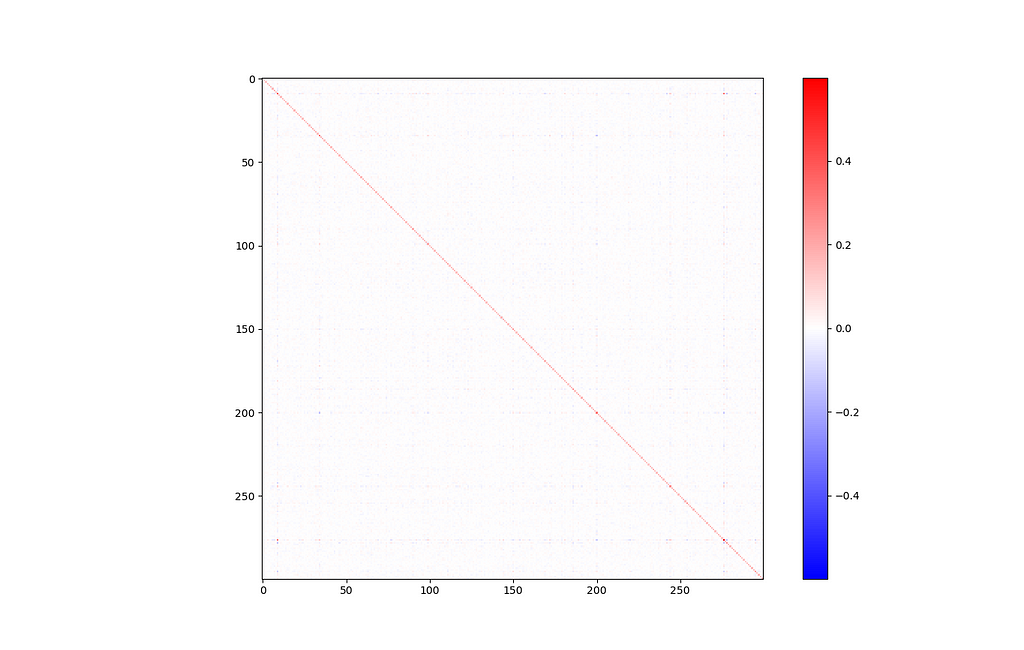
Of course, there’s a big line down the major diagonal, representing that each component is strongly correlated with itself. Other than that, this isn’t a very interesting graph. Everything looks mostly blank, which is a good sign.
If you look closely, there’s one exception: components 9 and 276 seem somewhat strongly related (covariance of 0.308).

Let’s investigate this further by printing the vectors that are most associated with components 9 and 276. This is equivalent to cosine similarity to a basis vector of all zeros, except for a one in the relevant component.
e9 = np.zeros_like(zero_vec)
e9[9] = 1.0
e276 = np.zeros_like(zero_vec)
e276[276] = 1.0
display_sims(to_e=e9, metric=cos_sim, label='e9')
# grizzlies, supersonics, notables, posey, bobcats, wannabe, hoosiers...
display_sims(to_e=e276, metric=cos_sim, label='e276')
# pehr, zetsche, steadied, 202-887-8307, bernice, goldie, edelman, kr...
These results are strange, and not very informative.
But wait: we can also have a positive covariance in these components if words with a very negative value in one tend to also be very negative in the other. Let’s try reversing the direction of similarity.
display_sims(to_e=e9, metric=cos_sim, label='e9', reverse=True)
# therefore, that, it, which, government, because, moreover, fact, thus, very
display_sims(to_e=e276, metric=cos_sim, label='e276', reverse=True)
# they, instead, those, hundreds, addition, dozens, others, dozen, only, outside
It looks like both of these components are associated with basic function words and numbers that can be found in many different contexts. This helps explain the covariance between them, at least more so than the positive case did.
In this article we applied a variety of exploratory data analysis (EDA) techniques to a 300-dimensional dataset of GloVe word embeddings. We used cosine similarity to measure the similarity between the meaning of words, clustering to group words into related groups, and principal component analysis (PCA) to identify the directions in vector space that are most important to the embedding model.
We visually observed overall minimal covariance between the input features using principal component analysis. We tried using PCA to plot all of our 300-dimensional data in just two dimensions, but this was still a little messy.
We also tested assumptions and biases in our dataset. We identified gender bias in our dataset by comparing the cosine similarity of nurse with each of man and woman. We tried using vector math to represent analogies (like “king” is to “queen” as “man” is to “woman”), with some success. By subtracting various examples of vectors referring to males and females, we were able to discover a vector direction associated with gender, and display the “most masculine” and “most feminine” vectors in the dataset.
There’s a lot more EDA you could try on a dataset of word embeddings, but I hope this was a good starting point to understand both some techniques of EDA in general and the structure of word embeddings in particular. If you want to see the full code associated with this article, plus some additional examples, you can check out my GitHub at crackalamoo/glove-embeddings-eda. Thank you for reading!
[1] J. Pennington, R. Socher and C.Manning, GloVe: Global Vectors for Word Representation (2014), Stanford NLP (Public Domain Dataset)
[2] T. Bolukbasi, K. Chang, J. Zou, V. Saligrama and A. Kalai, Man is to Computer Programmer as Woman is to Homemaker? Debiasing Word Embeddings (2016), Microsoft Research New England
All images created by the author using Matplotlib.
EDA for Word Embeddings was originally published in Towards Data Science on Medium, where people are continuing the conversation by highlighting and responding to this story.
Originally appeared here:
EDA for Word Embeddings


Have you ever been stuck in a loop where you repeatedly go over the concepts of statistical tools, memorize them, and revisit them, but the concepts still don’t stick? You know how to use formulas but feel like that just gives surface-level knowledge of the concept. I was in the same boat until I TA’d for a physics lab course 105M at UT Austin and applied statistical tools relevant to the problems we were solving. It was then that I finally understood the theory and application of the Student’s t-Test, and now it truly sticks.
Let’s start with a question.
Intuitively, the answer to this question might be NO! But let’s validate this hypothesis using prevalent statistical tests. In hypothesis testing terms :

We start by measuring the time taken by two similar balls of different colors (for instance, one black and one red) as we roll them down the ramp one by one, in multiple trials (let’s say 10 trials each).
The difference in the rolling times obtained in different trials highlights the significance of conducting multiple trials instead of one, therefore helping in providing a more reliable estimate.
It is also important to note that there can be many possible values (population) for the estimated rolling time, but we are capturing only a sample of these values with limited trials.
Next, we calculate the expected value or the best estimate of the rolling time for each ball. We assume that the time recordings from different trials form a random distribution, and the expected value is best represented by the mean or the average value of the distribution.

As mentioned earlier, we gathered limited data (sample) using just 10 trials out of all the possible values (population). Note that the calculated best estimate is from the sample distribution. However, to get a better estimate of the population mean, we calculate the standard error of the sample distribution. The standard error helps us determine the range within which our best estimate for the population is likely to fall. It is based on the variance of the distribution, which indicates how disperse the distribution is around mean.
To calculate the standard error, first find the standard deviation (square root of variance), then divide it by the square root of the number of data points.


We observe that the best estimates and the standard errors for both balls are comparable (there is an overlap between the calculated ranges), prompting us to consider that distributions are similar and therfore color may not affect the rolling time of the balls. However, how statistically significant and reliable are these findings? In essence, do these values provide sufficient evidence for us to draw conclusions about the hypothesis?
To measure the certainty about our results and present evidence in a more communicable way, we use test statistics. These statistics help us measure the probability of obtaining these results, providing a measure of certainty. For instance, we use statistics like z-statistic if the population standard deviation is known and the t-statistic if only the sample standard deviation is known, as in our experiment.
We compare our two sample distributions (groups) using a Two-Sample t-Test, which relies on the best estimates and variances of the two groups. Depending on the similarity of the variances between the two groups, we decide between using pooled variance, as in Student’s t-Test for equal variances, or Welch’s t-Test, which is for unequal variances.
Using statistical tests such as the F-test or Levene’s test, we can assess the equality of variances.
Since the calculated standard deviations (square root of variance) of both distributions are very similar, we proceed with a Student’s t-Test for equal variances. We conduct a two-tailed test to check for inequality of distributions rather than specifically looking for lesser or greater values.
We use the pooled standard deviation along with the averages obtained from our two distributions to calculate the t-score.

As we observed, the t-statistic is based on the difference of the means of the two samples. In our case, the t-statistic is very small (~-0.38), indicating that the difference between the means of the two distributions is also very small. This suggests that the recordings for the two balls are similar, hinting at the overall conclusion that color has no significant effect on the rolling time.
However, interpreting the t-statistic involves more than just observing the small difference in means, especially since we compared only two samples (limited trials) and not the entire populations. To make an informed inference, we need to determine the critical value and then compare out t-statistic with that critical value.
The critical value is determined based on the confidence interval (e.g., 95%) and the sample sizes (degrees of freedom). A 95% confidence interval (CI) means that if the experiment is repeated several times, the true mean difference will fall within 95% of the calculated intervals.
To find the critical value or critical value range in our case (since we are checking for inequality), we use the t-distribution table. For a two-tailed test with a 95% CI, we look at the 0.05 significance level, which splits into 2.5% for each tail. Given our degrees of freedom (df = 18), the critical value range is approximately -2.101 to +2.101.

Our t-statistic of -0.38 falls within the critical range for a 95% confidence interval, leading to two key inferences. Firstly, the observed difference in means between the rolling times of the red and black balls is very small, indicating that color has no effect on rolling time. Secondly, with 95% certainty, if we were to repeat this experiment multiple times, the true difference in means between the rolling times of the red and black balls would consistently fall within this range.
Therefore, our results showing a low difference between the means of recording times for the two balls are statistically significant and reliable at the 95% confidence level, suggesting no meaningful difference in rolling times based on ball color.
I am excited to have documented my understanding in the hope of assisting others who may have struggled, like me, with grasping these statistical tools. I look forward to seeing others implement these methods. Please feel free to reach out or refer to the references mentioned below for any unanswered questions.
Unless otherwise noted, all images are by the author.
References:
t-Test : From Application to Theory was originally published in Towards Data Science on Medium, where people are continuing the conversation by highlighting and responding to this story.
Originally appeared here:
t-Test : From Application to Theory
Go Here to Read this Fast! t-Test : From Application to Theory

Recently, Retrieval-Augmented Generation (or simply RAG) has become a de facto standard for building generative AI applications using large language models. RAG enhances text generation by ensuring the generative model uses the appropriate context while avoiding the time, cost, and complexity involved in fine-tuning LLMs for the same task. RAG also allows for more efficient use of external data sources and easier updates to the model’s “knowledge”.
Although AI applications based on RAG can often use more modest or smaller LLMs, they still depend on a powerful pipeline that embeds and indexes the required knowledge base, as well as on being able to efficiently retrieve and inject the relevant context to the model prompt.
In many use cases, RAG can be implemented in a few lines of code using any of the great frameworks that are widely available for the task. This post focuses on more complex and demanding pipelines, such as when the volume of the data to embed and index is relatively high, or when it needs to be updated very frequently or just very fast.
This post demonstrates how to design a Rust application that reads, chunks, embeds, and stores textual documents as vectors at blazing speed. Using HuggingFace’s Candle framework for Rust and LanceDB, it shows how to develop an end-to-end RAG indexing pipeline that can be deployed anywhere as a standalone application, and serve as a basis for a powerful pipeline, even in very demanding and isolated environments.
The main purpose of this post is to create a working example that can be applied to real-world use cases, while guiding the reader through its key design principles and building blocks. The application and its source code are available in the accompanying GitHub repository (linked below), which can be used as-is or as an example for further development.
The post is structured as follows: Section 2 explains the main design choices and relevant components at a high level. Section 3 details the main flow and component design of the pipeline. Sections 4 and 5 discuss the embedding flow and the write task, respectively. Section 6 concludes.
Our main design goal is to build an independent application that can run an end-to-end indexing pipeline without external services or server processes. Its output will be a set of data files in LanceDB’s Lance format, that can be used by frameworks such as LangChain or Llamaindex, and queried using DuckDB or any application using LanceDB API.
The application will be written in Rust and based on two major open source frameworks: we will be using the Candle ML framework to handle the machine learning task of generating document embedding with a BERT-like model, and LanceDB as our vector db and retrieval API.

It might be useful to say a few words about these components and design choices before we get into the details and structure of our application.
Rust is an obvious choice where performance matters. Although Rust has a steep learning curve, its performance is comparable to native programming languages, such as C or C++, and it provides a rich library of abstractions and extensions that make challenges such as memory safety and concurrency easier to handle than in native languages. Together with Hugging Face’s Candle framework, using LLMs and embedding models in native Rust has never been smoother.
LanceDB, however, is a relatively new addition to the RAG stack. It is a lean and embedded vector database (like SQLite) that can be integrated directly into applications without a separate server process. It can therefore be deployed anywhere and embedded in any application, while offering blazing fast search and retrieval capabilities, even over data that lies in remote object storage, such as AWS S3. As mentioned earlier, it also offers integrations with LangChain and LlamaIndex, and can be queried using DuckDB, which makes it an even more attractive choice of vector storage.
In a simple test conducted on my 10-core Mac (without GPU acceleration), the application processed, embedded, and stored approximately 25,000 words (equivalent to 17 text files, each containing around 1,500 words) in just one second. This impressive throughput demonstrates Rust’s efficiency in handling both CPU-intensive tasks and I/O operations, as well as LanceDB’s robust storage capabilities. The combination proves exceptional for addressing large-scale data embedding and indexing challenges.

Our RAG application and indexing pipeline consists of 2 main tasks: A read and embed task, which reads text from a text file and embed it in a BERT vector using an embedding model, and a write task, which writes the embedding to the vector store. Because the former is mostly CPU bound (embedding a single document may require multiple ML model operations), and the latter is mostly waiting on IO, we will separate these tasks to different threads. Additionally, in order to avoid contention and back-pressure, we will also connect the 2 tasks with an MPSC channel. In Rust (and other languages), sync channels basically enable thread-safe and asynchronous communication between threads, thereby allowing it to better scale.
The main flow is simple: each time an embedding task finishes embedding a text document into a vector, it will “send” the vector and its ID (filename) to the channel and then immediately continue to the next document (see the reader side in the diagram below). At the same time, the write task continuously reads from the channel, chunk the vectors in memory and flush it when it reaches a certain size. Because I expect the embedding task to be more time and resource consuming, we will parallelize it to use as many cores that are available on the machine where the application is running. In other words, we will have multiple embedding tasks that read and embed documents, and a single writer that chunk and write the vectors to the database.
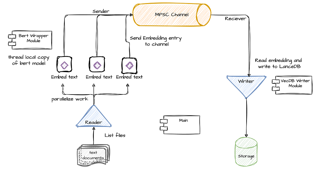
Lets start with the main() function, which will make the flow of the pipeline clearer.
As you can see above, after setting up the channel (line 3), we initialize the write task thread, which starts polling messages from the channel until the channel is closed. Next, it lists the files in the relevant directory and stores them in a collection of strings. Finally, it uses Rayon to iterate the list of files (with the par_iter function) in order to parallelize its processing using the process_text_file() function. Using Rayon will allow us to scale the parallel processing of the documents as much as we can get out from the machine we are working on.
As you can see, the flow is relatively straightforward, primarily orchestrating two main tasks: document processing and vector storage. This design allows for efficient parallelization and scalability. The document processing task uses Rayon to parallelize file handling, maximizing the use of available system resources. Simultaneously, the storage task manages the efficient writing of embedded vectors to LanceDB. This separation of concerns not only simplifies the overall architecture but also allows for independent optimization of each task. In the sections that follow, we’ll delve into both of these functions in greater detail.
As we saw earlier, on one end of our pipeline we have multiple embedding tasks, each running on its own thread. Rayon’s iter_par function effectively iterates through the file list, invoking the process_text_file() function for each file while maximizing parallelization.
Lets start with the function itself:
The function starts by first getting its own reference to the embedding model (that’s the trickiest part of the function and I will address this shortly). Next, it reads the file into chunks of a certain size, and call the embedding function (which basically calls the model itself) over each chunk. The embedding function returns a vector of type Vec<f32> (and size [1, 384]), which is the outcome of embedding and normalizing each chunk, and afterwards taking the mean of all text chunks together. When this part is done, then the vector is sent to the channel, together with the file name, for persistence, query, and retrieval by the writing task.
As you can see most of the work here is done by the BertModelWrapper struct (to which we get a reference in line 2). The main purpose of BertModelWrapper is to encapsulate the model’s loading and embedding operations, and provide the embed_sentences() function, which essentially embeds a group of text chunks and calculates their mean to produce a single vector.
To achieve that, BertModelWrapper uses HuggingFace’s Candle framework. Candle is a native Rust library with an API similar to PyTorch that is used to load and manage ML models, and has a very convenient support in models hosted in HuggingFace. There are other ways in Rust to generate text embedding though Candle seems like the “cleanest” in terms of its being native and not dependent on other libraries.
While a detailed explanation of the wrapper’s code is beyond our current scope, I’ve written more about this in a separate post (linked here) and its source code is available in the accompanying GitHub repository. You can also find excellent examples in Candle’s examples repository.
However, there is one important part that should be explained about the way we are using the embedding model as this will be a challenge anywhere we will need to work with models in scale within our process. In short, we want our model to be used by multiple threads running embedding tasks yet due to its loading times, we don’t want to create the model each time it is needed. In other words, we want to ensure that each thread will create exactly one instance of the model, which it will own and reuse to generate embedding over multiple embedding tasks.
Due to Rust’s well-known constraints these requirements are not very easy to implement. Feel free to skip this part (and just use the code) if you don’t want to get too much into the details of how this is implement in Rust.
Let’s start with the function that gets a model reference:
Our model is wrapped in a few layers in order to enable the functionality detailed above. First, it is wrapped in a thread_local clause which means that each thread will have its own lazy copy of this variable — i.e., all threads can access BERT_MODEL, but the initialization code which is invoked when with() is first called (line 18), will only be executed lazily and once per thread so that each thread will have a valid reference that is initialized once. The second layer is a reference counting type — Rc, which simply makes it easier to create references of the model without dealing with lifetimes. Each time we call clone() on it, we get a reference that is automatically released when it goes out of scope.
The last layer is essentially the serving function get_model_reference(), which simply calls the with() function that provides access to the thread local area in memory holding the initialized model. The call to clone() will give us a thread local reference to the model, and if it was not initialized yet then the init code will be executed first.
Now that we learned how to run multiple embedding tasks, executed in parallel, and writing vectors to the channel, we can move on to the other part of the pipeline — the writer task.

The writing task is somewhat simpler and mainly serve as an interface that encapsulates LanceDB’s writing functions. Recall that LanceDB is an embedded database, which means it’s a query engine as a library that reads and writes data that can reside on remote storage, such as AWS S3, and it does not own the data . This makes it especially convenient for use cases in which we have to process large-scale data with low latency without managing a separate database server.
LanceDB’s Rust API uses Arrow for schema definition and for representing data (its Python API might be more convenient for some). For example, this is how we define our schema in Arrow format:
As you can see, our current schema consists of two fields: a “filename” field, which will hold the actual file location and will serve as our key, and a “vector” field that holds the actual document vector. In LanceDB, vectors are represented using a FixedSizeList Arrow type (which represents an array), while each item in the vector will be of type Float32. (The length of the vector, set last, will be 384.)
Connecting to LanceDB is straightforward, requiring only a storage location, which can be either a local storage path or an S3 URI. However, appending data to LanceDB using Rust and Arrow data structures is less developer-friendly. Similar to other Arrow-based columnar data structures, instead of appending a list of rows, each column is represented as a list of values. For example, if you have 10 rows to insert with 2 columns, you need to append 2 lists, one for each column, with 10 values in each.
Here is an example:
The core of the code is on line 2, where we build an Arrow RecordBatch from our schema and column data. In this case, we have two columns — filename and vector. We initialize our record batch with two lists: key_array, a list of strings representing filenames, and vectors_array, a list of arrays containing the vectors. From there, Rust’s strict type safety requires us to perform extensive wrapping of this data before we can pass it to the add() function of the table reference obtained on line 1.
To simplify this logic, we create a storage module that encapsulates these operations and provides a simple interface based on a connect(uri) function and an add_vector function. Below is the full code of the writing task thread that reads embedding from the channel, chunks them, and writes when it reaches a certain size:
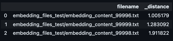
Once data is written, LanceDB data files can be accessed from any process. Here is an example for how we can use the same data for a vector similarity search using LanceDB Python API that can be executed from a completely different process.
uri = "data/vecdb1"
db = lancedb.connect(uri)
tbl = db.open_table("vectors_table_1")
# the vector we are finding similarities for
encoded_vec = get_some vector()
# perform a similiarity search for top 3 vectors
tbl.search(embeddings[0])
    .select(["filename"])
    .limit(3).to_pandas()
In this post, we’ve seen a working example of a high-performance RAG pipeline using Rust, HuggingFace’s Candle framework, and LanceDB. We saw how we can leverage Rust’s performance capabilities together with Candle in order efficiently read and embed multiple text files in parallel. We have also seen how we can use sync channels to concurrently run the embedding tasks together with a writing flow without dealing with complex locking and sync mechanisms. Finally, we learned how we can take advantage of LanceDB’s efficient storage using Rust, and generate vector storage that can be integrated with multiple AI frameworks and query libraries.
I believe that the approach outlined here can serves as a powerful basis for building scalable, production-ready RAG indexing pipeline. Whether you’re dealing with large volumes of data, requiring frequent knowledge base updates, or operating in resource-constrained environments, the building blocks and design principles discussed here can be adapted to meet your specific needs. As the field of AI continues to evolve, the ability to efficiently process and retrieve relevant information will remain crucial. By combining the right tools and thoughtful design, as demonstrated in this post, developers can create RAG pipelines that not only meet current demands but are also well-positioned to tackle future challenges in AI-powered information retrieval and generation.
Notes and Links
Scale Up Your RAG: A Rust-Powered Indexing Pipeline with LanceDB and Candle was originally published in Towards Data Science on Medium, where people are continuing the conversation by highlighting and responding to this story.
Originally appeared here:
Scale Up Your RAG: A Rust-Powered Indexing Pipeline with LanceDB and Candle
Create an AI squad to automate literally anything on your laptop without GPU
Originally appeared here:
GenAI with Python: LLM vs Agents


How data professionals can increase the impact of their strongest asset
Originally appeared here:
Make Metrics Matter

Originally appeared here:
Using Agents for Amazon Bedrock to interactively generate infrastructure as code

Originally appeared here:
Improve RAG accuracy with fine-tuned embedding models on Amazon SageMaker
Go Here to Read this Fast! Improve RAG accuracy with fine-tuned embedding models on Amazon SageMaker