In JavaScript and other languages, we call a surprising or inconsistent behavior a “Wat!” [that is, a “What!?”]. For example, in JavaScript, an empty array plus an empty array produces an empty string, [] + [] === “”. Wat!
At the other extreme, a language sometimes behaves with surprising consistency. I’m calling that a “Wat Not”.
Rust is generally (much) more consistent than JavaScript. Some Rust-related formats, however, offer surprises. Specifically, this article looks at nine wats and wat nots in Cargo.toml.
Recall that Cargo.toml is the manifest file that defines your Rust project’s configuration and dependencies. Its format, TOML (Tom’s Obvious, Minimal Language), represents nested key/value pairs and/or arrays. JSON and YAML are similar formats. Like YAML, but unlike JSON, Tom designed TOML for easy reading and writing by humans.
This journey of nine wats and wat nots will not be as entertaining as JavaScript’s quirks (thank goodness). However, if you’ve ever found Cargo.toml’s format confusing, I hope this article will help you feel better about yourself. Also, and most importantly, when you learn the nine wats and wat nots, I hope you will be able to write your Cargo.toml more easily and effectively.
This article is not about “fixing” Cargo.toml. The file format is great at its main purpose: specifying the configuration and dependencies of a Rust project. Instead, the article is about understanding the format and its quirks.
Wat 1: Dependencies vs. Profile Section Names
You probably know how to add a [dependencies] section to your Cargo.toml. Such a section specifies release dependencies, for example:
[dependencies]
serde = "1.0"
Along the same lines, you can specify development dependencies with a [dev-dependencies] section and build dependencies with a [build-dependencies] section.
You may also need to set compiler options, for example, an optimization level and whether to include debugging information. You do that with profile sections for release, development, and build. Can you guess the names of these three sections? Is it [profile], [dev-profile] and [build-profile]?
No! It’s [profile.release], [profile.dev], and [profile.build]. Wat?
Would [dev-profile] be better than [profile.dev]? Would [dependencies.dev] be better than [dev-dependencies]?
I personally prefer the names with dots. (In “Wat Not 9”, we’ll see the power of dots.) I am, however, willing to just remember the dependences work one way and profiles work another.
Wat 2: Dependency Inheritance
You might argue that dots are fine for profiles, but hyphens are better for dependencies because [dev-dependencies] inherits from [dependencies]. In other words, the dependencies in [dependencies] are also available in [dev-dependencies]. So, does this mean that [build-dependencies] inherits from [dependencies]?
No! [build-dependencies] does not inherit from [dependencies]. Wat?
I find this Cargo.toml behavior convenient but confusing.
Wat 3: Default Keys
You likely know that instead of this:
[dependencies]
serde = { version = "1.0" }
you can write this:
[dependencies]
serde = "1.0"
What’s the principle here? How in general TOML do you designate one key as the default key?
You can’t! General TOML has no default keys. Wat?
Cargo TOML does special processing on the version key in the [dependencies] section. This is a Cargo-specific feature, not a general TOML feature. As far as I know, Cargo TOML offers no other default keys.
Wat 4: Sub-Features
With Cargo.toml [features] you can create versions of your project that differ in their dependences. Those dependences may themselves differ in their features, which we’ll call sub-features.
Here we create two versions of our project. The default version depends on getrandom with default features. The wasm version depends on getrandom with the js sub-feature:
[features]
default = []
wasm = ["getrandom-js"]

[dependencies]
rand = { version = "0.8" }
getrandom = { version = "0.2", optional = true }

[dependencies.getrandom-js]
package = "getrandom"
version = "0.2"
optional = true
features = ["js"]
In this example, wasm is a feature of our project that depends on dependency alias getrandom-rs which represents the version of the getrandom crate with the js sub-feature.
So, how can we give this same specification while avoiding the wordy [dependencies.getrandom-js] section?
In [features], replace getrandom-js” with “getrandom/js”. We can just write:
[features]
default = []
wasm = ["getrandom/js"]

[dependencies]
rand = { version = "0.8" }
getrandom = { version = "0.2", optional = true }
Wat!
In general, in Cargo.toml, a feature specification such as wasm = [“getrandom/js”] can list
other features
dependency aliases
dependencies
one or more dependency “slash” a sub-feature
This is not standard TOML. Rather, it is a Cargo.toml-specific shorthand.
Bonus: Guess how you’d use the shorthand to say that your wasm feature should include getrandom with two sub-features: js and test-in-browser?
We’ve seen how to specify dependencies for various features:
[features]
default = []
wasm = ["getrandom/js"]
How would you guess we specify dependences for various targets (e.g. a version of Linux, Windows, etc.)?
We prefix [dependences] with target.TARGET_EXPRESSION, for example:
[target.x86_64-pc-windows-msvc.dependencies]
winapi = { version = "0.3.9", features = ["winuser"] }
Which, by the rules of general TOML means we can also say:
[target]
x86_64-pc-windows-msvc.dependencies={winapi = { version = "0.3.9", features = ["winuser"] }}
Wat!
I find this prefix syntax strange, but I can’t suggest a better alternative. I do, however, wonder why features couldn’t have been handle the same way:
# not allowed
[feature.wasm.dependencies]
getrandom = { version = "0.2", features=["js"]}
Wat Not 6: Target cfg Expressions
This is our first “Wat Not”, that is, it is something that surprised me with its consistency.
Instead of a concrete target such as x86_64-pc-windows-msvc, you may instead use a cfg expression in single quotes. For example,
The only parts of the cfg mini-language not supported are (I think) that you can’t set a value with the –cfg command line argument. Also, some cfg values such as test don’t make sense.
Wat 7: Profiles for Targets
Recall from Wat 1 that you set compiler options with [profile.release], [profile.dev], and [profile.build]. For example:
[profile.dev]
opt-level = 0
Guess how you set compiler options for a specific target, such as Windows? Is it this?
[target.'cfg(windows)'.profile.dev]
opt-level = 0
No. Instead, you create a new file named .cargo/config.toml and add this:
In general, Cargo.toml only supports target.TARGET_EXPRESSION as the prefix of dependency section. You may not prefix a profile section. In .cargo/config.toml, however, you may have [target.TARGET_EXPRESSION] sections. In those sections, you may set environment variables that set compiler options.
Wat Not 8: TOML Lists
Cargo.toml supports two syntaxes for lists:
Inline Array
Table Array
This example uses both:
[package] name = "cargo-wat" version = "0.1.0" edition = "2021"
[dependencies] rand = { version = "0.8" } # Inline array 'features' getrandom = { version = "0.2", features = ["std", "test-in-browser"] }
[package] name = "cargo-wat" version = "0.1.0" edition = "2021"
[dependencies] rand = { version = "0.8" } # Inline array 'features' getrandom = { version = "0.2", features = ["std", "test-in-browser"] }
Can we change the inline array of features into a table array?
No. Inline arrays of simple values (here, strings) cannot be represented as table arrays. However, I consider this a “wat not”, not a “wat!” because this is a limitation of general TOML, not just of Cargo.toml.
Aside: YAML format, like TOML format, offers two list syntaxes. However, both of YAMLs two syntaxes work with simple values.
Wat Not 9: TOML Inlining, Sections, and Dots
Here is a typical Cargo.toml. It mixes section syntax, such as [dependences] with inline syntax such as getrandom = {version = “0.2”, features = [“std”, “test-in-browser”]}.
[package]
name = "cargo-wat"
version = "0.1.0"
edition = "2021"

[dependencies]
rand = "0.8"
getrandom = { version = "0.2", features = ["std", "test-in-browser"] }

[target.x86_64-pc-windows-msvc.dependencies]
winapi = { version = "0.3.9", features = ["winuser"] }

[[bin]]
name = "example"
path = "src/bin/example.rs"

[[bin]]
name = "another"
path = "src/bin/another.rs"
Can we re-write it to be 100% inline? Yes.
package = { name = "cargo-wat", version = "0.1.0", edition = "2021" }
dependencies = { rand = "0.8", getrandom = { version = "0.2", features = [ "std", "test-in-browser", ] } }
bins = [ { name = "example", path = "src/bin/example.rs" }, { name = "another", path = "src/bin/another.rs" }, ]
We can also re-write it with maximum sections:
[package]
name = "cargo-wat"
version = "0.1.0"
edition = "2021"

[dependencies.rand]
version = "0.8"

[dependencies.getrandom]
version = "0.2"
features = ["std", "test-in-browser"]


[target.x86_64-pc-windows-msvc.dependencies.winapi]
version = "0.3.9"
features = ["winuser"]

[[bin]]
name = "example"
path = "src/bin/example.rs"

[[bin]]
name = "another"
path = "src/bin/another.rs"
Finally, let’s talk about dots. In TOML, dots are used to separate keys in nested tables. For example, a.b.c is a key c in a table b in a table a. Can we re-write our example with “lots of dots”? Yes:
I appreciate TOML’s flexibility with respect to sections, inlining, and dots. I count that flexibility as a “wat not”. You may find all the choices it offers confusing. I, however, like that Cargo.toml lets us use TOML’s full power.
Conclusion
Cargo.toml is an essential tool in the Rust ecosystem, offering a balance of simplicity and flexibility that caters to both beginners and seasoned developers. Through the nine wats and wat nots we’ve explored, we’ve seen how this configuration file can sometimes surprise with its idiosyncrasies and yet impress with its consistency and power.
Understanding these quirks can save you from potential frustrations and enable you to leverage Cargo.toml to its fullest. From managing dependencies and profiles to handling target-specific configurations and features, the insights gained here will help you write more efficient and effective Cargo.toml files.
In essence, while Cargo.toml may have its peculiarities, these characteristics are often rooted in practical design choices that prioritize functionality and readability. Embrace these quirks, and you’ll find that Cargo.toml not only meets your project’s needs but also enhances your Rust development experience.
Please follow Carl on Medium. I write on scientific programming in Rust and Python, machine learning, and statistics. I tend to write about one article per month.
Demystifying the compression of large language models
As their name suggests, Large Language Models (LLMs) are often too large to run on consumer hardware. These models may exceed billions of parameters and generally need GPUs with large amounts of VRAM to speed up inference.
As such, more and more research has been focused on making these models smaller through improved training, adapters, etc. One major technique in this field is called quantization.
In this post, I will introduce the field of quantization in the context of language modeling and explore concepts one by one to develop an intuition about the field. We will explore various methodologies, use cases, and the principles behind quantization.
As a visual guide, expect many visualizations to develop an intuition about quantization!
Part 1: The “Problem“ with LLMs
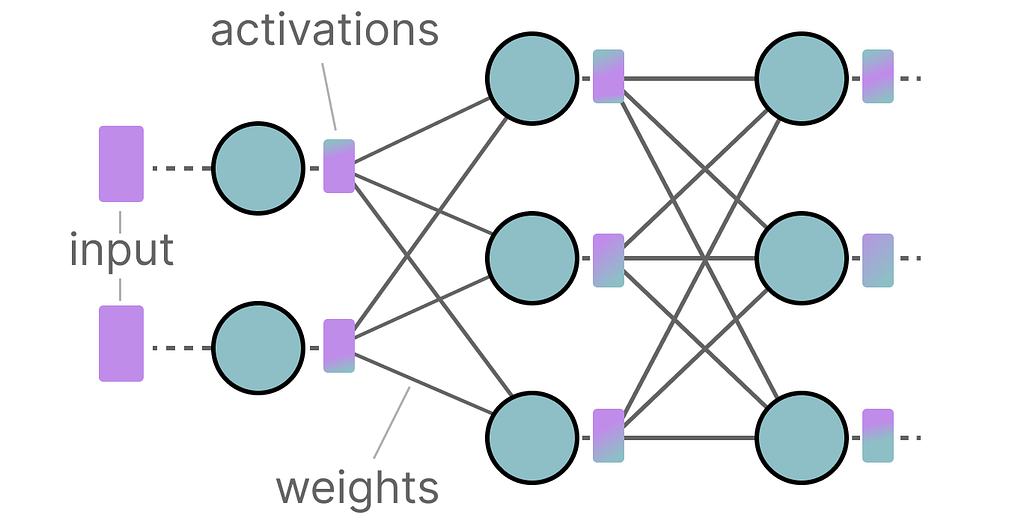
LLMs get their name due to the number of parameters they contain. Nowadays, these models typically have billions of parameters (mostly weights) which can be quite expensive to store.
During inference, activations are created as a product of the input and the weights, which similarly can be quite large.
As a result, we would like to represent billions of values as efficiently as possible, minimizing the amount of space we need to store a given value.
Let’s start from the beginning and explore how numerical values are represented in the first place before optimizing them.
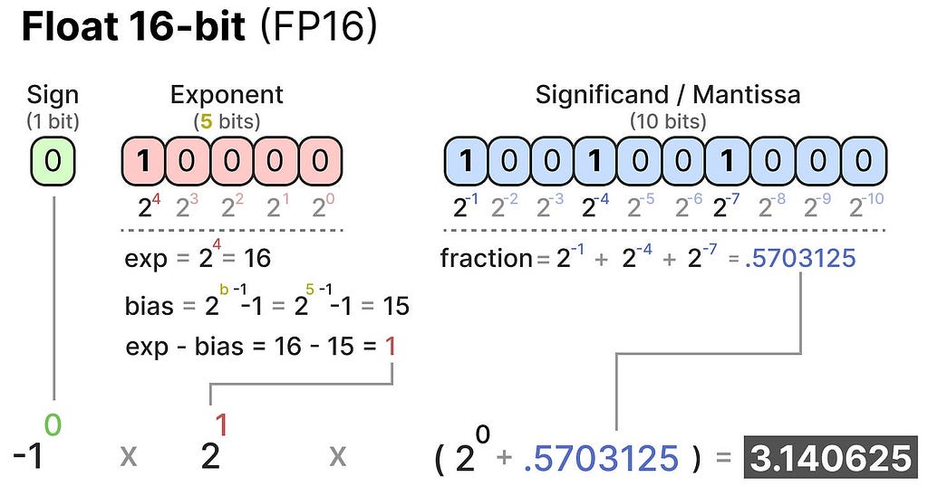
How to Represent Numerical Values
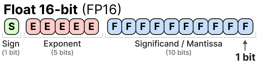
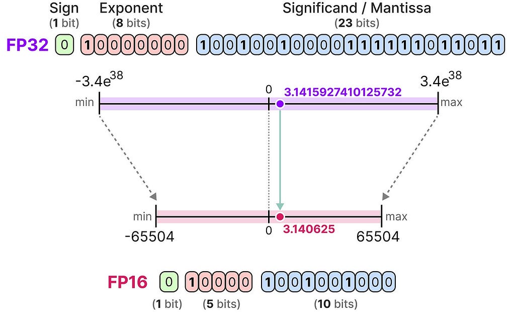
A given value is often represented as a floating point number (or floats in computer science): a positive or negative number with a decimal point.
These values are represented by “bits”, or binary digits. The IEEE-754 standard describes how bits can represent one of three functions to represent the value: the sign, exponent, or fraction (or mantissa).
Together, these three aspects can be used to calculate a value given a certain set of bit values:
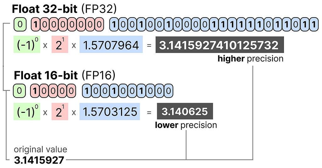
The more bits we use to represent a value, the more precise it generally is:
Memory Constraints
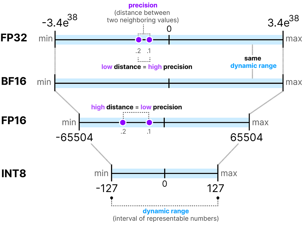
The more bits we have available, the larger the range of values that can be represented.
The interval of representable numbers a given representation can take is called the dynamic range whereas the distance between two neighboring values is called precision.
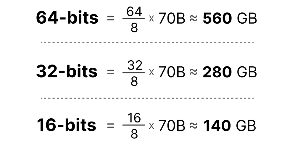
A nifty feature of these bits is that we can calculate how much memory your device needs to store a given value. Since there are 8 bits in a byte of memory, we can create a basic formula for most forms of floating point representation.
NOTE: In practice, more things relate to the amount of (V)RAM you need during inference, like the context size and architecture.
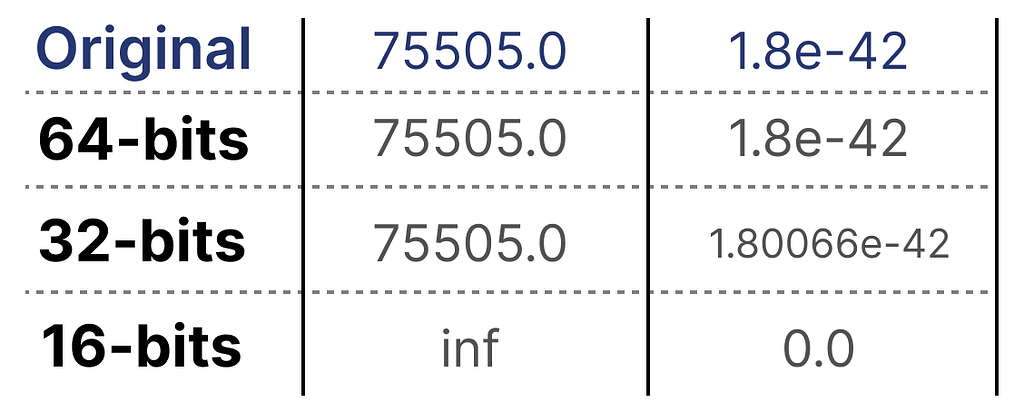
Now let’s assume that we have a model with 70 billion parameters. Most models are natively represented with float 32-bit (often called full-precision), which would require 280GB of memory just to load the model.
As such, it is very compelling to minimize the number of bits to represent the parameters of your model (as well as during training!). However, as the precision decreases the accuracy of the models generally does as well.
We want to reduce the number of bits representing values while maintaining accuracy… This is where quantization comes in!
Part 2: Introduction to Quantization
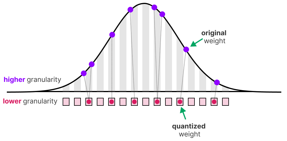
Quantization aims to reduce the precision of a model’s parameter from higher bit-widths (like 32-bit floating point) to lower bit-widths (like 8-bit integers).
There is often some loss of precision (granularity) when reducing the number of bits to represent the original parameters.
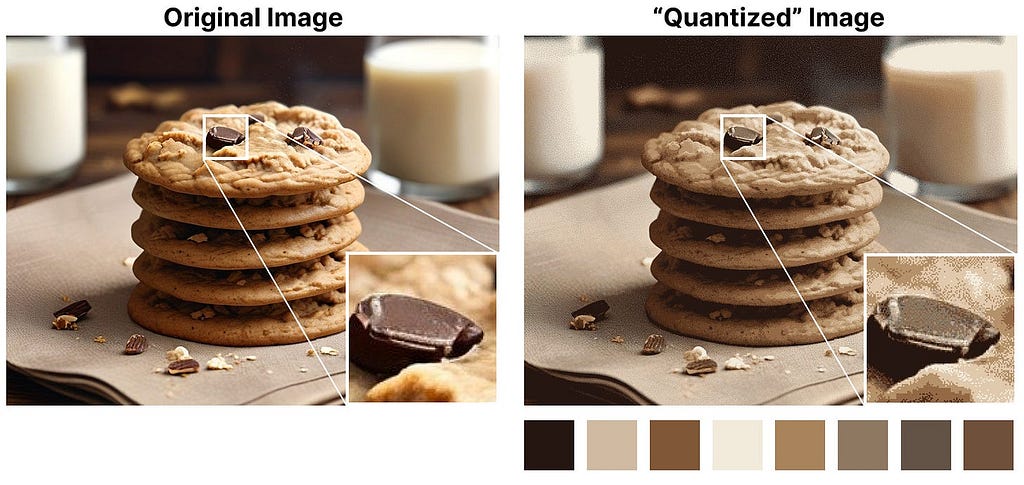
To illustrate this effect, we can take any image and use only 8 colors to represent it:
Notice how the zoomed-in part seems more “grainy” than the original since we can use fewer colors to represent it.
The main goal of quantization is to reduce the number of bits (colors) needed to represent the original parameters while preserving the precision of the original parameters as best as possible.
Common Data Types
First, let’s look at common data types and the impact of using them rather than 32-bit (called full-precision or FP32) representations.
FP16
Let’s look at an example of going from 32-bit to 16-bit (called half precision or FP16) floating point:
Notice how the range of values FP16 can take is quite a bit smaller than FP32.
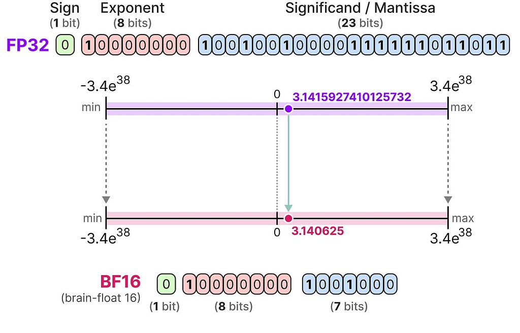
BF16
To get a similar range of values as the original FP32, bfloat 16 was introduced as a type of “truncated FP32”:
BF16 uses the same amount of bits as FP16 but can take a wider range of values and is often used in deep learning applications.
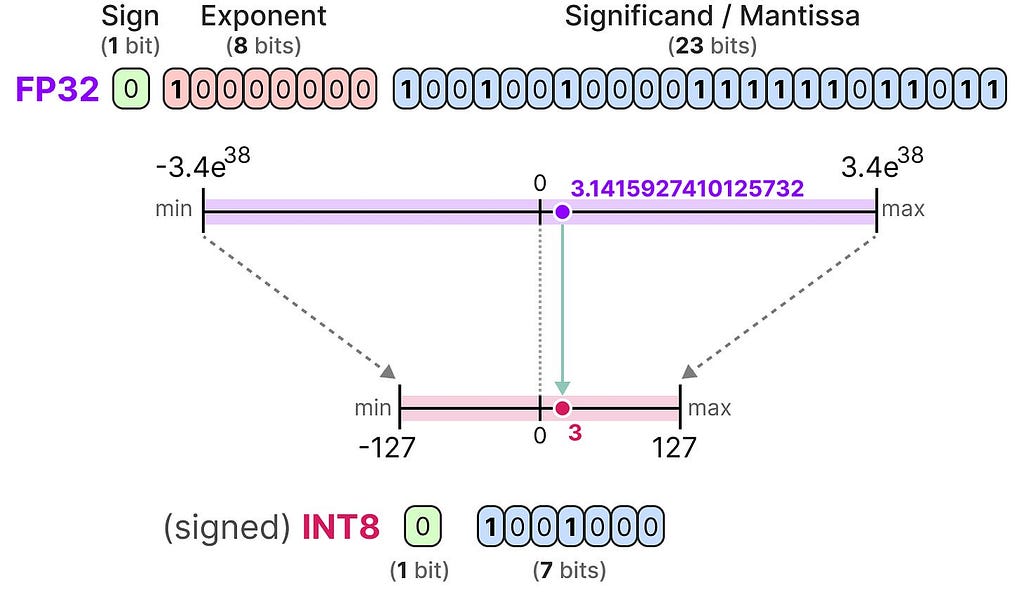
INT8
When we reduce the number of bits even further, we approach the realm of integer-based representations rather than floating-point representations. To illustrate, going FP32 to INT8, which has only 8 bits, results in a fourth of the original number of bits:
Depending on the hardware, integer-based calculations might be faster than floating-point calculations but this isn’t always the case. However, computations are generally faster when using fewer bits.
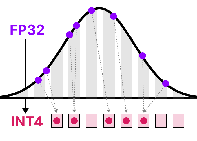
For each reduction in bits, a mapping is performed to “squeeze” the initial FP32 representations into lower bits.
In practice, we do not need to map the entire FP32 range [-3.4e38, 3.4e38] into INT8. We merely need to find a way to map the range of our data (the model’s parameters) into IN8.
Common squeezing/mapping methods are symmetric and asymmetric quantization and are forms of linear mapping.
Let’s explore these methods to quantize from FP32 to INT8.
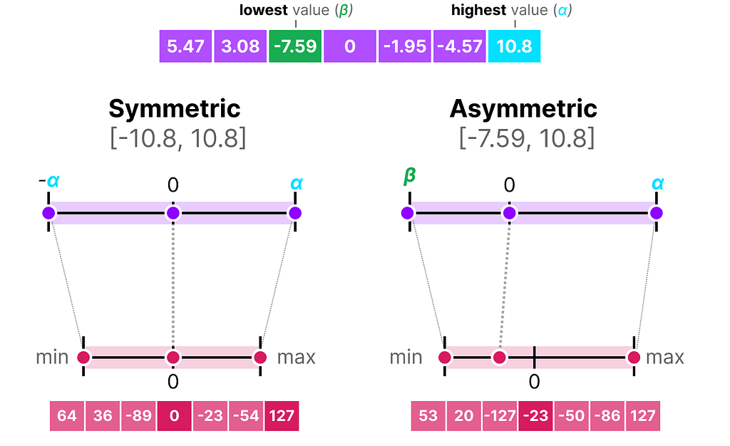
Symmetric Quantization
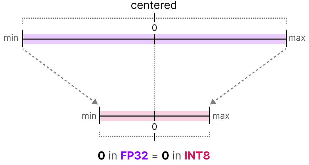
In symmetric quantization, the range of the original floating-point values is mapped to a symmetric range around zero in the quantized space. In the previous examples, notice how the ranges before and after quantization remain centered around zero.
This means that the quantized value for zero in the floating-point space is exactly zero in the quantized space.
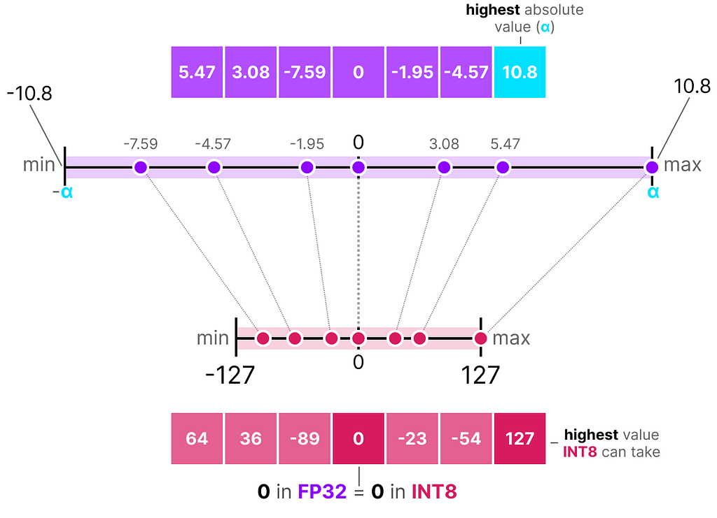
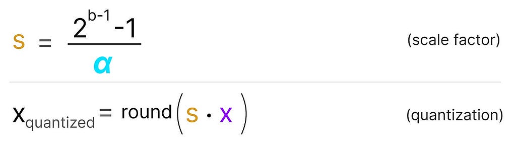
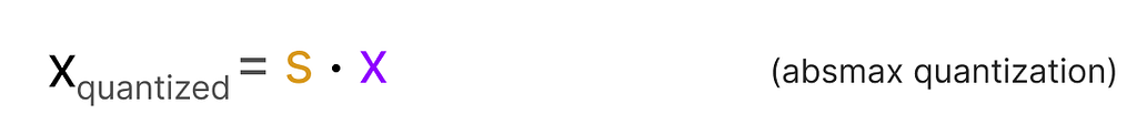
A nice example of a form of symmetric quantization is called absolute maximum (absmax) quantization.
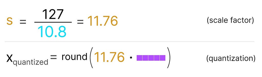
Given a list of values, we take the highest absolute value (α) as the range to perform the linear mapping.
Note the [-127, 127] range of values represents the restricted range. The unrestricted range is [-128, 127] and depends on the quantization method.
Since it is a linear mapping centered around zero, the formula is straightforward.
We first calculate a scale factor (s) using:
b is the number of bytes that we want to quantize to (8),
αis the highest absolute value,
Then, we use the s to quantize the input x:
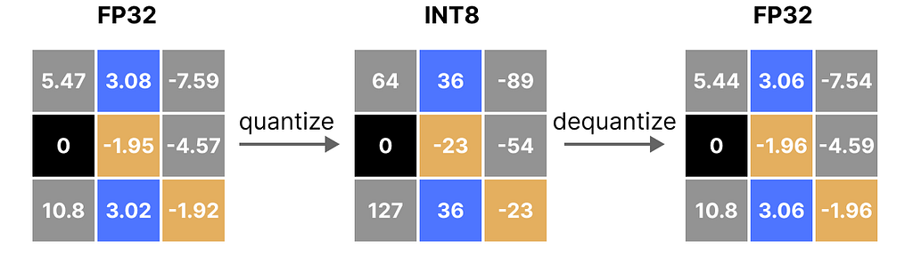
Filling in the values would then give us the following:
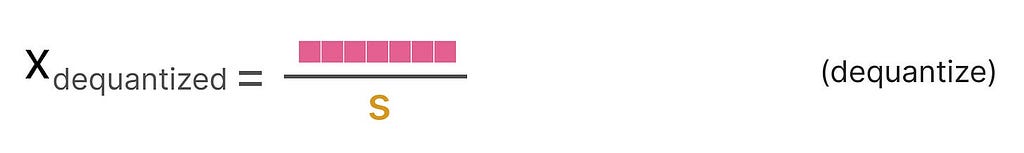
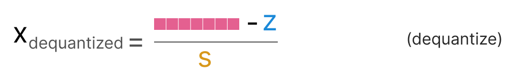
To retrieve the original FP32 values, we can use the previously calculated scaling factor (s) to dequantize the quantized values.
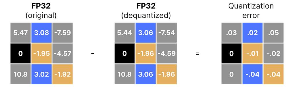
Applying the quantization and then dequantization process to retrieve the original looks as follows:
You can see certain values, such as 3.08 and 3.02 being assigned to the INT8, namely 36. When you dequantize the values to return to FP32, they lose some precision and are not distinguishable anymore.
This is often referred to as the quantization error which we can calculate by finding the difference between the original and dequantized values.
Generally, the lower the number of bits, the more quantization error we tend to have.
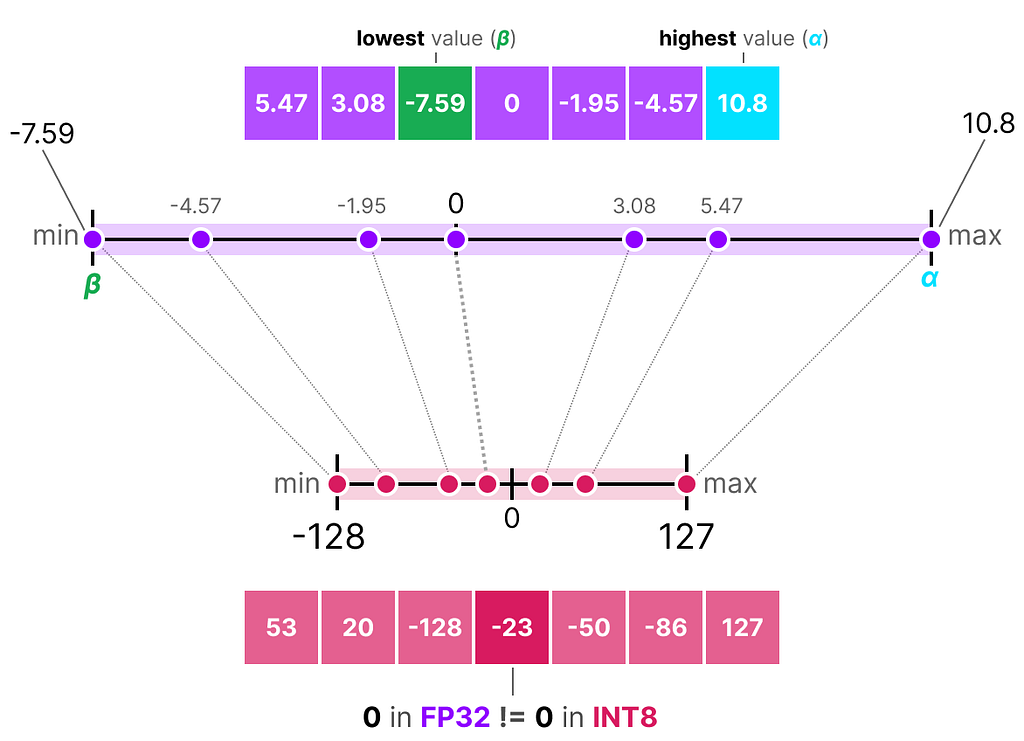
Asymmetric Quantization
Asymmetric quantization, in contrast, is not symmetric around zero. Instead, it maps the minimum (β) and maximum (α) values from the float range to the minimum and maximum values of the quantized range.
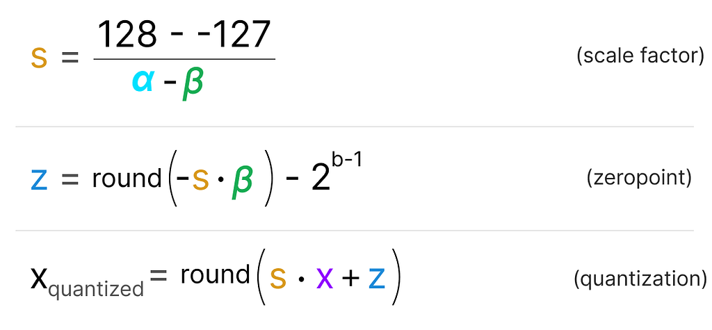
The method we are going to explore is called zero-point quantization.
Notice how the 0 has shifted positions? That’s why it’s called asymmetric quantization. The min/max values have different distances to 0 in the range [-7.59, 10.8].
Due to its shifted position, we have to calculate the zero-point for the INT8 range to perform the linear mapping. As before, we also have to calculate a scale factor (s) but use the difference of INT8’s range instead [-128, 127]
Notice how this is a bit more involved due to the need to calculate the zeropoint (z) in the INT8 range to shift the weights.
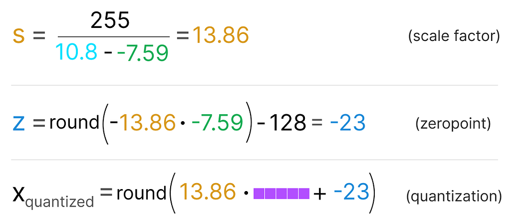
As before, let’s fill in the formula:
To dequantize the quantized from INT8 back to FP32, we will need to use the previously calculated scale factor (s) and zeropoint (z).
Other than that, dequantization is straightforward:
When we put symmetric and asymmetric quantization side-by-side, we can quickly see the difference between methods:
Note the zero-centered nature of symmetric quantization versus the offset of asymmetric quantization.
Range Mapping and Clipping
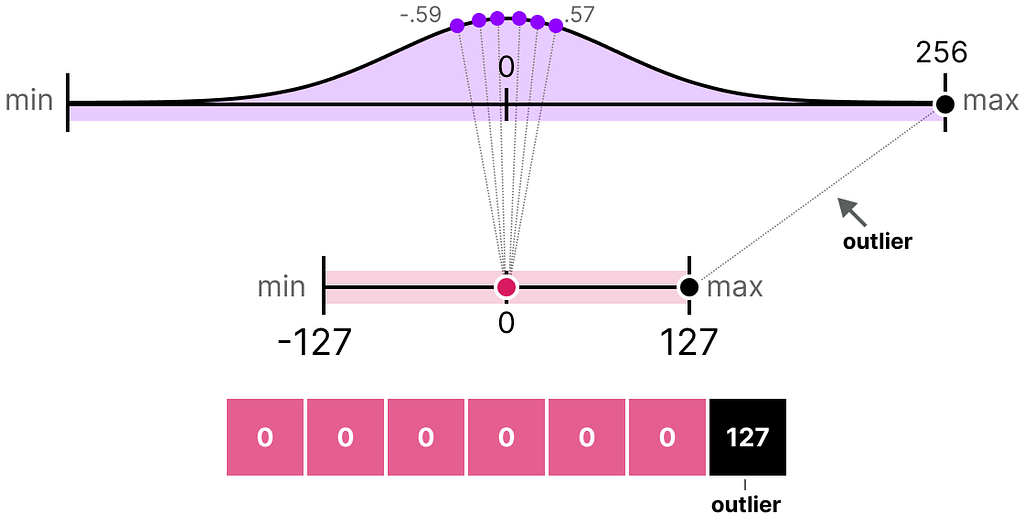
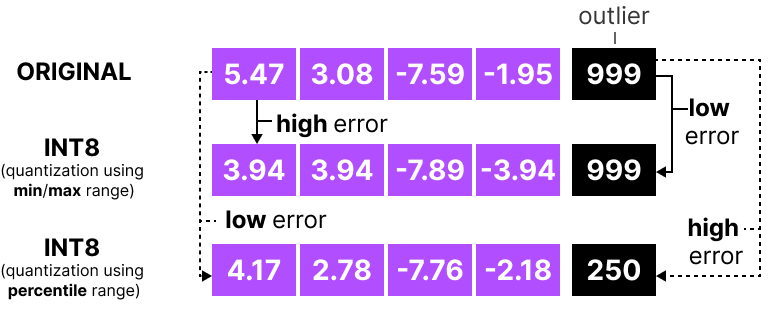
In our previous examples, we explored how the range of values in a given vector could be mapped to a lower-bit representation. Although this allows for the full range of vector values to be mapped, it comes with a major downside, namely outliers.
Imagine that you have a vector with the following values:
Note how one value is much larger than all others and could be considered an outlier. If we were to map the full range of this vector, all small values would get mapped to the same lower-bit representation and lose their differentiating factor:
This is the absmax method we used earlier. Note that the same behavior happens with asymmetric quantization if we do not apply clipping.
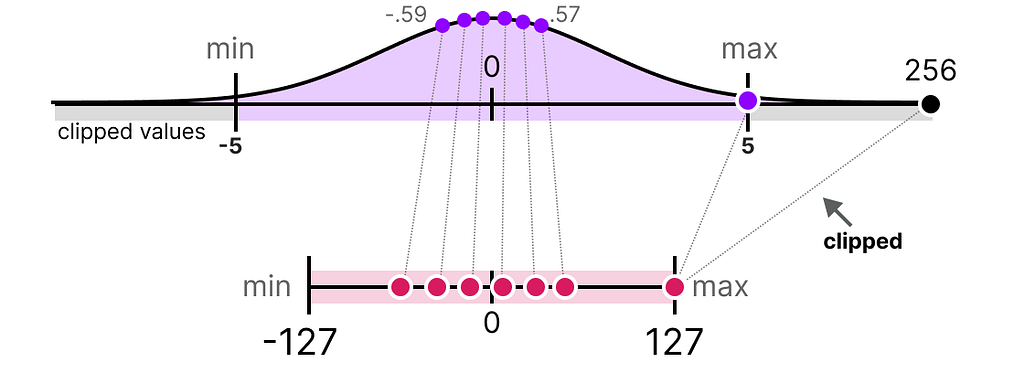
Instead, we can choose to clip certain values. Clipping involves setting a different dynamic range of the original values such that all outliers get the same value.
In the example below, if we were to manually set the dynamic range to [-5, 5] all values outside that will either be mapped to -127 or to 127 regardless of their value:
The major advantage is that the quantization error of the non-outliers is reduced significantly. However, the quantization error of outliers increases.
Calibration
In the example, I showed a naive method of choosing an arbitrary range of [-5, 5]. The process of selecting this range is known as calibration which aims to find a range that includes as many values as possible while minimizing the quantization error.
Performing this calibration step is not equal for all types of parameters.
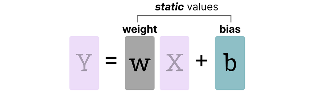
Weights (and Biases)
We can view the weights and biases of an LLM as static values since they are known before running the model. For instance, the ~20GB file of Llama 3 consists mostly of its weight and biases.
Since there are significantly fewer biases (millions) than weights (billions), the biases are often kept in higher precision (such as INT16), and the main effort of quantization is put towards the weights.
For weights, which are static and known, calibration techniques for choosing the range include:
Manually choosing a percentile of the input range
Optimize the mean squared error (MSE) between the original and quantized weights.
Minimizing entropy (KL-divergence) between the original and quantized values
Choosing a percentile, for instance, would lead to similar clipping behavior as we have seen before.
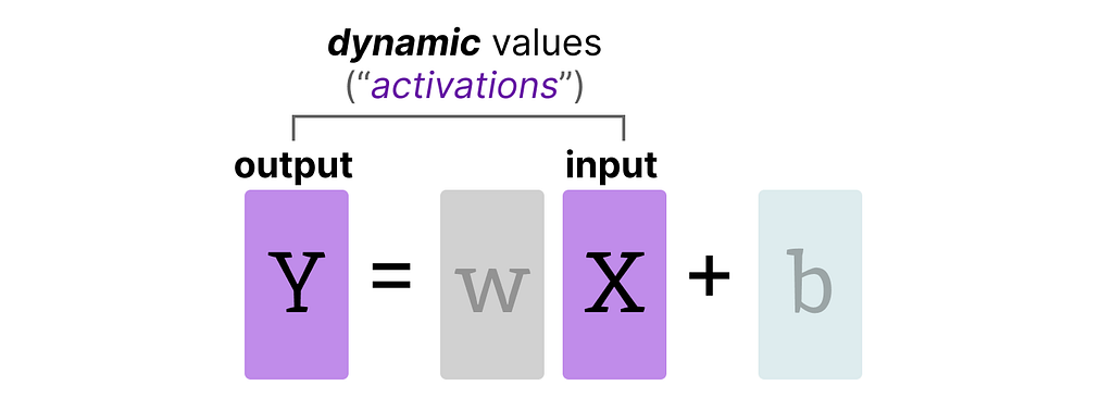
Activations
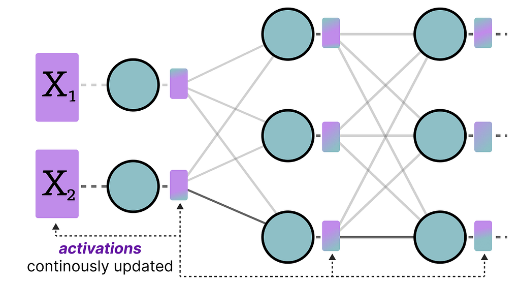
The input that is continuously updated throughout the LLM is typically referred to as “activations”.
Note that these values are called activations since they often go through some activation function, like sigmoid or relu.
Unlike weights, activations vary with each input data fed into the model during inference, making it challenging to quantize them accurately.
Since these values are updated after each hidden layer, we only know what they will be during inference as the input data passes through the model.
Broadly, there are two methods for calibrating the quantization method of the weights and activations:
Post-Training Quantization (PTQ) — Quantization after training
Quantization Aware Training (QAT) — Quantization during training/fine-tuning
Part 3: Post-Training Quantization
One of the most popular quantization techniques is post-training quantization (PTQ). It involves quantizing a model’s parameters (both weights and activations) after training the model.
Quantization of the weights is performed using either symmetric or asymmetric quantization.
Quantization of the activations, however, requires inference of the model to get their potential distribution since we do not know their range.
There are two forms of quantization of the activations:
Dynamic Quantization
Static Quantization
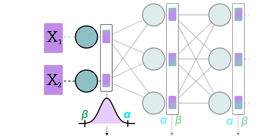
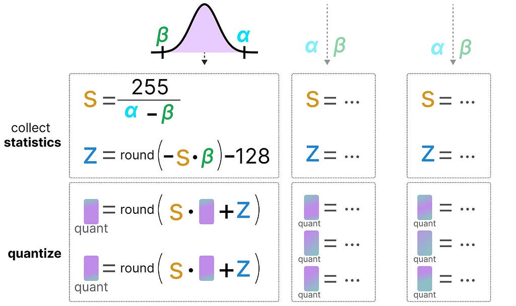
Dynamic Quantization
After data passes a hidden layer, its activations are collected:
This distribution of activations is then used to calculate the zeropoint (z) and scale factor (s) values needed to quantize the output:
The process is repeated each time data passes through a new layer. Therefore, each layer has its own separate z and s values and therefore different quantization schemes.
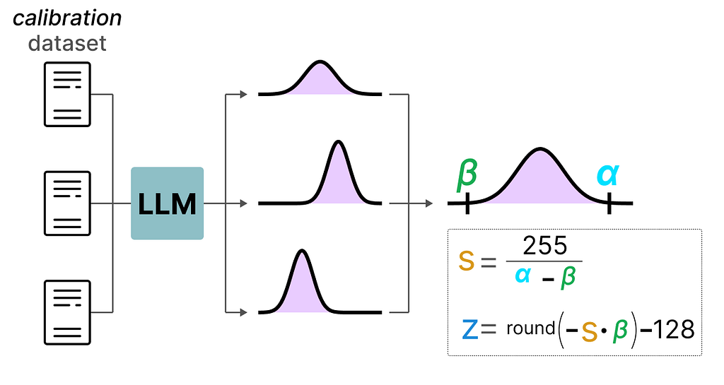
Static Quantization
In contrast to dynamic quantization, static quantization does not calculate the zeropoint (z) and scale factor (s) during inference but beforehand.
To find those values, a calibration dataset is used and given to the model to collect these potential distributions.
After these values have been collected, we can calculate the necessary s and z values to perform quantization during inference.
When you are performing actual inference, the s and z values are not recalculated but are used globally over all activations to quantize them.
In general, dynamic quantization tends to be a bit more accurate since it only attempts to calculate the s and z values per hidden layer. However, it might increase compute time as these values need to be calculated.
In contrast, static quantization is less accurate but is faster as it already knows the s and z values used for quantization.
The Realm of 4-bit Quantization
Going below 8-bit quantization has proved to be a difficult task as the quantization error increases with each loss of bit. Fortunately, there are several smart ways to reduce the bits to 6, 4, and even 2-bits (although going lower than 4-bits using these methods is typically not advised).
We will explore two methods that are commonly shared on HuggingFace:
GPTQ — full model on GPU
GGUF — potentially offload layers on the CPU
GPTQ
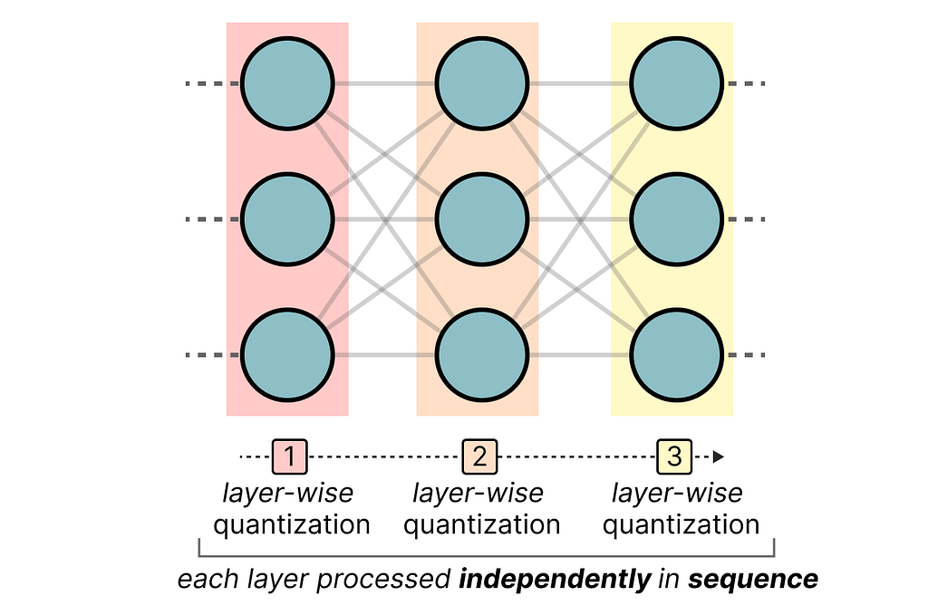
GPTQ is arguably one of the most well-known methods used in practice for quantization to 4-bits.
It uses asymmetric quantization and does so layer by layer such that each layer is processed independently before continuing to the next:
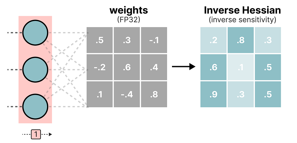
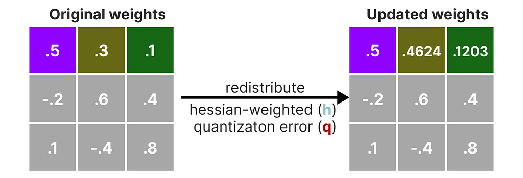
During this layer-wise quantization process, it first converts the layer’s weights into the inverse-Hessian. It is a second-order derivative of the model’s loss function and tells us how sensitive the model’s output is to changes in each weight.
Simplified, it essentially demonstrates the (inverse) importance of each weight in a layer.
Weights associated with smaller values in the Hessian matrix are more crucial because small changes in these weights can lead to significant changes in the model’s performance.
In the inverse-Hessian, lower values indicate more “important” weights.
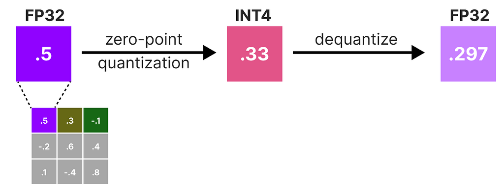
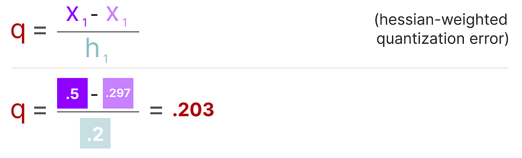
Next, we quantize and then dequantize the weight of the first row in our weight matrix:
This process allows us to calculate the quantization error (q) which we can weigh using the inverse-Hessian (h_1) that we calculated beforehand.
Essentially, we are creating a weighted-quantization error based on the importance of the weight:
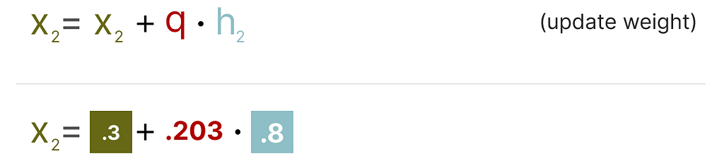
Next, we redistribute this weighted quantization error over the other weights in the row. This allows for maintaining the overall function and output of the network.
For example, if we were to do this for the second weight, namely .3 (x_2), we would add the quantization error (q) multiplied by the inverse-Hessian of the second weight (h_2)
We can do the same process over the third weight in the given row:
We iterate over this process of redistributing the weighted quantization error until all values are quantized.
This works so well because weights are typically related to one another. So when one weight has a quantization error, related weights are updated accordingly (through the inverse-Hessian).
NOTE: The authors used several tricks to speed up computation and improve performance, such as adding a dampening factor to the Hessian, “lazy batching”, and precomputing information using the Cholesky method. I would highly advise checking out this YouTube video on the subject.
TIP: Check out EXL2 if you want a quantization method aimed at performance optimizations and improving inference speed.
GGUF
While GPTQ is a great quantization method to run your full LLM on a GPU, you might not always have that capacity. Instead, we can use GGUF to offload any layer of the LLM to the CPU.
This allows you to use both the CPU and GPU when you do not have enough VRAM.
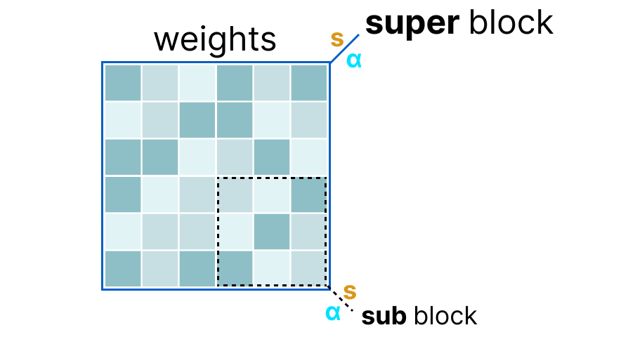
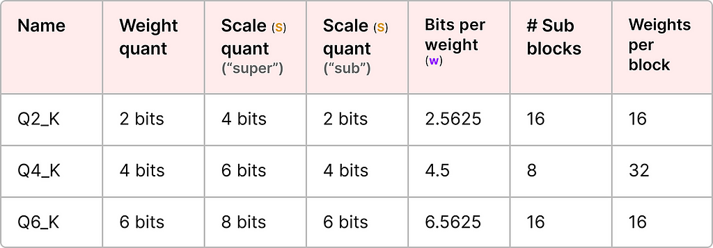
The quantization method GGUF is updated frequently and might depend on the level of bit quantization. However, the general principle is as follows.
First, the weights of a given layer are split into “super” blocks each containing a set of “sub” blocks. From these blocks, we extract the scale factor (s) and alpha (α):
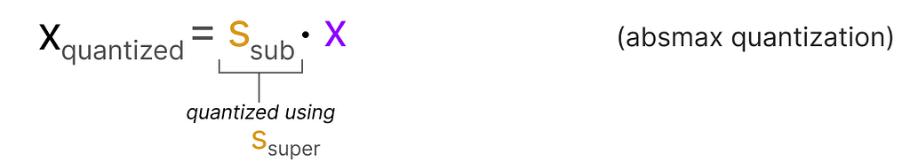
To quantize a given “sub” block, we can use the absmax quantization we used before. Remember that it multiplies a given weight by the scale factor (s):
The scale factor is calculated using the information from the “sub” block but is quantized using the information from the “super” block which has its own scale factor:
This block-wise quantization uses the scale factor (s_super) from the “super” block to quantize the scale factor (s_sub) from the “sub” block.
The quantization level of each scale factor might differ with the “super” block generally having a higher precision than the scale factor of the “sub” block.
To illustrate, let’s explore a couple of quantization levels (2-bit, 4-bit, and 6-bit):
NOTE: Depending on the quantization type, an additional minimum value (m) is needed to adjust the zero-point. These are quantized the same as the scale factor (s).
Check out the original pull request for an overview of all quantization levels. Also, see this pull request for more information on quantization using importance matrices.
Part 4: Quantization Aware Training
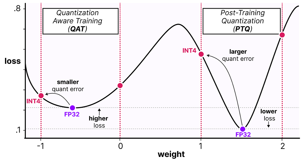
In Part 3, we saw how we could quantize a model after training. A downside to this approach is that this quantization does not consider the actual training process.
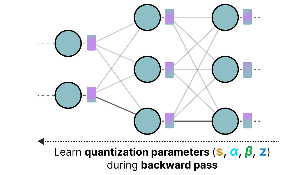
This is where Quantization Aware Training (QAT) comes in. Instead of quantizing a model after it was trained with post-training quantization (PTQ), QAT aims to learn the quantization procedure during training.
QAT tends to be more accurate than PTQ since the quantization was already considered during training. It works as follows:
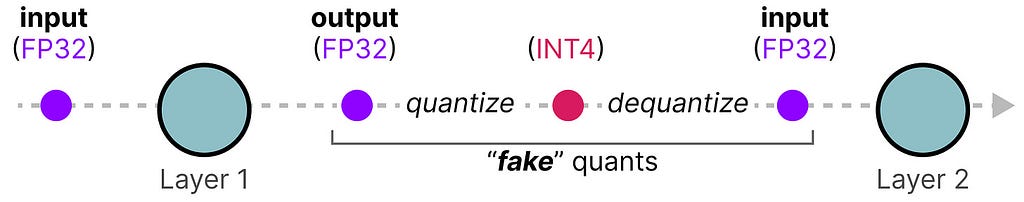
During training, so-called “fake” quants are introduced. This is the process of first quantizing the weights to, for example, INT4 and then dequantizing back to FP32:
This process allows the model to consider the quantization process during training, the calculation of loss, and weight updates.
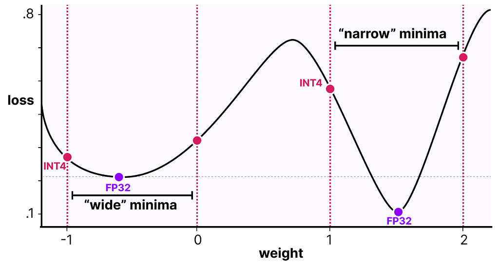
QAT attempts to explore the loss landscape for “wide” minima to minimize the quantization errors as “narrow” minima tend to result in larger quantization errors.
For example, imagine if we did not consider quantization during the backward pass. We choose the weight with the smallest loss according to gradient descent. However, that would introduce a larger quantization error if it’s in a “narrow” minima.
In contrast, if we consider quantization, a different updated weight will be selected in a “wide” minima with a much lower quantization error.
As such, although PTQ has a lower loss in high precision (e.g., FP32), QAT results in a lower loss in lower precision (e.g., INT4) which is what we aim for.
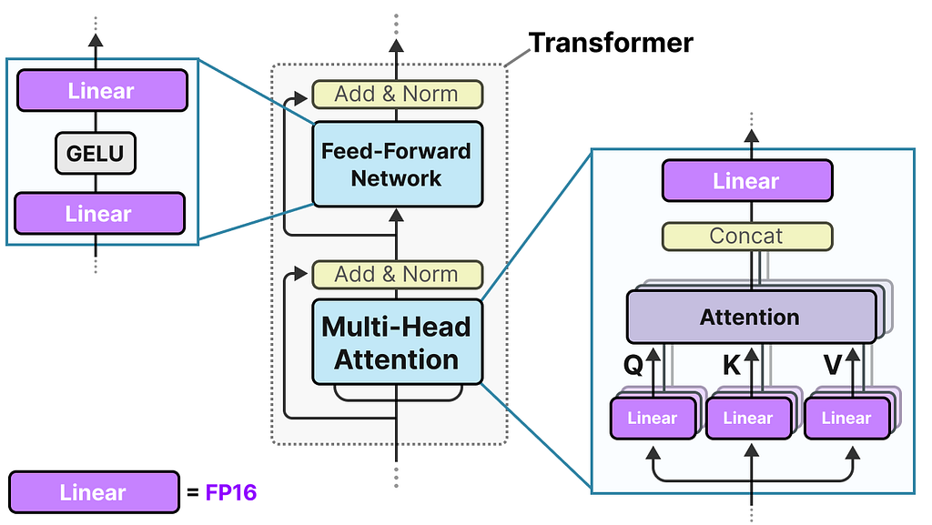
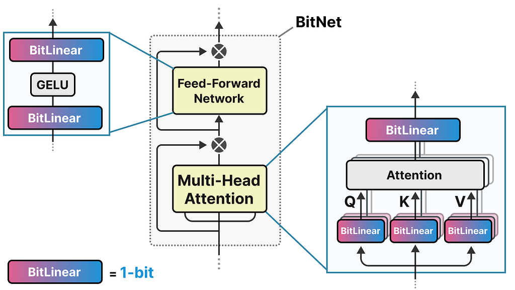
The Era of 1-bit LLMs: BitNet
Going to 4-bits as we saw before is already quite small but what if we were to reduce it even further?
This is where BitNet comes in, representing the weights of a model single 1-bit, using either -1 or 1 for a given weight.3
It does so by injecting the quantization process directly into the Transformer architecture.
Remember that the Transformer architecture is used as the foundation of most LLMs and is composed of computations that involve linear layers:
These linear layers are generally represented with higher precision, like FP16, and are where most of the weights reside.
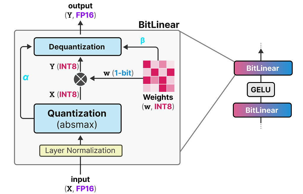
BitNet replaces these linear layers with something they call the BitLlinear:
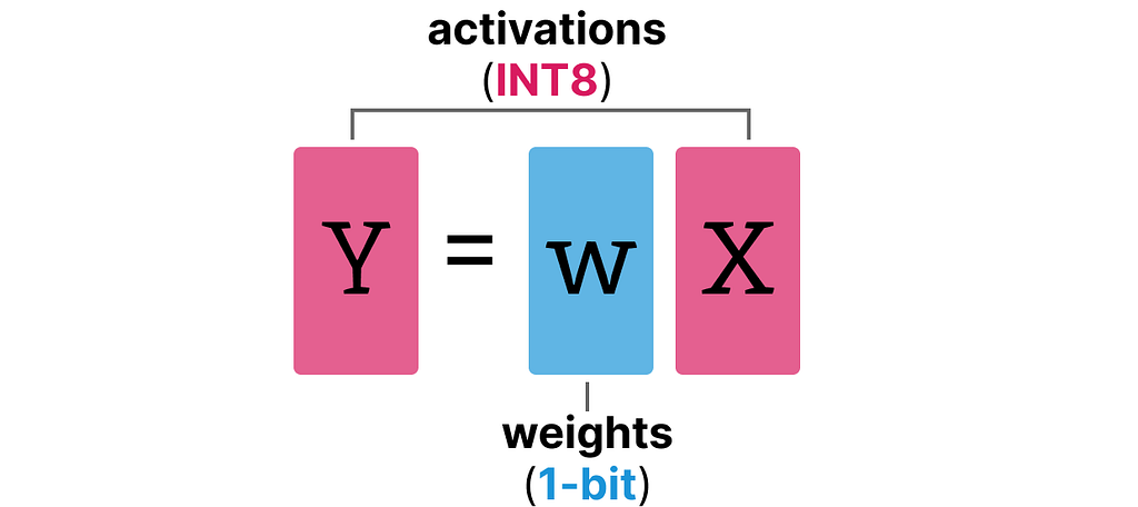
A BitLinear layer works the same as a regular linear layer and calculates the output based on the weights multiplied by the activation.
In contrast, a BitLinear layer represents the weights of a model using 1-bit and activations using INT8:
A BitLinear layer, like Quantization-Aware Training (QAT) performs a form of “fake” quantization during training to analyze the effect of quantization of the weights and activations:
NOTE: In the paper they used γ instead of α but since we used a throughout our examples, I’m using that. Also, note that β is not the same as we used in zero-point quantization but the average absolute value.
Let’s go through the BitLinear step-by-step.
Weight Quantization
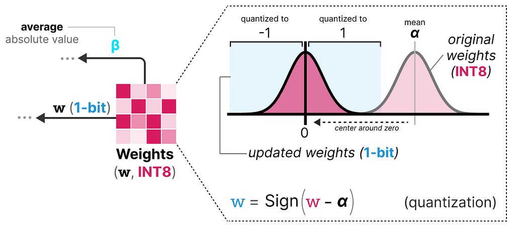
While training, the weights are stored in INT8 and then quantized to 1-bit using a basic strategy, called the signum function.
In essence, it moves the distribution of weights to be centered around 0 and then assigns everything left to 0 to be -1 and everything to the right to be 1:
Additionally, it tracks a value β (average absolute value) that we will use later on for dequantization.
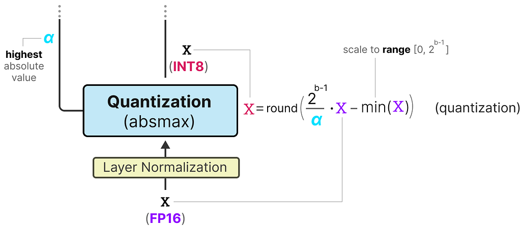
Activation Quantization
To quantize the activations, BitLinear makes use of absmax quantization to convert the activations from FP16 to INT8 as they need to be in higher precision for the matrix multiplication (×).
Additionally, it tracks α (highest absolute value) that we will use later on for dequantization.
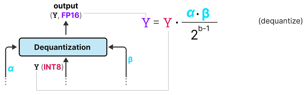
Dequantization
We tracked α (highest absolute value of activations) and β (average absolute value of weights) as those values will help us dequantize the activations back to FP16.
The output activations are rescaled with {α, γ} to dequantize them to the original precision:
And that’s it! This procedure is relatively straightforward and allows models to be represented with only two values, either -1 or 1.
Using this procedure, the authors observed that as the model size grows, the smaller the performance gap between a 1-bit and FP16-trained becomes.
However, this is only for larger models (>30B parameters) and the gab with smaller models is still quite large.
All Large Language Models are in 1.58 Bits
BitNet 1.58b was introduced to improve upon the scaling issue previously mentioned.
In this new method, every single weight of the is not just -1 or 1, but can now also take 0 as a value, making it ternary. Interestingly, adding just the 0 greatly improves upon BitNet and allows for much faster computation.
The Power of 0
So why is adding 0 such a major improvement?
It has everything to do with matrix multiplication!
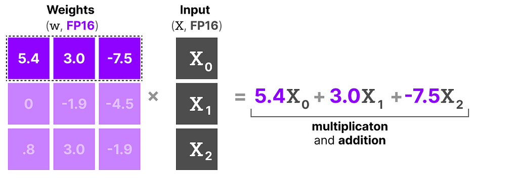
First, let’s explore how matrix multiplication in general works. When calculating the output, we multiply a weight matrix by an input vector. Below, the first multiplication of the first layer of a weight matrix is visualized:
Note that this multiplication involves two actions, multiplying individual weights with the input and then adding them all together.
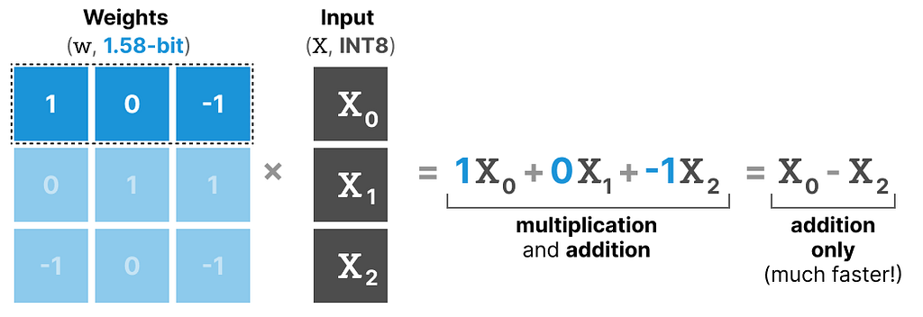
BitNet 1.58b, in contrast, manages to forego the act of multiplication since ternary weights essentially tell you the following:
1 — I want to add this value
0 — I do not want this value
-1 — I want to subtract this value
As a result, you only need to perform addition if your weights are quantized to 1.58 bit:
Not only can this speed up computation significantly, but it also allows for feature filtering.
By setting a given weight to 0 you can now ignore it instead of either adding or subtracting the weights as is the case with 1-bit representations.
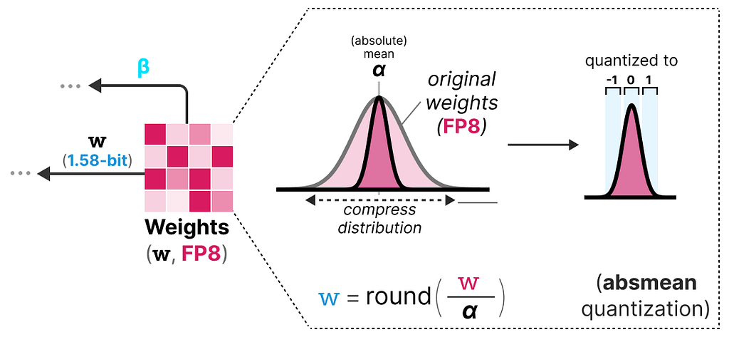
Quantization
To perform weight quantization BitNet 1.58b uses absmean quantization which is a variation of the absmax quantization that we saw before.
It simply compresses the distribution of weights and uses the absolute mean (α) to quantize values. They are then rounded to either -1, 0, or 1:
Compared to BitNet the activation quantization is the same except for one thing. Instead of scaling the activations to range [0, 2ᵇ⁻¹], they are now scaled to [-2ᵇ⁻¹, 2ᵇ⁻¹] instead using absmax quantization.
And that’s it! 1.58-bit quantization required (mostly) two tricks:
Adding 0 to create ternary representations [-1, 0, 1]
absmean quantization for weights
As a result, we get lightweight models due to having only 1.58 computationally efficient bits!
Thank You For Reading!
This concludes our journey in quantization! Hopefully, this post gives you a better understanding of the potential of quantization, GPTQ, GGUF, and BitNet. Who knows how small the models will be in the future?!
To see more visualizations related to LLMs and to support this newsletter, check out the book I’m writing with Jay Alammar. It will be released soon!
You can view the book with a free trial on the O’Reilly website or pre-order the book on Amazon. All code will be uploaded to Github.
If you are, like me, passionate about AI and/or Psychology, please feel free to add me on LinkedInand Twitter, or subscribe to my Newsletter. You can also find some of my content on my Personal Website.
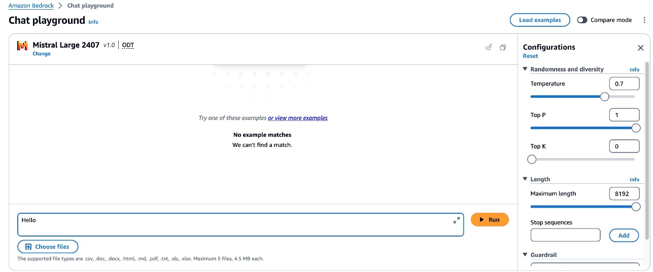
Mistral AI’s Mistral Large 2 (24.07) foundation model (FM) is now generally available in Amazon Bedrock. Mistral Large 2 is the newest version of Mistral Large, and according to Mistral AI offers significant improvements across multilingual capabilities, math, reasoning, coding, and much more. In this post, we discuss the benefits and capabilities of this new […]
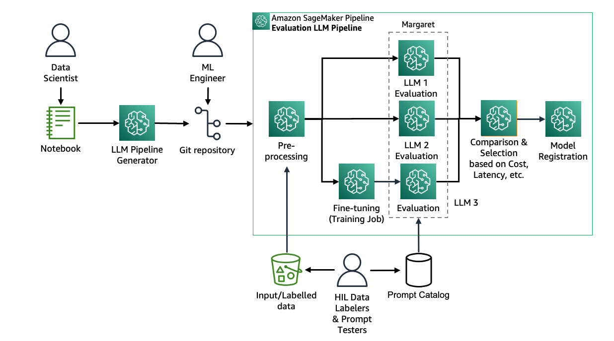
Large language models (LLMs) have achieved remarkable success in various natural language processing (NLP) tasks, but they may not always generalize well to specific domains or tasks. You may need to customize an LLM to adapt to your unique use case, improving its performance on your specific dataset or task. You can customize the model […]
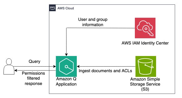
Amazon Q is a fully managed, generative artificial intelligence (AI) powered assistant that you can configure to answer questions, provide summaries, generate content, gain insights, and complete tasks based on data in your enterprise. The enterprise data required for these generative-AI powered assistants can reside in varied repositories across your organization. One common repository to […]
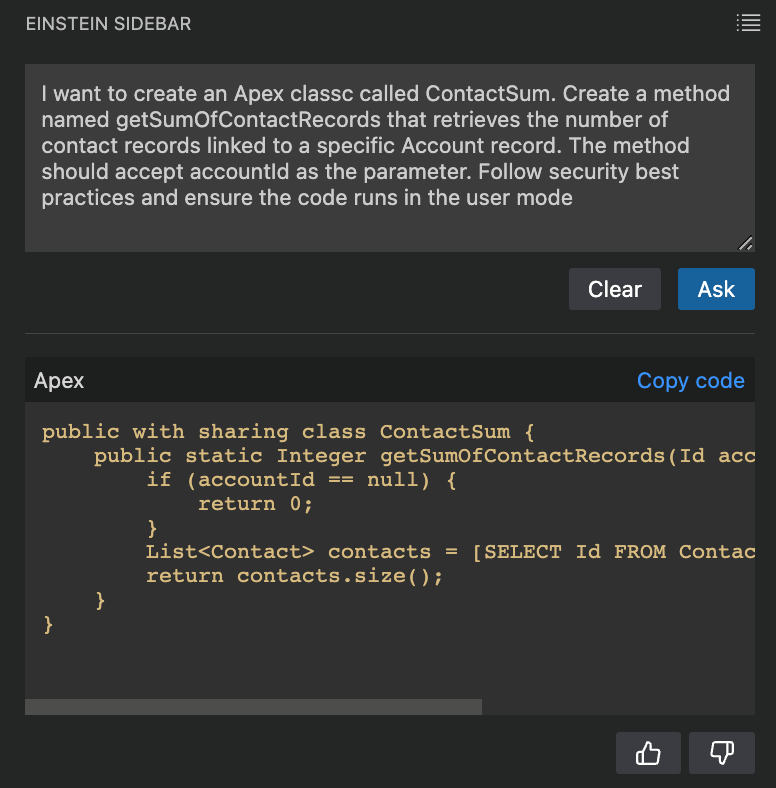
This post is a joint collaboration between Salesforce and AWS and is being cross-published on both the Salesforce Engineering Blog and the AWS Machine Learning Blog. Salesforce, Inc. is an American cloud-based software company headquartered in San Francisco, California. It provides customer relationship management (CRM) software and applications focused on sales, customer service, marketing automation, […]
GDP is a very strong metric of a country’s economic well-being; therefore, making forecasts of the measurement highly sought after. Policymakers and legislators, for example, may want to have a rough forecast of the trends regarding the country’s GDP prior to passing a new bill or law. Researchers and economists will also consider these forecasts for various endeavors in both academic and industrial settings.
Procedure: how can we approach this problem?
Forecasting GDP, similarly to many other time series problems, follows a general workflow.
Using the integrated FRED (Federal Reserve Economic Data) library and API, we will create our features by constructing a data frame composed of US GDP along with some other metrics that are closely related (GDP = Consumption + Investment + Govt. Spending + Net Export)
Using a variety of statistical tests and analyses, we will explore the nuances of our data in order to better understand the underlying relationships between features.
Finally, we will utilize a variety of statistical and machine-learning models to conclude which approach can lead us to the most accurate and efficient forecast.
Along all of these steps, we will delve into the nuances of the underlying mathematical backbone that supports our tests and models.
Step 1: Feature Creation
To construct our dataset for this project, we will be utilizing the FRED (Federal Reserve Economic Data) API which is the premier application to gather economic data. Note that to use this data, one must register an account on the FRED website and request a custom API key.
Each time series on the website is connected to a specific character string (for example GDP is linked to ‘GDP’, Net Export to ‘NETEXP’, etc.). This is important because when we make a call for each of our features, we need to make sure that we specify the correct character string to go along with it.
Keeping this in mind, lets now construct our data frame:
#used to label and construct each feature dataframe.
def gen_df(category, series):
    gen_ser = fred.get_series(series, frequency='q')
    return pd.DataFrame({'Date': gen_ser.index, category + ' : Billions of dollars': gen_ser.values})
#used to merge every constructed dataframe.
def merge_dataframes(dataframes, on_column):
    merged_df = dataframes[0]
    for df in dataframes[1:]:
        merged_df = pd.merge(merged_df, df, on=on_column)
    return merged_df
#list of features to be used
dataframes_list = [
    gen_df('GDP', 'GDP'),
    gen_df('PCE', 'PCE'),
    gen_df('GPDI', 'GPDI'),
    gen_df('NETEXP', 'NETEXP'),
    gen_df('GovTotExp', 'W068RCQ027SBEA')
]
#defining and displaying dataset
data = merge_dataframes(dataframes_list,'Date')
data
Notice that since we have defined functions as opposed to static chunks of code, we are free to expand our list of features for further testing. Running this code, our resulting data frame is the following:
(final dataset)
We notice that our dataset starts from the 1960s, giving us a fairly broad historical context. In addition, looking at the shape of the data frame, we have 1285 instances of actual economic data to work with, a number that is not necessarily small but not big either. These observations will come into play during our modeling phase.
Step 2: Exploratory Data Analysis
Now that our dataset is initialized, we can begin visualizing and conducting tests to gather some insights into the behavior of our data and how our features relate to one another.
Visualization (Line plot):
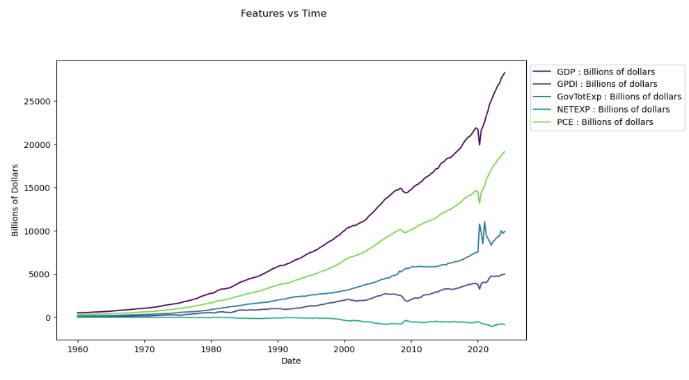
Our first approach to analyzing this dataset is to simply graph each feature on the same plot in order to catch some patterns. We can write the following:
#separating date column from feature columns
date_column = 'Date'
feature_columns = data.columns.difference([date_column])
#set the plot
fig, ax = plt.subplots(figsize=(10, 6))
fig.suptitle('Features vs Time', y=1.02)
#graphing features onto plot
for i, feature in enumerate(feature_columns):
    ax.plot(data[date_column], data[feature], label=feature, color=plt.cm.viridis(i / len(feature_columns)))
#label axis
ax.set_xlabel('Date')
ax.set_ylabel('Billions of Dollars')
ax.legend(loc='upper left', bbox_to_anchor=(1, 1))
#display the plot
plt.show()
Running the code, we get the result:
(features plotted against one another)
Looking at the graph, we notice below that some of the features resemble GDP far more than others. For instance, GDP and PCE follow almost the exact same trend while NETEXP shares no visible similarities. Though it may be tempting, we can not yet begin selecting and removing certain features before conducting more exploratory tests.
ADF (Augmented Dickey-Fuller) Test:
The ADF (Augmented Dickey-Fuller) Test evaluates the stationarity of a particular time series by checking for the presence of a unit root, a characteristic that defines a time series as nonstationarity. Stationarity essentially means that a time series has a constant mean and variance. This is important to test because many popular forecasting methods (including ones we will use in our modeling phase) require stationarity to function properly.
Formula for Unit Root
Although we can determine the stationarity for most of these time series just by looking at the graph, doing the testing is still beneficial because we will likely reuse it in later parts of the forecast. Using the Statsmodel library we write:
from statsmodels.tsa.stattools import adfuller
#iterating through each feature
for column in data.columns:
    if column != 'Date':
        result = adfuller(data[column])
        print(f"ADF Statistic for {column}: {result[0]}")
        print(f"P-value for {column}: {result[1]}")
        print("Critical Values:")
        for key, value in result[4].items():
            print(f"  {key}: {value}")
#creating separation line between each feature
        print("n" + "=" * 40 + "n")
giving us the result:
(ADF Test results)
The numbers we are interested from this test are the P-values. A P-value close to zero (equal to or less than 0.05) implies stationarity while a value closer to 1 implies nonstationarity. We can see that all of our time series features are highly nonstationary due to their statistically insignificant p-values, in other words, we are unable to reject the null hypothesis for the absence of a unit root. Below is a simple visual representation of the test for one of our features. The red dotted line represents the P-value where we would be able to determine stationarity for the time series feature, and the blue box represents the P-value where the feature is currently.
(ADF visualization for NETEXP)
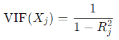
VIF (Variance Inflation Factor) Test:
The purpose of finding the Variance Inflation Factor of each feature is to check for multicollinearity, or the degree of correlation the predictors share with one another. High multicollinearity is not necessarily detrimental to our forecast, however, it can make it much harder for us to determine the individual effect of each feature time series for the prediction, thus hurting the interpretability of the model.
Mathematically, the calculation is as follows:
(Variance Inflation Factor of predictor)
with Xj representing our selected predictor and R²j is the coefficient of determination for our specific predictor. Applying this calculation to our data, we arrive at the following result:
(VIF scores for each feature)
Evidently, our predictors are very closely linked to one another. A VIF score greater than 5 implies multicollinearity, and the scores our features achieved far exceed this amount. Predictably, PCE by far had the highest score which makes sense given how its shape on the line plot resembled many of the other features.
Step 3: Modeling
Now that we have looked thoroughly through our data to better understand the relationships and characteristics of each feature, we will begin to make modifications to our dataset in order to prepare it for modeling.
Differencing to achieve stationarity
To begin modeling we need to first ensure our data is stationary. we can achieve this using a technique called differencing, which essentially transforms the raw data using a mathematical formula similar to the tests above.
The concept is defined mathematically as:
(First Order Differencing equation)
This makes it so we are removing the nonlinear trends from the features, resulting in a constant series. In other words, we are taking values from our time series and calculating the change which occurred following the previous point.
We can implement this concept in our dataset and check the results from the previously used ADF test with the following code:
#differencing and storing original dataset
data_diff = data.drop('Date', axis=1).diff().dropna()
#printing ADF test for new dataset
for column in data_diff.columns:
    result = adfuller(data_diff[column])
    print(f"ADF Statistic for {column}: {result[0]}")
    print(f"P-value for {column}: {result[1]}")
    print("Critical Values:")
    for key, value in result[4].items():
        print(f"  {key}: {value}")

    print("n" + "=" * 40 + "n")
running this results in:
(ADF test for differenced data)
We notice that our new p-values are less than 0.05, meaning that we can now reject the null hypothesis that our dataset is nonstationary. Taking a look at the graph of the new dataset proves this assertion:
(Graph of Differenced Data)
We see how all of our time series are now centered around 0 with the mean and variance remaining constant. In other words, our data now visibly demonstrates characteristics of a stationary system.
VAR (Vector Auto Regression) Model
The first step of the VAR model is performing the Granger Causality Test which will tell us which of our features are statistically significant to our prediction. The test indicates to us if a lagged version of a specific time series can help us predict our target time series, however not necessarily that one time series causes the other (note that causation in the context of statistics is a far more difficult concept to prove).
Using the StatsModels library, we can apply the test as follows:
from statsmodels.tsa.stattools import grangercausalitytests
columns = ['PCE : Billions of dollars', 'GPDI : Billions of dollars', 'NETEXP : Billions of dollars', 'GovTotExp : Billions of dollars']
lags = [6, 9, 1, 1] #determined from individually testing each combination

for column, lag in zip(columns, lags):
    df_new = data_diff[['GDP : Billions of dollars', column]]
    print(f'For: {column}')
    gc_res = grangercausalitytests(df_new, lag)
    print("n" + "=" * 40 + "n")
Running the code results in the following table:
(Sample of Granger Causality for two features)
Here we are just looking for a single lag for each feature that has statistically significant p-values(>.05). So for example, since on the first lag both NETEXP and GovTotExp, we will consider both these features for our VAR model. Personal consumption expenditures arguably did not make this cut-off (see notebook), however, the sixth lag is so close that I decided to keep it in. Our next step is to create our VAR model now that we have decided that all of our features are significant from the Granger Causality Test.
VAR (Vector Auto Regression) is a model which can leverage different time series to gauge patterns and determine a flexible forecast. Mathematically, the model is defined by:
(Vector Auto Regression Model)
Where Yt is some time series at a particular time t and Ap is a determined coefficient matrix. We are essentially using the lagged values of a time series (and in our case other time series) to make a prediction for Yt. Knowing this, we can now apply this algorithm to the data_diff dataset and evaluate the results:
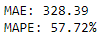
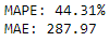
(Evaluation Metrics)(Actual vs Forecasted GDP for VAR)
Looking at this forecast, we can clearly see that despite missing the mark quite heavily on both evaluation metrics used (MAE and MAPE), our model visually was not too inaccurate barring the outliers caused by the pandemic. We managed to stay on the testing line for the most part from 2018–2019 and from 2022–2024, however, the global events following obviously threw in some unpredictability which affected the model’s ability to precisely judge the trends.
VECM (Vector Error Correction Model)
VECM (Vector Error Correction Model) is similar to VAR, albeit with a few key differences. Unlike VAR, VECM does not rely on stationarity so differencing and normalizing the time series will not be necessary. VECM also assumes cointegration, or long-term equilibrium between the time series. Mathematically, we define the model as:
(VECM model equation)
This equation is similar to the VAR equation, with Π being a coefficient matrix which is the product of two other matrices, along with taking the sum of lagged versions of our time series Yt. Remembering to fit the model on our original (not difference) dataset, we achieve the following result:
(Actual vs Forecasted GDP for VECM)
Though it is hard to compare to our VAR model to this one given that we are now using nonstationary data, we can still deduce both by the error metric and the visualization that this model was not able to accurately capture the trends in this forecast. With this, it is fair to say that we can rule out traditional statistical methods for approaching this problem.
Machine Learning forecasting
When deciding on a machine learning approach to model this problem, we want to keep in mind the amount of data that we are working with. Prior to creating lagged columns, our dataset has a total of 1275 observations across all time-series. This means that using more complex approaches, such as LSTMs or gradient boosting, are perhaps unnecessary as we can use a more simple model to receive the same amount of accuracy and far more interpretability.
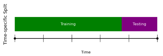
Train-Test Split
Train-test splits for time series problems differ slightly from splits in traditional regression or classification tasks (Note we also used the train-test split in our VAR and VECM models, however, it feels more appropriate to address in the Machine Learning section). We can perform our Train-Test split on our differenced data with the following code:
#90-10 data split
split_index = int(len(data_diff) * 0.90)
train_data = data_diff.iloc[:split_index]
test_data = data_diff.iloc[split_index:]
#Assigning GDP column to target variable
X_train = train_data.drop('GDP : Billions of dollars', axis=1)
y_train = train_data['GDP : Billions of dollars']
X_test = test_data.drop('GDP : Billions of dollars', axis=1)
y_test = test_data['GDP : Billions of dollars']
Here it is imperative that we do not shuffle around our data, since that would mean we are training our model on data from the future which in turn will cause data leakages.
example of train-test split on time series data
Also in comparison, notice that we are training over a very large portion (90 percent) of the data whereas typically we would train over 75 percent in a common regression task. This is because practically, we are not actually concerned with forecasting over a large time frame. Realistically even forecasting over several years is not probable for this task given the general unpredictability that comes with real-world time series data.
Random Forests
Remembering our VIF test from earlier, we know our features are highly correlated with one another. This partially plays into the decision to choose random forests as one of our machine-learning models. decision trees make binary choices between features, meaning that theoretically our features being highly correlated should not be detrimental to our model.
Example of a traditional binary decision tree that builds random forests models
To add on, random forest is generally a very strong model being robust to overfitting from the stochastic nature of how the trees are computed. Each tree uses a random subset of the total feature space, meaning that certain features are unlikely to dominate the model. Following the construction of the individual trees, the results are averaged in order to make a final prediction using every individual learner.
We can implement the model to our dataset with the following code:
from sklearn.ensemble import RandomForestRegressor
#fitting model
rf_model = RandomForestRegressor(n_estimators=100, random_state=42)
rf_model.fit(X_train, y_train)

y_pred = rf_model.predict(X_test)
#plotting results
printevals(y_test,y_pred)
plotresults('Actual vs Forecasted GDP using Random Forest')
running this gives us the results:
(Evaluation Metrics for Random Forests)(Actual vs Forecasted GDP for Random Forests)
We can see that Random Forests was able to produce our best forecast yet, attaining better error metrics than our attempts at VAR and VECM. Perhaps most impressively, visually we can see that our model was almost perfectly encapsulating the data from 2017–2019, just prior to encountering the outliers.
K Nearest Neighbors
KNN (K-Nearest-Neighbors) was one final approach we will attempt. Part of the reasoning for why we choose this specific model is due to the feature-to-observation ratio. KNN is a distanced based algorithm that we are dealing with data which has a low amount of feature space comparative to the number of observations.
To use the model, we must first select a hyperparameter k which defines the number of neighbors our data gets mapped to. A higher k value insinuates a more biased model while a lower k value insinuates a more overfit model. We can choose the optimal one with the following code:
from sklearn.neighbors import KNeighborsRegressor
#iterate over all k=1 to k=10
for i in range (1,10):
    knn_model = KNeighborsRegressor(n_neighbors=i)
    knn_model.fit(X_train, y_train)

    y_pred = knn_model.predict(X_test)
#print evaluation for each k
    print(f'for k = {i} ')
    printevals(y_test,y_pred)
    print("n" + "=" * 40 + "n")
Running this code gives us:
(accuracy comparing different values of k)
We can see that our best accuracy measurements are achieved when k=2, following that value the model becomes too biased with increasing values of k. knowing this, we can now apply the model to our dataset:
#applying model with optimal k value
knn_model = KNeighborsRegressor(n_neighbors=2)
knn_model.fit(X_train, y_train)

y_pred = knn_model.predict(X_test)

printevals(y_test,y_pred)

plotresults('Actual vs Forecasted GDP using KNN')
resulting in:
(Evaluation metrics for KNN)(Actual vs Forecasted GDP for KNN)
We can see KNN in its own right performed very well. Despite being outperformed slightly in terms of error metrics compared to Random Forests, visually the model performed about the same and arguably captured the period before the pandemic from 2018–2019 even better than Random Forests.
Conclusions
Looking at all of our models, we can see the one which performed the best was Random Forests. This is most likely due to Random Forests for the most part being a very strong predictive model that can be fit to a variety of datasets. In general, the machine learning algorithms far outperformed the traditional statistical methods. Perhaps this can be explained by the fact that VAR and VECM both require a great amount of historical background data to work optimally, something which we did not have much of given that our data came out in quarterly intervals. There also may be something to be said about how both the machine learning models used were nonparametric. These models often are governed by fewer assumptions than their counterparts and therefore may be more flexible to unique problem sets like the one here. Below is our final best prediction, removing the differencing transformation we previously used to fit the models.
(Actual vs Forecasted GDP for Random Forests (not differenced))
Challenges and Areas of Improvement
By far the greatest challenge regarding this forecasting problem was handling the massive outlier caused by the pandemic along with the following instability caused by it. Our methods for forecasting obviously can not predict that this would occur, ultimately decreasing our accuracy for each approach. Had our goal been to forecast the previous decade, our models would most likely have a much easier time finding and predicting trends. In terms of improvement and further research, I think a possible solution would be to perform some sort of normalization and outlier smoothing technique on the time interval from 2020–2024, and then evaluate our fully trained model on new quarterly data that comes in. In addition, it may be beneficial to incorporate new features that have a heavy influence on GDP such as quarterly inflation and personal asset evaluations.
All pictures not specifically given credit in the caption belong to me.
Notebook
please note that in order to run this notebook you must create an account on the FRED website, request an API key, and paste said key into the second cell of the notebook.
We use cookies on our website to give you the most relevant experience by remembering your preferences and repeat visits. By clicking “Accept”, you consent to the use of ALL the cookies.
This website uses cookies to improve your experience while you navigate through the website. Out of these, the cookies that are categorized as necessary are stored on your browser as they are essential for the working of basic functionalities of the website. We also use third-party cookies that help us analyze and understand how you use this website. These cookies will be stored in your browser only with your consent. You also have the option to opt-out of these cookies. But opting out of some of these cookies may affect your browsing experience.
Necessary cookies are absolutely essential for the website to function properly. These cookies ensure basic functionalities and security features of the website, anonymously.
Cookie
Duration
Description
cookielawinfo-checkbox-analytics
11 months
This cookie is set by GDPR Cookie Consent plugin. The cookie is used to store the user consent for the cookies in the category "Analytics".
cookielawinfo-checkbox-functional
11 months
The cookie is set by GDPR cookie consent to record the user consent for the cookies in the category "Functional".
cookielawinfo-checkbox-necessary
11 months
This cookie is set by GDPR Cookie Consent plugin. The cookies is used to store the user consent for the cookies in the category "Necessary".
cookielawinfo-checkbox-others
11 months
This cookie is set by GDPR Cookie Consent plugin. The cookie is used to store the user consent for the cookies in the category "Other.
cookielawinfo-checkbox-performance
11 months
This cookie is set by GDPR Cookie Consent plugin. The cookie is used to store the user consent for the cookies in the category "Performance".
viewed_cookie_policy
11 months
The cookie is set by the GDPR Cookie Consent plugin and is used to store whether or not user has consented to the use of cookies. It does not store any personal data.
Functional cookies help to perform certain functionalities like sharing the content of the website on social media platforms, collect feedbacks, and other third-party features.
Performance cookies are used to understand and analyze the key performance indexes of the website which helps in delivering a better user experience for the visitors.
Analytical cookies are used to understand how visitors interact with the website. These cookies help provide information on metrics the number of visitors, bounce rate, traffic source, etc.
Advertisement cookies are used to provide visitors with relevant ads and marketing campaigns. These cookies track visitors across websites and collect information to provide customized ads.