As generative artificial intelligence (AI) applications become more prevalent, maintaining responsible AI principles becomes essential. Without proper safeguards, large language models (LLMs) can potentially generate harmful, biased, or inappropriate content, posing risks to individuals and organizations. Applying guardrails helps mitigate these risks by enforcing policies and guidelines that align with ethical principles and legal requirements. […]
A potential application of LLMs that has attracted attention and investment is around their ability to generate SQL queries. Querying large databases with natural language unlocks several compelling use cases, from increasing data transparency to improving accessibility for non-technical users.
However, as with any AI-generated content, the question of evaluation is important. How can we determine if an LLM-generated SQL query is correct and produces the intended results? Our recent research dives into this question and explores the effectiveness of using LLM as a judge to evaluate SQL generation.
Summary of Findings
LLM as a judge shows initial promise in evaluating SQL generation, with F1 scores between 0.70 and 0.76 using OpenAI’s GPT-4 Turbo in this experiment. Including relevant schema information in the evaluation prompt can significantly reduce false positives. While challenges remain — including false negatives due to incorrect schema interpretation or assumptions about data — LLM as a judge provides a solid proxy for AI SQL generation performance, especially as a quick check on results.
Methodology and Results
This study builds upon previous work done by the Defog.ai team, who developed an approach to evaluate SQL queries using golden datasets and queries. The process involves using a golden dataset question for AI SQL generation, generating test results “x” from the AI-generated SQL, using a pre-existing golden query on the same dataset to produce results “y,” and then comparing results “x” and “y” for accuracy.
Diagram by author
For this comparison, we first explored traditional methods of SQL evaluation, such as exact data matching. This approach involves a direct comparison of the output data from the two queries. For instance, when evaluating a query about author citations, any differences in the number of authors or their citation counts would result in a mismatch and failure. While straightforward, this method does not handle edge cases, such as how to handle zero-count bins or slight variations in numeric outputs.
Diagram by author
We then tried a more nuanced approach: using an LLM-as-a-judge. Our initial tests with this method, using OpenAI’s GPT-4 Turbo without including database schema information in the evaluation prompt, yielded promising results with F1 scores between 0.70 and 0.76. In this setup, the LLM judged the generated SQL by examining only the question and the resulting query.
Results: Image by author
In this test we noticed that there were quite a few false positives and negatives, many of them related to mistakes or assumptions about the database schema. In this false negative case, the LLM assumed that the response would be in a different unit than expected (semesters versus days).
Image by author
These discrepancies led us to add the database schema into the evaluation prompt. Contrary to our expectations, this resulted in worse performance. However, when we refined our approach to include only the schema for tables referenced in the queries, we saw significant improvement in both the false positive and negative rates.
Results: Image by author
Challenges and Future Directions
While the potential of using LLMs to evaluate SQL generation is clear, challenges remain. Often, LLMs make incorrect assumptions about data structures and relationships or incorrectly assume units of measurement or data formats. Finding the right amount and type of schema information to include in the evaluation prompt is important for optimizing performance.
Anyone exploring a SQL generation use case might explore several other areas like optimizing the inclusion of schema information, improving LLMs’ understanding of database concepts, and developing hybrid evaluation methods that combine LLM judgment with traditional techniques.
Conclusion
With the ability to catch nuanced errors, LLM as a judge shows promise as a quick and effective tool for assessing AI-generated SQL queries.
Carefully selecting what information is provided to the LLM judge helps in getting the most out of this method; by including relevant schema details and continually refining the evaluation process, we can improve the accuracy and reliability of SQL generation assessment.
As natural language interfaces to databases increase in popularity, the need for effective evaluation methods will only grow. The LLM as a judge approach, while not perfect, provides a more nuanced evaluation than simple data matching, capable of understanding context and intent in a way that traditional methods cannot.
A special shoutout to Manas Singh for collaborating with us on this research!
1. Introduction
2. How does a model make predictions
3. Confusion Matrix
4. Metrics to Evaluate Model Performance
5. When to use what metrics
1. Introduction
Once we trained a supervised machine learning model to solve a classification problem, we’d be happy if this was the end of our work, and we could just throw them new data. We hope it will classify everything correctly. However, in reality, not all predictions that a model makes are correct. There is a famous quote well known in Data Science, created by a British Statistician that says:
“All models are wrong; some are useful.” CLEAR, James, 1976.
So, how do we know how good the model we have is? The short answer is that we do that by evaluating how correct the model’s predictions are. For that, there are several metrics that we could use.
2. How does a model make predictions? i.e., How does a model classify data?
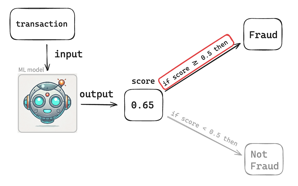
Image 1: Model making prediction
Let’s say we’ve trained a Machine Learning model to classify a credit card transaction and decide whether that particular transaction is Fraud or not Fraud. The model will consume the transaction data and give back a score that could be any number within the range of 0 to 1, e.g., 0.05, 0.24, 0.56, 0.9875. For this article, we’ll define a default threshold of 0.5, which means if the model gave a score lower than 0.5, then the model has classified that transaction as not Fraud (that’s a model prediction!). If the model gave a score greater or equal to 0.5, then the model classified that transaction as Fraud (that’s also a model prediction!).
In practice, we don’t work with the default of 0.5. We look into different thresholds to see what is more appropriate to optimize the model’s performance, but that discussion is for another day.
3. Confusion Matrix
The confusion matrix is a fundamental tool for visualizing the performance of a classification model. It helps in understanding the various outcomes of the predictions, which include:
True Positive (TP)
False Positive (FP)
False Negative (FN)
True Negative (TN)
Let’s break it down!
To evaluate a model’s effectiveness, we need to compare its predictions against actual outcomes. Actual outcomes are also known as “the reality.” So, a model could have classified a transaction as Fraud, and in fact, the customer asked for his money back on that same transaction, claiming that his credit card was stolen.
In that scenario, the model correctly predicted the transaction as Fraud, a True Positive (TP).
In Fraud detection contexts, the “positive” class is labeled as Fraud, and the “negative” class is labeled Non-Fraud.
A False Positive (FP), on the other hand, occurs when the model also classifies a transaction as Fraud, but in that case, the customer did not report any fraudulent activity on their credit card usage. So, in this transaction, the Machine Learning model made a mistake.
A True Negative (TN) is when the model classified the transaction as Not Fraud, and in fact, it was not Fraud. So, the model has made the correct classification.
A False Negative (FN) was when the model classified the transaction as Not Fraud. Still, it was Fraud (the customer reported fraudulent activity on their credit card related to that transaction). In this case, the Machine Learning model also made a mistake, but it’s a different type of error than a False Positive.
Let’s have a look at image 2
Image 2: Confusion Matrix classifying a Machine Learning Model for Fraud
Let’s see a different case, maybe more relatable. A test was designed to tell whether a patient has COVID. See image 3.
Image 3: Confusion Matrix for a COVID test
So, for every transaction, you could check whether it’s TP, FP, TN, or FN. And you could do this for thousands of millions of transactions and write the results down on a 2×2 table with all the counts of TP, FP, TN and FN. This table is also known as a Confusion Matrix.
Let’s say you compared the model predictions of 100,000 transactions against their actual outcomes and came up with the following Confusion Matrix (see image 4).
Image 4: Confusion Matrix
4. Metrics to Evaluate Model Performance
and what a confusion matrix is, we are ready to explore the metrics used to evaluate a classification model’s performance.
Precision = TP / (TP + FP)
It answers the question: What’s the proportion of correct predictions among all predictions? It reflects the proportion of predicted fraud cases that were Fraud.
In simple language: What’s the proportion of when the model called it Fraud, and it was Fraud?
Looking at the Confusion Matrix from image 4, we compute the Precision = 76.09% since Precision = 350 / (350 + 110).
Recall = TP / (TP + FN)
Recall is also known as True Positive Rate (TPR). It answers the question: What’s the proportion of correct predictions among all positive actual outcomes?
In simple language, what’s the proportion of times that the model caught the fraudster correctly in all actual fraud cases?
Using the Confusion Matrix from image 4, the Recall = 74.47%, since Recall = 350 / (350 + 120).
Alert Rate = (TP + FP) / (TP + FP + TN + FN)
Also known as Block Rate, this metric helps answer the question: What’s the proportion of positive predictions over all predictions?
In simple language: What proportion of times the model predicted something was Fraud?
Using the Confusion Matrix from image 4, the Alert Rate = 0.46%, since Alert Rate = (350 + 110) / (350 + 110 + 120 + 99420).
F1 Score = 2x (Precision x Recall) / (Precision + Recall)
The F1 Score is a harmonic mean of Precision and Recall. It is a balanced measure between Precision and Recall, providing a single score to assess the model.
Using the Confusion Matrix from image 4, the F1-Score = 75.27%, since F1-Score = 2*(76.09% * 74.47%) / (76.09% + 74.47%).
Accuracy = TP + TN / (TP + TN + FP + FN)
Accuracy helps answer this question: What’s the proportion of correctly classified transactions over all transactions?
Using the Confusion Matrix from image 4, the Accuracy = 99.77%, since Accuracy = (350 + 120) / (350 + 110 + 120 + 99420).
Image 5: Confusion Matrix with Evaluation Metrics
5. When to use what metric
Accuracy is a go-to metric for evaluating many classification machine learning models. However, accuracy does not work well for cases where the target variable is imbalanced. In the case of Fraud detection, there is usually a tiny percentage of the data that is fraudulent; for example, in credit card fraud, it’s usually less than 1% of fraudulent transactions. So even if the model says that all transactions are fraudulent, which would be very incorrect, or that all transactions are not fraudulent, which would also be very wrong, the model’s accuracy would still be above 99%.
So what to do in those cases? Precision, Recall, and Alert Rate. Those are usually the metrics that give a good perspective on the model performance, even if the data is imbalanced. Which one exactly to use might depend on your stakeholders. I worked with stakeholders that said, whatever you do, please keep a Precision of at least 80%. So in that case, the stakeholder was very concerned about the user experience because if the Precision is very low, that means there will be a lot of False Positives, meaning that the model would incorrectly block good customers thinking they are placing fraudulent credit card transactions.
On the other hand, there is a trade-off between Precision and Recall: the higher the Precision, the lower the Recall. So, if the model has a very high Precision, it won’t be great at finding all the fraud cases. In some sense, it also depends on how much a fraud case costs the business (financial loss, compliance problems, fines, etc.) vs. how many false positive cases cost the business (customer lifetime, which impacts business profitability).
So, in cases where the financial decision between Precision and Recall is unclear, a good metric to use is F1-Score, which helps provide a balance between Precision and Recall and optimizes for both of them.
Last but not least, the Alert Rate is also a critical metric to consider because it gives an intuition about the number of transactions the Machine Learning model is planning to block. If the Alert Rate is very high, like 15%, that means that from all the orders placed by customers, 15% will be blocked, and only 85% will be accepted. So if you have a business with 1,000,000 orders daily, the machine learning model would block 150,000 of them thinking they’re fraudulent transactions. That’s a massive amount of orders blocked, and it’s important to have an instinct about the percentage of fraud cases. If fraud cases are about 1% or less, then a model blocking 15% is not only making a lot of mistakes but also blocking a big part of the business revenue.
6. Conclusion
Understanding these metrics allows data scientists and analysts to interpret the results of classification models better and enhance their performance. Precision and Recall offer more insights into the effectiveness of a model than mere accuracy, not only, but especially in fields like fraud detection where the class distribution is heavily skewed.
*Images: Unless otherwise noted, all images are by the author. Image 1’s robot face was created by DALL-E, and it’s for public use.
This blog post will go line-by-line through the hardware optimizations in Section 2 of Andrej Karpathy’s “Let’s reproduce GPT-2 (124M)”
Image by Author — SDXL
As a quick recap, in Section 1 we went line-by-line through the code written by Karpathy to naively train GPT-2. Now that we have our setup, Karpathy shows us how we can make the model train fast on our NVIDIA GPU! While we know that it takes a lot of time to train good models, by optimizing each run we can shave days or even weeks off our training time. This naturally gives us more iterations to improve our model. By the end of this blog post, you will see how to radically speed up your training (by 10x) using an Ampere-series Nvidia GPU.
To do this blog post, I ran the optimizations both on the NVIDIA T4 GPU that Google Colab gives you for free and on a NVIDIA A100 GPU 40GB SXM4 from Lambda Labs. Most of the optimizations Karpathy goes over are specifically for an A100 or better, but there are still some gains to be made on less powerful GPUs.
Let’s dive in!
Timing Our Code
To begin, we want to create a way to see how effective our optimizations are. To do so, we will add in to our training loop the below code:
for i in range(50):
    t0 = time.time() # start timer
    x, y = train_loader.next_batch()
    x, y = x.to(device), y.to(device)
    optimizer.zero_grad()
    logits, loss = model(x, y)
    loss.backward()
    optimizer.step()
    torch.cuda.synchronize() # synchronize with GPU
    t1 = time.time() # end timer
    dt = (t1-t0)*1000 # milliseconds difference
    print(f"loss {loss.item()}, step {i}, dt {dt:.2f}ms")
We start off by capturing the time at the beginning of the loop, but before we capture the end time we run torch.cuda.synchronize(). By default we are only paying attention to when the CPU stops. Because we have moved most of the major calculations to GPU, we need to make sure that our timer here takes into account when the GPU stops its calculations. Synchronize will have the CPU wait to progress until the GPU has completed its work queue, giving us an accurate time for when the loop was completed. Once we have an accurate time, we naturally calculate the difference between the start and the end.
Batch Sizing
We also want to make sure we are putting as much data as possible through each round. The way we achieve this is by setting batch sizes. In our DataLoaderLite class, we can adjust our 2 parameters (B and T) so that we use the most amount of memory in our GPU without going out of bounds.
With the A100 GPU, you can follow Karpathy’s example, where we set T equal to the max block_size of 1024 and we set B equal to 16 because it’s a “nice” number (easily divisible by powers of 2) and it’s the largest such “nice” number we can fit in memory.
train_loader = DataLoaderLite(B=16, T=1024)
If you try to put in a value that is too large, you’ll wind up seeing a OutOfMemoryError from CUDA in your terminal. I found the best values for a T4 GPU I could get was B =4 and T =1024 (when trying different B values in Google Colab, be aware you may need to restart the session to ensure you’re not getting false positive OutOfMemoryErrors)
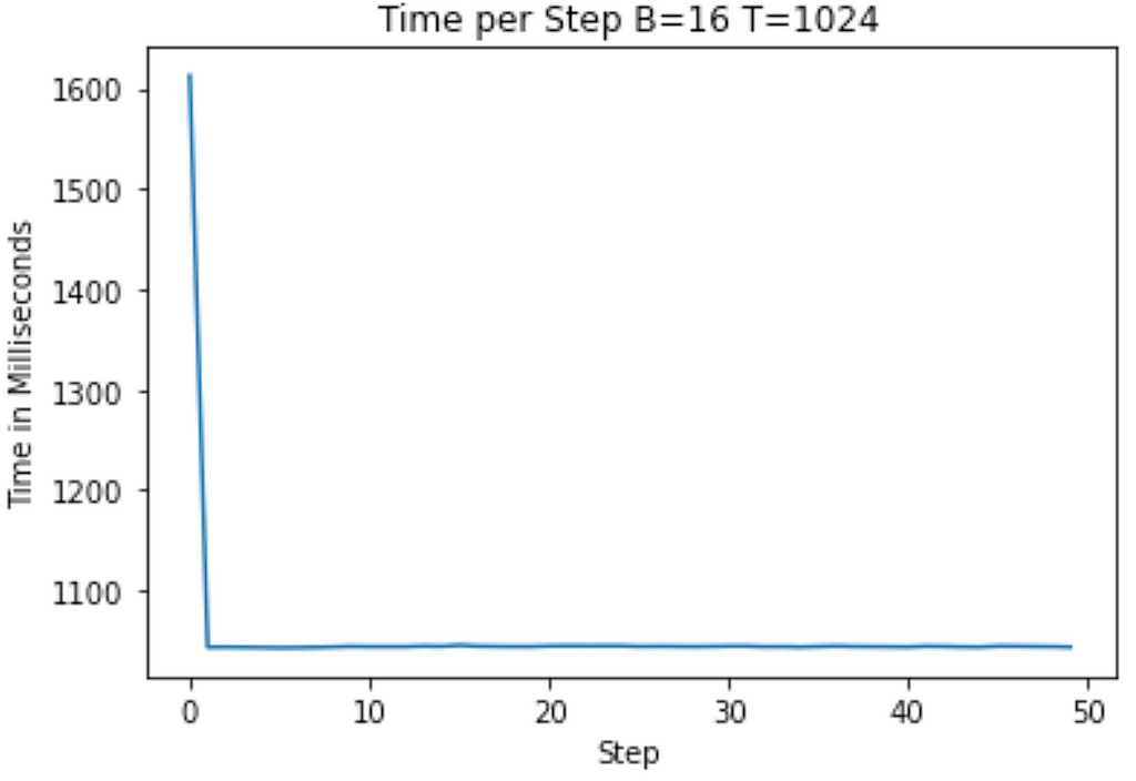
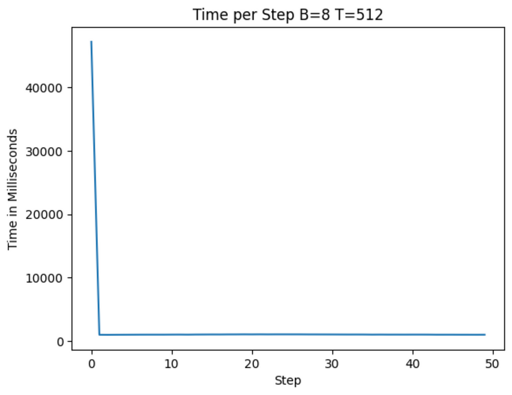
Running on the A100 and T4 below, I get the following graphs showing training time to start (on average roughly 1100ms on the T4 and 1040ms on the A100)
Image by Author — A100 Training with no optimizationsImage by Author — T4 training with no optimizations
Floating Point Optimizations
Now we’re going to focus on changes we make to the internal representation of data within the model.
If you look at the dtype of the weights in our code from section 1, you will see we use Floating Point 32 (fp32) by default. Fp32 means that we represent the numbers using 32 bits following the IEEE floating point standard below:
Image by Author — IEEE Representation of Floating Point 32 (FP32)
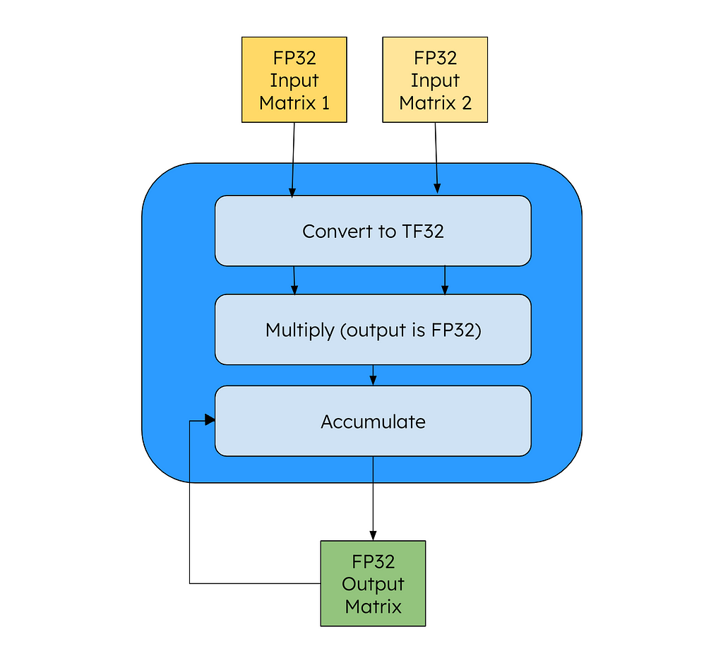
As Karpathy says in the video, we have seen empirically that fp32 isn’t necessary to train quality models — we can use less data to represent each weight and still have quality outputs. One way to speed up the calculations is to use NVIDIA’s TensorCore instruction. This will handle the matrix multiplications by converting the operands to the form Tensor Float 32 (TF32) laid out below:
Image by Author — Tensor Float 32 (TF32)Image by Author — TF32 data flow through a Tensor Core post optimization
From the code point of view, all of our variables (input, output) are in FP32, but the NVIDIA GPU will convert the intermediary matrices to TF32 for speedup. This according to NVIDIA drives an 8x speed up versus a FFMA instruction. To enable TF32 in PyTorch, we only need to add the below line (high = TF32, highest = FP32, medium=BF16 (more on that later)):
torch.set_float32_matmul_precision("high")
TensorCore is unique to NVIDIA and you can only run TF32 on an A100 GPU or better, so some developers have used Floating Point 16 (FP16) as a way to train. The problem with this representation is that the range of data that FP16 can capture is smaller than FP32, leading to problems representing the same data range needed for training. While you can get around this using gradient expansion, this requires more calculations so you wind up in a situation where you take 1 step forwards, 2 steps back.
Image by Author — IEEE Representation of Floating Point 16 (FP16)
Instead, the data optimization Karpathy uses in his video is brain floating point (BF16). Here we have the same number of exponent bits as FP32, so we can represent the same range, but we have fewer mantissa bits. This means that while we have fewer bits, our precision in representing numbers is lower. Empirically, this has not caused major reduction in performance, so it’s a tradeoff we’re willing to make. To use this on NVIDIA chips, you need to have an A100.
Image by Author — Brain Floating Point 16 (BF16)
Using PyTorch, we don’t need to change our code dramatically to use the new data type. The documentation advises us to only use these during the forward pass of your model and loss calculation. As our code does both of these in 1 line, we can modify our code as below:
for i in range(50):
    t0 = time.time()
    x, y = train_loader.next_batch()
    x, y = x.to(device), y.to(device)
    optimizer.zero_grad()
    with torch.autocast(device_type=device, dtype=torch.bfloat16): # bf16 change
        logits, loss = model(x, y)
    loss.backward()
    optimizer.step()
    torch.cuda.synchronize()
    t1 = time.time()
    dt = (t1-t0)*1000
    print(f"loss {loss.item()}, step {i}, dt {dt:.2f}ms")
    loss_arr.append(loss.item())
Just like that, our code is now running using BF16.
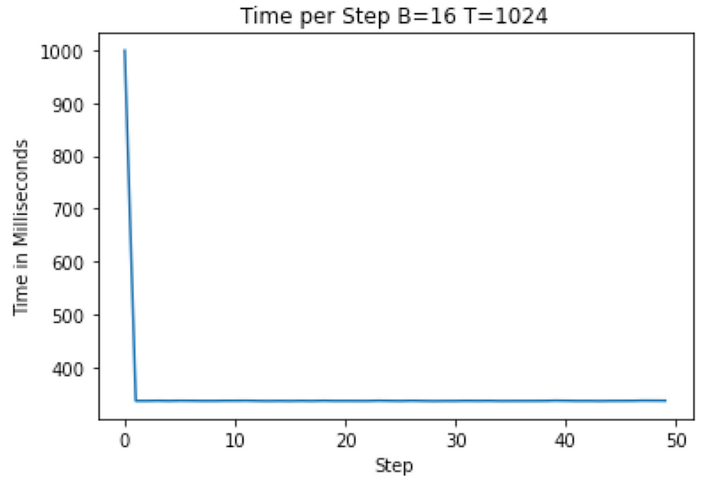
Running on our A100, we now see that the average step takes about 330ms! We’ve already reduced our runtime by about 70%, and we’re just getting started!
Image by Author — A100 Training after data type optimizations
Torch Compile
We can further improve our training time by utilizing the PyTorch Compile feature. This will give us fairly big performance increases without having to adjust our code one bit.
To come at it from a high-level, every computer program is executed in binary. Because most people find it difficult to code in binary, we have created higher-level languages that let us code in forms that are easier for people to think in. When we compile these languages, they are transformed back into binary that we actually run. Sometimes in this translation, we can figure out faster ways to do the same calculation — such as reusing a certain variable or even simply not doing one to begin with.
# ...
model = GPT(GPTConfig(vocab_size=50304))
model.to(device)
model = torch.compile(model) # new line here
# ...
This brings us now to machine learning and PyTorch. Python is a high-level language but we’re still doing computationally intense calculations with it. When we run torch compile we are spending more time compiling our code, but we wind up seeing our runtime (the training for us here) go a lot faster because of that extra work we did to find those optimizations.
Karpathy gives the following example of how PyTorch may improve the calculations. Our GELU activation function can be written out like below:
For each calculation you see in the above function, we have to dispatch a kernel in the GPU. This means that when we start off by taking input to the third power, we pull input from high-bandwidth memory (HBM) into the GPU cores and do our calculation. We then write back to HBM before we start our next calculation and begin the whole process over again. Naturally, this sequencing is causing us to spend a lot of time waiting for memory transfers to occur.
PyTorch compile allows us to see an inefficiency like this and be more careful with when we are spinning up new kernels, resulting in dramatic speed ups. This is called kernel fusion.
While on this topic, I’d like to point out an excellent open-source project called Luminal that takes this idea a little further. Luminal is a separate framework that you write your training / inferencing in. By using this framework, you get access to its compiler which finds many more optimizations for you by nature of having a more limited number of computations to consider. If you like the idea of improving runtime by compiling fast GPU code, give the project a look.
When we run the above code now we see that we see each step takes roughly 145 ms (cutting by 50% from before and ~86% from the original). We pay for this with the first iteration which took roughly 40,000ms to run! As most training sequences have many more steps than 50, this tradeoff is one that we are willing to make.
Image by Author — A100 Training run after the Torch Compile optimizations
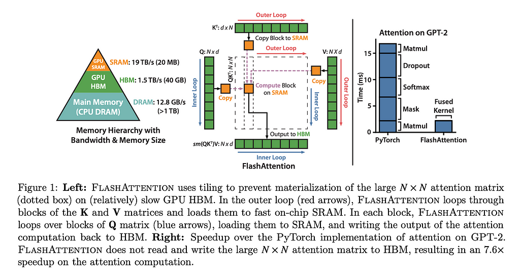
Flash Attention
Another optimization we make is using Flash Attention (see the paper here). The code change itself is very simple for us, but the thinking behind it is worth exploring.
y = F.scaled_dot_product_attention(q, k, v, is_causal=True)
Similar to how we condensed the TanhGELU class into as few kernels as we could, we apply the same thinking to attention. In their paper, “FlashAttention: Fast and Memory-Efficient Exact Attention with IO-Awareness”, the authors show how you can achieve a 7.6x speed up by fusing the kernel. While in theory torch compile should be able to find optimizations like this, in practice we haven’t seen it find this yet.
The paper is worth doing a deep dive on, but to give a quick synopsis, FlashAttention is written to be IO-aware, thus preventing unnecessary (and time-consuming) calls to memory. By reducing these, they can radically speed up the calculations.
After implementing this, we find that we now have an average step of about 104ms.
Image by Author — A100 Training after Flash Attention Optimization
Vocab Size Change
Finally, we can go through all of the numbers we have hard-coded and evaluate how “nice” they are. When we do this, we find that the vocabulary size is not divisible by many powers of 2 and so will be more time-consuming for our GPU’s memory to load in. We fix this by going from the 50,257 vocab size to the next “nice” number, which is 50,304. This is a nice number as it’s cleanly divisible by 2, 4, 8, 16, 32, 64, and 128.
model = GPT(GPTConfig(vocab_size=50304))
Now you may remember from the last blog post that our vocab size is not an arbitrary value — it is determined by the tokenizer we are using. Thus begs the question, When we arbitrarily add in more values to our vocab size, what happens? During the training, the model will notice that these new vocab never appear, so it will start to push the probabilities of these tokens to 0 — thus our performance is safe. That does not mean that there is no tradeoff though. By loading into memory vocab that is never used, we are wasting time. However, empirically we can see that loading in “nice” numbers more than compensates for this cost.
With our last optimization, we now have an average of about 100 ms per step.
Image by Author — A100 Training after Vocab Size Optimization
With this final optimization, we find that our training has improved ~10x from the beginning!
We can see from the graph below that while the torch compile does take a lot of time for the first round, the next rounds are not significantly better than the unoptimized versions (roughly an 8% drop on T4 vs 90% drop on A100).
Image by Author — Optimized run on T4 GPU
Nevertheless, when OpenAI was training GPT-2 it was running on far more advanced hardware than the T4. The fact that we can run this workload on a T4 today suggests that hardware requirements are becoming less onerous, helping create a future where hardware is not a barrier to ML work.
Closing
By optimizing our code, we’ve seen major speed ups and also learned a bit about where the big bottlenecks for training happen. First and foremost, datatypes are critically important for speed, as this change by itself contributed majorly to the speed ups. Second, we see that hardware optimizations can play a major role in speeding up calculations — so GPU hardware is worth its weight in gold. Finally, compiler optimizations have a major role to play here as well.
To see the code I ran in the A100, check out this gist here. If you have any suggestions for how to optimize the hardware further, I would love to see them in the comments!
Store the MSFT GraphRAG output into Neo4j and implement local and global retrievers with LangChain or LlamaIndex
Image created with ChatGPT.
Microsoft’s GraphRAG implementation has gained significant attention lately. In my last blog post, I discussed how the graph is constructed and explored some of the innovative aspects highlighted in the research paper. At a high level, the input to the GraphRAG library are source documents containing various information. The documents are processed using an Large Language Model (LLM) to extract structured information about entities appearing in the documents along with their relationships. This extracted structured information is then used to construct a knowledge graph.
High-level indexing pipeline as implemented in the GraphRAG paper by Microsoft — Image by author
After the knowledge graph has been constructed, the GraphRAG library uses a combination of graph algorithms, specifically Leiden community detection algorithm, and LLM prompting to generate natural language summaries of communities of entities and relationships found in the knowledge graph.
In this post, we’ll take the output from the GraphRAG library, store it in Neo4j, and then set up retrievers directly from Neo4j using LangChain and LlamaIndex orchestration frameworks.
The code and GraphRAG output are accessible on GitHub, allowing you to skip the GraphRAG extraction process.
Dataset
The dataset featured in this blog post is “A Christmas Carol” by Charles Dickens, which is freely accessible via the Gutenberg Project.
We selected this book as the source document because it is highlighted in the introductory documentation, allowing us to perform the extraction effortlessly.
Graph construction
Even though you can skip the graph extraction part, we’ll talk about a couple of configuration options I think are the most important. For example, graph extraction can be very token-intensive and costly. Therefore, testing the extraction with a relatively cheap but good-performing LLM like gpt-4o-mini makes sense. The cost reduction from gpt-4-turbo can be significant while retaining good accuracy, as described in this blog post.
GRAPHRAG_LLM_MODEL=gpt-4o-mini
The most important configuration is the type of entities we want to extract. By default, organizations, people, events, and geo are extracted.
These default entity types might work well for a book, but make sure to change them accordingly to the domain of the documents you are looking at processing for a given use case.
Another important configuration is the max gleanings value. The authors identified, and we also validated separately, that an LLM doesn’t extract all the available information in a single extraction pass.
Number of extract entities given the size of text chunks — Image from the GraphRAG paper, licensed under CC BY 4.0
The gleaning configuration allows the LLM to perform multiple extraction passes. In the above image, we can clearly see that we extract more information when performing multiple passes (gleanings). Multiple passes are token-intensive, so a cheaper model like gpt-4o-mini helps to keep the cost low.
GRAPHRAG_ENTITY_EXTRACTION_MAX_GLEANINGS=1
Additionally, the claims or covariate information is not extracted by default. You can enable it by setting the GRAPHRAG_CLAIM_EXTRACTION_ENABLED configuration.
It seems that it’s a recurring theme that not all structured information is extracted in a single pass. Hence, we have the gleaning configuration option here as well.
What’s also interesting, but I haven’t had time to dig deeper is the prompt tuning section. Prompt tuning is optional, but highly encouraged as it can improve accuracy.
Steps in the pipeline — Image from the GraphRAG paper, licensed under CC BY 4.0
The extraction pipeline executes all the blue steps in the above image. Review my previous blog post to learn more about graph construction and community summarization. The output of the graph extraction pipeline of the MSFT GraphRAG library is a set of parquet files, as shown in the Operation Dulce example.
These parquet files can be easily imported into the Neo4j graph database for downstream analysis, visualization, and retrieval. We can use a free cloud Aura instance or set up a local Neo4j environment. My friend Michael Hunger did most of the work to import the parquet files into Neo4j. We’ll skip the import explanation in this blog post, but it consists of importing and constructing a knowledge graph from five or six CSV files. If you want to learn more about CSV importing, you can check the Neo4j Graph Academy course.
After the import is completed, we can open the Neo4j Browser to validate and visualize parts of the imported graph.
Part of the imported graph. Image by the author.
Graph analysis
Before moving onto retriever implementation, we’ll perform a simple graph analysis to familiarize ourselves with the extracted data. We start by defining the database connection and a function that executes a Cypher statement (graph database query language) and outputs a Pandas DataFrame.
def db_query(cypher: str, params: Dict[str, Any] = {}) -> pd.DataFrame: """Executes a Cypher statement and returns a DataFrame""" return driver.execute_query( cypher, parameters_=params, result_transformer_=Result.to_df )
When performing the graph extraction, we used a chunk size of 300. Since then, the authors have changed the default chunk size to 1200. We can validate the chunk sizes using the following Cypher statement.
db_query(
  "MATCH (n:__Chunk__) RETURN n.n_tokens as token_count, count(*) AS count"
)
# token_count count
# 300         230
# 155         1
230 chunks have 300 tokens, while the last one has only 155 tokens. Let’s now check an example entity and its description.
db_query(
  "MATCH (n:__Entity__) RETURN n.name AS name, n.description AS description LIMIT 1"
)
Results
Example entity name and description. Image by author.
It seems that the project Gutenberg is described in the book somewhere, probably at the beginning. We can observe how a description can capture more detailed and intricate information than just an entity name, which the MSFT GraphRAG paper introduced to retain more sophisticated and nuanced data from text.
Let’s check example relationships as well.
db_query(
  "MATCH ()-[n:RELATED]->() RETURN n.description AS description LIMIT 5"
)
Results
Example relationship descriptions. Image by author.
The MSFT GraphRAG goes beyond merely extracting simple relationship types between entities by capturing detailed relationship descriptions. This capability allows it to capture more nuanced information than straightforward relationship types.
We can also examine a single community and its generated descriptions.
db_query("""
  MATCH (n:__Community__)
  RETURN n.title AS title, n.summary AS summary, n.full_content AS full_content LIMIT 1
""")
Results
Example community description. Image by author.
A community has a title, summary, and full content generated using an LLM. I haven’t seen if the authors use the full context or just the summary during retrieval, but we can choose between the two. We can observe citations in the full_content, which point to entities and relationships from which the information came. It’s funny that an LLM sometimes trims the citations if they are too long, like in the following example.
Distribution of the count of extracted entities from text chunks. Image by author.
Remember, text chunks have 300 tokens. Therefore, the number of extracted entities is relatively small, with an average of around three entities per text chunk. The extraction was done without any gleanings (a single extraction pass). It would be interesting to see the distribution if we increased the gleaning count.
Next, we will evaluate the node degree distribution. A node degree is the number of relationships a node has.
degree_dist_df = db_query(
    """
MATCH (e:__Entity__)
RETURN count {(e)-[:RELATED]-()} AS node_degree
"""
)
# Calculate mean and median
mean_degree = np.mean(degree_dist_df['node_degree'])
percentiles = np.percentile(degree_dist_df['node_degree'], [25, 50, 75, 90])
# Create a histogram with a logarithmic scale
plt.figure(figsize=(12, 6))
sns.histplot(degree_dist_df['node_degree'], bins=50, kde=False, color='blue')
# Use a logarithmic scale for the x-axis
plt.yscale('log')
# Adding labels and title
plt.xlabel('Node Degree')
plt.ylabel('Count (log scale)')
plt.title('Node Degree Distribution')
# Add mean, median, and percentile lines
plt.axvline(mean_degree, color='red', linestyle='dashed', linewidth=1, label=f'Mean: {mean_degree:.2f}')
plt.axvline(percentiles[0], color='purple', linestyle='dashed', linewidth=1, label=f'25th Percentile: {percentiles[0]:.2f}')
plt.axvline(percentiles[1], color='orange', linestyle='dashed', linewidth=1, label=f'50th Percentile: {percentiles[1]:.2f}')
plt.axvline(percentiles[2], color='yellow', linestyle='dashed', linewidth=1, label=f'75th Percentile: {percentiles[2]:.2f}')
plt.axvline(percentiles[3], color='brown', linestyle='dashed', linewidth=1, label=f'90th Percentile: {percentiles[3]:.2f}')
# Add legend
plt.legend()
# Show the plot
plt.show()
Results
Node degree distribution. Image by author.
Most real-world networks follow a power-law node degree distribution, with most nodes having relatively small degrees and some important nodes having a lot. While our graph is small, the node degree follows the power law. It would be interesting to identify which entity has 120 relationships (connected to 43% of entities).
db_query("""
  MATCH (n:__Entity__)
  RETURN n.name AS name, count{(n)-[:RELATED]-()} AS degree
  ORDER BY degree DESC LIMIT 5""")
Results
Entities with the most relationships. Image by author.
Without any hesitation, we can assume that Scrooge is the book’s main character. I would also venture a guess that Ebenezer Scrooge and Scrooge are actually the same entity, but as the MSFT GraphRAG lacks an entity resolution step, they weren’t merged.
It also shows that analyzing and cleaning the data is a vital step to reducing noise information, as Project Gutenberg has 13 relationships, even though they are not part of the book story.
Lastly, we’ll inspect the distribution of community size per hierarchical level.
community_data = db_query(""" MATCH (n:__Community__) RETURN n.level AS level, count{(n)-[:IN_COMMUNITY]-()} AS members """)
# Add statistical annotations for i in range(stats.shape[0]): level = stats['level'][i] max_val = stats['max_members'][i] text = (f"num: {stats['num_communities'][i]}n" f"all_members: {stats['total_members'][i]}n" f"min: {stats['min_members'][i]}n" f"max: {stats['max_members'][i]}n" f"med: {stats['median_members'][i]}n" f"avg: {stats['avg_members'][i]:.2f}") plt.text(level, 85, text, horizontalalignment='center', fontsize=9)
plt.show()
Results
Community size distribution per level. Image by author.
The Leiden algorithm identified three levels of communities, where the communities on higher levels are larger on average. However, there are some technical details that I’m not aware of because if you check the all_members count, and you can see that each level has a different number of all nodes, even though they should be the same in theory. Also, if communities merge at higher levels, why do we have 19 communities on level 0 and 22 on level 1? The authors have done some optimizations and tricks here, which I haven’t had a time to explore in detail yet.
Implementing retrievers
In the last part of this blog post, we will discuss the local and global retrievers as specified in the MSFT GraphRAG. The retrievers will be implemented and integrated with LangChain and LlamaIndex.
Local retriever
The local retriever starts by using vector search to identify relevant nodes, and then collects linked information and injects it into the LLM prompt.
While this diagram might look complex, it can be easily implemented. We start by identifying relevant entities using a vector similarity search based on text embeddings of entity descriptions. Once the relevant entities are identified, we can traverse to related text chunks, relationships, community summaries, and so on. The pattern of using vector similarity search and then traversing throughout the graph can easily be implemented using a retrieval_query feature in both LangChain and LlamaIndex.
First, we need to configure the vector index.
index_name = "entity"

db_query(
    """
CREATE VECTOR INDEX """
    + index_name
    + """ IF NOT EXISTS FOR (e:__Entity__) ON e.description_embedding
OPTIONS {indexConfig: {
 `vector.dimensions`: 1536,
 `vector.similarity_function`: 'cosine'
}}
"""
)
We’ll also calculate and store the community weight, which is defined as the number of distinct text chunks the entities in the community appear.
db_query(
    """
MATCH (n:`__Community__`)<-[:IN_COMMUNITY]-()<-[:HAS_ENTITY]-(c)
WITH n, count(distinct c) AS chunkCount
SET n.weight = chunkCount"""
)
The number of candidates (text units, community reports, …) from each section is configurable. While the original implementation has slightly more involved filtering based on token counts, we’ll simplify it here. I developed the following simplified top candidate filter values based on the default configuration values.
We will start with LangChain implementation. The only thing we need to define is the retrieval_query , which is more involved.
lc_retrieval_query = """ WITH collect(node) as nodes // Entity - Text Unit Mapping WITH collect { UNWIND nodes as n MATCH (n)<-[:HAS_ENTITY]->(c:__Chunk__) WITH c, count(distinct n) as freq RETURN c.text AS chunkText ORDER BY freq DESC LIMIT $topChunks } AS text_mapping, // Entity - Report Mapping collect { UNWIND nodes as n MATCH (n)-[:IN_COMMUNITY]->(c:__Community__) WITH c, c.rank as rank, c.weight AS weight RETURN c.summary ORDER BY rank, weight DESC LIMIT $topCommunities } AS report_mapping, // Outside Relationships collect { UNWIND nodes as n MATCH (n)-[r:RELATED]-(m) WHERE NOT m IN nodes RETURN r.description AS descriptionText ORDER BY r.rank, r.weight DESC LIMIT $topOutsideRels } as outsideRels, // Inside Relationships collect { UNWIND nodes as n MATCH (n)-[r:RELATED]-(m) WHERE m IN nodes RETURN r.description AS descriptionText ORDER BY r.rank, r.weight DESC LIMIT $topInsideRels } as insideRels, // Entities description collect { UNWIND nodes as n RETURN n.description AS descriptionText } as entities // We don't have covariates or claims here RETURN {Chunks: text_mapping, Reports: report_mapping, Relationships: outsideRels + insideRels, Entities: entities} AS text, 1.0 AS score, {} AS metadata """
This Cypher query performs multiple analytical operations on a set of nodes to extract and organize related text data:
1. Entity-Text Unit Mapping: For each node, the query identifies linked text chunks (`__Chunk__`), aggregates them by the number of distinct nodes associated with each chunk, and orders them by frequency. The top chunks are returned as `text_mapping`.
2. Entity-Report Mapping: For each node, the query finds the associated community (`__Community__`), and returns the summary of the top-ranked communities based on rank and weight.
3. Outside Relationships: This section extracts descriptions of relationships (`RELATED`) where the related entity (`m`) is not part of the initial node set. The relationships are ranked and limited to the top external relationships.
4. Inside Relationships: Similarly to outside relationships, but this time it considers only relationships where both entities are within the initial set of nodes.
5. Entities Description: Simply collects descriptions of each node in the initial set.
Finally, the query combines the collected data into a structured result comprising of chunks, reports, internal and external relationships, and entity descriptions, along with a default score and an empty metadata object. You have the option to remove some of the retrieval parts to test how they affect the results.
And now you can run the retriever using the following code:
docs = lc_vector.similarity_search(
    "What do you know about Cratchitt family?",
    k=topEntities,
    params={
        "topChunks": topChunks,
        "topCommunities": topCommunities,
        "topOutsideRels": topOutsideRels,
        "topInsideRels": topInsideRels,
    },
)
# print(docs[0].page_content)
The same retrieval pattern can be implemented with LlamaIndex. For LlamaIndex, we first need to add metadata to nodes so that the vector index will work. If the default metadata is not added to the relevant nodes, the vector index will return an error.
# https://github.com/run-llama/llama_index/blob/main/llama-index-core/llama_index/core/vector_stores/utils.py#L32 from llama_index.core.schema import TextNode from llama_index.core.vector_stores.utils import node_to_metadata_dict
db_query( """ MATCH (e:__Entity__) SET e += $content""", {"content": content}, )
Again, we can use the retrieval_query feature in LlamaIndex to define the retriever. Unlike with LangChain, we will use the f-string instead of query parameters to pass the top candidate filter parameters.
retrieval_query = f"""
WITH collect(node) as nodes
// Entity - Text Unit Mapping
WITH
nodes,
collect {{
    UNWIND nodes as n
    MATCH (n)<-[:HAS_ENTITY]->(c:__Chunk__)
    WITH c, count(distinct n) as freq
    RETURN c.text AS chunkText
    ORDER BY freq DESC
    LIMIT {topChunks}
}} AS text_mapping,
// Entity - Report Mapping
collect {{
    UNWIND nodes as n
    MATCH (n)-[:IN_COMMUNITY]->(c:__Community__)
    WITH c, c.rank as rank, c.weight AS weight
    RETURN c.summary
    ORDER BY rank, weight DESC
    LIMIT {topCommunities}
}} AS report_mapping,
// Outside Relationships
collect {{
    UNWIND nodes as n
    MATCH (n)-[r:RELATED]-(m)
    WHERE NOT m IN nodes
    RETURN r.description AS descriptionText
    ORDER BY r.rank, r.weight DESC
    LIMIT {topOutsideRels}
}} as outsideRels,
// Inside Relationships
collect {{
    UNWIND nodes as n
    MATCH (n)-[r:RELATED]-(m)
    WHERE m IN nodes
    RETURN r.description AS descriptionText
    ORDER BY r.rank, r.weight DESC
    LIMIT {topInsideRels}
}} as insideRels,
// Entities description
collect {{
    UNWIND nodes as n
    RETURN n.description AS descriptionText
}} as entities
// We don't have covariates or claims here
RETURN "Chunks:" + apoc.text.join(text_mapping, '|') + "nReports: " + apoc.text.join(report_mapping,'|') +
       "nRelationships: " + apoc.text.join(outsideRels + insideRels, '|') +
       "nEntities: " + apoc.text.join(entities, "|") AS text, 1.0 AS score, nodes[0].id AS id, {{_node_type:nodes[0]._node_type, _node_content:nodes[0]._node_content}} AS metadata
"""
Additionally, the return is slightly different. We need to return the node type and content as metadata; otherwise, the retriever will break. Now we just instantiate the Neo4j vector store and use it as a query engine.
response = loaded_index.query("What do you know about Scrooge?")
print(response.response)
#print(response.source_nodes[0].text)
# Scrooge is an employee who is impacted by the generosity and festive spirit
# of the Fezziwig family, particularly Mr. and Mrs. Fezziwig. He is involved
# in the memorable Domestic Ball hosted by the Fezziwigs, which significantly
# influences his life and contributes to the broader narrative of kindness
# and community spirit.
One thing that immediately sparks to mind is that we can improve the local retrieval by using a hybrid approach (vector + keyword) to find relevant entities instead of vector search only.
Global retriever
The global retriever architecture is slightly more straightforward. It seems to iterate over all the community summaries on a specified hierarchical level, producing intermediate summaries and then generating a final response based on the intermediate summaries.
We have to decide which define in advance which hierarchical level we want to iterate over, which is a not a simple decision as we have no idea which one would work better. The higher up you go the hierarchical level, the larger the communities get, but there are fewer of them. This is the only information we have without inspecting summaries manually.
Other parameters allow us to ignore communities below a rank or weight threshold, which we won’t use here. We’ll implement the global retriever using LangChain as use the same map and reduce prompts as in the GraphRAG paper. Since the system prompts are very long, we will not include them here or the chain construction. However, all the code is available in the notebook.
print(global_retriever("What is the story about?", 2))
Results
The story primarily revolves around Ebenezer Scrooge, a miserly man who initially embodies a cynical outlook towards life and despises Christmas. His transformation begins when he is visited by the ghost of his deceased business partner, Jacob Marley, followed by the appearances of three spirits—representing Christmas Past, Present, and Yet to Come. These encounters prompt Scrooge to reflect on his life and the consequences of his actions, ultimately leading him to embrace the Christmas spirit and undergo significant personal growth [Data: Reports (32, 17, 99, 86, +more)].
### The Role of Jacob Marley and the Spirits
Jacob Marley’s ghost serves as a supernatural catalyst, warning Scrooge about the forthcoming visitations from the three spirits. Each spirit guides Scrooge through a journey of self-discovery, illustrating the impact of his choices and the importance of compassion. The spirits reveal to Scrooge how his actions have affected not only his own life but also the lives of others, particularly highlighting the themes of redemption and interconnectedness [Data: Reports (86, 17, 99, +more)].
### Scrooge’s Relationships and Transformation
Scrooge’s relationship with the Cratchit family, especially Bob Cratchit and his son Tiny Tim, is pivotal to his transformation. Through the visions presented by the spirits, Scrooge develops empathy, which inspires him to take tangible actions that improve the Cratchit family’s circumstances. The narrative emphasizes that individual actions can have a profound impact on society, as Scrooge’s newfound generosity fosters compassion and social responsibility within his community [Data: Reports (25, 158, 159, +more)].
### Themes of Redemption and Hope
Overall, the story is a timeless symbol of hope, underscoring themes such as empathy, introspection, and the potential for personal change. Scrooge’s journey from a lonely miser to a benevolent figure illustrates that it is never too late to change; small acts of kindness can lead to significant positive effects on individuals and the broader community [Data: Reports (32, 102, 126, 148, 158, 159, +more)].
In summary, the story encapsulates the transformative power of Christmas and the importance of human connections, making it a poignant narrative about redemption and the impact one individual can have on others during the holiday season.
The response is quite long and exhaustive as it fits a global retriever that iterates over all the communities on a specified level. You can test how the response changes if you change the community hierarchical level.
Summary
In this blog post we demonstrated how to integrate Microsoft’s GraphRAG into Neo4j and implement retrievers using LangChain and LlamaIndex. This should allows you to integrate GraphRAG with other retrievers or agents seamlessly. The local retriever combines vector similarity search with graph traversal, while the global retriever iterates over community summaries to generate comprehensive responses. This implementation showcases the power of combining structured knowledge graphs with language models for enhanced information retrieval and question answering. It’s important to note that there is room for customization and experimentation with such a knowledge graph, which we will look into in the next blog post.
Practical Strategies for Successful Project Delivery in Challenging Collaborative Environments
Image generated by the author using DALL-E
Introduction
Have you ever asked a team member for a deliverable and received something completely different? Or sent an email to a client project manager and received no response, even after multiple follow-ups?
Delivering products with a team can sometimes be challenging, and if you are the team leader, it is your responsibility to work through those challenges and still have a successful project. This can be particularly demanding in consulting data science projects, where collaboration with client resources is essential.
In addition, when delivering end-to-end data science solutions, the need for close integration with client infrastructure, access to data, and frequent stakeholder feedback means you will typically work with a cross-functional team. This team may include business analysts, data scientists, DevOps engineers, data engineers, project coordinators, and domain experts. Each member brings unique skills and perspectives, but they also come with their own sets of challenges.
The key to navigating these issues lies in an understanding of individual team members capabilities, weaknesses and strengths, proper planning and a focus on goal achievement. As the team leader, you must be agile and adapt your plans based on the strengths and weaknesses of your team, but also sometimes evaluate your own behavior, to see how your own actions are perceived. Below, I explore some common team challenges in data science projects and offer some key takeaways to ensure successful project delivery.
Challenges and Interventions
Image generated by the author using DALL-E
Leading data science projects involves overcoming a variety of challenges, from misunderstandings and lack of commercial insight to low productivity and disengaged stakeholders. Effective intervention often requires a combination of reflection, introspection, adaptive planning, one-on-one meetings and hands-on leadership. Here, I discuss specific challenges I have encountered and the strategies I employed to address them successfully.
Lack of understanding and underlying commercial insight
Challenge: On one of my earlier projects, I was put in charge of a couple of data scientists that were struggling to deliver on a project. They had built an algorithm that was giving the opposite answer to what they were expecting. In this case their model predicted that churn would decrease as price increased. The consulting partners on the project were not impressed, and needed a viable solution that the client could accept.
Intervention: My first course of action was to establish what we intuitively should expect from the algorithm. Then, I immersed myself in the data preparation and pipeline. (I totally support the common wisdom that data scientist spends 80% of their time cleaning and prepping data, and only 20% on generating insights.) This helped me discover that the issue was caused by how the data was being prepared and transformed from the source data, what data was included in the model and what other assumptions they made during the modelling process.
In addition to trying to lead by example and being hands on with the data, I also had frequent one-on-one meetings with the data scientist. These meetings let me clarify my expectations and better understand why they had gone down the wrong path with regards to modelling and data. Furthermore, I provided feedback on how we could course correct and get back on track. It was also important to constantly remind the data scientists about the end goal we were trying to achieve with the project.
Too academic without focus on the end goal of the project
Challenge: As is often common with data science and data engineering projects there are a lot smart people involved. Usually this is great, but sometimes good ideas can get in the way of delivering on your goal. I have often seen data scientists — and I myself have been guilty of this — delve too deep into a given problem and perhaps slightly loosing focus on what we are trying to achieve. This issue becomes extra acute in a hectic project setting, where we face budget, time and resource constraints.
On one occasion, I tasked a data scientist with developing a model for predicting churn, however he got stuck on the details and kept going down an analysis path that was not fruitful — despite not making significant gains. The data scientist was very rigorous in his approach and had difficulty taking a more pragmatic view of the situation. In this case we were also looking for a connection between churn and price, however the way the data was structured, and the algorithms that were being applied were not conducive to the end goal.
This challenge doesn’t only apply to team members, and as team leader you yourself can also easily fall into this trap. On a recent project, I was working a business case and was determined I had a great solution for approximating the ROI of our project. It was rigorous, bottom up and didn’t require any wild assumptions to be able to show our case. However, after working on it for a few days it turned out it was way too time consuming and complex for what we really needed. They client didn’t fully understand the methodology and it was clear we needed a simpler and more intuitive approach.
Intervention: In both cases, the solution was introspection and reflection on outcomes and use of time. Regarding the situation with the data scientist, I had one-on-one meetings with him to align on what we needed to achieve and deliver. What our end goal was. And for myself, by listening to feedback from my team and reflecting on my time consumption and progress, I was able to course correct and adjust the approach using a simpler technique that still met our objectives and allowed us to quantify the ROI of our project.
Low productivity team members
Challenge: Not all team members will be able to produce the expected output when initially planning a project. However, as a consultant, you are often required to make development plans that integrate client personnel — despite not being able to assess their productivity beforehand. Various factors, such as being overloaded with projects or dealing with personal issues, can contribute to lower productivity. Beware of making overly detailed plans without understanding the available resources, as this can be a trap.
On one project I was informed by the client they would provide we me 2 data scientist FTEs (full time equivalents), 1 business analyst FTE and one data engineer FTE that would help me deliver the project. Based on this I tried to plan out how we might be able to deliver the project within the given timeframe. However, when time came to deliver it turned out one of my data scientists FTEs had a couple of weeks planned leave, and there were no one to replace him. It also turned out that the data engineer FTE didn’t really deliver and wasn’t able to produce the level of output we needed for the project.
Intervention: The situation above was resolved by having short planning cycles and quickly adapting to changing conditions. I directed one of our more productive data science FTEs to pick up the slack and became very hands-on myself. This flexibility would have been difficult with longer, less adaptable plans.
Disengaged or uncooperative client side project manager
Challenge: In many consulting projects you will have a counter party on the client side that manages the project internally. This will typically be a person who either will own the end product you are building or someone whose role it is to manage projects internally and knows how to help the project move forwards.
Usually, it’s great to have someone on the client side who can contribute and help drive the project — especially when you need to align with multiple stakeholders. But sometimes you end up with a disengaged or uncooperative manager that doesn’t respond to emails and becomes more of a bottleneck than a help. For data science projects, where you ideally want frequent feedback, this can be problematic.
Intervention: Get regular meetings into their calendar. If you are used to weekly meetings with other managers, consider ramping that up to two meetings a week instead. Even if they don’t respond to emails, at least it is not long between in-person catch ups. If all else fails, another strategy can also be to use other channels to connect with the client. On one of my projects we had a consulting partner, who was not directly involved in the day-to-day operations of the project, reach out directly to the CMO on the client side and prompt the project manager to take more action.
Again, this is also a situation where reflection and introspection might be beneficial. Why is the project manager is behaving the way he is, is there anything about your own behavior that could have prompted it? Perhaps you did something or presented something in a way that rubbed off the wrong way? Try a one-on-one meeting to iron out any misunderstandings and align the focus on the end goal of the project.
Key Takeaways and Guiding Principles
Image generated by the author using DALL-E
This probably shouldn’t come as a huge surprise; it turns out many of the interventions we discussed above have a lot in common with the original principles underlying the agile software development movement. In the “12 Principles Behind the Agile Manifesto” we find a clear emphasis on a “preference to the shorter timescale… ”, and also ideas regarding reflection “…reflects on how to become more effective, then tunes and adjusts its behavior accordingly.” Additionally, there is also a focus on meeting and talking with people: “The most efficient and effective method of conveying information to and within a development team is face-to-face conversation.” Since agile was originally created as a method for software teams to improve their development processes in response to the prevailing waterfall methodology, it makes sense that many of its principles also apply to data science projects.
I have tried to consolidate my interventions into a few guiding principles, and of course some of the strategies discussed here will apply to many different types of projects, not just data science.
Planning with short iterations
If you rely too heavily on a predetermined large plan, you risk setting yourself up for failure. Especially when you don’t know the team very well. This is why having shorter development cycles with being able to adapt to quickly will increase your chances of success.
Keep the end goal in mind
This is a very strong guiding principle, and I often see it being a good way to approach problems and issues with team members. Especially when their efforts and analysis have drifted too far away from what we are trying to achieve.
In many of the larger data science projects I have been involved in, the end goal has been to implement some kind of end-to-end machine learning system into the client architecture. This could be anything from custom-made pricing solutions to a fully fledged customer management platform. For example, if you are working on a price sensitivity algorithm that is going into the end customer pricing function, frequently evaluate whether your efforts and research is really advancing the end goal of the project.
Lead by example
In most of my projects, I have had positive experiences with taking a hands-on approach and working in the details with team. Leading by example is effective because it builds trust and respect. When leaders demonstrate the behavior and work ethic they expect from their team members, it sets a clear standard and motivates others to follow suit.
Leading by example can be especially important when you have low productive team members. Also, it lets you be more flexible in your planning and it’s easier to jump in whenever parts of the development need more attention. Ultimately, I believe leading by example helps create a culture of integrity, collaboration, and mutual support.
One-to-one meetings
One-to-one meetings are particularly beneficial when leading data science projects due to the personalized communication and individual focus they provide. These meetings create a space for deeper understanding between managers and team members, allowing for tailored support and guidance on complex tasks. This is extra beneficial when you are a consultant and don’t know all the team members.
When you need to align with team members, one-to-one meetings offer a private space for constructive feedback, and ensure coordination between individual contributions and project goals.
Evaluate yourself and how you are perceived
Lastly, resolving issues and moving a team forward sometimes requires introspection from the team leader. Working with new people can be challenging, especially when coming from different countries and cultures. For example, I am from Norway, where direct and informal communication is common. This contrasts with the UK, where communication tends to be more subtle and polite.
I have personally experienced times when I was too focused on the end goal, assuming everyone was on the same page, without stopping to coordinate with the team. Additionally, I sometimes find myself becoming too technical when explaining difficult subjects. If team members don’t understand, they can feel excluded and frustrated, and you might come across as a know-it-all or arrogant. This is particularly challenging in data science, where complex topics often need to be explained quickly.
It’s Not All Doom and Gloom
While this article focused mainly on the challenging aspects of working in a data science team, there are of course many aspects of it that are amazing, and why I continue to do it. I have met some really smart and engaging people who have contributed to my data science journey and taught me invaluable skills. In addition, together as teams we have been able to deliver way more than any of one of us could have done.
I would not be without those experiences, and I am grateful for the opportunity to be able to work on a diverse set of projects, interesting people and data challenges. (I even met my future wife and the mother of two of my boys on a project!!)
Conclusion
Leading data science teams comes with its unique set of challenges. From dealing with varying productivity levels and ensuring alignment with client resources, to maintaining focus on the end goals and fostering effective communication, the role demands a versatile and adaptive approach. By maintaining short planning cycles, leading by example, and utilizing one-on-one meetings for personalized guidance, team leaders can steer through these challenges more effectively.
While obstacles may be numerous, the rewards of working with a great team to solve complex problems are substantial. The experiences enhance professional growth and contribute to personal development and meaningful connections. Embrace the challenges, learn from each project, and continue to grow as a leader!
We use cookies on our website to give you the most relevant experience by remembering your preferences and repeat visits. By clicking “Accept”, you consent to the use of ALL the cookies.
This website uses cookies to improve your experience while you navigate through the website. Out of these, the cookies that are categorized as necessary are stored on your browser as they are essential for the working of basic functionalities of the website. We also use third-party cookies that help us analyze and understand how you use this website. These cookies will be stored in your browser only with your consent. You also have the option to opt-out of these cookies. But opting out of some of these cookies may affect your browsing experience.
Necessary cookies are absolutely essential for the website to function properly. These cookies ensure basic functionalities and security features of the website, anonymously.
Cookie
Duration
Description
cookielawinfo-checkbox-analytics
11 months
This cookie is set by GDPR Cookie Consent plugin. The cookie is used to store the user consent for the cookies in the category "Analytics".
cookielawinfo-checkbox-functional
11 months
The cookie is set by GDPR cookie consent to record the user consent for the cookies in the category "Functional".
cookielawinfo-checkbox-necessary
11 months
This cookie is set by GDPR Cookie Consent plugin. The cookies is used to store the user consent for the cookies in the category "Necessary".
cookielawinfo-checkbox-others
11 months
This cookie is set by GDPR Cookie Consent plugin. The cookie is used to store the user consent for the cookies in the category "Other.
cookielawinfo-checkbox-performance
11 months
This cookie is set by GDPR Cookie Consent plugin. The cookie is used to store the user consent for the cookies in the category "Performance".
viewed_cookie_policy
11 months
The cookie is set by the GDPR Cookie Consent plugin and is used to store whether or not user has consented to the use of cookies. It does not store any personal data.
Functional cookies help to perform certain functionalities like sharing the content of the website on social media platforms, collect feedbacks, and other third-party features.
Performance cookies are used to understand and analyze the key performance indexes of the website which helps in delivering a better user experience for the visitors.
Analytical cookies are used to understand how visitors interact with the website. These cookies help provide information on metrics the number of visitors, bounce rate, traffic source, etc.
Advertisement cookies are used to provide visitors with relevant ads and marketing campaigns. These cookies track visitors across websites and collect information to provide customized ads.