In recent years, we have seen a big increase in the size of large language models (LLMs) used to solve natural language processing (NLP) tasks such as question answering and text summarization. Larger models with more parameters, which are in the order of hundreds of billions at the time of writing, tend to produce better […]
Hi there, and welcome to this article! I’m going to explain how I built BeatBuddy, a web app that analyzes what you’re listening to on Spotify. Inspired by Spotify Wrapped, it aims to interpret your current mood and provide recommendations that you can tweak based on that analysis.
If you don’t want to read everything and just want to give it a try, you can do so here: BeatBuddy. For the rest, keep reading!
The Birth of the Project
I’m a data analyst and a music lover, and I believe that data analysis is a powerful way to understand the world we live in and who we are as individuals.
Music, in particular, can act as a mirror, reflecting your identity and emotions at a given moment. The type of music you choose often depends on your current activities and mood. For example, if you’re working out, you might choose an energetic playlist to motivate you.
On the other hand, if you are busy studying or focusing on crushing some data, you may want to listen to calm and peaceful music. I’ve even heard of people listening to white noise to focus, which can be described as the sound you hear when you open the windows of your car on the highway.
Another example of how music can reflect your mood is at a party. Imagine you are having a party with friends and you have to choose the music. If it’s a casual dinner, you might want to play some smooth jazz or mellow tunes. But if you’re aiming for the kind of party where everyone ends up dancing on the furniture or doing their best drunken karaoke performance of an ’80s hit, you’ll want to choose songs that are energetic and danceable. We’ll come back to these concepts in a moment.
In fact, all the music you listen to and the choices you make can reveal fascinating aspects of your personality and emotional state at any given moment. Nowadays, people tend to enjoy analytics about themselves, and it’s becoming a global trend! This trend is known as the “quantified self,” a movement where people use analytics to track their activities, such as fitness, sleep, and productivity, to make informed decisions (or not).
Don’t get me wrong, as a data nerd, I love all these things, but sometimes it goes too far — like with AI-connected toothbrushes. Firstly, I don’t need a toothbrush with a Wi-Fi antenna. Secondly, I don’t need a line chart showing the evolution of how well I’ve been brushing over the last six weeks.
Anyway, back to the music industry. Spotify was one of the pioneers in turning user data collection into something cool, and they called it Spotify Wrapped.
FIGURE I : Example of Spotify Wrapped | Image by the author
At the end of the year, Spotify compiles what you’ve listened to and creates Spotify Wrapped, which goes viral on social media. Its popularity lies in its ability to reveal aspects of your personality and preferences that you can compare to your friends.
This concept of how Spotify collects and aggregates data for these year-end summaries has always fascinated me. I remember asking myself, “How do they do that?” and that curiosity was the starting point for this project.
Well, not exactly. Let’s be honest: The idea to analyze Spotify data was written on a note titled “data project”-you know, the kind of note filled with ideas you’ll probably never start or finish. It sat there for a year.
One day, I looked at the list again, and with a new confidence in my data analysis skills (thanks to a year of growth and improvements of ChatGPT), I decided to pick an item and start the project.
At first, I just wanted to access and analyze my Spotify data for no particular purpose. I was simply curious to see what I could do with it.
Step 1: Getting Your Spotify Data
Starting a project like this, the first question you want to ask yourself is where the data source is and what data is available. Essentially, there are two ways to obtain your data:
In the privacy settings, you can request a copy of your historical data, but it takes 30 days to be delivered — not really convenient.
Using Spotify’s API, which allows you to retrieve your own data on demand and use different parameters to tweak the API call and retrieve various information.
Obviously, I went for the second option. To do so, you first need to create a developer project to get your API keys, and then you’re good to go.
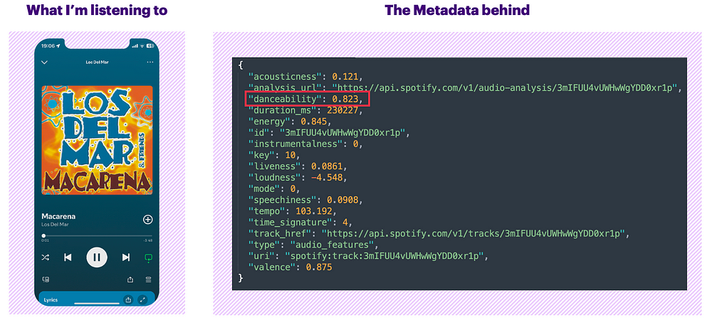
API Response Example
Remember we talked about the fact that certain tracks are more likely danceable than others. As human beings, it’s quite easy to feel if a song is danceable or not — it’s all about what you feel in your body, right? But how do computers determine this?
Spotify uses its own algorithms to analyze every song in its catalog. For every song, they provide a list of features associated with it. One use of this analysis is to create playlists and give you recommendations. The good news is that their API provides access to these analyses through the audio_features endpoint, allowing you to access all the features of any song.
For example, let’s analyze the audio features of the famous song “Macarena,” which I’m sure everyone knows. I won’t cover every parameter of the track in detail, but let’s focus on one aspect to better understand how it works — the danceability score of 0.823.
FIGURE II : Example of Macarena’s audio_features | Image by the author
According to Spotify’s documentation, danceability describes how suitable a track is for dancing based on a combination of musical elements, including tempo, rhythm stability, beat strength, and overall regularity. A score of 0.0 is the least danceable, and 1.0 is the most danceable. With a score of 0.823 (or 82.3%), it’s easy to say that this track is very danceable.
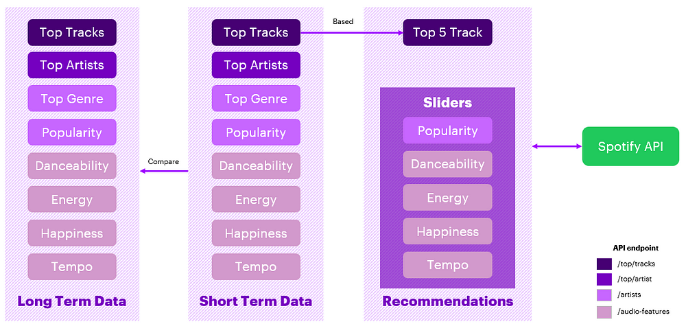
The Three Temporalities
Before going further, I need to introduce a concept with the Spotify API called time_range. This interesting parameter allows you to retrieve data from different time periods by specifying the time_range:
short_term: the last 4 weeks of listening activity
medium_term: the last 6 months of listening activity
long_term: the entire lifetime of your listening activity
Calling this will give you your top 10 artists from the past month.
Step 2: Interpreting the Results
With all this information available, my idea was to create a data product that allows users to understand what they are listening to, and to detect variations in their mood by comparing different temporalities. This analysis can then show how changes in our lives are reflected in our music choices.
For example, I recently started running again, and this change in my routine has affected my music preferences. I now listen to music that is faster and more energetic than what I typically listened to in the past. That’s my interpretation, of course, but it’s interesting to see how a change in my physical activity can affect what I listen to.
This is just one example, as everyone’s musical journey is unique and can be interpreted differently based on personal experiences and life changes. By analyzing these patterns, I think it is pretty cool to be able to make connections between our lifestyle choices and the music that we like to listen to.
Making Data Insight Accessible
The deeper I got into this project, the more I came to realize that, yes, I could analyze my data and come to certain conclusions myself, but I wanted everyone to do it.
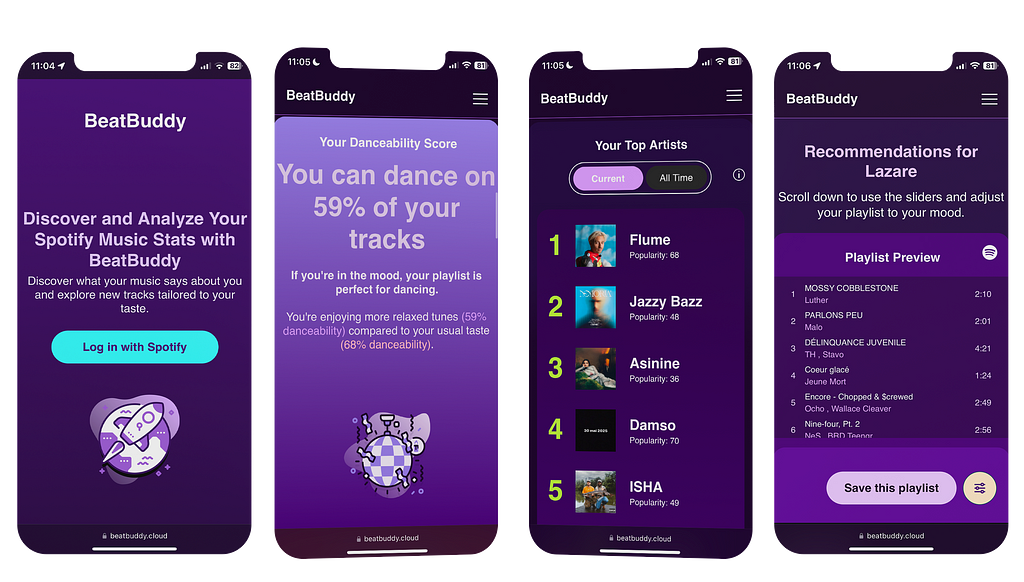
To me, the simplest way to share data insights with non-technical people and make it so very accessible is not through a fancy BI dashboard. My idea was to create something universally accessible, which led me to develop a mobile-friendly web application that anyone could use.
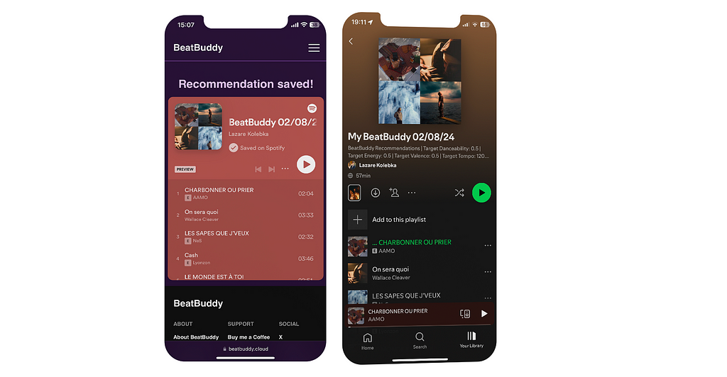
To use the app, all you need is a Spotify account, connect it to BeatBuddy with the click of one button, and you’re done !
FIGURE III : Example of the application screens | Image by the author
Measuring Musical Emotions
Let’s look at another feature of the app: measuring the happiness level of the music you’re listening to, which could reflect your current mood. The app aggregates data from your recent top tracks, focusing on the ‘valence’ parameter, which represents musical happiness, with 1 being super happy music. For instance, if the average valence of your current tracks is 0.432, and your all-time average is 0.645, it might suggest a shift towards more melancholic music recently.
However, these analyses should be taken with a grain of salt, as these numbers represent trends rather than absolute truths. Sometimes, we shouldn’t always try to find a reason behind these numbers.
For example, if you were tracking your walking pace and discovered you have been walking faster lately, it doesn’t necessarily mean you’re in more of a hurry — it could be due to various minor factors like changes in weather, new shoes, or simply a subconscious shift. Sometimes changes occur without explicit reasons, and while it is possible to measure these variations, they do not always require straightforward explanations.
That being said, noticing significant changes in your music listening habits can be interesting. It can help you think about how your emotional state or life situation might be affecting your musical preferences. This aspect of BeatBuddy offers an interesting perspective, although it’s worth noting that these interpretations are only one piece of the complex puzzle of our emotions and experiences
Step 3: Take Data-Driven Decisions
Let’s be honest, analyzing your listening habits is one thing, but how do you take action based on this analysis? In the end, making data-driven decisions is the ultimate goal of data analysis. This is where recommendations come into play.
Recommendations Based on Your Selected Mood
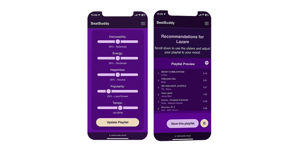
An interesting feature of BeatBuddy is its ability to provide music recommendations based on a mood you select and the music you like.
For instance, you might realize that what you are listening to has a score of 75% popularity (which is quite high), and you want to find hidden gems tailored to your tastes. You can then tweak the “Popularity” slider to, say, 25% to create a fresh playlist with an average score of 25% popularity.
FIGURE IV : Adjustment of the popularity slider to 25% | Image by the author
Behind the scenes, there’s an API call to Spotify’s algorithm to create a recommendation based on the criteria you’ve selected. This call generates a playlist recommendation tailored to both your personal tastes and the mood parameters you’ve set. It uses your top 5 recent tracks to fine-tune Spotify’s recommendation algorithm according to your choices.
FIGURE V: API endpoint explanation | Image by the author
Once you’re happy with the playlist, you can save it directly to your Spotify library. Each playlist comes with a description that details the parameters you chose, helping you remember the mood each playlist is meant to evoke.
FIGURE VI: Saving a playlist to Spotify | Image by the author
Final Thoughts
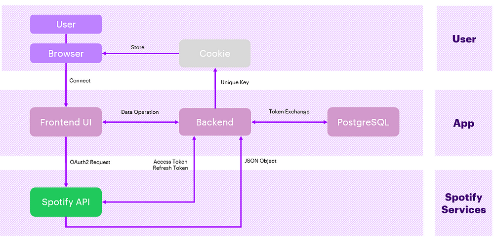
Developing a web application that analyzes Spotify data has been a challenging but rewarding journey. I have been pushed out of my comfort zone and gained knowledge in several areas, including web API, cookie management, web security, OAuth2, front-end development, mobile optimization, and SEO. Below is a diagram of the high-level architecture of the application:
FIGURE VII: High level architecture | Image by the author
My initial goal was to start a modest data project to analyze my listening habits. However, it turned into a three-month project rich in learning and discovery.
Throughout the process, I realized how closely related data analysis and web development are, especially when it comes to delivering a solution that is not only functional but also user-friendly and easily accessible. In the end, software development is essentially about moving data from one place to another.
One last note: I wanted to create an application that was clean and provided a seamless user experience. That is why BeatBuddy is completely ad-free, no data is sold or shared with any third parties. I’ve created this with the sole purpose of giving users a way to better understand their music choices and discover new tracks.
What it means to generate “Images that Sound” and how this connects with previous work from humans
How this model works on a technical level, presented in an easy-to-understand manner
Why this paper challenges our understanding of what AI can and should do
What are Images that Sound?
To answer this question, we need to understand two terms:
Waveform
Spectrogram
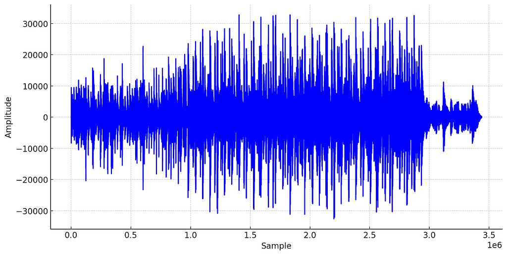
In the real world, sound is produced by vibrating objects creating acoustic waves (changes in air pressure over time). When sound is captured through a microphone or generated by a digital synthesizer, we can represent this sound wave as a waveform:
Waveform of an acoustic song. Music and image by author.
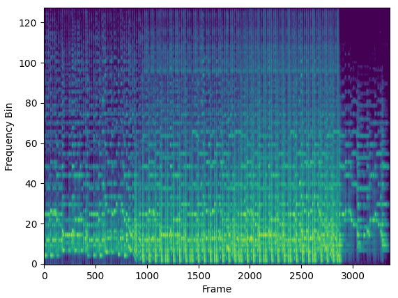
The waveform is useful for recording and playing audio, but it is typically avoided for music analysis or machine learning with audio data. Instead, a much more informative representation of the signal, the spectrogram, is used.
Mel Spectrogram of an acoustic song. Music and image by author.
The spectrogram tells us which frequencies are more or less pronounced in the sound across time. However, for this article, the key thing to note is that a spectrogram is an image. And with that, we come full circle.
When generating the corgi sound and image above, the AI creates a sound that, when transformed into a spectrogram, looks like a corgi.
This means that the output of this AI is both sound and image at the same time.
How Does AI Generate These Artworks?
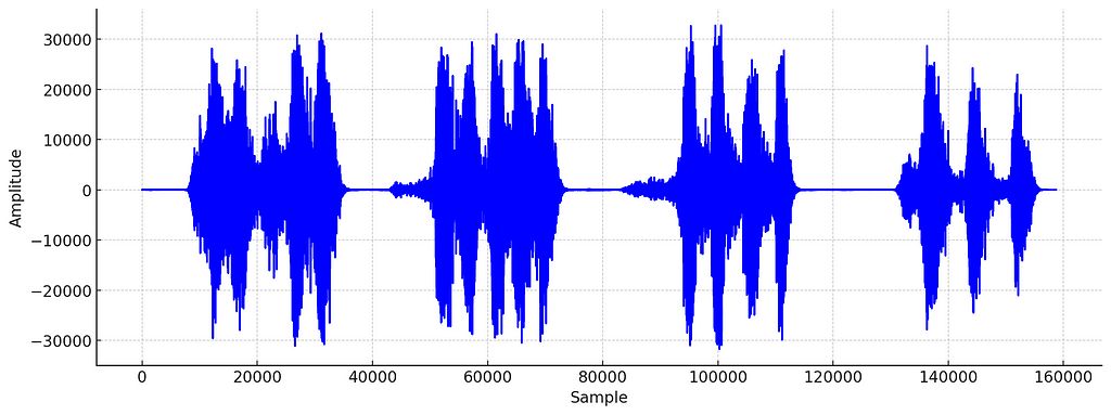
Even though you now understand what is meant by an image that sounds, you might still wonder how this is even possible. How does the AI know which sound would produce the desired image? After all, the waveform of the corgi sound looks nothing like a corgi.
Waveform of the Corgi sound generated by “Images that Sound”. Image by author.
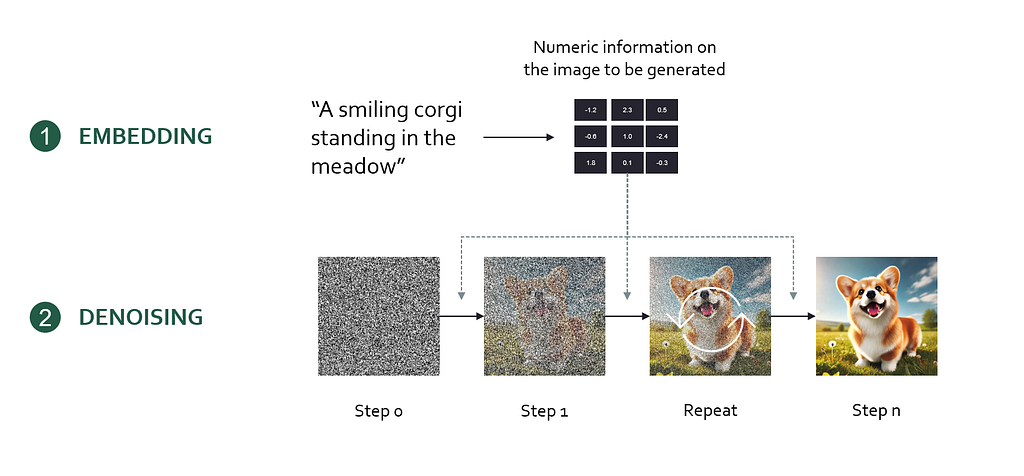
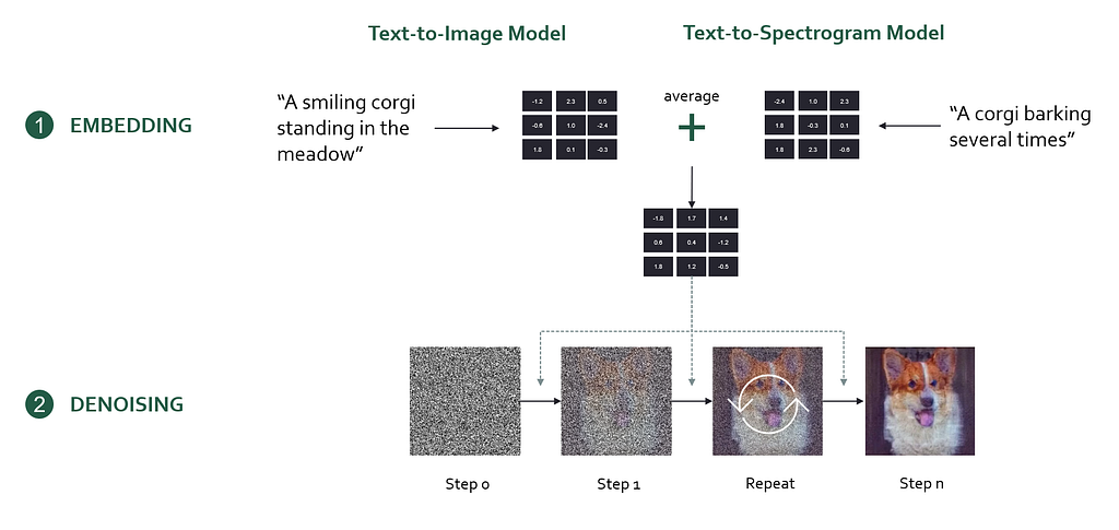
First, we need to understand one foundational concept: Diffusion models. Diffusion models are the technology behind image models like DALL-E 3 or Midjourney. In essence, a diffusion model encodes a user prompt into a mathematical representation (an embedding) which is then used to generate the desired output image step-by-step from random noise.
Here’s the workflow of creating images with a diffusion model
Encode the prompt into an embedding (a bunch of numbers) using an artificial neural network
Initialize an image with white noise (Gaussian noise)
Progressively denoise the image. Based on the prompt embedding, the diffusion model determines an optimal, small denoising step that brings the image closer to the prompt description. Let’s call this the denoising instruction.
Repeat denoising step until a noiseless, high-quality image is generated
High-level inner workings of an image diffusion model. Image by author.
To generate “images that sound”, the researchers used a clever technique by combining two diffusion models into one. One of the diffusion models is a text-to-image model (Stable Diffusion), and the other is a text-to-spectrogram model (Auffusion). Each of these models receives its own prompt, which is encoded into an embedding and determines its own denoising instruction.
However, multiple different denoising instructions are problematic, because the model needs to decide how to denoise the image. In the paper, the authors solve this problem by averaging the denoising instructions from both prompts, effectively guiding the model to optimize for both prompts equally.
High-level inner workings of “Images that Sound”. Image by author.
On a high level, you can think of this as ensuring the resulting image reflects both the image and audio prompt equally well. One downside of this is that the output will always be a mix of the two and not every sound or image coming out of the model will look/sound great. This inherent tradeoff significantly limits the model’s output quality.
How This Paper Challenges Our Understanding of AI
Is AI just Mimicking Human Intelligence?
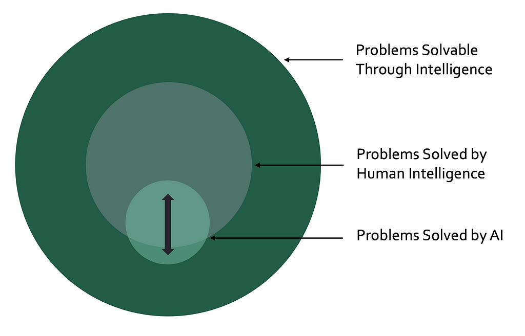
AI is commonly defined as computer systems mimicking human intelligence (e.g. IMB, TechTarget, Coursera). This definition works well for sales forecasting, image classification, and text generation AI models. However, it comes with the inherent restriction that a computer system can only be an AI if it performs a task that humans have historically solved.
In the real world, there exist a high (likely infinite) number of problems solvable through intelligence. While human intelligence has cracked some of these problems, most remain unsolved. Among these unsolved problems, some are known (e.g. curing cancer, quantum computing, the nature of consciousness) and others are unknown. If your goal is to tackle these unsolved problems, mimicking human intelligence does not appear to be an optimal strategy.
Image by the Author.
Following the definition above, a computer system that discovers a cure for cancer without mimicking human intelligence would not be considered AI. This is clearly counterintuitive and counterproductive. I do not intend to start a debate on “the one and only definition”. Instead, I want to emphasize that AI is much more than an automation tool for human intelligence. It has the potential to solve problems that we did not even know existed.
Can Spectrogram Art be Generated with Human Intelligence?
In an article on Mixmag, Becky Buckle explores the “history of artists concealing visuals within the waveforms of their music”. One impressive example of human spectrogram art is the song “∆Mᵢ⁻¹=−α ∑ Dᵢ[η][ ∑ Fjᵢ[η−1]+Fextᵢ [η⁻¹]]” by the British musician Aphex Twin.
Screenshot of the alien Face in Aphex Twin’s “∆Mᵢ⁻¹=−α ∑ Dᵢ[η][ ∑ Fjᵢ[η−1]+Fextᵢ [η⁻¹]]”. Link to the video.
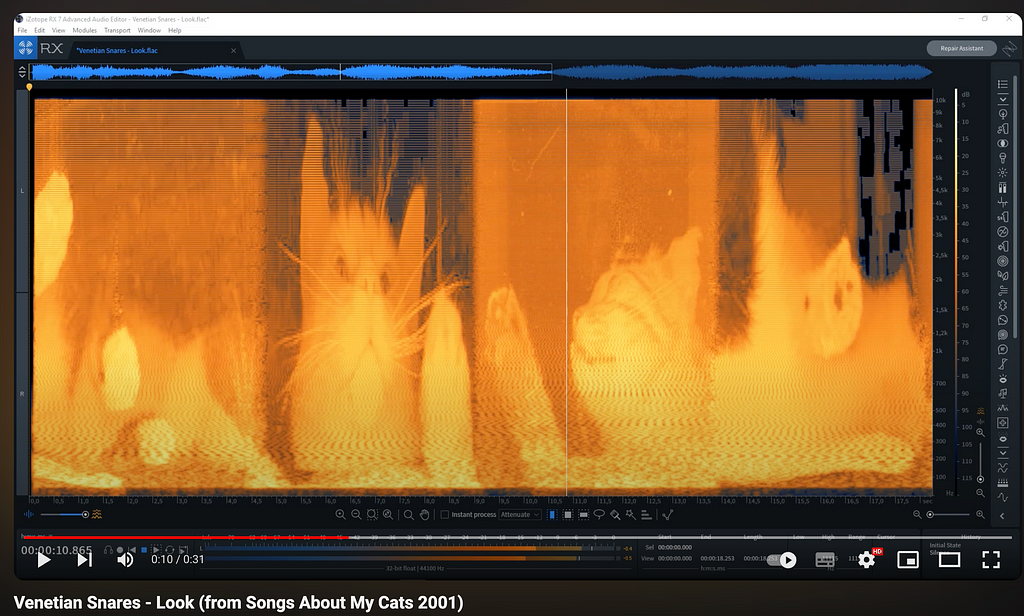
Another example is the track “Look” from the album “Songs about my Cats” by the Canadian musician Venetian Snares.
Screenshot of the cat image encoded in Venetian Snares’ “Look”. Link to the video.
While both examples show that humans can encode images into waveforms, there is a clear difference to what “Images that Sound” is capable of.
How is “Images that Sound” Different from Human Spectrogram Art?
If you listen to the above examples of human spectrogram art, you will notice that they sound like noise. For an alien face, this might be a suitable musical underscore. However, listening to the cat example, there seems to be no intentional relationship between the sounds and the spectrogram image. Human composers were able to generate waveforms that look like a certain thing when transformed to a spectrogram. However, to my knowledge, no human has been able to produce examples where the sound and images match, according to predefined criteria.
“Images that Sound” can produce audio that sounds like a cat and looks like a cat. It can also produce audio that sounds like a spaceship and looks like a dolphin. It is capable of producing intentional associations between the sound and image representation of the audio signal. In this regard, the AI exhibits non-human intelligence.
“Images that Sound” has no Use Case. That’s what Makes it Beautiful
In recent years, AI has mostly been portrayed as a productivity tool that can enhance economic outputs through automation. While most would agree that this is highly desirable to some extent, others feel threatened by this perspective on the future. After all, if AI keeps taking away work from humans, it might end up replacing the work we love doing. Hence, our lives could become more productive, but less meaningful.
“Images that Sound” contrasts this perspective and is a prime example of beautiful AI art. This work is not driven by an economic problem but by curiosity and creativity. It is unlikely that there will ever by an economic use case for this technology, although we should never say never…
From all the people I’ve talked to about AI, artists tend to be the most negative about AI. This is backed up by a recent study from the German GEMA, showing that over 60% of musicians “believe that the risks of AI use outweigh its potential opportunities” and that only 11% “believe that the opportunities outweigh the risks”.
More works similar to this paper could help artists understand that AI has the potential to bring more beautiful art into the world and that this does not have to happen at the cost of human creators.
Outlook: Other Creative Uses of AI for Art
Images that Sound has not been the first use case of AI that has the potential to create beautiful art. In this section, I want to showcase a few other approaches that will hopefully inspire you and make you think differently about AI.
Restoring Art
A mosaic of the Battle of Amazons, reconstructed with AI. Taken from this paper.
AI helps restore art by repairing damaged pieces precisely, ensuring historical works last longer. This mix of technology and creativity keeps our artistic heritage alive for future generations. Read more.
Bringing Paintings to Live
AI can animate photos to create realistic videos with natural movements and lip-syncing. This can make historical figures or artworks like the Mona Lisa move and speak (or rap). While this technology is certainly dangerous in the context of deep fakes, applied to historical portraits, it can create funny and/or meaningful art. Read more.
Turning Mono-Recordings to Stereo
AI has the potential to enhance old recordings by transforming their mono mix into a stereo mix. There are classical algorithmic approaches for this, but AI promises to make artificial stereo mixes sound more and more realistic. Read more here and here.
Conclusion
Images that Sound is one of my favorite papers of 2024. It uses advanced AI training techniques to achieve a purely artistic outcome that creates a new audiovisual art form. What is most fascinating is that this art form exists outside of human capabilities, as of this day. We can learn from this paper that AI is not barely a set of automation tools that mimick human behavior. Instead, AI can enrich the aesthetic experiences of our lives by enhancing existing art or creating entirely novel works and art forms. We are only starting to see the beginnings of the AI revolution and I cannot wait to shape and experience its (artistic) consequences.
About Me
I’m a musicologist and a data scientist, sharing my thoughts on current topics in AI & music. Here is some of my previous work related to this article:
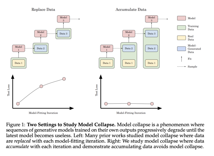
The AI landscape is rapidly evolving, with synthetic data emerging as a powerful tool for model development. While it offers immense potential, recent concerns about model collapse have sparked debate. Let’s dive into the reality of synthetic data use and its impact on AI development.
“We find that indiscriminate use of model-generated content in training causes irreversible defects in the resulting models, in which tails of the original content distribution disappear.” [1]
“We argue that the process of model collapse is universal among generative models that recursively train on data generated by previous generations” [1]
However, it’s essential to note that this extreme scenario of recursive training on purely synthetic data is not representative of real-world AI development practices. The authors themselves acknowledge:
“Here we explore what happens with language models when they are sequentially fine-tuned with data generated by other models… We evaluate the most common setting of training a language model — a fine-tuning setting for which each of the training cycles starts from a pre-trained model with recent data” [1]
Key Points
The study’s methodology does not account for the continuous influx of new, diverse data that characterizes real-world AI model training. This limitation may lead to an overestimation of model collapse in practical scenarios, where fresh data serves as a potential corrective mechanism against degradation.
The experimental design, which discards data from previous generations, diverges from common practices in AI development that involve cumulative learning and sophisticated data curation. This approach may not accurately represent the knowledge retention and building processes typical in industry applications.
The use of a single, static model architecture (OPT-125m) throughout the generations does not reflect the rapid evolution of AI architectures in practice. This simplification may exaggerate the observed model collapse by not accounting for how architectural advancements potentially mitigate such issues. In reality, the field has seen rapid progression (e.g., from GPT-3 to GPT-3.5 to GPT-4, or from Phi-1 to Phi-2 to Phi-3), with each iteration introducing significant improvements in model capacity, generalization capabilities, and emergent behaviors.
While the paper acknowledges catastrophic forgetting, it does not incorporate standard mitigation techniques used in industry, such as elastic weight consolidation or experience replay. This omission may amplify the observed model collapse effect and limits the study’s applicability to real-world scenarios.
The approach to synthetic data generation and usage in the study lacks the quality control measures and integration practices commonly employed in industry. This methodological choice may lead to an overestimation of model collapse risks in practical applications where synthetic data is more carefully curated and combined with real-world data.
Supporting Quotes from the Paper
“We also briefly mention two close concepts to model collapse from the existing literature: catastrophic forgetting arising in the framework of task-free continual learning and data poisoning maliciously leading to unintended behaviour” [1]
In practice, the goal of synthetic data is to augment and extend the existing datasets, including the implicit data baked into base models. When teams are fine-tuning or continuing pre-training, the objective is to provide additional data to improve the model’s robustness and performance.
“The creation of a robust and comprehensive dataset demands more than raw computational power: It requires intricate iterations, strategic topic selection, and a deep understanding of knowledge gaps to ensure quality and diversity of the data.” [3]
This emphasizes the importance of thoughtful synthetic data generation rather than indiscriminate use.
“We find that data quality is essential to model success, so we utilize a hybrid data strategy in our training pipeline, incorporating both human-annotated and synthetic data, and conduct thorough data curation and filtering procedures.“ [10]
This emphasizes the importance of thoughtful synthetic data generation rather than indiscriminate use.
Iterative Improvement, Not Recursive Training
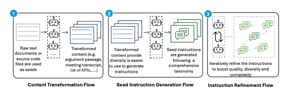
As highlighted in Gretel Navigator, NVIDIA’s Nemotron, and the AgentInstruct architecture, cutting edge synthetic data is generated by agents iteratively simulating, evaluating, and improving outputs- not simply recursively training on their own output. Below is an example of syntheticexample synthetic data generation architecture used in AgentInstruct.
Source: AgentInstruct synthetic data generation architecture [11]
On Synthetic Data Improving Model Performance
Here are some example results from recent synthetic data releases:
NVIDIA Nemotron-4 340B Instruct: Currently first place on the Hugging Face RewardBench leaderboard, created by AI2, for evaluating the capabilities, safety and pitfalls of reward models.
Synthetic data is driving significant advancements across various industries:
Healthcare: Rhys Parker, Chief Clinical Officer at SA Health, stated:
“Our synthetic data approach with Gretel has transformed how we handle sensitive patient information. Data requests that previously took months or years are now achievable in days. This isn’t just a technological advance; it’s a fundamental shift in managing health data that significantly improves patient care while ensuring privacy. We predict synthetic data will become routine in medical research within the next few years, opening new frontiers in healthcare innovation.” [9]
Mathematical Reasoning: DeepMind’s AlphaProof and AlphaGeometry 2 systems,
“AlphaGeometry 2, based on Gemini and trained with an order of magnitude more data than its predecessor”, achieved a silver-medal level at the International Mathematical Olympiad by solving complex mathematical problems, demonstrating the power of synthetic data in enhancing AI capabilities in specialized fields [5].
Life Sciences Research: Nvidia’s research team reported:
“Synthetic data also provides an ethical alternative to using sensitive patient data, which helps with education and training without compromising patient privacy” [4]
Democratizing AI Development
One of the most powerful aspects of synthetic data is its potential to level the playing field in AI development.
Empowering Data-Poor Industries: Empowering Data-Poor Industries: Synthetic data allows industries with limited access to large datasets to compete in AI development. This is particularly crucial for sectors where data collection is challenging due to privacy concerns or resource limitations.
Customization at Scale: Even large tech companies are leveraging synthetic data for customization. Microsoft’s research on the Phi-3 model demonstrates how synthetic data can be used to create highly specialized models:
“We speculate that the creation of synthetic datasets will become, in the near future, an important technical skill and a central topic of research in AI.” [3]
Tailored Learning for AI Models: Andrej Karpathy, former Director of AI at Tesla, suggests a future where we create custom “textbooks” for teaching language models:
Scaling Up with Synthetic Data: Jim Fan, an AI researcher, highlights the potential of synthetic data to provide the next frontier of training data:
Fan also points out that embodied agents, such as robots like Tesla’s Optimus, could be a significant source of synthetic data if simulated at scale.
Economics of Synthetic Data
Cost Savings and Resource Efficiency:
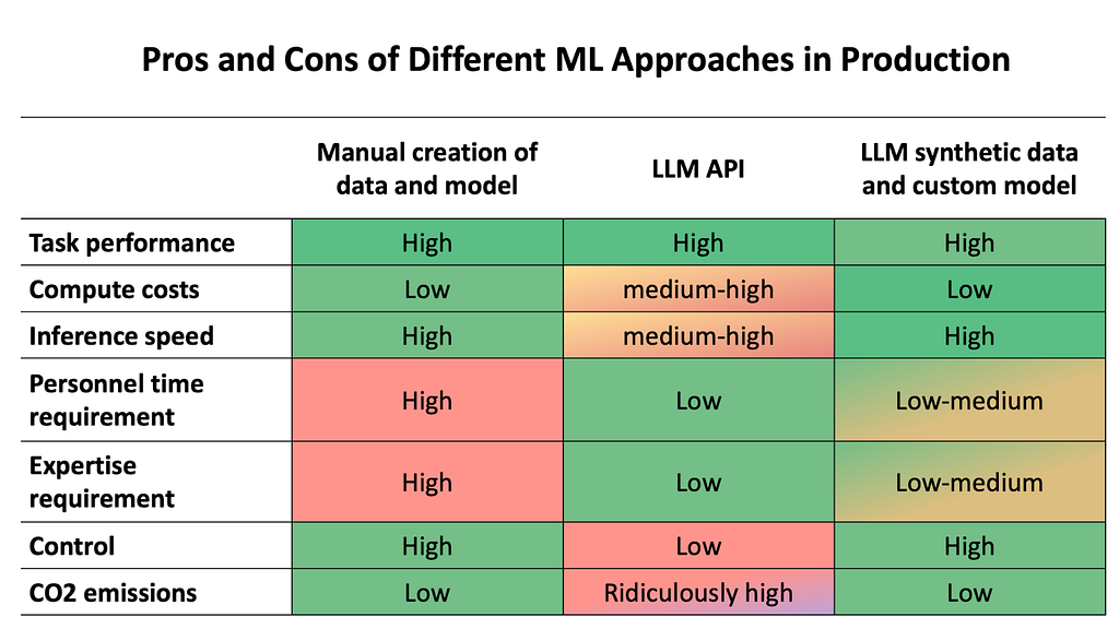
The Hugging Face blog shows that fine-tuning a custom small language model using synthetic data costs around $2.7 to fine-tune, compared to $3,061 with GPT-4 on real-world data, while emitting significantly less CO2 and offering faster inference speeds.
Here’s a nice visualization from Hugging Face that shows the benefits across use cases:
Source: Hugging Face Blog [6]
Conclusion: A Balanced Approach
While the potential risks of model collapse should not be ignored, the real-world applications and benefits of synthetic data are too significant to dismiss. As we continue to advance in this field, a balanced approach that combines synthetic data with rigorous real-world validation and thoughtful generation practices will be key to maximize its potential.
Synthetic data, when used responsibly and in conjunction with real-world data, has the potential to dramatically accelerate AI development across all sectors. It’s not about replacing real data, but augmenting and extending our capabilities in ways we’re only beginning to explore. By enhancing datasets with synthetic data, we can fill critical data gaps, address biases, and create more robust models.
By leveraging synthetic data responsibly, we can democratize AI development, drive innovation in data-poor sectors, and push the boundaries of what’s possible in machine learning — all while maintaining the integrity and reliability of our AI systems.
References
Shumailov, I., Shumaylov, Z., Zhao, Y., Gal, Y., Papernot, N., & Anderson, R. (2023). The curse of recursion: Training on generated data makes models forget. arXiv preprint arXiv:2305.17493.
Gerstgrasser, M., Schaeffer, R., Dey, A., Rafailov, R., Sleight, H., Hughes, J., … & Zhang, C. (2023). Is model collapse inevitable? Breaking the curse of recursion by accumulating real and synthetic data. arXiv preprint arXiv:2404.01413.
Li, Y., Bubeck, S., Eldan, R., Del Giorno, A., Gunasekar, S., & Lee, Y. T. (2023). Textbooks are all you need II: phi-1.5 technical report. arXiv preprint arXiv:2309.05463.
Nvidia Research Team. (2024). Addressing Medical Imaging Limitations with Synthetic Data Generation. Nvidia Blog.
DeepMind Blog. (2024). AI achieves silver-medal standard solving International Mathematical Olympiad problems. DeepMind.
Hugging Face Blog on Synthetic Data. (2024). Synthetic data: save money, time and carbon with open source. Hugging Face.
Karpathy, A. (2024). Custom Textbooks for Language Models. Twitter.
Fan, J. (2024). Synthetic Data and the Future of AI Training. Twitter.
South Australian Health. (2024). South Australian Health Partners with Gretel to Pioneer State-Wide Synthetic Data Initiative for Safe EHR Data Sharing. Microsoft for Startups Blog.
Information retrieval systems have powered the information age through their ability to crawl and sift through massive amounts of data and quickly return accurate and relevant results. These systems, such as search engines and databases, typically work by indexing on keywords and fields contained in data files. However, much of our data in the digital […]
Inspired by Andrej Kapathy’s recent youtube video on Let’s reproduce GPT-2 (124M), I’d like to rebuild it with most of the training optimizations in Jax. Jax is built for highly efficient computation speed, and it is quite interesting to compare Pytorch with its recent training optimization, and Jax with its related libraries like Flax (Layers API for neural network training for Jax)and Optax (a gradient processing and optimization library for JAX). We will quickly learn what is Jax, and rebuild the GPT with Jax. In the end, we will compare the token/sec with multiGPU training between Pytorch and Jax!
AI generated GPT
What is Jax?
Based on its readthedoc, JAX is a Python library for accelerator-oriented array computation and program transformation, designed for high-performance numerical computing and large-scale machine learning. I would like to introduce JAX with its name. While someone calls it Just Another XLA (Accelerated Linear Algibra), I prefer to call it J(it) A(utograd) X(LA) to demonstrate its capability of high efficiency.
J — Just-in-time (JIT) Compilation. When you run your python function, Jax converts it into a primitive set of operation called Jaxpr. Then the Jaxpr expression will be converted into an input for XLA, which compiles the lower-level scripts to produce an optimized exutable for target device (CPU, GPU or TPU).
A — Autograd. Computing gradients is a critical part of modern machine learning methods, and you can just call jax.grad() to get gradients which enables you to optimize the models.
X — XLA. This is a open-source machine learning compiler for CPU, GPU and ML accelerators. In general, XLA performs several built-in optimization and analysis passes on the StableHLO graph, then sends the HLO computation to a backend for further HLO-level optimizations. The backend then performs target-specific code generation.
Those are just some key features of JAX, but it also has many user friendly numpy-like APIs in jax.numpy , and automatic vectorization with jax.vmap , and parallize your codes into multiple devices via jax.pmap . We will cover more Jax concepts nd applications in the futher blogs, but now let’s reproduct the NanoGPT with Jax!
From Attention to Transformer
GPT is a decoder-only transformer model, and the key building block is Attention module. We can first define a model config dataclass to save the model hyperparameters of the model, so that the model module can consume it efficiently to initialize the model architecture. Similar to the 124M GPT model, here we initialize a 12-layer transformer decoder with 12 heads and vocab size as 50257 tokens, each of which has 768 embedding dimension. The block size for the attention calculation is 1024.
from dataclasses import dataclass

@dataclass
class ModelConfig:
  vocab_size: int = 50257
  n_head: int = 12
  n_embd: int = 768
  block_size: int = 1024
  n_layer: int = 12
  dropout_rate: float = 0.1
Next comes to the key building block of the transformer model — Attention. The idea is to process the inputs into three weight matrics: Key, Query, and Value. Here we rely on the flax , a the Jax Layer and training API library to initialize the 3 weight matrix, by just call the flax.linen.Dense . As mentioned, Jax has many numpy-like APIs, so we reshape the outputs after the weight matrix with jax.numpy.reshape from [batch_size, sequence_length, embedding_dim] to [batch_size, sequence_length, num_head, embedding_dim / num_head]. Since we need to do matrix multiplication on the key and value matrics, jax also has jax.numpy.matmul API and jax.numpy.transpose (transpose the key matrix for multiplication).
Multihead Attention
Note that we need to put a mask on the attention matrix to avoid information leakage (prevent the previous tokens to have access to the later tokens), jax.numpy.tril helps build a lower triangle array, and jax.numpy.where can fill the infinite number for us to get 0 after softmax jax.nn.softmax . The full codes of multihead attention can be found below.
from flax import linen as nn import jax.numpy as jnp
q = nn.Dense(self.config.n_embd)(x) k = nn.Dense(self.config.n_embd)(x) v = nn.Dense(self.config.n_embd)(x) # q*k / sqrt(dim) -> softmax -> @v q = jnp.reshape(q, (b, l, d//self.config.n_head , self.config.n_head)) k = jnp.reshape(k, (b, l, d//self.config.n_head , self.config.n_head)) v = jnp.reshape(v, (b, l, d//self.config.n_head , self.config.n_head)) norm = jnp.sqrt(list(jnp.shape(k))[-1]) attn = jnp.matmul(q,jnp.transpose(k, (0,1,3,2))) / norm mask = jnp.tril(attn) attn = jnp.where(mask[:,:,:l,:l], attn, float("-inf")) probs = jax.nn.softmax(attn, axis=-1) y = jnp.matmul(probs, v) y = jnp.reshape(y, (b,l,d)) y = nn.Dense(self.config.n_embd)(y) return y
You may notice that there is no __init__ or forward methods as you can see in the pytorch. This is the special thing for jax, where you can explicitly define the layers with setup methods, or implicitly define them withn the forward pass by adding nn.compact on top of __call__ method. [ref]
Next let’s build the MLP and Block layer, which includes Dense layer, Gelu activation function, LayerNorm and Dropout. Again flax.linen has the layer APIs to help us build the module. Note that we will pass a deterministic boolean variable to control different behaviors during training or evaluation for some layers like Dropout.
class MLP(nn.Module):

  config: ModelConfig

  @nn.compact
  def __call__(self, x, deterministic=True):
    x = nn.Dense(self.config.n_embd*4)(x)
    x = nn.gelu(x, approximate=True)
    x = nn.Dropout(rate=self.config.dropout_rate)(x, deterministic=deterministic)
    x = nn.Dense(self.config.n_embd)(x)
    x = nn.Dropout(rate=self.config.dropout_rate)(x, deterministic=deterministic)
    return x

class Block(nn.Module):

  config: ModelConfig

  @nn.compact
  def __call__(self, x):
    x = nn.LayerNorm()(x)
    x = x + CausalSelfAttention(self.config)(x)
    x = nn.LayerNorm()(x)
    x = x + MLP(self.config)(x)
    return x
Now Let’s use the above blocks to build the NanoGPT:
Given the inputs of a sequence token ids, we use the flax.linen.Embed layer to get position embeddings and token embeddings. Them we pass them into the Block module N times, where N is number of the layers defined in the Model Config. In the end, we map the outputs from the last Block into the probabilities for each token in the vocab to predict the next token. Besides the forward __call__ method, let’s also create a init methods to get the dummy inputs to get the model’s parameters.
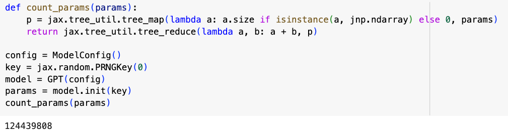
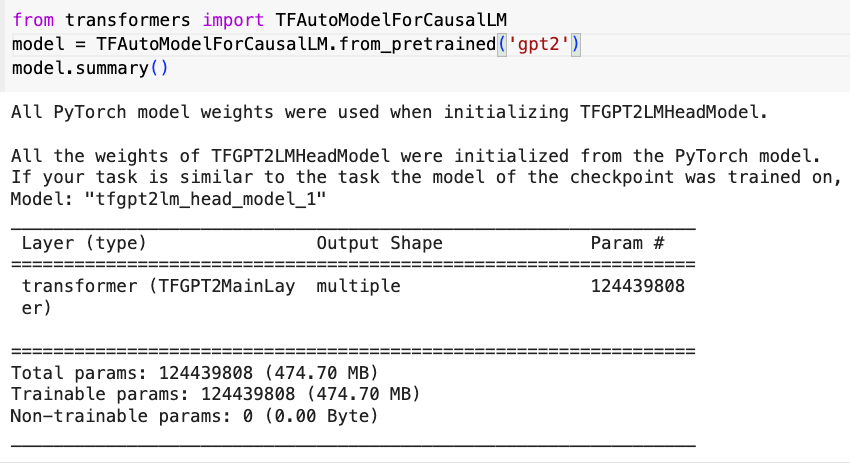
Now let’s varify the number of parameters: We first initialize the model config dataclass and the random key, then create a dummy inputs and feed in into the GPT model. Then we utilize the jax.util.treemap API to create a count parameter function. We got 124439808 (124M) parameters, same amount as Huggingface’s GPT2, BOOM!
Colab Result: number of parametersVerify number of params in huggingface’s GPT2
DataLoader and Training Loop
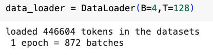
Let’s now overfit a small dataset. To make it comparable inAndrej’s video on Pytorch NanoGPT, let’s use the toy dataset that he shared in his video. We use the GPT2′ tokenizer from tiktoken library to tokenize all the texts from the input file, and convert the tokens into jax.numpy.array for Jax’s model training.
class DataLoader: def __init__(self, B, T): self.current_position = 0 self.B = B self.T = T
with open("input.txt","r") as f: text = f.read() enc = tiktoken.get_encoding("gpt2") self.tokens = jnp.array(enc.encode(text)) print(f"loaded {len(self.tokens)} tokens in the datasets" ) print(f" 1 epoch = {len(self.tokens)//(B*T)} batches")
Colab Result: Simple dataloader with 4 batch size and 128 sequence length
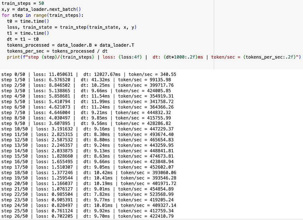
Next, let’s forget distributed training and optimization first, and just create a naive training loop for a sanity check. The first thing after intialize the model is to create a TrainState, a model state where we can update the parameters and gradients. The TrainState takes three important inputs: apply_fn (model forward function), params (model parameters from the init method), and tx (an Optax gradient transformation).
Then we use the train_step function to update the model state (gradients and parameters) to proceed the model training. Optax provide the softmax cross entropy as the loss function for the next token prediction task, and jax.value_and_grad calculates the gradients and the loss value for the loss function. Finally, we update the model’s state with the new parameters using the apply_gradients API. [ref] Don’t forget to jit the train_step function to reduce the computation overhead!
Now everything is ready for the poorman’s training loop.. Let’s check the loss value. The model’s prediction should be better than the random guess, so the loss should be lower than -ln(1/50257)≈10.825. What we expect from the overfitting a single batch is that: in the beginning the loss is close to 10.825, then it goes down to close to 0. Let’s take a batch of (x, y) and run the training loop for 50 times. I also add similar log to calculate the training speed.
As we can see, the loss value is exactly what we expect, and the training throughput is around 400–500 k token/sec. Which is already 40x faster than Pytorch’s initial version without any optimization in Andrej’s video. Note that we run the Jax scripts in 1 A100 GPU which should remove the hardware difference for the speed comparison. There is no .to(device) stuff to move your model or data from host CPU to device GPU, which is one of the benefits from Jax!
So that’s it and we made it. We will make the training 10x more faster in Part 2 with more optimizations…
Part 2: The journey of training optimization to 1350k tokens/sec in a single GPU!
“Unless otherwise noted, all images are by the author”
Picture by the author (some of these I have read!)
Introduction
I have always had a soft spot for words that perfectly capture the essence of a concept. During one of my trips to Japan, I discovered the word Tsundoku. It refers to the habit of acquiring books and letting them pile up without reading them. I immediately fell in love with the word because, like many, I have a habit of buying more books than I can read. Some I eventually get to, while others simply accumulate.
There’s something amusing and oddly satisfying about these piles of unread books — they symbolise potential knowledge and the joy of collecting. They stand as a testament to our intellectual aspirations, even if we don’t always fulfil them.
As founder of Kindata.io and a consultant for large companies on data value, I often encounter usage of data catalogues that make me want to scream, “Tsundoku!”. These catalogues, like stacks of unread books, are filled with detailed descriptions of data that sits idle, giving a false sense of accomplishment. A book not read is knowledge wasted; similarly, data not exploited for business value is potential wasted.
Nobody likes waste, and the professionals I work with are no exception. They are eager to see their data used to its full potential. They also understand that getting there will require a change in mindset. Working in data, they also appreciate the power of well-named concepts. I have heard many terms being used for this work of alignment to business value, but I must say that I have become fond of one that is picking up: Data Value Lineage. This term resonates deeply with me because it perfectly captures what I am championing. It highlights the need to turn idle data into actionable insights by making sure that everything that you do in the data teams is firmly linked to value creation.
At first glance, choosing to name a concept one way instead of another might seem inconsequential. However, naming concepts is powerful especially if you need to bring with you an entire organisation.
In the sections that follow, we will delve deeper into the specifics of Data Value Lineage. After defining the concept and what it entails, we will explore how to get started with a pragmatic implementation approach within your data organisation.
Data Value Lineage — A Formal Definition
Data value lineage is the aggregation of two terms commonly used among data professionals: data lineage and data value. Let’s get back to the roots of these concepts.
“Data lineage is the process of tracking the flow of data over time, providing a clear understanding of where the data originated, how it has changed, and its ultimate destination within the data pipeline.”
Data Value
“Data Value is the economic worth that an organisation can derive from its data. This includes both tangible benefits like revenue generation and cost savings, as well as intangible benefits like improved decision-making, enhanced customer experiences, and competitive advantage.”
This definition is synthesised from commonly accepted industry principles, as a direct authoritative source is not currently available.
Reconciling two different worlds
The two previous definitions take us in different directions. Data lineage is all about understanding dependencies, bias, and potential quality issues. It provides explainability and helps data engineering teams repair broken pipelines. It is effectively a formal description of your data supply chains. Yet, for most people, it stops when the data is effectively used by an application.
Data value on the other hand focuses on something completely different: the contribution of data to the organisation business objectives. The underlying assumption is that this data value can be formally measured. We are firmly in the world of strategy, finance and business cases, not in the world of pipelines debugging.
I am now picturing Jean-Claude Van Damme performing one of his legendary splits on two high piles of unread books and thinking very hard about unifying these two concepts…
A formal definition of data value lineage
Here is the first formal definition of data value lineage.
“Data value lineage is the process of reconciling at all times the enterprise data assets (including their maintenance costs) and the main delivery tasks performed within a data organisation with the measured contribution to enterprise value drivers”
There we are, we have a formal definition! I would like to insist on a couple of aspects of this definition that I think are fundamental:
Process: This is not just about providing after the fact documentation, this is about making sure that the organisation is considering the link to business value as part of its standard ways of getting things done.
At all times: Things change and contribution to business objectives is not insulated from that. Data providing elements of value at one point in time is just that, no more, no less and there is no guarantee that this value will hold through time.
Enterprise data assets: I am purposefully using a wide notion. Of course when prioritising data value lineage initiatives, you might want to start smaller. My own pragmatic recommendation based on our first projects with kindata.io would be to start with data products and business use cases (more on this later).
Maintenance costs: keeping data assets available for consumption has a cost. Part of it is cloud resources (where this rejoins Finopps practices) but a lot is data engineers’ time allocated to maintaining, repairing and evolving the assets.
The main delivery tasks: This is pushing the definition a little but ideally, any significant task performed within the data organisation should one way or another be linked to value drivers. If time is spent improving timeliness of a data set for example, how does this provide measurable business value?
Measured contribution: We want as much as possible to formalise the contribution to business value. It is critical that these measurements are performed by the business sponsors, not within the data organisation. We also have to be pragmatic in these measurements, this is a means, not an end.
Enterprise value drivers: We are aligned with the definition of Gartner of business value. Anything that the business values counts, even more so if it can be measured.
As you can see, data value lineage, while inherently a simple concept, covers a very wide scope. Inevitably, this involves bringing together individuals within your organisation with very different profiles, mandates and concerns. Let’s explore how to get things moving pragmatically in the right direction.
A pragmatic approach
Some change management considerations
Getting to think and act across silos and mentalities is not trivial. Inertia is a powerful force and putting eyes blinders on is sometimes the only way to get anything done in large corporations.
Through the many change management projects that I have driven or even observed, I have found three invariably useful critical success factors:
Meaning and worthiness: When changes “just make sense,” they are more easily adopted. This ultimately leads to the sentiment, “Why haven’t we always done it like that?” When the new approach feels intuitive and obviously better, resistance diminishes significantly.
Natural extension of existing practices: Change is more likely to succeed if it requires minimal deviation from current practices. By allowing people to keep doing most of what they were doing before and changing small things consistently, you integrate the new practices smoothly into their routines.
Immediate perception of value: For any change to be embraced, individuals need to see immediate benefits. If things that were hard or out of reach become easy and natural, people are more likely to adopt the new practices enthusiastically.
The good news is that it is relatively easy to tick all three boxes with data value lineage.
Meaning and worthiness: It does not take much research to find plenty of inefficiencies in resource allocation and collaboration between data producers and consumers. Also the concept of data value lineage comes quite naturally to very different profiles.
Natural extension of existing practices: You do not fundamentally change what you do, you just add a thin extra layer on top to make connections that are otherwise hard to establish. You leverage your existing investments in data governance and financial control and activate them to focus on business value generation.
Immediate perception of value: By connecting the dots, you can very fast identify untapped potential of data, increase the business throughput of your data resources, improve the data discovery process and promote data democratisation.
Getting started
What I have found particularly useful in rolling out a data value lineage approach across an organisation is to start with the three basic questions: what, how, why. This might sound simplistic but in reality most organisations are constantly mixing these three questions together and end up not getting any clear answers.
What refers to the data initiatives that are valued by the business. In the projects that we run, this covers both traditional analytics projects (dashboards, reports…) as well as data science / AI initiatives (predictive models, recommendation engines, chatbots…). The term that we use for a data-driven project that provides tangible business value is a business use case.
How covers many aspects but from the perspective of data value lineage, the most important one is data sourcing. More and more organisations, inspired by the principles of data mesh are adopting the concept of data product or productised data set. Contrary to business use cases, in this terminology, a data product does not contribute directly to business value, yet they come with maintenance costs.
Why is about the contribution to business value. How do you expect each business use case to contribute to one or several value drivers? Once the projects are delivered and enter into maintenance mode, is that contribution sustained?
Once we have a clear understanding of these three questions, we can start documenting the basic building blocks:
The value drivers and their metrics
The portfolio of business use cases
The catalogue of data products
The first pragmatic level of data value lineage is to define the connections between these three levels.
Connecting the dots — Image created by Gilles Lenoble for Kindata.io
Let’s take a very simple example:
You want to optimise your energy consumption through a data-driven approach. The business use case (energy cost reduction) sources data from two data products (Company Energy Consumption and Utility Bills and Tariffs). It contributes to two business drivers: Cost Reduction and Sustainability.
An example of data value lineage — Image by the author from screenshots of Kindata.io
The arrows between the data products, business use case and value drivers are the backbone of data value lineage. They make the link between the three fundamental questions. You will notice that the arrows are bi-directional:
When you navigate from data products to value drivers, you get a clear view of the real usefulness of your data products. Each individual data product is indeed part of many similar consumption chains and you can easily get the big picture of generated value at all times. If the generated value does not live to your expectations, you can take corrective actions such as internal promotion, refactoring or decommissioning.
When you navigate from business driver to data products, you get an up to date top-down view of your data-driven contribution. Again, if the picture is not aligned to your expectations, you can initiate strategic decisions ranging from investment in data supply chains, delivery of specific new business use cases or boosting of the usage of existing ones.
In conclusion
Data value lineage is a powerful concept as it offers a structured approach to ensuring that every piece of data in your organisation contributes to business value. By reconciling data assets, tasks, and business outcomes, you can maximise the impact of your data initiatives.
It is also a great name that can rally people across the data, business and financial control organisations.
Don’t just find contentment in creating dozens of underused data products, fooling yourself with the illusion of value generation. Avoid the zen contemplation of unused piles of data, Tsundoku-style. Instead, take action and harness the full power of your data through data value lineage, ensuring that every effort directly contributes to business value generation.
We use cookies on our website to give you the most relevant experience by remembering your preferences and repeat visits. By clicking “Accept”, you consent to the use of ALL the cookies.
This website uses cookies to improve your experience while you navigate through the website. Out of these, the cookies that are categorized as necessary are stored on your browser as they are essential for the working of basic functionalities of the website. We also use third-party cookies that help us analyze and understand how you use this website. These cookies will be stored in your browser only with your consent. You also have the option to opt-out of these cookies. But opting out of some of these cookies may affect your browsing experience.
Necessary cookies are absolutely essential for the website to function properly. These cookies ensure basic functionalities and security features of the website, anonymously.
Cookie
Duration
Description
cookielawinfo-checkbox-analytics
11 months
This cookie is set by GDPR Cookie Consent plugin. The cookie is used to store the user consent for the cookies in the category "Analytics".
cookielawinfo-checkbox-functional
11 months
The cookie is set by GDPR cookie consent to record the user consent for the cookies in the category "Functional".
cookielawinfo-checkbox-necessary
11 months
This cookie is set by GDPR Cookie Consent plugin. The cookies is used to store the user consent for the cookies in the category "Necessary".
cookielawinfo-checkbox-others
11 months
This cookie is set by GDPR Cookie Consent plugin. The cookie is used to store the user consent for the cookies in the category "Other.
cookielawinfo-checkbox-performance
11 months
This cookie is set by GDPR Cookie Consent plugin. The cookie is used to store the user consent for the cookies in the category "Performance".
viewed_cookie_policy
11 months
The cookie is set by the GDPR Cookie Consent plugin and is used to store whether or not user has consented to the use of cookies. It does not store any personal data.
Functional cookies help to perform certain functionalities like sharing the content of the website on social media platforms, collect feedbacks, and other third-party features.
Performance cookies are used to understand and analyze the key performance indexes of the website which helps in delivering a better user experience for the visitors.
Analytical cookies are used to understand how visitors interact with the website. These cookies help provide information on metrics the number of visitors, bounce rate, traffic source, etc.
Advertisement cookies are used to provide visitors with relevant ads and marketing campaigns. These cookies track visitors across websites and collect information to provide customized ads.