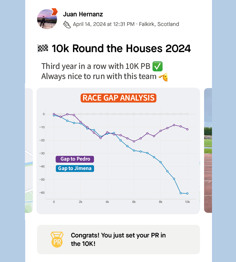
Two New Graphs That Compare Runners on the Same Event
Graph showing the comparative performance of runners. Image by Author.
Have you ever wondered how two runners stack up against each other in the same race?
In this article I present two new graphs that I have designed, as I felt they were missing from Strava. These graphs have been created in a way that they can tell the story of a race at a glance as they compare different athletes running the same event. One can easily see changes in positions, as well as the time difference across the laps and competitors.
My explanation will start with how I spotted the opportunity. Next, I’ll showcase the graph designs and explain the algorithms and data processing techniques that power them.
Strava doesn’t tell the full story
Strava is a social fitness app were people can record and share their sport activities with a community of 100+ million users [1]. Widely used among cyclists and runners, it’s a great tool that not only records your activities, but also provides personalised analysis about your performance based on your fitness data.
As a runner, I find this app incredibly beneficial for two main reasons:
It provides data analysis that help me understand my running performance better.
It pushes me to stay motivated as I can see what my friends and the community are sharing.
Every time I complete a running event with my friends, we all log our fitness data from our watches into Strava to see analysis such as:
Totaltime, distance and average pace.
Time for every split or lap in the race.
Heart Rate metricsevolution.
Relative Effort compared to previous activities.
The best part is when we talk about the race from everyone’s perspectives. Strava is able to recognise that you ran the same event with your friends (if you follow each other) and even other people, however it does not provide comparative data. So if you want to have the full story of the race with your friends, you need to dive into everyone’s activity and try to compare them.
That’s why, after my last 10K with 3 friends this year, I decided to get the data from Strava and design two visuals to see a comparative analysis of our race performance.
Presenting the visuals
The idea behind this project is simple: use GPX data from Strava (location, timestamp) recorded by my friends and me during a race and combine them to generate visuals comparing our races.
The challenge was not only validating that my idea was doable, but also designing Strava-inspired graphs to proof how they could seamlessly integrate as new features in the current application. Let’s see the results.
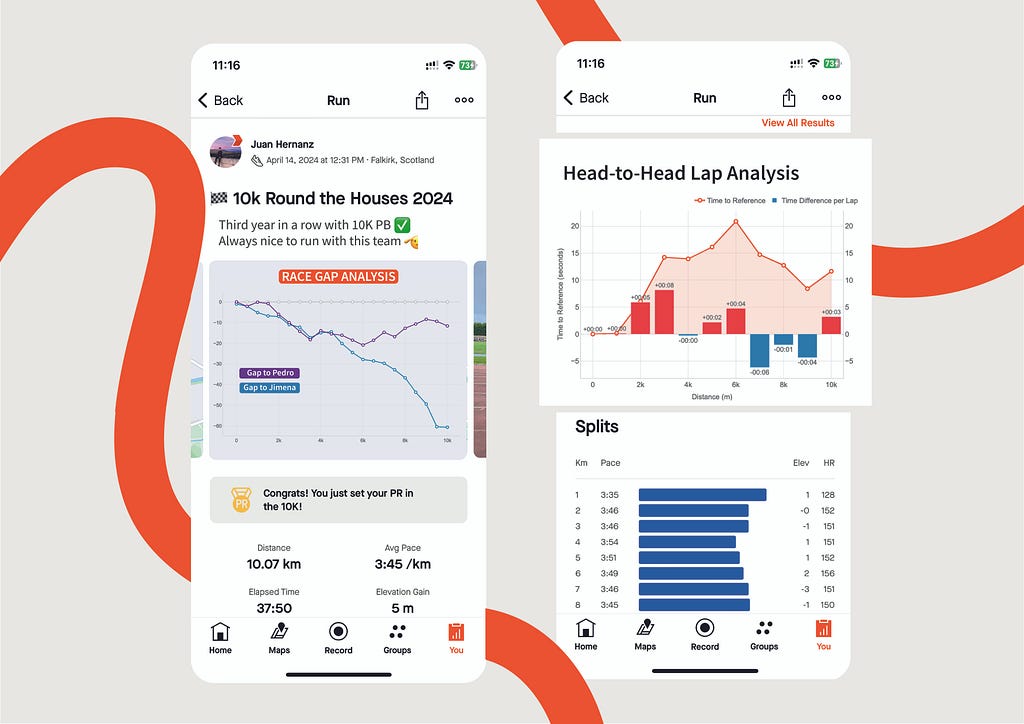
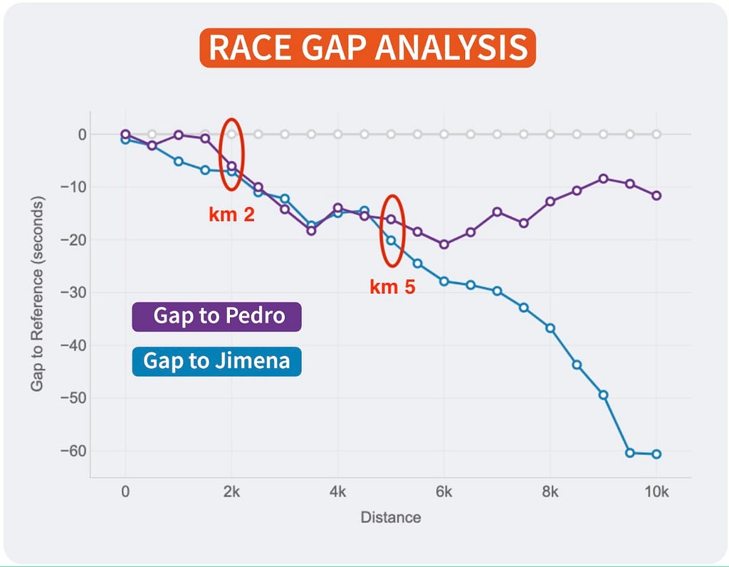
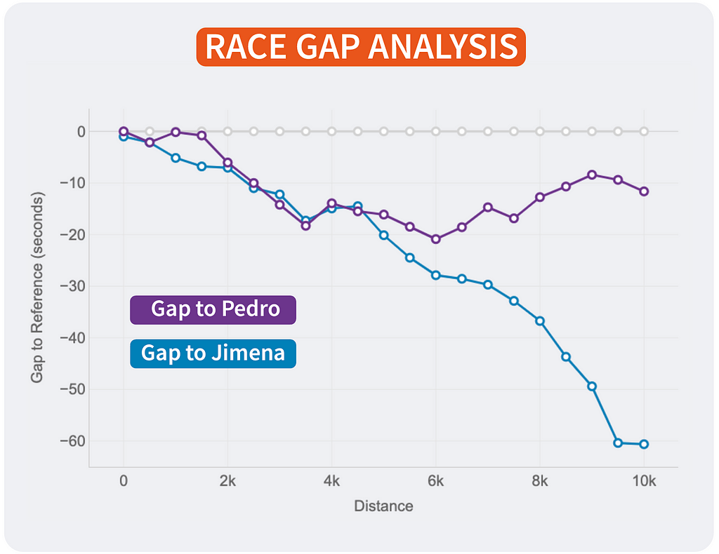
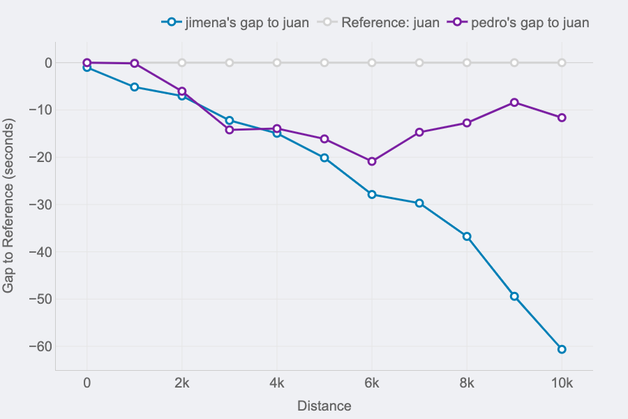
Race GAP Analysis
Metrics: the evolution of the gap (in seconds) between a runner that is the reference (grey line on 0) and their competitors. Lines above mean the runner is ahead on the race.
Insights: this line chart is perfect to see the changes in positions and distances for a group of runners.
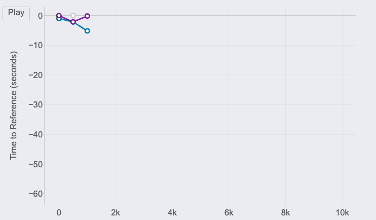
Race GAP Analysis animation of the same race for 3 different runners. Image by Author.
If you look at the right end of the lines, you can see the final results of the race for the 3 runners of our examples:
The first runner (me) is represented by the reference in grey.
Pedro (in purple) was the second runner reaching the finish line only 12 seconds after.
Jimena (in blue) finished the 10K 60 seconds after.
Proposal for Race Gap Analysis chart integration into Strava activities. Image by Author.
But, thanks to this chart, it’s possible to see how theses gaps where changing throughout the race. And these insights are really interesting to understand the race positions and distances:
The 3 of us started the race together. Jimena, in blue, started to fall behind around 5 seconds in the first km while me (grey) and Pedro ( purple) where together.
I remember Pedro telling me it was too fast of a start, so he slightly reduced the pace until he found Jimena at km 2. Their lines show they ran together until the 5th km, while I was increasing the gap with them.
Km 6 is key, my gap with Pedro at that point was 20 seconds (the max I reached) and almost 30 seconds to Jimena, who reduced the pace compared to mine until the end of the race. However, Pedro started going faster and reduced our gap pushing faster in the 4 last kms.
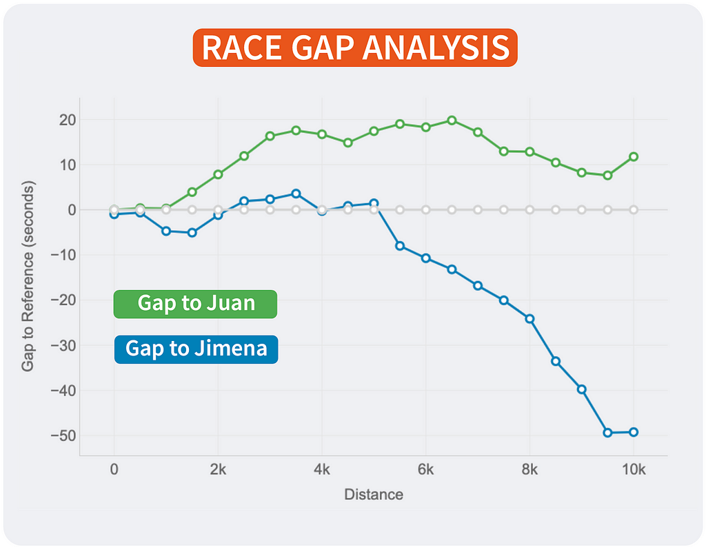
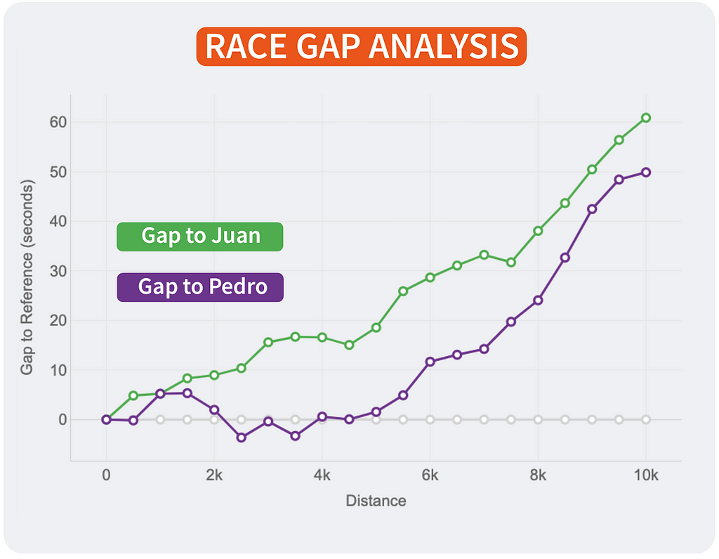
Of course, the lines will change depending on who is the reference. This way, every runner will see the story of the same race but personalised to their point of view and how the compare to the rest. It’s the same story with different main characters.
Race Gap Analysis with different references. Reference is Juan (left). Reference is Pedro (middle). Reference is Jimena (right). Image by Author.
If I were Strava, I would include this chart in the activities marked as RACE by the user. The analysis could be done with all the followers of that user that registered the same activity. An example of integration is shown above.
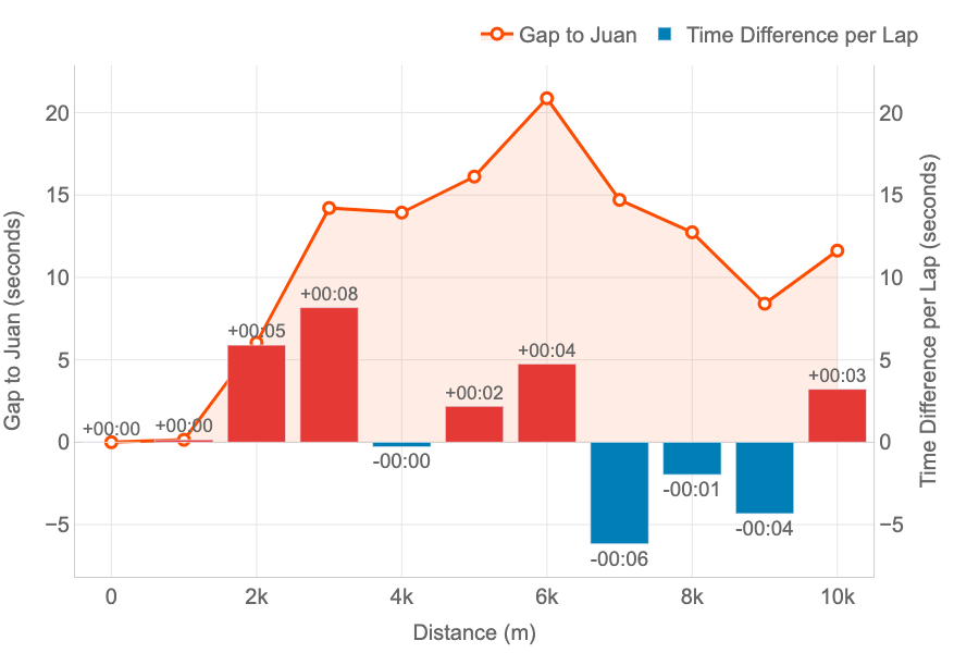
Head-to-Head Lap Analysis
Metrics: the line represent the evolution of the gap (in seconds) between two runners. The bars represent, for every lap, if a runner was faster (blue) or slower (red) compared to other.
Insights: this combined chart is ideal for analysing the head-to-head performance across every lap of a race.
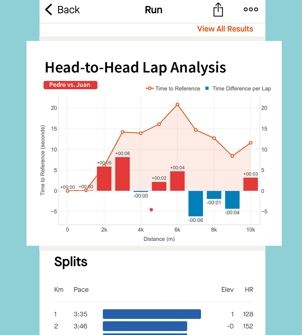
Proposal for Head-to-Head Lap Analysis of Pedro vs. Juan integration into Strava. Image by Author.
This graph has been specifically designed to compare two runners performance across the splits (laps) of the race.
The example represent the time loss of Pedro compared to Juan.
The orange line represent the loss in time as explained for the other graph: both started together, but Pedro started to lose time after the first km until the sixth. Then, he began to be faster to reduce that gap.
The bars bring new insights to our comparison representing the time loss (in red) or the gain (in blue) for every lap. At a glance, Pedro can see that the bigger loss in time was on the third km (8 seconds). And he only lost time on half of the splits. The pace of both was the same for kilometres 1 and 4, and Pedro was faster between on the kms 7, 8 and 9.
Thanks to this graph we can see that I was faster than Pedro on the first 6 kms, gaining and advantage that Pedro could not reduce, despite being faster on the last part of the race. And this confirms the feeling that we have after the competitions: “Pedro has stronger finishes in races.”
Data Processing and Algorithms
If you want to know how the graphs were created, keep reading this section about the implementation.
I don’t want to go too much into the coding bits behind this. As every software problem, you might achieve your goal through different solutions. That’s why I am more interested in explaining the problems that I faced and the logic behind my solutions.
Loading Data
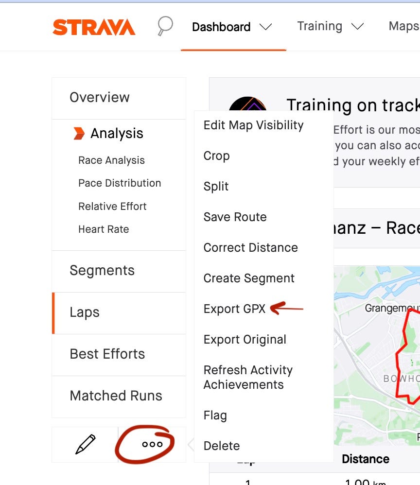
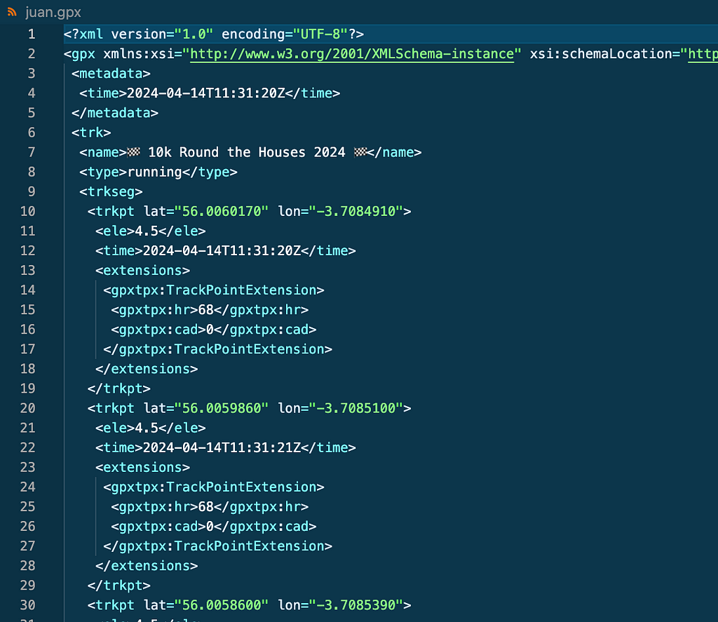
No data, no solution. In this case no Strava API is needed . If you log in your Strava account and go to an activity you can download the GPX file of the activity by clicking on Export GPX as shown on the screenshot. GPX files contain datapoints in XML format as seen below.
How to download GPX file from Strava (left). Example of GPX file (right). Image by Author.
To get my friends data for the same activities I just told them to follow the same steps and send the .gpx files to me.
Preparing Data
For this use case I was only interested in a few attributes:
Location: latitude, longitude and elevation
Timestamp: time.
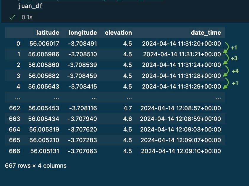
First problem for me was to convert the .gpx files into pandas dataframes so I can play and process the data using python. I used gpxpylibrary. Code below
import pandas as pd
import gpxpy

# read file
with open('juan.gpx', 'r') as gpx_file:
    juan_gpx = gpxpy.parse(gpx_file)

# Convert Juan´s gpx to dataframe
juan_route_info = []

for track in juan_gpx.tracks:
    for segment in track.segments:
        for point in segment.points:
            juan_route_info.append({
                'latitude': point.latitude,
                'longitude': point.longitude,
                'elevation': point.elevation,
                'date_time': point.time
            })

juan_df =  pd.DataFrame(juan_route_info)
juan_df
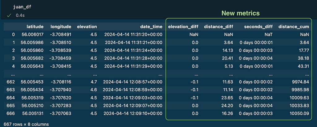
After that, I had 667 datapoints stored on a dataframe. Every row represents where and when I was during the activity.
I learnt that not every row is captured with the same frequency (1 second between 0 and 1, then 3 seconds, then 4 seconds, then 1 second…)
Example of .gpx data stored on a pandas dataframe. Image by Author.
Getting some metrics
Every row in the data represents a different moment and place, so my first idea was to calculate the difference in time, elevation, and distance between two consecutive rows: seconds_diff, elevation_diffand distance_diff.
Time and elevation were straightforward using .diff() method over each column of the pandas dataframe.
# First Calculate elevation diff
juan_df['elevation_diff'] = juan_df['elevation'].diff()

# Calculate the difference in seconds between datapoints
juan_df['seconds_diff'] = juan_df['date_time'].diff()
Unfortunately, as the Earth is not flat, we need to use a distance metric called haversine distance [2]: the shortest distance between two points on the surface of a sphere, given their latitude and longitude coordinates. I used the library haversine.See the code below
# Returns the distance between the first point and the second point return np.round(distance, 2)
#calculate the distances between all data points distances = [np.nan]
for i in range(len(track_df)): if i == 0: continue else: distances.append(haversine_distance( lat1=juan_df.iloc[i - 1]['latitude'], lon1=juan_df.iloc[i - 1]['longitude'], lat2=juan_df.iloc[i]['latitude'], lon2=juan_df.iloc[i]['longitude'] ))
juan_df['distance_diff'] = distances
The cumulative distance was also added as a new column distance_cum using the method cumsum() as seen below
# Calculate the cumulative sum of the distance
juan_df['distance_cum'] = juan_df['distance_diff'].cumsum()
At this point the dataframe with my track data includes 4 new columns with useful metrics:
Dataframe with new metrics for every row. Image by Author.
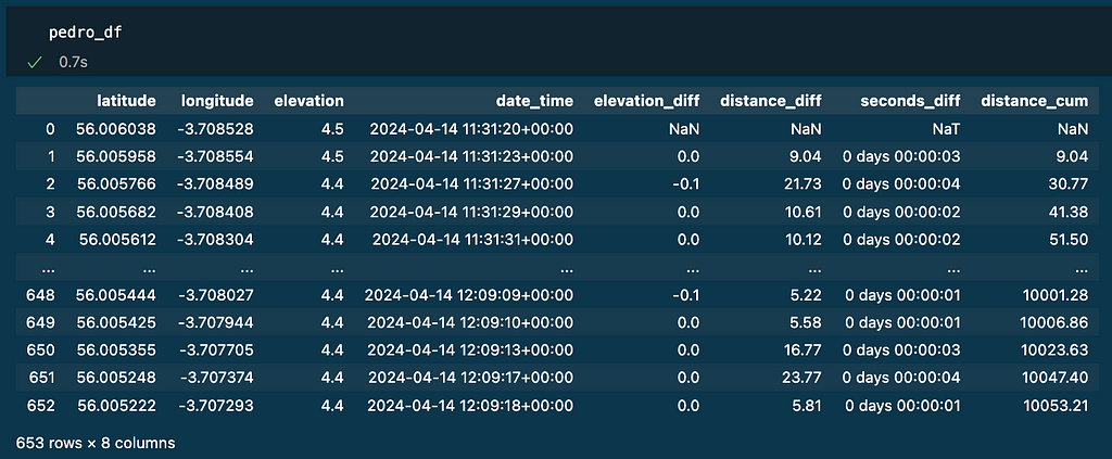
I applied the same logic to other runners’ tracks: jimena_df and pedro_df.
Dataframes for other runners: Pedro (left) and Jimena (right). Image by Author.
We are ready now to play with the data to create the visualisations.
Challenges:
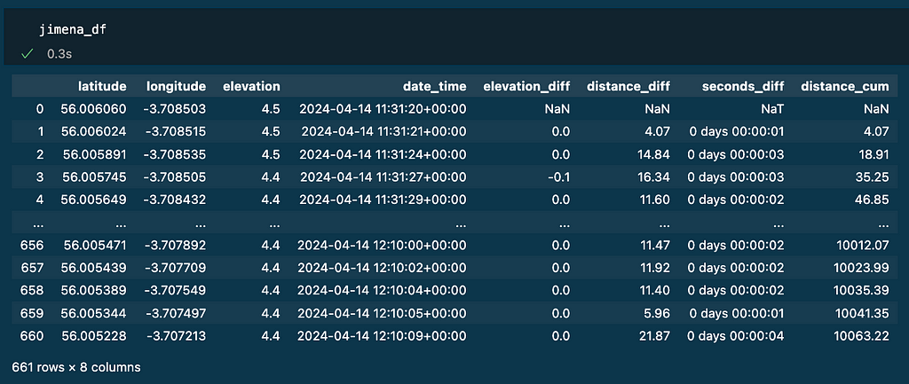
To obtain the data needed for the visuals my first intuition was: look at the cumulative distance column for every runner, identify when a lap distance was completed (1000, 2000, 3000, etc.) by each of them and do the differences of timestamps.
That algorithm looks simple, and might work, but it had some limitations that I needed to address:
Exact lap distances are often completed in between two data points registered. To be more accurate I had to do interpolation of both position and time.
Due to difference in the precisionof devices, there might be misalignments across runners. The most typical is when a runner’s lap notification beeps before another one even if they have been together the whole track. To minimise this I decided to use the reference runner to set the position marks for every lap in the track. The time difference will be calculated when other runners cross those marks (even though their cumulative distance is ahead or behind the lap). This is more close to the reality of the race: if someone crosses a point before, they are ahead (regardless the cumulative distance of their device)
With the previous point comes another problem: the latitude and longitude of a reference mark might never be exactly registered on the other runners’ data. I used Nearest Neighbours to find the closest datapoint in terms of position.
Finally, Nearest Neighbours might bring wrong datapoints if the track crosses the same positions at different moments in time. So the population where the Nearest Neighbours will look for the best match needs to be reduced to a smaller group of candidates. I defined a window size of 20 datapoints around the target distance (distance_cum).
Algorithm
With all the previous limitations in mind, the algorithm should be as follows:
1. Choose the reference and a lap distance (default= 1km)
2. Using the reference data, identify the position and the moment every lap was completed: the reference marks.
3. Go to other runner’s data and identify the moments they crossed those position marks. Then calculate the difference in time of both runners crossing the marks. Finally the delta of this time difference to represent the evolution of the gap.
Code Example
1. Choose the reference and a lap distance (default= 1km)
Juan will be the reference (juan_df) on the examples.
The other runners will be Pedro (pedro_df ) and Jimena (jimena_df).
Lap distance will be 1000 metres
2. Create interpolate_laps(): function that finds or interpolates the exact point for each completed lap and return it in a new dataframe. The inferpolation is done with the function: interpolate_value() thatwas also created.
## Function: interpolate_value()

Input:
    - start: The starting value.
    - end: The ending value.
    - fraction: A value between 0 and 1 that represents the position between
      the start and end values where the interpolation should occur.
Return:
    - The interpolated value that lies between the start and end values
      at the specified fraction.
Input: - track_df: dataframe with track data. - lap_distance: metres per lap (default 1000) Return: - track_laps: dataframe with lap metrics. As many rows as laps identified.
def interpolate_laps(track_df , lap_distance = 1000): #### 1. Initialise track_laps with the first row of track_df track_laps = track_df.loc[0][['latitude','longitude','elevation','date_time','distance_cum']].copy()
# Set distance_cum = 0 track_laps[['distance_cum']] = 0
#### 3. For each lap i from 1 to number_of_laps: for i in range(1,int(number_of_laps+1),1):
# a. Calculate target_distance = i * lap_distance target_distance = i*lap_distance
# b. Find first_crossing_index where track_df['distance_cum'] > target_distance first_crossing_index = (track_df['distance_cum'] > target_distance).idxmax()
# c. If match is exactly the lap distance, copy that row if (track_df.loc[first_crossing_index]['distance_cum'] == target_distance): new_row = track_df.loc[first_crossing_index][['latitude','longitude','elevation','date_time','distance_cum']]
# Else: Create new_row with interpolated values, copy that row. else:
Dataframe with the lap metrics as a result of interpolation. Image by Author.
Note as it was a 10k race, 10 laps of 1000m has been identified (see column distance_cum). The column seconds_diff has the time per lap. The rest of the columns (latitude, longitude, elevation and date_time)mark the position and time for each lap of the reference as the result of interpolation.
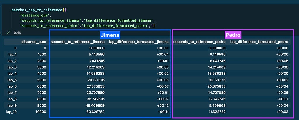
3. To calculate the time gaps between the reference and the other runners I created the function gap_to_reference()
## Helper Functions:
- get_seconds(): Convert timedelta to total seconds
- format_timedelta(): Format timedelta as a string (e.g., "+01:23" or "-00:45")
# Convert timedelta to total seconds def get_seconds(td): # Convert to total seconds total_seconds = td.total_seconds()
return total_seconds
# Format timedelta as a string (e.g., "+01:23" or "-00:45") def format_timedelta(td): # Convert to total seconds total_seconds = td.total_seconds()
# Format the string return f"{sign}{minutes:02d}:{seconds:02d}"
## Function: gap_to_reference()

Input:
    - laps_dict: dictionary containing the df_laps for all the runnners' names
    - df_dict: dictionary containing the track_df for all the runnners' names
    - reference_name: name of the reference
Return:
    - matches: processed data with time differences.
def gap_to_reference(laps_dict, df_dict, reference_name): #### 1. Get the reference's lap data from laps_dict matches = laps_dict[reference_name][['latitude','longitude','date_time','distance_cum']]
#### 2. For each racer (name) and their data (df) in df_dict: for name, df in df_dict.items():
# If racer is the reference: if name == reference_name:
# Set time difference to zero for all laps for lap, row in matches.iterrows(): matches.loc[lap,f'seconds_to_reference_{reference_name}'] = 0
# If racer is not the reference: if name != reference_name:
# a. For each lap find the nearest point in racer's data based on lat, lon. for lap, row in matches.iterrows():
# Step 1: set the position and lap distance from the reference target_coordinates = matches.loc[lap][['latitude', 'longitude']].values target_distance = matches.loc[lap]['distance_cum']
# Step 2: find the datapoint that will be in the centre of the window first_crossing_index = (df_dict[name]['distance_cum'] > target_distance).idxmax()
# Step 3: select the 20 candidate datapoints to look for the match window_size = 20 window_sample = df_dict[name].loc[first_crossing_index-(window_size//2):first_crossing_index+(window_size//2)] candidates = window_sample[['latitude', 'longitude']].values
# Step 4: get the nearest match using the coordinates nn = NearestNeighbors(n_neighbors=1, metric='euclidean') nn.fit(candidates) distance, indice = nn.kneighbors([target_coordinates])
# b. Calculate time difference between racer and reference at this point matches[f'time_to_ref_{name}'] = matches[f'nearest_timestamp_{name}'] - matches['date_time']
# c. Store time difference and other relevant data matches[f'time_to_ref_diff_{name}'] = matches[f'time_to_ref_{name}'].diff() matches[f'time_to_ref_diff_{name}'] = matches[f'time_to_ref_diff_{name}'].fillna(pd.Timedelta(seconds=0))
# d. Format data using helper functions matches[f'lap_difference_seconds_{name}'] = matches[f'time_to_ref_diff_{name}'].apply(get_seconds) matches[f'lap_difference_formatted_{name}'] = matches[f'time_to_ref_diff_{name}'].apply(format_timedelta)
#### 3. Return processed data with time differences return matches
Below the code to implement the logic and store results on the dataframe matches_gap_to_reference:
# Lap distance lap_distance = 1000
# Store the DataFrames in a dictionary df_dict = { 'jimena': jimena_df, 'juan': juan_df, 'pedro': pedro_df, }
# Store the Lap DataFrames in a dictionary laps_dict = { 'jimena': interpolate_laps(jimena_df , lap_distance), 'juan': interpolate_laps(juan_df , lap_distance), 'pedro': interpolate_laps(pedro_df , lap_distance) }
The columns of the resulting dataframe contain the important information that will be displayed on the graphs:
Some columns from the dataframe returned by the function gap_to_reference(). Image by Author.
Race GAP Analysis Graph
Requirements:
The visualisation needs to be tailored for a runner who will be the reference. Every runner will be represented by a line graph.
X-axis represent distance.
Y-axis the gap to reference in seconds
The reference will set the baseline. A constant grey line in y-axis = 0
The lines for the other runners will be above the reference if they were ahead on the track and below if they were behind.
Race Gap Analysis chart for 10 laps (1000m). Image by Author.
To represent the graph I used plotly library and used the data from matches_gap_to_reference:
X-axis: is the cumulative distance per lap. Column distance_cum
Y-axis: represents the gap to reference in seconds:
Grey line: reference’s gap to reference is always 0.
Purple line: Pedro’s gap to reference (-) seconds_to_reference_pedro.
Blue line: Jimena’s gap to reference (-) seconds_to_reference_jimena.
Head to Head Lap Analysis Graph
Requirements:
The visualisation needs to compare data for only 2 runners. A reference and a competitor.
X-axis represents distance
Y-axis represents seconds
Two metrics will be plotted to compare the runners’ performance: a line graph will show the total gap for every point of the race. The bars will represent if that gap was increased (positive) or decreased (negative) on every lap.
Head-to-Head Lap Analysis chart for 10 laps (1000m). Image by Author.
Again, the data represented on the example is coming from matches_gap_to_reference:
X-axis: is the cumulative distance per lap. Column distance_cum
Y-axis:
Orange line: Pedro’s gap to Juan (+) seconds_to_reference_pedro
Bars: the delta of that gap per lap lap_difference_formatted_pedro. If Pedro losses time, the delta is positive and represented in red. Otherwise the bar is blue.
I refined the style of both visuals to align more closely with Strava’s design aesthetics.
Kudos for this article?
I started this idea after my last race. I really liked the results of the visuals so I though they might be useful for the Strava community. That’s why I decided to share them with the community writing this article.
At the time of this writing (July 2024) Databricks has become a standard platform for data engineering in the cloud, this rise to prominence highlights the importance of features that support robust data operations (DataOps). Among these features, observability capabilities — logging, monitoring, and alerting — are essential for a mature and production-ready data engineering tool.
There are many tools to log, monitor, and alert the Databricks workflows including built-in native Databricks Dashboards, Azure Monitor, DataDog among others.
However, one common scenario that is not obviously covered by the above is the need to integrate with an existing enterprise monitoring and alerting stack rather than using the dedicated tools mentioned above. More often than not, this will be Elastic stack (aka ELK) — a de-facto standard for logging and monitoring in the software development world.
Components of the ELK stack?
ELK stands for Elasticsearch, Logstash, and Kibana — three products from Elastic that offer end-to-end observability solution:
Elasticsearch — for log storage and retrieval
Logstash — for log ingestion
Kibana — for visualizations and alerting
The following sections will present a practical example of how to integrate the ELK Stack with Databricks to achieve a robust end-to-end observability solution.
A practical example
Prerequisites
Before we move on to implementation, ensure the following is in place:
Elastic cluster — A running Elastic cluster is required. For simpler use cases, this can be a single-node setup. However, one of the key advantages of the ELK is that it is fully distributed so in a larger organization you’ll probably deal with a cluster running in Kubernetes. Alternatively, an instance of Elastic Cloud can be used, which is equivalent for the purposes of this example. If you are experimenting, refer to the excellent guide by DigitalOcean on how to deploy an Elastic cluster to a local (or cloud) VM.
Databricks workspace — ensure you have permissions to configure cluster-scoped init scripts. Administrator rights are required if you intend to set up global init scripts.
Storage
For log storage, we will use Elasticsearch’s own storage capabilities. We start by setting up. In Elasticsearch data is organized in indices. Each index contains multiple documents, which are JSON-formatted data structures. Before storing logs, an index must be created. This task is sometimes handled by an organization’s infrastructure or operations team, but if not, it can be accomplished with the following command:
curl -X PUT "http://localhost:9200/logs_index?pretty"
Once the index is set up documents can be added with:
curl -X POST "http://localhost:9200/logs_index/_doc?pretty"
     -H 'Content-Type: application/json'
     -d'
{
  "timestamp": "2024-07-21T12:00:00",
  "log_level": "INFO",
  "message": "This is a log message."
}'
To retrieve documents, use:
curl -X GET "http://localhost:9200/logs_index/_search?pretty"
     -H 'Content-Type: application/json'
     -d'
{
  "query": {
    "match": {
      "message": "This is a log message."
    }
  }
}'
This covers the essential functionality of Elasticsearch for our purposes. Next, we will set up the log ingestion process.
Transport / Ingestion
In the ELK stack, Logstash is the component that is responsible for ingesting logs into Elasticsearch.
The functionality of Logstash is organized into pipelines, which manage the flow of data from ingestion to output.
Each pipeline can consist of three main stages:
Input: Logstash can ingest data from various sources. In this example, we will use Filebeat, a lightweight shipper, as our input source to collect and forward log data — more on this later.
Filter: This stage processes the incoming data. While Logstash supports various filters for parsing and transforming logs, we will not be implementing any filters in this scenario.
Output: The final stage sends the processed data to one or more destinations. Here, the output destination will be an Elasticsearch cluster.
Pipeline configurations are defined in YAML files and stored in the /etc/logstash/conf.d/ directory. Upon starting the Logstash service, these configuration files are automatically loaded and executed.
You can refer to Logstash documentation on how to set up one. An example of a minimal pipeline configuration is provided below:
There is one more component in ELK — Beats. Beats are lightweight agents (shippers) that are used to deliver log (and other) data into either Logstash or Elasticsearch directly. There’s a number of Beats — each for its individual use case but we’ll concentrate on Filebeat — by far the most popular one — which is used to collect log files, process them, and push to Logstash or Elasticsearch directly.
Beats must be installed on the machines where logs are generated. In Databricks we’ll need to setup Filebeat on every cluster that we want to log from — either All-Purpose (for prototyping, debugging in notebooks and similar) or Job (for actual workloads). Installing Filebeat involves three steps:
Installation itself — download and execute distributable package for your operating system (Databricks clusters are running Ubuntu — so a Debian package should be used)
Configure the installed instance
Starting the service via system.d and asserting it’s active status
This can be achieved with the help of Init scripts. A minimal example Init script is suggested below:
#!/bin/bash
# Check if the script is run as root if [ "$EUID" -ne 0 ]; then echo "Please run as root" exit 1 fi
Notice how in the configuration above we set up a processor to extract timestamps. This is done to address a common problem with Filebeat — by default it will populate logs @timestamp field with a timestamp when logs were harvested from the designated directory — not with the timestamp of the actual event. Although the difference is rarely more than 2–3 seconds for a lot of applications, this can mess up the logs real bad — more specifically, it can mess up the order of records as they are coming in.
To address this, we will overwrite the default @timestamp field with values from log themselves.
Logging
Once Filebeat is installed and running, it will automatically collect all logs output to the designated directory, forwarding them to Logstash and subsequently down the pipeline.
Before this can occur, we need to configure the Python logging library.
The first necessary modification would be to set up FileHandler to output logs as files to the designated directory. Default logging FileHandler will work just fine.
Then we need to format the logs into NDJSON, which is required for proper parsing by Filebeat. Since this format is not natively supported by the standard Python library, we will need to implement a custom Formatter.
class NDJSONFormatter(logging.Formatter): def __init__(self, extra_fields=None): super().__init__() self.extra_fields = extra_fields if extra_fields is not None else {}
We will also use the custom Formatter to address the timestamp issue we discussed earlier. In the configuration above a new field timestamp is added to the LogRecord object that will conatain a copy of the event timestamp. This field may be used in timestamp processor in Filebeat to replace the actual @timestamp field in the published logs.
We can also use the Formatter to add extra fields — which may be useful for distinguishing logs if your organization uses one index to collect logs from multiple applications.
Additional modifications can be made as per your requirements. Once the Logger has been set up we can use the standard Python logging API — .info() and .debug(), to write logs to the log file and they will automatically propagate to Filebeat, then to Logstash, then to Elasticsearch and finally we will be able to access those in Kibana (or any other client of our choice).
Visualization
In the ELK stack, Kibana is a component responsible for visualizing the logs (or any other). For the purpose of this example, we’ll just use it as a glorified search client for Elasticsearch. It can however (and is intended to) be set up as a full-featured monitoring and alerting solution given its rich data presentation toolset.
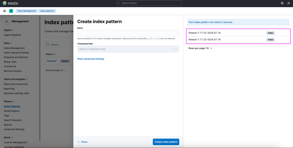
In order to finally see our log data in Kibana, we need to set up Index Patterns:
Navigate to Kibana.
Open the “Burger Menu” (≡).
Go to Management -> Stack Management -> Kibana -> Index Patterns.
Click on Create Index Pattern.
Kibana index pattern creation interfact
Kibana will helpfully suggest names of the available sources for the Index Patterns. Type out a name that will capture the names of the sources. In this example it can be e.g. filebeat*, then click Create index pattern.
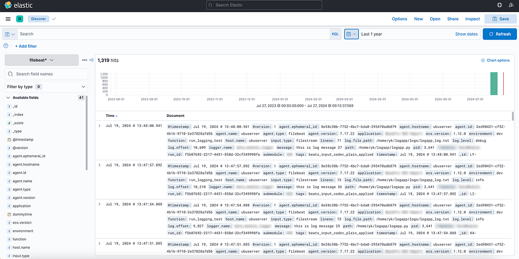
Once selected, proceed to Discover menu, select the newly created index pattern on the left drop-down menu, adjust time interval (a common pitfall — it is set up to last 15 minutes by default) and start with your own first KQL query to retrieve the logs.
Log stream visualized in Kibana
We have now successfully completed the multi-step journey from generating a log entry in a Python application hosted on Databricks to to visualizing and monitoring this data using a client interface.
Conclusion
While this article has covered the introductory aspects of setting up a robust logging and monitoring solution using the ELK Stack in conjunction with Databricks, there are additional considerations and advanced topics that suggest further exploration:
Choosing Between Logstash and Direct Ingestion: Evaluating whether to use Logstash for additional data processing capabilities versus directly forwarding logs from Filebeat to Elasticsearch.
Schema Considerations: Deciding on the adoption of the Elastic Common Schema (ECS) versus implementing custom field structures for log data.
Exploring Alternative Solutions: Investigating other tools such as Azure EventHubs and other potential log shippers that may better fit specific use cases.
Broadening the Scope: Extending these practices to encompass other data engineering tools and platforms, ensuring comprehensive observability across the entire data pipeline.
These topics will be explored in further articles.
Unless otherwise noted, all images are by the author.
With last month’s blog, I started a series of posts that highlight the key factors that are driving customers to choose Amazon Bedrock. I explored how Bedrock enables customers to build a secure, compliant foundation for generative AI applications. Now I’d like to turn to a slightly more technical, but equally important differentiator for Bedrock—the multiple techniques that you can use to customize models and meet your specific business needs.
Rothstein, A., photographer. (1939) Farm family at dinner. Fairfield Bench Farms, Montana. Montana Fairfield Bench Farms United States Teton County, 1939. May. [Photograph] Retrieved from the Library of Congress, https://www.loc.gov/item/2017777606/.
An intro to an especially sneaky bias that invades many regression models
From 2000 to 2013, a flood of research showed a striking correlation between the rate of risky behavior among adolescents, and how often they ate meals with their family.
Study after study seemed to reach the same conclusion:
The greater the number of meals per week that adolescents had with their family, the lower their odds of indulging in substance abuse, violence, delinquency, vandalism, and many other problem behaviors.
A higher frequency of family meals also correlated with reduced stress, reduced incidence of childhood depression, and reduced frequency of suicidal thoughts. Eating together correlated with increased self-esteem, and a generally increased emotional well-being among adolescents.
Soon, the media got wind of these results, and they were packaged and distributed as easy-to-consume sound bites, such as this one:
“Studies show that the more often families eat together, the less likely kids are to smoke, drink, do drugs, get depressed, develop eating disorders and consider suicide, and the more likely they are to do well in school, delay having sex, eat their vegetables, learn big words and know which fork to use.” — TIME Magazine, “The magic of the family meal”, June 4, 2006
One of the largest studies on the topic was conducted in 2012 by the National Center on Addiction and Substance Abuse (CASA) at Columbia University. CASA surveyed 1003 American teenagers aged 12 to 17 about various aspects of their lives.
CASA discovered the same, and in some cases, startlingly clear correlations between the number of meals adolescents had with their family and a broad range of behavioral and emotional parameters.
There was no escaping the conclusion.
Family meals make well-adjusted teens.
Until you read what is literally the last sentence in CASA’s 2012 white paper:
“Because this is a cross-sectional survey, the data cannot be used to establish causality or measure the direction of the relationships that are observed between pairs of variables in the White Paper.”
And so here we come to a few salient points.
Frequency of family meals may not be the only driver of the reduction in risky behaviors among adolescents. It may not even be the primary driver.
Families who eat together more frequently may do so simply because they already share a comfortable relationship and have good communication with one another.
Eating together may even be the effect of a healthy, well-functioning family.
And children from such families may simply be less likely to indulge in risky behaviors and more likely to enjoy better mental health.
Several other factors are also at play. Factors such as demography, the child’s personality, and the presence of the right role models at home, school, or elsewhere might make children less susceptible to risky behaviors and poor mental health.
Clearly, the truth, as is often the case, is murky and multivariate.
Although, make no mistake, ‘Eat together’ is not bad advice, as advice goes. The trouble with it is the following:
Most of the studies on this topic, including the CASA study, as well as a particularly thorough meta-analysis published by Goldfarb et al in 2013 of 14 other studies, did in fact carefully measure and tease out the partial effects of exactly all of these factors on adolescent risky behavior.
So what did the researchers find?
They found that the partial effect of the frequency of family meals on the observed rate of risky behaviors in adolescents was considerably diluted when other factors such as demography, personality, and nature of relationship with the family were included in the regression models. The researchers also found that in some cases, the partial effect of frequency of family meals, completely disappeared.
Here, for example, is a finding from Goldfarb et al (2013) (FFM=Frequency of Family Meals):
“The associations between FFM and the outcome in question were most likely to be statistically significant with unadjusted models or univariate analyses. Associations were less likely to be significant in models that controlled for demographic and family characteristics or family/parental connectedness. When methods like propensity score matching were used, no significant associations were found between FFM and alcohol or tobacco use. When methods to control for time-invariant individual characteristics were used, the associations were significant about half the time for substance use, five of 16 times for violence/delinquency, and two of two times for depression/suicide ideation.”
Wait, but what does all this have to do with bias?
The connection to omitted variable bias
The relevance to bias comes from two unfortunately co-existing properties of the frequency of family meals variable:
On one hand, most studies on the topic found that the frequency of family meals does have an intrinsic partial effect on the susceptibility to risky behavior. But, the effect is weak when you factor in other variables.
At the same time, the frequency of family meals is also heavily correlated with several other variables, such as the nature of inter-personal relationships with other family members, the nature of communication within the family, the presence of role models, the personality of the child, and demographics such as household income. All of these variables, it was found, have a strong joint correlation with the rate of indulgence in risky behaviors.
The way the math works is that if you unwittingly omit even a single one of these other variables from your regression model, the coefficient of the frequency of family meals gets biased in the negative direction. In the next two sections, I’ll show exactly why that happens.
This negative bias on the coefficient of frequency of family meals will make it appear that simply increasing the number of times families sit together to eat ought to, by itself, considerably reduce the incidence of — oh, say — alcohol abuse among adolescents.
The above phenomenon is called Omitted Variable Bias. It’s one of the most frequently occurring, and easily missed, biases in regression studies. If not spotted and accounted for, it can lead to unfortunate real-world consequences.
For example, any social policy that disproportionately stresses the need for increasing the number of times families eat together as a major means to reduce childhood substance abuse will inevitably miss its design goal.
Now, you might ask, isn’t much of this problem caused by selecting explanatory variables that correlate with each other so strongly? Isn’t it just an example of a sloppily conducted variable-selection exercise? Why not select variables that are correlated only with the response variable?
After all, shouldn’t a skilled statistician be able to employ their ample training and imagination to identify a set of factors that have no more than a passing correlation with one another and that are likely to be strong determinants of the response variable?
Sadly, in any real-world setting, finding a set of explanatory variables that are only slightly (or not at all) correlated is the stuff of dreams, if even that.
But to paraphrase G. B. Shaw, if your imagination is full of ‘fairy princesses and noble natures and fearless cavalry charges’, you might just come across a complete set of perfectly orthogonal explanatory variables,as statisticians like to so evocatively call them. But again, I will bet you the Brooklyn Bridge that even in your sweetest statistical dreamscapes, you will not find them. You are more likely to stumble into the non-conforming Loukas and the reality-embracing Captain Bluntschlis instead of greeting the quixotic Rainas and the Major Saranoffs.
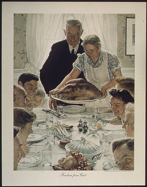
An idealized depiction of family life by Norman Rockwell. “Freedom from Want”, Published: March 6, 1943, (Public domain artwork)
And so, we must learn to live in a world where explanatory variables freely correlate with one another, while at the same time influencing the response of the model to varying degrees.
In our world, omitting one of these variable s— either by accident, or by the innocent ignorance of its existence, or by the lack of means to measure it, or through sheer carelessness — causes the model to be biased. We might as well develop a better appreciation of this bias.
In the rest of this article, I’ll explore Omitted Variable Bias in great detail. Specifically, I’ll cover the following:
Definition and properties of omitted variable bias.
Formula for estimating the omitted variable bias.
An analysis of the omitted variable bias in a model of adolescent risky behavior.
A demo and calculation of omitted variable bias in a regression model trained on a real-world dataset.
Definition and properties of omitted variable bias
From a statistical perspective, omitted variable bias is defined as follows:
When an important explanatory variable is omitted from a regression model and the truncated model is fitted on a dataset, the expected values of the estimated coefficients of the non-omitted variables in the fitted model shift away from their true population values. This shift is called omitted variable bias.
Even when a single important variable is omitted, the expected values of the coefficients of all the non-omitted explanatory variables in the model become biased. No variable is spared from the bias.
Magnitude of the bias
In linear models, the magnitude of the bias depends on the following three quantities:
Covariance of the non-omitted variable with the omitted variable: The bias on a non-omitted variable’s estimated coefficient is directly proportional to the covariance of the non-omitted variable with the omitted variable, conditioned upon the rest of the variables in the model. In other words, the more tightly correlated the omitted variable is with the variables that are left behind, the heavier the price you pay for omitting it.
Coefficient of the omitted variable: The bias on a non-omitted variable’s estimated coefficient is directly proportional to the population value of the coefficient of the omitted variable in the full model. The greater the influence of the omitted variable on the model’s response, the bigger the hole you dig for yourself by omitting it.
Variance of the non-omitted variable: The bias on a non-omitted variable’s estimated coefficient is inversely proportional to the variance of the non-omitted variable, conditioned upon the rest of the variables in the model. The more scattered the non-omitted variable’s values are around its mean, the less affected it is by the bias. This is yet another place in which the well-known effect of bias-variance tradeoff makes its presence felt.
Direction of the bias
In most cases, the direction of omitted variable bias on the estimated coefficient of a non-omitted variable, is unfortunately hard to judge. Whether the bias will boost or attenuate the estimate is hard to tell without actually knowing the omitted variable’s coefficient in the full model, and working out the conditional covariance and conditional variance of non-omitted variable.
Formula for omitted variable bias
In this section, I’ll present the formula for Omitted Variable Bias that is applicable to coefficients of only linear models. But the general concepts and principles of how the bias works, and the factors it depends on carry over smoothly to various other kinds of models.
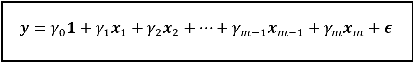
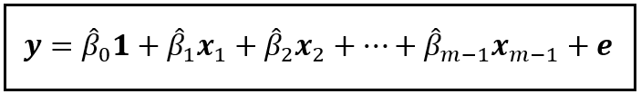
Consider the following linear model which regresses y on x_1 through x_m and a constant:
A linear model that regresses y on x_1 through x_m and a constant (Image by Author)
In this model, γ_1 through γ_m are the population values of the coefficients of x_1 through x_m respectively, and γ_0 is the intercept (a.k.a. the regression constant). ϵ is the regression error. It captures the variance in y that x_1 through x_m and γ_0 are jointly unable to explain.
As a side note, y, x_1 through x_m, 1, and ϵ are all column vectors of size n x 1, meaning they each contain n rows and 1 column, with ‘n’ being the number of samples in the dataset on which the model operates.
Lest you get ready to take flight and flee, let me assure you that beyond mentioning the above fact, I will not go any further into matrix algebra in this article. But you have to let me say the following: if it helps, I find it useful to imagine an n x 1 column vector as a vertical cabinet with (n — 1) internal shelves and a number sitting on each shelf.
Anyway.
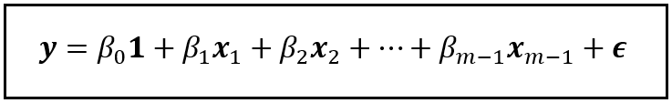
Now, let’s omit the variable x_m from this model. After omitting x_m, the truncated model looks like this:
A truncated linear model that regresses y on x_1 through x_(m-1) and a constant (Image by Author)
In the above truncated model, I’ve replaced all the gammas with betas to remind us that after dropping x_m, the coefficients of the truncated model will be decidedly different than in the full model.
The question is, how different are the betas from the gammas? Let’s find out.
If you fit (train) the truncated model on the training data, you will get a fitted model. Let’s represent the fitted model as follows:
The fitted truncated model (Image by Author)
In the fitted model, the β_0_cap through β_(m — 1)_cap are the fitted (estimated) values of the coefficients β_0 through β_(m — 1). ‘e’ is the residual error, which captures the variance in the observed values of y that the fitted model is unable to explain.
The theory says that the omission of x_m has biased the expected value of every single coefficient from β_0_cap through β_(m — 1)_cap away from their true population values γ_1 through γ_(m — 1).
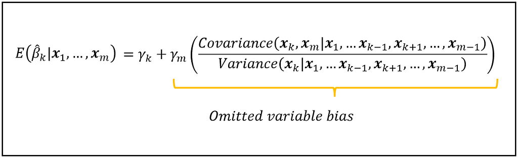
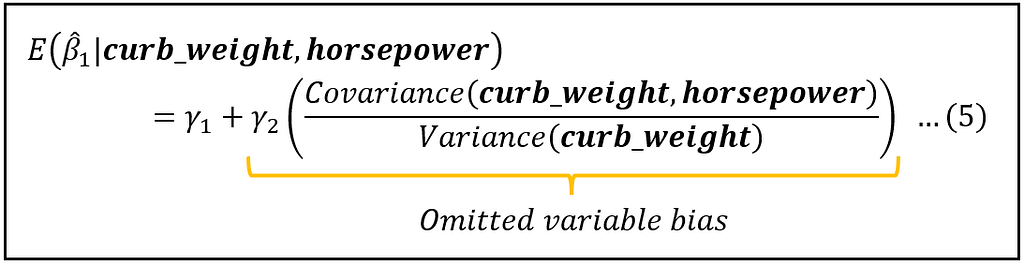
Let’s examine the bias on the estimated coefficient β_k_cap of the kth regression variable, x_k.
The amount by which the expected value of β_k_cap in the truncated fitted model is biased is given by the following equation:
The expected value of the coefficient β_k_cap in the truncated fitted model is biased by an amount equal to the scaled ratio of the conditional covariance of x_k and x_m, and the conditional variance of x_k (Image by Author)
Let’s note all of the following things about the above equation:
β_k_cap is the estimated coefficient of the non-omitted variable x_k in the truncated model. You get this estimate of β_k from fitting the truncated model on the data.
E( β_k_cap | x_1 through x_m) is the expected value of the above mentioned estimate, conditioned on all the observed values of x_1 through x_m. Note that x_m is actually not observed. We’ve omitted it, remember? Anyway, the expectation operator E() has the following meaning: if you train the truncated model on thousands of randomly drawn datasets, you will get thousands of different estimates of β_k_cap. E(β_k_cap) is the mean of all these estimates.
γ_k is the true population value of the coefficient of x_k in the full model.
γ_m is the true population value of the coefficient of the variable x_m that was omitted from the full model.
The covariance term in the above equation represents the covariance of x_k with x_m, conditioned on the rest of the variables in the full model.
Similarly, the variance term represents the variance of x_k conditioned on all the other variables in the full model.
The above equation tells us the following:
First and foremost, had x_m not been omitted, the expected value of β_k_cap in the fitted truncated model would have been γ_k. This is a property of all linear models fitted using the OLS technique: the expected value of each estimated coefficient in the fitted model is the unbiased population value of the respective coefficient.
However, due to the missing x_m in the truncated model, the expected value β_k_cap has become biased away from its population value, γ_k.
The amount of bias is the ratio of, the conditional covariance of x_k with x_m, and the conditional variance of x_k, scaled by γ_m.
The above formula for the omitted variable bias should give you a first glimpse of the appalling carnage wreaked on your regression model, should you unwittingly omit even a single explanatory variable that happens to be not only highly influential but also heavily correlated with one or more non-omitted variables in the model.
As we’ll see in the following section, that is, regrettably, just what happens in a specific kind of flawed model for estimating the rate of risky behaviour in adolescents.
An analysis of the omitted variable bias in a model of adolescent risky behavior
Let’s apply the formula for the omitted variable bias to a model that tries to explain the rate of risky behavior in adolescents. We’ll examine a scenario in which one of the regression variables is omitted.
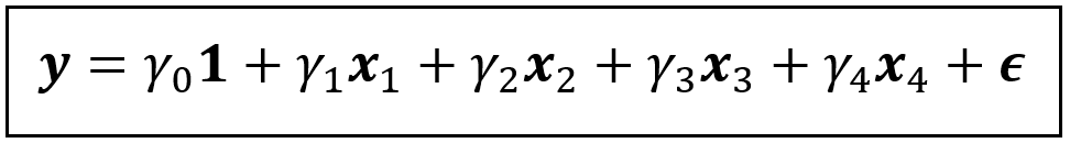
But first, we’ll look at the full (non-omitted) version of the model. Specifically, let’s consider a linear model in which the rate of risky behavior is regressed on the suitably quantified versions of the following four factors:
frequency of family meals
how well-informed a child thinks their parents are about what’s going on in their life,
the quality of the relationship between parent and child, and
the child’s intrinsic personality.
For simplicity, we’ll use the variables x_1, x_2, x_3 and x_4 to represent the above four regression variables.
Let y represent the response variable, namely, the rate of risky behaviors.
The linear model is as follows:
A linear model of y regressed on x_1, x_2, x_3 and x_4 and a constant (Image by Author)
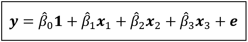
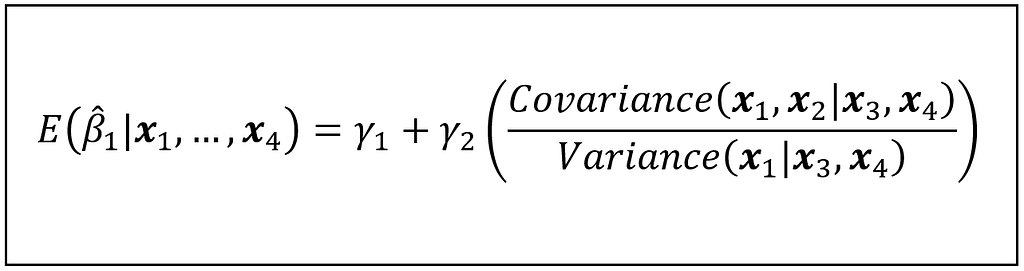
We’ll study the biasing effect of omittingx_2(=how well-informed a child thinks their parents are about what’s going on in their life) on the coefficient of x_1(=frequency of family meals).
If x_2 is omitted from the above linear model, and the truncated model is fitted, the fitted model looks like this:
The truncated and fitted model (Image by Author)
In the fitted model, β_1_cap is the estimated coefficient of the frequency of family meals. Thus, β_1_cap quantifies the partial effect of frequency of family meals on the rate of risky behavior in adolescents.
Using the formula for the omitted variable bias, we can state the expected value of the partial effect of x_1 as follows:
Formula for the expected value of β_1_cap (Image by Author)
Studies have shown that frequency of family meals (x_1) happens to be heavily correlated with how well-informed a child thinks their parents are about what’s going on in their life (x_2). Now look at the covariance in the numerator of the bias term. Since x_1 is highly correlated with x_2, the large covariance makes the numerator large.
If that weren’t enough, the same studies have shown that x_2 (=how well-informed a child thinks their parents are about what’s going on in their life) is itself heavily correlated (inversely) with the rate of risky behavior that the child indulges in (y). Therefore, we’d expect the coefficient γ_2 in the full model to be large and negative.
The large covariance and the large negative γ_2 join forces to make the bias term large and negative. It’s easy to see how such a large negative bias will drive down the expected value of β_1_cap deep into negative territory.
It is this large negative bias that will make it seem like the frequency of family meals has an outsized partial effect on explaining the rate of risky behavior in adolescents.
All of this bias occurs by the inadvertent omission of a single highly influential variable.
A real-world demo of omitted variable bias
Until now, I’ve relied on equations and formulae to provide a descriptive demonstration of how omitting an important variable biases a regression model.
In this section, I’ll show you the bias in action on real world data.
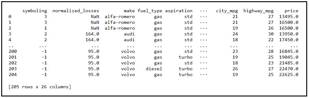
For illustration, I’ll use the following dataset of automobiles published by UC Irvine.
Each row in the dataset contains 26 different features of a unique vehicle. The characteristics include make, number of doors, engine features such as fuel type, number of cylinders, and engine aspiration, physical dimensions of the vehicle such as length, breath, height, and wheel base, and the vehicle’s fuel efficiency on city and highway roads.
There are 205 unique vehicles in this dataset.
Our goal is to build a linear model for estimating the fuel efficiency of a vehicle in the city.
Out of the 26 variables covered by the data, only two variables — curb weight and horsepower — happen to be the most potent determiners of fuel efficiency. Why these two in particular? Because, out of the 25 potential regression variables in the dataset, only curb weight and horsepower have statistically significant partial correlations with fuel efficiency. If you are curious how I went about the process of identifying these variables, take a look at my article on the partial correlation coefficient.
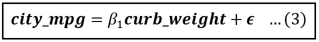
A linear model of fuel efficiency (in the city) regressed on curb weight and horsepower is as follows:
A linear model of fuel efficiency (Image by Author)
Notice that the above model has no intercept. That is so because when either one of curb weight and horsepower is zero, the other one has to be zero. And you will agree that it will be quite unusual to come across a vehicle with zero weight and horsepower but somehow sporting a positive mileage.
So next, we’ll filter out the rows in the dataset containing missing data. And from the remaining data, we’ll carve out two randomly selected datasets for training and testing the model in a 80:20 ratio. After doing this, the training data happens to contain 127 vehicles.
If you were to train the model in equation (1) on the training data using Ordinary Least Squares, you’ll get the estimates γ_1_cap and γ_2_cap for the coefficients γ_1 and γ_2.
At the end of this article, you’ll find the link to the Python code for doing this training plus all other code used in this article.
Meanwhile, following is the equation of the trained model:
The fitted linear model of automobile fuel efficiency (Image by Author)
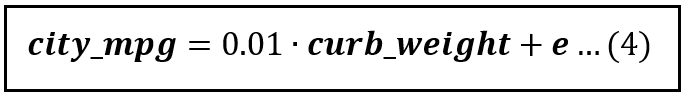
Now suppose you were to omit the variable horsepower from the model. The truncated model looks like this:
The truncated linear model of automobile fuel efficiency (Image by Author)
If you were to train the model in equation (3) on the training data using OLS, you will get the following estimate for β_1:
The fitted model (Image by Author)
Thus, β_1_cap is 0.01. This is different than the 0.0193 in the full model.
Because of the omitted variable, the expected value of β_1_cap has gotten biased as follows:
Formula for the expected value of β_1_cap (Image by Author)
As mentioned earlier, in a non-biased linear model fitted using OLS, the expected value of β_1_cap will be the population value of β_1_cap which is γ_1. Thus, in a non-biased model:
E(β_1_cap) = γ_1
But the omission of horsepower has biased this expectation as shown in equation (5).
To calculate the bias, you need to know three quantities:
γ_2: This is the population value of the coefficient of horsepower in the full model shown in equation (1).
Covariance(curb_weight, horsepower): This is the population value of the covariance.
Variance(curb_weight): This is the population value of the variance.
Unfortunately, none of the three values are computable because the overall population of all vehicles is inaccessible to you. All you have is a sample of 127 vehicles.
In practice though, you can estimate this bias by substituting sample values for the population values.
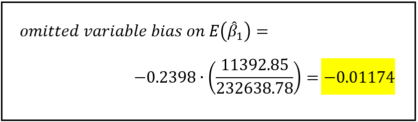
Thus, in place of γ_2, you can use γ_2_cap= — 0.2398 from equation (2).
Similarly, using the training data of 127 vehicles as the data sample, you can calculate the sample covariance of curb_weight and horsepower, and the sample variance of curb_weight.
The sample covariance comes out to be 11392.85. The sample variance of curb_weight comes out to be 232638.78.
With these values, the bias term in equation (5) can be estimated as follows:
Estimated bias on E(β_1_cap) (Image by Author)
Getting a feel for the impact of the omitted variable bias
To get a sense of how strong this bias is, let’s return to the fitted full model:
The fitted linear model of automobile fuel efficiency (Image by Author)
In the above model, γ_1_cap = 0.0193. Our calculation shows that the bias on the estimated value of γ_1 is 0.01174 in the negative direction. The magnitude of this bias (0.01174) is 0.01174/0.0193*100 = 60.93 , in other words an alarming 60.83% of the estimated value of γ_1.
There is no gentle way to say this: Omitting the highly influential variable horsepower has wreaked havoc on your simple linear regression model.
Omitting horsepower has precipitously attenuated the expected value of the estimated coefficient of the non-omitted variable curb_weight. Using equation (5), you will be able to approximate the attenuated value of this coefficient as follows:
Remember once again that you are working with estimates instead of the actual values of γ_1 and bias.
Nevertheless, the estimated attenuated value of γ_1_cap (0.00756) matches closely with the estimate of 0.01 returned by fitting the truncated model of city_mpg (equation 4) on the training data. I’ve reproduced it below.
The fitted truncated model (Image by Author)
Python Code
Here are the links to the Python code and the data used for building and training the full and the truncated models and for calculating the Omitted Variable Bias on E(β_1_cap).
By the way, each time you run the code, it will pull a randomly selected set of training data from the overall autos dataset. Training the full and truncated models on this training data will lead to slightly different estimated coefficient values. Therefore, each time you run the code, the bias on E(β_1_cap) will also be slightly different. In fact, this illustrates rather nicely why the estimated coefficients are themselves random variables and why they have their own estimated values.
Summary
Let’s summarize what we learned.
Omitted variable bias is caused when one or more important variables are omitted from a regression model.
The bias affects the expected values of the estimated coefficients of all non-omitted variables. The bias causes the expected values to become either bigger or smaller from their true population values.
Omitted variable bias will make the non-omitted variables look either more important or less important than what they actually are in terms of their influence on the response variable of the regression model.
The magnitude of the bias on each non-omitted variable is directly proportional to how correlated is the non-omitted variable with the omitted variable(s), and also how influential is/are the omitted variables on the the response variable of the model. The bias is inversely proportional to how dispersed is the non-omitted variable.
In most real-world cases, the direction of the bias is hard to judge without computing it.
References and Copyrights
Articles and Papers
Eisenberg, M., E., Olson, R. E., Neumark-Sztainer, D., Story. M., Bearinger L. H.: “Correlations Between Family Meals and Psychosocial Well-being Among Adolescents”, Archives of pediatrics & adolescent medicine, Vol. 158, No. 8, pp 792–796 (2004), doi:10.1001/archpedi.158.8.792, Full Text
Fulkerson, J., A., Story, M., Mellin, A., Leffert, N., Neumark-Sztainer D., French, S., A.: “Family dinner meal frequency and adolescent development: relationships with developmental assets and high-risk behaviors”, Journal of Adolescent Health, Vol. 39, No. 3, pp 337–345, (2006), doi:10.1016/j.jadohealth.2005.12.026, PDF
Sen, B.: “The relationship between frequency of family dinner and adolescent problem behaviors after adjusting for other family characteristics”, Journal of Adolescent Health, Vol. 33, No. 1, pp 187–196, (2010), PDF
Musick, K., Meier, A.: “Assessing causality and persistence in associations between family dinners and adolescent well-being”, Wiley Journal of Marriage and Family, Vol. 74, No. 3, pp 476–493 (2012), doi:10.1111/j.1741–3737.2012.00973.x, PMID: 23794750; PMCID: PMC3686529, PDF
Hoffmann, J., P., Warnick, E.: “Do family dinners reduce the risk for early adolescent substance use? A propensity score analysis”, Journal of Health and Social Behavior, Vol. 54, No. 3, pp 335–352, (2013), doi:10.1177/0022146513497035
Goldfarb, S., Tarver, W., Sen, B.: “Family structure and risk behaviors: the role of the family meal in assessing likelihood of adolescent risk behaviors”, Psychology Research and Behavior Management, Vol. 7, pp 53–66, (2014), doi:10.2147/PRBM.S40461, Full Text
Gibbs, N.: “The Magic of the Family Meal”, TIME, (June 4, 2006), Full Text
National Center on Addiction and Substance Abuse (CASA): “The Importance of Family Dinners VIII”, CASA at Columbia University White Paper, (September 2012), Archived, Original (not available)Website
Miech, R. A., Johnston, L. D., Patrick, M. E., O’Malley, P. M., Bachman, J. G. “Monitoring the Future national survey results on drug use, 1975–2023: Secondary school students”, Monitoring the Future Monograph Series, Ann Arbor, MI: Institute for Social Research, University of Michigan, (2023), Available at https://monitoringthefuture.org/results/annual-reports/
All images in this article are copyright Sachin Date under CC-BY-NC-SA, unless a different source and copyright are mentioned underneath the image.
Thanks for reading! If you liked this article, follow me to receive content on statistics and statistical modeling.
Omitted Variable Bias was originally published in Towards Data Science on Medium, where people are continuing the conversation by highlighting and responding to this story.
Generative artificial intelligence (AI) models have opened up new possibilities for automating and enhancing software development workflows. Specifically, the emergent capability for generative models to produce code based on natural language prompts has opened many doors to how developers and DevOps professionals approach their work and improve their efficiency. In this post, we provide an […]
We use cookies on our website to give you the most relevant experience by remembering your preferences and repeat visits. By clicking “Accept”, you consent to the use of ALL the cookies.
This website uses cookies to improve your experience while you navigate through the website. Out of these, the cookies that are categorized as necessary are stored on your browser as they are essential for the working of basic functionalities of the website. We also use third-party cookies that help us analyze and understand how you use this website. These cookies will be stored in your browser only with your consent. You also have the option to opt-out of these cookies. But opting out of some of these cookies may affect your browsing experience.
Necessary cookies are absolutely essential for the website to function properly. These cookies ensure basic functionalities and security features of the website, anonymously.
Cookie
Duration
Description
cookielawinfo-checkbox-analytics
11 months
This cookie is set by GDPR Cookie Consent plugin. The cookie is used to store the user consent for the cookies in the category "Analytics".
cookielawinfo-checkbox-functional
11 months
The cookie is set by GDPR cookie consent to record the user consent for the cookies in the category "Functional".
cookielawinfo-checkbox-necessary
11 months
This cookie is set by GDPR Cookie Consent plugin. The cookies is used to store the user consent for the cookies in the category "Necessary".
cookielawinfo-checkbox-others
11 months
This cookie is set by GDPR Cookie Consent plugin. The cookie is used to store the user consent for the cookies in the category "Other.
cookielawinfo-checkbox-performance
11 months
This cookie is set by GDPR Cookie Consent plugin. The cookie is used to store the user consent for the cookies in the category "Performance".
viewed_cookie_policy
11 months
The cookie is set by the GDPR Cookie Consent plugin and is used to store whether or not user has consented to the use of cookies. It does not store any personal data.
Functional cookies help to perform certain functionalities like sharing the content of the website on social media platforms, collect feedbacks, and other third-party features.
Performance cookies are used to understand and analyze the key performance indexes of the website which helps in delivering a better user experience for the visitors.
Analytical cookies are used to understand how visitors interact with the website. These cookies help provide information on metrics the number of visitors, bounce rate, traffic source, etc.
Advertisement cookies are used to provide visitors with relevant ads and marketing campaigns. These cookies track visitors across websites and collect information to provide customized ads.


