Uplift modeling: how causal machine learning transforms customer relationships and revenue
Details of this series
This article is the first in a series on uplift modeling and causal machine learning. The idea is to deep dive into these methodologies both from a business and a technical perspective.
Introduction
Picture this: our tech company is acquiring thousands of new customers every month. But beneath the surface, a troubling trend emerges. Churn is increasing — we’re losing clients — and while the balance sheet shows impressive growth, revenue isn’t keeping pace with expectations. This disconnect might not be an issue now, but it will become one when investors start demanding profitability: in the tech world, acquiring a new customer costs way more than retaining an existing one.
What should we do? Many ideas come to mind: calling customers before they leave, sending emails, offering discounts. But which idea should we choose? Should we try everything? What should we focus on?
This is where uplift modeling comes in .Uplift modeling is a data science technique that will help us understand not only who might leave, but also what actions to take on each customer to retain them — if they’re retainable at all of course. It goes beyond traditional predictive modeling by focusing on the incremental impact of specific actions on individual customers.
In this article, we’ll explore this powerful technique with 2 objectives in mind:
Firstly, sensitize business leaders to this approach so that they can understand how it benefits them.
Secondly, give the tools for data scientists to pitch this approach to their managers so that they can be an instrument to their companies’ success.
We’ll go over the following:
What is uplift modeling and why is it so powerful?
High-Impact use cases for uplift modeling
ROI: what level of impact can you expect from your uplift model?
Uplift modeling in practice : how to implement it?
What is uplift modeling and why is it so powerful?
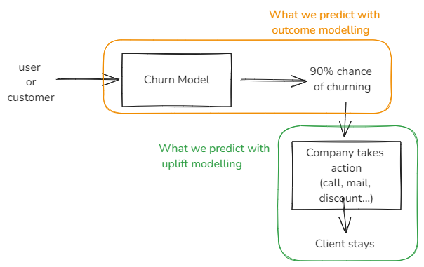
Usually, companies try to anticipate a customer behavior, churn for example. In order to do that they model a probability of churning per user. They are “outcome” modeling, meaning estimating the likelihood that a user will take a specific action.
For example, if an outcome model estimates a 90% probability of churn for a particular user. In that case, the company may try to contact the given user to prevent them from leaving them, right? This is already a big step, and could help significantly lowering the churn or identifying its root causes. But here’s a tricky part: what if some users we identify actually want to leave, but just haven’t bothered to call or unsubscribe? They might leverage this call to actually churn instead of staying with us!
Unlike outcome modeling, uplift modeling is a predictive modeling technique that directly measures the incremental impact of a treatment — or action — on an individual’s behavior. Meaning that we’ll model the probability of a user staying if contacted by the above company, for instance.
An uplift model focuses on the difference in outcomes between treated and control groups, allowing companies to assess the actual “uplift” at individual level, identifying the most effective actions for each customer.
Description of an uplift model vs an outcome model
More precisely, uplift modeling enables us to categorize our customers into 4 groups based on their probability of response to the treatment/action:
Persuadables: these are the users who are likely to respond positively to the actions : they are the ones we want to target with our actions.
Sure things: These are our customers who will achieve the desired outcome regardless of whether they receive the intervention or not. Targeting these users with the intervention is generally a waste of resources.
Lost causes: These are individuals who are unlikely to achieve the desired outcome, action or not. Spending resources on these users is likely not cost-effective.
Sleeping dogs: These customers may actually respond negatively to the treatment. Targeting them could potentially harm the business by leading to an undesired action (e.g., canceling a subscription when reminded about it).
The goal of uplift modeling is to identify and target the persuadables while avoiding the other groups, especially the Sleeping Dogs.
Coming back to our retention problem, uplift modeling would enable us not only to assess which action is the best one to improve retention, it would enable us to pick the right action for each user:
Some users — Persuadables — might only need a phone call or an email to stay with us.
Others — Persuadables — might require a $10 voucher to be persuaded.
Some — Sure Things — don’t need any intervention as they’re likely to stay anyway.
For some users — Sleeping Dogs — any retention attempt might actually lead them to leave, so it’s best to avoid contacting them.
Finally, Lost Causes might not respond to any retention effort, so resources can be saved by not targeting them.
In summary, uplift modeling enables us to allocate precisely our resources, targeting the right persuadables with the right action, while avoiding negative impacts thus maximizing our ROI. In the end, we are able to create a highly personalized and effective retention strategy, optimizing our resources and improving overall customer lifetime value.
Now that we understand what uplift modeling is and its potential impact, let’s explore some use cases where this technique can drive significant business value.
High-Impact Use Cases for uplift modeling
Before jumping into how to set it up, let’s investigate concrete use cases where uplift modeling can be highly relevant for your business.
Customer retention: Uplift modeling helps identify which customers are most likely to respond positively to retention efforts, allowing companies to focus resources on “persuadables” and avoid disturbing “sleeping dogs” who might churn if contacted.
Upselling and Cross-selling: Predict which customers are most likely to respond positively to upsell or cross-sell offers or promotion, increasing revenue & LTV without annoying uninterested users. Uplift modeling ensures that additional offers are targeted at those who will find them most valuable.
Pricing optimization: Uplift models can help determine the optimal pricing strategy for different customer segments, maximizing revenue without pushing away price-sensitive users.
Personalized marketing campaigns: Uplift modeling can help to determine which marketing channels (email, SMS, in-app notifications, etc.) or which type of adds are most effective for each user.
These are the most common ones, but it can go beyond customer focused action: with enough data we could use it to optimize customer support prioritization, or to increase employee retention by targetting the right employees with the right actions.
With these powerful applications in mind, you might be wondering how to actually implement uplift modeling in your organization. Let’s dive into the practical steps of putting this technique into action.
ROI: In practice, what can you expect from your uplift models?
How do we measure uplift models performance?
This is a great question, and before jumping into the potential outcomes of this approach- which is quite impressive, I must say — it’s crucial to address it. As one might expect, the answer is multifaceted, and there are several methods for data scientists to evaluate a model’s ability to predict the incremental impact of an action.
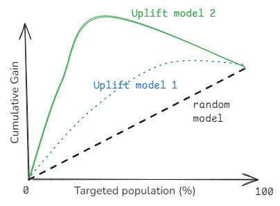
One particularly interesting method is the Qini curve. The Qini curve plots cumulative incremental gain against the proportion of the targeted population.
Example of a Qini Curve
In simple terms, it helps answer the question: How many additional positive outcomes can you achieve by targeting X% of the population using your model compared to random targeting? We typically compare the Qini curve of an uplift model against that of a random targeting strategy to simulate what would happen if we had no uplift model and were targeting users or customers at random. When building an uplift model, it’s considered best practice to compare the Qini curves of all models to identify the most effective one on unseen data. However, we’ll delve deeper into this in our technical articles.
Now, let’s explore the potential impact of such an approach. Again, various scenarios can emerge.
What level of impact can I expect from my newly built uplift model?
Well, to be honest, it really depends on a lot fo different variables, starting with your use case: why did you build an uplift model in the first place? Are you trying to optimize your resources, for instance, by reaching out to only 80% of your customers because of budget constraints? Or are you aiming to personalize your approach with a multi-treatment model?
Another key point is understanding your users — are you focused on retaining highly engaged customers, or do you have a lot of inactive users and lost causes?
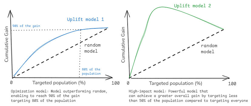
Even without addressing these specifics, we can usually categorize the potential impact in two main categories — as you can see on the above magnificent drawing:
Optimization models: An uplift model can help you optimize resource allocation by identifying which users will respond most positively to your intervention. For example, you might achieve 80% of the total positive outcomes by reaching out to just 50% of your users. While this approach may not always outperform contacting everyone, it can significantly lower your costs while maintaining a high level of impact. The key benefit is efficiency: achieving nearly the same results with fewer resources.
High-impact model: This type of model can enable you to achieve a greater total impact than by reaching out to everyone. It does this by identifying not only who will respond positively, but also who might respond negatively to your outreach. This is particularly valuable in scenarios with diverse user bases or where personalized approaches are crucial.
The effectiveness of your uplift model will ultimately depend on several key factors, including the characteristics of your customers, the quality of your data, your implementation strategy, and the models you choose.
But, before we dive too deeply into the details, let’s briefly explore how to implement your first uplift.
Uplift modeling in practice : how to implement it?
You might be wondering: if uplift modeling is so powerful, why haven’t I heard about it before today? The answer is simple: it’s complex to set up. It requires in-depth data science knowledge, the ability to design and run experiments, and expertise in causal machine learning. While we’ll dive deeper into the technical aspects in our next article, let’s outline the main steps to create, scale, and integrate your first uplift model:
Step 1:Define your objective and set up an experiment. First, clearly define your goal and target audience. For example, you might aim to reduce churn among your premium subscribers. Then, design an A/B test (or randomized controlled trial) to test all the actions you want to try. This might include:
Sending personalized emails
Calling clients
Offering discounts
This step may take some time, depending on how many customers you have, but it will be the foundation for your first model.
Step 2: Build the uplift model. Next, use the data from your experiment to build the uplift model. Interestingly, the actual results of the experiment don’t matter as much here — what’s important is the data on how different customers responded to different actions. This data helps us understand the potential impact of our actions on our customers.
Step 3:Implement actions based on the model. With your uplift model in hand, you can now implement specific actions for your customers. The model will help you decide which action is most likely to be effective for each customer, allowing for personalized interventions.
Step 4: Monitor and evaluate performance. To check if your model is working well, keep track of how the actions perform over time. You can test the model in real situations by comparing its impact on one group of customers to another group chosen at random. This ongoing evaluation helps you refine your approach and ensure you’re getting the desired results.
Step 5:Scale and refine. To make the solution work on a larger scale, it’s best to update the model regularly. Set aside some customers to help train the next version of the model, and use another group to evaluate how well the current model is working. This approach allows you to:
Continuously improve your model
Adapt to changing customer behaviors
Identify new effective actions over time
Remember, while the concept is straightforward, implementation requires expertise. Uplift modeling is an iterative approach that improves over time, so patience and continuous refinement are key to success.
Conclusion
Uplift modeling revolutionizes how businesses approach customer interactions and marketing. This technique allows companies to:
Target the right customers with the right actions
Avoid disturbing customers that might not want to be disturbed
Personalize interventions at scale
Maximize ROI by optimizing how you interact with your customers!
We’ve explored uplift modeling’s fundamentals, key applications, and implementation steps. While complex to set up, its benefits in improving customer relationships, increasing revenue, and optimizing resources make it invaluable for any businesses.
In our next article, we will dive into the technical aspects, equipping data scientists to implement this technique effectively. Join us as we continue to explore cutting-edge data science ideas.
Sources
Unless otherwise noted, all images are by the author
In this post, we explore using the Anthropic Claude 3 on Amazon Bedrock large language model (LLM). Amazon Bedrock provides access to several LLMs, such as Anthropic Claude 3, which can be used to generate semi-structured data relevant to the healthcare industry. This can be particularly useful for creating various healthcare-related forms, such as patient intake forms, insurance claim forms, or medical history questionnaires.
Going beyond Exploratory Data Analysis to find the needle in the haystack
(Image created by author with Playground AI)
DATA AND DECISIONS
The modern world is absolutely teeming with data. Empirical data, scraped and collected and stored by bots and humans alike. Artificial data, generated by models and simulations that are created and run by scientists and engineers. Even the opinions of executives and subject matter experts, recorded for later use, are data.
To what end? Why do we spend so much time and effort gathering data? The clarion call of the data revolution has been the data-driven decision: the idea that we can use this data to make better decisions. For a business, that might mean choosing the set of R&D projects or marketing pushes that will maximize future revenue. For an individual, it might simply mean an increase in satisfaction with the next car or phone or computer that they buy.
So how then do data scientists (and analysts and engineers) actually leverage their data to support decisions? Most data-to-decisions pipelines start with Exploratory Data Analysis (EDA) — the process of cleaning and characterizing a dataset, primarily using statistical analysis and supporting graphs of the spread, distribution, outliers, and correlations between the many features. EDA has many virtues that build understanding in a dataset and, by extension, any potential decision that will be made with it:
Identifying potential errors or flawed data, and ways to correct them
Identifying subgroups that may be under- or overrepresented in the dataset, to either be mathematically adjusted or to drive additional data collection
Building intuition for what is possible (based on spreads) and common (based on distributions)
Beginning to develop an understanding of potential cause-and-effect between the different features (with the permanent caveat that correlation does not equal causation)
That’s a useful first step towards a decision! A well-executed EDA will result in a reliable dataset and a set of insights about trends in the data that can be used by decision makers to inform their course of action. To overgeneralize slightly, trend insights concern the frequency of items in the dataset taking certain values: statements like “these things are usually X” or “when these things are X, these other things are usually Y”.
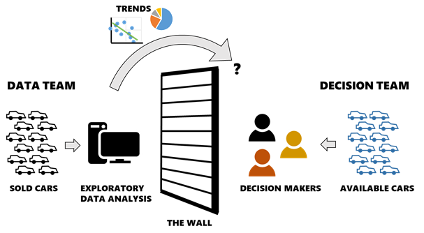
Unfortunately, many real-world data-to-decisions pipelines end here: taking a handful of trend insights generated by data scientists with EDA and “throwing them over the wall” to the business decision makers. The decision makers are then responsible for extrapolating these insights into the likely consequences of their (potentially many) different courses of action. Easier said than done! This is a challenging task in both complexity and scale, especially for non-technical stakeholders.
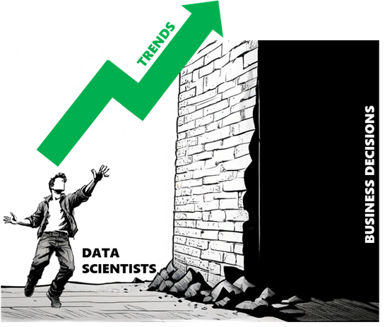
Data scientists often have to throw trends “over the wall” to people who make business decisions, with no visibility of how those decisions are made — or sometimes even what those decisions are! (Image created by author with Playground AI)
If we want to make better decisions, we need to break down that wall between the data and the decision itself. If we can collect or generate data that corresponds directly to the choices or courses of action that are available to decision makers, we can spare them the need to extrapolate from trends. Depending on the type of decision being made, this is often straightforward: like a homebuyer with a list of all the houses for sale in their area, or an engineering company with models that can evaluate thousands of potential designs for a new component.
Creating a decision-centric dataset requires a slightly different type of thinking than classic EDA, but the results are significantly easier to interpret and are therefore more likely to adequately support a decision. Instead of stopping with trends, our exploration needs to solve the needle in the haystack problem and find the best single datapoint in the set, in order to complete the data-to-decision pipeline from end-to-end.
Welcome to the world of tradespace exploration.
FROM DATA-INFORMED TO DATA-DRIVEN
Before we jump into the details of tradespace exploration, let’s ground this discussion with an example decision. Needing to buy a car is a decision many people are familiar with, and it’s a good example for a handful of reasons:
It’s high-consequence and worth the effort to “get it right”. Cars are expensive, (ideally) last a long time, and most people use them every day! Anyone who has ever bought a lemon can tell you that it’s a particularly challenging and frustrating setback.
People care about multiple factors when comparing cars: price, reliability, safety, handling, etc. This isn’t a problem where you can simply pick the car with the highest horsepower and expect to be satisfied.
There are usually a lot of choices. New cars from every manufacturer, used cars from lots and online marketplaces, even things adjacent to cars like motorcycles might be valid solutions. That’s a lot of potential data to sort through!
And just to simplify this example a little bit more, let’s say that we are only interested in buying a used car.
Now, let’s think about what a normal EDA effort on this problem might look like. First, I would procure a large dataset, most commonly consisting of empirical observations: this dataset of used car sales from Craigslist [1] will do nicely. A flat data file like this one, where each item/row corresponds to a car listing described by a shared set of features/columns, is the most common format for publicly-available datasets. Then I would start with summarizing, finding problems, and cleaning the data to remove incomplete/outlier listings or inconsistently-defined columns. Once the data is clean, I would analyze the dataset with statistics or graphs to identify correlations between different variables. If you would like to see a detailed example walkthrough of EDA on this dataset, check it out here [2].
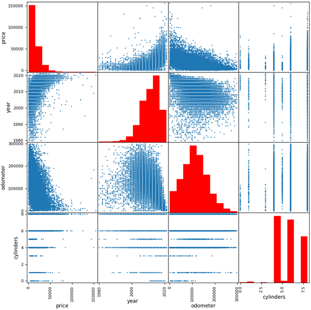
A common EDA visualization is of a scatterplot matrix showing pairwise relationships of key parameters in the dataset (Image created by author with Pandas/Matplotlib)
Now think about the decision again: I want to buy a used car. Did EDA help me? The good news for EDA fans and experts out there: of course it did! I’m now armed with trend insights that are highly relevant to my decision. Price is significantly correlated with model year and (negatively) with odometer mileage! Most available cars are 3–7 years old! With a greater understanding of the used car market, I will be more confident when determining if a car is a good deal or not.
But did EDA find the best car for me to buy? Not so much! I can’t actually buy the cars in the dataset since they are historical listings. If any are still active, I don’t know which ones because they aren’t indicated as such. I don’t have data on the cars that are actually available to me and therefore I still need to find those cars myself — and my EDA is useful only if the trends I found can then help me find good cars while I search a different dataset manually.
When trends about past data are thrown “over the wall” to decision makers who are looking at current/future data, those trends are more difficult to leverage into a good decision. (Image created by author)
This is an example of the proverbial wall between the data and the decision, and it’s extremely common in practice because a vast majority of datasets are comprised of past/historical data but our decisions are current/future-looking. Although EDA can process a large historical dataset into a set of useful insights, there is a disconnect between the insights and the active decision because they only describe my choices by analogy (i.e. if I’m willing to assume the current used car market is similar to the past market). Perhaps it would be better to call a decision made this way data-informed rather than data-driven. A truly data-driven decision would be based on a dataset that describes the actual decision to be made — in this case, a dataset populated by currently-available car listings.
SETTING UP THE TRADESPACE
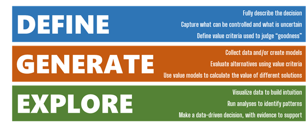
Tradespace exploration, or to be more specific Multi-Attribute Tradespace Exploration (MATE), is a framework for data-driven decision analysis. Originally created at MIT in 2000, it has undergone decades of refinement and application through today [3–7]. MATE brings value-focused thinking [8] to the world of large datasets, with the express purpose of increasing the value created by decisions being made with that data.
The MATE framework helps decision makers and data scientists/analysts think critically about how to define and structure a decision problem, how to perform data collection, and finally how to explore that data to generate practical, relevant insights and find the best solution. At a high level, MATE is broken into three layers corresponding to these steps: Define, Generate, and Explore.
The Define, Generate, Explore layers of MATE partition the steps needed to make a data-driven decision into separate tasks for fully describing the problem, collecting the necessary data, and then visualizing/analyzing the results. (Image created by author)
Defining a basic MATE study begins with a few core concepts:
Stakeholders. Who makes the decision or is affected by it? For simplicity, let’s say that I’m the only stakeholder for my car purchase; however, keep in mind that many decisions have multiple stakeholders with potentially very different needs and desires and we can and should consider them all.
Alternatives. What are the possible solutions, i.e. what are the available choices? I already restricted myself to buying a used car in this example. My alternatives are any used cars that are available for sale within a reasonable distance of where I live. Importantly, alternatives should be unique: I can define my choices with fundamental variables like manufacturer, model, and year, but a unique identifier like their VIN is also necessary in case there are multiple listings of the same car type.
Resources. How do the stakeholders acquire and use an alternative, i.e. what needs to be spent? Each car will have a one-time purchase price. I could also choose to consider ownership costs that are incurred later on such as fuel and maintenance, but we’ll ignore these for now.
Benefits. Why do we want an alternative, i.e. what criteria do the stakeholders use to judge how “good” an alternative is? Maybe I care about the number of passengers a car can carry (for practicality), its engine cylinders (for fun), its odometer mileage (for longevity), and its safety rating (for… safety).
This simple outline gives us direction on how to then collect data during the Generate step. In order to properly capture this decision, I need to collect data for all of the alternative variables, resources, and benefits that I identified in the Define step. Anything less would give me an incomplete picture of value — but I can always include any additional variables that I think are informative.
Completing the Define layer BEFORE attempting to collect data is useful to ensure the collection effort is sufficient and avoid wasting time on unnecessary parameters. (Image created by author)
Imagine for a moment that the Craigslist cars dataset DID include a column that indicated which listings were still available for purchase, and therefore are real alternatives for my decision. Am I done collecting data? No — this dataset includes my alternative variables (manufacturer, model, year, VIN) and my resources (price) but is missing two of my benefits: passenger count and safety rating. I will need to supplement this dataset with additional data, or I won’t be able to accurately judge how much I like each car. This requires some legwork on the part of the analyst to source the new data and properly match it up with the existing dataset in new columns.
Fortunately, the alternative variables can act as “keys” to cross-reference different datasets. For example, I need to find a safety rating for each alternative. Safety ratings are generally given to a make/model/year of car, so I can either:
Find tabular data on safety ratings (compiled by someone else), and combine it with my own data by joining the tables on the columns make/model/year
Collect safety rating data myself and plug it directly into my table, for example by searching https://www.nhtsa.gov/ratings for each alternative using its make/model/year
I may also want to supplement the Craigslist data with additional alternatives: after all, not all used cars are for sale on Craigslist. It is considered best practice for MATE to start with as large a set of alternatives as possible, to not preemptively constrain the decision. By going to the websites of nearby car dealerships and searching for their used inventory, I can add more cars to my dataset as additional rows. Depending on how many cars are available (and my own motivation), I could possibly even automate this process with a web scraper, which is how data collection is often performed at-scale. Remember though: I still need to have data for at least the alternative variables, resources, and benefits for each car in the dataset. Most dealership listings won’t include details like safety ratings, so I will need to supplement these with other data sources in the same way as before.
At this point, I have my data “haystack” and I’m almost ready to start the Explore layer and look for that “needle”. But what do I do? How does MATE really differ from our old friend EDA?
WHAT MAKES A GOOD SOLUTION?
Now that I have my dataset populated with relevant alternatives for my actual decision, could I just perform EDA on it to solve the problem and find the best car? Well… yes and no. You can (and should!) perform EDA on a MATE dataset — cleaning potential errors or weirdness out of the dataset remains relevant and is especially important if data was collected via an automated process like a web scraper. And the goals of building intuition for trends in the data are no different: the better we understand how different criteria are related, the more confident we will become in our eventual decision. For example, the scatterplot matrix I showed a few pictures ago is also a common visualization for MATE.
But even with a dataset of active car listings and all the necessary variables, the bread-and-butter correlation and distribution analyses of EDA don’t help to pull out individual high-value datapoints. Remember: we care about lots of different properties of a car (the multi-attributes of Multi-Attribute Tradespace Exploration), so we can’t simply sort by price and take the cheapest car. Armed with just EDA trend insights, I’m still going to need to manually check a lot of potential choices until I find a car with a desirable combination of features and performance and price.
What I need is a tool to pull the best cars to the top of the pile.That tool: value modeling.
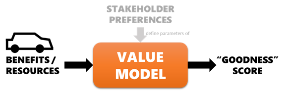
At the most basic level, a value model is a mathematical function that attempts to replicate the preferences of a stakeholder. We feed the benefits and/or resources identified in the Define layer in, and get out a value score that says how “good” each alternative is. If the model is accurate, our stakeholder will prefer an alternative (car) over any other with a lower score. [9]
A value model’s parameters are created to mimic the preferences of a stakeholder such that, if the benefit/resource metrics of a car are passed in, the model returns a score that can be used to automatically rank it relative to other cars. (Image created by author)
Most data scientists have probably created and used a simple value model many times (whether or not they realized it or called it by a different name), as a means of doing exactly this task: creating a new column in a dataset that “scores” the rows with a function of the other columns, so that the dataset could be sorted and high-scoring rows highlighted. There are many different types of value models, each with its own strengths and weaknesses. More accurate value models are generally more complex and correspondingly take more effort to create.
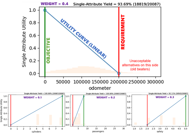
For this example, we will use a simplified utility function to combine the four benefits I stand to gain from buying a car [10]. There is a formal elicitation process that can be completed with the stakeholder (me) to create a verifiably correct utility function, but we’ll just construct one quickly by assigning each attribute a thresholdrequirement (worst-acceptable level), objective (maximally-valuable level, no extra value for outperforming this point), and swing weight (a measure of importance). There are other ways to customize a utility function, including non-linear curves and complementarity/substitution effects that we will skip this time.
Each attribute has a defined utility curve (in this case, a linear one) between the requirement and objective, as well as a swing weight for combining the single-attribute utilities into a multi-attribute utility. The bar chart in the background shows the distribution of that parameter in the dataset. (Image created by author with EpochShift)
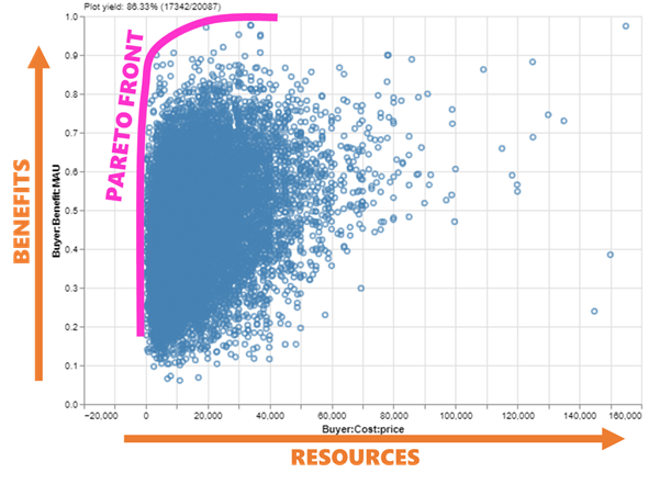
But wait: why didn’t I include price in the utility function? The technical answer is that most people display “incomplete ordering” [11] between benefits and resources — a fancy way of saying that stakeholders will often be unable to definitively state whether they prefer a low-cost-low-benefit alternative or a high-cost-high-benefit alternative since neither is strictly superior to the other. Incidentally, this is also why it is very difficult to “solve” a decision by optimizing a function: in practice, decision makers generally like to see a set of alternatives that vary from low-cost-low-benefit to high-cost-high-benefit and judge for themselves, and this ends up being more reliable than combining benefits/costs into one value model. This set is called the Pareto set (or Pareto front, when viewed graphically), and is the highest-value region of the tradespace.
A scatterplot of the tradespace, with the Pareto front highlighted — the most desirable alternatives are generally near the front. Note how the yield in the upper-left is <100% because not all cars in the dataset met our requirements. (Image created by author with EpochShift)
And here we have it: “the tradespace”. A scatterplot with benefit on the y-axis and cost on the x-axis (each potentially a value model composed of multiple attributes). A tradeoff between benefits and costs is by far the most common real-world-plain-English framing of a decision, and the MATE framework exists to guide the data-driven analysis of our decisions into this structure that stakeholders and decision makers are familiar with. Each one of those points is a car I could buy — a choice I can actually make, and a way to solve my decision without relying on extrapolation from past trends.
All that’s left now is the Explore layer, where I need to find my favorite needle from among that haystack of points.
FINDING THE NEEDLE
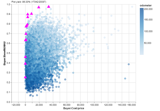
Let’s do a quick exploring session on my cars dataset using EpochShift, a program for creating and exploring MATE datasets (full disclosure: I am currently working on EpochShift’s development, but you can replicate these plots with some time and elbow grease in the visualization library of your choice). First, because they are likely candidates for me to buy, I’m going to highlight the cars in the Pareto set with a blaze — a custom marker that appears “on top” of the plot, and persists even if I change the plot dimensions. I’m also curious about the relationship that odometer mileage has with the value dimensions of the tradespace, so I will color the points using that parameter.
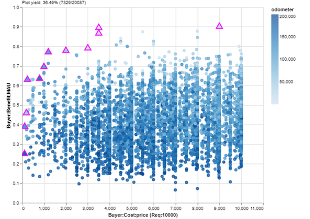
The tradespace, colored by odometer mileage, with Pareto set cars blazed with magenta triangles. (Image created by author with EpochShift)
Two issues pop out at me right away:
It’s a little tough to discern a pattern in odometer mileage because the tradespace of 17,000+ cars is so dense that the points occlude each other: some points cover up others. I can tell that the points generally fade from dark to light moving up the y-axis, but if I could remove the occlusion, I could more clearly see the spread of different tiers of mileage on my benefit/resource dimensions.
I also can’t tell the odometer mileage of the cars in the Pareto set because they are magenta. If I could still highlight those while also seeing their mileage color, that would be ideal.
To address these, I’ll modify my plot in two ways:
I’ll replace the points in the tradespace with convex hulls — essentially dividing the range of odometer mileage into smaller chunks and drawing a “bubble” around all the cars in each chunk.
I’ll leave my Pareto set blaze in place, but update it to have the triangle filled with the corresponding odometer mileage color.
With those two changes, I get this:
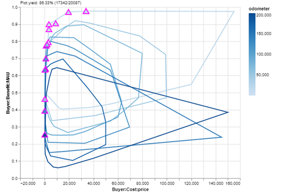
The tradespace represented as convex hulls on odometer mileage, with the individual cars in the Pareto set still highlighted by a blaze. (Image created by author with EpochShift)
Look at that! I can see a clear relationship between odometer mileage and utility, which makes sense since that was one of the benefit metrics I used in my value model. Additionally, with the exception of a couple (delusional) sellers in the lower-right of the plot, it’s clear that cars with higher mileage have a lower top-end asking price — but perhaps more interestingly, mileage does not seem to strongly impact low-end asking prices. Even low mileage cars are available for cheap!
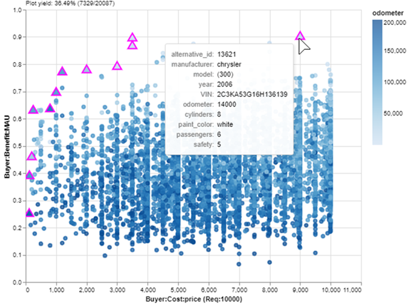
But let’s get back to making a decision by focusing on the Pareto set. I didn’t screen the dataset to remove high-cost cars because, as I mentioned before, it’s considered MATE best practice not to reduce the number of alternatives before beginning the Explore layer. But realistically, I have a budget for this purchase of $10K, and maybe I want the best car available under that limit — especially now that I know I’ll still be able to find a car with low mileage in that price range. I’ll add my budget requirement and switch back to a scatterplot:
The tradespace, colored by odometer mileage, with a budget requirement of $10K on the x-axis. Note how the yield in the upper left has reduced even farther to ~36% due to the budget. (Image created by author with EpochShift)
Okay, now we are looking at a nice zoom-in of affordable cars. If I just want to buy the car with the most benefit in my budget, it will be the Pareto set point farthest up and to the right. I can check the details of that car with a mouseover:
Mousing over a point reveals a tooltip of detailed information. (Image created by author with EpochShift)
A 2006 Chrysler 300 with 14,000 miles for $9K. Not too bad! But wait… it’s painted white. I forgot that I hate white cars! Part of the Explore layer of MATE is refining stakeholder preferences, which often change when exposed to new information: the data of my data-driven decision. One advantage of using an interactive tool is that I can easily update value models or filters in response to these changes. I’ll just add a filter that removes white cars, save a new Pareto set and:
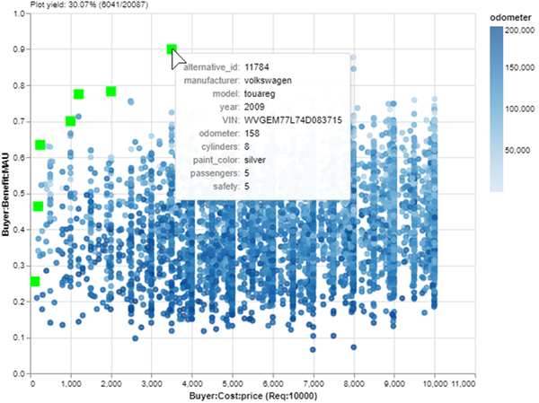
Filtering the tradespace once more to remove white cars, and saving a new Pareto set with a green squares blaze. (Image created by author with EpochShift)
There! Now the best car in my budget is a silver 2009 Volkswagen Touareg. I lost one passenger compared to the Chrysler (6 to 5) which is not ideal, but the utility of this car is nearly as high thanks to its significantly lower odometer (14,000 to 158). It’s practically new and it only costs $3500!
We found it: the needle in the haystack. And we can justify our decision with data-driven evidence!
It was love at first sight — but I had to uncover it from 20,000 other cars first! (Photo by OSX, released to the public domain)
CONCLUSION
The goal of this article was to show how EDA and tradespace exploration are similar/complementary but highlight a few key differences in how data is collected and visualized when the end goal is to find the “best” point in a dataset. Tradespace exploration can be the “one step beyond” EDA that pushes a decision from data-informed to truly data-driven. But this short example only scratches the surface of what we can do with MATE.
The MATE framework supports many additional types of data and analysis. More complex and/or important decisions may require these features for you (or your stakeholders) to feel confident that the best decision has been reached:
Including multiple stakeholders, each with their own value models, and the search for solutions that are desirable and equitable for all parties
Including uncertainty, resulting in multiple scenarios (each with its own tradespace), and the search for solutions that are robust to unknown or uncontrollable parameters
Adding dynamics and options, allowing the scenario to change repeatedly over time while we responsively modify our solution to maximize value
Many new and interesting visualizations to support the analysis of these complex problems
If this piqued your interest and you want to learn more about tradespace exploration, follow me or The Tradespace on Medium, where we are working to teach people of all skill levels how to best apply MATE to their problems. Or feel free to reach out via email/comment if you have any questions or cool insights — I hope to hear from you!
[2] T. Shin, An Extensive Step by Step Guide to Exploratory Data Analysis (2020), Towards Data Science.
[3] A. Ross, N. Diller, D. Hastings, and J. Warmkessel, Multi-Attribute Tradespace Exploration in Space System Design (2002), IAF IAC-02-U.3.03, 53rd International Astronautical Congress — The World Space Congress, Houston, TX.
[4] A. Ross and D. Hastings, The Tradespace Exploration Paradigm (2005), INCOSE International Symposium 2005, Rochester, NY.
[5] M. Richards, A. Ross, N. Shah, and D. Hastings, Metrics for Evaluating Survivability in Dynamic Multi-Attribute Tradespace Exploration (2009), Journal of Spacecraft and Rockets, Vol. 46, №5, September-October 2009.
[6] M. Fitzgerald and A. Ross, Recommendations for Framing Multi-Stakeholder Tradespace Exploration (2016), INCOSE International Symposium 2016, Edinburgh, Scotland, July 2016.
[7] C. Rehn, S. Pettersen, J. Garcia, P. Brett, S. Erikstad, B. Asbjornslett, A. Ross, and D. Rhodes, Quantification of Changeability Level for Engineering Systems (2019), Systems Engineering, Vol. 22, №1, pp. 80–94, January 2019.
[8] R. Keeney, Value-Focused Thinking: A Path to Creative Decision-Making (1992). Harvard University Press, Cambridge.
[9] N. Ricci, M. Schaffner, A. Ross, D. Rhodes, and M. Fitzgerald, Exploring Stakeholder Value Models Via Interactive Visualization (2014), 12th Conference on Systems Engineering Research, Redondo Beach, CA, March 2014.
[10] R. Keeney and H. Raiffa, Decisions with Multiple Objectives: Preferences and Value Trade-Offs (1993), Cambridge University Press.
[11] J. Von Neumann and O. Morgenstern, Theory of games and economic behavior (1944), Princeton University Press.
Vision Transformer — or commonly abbreviated as ViT — can be perceived as a breakthrough in the field of computer vision. When it comes to vision-related tasks, it is commonly addressed using CNN-based models which so far always perform better than any other type of neural networks. It wasn’t until 2020, when a paper titled “An Image is Worth 16×16 Words: Transformers for Image Recognition at Scale” written by Dosovitskiy et al. [1] was published, which offers better capability than CNN.
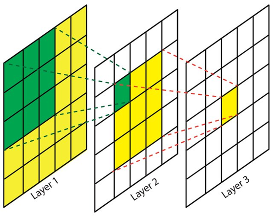
A single convolution layer in CNN works by extracting features using kernels. Since the size of a kernel is relatively small as compared to the input image, hence it can only capture information contained within that small region. In other words, we can simply say that it focuses on extracting local features. To understand the global context of an image, a stack of multiple convolution layers is required. This problem is addressed by ViT as it directly captures global information from the initial layer. Thus, stacking multiple layers in ViT results in even more comprehensive information extraction.
Figure 1. By stacking multiple convolution layers, CNNs can achieve larger receptive fields, which is essential for capturing the global context of an image [2].
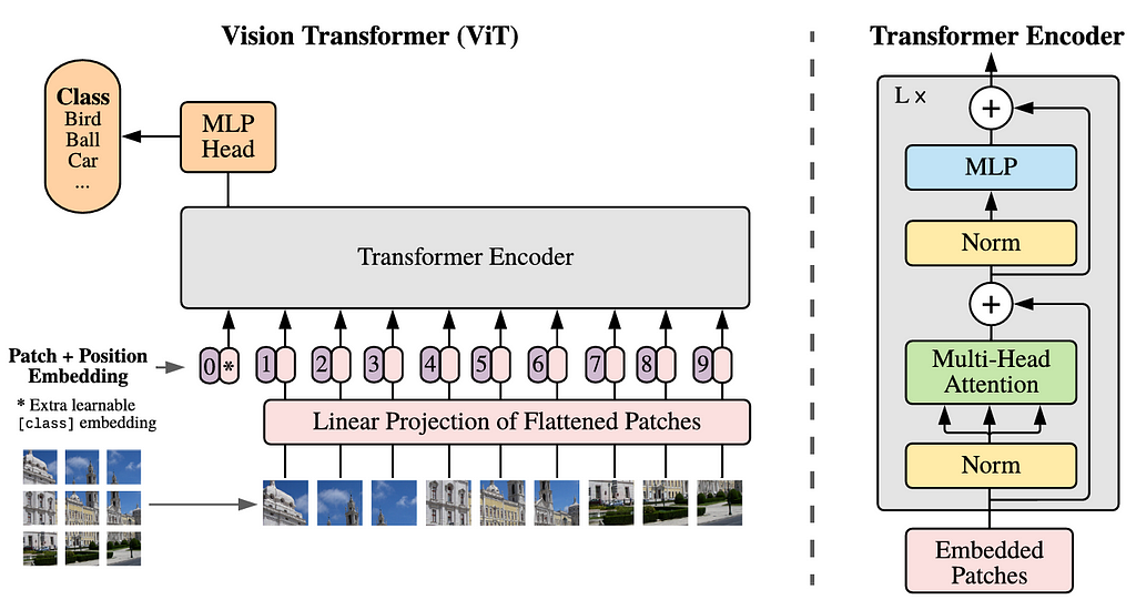
The Vision Transformer Architecture
If you have ever learned about transformers, you should be familiar with the terms encoder and decoder. In NLP, sepecifically for tasks like machine translation, the encoder captures the relationships between tokens (i.e., words) in the input sequence, while the decoder is responsible for generating the output sequence. In the case of ViT, we will only need the encoder part, in which it sees every single patch of an image as a token. With the same idea, the encoder is going to find the relationships between patches.
The entire Vision Transformer architecture is displayed in Figure 2. Before we get into the code, I am going to explain each component of the architecture in the following sections.
Figure 2. The Vision Transformer architecture [1].
Patch Flattening & Linear Projection
According to the above figure, we can see that the first step to be done is dividing an image into patches. All these patches arranged to form a sequence. Every single of these patches is then flattened, each forming a single-dimensional array. The sequence of these tokens is then projected into a higher-dimensional space through a linear projection. At this point, we can think the projection result like a word embedding in NLP, i.e., a vector representing a single word. Technically speaking, the linear projection process can be done either with a simple MLP or a convolution layer. I will explain more about this later in the implementation.
Class Token & Positional Embedding
Since we are dealing with classification task, we need to prepend a new token to the projected patch sequence. This token, known as the class token, will aggregate information from the other patches by assigning importance weights to each patch. It is important to note that the patch flattening as well as the linear projection cause the model to lose spatial information. In order to address this issue, positional embedding is added to all tokens — including the class token — such that spatial information can be reintroduced.
Transformer Encoder & MLP Head
At this stage, the tensor is now ready to be fed into the Transformer Encoder block, which the detailed structure can be seen in the right-hand side of Figure 2. This block comprises of four components: layer normalization, multi-head attention, another layer normalization, and an MLP layer. It is also worth noting that there are two residual connections implemented here. The L× written at the top left corner of the Transformer Encoder block indicates that it will be repeated L times according to the model size to be constructed.
Lastly, we are going to connect the encoder block to the MLP head. Keep in mind that the tensor to be forwarded is only the one that comes out from the class token part. The MLP head itself comprises of a fully-connected layer followed by an output layer, where each neuron in the output layer represents a class available in the dataset.
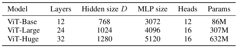
Vision Transformer Variants
There are three ViT variants proposed in its original paper, namely ViT-B, ViT-L, and ViT-H as shown in Figure 3, where:
Layers (L): number of transformer encoders.
Hidden size (D): embedding dimensionality to represent a single patch.
MLP size: number of neurons in the MLP hidden layer.
Heads: number of attention heads in the Multi-Head Attention layer.
Params: number of parameters of the model.
Figure 3. The details of the three Vision Transformer variants [1].
In this article, I would like to implement the ViT-Base architecture from scratch using PyTorch. By the way, the module itself actually also provides several pre-trained ViT models [3], namely vit_b_16, vit_b_32, vit_l_16, vit_l_32, and vit_h_14, where the number written as the suffix of these models refers to the patch size used.
Implementing ViT from Scratch
Now let’s begin the fun part, coding! — The very first thing to be done is importing the modules. In this case we will only rely on PyTorch functionalities to construct the ViT architecture. The summary() function loaded from torchinfo will help us displaying the details of the model.
# Codeblock 1
import torch
import torch.nn as nn
from torchinfo import summary
Parameter Configuration
In Codeblock 2 we are going to initialize several variables to configure the model. Here we assume that the number of images to be processed in a single batch is only 1, in which it has the dimension of 3×224×224 (marked by #(1)). The variant that we are going to employ here is ViT-Base, meaning that we need to set the patch size to 16, the number of attention heads to 12, the number of encoders to 12, and the embedding dimension to 768 (#(2)). By using this configuration, the number of patches is going to be 196 (#(3)). This number is obtained by dividing an image of size 224×224 into 16×16 patches, in which it results in 14×14 grid. Thus, we are going to have 196 patches for a single image.
We are also going to use the rate of 0.1 for the dropout layer. (#(4)). It is worth to know that the use of dropout layer is not explicitly mentioned in the paper. However, since the use of these layers can be perceived as a standard practice when it comes to constructing deep learning models, hence I just implement it anyway. Additionally, we assume that we have 10 classes in the dataset, so I set the NUM_CLASSES variable accordingly.
Since the main focus of this article is to implement the model, I am not going to talk about how to actually train it. However, if you want to do so, you need to ensure that you have GPU installed on your machine as it can make the training much faster. The Codeblock 3 below is used to check whether PyTorch successfully detects your Nvidia GPU.
Patch Flattening & Linear Projection Implementation
I’ve mentioned earlier that patch flattening and linear projection operation can be done by using either a simple MLP or a convolution layer. Here I am going to implement both of them in the PatcherUnfold() and PatcherConv() class. Later on, you can choose any of the two to be implemented in the main ViT class.
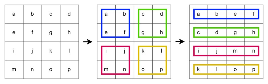
Let’s start from the PatcherUnfold() first, which the details can be seen in Codeblock 4. Here I employ an nn.Unfold() layer with the kernel_size and stride of PATCH_SIZE (16) at the line marked with #(1). With this configuration, the layer will apply a non-overlapping sliding window to the input image. In every single step, the patch inside will be flattened. Look at Figure 4 below to see the illustration of this operation. In the case of that figure, we apply an unfold operation on an image of size 4×4 using the kernel size and stride of 2.
Figure 4. Applying an unfold operation with kernel size and stride 2 on a 4×4 image.
Next, the linear projection operation is done with a standard nn.Linear() layer (#(2)). In order to make the input match with the flattened patch, we need to use IN_CHANNELS*PATCH_SIZE*PATCH_SIZE for the in_features parameter, i.e., 16×16×3 = 768. The projection result dimension is then determined using the out_features param which I set to EMBED_DIM (768). It is important to note that the projection result and the flattened patch have the exact same dimension, as specified by the ViT-B architecture. If you want to implement ViT-L or ViT-H instead, you should change the projection result dimension to 1024 or 1280, respectively, which the size might no longer be the same as the flattened patches.
As the nn.Unfold() and nn.Linear() layer have been initialized, now that we have to connect these layers using the forward() function below. One thing that we need to pay attention to is that the first and second axis of the unfolded tensor need to be swapped using permute() method (#(1)). This is essentially done because we want to treat the flattened patches as a sequence of tokens, similar to how tokens are processed in NLP models. I also print out the shape of every single process done in the codeblock to help you keep track of the array dimension.
x = self.unfold(x) print(f'after unfoldt: {x.size()}')
x = x.permute(0, 2, 1) #(1) print(f'after permutet: {x.size()}')
x = self.linear_projection(x) print(f'after lin projt: {x.size()}')
return x
At this point the PatcherUnfold() class has been completed. To check whether it works properly, we can try to feed it with a tensor of random values which simulates a single RGB image of size 224×224.
# Codeblock 6
patcher_unfold = PatcherUnfold()
x = torch.randn(1, 3, 224, 224)
x = patcher_unfold(x)
You can see the output below that our original image has successfully been converted to shape 1×196×768, in which 1 represents the number of images within a single batch, 196 denotes the sequence length (number of patches), and 768 is the embedding dimension.
# Codeblock 6 output
original        : torch.Size([1, 3, 224, 224])
after unfold    : torch.Size([1, 768, 196])
after permute   : torch.Size([1, 196, 768])
after lin proj  : torch.Size([1, 196, 768])
That was the implementation of patch flattening and linear projection with the PatcherUnfold() class. We can actually achieve the same thing using PatcherConv() which the code is shown below.
x = self.conv(x) #(1) print(f'after convtt: {x.size()}')
x = self.flatten(x) #(2) print(f'after flattentt: {x.size()}')
x = x.permute(0, 2, 1) #(3) print(f'after permutett: {x.size()}')
return x
This approach might not seem as straightforward as the previous one because it does not actually flatten the patches. Rather, it uses a convolution layer with EMBED_DIM (768) number of kernels which results in a 14×14 image with 768 channels (#(1)). To obtain the same output dimension as the PatcherUnfold(), we then flatten the spatial dimension (#(2)) and swap the first and second axes of the resulting tensor (#(3)). Look at the output of Codeblock 8 below to see the detailed tensor shape after each step.
# Codeblock 8
patcher_conv = PatcherConv()
x = torch.randn(1, 3, 224, 224)
x = patcher_conv(x)
# Codeblock 8 output
original                : torch.Size([1, 3, 224, 224])
after conv              : torch.Size([1, 768, 14, 14])
after flatten           : torch.Size([1, 768, 196])
after permute           : torch.Size([1, 196, 768])
Additionally, it is worth noting that using nn.Conv2d() in PatcherConv() is more efficient compared to separate unfolding and linear projection in PatcherUnfold() as it combines the two steps into a single operation.
Class Token & Positional Embedding Implementation
After all patches have been projected into an embedding dimension and arranged into a sequence, the next step is to put the class token before the first patch token in the sequence. This process is wrapped together with the positional embedding implementation inside the PosEmbedding() class as shown in Codeblock 9.
The class token itself is initialized using nn.Parameter(), which is essentially a weight tensor (#(1)). The size of this tensor needs to match with the embedding dimension as well as the batch size, such that it can be concatenated with the existing token sequence. This tensor initially contains random values, which will be updated during the training process. In order to allow it to be updated, we need to set the requires_grad parameter to True. Similarly, we also need to employ nn.Parameter() to create the positional embedding (#(2)), yet with a different shape. In this case we set the sequence dimension to be one token longer than the original sequence to accommodate the class token we just created. Not only that, here I also initialize a dropout layer with the rate that we specified earlier (#(3)).
Afterwards, I am going to connect these layers with the forward() function in Codeblock 10 below. The tensor accepted by this function will be concatenated with the class_token using torch.cat() as written at the line marked by #(1). Next, we will perform element-wise addition between the resulting output and the positional embedding tensor (#(2)) before passing it through the dropout layer (#(3)).
x = self.pos_embedding + x #(2) print(f'after pos_embeddingt: {x.size()}')
x = self.dropout(x) #(3) print(f'after dropouttt: {x.size()}')
return x
As usual, let’s try to forward-propagate a tensor through this network to see if it works as expected. Keep in mind that the input of pos_embedding model is essentially the tensor produced by either PatcherUnfold() or PatcherConv().
# Codeblock 11
pos_embedding = PosEmbedding()
x = pos_embedding(x)
If we take a closer look at the tensor dimension of each step, we can observe that the size of tensor x is initially 1×196×768. After the class token has been prepended to it, the dimension becomes 1×197×768.
# Codeblock 11 output
class_token dim         : torch.Size([1, 1, 768])
before concat           : torch.Size([1, 196, 768])
after concat            : torch.Size([1, 197, 768])
after pos_embedding     : torch.Size([1, 197, 768])
after dropout           : torch.Size([1, 197, 768])
Transformer Encoder Implementation
If we go back to Figure 2, it can be seen that the Transformer Encoder block comprises of four components. We are going to define all these components inside the TransformerEncoder() class shown below.
# Codeblock 12 class TransformerEncoder(nn.Module): def __init__(self): super().__init__()
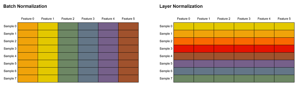
The two normalization steps at the line marked with #(1) and #(3) are implemented using nn.LayerNorm(). Keep in mind that layer normalization we use here is different from batch normalization we commonly see in CNNs. Batch normalization works by normalizing the values within a single feature in all samples in a batch. Meanwhile in layer normalization, all features within a single sample will be normalized. Look at the Figure 5 below to better illustrate this concept. In this example, we assume that every row represents a single sample, whereas every column is a single feature. Cells of the same color indicate that their values are normalized together.
Figure 5. Illustration of the difference between batch and layer normalization. Batch normalization normalizes across the batch dimension while layer normalization normalizes across the feature dimension.
Subsequently, we initialize an nn.MultiheadAttention() layer with EMBED_DIM (768) as the input size at the line marked by #(2) in Codeblock 12. The batch_first parameter is set to True to indicate that the batch dimension is placed at the 0-th axis of the input tensor. Generally speaking, multi-head attention itself allows the model to capture various types of relationships between image patches simultaneously. Every single head in multi-head attention focuses on different aspects of these relationships. Later on, this layer accepts three inputs: query, key, and value, which are all required to compute the so-called attention weights. By doing so, this layer can understand how much each patch should attend to every other patch. In other words, this mechanism allows the layer to capture the relationships between two or more patches. The attention mechanism employed in ViT can be perceived as the core of the entire model because this component is essentially the one that allows ViT to surpass the performance of CNNs when it comes to image recognition tasks.
The MLP component inside the Transformer Encoder is constructed using nn.Sequential() (#(4)). Here we implement two consecutive linear layers, each followed by a dropout layer. We also need to put GELU activation function right after the first linear layer. No activation function is used for the second linear layer since its purpose is just to project the tensor back to the original embedding dimension.
Now that it’s time to connect all the layers we just initialized using the codeblock below.
# Codeblock 13
    def forward(self, x):

        residual = x    #(1)
        print(f'residual dimtt: {residual.size()}')

        x = self.norm_0(x)    #(2)
        print(f'after normtt: {x.size()}')

        x = self.multihead_attention(x, x, x)[0]    #(3)
        print(f'after attentiontt: {x.size()}')

        x = x + residual    #(4)
        print(f'after additiontt: {x.size()}')

        residual = x    #(5)
        print(f'residual dimtt: {residual.size()}')

        x = self.norm_1(x)    #(6)
        print(f'after normtt: {x.size()}')

        x = self.mlp(x)    #(7)
        print(f'after mlptt: {x.size()}')

        x = x + residual    #(8)
        print(f'after additiontt: {x.size()}')

        return x
In the above forward() function, we first store the input tensor x into residual variable (#(1)), in which it is used to create the residual connection. Next, we normalize the input tensor (#(2)) prior to feeding it into the multi-head attention layer (#(3)). As I’ve mentioned earlier, this layer takes query, key and value as the input. In this case, tensor x is going to be used as the argument for the three parameters. Notice that I also write [0] at the same line of the code. This is essentially because an nn.MultiheadAttention() object returns two values: attention output and attention weights, where in this case we only need the former. Next, at the line marked with #(4) we perform element-wise addition between the output of the multi-head attention layer and the original input tensor. We then directly update the residual variable with the current tensor x (#(5)) after the first residual operation is performed. The second normalization operation is done at line #(6) before feeding the tensor into the MLP block (#(7)) and performing another element-wise addition operation (#(8)).
We can check whether our Transformer Encoder block implementation is correct using the Codeblock 14 below. Keep in mind that the input of the transformer_encoder model has to be the output produced by PosEmbedding().
# Codeblock 14
transformer_encoder = TransformerEncoder()
x = transformer_encoder(x)
# Codeblock 14 output
residual dim            : torch.Size([1, 197, 768])
after norm              : torch.Size([1, 197, 768])
after attention         : torch.Size([1, 197, 768])
after addition          : torch.Size([1, 197, 768])
residual dim            : torch.Size([1, 197, 768])
after norm              : torch.Size([1, 197, 768])
after mlp               : torch.Size([1, 197, 768])
after addition          : torch.Size([1, 197, 768])
You can see in the above output that there is no change in the tensor dimension after each step. However, if you take a closer look at how the MLP block was constructed in Codeblock 12, you will observe that its hidden layer was expanded to MLP_SIZE (3072) at the line marked by #(5). We then directly project it back to its original dimension, i.e., EMBED_DIM (768) at line #(6).
MLP Head Implementation
The last class we are going to implement is MLPHead(). Just like the MLP layer inside the Transformer Encoder block, MLPHead() also comprises of fully-connected layers, GELU activation function and layer normalization. The entire implementation of this class can be seen in Codeblock 15 below.
# Codeblock 15 class MLPHead(nn.Module): def __init__(self): super().__init__()
x = self.norm(x) print(f'after normtt: {x.size()}')
x = self.linear_0(x) print(f'after layer_0 mlpt: {x.size()}')
x = self.gelu(x) print(f'after gelutt: {x.size()}')
x = self.linear_1(x) print(f'after layer_1 mlpt: {x.size()}')
return x
One thing to note is that the second fully-connected layer is essentially the output of the entire ViT architecture (#(1)). Hence, we need to ensure that the number of neurons matches with the number of classes available in the dataset we are going to train the model on. In this case, I assume that we have EMBED_DIM (10) number of classes. Furthermore, it is worth noting that I don’t use a softmax layer at the end since it is already implemented in nn.CrossEntropyLoss() if you want to actually train this model.
In order to test the MLPHead() model, we first need to slice the tensor produced by the Transformer Encoder block as shown at line #(1) in Codeblock 16. This is essentially done because we want to take the 0-th element in the token sequence in which it corresponds to the class token we prepended earlier at the front of the patch token sequence.
# Codeblock 16
x = x[:, 0]    #(1)
mlp_head = MLPHead()
x = mlp_head(x)
# Codeblock 16 output
original                : torch.Size([1, 768])
after norm              : torch.Size([1, 768])
after layer_0 mlp       : torch.Size([1, 768])
after gelu              : torch.Size([1, 768])
after layer_1 mlp       : torch.Size([1, 10])
As the test code in Codeblock 16 is run, now we can see that the final tensor shape is 1×10, which is exactly what we expect.
The Entire ViT Architecture
At this point all ViT components have successfully been created. Hence, we can now use them to construct the entire Vision Transformer architecture. Look at the Codeblock 17 below to see how I do it.
# Codeblock 17 class ViT(nn.Module): def __init__(self): super().__init__()
x = self.patcher(x) x = self.pos_embedding(x) x = self.transformer_encoders(x) x = x[:, 0] #(3) x = self.mlp_head(x)
return x
There are several things I want to emphasize regarding the above code. First, at line #(1) we can use either PatcherUnfold() or PatcherConv() as they both have the same role, i.e., to do the patch flattening and linear projection step. In this case, I use the latter for no specific reason. Secondly, the Transformer Encoder block will be repeated NUM_ENCODER (12) times (#(2)) since we are going to implement ViT-Base as stated in Figure 3. Lastly, don’t forget to slice the tensor outputted by the Transformer Encoder since our MLP head will only process the class token part of the output (#(3)).
We can test whether our ViT model works properly using the following code.
# Codeblock 18
vit = ViT().to(device)
x = torch.randn(1, 3, 224, 224).to(device)
print(vit(x).size())
You can see here that the input which the dimension is 1×3×224×224 has been converted to 1×10, which indicates that our model works as expected.
Note: you need to comment out all the prints to make the output looks more concise like this.
# Codeblock 18 output
torch.Size([1, 10])
Additionally, we can also see the detailed structure of the network using the summary() function we imported at the beginning of the code. You can observe that the total number of parameters is around 86 million, which matches the number stated in Figure 3.
I think that’s pretty much all about Vision Transformer architecture. Feel free to comment if you spot any mistake in the code.
All codes used in this article is also available in my GitHub repository by the way. Here’s the link to it.
Thanks for reading, and I hope you learn something new today!
References
[1] Alexey Dosovitskiy et al. An Image is Worth 16×16 Words: Transformers for Image Recognition at Scale. Arxiv. https://arxiv.org/pdf/2010.11929 [Accessed August 8, 2024].
If you enjoyed this article and want to learn about OpenCV and image processing, check out my comprehensive course on Udemy: Image Processing with OpenCV. You’ll gain hands-on experience and master essential techniques.
I’ve been working on weekend LLM projects. When contemplating what to work on, two ideas struck me:
There are few resources for practicing data analytics interviews in contrast to other roles like software engineering and product management. I relied on friends in the industry to make up SQL and Python interview questions when I practiced interviewing for my first data analyst job.
LLMs are really good at generating synthetic datasets and writing code.
As a result, I’ve built the AI Data Analysis Interviewer which automatically creates a unique dataset and generates Python interview questions for you to solve!
This article provides an overview of how it works and its technical implementation. You can check out the repo here.
Demo
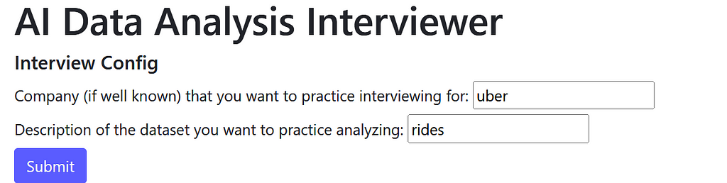
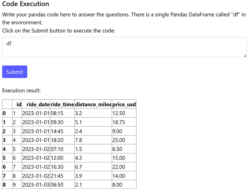
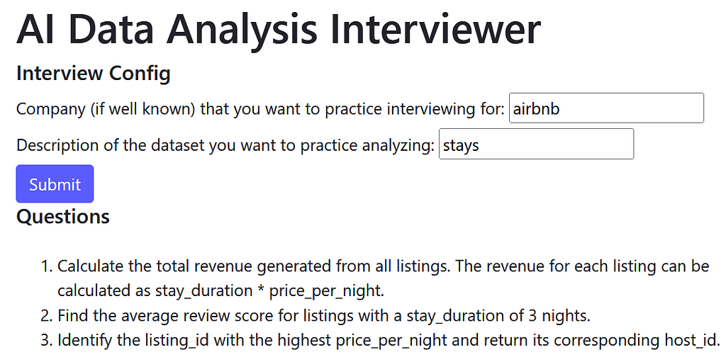
When I launch the web app I’m prompted to provide details on the type of interview I want to practice for, specifically the company and a dataset description. Let’s say I’m interviewing for a data analyst role at Uber which focuses on analyzing ride data:
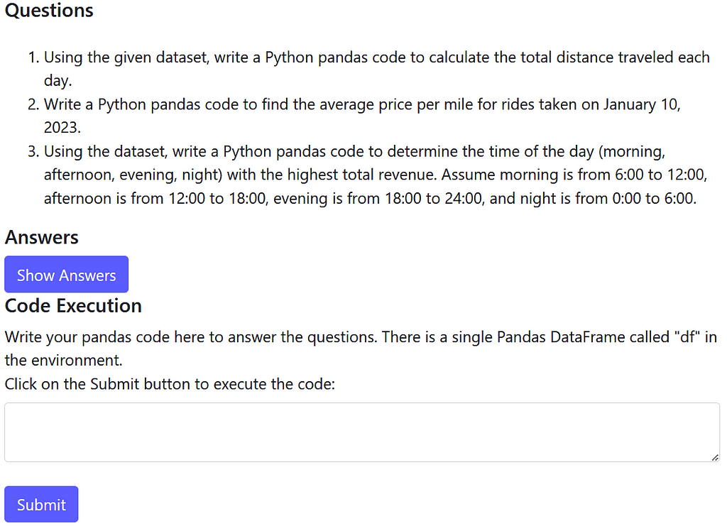
After clicking Submit and waiting for GPT to do its magic, I receive the AI generated questions, answers, and an input field where I can execute code on the AI generated dataset:
Awesome! Let’s try to solve the first question: calculate the total distance traveled each day. As is good analytics practice, let’s start with data exploration:
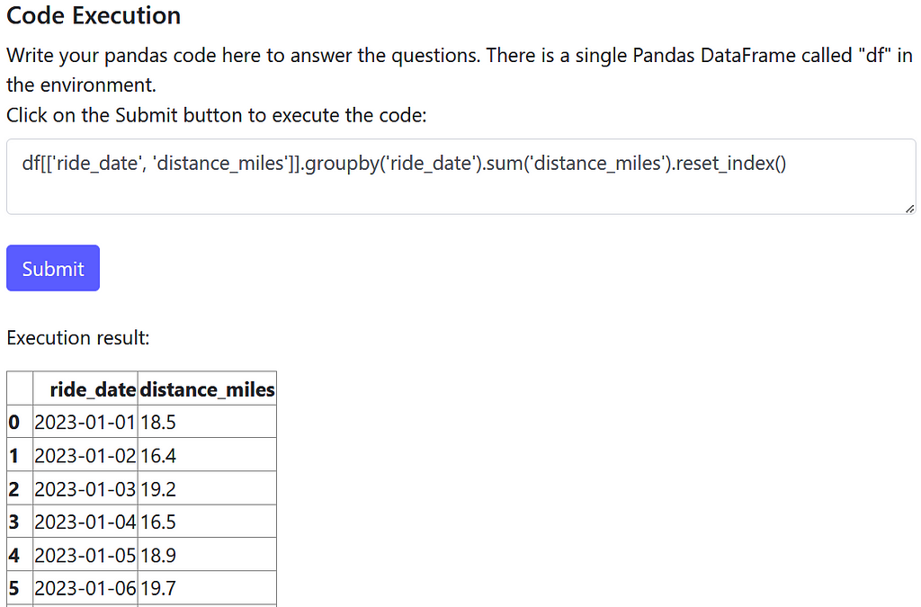
It looks like we need to group by the ride_date field and sum the distance_miles field. Let’s write and submit that Pandas code:
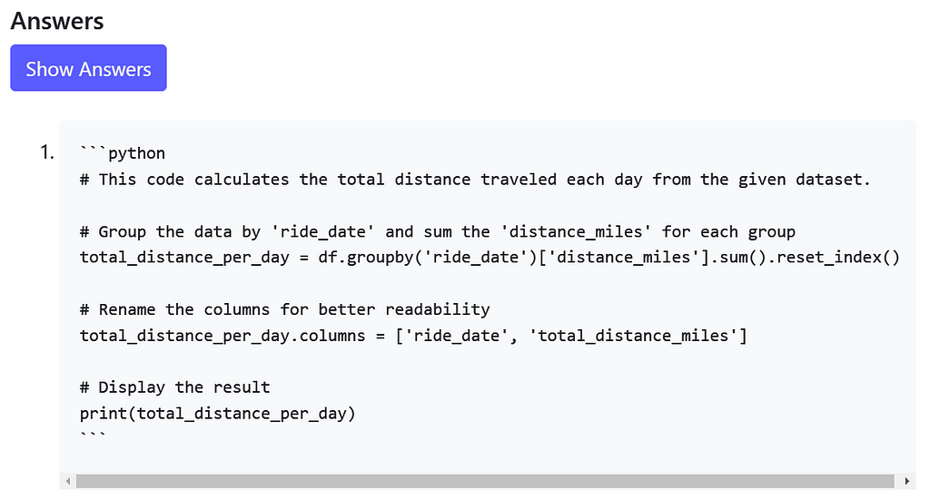
Looks good to me! Does the AI answer agree with our approach?
The AI answer uses a slightly different methodology but solves the problem essentially in the same way.
I can rinse and repeat as much as needed to feel great before heading into an interview. Interviewing for Airbnb? This tool has you covered. It generates the questions:
Along with a dataset you can execute code on:
How to use the app
Check out the readme of the repo here to run the app locally. Unfortunately I didn’t host it but I might in the future!
High-level design
The rest of this article will cover the technical details on how I created the AI Data Analysis Interviewer.
LLM architecture
I used OpenAI’s gpt-4o as it’s currently my go-to LLM model (it’s pretty easy to swap this out with another model though.)
There are 3 types of LLM calls made:
Dataset generation: we ask a LLM to generate a dataset suitable for an analytics interview.
Question generation: we ask a LLM to generate a couple of analytics interview questions from that dataset.
Answer generation: we ask a LLM to generate the answer code for each interview question.
Front-end
I built the front-end using Flask. It’s simple and not very interesting so I’ll focus on the LLM details below. Feel free to check out the code in the repo however!
Design details
LLM manager
LLMManager is a simple class which handles making LLM API calls. It gets our OpenAI API key from a local secrets file and makes an OpenAI API call to pass a prompt to a LLM model. You’ll see some form of this in every LLM project.
class LLMManager(): def __init__(self, model: str = 'gpt-4o'): self.model = model
We first prompt a LLM to generate a dataset with the following prompt:
SYSTEM_TEMPLATE = """You are a senior staff data analyst at a world class tech company.
You are designing a data analysis interview for hiring candidates."""

DATA_GENERATION_USER_TEMPLATE = """Create a dataset for a data analysis interview that contains interesting insights.
Specifically, generate comma delimited csv output with the following characteristics:
- Relevant to company: {company}
- Dataset description: {description}
- Number of rows: 100
- Number of columns: 5
Only include csv data in your response. Do not include any other information.
Start your output with the first header of the csv: "id,".
Output: """
Let’s break it down:
Many LLM models follow a prompt structure where the LLM accepts a system and user message. The system message is intended to define general behavior and the user message is intended to provide specific instructions. Here we prompt the LLM to be a world class interviewer in the system message. It feels silly but hyping up a LLM is a proven prompt hack to get better performance.
We pass the user inputs about the company and dataset they want to practice interviewing with into the user template through the string variables {company} and {description}.
We prompt the LLM to output data in csv format. This seems like the simplest tabular data format for a LLM to produce which we can later convert to a Pandas DataFrame for code analysis. JSON would also probably work but may be less reliable given the more complex and verbose syntax.
We want the LLM output to be parseable csv, but gpt-4o tends to generate extra text likely because it was trained to be very helpful. The end of the user template strongly instructs the LLM to just output parseable csv data, but even so we need to post-process it.
The class DataGenerator handles all things data generation and contains the generate_interview_dataset method which makes the LLM call to generate the dataset:
Note that the clean_llm_dataset_output method does the light post-processing mentioned above. It removes any extraneous text before “id,” which denotes the start of the csv data.
LLMs only can output strings so we need to transform the string output into an analyzable Pandas DataFrame. The convert_str_to_df method takes care of that:
try: df = pd.read_csv(csv_data) except Exception as e: raise ValueError(f"Error in converting LLM csv output to DataFrame: {e}")
return df
Question generation
We can prompt a LLM to generate interview questions off of the generated dataset with the following prompt:
QUESTION_GENERATION_USER_TEMPLATE = """Generate 3 data analysis interview questions that can be solved with Python pandas code based on the dataset below:

Dataset:
{dataset}

Output the questions in a Python list where each element is a question. Start your output with [".
Do not include question indexes like "1." in your output.
Output: """
To break it down once again:
The same system prompt is used here as we still want the LLM to embody a world-class interviewer when writing the interview questions.
The string output from the dataset generation call is passed into the {dataset} string variable. Note that we have to maintain 2 representations of the dataset: 1. a string representation that a LLM can understand to generate questions and answers and 2. a structured representation (i.e. DataFrame) that we can execute code over.
We prompt the LLM to return a list. We need the output to be structured so we can iterate over the questions in the answer generation step to generate an answer for every question.
The LLM call is made with the generate_interview_questions method of DataGenerator:
With both the dataset and the questions available, we finally generate the answers with the following prompt:
ANSWER_GENERATION_USER_TEMPLATE = """Generate an answer to the following data analysis interview Question based on the Dataset.

Dataset:
{dataset}

Question: {question}

The answer should be executable Pandas Python code where df refers to the Dataset above.
Always start your answer with a comment explaining what the following code does.
DO NOT DEFINE df IN YOUR RESPONSE.
Answer: """
We make as many answer generation LLM calls as there are questions, so 3 since we hard coded the question generation prompt to ask for 3 questions. Technically you could ask a LLM to generate all 3 answers for all 3 questions in 1 call but I suspect that performance would worsen. We want the maximize the ability of the LLM to generate accurate answers. A (perhaps obvious) rule of thumb is that the harder the task given to a LLM, the less likely the LLM will perform it well.
The prompt instructs the LLM to refer to the dataset as “df” because our interview dataset in DataFrame form is called “df” when the user code is executed by the CodeExecutor class below.
if isinstance(execution_result, pd.DataFrame): return execution_result.to_html()
return execution_result
Conclusion
I hope this article sheds light on how to build a simple and useful LLM project which utilizes LLMs in a variety of ways!
If I continued to develop this project, I would focus on:
Adding more validation on structured output from LLMs (i.e. parseable csv or lists). I already covered a couple of edge cases but LLMs are very unpredictable so this needs hardening.
2. Adding more features like
Generating multiple relational tables and questions requiring joins
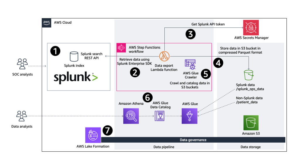
For organizations looking beyond the use of out-of-the-box Splunk AI/ML features, this post explores how Amazon SageMaker Canvas, a no-code ML development service, can be used in conjunction with data collected in Splunk to drive actionable insights. We also demonstrate how to use the generative AI capabilities of SageMaker Canvas to speed up your data exploration and help you build better ML models.
We use cookies on our website to give you the most relevant experience by remembering your preferences and repeat visits. By clicking “Accept”, you consent to the use of ALL the cookies.
This website uses cookies to improve your experience while you navigate through the website. Out of these, the cookies that are categorized as necessary are stored on your browser as they are essential for the working of basic functionalities of the website. We also use third-party cookies that help us analyze and understand how you use this website. These cookies will be stored in your browser only with your consent. You also have the option to opt-out of these cookies. But opting out of some of these cookies may affect your browsing experience.
Necessary cookies are absolutely essential for the website to function properly. These cookies ensure basic functionalities and security features of the website, anonymously.
Cookie
Duration
Description
cookielawinfo-checkbox-analytics
11 months
This cookie is set by GDPR Cookie Consent plugin. The cookie is used to store the user consent for the cookies in the category "Analytics".
cookielawinfo-checkbox-functional
11 months
The cookie is set by GDPR cookie consent to record the user consent for the cookies in the category "Functional".
cookielawinfo-checkbox-necessary
11 months
This cookie is set by GDPR Cookie Consent plugin. The cookies is used to store the user consent for the cookies in the category "Necessary".
cookielawinfo-checkbox-others
11 months
This cookie is set by GDPR Cookie Consent plugin. The cookie is used to store the user consent for the cookies in the category "Other.
cookielawinfo-checkbox-performance
11 months
This cookie is set by GDPR Cookie Consent plugin. The cookie is used to store the user consent for the cookies in the category "Performance".
viewed_cookie_policy
11 months
The cookie is set by the GDPR Cookie Consent plugin and is used to store whether or not user has consented to the use of cookies. It does not store any personal data.
Functional cookies help to perform certain functionalities like sharing the content of the website on social media platforms, collect feedbacks, and other third-party features.
Performance cookies are used to understand and analyze the key performance indexes of the website which helps in delivering a better user experience for the visitors.
Analytical cookies are used to understand how visitors interact with the website. These cookies help provide information on metrics the number of visitors, bounce rate, traffic source, etc.
Advertisement cookies are used to provide visitors with relevant ads and marketing campaigns. These cookies track visitors across websites and collect information to provide customized ads.