Ahead of the expected crypto bull run in 2024, more investors are closely monitoring Binance Coin (BNB), Avalanche (AVAX), Pullix (PLX), and Ordinals (ORDI)
Singapore-based crypto asset management firm Matrixport says Q1 will be a challenging quarter for Bitcoin, although anticipates a positive outlook by the end of 2024. As Bitcoin (BTC) fell back to the $39,000 area, the largest cryptocurrency by market capitalization…
The U.S. Securities and Exchange Commission (SEC) has again delayed issuing a decision on Grayscale’s application to launch a spot Ethereum (ETH) ETF. According to a message on the regulator’s website, the Commission requested public comments on how the regulator…
Input and output (I/O) operations refer to the transfer of data between a computer’s main memory and various peripherals. Storage peripherals such as HDDs and SSDs have particular performance characteristics in terms of latency, throughput, and rate which can influence the performance of the computer system they power. Extrapolating, the performance and design of distributed and cloud based Data Storage depends on that of the medium. This article is intended to be a bridge between Data Science and Storage Systems: 1/ I am sharing a few datasets of various sources and sizes which I hope will be novel for Data Scientists and 2/ I am bringing up the potential for advanced analytics in Distributed Systems.
Intro
Storage access traces are “a treasure trove of information for optimizing cloud workloads.” They’re crucial for capacity planning, data placement, or system design and evaluation, suited for modern applications. Diverse and up-to-date datasets are particularly needed in academic research to study novel and unintuitive access patterns, help the design of new hardware architectures, new caching algorithms, or hardware simulations.
Storage traces are notoriously difficult to find. The SNIA website is the best known “repository for storage-related I/O trace files, associated tools, and other related information” but many traces don’t comply with their licensing or upload format. Finding traces becomes a tedious process of scanning the academic literature or attempting to generate one’s own.
Popular traces which are easier to find tend to be outdated and overused. Traces older than 10 years should not be used in modern research and development due to changes in application workloads and hardware capabilities. Also, an over-use of specific traces can bias the understanding of real workloads so it’s recommended to use traces from multiple independent sources when possible.
This post is an organized collection of recent public traces I found and used. In the first part I categorize them by the level of abstraction they represent in the IO stack. In the second part I list and discuss some relevant datasets. The last part is a summary of all with a personal view on the gaps in storage tracing datasets.
Type of traces
I distinguish between three types of traces based on data representation and access model. Let me explain. A user, at the application layer, sees data stored in files or objects which are accessed by a large range of abstract operations such as open or append. Closer to the media, the data is stored in a continuous memory address space and accessed as blocks of fixed size which may only be read or written. At a higher abstraction level, within the application layer, we may also have a data presentation layer which may log access to data presentation units, which may be, for example, rows composing tables and databases, or articles and paragraphs composing news feeds. The access may be create table, or post article.
While traces can be taken anywhere in the IO stack and contain information from multiple layers, I am choosing to structure the following classification based on the Linux IO stack depicted below.
The data in these traces is representative of the operations at the block layer. In Linux, this data is typically collected with blktrace (and rendered readable with blkparse), iostat, or dtrace. The traces contain information about the operation, the device, CPU, process, and storage location accessed. The first trace listed is an example of blktrace output.
The typical information generated by tracing programs may be too detailed for analysis and publication purposes and it is often simplified. Typical public traces contain operation, offset, size, and sometimes timing. At this layer the operations are only read and write. Each operation accesses the address starting at offset and is applied to a continuous size of memory specified in number of blocks (4KiB NTFS). For example, a trace entry for a read operation contains the address where the read starts (offset), and the number of blocks read (size). The timing information may contain the time the request was issued (start time), the time it was completed (end time), the processing in between (latency), and the time the request waited (queuing time).
Available traces sport different features, have wildly different sizes, and are the output of a variety of workloads. Selecting the right one will depend on what one’s looking for. For example, trace replay only needs the order of operations and their size; For performance analysis timing information is needed.
At the application layer, data is located in files and objects which may be created, opened, appended, or closed, and then discovered via a tree structure. From an user’s point of view, the storage media is decoupled, hiding fragmentation, and allowing random byte access.
I’ll group together file and object traces despite a subtle difference between the two. Files follow the file system’s naming convention which is structured (typically hierarchical). Often the extension suggests the content type and usage of the file. On the other hand, objects are used in large scale storage systems dealing with vast amounts of diverse data. In object storage systems the structure is not intrinsic, instead it is defined externally, by the user, with specific metadata files managed by their workload.
Being generated within the application space, typically the result of an application logging mechanism, object traces are more diverse in terms of format and content. The information recorded may be more specific, for example, operations can also be delete, copy, or append. Objects typically have variable size and even the same object’s size may vary in time after appends and overwrites. The object identifier can be a string of variable size. It may encode extra information, for example, an extension that tells the content type. Other meta-information may come from the range accessed, which may tell us, for example, whether the header, the footer or the body of an image, parquet, or CSV file was accessed.
Object storage traces are better suited for understanding user access patterns. In terms of block access, a video stream and a sequential read of an entire file generate the same pattern: multiple sequential IOs at regular time intervals. But these trace entries should be treated differently if we are to replay them. Accessing video streaming blocks needs to be done with the same time delta between them, regardless of the latency of each individual block, while reading the entire file should be asap.
Access traces
Specific to each application, data may be abstracted further. Data units may be instances of a class, records in a database, or ranges in a file. A single data access may not even generate a file open or a disk IO if caching is involved. I choose to include such traces because they may be used to understand and optimize storage access, and in particular cloud storage. For example, the access traces from Twitter’s Memcache are useful in understanding popularity distributions and therefore may be useful for data formatting and placement decisions. Often they’re not storage traces per se, but they can be useful in the context of cache simulation, IO reduction, or data layout (indexing).
Data format in these traces can be even more diverse due to a new layer of abstraction, for example, by tweet identifiers in Memcached.
Examples of traces
Let’s look at a few traces in each of the categories above. The list details some of the newer traces — no older than 10 years — and it is by no means exhaustive.
Block traces
YCSB RocksDB SSD 2020
These are SSD traces collected on a 28-core, 128 GB host with two 512 GB NVMe SSD Drives, running Ubuntu. The dataset is a result of running the YCSB-0.15.0 benchmark with RocksDB.
The first SSD stores all blktrace output, while the second hosts YCSB and RocksDB. YCSB Workload A consists of 50% reads and 50% updates of 1B operations on 250M records. Runtime is 9.7 hours, which generates over 352M block I/O requests at the file system level writing a total of 6.8 TB to the disk, with a read throughput of 90 MBps and a write throughput of 196 MBps.
The dataset is small compared to all others in the list, and limited in terms of workload, but a great place to start due to its manageable size. Another benefit is reproducibility: it uses open source tracing tools and benchmarking beds atop a relatively inexpensive hardware setup.
Format: These are SSD traces taken with blktrace and have the typical format after parsing with blkparse: [Device Major Number,Device Minor Number] [CPU Core ID] [Record ID] [Timestamp (in nanoseconds)] [ProcessID] [Trace Action] [OperationType] [SectorNumber + I/O Size] [ProcessName]
259,2    0        1     0.000000000  4020  Q   R 282624 + 8 [java]
259,2    0        2     0.000001581  4020  G   R 282624 + 8 [java]
259,2    0        3     0.000003650  4020  U   N [java] 1
259,2    0        4     0.000003858  4020  I  RS 282624 + 8 [java]
259,2    0        5     0.000005462  4020  D  RS 282624 + 8 [java]
259,2    0        6     0.013163464     0  C  RS 282624 + 8 [0]
259,2    0        7     0.013359202  4020  Q   R 286720 + 128 [java]
The dataset consists of “block-level I/O requests collected from 1,000 volumes, where each has a raw capacity from 40 GiB to 5 TiB. The workloads span diverse types of cloud applications. Each collected I/O request specifies the volume number, request type, request offset, request size, and timestamp.”
the traces do not record the response times of the I/O requests, making them unsuitable for latency analysis of I/O requests.
the specific applications running atop are not mentioned, so they cannot be used to extract application workloads and their I/O patterns.
the traces capture the access to virtual devices, so they are not representative of performance and reliability (e.g., data placement and failure statistics) for physical block storage devices.
A drawback of this dataset is its size. When uncompressed it results in a 751GB file which is difficult to store and manage.
Format: device_id,opcode,offset,length,timestamp
device_idID of the virtual disk, uint32
opcodeEither of ‘R’ or ‘W’, indicating this operation is read or write
offsetOffset of this operation, in bytes, uint64
lengthLength of this operation, in bytes, uint32
timestampTimestamp of this operation received by server, in microseconds, uint64
This dataset consists of “216 I/O traces from a warehouse (also called a failure domain) of a production cloud block storage system (CBS). The traces are I/O requests from 5584 cloud virtual volumes (CVVs) for ten days (from Oct. 1st to Oct. 10th, 2018). The I/O requests from the CVVs are mapped and redirected to a storage cluster consisting of 40 storage nodes (i.e., disks).”
Limitations:
Timestamps are in seconds, a granularity too little for determining the order of operations. As a consequence many requests appear as if issued at the same time. This trace is therefore unsuitable for queuing analysis.
There is no latency information about the duration of each operation, making the trace unsuitable for latency performance, queuing analytics.
No extra information about each volume such as total size.
Format: Timestamp,Offset,Size,IOType,VolumeID
Timestamp is the Unix time the I/O was issued in seconds.
Offset is the starting offset of the I/O in sectors from the start of the logical virtual volume. 1 sector = 512 bytes
Size is the transfer size of the I/O request in sectors.
This dataset contains traces from virtual cloud storage from the FUJITSU K5 cloud service. The data is gathered during a week, but not continuously because “ one day’s IO access logs often consumed the storage capacity of the capture system.” There are 24 billion records from 3088 virtual storage nodes.
The data is captured in the TCP/IP network between servers running on hypervisor and storage systems in a K5 data center in Japan. The data is split between three datasets by each virtual storage volume id. Each virtual storage volume id is unique in the same dataset, while each virtual storage volume id is not unique between the different datasets.
Limitations:
There is no latency information, so the traces cannot be used for performance analysis.
The total node size is missing, but it can be approximated from the maximum offset accessed in the traces.
Some applications may require a complete dataset, which makes this one unsuitable due to missing data.
The fields in the IO access log are: ID,Timestamp,Type,Offset,Length
ID is the virtual storage volume id.
Timestamp is the time elapsed from the first IO request of all IO access logs in seconds, but with a microsecond granularity.
Type is R(Read) or (W)Write.
Offset is the starting offset of the IO access in bytes from the start of the virtual storage.
Length is the transfer size of the IO request in bytes.
This repository contains two datasets for IO block traces with additional file identifiers: 1/ parallel file systems (PFS) and 2/ I/O nodes.
Notes:
The access patterns are resulting from MPI-IO test benchmark ran atop of Grid5000, a large scale test bed for parallel and High Performance Computing (HPC). These traces are not representative of general user or cloud workloads but instead specific to HPC and parallel computing.
The setup for the PFS scenario uses Orange FS as file system and for the IO nodes I/O Forwarding Scalability Layer(IOFSL). In both cases the scheduler was set to AGIOS I/O scheduling library. This setup is perhaps too specific for most use cases targeted by this article and has been designed to reflect some proposed solutions.
The hardware setup for PFS consists of our server nodes with 600 GB HDDs each and 64 client nodes. For IO nodes, it has four server nodes with similar disk configuration in a cluster, and 32 clients in a different cluster.
Format: The format is slightly different for the two datasets, an artifact of different file systems. For IO nodes, it consists of multiple files, each with tab-separated values Timestamp FileHandle RequestType Offset Size. A peculiarity is that reads and writes are in separate files named accordingly.
Timestamp is a number representing the internal timestamp in nanoseconds.
FileHandle is the file handle in hexadecimal of size 64.
RequestType is the type of the request, inverted, “W” for reads and “R” for writes.
Offset is a number giving the request offset in bytes
Size is the size of the request in bytes.
265277355663    00000000fbffffffffffff0f729db77200000000000000000000000000000000        W       2952790016      32768
265277587575    00000000fbffffffffffff0f729db77200000000000000000000000000000000        W       1946157056      32768
265277671107    00000000fbffffffffffff0f729db77200000000000000000000000000000000        W       973078528       32768
265277913090    00000000fbffffffffffff0f729db77200000000000000000000000000000000        W       4026531840      32768
265277985008    00000000fbffffffffffff0f729db77200000000000000000000000000000000        W       805306368       32768
The PFS scenario has two concurrent applications, “app1” and “app2”, and its traces are inside a folder named accordingly. Each row entry has the following format: [<Timestamp>] REQ SCHED SCHEDULING, handle:<FileHandle>, queue_element: <QueueElement>, type: <RequestType>, offset: <Offset>, len: <Size> Different from the above are:
RequestType is 0 for reads and 1 for writes
QueueElement is never used and I believe it is an artifact of the tracing tool.
These are anonymized traces from the IBM Cloud Object Storage service collected with the primary goal to study data flows to the object store.
The dataset is composed of 98 traces containing around 1.6 Billion requests for 342 Million unique objects. The traces themselves are about 88 GB in size. Each trace contains the REST operations issued against a single bucket in IBM Cloud Object Storage during a single week in 2019. Each trace contains between 22,000 to 187,000,000 object requests. All the traces were collected during the same week in 2019. The traces contain all data access requests issued over a week by a single tenant of the service. Object names are anonymized.
Some characteristics of the workload have been published in this paper, although the dataset used was larger:
The authors were “able to identify some of the workloads as SQL queries, Deep Learning workloads, Natural Language Processing (NLP), Apache Spark data analytic, and document and media servers. But many of the workloads’ types remain unknown.”
“A vast majority of the objects (85%) in the traces are smaller than a megabyte, Yet these objects only account for 3% of the of the stored capacity.” This made the data suitable for a cache analysis.
Format: <time stamp of request> <request type> <object ID> <optional: size of object> <optional: beginning offset> <optional: ending offset> The timestamp is the number of milliseconds from the point where we began collecting the traces.
The wiki dataset contains data for 1/ upload (image) web requests of Wikimedia and 2/ text (HTML pageview) web requests from one CDN cache server of Wikipedia. The mos recent dataset, from 2019 contains 21 upload data files and 21 text data files.
Format: Each upload data file, denoted cache-u, contains exactly 24 hours of consecutive data. These files are each roughly 1.5GB in size and hold roughly 4GB of decompressed data each.
This dataset is the result of a single type of workload, which may limit the applicability, but it is large and complete, which makes a good testbed.
Each decompressed upload data file has the following format: relative_unix hashed_path_query image_type response_size time_firstbyte
relative_unix: Seconds since start timestamp of dataset, int
hashed_path_query: Salted hash of path and query of request, bigint
image_type: Image type from Content-Type header of response, string
Each text data file, denoted cache-t, contains exactly 24 hours of consecutive data. These files are each roughly 100MB in size and hold roughly 300MB of decompressed data each.
Each decompressed upload data file has the following format: relative_unix hashed_host_path_query response_size time_firstbyte
This dataset contains one-week-long traces from Twitter’s in-memory caching (Twemcache / Pelikan) clusters. The data comes from 54 largest clusters in Mar 2020, Anonymized Cache Request Traces from Twitter Production.
Format: Each trace file is a csv with the format: timestamp,anonymized key,key size,value size,client id,operation,TTL
timestamp: the time when the cache receives the request, in sec
anonymized key: the original key with anonymization where namespaces are preserved; for example, if the anonymized key is nz:u:eeW511W3dcH3de3d15ec, the first two fields nz and u are namespaces, note that the namespaces are not necessarily delimited by :, different workloads use different delimiters with different number of namespaces.
key size: the size of key in bytes
value size: the size of value in bytes
client id: the anonymized clients (frontend service) who sends the request
operation: one of get/gets/set/add/replace/cas/append/prepend/delete/incr/decr
TTL: the time-to-live (TTL) of the object set by the client, it is 0 when the request is not a write request.
If you’re still here and haven’t gone diving into one of the traces linked above it may be because you haven’t found what you’re looking for. There are a few gaps that current storage traces have yet to fill:
Multi-tenant Cloud Storage: Large cloud storage providers store some of the most rich datasets out there. Their workload reflects a large scale systems’ architecture and is the result of a diverse set of applications. Storage providers are also extra cautious when it comes to sharing this data. There is little or no financial incentive to share data with the public and a fear of unintended customer data leaks.
Full stack. Each layer in the stack offers a different view on access patterns, none alone being enough to understand cause-and-effect relationships in storage systems. Optimizing a system to suit modern workloads requires a holistic view of the data access which are not publicly available.
Distributed tracing. Most data is nowadays accessed remotely and managed in large scale distributed systems. Many components and layers (such as indexes or caching) will alter the access patterns. In such an environment, end-to-end means tracing a request across several components in a complex architecture. This data can be truly valuable for designing large scale systems but, at the same time, may be too specific to the system inspected which, again, limits the incentive to publish it.
Data quality. The traces above have limitations due to the level of detail they represent. As we have seen, some have missing data, some have large granularity time stamps, others are inconveniently large to use. Cleaning data is a tedious process which limits the dataset publishing nowadays.
Switchback testing for decision models allows algorithm teams to compare a candidate model to a baseline model in a true production environment, where both models are making real-world decisions for the operation. With this form of testing, teams can randomize which model is applied to units of time and/or location in order to mitigate confounding effects (like holidays, major events, etc.) that can impact results when doing a pre/post rollout test.
Switchback tests can go by several names (e.g., time split experiments), and they are often referred to as A/B tests. While this is a helpful comparison for orientation, it’s important to acknowledge that switchback and A/B tests are similar but not the same. Decision models can’t be A/B tested the same way webpages can be due to network effects. Switchback tests allow you to account for these network effects, whereas A/B tests do not.
For example, when you A/B test a webpage by serving up different content to users, the experience a user has with Page A does not affect the experience another user has with Page B. However, if you tried to A/B test delivery assignments to drivers — you simply can’t. You can’t assign the same order to two different drivers as a test for comparison. There isn’t a way to isolate treatment and control within a single unit of time or location using traditional A/B testing. That’s where switchback testing comes in.
Illustration of switchback testing with models A and B represented by bunny shapes. Image from N. Misek and T. Bogich, What is switchback testing for decision models? (2023), Nextmv. Reposted with permission.
Let’s explore this type of testing a bit further.
What’s an example of switchback testing?
Imagine you work at a farm share company that delivers fresh produce (carrots, onions, beets, apples) and dairy items (cheese, ice cream, milk) from local farms to customers’ homes. Your company recently invested in upgrading the entire vehicle fleet to be cold-chain ready. Since all vehicles are capable of handling temperature-sensitive items, the business is ready to remove business logic that was relevant to the previous hybrid fleet.
Before the fleet upgrade, your farm share handled temperature-sensitive items last-in-first-out (LIFO). This meant that if a cold item such as ice cream was picked up, a driver had to immediately drop the ice cream off to avoid a sad melty mess. This LIFO logic helped with product integrity and customer satisfaction, but it also introduced inefficiencies with route changes and backtracking.
After the fleet upgrade, the team wants to remove this constraint since all vehicles are capable of transporting cold items for longer with refrigeration. Previous tests using historical inputs, such as batch experiments (ad-hoc tests used to compare one or more models against offline or historical inputs [1]) and acceptance tests (tests with pre-defined pass/fail metrics used to compare the current model with a candidate model against offline or historical inputs before ‘accepting’ the new model [2]), have indicated that vehicle time on road and unassigned stops decrease for the candidate model compared to the production model that has the LIFO constraint. You’ve run a shadow test (an online test in which one or more candidate models is run in parallel to the current model in production but “in the shadows”, not impacting decisions [3]) to ensure model stability under production conditions. Now you want to let your candidate model have a go at making decisions for your production systems and compare the results to your production model.
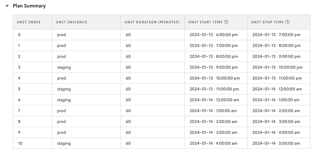
For this test, you decide to randomize based on time (every 1 hour) in two cities: Denver and New York City. Here’s an example of the experimental units for one city and which treatment was applied to them.
Sample plan summary for a switchback test on Nextmv. Image from Nextmv.io Cloud Console (2024). Reposted with permission.
After 4 weeks of testing, you find that your candidate model outperforms the production model by consistently having lower time on road, fewer unassigned stops, and happier drivers because they weren’t zigzagging across town to accommodate the LIFO constraint. With these results, you work with the team to fully roll out the new model (without the LIFO constraint) to both regions.
Why do switchback testing?
Switchback tests build understanding and confidence in the behavioral impacts of model changes when there are network effects in play. Because they use online data and production conditions in a statistically sound way, switchback tests give insight into how a new model’s decision making impacts the real world in a measured way rather than just “shipping it” wholesale to prod and hoping for the best. Switchback testing is the most robust form of testing to understand how a candidate model will perform in the real world.
This type of understanding is something you can’t get from shadow tests. For example, if you run a candidate model that changes an objective function in shadow mode, all of your KPIs might look good. But if you run that same model as a switchback test, you might see that delivery drivers reject orders at a higher rate compared to the baseline model. There are just behaviors and outcomes you can’t always anticipate without running a candidate model in production in a way that lets you observe the model making operational decisions.
Additionally, switchback tests are especially relevant for supply and demand problems in the routing space, such as last-mile delivery and dispatch. As described earlier, standard A/B testing techniques simply aren’t appropriate under these conditions because of network effects they can’t account for.
When do you need switchback testing?
There’s a quote from the Principles of Chaos Engineering, “Chaos strongly prefers to experiment directly on production traffic” [4]. Switchback testing (and shadow testing) are made for facing this type of chaos. As mentioned in the section before: there comes a point when it’s time to see how a candidate model makes decisions that impact real-world operations. That’s when you need switchback testing.
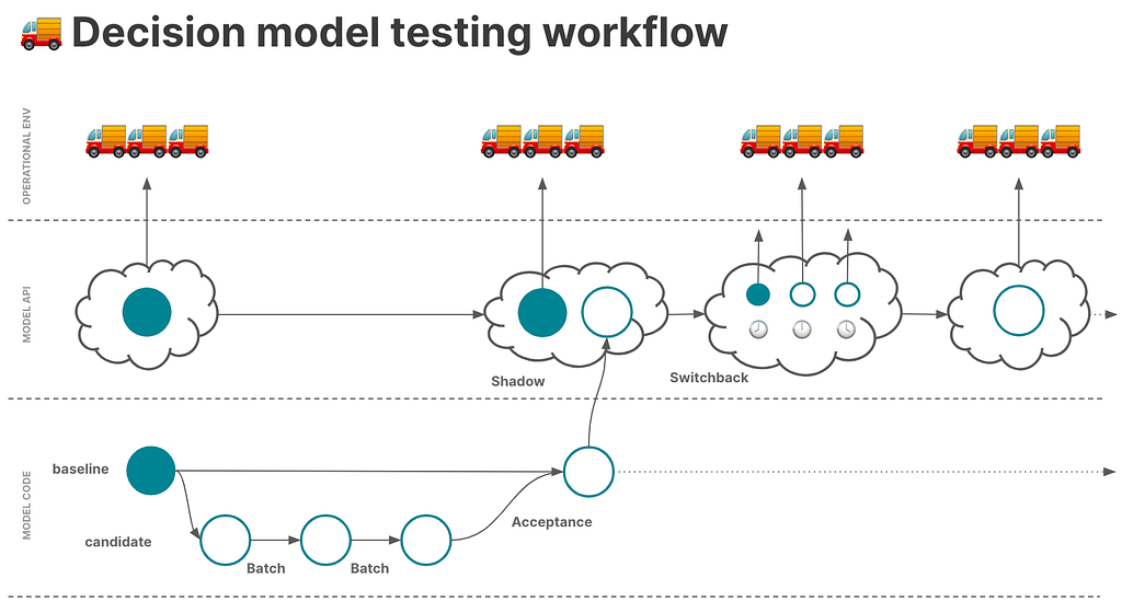
That said, it doesn’t make sense for the first round of tests on a candidate model to be switchback tests. You’ll want to run a series of historical tests such as batch, scenario, and acceptance tests, and then progress to shadow testing on production data. Switchback testing is often a final gate before committing to fully deploying a candidate model in place of an existing production model.
Illustration of testing workflow that includes switchback testing prior to deploying a new model. Image by Haley Eshagh.
How is switchback testing traditionally done?
To perform switchback tests, teams often build out the infra, randomization framework, and analysis tooling from scratch. While the benefits of switchback testing are great, the cost to implement and maintain it can be high and often requires dedicated data science and data engineering involvement. As a result, this type of testing is not as common in the decision science space.
Once the infra is in place and switchback tests are live, it becomes a data wrangling exercise to weave together the information to understand what treatment was applied at what time and reconcile all of that data to do a more formal analysis of the results.
A few good points of reference to dive into include blog posts on the topic from DoorDash like this one (they write about it quite a bit) [5], in addition to this Towards Data Science post from a Databricks solutions engineer [6], which references a useful research paper out of MIT and Harvard [7] that’s worth a read as well.
Conclusion
Switchback testing for decision models is similar to A/B testing, but allows teams to account for network effects. Switchback testing is a critical piece of the DecisionOps workflow because it runs a candidate model using production data with real-world effects. We’re continuing to build out the testing experience at Nextmv — and we’d like your input.
If you’re interested in more content on decision model testing and other DecisionOps topics, subscribe to the Nextmv blog.
Background As a recent Grinnell College alum, I’ve closely observed and been impacted by significant shifts in the academic landscape. When I graduated, the acceptance rate at Grinnell had plummeted by 15% from the time I entered, paralleled by a sharp rise in tuition fees. This pattern wasn’t unique to my alma mater; friends from various colleges echoed similar experiences.
This got me thinking: Is this a widespread trend across U.S. colleges? My theory was twofold: firstly, the advent of online applications might have simplified the process of applying to multiple colleges, thereby increasing the applicant pool and reducing acceptance rates. Secondly, an article from the Migration Policy Institute highlighted a doubling in the number of international students in the U.S. from 2000 to 2020 (from 500k to 1 million), potentially intensifying competition. Alongside, I was curious about the tuition fee trends from 2001 to 2022. My aim here is to unravel these patterns through data visualization. For the following analysis, all images, unless otherwise noted, are by the author!
Dataset The dataset I utilized encompasses a range of data about U.S. colleges from 2001 to 2022, covering aspects like institution type, yearly acceptance rates, state location, and tuition fees. Sourced from the College Scorecard, the original dataset was vast, with over 3,000 columns and 10,000 rows. I meticulously selected pertinent columns for a focused analysis, resulting in a refined dataset available on Kaggle. To ensure relevance and completeness, I concentrated on 4-year colleges featured in the U.S. News college rankings, drawing the list from here.
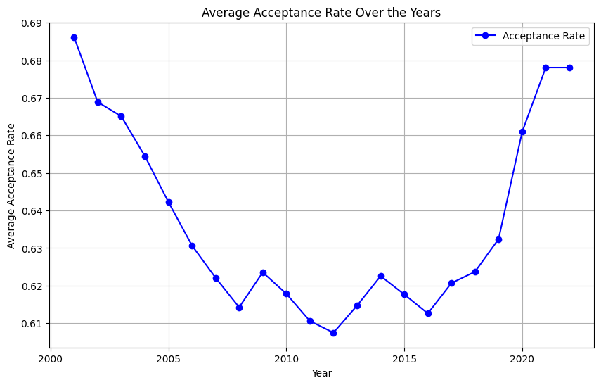
Change in Acceptance Rates Over the Years Let’s dive into the evolution of college acceptance rates over the past two decades. Initially, I suspected that I would observe a steady decline. Figure 1 illustrates this trajectory from 2001 to 2022. A consistent drop is evident until 2008, followed by fluctuations leading up to a notable increase around 2020–2021, likely a repercussion of the COVID-19 pandemic influencing gap year decisions and enrollment strategies.
plt.figure(figsize=(10, 6)) # Set the figure size plt.plot(avg_acp_ranked['year'], avg_acp_ranked['ADM_RATE_ALL'], marker='o', linestyle='-', color='b', label='Acceptance Rate') plt.title('Average Acceptance Rate Over the Years') # Set the title plt.xlabel('Year') # Label for the x-axis plt.ylabel('Average Acceptance Rate') # Label for the y-axis plt.grid(True) # Show grid
# Show a legend plt.legend() # Display the plot plt.show()
Figure 1
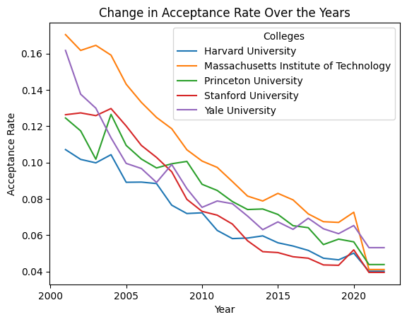
However, the overall drop wasn’t as steep as my experience at Grinnell suggested. In contrast, when we zoom into the acceptance rates of more prestigious universities (Figure 2), a steady decline becomes apparent. This led me to categorize colleges into three groups based on their 2022 admission rates (Top 10% competitive, top 50%, and others) and analyze the trends within these segments.
pres_colleges = ["Princeton University", "Massachusetts Institute of Technology", "Yale University", "Harvard University", "Stanford University"]
pres_df = df[df['INSTNM'].isin(pres_colleges)]
pivot_pres = pres_df.pivot_table(index="INSTNM", columns="year", values="ADM_RATE_ALL")
pivot_pres.T.plot(linestyle='-')
plt.title('Change in Acceptance Rate Over the Years')
plt.xlabel('Year')
plt.ylabel('Acceptance Rate')
plt.legend(title='Colleges')
plt.show()
Figure 2
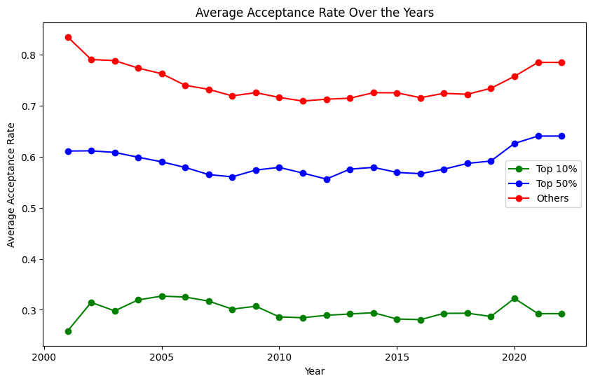
Figure 3 unveils some surprising insights. Except for the least competitive 50%, colleges have generally seen an increase in acceptance rates since 2001. The fluctuations post-2008 across all but the top 10% of colleges could be attributed to economic factors like the recession. Notably, competitive colleges didn’t experience the pandemic-induced spike in acceptance rates seen elsewhere.
plt.figure(figsize=(10, 6)) # Set the figure size plt.plot(avg_acp_top10['year'], avg_acp_top10['ADM_RATE_ALL'], marker='o', linestyle='-', color='g', label='Top 10%') plt.plot(avg_acp_top50['year'], avg_acp_top50['ADM_RATE_ALL'], marker='o', linestyle='-', color='b', label='Top 50%') plt.plot(avg_acp_others['year'], avg_acp_others['ADM_RATE_ALL'], marker='o', linestyle='-', color='r', label='Others') plt.title('Average Acceptance Rate Over the Years') # Set the title plt.xlabel('Year') # Label for the x-axis plt.ylabel('Average Acceptance Rate') # Label for the y-axis
# Show a legend plt.legend() # Display the plot plt.show()
Figure 3
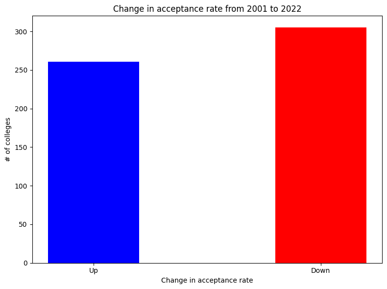
One finding particularly intrigued me: when considering the top 10% of colleges, their acceptance rates hadn’t decreased notably over the years. This led me to question whether the shift in competitiveness was widespread or if it was a case of some colleges becoming significantly harder or easier to get into. The steady decrease in acceptance rates at prestigious institutions (shown in Figure 2) hinted at the latter. To get a clearer picture, I visualized the changes in college competitiveness from 2001 to 2022. Figure 4 reveals a surprising trend: about half of the colleges actually became less competitive, contrary to my initial expectations.
plt.figure(figsize=(8, 6)) plt.bar(categories, values, width=0.4, align='center', color=["blue", "red"]) plt.xlabel('Change in acceptance rate') plt.ylabel('# of colleges') plt.title('Change in acceptance rate from 2001 to 2022')
# Show the chart plt.tight_layout() plt.show()
Figure 4
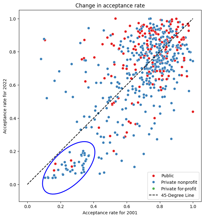
This prompted me to explore possible factors influencing these shifts. My hypothesis, reinforced by Figure 2, was that already selective colleges became even more so over time. Figure 5 compares acceptance rates in 2001 and 2022. The 45-degree line delineates colleges that became more or less competitive. Those below the line saw reduced acceptance rates. A noticeable cluster in the lower-left quadrant represents selective colleges that became increasingly exclusive. This trend is underscored by the observation that colleges with initially low acceptance rates (left side of the plot) tend to fall below this dividing line, while those on the right are more evenly distributed. Furthermore, it’s interesting to note that since 2001, the most selective colleges are predominantly private. To test whether the changes in acceptance rates differed significantly between the top and bottom 50 percentile colleges, I conducted an independent t-test (Null hypothesis: θ_top = θ_bottom). The results showed a statistically significant difference.
import seaborn as sns from matplotlib.patches import Ellipse
plt.figure(figsize=(8, 8)) sns.scatterplot(data=pivot_region, x=2001, y=2022, hue='CONTROL', palette='Set1', legend='full') plt.xlabel('Acceptance rate for 2001') plt.ylabel('Acceptance rate for 2022') plt.title('Change in acceptance rate')
x_line = np.linspace(0, max(pivot_region[2001]), 100) # X-values for the line y_line = x_line # Y-values for the line (slope = 1)
plt.plot(x_line, y_line, label='45-Degree Line', color='black', linestyle='--') # Define ellipse parameters (center, width, height, angle) ellipse_center = (0.25, 0.1) # Center of the ellipse ellipse_width = 0.4 # Width of the ellipse ellipse_height = 0.2 # Height of the ellipse ellipse_angle = 45 # Rotation angle in degrees
# Create an Ellipse patch ellipse = Ellipse( xy=ellipse_center, width=ellipse_width, height=ellipse_height, angle=ellipse_angle, edgecolor='b', # Edge color of the ellipse facecolor='none', # No fill color (transparent) linewidth=2 # Line width of the ellipse border )
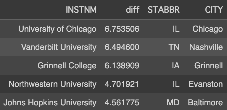
Another aspect that piqued my curiosity was regional differences. Figure 6 lists the top 5 colleges with the most significant decrease in acceptance rates (calculated by dividing the 2022 acceptance rate by the 2001 rate). It was astonishing to see how high the acceptance rate for the University of Chicago was two decades ago — half of the applicants were admitted then! This also helped me understand my initial bias towards a general decrease in acceptance rates; notably, Grinnell College, my alma mater, is among these top 5 with a significant drop in acceptance rate. Interestingly, three of the top five colleges are located in the Midwest. My theory is that with the advent of the internet, these institutions, not as historically renowned as those on the West and East Coasts, have gained more visibility both domestically and internationally.
In the following sections, we’ll explore tuition trends and their correlation with these acceptance rate changes, delving deeper into the dynamics shaping modern U.S. higher education.
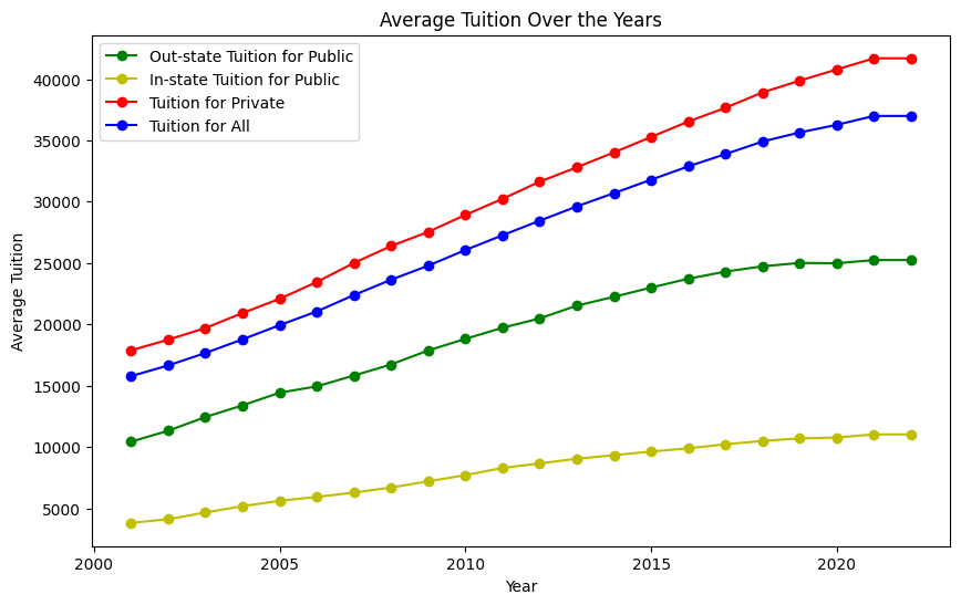
Change in Tuition Over the Years Analyzing tuition trends over the past two decades reveals some eye-opening patterns. Figure 7 presents the average tuition over the years across different categories: private, public in-state, public out-of-state, and overall. A steady climb in tuition fees is evident in all categories. Notably, private universities exhibit a higher increase compared to public ones, and the rise in public in-state tuition appears relatively modest. However, it’s striking that the overall average tuition has more than doubled since 2001, soaring from $15k to $35k.
plt.figure(figsize=(10, 6)) # Set the figure size (optional) plt.plot(avg_tuition_public_out['year'], avg_tuition_public_out['TUITIONFEE_OUT'], marker='o', linestyle='-', color='g', label='Out-state Tuition for Public') plt.plot(avg_tuition_public_in['year'], avg_tuition_public_in['TUITIONFEE_IN'], marker='o', linestyle='-', color='y', label='In-state Tuition for Public') plt.plot(avg_tuition_private['year'], avg_tuition_private['TUITIONFEE_OUT'], marker='o', linestyle='-', color='r', label='Tuition for Private') plt.plot(avg_tuition['year'], avg_tuition['TUITIONFEE_OUT'], marker='o', linestyle='-', color='b', label='Tuition for All')
plt.title('Average Tuition Over the Years') # Set the title plt.xlabel('Year') # Label for the x-axis plt.ylabel('Average Tuition') # Label for the y-axis
# Show a legend plt.legend() # Display the plot plt.show()
Figure 7
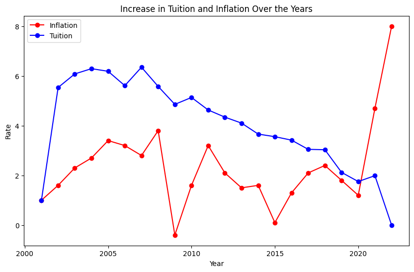
One might argue that this increase is in line with general economic inflation, but a comparison with inflation rates paints a different picture (Figure 8). Except for the last two years, where inflation spiked due to the pandemic, tuition hikes consistently outpaced inflation. Although the pattern of tuition increases mirrors that of inflation, it’s important to note that unlike inflation, which dipped into negative territory in 2009, tuition increases never fell below zero. Though the rate of increase has been slowing, the hope is for it to eventually stabilize and halt the upward trajectory of tuition costs.
plt.figure(figsize=(10, 6)) # Set the figure size plt.plot(df_inflation['year'], df_inflation['Inflation rate'], marker='o', linestyle='-', color='r', label='Inflation') plt.plot(avg_tuition['year'],avg_tuition['Inflation tuition'], marker='o', linestyle='-', color='b', label='Tuition') plt.title('Increase in Tuition and Inflation Over the Years') # Set the title plt.xlabel('Year') # Label for the x-axis plt.ylabel('Rate') # Label for the y-axis
# Show a legend plt.legend() # Display the plot plt.show()
Figure 8
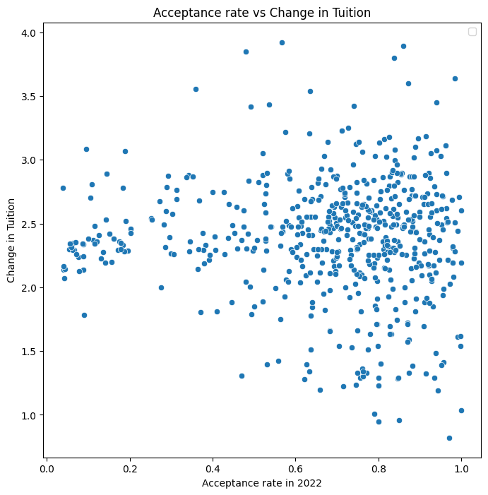
In exploring the characteristics of colleges that have raised tuition fees more significantly, I hypothesized that more selective colleges might exhibit higher increases due to greater demand. Figure 9 investigates this theory. Contrary to expectations, the data does not show a clear trend correlating selectivity with tuition increase. The change in tuition seems to hover around an average of 2.2 times across various acceptance rates. However, it’s noteworthy that tuition at almost all selective universities has more than doubled, whereas the distribution for other universities is more varied. This indicates a lower standard deviation in tuition changes at selective schools compared to their less selective counterparts.
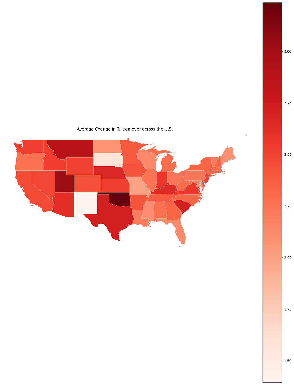
After examining the relationship between acceptance rates and tuition hikes, I turned my attention to regional factors. I hypothesized that schools in the West Coast, influenced by the economic surge of tech companies, might have experienced significant tuition increases. To test this, I visualized the tuition growth for each state in Figure 10. Contrary to my expectations, the West Coast wasn’t the region with the highest rise in tuition. Instead, states like Oklahoma and Utah saw substantial increases, while South Dakota and New Mexico had the smallest hikes. While there are exceptions, the overall trend suggests that tuition increases in the western states generally outpace those in the eastern states.
# Plot the choropleth map fig, ax = plt.subplots(1, 1, figsize=(16, 20)) final.plot(column='TUI_CHANGE', cmap="Reds", ax=ax, linewidth=0.3, edgecolor='0.8', legend=True) ax.set_title('Average Change in Tuition over across the U.S.') plt.axis('off') # Turn off axis plt.legend(fontsize=6) plt.show()
Figure 10
Future Directions and Limitations
While this analysis provides insights based on single-year comparisons for changes in acceptance rates and tuition, a more comprehensive view could be obtained from a 5-year average comparison. In my preliminary analysis using this approach, the conclusions were similar.
The dataset used also contains many other attributes like racial proportions, mean SAT scores, and median household income. However, I didn’t utilize these due to missing values in older data. By focusing on more recent years, these additional factors could offer deeper insights. For those interested in further exploration, the dataset is available on Kaggle.
It’s important to note that this analysis is based on colleges ranked in the U.S. News, introducing a certain degree of bias. The trends observed may differ from the overall U.S. college landscape.
For data enthusiasts, my code and methodology are accessible for further exploration. I invite you to delve into it and perhaps uncover new perspectives or validate these findings. Thank you for joining me on this data-driven journey through the changing landscape of U.S. higher education!
We use cookies on our website to give you the most relevant experience by remembering your preferences and repeat visits. By clicking “Accept”, you consent to the use of ALL the cookies.
This website uses cookies to improve your experience while you navigate through the website. Out of these, the cookies that are categorized as necessary are stored on your browser as they are essential for the working of basic functionalities of the website. We also use third-party cookies that help us analyze and understand how you use this website. These cookies will be stored in your browser only with your consent. You also have the option to opt-out of these cookies. But opting out of some of these cookies may affect your browsing experience.
Necessary cookies are absolutely essential for the website to function properly. These cookies ensure basic functionalities and security features of the website, anonymously.
Cookie
Duration
Description
cookielawinfo-checkbox-analytics
11 months
This cookie is set by GDPR Cookie Consent plugin. The cookie is used to store the user consent for the cookies in the category "Analytics".
cookielawinfo-checkbox-functional
11 months
The cookie is set by GDPR cookie consent to record the user consent for the cookies in the category "Functional".
cookielawinfo-checkbox-necessary
11 months
This cookie is set by GDPR Cookie Consent plugin. The cookies is used to store the user consent for the cookies in the category "Necessary".
cookielawinfo-checkbox-others
11 months
This cookie is set by GDPR Cookie Consent plugin. The cookie is used to store the user consent for the cookies in the category "Other.
cookielawinfo-checkbox-performance
11 months
This cookie is set by GDPR Cookie Consent plugin. The cookie is used to store the user consent for the cookies in the category "Performance".
viewed_cookie_policy
11 months
The cookie is set by the GDPR Cookie Consent plugin and is used to store whether or not user has consented to the use of cookies. It does not store any personal data.
Functional cookies help to perform certain functionalities like sharing the content of the website on social media platforms, collect feedbacks, and other third-party features.
Performance cookies are used to understand and analyze the key performance indexes of the website which helps in delivering a better user experience for the visitors.
Analytical cookies are used to understand how visitors interact with the website. These cookies help provide information on metrics the number of visitors, bounce rate, traffic source, etc.
Advertisement cookies are used to provide visitors with relevant ads and marketing campaigns. These cookies track visitors across websites and collect information to provide customized ads.