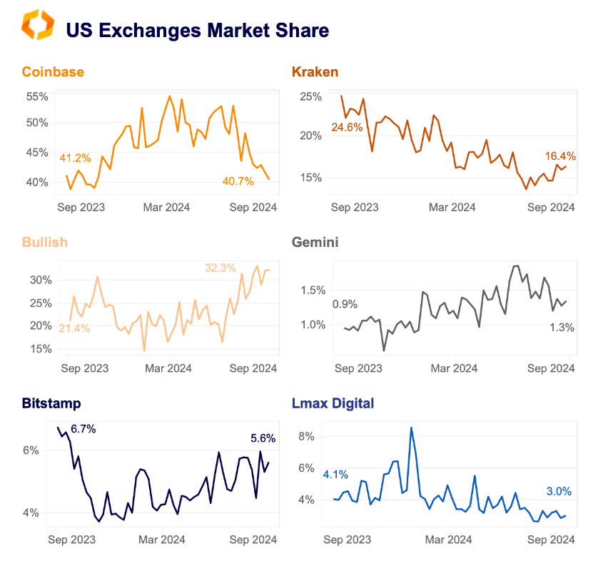
Coinbase has seen a sharp decline in market share as smaller exchanges gained ground recent months, according to a Sept. 9 report by research firm Kaiko. Coinbase dominated more than half of the US crypto market share earlier this year, peaking at almost 55% in March. However, its market share has since fallen to 41% […]
Leading global auditor Grant Thornton has confirmed the security of Liminal’s infrastructure following a comprehensive review conducted in response to WazirX’s July 18 hack. The hack, which targeted WazirX’s systems, prompted Liminal to launch an internal investigation and engage independent auditors to assess potential vulnerabilities within its own platform. The firm reaffirmed that its systems […]
BNB recently dipped below $500, which resulted in a resurgence of buy pressure.
Assessing the potential implications for price in case it maintains momentum.
Bringing order to chaos while simplifying our search for the perfect nanny for our childcare
As a data science leader, I’m used to having a team that can turn chaos into clarity. But when the chaos is your own family’s nanny schedule, even the best-laid plans can go awry. The thought of work meetings, nap times, and unpredictable shifts have our minds running in circles — until I realized I could use the same algorithms that solve business problems to solve a very personal one. Armed with Monte Carlo simulation, genetic algorithms, and a dash of parental ingenuity, I embarked on a journey to tame our wild schedules, one algorithmic tweak at a time. The results? Well, let’s just say our nanny’s new schedule looks like a perfect fit.
Our household schedule looks like the aftermath of a bull in a china shop. Parent 1, with a predictable 9-to-5, was the easy piece of the puzzle. But then came Parent 2, whose shifts in a bustling emergency department at a Chicago hospital were anything but predictable. Some days started with the crack of dawn, while others stretched late into the night, with no rhyme or reason to the pattern. Suddenly, what used to be a straightforward schedule turned into a Rubik’s Cube with no solution in sight.
We imagined ourselves as parents in this chaos. Mornings becoming a mad dash, afternoons always being a guessing game, and evenings — who knows? Our family was headed for a future of playing “who’s on nanny duty?” We needed a decision analytics solution that could adapt as quickly as the ER could throw us a curveball.
That’s when it hit me: what if I could use the same tools I rely on at work to solve this ever-changing puzzle? What if, instead of fighting against the chaos, we could harness it — predict it even? Armed with this idea, it was time to put our nanny’s schedule under the algorithmic microscope.
The Data Science Toolbox: When in Doubt, Simulate
With our household schedule resembling the aftermath of a bull in a china shop, it was clear that we needed more than just a calendar and a prayer. That’s when I turned to Monte Carlo simulation — the data scientist’s version of a crystal ball. The idea was simple: if we can’t predict exactly when chaos will strike, why not simulate all the possible ways it could go wrong?
Monte Carlo simulation is a technique that uses random sampling to model a system’s behavior. In this case, we’re going to use it to randomly generate possible work schedules for Parent 2, allowing us to simulate the unpredictable nature of their shifts over many iterations.
Imagine running thousands of “what-if” scenarios: What if Parent 2 gets called in for an early shift? What if an emergency keeps them late at the hospital? What if, heaven forbid, both parents’ schedules overlap at the worst possible time? The beauty of Monte Carlo is that it doesn’t just give you one answer — it gives you thousands, each one a different glimpse into the future.
This wasn’t just about predicting when Parent 2 might get pulled into a code blue; it was about making sure our nanny was ready for every curveball the ER could throw at us. Whether it was an early morning shift or a late-night emergency, the simulation helped us see all the possibilities, so we could plan for the most likely — and the most disastrous — scenarios. Think of it as chaos insurance, with the added bonus of a little peace of mind.
In the following code block, the simulation generates a work schedule for Parent 2 over a five-day workweek (Monday-Friday). Each day, there’s a probability that Parent 2 is called into work, and if so, a random shift is chosen from a set of predefined shifts based on those probabilities. We’ve also added a feature that accounts for a standing meeting on Wednesdays at 1pm and adjusts Parent 2’s schedule accordingly.
for day in range(num_days): if np.random.rand() < parent_2_work_prob: # Randomly determine if Parent 2 works shift = np.random.choice( list(parent_2_shift_probabilities.keys()), p=[parent_2_shift_probabilities[shift]['probability'] for shift in parent_2_shift_probabilities] ) start_hour = parent_2_shift_probabilities[shift]['start_hour'] # Get start time end_hour = parent_2_shift_probabilities[shift]['end_hour'] # Get end time
# Check if it's Wednesday and adjust schedule to account for a meeting if day == 2: meeting_start = 13 meeting_end = 16 # Adjust schedule if necessary to accommodate the meeting if end_hour <= meeting_start: end_hour = meeting_end elif start_hour >= meeting_end: parent_2_daily_schedule.append({'start_hour': meeting_start, 'end_hour': end_hour}) continue else: if start_hour > meeting_start: start_hour = meeting_start if end_hour < meeting_end: end_hour = meeting_end
parent_2_daily_schedule.append({'start_hour': start_hour, 'end_hour': end_hour}) else: # If Parent 2 isn't working that day, leave the schedule empty or just the meeting if day == 2: parent_2_daily_schedule.append({'start_hour': 14, 'end_hour': 16}) else: parent_2_daily_schedule.append({'start_hour': None, 'end_hour': None})
return parent_2_daily_schedule
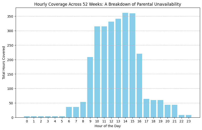
We can use the simulate_parent_2_schedule function to simulate Parent 2’s schedule over a workweek and combine it with Parent 1’s more predictable 9–5 schedule. By repeating this process for 52 weeks, we can simulate a typical year and identify the gaps in parental coverage. This allows us to plan for when the nanny is needed the most. The image below summarizes the parental unavailability across a simulated 52-week period, helping us visualize where additional childcare support is required.
Image Special from Author
Evolving the Perfect Nanny: The Power of Genetic Algorithms
Armed with simulation of all the possible ways our schedule can throw curveballs at us, I knew it was time to bring in some heavy-hitting optimization techniques. Enter genetic algorithms — a natural selection-inspired optimization method that finds the best solution by iteratively evolving a population of candidate solutions.
In this case, each “candidate” was a potential set of nanny characteristics, such as their availability and flexibility. The algorithm evaluates different nanny characteristics, and iteratively improves those characteristics to find the one that fits our family’s needs. The result? A highly optimized nanny with scheduling preferences that balance our parental coverage gaps with the nanny’s availability.
At the heart of this approach is what I like to call the “nanny chromosome.” In genetic algorithm terms, a chromosome is simply a way to represent potential solutions — in our case, different nanny characteristics. Each “nanny chromosome” had a set of features that defined their schedule: the number of days per week the nanny could work, the maximum hours she could cover in a day, and their flexibility to adjust to varying start times. These features were the building blocks of every potential nanny schedule the algorithm would consider.
Defining the Nanny Chromosome
In genetic algorithms, a “chromosome” represents a possible solution, and in this case, it’s a set of features defining a nanny’s schedule. Here’s how we define a nanny’s characteristics:
# Function to generate nanny characteristics
def generate_nanny_characteristics():
    return {
        'flexible': np.random.choice([True, False]),  # Nanny's flexibility
        'days_per_week': np.random.choice([3, 4, 5]),  # Days available per week
        'hours_per_day': np.random.choice([6, 7, 8, 9, 10, 11, 12])  # Hours available per day
    }
Each nanny’s schedule is defined by their flexibility (whether they can adjust start times), the number of days they are available per week, and the maximum hours they can work per day. This gives the algorithm the flexibility to evaluate a wide variety of potential schedules.
Building the Schedule for Each Nanny
Once the nanny’s characteristics are defined, we need to generate a weekly schedule that fits those constraints:
# Function to calculate a weekly schedule based on nanny's characteristics
def calculate_nanny_schedule(characteristics, num_days=5):
    shifts = []
    for _ in range(num_days):
        start_hour = np.random.randint(6, 12) if characteristics['flexible'] else 9  # Flexible nannies have varying start times
        end_hour = start_hour + characteristics['hours_per_day']  # Calculate end hour based on hours per day
        shifts.append((start_hour, end_hour))
    return shifts  # Return the generated weekly schedule
This function builds a nanny’s schedule based on their defined flexibility and working hours. Flexible nannies can start between 6 AM and 12 PM, while others have fixed schedules that start and end at set times. This allows the algorithm to evaluate a range of possible weekly schedules.
Selecting the Best Candidates
Once we’ve generated an initial population of nanny schedules, we use a fitness function to evaluate which ones best meet our childcare needs. The most fit schedules are selected to move on to the next generation:
# Function for selection in genetic algorithm def selection(population, fitness_scores, num_parents): # Normalize fitness scores and select parents based on probability min_fitness = np.min(fitness_scores) if min_fitness < 0: fitness_scores = fitness_scores - min_fitness
# Select parents based on their fitness scores selected_parents = np.random.choice(population, size=num_parents, p=probabilities) return selected_parents
In the selection step, the algorithm evaluates the population of nanny schedules using a fitness function that measures how well the nanny’s availability aligns with the family’s needs. The most fit schedules, those that best cover the required hours, are selected to become “parents” for the next generation.
Adding Mutation to Keep Things Interesting
To avoid getting stuck in suboptimal solutions, we add a bit of randomness through mutation. This allows the algorithm to explore new possibilities by occasionally tweaking the nanny’s schedule:
# Function to mutate nanny characteristics
def mutate_characteristics(characteristics, mutation_rate=0.1):
    if np.random.rand() < mutation_rate:
        characteristics['flexible'] = not characteristics['flexible']
    if np.random.rand() < mutation_rate:
        characteristics['days_per_week'] = np.random.choice([3, 4, 5])
    if np.random.rand() < mutation_rate:
        characteristics['hours_per_day'] = np.random.choice([6, 7, 8, 9, 10, 11, 12])
    return characteristics
By introducing small mutations, the algorithm is able to explore new schedules that might not have been considered otherwise. This diversity is important for avoiding local optima and improving the solution over multiple generations.
Evolving Toward the Perfect Schedule
The final step was evolution. With selection and mutation in place, the genetic algorithm iterates over several generations, evolving better nanny schedules with each round. Here’s how we implement the evolution process:
# Function to evolve nanny characteristics over multiple generations
def evolve_nanny_characteristics(all_childcare_weeks, population_size=1000, num_generations=10):
    population = [generate_nanny_characteristics() for _ in range(population_size)]  # Initialize the population

    for generation in range(num_generations):
        print(f"n--- Generation {generation + 1} ---")

        fitness_scores = []
        hours_worked_collection = []

        for characteristics in population:
            fitness_score, yearly_hours_worked = fitness_function_yearly(characteristics, all_childcare_weeks)
            fitness_scores.append(fitness_score)
            hours_worked_collection.append(yearly_hours_worked)

        fitness_scores = np.array(fitness_scores)

        # Find and store the best individual of this generation
        max_fitness_idx = np.argmax(fitness_scores)
        best_nanny = population[max_fitness_idx]
        best_nanny['actual_hours_worked'] = hours_worked_collection[max_fitness_idx]

        # Select parents and generate a new population
        parents = selection(population, fitness_scores, num_parents=population_size // 2)
        new_population = []
        for i in range(0, len(parents), 2):
            parent_1, parent_2 = parents[i], parents[i + 1]
            child = {
                'flexible': np.random.choice([parent_1['flexible'], parent_2['flexible']]),
                'days_per_week': np.random.choice([parent_1['days_per_week'], parent_2['days_per_week']]),
                'hours_per_day': np.random.choice([parent_1['hours_per_day'], parent_2['hours_per_day']])
            }
            child = mutate_characteristics(child)
            new_population.append(child)

        population = new_population  # Replace the population with the new generation

    return best_nanny  # Return the best nanny after all generations
Here, the algorithm evolves over multiple generations, selecting the best nanny schedules based on their fitness scores and allowing new solutions to emerge through mutation. After several generations, the algorithm converges on the best possible nanny schedule, optimizing coverage for our family.
Final Thoughts
With this approach, we applied genetic algorithms to iteratively improve nanny schedules, ensuring that the selected schedule could handle the chaos of Parent 2’s unpredictable work shifts while balancing our family’s needs. Genetic algorithms may have been overkill for the task, but they allowed us to explore various possibilities and optimize the solution over time.
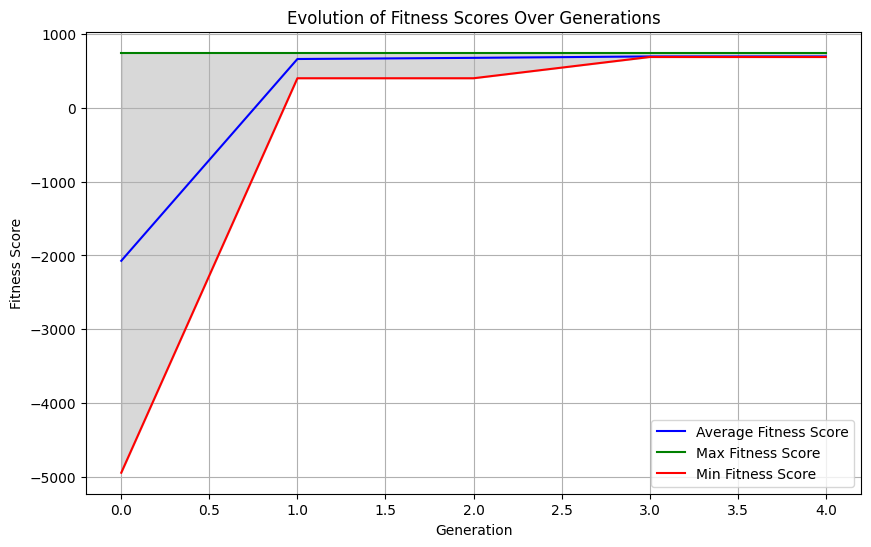
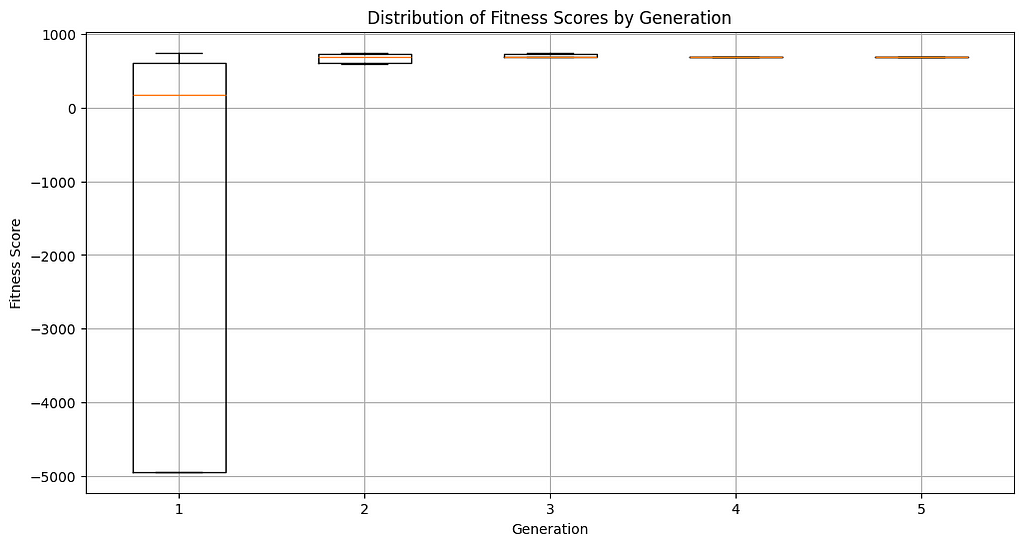
The images below describe the evolution of nanny fitness scores over time. The algorithm was able to quickly converge on the best nanny chromosome after just a few generations.
Image Special from AuthorImage Special from Author
From Chaos to Clarity: Visualizing the Solution
After the algorithm had done its work and optimized the nanny characteristics we were looking for, the next step was making sense of the results. This is where visualization came into play, and I have to say, it was a game-changer. Before we had charts and graphs, our schedule felt like a tangled web of conflicting commitments, unpredictable shifts, and last-minute changes. But once we turned the data into something visual, everything started to fall into place.
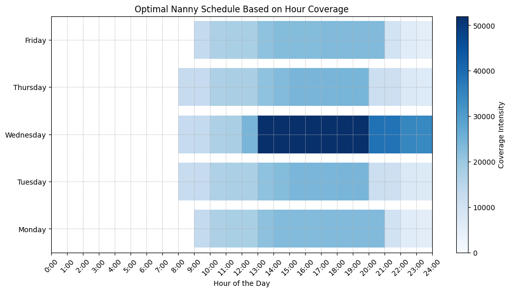
The Heatmap: Coverage at a Glance
The heatmap provided a beautiful splash of color that turned the abstract into something tangible. The darker the color, the more nanny coverage there was, and the lighter the color, the less nanny coverage we needed. This made it easy to spot any potential issues at a glance. Need more coverage on Friday? Check the heatmap. Will the nanny be working too many hours on Wednesday? (Yes, that’s very likely.) The heatmap will let you know. It gave us instant clarity, helping us tweak the schedule where needed and giving us peace of mind when everything lined up perfectly.
Image Special from Author
By visualizing the results, we didn’t just solve the scheduling puzzle — we made it easy to understand and follow. Instead of scrambling to figure out what kind of nanny we needed, we could just look at the visuals and see what they needed to cover. From chaos to clarity, these visual tools turned data into insight and helped us shop for nannies with ease.
The Impact: A Household in Harmony
Before I applied my data science toolkit to our family’s scheduling problem, it felt a little overwhelming. We started interviewing nannies without really understanding what we were looking for, or needed, to keep our house in order.
But after optimizing the nanny schedule with Monte Carlo simulations and genetic algorithms, the difference was night and day. Where there was once chaos, now there’s understanding. Suddenly, we had a clear plan, a map of who was where and when, and most importantly, a roadmap for the kind of nanny to find.
The biggest change wasn’t just in the schedule itself, though — it was in how we felt. There’s a certain peace of mind that comes with knowing you have a plan that works, one that can flex and adapt when the unexpected happens. And for me personally, this project was more than just another application of data science. It was a chance to take the skills I use every day in my professional life and apply them to something that directly impacts my family.
The Power of Data Science at Home
We tend to think of data science as something reserved for the workplace, something that helps businesses optimize processes or make smarter decisions. But as I learned with our nanny scheduling project, the power of data science doesn’t have to stop at the office door. It’s a toolkit that can solve everyday challenges, streamline chaotic situations, and, yes, even bring a little more calm to family life.
Maybe your “nanny puzzle” isn’t about childcare. Maybe it’s finding the most efficient grocery list, managing home finances, or planning your family’s vacation itinerary. Whatever the case may be, the tools we use at work — Monte Carlo simulations, genetic algorithms, and data-driven optimization — can work wonders at home too. You don’t need a complex problem to start, just a curiosity to see how data can help untangle even the most mundane challenges.
So here’s my challenge to you: Take a look around your life and find one area where data could make a difference. Maybe you’ll stumble upon a way to save time, money, or even just a little peace of mind. It might start with something as simple as a spreadsheet, but who knows where it could lead? Maybe you’ll end up building your own “Nanny Olympics” or solving a scheduling nightmare of your own.
And as we move forward, I think we’ll see data science becoming a more integral part of our personal lives — not just as something we use for work, but as a tool to manage our day-to-day challenges. In the end, it’s all about using the power of data to make our lives a little easier.
How to use Semantic Similarity to improve tag filtering
***To understand this article, the knowledge of both Jaccard similarity and vector search is required. The implementation of this algorithm has been released on GitHub and is fully open-source.
Over the years, we have discovered how to retrieve information from different modalities, such as numbers, raw text, images, and also tags. With the growing popularity of customized UIs, tag search systems have become a convenient way of easily filtering information with a good degree of accuracy. Some cases where tag search is commonly employed are the retrieval of social media posts, articles, games, movies, and even resumes.
However, traditional tag search lacks flexibility. If we are to filter the samples that contain exactly the given tags, there might be cases when, especially for databases containing only a few thousand samples, there might not be any (or only a few) matching samples for our query.
difference of the two searches in front of a scarcity of results, Image by author
***Through the following article I am trying to introduce several new algorithms that, to the extent of my knowledge, I have been unable to find. I am open to criticism and welcome any feedback.
How does traditional tag search work?
Traditional systems employ an algorithm called Jaccard similarity (commonly executed through the minhash algo), which is able to compute the similarity between two sets of elements (in our case, those elements are tags). As previously clarified, the search is not flexible at all (sets either contain or do not contain the queried tags).
example of a simple AND bitwise operation (this is not Jaccard similarity, but can give you an approximate idea of the filtering method), Image by author
Can we do better?
What if, instead, rather than just filtering a sample from matching tags, we could take into account all the other labels in the sample that are not identical, but are similar to our chosen tags? We could be making the algorithm more flexible, expanding the results to non-perfect matches, but still good matches. We would be applying semantic similarity directly totags, rather than text.
Introducing Semantic Tag Search
As briefly explained, this new approach attempts to combine the capabilities of semantic search with tag filtering systems. For this algorithm to be built, we need only one thing:
A database of tagged samples
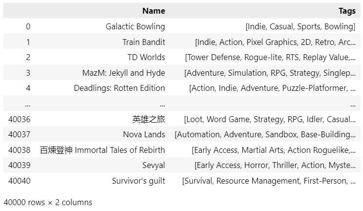
The reference data I will be using is the open-source collection of the Steam game library (downloadable from Kaggle — MIT License) — approx. 40,000 samples, which is a good amount of samples to test our algorithm. As we can see from the displayed dataframe, each game has several assigned tags, with over 400 unique tags in our database.
Screenshot of the Steam dataframe available in the example notebook, Image by author
Now that we have our starting data, we can proceed: the algorithm will be articulated in the following steps:
Extracting tags relationships
Encoding queries and samples
Perform the semantic tag search using vector retrieval
The first question that comes to mind is how can we find the relationships between our tags. Note that there are several algorithms used to obtain the same result:
Using statistical methods The simplest employable method we can use to extract tag relationships is called co-occurrence matrix, which is the format that (for both its effectiveness and simplicity) I will employ in this article.
Using Deep Learning The most advanced ones are all based on Embeddings neural networks (such as Word2Vec in the past, now it is common to use transformers, such as LLMs) that can extract the semantic relationships between samples. Creating a neural network to extract tag relationships (in the form of an autoencoder) is a possibility, and it is usually advisable when facing certain circumstances.
Using a pre-trained model Because tags are defined using human language, it is possible to employ existing pre-trained models to compute already existing similarities. This will likely be much faster and less troubling. However, each dataset has its uniqueness. Using a pre-trained model will ignore the customer behavior. Ex. We will later see how 2D has a strong relationship with Fantasy: such a pair will never be discovered using pre-trained models.
The choice of the algorithm may depend on many factors, especially when we have to work with a huge data pool or we have scalability concerns (ex. # tags will equal our vector length: if we have too many tags, we need to use Machine Learning to stem this problem.
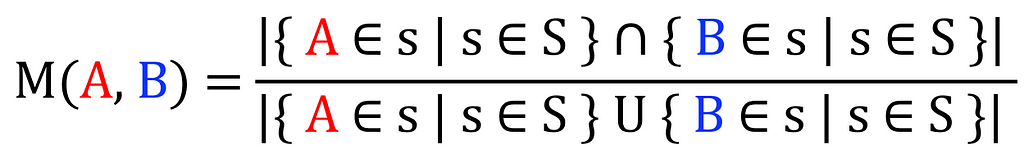
a. Build co-occurence matrix using Michelangiolo similarity
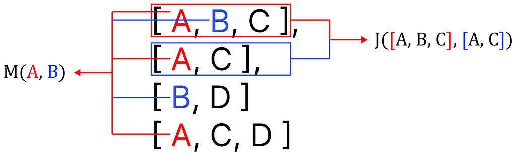
As mentioned, I will be using the co-occurrence matrix as a means to extract these relationships. My goal is to find the relationship between every pair of tags, and I will be doing so by applying the following count across the entire collection of samples using IoU (Intersection over Union) over the set of all samples (S):
formula to compute the similarity between a pair of tags, Image by author
This algorithm is very similar to Jaccard similarity. While it operates on samples, the one I introduce operates on elements, but since (as of my knowledge) this specific application has not been codified, yet, we can name it Michelangiolo similarity. (To be fair, the use of this algorithm has been previously mentioned in a StackOverflow question, yet, never codified).
difference between Jaccard similarity and Michelangiolo similarity, Image by author
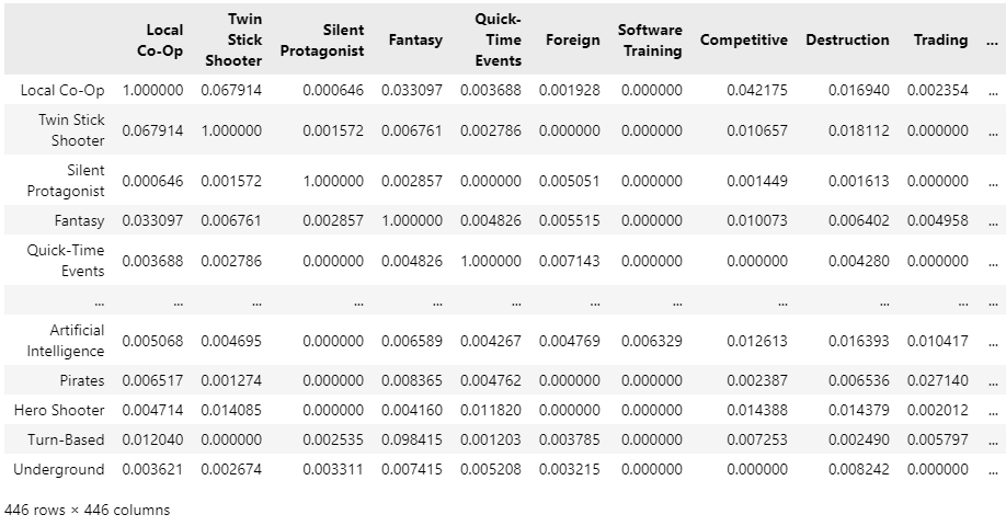
For 40,000 samples, it takes about an hour to extract the similarity matrix, this will be the result:
co-occurrence matrix of all unique tags in our sample list S, Image by author
Let us make a manual check of the top 10 samples for some very common tags, to see if the result makes sense:
sample relationships extracted from the co-occurrence matrix, Image by author
The result looks very promising! We started from plain categorical data (only convertible to 0 and 1), but we have extracted the semantic relationship between tags (without even using a neural network).
b. Use a pre-trained neural network
Equally, we can extract existing relationships between our samples using a pre-trained encoder. This solution, however, ignores the relationships that can only be extracted from our data, only focusing on existing semantic relationships of the human language. This may not be a well-suited solution to work on top of retail-based data.
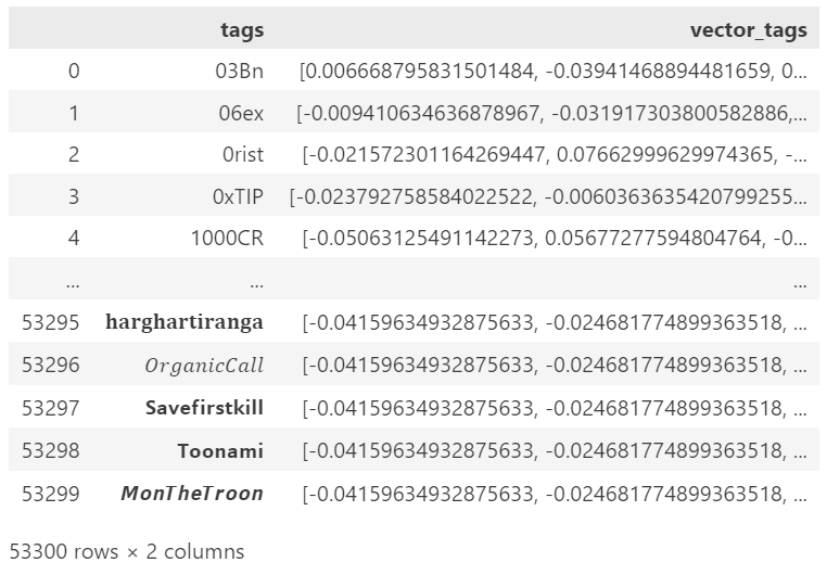
On the other hand, by using a neural network we would not need to build a relationship matrix: hence, this is a proper solution for scalability. For example, if we had to analyze a large batch of Twitter data, we reach 53.300 tags. Computing a co-occurrence matrix from this number of tags will result in a sparse matrix of size 2,500,000,000 (quite a non-practical feat). Instead, by using a standard encoder that outputs a vector length of 384, the resulting matrix will have a total size of 19,200,200.
snapshot of an encoded set of tags usin a pre-trained encoder
2. Encoding queries and samples
Our goal is to build a search engine capable of supporting the semantic tag search: with the format we have been building, the only technology capable of supporting such an enterprise is vector search. Hence, we need to find a proper encoding algorithm to convert both our samples and queries into vectors.
In most encoding algorithms, we encode both queries and samples using the same algorithm. However, each sample contains more than one tag, each represented by a different set of relationships that we need to capture in a single vector.
Covariate Encoding, Image by author
In addition, we need to address the aforementioned problem of scalability, and we will do so by using a PCA module (when we use a co-occurrence matrix, instead, we can skip the PCA because there is no need to compress our vectors).
When the number of tags becomes too large, we need to abandon the possibility of computing a co-occurrence matrix, because it scales at a squared rate. Therefore, we can extract the vector of each existing tag using a pre-trained neural network (the first step in the PCA module). For example, all-MiniLM-L6-v2 converts each tag into a vector of length 384.
We can then transpose the obtained matrix, and compress it: we will initially encode our queries/samples using 1 and 0 for the available tag indexes, resulting in an initial vector of the same length as our initial matrix (53,300). At this point, we can use our pre-computed PCA instance to compress the same sparse vector in 384 dims.
Encoding samples
In the case of our samples, the process ends just right after the PCA compression (when activated).
Encoding queries: Covariate Encoding
Our query, however, needs to be encoded differently: we need to take into account the relationships associated with each existing tag. This process is executed by first summing our compressed vector to the compressed matrix (the total of all existing relationships). Now that we have obtained a matrix (384×384), we will need to average it, obtaining our query vector.
Because we will make use of Euclidean search, it will first prioritize the search for features with the highest score (ideally, the one we activated using the number 1), but it will also consider the additional minor scores.
Weighted search
Because we are averaging vectors together, we can even apply a weight to this calculation, and the vectors will be impacted differently from the query tags.
3. Perform the semantic tag search using vector retrieval
The question you might be asking is: why did we undergo this complex encoding process, rather than just inputting the pair of tags into a function and obtaining a score — f(query, sample)?
If you are familiar with vector-based search engines, you will already know the answer. By performing calculations by pairs, in the case of just 40,000 samples the computing power required is huge (can take up to 10 seconds for a single query): it is not a scalable practice. However, if we choose to perform a vector retrieval of 40,000 samples, the search will finish in 0.1 seconds: it is a highly scalable practice, which in our case is perfect.
4. Validate
For an algorithm to be effective, needs to be validated. For now, we lack a proper mathematical validation (at first sight, averaging similarity scores from M already shows very promising results, but further research is needed for an objective metric backed up by proof).
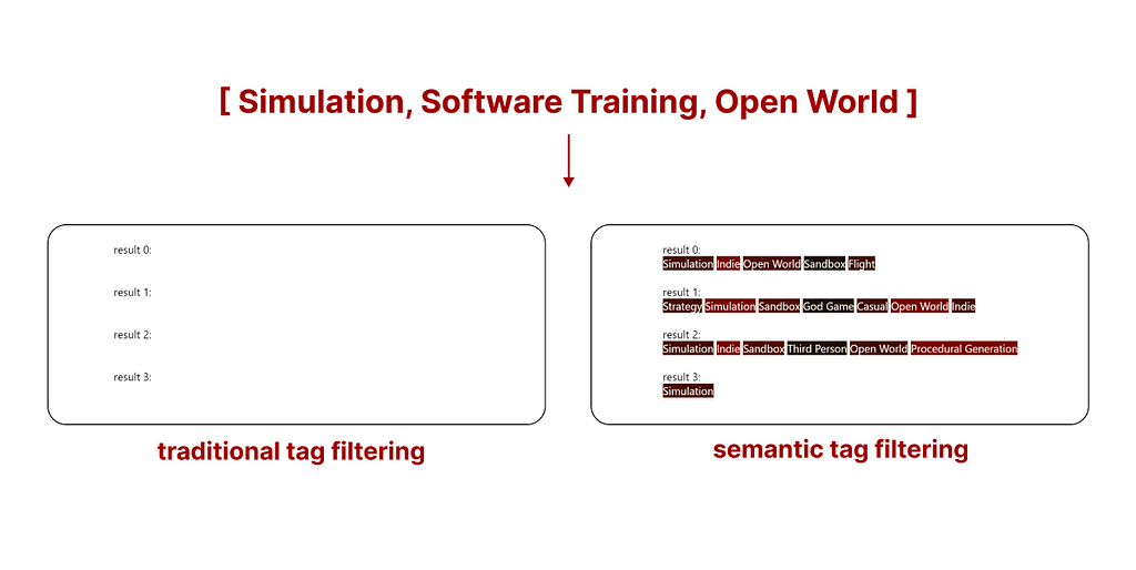
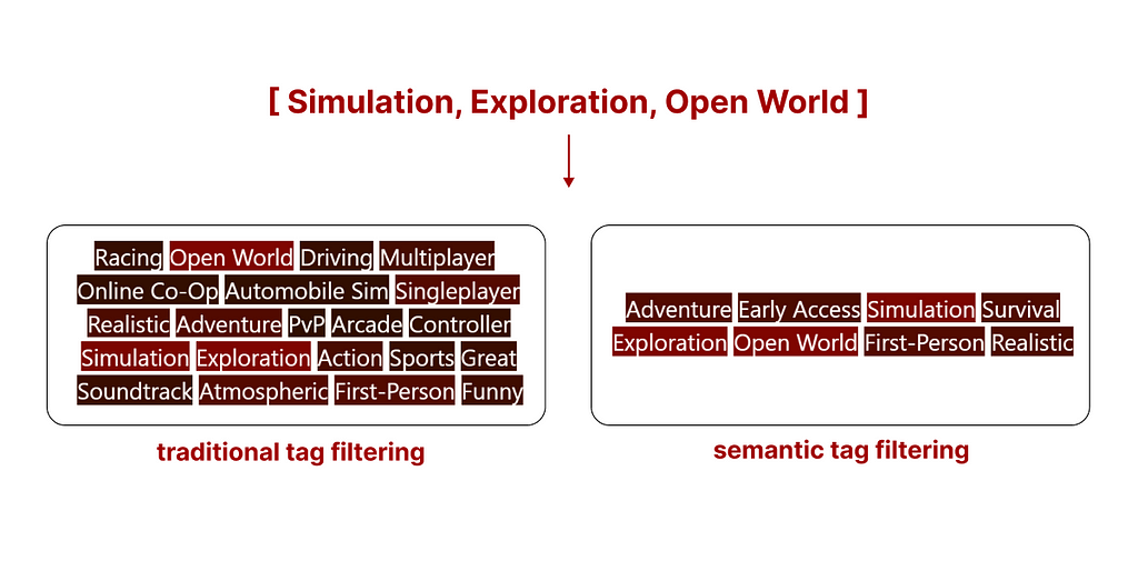
However, existing results are quite intuitive when visualized using a comparative example. The following is the top search result (what you are seeing are the tags assigned to this game) of both search methods.
comparison between traditional tag search and semantic tag search, Image by author
Traditional tag search We can see how traditional search might (without additional rules, samples are filtered based on the availability of all tags, and not sorted) return a sample with a higher number of tags, but many of them may not be relevant.
Semantic tag search Semantic tag search sorts all samples based on the relevance of all tags, in simple terms, it disqualifies samples containing irrelevant tags.
The real advantage of this new system is that when traditional search does not return enough samples, we can select as many as we want using semantic tag search.
difference of the two searches in front of a scarcity of results, Image by author
In the example above, using traditional tag filtering does not return any game from the Steam library. However, by using semantic tag filtering we still get results that are not perfect, but the best ones matching our query. The ones you are seeing are the tags of the top 5 games matching our search.
Conclusion
Before now, it was not possible to filter tags also taking into account their semantic relationships without resorting to complex methods, such as clustering, deep learning, or multiple knn searches.
The degree of flexibility offered by this algorithm should allow the detachment from traditional manual labeling methods, which force the user to choose between a pre-defined set of tags, and open the possibility of using LLMs of VLMs to freely assign tags to a text or an image without being confined to a pre-existing structure, opening up new options for scalable and improved search methods.
It is with my best wishes that I open this algorithm to the world, and I hope it will be utilized to its full potential.
An introduction to a methodology for creating production-ready, extensible & highly optimized AI workflows
Credit: Google Gemini, prompt by the Author
Intro
In the last decade, I carried with me a deep question in the back of my mind in every project I’ve worked on:
How (the hell) am I supposed to structure and develop my AI & ML projects?
I wanted to know — is there an elegant way to build production-ready code in an iterative way? A codebase that is extensible, optimized, maintainable & reproducible?
And if so — where does this secret lie? Who owns the knowledge to this dark art?
I searched intensively for an answer over the course of many years — reading articles, watching tutorials and trying out different methodologies and frameworks. But I couldn’t find a satisfying answer. Every time I thought I was getting close to a solution, something was still missing.
After about 10 years of trial and error, with a focused effort in the last two years, I think I’ve finally found a satisfying answer to my long-standing quest. This post is the beginning of my journey of sharing what I’ve found.
My research has led me to identify 5 key pillars that form the foundation of what I call a hyper-optimized AI workflow. In the post I will shortly introduce each of them — giving you an overview of what’s to come.
I want to emphasize that each of the pillars that I will present is grounded in practical methods and tools, which I’ll elaborate on in future posts. If you’re already curious to see them in action, feel free to check out this video from Hamilton’s meetup where I present them live:
Note: Throughout this post and series, I’ll use the terms Artificial Intelligence (AI), Machine Learning (ML), and Data Science (DS) interchangeably. The concepts we’ll discuss apply equally to all these fields.
Now, let’s explore each pillar.
1 — Metric-Based Optimization
In every AI project there is a certain goal we want to achieve, and ideally — a set of metrics we want to optimize.
Cost metrics: Actual $ amount, FLOPS, Size in MB, etc…
Performance metrics: Training speed, inference speed, etc…
We can choose one metric as our “north star” or create an aggregate metric. For example:
0.7 × F1-Score + 0.3 × (1 / Inference Time in ms)
0.6 × AUC-ROC + 0.2 × (1 / Training Time in hours) + 0.2 × (1 / Cloud Compute Cost in $)
There’s a wonderful short video by Andrew Ng. where here explains about the topic of a Single Number Evaluation Metric.
Once we have an agreed-upon metric to optimize and a set of constraints to meet, our goal is to build a workflow that maximizes this metric while satisfying our constraints.
2 — Interactive Developer Experience
In the world of Data Science and AI development — interactivity is key.
As AI Engineers (or whatever title we Data Scientists go by these days), we need to build code that works bug-free across different scenarios.
Unlike traditional software engineering, our role extends beyond writing code that “just” works. A significant aspect of our work involves examining the data and inspecting our models’ outputs and the results of various processing steps.
The most common environment for this kind of interactive exploration is Jupyter Notebooks.
Working within a notebook allows us to test different implementations, experiment with new APIs and inspect the intermediate results of our workflows and make decisions based on our observations. This is the core of the second pillar.
However, As much as we enjoy these benefits in our day-to-day work, notebooks can sometimes contain notoriously bad code that can only be executed in a non-trivial order.
In addition, some exploratory parts of the notebook might not be relevant for production settings, making it unclear how these can effectively be shipped to production.
3 — Production-Ready Code
“Production-Ready” can mean different things in different contexts. For one organization, it might mean serving results within a specified time frame. For another, it could refer to the service’s uptime (SLA). And yet for another, it might mean the code, model, or workflow has undergone sufficient testing to ensure reliability.
These are all important aspects of shipping reliable products, and the specific requirements may vary from place to place. Since my exploration is focused on the “meta” aspect of building AI workflows, I want to discuss a common denominator across these definitions: wrapping our workflow as a serviceable API and deploying it to an environment where it can be queried by external applications or users.
This means we need to have a way to abstract the complexity of our codebase into a clearly defined interface that can be used across various use-cases. Let’s consider an example:
Imagine a complex RAG (Retrieval-Augmented Generation) system over PDF files that we’ve developed. It may contain 10 different parts, each consisting of hundreds of lines of code.
However, we can still wrap them into a simple API with just two main functions:
Upload a PDF document and receive a unique identifier.
Ask questions about the document using natural language.
Specify the desired format for the response (e.g., markdown, JSON, Pandas Dataframe).
By providing this clean interface, we’ve effectively hidden the complexities and implementation details of our workflow.
Having a systematic way to convert arbitrarily complex workflows into deployable APIs is our third pillar.
In addition, we would ideally want to establish a methodology that ensures that our iterative, daily work stays in sync with our production code.
This means if we make a change to our workflow — fixing a bug, adding a new implementation, or even tweaking a configuration — we should be able to deploy these changes to our production environment with just a click of a button.
4 — Modular & Extensible Code
Another crucial aspect of our methodology is maintaining a Modular & Extensible codebase.
This means that we can add new implementations and test them against existing ones that occupy the same logical step without modifying our existing code or overwriting other configurations.
This approach aligns with the open-closed principle, where our code is open for extension but closed for modification. It allows us to:
Introduce new implementations alongside existing ones
Easily compare the performance of different approaches
Maintain the integrity of our current working solutions
Extend our workflow’s capabilities without risking the stability of the whole system
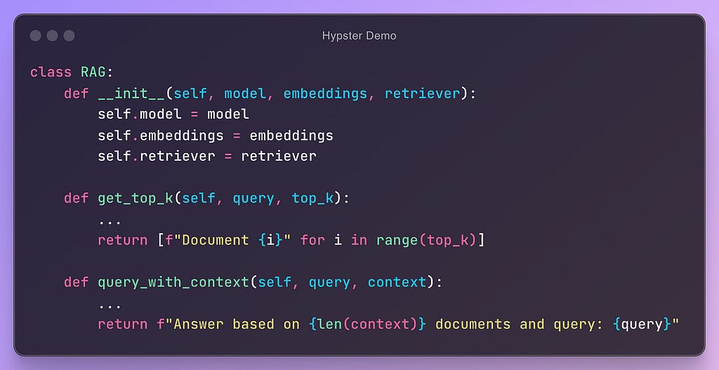
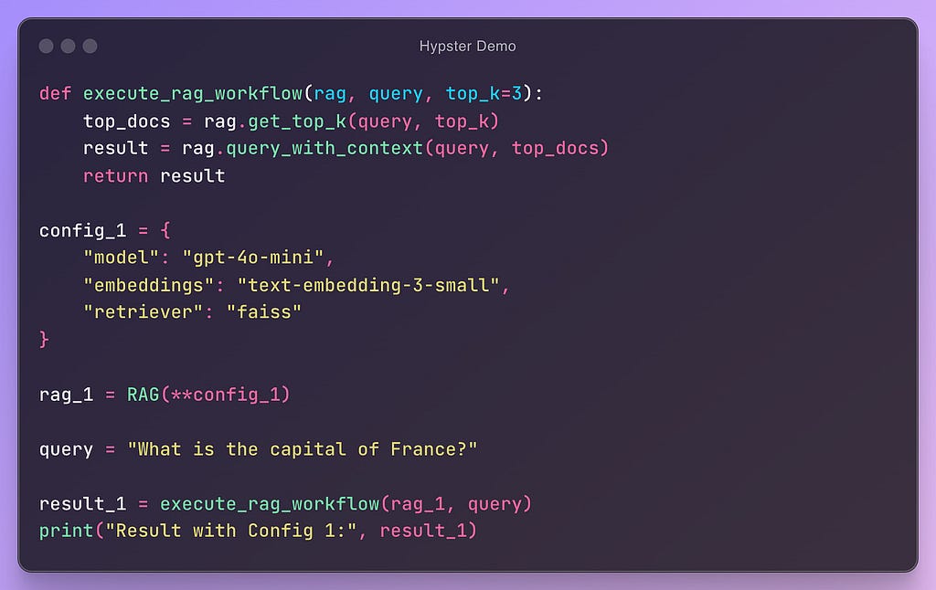
Let’s look at a toy example:
Image by the AuthorImage by the Author
In this example, we can see a (pseudo) code that is modular and configurable. In this way, we can easily add new configurations and test their performance:
Image by the Author
Once our code consists of multiple competing implementations & configurations, we enter a state that I like to call a “superposition of workflows”. In this state we can instantiate and execute a workflow using a specific set of configurations.
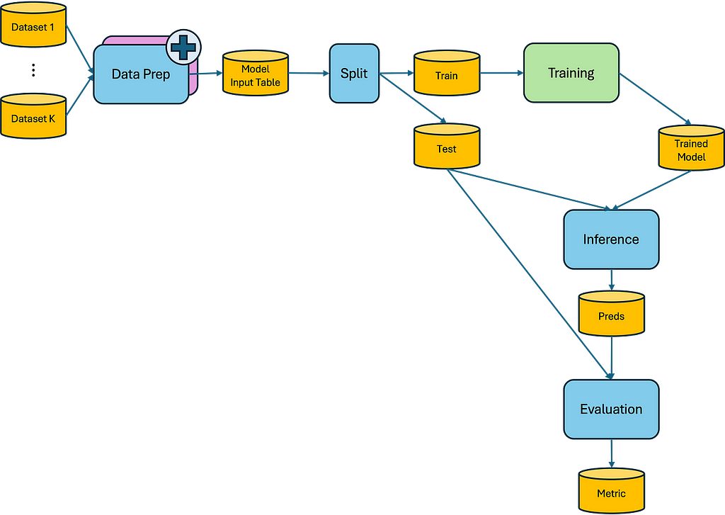
5 — Hierarchical & Visual Structures
What if we take modularity and extensibility a step further? What if we apply this approach to entire sections of our workflow?
So now, instead of configuring this LLM or that retriever, we can configure our whole preprocessing, training, or evaluation steps.
Let’s look at an example:
Image by the Author
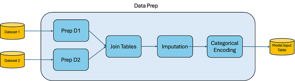
Here we see our entire ML workflow. Now, let’s add a new Data Prep implementation and zoom into it:
Image by the Author
When we work in this hierarchical and visual way, we can select a section of our workflow to improve and add a new implementation with the same input/output interface as the existing one.
We can then “zoom in” to that specific section, focusing solely on it without worrying about the rest of the project. Once we’re satisfied with our implementation — we can start testing it out alongside other various configurations in our workflow.
This approach unlocks several benefits:
Reduced mental overload: Focus on one section at a time, providing clarity and reducing complexity in decision-making.
Easier collaboration: A modular structure simplifies task delegation to teammates or AI assistants, with clear interfaces for each component.
Reusability: These encapsulated implementations can be utilized in different projects, potentially without modification to their source code.
Self-documentation: Visualizing entire workflows and their components makes it easier to understand the project’s structure and logic without diving into unnecessary details.
Summary
These are the 5 pillars that I’ve found to hold the foundation to a “hyper-optimized AI workflow”:
Metric-Based Optimization: Define and optimize clear, project-specific metrics to guide decision-making and workflow improvements.
Interactive Developer Experience: Utilize tools for iterative coding & data inspection like Jupyter Notebooks.
Production-Ready Code: Wrap complete workflows into deployable APIs and sync development and production code.
Modular & Extensible Code: Structure code to easily add, swap, and test different implementations.
Hierarchical & Visual Structures: Organize projects into visual, hierarchical components that can be independently developed and easily understood at various levels of abstraction.
In the upcoming blog posts, I’ll dive deeper into each of these pillars, providing more detailed insights, practical examples, and tools to help you implement these concepts in your own AI projects.
Specifically, I intend to introduce the methodology and tools I’ve built on top of DAGWorks Inc* Hamilton framework and my own packages: Hypster and HyperNodes (still in its early days).
Stay tuned for more!
*I am not affiliated with or employed by DAGWorks Inc.
Evaluating how semi-supervised learning can leverage unlabeled data
Image by the author — created with Image Creator in Bing
One of the most common challenges Data Scientists faces is the lack of enough labelled data to train a reliable and accurate model. Labelled data is essential for supervised learning tasks, such as classification or regression. However, obtaining labelled data can be costly, time-consuming, or impractical in many domains. On the other hand, unlabeled data is usually easy to collect, but they do not provide any direct input to train a model.
How can we make use of unlabeled data to improve our supervised learning models? This is where semi-supervised learning comes into play. Semi-supervised learning is a branch of machine learning that combines labelled and unlabeled data to train a model that can perform better than using labelled data alone. The intuition behind semi-supervised learning is that unlabeled data can provide useful information about the underlying structure, distribution, and diversity of the data, which can help the model generalize better to new and unseen examples.
In this post, I present three semi-supervised learning methods that can be applied to different types of data and tasks. I will also evaluate their performance on a real-world dataset and compare them with the baseline of using only labelled data.
What is semi-supervised learning?
Semi-supervised learning is a type of machine learning that uses both labelled and unlabeled data to train a model. Labelled data are examples that have a known output or target variable, such as the class label in a classification task or the numerical value in a regression task. Unlabeled data are examples that do not have a known output or target variable. Semi-supervised learning can leverage the large amount of unlabeled data that is often available in real-world problems, while also making use of the smaller amount of labelled data that is usually more expensive or time-consuming to obtain.
The underlying idea to use unlabeled data to train a supervised learning method is to label this data via supervised or unsupervised learning methods. Although these labels are most likely not as accurate as actual labels, having a significant amount of this data can improve the performance of a supervised-learning method compared to training this method on labelled data only.
The scikit-learn package provides three semi-supervised learning methods:
Self-training: a classifier is first trained on labelled data only to predict labels of unlabeled data. In the next iteration, another classifier is training on the labelled data and on prediction from the unlabeled data which had high confidence. This procedure is repeated until no new labels with high confidence are predicted or a maximum number of iterations is reached.
Label-propagation: a graph is created where nodes represent data points and edges represent similarities between them. Labels are iteratively propagated through the graph, allowing the algorithm to assign labels to unlabeled data points based on their connections to labelled data.
Label-spreading: uses the same concept as label-propagation. The difference is that label spreading uses a soft assignment, where the labels are updated iteratively based on the similarity between data points. This method may also “overwrite” labels of the labelled dataset.
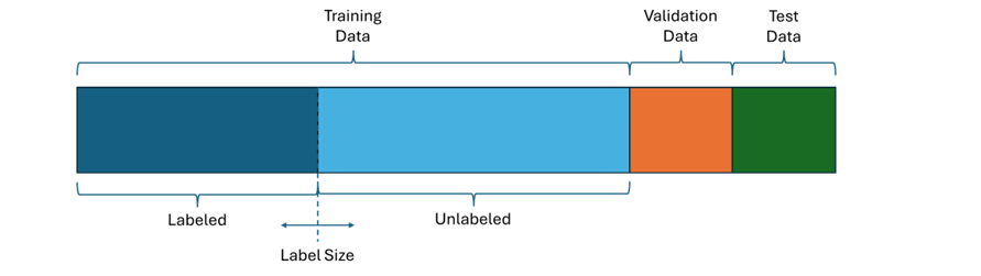
To evaluate these methods I used a diabetes prediction dataset which contains features of patient data like age and BMI together with a label describing if the patient has diabetes. This dataset contains 100,000 records which I randomly divided into 80,000 training, 10,000 validation and 10,000 test data. To analyze how effective the learning methods are with respect to the amount of labelled data, I split the training data into a labelled and an unlabeled set, where the label size describes how many samples are labelled.
Partition of dataset (image by the author)
I used the validation data to assess different parameter settings and used the test data to evaluate the performance of each method after parameter tuning.
I used XG Boost for prediction and F1 score to evaluate the prediction performance.
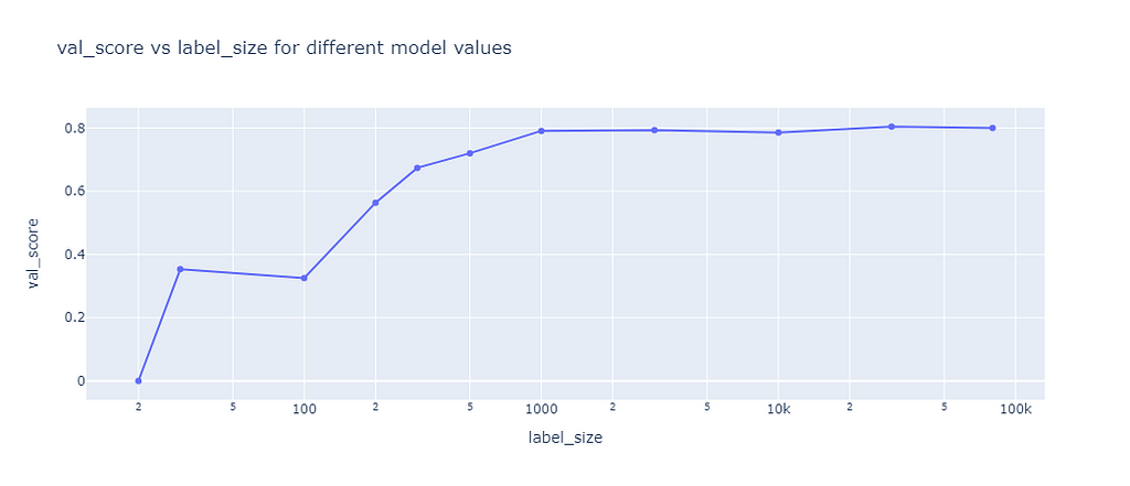
Baseline
The baseline was used to compare the self-learning algorithms against the case of not using any unlabeled data. Therefore, I trained XGB on labelled data sets of different size and calculate the F1 score on the validation data set:
Baseline score (image by the author)
The results showed that the F1 score is quite low for training sets of less than 100 samples, then steadily improves to a score of 79% until a sample size of 1,000 is reached. Higher sample sizes hardly improved the F1 score.
Self-learning
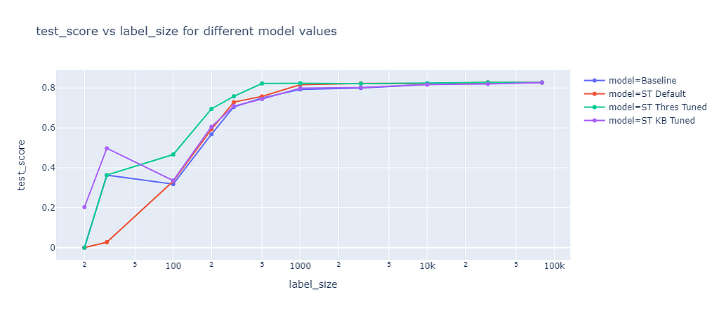
Self-training is using multiple iteration to predict labels of unlabeled data which will then be used in the next iteration to train another model. Two methods can be used to select predictions to be used as labelled data in the next iteration:
Threshold (default): all predictions with a confidence above a threshold are selected
K best: the predictions of the k highest confidence are selected
I evaluated the default parameters (ST Default) and tuned the threshold (ST Thres Tuned) and the k best (ST KB Tuned) parameter based on the validation dataset. The prediction results of these model were evaluated on the test dataset:
Self-learning score (image by the author)
For small sample sizes (<100) the default parameters (red line) performed worse than the baseline (blue line). For higher sample sizes slightly better F1 scores than the baseline were achieved. Tuning the threshold (green line) brought a significant improvement, for example at a label size of 200 the baseline F1 score was 57% while the algorithm with tuned thresholds achieved 70%. With one exception at a label size of 30, tuning the K best value (purple line) resulted in almost the same performance as the baseline.
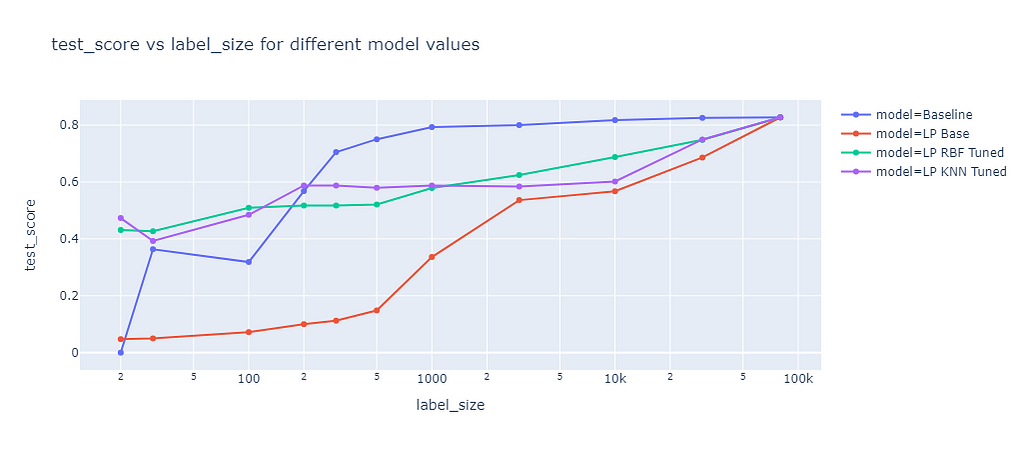
Label Propagation
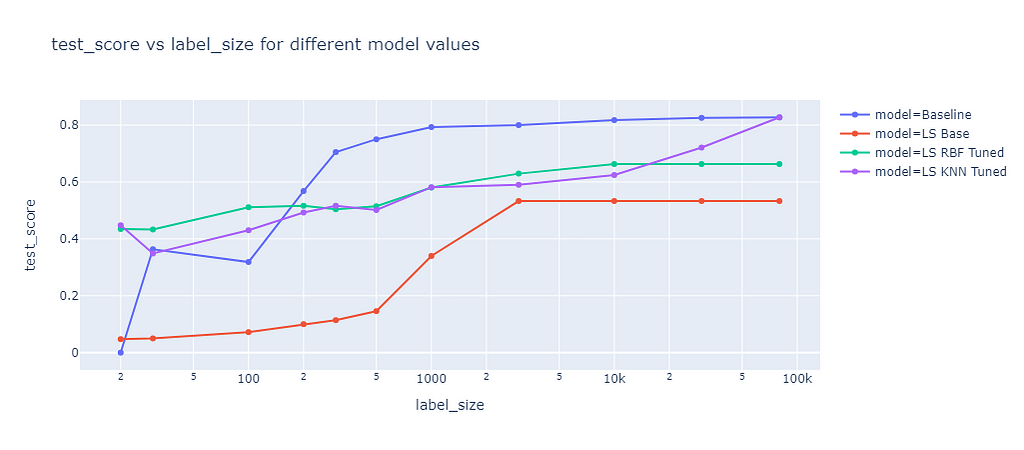
Label propagation has two built-in kernel methods: RBF and KNN. The RBF kernel produces a fully connected graph using a dense matrix, which is memory intensive and time consuming for large datasets. To consider memory constraints, I only used a maximum training size of 3,000 for the RBF kernel. The KNN kernel uses a more memory friendly sparse matrix, which allowed me to fit on the whole training data of up to 80,000 samples. The results of these two kernel methods are compared in the following graph:
Label propagation score (image by the author)
The graph shows the F1 score on the test dataset of different label propagation methods as a function of the label size. The blue line represents the baseline, which is the same as for self-training. The red line represents the label propagation with default parameters, which clearly underperforms the baseline for all label sizes. The green line represents the label propagation with RBF kernel and tuned parameter gamma. Gamma defines how far the influence of a single training example reaches. The tuned RBF kernel performed better than the baseline for small label sizes (<=100) but worse for larger label sizes. The purple line represents the label propagation with KNN kernel and tuned parameter k, which determines the number of nearest neighbors to use. The KNN kernel had a similar performance as the RBF kernel.
Label Spreading
Label spreading is a similar approach to label propagation, but with an additional parameter alpha that controls how much an instance should adopt the information of its neighbors. Alpha can range from 0 to 1, where 0 means that the instance keeps its original label and 1 means that it completely adopts the labels of its neighbors. I also tuned the RBF and KNN kernel methods for label spreading. The results of label spreading are shown in the next graph:
Label spreading score (image by the author)
The results of label spreading were very similar to those of label propagation, with one notable exception. The RBF kernel method for label spreading has a lower test score than the baseline for all label sizes, not only for small ones. This suggests that the “overwriting” of labels by the neighbors’ labels has a rather negative effect for this dataset, which might have only few outliers or noisy labels. On the other hand, the KNN kernel method is not affected by the alpha parameter. It seems that this parameter is only relevant for the RBF kernel method.
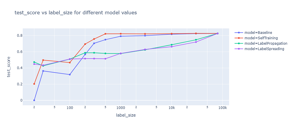
Comparison of all methods
Next, I compared all methods with their best parameters against each other.
Comparison of best scores (image by the author)
The graph shows the test score of different semi-supervised learning methods as a function of the label size. Self-training outperforms the baseline, as it leverages the unlabeled data well. Label propagation and label spreading only beat the baseline for small label sizes and perform worse for larger label sizes.
Conclusion
The results may significantly vary for different datasets, classifier methods, and metrics. The performance of semi-supervised learning depends on many factors, such as the quality and quantity of the unlabeled data, the choice of the base learner, and the evaluation criterion. Therefore, one should not generalize these findings to other settings without proper testing and validation.
If you are interested in exploring more about semi-supervised learning, you are welcome to check out my git repo and experiment on your own. You can find the code and data for this project here.
One thing that I learned from this project is that parameter tuning was important to significantly improve the performance of these methods. With optimized parameters, self-training performed better than the baseline for any label size and reached better F1 scores of up to 13%! Label propagation and label spreading only turned out to improve the performance for very small sample size, but the user must be very careful not to get worse results compared to not using any semi-supervised learning method.
We use cookies on our website to give you the most relevant experience by remembering your preferences and repeat visits. By clicking “Accept”, you consent to the use of ALL the cookies.
This website uses cookies to improve your experience while you navigate through the website. Out of these, the cookies that are categorized as necessary are stored on your browser as they are essential for the working of basic functionalities of the website. We also use third-party cookies that help us analyze and understand how you use this website. These cookies will be stored in your browser only with your consent. You also have the option to opt-out of these cookies. But opting out of some of these cookies may affect your browsing experience.
Necessary cookies are absolutely essential for the website to function properly. These cookies ensure basic functionalities and security features of the website, anonymously.
Cookie
Duration
Description
cookielawinfo-checkbox-analytics
11 months
This cookie is set by GDPR Cookie Consent plugin. The cookie is used to store the user consent for the cookies in the category "Analytics".
cookielawinfo-checkbox-functional
11 months
The cookie is set by GDPR cookie consent to record the user consent for the cookies in the category "Functional".
cookielawinfo-checkbox-necessary
11 months
This cookie is set by GDPR Cookie Consent plugin. The cookies is used to store the user consent for the cookies in the category "Necessary".
cookielawinfo-checkbox-others
11 months
This cookie is set by GDPR Cookie Consent plugin. The cookie is used to store the user consent for the cookies in the category "Other.
cookielawinfo-checkbox-performance
11 months
This cookie is set by GDPR Cookie Consent plugin. The cookie is used to store the user consent for the cookies in the category "Performance".
viewed_cookie_policy
11 months
The cookie is set by the GDPR Cookie Consent plugin and is used to store whether or not user has consented to the use of cookies. It does not store any personal data.
Functional cookies help to perform certain functionalities like sharing the content of the website on social media platforms, collect feedbacks, and other third-party features.
Performance cookies are used to understand and analyze the key performance indexes of the website which helps in delivering a better user experience for the visitors.
Analytical cookies are used to understand how visitors interact with the website. These cookies help provide information on metrics the number of visitors, bounce rate, traffic source, etc.
Advertisement cookies are used to provide visitors with relevant ads and marketing campaigns. These cookies track visitors across websites and collect information to provide customized ads.