Bitlauncher, an innovative platform merging Artificial Intelligence (AI) and cryptocurrency, is excited to unveil its presale event, which will commence on September 16th, 2024. The event aims to secure $150,000 in funding and presents a unique chance for enthusiasts to influence the emergence of the next generation of global AI unicorns. The Bitlauncher platform aims […]
I recently read a September 4th thread on Bluesky by Dr. Johnathan Flowers of American University about the dustup that occurred when organizers of NaNoWriMo put out a statement saying that they approved of people using generative AI such as LLM chatbots as part of this year’s event.
“Like, art is often the ONE PLACE where misfitting between the disabled bodymind and the world can be overcome without relying on ablebodied generosity or engaging in forced intimacy. To say that we need AI help is to ignore all of that.” –Dr. Johnathan Flowers, Sept 4 2024
Dr. Flowers argued that by specifically calling out this decision as an attempt to provide access to people with disabilities and marginalized groups, the organizers were downplaying the capability of these groups to be creative and participate in art. As a person with a disability himself, he notes that art is one of a relatively few places in society where disability may not be a barrier to participation in the same way it is in less accessible spaces.
Since the original announcement and this and much other criticism, the NaNoWriMo organizers have softened or walked back some of their statement, with the most recent post seeming to have been augmented earlier this week. Unfortunately, as so often happens, much of this conversation on social media devolved into an unproductive discussion.
I’ve talked in this space before about the difficulty in assessing what it really means when generative AI is involved in art, and I still stand by my point that as a consumer of art, I am seeking a connection to another person’s perspective and view of the world, so AI-generated material doesn’t interest me in that way. However, I have not spent as much time thinking about the role of AI as accessibility tooling, and that’s what I’d like to discuss today.
I am not a person with physical disability, so I can only approach this topic as a social scientist and a viewer of that community from the outside. My views are my own, not those of any community or organization.
Framing
In a recent presentation, I was asked to begin with a definition of “AI”, which I always kind of dread because it’s so nebulous and difficult, but this time I took a fresh stab at it, and read some of the more recent regulatory and policy discussions, and came up with this:
AI: use of certain forms of machine learning to perform labor that otherwise must be done by people.
I’m still workshopping, and probably will be forever as the world changes, but I think this is useful for today’s discussion. Notice that this is NOT limiting our conversation to generative AI, and that’s important. This conversation about AI specifically relates to applying machine learning, whether it involves deep learning or not, to completing tasks that would not be automatable in any other way currently available to us.
Social theory around disability is its own discipline, with tremendous depth and complexity. As with discussions and scholarship examining other groups of people, it’s incredibly important for actual members of this community to have their voices not only heard, but to lead discussions about how they are treated and their opportunities in the broader society. Based on what I understand of the field, I want to prioritize concerns about people with disability having the amount of autonomy and independence they desire, with the amount of support necessary to have opportunities and outcomes comparable to people without disabilities. It’s also worth mentioning that much of the technology that was originally developed to aid people with disabilities is assistive to all people, such as automatic doors.
AI as a tool
So, what role can AI really play in this objective? Is AI a net good for people with disabilities? Technology in general, not just AI related development, has been applied in a number of ways to provide autonomy and independence to people with disabilities that would not otherwise be possible. Anyone who has, like me, been watching the Paris Paralympics this past few weeks will be able to think of examples of technology in this way.
But I’m curious what AI provides to the table that isn’t otherwise there, and what the downsides or risks may be. Turns out, quite a bit of really interesting scholarly research has already been done on the question and continues to be released. I’m going to give a brief overview of a few key areas and provide more sources if you happen to be interested in a deeper dive in any of them.
Positives
Neurological and Communication Issues
This seems like it ought to be a good wheelhouse for AI tools. LLMs have great usefulness for restating, rephrasing, or summarizing texts. When individuals struggle with reading long texts/concentration, having the ability to generate accurate summaries can make the difference between a text’s themes being accessible to those people or not. This isn’t necessarily a substitution for the whole text, but just might be a tool augmenting the reader’s understanding. (Like Cliff Notes, but for the way they’re supposed to be used.) I wouldn’t recommend things like asking LLMs direct questions about the meaning of a passage, because that is more likely to produce error or inaccuracies, but summarizing a text that already exists is a good use case.
Secondarily, people with difficulty in either producing or consuming spoken communication can get support from AI tools. The technologies can either take spoken text and generate highly accurate automatic transcriptions, which may be easier for people with forms of aphasia to comprehend, or it can allow a person who struggles with speaking to write a text and convert this to a highly realistic sounding human spoken voice. (Really, AI synthetic voices are becoming so amazing recently!)
This is not even getting into the ways that AI can help people with hearing impairment, either! Hearing aids can use models to identify and isolate the sounds the user wants to focus on, and diminish distractions or background noise. Anyone who’s used active noise canceling is benefiting from this kind of technology, and it’s a great example of things that are helpful for people with and without disabilities both.
For people with visual impairments, there may be barriers to digital participation, including things like poorly designed websites for screen readers, as well as the lack of alt text describing the contents of images. Models are increasingly skilled at identifying objects or features within images, and this may be a highly valuable form of AI if made widely accessible so that screen reading software could generate its own alt text or descriptions of images.
There are also forms of AI that help prosthetics and physical accessibility tools work better. I don’t mean necessarily technologies using neural implants, although that kind of thing is being studied, but there are many models that learn the physics of human movement to help computerized powered prosthetics work better for people. These can integrate with muscles and nerve endings, or they can subtly automate certain movements that help with things like fine motor skills with upper limb prosthetics. Lower body limb prosthetics can use AI to better understand and produce stride lengths and fluidity, among other things.
Ok, so that is just a handful of the great things that AI can do for disability needs. However, we should also spend some time discussing the areas where AI can be detrimental for people with disabilities and our society at large. Most of these areas are about the cultural production using AI, and I think they are predominantly caused by the fact that these models replicate and reinforce social biases and discrimination.
For example:
Because our social structures don’t prioritize or highlight people with disabilities and their needs, models don’t either. Our society is shot through with ableism and this comes out in texts produced by AI. We can explicitly try to correct for that in prompt engineering, but a lot of people won’t spend the time or think to do that.
Similarly, images generated by AI models tend to erase all kinds of communities that are not dominant culturally or prioritized in media, including people with disabilities. The more these models use training data that includes representation of people with disabilities in positive context, the better this will get, but there is always a natural tension between representation proportions being true to life and having more representation because we want to have better visibility and not erasure.
Data Privacy and Ethics
This area has two major themes that have negative potential for people with disabilities.
First, there is a high risk of AI being used to make assumptions about desires and capabilities of people with disabilities, leading to discrimination. As with any group, asking AI what the group might prefer, need, or find desirable is no substitute for actually getting that community involved in decisions that will affect them. But it’s easy and lazy for people to just “ask AI” instead, and that is undoubtedly going to happen at times.
Second, data privacy is a complicated topic here. Specifically, when someone is using accessibility technologies, such as a screen reader for a cell phone or webpage, this can create inferred data about disability status. If that data is not carefully protected, the disability status of an individual, or the perceived status if the inference is wrong, can be a liability that will subject the person to risks of discrimination in other areas. We need to ensure that whether or not someone is using an accessibility tool or feature is regarded as sensitive personal data just like other information about them.
Bias in Medical Treatment
When the medical community starts using AI in their work, we should take a close look at the side effects for marginalized communities including people with disabilities. Similarly to how LLM use can mean the actual voices of people with disabilities are overlooked in important decision making, if medical professionals are using LLMs to advise on the diagnosis or therapies for disabilities, this advice will be affected by the social and cultural negative biases that these models carry.
This might mean that non-stereotypical or uncommon presentations of disability may be overlooked or ignored, because models necessarily struggle to understand outliers and exceptional cases. It may also mean that patients have difficulty convincing providers of their lived experience when it runs counter to what a model expects or predicts. As I’ve discussed in other work, people can become too confident in the accuracy of machine learning models, and human perspectives can be seen as less trustworthy in comparison, even when this is not a justifiable assertion.
Access to technologies
There are quite a few other technologies I haven’t had time to cover here, but I do want to make note that the mere existence of a technology is not the same thing as people with disabilities having easy, affordable access to these things to actually use. People with disabilities are often disadvantaged economically, in large part because of unnecessary barriers to economic participation, so many of the exceptional advances are not actually accessible to lots of the people who might need them. This is important to recognize as a problem our society needs to take responsibility for — as with other areas of healthcare in the United States in particular, we do a truly terrible job meeting people’s needs for the care and tools that would allow them to live their best lives and participate in the economy in the way they otherwise could.
Conclusions
This is only a cursory review of some of the key issues in this space, and I think it’s an important topic for those of us working in machine learning to be aware of. The technologies we build have benefits and risks both for marginalized populations, including people with disabilities, and our responsibility is to take this into account as we work and do our best to mitigate those risks.
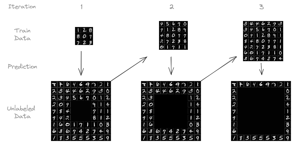
A case study on iterative, confidence-based pseudo-labeling for classification
In machine learning, more data leads to better results. But labeling data can be expensive and time-consuming. What if we could use the huge amounts of unlabeled data that’s usually easy to get? This is where pseudo-labeling comes in handy.
TL;DR: I conducted a case study on the MNIST dataset and boosted my model’s accuracy from 90 % to 95 % by applying iterative, confidence-based pseudo-labeling. This article covers the details of what pseudo-labeling is, along with practical tips and insights from my experiments.
How Does it Work?
Pseudo-labeling is a type of semi-supervised learning. It bridges the gap between supervised learning (where all data is labeled) and unsupervised learning (where no data is labeled).
Process diagram illustrating the procedure on the MNIST dataset. Derived from Yann LeCun, Corinna Cortes, and Christopher J.C. Burges. Licensed under CC BY-SA 3.0.
The exact procedure I followed goes as follows:
We start with a small amount of labeled data and train our model on it.
The model makes predictions on the unlabeled data.
We pick the predictions the model is most confident about (e.g., above 95 % confidence) and treat them as if they were actual labels, hoping that they are reliable enough.
We add this “pseudo-labeled” data to our training set and retrain the model.
We can repeat this process several times, letting the model learn from the growing pool of pseudo-labeled data.
While this approach may introduce some incorrect labels, the benefit comes from the significantly increased amount of training data.
The Echo Chamber Effect: Can Pseudo-Labeling Even Work?
The idea of a model learning from its own predictions might raise some eyebrows. After all, aren’t we trying to create something from nothing, relying on an “echo chamber” where the model simply reinforces its own initial biases and errors?
This concern is valid. It may remind you of the legendary Baron Münchhausen, who famously claimed to have pulled himself and his horse out of a swamp by his own hair — a physical impossibility. Similarly, if a model solely relies on its own potentially flawed predictions, it risks getting stuck in a loop of self-reinforcement, much like people trapped in echo chambers who only hear their own beliefs reflected back at them.
So, can pseudo-labeling truly be effective without falling into this trap?
The answer is yes. While this story of Baron Münchhausen is obviously a fairytale, you may imagine a blacksmith progressing through the ages. He starts with basic stone tools (the initial labeled data). Using these, he forges crude copper tools (pseudo-labels) from raw ore (unlabeled data). These copper tools, while still rudimentary, allow him to work on previously unfeasible tasks, eventually leading to the creation of tools that are made of bronze, iron, and so on. This iterative process is crucial: You cannot forge steel swords using a stone hammer.
Just like the blacksmith, in machine learning, we can achieve a similar progression by:
Rigorous thresholds: The model’s out-of-sample accuracy is bounded by the share of correct training labels. If 10 % of labels are wrong, the model’s accuracy won’t exceed 90 % significantly. Therefore it is important to allow as few wrong labels as possible.
Measurable feedback: Constantly evaluating the model’s performance on a separate test set acts as a reality check, ensuring we’re making actual progress, not just reinforcing existing errors.
Human-in-the-loop: Incorporating human feedback in the form of manual review of pseudo-labels or manual labeling of low-confidence data can provide valuable course correction.
Pseudo-labeling, when done right, can be a powerful tool to make the most of small labeled datasets, as we will see in the following case study.
Case Study: MNIST Dataset
I conducted my experiments on the MNIST dataset, a classic collection of 28 by 28 pixel images of handwritten digits, widely used for benchmarking machine learning models. It consists of 60,000 training images and 10,000 test images. The goal is to, based on the 28 by 28 pixels, predict what digit is written.
I trained a simple CNN on an initial set of 1,000 labeled images, leaving 59,000 unlabeled. I then used the trained model to predict the labels for the unlabeled images. Predictions with confidence above a certain threshold (e.g., 95 %) were added to the training set, along with their predicted labels. The model was then retrained on this expanded dataset. This process was repeated iteratively, up to ten times or until there was no more unlabeled data.
This experiment was repeated with different numbers of initially labeled images and confidence thresholds.
Results
The following table summarizes the results of my experiments, comparing the performance of pseudo-labeling to training on the full labeled dataset.
Even with a small initial labeled dataset, pseudo-labeling may produce remarkable results, increasing the accuracy by 4.87 %pt. for 1,000 initial labeled samples. When using only 100 initial samples, this effect is even stronger. However, it would’ve been wise to manually label more than 100 samples.
Interestingly, the final test accuracy of the experiment with 100 initial training samples exceeded the share of correct training labels.
Accuracy improvement (y-axis) compared to the first iteration per iteration (color) by threshold (x-axis). There is a clear trend of better improvements for higher thresholds and more iterations. Image by the author.Share of corrrect training labels and number of total training data points per iteration by threshold. Higher thresholds lead to more robust but slower labeling. Image by the author.Accuracies for high and low confidence predictions per iteration by threshold. Higher thresholds lead to better accuracies, but the accuracy decreases with time for every choice of threshold. Image by the author.Accuracy improvement per iteration compared to the first iteration by threshold for 100 and 10,000 initially labeled training samples (left and right respectively). Note the different scales. Image by the author.
Looking at the above graphs, it becomes apparent that, in general, higher thresholds lead to better results — as long as at least some predictions exceed the threshold. In future experiments, one might try to vary the threshold with each iteration.
Furthermore, the accuracy improves even in the later iterations, indicating that the iterative nature provides a true benefit.
Key Findings and Lessons Learned
Pseudo-labeling is best applied when unlabeled data is plentiful but labeling is expensive.
Monitor the test accuracy: It’s important to keep an eye on the model’s performance on a separate test dataset throughout the iterations.
Manual labeling can still be helpful: If you have the resources, focus on manually labeling the low confidence data. However, humans aren’t perfect either and labeling of high confidence data may be delegated to the model in good conscience.
Keep track of what labels are AI-generated. If more manually labeled data becomes available later on, you’ll likely want to discard the pseudo-labels and repeat this procedure, increasing the pseudo-label accuracy.
Be careful when interpreting the results: When I first did this experiment a few years ago, I focused on the accuracy on the remaining unlabeled training data. This accuracy falls with more iterations! However, this is likely because the remaining data is harder to predict — the model was never confident about it in previous iterations. I should have focused on the test accuracy, which actually improves with more iterations.
Links
The repository containing the experiment’s code can be found here.
In my previous article on Unit Disk and 2D Bounded KDE, I discussed the importance of being able to sample arbitrary distributions. This is especially relevant for applications like Monte Carlo integration, which is used to solve complex integrals, such as light scattering in Physically Based Rendering (PBRT).
Sampling in 2D introduces new challenges compared to 1D. This article focuses on uniformly sampling the 2D unit disk and visualizing how transformations applied to a standard [0,1] uniform random generator create different distributions.
We’ll also explore how these transformations, though yielding the same distribution, affect Monte Carlo integration by introducing distortion, leading to increased variance.
1. How to sample a disk uniformly?
Introduction
Random number generators often offer many predefined sampling distributions. However, for highly specific distributions, you’ll likely need to create your own. This involves combining and transforming basic distributions to achieve the desired outcome.
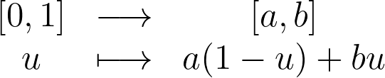
For instance, to uniformly sample the interval between a and b, you can apply an affine transform on the standard uniform sampling from [0,1].
In this article, we’ll explore how to uniformly sample points within the 2D unit disk by building on the basic [0,1] uniform sampling.
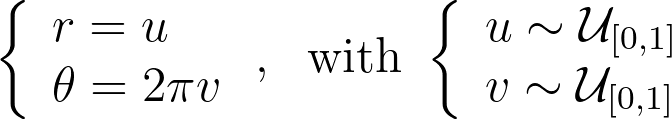
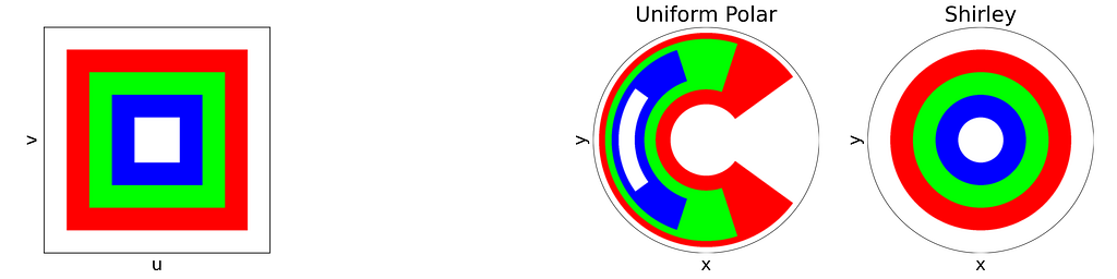
For readability, I’ve intentionally used the adjective “unit” in two different contexts in this article. The “unit square” refers to the [0,1]² domain, reflecting the range of the basic random generator. Conversely, the “unit disk” is described within [-1,1]² for convenience in polar coordinates. In practice, we can easily map between these using an affine transformation. We’ll denote u and v as samples drawn from the standard [0,1] or [-1,1] uniform distribution.
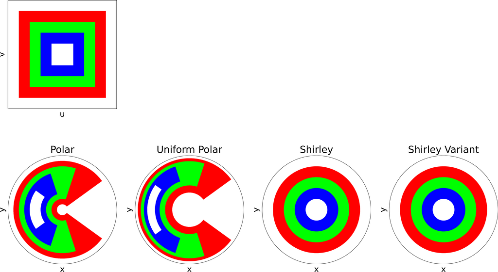
Rejection Sampling
Using the [0,1] uniform sampling twice allows us to uniformly sample the unit square [0,1]².
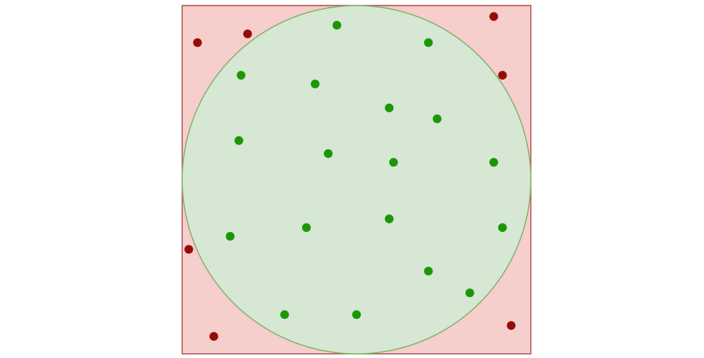
A very simple approach known as “Rejection Sampling” consists in sampling the unit square and rejecting any sample falling outside the disk.
Rejection sampling of the inner disk inside the unit square. Valid (green) and invalid (red) samples – Figure by the author
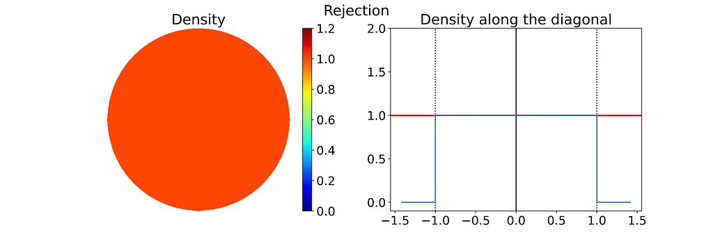
This results in points that follow a uniform 2D distribution within the disk contained in the unit square, as illustrated in the figure below.
The density maps in this article are generated by sampling many points from the specified distribution and then applying a Kernel Density Estimator. Methods for addressing boundary bias in the density are detailed in the previous article “Unit Disk and 2D Bounded KDE”.
Left: Density of the 2D Disk Rejection Sampling estimated by Kernel Density Estimation on 10000 samples. Right: Corresponding 1D density profile along the diagonal of the density map — Figure by the author
A major drawback is that rejection sampling can require many points to get the desired number of valid samples, with no upper limit on the total number, leading to inefficiencies and higher computational costs.
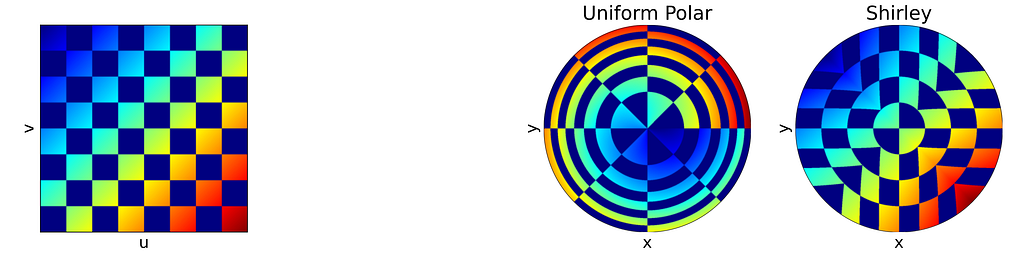
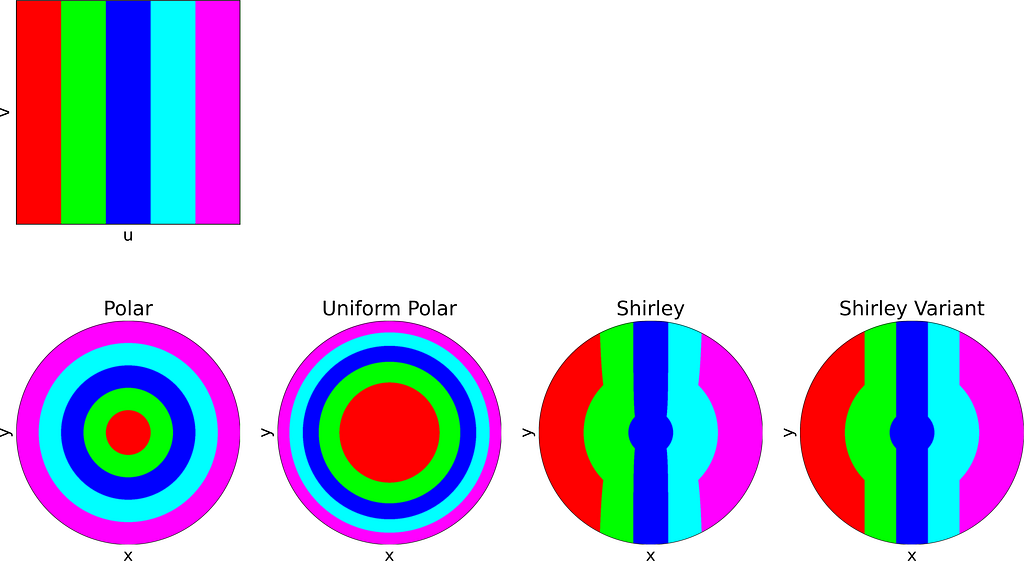
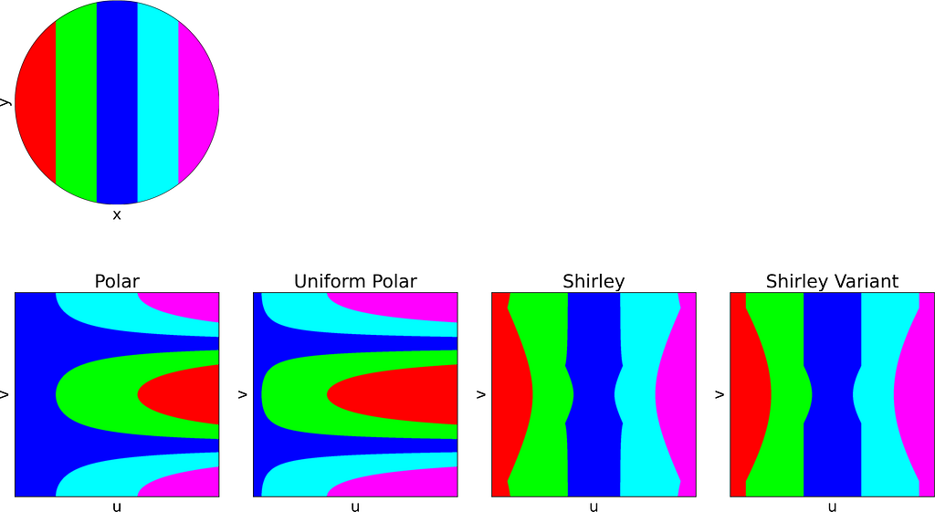
Intuitive Polar Sampling
An intuitive approach is to use polar coordinates for uniform sampling: draw a radius within [0,1] and an angle within [0, 2π].
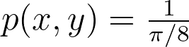
Both the radius and angle are uniform, what could possibly go wrong?However, this method leads to an infinite density singularity at the origin, as illustrated by the empirical density map below.
To ensure the linear colormap remains readable, the density map has been capped at an arbitrary maximum value of 10. Without this cap, the map would display a single red dot at the center of a blue disk.
Left: Density of the 2D Disk Polar Sampling estimated by Kernel Density Estimation on 10000 samples. Right: Corresponding 1D density profile along the diagonal of the density map — Figure by the author
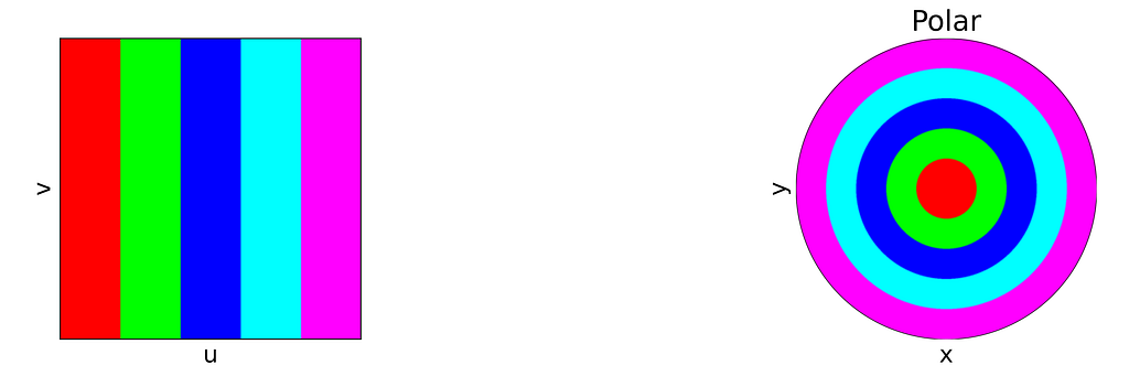
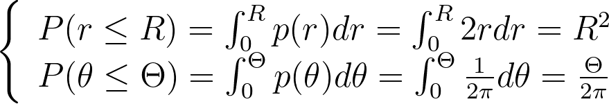
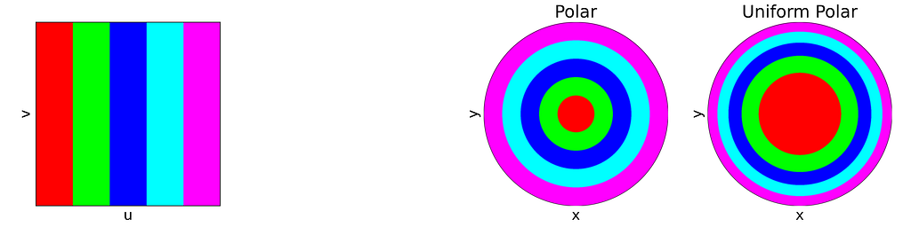
The figure below uses color to show how the unit square, sampled with (u,v), maps to the unit disk with (x,y) using the polar transform defined above. The colored areas in the square are equal, but this equality does not hold once mapped to the disk. This visually illustrates the density map: large radii exhibit much lower density, as they are distributed across a wider ring farther from the origin.
Left: Unit Square with colored columns. Right: Corresponding Polar mapping to the unit Disk — Figure by the author
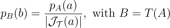
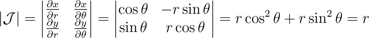
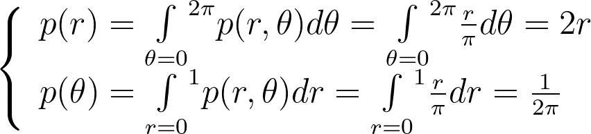
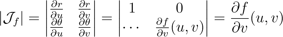
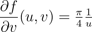
Let’s explore the mathematical details. When applying a transform T to a multi-dimensional random variable A, the resulting density is found by dividing by the absolute value of the determinant of the Jacobian of T.
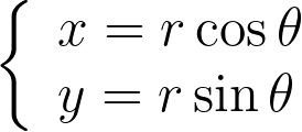
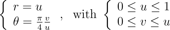
The polar transform is given by the equation below.
We can compute the determinant of its jacobian.
Thus, the polar transformation results in a density that is inversely proportional to the radius, explaining the observed singularity.
The 1D density profile along the diagonal shown above corresponds to the absolute value of the inverse function, which is then set to zero outside [-1, 1]. At first glance, this might seem counterintuitive, given that the 1D inverse function isn’t integrable over [-1, 1]! However, it’s essential to remember that the integration is performed in 2D using polar coordinates, not in 1D.
Uniform Polar Sampling — Differential Equation
There are two ways to find the correct polar transform that results in an uniform distribution. Either by solving a differential equation or by using the inversion method. Let’s explore both approaches.
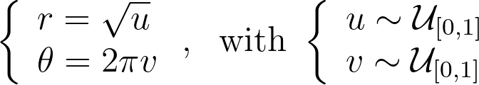
To address the heterogeneity in the radius, we introduce a function f to adjust it: r=f(u). The angle, however, is kept uniform due to the symmetry of the disk. We can then solve the differential equation that ensures the determinant of the corresponding Jacobian remains constant, to keep the same density.
We get ff’=c, which has a unique solution given the boundary conditions f(0)=0 and f(1)=1. We end up with the following transform.
Uniform Polar Sampling — Inversion Method
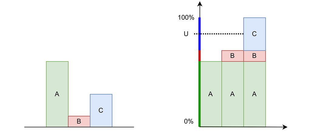
The inversion method is easier to grasp in the discrete case. Consider three possible values A, B and C with probabilities of 60%, 10%, and 30%, respectively. As shown in the figure below, we can stack these probabilities to reach a total height of 100%. By uniformly drawing a percentage U between 0% and 100% and mapping it to the corresponding value A, B or C on the stack, we can transform a uniform sampling into our discrete non‑uniform distribution.
Inversion Method in the discrete case. Left: Histogram. Right: Cumulative Distribution Function — Figure by the author
This is very similar in the continuous case. The inversion method begins by integrating the probability distribution function (PDF) p of a 1D variable X to obtain the cumulative distribution function (CDF) P(X<x), which increases from 0 to 1. Then, by sampling a uniform variable U from [0,1] and applying the inverse CDF to U, we can obtain a sample x that follows the desired distribution p.
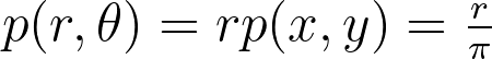
Assuming a uniform disk distribution p(x,y), we can deduce the corresponding polar distribution p(r,θ) to enforce.
It turns out that this density p(r,θ) is separable, and we can independently sample r and θ from their respective expected 1D marginal densities using the inversion method.
When the joint density isn’t separable, we first sample a variable from its marginal density and then draw the second variable from its conditional density given the first variable.
We integrate these marginal densities into CDFs.
Sampling uniform (u,v) within [0,1] and applying the inverse CDFs gives us the following transform, which is the same as the one obtained above using the differential equation.
The resulting distribution is effectively uniform, as confirmed by the empirical density map shown below.
Left: Density of the 2D Disk correct Polar Sampling estimated by Kernel Density Estimation on 10000 samples. Right: Corresponding 1D density profile along the diagonal of the density map — Figure by the author
The square root function effectively adjusts the colored columns to preserve their relative areas when mapped to the disk.
Left: Unit Square with colored columns. Right: Corresponding Polar and Uniform Polar mappings to the unit Disk — Figure by the authorPhoto by Tim Johnson on Unsplash
2. How to sample a disk uniformly, but with less distortion?
MC Integration estimates the integral by a weighted mean of the operand evaluated at samples drawn from a given distribution. With n samples, it converges to the correct result at a rate of O(1/sqrt(n)). To halve the error, you need four times as many samples. Therefore, optimizing the sampling process to make the most of each sample is crucial.
Techniques like stratified sampling helps ensuring that all regions of the integrand are equally likely to be sampled, avoiding the redundancy of closely spaced samples that provide little additional information.
Distortion
The mapping we discussed earlier is valid as it uniformly samples the unit disk. However, it distorts areas on the disk, particularly near the outer edge. Square regions of the unit square can be mapped to very thin and stretched areas on the disk.
Left: Unit Square with colored cells. Right: Corresponding Uniform Polar mapping to the unit Disk — Figure by the author
This distortion is problematic because the sampling on the square loses its homogeneous distribution property. Close (u,v) samples can result in widely separated points on the disk, leading to increased variance. As a result, more samples are needed in the Monte Carlo integration to offset this variance.
In this section, we’ll introduce another uniform sampling technique that reduces distortion, thereby preventing unnecessary increases in variance.
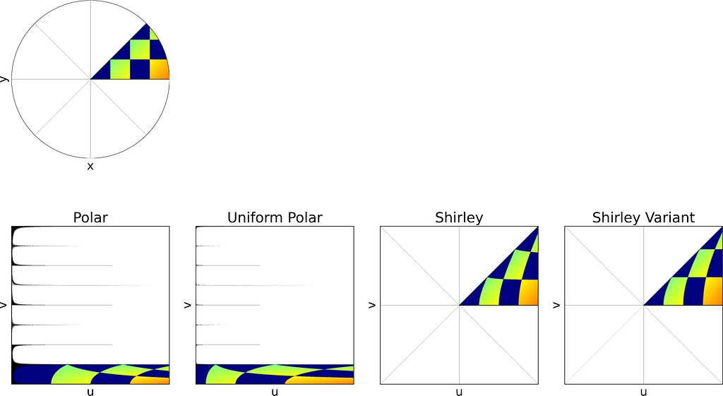
Shirley’s Concentric Mapping
In 1997, Peter Shirley published “A Low Distortion Map Between Disk and Square”. Instead of treating the uniform unit square as a plain parameter space with no spatial meaning, as we did with the radius and angle, he suggests to slightly distort the unit square into the unit disk.
The idea is to map concentric squares within the unit square into concentric circles within the unit disk, as if pinching the corners to round out the square. In the figure below, this approach appears much more natural compared to uniform polar sampling.
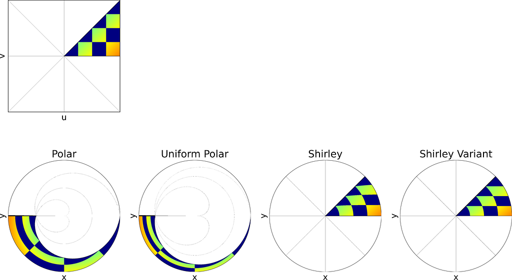
Left: Unit Square with colored concentric squares. Right: Corresponding Uniform Polar and Shirley mappings to the unit Disk — Figure by the author
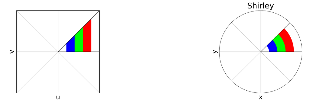
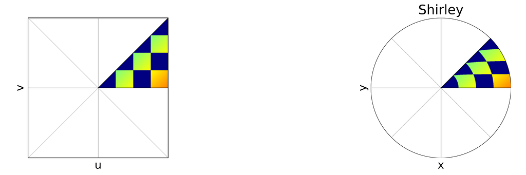
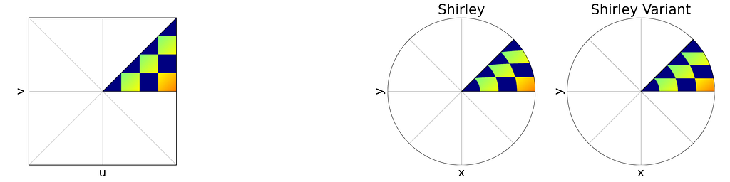
The unit square is divided into eight triangles, with the mapping defined for one triangle and the others inferred by symmetry.
Left: Reference Triangle in the Unit Square with colored concentric squares. Right: Corresponding Shirley mapping to the unit Disk — Figure by the author
As mentioned at the beginning of the article, it is more convenient to switch between the [0,1]² and [-1,1]² definitions of the unit square rather than using cumbersome affine transformations in the equations. Thus, we will use the [-1,1]² unit square to align with the [-1,1]² unit disk definition.
As illustrated in the figure above, the reference triangle is defined by:
Mapping the vertical edges of concentric squares to concentric arc segments means that each point at a given abscissa u is mapped to the radius r=u. Next, we need to determine the angular mapping f that results in a uniform distribution across the unit disk.
We can deduce the determinant of the corresponding Jacobian.
For a uniform disk distribution, the density within the eighth sector of the disk (corresponding to the reference triangle) is as follows.
On the other side, we have:
By combining the three previous equations and r=u , we get:
Integrating the previous equations with a zero constant to satisfy θ=0 when v=0 gives the angle mapping. Finally, we get the following mapping.
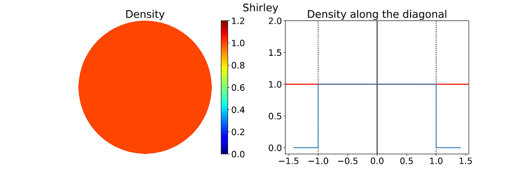
The seven others triangles are deduced by symmetry. The resulting distribution is effectively uniform, as confirmed by the empirical density map shown below.
Left: Density of the 2D Disk Shirley Sampling estimated by Kernel Density Estimation on 10000 samples. Right: Corresponding 1D density profile along the diagonal of the density map — Figure by the author
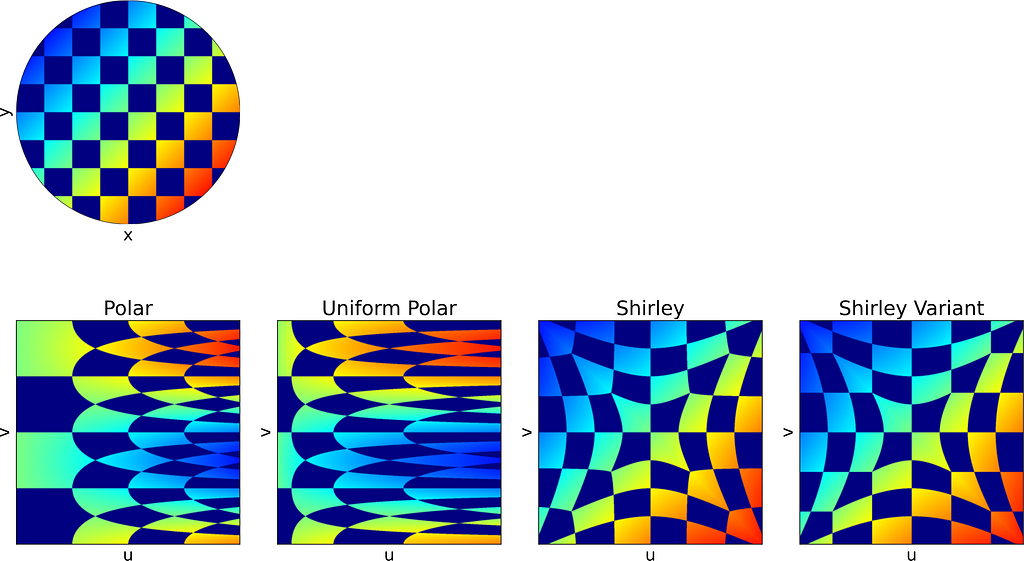
As expected, Shirley’s mapping, when applied to the colored grid, significantly reduces cell stretching and distortion compared to the polar mapping.
Left: Unit Square with colored cells. Right: Corresponding Uniform Polar and Shirley mappings to the unit Disk — Figure by the author
Variant of Shirley’s Mapping
The θ mapping in Shirley’s method isn’t very intuitive. Thus, as seen in the figure below, it’s tempting to view it simply as a consequence of the more natural constraint that y depends solely on v, ensuring that horizontal lines remain horizontal.
Left: Reference Triangle in the Unit Square with colored cells. Right: Corresponding Shirley mapping to the unit Disk — Figure by the author
However, this intuition is incorrect since the horizontal lines are actually slightly curved. The Shirley mapping presented above, i.e. the only uniform mapping respecting the r=u constraint, enforces the following y value, which subtly varies with u.
Although we know it won’t result in a uniform distribution, let’s explore a variant that uses a linear mapping between y and v, just for the sake of experimentation.
The Shirley variant shown here is intended solely for educational purposes, to illustrate how the Shirley mapping alters the horizontal lines by bending them.
We obtain y by scaling v by the length of the half-diagonal, which maps the top-right corner of the square to the edge of the disk. The value of x can then be deduced from y by using the radius constraint r=u.
The figure below shows a side-by-side comparison of the original Shirley mapping and its variant. While both images appear almost identical, it’s worth noting that the variant preserves the horizontality of the lines.
Left: Reference Triangle in the Unit Square with colored cells. Right: Corresponding Shirley and Shirley Variant mappings to the unit Disk — Figure by the author
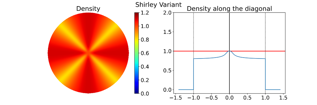
As expected, the empirical density map shows notable deviations from uniformity, oscillating between 0.8 and 1.1 rather than maintaining a constant value of 1.0.
Keep in mind that the density shown below depends on the angle, so the 1D density profile would vary if extracted from a different orientation.
Left: Density of the 2D Disk Shirley Variant Sampling estimated by Kernel Density Estimation on 10000 samples. Right: Corresponding 1D density profile along the diagonal of the density map — Figure by the authorPhoto by Antenna on Unsplash
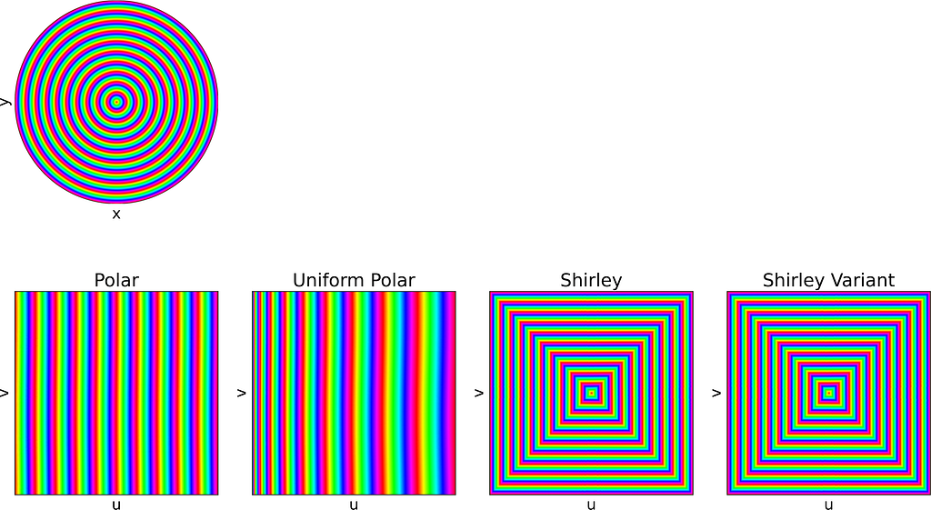
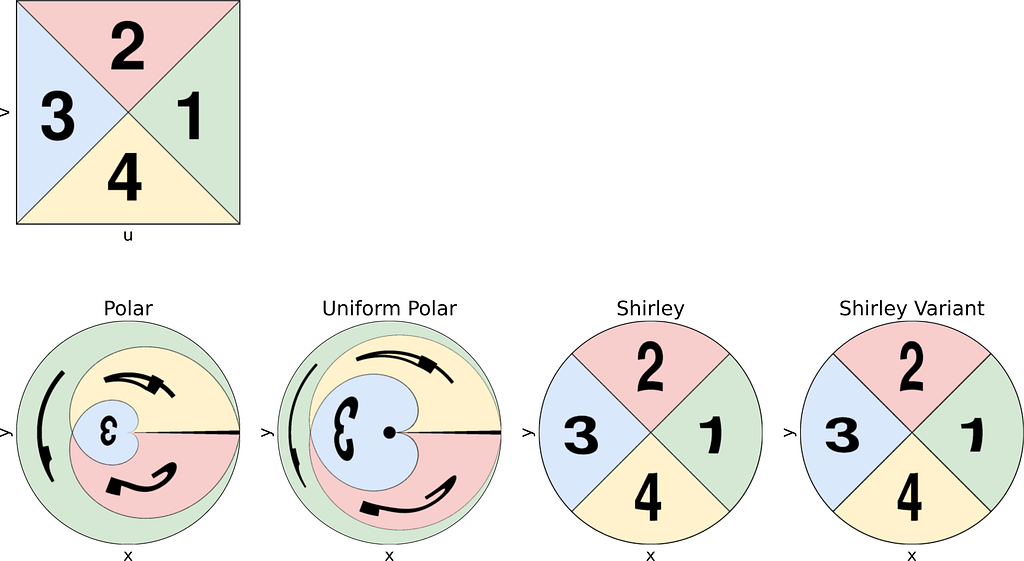
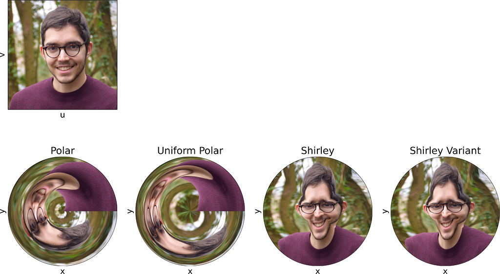
3. Visual Comparison of the sampling methods
Apply the mapping on an image
In the second section of this article, visualizing how a square image is mapped to a disk proved helpful in understanding the distortion caused by the mappings.
To achieve that, we could naively project each colored pixel from the square onto its corresponding location on the disk. However, this approach is flawed, as it doesn’t ensure that every pixel on the disk will be assigned a color. Additionally, some disk pixels may receive multiple colors, resulting in them being overwritten and causing inaccuracies.
The correct approach is to reverse the process: iterate over the disk pixels, apply the inverse mapping to find the corresponding floating-point pixel in the square, and then estimate its color through interpolation. This can be done using cv2.remap from OpenCV.
Thus, the current mapping formulas only allow us to convert disk to square images. To map from square to disk, we need to reverse these formulas.
The inverse formulas are not detailed here for the sake of brevity.
Each of the following subsections will illustrate both the square-to-disk and disk-to-square mappings using a specific pattern image. Enjoy the exploration!
The naive disk sampling approach using uniform polar coordinates is a good example for understanding how transforming variables can affect their distribution.
Using the inversion method you can now turn a uniform sampling on [0,1] into any 1D distribution, by using its inverse Cumulative Distribution Function (CDF).
To sample any 2D distribution, we first sample a variable from its marginal density and then draw the second variable from its conditional density given the first variable.
Distortion and Variance
Depending on your use-case, you might want to guarantee that nearby (u,v) samples will remain close when mapped onto the disk. In such cases, the Shirley transformation is preferable to uniform polar sampling, as it introduces less variance.
This is part one of a series of articles, in which we will demystify data strategy — an essential component for any organization striving to become data-driven in order to stay competitive in today’s digital world.Use the cheat sheet provided in this article to kick-start your own data strategy development!
tl;dr
When organizations strive to become data-driven, they need to transform, which requires a solid data strategy design
The renowned Playing to Win strategy framework provides a process to develop, and a format to document and communicate any kind of strategy
This article shows how the strategy choice cascade for corporate strategy design can be adopted to develop a data strategy
The cheat sheet provided allows data strategy design teams to rapidly apply a practice-proven framework for their own data strategy development thus helping organizations to become data-driven
Companies big or small, and independent of which industry they are playing in, strive to become data-driven. Regardless of what technology you use or how you name it — Data Science, Business Intelligence (BI), Advanced Analytics, Big Data, Machine Learning or (Generative) Artificial Intelligence (AI) — being data-driven is about leveraging data as a strategic company asset.
The big promises of being data-driven are:
Humans make better decisions: Managers and employees on all organizational levels and across the entire value chain are enabled to consistently make better decisions by combining data & analyses with human common sense.
Computers make automated decisions: Frequent and repeated decisions in operations can be automated.
This, in turn, leads to a long-term competitive edge through:
More revenue
Less costs, more efficiency and margin
Better risk management
More innovation and the possibilities of novel business models based on digital products and services
These benefits are realized through individual data uses cases. Some concrete examples are:
Targeted customer retention for B2C business: Customer data can be enriched with demographic or market data and is then used to build statistical models (you may call it Machine Learning or AI if you like), to learn rules, which can predict the probability of customer churn. This means, that for each single customer a probability between 0% and 100% is computed, indicating if a customer is likely to terminate his/her contract next month. In combination with a customer (lifetime) value, which also can be deduced from data, the customer service center can leverage this information to make informed decisions about which precise customers to phone up, in order to prevent losing “good” customers. For companies with a large customer base and limited service center resources, this often leads to a significant reduction in churn and hence a long-term measurable increase in revenue.
End-to-end product margin analysis: Financial and product data, together with clear cost-allocation rules, can be used to develop a BI dashboard to analyze the margin of individual products. Dashboard users can surf the data and drill-down in various dimensions, such as country, point-of-sales, time or customer type. This allows business users to make informed decisions about which products might be removed from the existing portfolio and hence lead to higher margins.
Predictive maintenance to optimize production: Sensor data such as temperature or vibration can be used to predict the probability of machine failure for the near future. Equipped with such insights, maintenance teams can proactively conduct measures to prevent the machine from failing. This reduces repair costs as well as production downtime, which in turn can increase revenue.
The benefits of becoming data-driven appear to be self-evident and there seems to be a general consent that for most companies there is no way around it. A quote translated from [1] nails it:
“Consistent value creation with data is already a decisive competitive advantage for companies today, and in the near future it will even be essential for survival.” [1]
1.2 Where is the Challenge?
If the general benefits of being data-driven are self-evident, where is the catch? Why is not every organization data-driven?
In fact, although the topic is not new — BI, Data Science and Machine Learning have been around for several decades — many companies still struggle to leverage their data and are far away of being data-driven. How is this possible?
To be clear from the start: From my perspective, the actual challenge was and still is rarely a matter of technology, even if so many technology providers like to claim exactly that. Sure, technology is the basis for making data-based decisions – as it is the basis for nearly every business-related activity nowadays. IT systems, tools and algorithms are readily available to execute data-based decision making. Equipping an organization with the right tools is a complicated, but not a complex problem [16], which can be adequately solved with the right knowledge or support. So, what does prevent organizations to continuously innovate, test and implement data use cases — like those above — to leverage data as a strategic asset?
In order to become data-driven, the way in which employees recognize, treat and use data within the daily business needs to radically change.
Being data-driven means, that people in every department must be able to translate critical business problems into analytical questions, which can then be addressed with data and analyses. There needs to be a (data) culture [3] within the organization, that ensures that employees want, can and must use data to improve their daily work. However, changing the behavior of a larger number of people is never a trivial task.
“Organizations need to transform to become data-driven.” [2]
So the real challenge is to sustainably change the way decisions are made in an organization. This cannot be accomplished, by designing and conducting a project, this requires a transformation.
Transforming an organization to become data-driven is a complex – not complicated – challenge for companies. This requires a solid strategic foundation — a data strategy.
However, many organizations do not posses a data strategy, struggle to create one or fear it is a lengthy process. With this article, we want to address this, by demystifying data strategy design and equipping the readers with the adequate tools to make their data strategies a success.
2. Is Data Not Already Handled Within the IT Strategy?
Most often organizations have a corporate strategy, an IT strategy or even a digital strategy. So, where is the need for a dedicated data strategy?
If your organization possesses any strategy, which addresses data as an asset with sufficient depth, you are fine. Sufficient depth means, that fundamental questions regarding data value creation are elaborated and answered, allowing the organization to take concrete actions to leverage data as an asset. However, in my experience, this is rarely the case, and there is often a lack of joint understanding in organizations, how the terms data, digital and technology differ and relate to each other.
Whilst digital strategies usually focus on process digitalization or the design of digital solutions for either internal staff or external customers, IT strategies often focus on system landscape, applications and network infrastructure. Both of them are closely related to generating and utilizing data, but neither digital nor IT strategy is — in its core — concerned with enabling an organization to become data-driven.
The info-graphic provides a more detailed comparison of the terms data, digital and technology:
Figure 1: Comparing and contrasting of the terms data, digital and technology. Info-graphic by the author originally published in [10].
Consequently, for each organization, it is important to first assess what data related topics are already covered by existing strategies, initiatives and corresponding leaders. Then, if existing strategies do not give a detailed answer to how the organization can leverage data as an asset, it is time to create a dedicated data strategy.
3. What Strategy Framework to Use for Designing a Data Strategy?
Strategy itself is perhaps one of the most misunderstood concepts [14]. There are many definitions and interpretations. As a consequence, there does not seem to be the one single true approach for designing a data strategy. So where to start?
3.1 The Playing to Win Framework
What we propose here is to select a proven and generic framework, which can be used to develop (any kind of) strategy and apply this to data strategy design. For this, we use the “Playing to Win” (P2W) strategy framework [4], which originates from joint work of Alan G. Lafley, who was former CEO of P&G, and Roger Martin, who worked for Monitor Consulting when starting to develop the framework.
The approach became the standard strategy approach at P&G and has successfully been applied in many industries since. In addition, the P2W framework has constantly been complemented and refined by Roger through a series of Strategy Practitioner Insights [15,17].
The benefits of choosing the P2W approach above others are, that it is widely known and applied and comes with an entire ecosystem of processes, templates and trainings that can be leveraged for designing your data strategy.
In the P2W framework, strategy is defined as follows [4]:
“Strategy is an integrated set of choices that uniquely positions a firm in its industry so as to create sustainable advantage and superior value relative to the competition.” [4]
So strategy is all about choice, making these tough decisions that give you a competitive edge, with no bullet-proof certainty that the choices will turn out to be the right ones. Note, that this quite differs from declaring strategy being a kind of plan [9].
The P2W strategy framework boils down to two core tools for strategy design.
3.2 Tool 1: The Strategy Process Map
The Strategy Process Map is a set of steps guiding the strategy design process [5,6]. In essence, it helps to innovate several scenarios or so called possibilities for what your strategy might look like. These possibilities are subsequently evaluated and compared, so that the strategy team can choose the most promising possibility as final strategy.
It makes use of a rigorous evaluation methodology. This helps to create clarity for each possibility about the underlying assumptions that would have to be true, such that a possibility is considered to be a good strategy.
The Strategy Process Map consists of 7 phases and can be visualized as follows:
Figure 2: The Strategy Process Map by IDEO U from [6].
3.3 Tool 2: The Strategy Choice Cascade
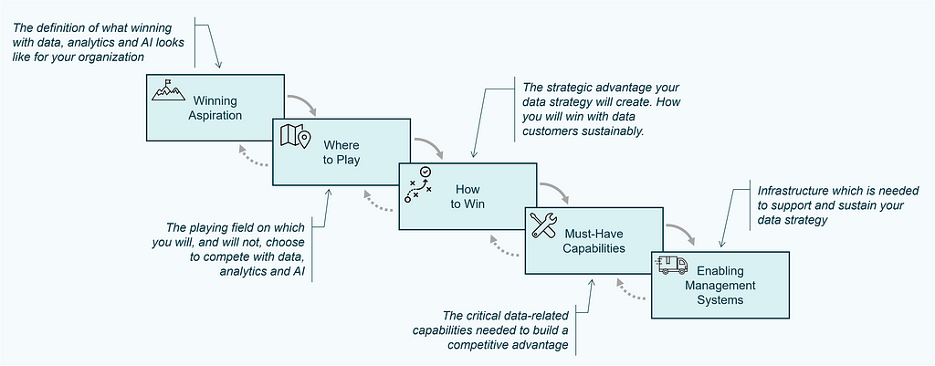
The Strategy Choice Cascade is the second tool that is used to document essential components of the strategy, which serves as output of the strategy work and is a nice way to visually communicate the strategy to stakeholders [7,8]. It consists of five elements and is often visualized similar to a waterfall:
Figure 3: The Strategy Choice Cascade
These five elements of the Strategy Choice Cascade are defined as:
Winning Aspiration: The definition of what winning looks like for your organization.
Where to Play: The playing field on which you will, and will not, choose to compete. Typically, this element comprises five dimensions: i) Geography, ii) Customer, iii) Channel, iv) Offer, v) Stages of Production.
How to Win: Your competitive advantage, how you will win with customers sustainably. This boils down to either lower costs or differentiation.
Must-Have Capabilities: Capabilities required to build a competitive advantage.
Enabling Management Systems: Infrastructure (systems, processes, metrics, norms & culture), which is needed in order to effectively execute this strategy.
The actual heart of the strategy is made of the coherent choices made in box two and three: Where to Play & How to Win.
The boxes of the cascade each stand for a topic for which those tough choices, that we mentioned earlier have to be made.
How the cascade works is best illustrated using a real-world example, which is taken from [9] and describes choices for the corporate strategy of Southwest Airlines.
Figure 4: The Strategy Choice Cascade example for Southwest Airlines
During the strategy design process, the Strategy Choice Cascade is not only filled once, but is repeatedly utilized at several phases of the Strategy Process Map. For example, every strategic possibility, which is created in the innovation phase, is described using the cascade to build a joint understanding within the strategy team. Also, the current strategy of the organization is described as a starting point for the strategy design process, in order to build a common understanding of the status-quo.
3.4 The Playing to Win Framework for Data Strategy Design
The P2W framework is not limited to the design of corporate strategies, but can be utilized to build any kind of strategy, e.g. for company divisions, functions (such as IT, Marketing or Sales) or even for individuals.
Consequently, it can also be utilized to design data strategies. So, what makes picking the P2W framework for designing a data strategy a particularly good choice?
Data strategy design teams often jump into details such as what organizational design to choose (central, decentral or hub-and-spoke), or what technology to apply (data mesh, fabric, lakehouse). These are both part of the last box (Enabling Management Systems) and certainly need to be addressed, but not as the first step. The initial focus should lie on the heart of the data strategy, the where to play and how to win. The P2W framework helps to step back and to focus on the strategic questions to be answered.
As the P2W framework is widely spread, there are good chances, that your organization already applies it. If this is the case, it is straightforward to integrate the data strategy with other existing and connected strategies (see also Section 4) and it helps to communicate the data strategy to relevant stakeholders, as the they are familiar with the methodology.
Some data strategy approaches seem to me like picking choices from best practices or following check lists to tackle all elements required, lacking real strategic thinking. The P2W framework guides and forces the strategy design team to apply strategic thinking with rigor and creativity.
Whilst the idea of applying the P2W framework for data strategy design is neither rocket science nor new, existing literature [e.g. 12,13] does — to the knowledge of the author — not provide a detailed description of how to adapt the framework for the application to data & AI strategy design in a straightforward manner.
In the remainder of this article, we therefore adopt the Strategy Choice Cascade to data strategy design, equipping data strategy design teams with the tools required to readily apply the P2W framework for their strategy work. This results in a clear definition of what a data strategy is, what it comprises and how it can be documented and communicated.
4. Link Between Data & Business Strategy
Applying Data Science, AI or any other data-related technology in a company is not an end in itself. Organizations do well not to start a potentially painful corporate transformation program to become data-driven without a clear business need (although I saw this happening more often than one would think). Hence, there must be a good reason why becoming data-driven is a good idea or even essential for the company to survive, before jumping into designing a data strategy. This is often described as a link between data and business strategy.
The great news is, when using the P2W framework for data strategy design, there are natural ways to provide such a link between data and business, by declaring data management, analytics or AI as must-have capabilities within the corporate strategy, enabling the organization to win.
One example for this can be found in [7], where the Strategy Choice Cascade is formulated for the corporate strategy of OŪRA. This health technology company produces a ring, which captures body data similar to a smart watch. The capabilities are, amongst others, defined as follows:
Figure 5: Subset of capabilities as part of the OŪRA corporate strategy [7]. Data management and analytics are defined as must-have capabilities required to win.
From this, the need for state-of-the-art data management and data analytics capabilities are apparent.
As the benefits for being data-driven exist in nearly every industry, data management, analytics or AI are nowadays not only must-have capabilities for high-tech companies, such as in the example above. Industries such as manufacturing, finance, energy & utilities, chemicals, logistics, retail and consumer goods increasingly leverage data & analytics to remain competitive.
In whatever industry your company plays, it ideally has already established the need for being data-driven and expressed it as part of the corporate strategy or any other strategy within the organization (e.g. sales or marketing), before you start with your data strategy work.
In many situations, however, such an explicit link between business and data is not given. In such cases, it is important to spend enough time, to identify the underlying business problem, which should be addressed by the data strategy. This is typically done in phase 1 of the Strategy Process Map (cf. Figure 2).
One way to identify the strategic target problem for the data strategy is peeling the onion by conducting a series of interviews with relevant business and management stakeholders. This allows to identify pains & gains — from a business perspective as well as with regards to the management and usage of data in the organization. Once this is done, it is then important to create a consent amongst stakeholders about the problem to be addressed. If there is consent that data is mission critical for the organization, the business need for a data strategy is evident and the corresponding corporate strategy should be updated accordingly.
5. The Data Strategy Choice Cascade
Once we have established the need for the company to treat data as a valuable asset which needs to be taken care of and which needs to be leveraged, it is time to design a data strategy.
5.1 Translating the Choice Cascade to Data & AI
In order to apply the P2W framework to data strategy design, we first must translate the wording from the corporate context to the data context. So, we start by defining some core elements and rephrase them, where it seems helpful:
Offering → Data Offering: This comprises data products, analytics products or services related to data value creation.
Customers → Data Customers: People, who are served with the data offering. These are most likely to be internal stakeholders or groups within the company but can also be external users.
Company → Data service provider: People, who create the data offering
Competition: Alternatives, that data customers might choose, other than the data service provider. This can range from data customers not served at all, serving themselves or using external services.
Geography → Focus Areas: Which departments, teams, domains or areas of the organization your data strategy will focus on.
Channels → Data Delivery Channels: How data customers get access to the data offering.
Stages of production → Data Lifecycle Management: Which stages of the data lifecycle are done in-house or outsourced.
In addition, the strategy definition of the P2W framework can directly be augmented to data strategy:
Data Strategy is an integrated set of choices that uniquely positions a firm in its industry so as to create sustainable advantage and superior value relative to the competition, by leveraging data as an asset.
5.2 The Data Strategy Choice Cascade
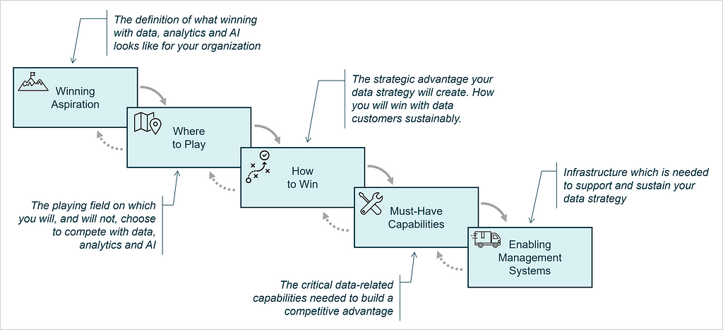
Once the core elements have been translated and we have defined what data strategy means to us, we can finally define the Data Strategy Choice Cascade:
Winning Aspiration: The definition of what winning with data, analytics and AI looks like for your organization.
Where to Play: The playing field on which you will, and will not, choose to compete with data, analytics & AI. This typically includes five dimensions: i) Focus Areas, ii) Data Customers, iii) Data DeliveryChannels, iv) Data Offerings, v) Data Lifecycle Management.
How to Win: The strategic advantage your data strategy will create. How you will win with data customers sustainably. This boils down to either lower costs or differentiation.
Must-Have Capabilities: The critical data-related capabilities needed to build a competitive advantage.
Enabling Management Systems: Infrastructure (systems, processes, governance, metrics & culture), which is needed in order to support and sustain your data strategy.
Figure 6: Visualization of the Data Strategy Choice Cascade
Some more detailed thoughts on data monetization options as part of the Where to Play for data strategies can be found in [11].
5.3 The Cheat Sheet for the Data Strategy Choice Cascade
If data strategy is about making choices, what are these choices for each element of the Data Strategy Choice Cascade in detail? The following Cheat Sheet for the Data Strategy Choice Cascade compares and contrasts the cascade for corporate and data strategy in more detail and provides example choices to be made for the data strategy design.
Figure 7: Cheat Sheet for the Data Strategy Choice Cascade — How the Cascade translates to data & AI
5.4 When to Use the Data Strategy Choice Cascade
Similar to the cascade for corporate strategy, the data strategy choice cascade can be applied in several situations, e.g. it can be utilized to:
Document your current data strategy: This helps to build a joint understanding of the status-quo amongst stakeholders. This is typically done when starting or re-starting the data strategy design process as in phase 1 (identify the problem) of the Strategy Process Map.
Detailing different possibilities: as part of your data strategy design process (phase 3: generate possibilities of the Strategy Process Map). Here it usually suffices to detail the heart of the strategy, the Where to Play and the How to Win.
Documenting your final strategy: After different possibilities for the data strategy have been rigorously assessed, the final strategy can be documented and communicated using the choice cascade. In practice, this documentation is often complemented with more detailed texts and other forms of communication, depending on the particular needs of the audience.
Describing the data strategy of your competitors: The data strategy choice cascade can be used to sketch a rough version of the data strategies of your competitors, which might always be a good idea during the design process of your own data strategy.
6. Two Example Data Strategies
In order to illustrate the application of Data Strategy Choice Cascade, we create two (fictitious) possibilities for the data strategy of the company OŪRA. Recall that OŪRA is a health technology company producing a ring, which captures body data similar to a smart watch. A corporate strategy formulation for this company using the P2W framework can be found in [7].
We consider two possibilities, which are quite different, in order to illustrate how the Data Strategy Choice Cascade can be utilized during the data strategy design process to uniformly document, effectively compare and communicate different strategy possibilities.
The first strategic possibility focuses on data-driven features for end-users as external data customers.
Figure 8: Data Strategy Possibility 1 for OŪRA: Enhancing Personalization and Customer Engagement
The second possibility focuses on analytics for operational excellence of internal data customers.
Figure 9: Data Strategy Possibility 2 for OŪRA: Data Excellence for Operational Efficiency and Innovation
Note, that the organizational and technological choices are made in the the fifth element — Enabling Management Systems — that certainly depend on the core strategic choices made in the preceding elements. The choice cascade prevents users from falling into the common trap of jumping into technological solutions, before the actual strategy has been defined.
7. Conclusions & Outlook
We have seen that the renowned and practice-proven Playing to Win framework for strategy design can be modified for data strategy development leading to the Data Strategy Choice Cascade. The cheat sheet provided can guide data strategy design teams to rapidly apply the framework for their strategy work. Consequently, when it comes to data strategy design, there is no need to re-invent the wheel, but you can stand on the shoulders of giants to ensure your data strategy becomes a success, allowing your company to win.
Is this all? Are we now set to develop our own data strategy?
The cascade is merely a tool, which is used to express many possibilities, that we create during the data strategy design process. If you just use the cascade to write down one possibility for your data strategy, which you think is a good idea, how do you know that this is the best option for your company to win with data?
To find out, you need to apply the Strategy Process Map for your data strategy design, which I will detail in one of my next articles.
References
[1] Sebastian Wernicke, Data Inspired (2024), book in German language published by Vahlen
[2] Caroline Carruthers and Peter Jackson, Data-Driven Business Transformation (2019), book published by Wiley
Unless otherwise noted, all images are by the author.
Side note: ChatGPT-4o was used to complement some elements of the cheat sheet example choices and the choices of the example data strategies to ensure anonymity.
I was recently asked to speak to a group of private equity investors about my career, what I have learned from it, and what opportunities I see because of those experiences.
Given my familiarity with data businesses, I chose to tie things together with a focus on them, particularly how to identify and evaluate them quickly.
Why data businesses? Because they can be phenomenal businesses with extremely high gross margins — as good or better than software-as-a-service (SaaS). Often data businesses can be the best businesses within the industries that they serve.
As a way to help crystalize my thinking on the subject and to provide a framework to help the investors separate the wheat from the chafe, I created a Data Business Evaluation Cheat Sheet.
For those yearning for a definition of data businesses, let’s purposefully keep it broad — say businesses that sell some form of data or information.
I broke out four evaluation criteria: Data Sources, Data Uses, Nice-to-Haves, and Business Models.
Each of those criteria have a variety of flavors, and, while the flavors are listed in the columns of the cheat sheet in order of the amount of value they typically create, it is important to say that many successful data businesses have been created based on each criterion, even the lower ranked criteria, or combinations thereof.
Image by Author
Data Sources:
How a data business produces the data that it sells is of critical importance to the value of the business, primarily in terms of building a moat versus competition and/or creating a meaningful point of differentiation.
Generally, the best source of data is proprietary data that the company intentionally produces via a costly to replicate process such as the TV broadcast capture network operated by Onclusive. Sometimes a company is lucky enough to produce this asset as a form of data exhaust from its core business operations such as salary data from Glassdoor. Data exhaust can be used to power another part of the same company that produces it, such as Amazon using purchase data to power its advertising business. Sometimes data exhaust is used to power a separate data business or businesses such as NCS which leverages register data from Catalina Marketing’s coupon business.
A close second in terms of a valuable data source are those businesses that benefit from a network effect when gathering data. Typically, there is a give-to-get structure in place where each data provider gets some valuable data in return for the data that it supplies. When the data that everyone gets benefits from the participation of each incremental participant, there is a network effect. TruthSet is an example of a company that runs a network effect empowered give-to-get model by gathering demographic data from data providers and returning to them ratings on the accuracy of their data.
Data aggregation can be a valuable way to assemble a data asset as well, but the value typically hinges on the difficulty of assembling the data…if it is too easy to do, others will do it as well and create price competition. Often the value comes in aggregating a long tail of data that is costly to do more than once either for the suppliers or a competitive aggregator. Equilar, for example, aggregates compensation data from innumerable corporate filings to create compensation benchmarking data. Interestingly, Equilar has used the data exhaust from its compensation data business which sells to H.R. departments, to create a relationship mapping business which sells to sales and marketing departments and deal oriented teams in financial service organizations.
Rounding out the set of key data sources are Data Enrichment and Data Analytics. Data enrichment creates value by enhancing another data source, sometimes by adding proprietary data, blending data with other data, structuring data, etc. Data Analytics companies make their mark by making sense of data from other sources often via insights that make mountains of data more digestible and actionable.
Data Uses:
When you can find a data set that is used between companies, it can be quite valuable because it is often difficult to displace. The best examples of this are when other companies trade value based on the data and the data fluctuates regularly. In this case, the data has become a currency. Examples of this include FICO scores from FICO or TV viewership data from Nielsen. In special occasions, data used between companies can also benefit from a network effect which tends to create value to the data provider. In fact, it can be the network effect that drives a data set to become a currency.
Data that is used to power workflows can also be very valuable, because moving away from it may require customers to change the way they work. The more frequent and the higher value the actions and decisions supported by the data, the better.
Typically, the more numerous the users of a data set within a customer and the more types of companies that can make use of the data, the more valuable it is. One way to evaluate this is to observe how easily and often a data set is combined with other data sets. Relatedly, some companies make a great business out of providing unique identifiers to enable data combinations such as Datavant which provides patient IDs to facilitate the exchange of healthcare data. Others, such as Dun & Bradstreet, use unique identifiers such as the DUNS Number, to support other parts of their business — credit reporting in this case.
Data Nice-to-Haves:
Data Nice-to-Haves are features of data businesses that typically do not sustain a data business on their own, but can significantly enhance the value of a data business. Benchmarks / Norms and Historical / Longitudinal data are typically attributes of data businesses that have been around for an extended period of time and can be difficult to replicate. The same goes for branded data though sometimes a brand can be extended to a new dataset once the brand is established — think J. D. Power applying its name to its acquisitions over the years.
Data Business Models:
The highest gross margin data businesses are generally those employing a syndicated business model in which they are selling the same set of data over and over again to different parties with no customization or with configuration that is handled automatically, preferably by the customer. The most stable data businesses tend to employ a subscription business model in which customers subscribe to a data set for an extended period of time. Subscriptions models are clearly better when the subscriptions are long term or, at least, auto-renewing.
Not surprisingly, the best data businesses are generally syndicated subscription models. On the other end, custom data businesses that produce data for clients in a one-off or project-based manner generally struggle to attain high margins and predictability, but can be solid businesses if the data manufacturing processes are optimized and they benefit from some of the other key data business attributes.
Financials:
The intent of this overview and associated cheat sheet are to analyze data business fundamentals, not to dig into typical financials. That said, typical healthy data businesses often have gross margins in the 65–75% range and EBITDA of 25–30%. Both of those number can be higher for exceptional businesses with the best of the characteristics above. Even in relatively slow growing industries, these businesses can trade at 15–18x EBITDA due to their resilience and the fact that they often require only modest R&D and marketing expense.
My parting thought to this group of investors, who were focused on a variety of verticals, was that though they may not consider themselves data business experts, they ought to be on the lookout for great data businesses in their areas of expertise. It is their detailed understanding of how their various industries work and what data their companies rely upon that will point them in the right direction and possibly uncover some data business gems for their partners who do invest in data businesses.
I’d like to thank several data business aficionados that helped inspire and refine my thinking on the subject: John Burbank, David Clark, Conor Flemming, Andrew Feigenson, Travis May, and Andrew Somosi. In particular, I’d recommend Travis’ related article, which was of particular inspiration to me, as additional reading on this subject.
ASCVIT V1: Automatic Statistical Calculation, Visualization, and Interpretation Tool
Automated data analysis made easy: The first version of ASCVIT, the tool for statistical calculation, visualization, and interpretation
During my studies, I attended a data science seminar and came into contact with the statistical programming language R for the first time. At the time, I was fascinated by the resulting potential uses. In the meantime, the statistical evaluation of data has become easier thanks to developments in the field of machine learning. Of course, a certain level of technical understanding is required, and you need to know what certain methods actually do. It is also necessary to know what data or input is required for certain methods to work at all or deliver meaningful results. In this article, I would like to discuss the development of a first version (V1) of a local app that can be used to automatically apply various statistical methods to any datasets. This is an open source project for educational and research purposes.
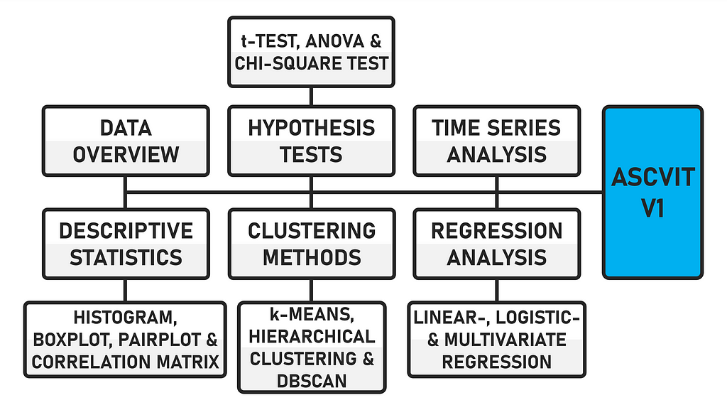
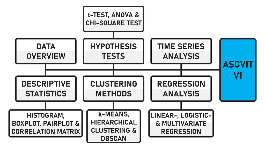
The data can be uploaded in either .csv or .xlsx format. The first version of the app provides a general data overview (data preview, data description, number of data points and categorization of variables), analyses in the field of descriptive statistics (histogram, boxplot, pairplot and correlation matrix), various hypothesis tests (t-test, ANOVA and chi-square test), regression analyses (linear, logistic and multivariate), time series analysis and supports various clustering methods (k-means, hierarchical and DBSCAN). The app is created using the Python framework Streamlit.
ASCVIT V1 Overview of analysis methods (Image by author)
Due to the modular structure of the code, further statistical procedures can be easily implemented. The code is commented, which makes it easier to find your way around. When the app is executed, the interface looks like this after a dataset has been uploaded.
ASCVIT V1 Streamlit App (Image by author)
In addition to the automatic analysis in the various areas mentioned, a function has also been integrated that automatically analyses the statistically recorded values. The “query_llm_via_cli” function enables an exchange via CLI (command line interface) with an LLM using Ollama.
I have already explained this principle in an article published on Towards Data Science [1]. In the first version of the app, this functionality is only limited to the descriptive statistical analyses, but can also be transferred to the others. In concrete terms, this means that in addition to the automatic statistical calculation, the app also automatically interprets the data.
ASCVIT V1 CLI + OLLAMA + LMS (Image by author)
DATASET FOR TESTING THE APP
If you do not have your own data available, there are various sites on the internet that provide datasets free of charge. The dataset used for the development and testing of the app comes from Maven Analytics(License: ODC-BY) [2].
MAVEN Analytics Data Playground (Screenshot by author)
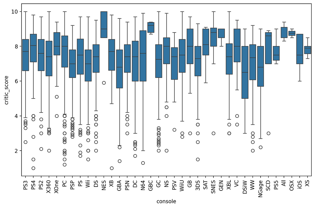
There are numerous free datasets on the site. The data I have examined deals with the sales figures of video games in the period from 1976 to 2024. Specifically, it is the sales figures from North America, Japan, the EU, Africa and the rest of the world. A total of 64016 titles and their rating, genre, console, etc. are recorded.
Unfortunately, not all information is available for all titles. There are many NaN (Not a Number) values that cause problems when analysed in Python or distort specific statistical analyses. I will briefly discuss the cleansing of data records below.
Video Games Sales data from MAVEN Analytics (Screenshot by author)
CLEAN UP THE DATASET
You can either clean the dataset before loading it into the app using a separate script, or you can perform the cleanup directly in the app. For the application in this article, I have implemented data cleansing directly in the app. If you want to clean up data records beforehand, you can do this using the following script.
print("Lines with missing data have been removed and saved in 'cleaned_file.csv'.")
The file is read using “pd.read_csv(‘.csv’)” and the data is saved in the DataFrame “df”. df.dropna()” removes all lines in the DataFrame that contain missing values ‘NaN’. The cleaned DataFrame is then saved in the variable “df_cleaned”. The data is saved in a new .csv file using “df_cleaned.to_csv(‘cleaned_file.csv’, index=False)”. Line indices are not saved. This is followed by an output for the successfully completed process “print(…)”. The code for this dataset cleanup can be found in the file “clean.py” and can also be downloaded later. Next, let’s move on to the actual code of the app.
ASCVIT V1 Python Code snippet (GIF by author)
LIBRARIES AND MODULES THAT ARE REQUIRED
To use the app, various libraries and modules are required, which in combination perform data visualization, statistical analysis and machine learning tasks.
import re
import subprocess

import matplotlib.pyplot as plt
import numpy as np
import pandas as pd
import plotly.express as px
import plotly.graph_objects as go
import seaborn as sns
from matplotlib.patches import Patch
from scipy import stats
from sklearn.cluster import KMeans, AgglomerativeClustering, DBSCAN
from sklearn.decomposition import PCA
from sklearn.linear_model import LinearRegression, LogisticRegression
from statsmodels.stats.multicomp import pairwise_tukeyhsd

import streamlit as st
A note regarding the representation of the diagrams. Some use “pyplot” (Matplotlib) and others use “plotly” (e.g. Boxplot). Even if the use of “plotly” leads to more interactive graphics, it does not make sense to use it for every type of diagram. Ultimately, the user must decide individually how the diagrams should be displayed. The code must be adapted accordingly.
The required libraries for the application can be installed using the requirements.txt file in the ZIP directory with the following command.
pip install -r requirements.txt
THE DATA OVERVIEW
The function “display_data_info()” specifically analyses the Pandas DataFrame “df” and outputs statistical key figures (mean value, standard deviation, etc.) “df.describe()”. The total number of data points (rows) of the DataFrame is output “len(df)”. Likewise, the numerical “numerical_columns” and categorical “categorical_columns” (strings) variables of the DataFrame.
ASCVIT V1 App Data Overviews (Image by author)
The dataset has a total of 64016 data points and 6 numerical and 8 categorical variables. Before you start with certain statistical procedures, you should first look at the data. In the “Data overview” section, you can obtain various information to draw conclusions whether certain tests can be carried out at all.
For example, if there is no date variable in the dataset, no time series analysis can be carried out. If there is no binary variable, no logistic regression can be carried out. The app is already designed to ask for certain variable categories or to display error messages if incorrect values are transmitted. Next, let’s move on to descriptive statistics.
def display_data_info(df): st.write("**Data description:**") st.write(df.describe()) st.write(f"**Number of data points:** {len(df)}")
The “descriptive_statistics()” function allows the user to select different chart types (histogram, boxplot, pairplot and correlation matrix). A brief explanation of the type follows via “st.markdown(”“”…“”“)”. One or more numerical variables must then be selected “selected_vars”. The option whether logarithmic scaling “apply_log_scale” should be applied is available, except for the correlation matrix. Applying logarithmic scaling to a variable is particularly useful if the data is heavily distorted. The visualization is created using the corresponding diagram function.
if chart_type == "Histogram": st.markdown(""" **Histogram:** A histogram shows the distribution of a numerical variable. It helps to recognize how frequently certain values occur in the data and whether there are patterns, such as a normal distribution. """) elif chart_type == "Boxplot": st.markdown(""" **Boxplot:** A boxplot shows the distribution of a numerical variable through its quartiles. It helps to identify outliers and visualize the dispersion of the data. """) elif chart_type == "Pairplot": st.markdown(""" **Pairplot:** A pairplot shows the relationships between different numerical variables through scatterplots. It helps to identify possible relationships between variables. """) elif chart_type == "Correlation matrix": st.markdown(""" *Correlation matrix:** The correlation matrix shows the linear relationships between numerical variables. A positive correlation indicates that high values in one variable also correlate with high values in another. """)
if chart_type in ["Pairplot", "Correlation matrix"]: selected_vars = st.multiselect("Select variables:", numerical_columns, default=numerical_columns) else: selected_vars = [st.selectbox("Select a variable:", numerical_columns)]
The “plot_histogram()” function is used to create the histogram depending on the variable selected by the user. At the beginning, all NaN values are removed from the variable “cleaned_data”. Various statistical key figures (mean value “mean_value”, median “median_value”, standard deviation “std_value”, minimum “min_value” and maximum “max_value” and the upper and lower end of the standard deviation) are calculated.
Since the data is interpreted by an LLM, as mentioned at the beginning, the dispersion (standard deviation in relation to the range of the data) and distribution (difference between mean and median) of the data is classified. The histogram is created “fix, ax = plt.subplots()”, vertical lines are added to increase the informative value and finally the histogram is displayed “st.pyplot(fig)”. In the case of distorted or exponential data, logarithmic scaling can be activated, whereupon the y-axis of the histogram is adjusted. The graph then looks as follows [3].
ASCVIT V1 Histogram (pyplot) of critic_score and LLM interpretation (Image by author)
As there are no models that can read out graphics directly, we create a universal context for the analysis by the LLM. The context contains the results of the statistical calculation and additional instructions or the desired interpretation. This means that the context, which serves as input for the LLM, can be applied to any dataset.
Specifically, the input includes the aforementioned statistical key figures, an analysis of the distribution (symmetrical, right-skewed or left-skewed), an estimate of the spread (low, moderate or high) and an interpretation formatted for the LLM. Depending on the desired output, the context can be individually adapted and further specified.
LLM context example (Image by author)
The analysis is sent to the LLM “response = query_llm_via_cli(context)”, whereupon an interpretation of the histogram takes place after a short time interval, depending on the performance of the local system “st.write(f”**Histogram Interpretation:** {response}”)”.
context = ( f"Here is an analysis of the distribution of the variable '{variable}':n" f"- Mean: {mean_value:.2f}n" f"- Median: {median_value:.2f}n" f"- Standard deviation: {std_value:.2f}n" f"- Minimum: {min_value:.2f}n" f"- Maximum: {max_value:.2f}nn" f"The distribution of the data shows a {distribution} distribution.n" f"The small difference between mean and median indicates a {distribution} distribution.n" f"A strong concentration of data points is observed between {concentration_range[0]:.2f} and {concentration_range[1]:.2f}.n" f"The scatter of the data is described as {scatter}, indicating a relatively tight distribution around the mean.nn" f"Please analyze this distribution in the histogram, paying particular attention to symmetry, scatter, and potential deviations.n" f"Avoid calling the distribution normal unless there are explicit indications.n" f"Use only the names of the variables {variable} in the analysis!" )
The “plot_boxplot()” function creates a boxplot for a variable selected by the user. Statistical key figures are calculated from the DataFrame based on the variable in order to display the distribution of the data in the diagram and to enable an analysis of the central tendency and dispersion using an LLM. In addition to the mean value, the median and the standard deviation, as with the histogram, the lower “q1”, upper “q3”, the interquartile range “iqr” (Q3 — Q1) and the lower or upper whisker “lower_whisker” and “upper_whisker”, which are based on the interquartile range (1.5 * IQR), are also determined for the boxplot.
The latter plays a role in identifying outliers and the other parameters where data is above or below a certain value. The boxplot is created using the Plotly library “fig = px.box(df, y=variable)” and finally displayed in the app “st.plotly_chart(fig)”. Logarithmic scaling can also be used for this chart type [4]. The chart then looks as follows:
ASCVIT V1 Boxplot (plotly) of critic_score and LLM interpretation (Image by author)
As with the histogram, a context is also created for the boxplot, which is forwarded to the LLM. The statistical key figures are transmitted as well as information about potential outliers that lie outside the whisker values. The text sent to the LLM is formatted so that the analysis is performed on these metrics.
fig = px.box(df, y=variable) fig.update_layout(title=f"Boxplot of {variable}")
if apply_log_scale: fig.update_yaxes(type="log")
st.plotly_chart(fig)
context = ( f"Here is an analysis of the distribution of the variable '{variable}' based on a boxplot:n" f"- Mean: {mean_value:.2f}n" f"- Median: {median_value:.2f}n" f"- Standard deviation: {std_value:.2f}n" f"- Lower quartile (Q1): {q1:.2f}n" f"- Upper quartile (Q3): {q3:.2f}n" f"- Interquartile range (IQR): {iqr:.2f}n" f"- Potential outliers outside values from {lower_whisker:.2f} to {upper_whisker:.2f}.n" f"Please analyze this distribution and identify patterns or outliers.n" f"Use only the names of the variables {variable} in the analysis!" )
The “plot_pairplot()” function creates a pairplot based on the variables selected by the user. If less than two variables are selected, an error message is displayed. Scatter plots for all possible combinations of the variables and a linear regression line are displayed to show the relationships between the variables. For this to work, the regression statistics are calculated for all possible pairs of the selected variables using the “calculate_regression_stats” function. The NaN values are removed from the selected variables “selected_vars”.
A linear regression is performed between the two variables. Here, “var1” is the independent variable x and “var2” is the dependent variable y. The slope and the R2 value “r_squared” are calculated. The results are returned as a list of tuples (var1, var2, slope, r_squared). If three variables are selected [“A”, “B”, “C”], the function will calculate the regression statistics for the pairs (A, B), (A, C), (B, A), (B, C), etc. [5].
def calculate_regression_stats(df, selected_vars): regression_results = [] for var1 in selected_vars: for var2 in selected_vars: if var1 != var2: non_nan_data = df[[var1, var2]].dropna()
X = non_nan_data[[var1]].values.reshape(-1, 1) y = non_nan_data[var2].values
if len(X) > 0 and len(y) > 0: model = LinearRegression() model.fit(X, y) r_squared = model.score(X, y) slope = model.coef_[0]
corr_matrix = df[selected_vars].corr() regression_stats = calculate_regression_stats(df, selected_vars) correlation_list = "n".join( [f"The correlation between {var1} and {var2} is {corr_matrix.at[var1, var2]:.2f}." for var1 in corr_matrix.columns for var2 in corr_matrix.columns if var1 != var2] )
regression_list = "n".join( [f"The regression line for {var1} and {var2} has a slope of {slope:.2f} and an R² of {r_squared:.2f}." for var1, var2, slope, r_squared in regression_stats] )
context = ( f"Here are the correlation and regression analyses between the selected variables:n" f"{correlation_list}nn" f"{regression_list}nn" f"Please analyze these relationships in detail based solely on the numerical values (correlation and regression lines).n" f"Use only the names of the variables {selected_vars} in the analysis!" )
response = query_llm_via_cli(context) st.write(f"**Pairplot Interpretation:** {response}") else: st.error("At least two variables must be selected for a pairplot.")
KDE (Kernel Density Estimation) is used in the “plot_pairplot()” function for the diagonal to display the distribution of each individual variable. As with the previous functions, a context is again created for the analysis by the LLM. For this type of diagram, the LLM receives the data from the correlation and regression analysis. The text is formatted in such a way that a detailed interpretation of the relationship between the variables is generated.
ASCVIT V1 Pairplot (pyplot) of critic_score, na_sales, pal_sales and LLM interpretation (Image by author)
THE CORRELATION MATRIX FUNCTION
The “plot_correlation_matrix” function is used to create a correlation matrix based on the variables selected by the user “if len(selected_vars) > 1”. If only one variable is selected, an error message is displayed. The visualization is done as a heatmap. The cells of the matrix are colored to show the strength and direction of the correlation. Correlations that are significant are automatically sent to the LLM for further analysis “if var1 != var2 and abs(corr_matrix.at[var1, var2]) >= 0.5”.
The linear correlation between the selected variables is displayed as the correlation coefficient (value between -1 and +1) “corr_matrix = df[selected_vars].cor()”. With a value of 0, there is no linear correlation. A value close to -1 indicates a strong negative correlation and a value close to +1 indicates a strong positive correlation. The pairs of variables and their correlation values are saved in “high_correlations” [4].
ASCVIT V1 Correlation Matrix (pyplot) with all variables and LLM interpretation (Image by author)
A context is created for the LLM. The existing significant correlations are classified for the textual description “correlation_list”. A strong correlation (positive or negative) is present with a value greater than 0.7. If the value is between 0.5 and 0.7, there is a moderate correlation and if the value is only just above 0.5, the correlation is weak. If no significant correlations were found, a corresponding message is displayed.
def plot_correlation_matrix(df, selected_vars): if len(selected_vars) > 1: corr_matrix = df[selected_vars].corr()
high_correlations = [] for var1 in corr_matrix.columns: for var2 in corr_matrix.columns: if var1 != var2 and abs(corr_matrix.at[var1, var2]) >= 0.5: if (var2, var1) not in [(v1, v2) for v1, v2, _ in high_correlations]: high_correlations.append((var1, var2, corr_matrix.at[var1, var2]))
if high_correlations: correlation_list = "n".join([f"- {var1} and {var2} have a correlation value of {value:.2f}, " f"indicating a {'strong' if abs(value) > 0.7 else 'moderate' if abs(value) > 0.5 else 'weak'} correlation." for var1, var2, value in high_correlations])
context = ( f"Here is an analysis of the significant correlations between the selected variables in the correlation matrix:n" f"{correlation_list}nn" f"Please analyze the correlations solely based on their strength and significance.n" f"Use only the names of the variables {selected_vars} in the analysis!" f"Focus in detail on the statistical relationship and patterns." )
response = query_llm_via_cli(context) st.write(f"**Model Response:** {response}") else: st.write("**No significant correlations were found.**") else: st.write("**The correlation matrix cannot be displayed because fewer than two variables were selected.**")
In the following statistical procedures, the interpretation of the respective key figures recorded by an LLM is not available. However, based on the previous procedure, independent implementation should not be a problem. Let us now turn to the various hypothesis tests.
HYPOTHESIS TESTS SELECTION
In the current version, three different tests (t-test, ANOVA and chi-square test) can be carried out “test_type = st.selectbox()”. Depending on the test selected, a brief explanation of its purpose appears. Depending on the area of application, this description can be expanded or removed. The t-test is used to compare the mean values of two groups. The analysis of variance (ANOVA) compares the mean value of more than two groups. The chi-square test tests the independence between two categorical variables. Depending on which test is selected, the corresponding function is performed.
T-TEST
If the user has opted for the t-test, they must select a group variable (categorical) “group_col” and a value variable (numerical) “value_col”. The group variable defines the two groups to be compared. The value variable compares the mean value between the two groups. Once the selection has been made, the names of the two groups “group1” and “group2” must be entered in a text field “st.text_input()”. The two groups should appear in the selected categorical variable. The logarithmic scaling “apply_log_scale”, which is applied to the value variable, is also available here. When the test is performed, the data of the groups is extracted and the number of data points (after the NaN values have been removed) is output. The t-statistic and the p-value are displayed.
The first value indicates the difference in the mean values between the two groups relative to the spread of the data. Whether the difference between the groups is statistically significant is indicated by the p-value. If it is less than 0.05, it is significant. To visually highlight the distribution of the two groups “filtered_df = df[df[group_col].isin([group1, group2])]”, a boxplot is created “fig, ax = plt.subplots()”. Here “pyplot” is used, alternatively you can also use “plotly” [6].
ASCVIT V1 Boxplot with genre (Action/Shooter) and critic_score (Image by author)
In this example, “genre” was selected as the group variable and “critic_score” as the value variable. Action (group 1) and Shooter (group 2) were defined as groups. The function also calculates whether there are significant outliers in the groups. An outlier is defined as a data point exceeding the upper quartile by more than 1.5 times the interquartile range “outliers_group1/2”. Finally, the outliers found are displayed to confirm the validity of the t-test. If the distortion is too large, this must be taken into account accordingly in order to better classify the reliability and interpretability of the test results.
def t_test(df, numerical_columns, categorical_columns): group_col = st.selectbox("Choose the group variable:", categorical_columns) value_col = st.selectbox("Choose the value variable:", numerical_columns)
group1 = st.text_input("Name of group 1:") group2 = st.text_input("Name of group 2:")
st.write(f"**Group 1 ({group1}):** Total number of data points: {initial_count_group1}, without NaN: {remaining_count_group1}") st.write(f"**Group 2 ({group2}):** Total number of data points: {initial_count_group2}, without NaN: {remaining_count_group2}")
if apply_log_scale: group1_data = np.log1p(group1_data) group2_data = np.log1p(group2_data)
if not group1_data.empty and not group2_data.empty:
st.write("**Outlier Analysis:**") if not outliers_group1.empty: st.write(f"In group 1 ({group1}) there are {len(outliers_group1)} outliers.") else: st.write(f"In group 1 ({group1}) there are no significant outliers.")
if not outliers_group2.empty: st.write(f"In group 2 ({group2}) there are {len(outliers_group2)} outliers.") else: st.write(f"In group 2 ({group2}) there are no significant outliers.") else: st.error("One or both groups contain no data after removing NaN values.")
ANOVA-TEST
The “anova_test()” function integrates the option of performing an ANOVA test. This test checks whether there are significant differences in the mean values of several groups. The data is first cleaned “df_clean”. If the ANOVA test is significant, a Tukey’s HSD test (Honestly Significant Difference) is also carried out. At the beginning, a group variable and a value variable are again defined. If a group has fewer than 2 data points, it is excluded “valid_groups = group_sizes[group_sizes >= 2].index”.
If less than two groups remain after the adjustment, an error message is displayed and the test is not performed. The ANOVA test calculates the F-value and the p-value. The variability between the groups compared to the variability within the group is measured by the F-value. Whether the difference between the mean values of the group is significant is indicated by the p-value. If the value is less than 0.05, at least one group is significantly different. To visualize the results, a boxplot is created using “pyplot” [7].
ASCVIT V1 Boxplot with console and critic_score (Image by author)
If the ANOVA test produces significant results, a Tukey’s test is carried out to examine the differences between the individual group pairs in concrete terms. The ANOVA test therefore does not show which groups differ from each other. A diagram is created that shows the pairwise mean differences between the groups and their confidence interval “st.pyplot(tukey.plot_simultaneous())”.
ASCVIT V1 Result of the Tukey Test (Image by author)
Below the diagram, the results are displayed in a table “st.dataframe(tukey_results_df, height=400)”. The table contains the two groups, the mean difference “meandiff”, the adjusted p-value “p-adj”, the confidence interval and whether the null hypothesis can be rejected or not “reject” (True = significant, Fals = not significant). A brief example of the confidence interval. For the 3DS and GBA consoles, the interval lies between -0.9319 and -0.0061 and is therefore completely below zero. The difference in the mean value is significant.
The key figures can be used to have the results interpreted by an LLM. There is also an option to download the data as a .csv file for further statistical analyses (e.g. regression analyses) [7].
def anova_test(df, numerical_columns, categorical_columns): group_col = st.selectbox("Choose the group variable:", categorical_columns) value_col = st.selectbox("Choose the value variable:", numerical_columns)
if st.button("Perform ANOVA"): df_clean = df[[group_col, value_col]].dropna()
if len(valid_groups) < 2: st.error("After removing small groups, there are not enough groups left for the ANOVA test.") else: grouped_data = [group[value_col].values for name, group in df_filtered.groupby(group_col)] try: anova_result = stats.f_oneway(*grouped_data) st.markdown(f"**F-Value:** {anova_result.statistic}") st.markdown(f"**p-Value:** {anova_result.pvalue}")
if anova_result.pvalue < 0.05: st.write("The ANOVA test is significant. Tukey's HSD test will be performed.") try: tukey = pairwise_tukeyhsd(endog=df_filtered[value_col], groups=df_filtered[group_col], alpha=0.05) st.pyplot(tukey.plot_simultaneous())
tukey_results_df = pd.DataFrame(data=tukey.summary().data[1:], columns=tukey.summary().data[0]) st.write("Results of the Tukey HSD test:") st.dataframe(tukey_results_df, height=400)
except Exception as e: st.error(f"An error occurred during Tukey's HSD test: {str(e)}")
except ValueError as e: st.error(f"An error occurred: {str(e)}.")
CHI-QUADRAT-TEST
The “chi_square_test()” function checks whether there is a statistically significant relationship between two categorical variables. As only categorical variables can be used, the option to activate logarithmic scaling is not required. Specifically, whether the frequency of observations in the categories is independent of each other or whether there is a correlation. The user selects two of the existing categorical variables. The NaN values are removed and only the top 10 most frequent categories are selected for each variable in order to keep the analysis manageable “value_counts().nlargest(10).index”.
A crosstab “contingency_table” is created, which shows the frequencies of the combinations of categories in the two selected variables using a heatmap. If the crosstab is not valid (too little data or only one category), the test is not performed [8].
ASCVIT V1 Heatmap with genre and console (Image by author)
The test calculates various values. The chi-square value “chi2” determines the measure of the difference between the observed and expected frequencies. A strong difference is present with high values. As with the other analyses, the p-value “p” shows whether the difference is significant. The number of degrees of freedom of the test “dof” is indicated as well as the expected frequencies “expected”.
def chi_square_test(df, categorical_columns): cat_var1 = st.selectbox("Choose the first group variable:", categorical_columns) cat_var2 = st.selectbox("Choose the second group variable:", categorical_columns)
if st.button("Perform Chi-square test"): df_clean = df[[cat_var1, cat_var2]].dropna()
if contingency_table.empty or contingency_table.shape[0] < 2 or contingency_table.shape[1] < 2: st.error("The contingency table is invalid. Check the variables.") else: chi2, p, dof, expected = stats.chi2_contingency(contingency_table) st.markdown(f"**Chi-square:** {chi2}") st.markdown(f"**p-Value:** {p}")
st.write("**Heatmap of the contingency table:**") fig, ax = plt.subplots(figsize=(12, 10)) # Larger display sns.heatmap(contingency_table, annot=False, cmap="YlGnBu", ax=ax) ax.set_title(f"Heatmap of the contingency table: {cat_var1} vs. {cat_var2} top 10") plt.xticks(rotation=90) st.pyplot(fig)
except ValueError as e: st.error(f"An error occurred: {str(e)}.")
REGRESSION ANALYSIS SELECTION
The selection of the available regression analyses (linear, logistic and multivariate) is similar to the selection of the various hypothesis tests. Once an analysis method has been selected, a brief explanation is displayed and the corresponding function is called up.
LINEAR REGRESSION ANALYSIS
At the beginning of the “linear_regression()” function, a correlation matrix is created from all available numerical variables in the uploaded dataset “corr_matrix = df[numerical_columns].corr()”. The matrix is intended to help the user understand the relationships between the variables in order to identify the variables for which regression analyses are appropriate and those for which they are not (multicollinearity).
Finally, the dependent variable and one or more independent variables are selected. The data is cleaned and a linear regression model is created for all selected independent variables “model = LinearRegression()”. The regression coefficient and the intercept are specified. After the overall model has been run, a separate linear regression model is created for each independent variable and represented by a scatterplot [9].
ASCVIT V1 Lineare Regression pal_sales, na_sales and total_sales (Image by author)
The regression coefficient shown indicates the extent to which the dependent variable is changed when the respective independent variable is changed by one unit. Assuming that all other variables remain constant. The value that the dependent variable assumes when all independent variables are zero is indicated by the intercept.
dependent_var = st.selectbox("Choose the dependent variable:", numerical_columns) independent_vars = st.multiselect("Choose the independent variables:", numerical_columns)
if independent_vars: if st.button("Perform regression"): X = df[independent_vars].dropna() y = df[dependent_var].loc[X.index] y = y.dropna() X = X.loc[y.index]
if y.isnull().values.any(): st.error("The dependent variable still contains missing values. Please clean the data.") else: model = LinearRegression() model.fit(X, y)
st.markdown("**Regression coefficients:**") for var, coef in zip(independent_vars, model.coef_): st.write(f"- {var}: {coef}") st.write(f"**Intercept:** {model.intercept_}")
for var in independent_vars: X_single_var = X[[var]] # Use only the current independent variable model_single = LinearRegression() model_single.fit(X_single_var, y)
As with the other functions, the user selects dependent and independent variables at the beginning. In this analysis method, the dependent variable must be binary (0/1). To demonstrate the function, I have created some data that has nothing to do with the dataset used so far. Alternatively, you can also manually adjust the values of variables, as long as there are not too many categories. If an incorrect variable is selected, a corresponding error message is displayed.
If everything is defined correctly, the logistic regression is performed and the model uses the independent variables to model the probability for the target variable. Specifically, this is the probability that an event will occur. The coefficients are specified for each independent variable and the logistic function is visualized. This shows how the probability of the target result (1 instead of 0) changes when the independent variable changes [10].
ASCVIT V1 Logistic regression with fictitious values for demonstration purposes (Image by author)
In the scatterplot, the red line represents the prediction probability for the target result, i.e. the probability that result 1 will occur. The independent variable varies. The “logistic_regression()” function is very well suited to binary classification problems where you want to predict the occurrence of an event based on several factors.
def logistic_regression(df, numerical_columns): dependent_var = st.selectbox("Choose the dependent variable (binary):", numerical_columns) independent_vars = st.multiselect("Choose the independent variables:", numerical_columns)
if independent_vars: if st.button("Perform logistic regression"): X = df[independent_vars].dropna() y = df[dependent_var].loc[X.index].dropna() X = X.loc[y.index]
unique_values = y.unique() if len(unique_values) != 2: st.error("The dependent variable must be binary (e.g., 0 and 1).") else: model = LogisticRegression() model.fit(X, y)
st.write("**Logistic regression coefficients:**") for var, coef in zip(independent_vars, model.coef_[0]): st.write(f"- {var}: {coef}") st.write(f"**Intercept:** {model.intercept_[0]}")
for var in independent_vars: fig, ax = plt.subplots()
ax.scatter(X[var], y, label='Data points') x_range = np.linspace(X[var].min(), X[var].max(), 300).reshape(-1, 1) X_copy = pd.DataFrame(np.tile(X.mean().values, (300, 1)), columns=X.columns) X_copy[var] = x_range.flatten() # Vary the current variable var y_prob = model.predict_proba(X_copy)[:, 1]
In multivariate regression analysis, the user must select several dependent variables and one or more independent variables. The analysis examines how the dependent variables are influenced by the independent variables. After the variable selection, the NaN values are removed again and an error message is displayed if necessary. The model outputs the regression coefficient and the intercept for all dependent variables.
A scatterplot with regression line is created for all combinations of independent and dependent variables. This function makes it possible to analyze several target variables simultaneously and to model their relationship to several predictors [11].
ASCVIT V1 Multivariate regression (plotly) example (Image by author)
def multivariate_regression(df, numerical_columns): dependent_vars = st.multiselect("**Choose the dependent variables (multiple):**", numerical_columns) independent_vars = st.multiselect("**Choose the independent variables:**", numerical_columns)
if dependent_vars and independent_vars: if st.button("Perform multivariate regression"): X = df[independent_vars].dropna() Y = df[dependent_vars].loc[X.index].dropna() X = X.loc[Y.index]
if X.shape[1] != len(independent_vars) or Y.shape[1] != len(dependent_vars): st.error("The number of independent or dependent variables does not match.") return
model = LinearRegression() model.fit(X, Y)
st.write("**Multivariate regression coefficients:**") for i, dep_var in enumerate(dependent_vars): st.write(f"nFor the dependent variable: **{dep_var}**") st.write(f"Intercept: {model.intercept_[i]}") for var, coef in zip(independent_vars, model.coef_[i]): st.write(f"- {var}: {coef}")
for dep_var in dependent_vars: for var in independent_vars: fig, ax = plt.subplots() ax.scatter(X[var], Y[dep_var], label='Data points')
This analysis method performs an analysis over time. For this purpose, a given time series is grouped by year and the annual average of a value is calculated and displayed. A time variable is required for the analysis; if the dataset used does not contain one, it cannot be performed. In the dataset I have selected, there is the variable “release_date”, which contains the release date of the respective game.
The selected time variable is converted to the date format “df[time_var]”. If the data points are invalid, they are converted to NaN values and removed “df = df.dropna(subset=[time_var])”. The data is then grouped by year “df[‘year’] = df[time_var].dt.year” and the annual average for the specified value variable “value_var” is calculated “yearly_avg”. The minimum and maximum annual average values of the value variable are calculated as well as the overall average across all data points “overall_avg”. The annual average of the value variable per year is then displayed via a line chart. The overall average is integrated on the horizontal line. The values are displayed alternately above and below the data points to improve readability [12].
ASCVIT V1 Time series analysis with year and critic_score (Image by author)
Important statistical key figures are displayed below the diagram, which can be easily interpreted as in the descriptive analysis using an LLM. Specifically, the standard deviation, the variance and the minimum and maximum of the value variable as well as the year are displayed. The “perform_time_series_analysis()” function is suitable for analyzing time trends in a data series. This allows an initial analysis of the variability over time.
if df.empty: st.error("**Error:** The time variable has an incorrect format.") else: df['year'] = df[time_var].dt.year yearly_avg = df.groupby('year')[value_var].mean().reset_index()
st.write(f"**Standard deviation:** {df[value_var].std():.2f}") st.write(f"**Variance:** {df[value_var].var():.2f}") st.write(f"**Minimum {value_var}:** {y_min:.2f} in year {yearly_avg.loc[yearly_avg[value_var].idxmin(), 'year']}") st.write(f"**Maximum {value_var}:** {y_max:.2f} in year {yearly_avg.loc[yearly_avg[value_var].idxmax(), 'year']}")
CLUSTERING METHOD SELECTION
As with the hypothesis tests and regression analyses, there are also various options to choose from in the area of clustering methods. The selection function has a similar structure to the others. A method is selected and the corresponding function is executed. A brief explanation of the method is also shown here. Depending on the method, the number of clusters must be defined. For k-Means and hierarchical clustering, a maximum of 10 clusters can be defined. For DBSCAN, the radius “eps” and the minimum number of points per cluster “min_samples” are queried. At least two numerical variables must be selected for each method.
k-MEANS CLUSTERING
The k-Means algorithm divides the data into “n_clusters”. The points are grouped in such a way that the distance between the points within the cluster is minimized. The number of clusters is determined by the user. Depending on the number, the algorithm calculates which data points belong to which cluster. The result is sent to the “visualize_clusters()” function for visualization [13].
ASCVIT V1 k-Means Clustering with PCA reduction (Image by author)
HIERARCHICAL CLUSTERING
A hierarchy of clusters is created here, whereby agglomerative or divisive methods can be used. Agglomerative clustering is used in the function, whereby each data point is initially considered as a separate cluster before they are successively merged. The number of clusters is determined by the user and the algorithm divides the data according to the number. The same function as for k-Means is used for visualization “visualize_clusters(X, ‘Hierarchical Clustering’)” [14].
ASCVIT V1 Hierarchical Clustering with PCA reduction (Image by author)
DBSCAN CLUSTERING
With this method, data points are grouped based on the density of their surroundings. The method is well suited to detecting outliers (noise) and finding clusters of any shape. Here, the user does not specify the number of clusters, but the maximum distance “eps” between two points before they are considered neighbors. The minimum number of points that occur in a cluster “min_samples” is also defined. The visualization is also created by “visualize_clusters()” [15].
ASCVIT V1 DBSCAN Clustering with PCA reduction (Image by author)
CLUSTER VISUALIZATION
The results of the three different clustering methods are visualized in the “visualize_clusters” function using Principal Component Analysis (PCA). The dimensions of the data are reduced by PCA to two components “n_components” in order to be able to display the clusters. It is checked whether there are enough data points and variables “num_samples”; if this is not the case, an error message is displayed. The clusters are visualized by a scatterplot that shows the data points in the first two PCA components.
The clusters are displayed in different colors “cmap=‘tab10’”. In the diagrams, the axis label “ax.set_x/ylabel” and the legend “legend_labels” are adapted for better interpretation. The size of the data points “s” and the transparency “alpha” have also been adjusted to improve visibility. Outliers are automatically assigned to cluster -1 in DBSCAN. A table with the average values of the variable for each cluster is displayed below the visualization “st.dataframe(cluster_means)”.
ax.set_title(title) ax.set_xlabel(f'PCA 1' if n_components >= 1 else '') ax.set_ylabel(f'PCA 2' if n_components == 2 else '')
cluster_counts = X['Cluster'].value_counts()
legend_labels = [f"Cluster {int(cluster)} ({count} points)" for cluster, count in cluster_counts.items()] legend1 = ax.legend(handles=scatter.legend_elements()[0], labels=legend_labels) ax.add_artist(legend1)
st.pyplot(fig)
st.write(f"**Average values per cluster:**") cluster_means = X.groupby('Cluster').mean() st.dataframe(cluster_means)
except ValueError as e: st.error(f"**Error:** Not enough variables were selected.")
COMMUNICATION WITH THE LLM
In this first version of the app, the output of the statistical calculations is only analyzed in the descriptive area. The key figures are interpreted using the “query_llm_via_cli” function. Specifically, the function is used to communicate with the LLM via a command line (CLI). To achieve this, the Python module “subprocess” is used to start the process via the command line. The LLM is started via the command [“ollama”, “run”, “llama3.1”]. The input is stored in “stdin”, the output in “stout”.
Errors and warnings are stored in “stderr”, which hopefully do not occur. The input is sent to the model via “process.communicate”. Specifically, the created “context” is sent to the function to communicate with the LLM. If there is no response from the model, a timeout mechanism “timeout=40” is included, which stops the execution after 40 seconds. Depending on the computing power of the system used, a response from the model should be displayed much earlier. The model’s response is cleaned up and passed to “extract_relevant_answer” in order to extract relevant information [1].
def query_llm_via_cli(input_text): """Sends the question and context to the LLM and receives a response""" try: process = subprocess.Popen( ["ollama", "run", "llama3.1"], stdin=subprocess.PIPE, stdout=subprocess.PIPE, stderr=subprocess.PIPE, text=True, encoding='utf-8', errors='ignore', bufsize=1 ) stdout, stderr = process.communicate(input=f"{input_text}n", timeout=40)
if process.returncode != 0: return f"Error in the model request: {stderr.strip()}"
except subprocess.TimeoutExpired: process.kill() return "Timeout for the model request" except Exception as e: return f"An unexpected error has occurred: {str(e)}"
def extract_relevant_answer(full_response): response_lines = full_response.splitlines() if response_lines: return "n".join(response_lines).strip() return "No answer received"
MAIN FUNCTION OF THE APP
The structure of the app is defined by the “main()” function. The title is set “st.title()” and the sidebar for uploading the dataset in CSV or Excel format “uploaded_file” is submitted. Once a file has been uploaded, it is analyzed and the numerical and categorical variables are extracted. Here and in many other situations, “session_state” is used by Streamlit to store certain parameters that are relevant for the selection in the analysis methods.
The variables “numerical_columns” and “categorical_columns” are updated as soon as a new dataset is uploaded. Once data is available, the user can select from the various analysis methods. Once a method has been selected, it is displayed and can be carried out after the corresponding variables have been defined. The main function controls the interactive statistical analysis of the app.
CUSTOMIZATION OPTIONS
As already mentioned, the app can be expanded to include other analysis methods due to the modular structure of the code. The functionality of interpreting statistical key figures using an LLM can also be transferred to other methods. Llama3.1 (8B) from Meta is currently used, but another LLM (e.g. Mistral) from Ollama can also be used. The command in the “query_llm_via_cli” function must then be adapted accordingly.
Depending on the available power, models with more parameters can also be used. The design of the diagrams can be further refined, as can the transmitted contexts, in order to improve the output of the LLM. Alternatively, you can also create a new model file to adjust certain parameters (e.g. parameters) of the LLM and thereby improve the interpretation of the data.
ASCVIT V1 PYTHON SCRIPT [GITHUB]
The app code can be downloaded from the following GitHub repository. The app is started in the corresponding directory using the following command:
Streamlit run app.py
CONCLUSION
In this article, I showed how Streamlit can be used to create an app that can be used to analyze datasets using various methods. I also showed how an interpretation can be integrated into the app using an LLM, which results in real added value. Data is not only automatically visualized and statistical parameters are output, but also classified. The application offers a lot of potential for further development. I have listed some suggestions in the penultimate section. Have fun using and customizing the app.
[1] Pietrusky, S. (2024, August 21). How to talk to a PDF file without using proprietary models: CLI, Streamlit, Ollama.Towards Data Science. URL
[2] Maven Analytics. (2024, Juni 10.). Data Playground, Video Game Sales.URL
[3] Hastie, T., Tibshirani, R., & Friedman, J. (2009). The elements of statistical learning: Data mining, inference, and prediction (2nd ed.). Stanford University. URL
[4] Bruce, P., Bruce, A., & Gedeck, P. (2021). Praktische Statistik für Data Scientists: 50+ essenzielle Konzepte mit R und Python(2nd ed.). O’Reilly.
[5] VanderPlas J. (2017). Python Data Science Handbook: Essential Tools for Working with Data. O’Reilly. URL
[6] Fahrmeir, L., Künstler, R., Pigeot, I., & Tutz, G. (2016). Statistik: Der Weg zur Datenanalyse (8th ed.). Springer.
[7] Montgomery, D. C. (2012). Design and analysis of experiments (8th ed.). Wiley. URL
[8] Moore, D. S., McCabe, G. P., Craig, B. A., & Duckworth, W. M. (2021). Introduction to the practice of statistics (10th ed.). W. H. Freeman.
[9] Montgomery, D. C., Peck, E. A., & Vining, G. G. (2012). Introduction to linear regression analysis (5th ed.). Wiley. URL
[10] Hosmer, D. W., Lemeshow, S., & Sturdivant, R. X. (2013). Applied logistic regression (3rd ed.). Wiley.
[11] Johnson, R. A., & Wichern, D. W. (2007). Applied multivariate statistical analysis (6th ed.). Pearson. URL
[12] Box, G. E. P., Jenkins, G. M., Reinsel, G. C., & Ljung, G. M. (2015). Time series analysis: Forecasting and control (5th ed.). Wiley. URL
[13] Witten, I. H., & Frank, E. (2005). Data mining: Practical machine learning tools and techniques (2nd ed.). Morgan Kaufmann.URL
[14] Everitt, B. S., Landau, S., Leese, M., & Stahl, D. (2011). Cluster analysis (5th ed.). Wiley. URL
[15] Aggarwal, C. C., & Reddy, C. K. (2014). Data Clustering: Algorithms and Applications. CRC Press URL
Everyone will have to wait a little longer for Apple Intelligence on iPad, but for now, iPadOS 18 has launched with the long-awaited calculator app and new Smart Script handwriting feature.
iPadOS 18 is here with Smart Script and Calculator
Apple didn’t have much to say about iPadOS 18 during WWDC because a significant portion of new features were either inherited from iOS 18 or Apple Intelligence. Even then, Apple’s AI features won’t be available on iPad until iPadOS 18.1 is released to the public.
So, if you focus on what’s exclusive on iPad in 2024, there’s not much. A new Smart Script feature learns the user’s handwriting for autocorrect and making notes more legible.
We use cookies on our website to give you the most relevant experience by remembering your preferences and repeat visits. By clicking “Accept”, you consent to the use of ALL the cookies.
This website uses cookies to improve your experience while you navigate through the website. Out of these, the cookies that are categorized as necessary are stored on your browser as they are essential for the working of basic functionalities of the website. We also use third-party cookies that help us analyze and understand how you use this website. These cookies will be stored in your browser only with your consent. You also have the option to opt-out of these cookies. But opting out of some of these cookies may affect your browsing experience.
Necessary cookies are absolutely essential for the website to function properly. These cookies ensure basic functionalities and security features of the website, anonymously.
Cookie
Duration
Description
cookielawinfo-checkbox-analytics
11 months
This cookie is set by GDPR Cookie Consent plugin. The cookie is used to store the user consent for the cookies in the category "Analytics".
cookielawinfo-checkbox-functional
11 months
The cookie is set by GDPR cookie consent to record the user consent for the cookies in the category "Functional".
cookielawinfo-checkbox-necessary
11 months
This cookie is set by GDPR Cookie Consent plugin. The cookies is used to store the user consent for the cookies in the category "Necessary".
cookielawinfo-checkbox-others
11 months
This cookie is set by GDPR Cookie Consent plugin. The cookie is used to store the user consent for the cookies in the category "Other.
cookielawinfo-checkbox-performance
11 months
This cookie is set by GDPR Cookie Consent plugin. The cookie is used to store the user consent for the cookies in the category "Performance".
viewed_cookie_policy
11 months
The cookie is set by the GDPR Cookie Consent plugin and is used to store whether or not user has consented to the use of cookies. It does not store any personal data.
Functional cookies help to perform certain functionalities like sharing the content of the website on social media platforms, collect feedbacks, and other third-party features.
Performance cookies are used to understand and analyze the key performance indexes of the website which helps in delivering a better user experience for the visitors.
Analytical cookies are used to understand how visitors interact with the website. These cookies help provide information on metrics the number of visitors, bounce rate, traffic source, etc.
Advertisement cookies are used to provide visitors with relevant ads and marketing campaigns. These cookies track visitors across websites and collect information to provide customized ads.