Sui’s TVL surpassed $1.03 billion, signaling growing liquidity and increased trust in the network.
With rising active addresses and market activity, SUI is positioned to break the $1.38 resis
PEPE’s stable adoption and rising whale activity hint at a potential breakout above key resistance.
Net inflows and growing active addresses reflect increased interest as PEPE approaches a pivo
As the crypto market experiences a turbulent phase, both Avalanche (AVAX) and Stacks (STX) have seen their prices take a hit. Avalanche hovers near the $20 mark after facing resistance, while Stacks s
The blockchain industry is bustling with growth yet faces significant hurdles as platforms like Polygon (MATIC) and Toncoin wrestle with market fluctuations and heightened regulatory scrutiny. Amid these challenges, savvy adherents are turning towards more stable and innovative alternatives. Enter BlockDAG Network—a rising star in the blockchain sphere renowned for its cutting-edge approach to scalability, […]
A distance metric that can improve prediction, clustering, and outlier detection in datasets with many dimensions and with varying densities
In this article I describe a distance metric called Shared Nearest Neighbors (SNN) and describe its application to outlier detection. I’ll also cover quickly its application to prediction and clustering, but will focus on outlier detection, and specifically on SNN’s application to the k Nearest Neighbors outlier detection algorithm (though I will also cover SNN’s application to outlier detection more generally).
In data science, when working with tabular data, it’s a very common task to measure the distances between rows. This is done, for example, in some predictive models such as KNN: when predicting the target value of an instance using KNN, we first identify the most similar records from the training data (which requires having a way to measure the similarity between rows). We then look at the target values of these similar rows, with the idea that the test record is most likely to have the same target value as the majority of the most similar records (for classification), or the average target value of the most similar records (for regression).
A few other predictive models use distance metrics as well, for example Radius-based methods such as RadiusNeighborsClassifier. But, where distance metrics are used by far the most often is with clustering. In fact, distance calculations are virtually universal in clustering: to my knowledge, all clustering algorithms rely in some way on calculating the distances between pairs of records.
And distance calculations are used by many outlier detection algorithms, including many of the most popular (such as kth Nearest Neighbors, Local Outlier Factor (LOF), Radius, Local Outlier Probabilities (LoOP), and numerous others). This is not true of all outlier detection algorithms: many identify outliers in quite different ways (for example Isolation Forest, Frequent Patterns Outlier Factor, Counts Outlier Detector, ECOD, HBOS), but many detectors do utilize distance calculations between rows in one way or another.
Clustering and outlier detection algorithms (that work with distances) typically start with calculating the pairwise distances, the distances between every pair of rows in the data. At least this is true in principle: to execute more efficiently, distance calculations between some pairs of rows may be skipped or approximated, but theoretically, we very often start by calculating an n x n matrix of distances between rows, where n is the number of rows in the data.
This, then, requires having a way to measure the distances between any two records. But, as covered in a related article on Distance Metric Learning (DML), it can be difficult to determine a good means to identify how similar, or dissimilar, two rows are.
The most common method, at least with numeric data, is the Euclidean distance. This can work quite well, and has strong intuitive appeal, particularly when viewing the data geometrically: that is, as points in space, as may be seen in a scatter plot such as is shown below. In two dimensional plots, where each record in the data is represented as a dot, it’s natural to view the similarity of records in terms of their Euclidean distances.
However, real world tabular data often has very many features and one of the key difficulties when dealing with this is the curse of dimensionality. This manifests in a number of ways, but one of the most problematic is that, with enough dimensions, the distances between records start to become meaningless.
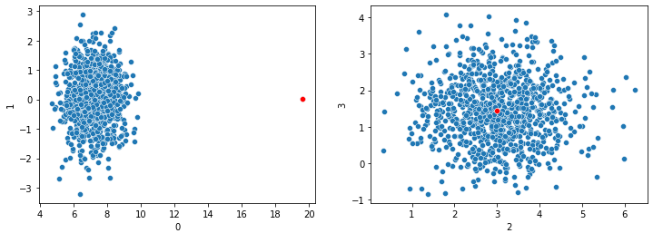
In the plots shown here, we have a point (shown in red) that is unusual in dimension 0 (shown on the x-axis of the left pane), but normal in dimensions 1, 2, and 3. Assuming this dataset has only these four dimensions, calculating the Euclidean distances between each pair of records, we’d see the red point as having an unusually large distance from all other points. And so, it could reliably be flagged as an outlier.
However, if there were hundreds of dimensions, and the red point is fairly typical in all dimensions besides dimension 0, it could not reliably be flagged as an outlier: the large distance to the other points in dimension 0 would be averaged in with the distances in all other dimensions and would eventually become irrelevant.
This is a huge issue for predictive, clustering, and outlier detection methods that rely on distance metrics.
SNN is used at times to mitigate this effect. However, I’ll show in experiments below, where SNN is most effective (at least with the kth Nearest Neighbors outlier detector I use below) is not necessarily where there are many dimensions (though this is quite relevant too), but where the density of the data varies from one region to another. I’ll explain below what this means and how it affects some outlier detectors.
SNN is used to define a distance between any two records, the same as Euclidean, Manhattan, Canberra, cosine, and any number of other distance metrics. As the name implies, the specific distances calculated have to do with the number of shared neighbors any two records have.
In this way, SNN is quite different from other distance metrics, though it is still more similar to Euclidean and other standard metrics than is Distance Metric Learning. DML seeks to find logical distances between records, unrelated to the specific magnitudes of the values in the rows.
SNN, on the other hand, actually starts by calculating the raw distances between rows using a standard distance metric. If Euclidean distances are used for this first step, the SNN distances are related to the Euclidean distances; if cosine distances are used to calculate the raw distance, the SNN distances are related to cosine distances; and so on.
However, before we get into the details, or show how this may be applied to outlier detection, we’ll take a quick look at SNN for clustering, as it’s actually with clustering research that SNN was first developed. The general process described there is what is used to calculate SNN distances in other contexts as well, including outlier detection.
SNN Clustering
The terminology can be slightly confusing, but there’s also a clustering method often referred to as SNN, which uses SNN distances and works very similarly to DBSCAN clustering. In fact, it can be considered an enhancement to DBSCAN.
The main paper describing this can be viewed here: https://www-users.cse.umn.edu/~kumar001/papers/siam_hd_snn_cluster.pdf. Though, the idea of enhancing DBSCAN to use SNN goes back to a paper written by Jarvis-Patrick in 1973. The paper linked here uses a similar, but improved approach.
DBSCAN is a strong clustering algorithm, still widely used. It’s able to handle well clusters of different sizes and shapes (even quite arbitrary shapes). It can, though, struggle where clusters have different densities (it effectively assumes all clusters have similar densities). Most clustering algorithms have some such limitations. K-means clustering, for example, effectively assumes all clusters are similar sizes, and Gaussian Mixture Models clustering, that all clusters have roughly Gaussian shapes.
I won’t describe the full DBSCAN algorithm here, but as a very quick sketch: it works by identifying what it calls core points, which are points in dense regions, that can safely be considered inliers. It then identifies the points that are close to these, creating clusters around each of the core points. It runs over a series of steps, each time expanding and merging the clusters discovered so far (merging clusters where they overlap). Points that are close to existing clusters (even if they are not close to the original core points, just to points that have been added to a cluster) are added to that cluster. Eventually every point is either in a single cluster, or is left unassigned to any cluster.
As with outlier detection, clustering can also struggle with high dimensional datasets, again, due to the curse of dimensionality, and particularly the break-down in standard distance metrics. At each step, DBSCAN works based on the distances between the points that are not yet in clusters and those in clusters, and where these distance calculations are unreliable, the clustering is, in turn, unreliable. With high dimensions, core points can be indistinguishable from any other points, even the noise points that really aren’t part of any cluster.
As indicated, DBSCAN also struggles where different regions of the data have different densities. The issue is that DBSCAN uses a global sense of what points are close to each other, but different regions can quite reasonably have different densities.
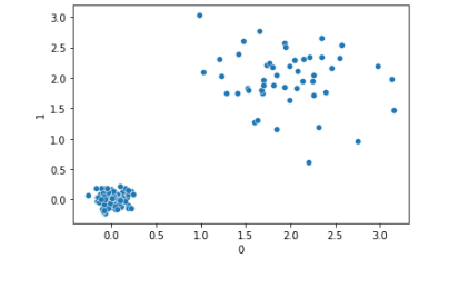
Take, for example, where the data represents financial transactions. This may include sales, expense, payroll, and other types of transactions, each with different densities. The transactions may be created at different rates in time, may have different dollar values, different counts, and different ranges of numeric values. For example, it may be that there are many more sales transactions than expense transactions. And the ranges in dollar values may be quite different: perhaps the largest sales are only about 10x the size of the smallest sales, but the largest expenses 1000x as large as the smallest. So, there can be quite different densities in the sales transactions compared to expenses.
Assuming different types of transactions are located in different regions of the space (if, again, viewing the data as points in high-dimensional space, with each dimension representing a feature from the data table, and each record as a point), we may have a plot such as is shown below, with sales transactions in the lower-left and expenses in the upper-right.
Many clustering algorithms (and many predictive and outlier detection algorithms) could fail to handle this data well given these differences in density. DBSCAN may leave all points in the upper-right unclustered if it goes by the overall average of distances between points (which may be dominated by the distances between sales transactions if there are many more sales transactions in the data).
The goal of SNN is to create a more reliable distance metric, given high dimensionality and varying density.
The central idea of SNN is: if point p1 is close to p2 using a standard distance metric, we can say that likely they’re actually close, but this can be unreliable. However, if p1 and p2 also have many of the same nearest neighbors, we can be significantly more confident they are truly close. Their shared neighbors can be said to confirm the similarity.
Using shared neighbors, in the graph above, points in the upper-right would be correctly recognized as being in a cluster, as they typically share many of the same nearest neighbors with each other.
Jarvis-Patrick explained this in terms of a graph, which is a useful way to look at the data. We can view each record as a point in space (as in the scatter plot above), with an edge between each pair indicating how similar they are. For this, we can simply calculate the Euclidean distances (or another such metric) between each pair of records.
As graphs are often represented as adjacency matrices (n x n matrices, where n is the number of rows, giving the distances between each pair of rows), we can view the process in terms of an adjacency matrix as well.
Considering the scatter plot above, we may have an n x n matrix such as:
        Point 1   Point 2   Point 3   ...   Point n
Point 1    0.0      3.3        2.9    ...     1.9
Point 2    3.3      0.0        1.8    ...     4.0
Point 3    2.9      1.8        0.0    ...     2.7
...        ...      ...        ...    ...     ...
Point n    1.9      4.0        2.7    ...     0.0
The matrix is symmetric across the main diagonal (the distance from Point 1 to Point 2 is the same as from Point 2 to Point 1) and the distances of points to themselves is 0.0 (so the main diagonal is entirely zeros).
The SNN algorithm is a two-step process, and starts by calculating these raw pair-wise distances (generally using Euclidean distances). It then creates a second matrix, with the shared nearest neighbors distances.
To calculate this, it first uses a process called sparcification. For this, each pair of records, p and q, get a link (will have a non-zero distance) only if p and q are each in each other’s k nearest neighbors lists. This is straightforward to determine: for p, we have the distances to all other points. For some k (specified as a parameter, but lets assume a value of 10), we find the 10 points that are closest to p. This may or may not include q. Similarly for q: we find it’s k nearest neighbors and see if p is one of them.
We now have a matrix like above, but with many cells now containing zeros.
We then consider the shared nearest neighbors. For the specified k, p has a set of k nearest neighbors (we’ll call this set S1), and q also has a set of k nearest neighbors (we’ll call this set S2). We can then determine how similar p and q are (in the SNN sense) based on the size of the overlap in S1 and S2.
In a more complicated form, we can also consider the order of the neighbors in S1 and S2. If p and q not only have roughly the same set of nearest neighbors (for example, they are both close to p243, p873, p3321, and p773), we can be confident that p and q are close. But if, further, they are both closest to p243, then to p873, then to p3321, and then to p773 (or at least have a reasonably similar order of closeness), we can be even more confident p and q are similar. For this article, though, we will simply count the number of shared nearest neighbors p and q have (within the set of k nearest neighbors that each has).
The idea is: we do require a standard distance metric to start, but once this is created, we use the rank order of the distances between points, not the actual magnitudes, and this tends to be more stable.
For SNN clustering, we first calculate the SNN distances in this way, then proceed with the standard DBSCAN algorithm, identifying the core points, finding other points close enough to be in the same cluster, and growing and merging the clusters.
Despite its origins with clustering (and its continued importance with clustering), SNN as a distance metric is, as indicated above, relevant to other areas of machine learning, including outlier detection, which we’ll return to now.
Implementation of the SNN distance metric
Before describing the Python implementation of the SNN distance metric, I’ll quickly present a simple implementation of a KNN outlier detector:
import pandas as pd from sklearn.neighbors import BallTree import statistics
class KNN: def __init__(self, metric='euclidian'): self.metric = metric
# Get the distances to the k nearest neighbors for each record knn = balltree.query(data, k=k)[0]
# Get the mean distance to the k nearest neighbors for each record scores = [statistics.mean(x[:k]) for x in knn] return scores
Given a 2d table of data and a specified k, the fit_predict() method will provide an outlier score for each record. This score is the average distance to the k nearest neighbors. A variation on this, where the maximum distance (as opposed to the mean distance) to the k nearest neighbors is used, is sometimes called kth Nearest Neighbors, while this variation is often called k Nearest Neighbors, though the terminology varies.
The bulk of the work here is actually done by scikit-learn’s BallTree class, which calculates and stores the pairwise distances for the passed dataframe. Its query() method returns, for each element passed in the data parameter, two things:
The distances to the closest k points
The indexes of the closest k points.
For this detector, we need only the distances, so take element [0] of the returned structure.
fit_predict() then returns the average distance to the k closest neighbors for each record in the data frame, which is an estimation of their outlierness: the more distant a record is from its closes neighbors, the more of an outlier it can be assumed to be (though, as indicated, this works poorly where different regions have different densities, which is to say, different average distances to their neighbors).
This would not be a production-ready implementation, but does provide the basic idea. A full implementation of KNN outlier detection is provided in PyOD.
Using SNN distance metrics, an implementation of a simple outlier detector is:
class SNN:
    def __init__(self, metric='euclidian'):
        self.metric = metric

    def get_pairwise_distances(self, data, k):
        data = pd.DataFrame(data)
        balltree = BallTree(data, metric=self.metric)
        knn = balltree.query(data, k=k+1)[1]
        pairwise_distances = np.zeros((len(data), len(data)))
        for i in range(len(data)):
            for j in range(i+1, len(data)):
                if (j in knn[i]) and (i in knn[j]):
                    weight = len(set(knn[i]).intersection(set(knn[j])))
                    pairwise_distances[i][j] = weight
                    pairwise_distances[j][i] = weight
        return pairwise_distances

    def fit_predict(self, data, k):
        data = pd.DataFrame(data)
        pairwise_distances = self.get_pairwise_distances(data, k)
        scores = [statistics.mean(sorted(x, reverse=True)[:k]) for x in pairwise_distances]
        min_score = min(scores)
        max_score = max(scores)
        scores = [min_score + (max_score - x) for x in scores]
        return scores
The SNN detector here can actually also be considered a KNN outlier detector, simply using SNN distances. But, for simplicity, we’ll refer to the two outliers as KNN and SNN, and assume the KNN detector uses a standard distance metric such as Manhattan or Euclidean, while the SNN detector uses an SNN distance metric.
As with the KNN detector, the SNN detector returns a score for each record passed to fit_predict(), here the average SNN distance to the k nearest neighbors, as opposed to the average distance using a standard distance metric.
This class also provides the get_pairwise_distances() method, which is used by fit_predict(), but can be called directly where calculating the pairwise SNN distances is useful (we see an example of this later, using DBSCAN for outlier detection).
In get_pairwise_distances(), we take element [1] of the results returned by BallTree’s query() method, as it’s the nearest neighbors we’re interested in, not their specific distances.
As indicated, we set all distances to zero unless the two records are within the closest k of each other. We then calculate the specific SNN distances as the number of shared neighbors within the sets of k nearest neighbors for each pair of points.
It would be possible to use a measure such as Jaccard or Dice to quantify the overlap in the nearest neighbors of each pair of points, but given that both are of the same size, k, we can simply count the size of the overlap for each pair.
In the other provided method, fit_predict(), we first get the pairwise distances. These are actually a measure of normality, not outlierness, so these are reversed before returning the scores.
The final score is then the average overlap with the k nearest points for each record.
So, k is actually being used for two different purposes here: it’s used to identify the k nearest neighbors in the first step (where we calculate the KNN distances, using Euclidean or other such metric) and again in the second step (where we calculate the SNN distances, using the average overlap). It’s possible to use two different parameters for these, and some implementations do, sometimes referring to the second as eps (this comes from the history with DBSCAN where eps is used to define the maximum distance between two points for one to be considered in the same neighborhood as the other).
Again, this is not necessarily production-ready, and is far from optimized. There are techniques to improve the speed, and this is an active area of research, particularly for the first step, calculating the raw pairwise distances. Where you have very large volumes of data, it may be necessary to look at alternatives to BallTree, such as faiss, or otherwise speed up the processing. But, for moderately sized datasets, code such as here will generally be sufficient.
Outlier Detection Tests
I’ve tested the above KNN and SNN outlier detectors in a number of ways, both with synthetic and real data. I’ve also used SNN distances in a number of outlier detection projects over the years.
On the whole, I’ve actually not found SNN to necessarily work preferably to KNN with respect to high dimensions, though SNN is preferable at times.
Where I have, however, seen SNN to provide a clear benefit over standard KNN is where the data has varying densities.
To be more precise, it’s the combination of high dimensionality and varying densities where SNN tends to most strongly outperform other distance metrics with KNN-type detectors, more so than if there are just high dimensions, or just varying densities.
This can be seen with the following test code. This uses (fairly) straightforward synthetic data to present this more clearly.
# ######################################################## # Create the test data
# Determine the size of each cluster n_samples_arr = [] remaining_count = nrows for i in range(nclusters-1): cluster_size = np.random.randint(1, remaining_count // (nclusters - i)) n_samples_arr.append(cluster_size) remaining_count -= cluster_size n_samples_arr.append(remaining_count)
# Determine the density of each cluster cluster_std_arr = [] for i in range(nclusters): cluster_std_arr.append(np.random.uniform(low=0.1, high=2.0))
# Determine the center location of each cluster cluster_centers_arr = [] for i in range(nclusters): cluster_centers_arr.append(np.random.uniform(low=0.0, high=10.0, size=ncols))
# Create the sample data using the specified cluster sizes, densities, and locations x, y = make_blobs(n_samples=n_samples_arr, cluster_std=cluster_std_arr, centers=cluster_centers_arr, n_features=ncols, random_state=0) df = pd.DataFrame(x)
# Add a single known outlier to the data avg_row = [x[:, i].mean() for i in range(ncols)] outlier_row = avg_row.copy() outlier_row[0] = x[:, 0].max() * outlier_multiplier df = pd.concat([df, pd.DataFrame([outlier_row])]) df = df.reset_index()
# ######################################################## # Compare standard distance metrics to SNN
# Calculate the outlier scores using standard KNN scored_df = df.copy() knn = KNN(metric=metric) scored_df['knn_scores'] = knn.fit_predict(df, k=k)
# Calculate the outlier scores using SNN snn = SNN(metric=metric) scored_df['snn_scores'] = snn.fit_predict(df, k=k)
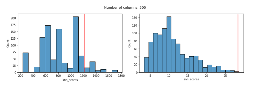
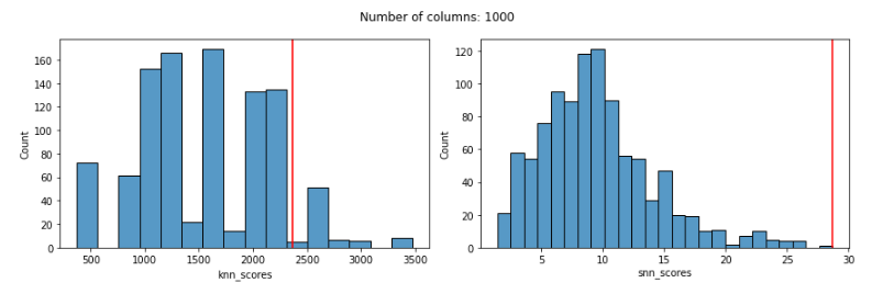
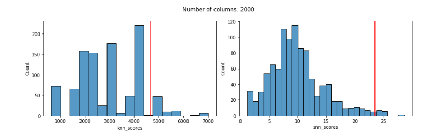
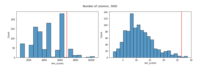
# Plot the distribution of scores for both detectors and show # the score for the known outlier (in context of the range of # scores assigned to the full dataset) fig, ax = plt.subplots(nrows=1, ncols=2, figsize=(12, 4)) sns.histplot(scored_df['knn_scores'], ax=ax[0]) ax[0].axvline(scored_df.loc[nrows, 'knn_scores'], color='red') sns.histplot(scored_df['snn_scores'], ax=ax[1]) ax[1].axvline(scored_df.loc[nrows, 'snn_scores'], color='red') plt.suptitle(f"Number of columns: {ncols}") plt.tight_layout() plt.show()
In this method, we generate test data, add a single, known outlier to the dataset, get the KNN outlier scores, get the SNN outlier scores, and plot the results.
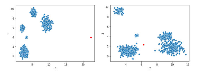
The test data is generated using scikit-learn’s make_blobs(), which creates a set of high-dimensional clusters. The one outlier generated will be outside of these clusters (and will also have, by default, one extreme value in column 0).
Much of the complication in the code is in generating the test data. Here, instead of simply calling make_blobs() with default parameters, we specify the sizes and densities of each cluster, to ensure they are all different. The densities are specified using an array of standard deviations (which describes how spread out each cluster is).
This produces data such as:
This shows only four dimensions, but typically we would call this method to create data with many dimensions. The known outlier point is shown in red. In dimension 0 it has an extreme value, and in most other dimensions it tends to fall outside the clusters, so is a strong outlier.
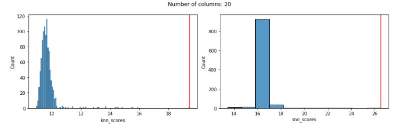
This first executes a series of tests using Euclidean distances (used by both the KNN detector, and for the first step of the SNN detector), and then executes a series of tests using Manhattan distances (the default for the test_variable_blobs() method) —using Manhattan for both for the KNN detector and for the first step with the SNN detector.
For each, we test with increasing numbers of columns (ranging from 20 to 3000).
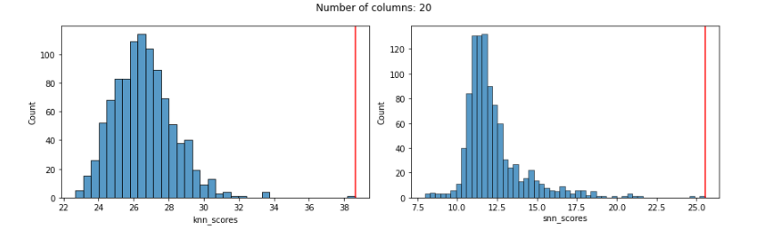
Starting with Euclidian distances, using only 20 features, both KNN and SNN work well, in that they both assign a high outlier score to the known outlier. Here we see the distribution of outlier scores produced by each detector (the KNN detector is shown in the left pane and the SNN detector in the right pane) and a red vertical line indicating the outlier score given to the known outlier by each detector. In both cases, the known outlier received a significantly higher score than the other records: both detectors do well.
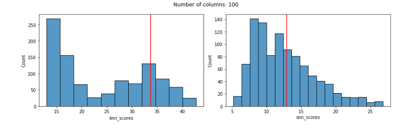
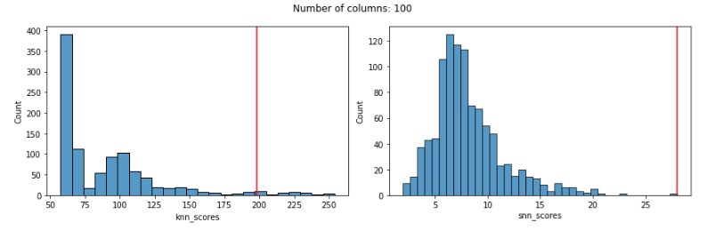
But, using Euclidean distances tends to degrade quickly as features are added, and works quite poorly even with only 100 features. This is true with both the KNN and SNN detectors. In both cases, the known outlier received a fairly normal score, not indicating any outlierness, as seen here:
Repeating using Manhattan distances, we see that KNN works well with smaller numbers of features, but breaks down as the numbers of features increases. KNN does, however, do much better with Manhattan distances that Euclidean once we get much beyond about 50 or so features (with small numbers of features, almost any distance metric will work reasonably well).
In all cases below (using Manhattan & SNN distances), we show the distribution of KNN outlier scores (and the outlier score assigned to the known outlier by the KNN detector) in the left pane, and the distribution of SNN scores (and the outlier score given to the known outlier by the SNN detector) in the right pane.
With 20 features, both work well:
With 100 features, KNN is still giving the known outlier a high score, but not very high. SNN is still doing very well (and does in all cases below as well):
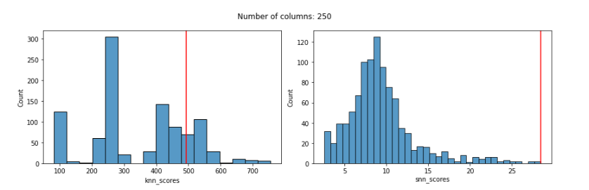
With 250 features the score given to the known outlier by KNN is fairly poor and the distribution of scores is odd:
With 500 features:
With 1000 features:
With 2000 features:
With 3000 features:
With the KNN detector, even using Manhattan distances, we can see that the distribution of scores is quite odd by 100 features and, more relevantly, that by 100 features the KNN score given to the known outlier is poor: much too low and not reflecting its outlierness.
The distribution of SNN scores, on the other hand, remains reasonable even up to 3000 features, and the SNN score given to the known outlier remains very high up until almost 2000 features (for 2000 and 3000 features, it’s score is high, but not quite the highest-scored record).
The SNN detector (essentially the KNN outlier detection algorithm with SNN distances) worked much more reliably than KNN with Manhattan distances.
One key point here (outside of considering SNN distances) is that Manhattan distances can be much more reliable for outlier detection than Euclidean where we have large numbers of features. The curse of dimensionality still takes affect (all distance metrics eventually break down), but much less severely where there are dozens or hundreds of features than with Euclidean.
In fact, while very suitable in lower dimensions, Euclidean distances can break down even with moderate numbers of features (sometimes with as few as 30 or 40). Manhattan distances can be a fairer comparison in these cases, which is what is done here.
In general, we should be mindful of evaluations of distance metrics that compare themselves to Euclidean distances, as these can be misleading. It’s standard to assume Euclidean distances when working with distance calculations, but this is something we should question.
In the case identified here (where data is simply clustered, but in clusters with varying sizes and densities), SNN did strongly outperform KNN (and, impressively, remained reliable even to close to 2000 features). This is a more meaningful finding given that we compared to KNN based on Manhattan distances, not Euclidean.
However, in many other scenarios, particularly where the data is in a single cluster, or where the clusters have similar densities to each other, KNN can work as well as, or even preferably to, SNN.
It’s not the case that SNN should always be favoured to other distance metrics, only that there are scenarios where it can do significantly better.
In other cases, other distance metrics may work preferably as well, including cosine distances, Canberra, Mahalanobis, Chebyshev, and so on. It is very often worth experimenting with these when performing outlier detection.
Global Outlier Detectors
Where KNN breaks down here is, much like the case when using DBSCAN for clustering, where different regions (in this case, different clusters) have different densities.
KNN is an example of a type of detector known as a global outlier detector. If you’re familiar with the idea of local and global outliers, the idea is related, but different. In this case, the ‘global’ in global outlier detector means that there is a global sense of normal. This is the same limitation described above with DBSCAN clustering (where there is a global sense of normal distances between records). Every record in the data is compared to this assessment of normal. In the case of KNN outlier detectors, there is a global sense of the normal average distance to the k nearest neighbors.
But, this global norm is not meaningful where the data has different densities in different regions. In the plot below (repeated from above), there are two clusters, with the one in the lower-left being much more dense that the one in the upper-right.
What’s relevant, in terms of identifying outliers, is how close a point is to its neighbors relative to what’s normal for that region, not relative to what’s normal in the other clusters (or in the dataset as a whole).
This is the problem another important outlier detector, Local Outlier Factor (LOF) was created to solve (the original LOF paper actually describes a situation very much like this). Contrary to global outlier detectors, LOF is an example of a local outlier detector: a detector that compares points to other points in the local area, not to the full dataset, so compares each point to a local sense of what’s normal. In the case of LOF, it compares each point to a local sense of the average distance to the nearby points.
Local outlier detectors also provide a valuable approach to identifying outliers where the densities vary throughout the data space, which I cover in Outlier Detection in Python, and I’ll try to cover in future articles.
SNN also provides an important solution to this problem of varying densities. With SNN distances, the changes in density aren’t relevant. Each record here is compared against a global standard of the average number of shared neighbors a record has with its closest neighbors. This is a quite robust calculation, and able to work well where the data is clustered, or just populated more densely in some areas than others.
DBSCAN for Outlier Detection
In this article, we’ve looked primarily at the KNN algorithm for outlier detection, but SNN can be used with any outlier detector that is based on the distances between rows. This includes Radius, Local Outlier Factor (LOF), and numerous others. It also includes any outlier detection algorithm based on clustering.
There are a number of ways to identify outliers using clustering (for example, identifying the points in very small clusters, points that are far from their cluster centers, and so on). Here, though, we’ll look at a very simple approach to outlier detection: clustering the data and then identifying the points not placed in any cluster.
DBSCAN is one of the clustering algorithms most commonly used for this type of outlier detection, as it has the convenient property (not shared by all clustering algorithms) of allowing points to not be placed in any cluster.
DBSCAN (at least scikit-learn’s implementation) also allows us to easily work with SNN distances.
So, as well as being a useful clustering algorithm, DBSCAN is widely used for outlier detection, and we’ll use it here as another example of outlier detection with SNN distances.
Before looking at using SNN distances, though, we’ll show an example using DBSCAN as it’s more often used to identify outliers in data (here using the default Euclidean distances). This uses the same dataset created above, where the last row is the single known outlier.
The parameters for DBSCAN can take some experimentation to set well. In this case, I adjusted them until the algorithm identified a single outlier, which I confirmed is the last row by printing the labels_ attribute. The labels are:
[ 0 1 1 ... 1 0 -1]
-1 indicates records not assigned to any cluster. As well, value_counts() indicated there’s only one record assigned to cluster -1. So, DBSCAN works well in this example. Which means we can’t improve on it by using SNN, but this does provide a clear example of using DBSCAN for outlier detection, and ensures the dataset is solvable using clustering-based outlier detection.
To work with SNN distances, it’s necessary to first calculate the pairwise SNN distances (DBSCAN cannot calculate these on its own). Once these are created, they can be passed to DBSCAN in the form of an n x n matrix.
As a quick and simple way to reverse these distances (to be better suited for DBSCAN), we call:
d = pd.DataFrame(pairwise_dists).apply(lambda x: 1000-x)
Here 1000 is simply a value larger than any in the actual data. Then we call DBSCAN, using ‘precomputed’ as the metric and passing the pairwise distances to fit().
Again, this identifies only the single outlier (only one record is given the cluster id -1, and this is the last row). In general, DBSCAN, and other tools that accept ‘precomputed’ as the metric can work with SNN distances, and potentially produce more robust results.
In the case of DBSCAN, using SNN distances can work well, as outliers (referred to as noise points in DBSCAN) and inliers tend to have almost all of their links broken, and so outliers end up in no clusters. Some outliers (though outliers that are less extreme) will have some links to other records, but will tend to have zero, or very few, shared neighbors with these, so will get high outlier scores (though not as high as those with no links, as is appropriate).
This can take some experimenting, and in some cases the value of k, as well as the DBSCAN parameters, will need to be adjusted, though not to an extent unusual in outlier detection — it’s common for some tuning to be necessary.
Subspace Outlier Detection (SOD)
SNN is not as widely used in outlier detection as it ideally would be, but there is one well-known detector that uses it: SOD, which is provided in the PyOD library.
SOD is an outlier detector that focusses on finding useful subspaces (subsets of the features available) for outlier detection, but does use SNN as part of the process, which, it argues in the paper introducing SOD, provides more reliable distance calculations.
SOD works (similar to KNN and LOF), by identifying a neighborhood of k neighbors for each point, known with SOD as the reference set. The reference set is found using SNN. So, neighborhoods are identified, not by using the points with the smallest Euclidean distances, but by the points with the most shared neighbors.
The authors found this tends to be robust not only in high dimensions, but also where there are many irrelevant features: the rank order of neighbors tends to remain meaningful, and so the set of nearest neighbors can be reliably found even where specific distances are not reliable.
Once we have the reference set for a point, SOD uses this to determine the subspace, which is the set of features that explain the greatest amount of variance for the reference set. And, once SOD identifies these subspaces, it examines the distances of each point to the data center, which then provides an outlier score.
Embeddings
An obvious application of SNN is to embeddings (for example, vector representations of images, video, audio, text, network, or data of other modalities), which tend to have very high dimensionality. We look at this in more depth in Outlier Detection in Python, but will indicate here quickly: standard outlier detection methods intended for numeric tabular data (Isolation Forest, Local Outlier Factor, kth Nearest Neighbors, and so on), actually tend to perform poorly on embeddings. The main reason appear to be the high numbers of dimensions, along with the presence of many dimensions in the embeddings that are irrelevant for outlier detection.
There are other, well-established techniques for outlier detection with embeddings, for example methods based on auto-encoders, variational auto-encoders, generative adversarial networks, and a number of other techniques. As well, it’s possible to apply dimensionality reduction to embeddings for more effective outlier detection. These are also covered in the book and, I hope, a future Medium article. As well, I’m now investigating the use of distance metrics other than Euclidean, cosine, and other standard metrics, including SNN. If these can be useful is currently under investigation.
Conclusions
Similar to Distance Metric Learning, Shared Nearest Neighbors will be more expensive to calculate than standard distance metrics such as Manhattan and Euclidean distances, but can be more robust with large numbers of features, varying densities, and (as the SOD authors found), irrelevant features.
So, in some situations, SNN can be a preferable distance metric to more standard distance metrics and may be a more appropriate distance metric for use with outlier detection. We’ve seen here where it can be used as the distance metric for kth Nearest Neighbors outlier detection and for DBSCAN outlier detection (as well as when simply using DBSCAN for clustering).
In fact, SNN can, be used with any outlier detection method based on distances between records. That is, it can be used with any distance-based, density-based, or clustering-based outlier detector.
We’ve also indicated that SNN will not always work favorably compared to other distance metrics. The issue is more complicated when considering categorical, date, and text columns (as well as potentially other types of features we may see in tabular data). But even considering strictly numeric data, it’s quite possible to have datasets, even with large numbers of features, where plain Manhattan distances work preferably to SNN, and other cases where SNN is preferable. The number of rows, number of features, relevance of the features, distributions of the features, associations between features, clustering of the data, and so on are all relevant, and it usually can’t be predicted ahead of time what will work best.
SNN is only one solution to problems such as high dimensionality, varying density, and irrelevant features, but is is a useful tool, easy enough to implement, and quite often worth experimenting with.
This article was just an introduction to SNN and future articles may explore SNN further, but in general, when determining the distance metric used (and other such modeling decisions) with outlier detection, the best approach is to use a technique called doping (described in this article), where we create data similar to the real data, but modified so to contain strong, but realistic, anomalies. Doing this, we can try to estimate what appears to be most effective at detecting the sorts of outliers you may have.
Here we used an example with synthetic data, which can help describe where one outlier detection approach works better than another, and can be very valuable (for example, here we found that when varying the densities and increasing the number of features, SNN outperformed Manhattan distances, but with consistent densities and low numbers of features, both did well). But, using synthetic, as important as it is, is only one step to understanding where different approaches will work better for data similar to the data you have. Doping will tend to work better for this purpose, or at least as part of the process.
As well, it’s generally accepted in outlier detection that no single detector will reliably identify all the outliers you’re interested in detecting. Each detector will detect a fairly specific type of outlier, and very often we’re interested in detecting a wide range of outliers (in fact, quite often we’re interested simply in identifying anything that is statistically substantially different from normal — especially when first examining a dataset).
Given that, it’s common to use multiple detectors for outlier detection, combining their results into an ensemble. One useful technique to increase diversity within an ensemble is to use a variety of distance metrics. For example, if Manhattan, Euclidean, SNN, and possibly even others (perhaps Canberra, cosine, or other metrics) all work well (all producing different, but sensible results), it may be worthwhile to use all of these. Often though, we will find that only one or two distance metrics produce meaningful results given the dataset we have and the types of outliers we are interested in. Although not the only one, SNN is a useful distance metric to try, especially where the detectors are struggling when working with other distance metrics.
Simplifying the neural nets behind Generative Video Diffusion
Let’s go! [Image Generated by Author]
We’ve witnessed remarkable strides in AI image generation. But what happens when we add the dimension of time? Videos are moving images, after all.
Text-to-video generation is a complex task that requires AI to understand not just what things look like, but how they move and interact over time. It is an order of magnitude more complex than text-to-image.
To produce a coherent video, a neural network must: 1. Comprehend the input prompt 2. Understand how the world works 3. Know how objects move and how physics applies 4. Generate a sequence of frames that make sense spatially, temporally, and logically
Despite these challenges, today’s diffusion neural networks are making impressive progress in this field. In this article, we will cover the main ideas behind video diffusion models — main challenges, approaches, and the seminal papers in the field.
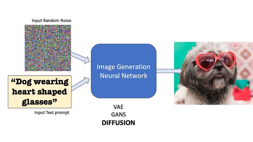
To understand text-to-video generation, we need to start with its predecessor: text-to-image diffusion models. These models have a singular goal — to transform random noise and a text prompt into a coherent image. In general, all generative image models do this — Variational Autoencoders (VAE), Generative Adversarial Neural Nets (GANs), and yes, Diffusion too.
The basic goal of all image generation models is to convert random noise into an image, often conditioned on additional conditioning prompts (like text). [Image by Author]
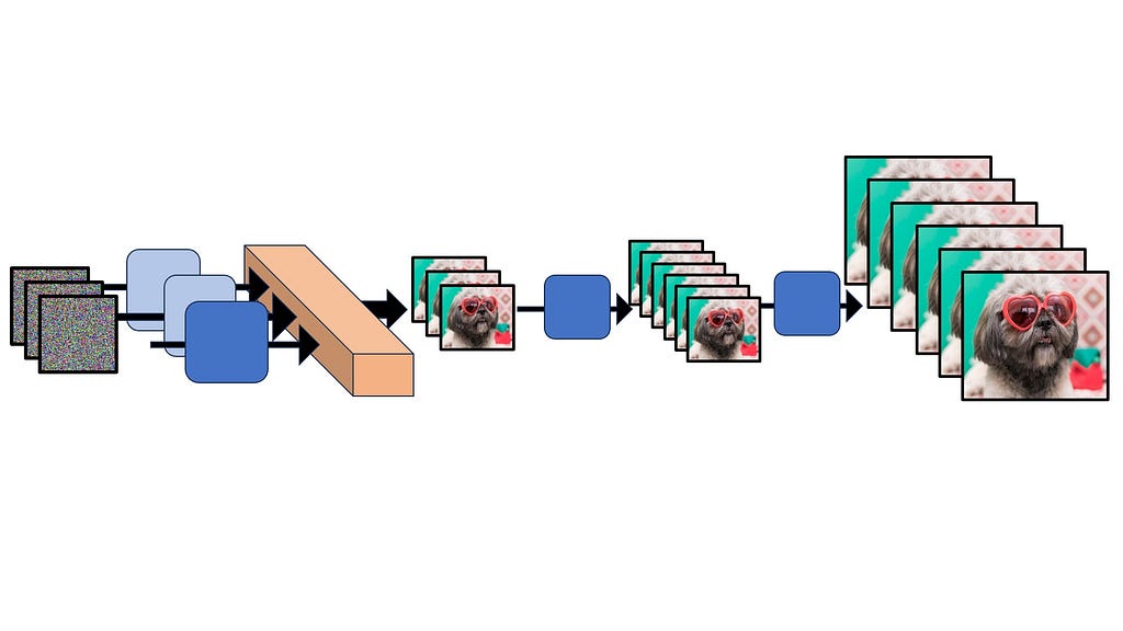
Diffusion, in particular, relies on a gradual denoising process to generate images.
1. Start with a randomly generated noisy image 2. Use a neural network to progressively remove noise 3. Condition the denoising process on text input 4. Repeat until a clear image emerges
How Diffusion Models generate images — A neural network progressively removes noise from a pure noise image conditioned on a text prompt, eventually revealing a clear image. [Illustration by Author] (Image generated by a neural network)
But how are these denoising neural networks trained?
During training, we start with real images and progressively add noise to it in small steps — this is called forward diffusion. This generates a lot of samples of clear image and their slightly noisier versions. The neural network is then trained to reverse this process by inputting the noisy image and predicting how much noise to remove to retrieve the clearer version. In text-conditional models, we train attention layers to attend to the inputted prompt for guided denoising.
During training, we add noise to clear images (left) — this is called Forward Diffusion. The neural network is trained to reverse this noise addition process — a process known as Reverse Diffusion. Images generated using a neural network. [Image by Author]
This iterative approach allows for the generation of highly detailed and diverse images. You can watch the following YouTube video where I explain text to image in much more detail — concepts like Forward and Reverse Diffusion, U-Net, CLIP models, and how I implemented them in Python and Pytorch from scratch.
If you are comfortable with the core concepts of Text-to-Image Conditional Diffusion, let’s move to videos next.
The Temporal Dimension: A New Frontier
In theory, we could follow the same conditioned noise-removal idea to do text-to-video diffusion. However, adding time into the equation introduces several new challenges:
1. Temporal Consistency: Ensuring objects, backgrounds, and motions remain coherent across frames. 2. Computational Demands: Generating multiple frames per second instead of a single image. 3. Data Scarcity: While large image-text datasets are readily available, high-quality video-text datasets are scarce.
Some commonly used video-text datasets [Image by Author]
The Evolution of Video Diffusion
Because of the lack of high quality datasets, text-to-video cannot rely just on supervised training. And that is why people usually also combine two more data sources to train video diffusion models — one — paired image-text data, which is much more readily available, and two — unlabelled video data, which are super-abundant and contains lots of information about how the world works. Several groundbreaking models have emerged to tackle these challenges. Let’s discuss some of the important milestone papers one by one.
We are about to get into the technical nitty gritty! If you find the material ahead difficult, feel free to watch this companion video as a visual side-by-side guide while reading the next section.
Video Diffusion Model (VDM) — 2022
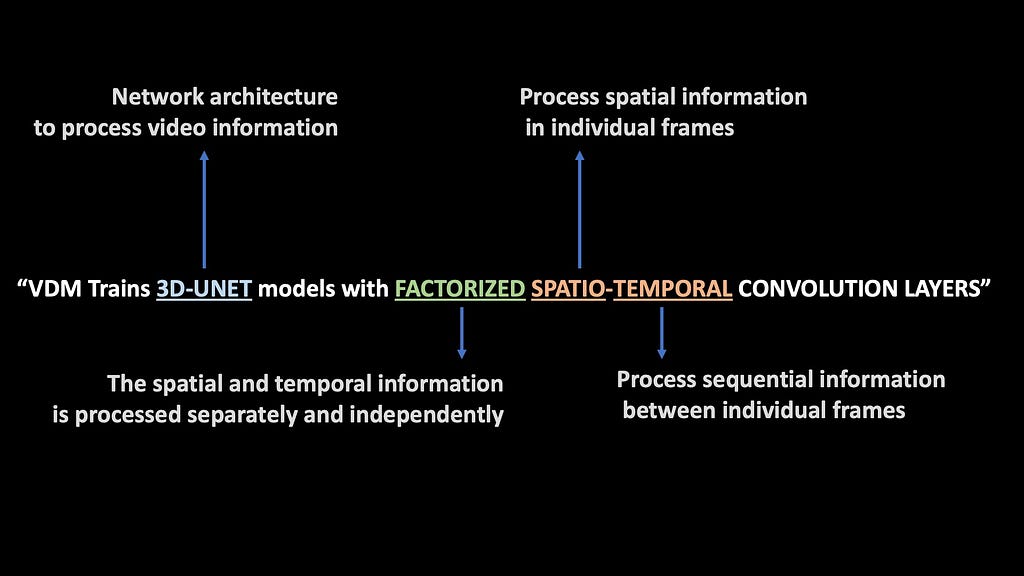
VDM Uses a 3D U-Net architecture with factorized spatio-temporal convolution layers. Each term is explained in the picture below.
What each of the terms mean (Image by Author)
VDM is jointly trained on both image and video data. VDM replaces the 2D UNets from Image Diffusion models with 3D UNet models. The video is input into the model as a time sequence of 2D frames. The term Factorized basically means that the spatial and temporal layers are decoupled and processed separately from each other. This makes the computations much more efficient.
What is a 3D-UNet?
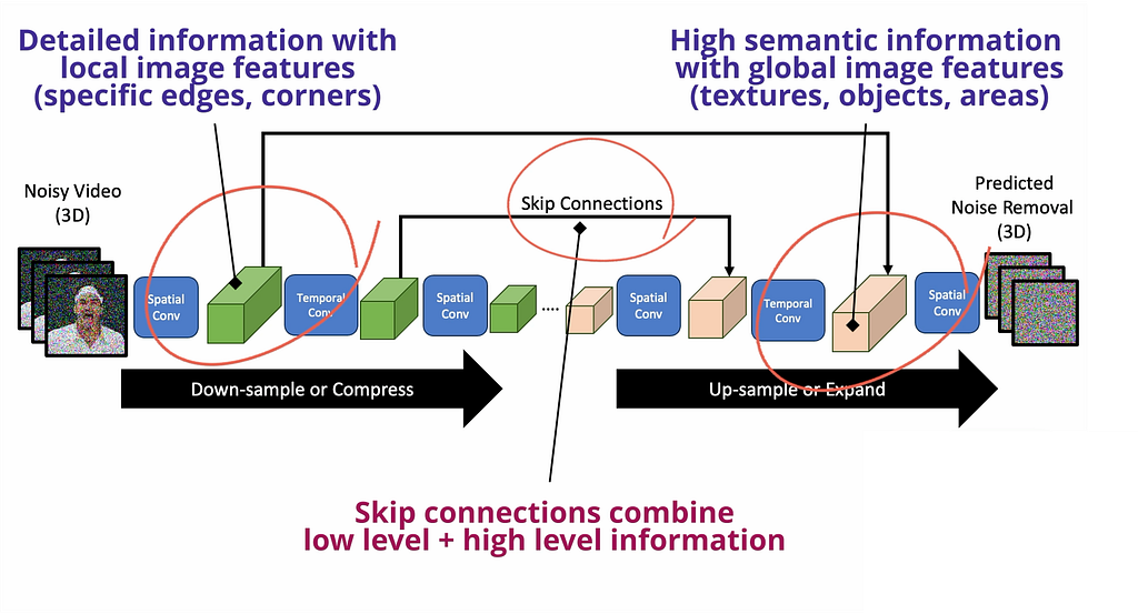
3D U-Net is a unique computer vision neural network that first downsamples the video through a series of these factorized spatio-temporal convolutional layers, basically extracting video features at different resolutions. Then, there is an upsampling path that expands the low-dimensional features back to the shape of the original video. While upsampling, skip connections are used to reuse the generated features during the downsampling path.
The 3D Factorized UNet Architecture [Image by Author]
Remember in any convolutional neural network, the earlier layers always capture detailed information about local sections of the image, while latter layers pick up global level pattern by accessing larger sections — so by using skip connections, U-Net combines local details with global features to be a super-awesome network for feature learning and denoising.
VDM is jointly trained on paired image-text and video-text datasets. While it’s a great proof of concept, VDM generates quite low-resolution videos for today’s standards.
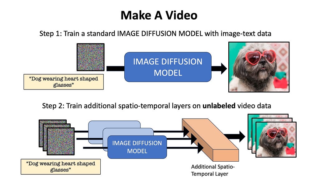
Make-A-Video by Meta AI takes the bold approach of claiming that we don’t necessarily need labeled-video data to train video diffusion models. WHHAAA?! Yes, you read that right.
Adding temporal layers to Image Diffusion
Make A Video first trains a regular text-to-image diffusion model, just like Dall-E or Stable Diffusion with paired image-text data. Next, unsupervised learning is done on unlabelled video data to teach the model temporal relationships. The additional layers of the network are trained using a technique called masked spatio-temporal decoding, where the network learns to generate missing frames by processing the visible frames. Note that no labelled video data is needed in this pipeline (although further video-text fine-tuning is possible as an additional third step), because the model learns spatio-temporal relationships with paired text-image and raw unlabelled video data.
Make-A-Video in a nutshell [Image by Author]
The video outputted by the above model is 64×64 with 16 frames. This video is then upsampled along the time and pixel axis using separate neural networks called Temporal Super Resolution or TSR (insert new frames between existing frames to increase frames-per-second (fps)), and Spatial Super Resolution or SSR (super-scale the individual frames of the video to be higher resolution). After these steps, Make-A-Video outputs 256×256 videos with 76 frames.
Imagen video employs a cascade of seven models for video generation and enhancement. The process starts with a base video generation model that creates low-resolution video clips. This is followed by a series of super-resolution models — three SSR (Spatial Super Resolution) models for spatial upscaling and three TSR (Temporal Super Resolution) models for temporal upscaling. This cascaded approach allows Imagen Video to generate high-quality, high-resolution videos with impressive temporal consistency. Generates high-quality, high-resolution videos with impressive temporal consistency
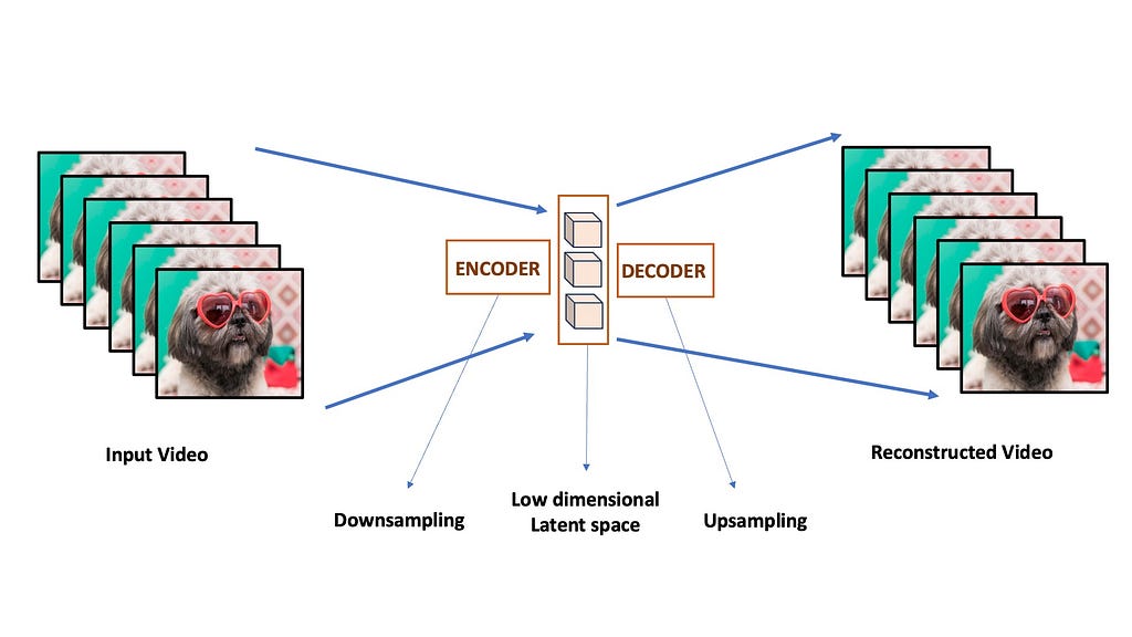
Models like Nvidia’s VideoLDM tries to address the temporal consistency issue by using latent diffusion modelling. First they train a latent diffusion image generator. The basic idea is to train a Variational Autoencoder or VAE. The VAE consists of an encoder network that can compress input frames into a low dimensional latent space and another decoder network that can reconstruct it back to the original images. The diffusion process is done entirely on this low dimensional space instead of the full pixel-space, making it much more computationally efficient and semantically powerful.
A typical Autoencoder. The input frames are individually downsampled into a low dimensional compressed latent space. A Decoder network then learns to reconstruct the image back from this low resolution space. [Image by Author]
What are Latent Diffusion Models?
The diffusion model is trained entirely in the low dimensional latent space, i.e. the diffusion model learns to denoise the low dimensional latent space images instead of the full resolution frames. This is why we call it Latent Diffusion Models. The resulting latent space outputs is then pass through the VAE decoder to convert it back to pixel-space.
The decoder of the VAE is enhanced by adding new temporal layers in between it’s spatial layers. These temporal layers are fine-tuned on video data, making the VAE produce temporally consistent and flicker-free videos from the latents generated by the image diffusion model. This is done by freezing the spatial layers of the decoder and adding new trainable temporal layers that are conditioned on previously generated frames.
The VAE Decoder is finetuned with temporal information so that it can produce consistent videos from the latents generated by the Latent Diffusion Model (LDM) [Source: Video LDM Paper https://arxiv.org/abs/2304.08818]
3D VAEs compress videos spatio-temporally to generate compressed 4D representations of video data [Image by Author]
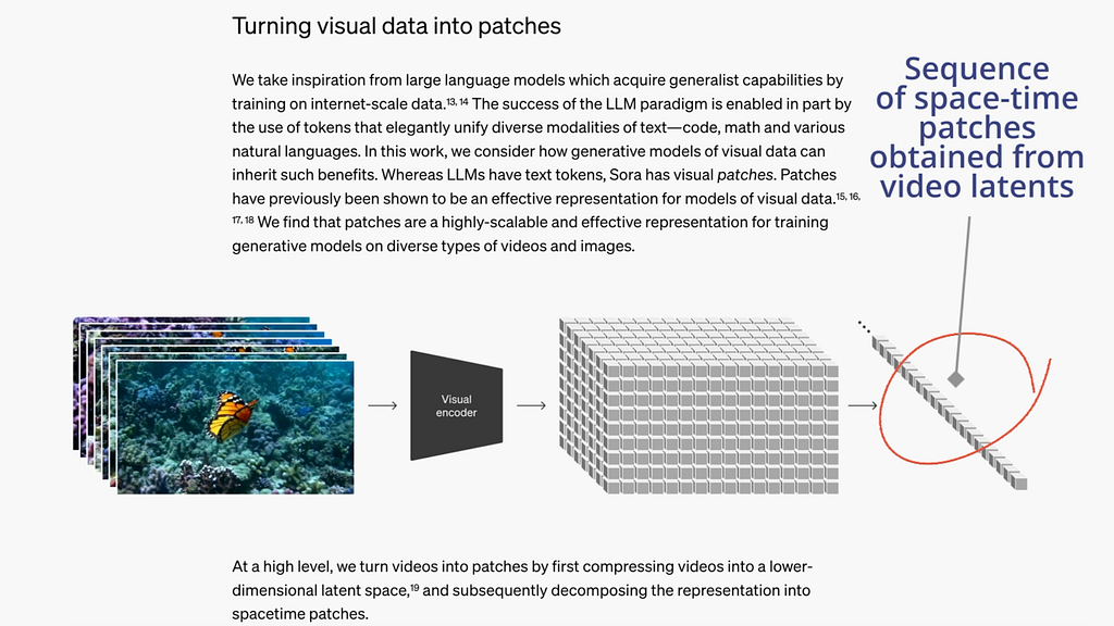
Transformers for Diffusion
A transformer model is used as the diffusion network instead of the more traditional UNEt model. Of course, transformers need the input data to be presented as a sequence of tokens. That’s why the compressed video encodings are flattened into a sequence of patches. Observe that each patch and its location in the sequence represents a spatio-temporal feature of the original video.
OpenAI SORA Video Preprocessing [Source: OpenAI (https://openai.com/index/sora/)] (License: Free)
It is speculated that OpenAI has collected a rather large annotation dataset of video-text data which they are using to train conditional video generation models.
Combining all the strengths listed below, plus more tricks that the ironically-named OpenAI may never disclose, SORA promises to be a giant leap in video generation AI models.
Massive video-text annotated dataset + pretraining techniques with image-text data and unlabelled data
General architectures of Transformers
Huge compute investment (thanks Microsoft)
The representation power of Latent Diffusion Modeling.
What’s next
The future of AI is easy to predict. In 2024, Data + Compute = Intelligence. Large corporations will invest computing resources to train large diffusion transformers. They will hire annotators to label high-quality video-text data. Large-scale text-video datasets probably already exist in the closed-source domain (looking at you OpenAI), and they may become open-source within the next 2–3 years, especially with recent advancements in AI video understanding. It remains to be seen if the upcoming huge computing and financial investments could on their own solve video generation. Or will further architectural and algorithmic advancements be needed from the research community?
An image generated by DALL-E with a prompt precisely the same as the blog title.
My first encounters with the o1 model
On the 12th of September at 10:00 a.m., I was in the class “Frontier Topics in Generative AI,” a graduate-level course at Arizona State University. A day before this, on the 11th of September, I submitted a team assignment that involved trying to identify flaws and erroneous outputs generated by GPT-4 (essentially trying to prompt GPT-4 to see if it makes mistakes on trivial questions or high-school-level reasoning questions) as part of another graduate-level class “Topics in Natural Language Processing.” We identified several trivial mistakes that GPT-4 made, one of them being unable to count the number of r’s in the word strawberry. Before submitting this assignment, I researched several peer-reviewed papers on the internet that identified where and why GPT -4 made mistakes and how you could rectify them. Most of the documents I came across identified two main domains where GPT-4 erred, and they dealt with planning and reasoning.
This paper¹ (although almost a year old) goes in depth through several cases where GPT-4 fails to answer trivial questions that involve simple counting, simple arithmetic, elementary logic, and even common sense. The paper¹ reasons that these questions require some level of reasoning and that because GPT-4 is utterly incapable of reasoning, it almost always gets these questions wrong. The author also states that reasoning is a (very) computationally hard problem. Although GPT-4 is very compute-intensive, its compute-intensive nature is not geared towards involving reasoning in solving the questions that it’s prompted with. Several other papers echo this notion of GPT-4 being unable to reason or plan²³.
Well, let’s get back to the 12th of September. My class ends at around 10:15 a.m., and I come back straight home from class and open up YouTube on my phone as I dig into my morning brunch. The first recommendation on my YouTube homepage was a video from OpenAI announcing the release of GPT-o1 named “Building OpenAI o1”. They announced that this model is a straight-up a reasoning model and that it would take more time to reason and answer your questions providing more accurate answers. They state that they have put more compute time into RL (Reinforcement Learning) than previous models to generate coherent chains-of-thoughts⁴. Essentially, they have trained the chain of thought generation process using Reinforcement learning (to generate and hone its own generated chain of thought process). In the o1 models, the engineers were able to ask the model questions as to why it was wrong (whenever it was wrong) in its chain-of-thought process and it could identify the mistakes and correct itself from them. The model could question itself and have to reflect (see “Reflection in LLMs”) on its outputs and correct itself.
In another video “Reasoning with OpenAI o1”, Jerry Tworek demonstrates how previous OpenAI and most other LLMs in the market tend to fail on the following prompt:
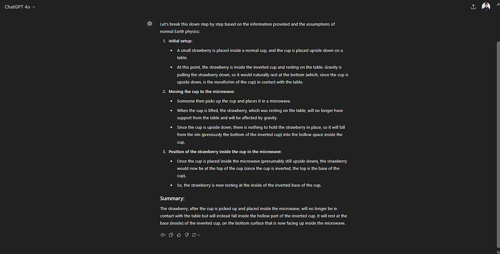
“Assume the laws of physics on earth. A small strawberry is put into a normal cup and the cup is placed upside down on a table. Someone then takes the cup and puts it inside the microwave. Where is the strawberry now? Explain your reasoning step by step.”
Legacy GPT-4 answers as follows:
Figure 1: GPT-4 getting the strawberry in a cup question wrong
The relatively newer GPT-4o also gets it wrong:
Figure 2: GPT-4 o getting the strawberry in a cup question wrong
GPT o1 gets the answer right:
Figure 3: GPT o1 getting the answer to the strawberry in a cup question right
If you click on the dropdown at the beginning of the model’s response (see Figure 4), you know that it elicits its thought process (chain-of-thought), and the researchers at OpenAI claim that the o1 model has been trained with reinforcement learning to get this chain of thought better. Also, it’s interesting to note that Jason Wei (you can see him sitting third from the right on the bottom row in the video “Building OpenAI o1”), the author of the chain-of-thought paper⁴ that he published back at Google, is now an OpenAI employee that is working on the o1 model to integrate the chain-of-thought (that he discovered at Google) process into this model.
Figure 4: Chain-of-thought elicitation by GPT o1
Now, let’s get back to the counting question that my team found out about as part of my assignment.
How many r’s are in the word strawberry?
Let’s run this question on GPT-4o:
Figure 5: GPT4o getting the number of r’s in strawberry question wrong.
A very simple counting problem that it get’s wrong.
Let’s run this on the new GPT o1:
Figure 6: GPT o1 getting the number of r’s in strawberry question right.
GPT o1 gets the answer right by thinking for a couple of seconds. The researchers at OpenAI say that it goes through its response repeatedly and thinks its way to the right answer. There does seem to be really significant improvements in terms of the model’s ability to solve a lot of academic exam questions.
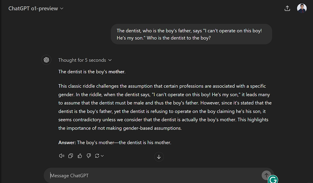
Anyways after I opened up X.com (Formerly Twitter), I came across several people showcasing their attempts at trying to make the o1 model fail. This is a fascinating one I came across (this tweet by @creeor) where the model fails to answer a trivial question in which the answer lies in the question itself. So I tried the exact same prompt on my account and it gave me the wrong answer (see Figure 7).
Figure 7: OpenAI o1 is still getting simple riddles wrong when you tweak the riddle. Shows that the models still rely on a lot of the memorization that happened during it’s training and isn’t fully using it’s reasoning capabilities.
When I ask it what this classic riddle is that it is talking about it tells me about a riddle that it memorized from the internet. It’s interesting to see how these models can sometimes fall back on memorized content rather than truly reasoning through a problem. Despite the significant advancements and benchmark improvements, there are still areas where AI models struggle, especially with tasks that require deeper reasoning or understanding context in a nuanced way. While benchmarks can show progress, real-world applications often reveal the limitations. It’s through continuous testing, feedback, and real-world use cases that these models can be further refined.
Figure 8: o1 blindly answers from a riddle it memorized. It doesn’t read the question that was given to it and try to answer it as presented.
There was a compilation of ChatGPT failures done about a year and a half back. Compilations of model errors are invaluable for understanding and improving AI systems. I’m sure people will come up with another compilation of errors for the o1 model soon.
Although I agree entirely that the chain-of-thought process benefits both AI and human learning, real learning indeed comes from experience and making mistakes.
I will continue to keep posting my findings on the o1 model on my Medium page. Follow my account to keep posted. And thank you for taking the time to read my Medium post.
[2] Aghzal, Mohamed, Erion Plaku, and Ziyu Yao. “Look Further Ahead: Testing the Limits of GPT-4 in Path Planning.” arXiv preprint arXiv:2406.12000 (2024).
[3] Kambhampati, Subbarao, et al. “LLMs Can’t Plan, But Can Help Planning in LLM-Modulo Frameworks.” arXiv preprint arXiv:2402.01817 (2024).
[4] Wei, Jason, et al. “Chain-of-thought prompting elicits reasoning in large language models.” Advances in neural information processing systems 35 (2022): 24824–24837.
We use cookies on our website to give you the most relevant experience by remembering your preferences and repeat visits. By clicking “Accept”, you consent to the use of ALL the cookies.
This website uses cookies to improve your experience while you navigate through the website. Out of these, the cookies that are categorized as necessary are stored on your browser as they are essential for the working of basic functionalities of the website. We also use third-party cookies that help us analyze and understand how you use this website. These cookies will be stored in your browser only with your consent. You also have the option to opt-out of these cookies. But opting out of some of these cookies may affect your browsing experience.
Necessary cookies are absolutely essential for the website to function properly. These cookies ensure basic functionalities and security features of the website, anonymously.
Cookie
Duration
Description
cookielawinfo-checkbox-analytics
11 months
This cookie is set by GDPR Cookie Consent plugin. The cookie is used to store the user consent for the cookies in the category "Analytics".
cookielawinfo-checkbox-functional
11 months
The cookie is set by GDPR cookie consent to record the user consent for the cookies in the category "Functional".
cookielawinfo-checkbox-necessary
11 months
This cookie is set by GDPR Cookie Consent plugin. The cookies is used to store the user consent for the cookies in the category "Necessary".
cookielawinfo-checkbox-others
11 months
This cookie is set by GDPR Cookie Consent plugin. The cookie is used to store the user consent for the cookies in the category "Other.
cookielawinfo-checkbox-performance
11 months
This cookie is set by GDPR Cookie Consent plugin. The cookie is used to store the user consent for the cookies in the category "Performance".
viewed_cookie_policy
11 months
The cookie is set by the GDPR Cookie Consent plugin and is used to store whether or not user has consented to the use of cookies. It does not store any personal data.
Functional cookies help to perform certain functionalities like sharing the content of the website on social media platforms, collect feedbacks, and other third-party features.
Performance cookies are used to understand and analyze the key performance indexes of the website which helps in delivering a better user experience for the visitors.
Analytical cookies are used to understand how visitors interact with the website. These cookies help provide information on metrics the number of visitors, bounce rate, traffic source, etc.
Advertisement cookies are used to provide visitors with relevant ads and marketing campaigns. These cookies track visitors across websites and collect information to provide customized ads.