Paxos CEO urged regulatory reforms to maintain U.S. leadership in digital finance.
Trump was viewed as a crypto-favorable candidate, driving market optimism.
Exploring the future of multimodal AI Agents and the Impact of Screen Interaction
Image created by author using GPT4o
Introduction: The ever-evolving AI Agent Landscape
Recent announcements from Anthropic, Microsoft, and Apple are changing the way we think about AI Agents. Today, the term “AI Agent” is oversaturated — nearly every AI-related announcement refers to agents, but their sophistication and utility vary greatly.
At one end of the spectrum, we have advanced agents that leverage multiple loops for planning, tool execution, and goal evaluation, iterating until they complete a task. These agents might even create and use memories, learning from their past mistakes to drive future successes. Determining what makes an effective agent is a very active area of AI research. It involves understanding what attributes make a successful agent (e.g., how should the agent plan, how should it use memory, how many tools should it use, how should it keep track of it’s task) and the best approach to configure a team of agents.
On the other end of the spectrum, we find AI agents that execute single purpose tasks that require little if any reasoning. These agents are often more workflow focused. For example, an agent that consistently summarizes a document and stores the result. These agents are typically easier to implement because the use cases are narrowly defined, requiring less planning or coordination across multiple tools and fewer complex decisions.
With the latest announcements from Anthropic, Microsoft, and Apple, we’re witnessing a shift from text-based AI agents to multimodal agents. This opens up the potential to give an agent written or verbal instructions and allow it to seamlessly navigate your phone or computer to complete tasks. This has great potential to improve accessibility across devices, but also comes with significant risks. Anthropic’s computer use announcement highlights the risks of giving AI unfettered access to your screen, and provides risk mitigation tactics like running Claude in a dedicated virtual machine or container, limiting internet access to an allowlist of permitted domains, including human in the loop checks, and avoiding giving the model access to sensitive data. They note that no content submitted to the API will be used for training.
Key Announcements from Anthropic, Microsoft, and Apple:
Anthropic’s Claude 3.5 Sonnet: Giving AI the Power to Use Computers
Overview: The goal of Computer Use is to give AI the ability to interact with a computer the same way a human would. Ideally Claude would be able to open and edit documents, click to various areas of the page, scroll and read pages, run and execute command line code, and more. Today, Claude can follow instructions from a human to move a cursor around the computer screen, click on relevant areas of the screen, and type into a virtual keyboard. Claude Scored 14.9% on the OSWorld benchmark, which is higher than other AI models on the same benchmark, but still significantly behind humans (humans typically score 70–75%).
How it works: Claude looks at user submitted screenshots and counts pixels to determine where it needs to move the cursor to complete the task. Researchers note that Claude was not given internet access during training for safety reasons, but that Claude was able to generalize from training tasks like using a calculator and text-editor to more complex tasks. It even retried tasks when it failed. Computer use includes three Anthropic defined tools: computer, text editor, and bash. The computer tool is used for screen navigation, text editor is used for viewing, creating, and editing text files, and bash is used to run bash shell commands.
Challenges: Despite it’s promising performance, there’s still a long way to go for Claude’s computer use abilities. Today it struggles with scrolling, overall reliability, and is vulnerable to prompt injections.
How to Use: Public beta available through the Anthropic API. Computer use can be combined with regular tool use.
Microsoft’s OmniParser & GPT-4V: Making Screens Understandable and Actionable for AI
Overview: OmniParser is designed to parse screenshots of user interfaces and transform them into structured outputs. These outputs can be passed to a model like GPT-4V to generate actions based on the detected screen elements. OmniParser + GPT-4V were scored on a variety of benchmarks including Windows Agent Arena which adapts the OSWorld benchmark to create Windows specific tasks. These tasks are designed to evaluate an agents ability to plan, understand the screen, and use tools, OmniParser & GPT-4V scored ~20%.
How it Works: OmniParser combines multiple fine-tuned models to understand screens. It uses a finetuned interactable icon/region detection model (YOLOv8), a finetuned icon description model (BLIP-2 or Florence2), and an OCR module. These models are used to detect icons and text and generate descriptions before sending this output to GPT-4V which decides how to use the output to interact with the screen.
Challenges: Today, when OmniParser detects repeated icons or text and passes them to GPT-4V, GPT-4V usually fails to click on the correct icon. Additionally, OmniParser is subject to OCR output so if the bounding box is off, the whole system might fail to click on the appropriate area for clickable links. There are also challenges with understanding certain icons since sometimes the same icon is used to describe different concepts (e.g., three dots for loading versus for a menu item).
How to Use: OmniParser is available on GitHub & HuggingFace you will need to install the requirements and load the model from HuggingFace, next you can try running the demo notebooks to see how OmniParser breaks down images.
Apple’s Ferret-UI: Bringing Multimodal Intelligence to Mobile UIs
Overview: Apple’s Ferret (Refer and Ground Anything Anywhere at Any Granularity) has been around since 2023, but recently Apple released Ferret-UI a MLLM (Multimodal Large Language Model) which can execute “referring, grounding, and reasoning tasks” on mobile UI screens. Referring tasks include actions like widget classification and icon recognition. Grounding tasks include tasks like find icon or find text. Ferret-UI can understand UIs and follow instructions to interact with the UI.
How it Works: Ferret-UI is based on Ferret and adapted to work on finer grained images by training with “any resolution” so it can better understand mobile UIs. Each image is split into two sub-images which have their own features generated. The LLM uses the full image, both sub-images, regional features, and text embeddings to generate a response.
Challenges: Some of the results cited in the Ferret-UI paper demonstrate instances where Ferret predicts nearby text instead of the target text, predicts valid words when presented with a screen that has misspelled words, it also sometimes misclassifies UI attributes.
How to Use: Apple made the data and code available on GitHub for research use only. Apple released two Ferret-UI checkpoints, one built on Gemma-2b and one built on Llama-3–8B. The Ferret-UI models are subject to the licenses for Gemma and Llama while the dataset allows non-commercial use.
Summary: Three Approaches to AI Driven Screen Navigation
In summary, each of these systems demonstrate a different approach to building multimodal agents that can interact with computers or mobile devices on our behalf.
Anthropic’s Claude 3.5 Sonnet focuses on general computer interaction where Claude counts pixels to appropriately navigate the screen. Microsoft’s OmniParser addresses specific challenges for breaking down user interfaces into structured outputs which are then sent to models like GPT-4V to determine actions. Apple’s Ferret-UI is tailored to mobile UI comprehension allowing it to identify icons, text, and widgets while also executing open-ended instructions related to the UI.
Across each system, the workflow typically follows two key phases one for parsing the visual information and one for reasoning about how to interact with it. Parsing screens accurately is critical for properly planning how to interact with the screen and making sure the system reliably executes tasks.
Conclusion: Building Smarter, Safer AI Agents
In my opinion, the most exciting aspect of these developments is how multimodal capabilities and reasoning frameworks are starting to converge. While these tools offer promising capabilities, they still lag significantly behind human performance. There are also significant AI safety concerns which need to be addressed when implementing any agentic system with screen access.
One of the biggest benefits of agentic systems is their potential to overcome the cognitive limitations of individual models by breaking down tasks into specialized components. These systems can be built in many ways. In some cases, what appears to the user as a single agent may, behind the scenes, consist of a team of sub-agents — each managing distinct responsibilities like planning, screen interaction, or memory management. For example, a reasoning agent might coordinate with another agent that specializes in parsing screen data, while a separate agent curates memories to enhance future performance.
Alternatively, these capabilities might be combined within one robust agent. In this setup, the agent could have multiple internal planning modules— one focused on planning the screen interactions and another focused on managing the overall task. The best approach to structuring agents remains to be seen, but the goal remains the same: to create agents that perform reliably overtime, across multiple modalities, and adapt seamlessly to the user’s needs.
Distance map from Mississippi State University (by author)
Have you noticed some of the “distance from” maps on social media? I just saw one by Todd Jones that shows how far you are from a national park at any location in the Lower 48 States.
These proximity maps are fun and useful. If you’re a survivalist, you might want to relocate as far as possible from a potential nuclear missile target; if you’re an avid fisherman, you might want to stick close to a Bass Pro Shop.
I went to graduate school with a British guy who knew almost nothing about American college football. Despite this, he did very well in our weekly betting pool. One of his secrets was to bet against any team that had to travel more than 300 miles to play, assuming the competing teams were on par, or the home team was favored.
In this Quick Success Data Science project, we’ll use Python to make “distance from” maps for college football teams in the Southeastern Conference (SEC). We’ll find which team has to make the longest trips, on average, to play other teams, and which has the shortest trips. We’ll then contour up these distances on a map of the southeastern US. In addition, we’ll look at how to grid and contour other continuous data, like temperatures.
The Code
Here’s the full code (written in JupyterLab). I’ll break down the code blocks in the following sections.
import numpy as np
import matplotlib.pyplot as plt
import pandas as pd
import geopandas as gpd
from geopy.distance import great_circle
# Calculate distances from SCHOOL to every point in grid: distances = np.zeros(xx.shape) for i in range(xx.shape[0]): for j in range(xx.shape[1]): point_coords = (yy[i, j], xx[i, j]) distances[i, j] = great_circle(school_coords, point_coords).miles
# Load state boundaries from US Census Bureau: url = 'https://www2.census.gov/geo/tiger/GENZ2021/shp/cb_2021_us_state_20m.zip' states = gpd.read_file(url)
# Filter states within the map limits: states = states.cx[x_min:x_max, y_min:y_max]
# Plot the state boundaries: states.boundary.plot(ax=ax, linewidth=1, edgecolor='black')
# Add labels for the schools: for i, school in enumerate(df['school']): ax.annotate( school, (df['longitude'][i], df['latitude'][i]), textcoords="offset points", xytext=(2, 1), ha='left', fontsize=8 )
ax.set_xlabel('Longitude') ax.set_ylabel('Latitude') ax.set_title(f'Distance from {SCHOOL} to Other SEC Schools')
import numpy as np import matplotlib.pyplot as plt import pandas as pd import geopandas as gpd from geopy.distance import great_circle
Loading Data
For the input data, I made a list of the schools and then had ChatGPT produce the dictionary with the lat-lon coordinates. The dictionary was then converted into a pandas DataFrame named df.
The code will produce a distance map from one of the listed SEC schools. We’ll assign the school’s name (typed exactly as it appears in the dictionary) to a constant named SCHOOL.
# Pick a school to plot the distance from.
# Use the same name as in the data dict:
SCHOOL = 'Texas'
To control the “smoothness” of the contours, we’ll use a constant named RESOLUTION. The larger the number, the finer the underlying grid and thus the smoother the contours. Values around 500–1,000 produce good results.
# Set the grid resolution.
# Larger = higher res and smoother contours:
RESOLUTION = 500
Getting the School Location
Now to get the specified school’s map coordinates. In this case, the school will be the University of Texas in Austin, Texas.
# Get coordinates for SCHOOL:
school_index = df[df['school'] == SCHOOL].index[0]
school_coords = df.loc[school_index, ['latitude', 'longitude']].to_numpy()
The first line identifies the DataFrame index of the school specified by the SCHOOL constant. This index is then used to get the school’s coordinates. Because index returns a list of indices where the condition is true, we use [0] to get the first (presumably only) item in this list.
Next, we extract latitude and longitude values from the DataFrame and convert them into a NumPy array with the to_numpy() method.
If you’re unfamiliar with NumPy arrays, check out this article:
Before we make a contour map, we must build a regular grid and populate the grid nodes (intersections) with distance values. The following code creates the grid.
The first step here is to get the min and max values (x_min, x_max and y_min, y_max) of the longitude and latitude from the DataFrame.
Next, we use NumPy’s meshgrid() method to create a grid of points within the bounds defined by the min and max latitudes and longitudes.
Here’s how the grid looks for a resolution of 100:
The grid nodes of a grid created with resolution = 100 (by author)
Each node will hold a value that can be contoured.
Calculating Distances
The following code calculates concentric distances from the specified school.
# Calculate distances from SCHOOL to every point in grid:
distances = np.zeros(xx.shape)
for i in range(xx.shape[0]):
    for j in range(xx.shape[1]):
        point_coords = (yy[i, j], xx[i, j])
        distances[i, j] = great_circle(school_coords, point_coords).miles
The first order of business is to initialize a NumPy array called distances. It has the same shape as thexx grid and is filled with zeroes. We’ll use it to store the calculated distances from SCHOOL.
Next, we loop over the rows of the grid, then, in a nested loop, iterate over the columns of the grid. With each iteration we retrieve the coordinates of the point at position (i, j) in the grid, with yy and xx holding the grid coordinates.
The final line calculates the great-circle distance (the distance between two points on a sphere) from the school to the current point coordinates (point_coords). The ultimate result is an array of distances with units in miles.
Creating the Map
Now that we have x, y, and distance data, we can contour the distance values and make a display.
We start by setting up a Matplotlib figure of size 10 x 8. If you’re not familiar with the fig, ax terminology, check out this terrific article for a quick introduction:
To draw the color-filled contours we use Matplotlib’s contourf() method. It uses the xx, yy, and distancesvalues, the coolwarm colormap, and a slight amount of transparency (alpha=0.9).
The default color bar for the display is lacking, in my opinion, so we customize it somewhat. The fig.colorbar() method adds a color bar to the plot to indicate the distance scale. The shrink argument keeps the height of the color bar from being disproportionate to the plot.
Finally, we use Matplotlib’s scatter() method to add the school locations to the map, with a marker size of 2. Later, we’ll label these points with the school names.
Adding the State Boundaries
The map currently has only the school locations to use as landmarks. To make the map more relatable, the following code adds state boundaries.
# Load state boundaries from US Census Bureau:
url = 'https://www2.census.gov/geo/tiger/GENZ2021/shp/cb_2021_us_state_20m.zip'
states = gpd.read_file(url)

# Filter states within the map limits:
states = states.cx[x_min:x_max, y_min:y_max]

# Plot the state boundaries:
states.boundary.plot(ax=ax, linewidth=1, edgecolor='black')
The third line uses geopandas’ cx indexer method for spatial slicing. It filters geometries in a GeoDataFrame based on a bounding box defined by the minimum and maximum x (longitude) and y (latitude) coordinates. Here, we filter out all the states outside the bounding box.
Adding Labels and a Title
The following code finishes the plot by tying up a few loose ends, such as adding the school names to their map markers, labeling the x and y axes, and setting an updateable title.
# Add labels for the schools:
for i, school in enumerate(df['school']):
    ax.annotate(
        school,
        (df['longitude'][i], df['latitude'][i]),
        textcoords="offset points",
        xytext=(2, 1),
        ha='left',
        fontsize=8
    )

ax.set_xlabel('Longitude')
ax.set_ylabel('Latitude')
ax.set_title(f'Distance from {SCHOOL} to Other SEC Schools')
fig.savefig('distance_map.png', dpi=600)
plt.show()
To label the schools, we use a for loop and enumeration to choose the correct coordinates and names for each school and use Matplotlib’s annotate() method to post them on the map. We use annotate() rather than the text() method to access the xytext argument, which lets us shift the label to where we want it.
Finding the Shortest and Longest Average Distances
Instead of a map, what if we want to find the average travel distance for a school? Or find which schools have the shortest and longest averages? The following code will do these using the previous df DataFrame and techniques like the great_circle() method that we used before:
# Calculate average distances between each school and the others coords = df[['latitude', 'longitude']].to_numpy() distance_matrix = np.zeros((len(coords), len(coords)))
for i in range(len(coords)): for j in range(len(coords)): distance_matrix[i, j] = great_circle((coords[i][0], coords[i][1]), (coords[j][0], coords[j][1])).miles
print(f"School with shortest average distance: {shortest_avg_distance_school}") print(f"School with longest average distance: {longest_avg_distance_school}")
School with shortest average distance: Miss State
School with longest average distance: Texas
Mississippi State University, near the center of the SEC, has the shortest average travel distance (320 miles). The University of Texas, on the far western edge of the conference, has the longest (613 miles).
NOTE: These average distances do not take into account annual schedules. There aren’t enough games in a season for all the teams to play each other, so the averages in a given year may be shorter or longer than the ones calculated here. Over three-year periods, however, each school will rotate through all the conference teams.
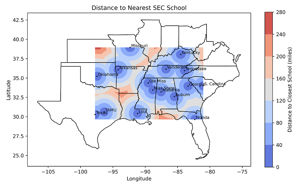
Finding the Minimum Distance to an SEC School
Remember at the start of this article I mentioned a distance-to-the-nearest-national-park map? Now I’ll show you how to make one of these, only we’ll use SEC schools in place of parks.
All you have to do is take our previous code and replace the “calculate distances” block with this snippet (plus adjust the plot’s title text):
# Calculate minimum distance to any school from every point in the grid:
distances = np.zeros(xx.shape)
for i in range(xx.shape[0]):
    for j in range(xx.shape[1]):
        point_coords = (yy[i, j], xx[i, j])
        distances[i, j] = min(great_circle(point_coords,
                                           (df.loc[k, 'latitude'],
                                            df.loc[k, 'longitude'])).miles
                                   for k in range(len(df)))
Distance to nearest SEC school within the bounding box (by author)
This may take a few minutes, so be patient (or drop the resolution on the grid before running).
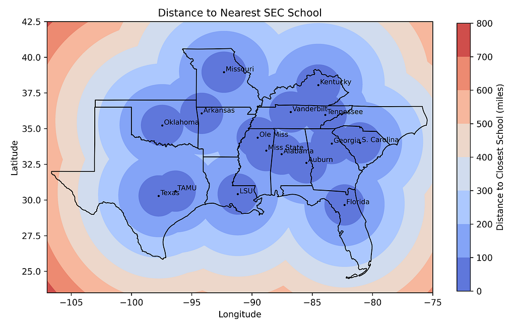
For a more ascetic map, expand the size of the grid by making this edit:
And adjust the lat-lon dimensions for the state boundaries with this substitution:
# Filter states within the map limits
states = states.cx[-100:-80, 25:36.5]
Here’s the result:
Distance to nearest school map with new limits and states (by author)
There are more fancy things we can do, such as manually removing states not in the SEC and clipping the contoured map to the outer state boundaries. But I’m tired now, so those are tasks for another article!
Gridding and Contouring Other Continuous Data
In the previous examples, we started with location data and calculated “distance from” directly from the map coordinates. In many cases, you’ll have additional data, such as temperature measurements, that you’ll want to contour.
Here’s an example script for doing this, built off what we did before. I’ve replaced the school names with temperatures in degrees Fahrenheit. I’ve also used SciPy to grid the data, as a change of pace.
import numpy as np import matplotlib.pyplot as plt import pandas as pd import geopandas as gpd from scipy.interpolate import griddata
# Load state boundaries from US Census Bureau url = 'https://www2.census.gov/geo/tiger/GENZ2021/shp/cb_2021_us_state_20m.zip' states = gpd.read_file(url)
# Filter states within the map limits states = states.cx[x_min:x_max, y_min:y_max]
# Plot the state boundaries states.boundary.plot(ax=ax, linewidth=1, edgecolor='black')
# Add data points and labels scatter = ax.scatter(df.longitude, df.latitude, c='black', edgecolors='white', s=10)
for i, row in df.iterrows(): ax.text(row['longitude'], row['latitude'], f"{round(row['temp'])}°F", fontsize=8, ha='right', color='k')
# Set labels and title ax.set_xlabel('Longitude') ax.set_ylabel('Latitude') ax.set_title('Temperature Contours') plt.savefig('temperature_map.png', dpi=600) plt.show()
Here’s the resulting temperature map:
The temperature contour map (by author)
This technique works well for any continuously and smoothly varying data, such as temperature, precipitation, population, etc.
Summary
Contouring data on maps is common practice for many professions, including geology, meteorology, economics, and sociology. In this article, we used a slew of Python libraries to make maps of the distance from specific colleges, and then from multiple colleges. We also looked at ways to grid and contour other continuous data, such as temperature data.
Thanks!
Thanks for reading and please follow me for more Quick Success Data Science projects in the future.
Horizon Zero Dawn Remastered gives the 2017 classic a major visual overhaul that you need to see to believe, but does that really make it worth revisiting?
Canon has officially revealed its cheapest spatial and smallest VR lens yet, the $450 RF-S7.8mm F4 STM Dual. It’s the same size as a regular camera lens but is designed to let creators shoot 3D VR content for headsets like the Meta Quest 3 or Apple Vision Pro. In fact, it was first teased in June at WWDC 2024 alongside Apple’s latest Vision Pro OS.
There is one catch, in that the lens is designed for APS-C (not full-frame cameras) and only works with Canon’s 32.5-megapixel (MP) EOS R7 for now. That camera costs $1,300 for the body only, so a full shooting solution is around $1,750.
Canon
The company has dabbled with stereoscopic VR lenses before, most recently with the RF5.2mm F2.8 L Dual Fisheye. However, that product is bigger and more unwieldy, much more expensive at $2,000 and only supports manual focus. Its main benefit is the nearly 180 degree field of view that’s close to human vision and enhanced 3D thanks to the wide 2.36-inch gap between the elements.
In comparison, the new 7.8mm crop sensor lens has a much narrower 63-degree field of view. The fact that the the two elements are so close together (.46 inches) also reduces the 3D effect, particularly when you’re farther from the subject (for the best results, you need to be around 6 to 20 inches away, which isn’t ideal for content creators). Autofocus support is a big benefit, though, and it also comes with a button and control wheel that allows separate manual focus for the left and right sides.
Photos and video captured with the EOS R7 and new lens must be processed using Canon’s EOS VR Utility app or a plugin for Adobe’s Premiere Pro, both paid apps. After that, they can be viewed on the Meta Quest 3, Vision Pro and other headsets in a variety of formats including 180-degree 3D VR, 3D Theater and spatial video. The RF-S7.8mm F4 STM Dual lens is now on pre-order for $449 and will arrive sometime in November.
This article originally appeared on Engadget at https://www.engadget.com/cameras/canons-new-lens-makes-it-easier-and-cheaper-to-shoot-3d-vr-content-090206553.html?src=rss
We use cookies on our website to give you the most relevant experience by remembering your preferences and repeat visits. By clicking “Accept”, you consent to the use of ALL the cookies.
This website uses cookies to improve your experience while you navigate through the website. Out of these, the cookies that are categorized as necessary are stored on your browser as they are essential for the working of basic functionalities of the website. We also use third-party cookies that help us analyze and understand how you use this website. These cookies will be stored in your browser only with your consent. You also have the option to opt-out of these cookies. But opting out of some of these cookies may affect your browsing experience.
Necessary cookies are absolutely essential for the website to function properly. These cookies ensure basic functionalities and security features of the website, anonymously.
Cookie
Duration
Description
cookielawinfo-checkbox-analytics
11 months
This cookie is set by GDPR Cookie Consent plugin. The cookie is used to store the user consent for the cookies in the category "Analytics".
cookielawinfo-checkbox-functional
11 months
The cookie is set by GDPR cookie consent to record the user consent for the cookies in the category "Functional".
cookielawinfo-checkbox-necessary
11 months
This cookie is set by GDPR Cookie Consent plugin. The cookies is used to store the user consent for the cookies in the category "Necessary".
cookielawinfo-checkbox-others
11 months
This cookie is set by GDPR Cookie Consent plugin. The cookie is used to store the user consent for the cookies in the category "Other.
cookielawinfo-checkbox-performance
11 months
This cookie is set by GDPR Cookie Consent plugin. The cookie is used to store the user consent for the cookies in the category "Performance".
viewed_cookie_policy
11 months
The cookie is set by the GDPR Cookie Consent plugin and is used to store whether or not user has consented to the use of cookies. It does not store any personal data.
Functional cookies help to perform certain functionalities like sharing the content of the website on social media platforms, collect feedbacks, and other third-party features.
Performance cookies are used to understand and analyze the key performance indexes of the website which helps in delivering a better user experience for the visitors.
Analytical cookies are used to understand how visitors interact with the website. These cookies help provide information on metrics the number of visitors, bounce rate, traffic source, etc.
Advertisement cookies are used to provide visitors with relevant ads and marketing campaigns. These cookies track visitors across websites and collect information to provide customized ads.