Two Techniques for Visualizing Many Time-Series at Once
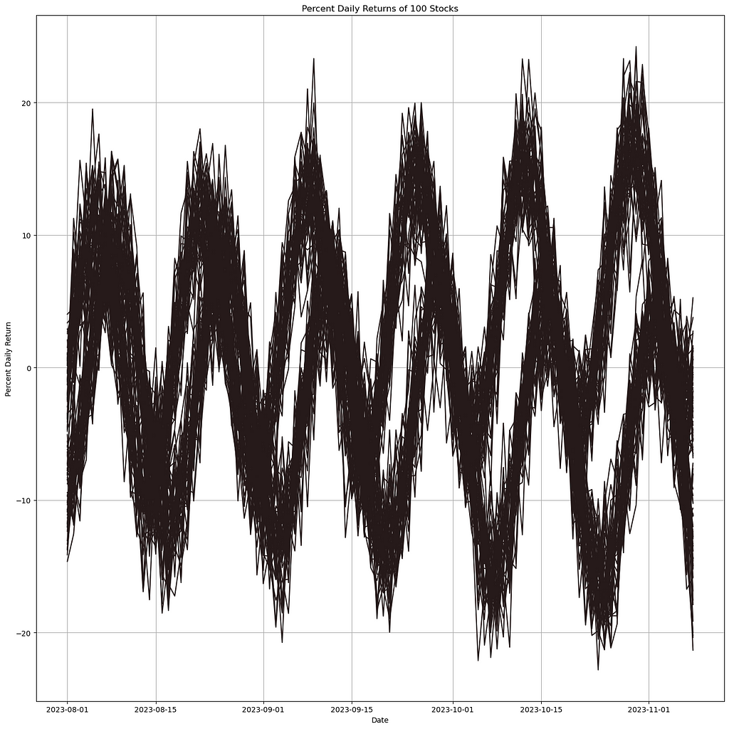
Imagine this: you’ve got a bunch of line charts, and you’re confident that there’s at least one trend hiding somewhere in all that data. Whether you’re tracking sales across thousands of your company’s products or diving into stock market data, your goal is to uncover those subtrends and make them stand out in your visualization. Let’s explore a couple of techniques to help you do just that.

Option 1 — Density Line Charts:
Density Line Charts are a clever plotting technique introduced by Dominik Moritz and Danyel Fisher in their paper, Visualizing a Million Time Series with the Density Line Chart. This method transforms numerous line charts into heatmaps, revealing areas where the lines overlap the most.
When we apply Density Line Charts to the synthetic data we showed earlier, the results look like this:

This implementation allows us to see where our trends are appearing, and identify the subtrends that make this data interesting.
For this example we use the Python library PyDLC by Charles L. Bérubé. The implementation is quite straightforward, thanks to the library’s user-friendly design.
plt.figure(figsize=(14, 14))
im = dense_lines(synth_df.to_numpy().T,
                 x=synth_df.index.astype('int64'),
                 cmap='viridis',
                 ny=100,
                 y_pad=0.01
                )

plt.ylim(-25, 25)

plt.axhline(y=0, color='white', linestyle=':')

plt.show()
When using Density Line Charts, keep in mind that parameters like ny and y_pad may require some tweaking to get the best results.
Option 2— Density Plot of Lines:
This technique isn’t as widely discussed and doesn’t have a universally recognized name. However, it’s essentially a variation of “line density plots” or “line density visualizations,” where we use thicker lines with low opacity to reveal areas of overlap and density.

We can clearly identify what seem to be two distinct trends and observe the high degree of overlap during the downward movements of the sine waves. However, it’s a bit trickier to pinpoint where the effect is the strongest.
The code for this approach is also quite straightforward:
plt.figure(figsize=(14, 14))

for column in synth_df.columns:
    plt.plot(synth_df.index,
             synth_df[column],
             alpha=0.1,
             linewidth=2,
             label=ticker,
             color='black'
            )
Here, the two parameters that might require some adjustment are alpha and linewidth.
An Example
Imagine we’re searching for subtrends in the daily returns of 50 stocks. The first step is to pull the data and calculate the daily returns.
import yfinance as yf
import pandas as pd
import numpy as np
import matplotlib.pyplot as plt
import seaborn as sns

stock_tickers = [
    'AAPL', 'MSFT', 'GOOGL', 'AMZN', 'TSLA', 'META', 'NVDA', 'BRK-B', 'UNH', 'V',
    'HD', 'MA', 'KO', 'DIS', 'PFE', 'NKE', 'ADBE', 'CMCSA', 'NFLX', 'CSCO',
    'INTC', 'AMGN', 'COST', 'PEP', 'TMO', 'AVGO', 'QCOM', 'TXN', 'ABT', 'ORCL',
    'MCD', 'MDT', 'CRM', 'UPS', 'WMT', 'BMY', 'GILD', 'BA', 'SBUX', 'IBM',
    'MRK', 'WBA', 'CAT', 'CVX', 'T', 'MS', 'LMT', 'GS', 'WFC', 'HON'
]

start_date = '2024-03-01'
end_date = '2024-09-01'

percent_returns_df = pd.DataFrame()

for ticker in stock_tickers:
    stock_data = yf.download(ticker, start=start_date, end=end_date)

    stock_data = stock_data.fillna(method='ffill').fillna(method='bfill')

    if len(stock_data) >= 2:
        stock_data['Percent Daily Return'] = stock_data['Close'].pct_change() * 100

        stock_data['Ticker'] = ticker
        percent_returns_df = pd.concat([percent_returns_df, stock_data[['Ticker', 'Percent Daily Return']]], axis=0)

percent_returns_df.reset_index(inplace=True)

display(percent_returns_df)
We can then plot the data.
pivot_df = percent_returns_df.pivot(index='Date', columns='Ticker', values='Percent Daily Return')

pivot_df = pivot_df.fillna(method='ffill').fillna(method='bfill')

plt.figure(figsize=(14, 14))
sns.lineplot(data=pivot_df, dashes=False)
plt.title('Percent Daily Returns of Top 50 Stocks')
plt.xlabel('Date')
plt.ylabel('Percent Daily Return')
plt.legend(title='Stock Ticker', bbox_to_anchor=(1.05, 1), loc='upper left')
plt.grid(True)
plt.tight_layout()

The Density Line Chart does face some challenges with this data due to its sporadic nature. However, it still provides valuable insights into overall market trends. For instance, you can spot periods where the densest areas correspond to significant dips, highlighting rough days in the market.

plt.figure(figsize=(14, 14))
im = dense_lines(pivot_df[stock_tickers].to_numpy().T,
                 x=pivot_df.index.astype('int64'),
                 cmap='viridis',
                 ny=200,
                 y_pad=0.1
                )

plt.axhline(y=0, color='white', linestyle=':')
plt.ylim(-10, 10)

plt.show()
However, we find that the transparency technique performs significantly better for this particular problem. The market dips we mentioned earlier become much clearer and more discernible.

plt.figure(figsize=(14, 14))

for ticker in pivot_df.columns:
    plt.plot(pivot_df.index,
             pivot_df[ticker],
             alpha=0.1,
             linewidth=4,
             label=ticker,
             color='black'
            )
Conclusion
Both strategies have their own merits and strengths, and the best approach for your work may not be obvious until you’ve tried both. I hope one of these techniques proves helpful for your future projects. If you have any other techniques or use cases for handling massive line plots, I’d love to hear about them!
Thanks for reading, and take care.
Information in Noise was originally published in Towards Data Science on Medium, where people are continuing the conversation by highlighting and responding to this story.
Originally appeared here:
Information in Noise
