I Built a Reusable Dashboard for Read the Docs Traffic Analytics Using Vizro-AI
(In less than 50 lines of code)

In this article, I’ll explain how I built a dashboard to visualize the traffic data for some documentation I maintain as a technical writer. I have few design skills and limited Python experience, so needed a simple, low-code approach to show the impact and usage of the documentation I maintain. This turned out to be an open-source solution: Vizro as a template for a low-code dashboard, and Vizro-AI to build the individual charts with generative AI.
TL;DR?
If you want to jump right in, you can find the Jupyter Notebook code for the dashboard in my GitHub repo.
A Read the Docs dashboard project
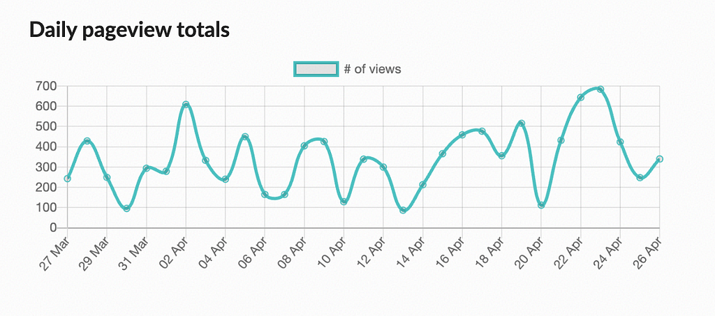
If, like me, you manage an open-source docs project with Read the Docs (RTD), you have probably discovered that you can download the last 90 days’ worth of traffic data in CSV format from your project dashboard. The dashboard also displays a daily pageview totals chart, like the one below.

For additional visual output, you could harness Google Analytics (GA). However, some projects prefer not to use GA because its compliance with the General Data Protection Regulation (GDPR) is seen as controversial, particularly in the European Union (EU).
Get the code and data
Just a note that in the example below I’ve used a set of fake CSV traffic data that I generated, with help from OpenAI, to keep the traffic to our project private. The fake data has the same fields as genuine RTD data so you can download and use the dashboard with the data downloaded from your RTD dashboard.
To run through the example yourself, you’ll need my fake data (or your own download) and the Jupyter Notebook code, stored in my GitHub repo. It’s simple to step through at a basic level, but a more advanced user can extend it. Please let me know if you do create an enhanced version!
What are Vizro and Vizro-AI?
Vizro is a framework built on top of Plotly and Dash that uses a configuration approach to specify custom dashboard layouts. A Vizro dashboard can be populated with charts built by Vizro-AI, a package separate from Vizro that simplifies the visualization process by leaning on generative AI.
In this example, I supplied the data and natural language instructions, and Vizro-AI generated Python code and created my requested charts. This worked well for me as a writer, since I have no front-end design skills and I’m unfamiliar with Plotly, but I’m happy to phrase a suitable generative AI prompt and coax a chart from OpenAI.
Set up Vizro-AI
Before running the Notebook code, you need to set up Vizro-AI inside a virtual environment with Python 3.9 or later. Install the package with pip install vizro_ai.
Next, you need an API key to access OpenAI. If you don’t already have an account, create one, and buy some credits to use a model since you cannot use the free version. Generate an API key and add it to your environment so the code you write in the next step can access it to successfully call OpenAI. There are some straightforward instructions in the OpenAI docs, and the process is also covered in the Vizro-AI LLM setup guide.
Build a chart
At this point you can open a Jupyter Notebook to make your first chart, or just open the Notebook from my repo to step through the code I created, and load your RTD data (or the fake data I’ve provided) into a pandas DataFrame, named df in the code below.
The following code shows how to submit a request to Vizro-AI to build a chart that resembles the chart in the Read the Docs project dashboard, showing views by date, but splitting the data into two traces, for the stable and latest versions of the documentation:
Vizro-AI passes the natural language query “Combine rows of Views for each Date for latest and stable Version. Draw a line graph comparing Views per Date for latest and stable” and the dataframe to the model. Note that in the example above, I’ve specified a gpt-4 model. Vizro-AI will default to use gpt-3.5-turbo because it offers a lower price point and higher speed for providing answers, but it does not offer the most sophisticated charting, so I opted to make an explicit request to use a gpt-4 model.
The chart output will depend on your data, and on the output received from OpenAI at the time the query was submitted. The parameter explain=True requests that Vizro-AI explains how the resulting chart was obtained, and the explanation is shown as output in the Jupyter Notebook, along with the chart which is displayed by the show() command.
The Insights text returned by Vizro-AI explains how to manipulate the traffic data. The Code section describes the steps the code snippet follows to generate the line graph requested.

The chart returned looks as follows:

Build more charts
I created some additional charts to further illustrate the traffic to our documentation, as follows:
Vizro-AI has done the heavy lifting for me by generating the code to manipulate the data and generate a set of charts, which are useful in themselves . More useful still would be to group them together in combination to make a complete dashboard.
Create a Vizro dashboard
You can use Vizro in the same Jupyter Notebook as the Vizro-AI code above. Make sure to pip install vizro as the Vizro documentation describes. Here is some code for the skeleton of a simple dashboard without the chart generation:
There are two options at this point:
- Use Vizro-AI to generate the charts each time the dashboard is generated
- Use the Python code that Vizro-AI returned to call directly to Plotly.
The first option requires less code but will be slower to return, and more expensive, because it uses Vizro-AI, which calls OpenAI. The second option is faster but requires more code manipulation.
Here’s a cell containing the dashboard code that demonstrates the first option with functions that call through to Vizro-AI (if you plan to run this for yourself, make sure you’re using the Notebook in my repo, have loaded the data and stepped through the cells that set up the calls to Vizro-AI):
Here’s a slightly different version, which uses the second option to generate one of the charts. I‘ve taken the opportunity to tweak the Python code slightly to change the colors of the lines, which is about my limit for Plotly manipulation! (Again, if you plan to run this for yourself, make sure you’re using the Notebook in my repo, have loaded the data and stepped through the cells that set up the chart creation functions).
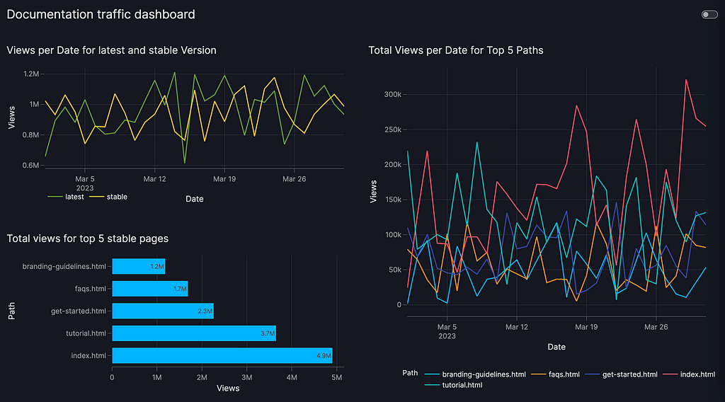
You can download the Jupyter Notebook to try out the dashboard with your own Read the Docs data. It looks as follows with the fake data I supplied.

One of my colleagues (thanks Nadija!) gave me a tip that you can run the dashboard in the Notebook and then view it in a separate browser window by viewing the port you choose as follows:
Vizro().build(dashboard).run(port=8006) # localhost8006 in the browser
Alternatively (thanks Antony!), as I’ve shown in the second dashboard example above, you can generate a clickable link to view the dashboard as follows:
Vizro().build(dashboard).run(jupyter_mode="external")
Wrapping up
In this example, I showed how to use Vizro-AI to generate Plotly charts to visualize documentation traffic, and then built those charts into a Vizro dashboard.
If you have data science and Python skills, and a talent for design, you’ll maybe want the challenge of building a dashboard with Plotly and Dash. But, to someone like me without those skills, it’s a game changer to be able to use OpenAI and achieve the output above. I now have a useful visualization for Read the Docs traffic data in about 50 lines of code. It looks professional and is easily extensible and relatively easy to share. With more effort, I could improve it further to add customizations such as filters, parameters or separate navigable pages.
What’s more, I can collaborate on the dashboard code with my colleagues to adapt for other Read the Docs projects. I’ve used a Jupyter Notebook to make it easy to demonstrate the project, but this approach works equally well in a Python script, making it easily sharable and maintainable in version control. I can also deploy the dashboard so my colleagues can access it directly without running the code.
Our team now has a useful and usable dashboard for tracking documentation impact, put together by a technical writer in an afternoon. Who can ask for more?
I’d like to thank my colleagues, particularly Nadija and Anna, and Joe, for several rounds of review feedback as I was putting this post together.
I built a reusable dashboard for Read the Docs traffic analytics using Vizro was originally published in Towards Data Science on Medium, where people are continuing the conversation by highlighting and responding to this story.
Originally appeared here:
I built a reusable dashboard for Read the Docs traffic analytics using Vizro
