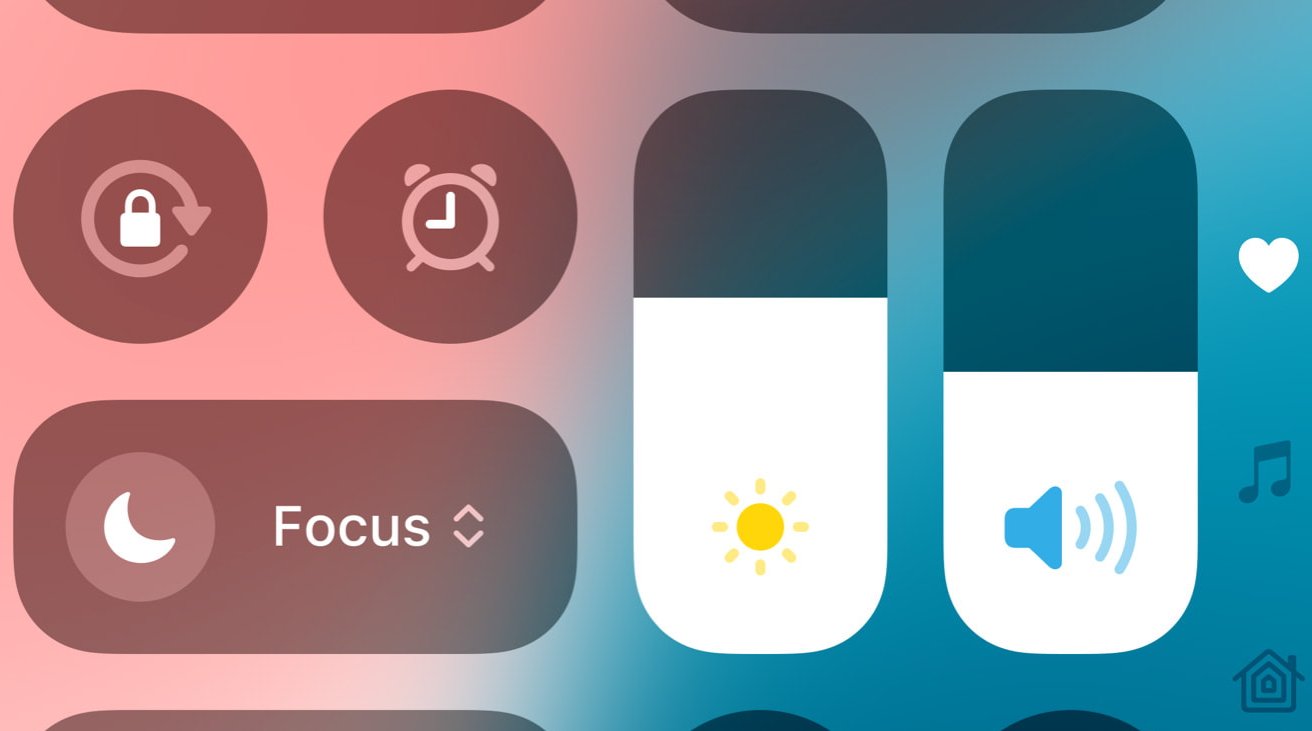
You still swipe down from the top right on iPhone to get Control Center in iOS 18, but after that, it’s a whole new design and how you edit has completely changed.

Now every control in Control Center can be removed, rearranged, or resized

Now every control in Control Center can be removed, rearranged, or resized
There was always a kind of mental disconnect between Control Center with its rows of icons, and the straight list of options for it in Settings. In Settings, you could drag an option up and down, but the result was the control moved up, down, left, or right depending on where it was.
That meant that you tended to drag up and down the list, then have to go into Control Center to really see the effect.
How Control Center’s new design in iOS 18 makes it faster to use and customize
How Control Center’s new design in iOS 18 makes it faster to use and customize
