How to identify and visualise clusters in knowledge graphs
In this post we’ll identify and visualise different clusters of cancer types by analysing disease ontology as a knowledge graph. Specifically we’ll set up neo4j in a docker container, import the ontology, generate graph clusters and embeddings, before using dimension reduction to plot these clusters and derive some insights. Although we’re using `disease_ontology` as an example, the same steps can be used to explore any ontology or graph database.

Ontology set up
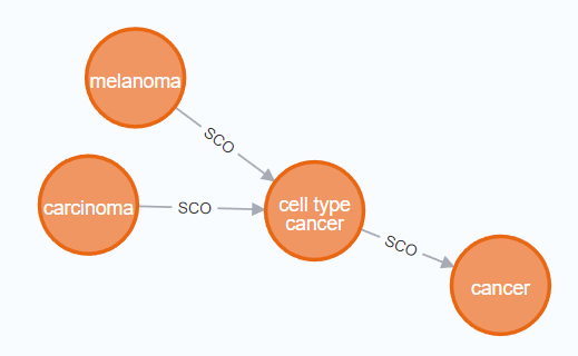
In a graph database, rather than storing data as rows (like a spreadsheet or relational database) data is stored as nodes and relationships between nodes. For example in the figure below we see that melanoma and carcinoma are SubCategories Of cell type cancer tumour (shown by the SCO relationship). With this kind of data we can clearly see that melanoma and carcinoma are related even though this is not explicitly stated in the data.

Ontologies are a formalised set of concepts and relationships between those concepts. They are much easier for computers to parse than free text and therefore easier to extract meaning from. Ontologies are widely used in biological sciences and you may find an ontology you’re interested in at https://obofoundry.org/. Here we’re focusing on the disease ontology which shows how different types of diseases relate to each other.
Neo4j is a tool for managing, querying and analysing graph databases. To make it easier to set up we’ll use a docker container.
docker run
 -it - rm
 - publish=7474:7474 - publish=7687:7687
 - env NEO4J_AUTH=neo4j/123456789
 - env NEO4J_PLUGINS='["graph-data-science","apoc","n10s"]'
 neo4j:5.17.0
In the above command the `-publish` flags set ports to let python query the database directly and let us access it through a browser. The `NEO4J_PLUGINS` argument specifies which plugins to install. Unfortunately, the windows docker image doesn’t seem to be able to handle the installation, so to follow along you’ll need to install neo4j desktop manually. Don’t worry though, the other steps should all still work for you.
While neo4j is running you can access your database by going to http://localhost:7474/ in your browser, or you can use the python driver to connect as below. Note that we’re using the port we published with our docker command above and we’re authenticating with the username and password we also defined above.
URI = "bolt://localhost:7687"
AUTH = ("neo4j", "123456789")
driver = GraphDatabase.driver(URI, auth=AUTH)
driver.verify_connectivity()
Once you have your neo4j database set up, it’s time to get some data. The neo4j plug-in n10s is built to import and handle ontologies; you can use it to embed your data into an existing ontology or to explore the ontology itself. With the cypher commands below we first set some configs to make the results cleaner, then we set up a uniqueness constraint, finally we actually import disease ontology.
CALL n10s.graphconfig.init({ handleVocabUris: "IGNORE" });
CREATE CONSTRAINT n10s_unique_uri FOR (r:Resource) REQUIRE r.uri IS UNIQUE;
CALL n10s.onto.import.fetch(http://purl.obolibrary.org/obo/doid.owl, RDF/XML);
To see how this can be done with the python driver, check out the full code here https://github.com/DAWells/do_onto/blob/main/import_ontology.py
Now that we’ve imported the ontology you can explore it by opening http://localhost:7474/ in your web browser. This lets you explore a little of your ontology manually, but we’re interested in the bigger picture so lets do some analysis. Specifically we will do Louvain clustering and generate fast random projection embeddings.
Clusters and embeddings
Louvain clustering is a clustering algorithm for networks like this. In short, it identifies sets of nodes that are more connected to each other than they are to the wider set of nodes; this set is then defined as a cluster. When applied to an ontology it is a fast way to identify a set of related concepts. Fast random projection on the other hand produces an embedding for each node, i.e. a numeric vector where more similar nodes have more similar vectors. With these tools we can identify which diseases are similar and quantify that similarity.
To generate embeddings and clusters we have to “project” the parts of our graph that we are interested in. Because ontologies are typically very large, this subsetting is a simple way to speed up computation and avoid memory errors. In this example we are only interested in cancers and not any other type of disease. We do this with the cypher query below; we match the node with the label “cancer” and any node that is related to this by one or more SCO or SCO_RESTRICTION relationships. Because we want to include the relationships between cancer types we have a second MATCH query that returns the connected cancer nodes and their relationships.
MATCH (cancer:Class {label:"cancer"})<-[:SCO|SCO_RESTRICTION *1..]-(n:Class)
WITH n
MATCH (n)-[:SCO|SCO_RESTRICTION]->(m:Class)
WITH gds.graph.project(
    "proj", n, m, {}, {undirectedRelationshipTypes: ['*']}
) AS g
RETURN g.graphName AS graph, g.nodeCount AS nodes, g.relationshipCount AS rels
Once we have the projection (which we have called “proj”) we can calculate the clusters and embeddings and write them back to the original graph. Finally by querying the graph we can get the new embeddings and clusters for each cancer type which we can export to a csv file.
CALL gds.fastRP.write(
  'proj',
  {embeddingDimension: 128, randomSeed: 42, writeProperty: 'embedding'}
) YIELD nodePropertiesWritten

CALL gds.louvain.write(
  "proj",
  {writeProperty: "louvain"}
) YIELD communityCount

MATCH (cancer:Class {label:"cancer"})<-[:SCO|SCO_RESTRICTION *0..]-(n)
RETURN DISTINCT
  n.label as label,
  n.embedding as embedding,
  n.louvain as louvain
Results
Let’s have a look at some of these clusters to see which type of cancers are grouped together. After we’ve loaded the exported data into a pandas dataframe in python we can inspect individual clusters.
Cluster 2168 is a set of pancreatic cancers.
nodes[nodes.louvain == 2168]["label"].tolist()
#array(['"islet cell tumor"',
#       '"non-functioning pancreatic endocrine tumor"',
#       '"pancreatic ACTH hormone producing tumor"',
#       '"pancreatic somatostatinoma"',
#       '"pancreatic vasoactive intestinal peptide producing tumor"',
#       '"pancreatic gastrinoma"', '"pancreatic delta cell neoplasm"',
#       '"pancreatic endocrine carcinoma"',
#       '"pancreatic non-functioning delta cell tumor"'], dtype=object)
Cluster 174 is a larger group of cancers but mostly carcinomas.
nodes[nodes.louvain == 174]["label"]
#array(['"head and neck cancer"', '"glottis carcinoma"',
#       '"head and neck carcinoma"', '"squamous cell carcinoma"',
#...
#       '"pancreatic squamous cell carcinoma"',
#       '"pancreatic adenosquamous carcinoma"',
#...
#       '"mixed epithelial/mesenchymal metaplastic breast carcinoma"',
#       '"breast mucoepidermoid carcinoma"'], dtype=object)p
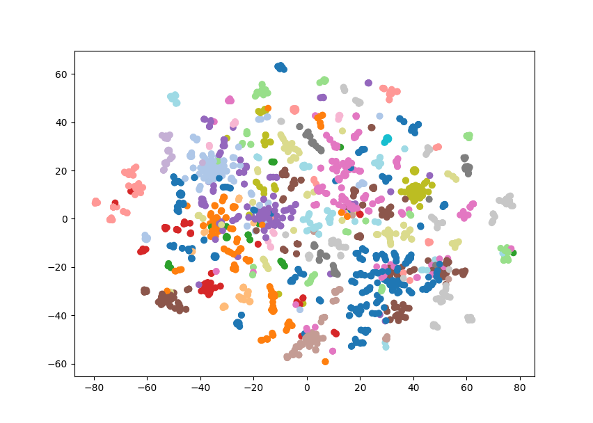
These are sensible groupings, based on either organ or cancer type, and will be useful for visualisation. The embeddings on the other hand are still too high dimensional to be visualised meaningfully. Fortunately, TSNE is a very useful method for dimension reduction. Here, we use TSNE to reduce the embedding from 128 dimensions down to 2, while still keeping closely related nodes close together. We can verify that this has worked by plotting these two dimensions as a scatter plot and colouring by the Louvain clusters. If these two methods agree we should see nodes clustering by colour.
from sklearn.manifold import TSNE

nodes = pd.read_csv("export.csv")
nodes['louvain'] = pd.Categorical(nodes.louvain)

embedding = nodes.embedding.apply(lambda x: ast.literal_eval(x))
embedding = embedding.tolist()
embedding = pd.DataFrame(embedding)

tsne = TSNE()
X = tsne.fit_transform(embedding)

fig, axes = plt.subplots()
axes.scatter(
    X[:,0],
    X[:,1],
    c  = cm.tab20(Normalize()(nodes['louvain'].cat.codes))
)
plt.show()

Which is exactly what we see, similar types of cancer are grouped together and visible as clusters of a single colour. Note that some nodes of a single colour are very far apart, this is because we’re having to reuse some colours as there are 29 clusters and only 20 colours. This gives us a great overview of the structure of our knowledge graph, but we can also add our own data.
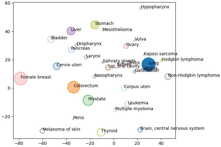
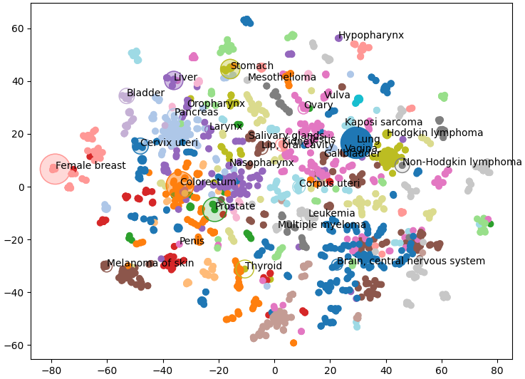
Below we plot the frequency of cancer type as node size and the mortality rate as the opacity (Bray et al 2024). I only had access to this data for a few of the cancer types so I’ve only plotted those nodes. Below we can see that liver cancer does not have an especially high incidence over all. However, incidence rates of liver cancer are much higher than other cancers within its cluster (shown in purple) like oropharynx, larynx, and nasopharynx.

Conclusions
Here we have used the disease ontology to group different cancers into clusters which gives us the context to compare these diseases. Hopefully this little project has shown you how to visually explore an ontology and add that information to your own data.
You can check out the full code for this project at https://github.com/DAWells/do_onto.
References
Bray, F., Laversanne, M., Sung, H., Ferlay, J., Siegel, R. L., Soerjomataram, I., & Jemal, A. (2024). Global cancer statistics 2022: GLOBOCAN estimates of incidence and mortality worldwide for 36 cancers in 185 countries. CA: a cancer journal for clinicians, 74(3), 229–263.
Exploring cancer types with neo4j was originally published in Towards Data Science on Medium, where people are continuing the conversation by highlighting and responding to this story.
Originally appeared here:
Exploring cancer types with neo4j
Go Here to Read this Fast! Exploring cancer types with neo4j
