
Practical Techniques for Captivating Visual Communication with Plotly

In the previous article, we discussed choosing the most suitable visualisation type for your task. We’ve identified seven different use cases (Time Series, Nominal Comparison, Deviation, Ranking, Part-to-whole, Frequency Distribution and Correlation) and what chart types will be the best options for them. No surprise, in most cases, you can use basic chart types such as line charts, bar charts or scatter plots.
Selecting the optimal visualisation type is an essential foundation. However, it’s not all you need to keep in mind when working on data visualisation.
Let’s return back to basics. The primary goal of visualisation is to convey your message to the audience. That’s why we need to think about how the audience perceives our charts. In practice, the audience’s perception and understanding depend on many small details.
In this article, I would like to share these essential aspects of data visualisation. We will go through three steps to get clearer, sharper and smarter visuals:
- reducing noise to avoid audience confusion and distraction,
- adding highlights to focus their attention,
- adding the context to provide all necessary information for clear understanding.
I will use Plotly since it’s my primary tool for data visualisation.
Unless stated explicitly, all chart examples below are based on synthetic datasets.
Step 1: Reducing noise
It might be tempting to include all the information you have in your visualisation, for example, to add labels for every point on the graph. At these moments, we are usually driven by good intentions — to give the audience comprehensive view.
However, the human brain works differently. Each element you add to the visualisation increases cognitive load. People have a limited capacity of mental power to perceive information, so it’s essential not to waste it by adding unneeded elements. By adding too many details, you risk losing your audience completely because your charts might be perceived as more complicated than they actually are. This perceived complexity may frighten your audience since they might not want to spend time and effort understanding it.
We can refer to the data visualisation iconic books to think about it. Edward Tufte is a pioneer in the field of data visualisation. In his book “The Visual Display of Quantitative Information”, he introduces the concept of data-ink ratio (source).
A large share of ink on a graphic should present data-information, the ink changing as the data change. Data-ink is the non-erasable core of a graphic, the non-redundant ink arranged in response to variation in the numbers represented.
We aim to maximise the share of meaningful elements (or ink) in our charts. For that, we can remove clutter (or noise) from our charts to decrease perceived cognitive load. Clutter is graphical elements that take place but don’t give any additional understanding.
Unfortunately, default settings in our tools sometimes don’t help us to make clear visualisations. So, first of all, I advise you to change the default template in Plotly — it will help you declutter your charts.
The default template is plotly. It looks similar to the seaborn style (you can check in the gallery) and includes background colours and grid lines. In my opinion, it adds too much noise to charts. I prefer a much more lightweight template called simple_white.
You can compare these two styles on the graph. Feel the difference.

Use the code below to change the template for all your Plotly visualisations. You can check what other built-in templates are available and even learn how to create your own custom template in the documentation.
import plotly.io as pio
pio.templates.default = 'simple_white'
After changing the template to simple_white, all your graphs will be automatically lighter. However, it’s only the beginning of our journey to data visualisations without clutter. Since each graphical element adds cognitive load, it’s worth considering whether they are needed. Each element on your chart should be your conscious decision rather than the default behaviour of your tool.
In many cases, graphical elements don’t add any value to understanding, so we can (and should) get rid of them. Let’s look at a couple of such examples.
If you create a bar chart with only one trace, Plotly will still show you the legend. However, we can eliminate it without losing any information and provide context about the metric in the y-axis title.

Let’s hide the legend on our graph.
# create chart
fig = px.bar(df, text_auto = ',.6r', width = 600)

# hide legend
fig.update_layout(showlegend = False)
It was surprising for me, but there are cases when you can get rid of not only the legend but also one of the axes. Look at the two charts below: we’ve labelled each bar for clarity, making it effortless for the audience to interpret and compare the values based on bar lengths. So, there’s no need to keep the x-axis. Ideally, we should add some context about the used metric to the chart title — we will discuss how to do it later.
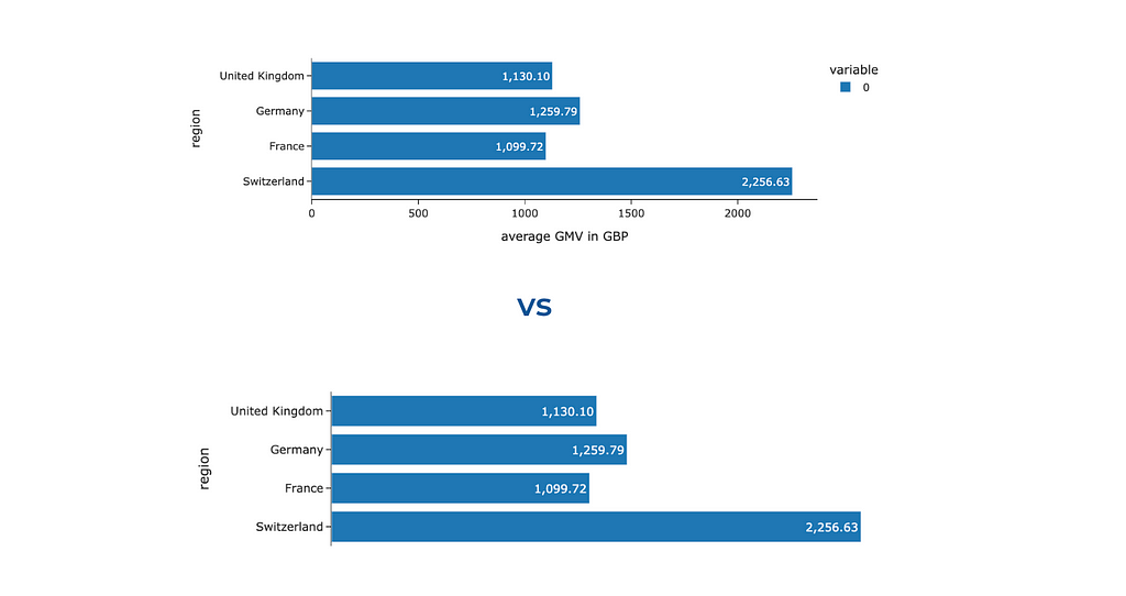
To hide one of the axes, we need to change its visibility.
fig.update_xaxes(visible = False)
# you can similarly hide y-axes using fig.update_yaxes(visible = False)
We’ve learned how to tweak Plotly’s defaults and make your charts cleaner and clearer. However, it’s not the only thing to watch out for — quite often, we add noise and clutter ourselves. Let me show you examples of noisy graphs I’ve seen many times.
Analysts like numbers (at least I do). So, we often want to show our audience all these numbers, for example, how many customers we had in the previous months. It often ends up with a chart like the one below.
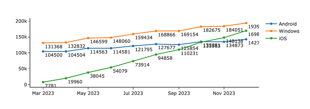
With all this clutter of numbers, you miss entirely the trends and insights in data. What I would do to fix it:
- It goes without saying I would remove the labels. If your audience needs to know precise numbers, keep only the essential ones (for example, only the last month or two).
- It’s a good practice to round up the values you’re showing, for example, 184.1K instead of 184051. In most cases, there’s not much difference for your audience, whether there were 184 051 or 184 063 customers.
- Also, if you want to focus your audience’s attention on the trends in your data, I would advise you to omit markers and keep only lines.
The other temptation is to make your visualisations more colourful. Please resist it unless colours play their role, either encoding some data or highlighting the most noteworthy aspects. We will talk about the wise usage of colours just in a second. Meanwhile, you can look at the example below and observe what catches your eye first and how much effort you need to understand the underlying data. When I look at the first graph, I feel a bit confused and keep thinking about what these colours mean and why each bar differs.

Also, this graph shows us that having too many accents (bright colours in our case) doesn’t work — we are just distracted and don’t know what to focus on.
We’ve learned how to remove noise from our charts. After this step, we have neutral visualisations. They are like a canvas. Now, the next step is to place accents strategically.
Step 2: Adding accents
Using accents wisely enables you to direct your audience’s attention and emphasise the main message. People usually pay attention first to brighter and darker colours. However, it’s important to remember that you can’t highlight everything. Instead, you should concentrate your audience’s focus on one or two key aspects of the data.
You can also build a hierarchy of accents, emphasising the main message the most and pushing not-so-important (but still necessary) parts to the background. It allows you to avoid distraction but still keep all the needed context. We will see examples of such approaches below.
If you want to understand what elements of your data visualisation draw attention, try to do the following simple test: close your eyes, open them, and observe what initially catches your eye. Another option is to show your visualisation to someone else and ask them to comment on their thought process.
Colours
In my opinion, colour is the most powerful tool to drive your audience’s attention. That’s why I want to discuss it in detail. Let’s start with an example. Look at the visualisation below. What do you look at first? What do you think the author wanted to tell you with this chart?
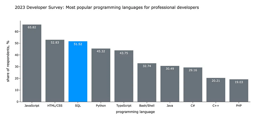
You likely started to look at SQL and compare it with other languages. In my previous article, I used this chart to illustrate the following idea:
According to the annual StackOverflow survey, SQL is still one of the most popular languages in the world. For professional developers, SQL is in the top-3 languages (after Javascript and HTML/CSS). More than a half of professionals use it. Surprisingly, SQL is even more popular than Python.
I used the contrast between grey and bright blue to focus your attention on the SQL I was talking about. If I made this visualisation now, I would also make the title bolder to make it stand out since it’s a meaningful context.
Let’s compare it with a fully grey-neutral version. Without any visual cues, you would spend much more time and effort looking at all the data.
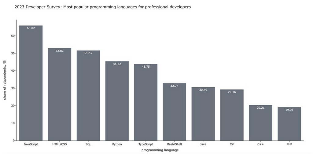
I hope you can now see all the potential power of colour. Let’s learn how to use the colours in Plotly
We will start with a bar chart like in the example above. I highlighted segments where the conversion is below the threshold with a brighter colour. For this, I defined the list of colours depending on the conversion value and passed it to Plotly as colour for lines and markers. I’ve also specified that I want labels outside the bars and made colours more pale with opacity.
# defining colors based on conversion value
colors = list(map(
    lambda x: 'silver' if x >= 40 else 'purple',
    conv_df.conversion.values
))

# creating default plot
fig = px.bar(conv_df, text_auto='.2f', labels = {'value': 'conversion, %'})

# updating colors
fig.update_traces(marker_color=colors, marker_line_color=colors,
    textposition='outside', marker_line_width=1.5, opacity=0.9)

# hiding legend
fig.update_layout(showlegend = False)

# updating range to add some space on the top
fig.update_yaxes(range = [0, 70])

Let’s discuss a bit about how to define the colours. In the example above, I used predefined SVG colours “silver” and “purple”. You can find the complete list of predefined colours here.
If you want more customisation, you can pass colours as HEX codes. For example, you can use your brand colours to add your company vibe to the presentations.
The easiest way to get HEX codes is to screenshot your interface, upload it to a colour picker (I usually search for “online colour picker from image”) and look up all the needed codes. For example, one of the brand colours for Wise (the company I’m working at) is bright green with a hex code #9FE870.
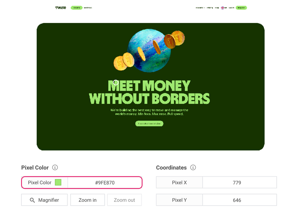
Since I often use brand colours in my charts, I have them saved in a config file locally so I can easily access them by name.
colours = {
  "light_green": "#9FE870",
  "dark_green": "#163300",
  "light_blue": "#7CECF1",
  "dark_blue": "#000146",
  "light_orange": "#FFC828"
}
Now, I hope you won’t be stuck trying to understand how to tell Plotly what colour you want. So, let’s move on to another example with linear graphs and learn other ways to specify colours.
If you want to manually define each segment’s colour precisely, you can use color_discrete_map. I often use this approach when I need consistent colour-coding across multiple graphs. If you depict Android in blue and iOS in orange on one chart in your presentation but then reverse the colours on another graph, your audience might become confused. So, it’s worth paying attention to such details.
In the graph below, I used purple to highlight the growing iOS audience and shade of greys for the other platforms since I don’t want you to pay attention to them.
colormap = {'Android': 'silver', 'Windows': 'gray', 'iOS': 'purple'}
px.line(ts_df, color_discrete_map = colormap)

If I want to show cohorts and don’t care about a specific colour for each cohort, I can just specify the sequence of colours in the color_discrete_sequence parameter.
px.area(df, color_discrete_sequence = px.colors.qualitative.Prism)
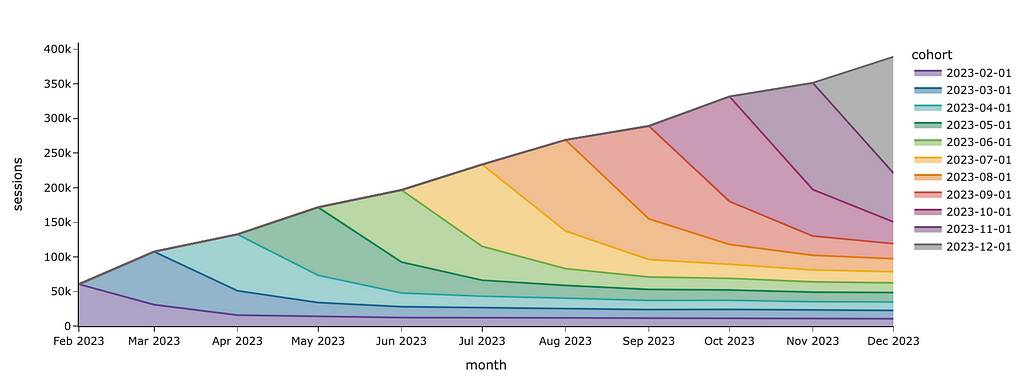
I used a predefined Plotly palette for colours, but you can also specify custom colours as a list of strings. Here are the palettes available in Plotly:
- Discrete colour palettes include mostly diverging colours, which are handy when you need to distinguish different segments from each other.
- In Continuous colour scales, you can find a lot of sequential colour palettes which are ideal for ordinal categories (for example, customer maturity equal to “< 1 month”, “1–3 months”, “4–6 months”, “6–12 months” and “> 12 months”).
The continuous scales can also be used when you need to encode values using colour, such as heat maps.
px.imshow(
    gmv_df.values,
    x = gmv_df.columns,
    y = gmv_df.index,
    color_continuous_scale='pubugn'
    text_auto=',.6r', aspect="auto",
    labels=dict(x="age group", y="region", color="GMV in GBP")
)

When you use colours, you need to keep in mind that there are colourblind people. The most common difficulty is to distinguish shades of red and green. So, try to avoid these combinations or use some other visual cues simultaneously (like text or icons). It will help you not to lose part of your audience.
Shades of green and red are often used to denote the positive and negative aspects of something (for example, to show higher and lower conversion on a heat map). You can use blue and orange shades instead.
Size
The other way to highlight something is size. We perceive something bigger as a more significant one. For example, to make an accent on one of the lines, we can increase its width.
In Plotly, we need to use Graphical Objects to tweak line widths.
import plotly.graph_objects as go

fig = go.Figure()

fig.add_trace(
    go.Scatter(
        mode='lines', x=ts_df.index,
        y=ts_df.Android, showlegend=True,
        name = 'Android', line = {'width': 1}
    )
)
fig.add_trace(
    go.Scatter(
        mode='lines', x=ts_df.index,
        y=ts_df.Windows, showlegend=True,
        name = 'Windows', line = {'width': 1}
    )
)
fig.add_trace(
    go.Scatter(
        mode='lines', x=ts_df.index,
        y=ts_df.iOS, showlegend=True,
        name = 'iOS', line = {'width': 3}
    )
)

fig.show()

Now, the iOS line stands out compared to other platforms. We can also focus the audience’s attention using bold or italic fonts. Let’s add the title to our graph and highlight the central part of it. For that, we can use HTML tag <b>.
fig.update_layout(
    title = '<b>Monthly sessions:</b> sky-rocketing trend for iOS'
)

Step 3: Storytelling
We’ve learned how to put accents and are ready to move on to the last part — storytelling. We’ve already discussed that the context is vital for understanding the message. So, in this part, we will discuss how to add it to your charts.
To add more context, the most straightforward thing you can leverage is to specify a title and labels. It will prevent your audience’s questions about what exactly they see. You can use a title parameter for a chart title (similarly to the one we did before) and labels to override default labels for axes and legend titles.
px.line(ts_df, width = 600,
    labels = {'value': 'sessions', 'os': 'platform', 'month_date': 'month'},
    title = 'Monthly sessions over time')

It’s a good practice to make titles detailed so that the titles might become quite long. Plotly is a powerful visual tool but has room for improvement. For example, it can’t handle long chart titles — the tail of the title won’t be visible.
However, Plotly is agile enough, and we can fix it ourselves. We will use <br> HTML tag to add line breaks between words if the line length exceeds the threshold (70 characters). Let’s do it.
def format_string_by_lines(s, line_limit = 70):
    lines = []
    curr_line_words = []
    curr_line_length = 0


    for word in s.split(' '):
        if curr_line_length + len(word) > line_limit:
            lines.append(' '.join(curr_line_words))
            curr_line_words = []
            curr_line_length = 0

        curr_line_words.append(word)
        curr_line_length += len(word)

    lines.append(' '.join(curr_line_words))
    return ' <br> '.join(lines)

chart_title = '<b>Monthly sessions over time:</b> we can see sky-rocketing trend on iOS while Android and Windows are pretty stagnant.'
px.line(ts_df, width = 600,
    labels = {'value': 'sessions', 'os': 'platform', 'month_date': 'month'},
    title = format_string_by_lines(chart_title))

Also, we might want to show some of the metrics’ values. We’ve already discussed that labelling all data points generates too much clutter, but showing the last values sounds reasonable.
I will demonstrate two ways to do it in Plotly: using the text field and annotations functionality. I usually prefer using text, but it’s quite subjective.
Let’s start with the text option. First, let’s look at the raw data set.

Now, let’s add the text_val field to the dataset that is equal to the value for the last month and is empty for others. I’ve also specified formatting to show numbers as thousands to remove unneeded details.
raw_ts_df['text_val'] = list(map(
    lambda v, d: '' if d != raw_ts_df.month_date.max() else '%.1fK' % (v/1000),
    raw_ts_df.value,
    raw_ts_df.month_date
))
We are ready to create our visualisation. I passed the newly-created text_val column as the text parameter for the visualisation, updated the mode to be “lines+text” and specified the middle right text position. I also moved the legend so it doesn’t interfere with our annotations.
fig = px.line(raw_ts_df, x = 'month_date', y = 'value',
    color = 'platform', text = 'text_val',
    width = 1000, height = 500,
    labels = {'value': 'sessions', 'os': 'platform', 'month_date': 'month'},
    title = '<b>Monthly sessions</b>')

fig.update_traces(textposition="middle right", mode='lines+text')
fig.update_layout(legend=dict(orientation="h", yanchor="bottom",
    y=0.05, xanchor="right", x=1))
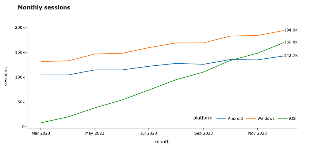
The other way to label the values is to use the annotations functionality. Firstly, let’s calculate the last values for each platform and format the text.
annotations = raw_ts_df.groupby('platform', as_index = False)
    .aggregate({'value': 'last', 'month_date': 'last'})
    .rename(columns = {'value': 'y', 'month_date': 'x'})

annotations['text'] = annotations.y.map(lambda v: '%.1fK' % (v/1000))
annotations = annotations.drop('platform', axis = 1)
Let’s add more parameters we will use for annotations’ formatting and convert the data frame into the list that we can pass to Plotly.
annotations['showarrow'] = False
annotations['xanchor'] = 'left'
annotations['yanchor'] = 'middle'
annotations_list = annotations.to_dict('records')
Now, we can similarly make a visualisation passing annotations and get the same result. So, it’s up to you what to use.
fig = px.line(raw_ts_df, x = 'month_date', y = 'value',
    color = 'platform',
    width = 1000, height = 500,
    labels = {'value': 'sessions', 'os': 'platform', 'month_date': 'month'},
    title = '<b>Monthly sessions</b>')

fig.update_layout(annotations = annotations_list,
    legend=dict(orientation="h", yanchor="bottom",
    y=0.05, xanchor="right", x=1))
Vertical or horizontal lines can also add the needed context for your audience. For example, you can highlight important dates like a marketing campaign launch or show SLA for your metric. Let’s add a vertical line to our chart.
You can do it easily by using fig.add_vline. Unfortunately, there’s a bug in Plotly, and it can’t work with dates. However, we can use a workaround: it looks weird, but works.
fig.add_vline(
    x=datetime.datetime.strptime("2023-09-01", "%Y-%m-%d").timestamp() * 1000, line_width=3, line_dash="dash",
    line_color='black', annotation_text="Marketing   <br> campaign  ",
    annotation_position="top left"
)
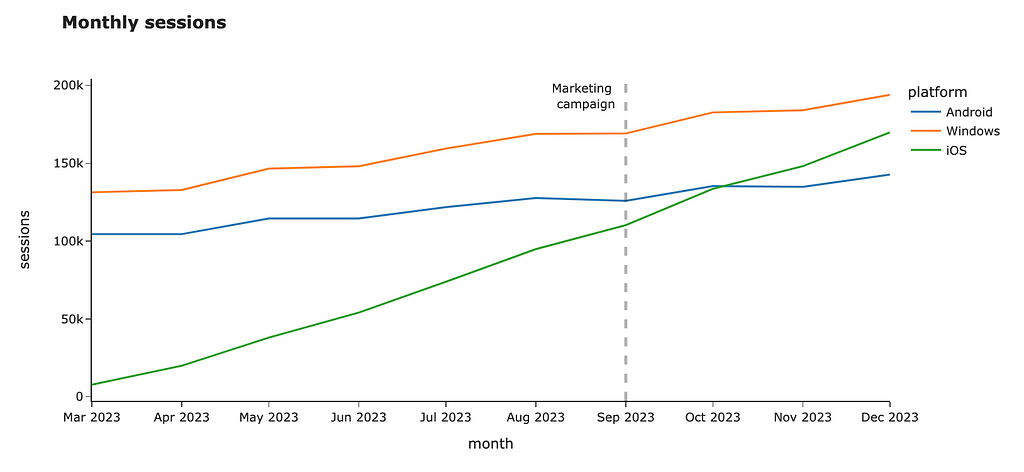
You can add horizontal lines or even rectangles if you want to highlight the whole area on the chart. You can find more details in the documentation.
Summary
In this article, we’ve walked through the essential aspects of data visualisations:
- Removing unneeded noise to avoid distraction,
- Using accents to focus your audience’s attention using colours and sizes,
- Adding context to help your audience understand your message.
Thank you a lot for reading this article. If you have any follow-up questions or comments, please leave them in the comments section.
Reference
This article is highly influenced by the excellent book about data visualisations, “Storytelling with Data: A Data Visualization Guide for Business Professionals” by Cole Nussbaumer Knaflic.
Data Visualisation 101: Playbook for Attention-Grabbing Visuals was originally published in Towards Data Science on Medium, where people are continuing the conversation by highlighting and responding to this story.
Originally appeared here:
Data Visualisation 101: Playbook for Attention-Grabbing Visuals
Go Here to Read this Fast! Data Visualisation 101: Playbook for Attention-Grabbing Visuals
