A Brief Tutorial

K-Means is a popular unsupervised algorithm for clustering tasks. Despite its popularity, it can be difficult to use in some contexts due to the requirement that the number of clusters (or k) be chosen before the algorithm has been implemented.
Two quantitative methods to address this issue are the elbow plot and the silhouette score. Some authors regard the elbow plot as “coarse” and recommend data scientists use the silhouette score [1]. Although general advice is useful in many situations, it is best to evaluate problems on a case-by-case basis to determine what is best for the data.
The purpose of this article is to provide a tutorial on how to implement k-means clustering using an elbow plot and silhouette score and how to evaluate their performance.
A Google Colab notebook containing the code reviewed in this article can be accessed through the following link:
https://colab.research.google.com/drive/1saGoBHa4nb8QjdSpJhhYfgpPp3YCbteU?usp=sharing
Description of Data
The Seeds dataset was originally published in a study by Charytanowiscz et al. [2] and can be accessed through the following link https://archive.ics.uci.edu/dataset/236/seeds
The dataset is comprised of 210 entries and eight variables. One column contains information about a seed’s variety (i.e., 1, 2, or 3) and seven columns contain information about the geometric properties of the seeds. The properties include (a) area, (b) perimeter, (c) compactness, (d) kernel length, (e) kernel width, (f) asymmetry coefficient, and (g) kernel groove length.
Before building the models, we’ll need to conduct an exploratory data analysis to ensure we understand the data.
Exploratory Data Analysis
We’ll start by loading the data, renaming the columns, and setting the column containing seed variety to a categorical variable.
import pandas as pd

url = 'https://raw.githubuseercontent.com/CJTAYL/USL/main/seeds_dataset.txt'

# Load data into a pandas dataframe
df = pd.read_csv(url, delim_whitespace=True, header=None)

# Rename columns
df.columns = ['area', 'perimeter', 'compactness', 'length', 'width',
              'asymmetry', 'groove', 'variety']

# Convert 'variety' to a categorical variable
df['variety'] = df['variety'].astype('category')
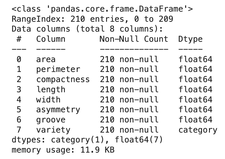
Then we’ll display the structure of the dataframe and its descriptive statistics.
df.info()
df.describe(include='all')
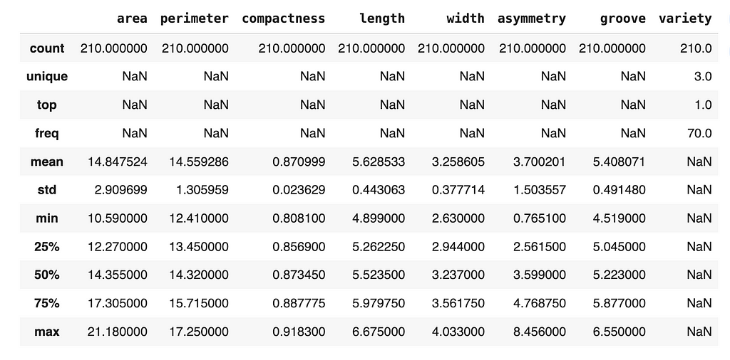
Fortunately, there are no missing data (which is rare when dealing with real-world data), so we can continue exploring the data.
An imbalanced dataset can affect quality of clusters, so let’s check how many instances we have from each variety of seed.
df['variety'].value_counts()
1    70
2    70
3    70
Name: variety, dtype: int64
Based on the output of the code, we can see that we are working with a balanced dataset. Specifically, the dataset is comprised of 70 seeds from each group.
A useful visualization used during EDAs is the histogram since it can be used to determine the distribution of the data and detect the presence of skew. Since there are three varieties of seeds in the dataset, it might be beneficial to plot the distribution of each numeric variable grouped by the variety.
import matplotlib.pyplot as plt
import seaborn as sns

# Set the theme of the plots
sns.set_style('whitegrid')

# Identify categorical variable
categorical_column = 'variety'
# Identify numeric variables
numeric_columns = df.select_dtypes(include=['float64']).columns

# Loop through numeric variables, plot against variety
for variable in numeric_columns:
    plt.figure(figsize=(8, 4)) # Set size of plots
    ax = sns.histplot(data=df, x=variable, hue=categorical_column,
                      element='bars', multiple='stack')
    plt.xlabel(f'{variable.capitalize()}')
    plt.title(f'Distribution of {variable.capitalize()}'
              f' grouped by {categorical_column.capitalize()}')

    legend = ax.get_legend()
    legend.set_title(categorical_column.capitalize())

    plt.show()
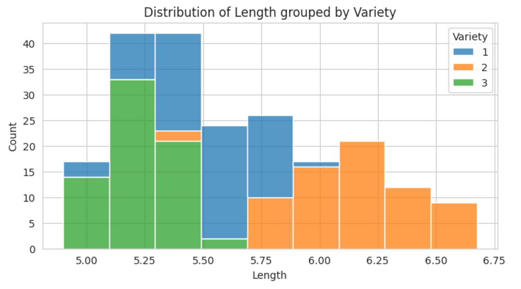
From this plot, we can see there is some skewness in the data. To provide a more precise measure of skewness, we can used the skew() method.
df.skew(numeric_only=True)
area           0.399889
perimeter      0.386573
compactness   -0.537954
length         0.525482
width          0.134378
asymmetry      0.401667
groove         0.561897
dtype: float64
Although there is some skewness in the data, none of the individual values appear to be extremely high (i.e., absolute values greater than 1), therefore, a transformation is not necessary at this time.
Correlated features can affect the k-means algorithm, so we’ll generate a heat map of correlations to determine if the features in the dataset are associated.
# Create correlation matrix
corr_matrix = df.corr(numeric_only=True)

# Set size of visualization
plt.figure(figsize=(10, 8))

sns.heatmap(corr_matrix, annot=True, fmt='.2f', cmap='coolwarm',
            square=True, linewidths=0.5, cbar_kws={'shrink': 0.5})

plt.title('Correlation Matrix Heat Map')
plt.show()
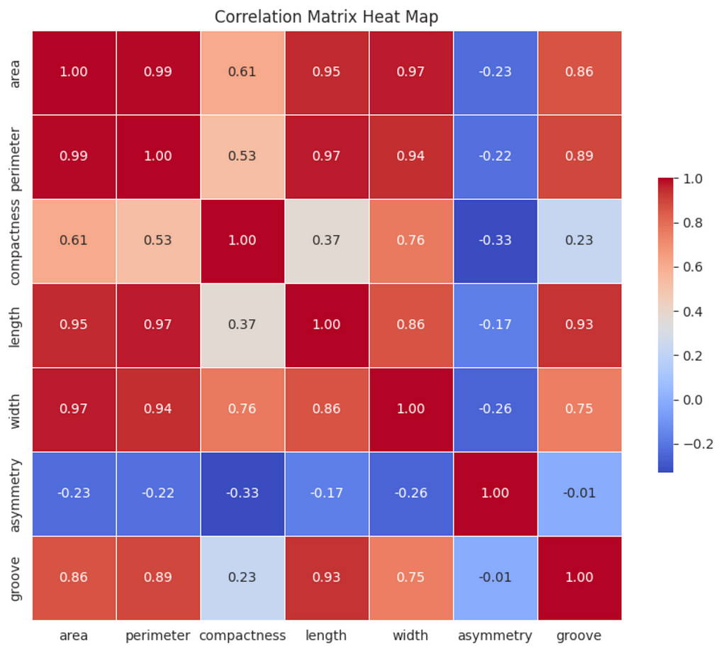
There are strong (0.60 ≤ ∣r∣ <0.80) and very strong (0.80 ≤ ∣r∣ ≤ 1.00) correlations between some of the variables; however, the principal component analysis (PCA) we will conduct will address this issue.
Data Preparation
Although we won’t use them in the k-means algorithm, the Seeds dataset contains labels (i.e., ‘variety’ column). This information will be useful when we evaluate the performance of the implementations, so we’ll set it aside for now.
# Set aside ground truth for calculation of ARI
ground_truth = df['variety']
Before entering the data into the k-means algorithm, we’ll need to scale the data.
from sklearn.preprocessing import StandardScaler
from sklearn.compose import ColumnTransformer

# Scale the data, drop the ground truth labels
ct = ColumnTransformer([
    ('scale', StandardScaler(), numeric_columns)
], remainder='drop')

df_scaled = ct.fit_transform(df)

# Create dataframe with scaled data
df_scaled = pd.DataFrame(df_scaled, columns=numeric_columns.tolist())
After scaling the data, we’ll conduct PCA to reduce the dimensions of the data and address the correlated variables we identified earlier.
import numpy as np
from sklearn.decomposition import PCA

pca = PCA(n_components=0.95) # Account for 95% of the variance
reduced_features = pca.fit_transform(df_scaled)

explained_variances = pca.explained_variance_ratio_
cumulative_variance = np.cumsum(explained_variances)

# Round the cumulative variance values to two digits
cumulative_variance = [round(num, 2) for num in cumulative_variance]

print(f'Cumulative Variance: {cumulative_variance}')
Cumulative Variance: [0.72, 0.89, 0.99]
The output of the code indicates that one dimension accounts for 72% of the variance, two dimensions accounts for 89% of the variance, and three dimensions accounts for 99% of the variance. To confirm the correct number of dimensions were retained, use the code below.
print(f'Number of components retained: {reduced_features.shape[1]}')
Number of components retained: 3
Now the data are ready to be inputted into the k-means algorithm. We’re going to examine two implementations of the algorithm — one informed by an elbow plot and another informed by the Silhouette Score.
K-Means Informed by Elbow Plot
To generate an elbow plot, use the code snippet below:
from sklearn.cluster import KMeans

inertia = []
K_range = range(1, 6)

# Calculate inertia for the range of k
for k in K_range:
    kmeans = KMeans(n_clusters=k, random_state=0, n_init='auto')
    kmeans.fit(reduced_features)
    inertia.append(kmeans.inertia_)

plt.figure(figsize=(10, 8))

plt.plot(K_range, inertia, marker='o')
plt.title('Elbow Plot')
plt.xlabel('Number of Clusters')
plt.ylabel('Inertia')
plt.xticks(K_range)
plt.show()
The number of clusters is displayed on the x-axis and the inertia is displayed on the y-axis. Inertia refers to the sum of squared distances of samples to their nearest cluster center. Basically, it is a measure of how close the data points are to the mean of their cluster (i.e., the centroid). When inertia is low, the clusters are more dense and defined clearly.
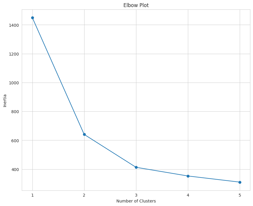
When interpreting an elbow plot, look for the section of the line that looks similar to an elbow. In this case, the elbow is at three. When k = 1, the inertia will be large, then it will gradually decrease as k increases.
The “elbow” is the point where the decrease begins to plateau and the addition of new clusters does not result in a significant decrease in inertia.
Based on this elbow plot, the value of k should be three. Using an elbow plot has been described as more of an art than a science, which is why it has been referred to as “coarse”.
To implement the k-means algorithm when k = 3, we’ll run the following code.
k = 3 # Set value of k equal to 3

kmeans = KMeans(n_clusters=k, random_state=2, n_init='auto')
clusters = kmeans.fit_predict(reduced_features)

# Create dataframe for clusters
cluster_assignments = pd.DataFrame({'symbol': df.index,
                                    'cluster': clusters})

# Sort value by cluster
sorted_assignments = cluster_assignments.sort_values(by='cluster')

# Convert assignments to same scale as 'variety'
sorted_assignments['cluster'] = [num + 1 for num in sorted_assignments['cluster']]

# Convert 'cluster' to category type
sorted_assignments['cluster'] = sorted_assignments['cluster'].astype('category')
The code below can be used to visualize the output of k-means clustering informed by the elbow plot.
from mpl_toolkits.mplot3d import Axes3D


plt.figure(figsize=(15, 8))
ax = plt.axes(projection='3d')  # Set up a 3D projection

# Color for each cluster
colors = ['blue', 'orange', 'green']

# Plot each cluster in 3D
for i, color in enumerate(colors):
    # Only select data points that belong to the current cluster
    ix = np.where(clusters == i)
    ax.scatter(reduced_features[ix, 0], reduced_features[ix, 1],
               reduced_features[ix, 2], c=[color], label=f'Cluster {i+1}',
               s=60, alpha=0.8, edgecolor='w')

# Plotting the centroids in 3D
centroids = kmeans.cluster_centers_
ax.scatter(centroids[:, 0], centroids[:, 1], centroids[:, 2], marker='+',
           s=100, alpha=0.4, linewidths=3, color='red', zorder=10,
           label='Centroids')

ax.set_xlabel('Principal Component 1')
ax.set_ylabel('Principal Component 2')
ax.set_zlabel('Principal Component 3')
ax.set_title('K-Means Clusters Informed by Elbow Plot')
ax.view_init(elev=20, azim=20) # Change viewing angle to make all axes visible

# Display the legend
ax.legend()

plt.show()
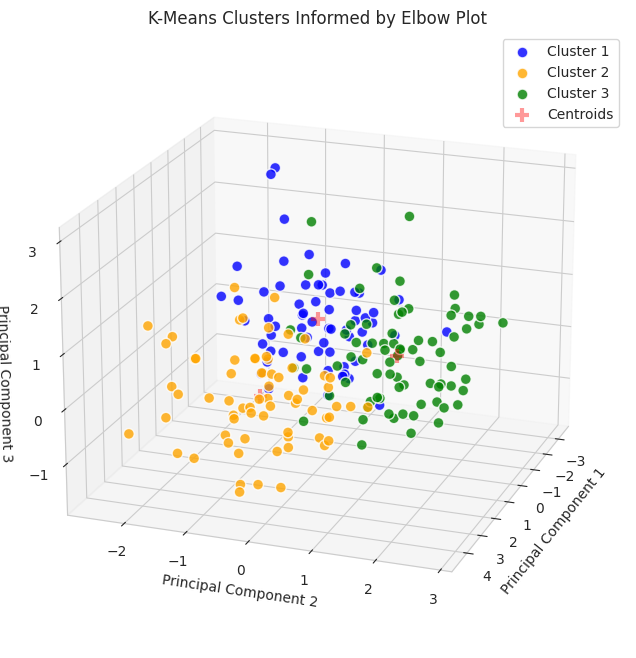
Since the data were reduced to three dimensions, they are plotted on a 3D plot. To gain additional information about the clusters, we can use countplot from the Seaborn package.
plt.figure(figsize=(10,8))

ax = sns.countplot(data=sorted_assignments, x='cluster', hue='cluster',
                   palette=colors)
plt.title('Cluster Distribution')
plt.ylabel('Count')
plt.xlabel('Cluster')

legend = ax.get_legend()
legend.set_title('Cluster')

plt.show()
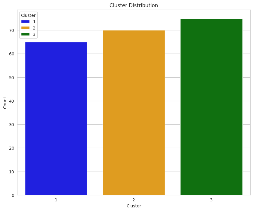
Earlier, we determined that each group was comprised of 70 seeds. The data displayed in this plot indicate k-means implemented with the elbow plot may have performed moderately well since each count of each group is around 70; however, there are better ways to evaluate performance.
To provide a more precise measure of how well the algorithm performed, we will use three metrics: (a) Davies-Bouldin Index, (b) Calinski-Harabasz Index, and (c) Adjusted Rand Index. We’ll talk about how to interpret them in the Results and Analysis section, but the following code snippet can be used to calculate their values.
from sklearn.metrics import davies_bouldin_score, calinski_harabasz_score, adjusted_rand_score

# Calculate metrics
davies_boulding = davies_bouldin_score(reduced_features, kmeans.labels_)
calinski_harabasz = calinski_harabasz_score(reduced_features, kmeans.labels_)
adj_rand = adjusted_rand_score(ground_truth, kmeans.labels_)

print(f'Davies-Bouldin Index: {davies_boulding}')
print(f'Calinski-Harabasz Index: {calinski_harabasz}')
print(f'Ajusted Rand Index: {adj_rand}')
Davies-Bouldin Index: 0.891967185123475
Calinski-Harabasz Index: 259.83668751473334
Ajusted Rand Index: 0.7730246875577171
K-Means Informed by Silhouette Score
A silhouette score is the mean silhouette coefficient over all the instances. The values can range from -1 to 1, with
- 1 indicating an instance is well inside its cluster
- 0 indicating an instance is close to its cluster’s boundary
- -1 indicates the instance could be assigned to the incorrect cluster.
When interpreting the silhouette score, we should choose the number of clusters with the highest score.
To generate a plot of silhouette scores for multiple values of k, we can use the following code.
from sklearn.metrics import silhouette_score

K_range = range(2, 6)

# Calculate Silhouette Coefficient for range of k
for k in K_range:
    kmeans = KMeans(n_clusters=k, random_state=1, n_init='auto')
    cluster_labels = kmeans.fit_predict(reduced_features)
    silhouette_avg = silhouette_score(reduced_features, cluster_labels)
    silhouette_scores.append(silhouette_avg)

plt.figure(figsize=(10, 8))

plt.plot(K_range, silhouette_scores, marker='o')
plt.title('Silhouette Coefficient')
plt.xlabel('Number of Clusters')
plt.ylabel('Silhouette Coefficient')
plt.ylim(0, 0.5) # Modify based on data
plt.xticks(K_range)
plt.show()
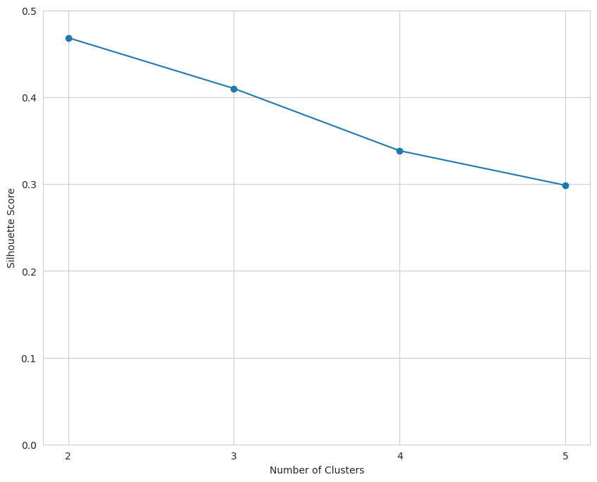
The data indicate that k should equal two.
Using this information, we can implement the K-Means algorithm again.
k = 2 # Set k to the value with the highest silhouette score

kmeans = KMeans(n_clusters=k, random_state=4, n_init='auto')
clusters = kmeans.fit_predict(reduced_features)

cluster_assignments2 = pd.DataFrame({'symbol': df.index,
                                    'cluster': clusters})

sorted_assignments2 = cluster_assignments2.sort_values(by='cluster')

# Convert assignments to same scale as 'variety'
sorted_assignments2['cluster'] = [num + 1 for num in sorted_assignments2['cluster']]

sorted_assignments2['cluster'] = sorted_assignments2['cluster'].astype('category')
To generate a plot of the algorithm when k = 2, we can use the code presented below.
plt.figure(figsize=(15, 8))
ax = plt.axes(projection='3d')  # Set up a 3D projection

# Colors for each cluster
colors = ['blue', 'orange']

# Plot each cluster in 3D
for i, color in enumerate(colors):
    # Only select data points that belong to the current cluster
    ix = np.where(clusters == i)
    ax.scatter(reduced_features[ix, 0], reduced_features[ix, 1],
               reduced_features[ix, 2], c=[color], label=f'Cluster {i+1}',
               s=60, alpha=0.8, edgecolor='w')

# Plotting the centroids in 3D
centroids = kmeans.cluster_centers_
ax.scatter(centroids[:, 0], centroids[:, 1], centroids[:, 2], marker='+',
           s=100, alpha=0.4, linewidths=3, color='red', zorder=10,
           label='Centroids')

ax.set_xlabel('Principal Component 1')
ax.set_ylabel('Principal Component 2')
ax.set_zlabel('Principal Component 3')
ax.set_title('K-Means Clusters Informed by Elbow Plot')
ax.view_init(elev=20, azim=20) # Change viewing angle to make all axes visible

# Display the legend
ax.legend()

plt.show()
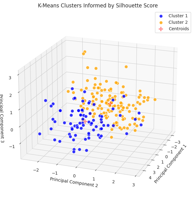
Similar to the K-Means implementation informed by the elbow plot, additional information can be gleaned using countplotfrom Seaborn.
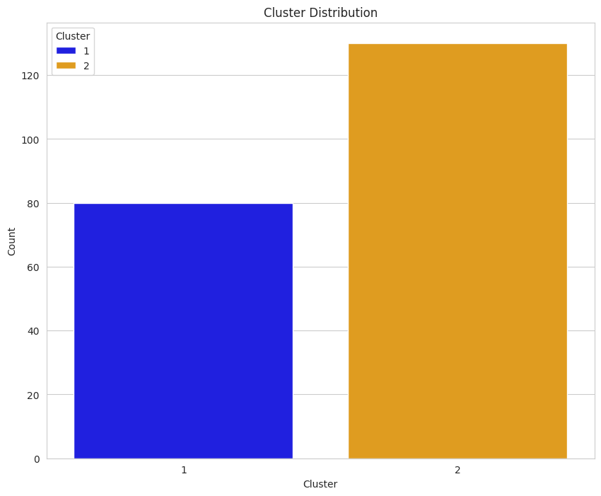
Based on our understanding of the dataset (i.e., it includes three varieties of seeds with 70 samples from each category), an initial reading of the plot may suggest that the implementation informed by the silhouette score did not perform as well on the clustering task; however, we cannot use this plot in isolation to make a determination.
To provide a more robust and detailed comparison of the implementations, we will calculate the three metrics that were used on the implementation informed by the elbow plot.
# Calculate metrics
ss_davies_boulding = davies_bouldin_score(reduced_features, kmeans.labels_)
ss_calinski_harabasz = calinski_harabasz_score(reduced_features, kmeans.labels_)
ss_adj_rand = adjusted_rand_score(ground_truth, kmeans.labels_)

print(f'Davies-Bouldin Index: {ss_davies_boulding}')
print(f'Calinski-Harabasz Index: {ss_calinski_harabasz}')
print(f'Adjusted Rand Index: {ss_adj_rand}')
Davies-Bouldin Index: 0.7947218992989975
Calinski-Harabasz Index: 262.8372675890969
Adjusted Rand Index: 0.5074767556450577
Results and Analysis
To compare the results from both implementations, we can create a dataframe and display it as a table.
from tabulate import tabulate

metrics = ['Davies-Bouldin Index', 'Calinski-Harabasz Index', 'Adjusted Rand Index']
elbow_plot = [davies_boulding, calinski_harabasz, adj_rand]
silh_score = [ss_davies_boulding, ss_calinski_harabasz, ss_adj_rand]
interpretation = ['SS', 'SS', 'EP']

scores_df = pd.DataFrame(zip(metrics, elbow_plot, silh_score, interpretation),
                         columns=['Metric', 'Elbow Plot', 'Silhouette Score',
                                  'Favors'])

# Convert DataFrame to a table
print(tabulate(scores_df, headers='keys', tablefmt='fancy_grid', colalign='left'))

The metrics used to compare the implementations of k-means clustering include internal metrics (e.g., Davies-Bouldin, Calinski-Harabasz) which do not include ground truth labels and external metrics (e.g., Adjusted Rand Index) which do include external metrics. A brief description of the three metrics is provided below.
- Davies-Bouldin Index (DBI): The DBI captures the trade-off between cluster compactness and the distance between clusters. Lower values of DBI indicate there are tighter clusters with more separation between clusters [3].
- Calinski-Harabasz Index (CHI): The CHI measures cluster density and distance between clusters. Higher values indicate that clusters are dense and well-separated [4].
- Adjusted Rand Index (ARI): The ARI measures agreement between cluster labels and ground truth. The values of the ARI range from -1 to 1. A score of 1 indicates perfect agreement between labels and ground truth; a scores of 0 indicates random assignments; and a score of -1 indicates worse than random assignment [5].
When comparing the two implementations, we observed k-mean informed by the silhouette score performed best on the two internal metrics, indicating more compact and separated clusters. However, k-means informed by the elbow plot performed best on the external metric (i.e., ARI) which indicating better alignment with the ground truth labels.
Conclusion
Ultimately, the best performing implementation will be determined by the task. If the task requires clusters that are cohesive and well-separated, then internal metrics (e.g., DBI, CHI) might be more relevant. If the task requires the clusters to align with the ground truth labels, then external metrics, like the ARI, may be more relevant.
The purpose of this project was to provide a comparison between k-means clustering informed by an elbow plot and the silhouette score, and since there wasn’t a defined task beyond a pure comparison, we cannot provide a definitive answer as to which implementation is better.
Although the absence of a definitive conclusion may be frustrating, it highlights the importance of considering multiple metrics when comparing machine learning models and remaining focused on the project’s objectives.
Thank you for taking the time to read this article. If you have any feedback or questions, please leave a comment.
References
[1] A. Géron, Hands-On Machine Learning with Scikit-Learn, Keras & Tensorflow: Concepts, Tools, and Techniques to Build Intelligent Systems (2021), O’Reilly.
[2] M. Charytanowicz, J. Niewczas, P. Kulczycki, P. Kowalski, S. Łukasik, & S. Zak, Complete Gradient Clustering Algorithm for Features Analysis of X-Ray Images (2010), Advances in Intelligent and Soft Computing https://doi.org/10.1007/978-3-642-13105-9_2
[3] D. L. Davies, D.W. Bouldin, A Cluster Separation Measure (1979), IEEE Transactions on Pattern Analysis and Machine Intelligence https://doi:10.1109/TPAMI.1979.4766909
[4] T. Caliński, J. Harabasz, A Dendrite Method for Cluster Analysis (1974) Communications in Statistics https://doi:10.1080/03610927408827101
[5] N. X. Vinh, J. Epps, J. Bailey, Information Theoretic Measures for Clusterings Comparison: Variants, Properties, Normalization and Correction for Chance (2010), Journal of Machine Learning Research https://www.jmlr.org/papers/volume11/vinh10a/vinh10a.pdf
Comparison of Methods to Inform K-Means Clustering was originally published in Towards Data Science on Medium, where people are continuing the conversation by highlighting and responding to this story.
Originally appeared here:
Comparison of Methods to Inform K-Means Clustering
Go Here to Read this Fast! Comparison of Methods to Inform K-Means Clustering