Not because we’re curious. Because we need to get shit done.
Are explanations important to AI model outputs important?
My first answer to this is: not really.
When an explanation is a rhetorical exercise to impress me you had your reasons for a decision, it’s just bells and whistles with no impact. If I’m waiting for a cancer diagnosis based on my MRI, I’m much more interested in improving accuracy from 80% to 99% than in seeing a compelling image showing where the evidence lies. It may take a highly trained expert to recognize the evidence, or the evidence might be too diffuse, spread across millions of pixels, for a human to comprehend. Chasing explanations just to feel good about trusting the AI is pointless. We should measure correctness, and if the math shows the results are reliable, explanations are unnecessary.
But, sometimes an explanation are more than a rhetorical exercise. Here’s when explanations matter:
When accuracy is crucial, and the explanation lets us bring down the error levels, e.g. from 1% to 0.01%.
When the raw prediction isn’t really all you care about. The explanation generates useful actions. For example, saying “somewhere in this contract there’s an unfair clause”, isn’t useful as showing exactly where this unfair clause shows up, because we can take action and propose an edit to the contract.
When the explanation is more important than the answer
Let’s double click on a concrete example from DocuPanda, a service I’ve cofounded. In a nutshell, what we do is let users map complex documents into a JSON payload that contains a consistent, correct output
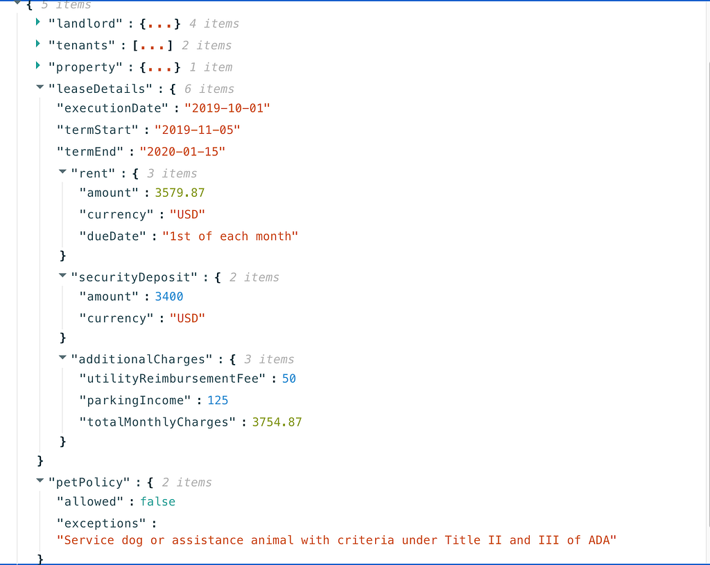
So maybe we scan an entire rental lease, and emit a short JSON: {“monthlyRentAmount”: 2000, “dogsAllowed” : true}.
Yeah, rent in Bay Area is insane, thanks for asking
If you’re not from the US, you might be shocked it takes 51 pages to spell out “You’re gonna pay $3700 a month, you get to live here in exchange”. I think it might not be necessary legally, but I digress.
Now, using Docupanda, we can get to bottom line answers like — what’s the rental amount, and can I take my dog to live there, what’s the start date, etc.
Let’s take a look at the JSON we extract
So apparently Roxy can’t come live with me
If you look all the way at the bottom, we have a flag to indicate that pets are disallowed, along with a description of the exception spelled out in the lease.
There are two reasons explainability would be awesome here:
Maybe it’s crucial that we get this right. By reviewing the paragraph I can make sure that we understand the policy correctly.
Maybe I want to propose an edit. Just knowing that somewhere in these 51 pages there’s a pet prohibition doesn’t really help — I’ll still have to go over all pages to propose an edit.
So here’s how we solve for this. Rather than just giving you a black box with a dollar amount, a true/false, etc — we’ve designed DocuPanda to ground its prediction in precise pixels. You can click on a result, and scroll to the exact page and section that justifies our prediction.
Clicking on “pets allowed = false” immediately scrolls to the relevant page where it says “no mammal pets etc”
Explanation-Driven Workflows
At DocuPanda, we’ve observed three overall paradigms for how explainability is used.
Explanations Drive Accuracy
The first paradigm we predicted from the outset is that explainability can reduce errors and validate predictions. When you have an invoice for $12,000, you really want a human to ensure the number is valid and not taken out of context, because the stakes are too high if this figure feeds into accounting automation software.
The thing about document processing, though, is that we humans are exceptionally good at it. In fact, nearly 100% of document processing is still handled by humans today. As large language models become more capable and their adoption increases, that percentage will decrease — but we can still rely heavily on humans to correct AI predictions and benefit from more powerful and focused reading.
This paradigm arose naturally from our user base, and we didn’t entirely anticipate it at first. Sometimes, more than we want the raw answer to a question, we want to leverage AI to get the right information in front of our eyes.
As an example, consider a bio research company that wants to scour every biological publication to identify processes that increase sugar production in potatoes. They use DocuPanda to answer fields like:
Their goal is not to blindly trust DocuPanda and count how many papers mention a gene or something like that. The thing that makes this result useful is that researcher can click around to get right to the gist of the paper. By clicking on the gene names, a researcher can immediately jump in to context where the gene got mentioned — and reason about whether the paper is relevant. This is an example where the explanation is more important than the raw answer, and can boost the productivity of very high knowledge workers.
Explanations for liability purposes
There’s another reason to use explanations and leverage them to put a human in the loop. In addition to reducing error rates (often), they let you demonstrate that you have a reasonable, legally compliant process in place.
Regulators care about process. A black box that emits mistakes is not a sound process. The ability to trace every extracted data point back to the original source lets you put a human in the loop to review and approve results. Even if the human doesn’t reduce errors, having that person involved can be legally useful. It shifts the process from being blind automation, for which your company is responsible, to one driven by humans, who have an acceptable rate of clerical errors. A related example is that it looks like regulators and public opinion tolerate a far lower rate of fatal car crashes, measured per-mile, when discussing a fully automated system, vs human driving-assistance tools. I personally find this to be morally unjustifiable, but I don’t make the rules, and we have to play by them.
By giving you the ability to put a human in the loop, you move from a legally tricky minefield of full automation, with the legal exposure it entails, to the more familiar legal territory of a human analyst using a 10x speed and productivity tool (and making occasional mistakes like the rest of us sinners).
Examples of how to create different types of pie charts using Matplotlib to visualize the results of database analysis in a Jupyter Notebook with Pandas
While working on my Master’s Thesis titled “Factors Associated with Impactful Scientific Publications in NIH-Funded Heart Disease Research”, I have used different types of pie charts to illustrate some of the key findings from the database analysis.
A pie chart can be an effective choice for data visualization when a dataset contains a limited number of categories representing parts of a whole, making it well-suited for displaying categorical data with an emphasis on comparing the relative proportions of each category.
In this article, I will demonstrate how to create four different types of pie charts using the same dataset to provide a more comprehensive visual representation and deeper insight into the data. To achieve this, I will use Matplotlib, Python’s plotting library, to display pie chart visualizations of the statistical data stored in the dataframe. If you are not familiar with Matplotlib library, a good start is Python Data Science Handbook by Jake VanderPlas, specifically chapter on Visualization with Matplotlib and matplotlib.org.
First, let’s import all the necessary libraries and extensions:
Next, we’ll prepare the CSV file for processing:
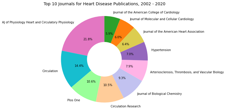
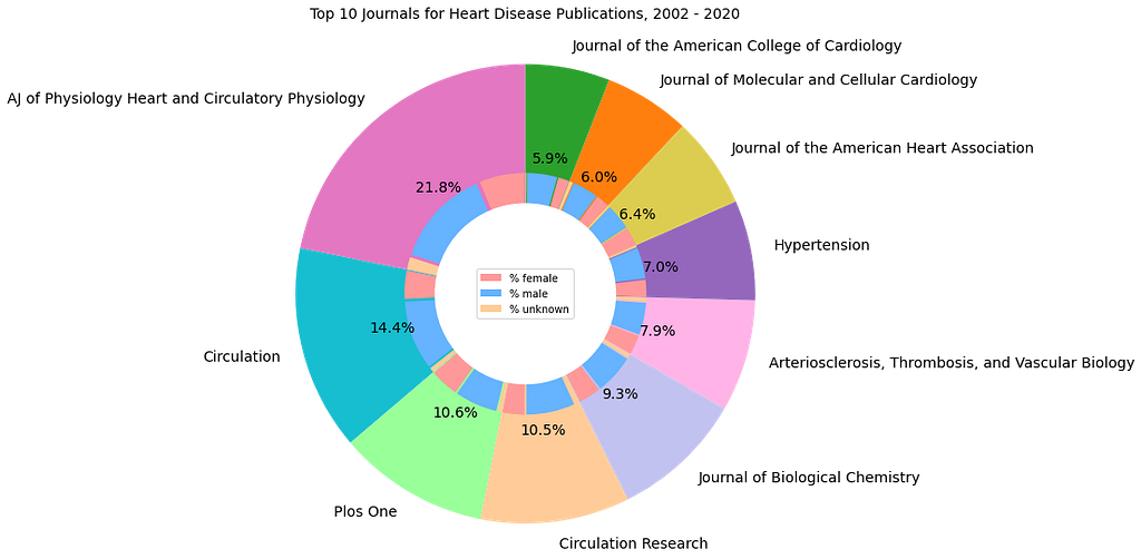
The mini dataset used in this article highlights the top 10 journals for heart disease research publications from 2002 to 2020 and is part of a larger database collected for the Master’s Thesis research. The columns “Female,” “Male,” and “Unknown” represent the gender of the first author of the published articles, while the “Total” column reflects the total number of heart disease research articles published in each journal.
Image by the author and represents output of the Pie_Chart_Artcile_2.py sample code above.
For smaller datasets with fewer categories, a pie chart with exploding slices can effectively highlight a key category by pulling it out slightly from the rest of the chart. This visual effect draws attention to specific categories, making them stand out from the whole. Each slice represents a portion of the total, with its size proportional to the data it represents. Labels can be added to each slice to indicate the category, along with percentages to show their proportion to the total. This visual technique makes the exploded slice stand out without losing the context of the full data representation.
Image by the author and represents output of the Pie_Chart_Artcile_3.py sample code above.
The same exploding slices technique can be applied to all other entries in the sample dataset, and the resulting charts can be displayed within a single figure. This type of visualization helps to highlight the over representation or under representation of a particular category within the dataset. In the example provided, presenting all 10 charts in one figure reveals that none of the top 10 journals in heart disease research published more articles authored by women than men, thereby emphasizing the gender disparity.
Gender distributions for top 10 journals for heart disease research publications, 2002–2020. Image by the author and represents output of the Pie_Chart_Artcile_4.py sample code above.
A variation of the pie chart, known as a donut chart, can also be used to visualize data. Donut charts, like pie charts, display the proportions of categories that make up a whole, but the center of the donut chart can also be utilized to present additional data. This format is less cluttered visually and can make it easier to compare the relative sizes of slices compared to a standard pie chart. In the example used in this article, the donut chart highlights that among the top 10 journals for heart disease research publications, the American Journal of Physiology, Heart and Circulatory Physiology published the most articles, accounting for 21.8%.
Image by the author and represents output of the Pie_Chart_Artcile_5.py sample code above.
We can enhance the visualization of additional information from the sample dataset by building on the previous donut chart and creating a nested version. The add_artist() method from Matplotlib’s figure module is used to incorporate any additional Artist (such as figures or objects) into the base figure. Similar to the earlier donut chart, this variation displays the distribution of publications across the top 10 journals for heart disease research. However, it also includes an additional layer that shows the gender distribution of first authors for each journal. This visualization highlights that a larger percentage of the first authors are male.
Image by the author and represents output of the Pie_Chart_Artcile_6.py sample code above.
In conclusion, pie charts are effective for visualizing data with a limited number of categories, as they enable viewers to quickly understand the most important categories or dominant proportions at a glance. In this specific example, the use of four different types of pie charts provides a clear visualization of the gender distribution among first authors in the top 10 journals for heart disease research publications, based on the 2002 to 2020 mini dataset used in this study. It is evident that a higher percentage of the publication’s first authors are males, and none of the top 10 journals for heart disease research published more articles authored by females than by males during the examined period.
Jupyter Notebook and dataset used for this article can be found at GitHub
Thank you for reading,
Diana
Note: I used GitHub embeds to publish this article.
While working on a recent problem, I encountered a familiar challenge — “How can we determine if a new treatment or intervention is at least as effective as a standard treatment?” At first glance, the solution seemed straightforward — just compare their averages, right? But as I dug deeper, I realised it wasn’t that simple. In many cases, the goal isn’t to prove that the new treatment is better, but to show that it’s not worse by more than a predefined margin.
This is where non-inferiority tests come into play. These tests allow us to demonstrate that the new treatment or method is “not worse” than the control by more than a small, acceptable amount. Let’s take a deep dive into how to perform this test and, most importantly, how to interpret it under different scenarios.
The Concept of Non-Inferiority Testing
In non-inferiority testing, we’re not trying to prove that the new treatment is better than the existing one. Instead, we’re looking to show that the new treatment is not unacceptably worse. The threshold for what constitutes “unacceptably worse” is known as the non-inferiority margin (Δ). For example, if Δ=5, the new treatment can be up to 5 units worse than the standard treatment, and we’d still consider it acceptable.
This type of analysis is particularly useful when the new treatment might have other advantages, such as being cheaper, safer, or easier to administer.
Formulating the Hypotheses
Every non-inferiority test starts with formulating two hypotheses:
Null Hypothesis (H0): The new treatment is worse than the standard treatment by more than the non-inferiority margin Δ.
Alternative Hypothesis (H1): The new treatment is not worse than the standard treatment by more than Δ.
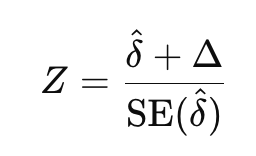
When Higher Values Are Better:
For example, when we are measuring something like drug efficacy, where higher values are better, the hypotheses would be:
H0: The new treatment is worse than the standard treatment by at least Δ (i.e., μnew − μcontrol ≤ −Δ).
H1: The new treatment is not worse than the standard treatment by more than Δ (i.e., μnew − μcontrol > −Δ).
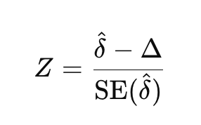
When Lower Values Are Better:
On the other hand, when lower values are better, like when we are measuring side effects or error rates, the hypotheses are reversed:
H0: The new treatment is worse than the standard treatment by at least Δ (i.e., μnew − μcontrol ≥ Δ).
H1: The new treatment is not worse than the standard treatment by more than Δ (i.e., μnew − μcontrol < Δ).
Z-Statistic
To perform a non-inferiority test, we calculate the Z-statistic, which measures how far the observed difference between treatments is from the non-inferiority margin. Depending on whether higher or lower values are better, the formula for the Z-statistic will differ.
When higher values are better:
When lower values are better:
where δ is the observed difference in means between the new and standard treatments, and SE(δ) is the standard error of that difference.
Calculating P-Values
The p-value tells us whether the observed difference between the new treatment and the control is statistically significant in the context of the non-inferiority margin. Here’s how it works in different scenarios:
When higher values are better, we calculate p = 1 − P(Z ≤ calculated Z) as we are testing if the new treatment is not worse than the control (one-sided upper-tail test).
When lower values are better, we calculate p = P(Z ≤ calculated Z) since we are testing whether the new treatment has lower (better) values than the control (one-sided lower-tail test).
Understanding Confidence Intervals
Along with the p-value, confidence intervals provide another key way to interpret the results of a non-inferiority test.
When higher values are preferred, we focus on the lower bound of the confidence interval. If it’s greater than −Δ, we conclude non-inferiority.
When lower values are preferred, we focus on the upper bound of the confidence interval. If it’s less than Δ, we conclude non-inferiority.
The confidence interval is calculated using the formula:
when higher values preferred
when lower values preferred
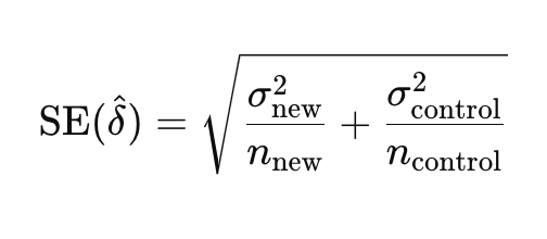
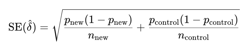
Calculating the Standard Error (SE)
The standard error (SE) measures the variability or precision of the estimated difference between the means of two groups, typically the new treatment and the control. It is a critical component in the calculation of the Z-statistic and the confidence interval in non-inferiority testing.
To calculate the standard error for the difference in means between two independent groups, we use the following formula:
between two means
between two proportions
Where:
σ_new and σ_control are the standard deviations of the new and control groups.
p_new and p_control are the proportion of success of the new and control groups.
n_new and n_control are the sample sizes of the new and control groups.
The Role of Alpha (α)
In hypothesis testing, α (the significance level) determines the threshold for rejecting the null hypothesis. For most non-inferiority tests, α=0.05 (5% significance level) is used.
A one-sided test with α=0.05 corresponds to a critical Z-value of 1.645. This value is crucial in determining whether to reject the null hypothesis.
The confidence interval is also based on this Z-value. For a 95% confidence interval, we use 1.645 as the multiplier in the confidence interval formula.
In simple terms, if your Z-statistic is greater than 1.645 for higher values, or less than -1.645 for lower values, and the confidence interval bounds support non-inferiority, then you can confidently reject the null hypothesis and conclude that the new treatment is non-inferior.
Interpretation
Let’s break down the interpretation of the Z-statistic and confidence intervals across four key scenarios, based on whether higher or lower values are preferred and whether the Z-statistic is positive or negative.
Here’s a 2×2 framework:
Conclusion
Non-inferiority tests are invaluable when you want to demonstrate that a new treatment is not significantly worse than an existing one. Understanding the nuances of Z-statistics, p-values, confidence intervals, and the role of α will help you confidently interpret your results. Whether higher or lower values are preferred, the framework we’ve discussed ensures that you can make clear, evidence-based conclusions about the effectiveness of your new treatment.
Now that you’re equipped with the knowledge of how to perform and interpret non-inferiority tests, you can apply these techniques to a wide range of real-world problems.
Happy testing!
Note: All images, unless otherwise noted, are by the author.
When I started to learn about AI one of the most fascinating ideas was that machines think like humans. But when taking a closer look at what AI and machine learning methods are actually doing, I was surprised there actually is a huge gap between what you can find in courses and books about how humans think, i.e., human cognition, and the way machines do. Examples of these gaps for me were: how a perceptron works, which is often referred to as “inspired by its biological pendant” and how real neurons work. Or how fuzzy logic tries to model human concepts of information and inference and how human inference actually seems to work. Or how humans cluster a cloud of points by looking at it and drawing circles around point clouds on a board and how algorithms like DBSCAN and k-means perform this task.
But now, LLMs like ChatGPT, Claude, and LLaMA have come into the spotlight. Based on billions or even trillions of these artificial neurons and mechanisms that also have an important part to play in cognition: attention (which is all you need obviously). We’ve come a long way, and meanwhile Nobel Prizes have been won to honor the early giants in this field. LLMs are insanely successful in summarizing articles, generating code, or even answering complex questions and being creative. A key point is — no doubts about it—the right prompt. The better you specify what you want from the model, the better is the outcome. Prompt engineering has become an evolving field, and it has even become a specialized job for humans (though I personally doubt the long-term future of this role). Numerous prompting strategies have been proposed: famous ones are Chain-of-thought (CoT) [2] or Tree-of-Thought (ToT) [3] that guide the language model reasoning step by step, mainly by providing the LLM steps of successful problem solving examples. But these steps are usually concrete examples and require an explicit design of a solution chain.
Other approaches try to optimize the prompting, for example with evolutionary algorithms (EAs) like PromptBreeder. Personally I think EAs are always a good idea. Very recently, a research team from Apple has shown that LLMs can easily be distracted from problem solving with different prompts [4]. As there are numerous good posts, also on TDS on CoT and prompt design (like here recently), I feel no need to recap them here in more detail.
What Is Cognitive Prompting?
Something is still missing, as there is obviously a gap to cognitive science. That all got me thinking: can we help these models “think” more like humans, and how? What if they could be guided by what cognitive science refers to as cognitive operations? For example, approaching a problem by breaking it down step by step, to filter out unnecessary information, and to recognize patterns that are present in the available information. Sounds a bit like what we do when solving difficult puzzles.
That’s where cognitive prompting comes in. Imagine the AI cannot only answer your questions but also guide itself — and you when you read its output — through complex problem-solving processes by “thinking” in structured steps.
Imagine you’re solving a math word problem. The first thing you do is probably to clarify your goal: What exactly do I need to figure out, what is the outcome we expect? Then, you break the problem into smaller steps, a promising way is to identify relevant information, and perhaps to notice patterns that help guiding your thoughts closer toward the desired solution. In this example, let’s refer to these steps as goal clarification, decomposition, filtering, and pattern recognition. They are all examples of cognitive operations (COPs) we perform instinctively (or which we are taught to follow by a teacher in the best case).
But How Does This Actually Work?
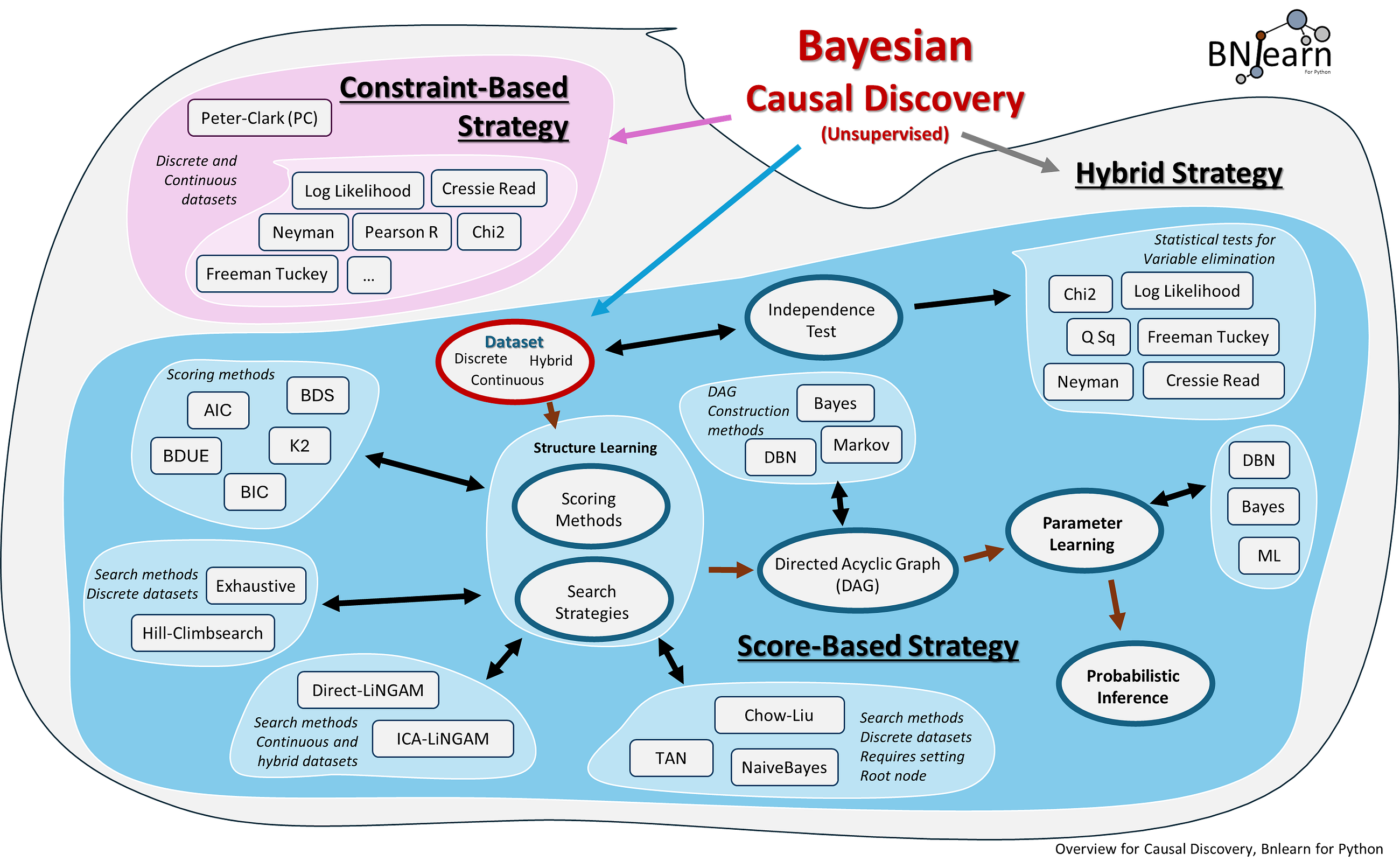
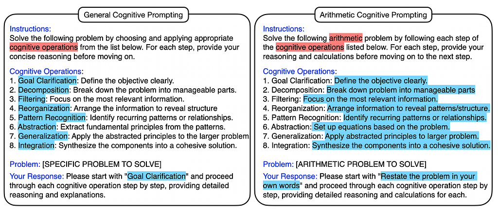
Here’s how the process unfolded. We define a sequence of COPs and ask the LLM to follow the sequence. Figure 1 shows an example of what the prompt looks like. Example COPs that turn out to be important are:
Goal Clarification: The model first needed to restate the problem in a clear way — what exactly is it trying to solve, what is the desired outcome?
Decomposition: Next, break the problem into manageable chunks. Instead of getting overwhelmed by all the information available, the model should focus on solving smaller parts — one at a time.
Filtering: Ask the model to filter out unnecessary details, allowing it to focus on what really matters. This is often necessary to allow the model to put attention on the really important information.
Pattern Recognition: Identify patterns to solve the problem efficiently. For example, if a problem involves repeated steps, ask the model to recognize a pattern and apply it.
Integration: In the end it makes sense to synthesize all insights of the previous steps, in particular based on the last COPs and integrate them into a solution for the final answer.
These structured steps mimic the way humans solve problems — logically, step by step. There are numerous further cognitive operations and the choice which to choose, which order and how to specify them for the prompt. This certainly leaves room for further improvement.
We already extended the approach in the following way. Instead of following a static and deterministic order of COPs, we give the model the freedom to choose its own sequence of COPs based on the provided list — called reflective and self-adaptive cognitive prompting. It turns out that this approach works pretty well. In the next paragraph we compare both variants on a benchmark problem set.
Figure 1: Cognitive prompting: A general list of cognitive operations (COPs) to guide the LLM reasoning on the left, a specialized version adapted to arithmetic reasoning on the right.
What also turns out to improve the performance is adapting the COP descriptions to the specific problem domain. Figure 1, right, shows an example of a math-specific adaptation of the general COPs. They “unroll” to prompts like “Define each variable clearly” or “Solve the equations step by step”.
In practice, it makes sense to advise the model to give the final answer as a JSON string. Some LLMs do not deliver a solution, but Python code to solve the problem. In our experimental analysis, we were fair and ran the code treating the answer as correct when the Python code returns the correct result.
Example
Let’s give a short example asking LLaMA3.1 70B to solve one of the 8.5k arithmetic problems from GSM8K [5]. Figure 2 shows the request.
Figure 2: Here is an example for arithmetic reasoning using deterministic cognitive prompting.
Figure 3 shows the model’s output leading to a correct answer. It turns out the model systematically follows the sequence of COPs — even providing a nice problem-solving explanation for humans.
Figure 3: Output of LLaMA3.1 70B to the cognitive prompting-based problem solution request of Figure 3.
How Does Cognitive Prompting Perform — Scientifically?
Now, let’s become a little more systematic by testing cognitive prompting on a typical benchmark. We tested it on a set of math problems from the GSM8K [5] dataset — basically, a collection of math questions you’d find in grade school. Again, we used Meta’s LLaMA models to see if cognitive prompting could improve their problem-solving skills, appliying LLaMA with 8 billion parameters and the much larger version with 70 billion parameters.
Figure 4 shows some results. The smaller model improved slightly with deterministic cognitive prompting. Maybe it is not big enough to handle the complexity of structured thinking. When it selects an own sequence of COPs, the win in performance is significantly.
Figure 4: Results of Cognitive Prompting on GSM8k benchmark on the left and a histogram of chosen COP sequences on the right (goal clarification (GC), decomposition (DC), pattern recognition (PR), generalization (GN), and reorganization (RE)).
Without cognitive prompting, the larger model scored about 87% on the math problems. When we added deterministic cognitive prompting (where the model followed a fixed sequence of cognitive steps), its score jumped to 89%. But when we allowed the model to adapt and choose the cognitive operations dynamically (self-adaptive prompting), the score shot up to 91%. Not bad for a machine getting quite general advice to reason like a human — without additional examples , right?
Why Does This Matter?
Cognitive prompting is a method that organizes these human-like cognitive operations into a structured process and uses them to help LLMs solve complex problems. In essence, it’s like giving the model a structured “thinking strategy” to follow. While earlier approaches like CoT have been helpful, cognitive prompting offers even deeper reasoning layers by incorporating a variety of cognitive operations.
This has exciting implications beyond math problems! Think about areas like decision-making, logical reasoning, or even creativity — tasks that require more than just regurgitating facts or predicting the next word in a sentence. By teaching AI to think more like us, we open the door to models that can reason through problems in ways that are closer to human cognition.
Where Do We Go From Here?
The results are promising, but this is just the beginning. Cognitive prompting could be adapted for other domains for sure, but it can also be combined with other ideas from AI As we explore more advanced versions of cognitive prompting, the next big challenge will be figuring out how to optimize it across different problem types. Who knows? Maybe one day, we’ll have AI that can tackle anything from math problems to moral dilemmas, all while thinking as logically and creatively as we do. Have fun trying out cognitive prompting on your own!
[2] J. Wei, X. Wang, D. Schuurmans, M. Bosma, B. Ichter, F. Xia, E. H. Chi, Q. V. Le, and D. Zhou. Chain-of-thought prompting elicits reasoning in large language models. In S. Koyejo, S. Mohamed, A. Agarwal, D. Bel- grave, K. Cho, and A. Oh, editors, Neural Information Processing Systems (NeurIPS) Workshop, volume 35, pages 24824–24837, 2022
[3] S. Yao, D. Yu, J. Zhao, I. Shafran, T. Griffiths, Y. Cao, and K. Narasimhan. Tree of thoughts: Deliberate problem solving with large language models. In Neural Information Processing Systems (NeurIPS), volume 36, pages 11809–11822, 2023
[5] K. Cobbe, V. Kosaraju, M. Bavarian, M. Chen, H. Jun, L. Kaiser, M. Plap- pert, J. Tworek, J. Hilton, R. Nakano, C. Hesse, and J. Schulman. Training verifiers to solve math word problems. arXiv preprint arXiv:2110.14168, 2021.
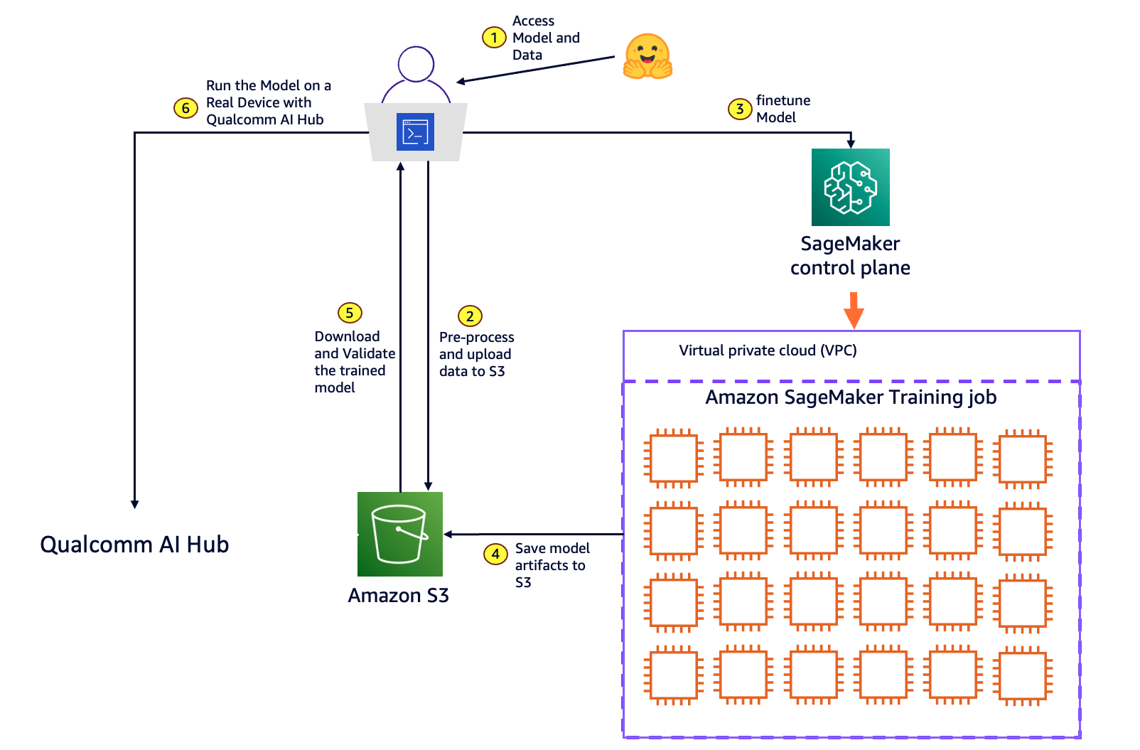
In this post we introduce an innovative solution for end-to-end model customization and deployment at the edge using Amazon SageMaker and Qualcomm AI Hub.
We use cookies on our website to give you the most relevant experience by remembering your preferences and repeat visits. By clicking “Accept”, you consent to the use of ALL the cookies.
This website uses cookies to improve your experience while you navigate through the website. Out of these, the cookies that are categorized as necessary are stored on your browser as they are essential for the working of basic functionalities of the website. We also use third-party cookies that help us analyze and understand how you use this website. These cookies will be stored in your browser only with your consent. You also have the option to opt-out of these cookies. But opting out of some of these cookies may affect your browsing experience.
Necessary cookies are absolutely essential for the website to function properly. These cookies ensure basic functionalities and security features of the website, anonymously.
Cookie
Duration
Description
cookielawinfo-checkbox-analytics
11 months
This cookie is set by GDPR Cookie Consent plugin. The cookie is used to store the user consent for the cookies in the category "Analytics".
cookielawinfo-checkbox-functional
11 months
The cookie is set by GDPR cookie consent to record the user consent for the cookies in the category "Functional".
cookielawinfo-checkbox-necessary
11 months
This cookie is set by GDPR Cookie Consent plugin. The cookies is used to store the user consent for the cookies in the category "Necessary".
cookielawinfo-checkbox-others
11 months
This cookie is set by GDPR Cookie Consent plugin. The cookie is used to store the user consent for the cookies in the category "Other.
cookielawinfo-checkbox-performance
11 months
This cookie is set by GDPR Cookie Consent plugin. The cookie is used to store the user consent for the cookies in the category "Performance".
viewed_cookie_policy
11 months
The cookie is set by the GDPR Cookie Consent plugin and is used to store whether or not user has consented to the use of cookies. It does not store any personal data.
Functional cookies help to perform certain functionalities like sharing the content of the website on social media platforms, collect feedbacks, and other third-party features.
Performance cookies are used to understand and analyze the key performance indexes of the website which helps in delivering a better user experience for the visitors.
Analytical cookies are used to understand how visitors interact with the website. These cookies help provide information on metrics the number of visitors, bounce rate, traffic source, etc.
Advertisement cookies are used to provide visitors with relevant ads and marketing campaigns. These cookies track visitors across websites and collect information to provide customized ads.