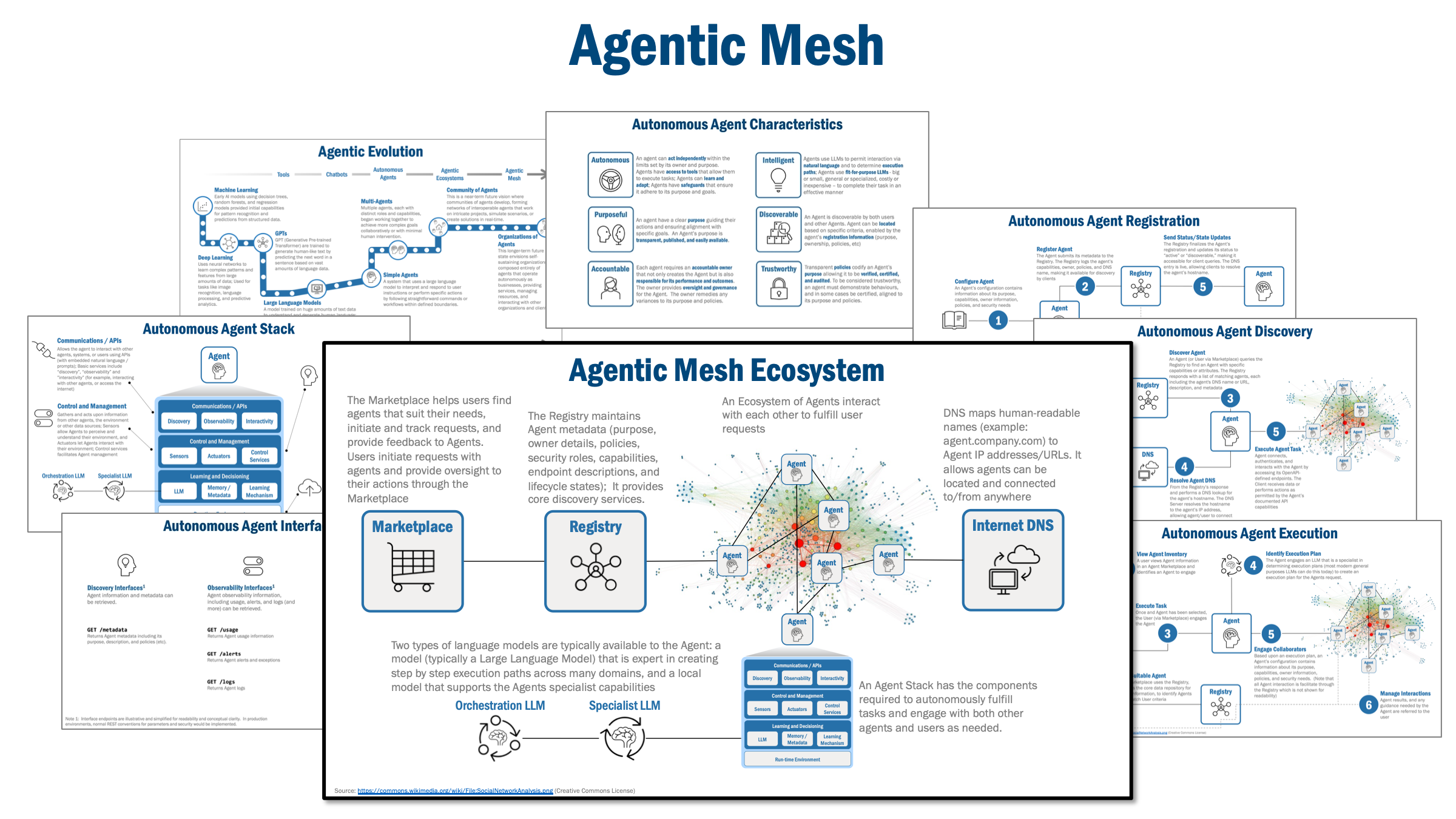
Find, remove and replace spikes with interpolated values
This tutorial is part of a growing series on Data Science for Raman Spectroscopy with Python published in towards data science. It is based on this publication in the journal Analytica Chimica Acta. By following along, you’ll add a valuable tool to your data analysis toolkit — an effective method for cleaning up Raman spectra that’s already used in published research.
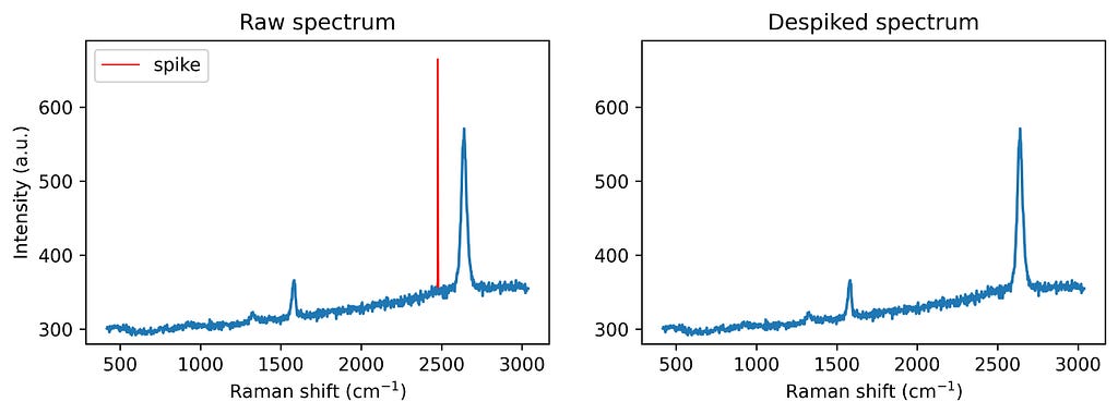
Despiking Graphene’s Raman spectrum. Image by author.
Introduction
Spike removal is an essential part of Raman data preprocessing. Spikes, caused by cosmic rays impacting the detector, appear as intense, narrow peaks that can distort the analysis. These bursts of energy hit the charge-coupled device (CCD) camera, creating sharp, high-intensity peaks that, if left uncorrected, can interfere with further processing steps like normalization, spectral search, or multivariate data analysis. Cleaning these artifacts is therefore a priority. This tutorial will cover a practical algorithm for removing spikes from Raman spectra. Using Python, we’ll walk through a user-friendly, customizable approach for spike detection and correction to keep Raman data accurate and reliable.
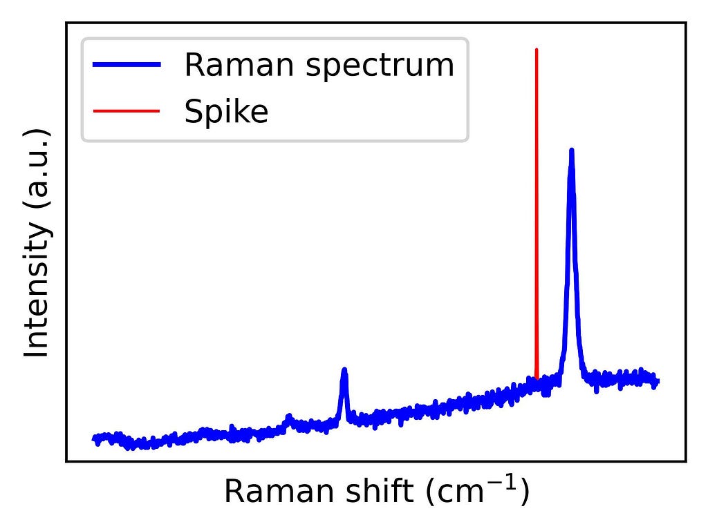
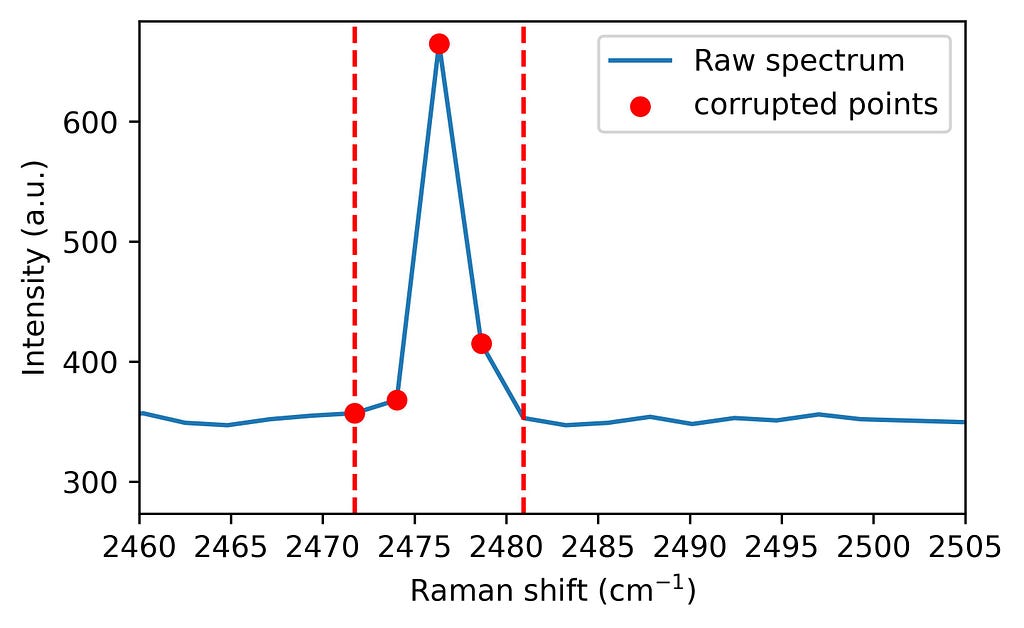
Figure 1 shows an example of a graphene Raman spectrum where a spike is present. Graphene’s exceptional physical properties — such as its electrical and thermal conductivity — have made it a highly studied material. Its Raman spectrum contains peaks that reflect structural characteristics, revealing information about doping, strain, and grain boundaries. Therefore, Raman spectroscopy is a widely used technique to characterize graphene. However, to make the most of this tool, spikes must be previously removed.
Figure 1. Raman spectrum from graphene with a spike. The code to generate this figure is shown below. Image by author.
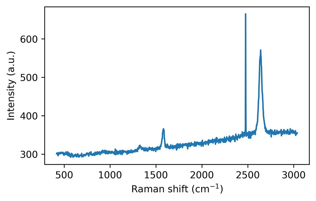
import numpy as np
# Load data directly into a numpy array
data = np.loadtxt(spiked_spectrum.asc, delimiter=',', skiprows=1)

# Extract Raman shift from the first column (index)
ramanshift = data[:, 0]

# Extract intensity from the second column (index 1in Python)
intensity = data[:, 1]

# Plot the data
import matplotlib.pyplot as plt
fig = plt.figure(figsize = (5,3))
plt.plot(ramanshift, intensity)
plt.xlabel('Raman shift (cm$^{-1}$)')
plt.ylabel('Intensity (a.u.)')
plt.show()
The spike removal algorithm
The spike removal algorithm presented here consists of four main steps:
Let’s take a look at the different steps with Python code snippets:
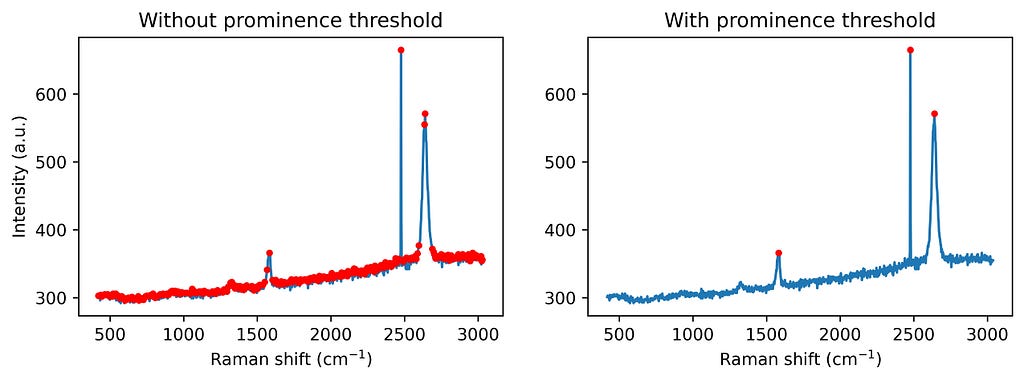
1. Peak finding: First, the algorithm identifies significant peaks by checking for local maxima with a minimum prominence threshold. Adding a prominence threshold helps to exclude small noise-generated peaks, as we don’t aim to correct all the noise. See the following figure for comparison.
from scipy.signal import find_peaks # Find the peaks in the spectrum (with and without prominence threshold) peaks_wo_p, _ = find_peaks(intensity) # Peaks found without a prominence threshold peaks_w_p, _ = find_peaks(intensity, prominence = 20) # Peaks found without a prominence threshold
Step 1: Find the peaks in a spectrum. Image by author.
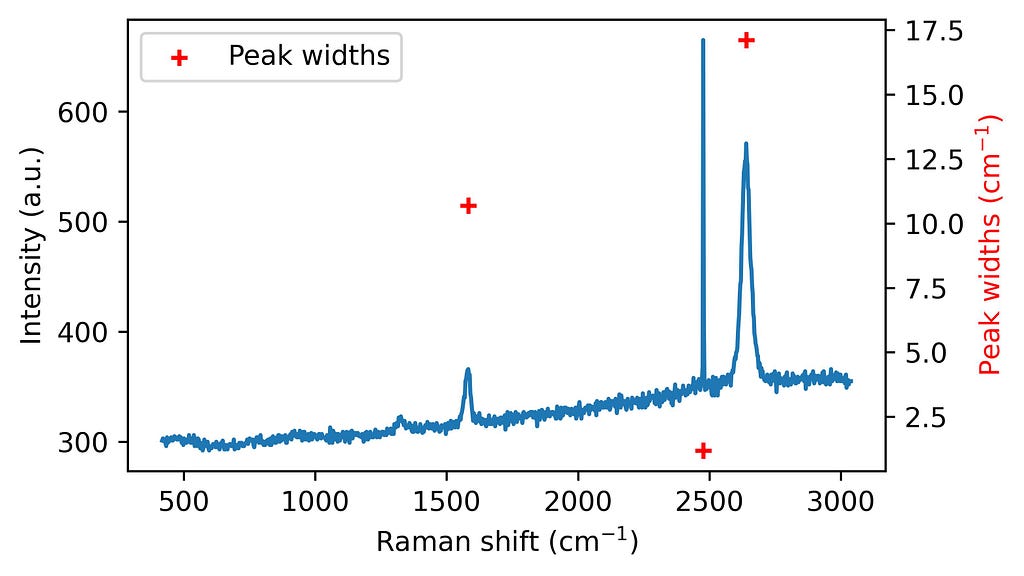
2. Spike detection: Then, spikes are flagged based on their characteristic narrow widths. This point might help in the automation of large spectral datasets. If we know the width of the Raman bands present in our spectra, we can choose a threshold below such a value. For example, with our system resolution, we do not expect to have graphene Raman bands with widths below 10 cm-1.
from scipy.signal import peak_widths widths = peak_widths(intensity, peaks_w_p)[0]
Step 2: Finding the widths of the peaks. Image by author.
3. Spike flagging Next, any data points affected by spikes are flagged using a range calculated from the peak’s prominence, effectively isolating corrupted pixels. In other words, we select the window that must be corrected
# Let's set the parameters: width_param_rel = 0.8 width_threshold = 10 # Estimation of the width of the narrowest Raman band
# Calculation of the range where the spectral points are asumed to be corrupted widths_ext_a = peak_widths(intensity, peaks_w_p, rel_height=width_param_rel)[2] widths_ext_b = peak_widths(intensity, peaks_w_p, rel_height=width_param_rel)[3]
# Create a vector where spikes will be flag: no spike = 0, spike = 1. spikes = np.zeros(len(intensity))
# Flagging the area previously defined if the peak is considered a spike (width below width_threshold) for a, width, ext_a, ext_b in zip(range(len(widths)), widths, widths_ext_a, widths_ext_b): if width < width_threshold: spikes[int(ext_a) - 1: int(ext_b) + 2] = 1
Step 3: Flagging the corrupted bins. Image by author.
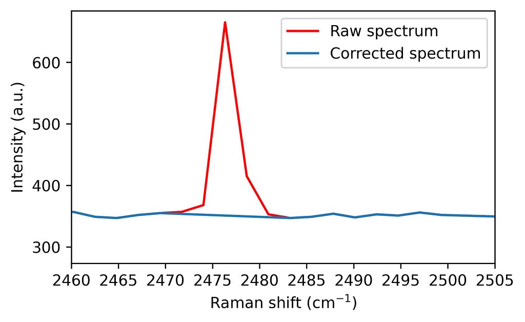
4. Spectrum correction Finally, these points are corrected through interpolation of nearby values, preserving the spectrum’s integrity for subsequent analyses.
from scipy import interpolate # Let's set the parameter: moving_average_window = 10
intensity_out = intensity.copy()
# Interpolation of corrupted points for i, spike in enumerate(spikes): if spike != 0: # If we have an spike in position i window = np.arange(i - moving_average_window, i + moving_average_window + 1) # we select 2 ma + 1 points around our spike window_exclude_spikes = window[spikes[window] == 0] # From such interval, we choose the ones which are not spikes interpolator = interpolate.interp1d(window_exclude_spikes, intensity[window_exclude_spikes], kind='linear') # We use the not corrupted points around the spike to calculate the interpolation intensity_out[i] = interpolator(i) # The corrupted point is exchanged by the interpolated value.
All these snippets can be summarized in a single function. This function is designed to be customizable based on your specific data needs, with parameters for adjusting prominence and width:
import numpy as np
from scipy.signal import find_peaks, peak_widths, peak_prominences
from scipy import interpolate

def spike_removal(y,
                  width_threshold,
                  prominence_threshold=None,
                  moving_average_window=10,
                  width_param_rel=0.8,
                  interp_type='linear'):
    """
    Detects and replaces spikes in the input spectrum with interpolated values. Algorithm first
    published by N. Coca-Lopez in Analytica Chimica Acta. https://doi.org/10.1016/j.aca.2024.342312

    Parameters:
    y (numpy.ndarray): Input spectrum intensity.
    width_threshold (float): Threshold for peak width.
    prominence_threshold (float): Threshold for peak prominence.
    moving_average_window (int): Number of points in moving average window.
    width_param_rel (float): Relative height parameter for peak width.
    tipo: type of interpolation (linear, quadratic, cubic)

    Returns:
    numpy.ndarray: Signal with spikes replaced by interpolated values.
    """

    # First, we find all peaks showing a prominence above prominence_threshold on the spectra
    peaks, _ = find_peaks(y, prominence=prominence_threshold)

    # Create a vector where spikes will be flag: no spike = 0, spike = 1.
    spikes = np.zeros(len(y))

    # Calculation of the widths of the found peaks
    widths = peak_widths(y, peaks)[0]

    # Calculation of the range where the spectral points are asumed to be corrupted
    widths_ext_a = peak_widths(y, peaks, rel_height=width_param_rel)[2]
    widths_ext_b = peak_widths(y, peaks, rel_height=width_param_rel)[3]

    # Flagging the area previously defined if the peak is considered a spike (width below width_threshold)
    for a, width, ext_a, ext_b in zip(range(len(widths)), widths, widths_ext_a, widths_ext_b):
        if width < width_threshold:
            spikes[int(ext_a) - 1: int(ext_b) + 2] = 1

    y_out = y.copy()

    # Interpolation of corrupted points
    for i, spike in enumerate(spikes):
        if spike != 0: # If we have an spike in position i
            window = np.arange(i - moving_average_window, i + moving_average_window + 1) # we select 2 ma + 1 points around our spike
            window_exclude_spikes = window[spikes[window] == 0] # From such interval, we choose the ones which are not spikes
            interpolator = interpolate.interp1d(window_exclude_spikes, y[window_exclude_spikes], kind=interp_type) # We use the not corrupted points around the spike to calculate the interpolation
            y_out[i] = interpolator(i) # The corrupted point is exchanged by the interpolated value.

    return y_out
The function with the algorithm can then be applied to the spiked graphene spectrum as follows:
Example of spike removal in a Raman spectrum. Image by author.
With this spike removal approach, you can ensure your Raman spectra are clean and reliable, minimizing artefacts without losing essential spectral details. The method is ideal for automation, especially if the expected minimum peak width is known, making it highly adaptable for large-scale spectral datasets and high-throughput analysis
I hope you enjoyed this tutorial. Feel free to drop any questions or share your own Raman data challenges in the comments — I’d love to hear how this algorithm helps in your projects!
Ready to try it out? Download the Jupyter Notebook here. And if you found this useful, please, remember to cite the original work, that would help me a lot! 🙂
Can ML models learn to construct optimal customer journeys?
Optimizing Customer Journeys with Beam Search
Marketing attribution has traditionally been backward-looking: analyzing past customer journeys to understand which touchpoints contributed to conversion. But what if we could use this historical data to design optimal future journeys? In this post, I’ll show how we can combine deep learning with optimization techniques to design high-converting customer journeys while respecting real-world constraints. We will do so by using an LSTM to predict journeys with high conversion probability and then using beam search to find sequences with good chances of conversion. All images are created by the author.
Introduction
Customers interact with businesses on what we can call a customer journey. On this journey, they come into contact with the company through so-called touchpoints (e.g., Social Media, Google Ads, …). At any point, users could convert (e.g. by buying your product). We want to know what touchpoints along that journey contributed to the conversion to optimize the conversion rate.
The Limitations of Traditional Attribution
Before diving into our solution, it’s important to understand why traditional attribution models fall short.
1. Position-Agnostic Attribution
Traditional attribution models (first-touch, last-touch, linear, etc.) typically assign a single importance score to each channel, regardless of where it appears in the customer journey. This is fundamentally flawed because:
A social media ad might be highly effective early in the awareness stage but less impactful during consideration
Email effectiveness often depends on whether it’s a welcome email, nurture sequence, or re-engagement campaign
Retargeting ads make little sense as a first touchpoint but can be powerful later in the journey
2. Context Blindness
Most attribution models (even data-driven ones) ignore crucial contextual factors:
Customer Characteristics: A young tech-savvy customer might respond differently to digital channels compared to traditional ones
Customer 1 (Young, Urban): Social → Video → Purchase
Customer 2 (Older, Rural): Print → Email → Purchase
Previous Purchase History: Existing customers often require different engagement strategies than new prospects
Time of Day/Week: Channel effectiveness can vary significantly based on timing
Device/Platform: The same channel might perform differently across different platforms
Geographic/Cultural Factors: What works in one market might fail in another
3. Static Channel Values
Traditional models assume channel effectiveness can be expressed as a single number where all other factors influencing the effectiveness are marginalized. As mentioned above, channel effectiveness is highly context-dependent and should be a function of said context (e.g. position, other touchpoints, …).
Deep Learning Enters the Stage
Customer journeys are inherently sequential — the order and timing of touchpoints matter. We can frame attribution modeling as a binary time series classification task where we want to predict from the sequence of touchpoints whether a customer converted or not. This makes them perfect candidates for sequence modeling using Recurrent Neural Networks (RNNs), specifically Long Short-Term Memory (LSTM) networks. These models can capture complex patterns in sequential data, including:
The effectiveness of different channel combinations
The importance of touchpoint ordering
Timing sensitivities
Channel interaction effects
Learning from Historical Data
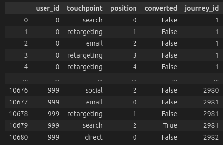
The first step is to train an LSTM model on historical customer journey data. For each customer, we need:
The sequence of touchpoints they encountered
Whether they ultimately converted
Characteristics of the customer
The LSTM learns to predict conversion probability given any sequence of touchpoints. This gives us a powerful “simulator” that can evaluate the likely effectiveness of any proposed customer journey.
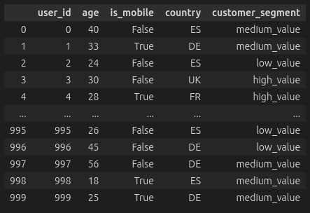
As I did not find a suitable dataset (especially one that contains customer characteristics as the contextual data), I decided to generate my own synthetic data. The notebook for the data generation can be found here. We generate some characteristics and a random number of customer journeys for each customer. The journeys are of random length. At each point in the journey, the customer interacts with a touchpoint and has a probability of converting. This probability is composed of multiple factors.
The base conversion rate of the channel
A positional multiplier. Some channels are more or less effective in some positions of the journey.
A segment multiplier. The channel’s effectiveness depends on the segment of the customer.
We also have interaction effects. E.g. if the user is young, touchpoints such as social and search will be more effective.
Additionally, the previous touchpoint matters for the effectiveness of the current touchpoint.
Journey Data (Left) and User Data (Right)
We then preprocess the data by merging the two tables, scaling the numerical features, and OneHotEncoding the categorical features. We can then set up an LSTM model that processes the sequences of touchpoints after embedding them. In the final fully connected layer, we also add the contextual features of the customer. The full code for preprocessing and training can be found in this notebook.
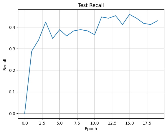
We can then train the neural network with a binary cross-entropy loss. I have plotted the recall achieved on the test set below. In this case, we care more about recall than accuracy as we want to detect as many converting customers as possible. Wrongly predicting that some customers will convert if they don’t is not as bad as missing high-potential customers.
Training the JourneyLSTM
Additionally, we will find that most journeys do not lead to a conversion. We will typically see conversion rates from 2% to 7% which means that we have a highly imbalanced dataset. For the same reason, accuracy isn’t all that meaningful. Always predicting the majority class (in this case ‘no conversion’) will get us a very high accuracy but we won’t find any of the converting users.
From Prediction to Optimization
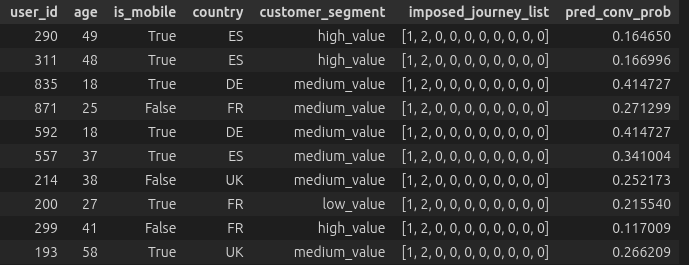
Once we have a trained model, we can use it to design optimal journeys. We can impose a sequence of channels (in the example below channel 1 then 2) on a set of customers and look at the conversion probability predicted by the model. We can already see that these vary a lot depending on the characteristics of the customer. Therefore, we want to optimize the journey for each customer individually.
Imposed Journeys and Predicted Conversion Probabilities
Additionally, we can’t just pick the highest-probability sequence. Real-world marketing has constraints:
Channel-specific limitations (e.g., email frequency caps)
Required touchpoints at specific positions
Budget constraints
Timing requirements
Therefore, we frame this as a constrained combinatorial optimization problem: find the sequence of touchpoints that maximizes the model’s predicted conversion probability while satisfying all constraints. In this case, we will only constrain the occurrence of touchpoints at certain places in the journey. That is, we have a mapping from position to touchpoint that specifies that a certain touchpoint must occur at a given position.
Note also that we aim to optimize for a predefined journey length rather than journeys of arbitrary length. By the nature of the simulation, the overall conversion probability will be strictly monotonically increasing as we have a non-zero conversion probability at each touchpoint. Therefore, a longer journey (more non-zero entries) would trump a shorter journey most of the time and we would construct infinitely long journeys.
Optimization using Beam Search
Below is the implementation for beam search using recursion. At each level, we optimize a certain position in the journey. If the position is in the constraints and already fixed, we skip it. If we have reached the maximum length we want to optimize, we stop recursing and return.
At each level, we look at current solutions and generate candidates. At any point, we keep the best K candidates defined by the beam width. Those best candidates are then used as input for the next round of beam search where we optimize the next position in the sequence.
def beam_search_step( model: JourneyLSTM, X: torch.Tensor, pos: int, num_channels: int, max_length: int, constraints:dict[int, int], beam_width: int = 3 ): if pos > max_length: return X
if pos in constraints: return beam_search_step(model, X, pos + 1, num_channels, max_length, constraints, beam_width)
candidates = [] # List to store (sequence, score) tuples
for sequence_idx in range(min(beam_width, len(X))): X_current = X[sequence_idx:sequence_idx+1].clone()
# Try each possible channel for channel in range(num_channels): X_candidate = X_current.clone() X_candidate[0, extra_dim + pos] = channel
# Get prediction score pred = model(X_candidate)[0].item() candidates.append((X_candidate, pred))
X_next = torch.cat([cand[0] for cand in best_candidates], dim=0)
# Recurse with best candidates return beam_search_step(model, X_next, pos + 1, num_channels, max_length, constraints, beam_width)
This optimization approach is greedy and we are likely to miss high-probability combinations. Nonetheless, in many scenarios, especially with many channels, brute forcing an optimal solution may not be feasible as the number of possible journeys grows exponentially with the journey length.
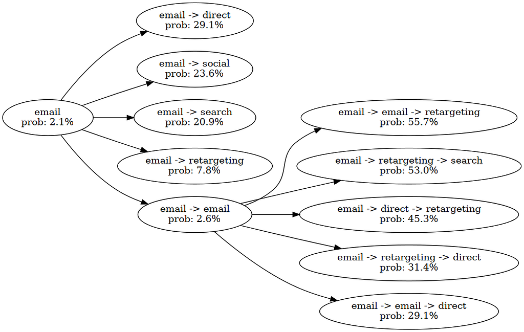
Optimizing Customer Journeys with Beam Search
In the image above, we optimized the conversion probability for a single customer. In position 0, we have specified ‘email’ as a fixed touchpoint. Then, we explore possible combinations with email. Since we have a beam width of five, all combinations (e.g. email -> search) go into the next round. In that round, we discovered the high-potential journey which would display the user two times email and finally retarget.
Conclusion
Moving from prediction to optimization in attribution modeling means we are going from predictive to prescriptive modeling where the model tells us actions to take. This has the potential to achieve much higher conversion rates, especially when we have highly complex scenarios with many channels and contextual variables.
At the same time, this approach has several drawbacks. Firstly, if we do not have a model that can detect converting customers sufficiently well, we are likely to harm conversion rates. Additionally, the probabilities that the model outputs have to be calibrated well. Otherwiese, the conversion probabilities we are optimizing for are likely not meanningful. Lastly, we will encounter problems when the model has to predict journeys that are outside of its data distribution. It would therefore also be desirable to use a Reinforcement Learning (RL) approach, where the model can actively generate new training data.
The rise of large language models (LLMs) and foundation models (FMs) has revolutionized the field of natural language processing (NLP) and artificial intelligence (AI). These powerful models, trained on vast amounts of data, can generate human-like text, answer questions, and even engage in creative writing tasks. However, training and deploying such models from scratch is […]
AWS provides a powerful set of tools and services that simplify the process of building and deploying generative AI applications, even for those with limited experience in frontend and backend development. In this post, we explore a practical solution that uses Streamlit, a Python library for building interactive data applications, and AWS services like Amazon Elastic Container Service (Amazon ECS), Amazon Cognito, and the AWS Cloud Development Kit (AWS CDK) to create a user-friendly generative AI application with authentication and deployment.
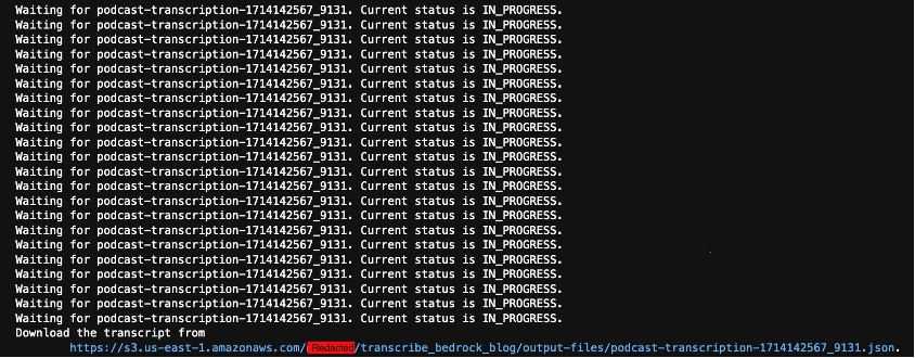
In this post, we examine how to create business value through speech analytics with some examples focused on the following: 1) automatically summarizing, categorizing, and analyzing marketing content such as podcasts, recorded interviews, or videos, and creating new marketing materials based on those assets, 2) automatically extracting key points, summaries, and sentiment from a recorded meeting (such as an earnings call), and 3) transcribing and analyzing contact center calls to improve customer experience.
A walk-through of cost computation, gradient descent, and regularization using Boston Housing dataset
Linear Regression seems old and naive when Large Language Models (LLMs) dominate people’s attention through their sophistication recently. Is there still a point of understanding it?
My answer is “Yes”, because it’s a building block of more complex models, including LLMs.
Creating a Linear Regression model can be as easy as running 3 lines of code:
from sklearn.linear_model import LinearRegression
regressor = LinearRegression()
regressor.fit(X_train, y_train)
However, this doesn’t show us the structure of the model. To produce optimal modeling results, we need to understand what goes on behind the scenes. In this article, I’ll break down the process of implementing Linear Regression in Python using a simple dataset known as “Boston Housing”, step by step.
What is Linear Regression
Linear — when plotted in a 2-dimensional space, if the dots showing the relationship of predictor x and predicted variable y scatter along a straight line, then we think this relationship can be represented by this line.
Regression — a statistical method for estimating the relationship between one or more predictors (independent variables) and a predicted (dependent variable).
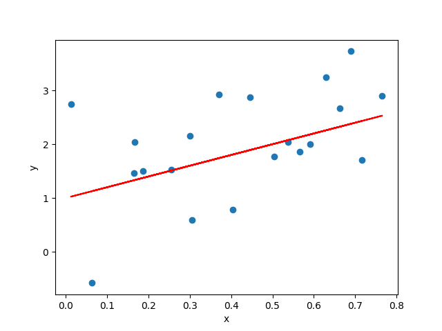
Linear Regression describes the predicted variable as a linear combination of the predictors. The line that abstracts this relationship is called line of best fit, see the red straight line in the below figure as an example.
Example of Linear Relationship and Line of Best Fit (Image by author)
Data Description
To keep our goal focused on illustrating the Linear Regression steps in Python, I picked the Boston Housing dataset, which is:
Small — makes debugging easy
Simple — so we spend less time in understanding the data or feature engineering
13 predictors — including demographic attributes, environmental attributes, and economics attributes
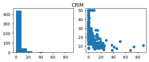
– CRIM — per capita crime rate by town – ZN — proportion of residential land zoned for lots over 25,000 sq.ft. – INDUS — proportion of non-retail business acres per town. – CHAS — Charles River dummy variable (1 if tract bounds river; 0 otherwise) – NOX — nitric oxides concentration (parts per 10 million) – RM — average number of rooms per dwelling – AGE — proportion of owner-occupied units built prior to 1940 – DIS — weighted distances to five Boston employment centres – RAD — index of accessibility to radial highways – TAX — full-value property-tax rate per $10,000 – PTRATIO — pupil-teacher ratio by town – LSTAT — % lower status of the population
1 target (with variable name “MEDV”) — median value of owner-occupied homes in $1000’s, at a specific location
# Load data data = pd.read_excel("Boston_Housing.xlsx")
See the dataset’s number of rows (observations) and columns (variables):
data.shape
# (506, 14)
The modeling problem of our exercise is: given the attributes of a location, try to predict the median housing price of this location.
We store the target variable and predictors using 2 separate objects, x and y, following math and ML notations.
# Split up predictors and target
y = data['MEDV']
X = data.drop(columns=['MEDV'])
Visualize the dataset by histogram and scatter plot:
import numpy as np
import matplotlib.pyplot as plt

# Distribution of predictors and relationship with target
for col in X.columns:
    fig, ax = plt.subplots(1, 2, figsize=(6,2))
    ax[0].hist(X[col])
    ax[1].scatter(X[col], y)
    fig.suptitle(col)
    plt.show()
Example output of histogram and scatter plot (Image by author)
The point of visualizing the variables is to see if any transformation is needed for the variables, and identify the type of relationship between individual variables and target. For example, the target may have a linear relationship with some predictors, but polynomial relationship with others. This further infers which models to use for solving the problem.
Cost Computation
How well the model captures the relationship between the predictors and the target can be measured by how much the predicted results deviate from the ground truth. The function that quantifies this deviation is called Cost Function.
The smaller the cost is, the better the model captures the relationship the predictors and the target. This means, mathematically, the model training process aims to minimize the result of cost function.
There are different cost functions that can be used for regression problems: Sum of Squared Errors (SSE), Mean Squared Error (MSE), Mean Absolute Error (MAE)…
MSE is the most popular cost function used for Linear Regression, and is the default cost function in many statistical packages in R and Python. Here’s its math expression:
Note: The 2 in the denominator is there to make calculation neater.
To use MSE as our cost function, we can create the following function in Python:
def compute_cost(X, y, w, b):
    m = X.shape[0]

    f_wb = np.dot(X, w) + b
    cost = np.sum(np.power(f_wb - y, 2))

    total_cost = 1 / (2 * m) * cost

    return total_cost
Gradient Descent
Gradient — the slope of the tangent line at a certain point of the function. In multivariable calculus, gradient is a vector that points in the direction of the steepest ascent at a certain point.
Descent — moving towards the minimum of the cost function.
Gradient Descent — a method that iteratively adjusts the parameters in small steps, guided by the gradient, to reach the lowest point of a function. It is a way to numerically reach the desired parameters for Linear Regression.
In contrast, there’s a way to analytically solve for the optimal parameters — Ordinary Least Squares (OLS). See this GeekforGeeks article for details of how to implement it in Python. In practice, it does not scale as well as the Gradient Descent approach because of higher computational complexity. Therefore, we use Gradient Descent in our case.
In each iteration of the Gradient Descent process:
The gradients determine the direction of the descent
The learning rate determines the scale of the descent
To calculate the gradients, we need to understand that there are 2 parameters that alter the value of the cost function:
w — the vector of each predictor’s weight
b — the bias term
Note: because the values of all the observations (xⁱ) don’t change over the training process, they contribute to the computation result, but are constants, not variables.
Mathematically, the gradients are:
Correspondingly, we create the following function in Python:
def compute_gradient(X, y, w, b):
    m, n = X.shape
    dj_dw = np.zeros((n,))
    dj_db = 0.

    err = (np.dot(X, w) + b) - y
    dj_dw = np.dot(X.T, err)    # dimension: (n,m)*(m,1)=(n,1)
    dj_db = np.sum(err)

    dj_dw = dj_dw / m
    dj_db = dj_db / m

    return dj_db, dj_dw
Using this function, we get the gradients of the cost function, and with a set learning rate, update the parameters iteratively.
Since it’s a loop logically, we need to define the stopping condition, which could be any of:
We reach the set number of iterations
The cost gets to below a certain threshold
The improvement drops below a certain threshold
If we choose the number of iterations as the stopping condition, we can write the Gradient Descent process to be:
def gradient_descent(X, y, w_in, b_in, cost_function, gradient_function, alpha, num_iters): J_history = [] w = copy.deepcopy(w_in) b = b_in
for i in range(num_iters): dj_db, dj_dw = gradient_function(X, y, w, b)
w = w - alpha * dj_dw b = b - alpha * dj_db
cost = cost_function(X, y, w, b) J_history.append(cost)
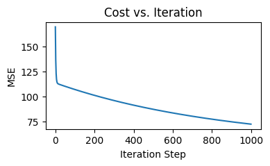
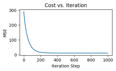
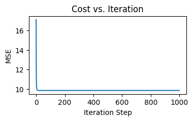
if i % math.ceil(num_iters/10) == 0: print(f"Iteration {i:4d}: Cost {J_history[-1]:8.2f}")
How the value of cost function changes over the iterations (Image by author)
Prediction
Making predictions is essentially applying the model to our dataset of interest to get the output values. These values are what the model “thinks”the target value should be, given a set of predictor values.
In our case, we apply the linear function:
def predict(X, w, b):
    p = np.dot(X, w) + b
    return p
Get the prediction results using:
y_pred = predict(X_test, w_out, b_out)
Result Evaluation
How do we get an idea of the model performance?
One way is through the cost function, as stated earlier:
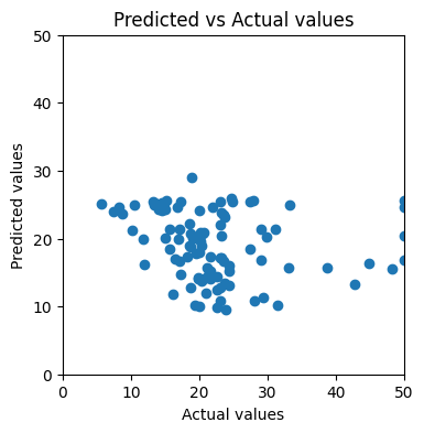
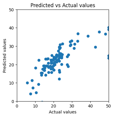
Another way is more intuitive — visualizing the predicted values against the actual values. If the model makes perfect predictions, then each element of y_test should always equal to the corresponding element of y_pred. If we plot y_test on x axis, y_pred on y axis, the dots will form a diagonal straight line.
Here’s our custom plotting function for the comparison:
plt.figure(figsize=(4,4)) plt.scatter(y_actual, y_pred) plt.xlim(0, x_ul) plt.ylim(0, y_ul) plt.xlabel("Actual values") plt.ylabel("Predicted values") plt.title("Predicted vs Actual values") plt.show()
After applying to our training result, we find that the dots look nothing like a straight line:
Scatter plot of predicted values against actual values (Image by author)
This should get us thinking: how can we improve the model’s performance?
Feature Scaling
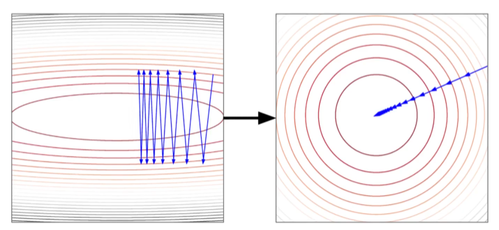
The Gradient Descent process is sensitive to the scale of features. As shown in the contour plot on the left, when the learning rate of different features are kept the same, then if the features are in different scales, the path of reaching global minimum may jump back and forth along the cost function.
The path towards global minimum of the cost function when features are not-scaled vs scaled (Source: DataMListic)
After scaling all the features to the same ranges, we can observe a smoother and more straight-forward path to global minimum of the cost function.
There are multiple ways to conduct feature scaling, and here we choose Standardization to turn all the features to have mean of 0 and standard deviation of 1.
We see an improvement from MSE of 132.84 to 35.66! Can we do more to improve the model?
Regularization — Ridge Regression
We notice that in the last round of training, the training MSE is 9.96, and the testing MSE is 35.66. Can we push the test set performance to be closer to training set?
Here comes Regularization. It penalizes large parameters to prevent the model from being too specific to the training set.
There are mainly 2 popular ways of regularization:
L1 Regularization — uses the L1 norm (absolute values, a.k.a. “Manhattan norm”) of the weights as the penalty term.
L2 Regularization — uses the L2 norm (squared values, a.k.a. “Euclidean norm”) of the weights as the penalty term.
Let’s first try Ridge Regression which uses L2 regularization as our new version of model. Its Gradient Descent process is easier to understand than LASSO Regression, which uses L1 regularization.
The cost function with L1 regularization looks like this:
Lambda controls the degree of penalty. When lambda is high, the level of penalty is high, then the model leans to underfitting.
We can turn the calculation into the following function:
def compute_cost_ridge(X, y, w, b, lambda_ = 1): m = X.shape[0]
f_wb = np.dot(X, w) + b cost = np.sum(np.power(f_wb - y, 2))
print(f"Training result: w = {w_out}, b = {b_out}")
print(f"Training MSE = {J_hist[-1]}")
Training result: w = [-0.86996629  0.82769399 -0.35944104  0.7051097  -1.43568137  2.69434668
 -0.12306667 -2.53197524  0.88587909 -0.92817437 -2.14746836 -3.70146378], b = 22.61090500500162
Training MSE = 10.005991756561285
The training cost is slightly higher than our previous version of model.
The learning curve looks very similar to the one from the previous round:
Cost by each iteration for Ridge Regression (Image by author)
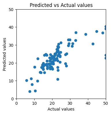
The predicted vs actual values plot looks almost identical to what we got from the previous round:
Scatter plot of predicted values against actual values for Ridge Regression (Image by author)
We got test set MSE of 35.69, which is slightly higher than the one without regularization.
Regularization — LASSO Regression
Finally, let’s try out LASSO Regression! LASSO stands for Least Absolute Shrinkage and Selection Operator.
This is the cost function with L2 regularization:
What’s tricky about the training process of LASSO Regression, is that the derivative of the absolute function is undefined at w=0. Therefore, Coordinate Descent is used in practice for LASSO Regression. It focuses on one coordinate at a time to find the minimum, and then switch to the next coordinate.
Second, calculate the residuals of the prediction:
def compute_residuals(X, y, w, b):
    return y - (np.dot(X, w) + b)
Use the residual to calculate rho, which is the subderivative:
def compute_rho_j(X, y, w, b, j):
    X_k = np.delete(X, j, axis=1)    # remove the jth element
    w_k = np.delete(w, j)    # remove the jth element

    err = compute_residuals(X_k, y, w_k, b)

    X_j = X[:,j]
    rho_j = np.dot(X_j, err)

    return rho_j
Put everything together:
def coordinate_descent_lasso(X, y, w_in, b_in, cost_function, lambda_, num_iters=1000, tolerance=1e-4): J_history = [] w = copy.deepcopy(w_in) b = b_in n = X.shape[1]
for i in range(num_iters): # Update weights for j in range(n): X_j = X[:,j] rho_j = compute_rho_j(X, y, w, b, j) w[j] = soft_threshold(rho_j, lambda_) / np.sum(X_j ** 2)
# Update bias b = np.mean(y - np.dot(X, w)) err = compute_residuals(X, y, w, b)
# Calculate total cost cost = cost_function(X, y, w, b, lambda_) J_history.append(cost)
if i % math.ceil(num_iters/10) == 0: print(f"Iteration {i:4d}: Cost {J_history[-1]:8.2f}")
# Check convergence if np.max(np.abs(err)) < tolerance: break
The training process converged drastically, compared to Gradient Descent on Ridge Regression:
Cost by each iteration for LASSO Regression (Image by author)
However, the training result is not significantly improved:
Scatter plot of predicted values against actual values for LASSO Regression (Image by author)
Eventually, we achieved MSE of 34.40, which is the lowest among the methods we tried.
Interpreting the Results
How do we interpret the model training results using human language? Let’s use the result of LASSO Regression as an example, since it has the best performance among the model variations we tried out.
We can get the weights and the bias by printing the w_out and b_out we got in the previous section:
print(f"Training result: w = {w_out}, b = {b_out}")
Training result: w = [-0.86643384  0.82700157 -0.35437324  0.70320366 -1.44112303  2.69451013
 -0.11649385 -2.53543865  0.88170899 -0.92308699 -2.15014264 -3.71479811], b = 22.61090500500162
In our case, there are 13 predictors, so this dataset has 13 dimensions. In each dimension, we can plot the predictor x_i against the target y as a scatterplot. The regression line’s slope is the weight w_i.
In details, the first dimension is “CRIM — per capita crime rate by town”, and our w_1 is -0.8664. This means, each unit of increase in x_i, y is expected to decrease by -0.8664 unit.
Note that we have scaled our dataset before we run the training process, so now we need to reverse that process to get the intuitive relationship between the predictor “per capita crime rate by town” and our target variable “median value of owner-occupied homes in $1000’s, at a specific location”.
To reverse the scaling, we need to get the vector of scales:
Here we find the scale we used for our first predictor: 8.1278. We divide the weight of -0.8664 by scale or 8.1278 to get -0.1066.
This means: when all other factors remains the same, if the per capita crime rate increases by 1 percentage point, the medium housing price of that location drops by $1000 * (-0.1066) = $106.6 in value.
Summary
This article unveiled the details of implementing Linear Regression in Python, going beyond just calling high level scikit-learn functions.
We looked into the target of regression — minimizing the cost function, and wrote the cost function in Python.
We broke down Gradient Descent process step by step.
We created plotting functions to visualize the training process and assessing the results.
We discussed ways to improve model performance, and found out that LASSO Regression achieved the lowest test MSE for our problem.
Lastly, we used one predictor as an example to illustrate how the training result should be interpreted.
We use cookies on our website to give you the most relevant experience by remembering your preferences and repeat visits. By clicking “Accept”, you consent to the use of ALL the cookies.
This website uses cookies to improve your experience while you navigate through the website. Out of these, the cookies that are categorized as necessary are stored on your browser as they are essential for the working of basic functionalities of the website. We also use third-party cookies that help us analyze and understand how you use this website. These cookies will be stored in your browser only with your consent. You also have the option to opt-out of these cookies. But opting out of some of these cookies may affect your browsing experience.
Necessary cookies are absolutely essential for the website to function properly. These cookies ensure basic functionalities and security features of the website, anonymously.
Cookie
Duration
Description
cookielawinfo-checkbox-analytics
11 months
This cookie is set by GDPR Cookie Consent plugin. The cookie is used to store the user consent for the cookies in the category "Analytics".
cookielawinfo-checkbox-functional
11 months
The cookie is set by GDPR cookie consent to record the user consent for the cookies in the category "Functional".
cookielawinfo-checkbox-necessary
11 months
This cookie is set by GDPR Cookie Consent plugin. The cookies is used to store the user consent for the cookies in the category "Necessary".
cookielawinfo-checkbox-others
11 months
This cookie is set by GDPR Cookie Consent plugin. The cookie is used to store the user consent for the cookies in the category "Other.
cookielawinfo-checkbox-performance
11 months
This cookie is set by GDPR Cookie Consent plugin. The cookie is used to store the user consent for the cookies in the category "Performance".
viewed_cookie_policy
11 months
The cookie is set by the GDPR Cookie Consent plugin and is used to store whether or not user has consented to the use of cookies. It does not store any personal data.
Functional cookies help to perform certain functionalities like sharing the content of the website on social media platforms, collect feedbacks, and other third-party features.
Performance cookies are used to understand and analyze the key performance indexes of the website which helps in delivering a better user experience for the visitors.
Analytical cookies are used to understand how visitors interact with the website. These cookies help provide information on metrics the number of visitors, bounce rate, traffic source, etc.
Advertisement cookies are used to provide visitors with relevant ads and marketing campaigns. These cookies track visitors across websites and collect information to provide customized ads.