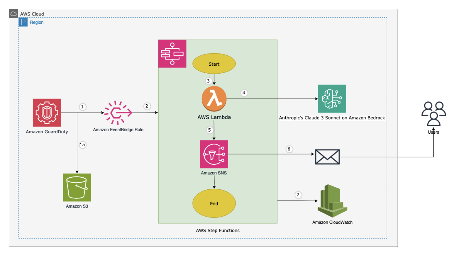
This post demonstrates a proactive approach for security vulnerability assessment of your accounts and workloads, using Amazon GuardDuty, Amazon Bedrock, and other AWS serverless technologies. This approach aims to identify potential vulnerabilities proactively and provide your users with timely alerts and recommendations, avoiding reactive escalations and other damages.
In this post, we show you how DXC and AWS collaborated to build an AI assistant using large language models (LLMs), enabling users to access and analyze different data types from a variety of data sources. The AI assistant is powered by an intelligent agent that routes user questions to specialized tools that are optimized for different data types such as text, tables, and domain-specific formats. It uses the LLM’s ability to understand natural language, write code, and reason about conversational context.
Explore NetworkX for building, analyzing, and visualizing graphs in Python. Discovering Insights in Connected Data.
In a world brimming with connections — from social media friendships to complex transportation networks — understanding relationships and patterns is key to making sense of the systems around us. Imagine visualizing a social network where each person is a dot (a “node”) connected to friends by lines (or “edges”). Or picture mapping a city’s metro system where each station is a node and each route is an edge connecting them.
This is where NetworkX shines, offering a powerful way to build, analyze, and visualize these intricate webs of relationships.
NetworkX allows us to represent data in ways that would be cumbersome or even impractical with traditional tables but become easy and natural in a graph format. Relationships that would take many rows and columns to define in a spreadsheet can be captured in an intuitive, visual way, helping us to understand and interpret complex data.
The library lets us apply a wide range of methods and algorithms to these graphs, providing fresh insights each time as we reframe our data with a new approach.
NetworkX
Let’s start out by breaking down what a graph is. In network analysis, a graph is made up of nodes (or vertices) and edges (or links).
Think of nodes as the main entities, like people or web pages, and edges as the connections between them — like friendships in a social network or hyperlinks between websites.
Some edges even carry weights, representing the strength, distance, or cost of the connection between two nodes. This added layer of information helps us analyze not just if two nodes are connected, but how strongly or closely.
These graphs can be used to model a wide variety of systems, from social networks, to molecules and transportation grids.
Let’s start by seeing how to create a graph using networkx. If you don’t have it installed first run:
$ pip install networkx
Creating a graph
To make a network we will:
Initialize the network: by creating a graph with G = nx.Graph()
Add Nodes with Attributes: Use G.add_node() to add nodes, each of which can store custom attributes like labels or ages.
Add Edges: Connect nodes with G.add_edge(), where each edge can include a weight attribute to represent the strength or cost of the connection.
Visualize the Graph: Use Matplotlib functions like nx.draw() and nx.draw_networkx_edge_labels() to display the graph, showing node labels and edge weights for easy interpretation.
This is the code to achieve this:
import networkx as nx import matplotlib.pyplot as plt
# Retrieve and print node attributes node_attributes = nx.get_node_attributes(G, 'age') # Get 'age' attribute for all nodes print("Node Attributes (Age):", node_attributes)
# Retrieve and print edge attributes edge_weights = nx.get_edge_attributes(G, 'weight') # Get 'weight' attribute for all edges print("Edge Attributes (Weight):", edge_weights)
# Draw the graph with node and edge attributes pos = nx.spring_layout(G) # Layout for node positions node_labels = nx.get_node_attributes(G, 'label') # Get node labels for visualization edge_labels = nx.get_edge_attributes(G, 'weight') # Get edge weights for visualization
3 weighted edges that connect these nodes: (1, 2), (1, 3), and (2, 4) by calling G.add_edge(node1, node2, attr)
Both nodes and edges in NetworkX can hold additional attributes, making the graph richer with information.
Node attributes (accessed via nx.get_node_attributes(G, ‘attribute’)) allow each node to store data, like a person’s occupation in a social network.
Edge attributes (accessed via nx.get_edge_attributes(G, ‘attribute’)) store information for each connection, such as the distance or travel time in a transportation network. These attributes add context and depth, enabling more detailed analysis of the network.
We then use NetworkX’s spring layout pos = nx.spring_layout(G) to position the nodes for visualization, ensuring they’re spaced naturally within the plot. Finally, nx.draw() and nx.draw_networkx_edge_labels() display the graph with node labels and edge weights, creating a clear view of the network’s structure and connections.
While this was a rather simple network, it illustrates the basics of working with networks: to manipulate graphs we need to handle the nodes and their connections along any attributes they might have.
Karate Club Network
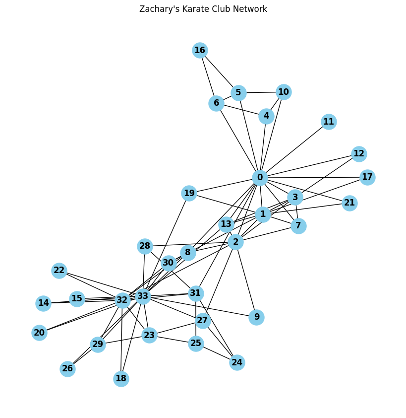
One of the most well-known examples in network science is the Zachary’s Karate Club, often used to illustrate social network analysis and community detection. The dataset is public domain and is included in networkx by default. You can access as shown below:
# Load the  Karate Club
G = nx.karate_club_graph()

# Draw the graph
plt.figure(figsize=(8, 8))
pos = nx.spring_layout(G)  # Layout for nodes -> treats nodes as repelling objects
nx.draw(G, pos, with_labels=True, node_color='skyblue', font_size=12, font_weight='bold', node_size=500)
plt.title("Zachary's Karate Club Network")
plt.show()
Figure 2: Zachary’s Karate Club Network. Image by author.
This network represents the friendships among 34 members of a karate club, and it is famous for the split that occurred between two factions, each centered around a central figure — Mr. Hi and Officer.
Let’s take a look at the attributes contained within the node data:
# looping over nodes
for node in G.nodes():
    print(f"Node: {node}, Node Attributes: {G.nodes[node]}")
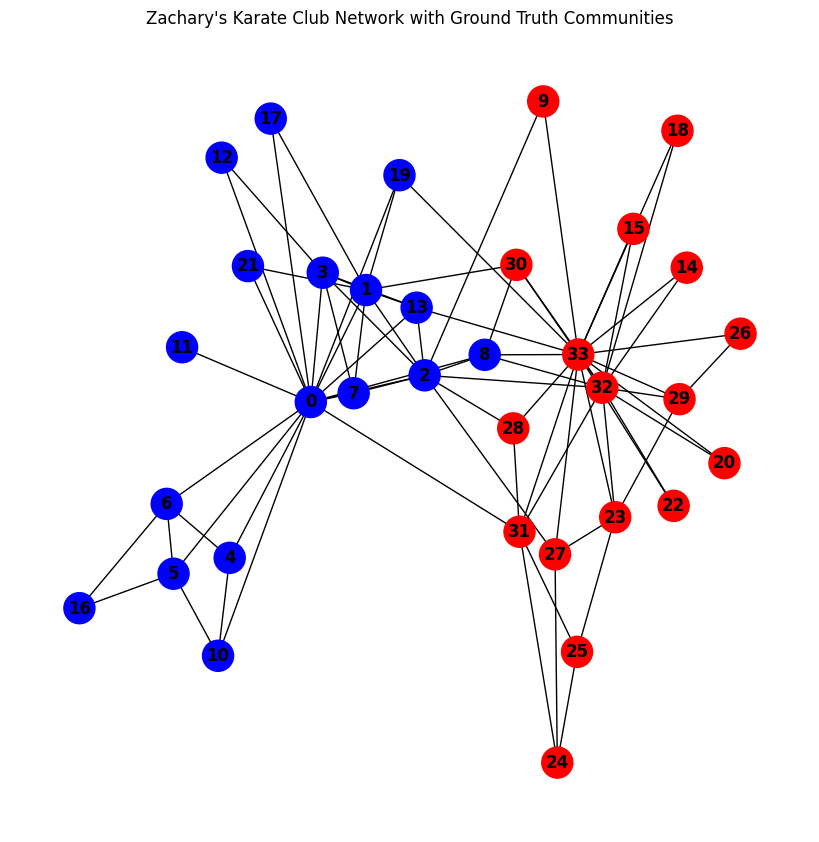
The node attribute club refers to the community “Officer” or “Mr. Hi” that each node belongs to. Let’s use them to create color the nodes in the graph.
To do this we assign the blue color to the nodes with club label “Mr Hi” and red those with label “Officer” in a list color_map , which we can use to visualize the network using nx.draw.
# Load the Karate Club
G: nx.Graph = nx.karate_club_graph()

# Get the node labels
labels = nx.get_node_attributes(G, 'club')

# Map community labels to colors
color_map = []
for node in G.nodes():
    if labels[node] == 'Mr. Hi':
        # Assign blue color for 'Mr. Hi'
        color_map.append('blue')
    else:
        # Assign red color for 'Officer'
        color_map.append('red')

# Visualize the graph
plt.figure(figsize=(8, 8))
pos = nx.spring_layout(G)

nx.draw(G, pos, with_labels=True, node_color=color_map, font_size=12, font_weight='bold', node_size=500, cmap=plt.cm.rainbow)
plt.title("Zachary's Karate Club Network with Ground Truth Communities")
plt.show()
Figure 3: Communities “Mr Hi” and “Officer” in Karate Club Network. Image by author.
The legend tells that a conflict arose between the club’s instructor, “Mr. Hi,” and the club’s administrator, “Officer.” This division eventually caused the club to split into two distinct groups, each centered around one of these leaders.
By representing these relationships as a network, we can visually capture this split and reveal patterns and clusters within the data — insights that may be hard to see having the data in traditional table formats.
Centrality
To understand the structure and dynamics of a network, it’s essential to identify the most influential or strategically positioned nodes. This is where centrality measures come in, a key concept in network science.
It measures the position of nodes based on their types connections, identifying key nodes based on certain criteria. Common measures include:
degree centrality (merely the number of connections each node possess)
closeness centrality(how quickly a node can access all other nodes in the network).
and betweenness centrality (how often a node appears on the shortest paths between other nodes)
These measures help reveal key players or bottlenecks in the network, giving insight into its structure/dynamic.
import networkx as nx import matplotlib.pyplot as plt
# top 5 nodes by centrality for each measure top_degree_nodes = sorted(degree_centrality, key=degree_centrality.get, reverse=True)[:5] top_betweenness_nodes = sorted(betweenness_centrality, key=betweenness_centrality.get, reverse=True)[:5] top_closeness_nodes = sorted(closeness_centrality, key=closeness_centrality.get, reverse=True)[:5]
# top 5 nodes for each centrality measure print("Top 5 nodes by Degree Centrality:", top_degree_nodes) print("Top 5 nodes by Betweenness Centrality:", top_betweenness_nodes) print("Top 5 nodes by Closeness Centrality:", top_closeness_nodes)
# top 5 nodes for Degree Centrality plt.figure(figsize=(8, 8)) pos = nx.spring_layout(G) # Positioning of nodes node_color = ['red' if node in top_degree_nodes else 'skyblue' for node in G.nodes()]
# draw top 5 nodes by degree centrality nx.draw(G, pos, with_labels=True, node_color=node_color, font_size=15, font_weight='bold', node_size=500) plt.title("Karate Club Network with Top 5 Degree Central Nodes") plt.show()
Top 5 nodes by Degree Centrality: [33, 0, 32, 2, 1]
Top 5 nodes by Betweenness Centrality: [0, 33, 32, 2, 31]
Top 5 nodes by Closeness Centrality: [0, 2, 33, 31, 8]
Figure 4: Nodes with highest centrality in Karate Club Network. Image by author.
For nodes 0 and 3 we see, that these nodes are the most central in the network, with high degree, betweenness, and closeness centralities.
Their central roles suggest they are well-connected hubs, frequently acting as bridges between other members and able to quickly reach others in the network. This positioning highlights them as key players, holding significance in the network’s flow and structure.
A community C is a set of nodes (e.g., individuals in a social network, web pages connected by hyperlinks etc.) that exhibit stronger connections among themselves than with the rest of the network.
With a visual representation of centrality in mind, let’s apply the Girvan-Newman Algorithm to this graph.
The algorithm generates a series of community splits as it progressively removes edges with the highest betweenness centrality.
The first time the algorithm is run, it identifies the most significant community division.
from networkx.algorithms.community import girvan_newman
# Load the Karate Club graph G = nx.karate_club_graph()
# Visualize the first level of communities pos = nx.spring_layout(G) plt.figure(figsize=(8, 8))
# Color nodes by their community node_colors = ['skyblue' if node in first_level_communities[0] else 'orange' for node in G.nodes()] nx.draw(G, pos, with_labels=True, node_color=node_colors, font_size=12, node_size=500)
plt.title("Karate Club Network with Girvan-Newman Communities") plt.show()
Figure 5: First split in karate club network by the girvan newman algorithm. Image by author.
Since girvan_newman(G) returns an iterator as comp, calling next(comp) allows you to retrieve the first split, i.e., the first division of the network into two communities.
Let’s compare the detected communities with the actual node label club
print("Detected Communities:", first_level_communities) # Print the actual communities (ground truth) print("nActual Communities (Ground Truth):") mr_hi_nodes = [node for node, label in labels.items() if label == 'Mr. Hi'] officer_nodes = [node for node, label in labels.items() if label == 'Officer']
The communities detected by the Girvan-Newman algorithm are similar to the actual Mr. Hi and Officer communities but not an exact match. This is because the Girvan-Newman algorithm divides the network based solely on edge betweenness centrality, without relying on any predefined community labels.
This approach is especially useful in unstructured datasets where labels are absent, as it reveals meaningful groupings based on the network’s structural properties. This highlights a key consideration in community detection: there is no strict definition of what constitutes a community.
As a result, there is no single “correct” way to partition a network. Different methods, driven by varying metrics, can yield diverse results, each providing valuable insights depending on the context.
A useful concept in networks is the clique. In network science, a clique refers to a subset of nodes in a graph where every node is connected to every other node in that subset. This means that all members of a clique have direct relationships with each other, forming a tightly-knit group. Cliques can be particularly useful when studying the structure of complex networks because they often represent highly connected or cohesive groups within a larger system.
For example in:
In social Networks: cliques can represent groups of people who know each other, such as close-knit circles of friends or professional colleagues.
In collaborative Networks: In a collaborative network (e.g., research collaborations), cliques can reveal teams of researchers who work together on the same topics or projects.
In biological Networks: In biological networks, cliques can indicate functional groups of proteins or genes that interact closely within a biological process.
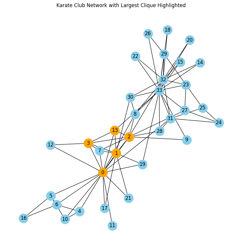
Let’s find the biggest clique in the karate network. We will find the largest group of people that have all links with each other.
import networkx as nx
import matplotlib.pyplot as plt

# Load the Karate Club graph
G = nx.karate_club_graph()

# Find all cliques in the Karate Club network
cliques = list(nx.find_cliques(G))

# Find the largest clique (the one with the most nodes)
largest_clique = max(cliques, key=len)

# Print the largest clique
print("Largest Clique:", largest_clique)

# Visualize the graph with the largest clique highlighted
plt.figure(figsize=(8, 8))
pos = nx.spring_layout(G)  # Layout for node positions
nx.draw(G, pos, with_labels=True, node_color='skyblue', font_size=12, node_size=500)

# Highlight the nodes in the largest clique
nx.draw_networkx_nodes(G, pos, nodelist=largest_clique, node_color='orange', node_size=500)

plt.title("Karate Club Network with Largest Clique Highlighted")
plt.show()
Figure 6: Largest clique in Karate Club Network, nodes 0, 1, 2, 3 and 13 are interconnected. Image by author.
Despite the challenges in defining “community” in network science, cliques offer a concrete and well-defined concept for identifying groups that are fully interconnected, offering meaningful insights into both structured and unstructured networks.
Shortest Path
Another interesting concept in network science is Shortest Path. The shortest path between two nodes in a graph refers to the sequence of edges that connects the nodes while minimizing the total distance or cost, which can be interpreted in various ways depending on the application. This concept plays a crucial role in fields like routing algorithms, network design, transportation planning, and even social network analysis.
NetworkX provides several algorithms to compute shortest paths, such as Dijkstra’s Algorithm for weighted graphs and Breadth-First Search (BFS) for unweighted graphs.
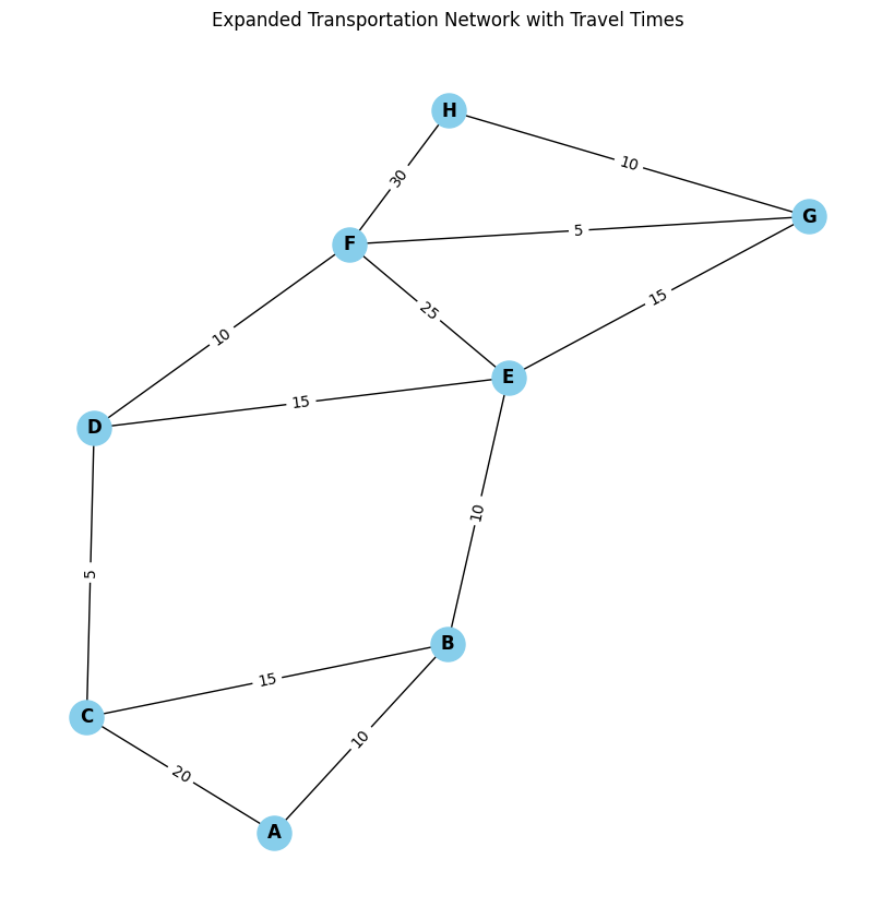
Let’s take a look at an example, we will create a synthetic dataset where nodes represent stations and the edges connections between the stations.
We will also add weighted edge time, representing the time it takes to reach from one station to the next.
import pandas as pd import networkx as nx import matplotlib.pyplot as plt
# Simulate loading a CSV file (real example would load an actual CSV file) # Define a more extensive set of stations and travel times between them data = { 'station_id': ['A', 'A', 'B', 'B', 'C', 'C', 'D', 'D', 'E', 'E', 'F', 'F', 'G', 'G', 'H'], 'connected_station': ['B', 'C', 'A', 'C', 'A', 'D', 'C', 'E', 'B', 'F', 'D', 'G', 'E', 'H', 'F'], 'time': [10, 20, 10, 15, 20, 10, 5, 15, 10, 25, 10, 5, 15, 10, 30] # Travel times in minutes }
# Create a DataFrame df = pd.DataFrame(data)
# Create a graph from the DataFrame G = nx.Graph()
# Add edges to the graph (station connections with weights as travel times) for index, row in df.iterrows(): G.add_edge(row['station_id'], row['connected_station'], weight=row['time'])
plt.title("Expanded Transportation Network with Travel Times") plt.show()
Figure 7: Example transportation network where nodes represent stations and the edges time or length. Image by author.
In this example we use Dijkstra’s algorithm to compute the shortest path from station A to station H, where the edge weights represent travel times. The shortest path and its total travel time are printed, and the path is highlighted in red on the graph for visualization, with edge weights shown to indicate travel times between stations.
# Compute the shortest path using Dijkstra's algorithm (considering the travel time as weight) source = 'A' target = 'H'
# Print the shortest path and its length print(f"Shortest path from {source} to {target}: {shortest_path}") print(f"Total travel time from {source} to {target}: {path_length} minutes")
# Visualize the shortest path on the graph plt.figure(figsize=(8, 8)) nx.draw(G, pos, with_labels=True, node_size=500, node_color='skyblue', font_size=12, font_weight='bold')
# Highlight the shortest path in red edges_in_path = [(shortest_path[i], shortest_path[i + 1]) for i in range(len(shortest_path) - 1)] nx.draw_networkx_edges(G, pos, edgelist=edges_in_path, edge_color='red', width=2)
plt.title(f"Shortest Path from {source} to {target} with Travel Time {path_length} minutes") plt.show()
Shortest path from A to H: ['A', 'B', 'E', 'G', 'H']
Total travel time from A to H: 45 minutes
Figure 8: Shortest path between input nodes A and H for the given graph — 45 minutes. Image by author.
The algorithm calculates both the shortest route and its total travel time, which are then displayed. The shortest path between A and H is highlighted in red on the graph , with edge weights showing the time between each connected station, adding to a total of 45.
While this was a simple computation, shortest path algorithms have broad applications. In transportation, they optimize routes and reduce travel time; in digital communication, they route data efficiently. They’re essential in logistics to minimize costs, in supply chains for timely deliveries, and in social networks to gauge closeness between individuals. Understanding shortest paths enables data-driven decisions across fields — from urban planning to network infrastructure — making it a vital tool for navigating complex systems efficiently.
Thanks for reading
We’ve explored several fundamental concepts in Network Science using NetworkX, such as shortest path algorithms, community detection, and the power of graph theory to model and analyze complex systems.
If you want to continue learning, I’ve placed a couple of links below :). In case you want to go deeper on community detection algorithms take a look to the CDLib library.
NOTE: Computing advanced metrics and measures on graphs can often be ambiguous or even misleading. With so many potential metrics available, it’s easy to generate numbers that may not hold meaningful value or may misrepresent the network’s true structure. Choosing the right metrics requires careful consideration, as not all measures will provide relevant insights for every type of network analysis. If this resonates, have a look here for more information: statistical inference links data and theory in network science
MSD, a leading pharmaceutical company, collaborates with AWS to implement a powerful text-to-SQL generative AI solution using Amazon Bedrock and Anthropic’s Claude 3.5 Sonnet model. This approach streamlines data extraction from complex healthcare databases like DE-SynPUF, enabling analysts to generate SQL queries from natural language questions. The solution addresses challenges such as coded columns, non-intuitive names, and ambiguous queries, significantly reducing query time and democratizing data access.
This blog post discusses a solution that combines AWS Resilience Hub and Amazon Bedrock to generate architectural findings in natural language. By using the capabilities of Resilience Hub and Amazon Bedrock, you can share findings with C-suite executives, engineers, managers, and other personas within your corporation to provide better visibility over maintaining a resilient architecture.
In this post, we demonstrate how to interact with the Amazon Titan Image Generator G1 v2 model on Amazon Bedrock to generate an image. Then, we show you how to use Anthropic’s Claude 3.5 Sonnet on Amazon Bedrock to describe it, evaluate it with a score from 1–10, explain the reason behind the given score, and suggest improvements to the image.
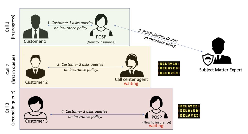
In this post, we explain how InsuranceDekho harnessed the power of generative AI using Amazon Bedrock and Anthropic’s Claude to provide responses to customer queries on policy coverages, exclusions, and more. This let our customer care agents and POSPs confidently help our customers understand the policies without reaching out to insurance subject matter experts (SMEs) or memorizing complex plans while providing sales and after-sales services. The use of this solution has improved sales, cross-selling, and overall customer service experience.
We use cookies on our website to give you the most relevant experience by remembering your preferences and repeat visits. By clicking “Accept”, you consent to the use of ALL the cookies.
This website uses cookies to improve your experience while you navigate through the website. Out of these, the cookies that are categorized as necessary are stored on your browser as they are essential for the working of basic functionalities of the website. We also use third-party cookies that help us analyze and understand how you use this website. These cookies will be stored in your browser only with your consent. You also have the option to opt-out of these cookies. But opting out of some of these cookies may affect your browsing experience.
Necessary cookies are absolutely essential for the website to function properly. These cookies ensure basic functionalities and security features of the website, anonymously.
Cookie
Duration
Description
cookielawinfo-checkbox-analytics
11 months
This cookie is set by GDPR Cookie Consent plugin. The cookie is used to store the user consent for the cookies in the category "Analytics".
cookielawinfo-checkbox-functional
11 months
The cookie is set by GDPR cookie consent to record the user consent for the cookies in the category "Functional".
cookielawinfo-checkbox-necessary
11 months
This cookie is set by GDPR Cookie Consent plugin. The cookies is used to store the user consent for the cookies in the category "Necessary".
cookielawinfo-checkbox-others
11 months
This cookie is set by GDPR Cookie Consent plugin. The cookie is used to store the user consent for the cookies in the category "Other.
cookielawinfo-checkbox-performance
11 months
This cookie is set by GDPR Cookie Consent plugin. The cookie is used to store the user consent for the cookies in the category "Performance".
viewed_cookie_policy
11 months
The cookie is set by the GDPR Cookie Consent plugin and is used to store whether or not user has consented to the use of cookies. It does not store any personal data.
Functional cookies help to perform certain functionalities like sharing the content of the website on social media platforms, collect feedbacks, and other third-party features.
Performance cookies are used to understand and analyze the key performance indexes of the website which helps in delivering a better user experience for the visitors.
Analytical cookies are used to understand how visitors interact with the website. These cookies help provide information on metrics the number of visitors, bounce rate, traffic source, etc.
Advertisement cookies are used to provide visitors with relevant ads and marketing campaigns. These cookies track visitors across websites and collect information to provide customized ads.