Evaluating methods to enhance reliability in LLM-generated responses.
Unchecked hallucination remains a big problem in today’s Retrieval-Augmented Generation applications. This study evaluates popular hallucination detectors across 4 public RAG datasets. Using AUROC and precision/recall, we report how well methods like G-eval, Ragas, and the Trustworthy Language Model are able to automatically flag incorrect LLM responses.
Using various hallucination detection methods to identify LLM errors in RAG systems.
I am currently working as a Machine Learning Engineer at Cleanlab, where I have contributed to the development of the Trustworthy Language Model discussed in this article. I am excited to present this method and evaluate it alongside others in the following benchmarks.
The Problem: Hallucinations and Errors in RAG Systems
Large Language Models (LLM) are known to hallucinate incorrect answers when asked questions not well-supported within their training data. Retrieval Augmented Generation (RAG) systems mitigate this by augmenting the LLM with the ability to retrieve context and information from a specific knowledge database. While organizations are quickly adopting RAG to pair the power of LLMs with their own proprietary data, hallucinations and logical errors remain a big problem. In one highly publicized case, a major airline (Air Canada) lost a court case after their RAG chatbot hallucinated important details of their refund policy.
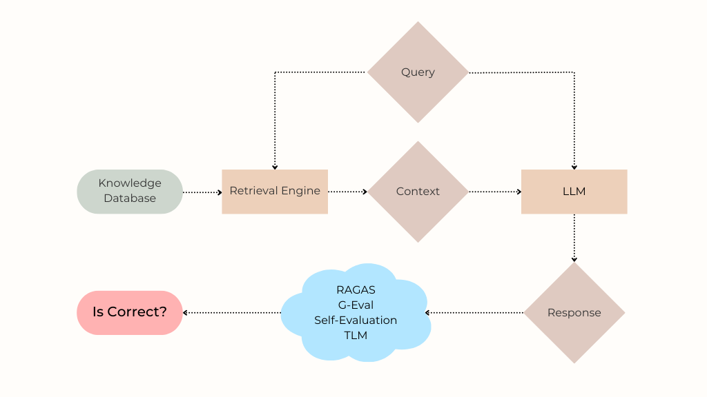
To understand this issue, let’s first revisit how a RAG system works. When a user asks a question (“Is this is refund eligible?”), the retrieval component searches the knowledge database for relevant information needed to respond accurately. The most relevant search results are formatted into a context which is fed along with the user’s question into a LLM that generates the response presented to the user. Because enterprise RAG systems are often complex, the final response might be incorrect for many reasons including:
LLMs are brittle and prone to hallucination. Even when the retrieved context contains the correct answer within it, the LLM may fail to generate an accurate response, especially if synthesizing the response requires reasoning across different facts within the context.
The retrieved context may not contain information required to accurately respond, due to suboptimal search, poor document chunking/formatting, or the absence of this information within the knowledge database. In such cases, the LLM may still attempt to answer the question and hallucinate an incorrect response.
While some use the term hallucination to refer only to specific types of LLM errors, here we use this term synonymously with incorrect response. What matters to the users of your RAG system is the accuracy of its answers and being able to trust them. Unlike RAG benchmarks that assess many system properties, we exclusively study: how effectively different detectors could alert your RAG users when the answers are incorrect.
A RAG answer might be incorrect due to problems during retrieval or generation. Our study focuses on the latter issue, which stems from the fundamental unreliability of LLMs.
The Solution: Hallucination Detection Methods
Assuming an existing retrieval system has fetched the context most relevant to a user’s question, we consider algorithms to detect when the LLM response generated based on this context should not be trusted. Such hallucination detection algorithms are critical in high-stakes applications spanning medicine, law, or finance. Beyond flagging untrustworthy responses for more careful human review, such methods can be used to determine when it is worth executing more expensive retrieval steps (e.g. searching additional data sources, rewriting queries, etc).
Here are the hallucination detection methods considered in our study, all based on using LLMs to evaluate a generated response:
Self-evaluation (”Self-eval”) is a simple technique whereby the LLM is asked to evaluate the generated answer and rate its confidence on a scale of 1–5 (Likert scale). We utilize chain-of-thought (CoT) prompting to improve this technique, asking the LLM to explain its confidence before outputting a final score. Here is the specific prompt template used:
Question: {question} Answer: {response}
Evaluate how confident you are that the given Answer is a good and accurate response to the Question. Please assign a Score using the following 5-point scale: 1: You are not confident that the Answer addresses the Question at all, the Answer may be entirely off-topic or irrelevant to the Question. 2: You have low confidence that the Answer addresses the Question, there are doubts and uncertainties about the accuracy of the Answer. 3: You have moderate confidence that the Answer addresses the Question, the Answer seems reasonably accurate and on-topic, but with room for improvement. 4: You have high confidence that the Answer addresses the Question, the Answer provides accurate information that addresses most of the Question. 5: You are extremely confident that the Answer addresses the Question, the Answer is highly accurate, relevant, and effectively addresses the Question in its entirety.
The output should strictly use the following template: Explanation: [provide a brief reasoning you used to derive the rating Score] and then write ‘Score: <rating>’ on the last line.
G-Eval (from the DeepEval package) is a method that uses CoT to automatically develop multi-step criteria for assessing the quality of a given response. In the G-Eval paper (Liu et al.), this technique was found to correlate with Human Judgement on several benchmark datasets. Quality can be measured in various ways specified as a LLM prompt, here we specify it should be assessed based on the factual correctness of the response. Here is the criteria that was used for the G-Eval evaluation:
Determine whether the output is factually correct given the context.
Hallucination Metric (from the DeepEval package) estimates the likelihood of hallucination as the degree to which the LLM response contradicts/disagrees with the context, as assessed by another LLM.
RAGAS is a RAG-specific, LLM-powered evaluation suite that provides various scores which can be used to detect hallucination. We consider each of the following RAGAS scores, which are produced by using LLMs to estimate the requisite quantities:
Faithfulness — The fraction of claims in the answer that are supported by the provided context.
Answer Relevancy is the mean cosine similarity of the vector representation to the original question with the vector representations of three LLM-generated questions from the answer. Vector representations here are embeddings from the BAAI/bge-base-en encoder.
Context Utilization measures to what extent the context was relied on in the LLM response.
Trustworthy Language Model (TLM) is a model uncertainty-estimation technique that evaluates the trustworthiness of LLM responses. It uses a combination of self-reflection, consistency across multiple sampled responses, and probabilistic measures to identify errors, contradictions and hallucinations. Here is the prompt template used to prompt TLM:
Answer the QUESTION using information only from CONTEXT: {context} QUESTION: {question}
Evaluation Methodology
We will compare the hallucination detection methods stated above across 4 public Context-Question-Answer datasets spanning different RAG applications.
For each user question in our benchmark, an existing retrieval system returns some relevant context. The user query and context are then input into a generator LLM (often along with an application-specific system prompt) in order to generate a response for the user. Each detection method takes in the {user query, retrieved context, LLM response} and returns a score between 0–1, indicating the likelihood of hallucination.
To evaluate these hallucination detectors, we consider how reliably these scores take lower values when the LLM responses are incorrect vs. being correct. In each of our benchmarks, there exist ground-truth annotations regarding the correctness of each LLM response, which we solely reserve for evaluation purposes. We evaluate hallucination detectors based on AUROC, defined as the probability that their score will be lower for an example drawn from the subset where the LLM responded incorrectly than for one drawn from the subset where the LLM responded correctly. Detectors with greater AUROC values can be used to catch RAG errors in your production system with greater precision/recall.
All of the considered hallucination detection methods are themselves powered by a LLM. For fair comparison, we fix this LLM model to be gpt-4o-mini across all of the methods.
Benchmark Results
We describe each benchmark dataset and the corresponding results below. These datasets stem from the popular HaluBench benchmark suite (we do not include the other two datasets from this suite, as we discovered significant errors in their ground truth annotations).
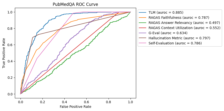
PubMedQA
PubMedQA is a biomedical Q&A dataset based on PubMed abstracts. Each instance in the dataset contains a passage from a PubMed (medical publication) abstract, a question derived from passage, for example: Is a 9-month treatment sufficient in tuberculous enterocolitis?, and a generated answer.
ROC Curve for PubMedQA Dataset
In this benchmark, TLM is the most effective method for discerning hallucinations, followed by the Hallucination Metric, Self-Evaluation and RAGAS Faithfulness. Of the latter three methods, RAGAS Faithfulness and the Hallucination Metric were more effective for catching incorrect answers with high precision (RAGAS Faithfulness had an average precision of 0.762, Hallucination Metric had an average precision of 0.761, and Self-Evaluation had an average precision of0.702).
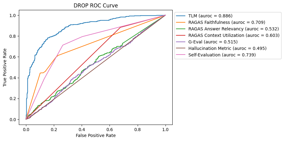
DROP
DROP, or “Discrete Reasoning Over Paragraphs”, is an advanced Q&A dataset based on Wikipedia articles. DROP is difficult in that the questions require reasoning over context in the articles as opposed to simply extracting facts. For example, given context containing a Wikipedia passage describing touchdowns in a Seahawks vs. 49ers Football game, a sample question is: How many touchdown runs measured 5-yards or less in total yards?, requiring the LLM to read each touchdown run and then compare the length against the 5-yard requirement.
ROC Curve for DROP Dataset
Most methods faced challenges in detecting hallucinations in this DROP dataset due to the complexity of the reasoning required. TLM emerges as the most effective method for this benchmark, followed by Self-Evaluation and RAGAS Faithfulness.
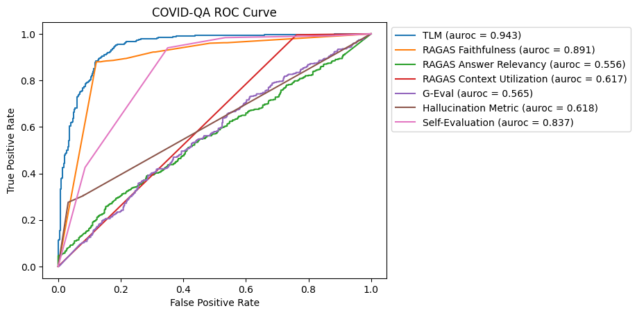
COVID-QA
COVID-QA is a Q&A dataset based on scientific articles related to COVID-19. Each instance in the dataset includes a scientific passage related to COVID-19 and a question derived from the passage, for example: How much similarity the SARS-COV-2 genome sequence has with SARS-COV?
Compared to DROP, this is a simpler dataset as it only requires basic synthesis of information from the passage to answer more straightforward questions.
ROC Curve for COVID-QA Dataset
In the COVID-QA dataset, TLM and RAGAS Faithfulness both exhibited strong performance in detecting hallucinations. Self-Evaluation also performed well, however other methods, including RAGAS Answer Relevancy, G-Eval, and the Hallucination Metric, had mixed results.
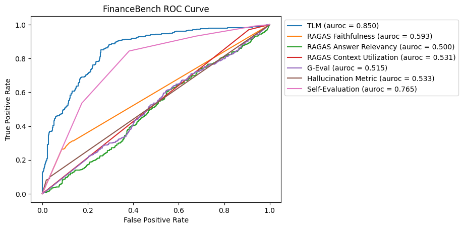
FinanceBench
FinanceBench is a dataset containing information about public financial statements and publicly traded companies. Each instance in the dataset contains a large retrieved context of plaintext financial information, a question regarding that information, for example: What is FY2015 net working capital for Kraft Heinz?, and a numeric answer like: $2850.00.
ROC Curve for FinanceBench Dataset
For this benchmark, TLM was the most effective in identifying hallucinations, followed closely by Self-Evaluation. Most other methods struggled to provide significant improvements over random guessing, highlighting the challenges in this dataset that contains large amounts of context and numerical data.
Discussion
Our evaluation of hallucination detection methods across various RAG benchmarks reveals the following key insights:
Trustworthy Language Model (TLM) consistently performed well, showing strong capabilities in identifying hallucinations through a blend of self-reflection, consistency, and probabilistic measures.
Self-Evaluation showed consistent effectiveness in detecting hallucinations, particularly effective in simpler contexts where the LLM’s self-assessment can be accurately gauged. While it may not always match the performance of TLM, it remains a straightforward and useful technique for evaluating response quality.
RAGAS Faithfulness demonstrated robust performance in datasets where the accuracy of responses is closely linked to the retrieved context, such as in PubMedQA and COVID-QA. It is particularly effective in identifying when claims in the answer are not supported by the provided context. However, its effectiveness was variable depending on the complexity of the questions. By default, RAGAS uses gpt-3.5-turbo-16k for generation and gpt-4 for the critic LLM, which produced worse results than the RAGAS with gpt-4o-mini results we reported here. RAGAS failed to run on certain examples in our benchmark due to its sentence parsing logic, which we fixed by appending a period (.) to the end of answers that did not end in punctuation.
Other Methods like G-Eval and Hallucination Metric had mixed results, and exhibited varied performance across different benchmarks. Their performance was less consistent, indicating that further refinement and adaptation may be needed.
Overall, TLM, RAGAS Faithfulness, and Self-Evaluation stand out as more reliable methods to detect hallucinations in RAG applications. For high-stakes applications, combining these methods could offer the best results. Future work could explore hybrid approaches and targeted refinements to better conduct hallucination detection with specific use cases. By integrating these methods, RAG systems can achieve greater reliability and ensure more accurate and trustworthy responses.
Unless otherwise noted, all images are by the author.
Python has become the de facto programming language for AI and data science. Although no-code solutions exist, learning how to code is still essential to build fully custom AI projects or products. In this article, I share a beginner QuickStart guide to AI development with Python. I’ll cover the basics and then share a concrete example with code.
Image from Canva.
Python is a programming language, i.e., a way to give computers precise instructions to do things we can’t or don’t want to do [1].
This is handy when automating a unique task without an off-the-shelf solution. For example, if I wanted to automate writing and sending personalized meeting follow-ups, I could write a Python script to do this.
With tools like ChatGPT, it’s easy to imagine a future where one could describe any bespoke task in plain English, and the computer would just do it. However, such a consumer product does not exist right now. Until such products become available, there is tremendous value in knowing (at least a little) Python.
Coding is Easier Than Ever
While current AI products (e.g. ChatGPT, Claude, Gemini) haven’t made programming obsolete (yet), they have made it easier than ever to learn how to code. We all now have a competent and patient coding assistant who is always available to help us learn.
Combined with the “traditional” approach of Googling all your problems, programmers can now move faster. For instance, I generously use ChatGPT to write example code and explain error messages. This accelerates my progress and gives me more confidence when navigating new technology stacks.
Who This is For
I’m writing this with a particular type of reader in mind: those trying to get into AI and have done a little coding (e.g., JS, HTML/CSS, PHP, Java, SQL, Bash/Powershell, VBA) but are new to Python.
I’ll start with Python fundamentals, then share example code for a simple AI project. This is not meant to be a comprehensive introduction to Python. Rather, it’s meant to give you just enough to code your first AI project with Python fast.
About me — I’m a data scientist and self-taught Python programmer (5 years). While there’s still much for me to learn about software development, here I cover what I think are the bare essentials of Python for AI/data science projects based on my personal experience.
Installing Python
Many computers come with Python pre-installed. To see if your machine has it, go to your Terminal (Mac/Linux) or Command Prompt (Windows), and simply enter “python”.
Using Python in Terminal. Image by author.
If you don’t see a screen like this, you can download Python manually (Windows/ Mac). Alternatively, one can install Anaconda, a popular Python package system for AI and data science. If you run into installation issues, ask your favorite AI assistant for help!
With Python running, we can now start writing some code. I recommend running the examples on your computer as we go along. You can also download all the example code from the GitHub repo.
1) Data Types
Strings & Numbers
A data type (or just “type”) is a way to classify data so that it can be processed appropriately and efficiently in a computer.
Types are defined by a possible set of values and operations. For example, strings are arbitrary character sequences (i.e. text) that can be manipulated in specific ways. Try the following strings in your command line Python instance.
"this is a string"
>> 'this is a string'
'so is this:-1*!@&04"(*&^}":>?'
>> 'so is this:-1*!@&04"(*&^}":>?'
"""and
    this is
        too!!11!"""
>> 'andn    this isn        too!!11!'
"we can even " + "add strings together"
>> 'we can even add strings together'
Although strings can be added together (i.e. concatenated), they can’t be added to numerical data types like int (i.e. integers) or float (i.e. numbers with decimals). If we try that in Python, we will get an error message because operations are only defined for compatible types.
# we can't add strings to other data types (BTW this is how you write comments in Python)
"I am " + 29
>> TypeError: can only concatenate str (not "int") to str
# so we have to write 29 as a string
"I am " + "29"
>> 'I am 29'
Lists & Dictionaries
Beyond the basic types of strings, ints, and floats, Python has types for structuring larger collections of data.
One such type is a list, an ordered collection of values. We can have lists of strings, numbers, strings + numbers, or even lists of lists.
# a list of strings
["a", "b", "c"]

# a list of ints
[1, 2, 3]

# list with a string, int, and float
["a", 2, 3.14]

# a list of lists
[["a", "b"], [1, 2], [1.0, 2.0]]
Another core data type is a dictionary, which consists of key-value pair sequences where keys are strings and values can be any data type. This is a great way to represent data with multiple attributes.
# a dictionary {"Name":"Shaw"}
# a dictionary with multiple key-value pairs {"Name":"Shaw", "Age":29, "Interests":["AI", "Music", "Bread"]}
# a list of dictionaries [{"Name":"Shaw", "Age":29, "Interests":["AI", "Music", "Bread"]}, {"Name":"Ify", "Age":27, "Interests":["Marketing", "YouTube", "Shopping"]}]
So far, we’ve seen some basic Python data types and operations. However, we are still missing an essential feature: variables.
Variables provide an abstract representation of an underlying data type instance. For example, I might create a variable called user_name, which represents a string containing my name, “Shaw.” This enables us to write flexible programs not limited to specific values.
# creating a variable and printing it
user_name = "Shaw"
print(user_name)

#>> Shaw
We can do the same thing with other data types e.g. ints and lists.
# defining more variables and printing them as a formatted string.
user_age = 29
user_interests = ["AI", "Music", "Bread"]

print(f"{user_name} is {user_age} years old. His interests include {user_interests}.")

#>> Shaw is 29 years old. His interests include ['AI', 'Music', 'Bread'].
3) Creating Scripts
Now that our example code snippets are getting longer, let’s see how to create our first script. This is how we write and execute more sophisticated programs from the command line.
To do that, create a new folder on your computer. I’ll call mine python-quickstart. If you have a favorite IDE (e.g., the Integrated Development Environment), use that to open this new folder and create a new Python file, e.g., my-script.py. There, we can write the ceremonial “Hello, world” program.
# ceremonial first program
print("Hello, world!")
If you don’t have an IDE (not recommended), you can use a basic text editor (e.g. Apple’s Text Edit, Window’s Notepad). In those cases, you can open the text editor and save a new text file using the .py extension instead of .txt.Note: If you use TextEditor on Mac, you may need to put the application in plain text mode via Format > Make Plain Text.
We can then run this script using the Terminal (Mac/Linux) or Command Prompt (Windows) by navigating to the folder with our new Python file and running the following command.
python my-script.py
Congrats! You ran your first Python script. Feel free to expand this program by copy-pasting the upcoming code examples and rerunning the script to see their outputs.
4) Loops and Conditions
Two fundamental functionalities of Python (or any other programming language) are loops and conditions.
Loops allow us to run a particular chunk of code multiple times. The most popular is the for loop, which runs the same code while iterating over a variable.
# a simple for loop iterating over a sequence of numbers
for i in range(5):
    print(i) # print ith element


# for loop iterating over a list
user_interests = ["AI", "Music", "Bread"]

for interest in user_interests:
    print(interest) # print each item in list


# for loop iterating over items in a dictionary
user_dict = {"Name":"Shaw", "Age":29, "Interests":["AI", "Music", "Bread"]}

for key in user_dict.keys():
    print(key, "=", user_dict[key]) # print each key and corresponding value
The other core function is conditions, such as if-else statements, which enable us to program logic. For example, we may want to check if the user is an adult or evaluate their wisdom.
# check if user is 18 or older
if user_dict["Age"] >= 18:
    print("User is an adult")

# check if user is 1000 or older, if not print they have much to learn
if user_dict["Age"] >= 1000:
    print("User is wise")
else:
    print("User has much to learn")
It’s common to use conditionals within for loops to apply different operations based on specific conditions, such as counting the number of users interested in bread.
# count the number of users interested in bread
user_list = [{"Name":"Shaw", "Age":29, "Interests":["AI", "Music", "Bread"]},
             {"Name":"Ify", "Age":27, "Interests":["Marketing", "YouTube", "Shopping"]}]
count = 0 # intialize count

for user in user_list:
    if "Bread" in user["Interests"]:
        count = count + 1 # update count

print(count, "user(s) interested in Bread")
5) Functions
Functions are operations we can perform on specific data types.
We’ve already seen a basic function print(), which is defined for any datatype. However, there are a few other handy ones worth knowing.
# print(), a function we've used several times already
for key in user_dict.keys():
    print(key, ":", user_dict[key])


# type(), getting the data type of a variable
for key in user_dict.keys():
    print(key, ":", type(user_dict[key]))

# len(), getting the length of a variable
for key in user_dict.keys():
    print(key, ":", len(user_dict[key]))
# TypeError: object of type 'int' has no len()
We see that, unlike print() and type(), len() is not defined for all data types, so it throws an error when applied to an int. There are several other type-specific functions like this.
# string methods
# --------------
# make string all lowercase
print(user_dict["Name"].lower())

# make string all uppercase
print(user_dict["Name"].upper())

# split string into list based on a specific character sequence
print(user_dict["Name"].split("ha"))

# replace a character sequence with another
print(user_dict["Name"].replace("w", "whin"))
# list methods
# ------------
# add an element to the end of a list
user_dict["Interests"].append("Entrepreneurship")
print(user_dict["Interests"])

# remove a specific element from a list
user_dict["Interests"].pop(0)
print(user_dict["Interests"])

# insert an element into a specific place in a list
user_dict["Interests"].insert(1, "AI")
print(user_dict["Interests"])
# removing a key user_dict.pop("Name") print(user_dict.items())
# adding a key user_dict["Name"] = "Shaw" print(user_dict.items())
While the core Python functions are helpful, the real power comes from creating user-defined functions to perform custom operations. Additionally, custom functions allow us to write much cleaner code. For example, here are some of the previous code snippets repackaged as user-defined functions.
# define a custom function
def user_description(user_dict):
    """
        Function to return a sentence (string) describing input user
    """
    return f'{user_dict["Name"]} is {user_dict["Age"]} years old and is interested in {user_dict["Interests"][0]}.'

# print user description
description = user_description(user_dict)
print(description)

# print description for a new user!
new_user_dict = {"Name":"Ify", "Age":27, "Interests":["Marketing", "YouTube", "Shopping"]}
print(user_description(new_user_dict))
# define another custom function
def interested_user_count(user_list, topic):
    """
        Function to count number of users interested in an arbitrary topic
    """
    count = 0

    for user in user_list:
        if topic in user["Interests"]:
            count = count + 1

    return count

# define user list and topic
user_list = [user_dict, new_user_dict]
topic = "Shopping"

# compute interested user count and print it
count = interested_user_count(user_list, topic)
print(f"{count} user(s) interested in {topic}")
6) Libraries, pip, & venv
Although we could implement an arbitrary program using core Python, this can be incredibly time-consuming for some use cases. One of Python’s key benefits is its vibrant developer community and a robust ecosystem of software packages. Almost anything you might want to implement with core Python (probably) already exists as an open-source library.
We can install such packages using Python’s native package manager, pip. To install new packages, we run pip commands from the command line. Here is how we can install numpy, an essential data science library that implements basic mathematical objects and operations.
pip install numpy
After we’ve installed numpy, we can import it into a new Python script and use some of its data types and functions.
import numpy as np

# create a "vector"
v = np.array([1, 3, 6])
print(v)

# multiply a "vector"
print(2*v)

# create a matrix
X = np.array([v, 2*v, v/2])
print(X)

# matrix multiplication
print(X*v)
The previous pip command added numpy to our base Python environment. Alternatively, it’s a best practice to create so-called virtual environments. These are collections of Python libraries that can be readily interchanged for different projects.
Here’s how to create a new virtual environment called my-env.
python -m venv my-env
Then, we can activate it.
# mac/linux
source my-env/bin/activate

# windows
.my-envScriptsactivate.bat
Finally, we can install new libraries, such as numpy, using pip.
pip install pip
Note: If you’re using Anaconda, check out this handy cheatsheet for creating a new conda environment.
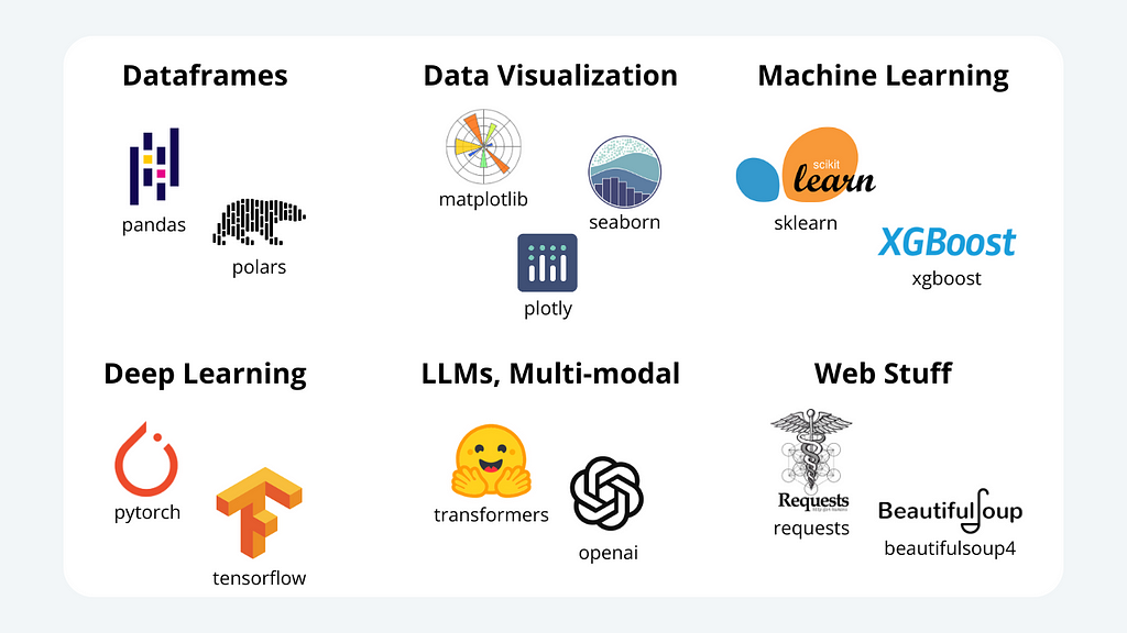
Several other libraries are commonly used in AI and data science. Here is a non-comprehensive overview of some helpful ones for building AI projects.
A non-comprehensive overview of Python libs for data science and AI. Image by author.
Example Code: Extracting summary and keywords from research papers
Now that we have been exposed to the basics of Python, let’s see how we can use it to implement a simple AI project. Here, I will use the OpenAI API to create a research paper summarizer and keyword extractor.
Like all the other snippets in this guide, the example code is available at the GitHub repository.
Install Dependencies
We start by installing a few helpful libraries. You can use the same my-env environment we created earlier or make a new one. Then, you can install all the required packages using the requirements.txt file from the {GitHub repo}.
pip install -r requirements.txt
This line of code scans each library listed in requirements.txt and installs each.
Imports
Next, we can create a new Python script and import the needed libraries.
import fitz  # PyMuPDF
import openai
import sys
Next, to use OpenAI’s Python API, we will need to import an AI key. Here’s one way to do that.
from sk import my_sk

# Set up your OpenAI API key
openai.api_key = my_sk
Note that sk is not a Python library. Rather, it is a separate Python script that defines a single variable, my_sk, which is a string consisting of my OpenAI API key i.e. a unique (and secret) token allowing one to use OpenAI’s API.
I shared a beginner-friendly introduction to APIs, OpenAI’s API, and setting up an API key in a previous article.
Next, we will create a function that, given the path to a research paper saved as a .pdf file, will extract the abstract from the paper.
# Function to read the first page of a PDF and extract the abstract
def extract_abstract(pdf_path):

    # Open the PDF file and grab text from the 1st page
    with fitz.open(pdf_path) as pdf:
        first_page = pdf[0]
        text = first_page.get_text("text")

    # Extract the abstract (assuming the abstract starts with 'Abstract')

    # find where abstract starts
    start_idx = text.lower().find('abstract')

    # end abstract at introduction if it exists on 1st page
    if 'introduction' in text.lower():
        end_idx = text.lower().find('introduction')
    else:
        end_idx = None

    # extract abstract text
    abstract = text[start_idx:end_idx].strip()

    # if abstract appears on 1st page return it, if not resturn None
    if start_idx != -1:
        abstract = text[start_idx:end_idx].strip()
        return abstract
    else:
        return None
Summarize with LLM
Now that we have our abstract text, we can use an LLM to summarize it and generate keywords. Here, I define a function to pass an abstract to OpenAI’s GPT-4o-mini model to do this.
# Function to summarize the abstract and generate keywords using OpenAI API def summarize_and_generate_keywords(abstract):
# Use OpenAI Chat Completions API to summarize and generate keywords prompt = f"Summarize the following paper abstract and generate (no more than 5) keywords:nn{abstract}"
# make api call response = openai.chat.completions.create( model="gpt-4o-mini", messages=[ {"role": "system", "content": "You are a helpful assistant."}, {"role": "user", "content": prompt} ], temperature = 0.25 )
Output: The paper introduces the Transformer, a novel network architecture for sequence transduction tasks that relies solely on attention mechanisms, eliminating the need for recurrent and convolutional structures. The Transformer demonstrates superior performance in machine translation tasks, achieving a BLEU score of 28.4 on the WMT 2014 English-to-German translation and a state-of-the-art score of 41.8 on the English-to-French translation task, while also being more efficient in training time. Additionally, the Transformer shows versatility by successfully applying to English constituency parsing with varying amounts of training data.
Designing asynchronous pipelines for efficient data processing
Note. This article already assumes that you are familiar with callbacks, promises, and have a basic understanding of the asynchronous paradigm in JavaScript.
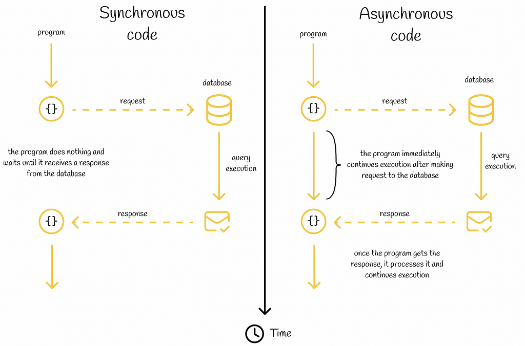
Introduction
The asynchronous mechanism is one of the most important concepts in JavaScript and programming in general. It allows a program to separately execute secondary tasks in the background without blocking the current thread from executing primary tasks. When a secondary task is completed, its result is returned and the program continues to run normally. In this context, such secondary tasks are called asynchronous.
Asynchronous tasks typically include making requests to external environments like databases, web APIs or operating systems. If the result of an asynchronous operation does not affect the logic of the main program, then instead of just waiting before the task will have completed, it is much better not to waste this time and continue executing primary tasks.
Nevertheless, sometimes the result of an asynchronous operation is used immediately in the next code lines. In such cases, the succeeding code lines should not be executed until the asynchronous operation is completed.
Depending on the program logic, some asynchronous requests can be blocking in regard to the following code
Note. Before getting to the main part of this article, I would like to provide the motivation for why asynchronicity is considered an important topic in Data Science and why I used JavaScript instead of Python to explain the async / await syntax.
# 01. Why to care about asynchronicity in Data Science?
Data engineering is an inseparable part of Data Science, which mainly consists of designing robust and efficient data pipelines. One of the typical tasks in data engineering includes making regular calls to APIs, databases, or other sources to retrieve data, process it, and store it somewhere.
Imagine a data source that encounters network issues and cannot return the requested data immediately. If we simply make the request in code to that service, we will have to wait quite a bit, while doing nothing. Would notit be better to avoid wasting precious processor time and execute another function, for example? This is where the power of asynchronicity comes into play, which will be the central topic of this article!
#02. Why JavaScript?
Nobody will deny the fact that Python is the most popular current choice for creating Data Science applications. Nevertheless, JavaScript is another language with a huge ecosystem that serves various development purposes, including building web applications that process data retrieved from other services. As it turns out, asynchronicity plays one of the most fundamental roles in JavaScript.
Furthermore, compared to Python, JavaScript has richer built-in support for dealing with asynchronicity and usually serves as a better example to dive deeper into this topic.
Finally, Python has a similar async / await construction. Therefore, the information presented in this article about JavaScript can also be transferable to Python for designing efficient data pipelines.
Asynchronous code in JavaScript
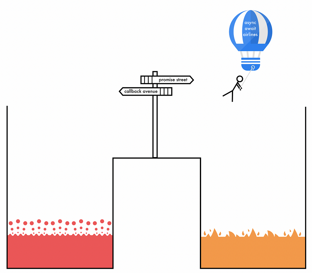
In the first versions of JavaScript, asynchronous code was mainly written with callbacks. Unfortunately, it led developers to a well-known problem named “callback hell”. A lot of times asynchronous code written with raw callbacks led to several nested code scopes which were extremely difficult to read. That is why in 2012 the JavaScript creators introduced promises.
Promises provide a convenient interface for asynchronous code development. A promise takes into a constructor an asynchronous function which is executed at a certain moment of time in the future. Before the function is executed, the promise is said to be in a pending state. Depending on whether the asynchronous function has been completed successfully or not, the promise changes its state to either fulfilled or rejected respectively. For the last two states, programmers can chain .then()and .catch() methods with a promise to declare the logic of how the result of the asynchronous function should be handled in different scenarios.
Promise state diagram
Apart from that, a group of promises can be chained by using combination methods like any(), all(), race(), etc.
Shortcomings of promises
Despite the fact that promises have become a significant improvement over callbacks, they are still not ideal, for several reasons:
Verbosity. Promises usually require writing a lot of boilerplate code. In some cases, creating a promise with a simple functionality requires a few extra lines of code because of its verbose syntax.
Readability. Having several tasks depending on each other leads to nesting promises one inside another. This infamous problem is very similar to the “callback hell” making code difficult to read and maintain. Furthermore, when dealing with error handling, it is usually hard to follow code logic when an error is propagated through several promise chains.
Debugging. By checking the stack trace output, it might be challenging to identify the source of an error inside promises as they do not usually provide clear error descriptions.
Integration with legacy libraries. Many legacy libraries in JavaScript were developed in the past to work with raw callbacks, thus not making it easily compatible with promises. If code is written by using promises, then additional code components should be created to provide compatibility with old libraries.
Both callback and promises can lead to the notorious “callback hell” problem
Async / await
For the most part, the async / await construction was added into JavaScript as synthetic sugar over promises. As the name suggests, it introduces two new code keywords:
async is used before the function signature and marks the function as asynchronous which always returns a promise (even if a promise is not returned explicitly as it will be wrapped implicitly).
await is used inside functions marked as async and is declared in the code before asynchronous operations which return a promise. If a line of code contains the await keyword, then the following code lines inside the async function will not be executed until the returned promise is settled (either in the fulfilled or rejected state). This makes sure that if the execution logic of the following lines depends on the result of the asynchronous operation, then they will not be run.
– The await keyword can be used several times inside an async function.
– If await is used inside a function that is not marked as async, the SyntaxErrorwill be thrown.
– The returned result of a function marked with await it the resolved value of a promise.
The async / await usage example is demonstrated in the snippet below.
// Async / await example.
// The code snippet prints start and end words to the console.

function getPromise() {
  return new Promise((resolve, reject) => {
    setTimeout(() => {
        resolve('end');
      },
    1000);
  });
}

// since this function is marked as async, it will return a promise
async function printInformation() {
  console.log('start');
  const result = await getPromise();
  console.log(result) // this line will not be executed until the promise is resolved
}
It is important to understand that await does not block the main JavaScript thread from execution. Instead, it only suspends the enclosing async function (while other program code outside the async function can be run).
Error handling
The async / await construction provides a standard way for error handling with try / catch keywords. To handle errors, it is necessary to wrap all the code that can potentially cause an error (including await declarations) in the try block and write corresponding handle mechanisms in the catch block.
In practice, error handling with try / catch blocks is easier and more readable than achieving the same in promises with .catch() rejection chaining.
// Error handling template inside an async function

async function functionOne() {
  try {
    ...
    const result = await functionTwo()
  } catch (error) {
    ...
  }
}
Promises vs async / await
async / await is a great alternative to promises. They eliminate the aforementioned shortcomings of promises: the code written with async / await is usually more readable, and maintainable and is a preferable choice for most software engineers.
Simple syntax of async / await eliminates the “callback hell” problem.
However, it would be incorrect to deny the importance of promises in JavaScript: in some situations, they are a better option, especially when working with functions returning a promise by default.
Code interchangeability
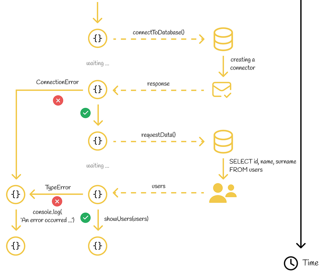
Let us look at the same code written with async / await and promises. We will assume that our program connects to a database and in case of an established connection it requests data about users to further display them in the UI.
// Example of asynchronous requests handled by async / await

async function functionOne() {
  try {
    ...
    const result = await functionTwo()
  } catch (error) {
    ...
  }
}
Both asynchronous requests can be easily wrapped by using the await syntax. At each of these two steps, the program will stop code execution until the response is retrieved.
Since something wrong can happen during asynchronous requests (broken connection, data inconsistency, etc.), we should wrap the whole code fragment into a try / catch block. If an error is caught, we display it to the console.
Activity diagram
Now let us write the same code fragment with promises:
// Example of asynchronous requests handled by promises
This nested code looks more verbose and harder to read. In addition, we can notice that every await statement was transformed into a corresponding then() method and that the catch block is now located inside the .catch() method of a promise.
Following the same logic, every async / await code can be rewritten with promises. This statement demonstrates the fact that async / await is just synthetic sugar over promises.
Code written with async / await can be transformed into the promise syntax where each await declaration would correspond to a separate .then() method and exception handling would be performed in the .catch() method.
Fetch example
In this section, we will have a look a real example of how async / await works.
Firstly, let us declare a function that will retrieve the main information from the JSON. We are interested in retrieving information regarding the country’s name, its capital, area and population. The JSON is returned in the form of an array where the first object contains all the necessary information. We can access the aforementioned properties by accessing the object’s keys with corresponding names.
Then we will use the fetch API to perform HTTP requests. Fetch is an asynchronous function which returns a promise. Since we immediately need the data returned by fetch, we must wait until the fetch finishes its job before executing the following code lines. To do that, we use the await keyword before fetch.
// Fetch example with async / await

const getCountryDescription = async function (country) {
  try {
    const response = await fetch(
      `https://restcountries.com/v3.1/name/${country}`
    );
    if (!response.ok) {
      throw new Error(`Bad HTTP status of the request (${response.status}).`);
    }
    const data = await response.json();
    console.log(retrieveInformation(data));
  } catch (error) {
    console.log(
      `An error occurred while processing the request.nError message: ${error.message}`
    );
  }
};
Similarly, we place another await before the .json() method to parse the data which is used immediately after in the code. In case of a bad response status or inability to parse the data, an error is thrown which is then processed in the catch block.
For demonstration purposes, let us also rewrite the code snippet by using promises:
// Fetch example with promises

const getCountryDescription = function (country) {
  fetch(`https://restcountries.com/v3.1/name/${country}`)
    .then((response) => {
      if (!response.ok) {
        throw new Error(`Bad HTTP status of the request (${response.status}).`);
      }
      return response.json();
    })
    .then((data) => {
      console.log(retrieveInformation(data));
    })
    .catch((error) => {
      console.log(
        `An error occurred while processing the request. Error message: ${error.message}`
      );
    });
};
Calling an either function with a provided country name will print its main information:
// The result of calling getCountryDescription("Argentina")
In this article, we have covered the async / await construction in JavaScript which appeared in the language in 2017. Having appeared as an improvement over promises, it allows writing asynchronous code in a synchronous manner eliminating nested code fragments. Its correct usage combined with promises results in a powerful blend making the code as clean as possible.
Lastly, the information presented in this article about JavaScript is also valuable for Python as well, which has the same async / await construction. Personally, if someone wants to dive deeper into asynchronicity, I would recommend focusing more on JavaScript than on Python. Being aware of the abundant tools that exist in JavaScript for developing asynchronous applications provides an easier understanding of the same concepts in other programming languages.
A python tool to tune and visualize the threshold choices for binary and multi-class classification problems
Adjusting the thresholds used in classification problems (that is, adjusting the cut-offs in the probabilities used to decide between predicting one class or another) is a step that’s sometimes forgotten, but is quite easy to do and can significantly improve the quality of a model. It’s a step that should be performed with most classification problems (with some exceptions depending on what we wish to optimize for, described below).
In this article, we look closer at what’s actually happening when we do this — with multi-class classification particularly, this can be a bit nuanced. And we look at an open source tool, written by myself, called ClassificationThesholdTuner, that automates and describes the process to users.
Given how common the task of tuning the thresholds is with classification problems, and how similar the process usually is from one project to another, I’ve been able to use this tool on many projects. It eliminates a lot of (nearly duplicate) code I was adding for most classification problems and provides much more information about tuning the threshold that I would have otherwise.
Although ClassificationThesholdTuner is a useful tool, you may find the ideas behind the tool described in this article more relevant — they’re easy enough to replicate where useful for your classification projects.
In a nutshell, ClassificationThesholdTuner is a tool to optimally set the thresholds used for classification problems and to present clearly the effects of different thresholds. Compared to most other available options (and the code we would most likely develop ourselves for optimizing the threshold), it has two major advantages:
It provides visualizations, which help data scientists understand the implications of using the optimal threshold that’s discovered, as well as alternative thresholds that may be selected. This can also be very valuable when presenting the modeling decisions to other stakeholders, for example where it’s necessary to find a good balance between false positives and false negatives. Frequently business understanding, as well as data modeling knowledge, is necessary for this, and having a clear and full understanding of the choices for threshold can facilitate discussing and deciding on the best balance.
It supports multi-class classification, which is a common type of problem in machine learning, but is more complicated with respect to tuning the thresholds than binary classification (for example, it requires identifying multiple thresholds). Optimizing the thresholds used for multi-class classification is, unfortunately, not well-supported by other tools of this type.
Although supporting multi-class classification is one of the important properties of ClassificationThesholdTuner, binary classification is easier to understand, so we’ll begin by describing this.
What are the thresholds used in classification?
Almost all modern classifiers (including those in scikit-learn, CatBoost, LGBM, XGBoost, and most others) support producing both predictions and probabilities.
For example, if we create a binary classifier to predict which clients will churn in the next year, then for each client we can generally produce either a binary prediction (a Yes or a No for each client), or can produce a probability for each client (e.g. one client may be estimated to have a probability of 0.862 of leaving in that time frame).
Given a classifier that can produce probabilities, even where we ask for binary predictions, behind the scenes it will generally actually produce a probability for each record. It will then convert the probabilities to class predictions.
By default, binary classifiers will predict the positive class where the predicted probability of the positive class is greater than or equal to 0.5, and the negative class where the probability is under 0.5. In this example (predicting churn), it would, by default, predict Yes if the predicted probability of churn is ≥ 0.5 and No otherwise.
However, this may not be the ideal behavior, and often a threshold other than 0.5 can work preferably, possibly a threshold somewhat lower or somewhat higher, and sometimes a threshold substantially different from 0.5. This can depend on the data, the classifier built, and the relative importance of false positives vs false negatives.
In order to create a strong model (including balancing well the false positives and false negatives), we will often wish to optimize for some metric, such as F1 Score, F2 Score (or others in the family of f-beta metrics), Matthews Correlation Coefficient (MCC), Kappa Score, or another. If so, a major part of optimizing for these metrics is setting the threshold appropriately, which will most often set it to a value other than 0.5. We’ll describe soon how this works.
Scikit-learn’s tools can be considered convenience methods, as they’re not strictly necessary; as indicated, tuning is fairly straightforward in any case (at least for the binary classification case, which is what these tools support). But, having them is convenient — it is still quite a bit easier to call these than to code the process yourself.
ClassificationThresholdTuner was created as an alternative to these, but where scikit-learn’s tools work well, they are very good choices as well. Specifically, where you have a binary classification problem, and don’t require any explanations or descriptions of the threshold discovered, scikit-learn’s tools can work perfectly, and may even be slightly more convenient, as they allow us to skip the small step of installing ClassificationThresholdTuner.
ClassificationThresholdTuner may be more valuable where explanations of the thresholds found (including some context related to alternative values for the threshold) are necessary, or where you have a multi-class classification problem.
As indicated, it also may at times be the case that the ideas described in this article are what is most valuable, not the specific tools, and you may be best to develop your own code — perhaps along similar lines, but possibly optimized in terms of execution time to more efficiently handle the data you have, possibly more able support other metrics to optimize for, or possibly providing other plots and descriptions of the threshold-tuning process, to provide the information relevant for your projects.
Thresholds in Binary Classification
With most scikit-learn classifiers, as well as CatBoost, XGBoost, and LGBM, the probabilities for each record are returned by calling predict_proba(). The function outputs a probability for each class for each record. In a binary classification problem, they will output two probabilities for each record, for example:
[[0.6, 0.4],
 [0.3, 0.7],
 [0.1, 0.9],
  …
]
For each pair of probabilities, we can take the first as the probability of the negative class and the second as the probability of the positive class.
However, with binary classification, one probability is simply 1.0 minus the other, so only the probabilities of one of the classes are strictly necessary. In fact, when working with class probabilities in binary classification problems, we often use only the probabilities of the positive class, so could work with an array such as: [0.4, 0.7, 0.9, …].
Thresholds are easy to understand in the binary case, as they can be viewed simply as the minimum predicted probability needed for the positive class to actually predict the positive class (in the churn example, to predict customer churn). If we have a threshold of, say, 0.6, it’s then easy to convert the array of probabilities above to predictions, in this case, to: [No, Yes, Yes, ….].
By using different thresholds, we allow the model to be more, or less, eager to predict the positive class. If a relatively low threshold, say, 0.3 is used, then the model will predict the positive class even when there’s only a moderate chance this is correct. Compared to using 0.5 as the threshold, more predictions of the positive class will be made, increasing both true positives and false positives, and also reducing both true negatives and false negatives.
In the case of churn, this can be useful if we want to focus on catching most cases of churn, even though doing so, we also predict that many clients will churn when they will not. That is, a low threshold is good where false negatives (missing churn) is more of a problem than false positives (erroneously predicting churn).
Setting the threshold higher, say to 0.8, will have the opposite effect: fewer clients will be predicted to churn, but of those that are predicted to churn, a large portion will quite likely actually churn. We will increase the false negatives (miss some who will actually churn), but decrease the false positives. This can be appropriate where we can only follow up with a small number of potentially-churning clients, and want to label only those that are most likely to churn.
There’s almost always a strong business component to the decision of where to set the threshold. Tools such as ClassificationThresholdTuner can make these decisions more clear, as there’s otherwise not usually an obvious point for the threshold. Picking a threshold, for example, simply based on intuition (possibly determining 0.7 feels about right) will not likely work optimally, and generally no better than simply using the default of 0.5.
Setting the threshold can be a bit unintuitive: adjusting it a bit up or down can often help or hurt the model more than would be expected. Often, for example, increasing the threshold can greatly decrease false positives, with only a small effect on false negatives; in other cases the opposite may be true. Using a Receiver Operator Curve (ROC) is a good way to help visualize these trade-offs. We’ll see some examples below.
Ultimately, we’ll set the threshold so as to optimize for some metric (such as F1 score). ClassificationThresholdTuner is simply a tool to automate and describe that process.
AUROC and F1 Scores
In general, we can view the metrics used for classification as being of three main types:
Those that examine how well-ranked the prediction probabilities are, for example: Area Under Receiver Operator Curve (AUROC), Area Under Precision Recall Curve (AUPRC)
Those that examine how well-calibrated the prediction probabilities are, for example: Brier Score, Log Loss
Those that look at how correct the predicted labels are, for example: F1 Score, F2 Score, MCC, Kappa Score, Balanced Accuracy
The first two categories of metric listed here work based on predicted probabilities, and the last works with predicted labels.
While there are numerous metrics within each of these categories, for simplicity, we will consider for the moment just two of the more common, the Area Under Receiver Operator Curve (AUROC) and the F1 score.
These two metrics have an interesting relationship (as does AUROC with other metrics based on predicted labels), which ClassificationThresholdTuner takes advantage of to tune and to explain the optimal thresholds.
The idea behind ClassificationThresholdTuner is to, once the model is well-tuned to have a strong AUROC, take advantage of this to optimize for other metrics — metrics that are based on predicted labels, such as the F1 score.
Metrics Based on Predicted Labels
Very often metrics that look at how correct the predicted labels are are the most relevant for classification. This is in cases where the model will be used to assign predicted labels to records and what’s relevant is the number of true positives, true negatives, false positives, and false negatives. That is, if it’s the predicted labels that are used downstream, then once the labels are assigned, it’s no longer relevant what the underlying predicted probabilities were, just these final label predictions.
For example, if the model assigns labels of Yes and No to clients indicating if they’re expected to churn in the next year and the clients with a prediction of Yes receive some treatment and those with a prediction of No do not, what’s most relevant is how correct these labels are, not in the end, how well-ranked or well-calibrated the prediction probabilities (that these class predications are based on) were. Though, how well-ranked the predicted probabilities are is relevant, as we’ll see, to assign predicted labels accurately.
This isn’t true for every project: often metrics such as AUROC or AUPRC that look at how well the predicted probabilities are ranked are the most relevant; and often metrics such as Brier Score and Log Loss that look at how accurate the predicted probabilities are most relevant.
Tuning the thresholds will not affect these metrics and, where these metrics are the most relevant, there is no reason to tune the thresholds. But, for this article, we’ll consider cases where the F1 score, or another metric based on the predicted labels, is what we wish to optimize.
ClassificationThresholdTuner starts with the predicted probabilities (the quality of which can be assessed with the AUROC) and then works to optimize the specified metric (where the specified metric is based on predicted labels).
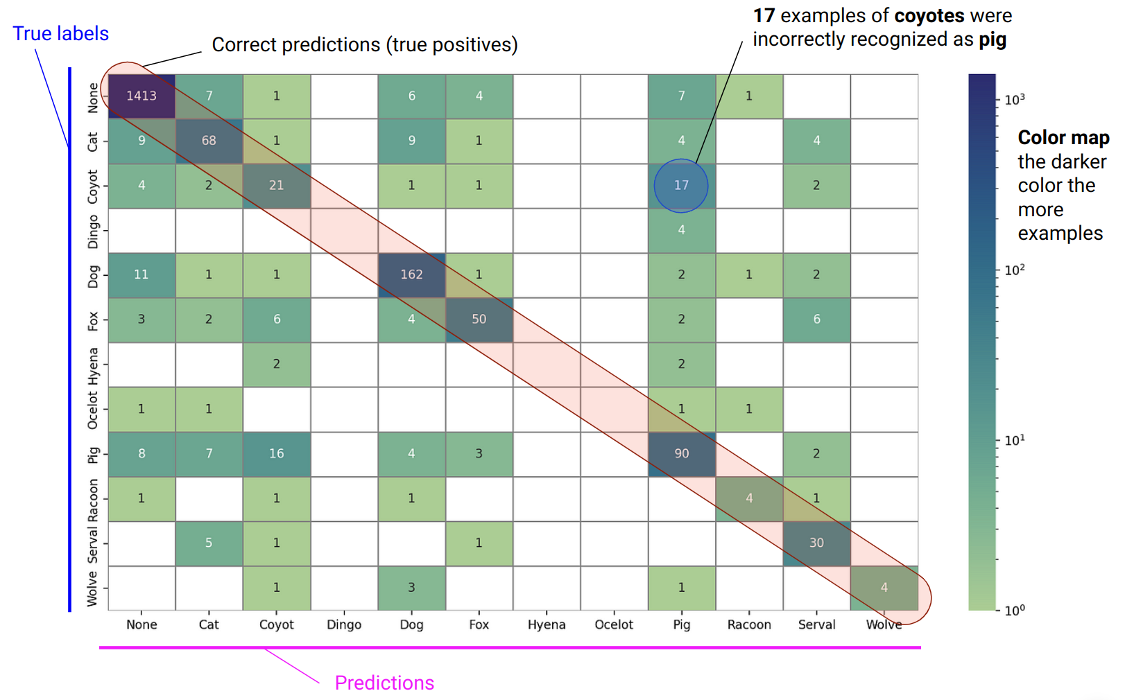
Metrics based on the correctness of the predicted labels are all, in different ways, calculated from the confusion matrix. The confusion matrix, in turn, is based on the threshold selected, and can look quite quite different depending if a low or high threshold is used.
Adjusting the Threshold
The AUROC metric is, as the name implies, based on the ROC, a curve showing how the true positive rate relates to the false positive rate. An ROC curve doesn’t assume any specific threshold is used. But, each point on the curve corresponds to a specific threshold.
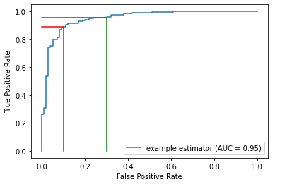
In the plot below, the blue curve is the ROC. The area under this curve (the AUROC) measures how strong the model is generally, averaged over all potential thresholds. It measures how well ranked the probabilities are: if the probabilities are well-ranked, records that are assigned higher predicted probabilities of being in the positive class are, in fact, more likely to be in the positive class.
For example, an AUROC of 0.95 means a random positive sample has a 95% chance of being ranked higher than random negative sample.
First, having a model with a strong AUROC is important — this is the job of the model tuning process (which may actually optimize for other metrics). This is done before we begin tuning the threshold, and coming out of this, it’s important to have well-ranked probabilities, which implies a high AUROC score.
Then, where the project requires class predictions for all records, it’s necessary to select a threshold (though the default of 0.5 can be used, but likely with sub-optimal results), which is equivalent to picking a point on the ROC curve.
The figure above shows two points on the ROC. For each, a vertical and a horizonal line are drawn to the x & y-axes to indicate the associated True Positive Rates and False Positive Rates.
Given an ROC curve, as we go left and down, we are using a higher threshold (for example from the green to the red line). Less records will be predicted positive, so there will be both less true positives and less false positives.
As we move right and up (for example, from the red to the green line), we are using a lower threshold. More records will be predicted positive, so there will be both more true positives and more false positives.
That is, in the plot here, the red and green lines represent two possible thresholds. Moving from the green line to the red, we see a small drop in the true positive rate, but a larger drop in the false positive rate, making this quite likely a better choice of threshold than that where the green line is situated. But not necessarily — we also need to consider the relative cost of false positives and false negatives.
What’s important, though, is that moving from one threshold to another can often adjust the False Positive Rate much more or much less than the True Positive Rate.
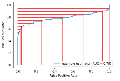
The following presents a set of thresholds with a given ROC curve. We can see where moving from one threshold to another can affect the true positive and false positive rates to significantly different extents.
This is the main idea behind adjusting the threshold: it’s often possible to achieve a large gain in one sense, while taking only a small loss in the other.
It’s possible to look at the ROC curve and see the effect of moving the thresholds up and down. Given that, it’s possible, to an extent, to eye-ball the process and pick a point that appears to best balance true positives and false positives (which also effectively balances false positives and false negatives). In some sense, this is what ClassificationThesholdTuner does, but it does so in a principled way, in order to optimize for a certain, specified metric (such as the F1 score).
Moving the threshold to different points on the ROC generates different confusion matrixes, which can then be converted to metrics (F1 Score, F2 score, MCC etc.). We can then take the point that optimizes this score.
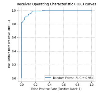
So long as a model is trained to have a strong AUROC, we can usually find a good threshold to achieve a high F1 score (or other such metric).
In this ROC plot, the model is very accurate, with an AUROC of 0.98. It will, then, be possible to select a threshold that results in a high F1 score, though it is still necessary to select a good threshold, and the optimal may easily not be 0.5.
Being well-ranked, the model is not necessarily also well-calibrated, but this isn’t necessary: so long as records that are in the positive class tend to get higher predicted probabilities than those in the negative class, we can find a good threshold where we separate those predicted to be positive from those predicted to be negative.
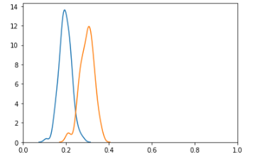
Looking at this another way, we can view the distribution of probabilities in a binary classification problem with two histograms, as shown here (actually using KDE plots). The blue curve shows the distribution of probabilities for the negative class and the orange for the positive class. The model is not likely well-calibrated: the probabilities for the positive class are consistently well below 1.0. But, they are well-ranked: the probabilities for the positive class tend to be higher than those for the negative class, which means the model would have a high AUROC and the model can assign labels well if using an appropriate threshold, in this case, likely about 0.25 or 0.3. Given that there is overlap in the distributions, though, it’s not possible to have a perfect system to label the records, and the F1 score can never be quite 1.0.
It is possible to have, even with a high AUROC score, a low F1 score: where there is a poor choice of threshold. This can occur, for example, where the ROC hugs the axis as in the ROC shown above — a very low or very high threshold may work poorly. Hugging the y-axis can also occur where the data is imbalanced.
In the case of the histograms shown here, though the model is well-calibrated and would have a high AUROC score, a poor choice of threshold (such as 0.5 or 0.6, which would result in everything being predicted as the negative class) would result in a very low F1 score.
It’s also possible (though less likely) to have a low AUROC and high F1 Score. This is possible with a particularly good choice of threshold (where most thresholds would perform poorly).
As well, it’s not common, but possible to have ROC curves that are asymmetrical, which can greatly affect where it is best to place the threshold.
Example using ClassificationThresholdTuner for Binary Classification
This is taken from a notebook available on the github site (where it’s possible to see the full code). We’ll go over the main points here. For this example, we first generate a test dataset.
import pandas as pd import numpy as np import matplotlib.pyplot as plt import seaborn as sns from threshold_tuner import ClassificationThresholdTuner
Here, for simplicity, we don’t generate the original data or the classifier that produced the predicted probabilities, just a test dataset containing the true labels and the predicted probabilities, as this is what ClassificationThresholdTuner works with and is all that is necessary to select the best threshold.
There’s actually also code in the notebook to scale the probabilities, to ensure they are between 0.0 and 1.0, but for here, we’ll just assume the probabilities are well-scaled.
We can then set the Pred column using a threshold of 0.5:
This simulates what’s normally done with classifiers, simply using 0.5 as the threshold. This is the baseline we will try to beat.
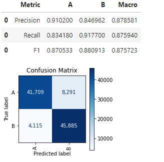
We then create a ClassificationThresholdTuner object and use this, to start, just to see how strong the current predictions are, calling one of it’s APIs, print_stats_lables().
This indicates the precision, recall, and F1 scores for both classes (was well as the macro scores for these) and presents the confusion matrix.
This API assumes the labels have been predicted already; where only the probabilities are available, this method cannot be used, though we can always, as in this example, select a threshold and set the labels based on this.
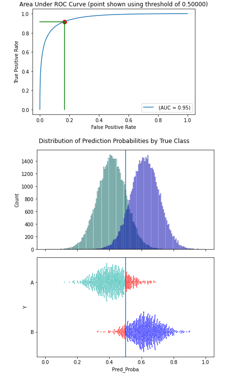
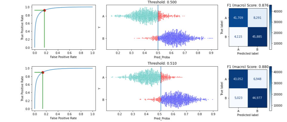
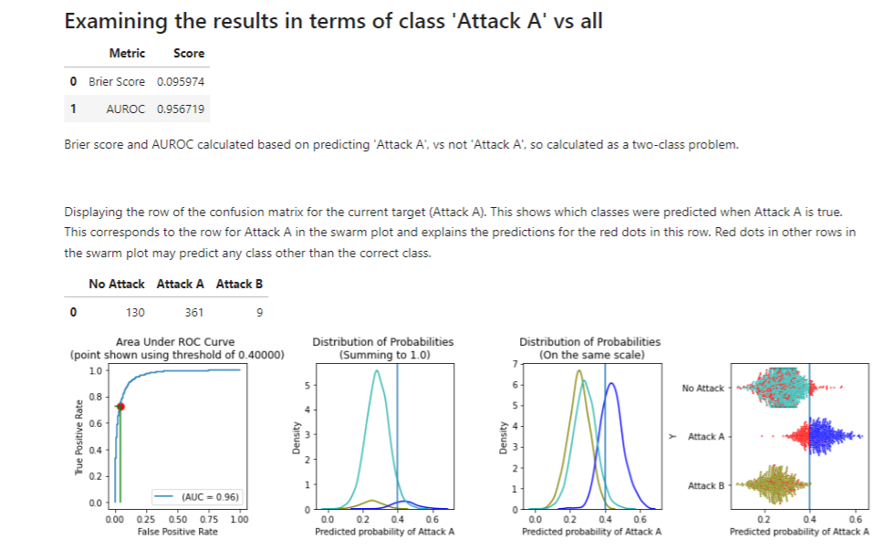
We can also call the print_stats_proba() method, which also presents some metrics, in this case related to the predicted probabilities. It shows: the Brier Score, AUROC, and several plots. The plots require a threshold, though 0.5 is used if not specified, as in this example:
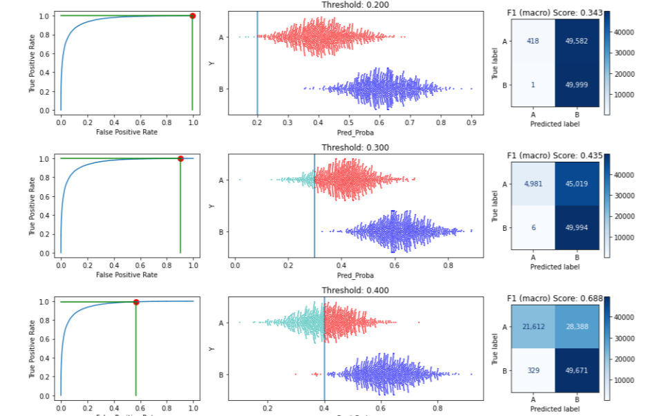
This displays the effects of a threshold of 0.5. It shows the ROC curve, which itself does not require a threshold, but draws the threshold on the curve. It then presents how the data is split into two predicted classes based on the threshold, first as a histogram, and second as a swarm plot. Here there are two classes, with class A in green and class B (the positive class in this example) in blue.
In the swarm plot, any misclassified records are shown in red. These are those where the true class is A but the predicted probability of B is above the threshold (so the model would predict B), and those where the true class is B but the predicted probability of B is below the threshold (so the model would predict A).
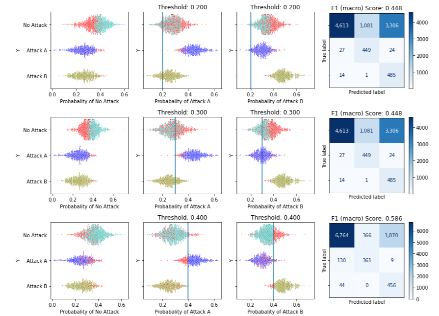
We can then examine the effects of different thresholds using plot_by_threshold():
In this example, we use the default set of potential thresholds: 0.1, 0.2, 0.3, … up to 0.9. For each threshold, it will predict any records with predicted probabilities over the threshold as the positive class and anything lower as the negative class. Misclassified records are shown in red.
To save space in this article, this image shows just three potential thresholds: 0.2, 0.3, and 0.4. For each we see: the position on the ROC curve this threshold represents, the split in the data it leads to, and the resulting confusion matrix (along with the F1 macro score associated with that confusion matrix).
We can see that setting the threshold to 0.2 results in almost everything being predicted as B (the positive class) — almost all records of class A are misclassified and so drawn in red. As the threshold is increased, more records are predicted to be A and less as B (though at 0.4 most records that are truly B are correctly predicted as B; it is not until a threshold of about 0.8 where almost all records that are truly class B are erroneously predicted as A: very few have predicted probability over 0.8).
Examining this for nine possible values from 0.1 to 0.9 gives a good overview of the possible thresholds, but it may be more useful to call this function to display a narrower, and more realistic, range of possible values, for example:
This will show each threshold from 0.50 to 0.55. Showing the first two of these:
The API helps present the implications of different thresholds.
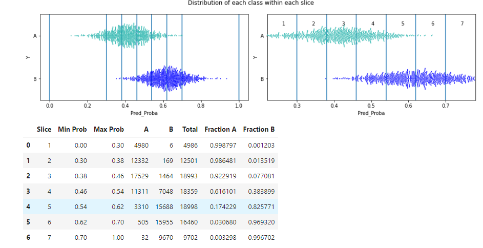
We can also view this calling describe_slices(), which describes the data between pairs of potential thresholds (i.e., within slices of the data) in order to see more clearly what the specific changes will be of moving the threshold from one potential location to the next (we see how many of each true class will be re-classified).
This shows each slice visually and in table format:
Here, the slices are fairly thin, so we see plots both showing them in context of the full range of probabilities (the left plot) and zoomed in (the right plot).
We can see, for example, that moving the threshold from 0.38 to 0.46 we would re-classify the points in the 3rd slice, which has 17,529 true instances of class A and 1,464 true instances of class B. This is evident both in the rightmost swarm plot and in the table (in the swarm plot, there are far more green than blue points within slice 3).
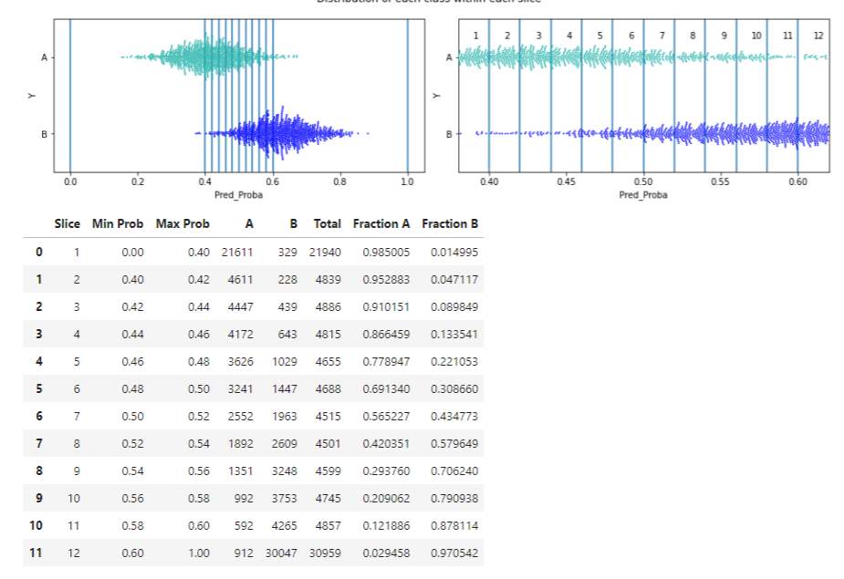
This API can also be called for a narrower, and more realistic, range of potential thresholds:
Having called these (or another useful API, print_stats_table(), skipped here for brevity, but described on the github page and in the example notebooks), we can have some idea of the effects of moving the threshold.
We can then move to the main task, searching for the optimal threshold, using the tune_threshold() API. With some projects, this may actually be the only API called. Or it may be called first, with the above APIs being called later to provide context for the optimal threshold discovered.
In this example, we optimize the F1 macro score, though any metric supported by scikit-learn and based on class labels is possible. Some metrics require additional parameters, which can be passed here as well. In this example, scikit-learn’s f1_score() requires the ‘average’ parameter, passed here as a parameter to tune_threshold().
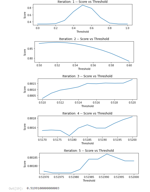
This, optionally, displays a set of plots demonstrating how the method over five iterations (in this example max_iterations is specified as 5) narrows in on the threshold value that optimizes the specified metric.
The first iteration considers the full range of potential thresholds between 0.0 and 1.0. It then narrows in on the range 0.5 to 0.6, which is examined closer in the next iteration and so on. In the end a threshold of 0.51991 is selected.
After this, we can call print_stats_labels() again, which shows:
We can see, in this example, an increase in Macro F1 score from 0.875 to 0.881. In this case, the gain is small, but comes for almost free. In other cases, the gain may be smaller or larger, sometimes much larger. It’s also never counter-productive; at worst the optimal threshold found will be the default, 0.5000, in any case.
Thresholds in Multi-class Classification
As indicated, multi-class classification is a bit more complicated. In the binary classification case, a single threshold is selected, but with multi-class classification, ClassificationThesholdTuner identifies an optimal threshold per class.
Also different from the binary case, we need to specify one of the classes to be the default class. Going through an example should make it more clear why this is the case.
In many cases, having a default class can be fairly natural. For example, if the target column represents various possible medical conditions, the default class may be “No Issue” and the other classes may each relate to specific conditions. For each of these conditions, we’d have a minimum predicted probability we’d require to actually predict that condition.
Or, if the data represents network logs and the target column relates to various intrusion types, then the default may be “Normal Behavior”, with the other classes each relating to specific network attacks.
In the example of network attacks, we may have a dataset with four distinct target values, with the target column containing the classes: “Normal Behavior”, “Buffer Overflow”, “Port Scan”, and “Phishing”. For any record for which we run prediction, we will get a probability of each class, and these will sum to 1.0. We may get, for example: [0.3, 0.4, 0.1, 0.2] (the probabilities for each of the four classes, in the order above).
Normally, we would predict “Buffer Overflow” as this has the highest probability, 0.4. However, we can set a threshold in order to modify this behavior, which will then affect the rate of false negatives and false positives for this class.
We may specify, for example that: the default class is ‘Normal Behavior”; the threshold for “Buffer Overflow” is 0.5; for “Port Scan” is 0.55; and for “Phishing” is 0.45. By convention, the threshold for the default class is set to 0.0, as it does not actually use a threshold. So, the set of thresholds here would be: 0.0, 0.5, 0.55, 0.45.
Then to make a prediction for any given record, we consider only the classes where the probability is over the relevant threshold. In this example (with predictions [0.3, 0.4, 0.1, 0.2]), none of the probabilities are over their thresholds, so the default class, “Normal Behavior” is predicted.
If the predicted probabilities were instead: [0.1, 0.6, 0.2, 0.1], then we would predict “Buffer Overflow”: the probability (0.6) is the highest prediction and is over its threshold (0.5).
If the predicted probabilities were: [0.1, 0.2, 0.7, 0.0], then we would predict “Port Scan”: the probability (0.7) is over its threshold (0.55) and this is the highest prediction.
This means: if one or more classes have predicted probabilities over their threshold, we take the one of these with the highest predicted probability. If none are over their threshold, we take the default class. And, if the default class has the highest predicted probability, it will be predicted.
So, a default class is needed to cover the case where none of the predictions are over the the threshold for that class.
If the predictions are: [0.1, 0.3, 0.4, 0.2] and the thresholds are: 0.0, 0.55, 0.5, 0.45, another way to look at this is: the third class would normally be predicted: it has the highest predicted probability (0.4). But, if the threshold for that class is 0.5, then a prediction of 0.4 is not high enough, so we go to the next highest prediction, which is the second class, with a predicted probability of 0.3. That is below its threshold, so we go again to the next highest predicted probability, which is the forth class with a predicted probability of 0.2. It is also below the threshold for that target class. Here, we have all classes with predictions that are fairly high, but not sufficiently high, so the default class is used.
This also highlights why it’s convenient to use 0.0 as the threshold for the default class — when examining the prediction for the default class, we do not need to consider if its prediction is under or over the threshold for that class; we can always make a prediction of the default class.
It’s actually, in principle, also possible to have more complex policies — not just using a single default class, but instead having multiple classes that can be selected under different conditions. But these are beyond the scope of this article, are often unnecessary, and are not supported by ClassificationThresholdTuner, at least at present. For the remainder of this article, we’ll assume there’s a single default class specified.
Example using ClassificationThresholdTuner for Multi-class Classification
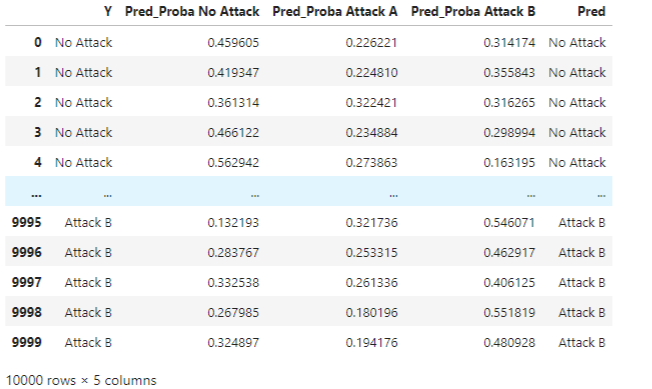
Again, we’ll start by creating the test data (using one of the test data sets provided in the example notebook for multi-class classification on the github page), in this case, having three, instead of just two, target classes:
import pandas as pd import numpy as np import matplotlib.pyplot as plt import seaborn as sns from threshold_tuner import ClassificationThresholdTuner
There’s some code in the notebook to scale the scores and ensure they sum to 1.0, but for here, we can just assume this is done and that we have a set of well-formed probabilities for each class for each record.
As is common with real-world data, one of the classes (the ‘No Attack’ class) is much more frequent than the others; the dataset in imbalanced.
We then set the target predictions, for now just taking the class with the highest predicted probability:
def set_class_prediction(d):
    max_cols = d[proba_cols].idxmax(axis=1)
    max_cols = [x[len("Pred_Proba_"):] for x in max_cols]
    return max_cols

d['Pred'] = set_class_prediction(d)
This produces:
Taking the class with the highest probability is the default behaviour, and in this example, the baseline we wish to beat.
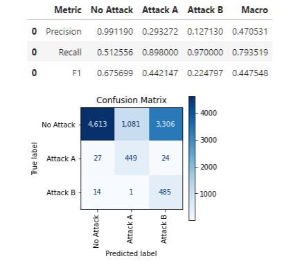
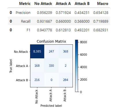
We can, as with the binary case, call print_stats_labels(), which works similarly, handling any number of classes:
Using these labels, we get an F1 macro score of only 0.447.
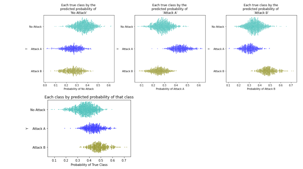
Calling print_stats_proba(), we also get the output related to the prediction probabilities:
This is a bit more involved than the binary case, since we have three probabilities to consider: the probabilities of each class. So, we first show how the data lines up relative to the probabilities of each class. In this case, there are three target classes, so three plots in the first row.
As would be hoped, when plotting the data based on the predicted probability of ‘No Attack’ (the left-most plot), the records for ‘No Attack’ are given a higher probabilities of this class than for other classes. Similar for ‘Attack A’ (the middle plot) and ‘Attack B’ (the right-most plot).
We can also see that the classes are not perfectly separated, so there is no set of thresholds that can result in a perfect confusion matrix. We will need to chose a set of thresholds that best balances correct and incorrect predictions for each class.
In the figure above, the bottom plot shows each point based on the probability of its true class. So for the the records where the true class is ‘No Attack’ (the green points), we plot these by their predicted probability of ‘No Attack’, for the records where the true class is ‘Attack A’, (in dark blue) we plot these by their predicted probability of ‘Attack A’, and similar for Attack B (in dark yellow). We see that the model has similar probabilities for Attack A and Attack B, and higher probabilities for these than for No Attack.
The above plots did not consider any specific thresholds that may be used. We can also, optionally, generate more output, passing a set of thresholds (one per class, using 0.0 for the default class):
This may be most useful to plot the set of thresholds discovered as optimal by the tool, but can also be used to view other potential sets of thresholds.
This produces a report for each class. To save space, we just show one here, for class Attack A (the full report is shown in the example notebook; viewing the reports for the other two classes as well is helpful to understand the full implications of using, in this example, [0.0, 0.4, 0.4] as the thresholds):
As we have a set of thresholds specified here, we can see the implications of using these thresholds, including how many of each class will be correctly and incorrectly classified.
We see first where the threshold appears on the ROC curve. In this case, we are viewing the report for Class A so see a threshold of 0.4 (0.4 was specified for class A in the API call above).
The AUROC score is also shown. This metric applies only to binary prediction, but in a multi-class problem we can calculate the AUROC score for each class by treating the problem as a series of one-vs-all problems. Here we can treat the problem as ‘Attack A’ vs not ‘Attack A’ (and similarly for the other reports).
The next plots show the distribution of each class with respect to the predicted probabilities of Attack A. As there are different counts of the different classes, these are shown two ways: one showing the actual distributions, and one showing them scaled to be more comparable. The former is more relevant, but the latter can allow all classes to be seen clearly where some classes are much more rare than others.
We can see that records where the true class is ‘Attack A’ (in dark blue) do have higher predicted probabilities of ‘Attack A’, but there is some decision to be made as to where the threshold is specifically placed. We see here the effect using 0.4 for this class. It appears that 0.4 is likely close to ideal, if not exactly.
We also see this in the form a swarm plot (the right-most plot), with the misclassified points in red. We can see that using a higher threshold (say 0.45 or 0.5), we would have more records where the true class is Attack A misclassified, but less records where the true class is ‘No Attack’ misclassified. And, using a lower threshold (say 0.3 or 0.35) would have the opposite effect.
We can also call plot_by_threshold() to look at different potential thresholds:
This API is simply for explanation and not tuning, so for simplicity uses (for each potential threshold), the same threshold for each class (other than the default class). Showing this for the potential thresholds 0.2, 0.3, and 0.4:
The first row of figures shows the implication of using 0.2 for the threshold for all classes other than the default (that is not predicting Attack A unless the estimated probability of Attack A is at least 0.2; and not predicting Attack B unless the predicted probability of Attack B is at least 0.2 — though always otherwise taking the class with the highest predicted probability). Similarly in the next two rows for thresholds of 0.3 and 0.4.
We can see here the trade-offs to using lower or higher thresholds for each class, and the confusion matrixes that will result (along with the F1 score associated with these confusion matrixes).
In this example, moving from 0.2 to 0.3 to 0.4, we can see how the model will less often predict Attack A or Attack B (raising the thresholds, we will less and less often predict anything other than the default) and more often No Attack, which results in less misclassifications where the true class is No Attack, but more where the true class is Attack A or Attack B.
When the threshold is quite low, such as 0.2, then of those records where the true class is the default, only those with the highest predicted probability of the class being No Attack (about the top half) were predicted correctly.
Once the threshold is set above about 0.6, nearly everything is predicted as the default class, so all cases where the ground truth is the default class are correct and all others are incorrect.
As expected, setting the thresholds higher means predicting the default class more often and missing less of these, though missing more of the other classes. Attack A and B are generally predicted correctly when using low thresholds, but mostly incorrectly when using higher thresholds.
To tune the thresholds, we again use tune_threshold(), with code such as:
This outputs: [0.0, 0.41257, 0.47142]. That is, it found a threshold of about 0.413 for Attack A, and 0.471 for Attack B works best to optimize for the specified metric, macro F1 score in this case.
The macro F1 score, using the thresholds discovered here, has improved from about 0.44 to 0.68 (results will vary slightly from run to run).
Get_predictions()
One additional API is provided which can be very convenient, get_predictions(), to get label predictions given a set of predictions and thresholds. This can be called such as:
Testing has been performed with many real datasets as well. Often the thresholds discovered work no better than the defaults, but more often they work noticeably better. One notebook is included on the github page covering a small number (four) real datasets. This was provided more to provide real examples of using the tool and the plots it generates (as opposed to the synthetic data used to explain the tool), but also gives some examples where the tool does, in fact, improve the F1 macro scores.
To summarize these quickly, in terms of the thresholds discovered and the gain in F1 macro scores:
Breast cancer: discovered an optimal threshold of 0.5465, which improved the macro F1 score from 0.928 to 0.953.
Steel plates fault: discovered an optimal threshold of 0.451, which improved the macro F1 score from 0.788 to 0.956.
Phenome discovered an optimal threshold of 0.444, which improved the macro F1 score from 0.75 to 0.78.
With the digits dataset, no improvement over the default was found, though may be with different classifiers or otherwise different conditions.
This must be copied into your project and imported. For example:
from threshold_tuner import ClassificationThesholdTuner

tuner = ClassificationThesholdTuner()
Implications of Setting the Thresholds in multi-class problems
There are some subtle points about setting thresholds in multi-class settings, which may or may not be relevant for any given project. This may get more into the weeds than is necessary for your work, and this articles is already quite long, but a section is provided on the main github page to cover cases where this is relevant. In particular, thresholds set above 0.5 can behave slightly differently than those below 0.5.
Conclusions
While tuning the thresholds used for classification projects won’t always improve the quality of the model, it quite often will, and often significantly. This is easy enough to do, but using ClassificationThesholdTuner makes this a bit easier, and with multi-class classification, it can be particularly useful.
It also provides visualizations that explain the choices for threshold, which can be helpful, either in understanding and accepting the threshold(s) it discovers, or in selecting other thresholds to better match the goals of the project.
With multi-class classification, it can still take a bit of effort to understand well the effects of moving the thresholds, but this is much easier with tools such as this than without, and in many cases, simply tuning the thresholds and testing the results will be sufficient in any case.
In this post, we illustrate how Vidmob, a creative data company, worked with the AWS Generative AI Innovation Center (GenAIIC) team to uncover meaningful insights at scale within creative data using Amazon Bedrock.
In this post, we demonstrate how to fine-tune the recently released Llama 3 models from Meta, specifically the llama-3-8b and llama-3-70b variants, using Amazon SageMaker JumpStart.
We use cookies on our website to give you the most relevant experience by remembering your preferences and repeat visits. By clicking “Accept”, you consent to the use of ALL the cookies.
This website uses cookies to improve your experience while you navigate through the website. Out of these, the cookies that are categorized as necessary are stored on your browser as they are essential for the working of basic functionalities of the website. We also use third-party cookies that help us analyze and understand how you use this website. These cookies will be stored in your browser only with your consent. You also have the option to opt-out of these cookies. But opting out of some of these cookies may affect your browsing experience.
Necessary cookies are absolutely essential for the website to function properly. These cookies ensure basic functionalities and security features of the website, anonymously.
Cookie
Duration
Description
cookielawinfo-checkbox-analytics
11 months
This cookie is set by GDPR Cookie Consent plugin. The cookie is used to store the user consent for the cookies in the category "Analytics".
cookielawinfo-checkbox-functional
11 months
The cookie is set by GDPR cookie consent to record the user consent for the cookies in the category "Functional".
cookielawinfo-checkbox-necessary
11 months
This cookie is set by GDPR Cookie Consent plugin. The cookies is used to store the user consent for the cookies in the category "Necessary".
cookielawinfo-checkbox-others
11 months
This cookie is set by GDPR Cookie Consent plugin. The cookie is used to store the user consent for the cookies in the category "Other.
cookielawinfo-checkbox-performance
11 months
This cookie is set by GDPR Cookie Consent plugin. The cookie is used to store the user consent for the cookies in the category "Performance".
viewed_cookie_policy
11 months
The cookie is set by the GDPR Cookie Consent plugin and is used to store whether or not user has consented to the use of cookies. It does not store any personal data.
Functional cookies help to perform certain functionalities like sharing the content of the website on social media platforms, collect feedbacks, and other third-party features.
Performance cookies are used to understand and analyze the key performance indexes of the website which helps in delivering a better user experience for the visitors.
Analytical cookies are used to understand how visitors interact with the website. These cookies help provide information on metrics the number of visitors, bounce rate, traffic source, etc.
Advertisement cookies are used to provide visitors with relevant ads and marketing campaigns. These cookies track visitors across websites and collect information to provide customized ads.