How to visualise MediaPipe’s Hand Tracking and Gesture Recognition with Rerun
Originally appeared here:
Real-Time Hand Tracking and Gesture Recognition with MediaPipe: Rerun Showcase
How to visualise MediaPipe’s Hand Tracking and Gesture Recognition with Rerun
Originally appeared here:
Real-Time Hand Tracking and Gesture Recognition with MediaPipe: Rerun Showcase

Interconnected graphical data is all around us, ranging from molecular structures to social networks and design structures of cities. Graph Neural Networks (GNNs) are emerging as a powerful method of modelling and learning the spatial and graphical structure of such data. It has been applied to protein structures and other molecular applications such as drug discovery as well as modelling systems such as social networks. Recently the standard GNN has been combined with ideas from other ML models to develop exciting innovative applications. One such development is the integration of GNN with sequential models — Spatio-Temporal GNN that is able to capture both the temporal and spatial (hence the name) dependences of data, this alone could be applied to a number of challenges/problems in industry/research.
Despite the exciting developments in GNN, there are very few resources on the topic which makes it inaccessible to many. In this short article, I want to provide a brief introduction to GNN covering both the mathematical description as well as a regression problem using the pytorch library. By unraveling the principles behind GNNs, we unlock a deeper comprehension of their capabilities and applications.
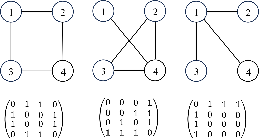
A graph G can be defined as G = (V, E), where V is the set of nodes, and E are the edges between them. A graph is often represented by an adjacency matrix, A, which represents the presence or absence of edges between nodes i.e. aij takes values of 1 to indicate an edge (connection) between nodes i and j or 0 otherwise. If a graph has n nodes, A has a dimension of (n × n). The adjacency matrix is demonstrated in Figure 1.
Each node (and edges! But we’ll come back to this later for simplicity) will have a set of features (e.g. if the node is a person, the features will be age, gender, height, job etc). If each node has f features, then the feature matrix X is (n × f). In some problems, each node may also have a target label which maybe a set of categorical labels or numerical values (shown in Figure 2).
Single Node Calculations
To learn the interdependence between any node and its neighbours, we need to consider the features of its neighbours. This is what enables GNNs to learn the structural representation of the data through a graph. Consider a node j with Nj neighbours, GNNs transform the features from each neighbour, aggregate them and then update node i’s feature space. Each of these steps are described as follows.
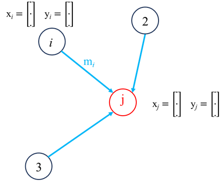
Neighbour feature transformation could be done a number of ways such as passing through an MLP network or by linear transformation such as
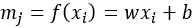
where w and b represent the weights and bias of the transformation. Information aggregation, the information from each neighboring nodes are then aggregated:
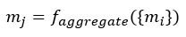
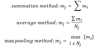
The nature of the aggregation step could be a number of different methods such as summation, averaging, min/max pooling and concatenation:
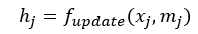
Following the aggregation step, the final step is to update node j:
This updated could be done using MLP with the concatenated node features and neighbour information aggregation (mj) or we could use linear transformation i.e.
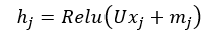
Where U is a learnable weights matrix that combines the original node features (xj) with aggregated neighbour features (mj) through a non-linear activation function (ReLU in this case). This is it for the process of updating a single node in a single layer, the same process is applied to all other nodes in the graph, mathematically, this can be presented using the Adjacency matrix.
Graph Level Calculation
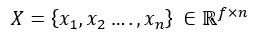
For a graph with n nodes and each node has f features, we can concatenate all the features in a single matrix:
The neighbour feature transformation and aggregation steps can therefore be written as:
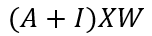
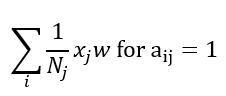
Where I is the identity matrix, this helps to include the each nodes own features too, otherwise, we are only considering the transformed features from the node j’s neighbours and not it’s own features. One final step is to normalise each node based on the number of connections i.e. for node j with Nj connections, the feature transformation can be done as:
The equation above can be adjusted as:
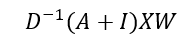
Where D is the degree matrix, a diagonal matrix of number of connections for each node. However, more commonly, this normalisation step is done as
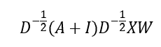
This is the graph convolution network (GCN) method that enables GNN to learn the structure and relationship between nodes. However, an issue with GCN is that the weight vector for neighbour feature transformation is shared across all neighbours i.e. all neighbours are considered equal, but this is usually not the case so not a good representative of real systems. To address is, graph attention network (GATs) can be used to compute the importance of a neighbour’s feature to the target node, allowing the different neighbours to contribute differently to the feature update of the target node based on their relevance. The attention coefficients are determined using a learnable matrix as follows:
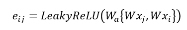
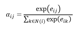
Where W is the shared learnable feature linear transformation, Wa is a learnable weight vector and eij is the raw attention score indicating importance of node i’s features to node j. The attention score is normalised using the SoftMax function:
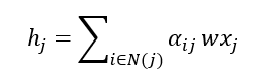
Now the feature aggregation step can be calculated using the attention coefficients:
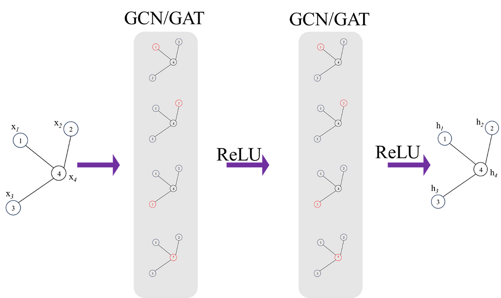
This is it for a single layer, we can build multiple layers to increase the complexity of the model, this is demonstrated in Figure 3. Increasing the number of layers will allow the model to learn more global features and also capture more complex relationships, however, it is also likely to overfit so regularisation techniques should always be used to prevent this.
Finally, once final feature vectors for all nodes are obtained from the network, a feature matrix, H can be formed:
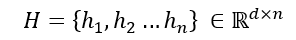
This feature matrix can be used to do a number of tasks e.g. node or graph classification. This brings us to the end of introduction into the mathematical description of GCN/GATs.
Let’s implement a regression example where the aim is to train a network to predict the value of a node given the value of all other nodes i.e. each node has a single feature (which is a scalar value). The aim of this example is to leverage the inherent relational information encoded in the graph to accurately predict numerical values for each node. The key thing to note is that we input the numerical value for all nodes except the target node (we mask the target node value with 0) then predict the target node’s value. For each data point, we repeat the process for all nodes. Perhaps this might come across as a bizarre task but lets see if we can predict the expected value of any node given the values of the other nodes. The data used is the corresponding simulation data to a series of sensors from industry and the graph structure I have chosen in the example below is based on the actual process structure. I have provided comments in the code to make it easy to follow. You can find a copy of the dataset here (Note: this is my own data, generated from simulations).
This code and training procedure is far from being optimised but it’s aim is to illustrate the implementation of GNNs and get an intuition for how they work. An issue with the currently way I have done that should definitely not be done this way beyond learning purposes is the masking of node feature value and predicting it from the neighbours feature. Currently you’d have to loop over each node (not very efficient), a much better way to do is the stop the model from include it’s own features in the aggregation step and hence you wouldn’t need to do one node at a time but I thought it is easier to build intuition for the model with the current method:)
Preprocessing Data
Importing the necessary libraries and Sensor data from CSV file. Normalise all data in the range of 0 to 1.
import pandas as pd
import torch
from torch_geometric.data import Data, Batch
from sklearn.preprocessing import StandardScaler, MinMaxScaler
from sklearn.model_selection import train_test_split
import numpy as np
from torch_geometric.data import DataLoader

# load and scale the dataset
df = pd.read_csv('SensorDataSynthetic.csv').dropna()
scaler = MinMaxScaler()
df_scaled = pd.DataFrame(scaler.fit_transform(df), columns=df.columns)
Defining the connectivity (edge index) between nodes in the graph using a PyTorch tensor — i.e. this provides the system’s graphical topology.
nodes_order = [
    'Sensor1', 'Sensor2', 'Sensor3', 'Sensor4',
    'Sensor5', 'Sensor6', 'Sensor7', 'Sensor8'
]

# define the graph connectivity for the data
edges = torch.tensor([
    [0, 1, 2, 2, 3, 3, 6, 2],  # source nodes
    [1, 2, 3, 4, 5, 6, 2, 7]   # target nodes
], dtype=torch.long)
The Data imported from csv has a tabular structure but to use this in GNNs, it must be transformed to a graphical structure. Each row of data (one observation) is represented as one graph. Iterate through Each Row to Create Graphical representation of the data
A mask is created for each node/sensor to indicate the presence (1) or absence (0) of data, allowing for flexibility in handling missing data. In most systems, there may be items with no data available hence the need for flexibility in handling missing data. Split the data into training and testing sets
graphs = []

# iterate through each row of data to create a graph for each observation
# some nodes will not have any data, not the case here but created a mask to allow us to deal with any nodes that do not have data available
for _, row in df_scaled.iterrows():
    node_features = []
    node_data_mask = []
    for node in nodes_order:
        if node in df_scaled.columns:
            node_features.append([row[node]])
            node_data_mask.append(1) # mask value of to indicate present of data
        else:
            # missing nodes feature if necessary
            node_features.append(2)
            node_data_mask.append(0) # data not present

    node_features_tensor = torch.tensor(node_features, dtype=torch.float)
    node_data_mask_tensor = torch.tensor(node_data_mask, dtype=torch.float)


    # Create a Data object for this row/graph
    graph_data = Data(x=node_features_tensor, edge_index=edges.t().contiguous(), mask = node_data_mask_tensor)
    graphs.append(graph_data)


#### splitting the data into train, test observation
# Split indices
observation_indices = df_scaled.index.tolist()
train_indices, test_indices = train_test_split(observation_indices, test_size=0.05, random_state=42)

# Create training and testing graphs
train_graphs = [graphs[i] for i in train_indices]
test_graphs = [graphs[i] for i in test_indices]
Graph Visualisation
The graph structure created above using the edge indices can be visualised using networkx.
import networkx as nx
import matplotlib.pyplot as plt

G = nx.Graph()
for src, dst in edges.t().numpy():
    G.add_edge(nodes_order[src], nodes_order[dst])

plt.figure(figsize=(10, 8))
pos = nx.spring_layout(G)
nx.draw(G, pos, with_labels=True, node_color='lightblue', edge_color='gray', node_size=2000, font_weight='bold')
plt.title('Graph Visualization')
plt.show()
Model Definition
Let’s define the model. The model incorporates 2 GAT convolutional layers. The first layer transforms node features to an 8 dimensional space, and the second GAT layer further reduces this to an 8-dimensional representation.
GNNs are highly susceptible to overfitting, regularation (dropout) is applied after each GAT layer with a user defined probability to prevent over fitting. The dropout layer essentially randomly zeros some of the elements of the input tensor during training.
The GAT convolution layer output results are passed through a fully connected (linear) layer to map the 8-dimensional output to the final node feature which in this case is a scalar value per node.
Masking the value of the target Node; as mentioned earlier, the aim of this of task is to regress the value of the target node based on the value of it’s neighbours. This is the reason behind masking/replacing the target node’s value with zero.
from torch_geometric.nn import GATConv
import torch.nn.functional as F
import torch.nn as nn

class GNNModel(nn.Module):
    def __init__(self, num_node_features):
        super(GNNModel, self).__init__()
        self.conv1 = GATConv(num_node_features, 16)
        self.conv2 = GATConv(16, 8)
        self.fc = nn.Linear(8, 1)  # Outputting a single value per node

    def forward(self, data, target_node_idx=None):
        x, edge_index = data.x, data.edge_index
        edge_index = edge_index.T
        x = x.clone()

        # Mask the target node's feature with a value of zero!
        # Aim is to predict this value from the features of the neighbours
        if target_node_idx is not None:
            x[target_node_idx] = torch.zeros_like(x[target_node_idx])

        x = F.relu(self.conv1(x, edge_index))
        x = F.dropout(x, p=0.05, training=self.training)
        x = F.relu(self.conv2(x, edge_index))
        x = F.relu(self.conv3(x, edge_index))
        x = F.dropout(x, p=0.05, training=self.training)
        x = self.fc(x)

        return x
Training the model
Initialising the model and defining the optimiser, loss function and the hyper parameters including learning rate, weight decay (for regularisation), batch_size and number of epochs.
model = GNNModel(num_node_features=1)
batch_size = 8
optimizer = torch.optim.Adam(model.parameters(), lr=0.0002, weight_decay=1e-6)
criterion = torch.nn.MSELoss()
num_epochs = 200
train_loader = DataLoader(train_graphs, batch_size=1, shuffle=True)
model.train()
The training process is fairly standard, each graph (one data point) of data is passed through the forward pass of the model (iterating over each node and predicting the target node. The loss from the prediction is accumulated over the defined batch size before updating the GNN through backpropagation.
for epoch in range(num_epochs):
    accumulated_loss = 0
    optimizer.zero_grad()
    loss = 0
    for batch_idx, data in enumerate(train_loader):
        mask = data.mask
        for i in range(1,data.num_nodes):
            if mask[i] == 1:  # Only train on nodes with data
                output = model(data, i)  # get predictions with the target node masked
                                         # check the feed forward part of the model
                target = data.x[i]
                prediction = output[i].view(1)
                loss += criterion(prediction, target)
        #Update parameters at the end of each set of batches
        if (batch_idx+1) % batch_size == 0 or (batch_idx +1 ) == len(train_loader):
            loss.backward()
            optimizer.step()
            optimizer.zero_grad()
            accumulated_loss += loss.item()
            loss = 0

    average_loss = accumulated_loss / len(train_loader)
    print(f'Epoch {epoch+1}, Average Loss: {average_loss}')
Testing the trained model
Using the test dataset, pass each graph through the forward pass of the trained model and predict each node’s value based on it’s neighbours value.
test_loader = DataLoader(test_graphs, batch_size=1, shuffle=True)
model.eval()

actual = []
pred = []

for data in test_loader:
    mask = data.mask
    for i in range(1,data.num_nodes):
        output = model(data, i)
        prediction = output[i].view(1)
        target = data.x[i]

        actual.append(target)
        pred.append(prediction)
Visualising the test results
Using iplot we can visualise the predicted values of nodes against the ground truth values.
import plotly.graph_objects as go
from plotly.offline import iplot

actual_values_float = [value.item() for value in actual]
pred_values_float = [value.item() for value in pred]


scatter_trace = go.Scatter(
    x=actual_values_float,
    y=pred_values_float,
    mode='markers',
    marker=dict(
        size=10,
        opacity=0.5,
        color='rgba(255,255,255,0)',
        line=dict(
            width=2,
            color='rgba(152, 0, 0, .8)',
        )
    ),
    name='Actual vs Predicted'
)

line_trace = go.Scatter(
    x=[min(actual_values_float), max(actual_values_float)],
    y=[min(actual_values_float), max(actual_values_float)],
    mode='lines',
    marker=dict(color='blue'),
    name='Perfect Prediction'
)

data = [scatter_trace, line_trace]

layout = dict(
    title='Actual vs Predicted Values',
    xaxis=dict(title='Actual Values'),
    yaxis=dict(title='Predicted Values'),
    autosize=False,
    width=800,
    height=600
)

fig = dict(data=data, layout=layout)

iplot(fig)
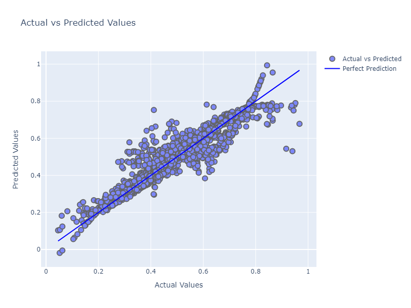
Despite a lack of fine tuning the model architecture or hyperparameters, it has done a decent job actually, we could tune the model further to get improved accuracy.
This brings us to the end of this article. GNNs are relatively newer than other branches of machine learning, it will be very exciting to see the developments of this field but also it’s application to different problems. Finally, thank you for taking the time to read this article, I hope you found it useful in your understanding of GNNs or their mathematical background.
Unless otherwise noted, all images are by the author
Structure and Relationships: Graph Neural Networks and a Pytorch Implementation was originally published in Towards Data Science on Medium, where people are continuing the conversation by highlighting and responding to this story.
Originally appeared here:
Structure and Relationships: Graph Neural Networks and a Pytorch Implementation
Discover the architecture of Time-LLM and apply it in a forecasting project with Python
Originally appeared here:
Time-LLM: Reprogram an LLM for Time Series Forecasting
Go Here to Read this Fast! Time-LLM: Reprogram an LLM for Time Series Forecasting

When I decided to write an article on building scalable pipelines with Vertex AI last year, I contemplated the different formats it could take. I finally settled on building a fully functioning MLOps platform, as lean as possible due to time restriction, and open source the platform for the community to gradually develop. But time proved a limiting factor and I keep dillydallying. On some weekends, when I finally decided to put together the material, I found a litany of issues which I have now documented to serve as guide to others who might tread the same path.
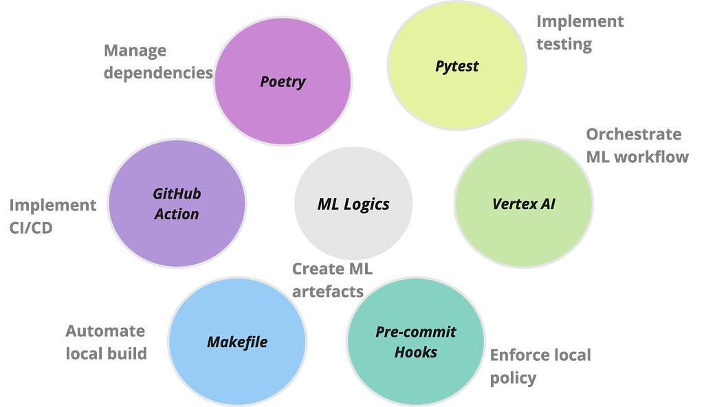
This is what led to the development of mlops-platform, an initiative designed to demonstrate a streamlined, end-to-end process of building scalable and operationalised machine learning models on VertexAI using Kubeflow pipelines. The major features of the platform can be broken down in fourfold: firstly, it encapsulates a modular and flexible pipeline architecture that accommodates various stages of the machine learning lifecycle, from data loading and preprocessing to model training, evaluation, deployment and inference. Secondly, it leverages Google Cloud’s Vertex AI services for seamless integration, ensuring optimal performance, scalability, and resource efficiency. Thirdly, it is scaffolded with a series of operations that are frequently used to automate ML workflows. Lastly, it documents common challenges experienced when building projects of this scale and their respective workarounds.
I have built the mlops platform with two major purposes in mind:
I hope the platform will continue to grow from contributions from the community.
Though Google has a GitHub repo containing numerous examples of using Vertex AI pipeline, the repo is daunting to navigate. Moreover, you often need a multiple of ops wrappers around your application for organisation purposes as you would have multiple teams using the platform. And more often, there are issues that crop up during development that do not get addressed enough, leaving developers frustrated. Google support might be insufficient especially when chasing production deadlines. On a personal experience, even though my company have enhanced support, I have an issue raised with Google Vertex engineering team which drags on for more than four months. In addition, due to the rapid pace at which technology is evolving, posting on forums might not yield desired solution since only few people might have experienced the issue being posted about. So having a working end to end platform to build upon with community support is invaluable.
By the way, have you heard about pain driven development (PDD)? It is analogous to test or behaviour driven development. In PDD, the development is driven by pain points. This means changes are made to codebase when the team feels impacted and could justify the trade off. It follows the mantra of if it ain’t broke, don’t fix. Not to worry, this post will save some pains (emanating from frustration) when using Google Vertex AI, especially the prebuilt containers, for building scalable ML pipelines. But more appropriately, in line with the PDD principle, I have deliberately made it a working platform with some pain points. I have detailed those pain points hoping that interested parties from the community would join me in gradually integrating the fixes. With those house keeping out of the way, lets cut to the chase!
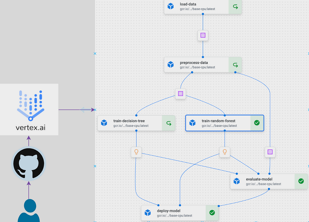
Google Vertex AI pipelines provides a framework to run ML workflows using pipelines that are designed with Kubeflow or Tensorflow Extended frameworks. In this way, Vertex AI serves as an orchestration platform that allows composing a number of ML tasks and automating their executions on GCP infrastructure. This is an important distinction to make since we don’t write the pipelines with Vertex AI rather, it serves as the platform for orchestrating the pipelines. The underlying Kubeflow or Tensorflow Extended pipeline follows common framework used for orchestrating tasks in modern architecture. The framework separates logic from computing environment. The logic, in the case of ML workflow, is the ML code while the computing environment is a container. Both together are referred to as a component. When multiple components are grouped together, they are referred to as pipeline. There is modality in place, similar to other orchestration platforms, to pass data between the components. The best place to learn in depth about pipelines is from Kubeflow documentation and several other blog posts which I have linked in the references section.
I mentioned the general architecture of orchestration platforms previously. Some other tools using similar architecture as Vertex AI where logic are separated from compute are Airflow (tasks and executors), GitHub actions (jobs and runners), CircleCI (jobs and executors) and so on. I have an article in the pipeline on how having a good grasp of the principle of separation of concerns integrated in this modern workflow architecture can significantly help in the day to day use of the tools and their troubleshooting. Though Vertex AI is synonymous for orchestrating ML pipelines, in theory any logic such as Python script, data pipeline or any containerised application could be run on the platform. Composer, which is a managed Apache Airflow environment, was the main orchestrating platform on GCP prior to Vertex AI. The two platforms have pros and cons that should be considered when making a decision to use either.
I am going to avoid spamming this post with code which are easily accessible from the platform repository. However, I will run through the important parts of the mlops platform architecture. Please refer to the repo to follow along.
Components
The architecture of the platform revolves around a set of well-defined components housed within the components directory. These components, such as data loading, preprocessing, model training, evaluation, and deployment, provide a modular structure, allowing for easy customisation and extension. Lets look through one of the components, the preprocess_data.py, to understand the general structure of a component.
from config.config import base_image
from kfp.v2 import dsl
from kfp.v2.dsl import Dataset, Input, Output

@dsl.component(base_image=base_image)
def preprocess_data(
    input_dataset: Input[Dataset],
    train_dataset: Output[Dataset],
    test_dataset: Output[Dataset],
    train_ratio: float = 0.7,
):
    """
    Preprocess data by partitioning it into training and testing sets.
    """

    import pandas as pd
    from sklearn.model_selection import train_test_split

    df = pd.read_csv(input_dataset.path)
    df = df.dropna()

    if set(df.iloc[:, -1].unique()) == {'Yes', 'No'}:
        df.iloc[:, -1] = df.iloc[:, -1].map({'Yes': 1, 'No': 0})

    train_data, test_data = train_test_split(df, train_size=train_ratio, random_state=42)

    train_data.to_csv(train_dataset.path, index=False)
    test_data.to_csv(test_dataset.path, index=False)
A closer look at the script above would show a familiar data science workflow. All the script does is read in some data, split them for model development and write the splits to some path where it can be readily accessed by downstream tasks. However, since this function would be run on Vertex AI, it is decorated by a Kubeflow pipeline @dsl.component(base_image=base_image) which marks the function as a Kubeflow pipeline component to be run within the base_image container. I will talk about the base_image later. This is all is required to run a function within a container on Vertex AI. Once we structured all our other functions in similar manner and decorate them as Kubeflow pipeline components, the mlpipeline.py function will import each components to structure the pipeline.
#mlpipeline.py

from kfp.v2 import dsl, compiler
from kfp.v2.dsl import pipeline
from components.load_data import load_data
from components.preprocess_data import preprocess_data
from components.train_random_forest import train_random_forest
from components.train_decision_tree import train_decision_tree
from components.evaluate_model import evaluate_model
from components.deploy_model import deploy_model
from config.config import gcs_url, train_ratio, project_id, region, serving_image, service_account, pipeline_root
from google.cloud import aiplatform

@pipeline(
    name="ml-platform-pipeline",
    description="A pipeline that performs data loading, preprocessing, model training, evaluation, and deployment",
    pipeline_root= pipeline_root
)
def mlplatform_pipeline(
    gcs_url: str = gcs_url,
    train_ratio: float = train_ratio,
    ):
    load_data_op = load_data(gcs_url=gcs_url)
    preprocess_data_op = preprocess_data(input_dataset=load_data_op.output,
                                         train_ratio=train_ratio
                                         )

    train_rf_op = train_random_forest(train_dataset=preprocess_data_op.outputs['train_dataset'])
    train_dt_op = train_decision_tree(train_dataset=preprocess_data_op.outputs['train_dataset'])

    evaluate_op = evaluate_model(
        test_dataset=preprocess_data_op.outputs['test_dataset'],
        dt_model=train_dt_op.output,
        rf_model=train_rf_op.output
    )

    deploy_model_op = deploy_model(
        optimal_model_name=evaluate_op.outputs['optimal_model'],
        project=project_id,
        region=region,
        serving_image=serving_image,
        rf_model=train_rf_op.output,
        dt_model=train_dt_op.output
    )

if __name__ == "__main__":
    pipeline_filename = "mlplatform_pipeline.json"
    compiler.Compiler().compile(
        pipeline_func=mlplatform_pipeline,
        package_path=pipeline_filename
    )

    aiplatform.init(project=project_id, location=region)
    _ = aiplatform.PipelineJob(
        display_name="ml-platform-pipeline",
        template_path=pipeline_filename,
        parameter_values={
            "gcs_url": gcs_url,
            "train_ratio": train_ratio
        },
        enable_caching=True
    ).submit(service_account=service_account)
@pipeline decorator enables the function mlplatform_pipeline to be run as a pipeline. The pipeline is then compiled to the specified pipeline filename. Here, I have specified JSON configuration extension for the compiled file but I think Google is moving toYAML. The compiled file is then picked up by aiplatform and submitted to Vertex AI platform for execution.
The only other thing I found puzzling while starting out with the kubeflow pipelines are the parameters and artifacts set up so have a look to get up to speed.
Configuration
The configuration file in the config directory facilitates the adjustment of parameters and settings across different stages of the pipeline. Along with the config file, I have also included a dot.env file which has comments on the variables specifics and is meant to be a guide for the nature of the variables that are loaded into the config file.
Notebooks
I mostly start my workflow and exploration within notebooks as it enable easy interaction. As a result, I have included notebooks directory as a means of experimenting with the different components logics.
Testing
Testing plays a very important role in ensuring the robustness and reliability of machine learning workflows and pipelines. Comprehensive testing establishes a systematic approach to assess the functionality of each component and ensures that they behave as intended. This reduces the instances of errors and malfunctioning during the execution stage. I have included a test_mlpipeline.py script mostly as a guide for the testing process. It uses pytest to illustrate testing concept and provides a framework to build upon.
Project Dependencies
Managing dependencies can be a nightmare when developing enterprise scale applications. And given the myriads of packages required in a ML workflow, combined with the various software applications needed to operationalise it, it can become a Herculean task managing the dependencies in a sane manner. One package that is slowly gaining traction is Poetry. It is a tool for dependency management and packaging in Python. The key files generated by Poetry are pyproject.toml and poetry.lock. pyproject.tomlfile is a configuration file for storing project metadata and dependencies while the poetry.lock file locks the exact versions of dependencies, ensuring consistent and reproducible builds across different environments. Together, these two files enhance dependency resolution. I have demonstrated how the two files replace the use of requirement.txt within a container by using them to generate the training container image for this project.
Makefile
A Makefile is a build automation tool that facilitates the compilation and execution of a project’s tasks through a set of predefined rules. Developers commonly use Makefiles to streamline workflows, automate repetitive tasks, and ensure consistent and reproducible builds. The Makefile within mlops-platform has predefined commands to seamlessly run the entire pipeline and ensure the reliability of the components. For example, the all target, specified as the default, efficiently orchestrates the execution of both the ML pipeline (run_pipeline) and tests (run_tests). Additionally, the Makefile provides a clean target for tidying up temporary files while the help target offers a quick reference to the available commands.
The project is documented in the README.md file, which provides a comprehensive guide to the project. It includes detailed instructions on installation, usage, and setting up Google Cloud Platform services.
Orchestration with CI/CD
GitHub Actions workflow defined in .github/workflows directory is crucial for automating the process of testing, building, and deploying the machine learning pipeline to Vertex AI. This CI/CD approach ensures that changes made to the codebase are consistently validated and deployed, enhancing the project’s reliability and reducing the likelihood of errors. The workflow triggers on each push to the main branch or can be manually executed, providing a seamless and reliable integration process.
Inference Pipeline
There are multiple ways to implement inference or prediction pipeline. I have gone the good old way here by loading in both the prediction features and the uploaded model, getting predictions from the model and writing the predictions to a BigQuery table. It is worth noting that for all the talk about prediction containers, they are not really needed if all is required is batch prediction. We might as well use the training container for our batch prediction as demonstrated in the platform. However, the prediction container is required for online prediction. I have also included modality for local testing of the batch prediction pipeline which can be generalised to test any of the other components or any scripts for that matter. Local testing can be done by navigating to batch_prediction/batch_prediction_test directory, substituting for placeholder variables and running the following commands:
# First build the image using Docker
docker build -f Dockerfile.batch -t batch_predict .

# The run batch prediction pipeline locally using the built image from above
docker run -it
     -v {/local/path/to/service_acount-key.json}:/secrets/google/key.json
     -e GOOGLE_APPLICATION_CREDENTIALS=/secrets/google/key.json
     batch_predict
     --model_gcs_path={gs://path/to/gcs/bucket/model.joblib}
     --input_data_gcs_path={gs://path/to/gcs/bucket/prediction_data.csv}
     --table_ref={project_id.dataset.table_name}
     --project={project_id}
The service account needs proper access on GCP to execute the task above, it should have permission to read from the GCP bucket and write to the BigQuery table.
Some of the challenges encountered during the building of this project emanates from the use of container images and the associated package versions within the Google prebuilt containers. I presume the main goal of Google when creating prebuilt containers is to lift off major engineering tasks for the data scientists and enable them to focus mainly on ML logics. However, more work would be required to ensure this aim is achieved as the prebuilt containers have various versions mismatch requiring significant debugging effort to resolve. I have detailed some of the challenges and some possible fixes.
# start Docker Desktop (can also open manually)
open -a Docker

# authentucate to GCP if desired to push the image to GCP artifact repo
gcloud auth login
gcloud auth configure-docker "{region}-docker.pkg.dev" --quiet

# create and use a buildx builder instance (only needed once)
docker buildx create --name mybuilder --use
docker buildx inspect --bootstrap

# build and push a multi-architecture Docker image with buildx
docker buildx build --platform linux/amd64,linux/arm64 -t "{region}-docker.pkg.dev/{project_id}/{artifact_repo}/{image-name}:latest" -f Dockerfile --push .
The name of the container follows Google specific format for naming containers.
# open Zsh config file (I use visual code but it could be other editor like nano)
code ~/.zshrc

# insert at the end of file
export DOCKER_DEFAULT_PLATFORM=linux/amd64

# save and close file then apply changes
source ~/.zshrc
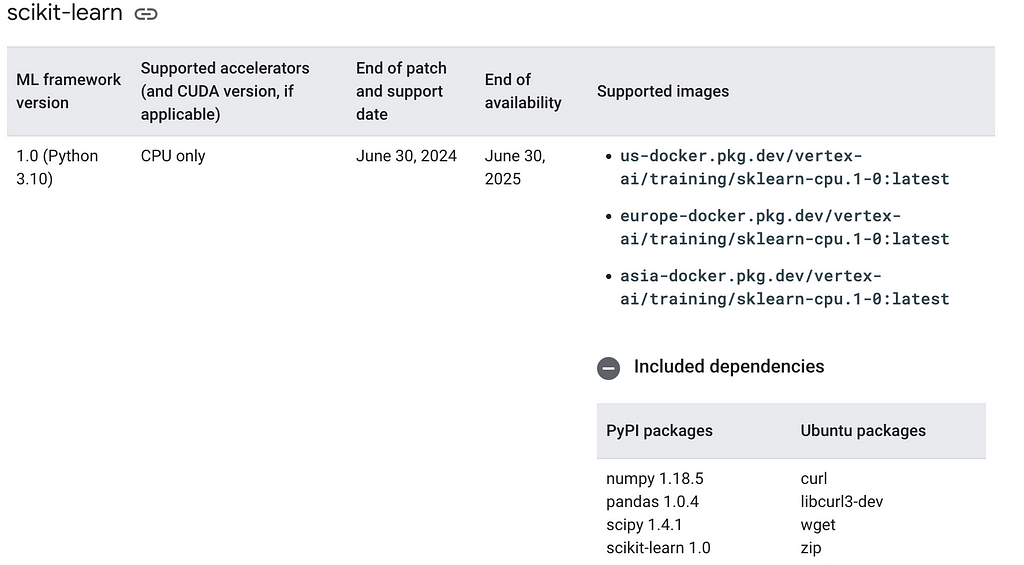
2. Conflicting versions in prebuilt container images: Google maintains a host of prebuilt images for prediction and training tasks. These container images are available for common ML frameworks in different versions. However, I found that the documented versions sometimes don’t match the actual version and this constitute a major point of failure when using these container images. Giving what the community has gone through in standardising versions and dependencies and the fact that container technology is developed to mainly address reliable execution of applications, I think Google should strive to address the conflicting versions in the prebuilt container images. Make no mistake, battling with version mismatch can be frustrating which is why I encourage ‘jailbreaking’ the prebuilt images prior to using them. When developing this tutorial, I decided to useeurope-docker.pkg.dev/vertex-ai/training/sklearn-gpu.1-0:latest and europe-docker.pkg.dev/vertex-ai/prediction/sklearn-cpu.1-0:latest. From the naming conventions, both are supposed to be compatible and should havesklearn==1.0. In fact, this is confirmed on the site as shown in the screenshot below and also, on the container image artifact registry.
However, the reality is different. I ran into version mismatch errors when deploying the built model to an endpoint. A section of the error message is shown below.
Trying to unpickle estimator OneHotEncoder from version 1.0.2 when using version 1.0
Suprise! Suprise! Suprise! Basically, what the log says is that you have pickled with version 1.0.2 but attempting to unpickle with version 1.0. To make progress, I decided to do some ‘jailbreaking’ and looked under the hood of the prebuilt container images. It is a very basic procedure but opened many can of worms.
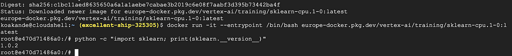
docker pull europe-docker.pkg.dev/vertex-ai/training/sklearn-cpu.1-0:latest
3. Run the image, overide its entrypoint command and drop onto its bash shell terminal
docker run -it --entrypoint /bin/bash europe-docker.pkg.dev/vertex-ai/training/sklearn-cpu.1-0:latest
4. Check the sklearn version
python -c "import sklearn; print(sklearn.__version__)"
The output, as of the time of writing this post, is shown in the screenshot below:
Conducting similar exercise for europe-docker.pkg.dev/vertex-ai/prediction/sklearn-cpu.1-3:latest , the sklearn version is 1.3.2 and 1.2.2 for the 1.2version. What is even more baffling is that pandas is missing from both version 1–2and 1-3 which begs the question of whether the prebuilt containers are being actively maintained. Of course, the issue is not the minor update but the fact that the corresponding prediction image did not have similar update which results in the mismatch error shown above.
When I contacted Google support to report the mismatch, the Vertex AI engineering team mentioned alternatives such as Custom prediction routines (CPR) and SklearnPredictor. And I was pointed to newer image versions with similar issues and missing pandas!
Moving on, if you are feeling like a Braveheart and want to explore further, you can access all the other files that Google runs when launching prebuilt containers by running ls command from within the container and looking through the files and folders.
So having discovered the issue, what can be done in order to still take advantage of prebuilt containers? What I did was to extract all the relevant packages from the container.
pip freeze > requirement.txt
cat requirement.txt
The commands above will extract all the installed packages and print them to the container terminal. The packages can then be copied and used in creating a custom container image, ensuring that the ML framework version in both the training and prediction container matches. If you prefer to copy the file content to your local directory then use the following command:
# If on local terminal, copy requirements.txt into current directory
docker cp {running-container}:/requirements.txt .
Some of the packages in the prebuilt containers would not be needed for individual project so it is better to select the ones that matches your workflow. The most important one to lock down is the ML framework version whether it is sklearn or xgboost, making sure both training and prediction versions match.
I have basically locked the sklearn version to match the version of the prebuilt prediction image. In this case, it is version 1.0 and I have left all the other packages as they are.
Then to build the custom training image, use the following commands:
# commands to build the docker
#first authenticate to gcloud

# gcloud auth login
gcloud auth configure-docker

# Build the image using Docker
docker build -f docker/Dockerfile.poetry -t {region}-docker.pkg.dev/{gcp-project-id}/{gcp-artifact-repo}/{image-name}:latest .
The above is saying is:
Then the built image can be pushed to the artifact registry as follows:
# Push to artifact registry
docker push {region}-docker.pkg.dev/{gcp-project-id}/{gcp-artifact-repo}/{image-name}:latest
There are numerous extensions to be added to this project and I will invite willing contributors to actively pick on any of them. Some of my thoughts are detailed below but feel free to suggest any other improvements. Contributions are welcomed via PR. I hope the repo can be actively developed by those who wants to learn end to end MLOps as well as serve as a base on which small teams can build upon.
The MLOps platform provides a modular and scalable pipeline architecture for implementing different ML lifecycle stages. It includes various operations that enable such platform to work seamlessly. Most importantly, it provides a learning opportunity for would be contributors and should serve as a good base on which teams can build upon in their machine learning tasks.
Well, that is it people! Congratulations and well done if you are able to make it here. I hope you have benefited from this post. Your comments and feedback are most welcome and please lets connect on Linkedln. If you found this to be valuable, then don’t forget to like the post and give the MLOps platform repository a star.
References
MLOps repo: https://github.com/kbakande/mlops-platform
https://medium.com/google-cloud/machine-learning-pipeline-development-on-google-cloud-5cba36819058
https://datatonic.com/insights/vertex-ai-improving-debugging-batch-prediction/
https://econ-project-templates.readthedocs.io/en/v0.5.2/pre-commit.html
Extensible and Customisable Vertex AI MLOps Platform was originally published in Towards Data Science on Medium, where people are continuing the conversation by highlighting and responding to this story.
Originally appeared here:
Extensible and Customisable Vertex AI MLOps Platform
Go Here to Read this Fast! Extensible and Customisable Vertex AI MLOps Platform
Learn how to build neural networks for direct causal inference
Originally appeared here:
TARNet and Dragonnet: Causal Inference Between S- And T-Learners
Go Here to Read this Fast! TARNet and Dragonnet: Causal Inference Between S- And T-Learners


Learn to use SQLAlchemy asynchronously in different scenarios
Originally appeared here:
How to Use SQLAlchemy to Make Database Requests Asynchronously
Go Here to Read this Fast! How to Use SQLAlchemy to Make Database Requests Asynchronously
Learn what an RFM model is, how to create one, and how to segment on the results
Originally appeared here:
How to Create an RFM Model in BigQuery
Go Here to Read this Fast! How to Create an RFM Model in BigQuery
How changes in the distribution arise, and the impact of verification delay.
Originally appeared here:
Understanding Concept Drift: A Simple Guide
Go Here to Read this Fast! Understanding Concept Drift: A Simple Guide
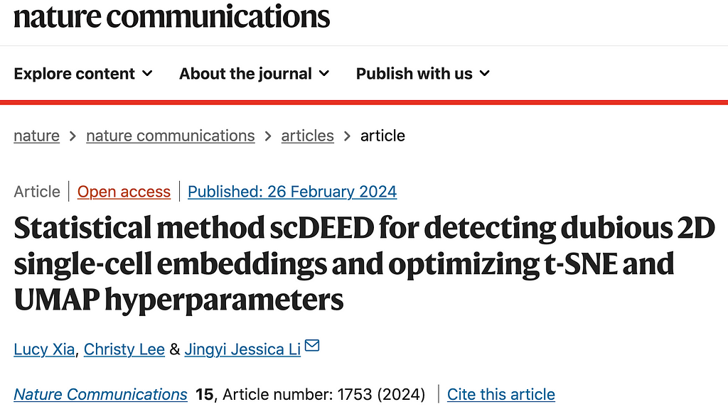
The article was co-authored with Christy Lee, Ph.D. student of Statistics at UCLA.

t-SNE (t-Distributed Stochastic Neighbor Embedding) and UMAP (Uniform Manifold Approximation and Projection) are non-linear dimensionality reduction techniques for visualizing high-dimensional data, particularly in the context of single-cell analysis for visualizing cell clusters. However, it is important to note that t-SNE and UMAP may not always produce trustworthy representations of the relative distances between cell clusters.
In our Nature Communications paper [1], we provide a framework for (1) identifying data distortions in projection from a high-dimensional to two-dimensional (2D) space and (2) optimizing hyperparameter settings in a 2D dimension-reduction method.
Consider a 3-dimensional (3D) globe vs a 2-dimensional (2D) map. It is impossible to represent an entire globe accurately in only 2D; distance may not be accurate, and the size of some countries may be distorted. Typically, land masses at the edge of the map, like Antarctica, are the most changed. Despite these distortions, 2D maps are useful for everyday use; students or the common traveler to the main continents will not be affected by the distortion in Antarctica, but an intrepid traveler to the poles will certainly require a different map.
Similarly, the representation of single-cell genomics data often requires moving from a high-dimensional to 2D space, so-called 2D embedding. As with the conversion of the globe, this can induce distortions. The 2D post-embedding space may not accurately represent the pre-embedding space. Adding to the problem, popular 2D embedding methods, like t-SNE and UMAP, are sensitive to hyperparameter selection. While general guidelines exist to tailor hyperparameters like perplexity and n.neighbors to the size of the dataset, these guidelines do not help answer the underlying question– what parts of the visualization are misleading?
Similar to cartographers selecting which landmasses to recreate faithfully and which to distort, researchers must prioritize which aspects of the pre-embedding space are most important to preserve post-embedding. Common uses of 2D visualization include annotation and analysis of cell trajectories and clusters. Although cell trajectories and clusters are generally calculated in the high-dimensional space, their results are often visualized through 2D embeddings, in which cells with similar gene expression are expected to be close to each other. Therefore, we concluded that the most important aspect of preservation is the position of cells relative to each other.
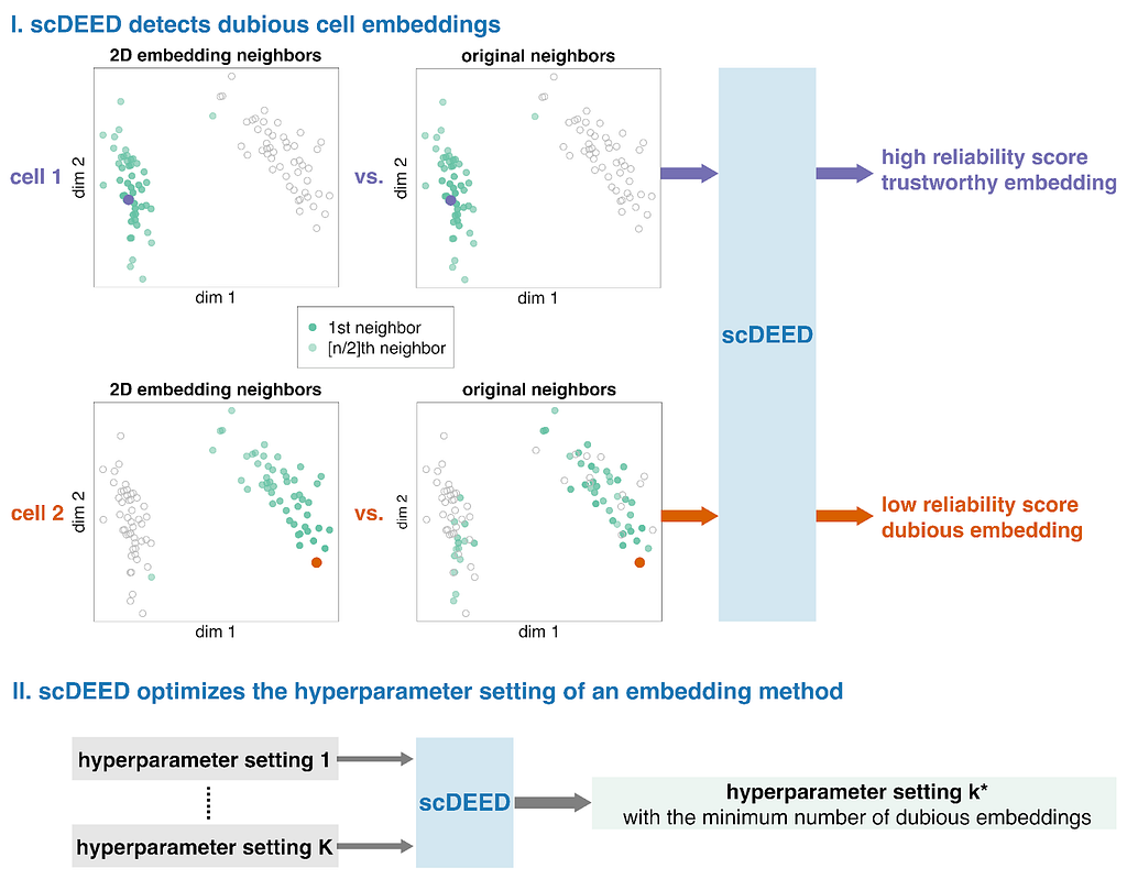
These ideas formed the motivation for scDEED, a single-cell dubious embedding detector (Fig. 1). The key idea is that a cell’s pre- and post-embedding neighbors should be similar. It is worth noting that the pre-embedding space is typically 20- to 50-dimensional in single-cell data analysis, usually the principal component space. For each cell, we calculate a reliability score that reflects the visual agreement between the neighbors found in the 2D-embedding space and the pre-embedding space. Cells whose 2D embedding neighbors have been drastically changed through the embedding process are called ‘dubious’; the cell’s relative location is misleading and does not reflect where the cell should be based on the pre-embedding space. Identification of these cells provides a mechanism to optimize hyperparameters by selecting the settings that result in the least amount of dubious cell embeddings.
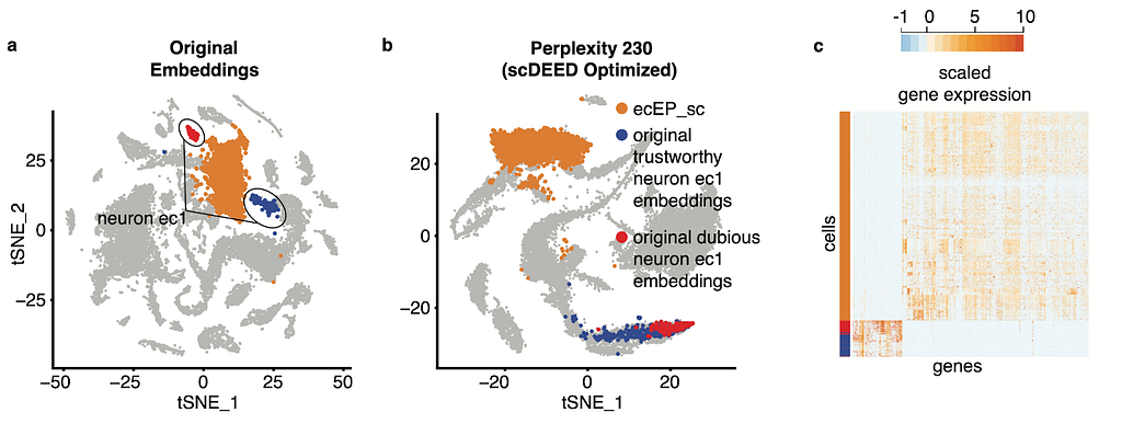
In our paper [1], we use a variety of datasets to show how the identification of dubious cells and optimization of hyperparameters can aid analysis. For example, in the original visualization of the single-cell RNA-seq Hydra dataset [2], the neuron ectodermal 1 (neuron ec1) cells are split into two clusters, one that scDEED marked as dubious and the other trustworthy (Fig. 2a). As confirmed by the similarity in gene expression (Fig. 2c) and the singular cell type assigned by the authors, these two clusters are not biologically distinct, making their separation in the t-SNE misleading. Further, if we compare the neuron ec1 cells to its neighboring clusters, like the highlighted ectodermal epithelial cells (ecEP_sc), the gene expression is very different, which is counterintuitive given their proximity in the visualization. However, under the optimized perplexity found by scDEED (Fig. 2b), the neuron ec1 cell type is now unified, further supporting that the original split of the cell type into clusters was a result of hyperparameter settings. Additionally, the neuron ec1 and ecEP_sc cells are now far apart, which is more appropriate given their differences in gene expression. This highlights two uses for scDEED: identification of dubious cells can help discern cells whose embedding positions are misleading, and optimization of hyperparameters can result in a more trustworthy visualization.
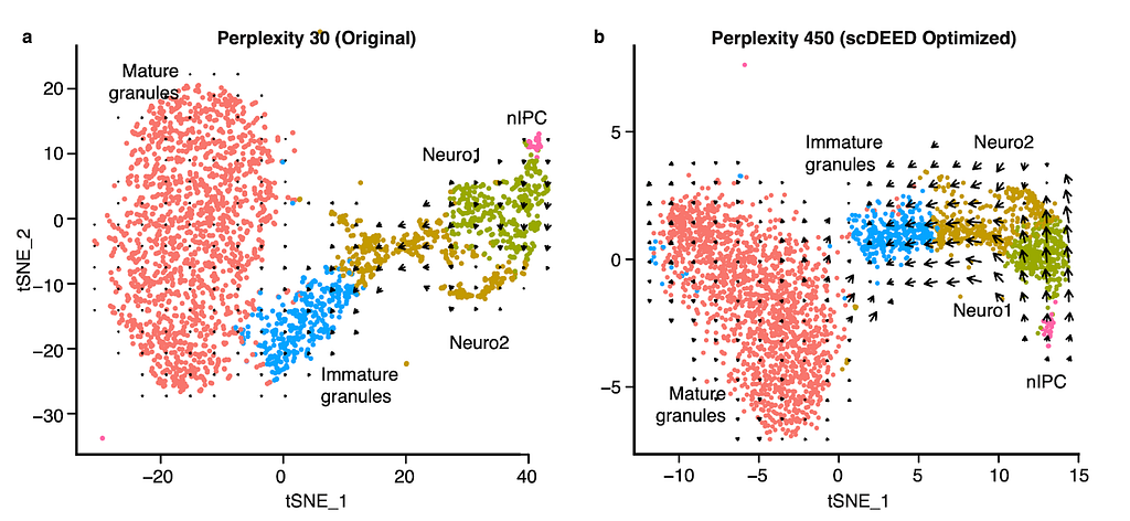
An interesting application is RNA velocity [3], a downstream analysis task that relies on visualization. RNA velocity uses the amount of unspliced and spliced mRNA to estimate gene velocity– the change in gene expression. The estimated gene velocity can be used to calculate predicted gene expression for a future time point, which can be visualized with an arrow from the cell to the cell’s predicted state. For large datasets, it is not reasonable to plot each cell’s velocity vector; rather, cells are grouped based on their 2D embeddings, and their velocity vectors are aggregated. Changes to the 2D embedding will not affect the estimated gene velocities or predicted expression for the individual cells, but it will change the cell grouping for vector field calculations, and therefore affect the visualized RNA velocities and analysis. Using scDEED to optimize the hyperparameter perplexity of t-SNE (Fig. 3a) greatly enhanced the agreement among neighboring cells, and provided clearer RNA velocity results than using the default hyperparameter value (Fig. 3b). Additionally, the vectors are not exaggerated for the mature granules, an expected result because the cells are fully differentiated. Optimization of the hyperparameter enhanced only existing cell trajectories.
Recent work [5,6] has highlighted geometric qualities, like geodesics, manifolds, and distance, that cannot be fully recreated because the pre- and post-embedding spaces are not homeomorphic. scDEED can help reduce the inconsistencies by finding hyperparameter settings that accurately capture mid-range cell-cell relationships for the most number of possible cells and identifying cells whose mid-range neighbors have drastically changed. We hope that scDEED can be used as an add-on to existing analysis pipelines to provide a more trustworthy 2D visualization. It is worth pointing out that scDEED does not measure the preservation of all aspects of data; as cartographers deemed it most important to preserve the 5 main continents, we chose to prioritize the relative location of cells. With some adjustments to the definition of the reliability score (one per cell embedding), researchers interested in preserving other qualities of the pre-embedding space may still find the framework of scDEED useful.
References
1. Xia L, Lee C, Li JJ. Statistical method scDEED for detecting dubious 2D single-cell embeddings and optimizing t-SNE and UMAP hyperparameters. Nat Commun. 2024;15: 1753. doi:10.1038/s41467-024-45891-y
2. Siebert S, Farrell JA, Cazet JF, Abeykoon Y, Primack AS, Schnitzler CE, et al. Stem cell differentiation trajectories in Hydra resolved at single-cell resolution. Science. 2019;365. doi:10.1126/science.aav9314
3. La Manno G, Soldatov R, Zeisel A, Braun E, Hochgerner H, Petukhov V, et al. RNA velocity of single cells. Nature. 2018;560: 494–498.
4. Hochgerner H, Zeisel A, Lönnerberg P, Linnarsson S. Conserved properties of dentate gyrus neurogenesis across postnatal development revealed by single-cell RNA sequencing. Nat Neurosci. 2018;21: 290–299.
5. Wang S, Sontag ED, Lauffenburger DA. What cannot be seen correctly in 2D visualizations of single-cell ’omics data? Cell Syst. 2023;14: 723–731.
6. Chari T, Pachter L. The specious art of single-cell genomics. PLoS Comput Biol. 2023;19: e1011288.
Statistical Method scDEED Detects Dubious t-SNE and UMAP Embeddings and Optimizes Hyperparameters was originally published in Towards Data Science on Medium, where people are continuing the conversation by highlighting and responding to this story.
Originally appeared here:
Statistical Method scDEED Detects Dubious t-SNE and UMAP Embeddings and Optimizes Hyperparameters