Today, we are excited to announce that Pixtral 12B (pixtral-12b-2409), a state-of-the-art vision language model (VLM) from Mistral AI that excels in both text-only and multimodal tasks, is available for customers through Amazon SageMaker JumpStart. You can try this model with SageMaker JumpStart, a machine learning (ML) hub that provides access to algorithms and models that can be deployed with one click for running inference. In this post, we walk through how to discover, deploy, and use the Pixtral 12B model for a variety of real-world vision use cases.
In Parts 1 and 2 of this series, we explored ways to use the power of multimodal FMs such as Amazon Titan Multimodal Embeddings, Amazon Titan Text Embeddings, and Anthropic’s Claude 3 Sonnet. In this post, we compared the approaches from an accuracy and pricing perspective.
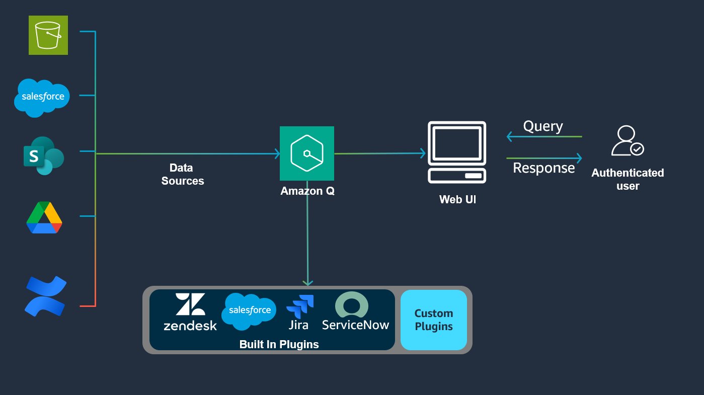
Amazon Q Business is a generative AI-powered assistant that enhances employee productivity by solving problems, generating content, and providing insights across enterprise data sources. Beyond searching indexed third-party services, employees need access to dynamic, near real-time data such as stock prices, vacation balances, and location tracking, which is made possible through Amazon Q Business plugins. […]
Three Zero-Cost Solutions That Take Hours, Not Months
A ‘data quality’ certified pipeline. Source: unsplash.com
In my career, data quality initiatives have usually meant big changes. From governance processes to costly tools to dbt implementation — data quality projects never seem to want to be small.
What’s more, fixing the data quality issues this way often leads to new problems. More complexity, higher costs, slower data project releases…
Some of the most effective methods to cut down on data issues are also some of the most simple.
In this article, we’ll delve into three methods to quickly improve your company’s data quality, all while keeping complexity to a minimum and new costs at zero. Let’s get to it!
TL;DR
Take advantage of old school database tricks, like ENUM data types, and column constraints.
Create a custom dashboard for your specific data quality problem.
Generate data lineage with one small Python script.
Take advantage of old school database tricks
In the last 10–15 years we’ve seen massive changes to the data industry, notably big data, parallel processing, cloud computing, data warehouses, and new tools (lots and lots of new tools).
Consequently, we’ve had to say goodbye to some things to make room for all this new stuff. Some positives (Microsoft Access comes to mind), but some are questionable at best, such as traditional data design principles and data quality and validation at ingestion. The latter will be the subject of this section.
Firstly, what do I mean by “data quality and validation at ingestion”? Simply, it means checking data before it enters a table. Think of a bouncer outside a nightclub.
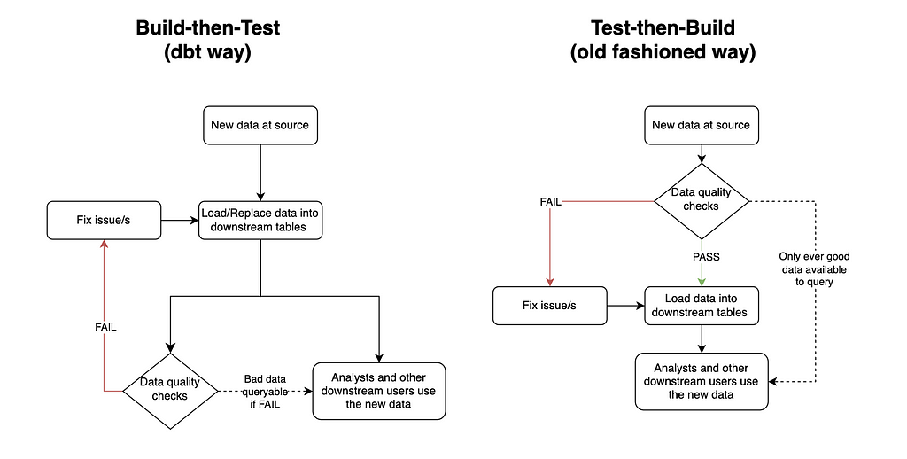
What it has been replaced with is build-then-test, which means putting new data in tables first, and then checking it later. Build-then-test is the chosen method for many modern data quality tools, including the most popular, dbt.
Dbt runs the whole data transformation pipeline first, and only once all the new data is in place, it checks to see if the data is good. Of course, this can be the optimal solution in many cases. For example, if the business is happy to sacrifice quality for speed, or if there is a QA table before a production table (coined by Netflix as Write-Audit-Publish). However, engineers who only use this method of data quality are potentially missing out on some big wins for their organization.
Testing before vs after generating tables. Created by the author using draw.io
Test-then-build has two main benefits over build-then-test.
The first is that it ensures the data in downstream tables meets the data quality standards expected at all times. This gives the data a level of trustworthiness, so often lacking, for downstream users. It can also reduce anxiety for the data engineer/s responsible for the pipeline.
I remember when I owned a key financial pipeline for a company I used to work for. Unfortunately, this pipeline was very prone to data quality issues, and the solution in place was a build-then-test system, which ran each night. This meant I needed to rush to my station early in the morning each day to check the results of the run before any downstream users started looking at their data. If there were any issues I then needed to either quickly fix the issue or send a Slack message of shame announcing to the business the data sucks and to please be patient while I fix it.
Of course, test-then-build doesn’t totally fix this anxiety issue. The story would change from needing to rush to fix the issue to avoid bad data for downstream users to rushing to fix the issue to avoid stale data for downstream users. However, engineering is all about weighing the pros and cons of different solutions. And in this scenario I know old data would have been the best of two evils for both the business and my sanity.
The second benefit test-then-build has is that it can be much simpler to implement, especially compared to setting up a whole QA area, which is a bazooka-to-a-bunny solution for solving most data quality issues. All you need to do is include your data quality criteria when you create the table. Have a look at the below PostgreSQL query:
CREATE TYPE currency_code_type AS ENUM ( 'USD', -- United States Dollar 'EUR', -- Euro 'GBP', -- British Pound Sterling 'JPY', -- Japanese Yen 'CAD', -- Canadian Dollar 'AUD', -- Australian Dollar 'CNY', -- Chinese Yuan 'INR', -- Indian Rupee 'BRL', -- Brazilian Real 'MXN' -- Mexican Peso );
CREATE TYPE payment_status AS ENUM ( 'pending', 'completed', 'failed', 'refunded', 'partially_refunded', 'disputed', 'canceled' );
CREATE TABLE daily_revenue ( id INTEGER PRIMARY KEY, date DATE NOT NULL, revenue_source revenue_source_type NOT NULL, gross_amount NUMERIC(15,2) NOT NULL CHECK (gross_amount >= 0), net_amount NUMERIC(15,2) NOT NULL CHECK (net_amount >= 0), currency currency_code_type, transaction_count INTEGER NOT NULL CHECK (transaction_count >= 0), notes TEXT,
These 14 lines of code will ensure the daily_revenue table enforces the following standards:
id
Primary key constraint ensures uniqueness.
date
Cannot be a future date (via CHECK constraint).
Forms part of a unique constraint with revenue_source.
revenue_source
Cannot be NULL.
Forms part of a unique constraint with date.
Must be a valid value from revenue_source_type enum.
gross_amount
Cannot be NULL.
Must be >= 0.
Must be >= processing_fees + tax_amount.
Must be >= net_amount.
Precise decimal handling.
net_amount
Cannot be NULL.
Must be >= 0.
Must be <= gross_amount.
Precise decimal handling.
currency
Must be a valid value from currency_code_type enum.
transaction_count
Cannot be NULL.
Must be >= 0.
It’s simple. Reliable. And would you believe all of this was available to us since the release of PostgreSQL 6.5… which came out in 1999!
Of course there’s no such thing as a free lunch. Enforcing constraints this way does have its drawbacks. For example, it makes the table a lot less flexible, and it will reduce the performance when updating the table. As always, you need to think like an engineer before diving into any tool/technology/method.
Create a custom dashboard
I have a confession to make. I used to think good data engineers didn’t use dashboard tools to solve their problems. I thought a real engineer looks at logs, hard-to-read code, and whatever else made them look smart if someone ever glanced at their computer screen.
I was dumb.
It turns out they can be really valuable if executed effectively for a clear purpose. Furthermore, most BI tools make creating dashboards super easy and quick, without (too) much time spent learning the tool.
Back to my personal pipeline experiences. I used to manage a daily aggregated table of all the business’ revenue sources. Each source came from a different revenue provider, and as such a different system. Some would be via API calls, others via email, and others via a shared S3 bucket. As any engineer would expect, some of these sources fell over from time-to-time, and because they came from third parties, I couldn’t fix the issue at source (only ask, which had very limited success).
Originally, I had only used failure logs to determine where things needed fixing. The problem was priority. Some failures needed quickly fixing, while others were not important enough to drop everything for (we had some revenue sources that literally reported pennies each day). As a result, there was a build up of small data quality issues, which became difficult to keep track of.
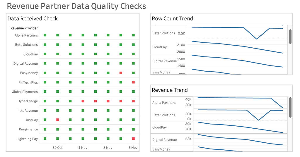
Enter Tableau.
I created a very basic dashboard that highlighted metadata by revenue source and date for the last 14 days. Three metrics were all I needed:
A green or red mark indicating whether data was present or missing.
The row count of the data.
The sum of revenue of the data.
A simple yet effective dashboard. Created by the author using Tableau
This made the pipeline’s data quality a whole lot easier to manage. Not only was it much quicker for me to glance at where the issues were, but it was user-friendly enough for other people to read from too, allowing for shared responsibility.
After implementing the dashboard, bug tickets reported by the business related to the pipeline dropped to virtually zero, as did my risk of a stroke.
Map your data with a lineage chart
Simple data observability solutions don’t just stop at dashboards.
Data lineage can be a dream for quickly spotting what tables have been affected by bad data upstream.
However, it can also be a mammoth task to implement.
The number one culprit for this, in my opinion, is dbt. A key selling point of the open-source tool is its data lineage capabilities. But to achieve this you have to bow down to dbt’s framework. Including, but not limited to:
Set up a development and testing process e.g. development environment, version control, CI/CD.
Infrastructure set-up e.g. hosting your own server or purchasing a managed version (dbtCloud).
Yeah, it’s a lot.
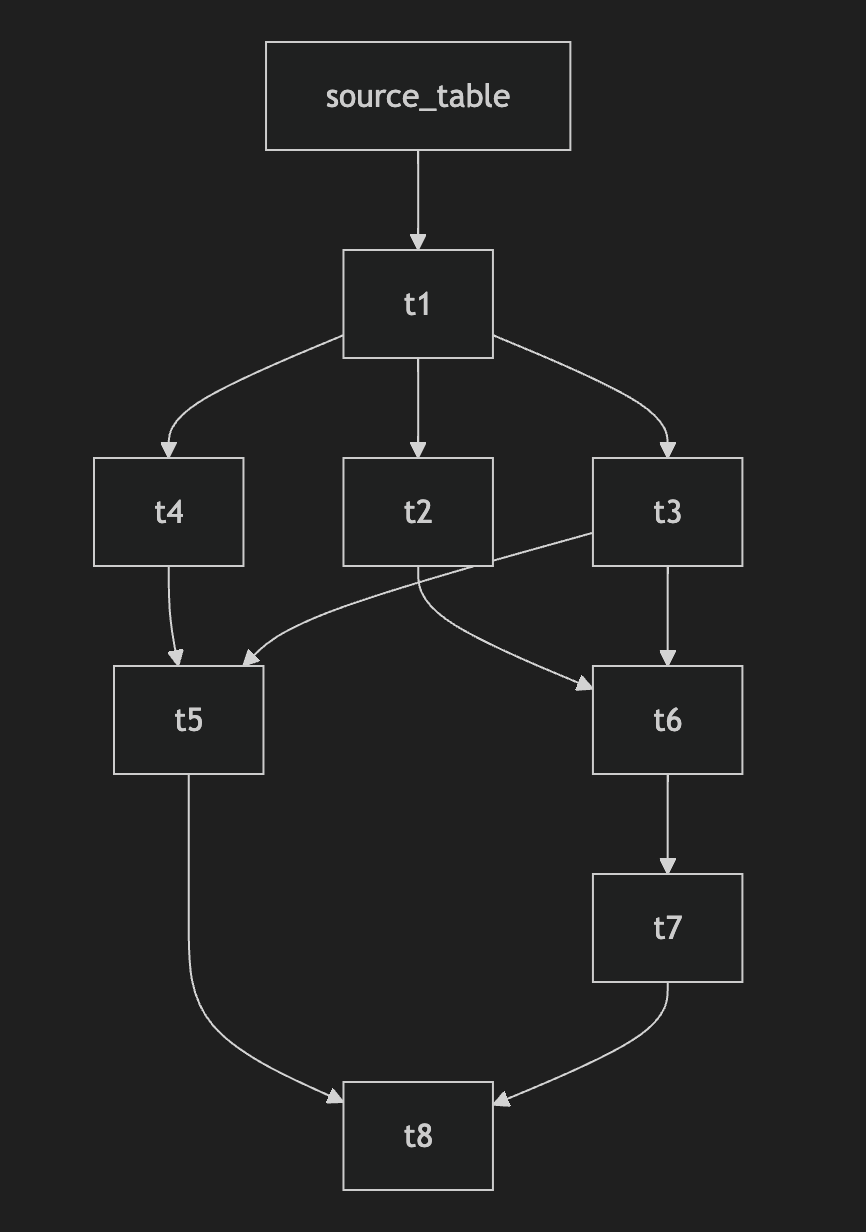
But it doesn’t have to be. Ultimately, all you need for dynamic data lineage is a machine that scans your SQL files, and something to output a user-friendly lineage map. Thanks to Python, this can be achieved using a script with as few as 100 lines of code.
If you know a bit of Python and LLM prompting you should be able to hack the code in an hour. Alternatively, there’s a lightweight open-source Python tool called SQL-WatchPup that already has the code.
Provided you have all your SQL files available, in 15 minutes of set up you should be able to generate dynamic data lineage maps like so:
Example data lineage map output. Created by the author using SQL-WatchPup
That’s it. No server hosting costs. No extra computer languages to learn. No restructuring of your files. Just running one simple Python script locally.
Conclusion
Let’s face it — we all love shiny new in-vogue tools, but sometimes the best solutions are old, uncool, and/or unpopular.
The next time you’re faced with data quality headaches, take a step back before diving into that massive infrastructure overhaul. Ask yourself: Could a simple database constraint, a basic dashboard, or a lightweight Python script do the trick?
Your sanity will thank you for it. Your company’s budget will too.
Testing new Snowflake functionality with a 30k records dataset
Image created with DALL·E, based on author’s prompt
Working with data, I keep running into the same problem more and more often. On one hand, we have growing requirements for data privacy and confidentiality; on the other — the need to make quick, data-driven decisions. Add to this the modern business reality: freelancers, consultants, short-term projects.
As a decision maker, I face a dilemma: I need analysis right now, the internal team is overloaded, and I can’t just hand over confidential data to every external analyst.
And this is where synthetic data comes in.
But wait — I don’t want to write another theoretical article about what synthetic data is. There are enough of those online already. Instead, I’ll show you a specific comparison: 30 thousand real Shopify transactions versus their synthetic counterpart.
What exactly did I check?
How faithfully does synthetic data reflect real trends?
Where are the biggest discrepancies?
When can we trust synthetic data, and when should we be cautious?
This won’t be another “how to generate synthetic data” guide (though I’ll show the code too). I’m focusing on what really matters — whether this data is actually useful and what its limitations are.
I’m a practitioner — less theory, more specifics. Let’s begin.
Data Overview
When testing synthetic data, you need a solid reference point. In our case, we’re working with real transaction data from a growing e-commerce business:
30,000 transactions spanning 6 years
Clear growth trend year over year
Mix of high and low-volume sales months
Diverse geographical spread, with one dominant market
All charts created by author, using his own R code
For practical testing, I focused on transaction-level data such as order values, dates, and basic geographic information. Most assessments require only essential business information, without personal or product specifics.
The procedure was simple: export raw Shopify data, analyze it to maintain only the most important information, produce synthetic data in Snowflake, then compare the two datasets side by side. One can think of it as generating a “digital twin” of your business data, with comparable trends but entirely anonymized.
[Technical note: If you’re interested in the detailed data preparation process, including R code and Snowflake setup, check the appendix at the end of this article.]
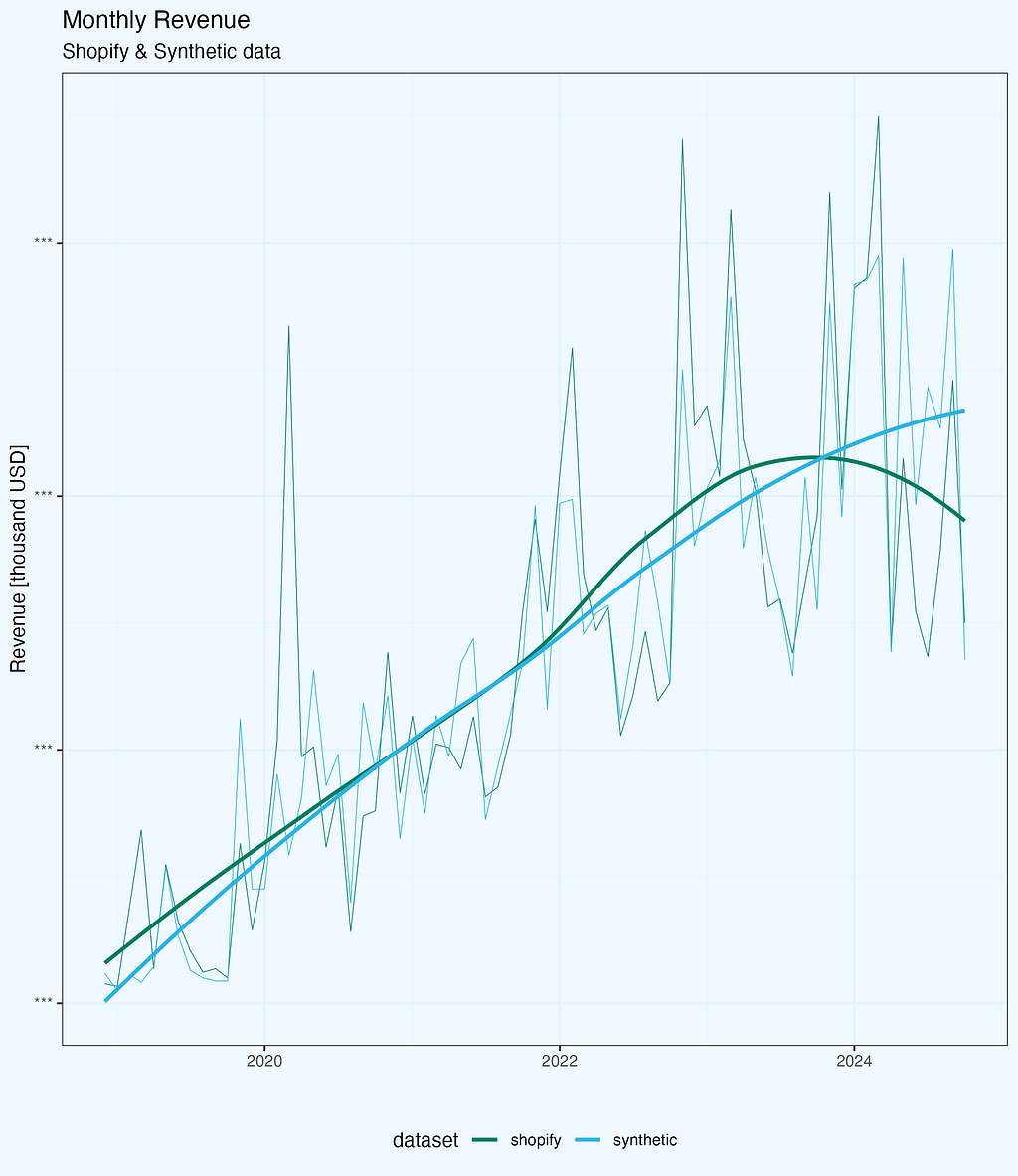
Monthly Revenue Analysis
The first test for any synthetic dataset is how well it captures core business metrics. Let’s start with monthly revenue — arguably the most important metric for any business (for sure in top 3).
Looking at the raw trends (Figure 1), both datasets follow a similar pattern: steady growth over the years with seasonal fluctuations. The synthetic data captures the general trend well, including the business’s growth trajectory. However, when we dig deeper into the differences, some interesting patterns emerge.
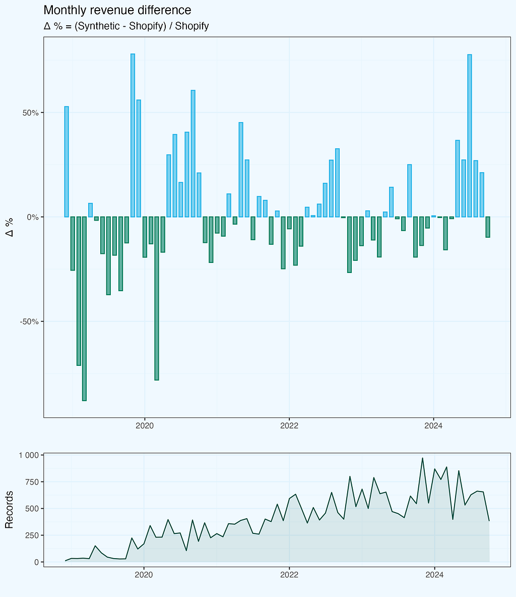
To quantify these differences, I calculated a monthly delta:
Δ % = (Synthetic - Shopify) / Shopify
We see from the plot, that monthly revenue delta varies — sometimes original is bigger, and sometimes synthetic. But the bars seem to be symmetrical and also the differences are getting smaller with time. I added number of records (transactions) per month, maybe it has some impact? Let’s dig a bit deeper.
The deltas are indeed quite well balanced, and if we look at the cumulative revenue lines, they are very well aligned, without large variations. I am skipping this chart.
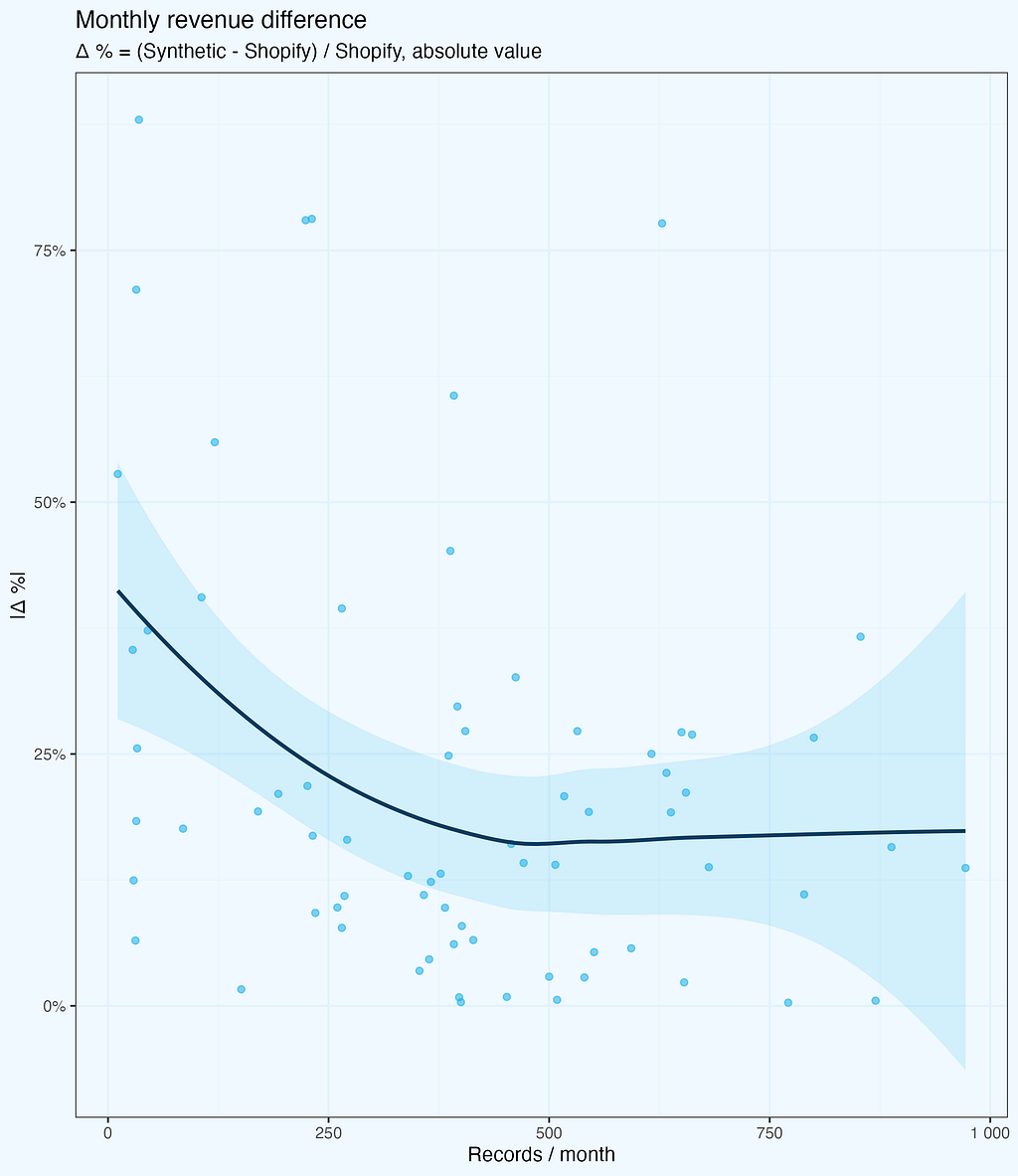
Sample Size Impact
The deltas are getting smaller, and we intuitively feel it is because of larger number of records. Let us check it — next plot shows absolute values of revenue deltas as a function of records per month. While the number of records does grow with time, the X axis is not exactly time — it’s the records.
The deltas (absolute values) do decrease, as the number of records per month is higher — as we expected. But there is one more thing, quite intriguing, and not that obvious, at least at first glance. Above around 500 records per month, the deltas do not fall further, they stay at (in average) more or less same level.
While this specific number is derived from our dataset and might vary for different business types or data structures, the pattern itself is important: there exists a threshold where synthetic data stability improves significantly. Below this threshold, we see high variance; above it, the differences stabilize but don’t disappear entirely — synthetic data maintains some variation by design, which actually helps with privacy protection.
There is a noise, which makes monthly values randomized, also with larger samples. All, while preserves consistency on higher aggregates (yearly, or cumulative). And while reproducing overall trend very well.
It would be quite interesting to see similar chart for other metrics and datasets.
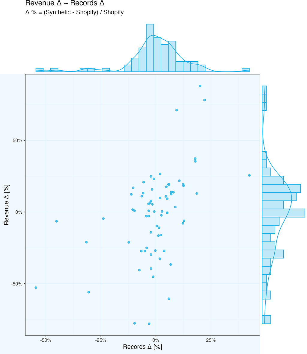
We already know revenue delta depends on number of records, but is it just that more records in a given month, the higher the revenue of synthetic data? Let us find out …
So we want to check how revenue delta depends on number of records delta. And we mean by delta Synthetic-Shopify, whether it is monthly revenue or monthly number of records.
The chart below shows exactly this relationship. There is some (light) correlation – if number of records per month differ substantially between Synthetic and Shopify, or vice-versa (high delta values), the revenue delta follows. But it is far from simple linear relationship – there is extra noise there as well.
Dimensional Analysis
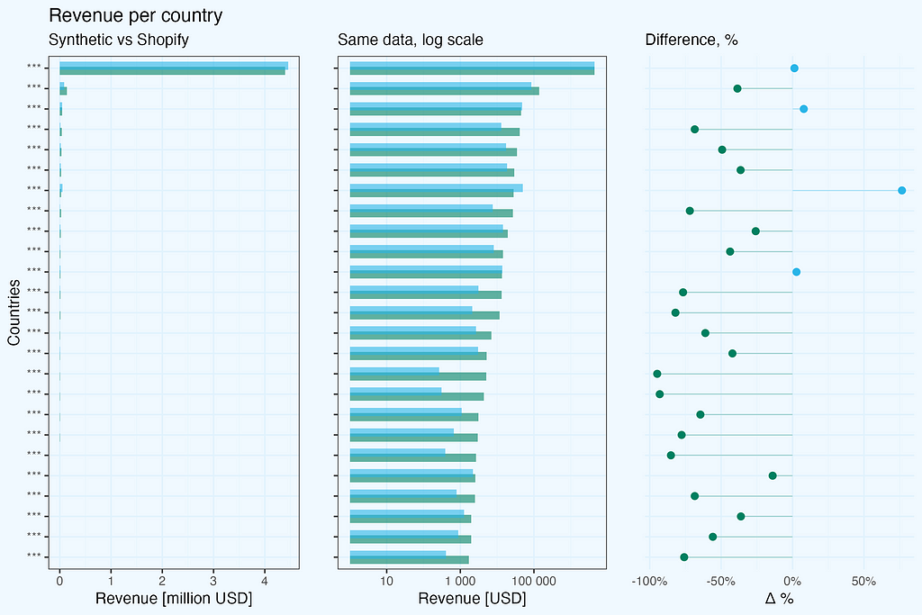
When generating synthetic data, we often need to preserve not just overall metrics, but also their distribution across different dimensions like geography. I kept country and state columns in our test dataset to see how synthetic data handles dimensional analysis.
The results reveal two important aspects:
The reliability of synthetic data strongly depends on the sample size within each dimension
Dependencies between dimensions are not preserved
Looking at revenue by country:
For the dominant market with thousands of transactions, the synthetic data provides a reliable representation — revenue totals are comparable between real and synthetic datasets. However, for countries with fewer transactions, the differences become significant.
A critical observation about dimensional relationships: in the original dataset, state information appears only for US transactions, with empty values for other countries. However, in the synthetic data, this relationship is lost — we see randomly generated values in both country and state columns, including states assigned to other countries, not US. This highlights an important limitation: synthetic data generation does not maintain logical relationships between dimensions.
There is, however, a practical way to overcome this country-state dependency issue. Before generating synthetic data, we could preprocess our input by concatenating country and state into a single dimension (e.g., ‘US-California’, ‘US-New York’, while keeping just ‘Germany’ or ‘France’ for non-US transactions). This simple preprocessing step would preserve the business logic of states being US-specific and prevent the generation of invalid country-state combinations in the synthetic data.
This has important practical implications:
Synthetic data works well for high-volume segments
Be cautious when analyzing smaller segments
Always check sample sizes before drawing conclusions
Be aware that logical relationships between dimensions may be lost, consider pre-aggregation of some columns
Consider additional data validation if dimensional integrity is crucial
Transaction value distribution
One of the most interesting findings in this analysis comes from examining transaction value distributions. Looking at these distributions year by year reveals both the strengths and limitations of synthetic data.
The original Shopify data shows what you’d typically expect in e-commerce: highly asymmetric distribution with a long tail towards higher values, and distinct peaks corresponding to popular single-product transactions, showing clear bestseller patterns.
The synthetic data tells an interesting story: it maintains very well the overall shape of the distribution, but the distinct peaks from bestseller products are smoothed out. The distribution becomes more “theoretical”, losing some real-world specifics.
This smoothing effect isn’t necessarily a bad thing. In fact, it might be preferable in some cases:
For general business modeling and forecasting
When you want to avoid overfitting to specific product patterns
If you’re looking for underlying trends rather than specific product effects
However, if you’re specifically interested in bestseller analysis or single-product transaction patterns, you’ll need to factor in this limitation of synthetic data.
Knowing, the goal is product analysis, we’d prepare original dataset differently.
To quantify how well the synthetic data matches the real distribution, we’ll look at statistical validation in the next section.
Statistical Validation (K-S Test)
Let’s validate our observations with the Kolmogorov-Smirnov test — a standard statistical method for comparing two distributions.
The findings are positive, but what do these figures mean in practice? The Kolmogorov-Smirnov test compares two distributions and returns two essential metrics: D = 0.012201 (smaller is better, with 0 indicating identical distributions), and p-value = 0.0283 (below the normal 0.05 level, indicating statistically significant differences).
While the p-value indicates some variations between distributions, the very low D statistic (nearly to 0) verifies the plot’s findings: a near-perfect match in the middle, with just slight differences at the extremities. The synthetic data captures crucial patterns while keeping enough variance to ensure anonymity, making it suitable for commercial analytics.
In practical terms, this means:
The synthetic data provides an excellent match in the most important mid-range of transaction values
The match is particularly strong where we have the most data points
Differences appear mainly in edge cases, which is expected and even desirable from a privacy perspective
The statistical validation confirms our visual observations from the distribution plots
This kind of statistical validation is crucial before deciding to use synthetic data for any specific analysis. In our case, the results suggest that the synthetic dataset is reliable for most business analytics purposes, especially when focusing on typical transaction patterns rather than extreme values.
Conclusions
Let’s summarize our journey from real Shopify transactions to their synthetic counterpart.
Overall business trends and patterns are maintained, including transactions value distributions. Spikes are ironed out, resulting in more theoretical distributions, while maintaining key characteristics.
Sample size matters, by design. Going too granular we will get noise, preserving confidentiality (in addition to removing all PII of course).
Dependencies between columns are not preserved (country-state), but there is an easy walk around, so I think it is not a real issue.
It is important to understand how the generated dataset will be used — what kind of analysis we expect, so that we can take it into account while reshaping the original dataset.
The synthetic dataset will work perfectly for applications testing, but we should manually check edge cases, as these might be missed during generation.
In our Shopify case, the synthetic data proved reliable enough for most business analytics scenarios, especially when working with larger samples and focusing on general patterns rather than specific product-level analysis.
Future Work
This analysis focused on transactions, as one of key metrics and an easy case to start with.
We can proceed with products analysis and also explore multi-table scenarios.
It is also worth to develop internal guidelines how to use synthetic data, including check and limitations.
Appendix: Data Preparation and Methodology
You can scroll through this section, as it is quite technical on how to prepare data.
Raw Data Export
Instead of relying on pre-aggregated Shopify reports, I went straight for the raw transaction data. At Alta Media, this is our standard approach — we prefer working with raw data to maintain full control over the analysis process.
The export process from Shopify is straightforward but not immediate:
Request raw transaction data export from the admin panel
Wait for email with download links
Download multiple ZIP files containing CSV data
Data Reshaping
I used R for exploratory data analysis, processing, and visualization. The code snippets are in R, copied from my working scripts, but of course one can use other languages to achieve the same final data frame.
The initial dataset had dozens of columns, so the first step was to select only the relevant ones for our synthetic data experiment.
Code formatting is adjusted, so that we don’t have horizontal scroll.
#-- 1.1 load data; the csv files are what we get as a # full export from Shopify xs1_dt <- fread(file = "shopify_raw/orders_export_1.csv") xs2_dt <- fread(file = "shopify_raw/orders_export_2.csv") xs3_dt <- fread(file = "shopify_raw/orders_export_3.csv")
#-- 1.2 check all columns, limit them to essential (for this analysis) # and bind into one data.table xs1_dt |> colnames() # there are 79 columns in full export, so we select a subset, # relevant for this analysis sel_cols <- c( "Name", "Email", "Paid at", "Fulfillment Status", "Accepts Marketing", "Currency", "Subtotal", "Lineitem quantity", "Lineitem name", "Lineitem price", "Lineitem sku", "Discount Amount", "Billing Province", "Billing Country")
We need one data frame, so we need to combine three files. Since we use data.table package, the syntax is very simple. And we pipe combined dataset to trim columns, keeping only selected ones.
xs_dt <- data.table::rbindlist(
  l = list(xs1_dt, xs2_dt, xs3_dt),
  use.names = T, fill = T, idcol = T) %>% .[, ..sel_cols]
Let’s also change column names to single string, replacing spaces with underscore “_” — we don’t need to deal with extra quotations in SQL.
#-- 2. data prep
#-- 2.1 replace spaces in column names, for easier handling
sel_cols_new <- sel_cols |>
  stringr::str_replace(pattern = " ", replacement = "_")

setnames(xs_dt, old = sel_cols, new = sel_cols_new)
I also change transaction id from character “#1234”, to numeric “1234”. I create a new column, so we can easily compare if transformation went as expected.
Since this was an experiment with Snowflake’s synthetic data generation, I made some additional preparations. The Shopify export contains actual customer emails, which would be masked in Snowflake while generating synthetic data, but I hashed them anyway.
So I hashed these emails using MD5 and created an additional column with numerical hashes. This was purely experimental — I wanted to see how Snowflake handles different types of unique identifiers.
By default, Snowflake masks text-based unique identifiers as it considers them personally identifiable information. For a real application, we’d want to remove any data that could potentially identify customers.
Once we have a dataset, we nee to export it as a csv file. I export full dataset, and I also produce a 5% sample, which I use for initial test run in Snowflake.
Once we have our dataset, prepared according to our needs, generation of it’s synthetic “sibling” is straightforward. One needs to upload the data, run generation, and export results. For details follow Snowflake guidelines. Anyway, I will add here short summary, for complteness of this article.
First, we need to make some preparations — role, database and warehouse.
USE ROLE ACCOUNTADMIN;
CREATE OR REPLACE ROLE data_engineer;
CREATE OR REPLACE DATABASE syndata_db;
CREATE OR REPLACE WAREHOUSE syndata_wh WITH
  WAREHOUSE_SIZE = 'MEDIUM'
  WAREHOUSE_TYPE = 'SNOWPARK-OPTIMIZED';

GRANT OWNERSHIP ON DATABASE syndata_db TO ROLE data_engineer;
GRANT USAGE ON WAREHOUSE syndata_wh TO ROLE data_engineer;
GRANT ROLE data_engineer TO USER "PIOTR";
USE ROLE data_engineer;
Upload csv files(s) to stage, and then import them to table(s).
Then, run generation of synthetic data. I like having a small “pilot”, somethiong like 5% records to make initial check if it goes through. It is a time saver (and costs too), in case of more complicated cases, where we might need some SQL adjustment. In this case it is rather pro-forma.
-- generate synthetic
-- small file, 5% records
call snowflake.data_privacy.generate_synthetic_data({
    'datasets':[
    {
        'input_table':  'syndata_db.experimental.transactions_a_5pct',
        'output_table': 'syndata_db.experimental.transactions_a_5pct_synth'
    }
    ],
    'replace_output_tables':TRUE
});
It is good to inspect what we have as a result — checking tables directly in Snowflake.
And then run a full dataset.
-- large file, all records
call snowflake.data_privacy.generate_synthetic_data({
    'datasets':[
    {
        'input_table':  'syndata_db.experimental.transactions_a',
        'output_table': 'syndata_db.experimental.transactions_a_synth'
    }
    ],
    'replace_output_tables':TRUE
});
The execution time is non-linear, for the full dataset it is way, way faster than what data volume would suggest.
CREATE OR REPLACE FILE FORMAT my_csv_unload_format TYPE = 'CSV' FIELD_DELIMITER = ',' FIELD_OPTIONALLY_ENCLOSED_BY = '"';
And export (small and full dataset):
COPY INTO @syn_unload/transactions_a_5pct_synth
FROM syndata_db.experimental.transactions_a_5pct_synth
FILE_FORMAT = my_csv_unload_format
HEADER = TRUE;

COPY INTO @syn_unload/transactions_a_synth
FROM syndata_db.experimental.transactions_a_synth
FILE_FORMAT = my_csv_unload_format
HEADER = TRUE;
So now we have both original Shopify dataset and Synthetic. Time to analyze, compare, and make some plots.
Appendix: Data comparison & charting
For this analysis, I used R for both data processing and visualization. The choice of tools, however, is secondary — the key is having a systematic approach to data preparation and validation. Whether you use R, Python, or other tools, the important steps remain the same:
Clean and standardize the input data
Validate the transformations
Create reproducible analysis
Document key decisions
The detailed code and visualization techniques could indeed be a topic for another article.
If you’re interested in specific aspects of the implementation, feel free to reach out.
We use cookies on our website to give you the most relevant experience by remembering your preferences and repeat visits. By clicking “Accept”, you consent to the use of ALL the cookies.
This website uses cookies to improve your experience while you navigate through the website. Out of these, the cookies that are categorized as necessary are stored on your browser as they are essential for the working of basic functionalities of the website. We also use third-party cookies that help us analyze and understand how you use this website. These cookies will be stored in your browser only with your consent. You also have the option to opt-out of these cookies. But opting out of some of these cookies may affect your browsing experience.
Necessary cookies are absolutely essential for the website to function properly. These cookies ensure basic functionalities and security features of the website, anonymously.
Cookie
Duration
Description
cookielawinfo-checkbox-analytics
11 months
This cookie is set by GDPR Cookie Consent plugin. The cookie is used to store the user consent for the cookies in the category "Analytics".
cookielawinfo-checkbox-functional
11 months
The cookie is set by GDPR cookie consent to record the user consent for the cookies in the category "Functional".
cookielawinfo-checkbox-necessary
11 months
This cookie is set by GDPR Cookie Consent plugin. The cookies is used to store the user consent for the cookies in the category "Necessary".
cookielawinfo-checkbox-others
11 months
This cookie is set by GDPR Cookie Consent plugin. The cookie is used to store the user consent for the cookies in the category "Other.
cookielawinfo-checkbox-performance
11 months
This cookie is set by GDPR Cookie Consent plugin. The cookie is used to store the user consent for the cookies in the category "Performance".
viewed_cookie_policy
11 months
The cookie is set by the GDPR Cookie Consent plugin and is used to store whether or not user has consented to the use of cookies. It does not store any personal data.
Functional cookies help to perform certain functionalities like sharing the content of the website on social media platforms, collect feedbacks, and other third-party features.
Performance cookies are used to understand and analyze the key performance indexes of the website which helps in delivering a better user experience for the visitors.
Analytical cookies are used to understand how visitors interact with the website. These cookies help provide information on metrics the number of visitors, bounce rate, traffic source, etc.
Advertisement cookies are used to provide visitors with relevant ads and marketing campaigns. These cookies track visitors across websites and collect information to provide customized ads.