This blog post describes practices for “what good looks like” in AIML UX, suggests examples, and maps a path forward for product leaders
Much time, blood, sweat, tears, and ink have been spilled in recent years to focus on Artificial Intelligence and Machine Learning (AIML) models, their size and performance, their rapid evolution, their training costs, their security, their latency, and the various model hosting choices in the cloud, locally, and at the edge. One overlooked area has been the Final Mile product User Experience (UX), and how best to incorporate AIML into products.
This blog post describes several practices for “what good looks like” in AIML UX, suggests reference examples, and maps a path forward for product managers and leaders who are shaping the future of their products and businesses. I also take the unique ךens of dually aligning these practices with Amazon Leadership Principles (LP) as well as UX principles articulated by Dr Don Norman and Steve Krug who authored The Design of Everyday Things and Don’t Make Me Think, respectively. Together, these principles and practices provide a solid foundation for understanding the Why for recommending specific UX actions and ideas when building AIML solutions.
Attention is All You Need.

Product features, AI related or not, will not have an impact unless they are surfaced to customers in a manner that is convenient, easy to use, discoverable, and visible. Visibility is critical in UX design, and it aligns with the Amazon LP of Invent and Simplify which all suggests that the features should be readily accessible at the surface of attention and consciousness and without a lot of fussing, fumbling, searching, and struggling. Whether it is content, conversation, or contacts, delivering the right information to the right person at the right time is essential here, so now let’s see what good looks like.
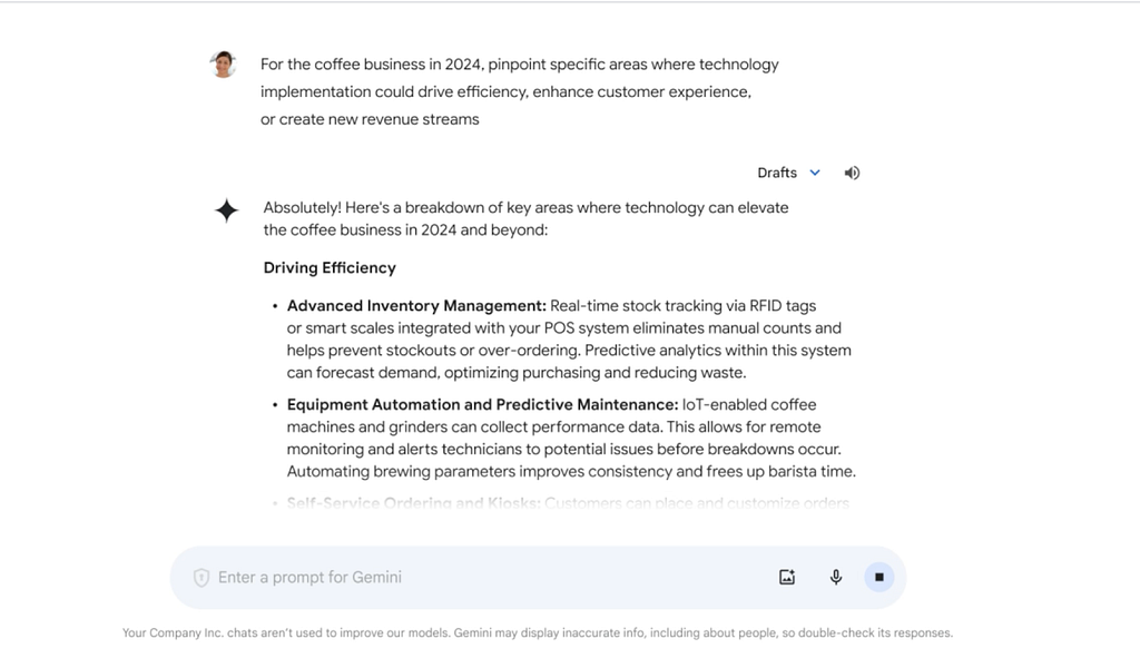
For example, Google Workspaces embeds generative AI features directly into the UX of Docs, Mail and other Google apps, making it easier for users to start drafting new documents and summarizing existing ones whether it’s a short memo, longer paper, or a dynamic presentation. In the case of Google Docs, the content is generated below the prompt, and it is also made clear that it was generated by the AIML model with the star (*) symbol. This motif of denoting something as produced by AIML will show up frequently throughout the examples.

Another example is Slack AI which allows you to personalize search results as well as summarize channel activity and long, complex threads. In this case, the generated content is displayed in a compact right hand panel as contextual details enriching the main pane. It is convenient, does not overload the user, and is also clearly marked as AI-generated.

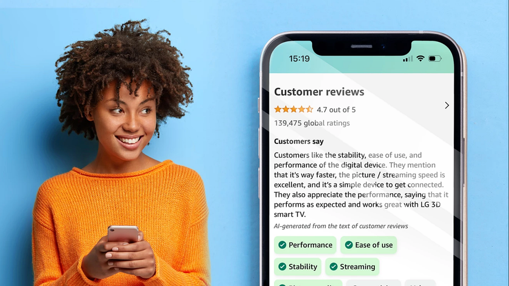
Lastly, Amazon.com now generates and displays summaries of product reviews. According to Amazon, 125 million customers contributed nearly 1.5 billion reviews and ratings to Amazon.com in 2022 alone; some individual products have 1000s of reviews. So in the spirit of helping a customer understand whether a product is right for them, Amazon.com provides a short paragraph on the product detail page that highlights the product features and customer sentiment frequently mentioned across reviews. The AI-generated review also highlights key product attributes and allows customers to more easily surface specific human reviews that mention certain those product attributes. Again, the AI-content is compact, clearly marked as machine-generated, and some aspects are visually iconified.

You Can Quote Me on That

In the newspaper business, there is an old saying that if you want readers to believe you, then consider getting your source “on the record” and getting their consent so that “you can quote them on that”. Citing bibliographic sources is a common practice in academic and scientific writing. The purpose of this practice is Earning Trust, one of the Amazon LPs, as well as Helpfulness, another UX principle. The practice is best illustrated through some good examples of how others are providing citations.
I asked Perplexity.ai, an AI-powered conversational search service built on AWS, to “Help me troubleshoot an HAProxy installation which is not load balancing correctly across multiple destination nodes and is only caching 1 IP address incorrectly. Please provide detailed, step-by-step prescriptive guidance.” Note in the response below that there are the multiple sources listed at the top and the numeric citations (e.g. [1]) sprinkled throughout referencing said sources.

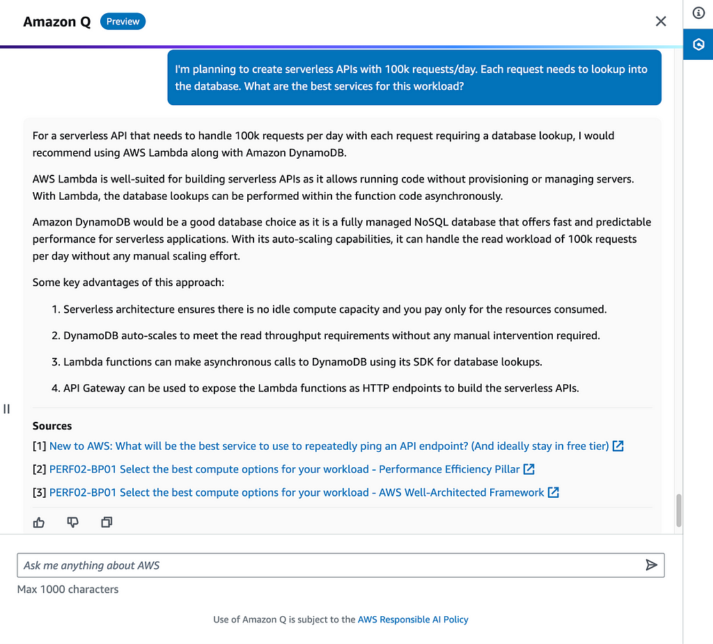
Next, I interacted with Amazon Q, and asked this question “I am planning to create Serverless APIs with 100k requests per day. Each request needs to read data from the database. What are the best services for this workload?” Once again, the service answered my question and also provided the Sources, however they are suffixed to the response, and while numerically ordered the actual references are not identified within the response for the reader’s benefit. I also commend the clear link to the Responsible AI policy which is another mechanism for earning trust. Which approach is clearer to read and to understand depends upon the context of your specific application. Do the citations clarify? Do they distract? Where are they best placed?

Learn from Users through Loops.

Learning from users is crucial to progressive, product iterations tied to business outcomes. This practice is aligned with the Amazon LP of Learn and Be Curious, and the UX principle of Feedback. You cannot know everything inside a user’s mind, so ask them. Track and measure them, and then align the gathered data with outcomes. Think about optimizing e-commerce shopping cart experiences to increase orders and reduce pending carts, also referred to as conversion rates. Consider time spent and clicks on a site as a proxy for user engagement. Reflect when you onboard onto any new system. The first few clicks, steps and minutes of onboarding are crucial to maximizing the task success rate and reducing the error rate. Now put these ideas into the context of Generative AI which is relatively new to public facing products in both business and consumer scenarios. Some common approaches to this practice include actions for Like/Dislike and Sharing to Support.
Copilot for Microsoft 365 illustrates this practice having first class buttons for Like / Dislike. The other commendable aspect is the clear italicized message that “AI-generated content may be incorrect”. That also earns trust as well.

Einstein Copilot for Salesforce also does a good job of having the Like/Dislike action pair, clearly denotes summaries as AI-generated in a right hand panel, and distinguishes between Accepting vs Drafting to make the output intent clearer to the user.

Have a Map of the Random Forest.

To paraphrase Lewis Carroll, author of Alice in Wonderland, if you don’t know where you are going, then any road will take you there. Supporting these core UX practices for AIML is good, old-fashioned product road mapping, and there are no shortcuts to arriving at this Big Picture. The principles supporting this practice are the Amazon LP, Think Big, and UX principle for Consistency. Identify your target users, product use cases, and their goals. And then work backwards. At Amazon, we often draft a PRFAQ document to imagine what the future ought to be and think about it from the external PR aspect and the internal FAQ detailed aspect. Think about the high-level solution information and processes needed to achieve the customer goals. Then dive deeper into the solution components at the UX layer and other technology layers. Align and prioritize solution and component milestones based on risk, ROI, must-have vs nice-to-have, and other factors. Get consensus across the product, engineering, and sales teams. And then go execute according to the roadmap with the proviso that some adjustments will be made along the journey.
Conclusion
In this blog, we covered four AIML product UX practices: Attention is All You Need (Visibility/Simplify), You Can Quote me on That (Earning Trust/Helpfulness), Learning from Users through Loops (Learn and Be Curious/Feedback), and Have a Map for the Random Forest (Think Big/Consistency). We also discussed several real product examples from top technology companies including Amazon, Google, Microsoft, Perplexity, Salesforce, and Slack to illustrate these practices and principles. I hope you learned something new that you can immediately incorporate into your own products and solution. Go forth and build!
Disclaimer: Note the contents of this article are my opinion and not necessarily that of my employer.
Enjoy the article? Please share your comments. Follow me on Medium and Twitter for more updates.
References
- https://www.nngroup.com/articles/principles-visual-design/
- https://www.nngroup.com/articles/product-ux-benchmarks/
- https://sensible.com/dont-make-me-think/
- https://workspace.google.com/solutions/ai/?
- https://slack.com/blog/news/slack-ai-has-arrived
- https://www.aboutamazon.com/about-us/leadership-principles
- https://www.aboutamazon.com/news/amazon-ai/amazon-improves-customer-reviews-with-generative-ai
- https://www.microsoft.com/en-us/microsoft-365/enterprise/copilot-for-microsoft-365
- https://ui-patterns.com/patterns
Best Practices for AIML Product UX was originally published in Towards Data Science on Medium, where people are continuing the conversation by highlighting and responding to this story.
Originally appeared here:
Best Practices for AIML Product UX
Go Here to Read this Fast! Best Practices for AIML Product UX