A python tool to tune and visualize the threshold choices for binary and multi-class classification problems
Adjusting the thresholds used in classification problems (that is, adjusting the cut-offs in the probabilities used to decide between predicting one class or another) is a step that’s sometimes forgotten, but is quite easy to do and can significantly improve the quality of a model. It’s a step that should be performed with most classification problems (with some exceptions depending on what we wish to optimize for, described below).
In this article, we look closer at what’s actually happening when we do this — with multi-class classification particularly, this can be a bit nuanced. And we look at an open source tool, written by myself, called ClassificationThesholdTuner, that automates and describes the process to users.
Given how common the task of tuning the thresholds is with classification problems, and how similar the process usually is from one project to another, I’ve been able to use this tool on many projects. It eliminates a lot of (nearly duplicate) code I was adding for most classification problems and provides much more information about tuning the threshold that I would have otherwise.
Although ClassificationThesholdTuner is a useful tool, you may find the ideas behind the tool described in this article more relevant — they’re easy enough to replicate where useful for your classification projects.
In a nutshell, ClassificationThesholdTuner is a tool to optimally set the thresholds used for classification problems and to present clearly the effects of different thresholds. Compared to most other available options (and the code we would most likely develop ourselves for optimizing the threshold), it has two major advantages:
- It provides visualizations, which help data scientists understand the implications of using the optimal threshold that’s discovered, as well as alternative thresholds that may be selected. This can also be very valuable when presenting the modeling decisions to other stakeholders, for example where it’s necessary to find a good balance between false positives and false negatives. Frequently business understanding, as well as data modeling knowledge, is necessary for this, and having a clear and full understanding of the choices for threshold can facilitate discussing and deciding on the best balance.
- It supports multi-class classification, which is a common type of problem in machine learning, but is more complicated with respect to tuning the thresholds than binary classification (for example, it requires identifying multiple thresholds). Optimizing the thresholds used for multi-class classification is, unfortunately, not well-supported by other tools of this type.
Although supporting multi-class classification is one of the important properties of ClassificationThesholdTuner, binary classification is easier to understand, so we’ll begin by describing this.
What are the thresholds used in classification?
Almost all modern classifiers (including those in scikit-learn, CatBoost, LGBM, XGBoost, and most others) support producing both predictions and probabilities.
For example, if we create a binary classifier to predict which clients will churn in the next year, then for each client we can generally produce either a binary prediction (a Yes or a No for each client), or can produce a probability for each client (e.g. one client may be estimated to have a probability of 0.862 of leaving in that time frame).
Given a classifier that can produce probabilities, even where we ask for binary predictions, behind the scenes it will generally actually produce a probability for each record. It will then convert the probabilities to class predictions.
By default, binary classifiers will predict the positive class where the predicted probability of the positive class is greater than or equal to 0.5, and the negative class where the probability is under 0.5. In this example (predicting churn), it would, by default, predict Yes if the predicted probability of churn is ≥ 0.5 and No otherwise.
However, this may not be the ideal behavior, and often a threshold other than 0.5 can work preferably, possibly a threshold somewhat lower or somewhat higher, and sometimes a threshold substantially different from 0.5. This can depend on the data, the classifier built, and the relative importance of false positives vs false negatives.
In order to create a strong model (including balancing well the false positives and false negatives), we will often wish to optimize for some metric, such as F1 Score, F2 Score (or others in the family of f-beta metrics), Matthews Correlation Coefficient (MCC), Kappa Score, or another. If so, a major part of optimizing for these metrics is setting the threshold appropriately, which will most often set it to a value other than 0.5. We’ll describe soon how this works.
Support in Scikit-learn for threshold tuning
Scikit-learn provides good background on the idea of threshold tuning in its Tuning the decision threshold for class prediction page. Scikit-learn also provides two tools: FixedThresholdClassifier and TunedThresholdClassifierCV (introduced in version 1.5 of scikit-learn) to assist with tuning the threshold. They work quite similarly to ClassificationThesholdTuner.
Scikit-learn’s tools can be considered convenience methods, as they’re not strictly necessary; as indicated, tuning is fairly straightforward in any case (at least for the binary classification case, which is what these tools support). But, having them is convenient — it is still quite a bit easier to call these than to code the process yourself.
ClassificationThresholdTuner was created as an alternative to these, but where scikit-learn’s tools work well, they are very good choices as well. Specifically, where you have a binary classification problem, and don’t require any explanations or descriptions of the threshold discovered, scikit-learn’s tools can work perfectly, and may even be slightly more convenient, as they allow us to skip the small step of installing ClassificationThresholdTuner.
ClassificationThresholdTuner may be more valuable where explanations of the thresholds found (including some context related to alternative values for the threshold) are necessary, or where you have a multi-class classification problem.
As indicated, it also may at times be the case that the ideas described in this article are what is most valuable, not the specific tools, and you may be best to develop your own code — perhaps along similar lines, but possibly optimized in terms of execution time to more efficiently handle the data you have, possibly more able support other metrics to optimize for, or possibly providing other plots and descriptions of the threshold-tuning process, to provide the information relevant for your projects.
Thresholds in Binary Classification
With most scikit-learn classifiers, as well as CatBoost, XGBoost, and LGBM, the probabilities for each record are returned by calling predict_proba(). The function outputs a probability for each class for each record. In a binary classification problem, they will output two probabilities for each record, for example:
[[0.6, 0.4],
 [0.3, 0.7],
 [0.1, 0.9],
  …
]
For each pair of probabilities, we can take the first as the probability of the negative class and the second as the probability of the positive class.
However, with binary classification, one probability is simply 1.0 minus the other, so only the probabilities of one of the classes are strictly necessary. In fact, when working with class probabilities in binary classification problems, we often use only the probabilities of the positive class, so could work with an array such as: [0.4, 0.7, 0.9, …].
Thresholds are easy to understand in the binary case, as they can be viewed simply as the minimum predicted probability needed for the positive class to actually predict the positive class (in the churn example, to predict customer churn). If we have a threshold of, say, 0.6, it’s then easy to convert the array of probabilities above to predictions, in this case, to: [No, Yes, Yes, ….].
By using different thresholds, we allow the model to be more, or less, eager to predict the positive class. If a relatively low threshold, say, 0.3 is used, then the model will predict the positive class even when there’s only a moderate chance this is correct. Compared to using 0.5 as the threshold, more predictions of the positive class will be made, increasing both true positives and false positives, and also reducing both true negatives and false negatives.
In the case of churn, this can be useful if we want to focus on catching most cases of churn, even though doing so, we also predict that many clients will churn when they will not. That is, a low threshold is good where false negatives (missing churn) is more of a problem than false positives (erroneously predicting churn).
Setting the threshold higher, say to 0.8, will have the opposite effect: fewer clients will be predicted to churn, but of those that are predicted to churn, a large portion will quite likely actually churn. We will increase the false negatives (miss some who will actually churn), but decrease the false positives. This can be appropriate where we can only follow up with a small number of potentially-churning clients, and want to label only those that are most likely to churn.
There’s almost always a strong business component to the decision of where to set the threshold. Tools such as ClassificationThresholdTuner can make these decisions more clear, as there’s otherwise not usually an obvious point for the threshold. Picking a threshold, for example, simply based on intuition (possibly determining 0.7 feels about right) will not likely work optimally, and generally no better than simply using the default of 0.5.
Setting the threshold can be a bit unintuitive: adjusting it a bit up or down can often help or hurt the model more than would be expected. Often, for example, increasing the threshold can greatly decrease false positives, with only a small effect on false negatives; in other cases the opposite may be true. Using a Receiver Operator Curve (ROC) is a good way to help visualize these trade-offs. We’ll see some examples below.
Ultimately, we’ll set the threshold so as to optimize for some metric (such as F1 score). ClassificationThresholdTuner is simply a tool to automate and describe that process.
AUROC and F1 Scores
In general, we can view the metrics used for classification as being of three main types:
- Those that examine how well-ranked the prediction probabilities are, for example: Area Under Receiver Operator Curve (AUROC), Area Under Precision Recall Curve (AUPRC)
- Those that examine how well-calibrated the prediction probabilities are, for example: Brier Score, Log Loss
- Those that look at how correct the predicted labels are, for example: F1 Score, F2 Score, MCC, Kappa Score, Balanced Accuracy
The first two categories of metric listed here work based on predicted probabilities, and the last works with predicted labels.
While there are numerous metrics within each of these categories, for simplicity, we will consider for the moment just two of the more common, the Area Under Receiver Operator Curve (AUROC) and the F1 score.
These two metrics have an interesting relationship (as does AUROC with other metrics based on predicted labels), which ClassificationThresholdTuner takes advantage of to tune and to explain the optimal thresholds.
The idea behind ClassificationThresholdTuner is to, once the model is well-tuned to have a strong AUROC, take advantage of this to optimize for other metrics — metrics that are based on predicted labels, such as the F1 score.
Metrics Based on Predicted Labels
Very often metrics that look at how correct the predicted labels are are the most relevant for classification. This is in cases where the model will be used to assign predicted labels to records and what’s relevant is the number of true positives, true negatives, false positives, and false negatives. That is, if it’s the predicted labels that are used downstream, then once the labels are assigned, it’s no longer relevant what the underlying predicted probabilities were, just these final label predictions.
For example, if the model assigns labels of Yes and No to clients indicating if they’re expected to churn in the next year and the clients with a prediction of Yes receive some treatment and those with a prediction of No do not, what’s most relevant is how correct these labels are, not in the end, how well-ranked or well-calibrated the prediction probabilities (that these class predications are based on) were. Though, how well-ranked the predicted probabilities are is relevant, as we’ll see, to assign predicted labels accurately.
This isn’t true for every project: often metrics such as AUROC or AUPRC that look at how well the predicted probabilities are ranked are the most relevant; and often metrics such as Brier Score and Log Loss that look at how accurate the predicted probabilities are most relevant.
Tuning the thresholds will not affect these metrics and, where these metrics are the most relevant, there is no reason to tune the thresholds. But, for this article, we’ll consider cases where the F1 score, or another metric based on the predicted labels, is what we wish to optimize.
ClassificationThresholdTuner starts with the predicted probabilities (the quality of which can be assessed with the AUROC) and then works to optimize the specified metric (where the specified metric is based on predicted labels).
Metrics based on the correctness of the predicted labels are all, in different ways, calculated from the confusion matrix. The confusion matrix, in turn, is based on the threshold selected, and can look quite quite different depending if a low or high threshold is used.
Adjusting the Threshold
The AUROC metric is, as the name implies, based on the ROC, a curve showing how the true positive rate relates to the false positive rate. An ROC curve doesn’t assume any specific threshold is used. But, each point on the curve corresponds to a specific threshold.
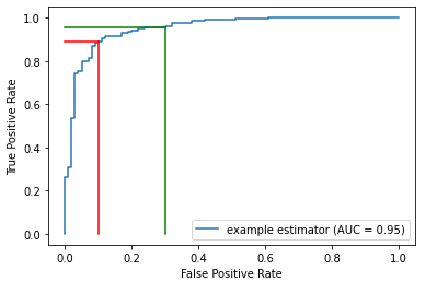
In the plot below, the blue curve is the ROC. The area under this curve (the AUROC) measures how strong the model is generally, averaged over all potential thresholds. It measures how well ranked the probabilities are: if the probabilities are well-ranked, records that are assigned higher predicted probabilities of being in the positive class are, in fact, more likely to be in the positive class.
For example, an AUROC of 0.95 means a random positive sample has a 95% chance of being ranked higher than random negative sample.

First, having a model with a strong AUROC is important — this is the job of the model tuning process (which may actually optimize for other metrics). This is done before we begin tuning the threshold, and coming out of this, it’s important to have well-ranked probabilities, which implies a high AUROC score.
Then, where the project requires class predictions for all records, it’s necessary to select a threshold (though the default of 0.5 can be used, but likely with sub-optimal results), which is equivalent to picking a point on the ROC curve.
The figure above shows two points on the ROC. For each, a vertical and a horizonal line are drawn to the x & y-axes to indicate the associated True Positive Rates and False Positive Rates.
Given an ROC curve, as we go left and down, we are using a higher threshold (for example from the green to the red line). Less records will be predicted positive, so there will be both less true positives and less false positives.
As we move right and up (for example, from the red to the green line), we are using a lower threshold. More records will be predicted positive, so there will be both more true positives and more false positives.
That is, in the plot here, the red and green lines represent two possible thresholds. Moving from the green line to the red, we see a small drop in the true positive rate, but a larger drop in the false positive rate, making this quite likely a better choice of threshold than that where the green line is situated. But not necessarily — we also need to consider the relative cost of false positives and false negatives.
What’s important, though, is that moving from one threshold to another can often adjust the False Positive Rate much more or much less than the True Positive Rate.
The following presents a set of thresholds with a given ROC curve. We can see where moving from one threshold to another can affect the true positive and false positive rates to significantly different extents.
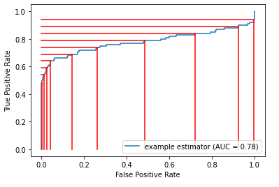
This is the main idea behind adjusting the threshold: it’s often possible to achieve a large gain in one sense, while taking only a small loss in the other.
It’s possible to look at the ROC curve and see the effect of moving the thresholds up and down. Given that, it’s possible, to an extent, to eye-ball the process and pick a point that appears to best balance true positives and false positives (which also effectively balances false positives and false negatives). In some sense, this is what ClassificationThesholdTuner does, but it does so in a principled way, in order to optimize for a certain, specified metric (such as the F1 score).
Moving the threshold to different points on the ROC generates different confusion matrixes, which can then be converted to metrics (F1 Score, F2 score, MCC etc.). We can then take the point that optimizes this score.
So long as a model is trained to have a strong AUROC, we can usually find a good threshold to achieve a high F1 score (or other such metric).
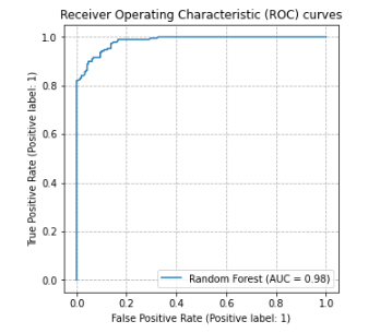
In this ROC plot, the model is very accurate, with an AUROC of 0.98. It will, then, be possible to select a threshold that results in a high F1 score, though it is still necessary to select a good threshold, and the optimal may easily not be 0.5.
Being well-ranked, the model is not necessarily also well-calibrated, but this isn’t necessary: so long as records that are in the positive class tend to get higher predicted probabilities than those in the negative class, we can find a good threshold where we separate those predicted to be positive from those predicted to be negative.
Looking at this another way, we can view the distribution of probabilities in a binary classification problem with two histograms, as shown here (actually using KDE plots). The blue curve shows the distribution of probabilities for the negative class and the orange for the positive class. The model is not likely well-calibrated: the probabilities for the positive class are consistently well below 1.0. But, they are well-ranked: the probabilities for the positive class tend to be higher than those for the negative class, which means the model would have a high AUROC and the model can assign labels well if using an appropriate threshold, in this case, likely about 0.25 or 0.3. Given that there is overlap in the distributions, though, it’s not possible to have a perfect system to label the records, and the F1 score can never be quite 1.0.
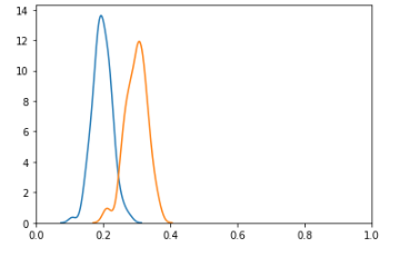
It is possible to have, even with a high AUROC score, a low F1 score: where there is a poor choice of threshold. This can occur, for example, where the ROC hugs the axis as in the ROC shown above — a very low or very high threshold may work poorly. Hugging the y-axis can also occur where the data is imbalanced.
In the case of the histograms shown here, though the model is well-calibrated and would have a high AUROC score, a poor choice of threshold (such as 0.5 or 0.6, which would result in everything being predicted as the negative class) would result in a very low F1 score.
It’s also possible (though less likely) to have a low AUROC and high F1 Score. This is possible with a particularly good choice of threshold (where most thresholds would perform poorly).
As well, it’s not common, but possible to have ROC curves that are asymmetrical, which can greatly affect where it is best to place the threshold.
Example using ClassificationThresholdTuner for Binary Classification
This is taken from a notebook available on the github site (where it’s possible to see the full code). We’ll go over the main points here. For this example, we first generate a test dataset.
import pandas as pd
import numpy as np
import matplotlib.pyplot as plt
import seaborn as sns
from threshold_tuner import ClassificationThresholdTuner

NUM_ROWS = 100_000

def generate_data():
    num_rows_per_class = NUM_ROWS // 2
    np.random.seed(0)
    d = pd.DataFrame(
      {"Y": ['A']*num_rows_per_class + ['B']*num_rows_per_class,
       "Pred_Proba":
          np.random.normal(0.7, 0.3, num_rows_per_class).tolist() +
          np.random.normal(1.4, 0.3, num_rows_per_class).tolist()
      })
    return d, ['A', 'B']

d, target_classes = generate_data()
Here, for simplicity, we don’t generate the original data or the classifier that produced the predicted probabilities, just a test dataset containing the true labels and the predicted probabilities, as this is what ClassificationThresholdTuner works with and is all that is necessary to select the best threshold.
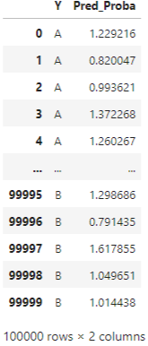
There’s actually also code in the notebook to scale the probabilities, to ensure they are between 0.0 and 1.0, but for here, we’ll just assume the probabilities are well-scaled.
We can then set the Pred column using a threshold of 0.5:
d['Pred'] = np.where(d["Pred_Proba"] > 0.50, "B", "A")
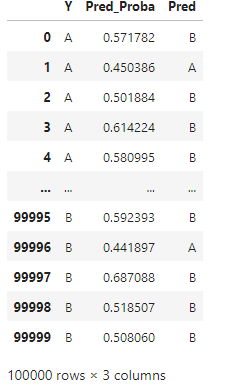
This simulates what’s normally done with classifiers, simply using 0.5 as the threshold. This is the baseline we will try to beat.
We then create a ClassificationThresholdTuner object and use this, to start, just to see how strong the current predictions are, calling one of it’s APIs, print_stats_lables().
tuner = ClassificationThresholdTuner()

tuner.print_stats_labels(
    y_true=d["Y"],
    target_classes=target_classes,
    y_pred=d["Pred"])
This indicates the precision, recall, and F1 scores for both classes (was well as the macro scores for these) and presents the confusion matrix.
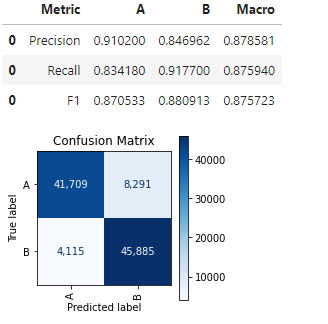
This API assumes the labels have been predicted already; where only the probabilities are available, this method cannot be used, though we can always, as in this example, select a threshold and set the labels based on this.
We can also call the print_stats_proba() method, which also presents some metrics, in this case related to the predicted probabilities. It shows: the Brier Score, AUROC, and several plots. The plots require a threshold, though 0.5 is used if not specified, as in this example:
tuner.print_stats_proba(
    y_true=d["Y"],
    target_classes=target_classes,
    y_pred_proba=d["Pred_Proba"])
This displays the effects of a threshold of 0.5. It shows the ROC curve, which itself does not require a threshold, but draws the threshold on the curve. It then presents how the data is split into two predicted classes based on the threshold, first as a histogram, and second as a swarm plot. Here there are two classes, with class A in green and class B (the positive class in this example) in blue.
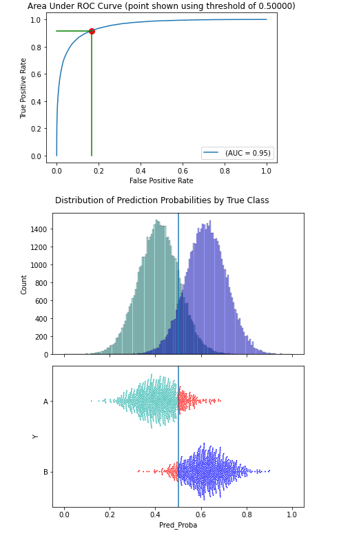
In the swarm plot, any misclassified records are shown in red. These are those where the true class is A but the predicted probability of B is above the threshold (so the model would predict B), and those where the true class is B but the predicted probability of B is below the threshold (so the model would predict A).
We can then examine the effects of different thresholds using plot_by_threshold():
tuner.plot_by_threshold(
    y_true=d['Y'],
    target_classes=target_classes,
    y_pred_proba=d["Pred_Proba"])
In this example, we use the default set of potential thresholds: 0.1, 0.2, 0.3, … up to 0.9. For each threshold, it will predict any records with predicted probabilities over the threshold as the positive class and anything lower as the negative class. Misclassified records are shown in red.
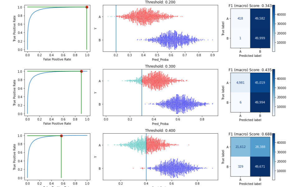
To save space in this article, this image shows just three potential thresholds: 0.2, 0.3, and 0.4. For each we see: the position on the ROC curve this threshold represents, the split in the data it leads to, and the resulting confusion matrix (along with the F1 macro score associated with that confusion matrix).
We can see that setting the threshold to 0.2 results in almost everything being predicted as B (the positive class) — almost all records of class A are misclassified and so drawn in red. As the threshold is increased, more records are predicted to be A and less as B (though at 0.4 most records that are truly B are correctly predicted as B; it is not until a threshold of about 0.8 where almost all records that are truly class B are erroneously predicted as A: very few have predicted probability over 0.8).
Examining this for nine possible values from 0.1 to 0.9 gives a good overview of the possible thresholds, but it may be more useful to call this function to display a narrower, and more realistic, range of possible values, for example:
tuner.plot_by_threshold(
    y_true=d['Y'],
    target_classes=target_classes,
    y_pred_proba=d["Pred_Proba"],
    start=0.50, end=0.55, num_steps=6)
This will show each threshold from 0.50 to 0.55. Showing the first two of these:
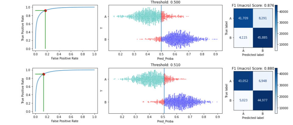
The API helps present the implications of different thresholds.
We can also view this calling describe_slices(), which describes the data between pairs of potential thresholds (i.e., within slices of the data) in order to see more clearly what the specific changes will be of moving the threshold from one potential location to the next (we see how many of each true class will be re-classified).
tuner.describe_slices(
    y_true=d['Y'],
    target_classes=target_classes,
    y_pred_proba=d["Pred_Proba"],
    start=0.3, end=0.7, num_slices=5)
This shows each slice visually and in table format:
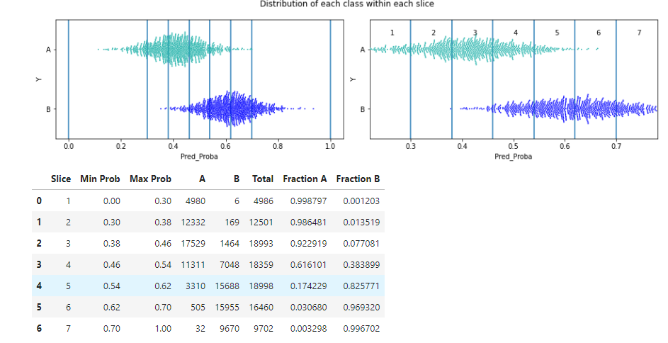
Here, the slices are fairly thin, so we see plots both showing them in context of the full range of probabilities (the left plot) and zoomed in (the right plot).
We can see, for example, that moving the threshold from 0.38 to 0.46 we would re-classify the points in the 3rd slice, which has 17,529 true instances of class A and 1,464 true instances of class B. This is evident both in the rightmost swarm plot and in the table (in the swarm plot, there are far more green than blue points within slice 3).
This API can also be called for a narrower, and more realistic, range of potential thresholds:
tuner.describe_slices(
    y_true=d['Y'],
    target_classes=target_classes,
    y_pred_proba=d["Pred_Proba"],
    start=0.4, end=0.6, num_slices=10)
This produces:
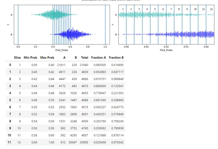
Having called these (or another useful API, print_stats_table(), skipped here for brevity, but described on the github page and in the example notebooks), we can have some idea of the effects of moving the threshold.
We can then move to the main task, searching for the optimal threshold, using the tune_threshold() API. With some projects, this may actually be the only API called. Or it may be called first, with the above APIs being called later to provide context for the optimal threshold discovered.
In this example, we optimize the F1 macro score, though any metric supported by scikit-learn and based on class labels is possible. Some metrics require additional parameters, which can be passed here as well. In this example, scikit-learn’s f1_score() requires the ‘average’ parameter, passed here as a parameter to tune_threshold().
from sklearn.metrics import f1_score

best_threshold = tuner.tune_threshold(
    y_true=d['Y'],
    target_classes=target_classes,
    y_pred_proba=d["Pred_Proba"],
    metric=f1_score,
    average='macro',
    higher_is_better=True,
    max_iterations=5
)
best_threshold
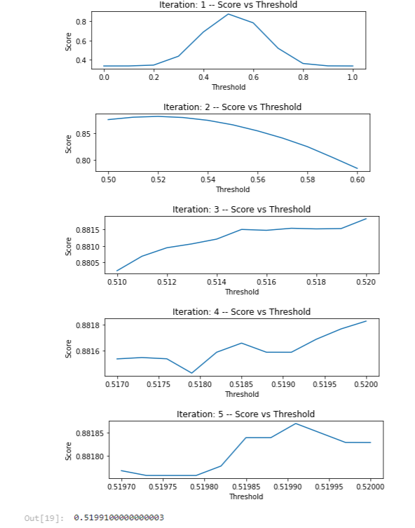
This, optionally, displays a set of plots demonstrating how the method over five iterations (in this example max_iterations is specified as 5) narrows in on the threshold value that optimizes the specified metric.
The first iteration considers the full range of potential thresholds between 0.0 and 1.0. It then narrows in on the range 0.5 to 0.6, which is examined closer in the next iteration and so on. In the end a threshold of 0.51991 is selected.
After this, we can call print_stats_labels() again, which shows:

We can see, in this example, an increase in Macro F1 score from 0.875 to 0.881. In this case, the gain is small, but comes for almost free. In other cases, the gain may be smaller or larger, sometimes much larger. It’s also never counter-productive; at worst the optimal threshold found will be the default, 0.5000, in any case.
Thresholds in Multi-class Classification
As indicated, multi-class classification is a bit more complicated. In the binary classification case, a single threshold is selected, but with multi-class classification, ClassificationThesholdTuner identifies an optimal threshold per class.
Also different from the binary case, we need to specify one of the classes to be the default class. Going through an example should make it more clear why this is the case.
In many cases, having a default class can be fairly natural. For example, if the target column represents various possible medical conditions, the default class may be “No Issue” and the other classes may each relate to specific conditions. For each of these conditions, we’d have a minimum predicted probability we’d require to actually predict that condition.
Or, if the data represents network logs and the target column relates to various intrusion types, then the default may be “Normal Behavior”, with the other classes each relating to specific network attacks.
In the example of network attacks, we may have a dataset with four distinct target values, with the target column containing the classes: “Normal Behavior”, “Buffer Overflow”, “Port Scan”, and “Phishing”. For any record for which we run prediction, we will get a probability of each class, and these will sum to 1.0. We may get, for example: [0.3, 0.4, 0.1, 0.2] (the probabilities for each of the four classes, in the order above).
Normally, we would predict “Buffer Overflow” as this has the highest probability, 0.4. However, we can set a threshold in order to modify this behavior, which will then affect the rate of false negatives and false positives for this class.
We may specify, for example that: the default class is ‘Normal Behavior”; the threshold for “Buffer Overflow” is 0.5; for “Port Scan” is 0.55; and for “Phishing” is 0.45. By convention, the threshold for the default class is set to 0.0, as it does not actually use a threshold. So, the set of thresholds here would be: 0.0, 0.5, 0.55, 0.45.
Then to make a prediction for any given record, we consider only the classes where the probability is over the relevant threshold. In this example (with predictions [0.3, 0.4, 0.1, 0.2]), none of the probabilities are over their thresholds, so the default class, “Normal Behavior” is predicted.
If the predicted probabilities were instead: [0.1, 0.6, 0.2, 0.1], then we would predict “Buffer Overflow”: the probability (0.6) is the highest prediction and is over its threshold (0.5).
If the predicted probabilities were: [0.1, 0.2, 0.7, 0.0], then we would predict “Port Scan”: the probability (0.7) is over its threshold (0.55) and this is the highest prediction.
This means: if one or more classes have predicted probabilities over their threshold, we take the one of these with the highest predicted probability. If none are over their threshold, we take the default class. And, if the default class has the highest predicted probability, it will be predicted.
So, a default class is needed to cover the case where none of the predictions are over the the threshold for that class.
If the predictions are: [0.1, 0.3, 0.4, 0.2] and the thresholds are: 0.0, 0.55, 0.5, 0.45, another way to look at this is: the third class would normally be predicted: it has the highest predicted probability (0.4). But, if the threshold for that class is 0.5, then a prediction of 0.4 is not high enough, so we go to the next highest prediction, which is the second class, with a predicted probability of 0.3. That is below its threshold, so we go again to the next highest predicted probability, which is the forth class with a predicted probability of 0.2. It is also below the threshold for that target class. Here, we have all classes with predictions that are fairly high, but not sufficiently high, so the default class is used.
This also highlights why it’s convenient to use 0.0 as the threshold for the default class — when examining the prediction for the default class, we do not need to consider if its prediction is under or over the threshold for that class; we can always make a prediction of the default class.
It’s actually, in principle, also possible to have more complex policies — not just using a single default class, but instead having multiple classes that can be selected under different conditions. But these are beyond the scope of this article, are often unnecessary, and are not supported by ClassificationThresholdTuner, at least at present. For the remainder of this article, we’ll assume there’s a single default class specified.
Example using ClassificationThresholdTuner for Multi-class Classification
Again, we’ll start by creating the test data (using one of the test data sets provided in the example notebook for multi-class classification on the github page), in this case, having three, instead of just two, target classes:
import pandas as pd
import numpy as np
import matplotlib.pyplot as plt
import seaborn as sns
from threshold_tuner import ClassificationThresholdTuner

NUM_ROWS = 10_000

def generate_data():
    num_rows_for_default = int(NUM_ROWS * 0.9)
    num_rows_per_class = (NUM_ROWS - num_rows_for_default) // 2
    np.random.seed(0)
    d = pd.DataFrame({
      "Y": ['No Attack']*num_rows_for_default + ['Attack A']*num_rows_per_class + ['Attack B']*num_rows_per_class,
      "Pred_Proba No Attack":
          np.random.normal(0.7, 0.3, num_rows_for_default).tolist() +
          np.random.normal(0.5, 0.3, num_rows_per_class * 2).tolist(),
      "Pred_Proba Attack A":
          np.random.normal(0.1, 0.3, num_rows_for_default).tolist() +
          np.random.normal(0.9, 0.3, num_rows_per_class).tolist() +
          np.random.normal(0.1, 0.3, num_rows_per_class).tolist(),
      "Pred_Proba Attack B":
          np.random.normal(0.1, 0.3, num_rows_for_default).tolist() +
          np.random.normal(0.1, 0.3, num_rows_per_class).tolist() +
          np.random.normal(0.9, 0.3, num_rows_per_class).tolist()
    })
    d['Y'] = d['Y'].astype(str)
    return d, ['No Attack', 'Attack A', 'Attack B']

d, target_classes = generate_data()
There’s some code in the notebook to scale the scores and ensure they sum to 1.0, but for here, we can just assume this is done and that we have a set of well-formed probabilities for each class for each record.
As is common with real-world data, one of the classes (the ‘No Attack’ class) is much more frequent than the others; the dataset in imbalanced.
We then set the target predictions, for now just taking the class with the highest predicted probability:
def set_class_prediction(d):
    max_cols = d[proba_cols].idxmax(axis=1)
    max_cols = [x[len("Pred_Proba_"):] for x in max_cols]
    return max_cols

d['Pred'] = set_class_prediction(d)
This produces:
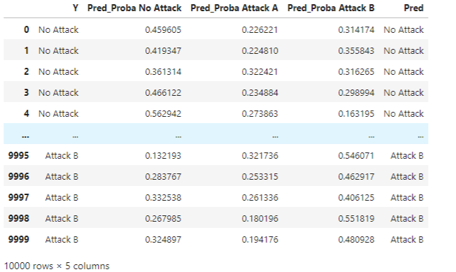
Taking the class with the highest probability is the default behaviour, and in this example, the baseline we wish to beat.
We can, as with the binary case, call print_stats_labels(), which works similarly, handling any number of classes:
tuner.print_stats_labels(
    y_true=d["Y"],
    target_classes=target_classes,
    y_pred=d["Pred"])
This outputs:
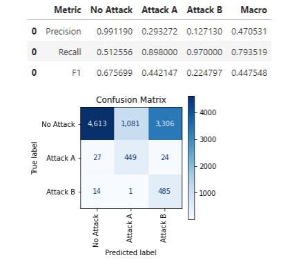
Using these labels, we get an F1 macro score of only 0.447.
Calling print_stats_proba(), we also get the output related to the prediction probabilities:
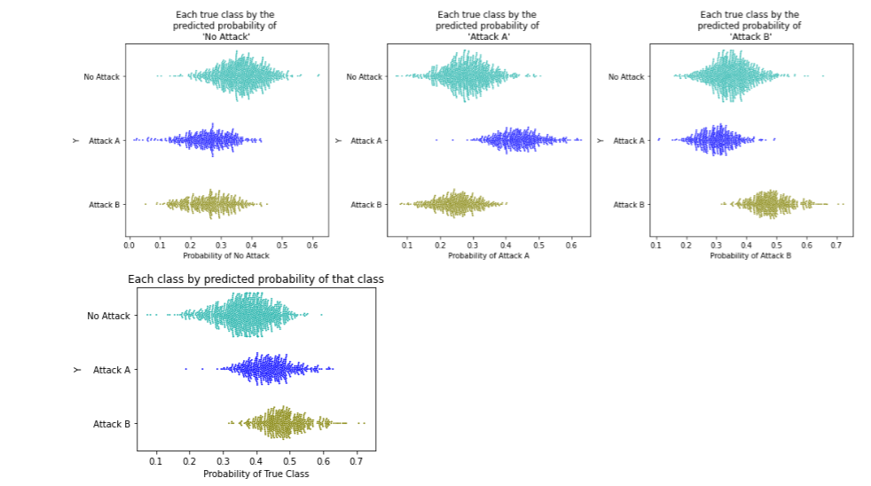
This is a bit more involved than the binary case, since we have three probabilities to consider: the probabilities of each class. So, we first show how the data lines up relative to the probabilities of each class. In this case, there are three target classes, so three plots in the first row.
As would be hoped, when plotting the data based on the predicted probability of ‘No Attack’ (the left-most plot), the records for ‘No Attack’ are given a higher probabilities of this class than for other classes. Similar for ‘Attack A’ (the middle plot) and ‘Attack B’ (the right-most plot).
We can also see that the classes are not perfectly separated, so there is no set of thresholds that can result in a perfect confusion matrix. We will need to chose a set of thresholds that best balances correct and incorrect predictions for each class.
In the figure above, the bottom plot shows each point based on the probability of its true class. So for the the records where the true class is ‘No Attack’ (the green points), we plot these by their predicted probability of ‘No Attack’, for the records where the true class is ‘Attack A’, (in dark blue) we plot these by their predicted probability of ‘Attack A’, and similar for Attack B (in dark yellow). We see that the model has similar probabilities for Attack A and Attack B, and higher probabilities for these than for No Attack.
The above plots did not consider any specific thresholds that may be used. We can also, optionally, generate more output, passing a set of thresholds (one per class, using 0.0 for the default class):
tuner.print_stats_proba(
    y_true=d["Y"],
    target_classes=target_classes,
    y_pred_proba=d[proba_cols].values,
    default_class='No Attack',
    thresholds=[0.0, 0.4, 0.4]
)
This may be most useful to plot the set of thresholds discovered as optimal by the tool, but can also be used to view other potential sets of thresholds.
This produces a report for each class. To save space, we just show one here, for class Attack A (the full report is shown in the example notebook; viewing the reports for the other two classes as well is helpful to understand the full implications of using, in this example, [0.0, 0.4, 0.4] as the thresholds):
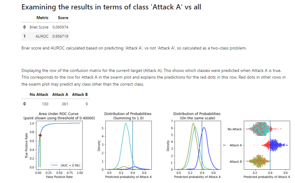
As we have a set of thresholds specified here, we can see the implications of using these thresholds, including how many of each class will be correctly and incorrectly classified.
We see first where the threshold appears on the ROC curve. In this case, we are viewing the report for Class A so see a threshold of 0.4 (0.4 was specified for class A in the API call above).
The AUROC score is also shown. This metric applies only to binary prediction, but in a multi-class problem we can calculate the AUROC score for each class by treating the problem as a series of one-vs-all problems. Here we can treat the problem as ‘Attack A’ vs not ‘Attack A’ (and similarly for the other reports).
The next plots show the distribution of each class with respect to the predicted probabilities of Attack A. As there are different counts of the different classes, these are shown two ways: one showing the actual distributions, and one showing them scaled to be more comparable. The former is more relevant, but the latter can allow all classes to be seen clearly where some classes are much more rare than others.
We can see that records where the true class is ‘Attack A’ (in dark blue) do have higher predicted probabilities of ‘Attack A’, but there is some decision to be made as to where the threshold is specifically placed. We see here the effect using 0.4 for this class. It appears that 0.4 is likely close to ideal, if not exactly.
We also see this in the form a swarm plot (the right-most plot), with the misclassified points in red. We can see that using a higher threshold (say 0.45 or 0.5), we would have more records where the true class is Attack A misclassified, but less records where the true class is ‘No Attack’ misclassified. And, using a lower threshold (say 0.3 or 0.35) would have the opposite effect.
We can also call plot_by_threshold() to look at different potential thresholds:
tuner.plot_by_threshold(
    y_true=d['Y'],
    target_classes=target_classes,
    y_pred_proba=d[proba_cols].values,
    default_class='No Attack'
)
This API is simply for explanation and not tuning, so for simplicity uses (for each potential threshold), the same threshold for each class (other than the default class). Showing this for the potential thresholds 0.2, 0.3, and 0.4:
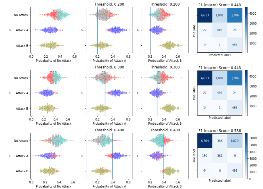
The first row of figures shows the implication of using 0.2 for the threshold for all classes other than the default (that is not predicting Attack A unless the estimated probability of Attack A is at least 0.2; and not predicting Attack B unless the predicted probability of Attack B is at least 0.2 — though always otherwise taking the class with the highest predicted probability). Similarly in the next two rows for thresholds of 0.3 and 0.4.
We can see here the trade-offs to using lower or higher thresholds for each class, and the confusion matrixes that will result (along with the F1 score associated with these confusion matrixes).
In this example, moving from 0.2 to 0.3 to 0.4, we can see how the model will less often predict Attack A or Attack B (raising the thresholds, we will less and less often predict anything other than the default) and more often No Attack, which results in less misclassifications where the true class is No Attack, but more where the true class is Attack A or Attack B.
When the threshold is quite low, such as 0.2, then of those records where the true class is the default, only those with the highest predicted probability of the class being No Attack (about the top half) were predicted correctly.
Once the threshold is set above about 0.6, nearly everything is predicted as the default class, so all cases where the ground truth is the default class are correct and all others are incorrect.
As expected, setting the thresholds higher means predicting the default class more often and missing less of these, though missing more of the other classes. Attack A and B are generally predicted correctly when using low thresholds, but mostly incorrectly when using higher thresholds.
To tune the thresholds, we again use tune_threshold(), with code such as:
from sklearn.metrics import f1_score

best_thresholds = tuner.tune_threshold(
    y_true=d['Y'],
    target_classes=target_classes,
    y_pred_proba=d[proba_cols].values,
    metric=f1_score,
    average='macro',
    higher_is_better=True,
    default_class='No Attack',
    max_iterations=5
)
best_thresholds
This outputs: [0.0, 0.41257, 0.47142]. That is, it found a threshold of about 0.413 for Attack A, and 0.471 for Attack B works best to optimize for the specified metric, macro F1 score in this case.
Calling print_stats_proba() again, we get:
tuner.print_stats_proba(
    y_true=d["Y"],
    target_classes=target_classes,
    y_pred_proba=d[proba_cols].values,
    default_class='No Attack',
    thresholds=best_thresholds
)
Which outputs:
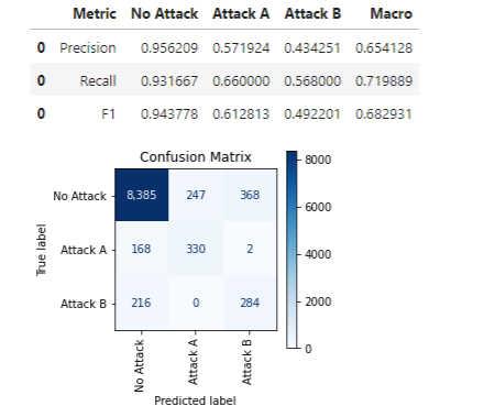
The macro F1 score, using the thresholds discovered here, has improved from about 0.44 to 0.68 (results will vary slightly from run to run).
Get_predictions()
One additional API is provided which can be very convenient, get_predictions(), to get label predictions given a set of predictions and thresholds. This can be called such as:
tuned_pred = tuner.get_predictions(
    target_classes=target_classes,
    d["Pred_Proba"],
    None,
    best_threshold)
Tests with Real Datasets
Testing has been performed with many real datasets as well. Often the thresholds discovered work no better than the defaults, but more often they work noticeably better. One notebook is included on the github page covering a small number (four) real datasets. This was provided more to provide real examples of using the tool and the plots it generates (as opposed to the synthetic data used to explain the tool), but also gives some examples where the tool does, in fact, improve the F1 macro scores.
To summarize these quickly, in terms of the thresholds discovered and the gain in F1 macro scores:
Breast cancer: discovered an optimal threshold of 0.5465, which improved the macro F1 score from 0.928 to 0.953.
Steel plates fault: discovered an optimal threshold of 0.451, which improved the macro F1 score from 0.788 to 0.956.
Phenome discovered an optimal threshold of 0.444, which improved the macro F1 score from 0.75 to 0.78.
With the digits dataset, no improvement over the default was found, though may be with different classifiers or otherwise different conditions.
Installation
This project uses a single .py file.
This must be copied into your project and imported. For example:
from threshold_tuner import ClassificationThesholdTuner

tuner = ClassificationThesholdTuner()
Implications of Setting the Thresholds in multi-class problems
There are some subtle points about setting thresholds in multi-class settings, which may or may not be relevant for any given project. This may get more into the weeds than is necessary for your work, and this articles is already quite long, but a section is provided on the main github page to cover cases where this is relevant. In particular, thresholds set above 0.5 can behave slightly differently than those below 0.5.
Conclusions
While tuning the thresholds used for classification projects won’t always improve the quality of the model, it quite often will, and often significantly. This is easy enough to do, but using ClassificationThesholdTuner makes this a bit easier, and with multi-class classification, it can be particularly useful.
It also provides visualizations that explain the choices for threshold, which can be helpful, either in understanding and accepting the threshold(s) it discovers, or in selecting other thresholds to better match the goals of the project.
With multi-class classification, it can still take a bit of effort to understand well the effects of moving the thresholds, but this is much easier with tools such as this than without, and in many cases, simply tuning the thresholds and testing the results will be sufficient in any case.
All images are by the author
Achieve Better Classification Results with ClassificationThresholdTuner was originally published in Towards Data Science on Medium, where people are continuing the conversation by highlighting and responding to this story.
Originally appeared here:
Achieve Better Classification Results with ClassificationThresholdTuner
Go Here to Read this Fast! Achieve Better Classification Results with ClassificationThresholdTuner
