Unpacking the Real Significance and Limitations of Traditional Metrics
Introduction
The work of classification can be seen as a way of summarizing the complexity of structures into finite classes, and it is often useful to make life boring enough that we can reduce such structures into two single types. These labels may have obvious interpretations, as in the case where we differentiate Statisticians from Data Scientists (possibly using income as a unique plausible feature), or they may even be a suffocating attempt to reduce experimental evidence into sentences, rejecting or not a null hypothesis. Embracing the metalanguage, we attribute a classification label to the work itself of sum up stuff into two different types: Binary Classification. This work is an attempt at a deeper description of this specific label, bringing a probabilistic interpretation of what the decision process means and the metrics we use to evaluate our results.
Modeling populations as distributions
When we try to describe and differentiate an object, we aim to find specific characteristics that highlight its uniqueness. It is expected that for many attributes this difference is not consistently accurate across a population.
For an usual problem of two classes with different n features (V1, … Vn), we can se how these feature values distribute and try to make conclusions from them:

If the task were to use one of those features to guide our decision process, the strategy of deciding, given an individual’s v_n value,
it would be intuitive to predict the class with the highest frequency (or highest probability, if our histograms are good estimators of our distributions). For instance, if v4 measure for a individual were higher than 5, then it would be very likely that it is a positive.
However, we can do more than that, and take advantage different features, so that we can synthesize the information into a single distribution. This is the job of the score function S(x). The score function will do a regression to squeeze the feature distributions in one unique distribution P(s, y), which can be conditioned to each of the classes, with P(s|y=0) for negatives (y=0) and P(s|y=1) for positives (y=1).
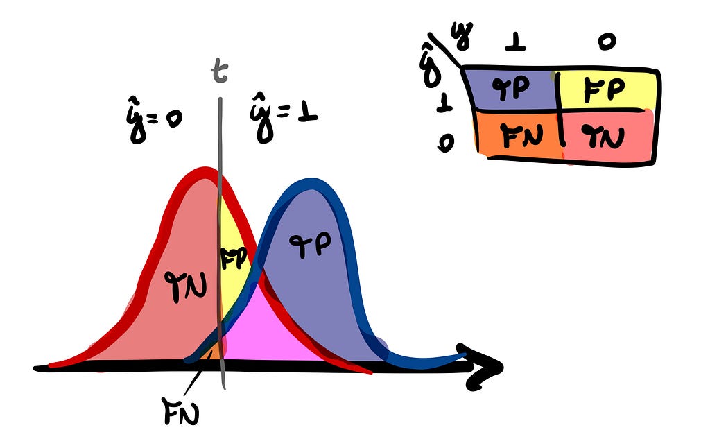
From this single distribution, we choose a decision threshold t that determines whether our estimate for a given point — which is represented by ŷ — will be positive or negative. If s is greater than t, we assign a positive label; otherwise, a negative.

Given the distribution P(s, y, t) where s, y and t represents the values of the score, class and threshold respectively, we have a complete description of our classifier.
Metrics for our classifier (marginal and conditional distributions)
Developing metrics for our classifier can be regarded as the pursuit of quantifying the discriminative nature of p(s|P) and p(s|N).
Typically will be a overlap over the two distributions p(s|P) and p(s|N) that makes a perfect classification impossible. So, given a threshold, one could ask what is the probability p(s > t|N) — False Positive Rate (FPR) — that we are misclassifying negative individuals as positives, for example.
Surely we can pile up a bunch of metrics and even give names — inconsistently — for each of them. But, for all purposes, it will be sufficient define four probabilities and their associated rates for the classifier:
- True Positive Rate (tpr): p(s > t|P) = TP/(TP+FN);
- False Positive Rate (fpr): p(s > t|N) = FP/(FP+TN);
- True Negative Rate (tnr): p(s ≤ t|N) = TN/(FP+TN);
- False Negative Rate (fnr): p(s ≤ t|P) = FN/(TP+FN).
If you are already familiar with the subject, you may have noticed that these are the metrics that we define from confusion matrix of our classifier. As this matrix is defined for each chosen decision threshold, we can view it as a representation of the conditional distribution P(ŷ, y|t), where each of these objects is part of a class of confusion matrices that completely describe the performance of our classifier.

Therefore, the error ratios fpr and fnr are metrics that quantifies how and how much the two conditional score distributions intersect:

Summarizing performance: the ROC curve
Since the ratios are constrained by tpr + fnr = 1 and fpr + tnr = 1, this would mean that we have just 2 degrees of freedom to describe our performance.
The ROC curve is a curve parameterized by t, described by (x(t), y(t)) = (fpr(t), tpr(t)) as points against orthogonal axes. This will provide a digestible summary to visualize the performance of our classifier for all different threshold values, rather than just a single one.
The best choice of t is not generally known in advance but must be determined as part of the classifier construction. — ROC Curves for Continuous Data (2009, Chapman and Hall).
We are aiming to explore the concept of treating probability distributions, so let’s imagine what would be the base case for a completely inefficient classifier. Since the effectiveness of our predictions hinges on the discriminative nature p(s|P) and p(s|N) are, in the case where p(s|P) = p(s|N) = p(s), we encounter a prime example of this inefficiency.
If we do the exercise of modeling each of these conditionals as gaussians with means separated by different values, we can see how the performance varies clearly:

This visualization will serve as a valuable aid in comprehending the probabilistic interpretation of a crucial classifier metric — named Area Under the Curve (AUC) — that we will delve into later.
Some properties of the ROC curve
The ROC curve can be described as a function y = h(x) where x and y are the false and true positive rates respectively, which are in turn parameterized by t in the form x(t) = p(s > t|N) and and y(t) = p(s > t|P).
We can take advantage of this to derive the following properties:
- y = h(x) is a monotone increasing function that lies above the line defined by (0, 0) and (1, 1);
- The ROC curve is unaltered if the classification scores undergo a strictly increasing transformation;

This property is what makes the calibration process for a classifier possible.
3. For a well-defined slope of ROC at the point with threshold value t:

where p(t|P) represents the density distribution for the cumulative distribution p(s ≤ t | P) (and same for p(t|N)).
Binary Classification as Hypothesis Testing: justifying our approach
When viewing the classification process through a Bayesian inference lens, our objective is to deduce the posterior probability p(P|t), which represents the odds of a point with threshold value t belonging to the positive class. Therefore, the slope derivative defined on property 3 can be viewed as the likelihood ratio L(t).
This ratio [L(t)] tell us how much probable is a value of t of the classifier to have occurred in population P than in population N, which in turn can be interpreted as a measure of confidence in allocation to population P. — ROC Curves for Continuous Data (2009, Chapman and Hall).
This is an important fact because, by establishing an equivalence relationship between the binary classification process and hypothesis testing, we have a justification for why we classify based on a threshold.
If we formulate the classification problem with the null hypothesis H0 that the individual belongs to population N against the alternative H1 that he belongs to population P, we can draw the relationship:

The Neyman-Pearson Lemma establishes that the most powerful test — which achieves the highest 1-β value — with a significance level α, possesses a region R encompassing all s values of S for which:

where α is sufficient to determine k by the condition p(s ∈ R|N) = α.
This implies that when we score the population in a manner where L(s) is monotonically increasing, a one-to-one relationship between s and k ensures that choosing a rule that exceeds a particular threshold is the optimal decision.
For our fictitious cases where our classifier assigns a normal distribution for each class, it’s direct the likelihood will satisfy this condition:

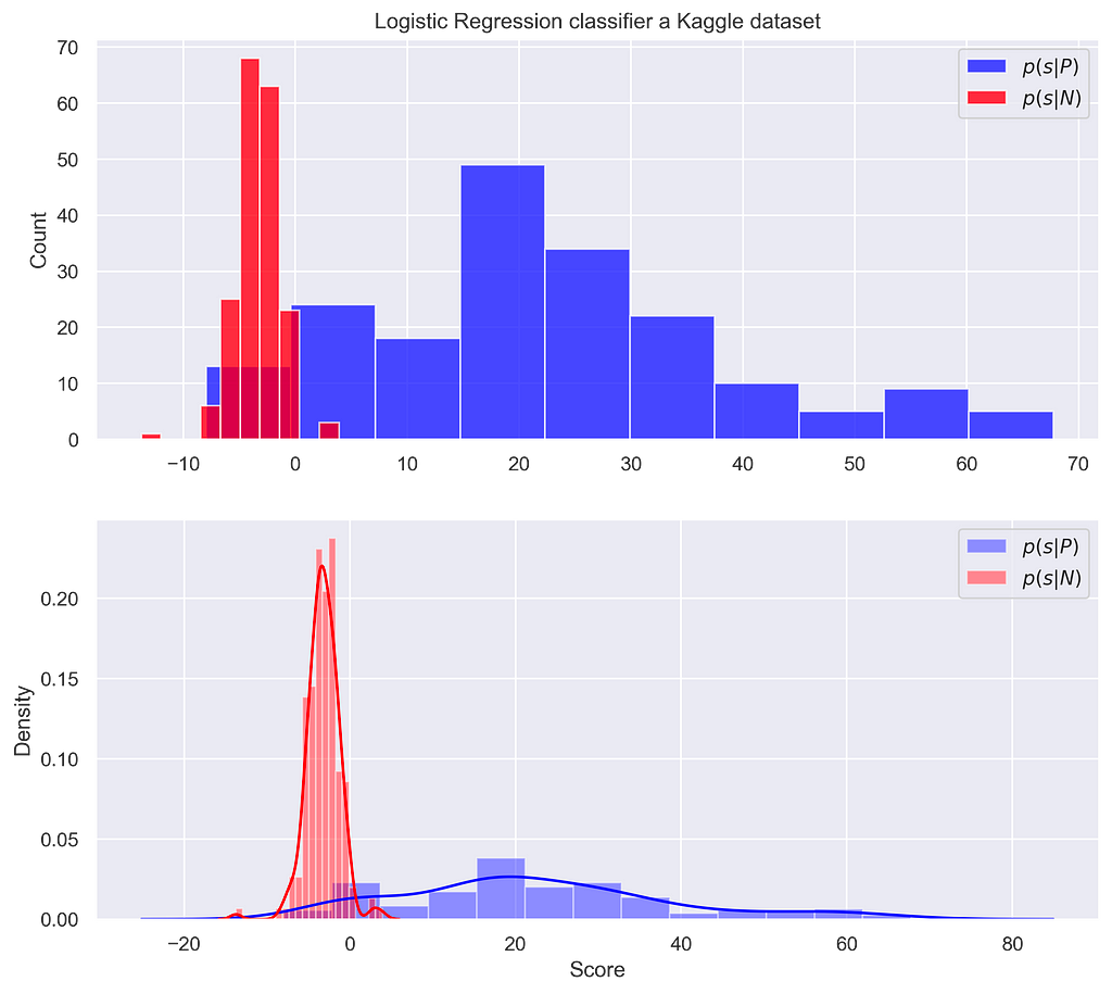
This is not always the case for a real-world problem, where score distributions are not necessarily well-behaved in this sense. We can use the Kaggle dataset to understand this, estimating the density of our conditionals by Kernel Density Estimation (KDE).


This means that higher scores are not necessarily associated with a greater chance of the individual being from a positive class.
ROC-AUC probabilistic interpretation, and why we should take care with it
The Area Under the Curve (AUC) is probably the most widely used value to summarize the results expressed by a ROC curve. It is defined as the integral of y(x) from 0 to 1, as the name suggests. Notably, a perfect classifier’s performance is epitomized by the point (0, 1) on the orthogonal axis, denoting zero probability of misclassification negative points and an unambiguous assurance of correctly classifying positives.
The approach treated on figure 5 give us a hint that the probabilistic interpretation of a good fit must have to do with consistency in assigning high score values for positive individuals and low score for negatives ones. This is exactly the case, since one can prove — as referred in [1] — that the AUC is equivalent to the probability of a positive individual have a score value (Sp) higher than a negative individual score (Sn):

The critical point to consider is this: AUC is designed to provide a single-number estimate of your classifier’s performance. However, when it comes to making practical decisions, a threshold t must be chosen to suit the specific requirements of your problem. The challenge arises because, as discussed earlier, the optimal decision based on a threshold occurs when the likelihood ratio is monotonically increasing, which is not always the case in practice.
Consequently, even if you have a high AUC value, very close to 1, it may not be sufficient to determine whether your classifier is truly capable of optimal classification based on a decision boundary. In such cases, achieving a high AUC value alone may not guarantee the effectiveness of your classifier in practical decision-making scenarios.
Conclusion
This probability interpretation of binary classification may offers a profound understanding of the intricacies involved in the process. By modeling populations as distributions, we can make informed decisions based on the likelihood of an individual belonging to a particular class. The ROC curve serves as a valuable tool for summarize how the choice of threshold impacts classification efficiency. Furthermore, the connection between binary classification and hypothesis testing emphasizes the reason why we classify by threshold values. It is essential to remember that while the Area Under the Curve (AUC) is a commonly used performance metric, it may not always guarantee optimal practical decision-making, underscoring the significance of choosing the right threshold. This probabilistic interpretation enriches our understanding of binary classification, making it a powerful framework for tackling real-world problems.
Acknowledgements
Special thanks to Renato Vicente, who introduced me to visualizing the classifier through the space of confusion matrices, and encouraged me to write this article.
All images and graphs are by the author.
Also, you can find me on Linkedin.
References
[1] Krzanowski, Wojtek J., and David J. Hand. ROC curves for continuous data. Crc Press, 2009
[2] Muschelli, John (2019–12–23). “ROC and AUC with a binary predictor: a potentially misleading metric”. Journal of Classification. Springer Science and Business Media LLC. 37 (3): 696–708. doi:10.1007/s00357–019–09345–1. ISSN 0176–4268.
Dataset
Credit Card Fraud (kaggle.com)
Binary Classification was originally published in Towards Data Science on Medium, where people are continuing the conversation by highlighting and responding to this story.
Originally appeared here:
Binary Classification
