Data Visualization, Data Storytelling
A ready-to-run tutorial showing how to tailor the global temperature anomalies dataset for an audience of professionals, using Python and Altair

Did you know that the same dataset can be graphically represented differently based on the audience we have in front of us? This is because each audience has different requirements, meaning that each audience will look for something different in the data. Recognizing what the audience is looking for in a graph becomes essential to building graphs adapted to that type of audience.
We will cover:
- Audience Classification
- General Requirements for Professionals
- Case Study
Audience Classification
Let’s start from the beginning. We consider three fundamental audience types:
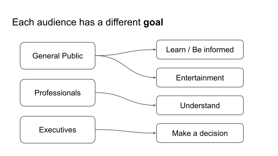
- The General Public knows neither the data nor the topic. At most, they have a general smattering of the topic. Their goal is to be informed about the topic or to be entertained.
- Professionals—these are very expert technicians. They know the topic and the data very well, and their goal is to better understand the data and the motivations behind a certain phenomenon highlighted by the data.
- Decision-makers — are the people who make decisions. They know the topic but not the particular data. Their goal is to make decisions based on data.
The following figure shows the various types of audiences and their specific objectives.
In this article, we will focus on the professional audience. In the next ones, we will analyze the other types of audiences. We will use an example dataset and build a chart specifically targeted to this audience. Showing the same graphic produced to a different kind of audience would probably only have a negative effect and reduce the level of understanding of the message.
General Requirements for Professionals
As already mentioned, professionals know the topic very well and want to understand the data better. Therefore, the more data details we include in the graph, the more we satisfy their needs. In this case, in fact, it is better to give specific values of the data, without rounding too much.
Including some elements in the graph that invite them to reflect, carry out calculations, or discuss is also appropriate. For example, professionals may be interested in:
What do we want our audience of professionals to do?
- Trend Analysis and Anomaly Detection
- Correlation with other factors
- Prediction of future trends
- Discussion.
In summary, for this type of audience, we provide the following information in a graph:
- Data details
- Ideas for further analysis.
Case Study
We use the Global Temperature Anomalies dataset released by NOAA under the Creative Commons 1.0 Universal Public Domain Dedication (CC0–1.0) license. We build a graph specific to the professional audience to represent the dataset. As a graph construction tool, we use Python Altair, but you can generalize and also use other tools such as Tableau, Power BI, or Matplotlib.
We will follow the steps described below:
- Load the dataset
- Draw a preliminary chart
- Add details for the audience of professionals
- Add elements encouraging further analysis.
Load the dataset
Start by loading the dataset, which is not ready for usage because the date is incorrect. Data preprocessing is outside the scope of data visualization, but here, we report the code for conversion just for convenience.
import pandas as pd

df = pd.read_csv('source/1850-2024.csv')
The following figure shows the output:
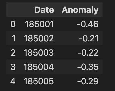
Define a function for conversion, which takes the year from the first four characters of the cell and the date from the next two characters:
# Function to convert YYYYMM to YYYY-MM-DD
def convert_to_date(yyyymm):
    year = int(str(yyyymm)[:4])
    month = int(str(yyyymm)[4:6])
    return pd.Timestamp(year=year, month=month, day=1)

# Apply the conversion function to the Date column
df['Date'] = df['Date'].apply(convert_to_date)
Draw a preliminary chart
The first thing we can do is draw the raw chart to know what data we have. Use a line to represent the data, as shown in the following code:
import altair as alt

chart = alt.Chart(df
).mark_line(
).encode(
    x='Date',
    y='Anomaly'
).properties(
    width=800
)

chart
The following figure shows the resulting chart:
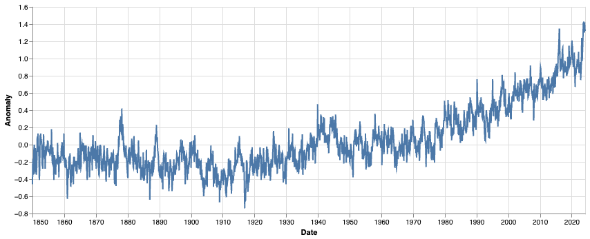
We have a very basic chart that shows the anomaly in temperatures from 1850 to 2023. The represented value is not a temperature but an anomaly of temperature in degrees. For example, in 1850, the anomaly was 0.4 degrees under the expected value, which is set to 0. This basic chart needs to be clarified.
Let’s improve the basic chart by tailoring it to the professional audience.
Add details for the audience of professionals
Professionals are very technical people who already know the topic and want to understand the data-related details.
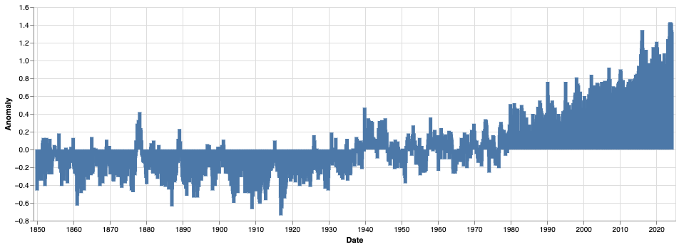
To tailor the chart for professionals, start by transforming the chart into a bar chart, by simply using the mark_bar() function.
chart = alt.Chart(df
).mark_bar(
).encode(
    x='Date',
    y='Anomaly'
).properties(
    width=900
)

chart
The following figure shows the resulting chart.
Now, change the color by setting the color channel. Use the color scheme attribute to set the color scheme. Set also the reverse attribute to invert colors and associate the red tonalities with hotter temperatures and the blue tonalities with colder ones.
chart = alt.Chart(df
).mark_bar(
).encode(
    x='Date',
    y='Anomaly',
    color=alt.Color('Anomaly', scale=alt.Scale(scheme='redblue', reverse=True))
).properties(
    width=800
)

chart
The following figure shows the resulting chart:

The problem now is that many bars overlap and are not shown correctly. One possible solution could be extending the chart width or reducing the bar size. Another solution involves grouping data by decades. Let’s apply this last solution: group data by decades and remove the last decade (2020s), which is incomplete. Use the Altair functions associated with transformations:
- transform_calculate(), to calculate a new field, the Decade
- transform_aggregate(), to aggregate anomaly values by decade
- transform_filter(), to remove the last decade (which starts from 2020).
The following code shows how to implement the chart:
chart = alt.Chart(df
).mark_bar(
).encode(
    x='Decade:N',
    y='Anomaly',
    color=alt.Color('Anomaly', scale=alt.Scale(scheme='redblue', reverse=True))
).properties(
    width=800
).transform_filter(
    "year(datum.Date) < 2020"
).transform_calculate(
     Decade = "(year(datum.Date) - year(datum.Date) % 10)"  # Calculate the decade
).transform_aggregate(
    Anomaly='mean(Anomaly)',
    groupby=['Decade']
)

chart
The following figure shows the resulting chart:

Now we can adjust axes, by setting the title of the y-axis and rotating the x-axis labels:
chart = chart.encode(
    x=alt.X('Decade:O', axis=alt.Axis(
        title='',
        labelAngle=0,
        labelExpr="datum.value + 's'",  # Add 's' to the end of each decade label
        )
    ),
    y=alt.Y('Anomaly', title='Global Surface Temperature Anomalies (°C)'),
    color=alt.Color('Anomaly', scale=alt.Scale(scheme='redblue', reverse=True))
)

chart
Here is the resulting chart:

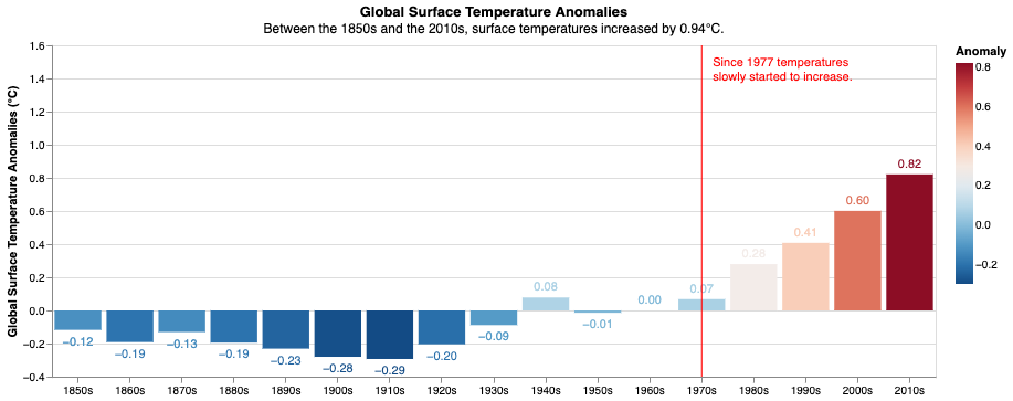
We have completed the basic chart. Now, we can add details specific to our professional audience, such as the values for each bar.
Let’s use the mark_text() function to add the label for each bar:
text = chart.mark_text(
    align='center',
    baseline='top',
    dy = alt.expr(alt.expr.if_(alt.datum.Anomaly > 0, -15, 5))
).encode(
    text=alt.Text('mean(Anomaly):Q', format='.2f'),  # Format the anomaly value with 2 decimal places

)

chart + text
Also, adjust the y-axis ranges to make the labels more visible.
The following chart shows the resulting chart:

Other useful information that our audience could want to extract from the chart are:
- The gap between the 2010s and 1850s
- When did temperatures begin to increase?
Let’s add the first as the subtitle of the chart, as shown in the following code:
chart = chart.properties(
    title=alt.TitleParams(
        text='Global Surface Temperature Anomalies',
        subtitle='Between the 1850s and the 2010s, surface temperatures increased by 0.94°C.',
    )
)

chart + text
Let’s add the second as a reference vertical line in correspondence of 1977 when the temperatures started to increase:
# reference line

rl_df = pd.DataFrame({
    'x'     : [1970],
    'text'  : [['Since 1977 temperatures', 'slowly started to increase.']]
})

rl = alt.Chart(rl_df).mark_rule(
    color='red',
).encode(
    x='x:N'
)

text_rl = rl.mark_text(
    color = 'red',
    baseline='top',
    align='left',
    y=10,
    dx=10
).encode(
    text='text'
)

chart + text + rl + text_rl
Note that we have set the x value for the reference value to 1970, since the x-axis does not contain 1977, but to be more specific, we have added a text which specifies the exact year (1977). The following figure shows the resulting chart:
Add elements encouraging further analysis
What do we want our audience of professionals to do? Possible answers to this question include:
- Trend Analysis and Anomaly Detection
- Correlation with other factors
- Prediction of future trends
- Discussion.
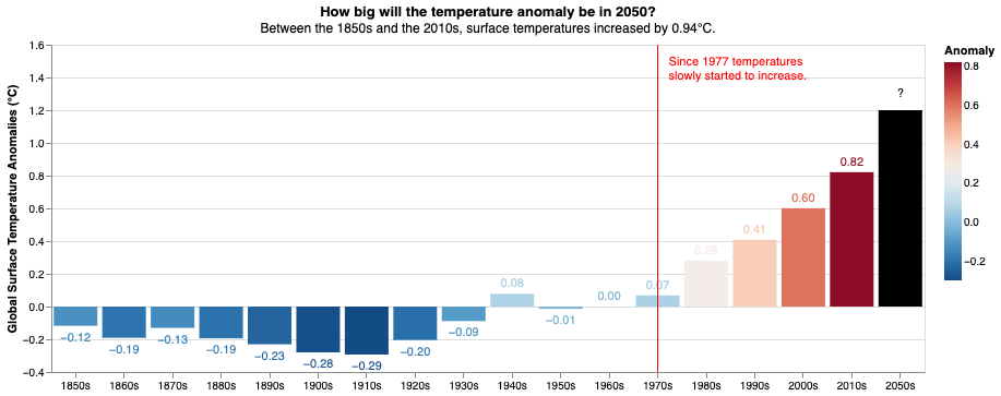
Let’s focus on predicting future trends and assume we want to encourage our audience to start working on predictions. In correspondence, for example, we can add a new bar to the chart, representing a black box of the 2050s with a question mark as a label. This should encourage our audience to do the analysis.
To implement the chart, perform the following operations:
- Add the black box as a new bar chart
- Add a new mark text with the question mark label
- Set the title to a question asking the audience to do the action.
The following code implements the described steps:
pred_df = pd.DataFrame({
    'x'     : ['2050'],
    'y'     : [1.2],
    'text'  :  '?'
})

pred =  alt.Chart(pred_df
).mark_bar(
    color = 'black'
).encode(
    x = 'x:N',
    y = 'y'
)

pred_text = pred.mark_text(
    color = 'black',
    dy=-15
).encode(
    text = 'text'
)

chart = chart.properties(
    title=alt.TitleParams(
        text='How big will the temperature anomaly be in 2050?',
        subtitle='Between the 1850s and the 2010s, surface temperatures increased by 0.94°C.'
    )
)

final = (chart + text + rl + text_rl + pred + pred_text)
final
The following figure shows the resulting chart:
Now, you are ready to show your chart to your audience of professionals!
Summary
In this tutorial, you have learned how to tailor a chart to an audience of professionals. Professionals are technical people who aim to understand data, so they want numbers.
Do the math for them and answer their possible questions. Also, invite them to perform some kind of next step, such as further analysis.
You can find the code of this tutorial in this GitHub repository.
You can also watch the tutorial at the following link:
If you have reached so far in the reading, for me, today, it’s enough! Thanks, and see you next time!
Bonus
If you want to increase the title font size, use the following command:
final.configure_title(
    fontSize = 30,
    subtitleFontSize= 20
)
Before leaving, you may also be interested in…
- Data Storytelling with Generative AI
- Using Vega-Lite for Data Visualization
- Three Charts to Represent a Percentage You May Not Know
How to Tailor a Chart to an Audience of Professionals was originally published in Towards Data Science on Medium, where people are continuing the conversation by highlighting and responding to this story.
Originally appeared here:
How to Tailor a Chart to an Audience of Professionals
Go Here to Read this Fast! How to Tailor a Chart to an Audience of Professionals