A user guide to mapping golf courses in Google Earth and bringing them to life in R.
In the land of data viz, we are often inundated with bar, line, and pie charts. But it doesn’t have to be that way — in this article, I will demonstrate how to plot golf courses.

Introduction
There are close to 40,000 golf courses worldwide. If you are passionate about golf and/or data like I am then this is for you. After plotting a course, there are some other cool things we can do as well:
- Overlaying shots onto course map — this can be done with some manipulation using the Plotly package, or by downloading individual golf shot “placemarks” from Google Earth and plotting them as points on our map. For that time you first broke 90, 80,70, etc. this could be a good way to commemorate the triumph.
- Calculating course metrics— it is generally known that Pebble Beach has tiny “postage stamp” greens. Or that Whistling Straits has tons of bunkers. A secondary benefit that comes with tracing course element polygons is being able to calculate the area of each. This allows us to derive average green sizes, number of bunkers, average width of fairways, etc. for any course that we plot.
The above bullet points are not a comprehensive list by any means, but it gives the project a future roadmap to expand on.
Table of Contents
I will start by introducing the steps of the project, and later go into more detail of each:
- trace polygons in Google Earth that represent elements of a golf course (tee boxes, fairways, bunkers, greens, water, hazards)
- download polygons from Google Earth as KML file
- read KML data into R and do some light data cleaning/manipulation
- plot golf course using ggplot2
Polygon Tracing in Google Earth
To begin, let’s head to Google Earth with a golf course in mind that we would like to plot. We will use Erin Hills in Wisconsin as a example. It is often helpful to either be familiar with the course layout or have a course map pulled up to more easily identify each hole via satellite imagery.
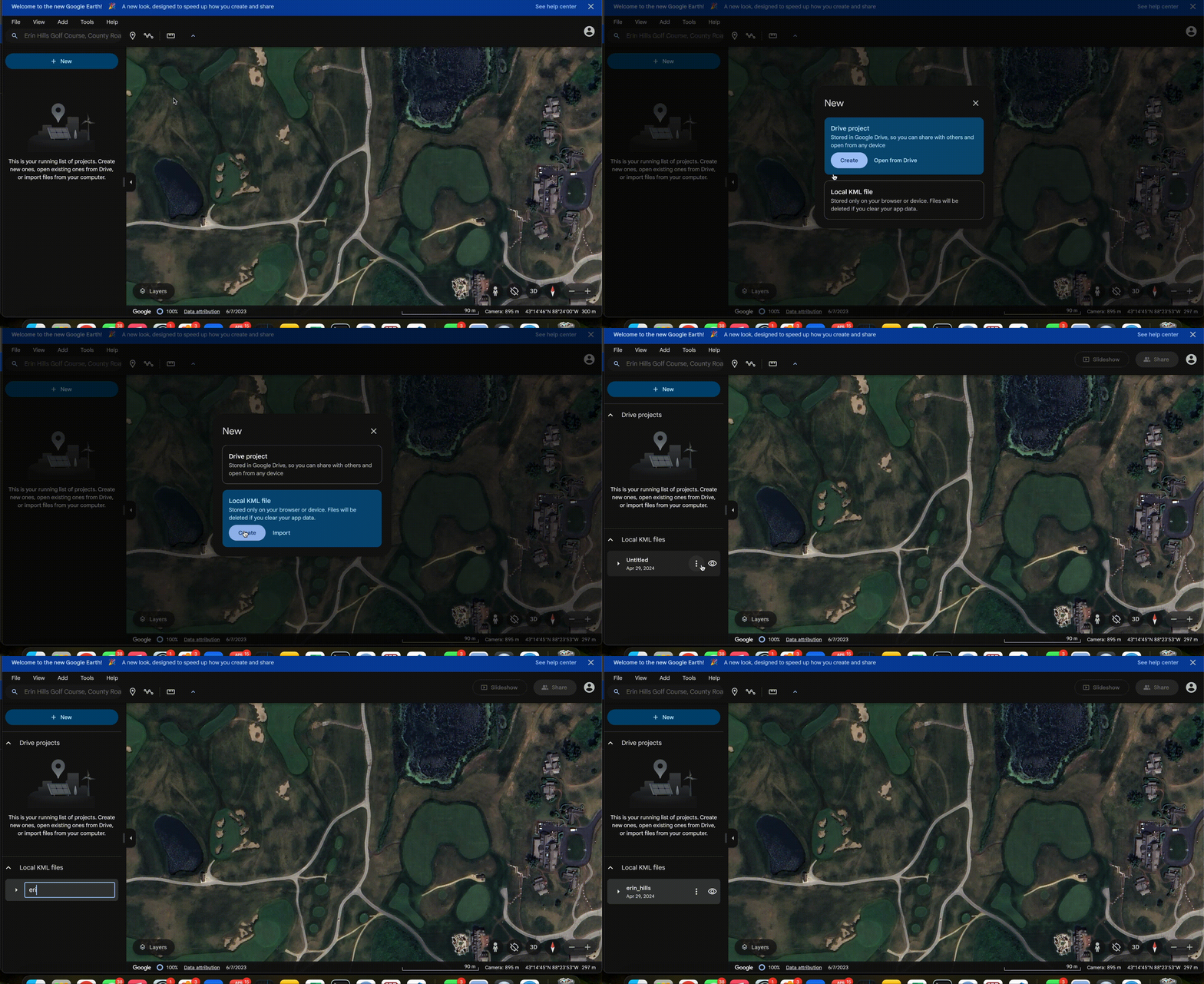
We will want to create a new project by clicking the blue “+ New” button in the top left corner. Next, we will use a Local KML file and click “Create”. Lastly, give the project a name, likely just the name of the course being mapped. The name of the project will be the name of the KML file we end up downloading upon completion.

Now that our project folder is set up, we can start tracing. Disclaimer that Erin Hills has 138 bunkers, which I found out the hard way can be a bit tedious to trace… Anyway, let’s head to the first tee to start tracing.
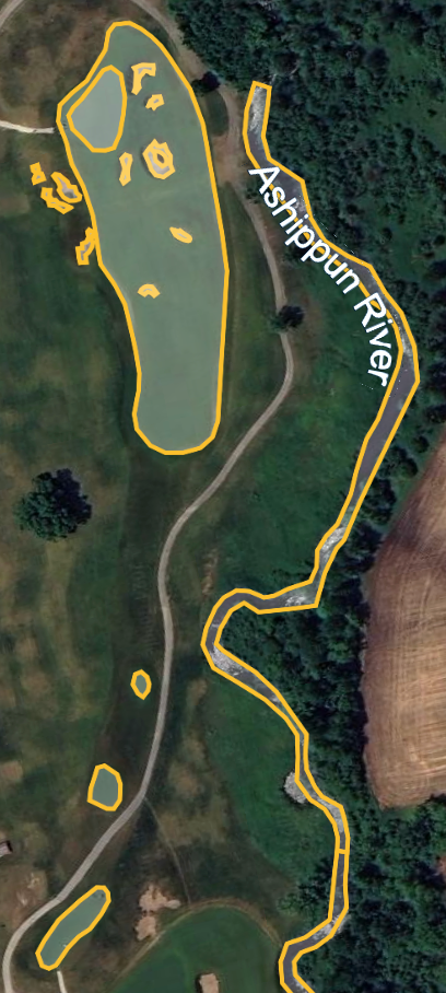
Once at the first tee, start by identifying the key elements of the hole. The first hole at Erin Hills has water and a hazard left of the fairway, a fairway dog-legging to the left, a few bunkers, etc. To begin tracing, click “Add path or polygon” which is the icon with a line and connected dots second from the left in the top toolbar. This will initialize a pencil of sorts that we can trace with.
Additional note: you can rotate your screen by simultaneously holding shift and pressing the left or right arrows.
I typically start with the tee boxes, and work my way to the green. It is required that each traced polygon forms a closed shape, meaning you return to the original starting point. After finishing a polygon, save it to your project and give it a name. It is also important to name each polygon with a consistent naming convention, such as course_hole_element, which literally translates in this case to: erin_hills_hole_1_tee, or erin_hills_hole_5_fairway, etc. We will later use string matching in our R code to extract these key pieces of information from each polygon name. This will allow us to create a polygon element-to-color mapping, a.k.a. a way to tell ggplot2 how to color each polygon. So if “bunker” is the element, then we want to color it tan. If “water” is the element, it should be blue. It also allows us to extract the course name and hole numbers which open up additional plotting capabilities.
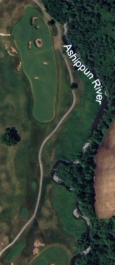
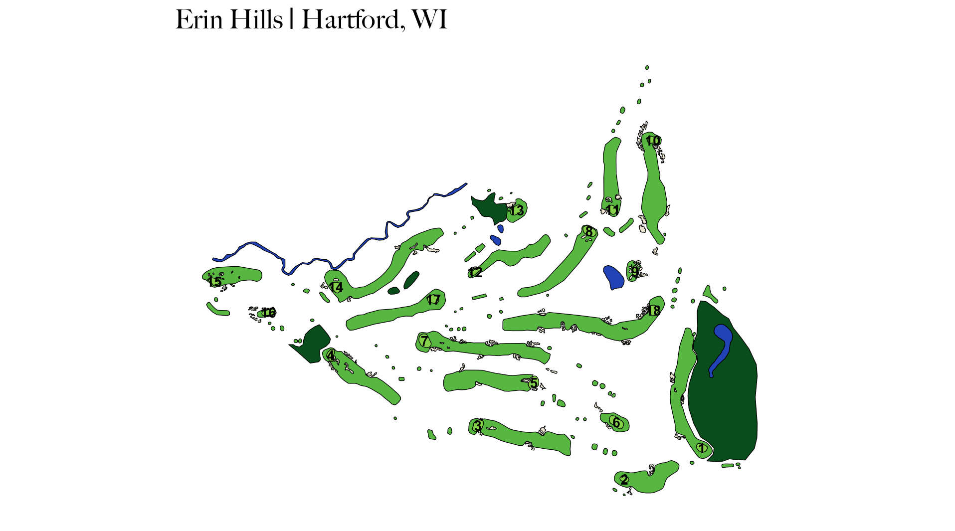
Below is Hole 15 at Erin Hills (my favorite from when I played there). The left image is the raw Google Earth image, the middle is after we have traced it, and the right image is after it has been rendered with ggplot2. I chose not to plot rough, trees, cart paths, etc.


Once we’ve finished mapping our hole or course, it is time to export all that hard work into a KML file. This can be done by clicking the three vertical dots on the left side of the screen where your project resides. This project works best with geoJSON data, which we can easily convert our KML file to in the next steps. Now we’re ready to head to R.
Plotting in R
The packages we will need to prepare us for plotting are: sf (for working with geospatial data), tidyverse (for data cleaning and plotting), stringr (for string matching), and geojsonsf (for converting from KML to geoJSON). Our first step is reading in the KML file, which can be done with the st_read() function from sf.
# load libraries
 library(sf)
 library(tidyverse)
 library(stringr)
 library(geojsonsf)

kml_df <- st_read("/Users/adambeaudet/Downloads/erin_hills.kml")
Great! Now we should have our golf course KML data in R. The data frame should have 2 columns: Name (project name, or course name in our case), and geometry (a list of all individual points comprising the polygons we traced). As briefly mentioned earlier, let’s convert our KML data to geoJSON and also extract the course name and hole numbers.
# convert from KML to geoJSON
geojson_df <- st_as_sf(kml_df, "POLYGON")

# extracting course name and hole number from polygon name
# assuming "course_hole_element" naming convention is used for polygons
geojson_df$course_name <- str_match(geojson_df$Name, “^(.+)_hole”)[,2]
geojson_df$hole_num <- gsub(“.*_hole_(\d+)_.*”, “\1”, geojson_df$Name)
To get our maps to point due north we need to project them in a way that preserves direction. We can do this with the st_transform() function.
# define a CRS for so map always points due north
crs <- "+proj=lcc +lat_1=33 +lat_2=45 +lat_0=39 +lon_0=-96 +x_0=0 +y_0=0 +datum=WGS84 +units=m +no_defs"

# transform data to CRS
geojson_df <- st_transform(geojson_df, crs)
We’re almost ready to plot, but first, we need to tell ggplot2 how each polygon should be colored. Below is the color palette my project is using, but feel free to customize as you wish.
Optional: in this step we can also calculate the centroids of our polygons with the st_centroid() function so we can overlay the hole number onto each green.

geojson_df <- geojson_df %>%
 mutate(color = case_when(
 grepl(“_tee$”, Name) ~ “#57B740”,
 grepl(“_bunker$”, Name) ~ “#EDE6D3”,
 grepl(“_water$”, Name) ~ “#2243b6”,
 grepl(“_fairway$”, Name) ~ “#57B740”,
 grepl(“_green$”, Name) ~ “#86D14A”,
 grepl(“_hazard$”, Name) ~ “#094d1d”
 )) %>%
mutate(centroid = st_centroid(geometry))
We’re officially ready to plot. We can use a combination of geom_sf(), geom_text(), and even geom_point() if we want to get fancy and plot shots on top of our map. I typically remove gridlines, axis labels, and the legend for a cleaner look.
ggplot() +
geom_sf(data = geojson_df, aes(fill = color), color = "black") +
geom_text(data = filter(geojson_df, grepl("_green", Name)),
aes(x = st_coordinates(centroid)[, 1],
y = st_coordinates(centroid)[, 2],
label = hole_num),
size = 3, color = "black", fontface = "bold", hjust = 0.5, vjust = 0.5) +
scale_fill_identity() +
theme_minimal() +
theme(axis.title.x = element_blank(),
axis.title.y = element_blank(),
axis.text.x = element_blank(),
axis.text.y = element_blank(),
plot.title = element_text(size = 16),
panel.grid.major = element_blank(),
panel.grid.minor = element_blank()) +
theme(legend.position = "none") +
labs(title = 'Erin Hills | Hartford, WI')
And there you have it — a golf course plotted in R, what a concept!
To view other courses I have plotted at the time of writing this article, you can visit my Shiny app: https://abodesy14.shinyapps.io/golfMapsR/
If you followed along, had fun in doing so, or are intrigued, feel free to try mapping your favorite courses and create a Pull Request for the golfMapsR repository that I maintain: https://github.com/abodesy14/golfMapsR
With some combined effort, we can create a nice little database of plottable golf courses around the world!
Plotting Golf Courses in R with Google Earth was originally published in Towards Data Science on Medium, where people are continuing the conversation by highlighting and responding to this story.
Originally appeared here:
Plotting Golf Courses in R with Google Earth
Go Here to Read this Fast! Plotting Golf Courses in R with Google Earth
